These are the edits of my first and second photoshoot:
Snapseed edits –
Using the app Snapseed on my phone, I was able to use their filters to create both a realistic depiction and more time-period based aesthetic of some of my images.

Lightroom & Photoshop –
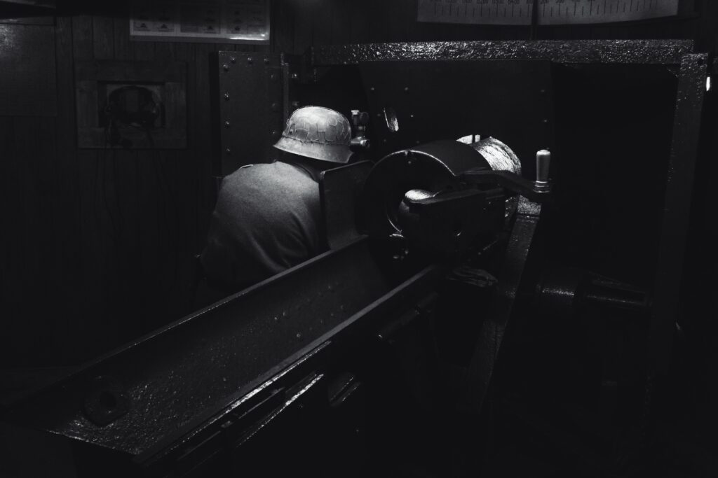
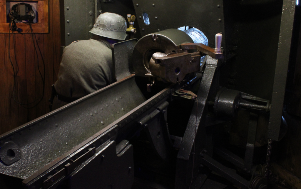
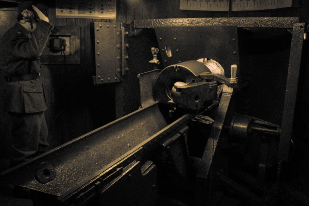
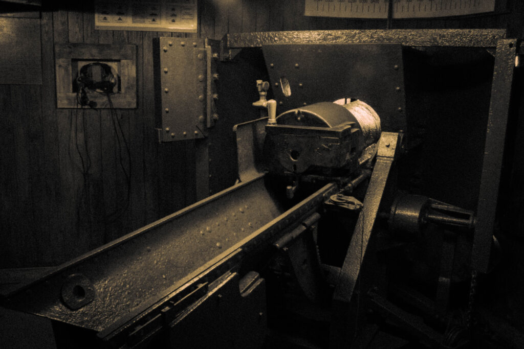
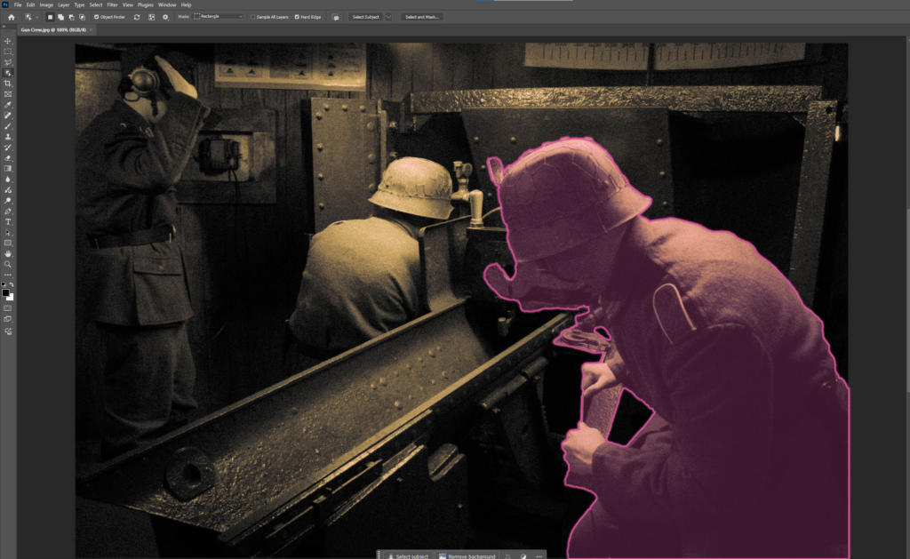
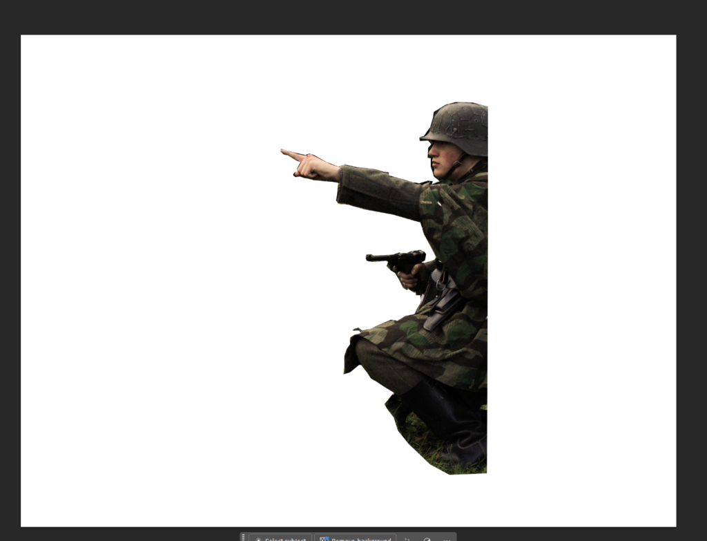
Gun Crew:
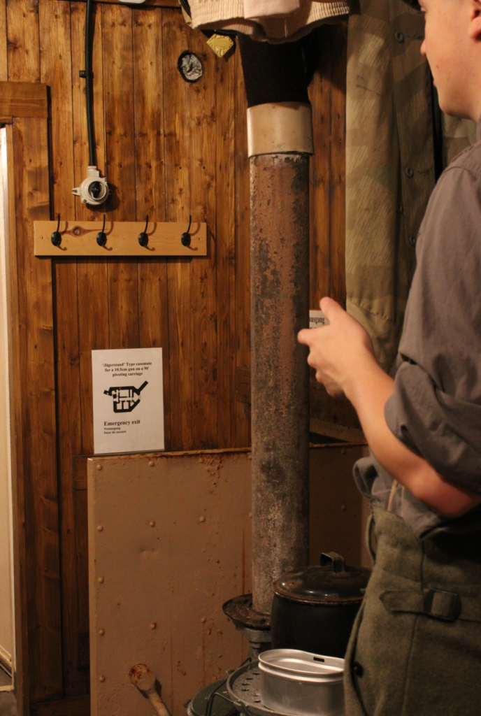
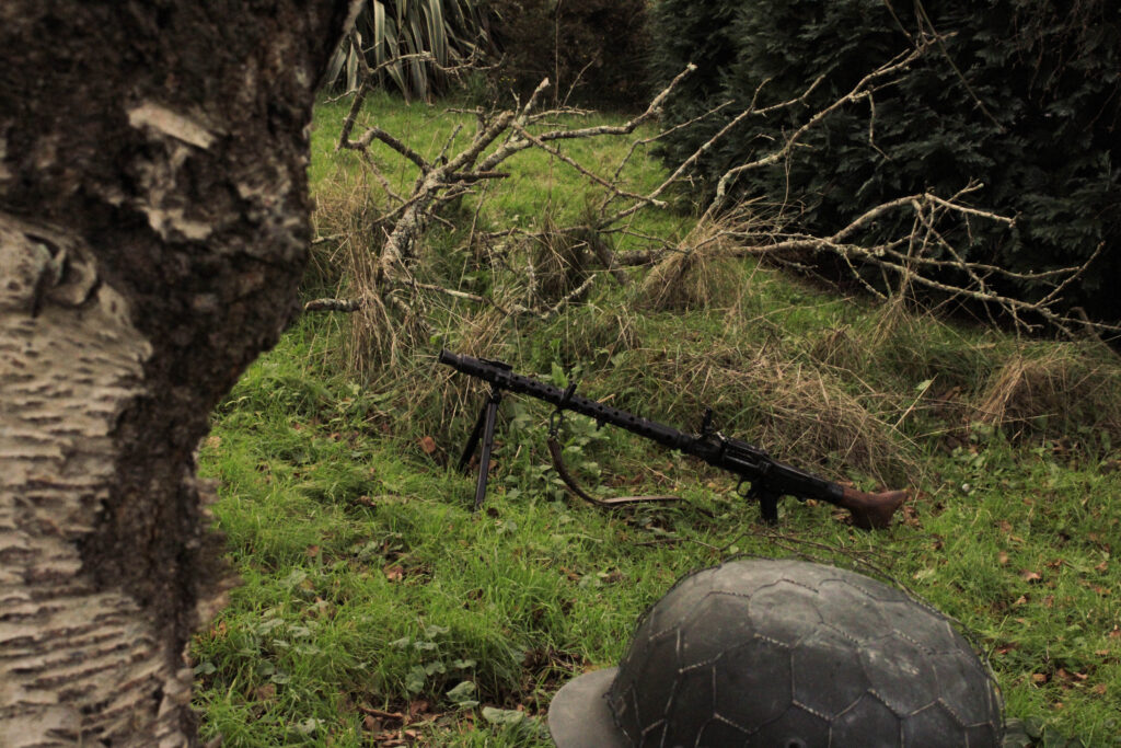
Before:
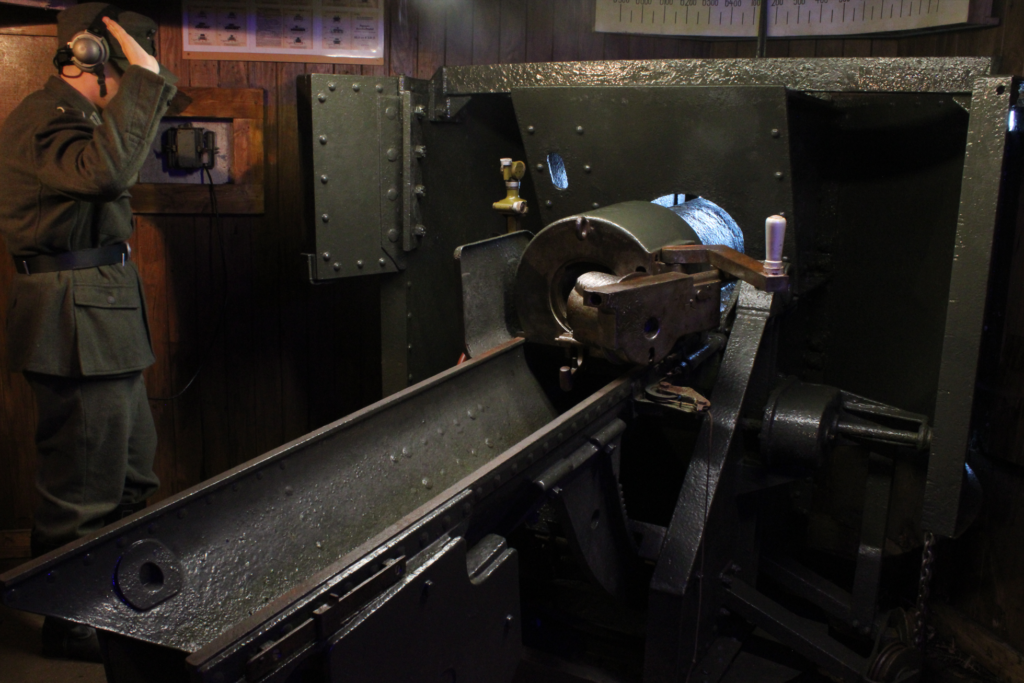
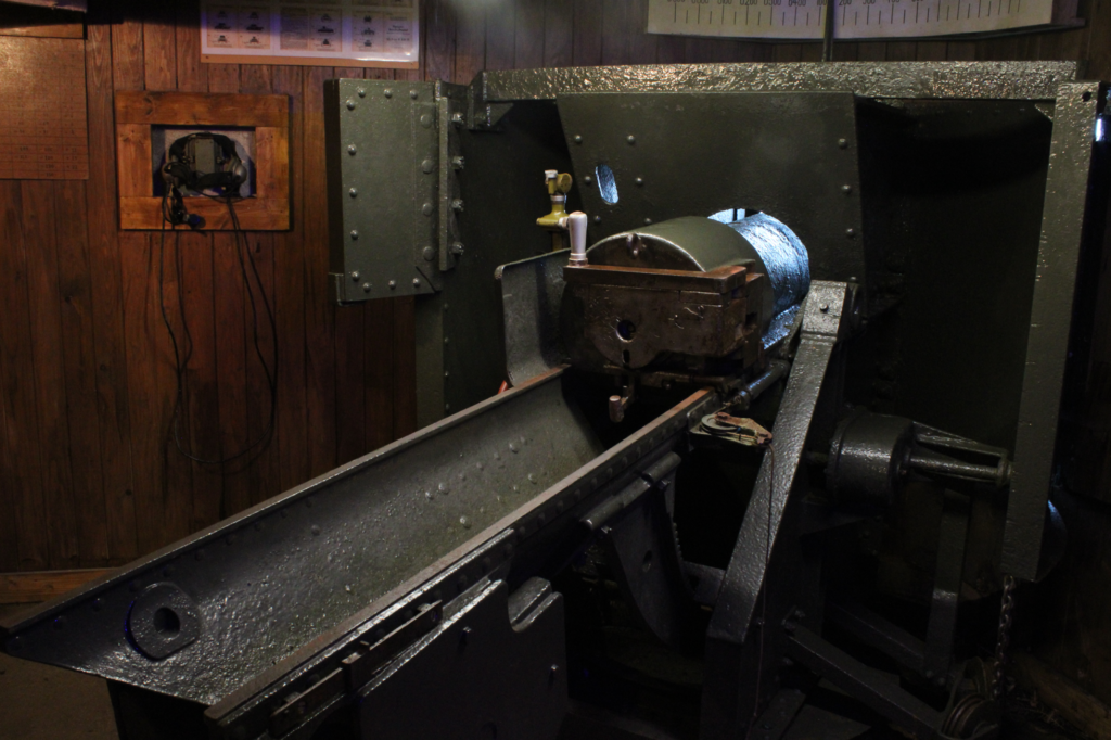
Using the Image without me as a base Image the aim was to recreate the original photograph by layering the different positions of myself to replicate the look of the gun crew. By syncing the images to the same editing settings I aimed to create the old Yellowish texture and hue photographs from the past contain.
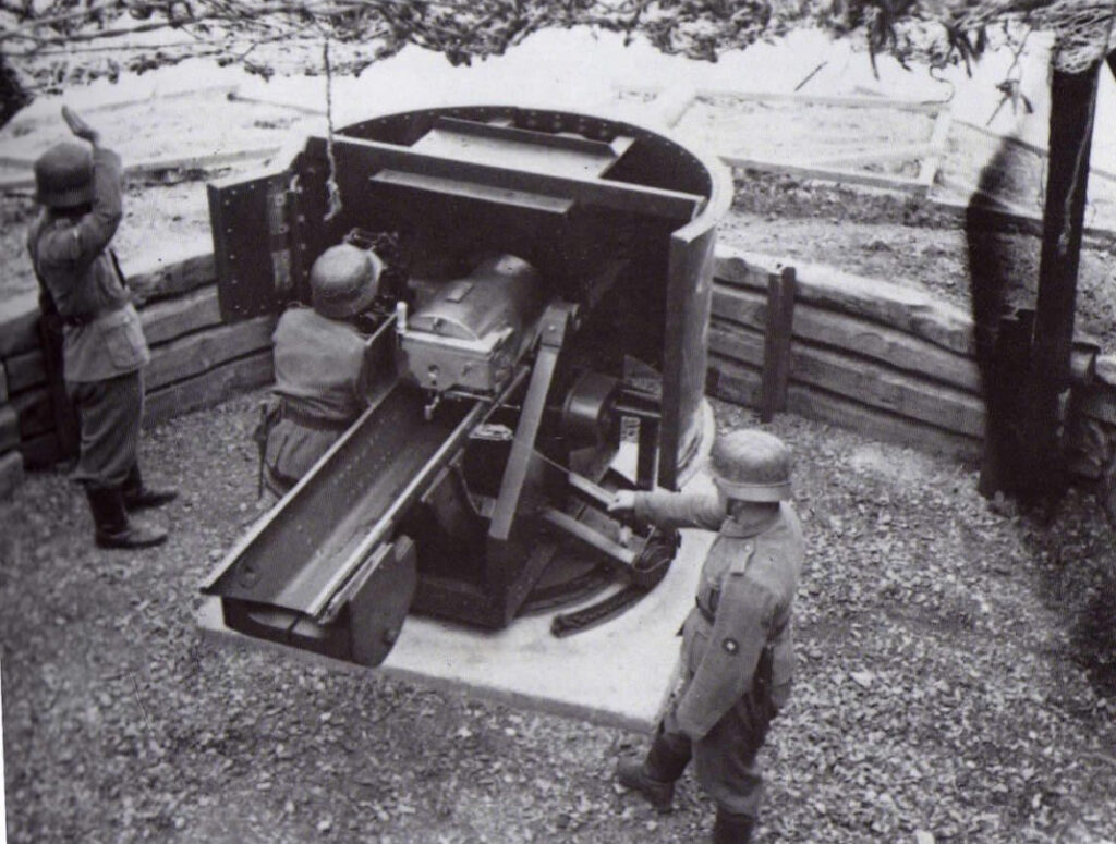
With this image as my reference, I tried to recreate it to the best I could.
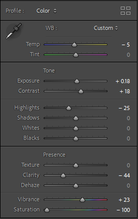
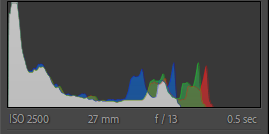
Editing:
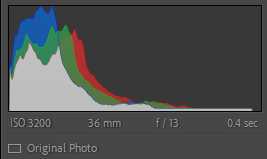
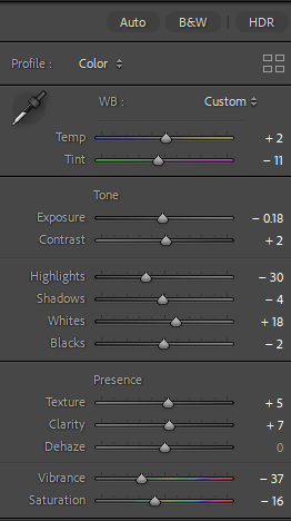
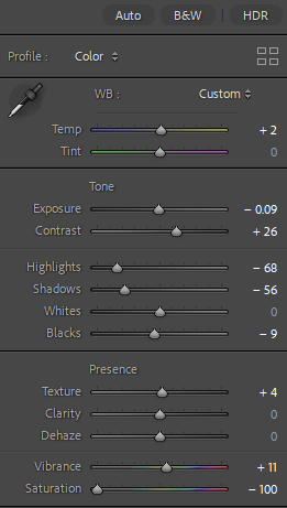
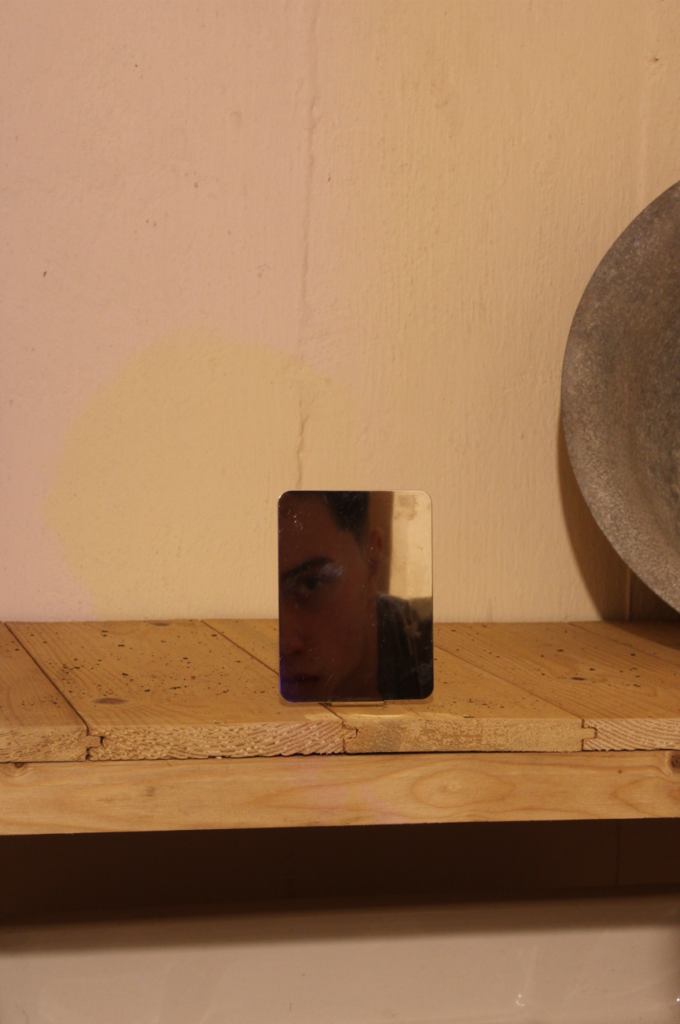
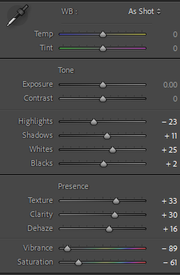
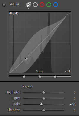
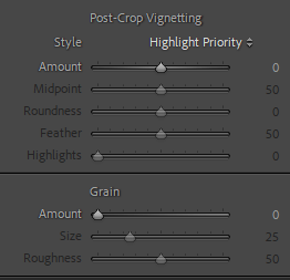
Using the following settings I was able to create the desired aesthetic that makes use of its low tones to contrast brightly against the limited but bright light.
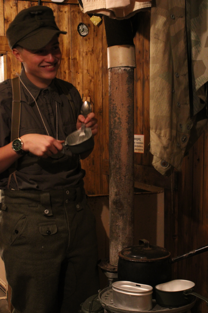
Outcome:
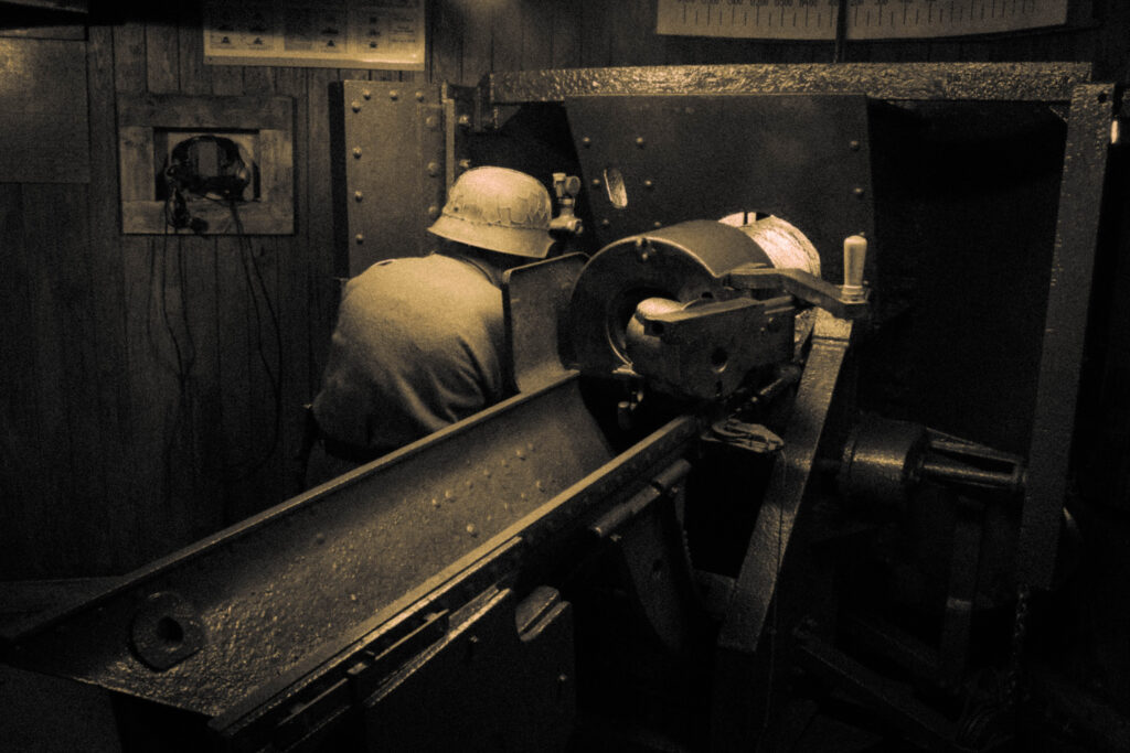
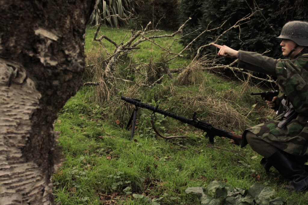
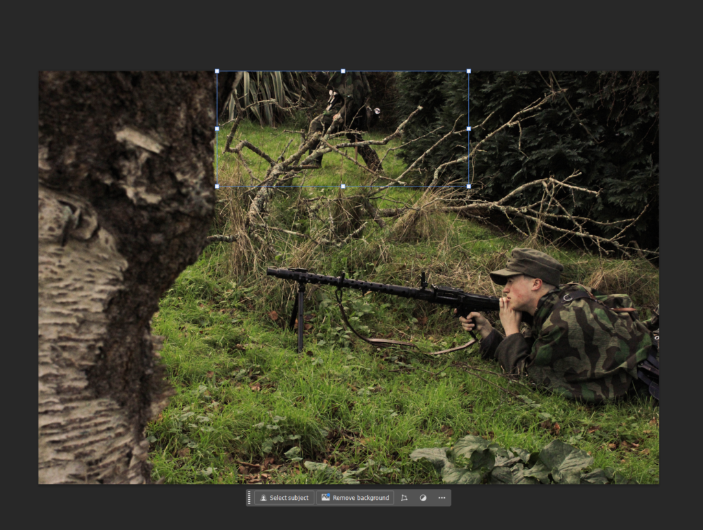
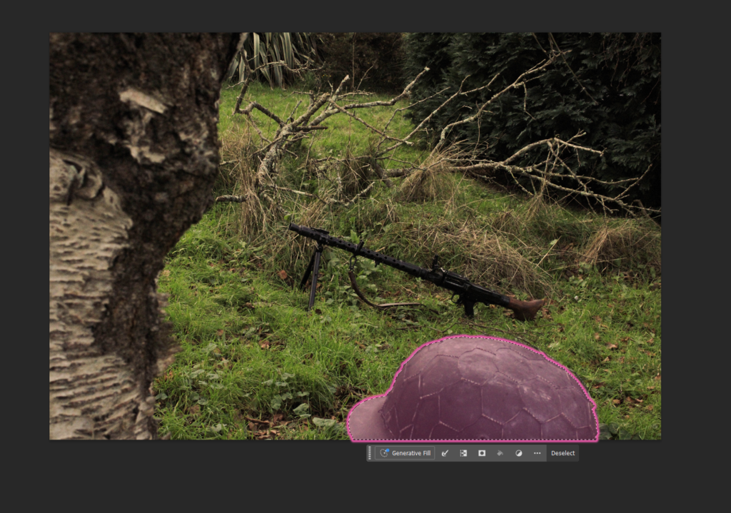
Now edited I was able to merge these images to replicate the original image using photoshops object selection tool to layer the images of myself into one.
After:
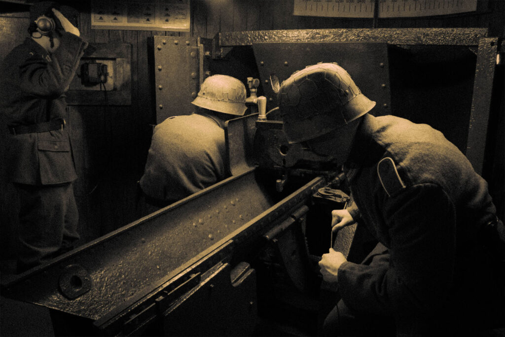
Overall I am happy with the outcome of this Image. With the overall composition creating an interesting story, I find my inspiration from both the the original reference Image and the artist inspiration from Paul M Smith are faithfully recreated in my own piece of work.
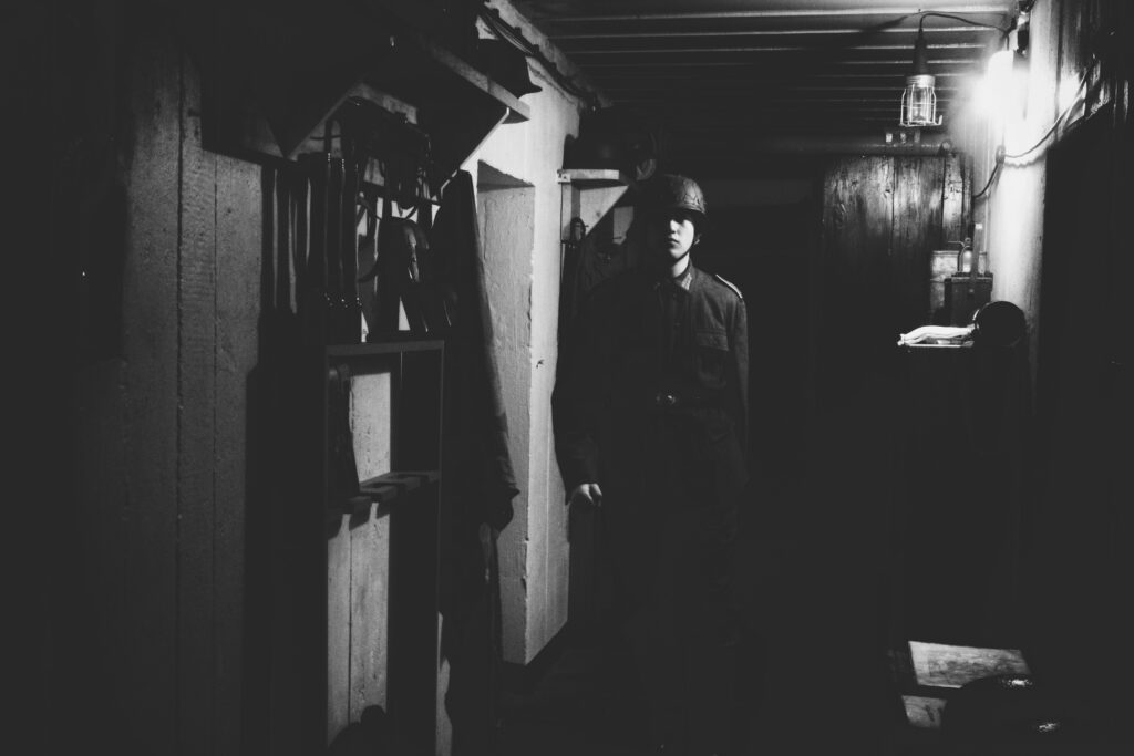
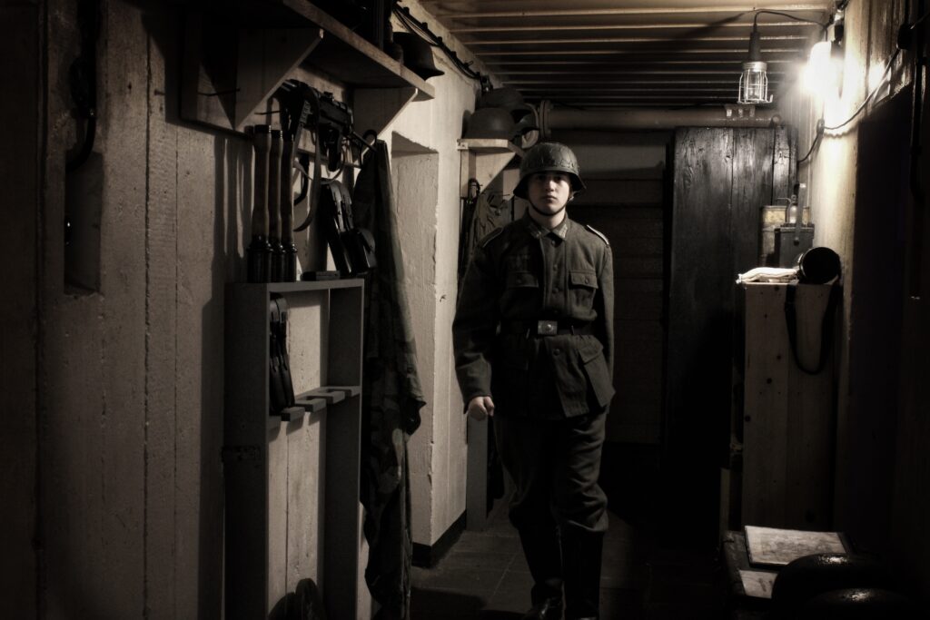
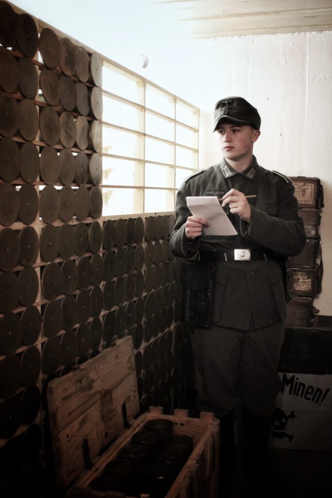
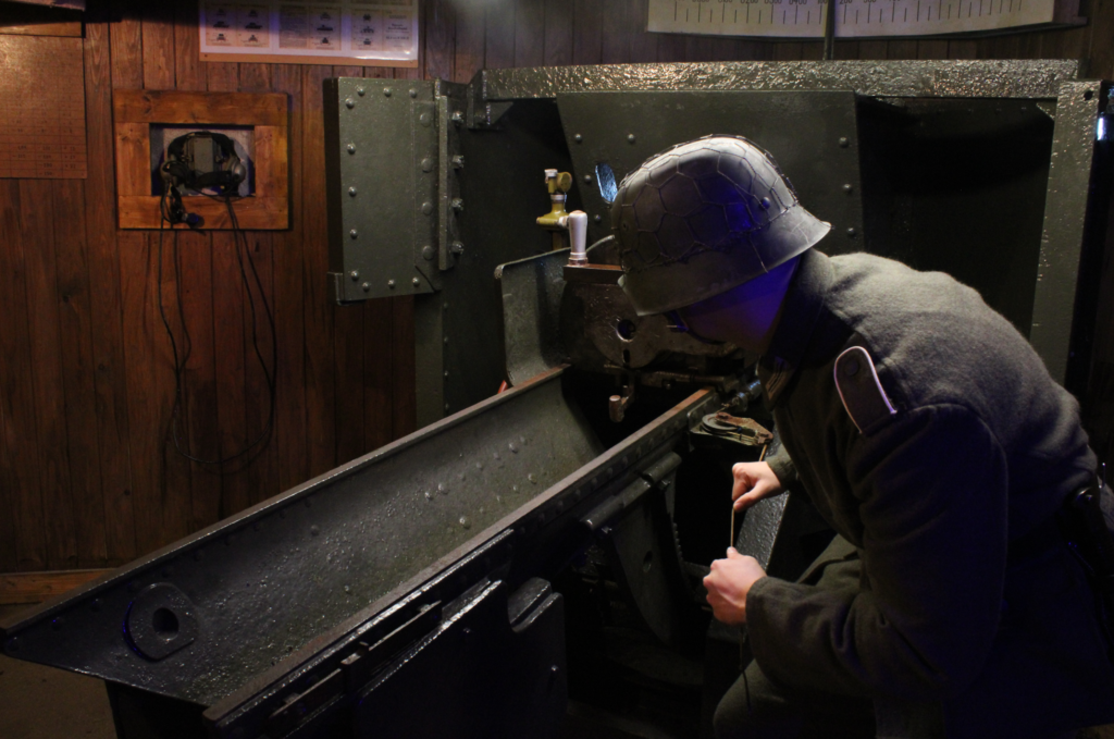
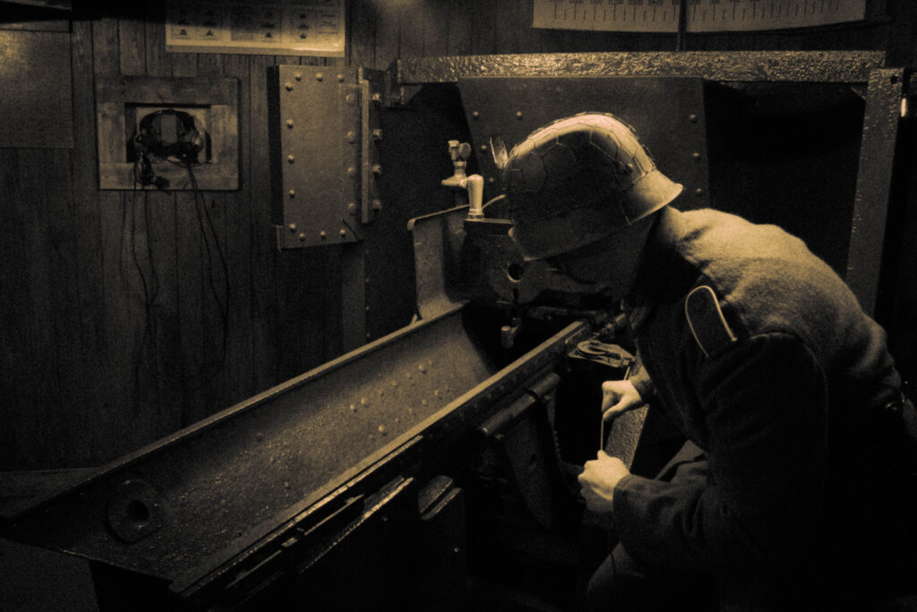
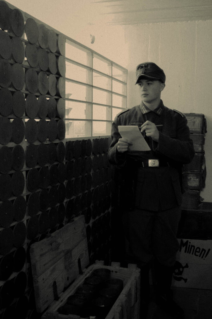
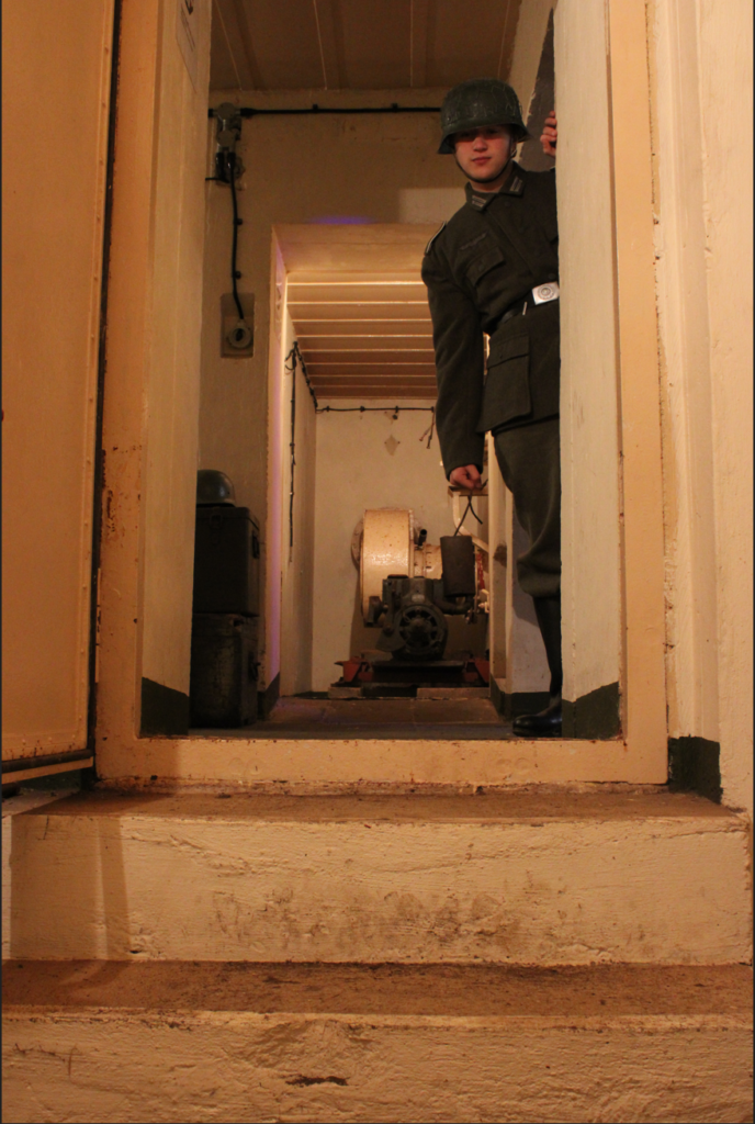
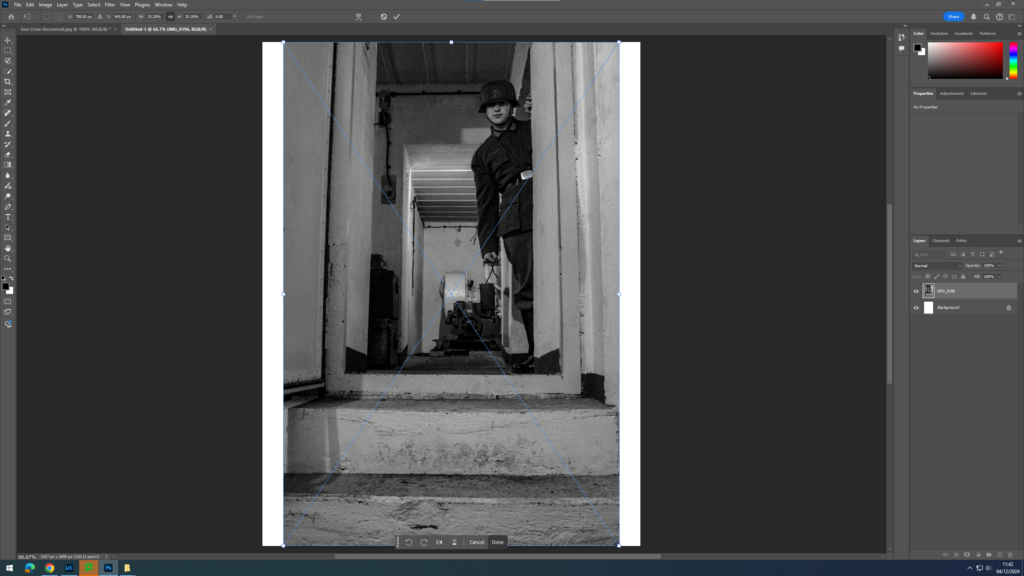
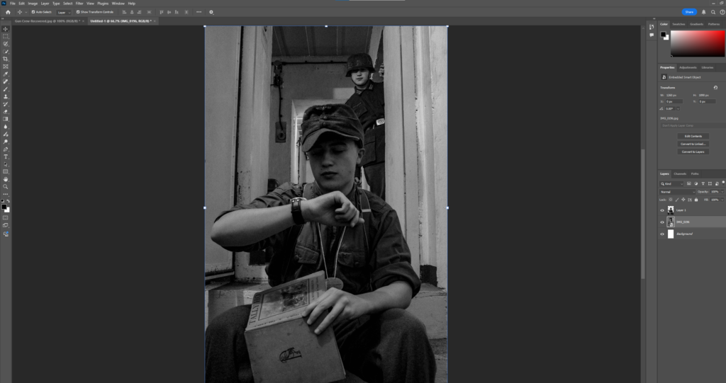
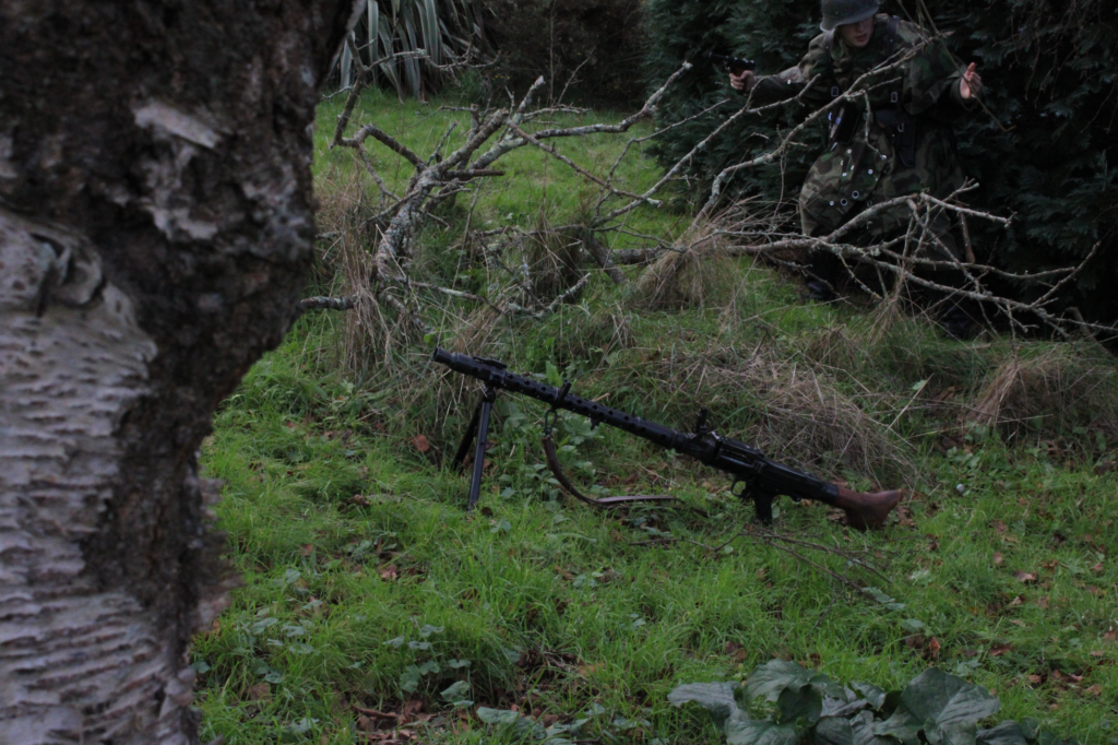
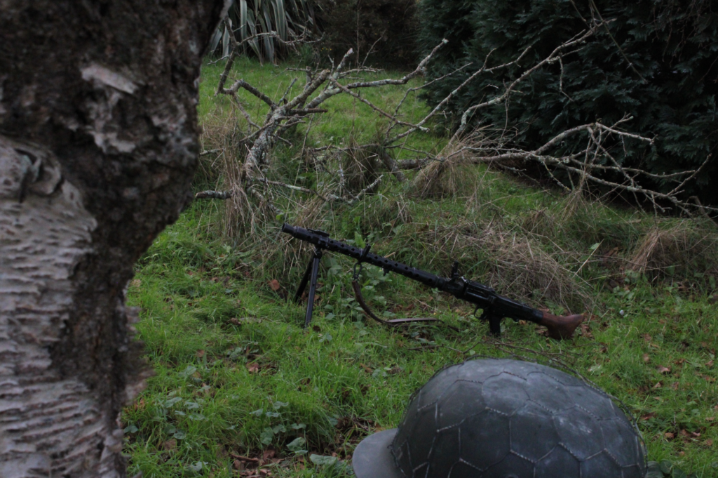
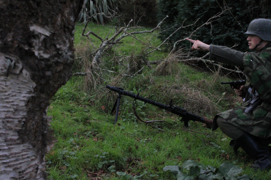
Ammo Inspection:
Before:
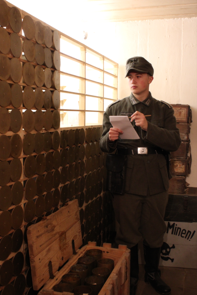
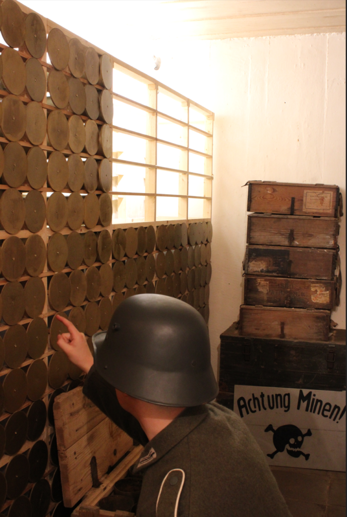
Like the previous Image, the aim for this image was to create a scenario that would occur within the life of the fortress. With the Bunker being remade to look how it did 80 years ago, this helped create the immersive aesthetic which I believe added to to its overall mise-en-scene through the additional use of props and costumes.
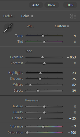
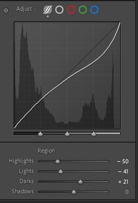
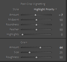
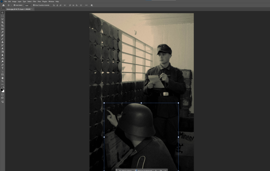
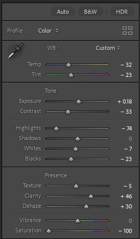
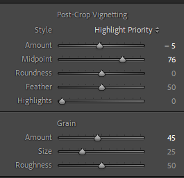
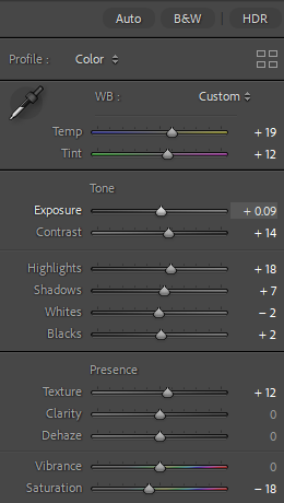
Editing:
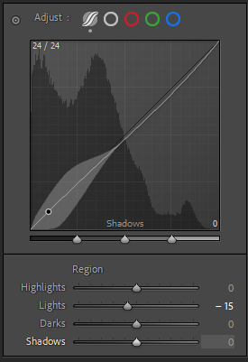
Using the following settings I was able to create an contrasted tone of stone grey’s and almost a sand-like white, to me this was creative in its own appearance, whilst still paying homage to the older appearance of photographs of that time.

Outcome:
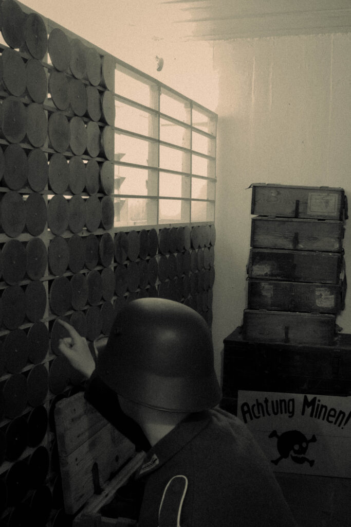
From this I was then able to repeat the process of using photoshops object selection tool to create ‘clonified’ versions of myself.
After:
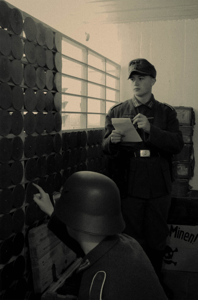
I Like this outcome as it recreates a plausible scenario which would occur within the bunker, with difference In headwear and accessories I feel that this image helps to separate the 2 ‘Me’s’ and creates an detailed level of immersion.
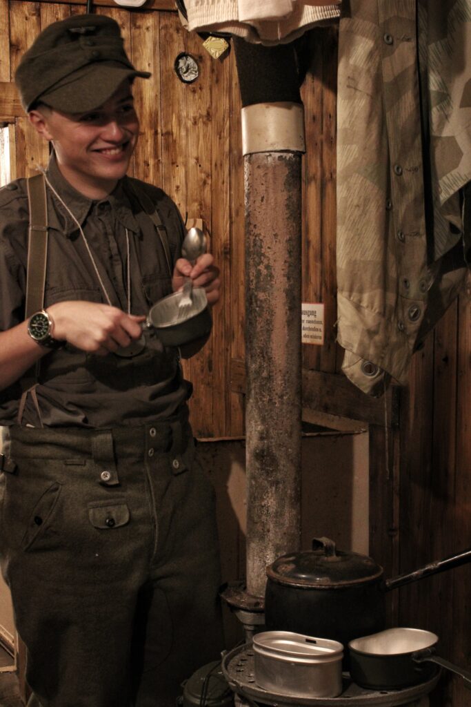
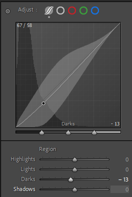
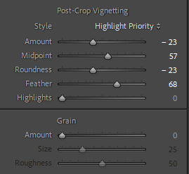
Crew Room:
Before:
With the more serious areas of the bunker being covered I thought I’d try to cover the more relaxed types of images you’d see in a bunker such as communal living and sharing the limited utilities offered.
Editing:
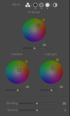
Using these settings I tried to create an Image with some colour, with the warmth of the photographs already with its brown and orange wood panelling as a backdrop, this acted as a stepping stone to achieve this, through the following edit settings

Outcome:
After:
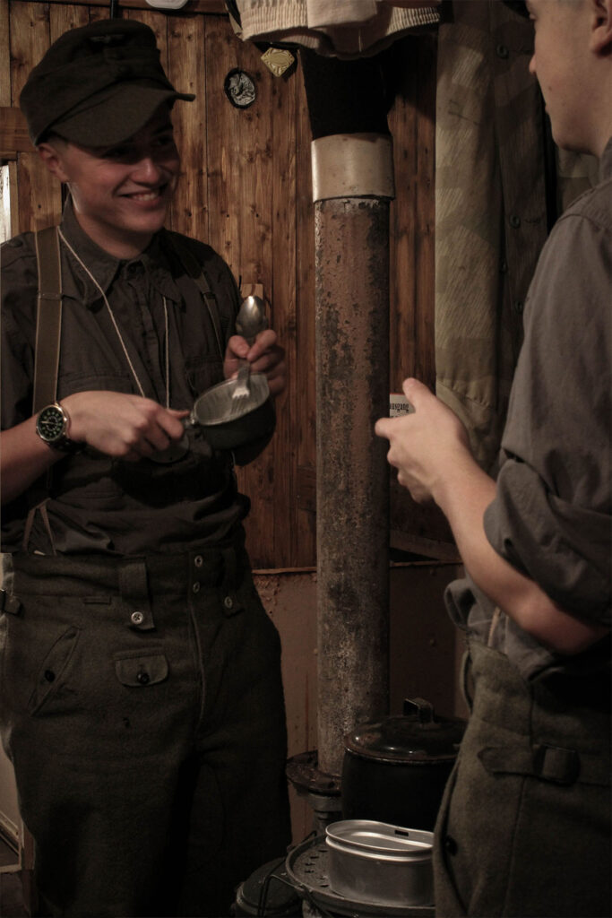
With this intended candid style, I feel it creates an interesting atmosphere and aesthetic to the image, with the me on the right having a partially obscured face, like some of the other images I have made, to me, it creates a level of realism to the peculiar concept of Paul M. Smiths work I have chosen to base my images off.
Spent cases room:
Before:
With these Images here I wanted to try and continue this intended candid style, with some minor influence from Henri Cartier Bretton with use of motion blur. With the centre image, this was inspired by this photograph in particular.
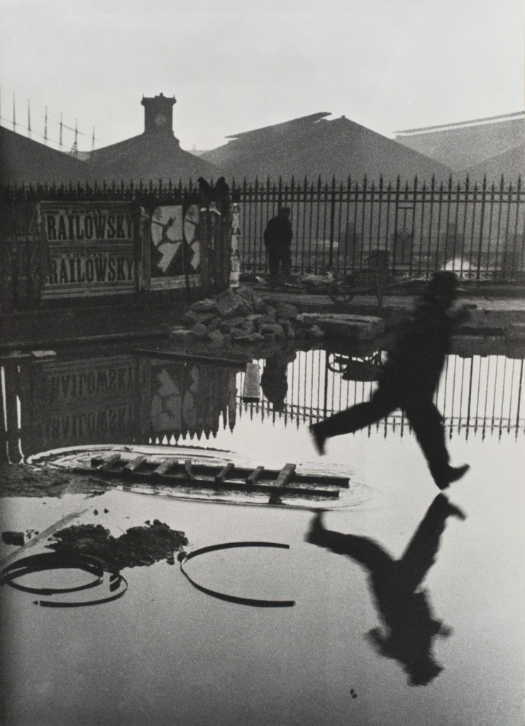
‘Behind the St. Lazare’, 1932 – Henri Cartier-Bresson
Editing:
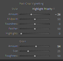
Using the settings shown I created the basis of tone, shadow, high lights and etc. This was to create that ‘Stoney’ colour like within Cartier-Bressons photograph.
Outcome:
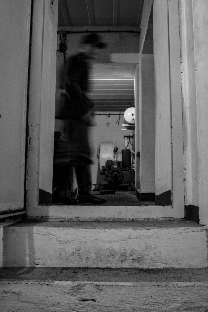
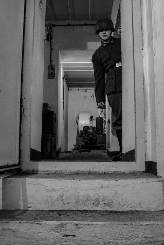
Now edited I could now merge them into an image to create another ‘scenario’ photo.
After:
With the use of different props, poses and uniform diversity I feel as if this shows a creative mise-en-scene into the idea of my project and how I aim to show the lives of Jerseys occupiers in World War 2.
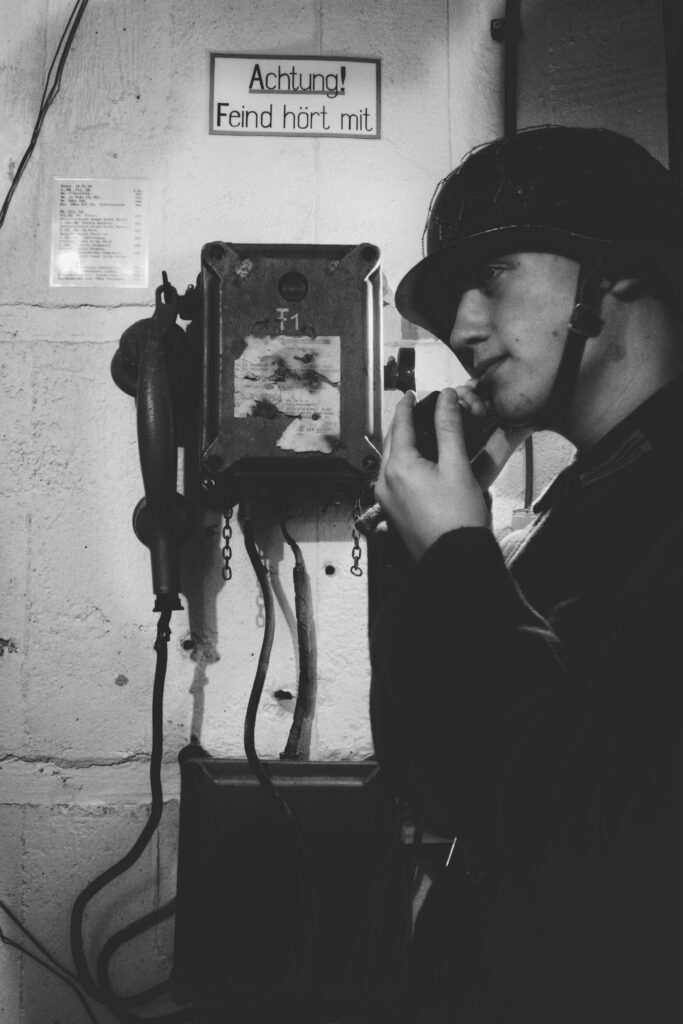
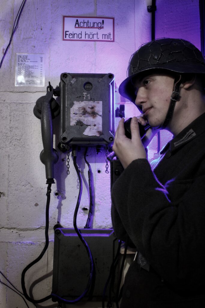
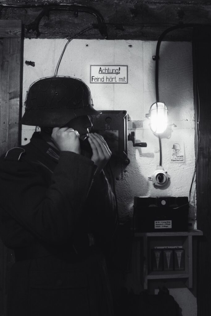
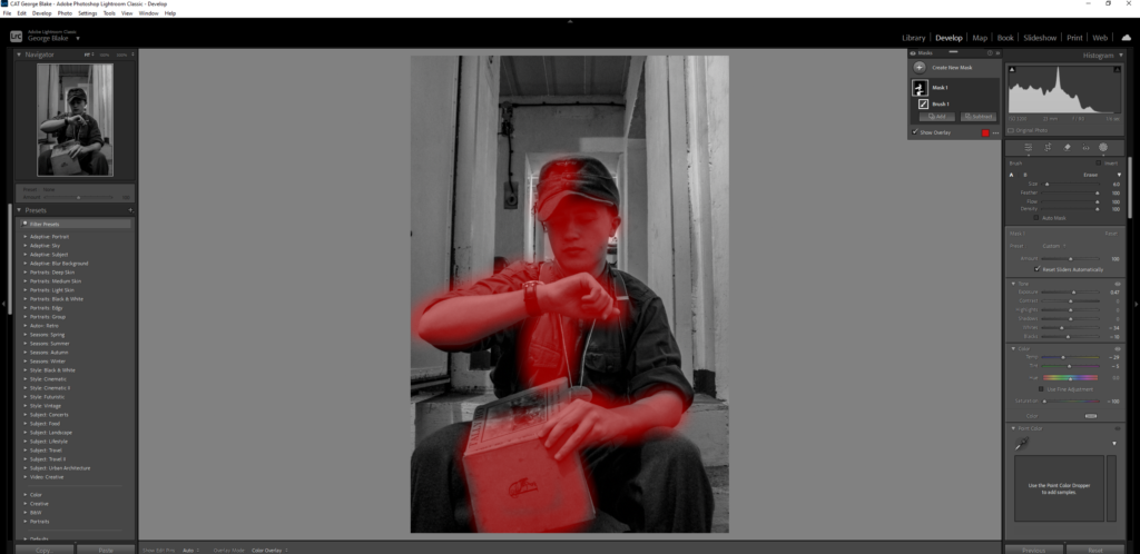
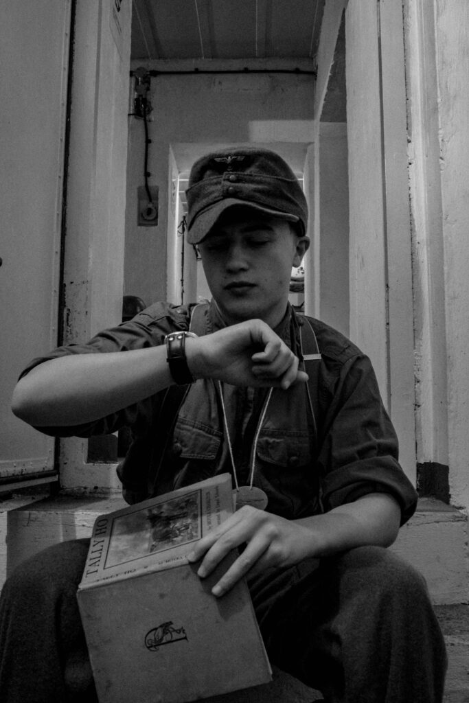
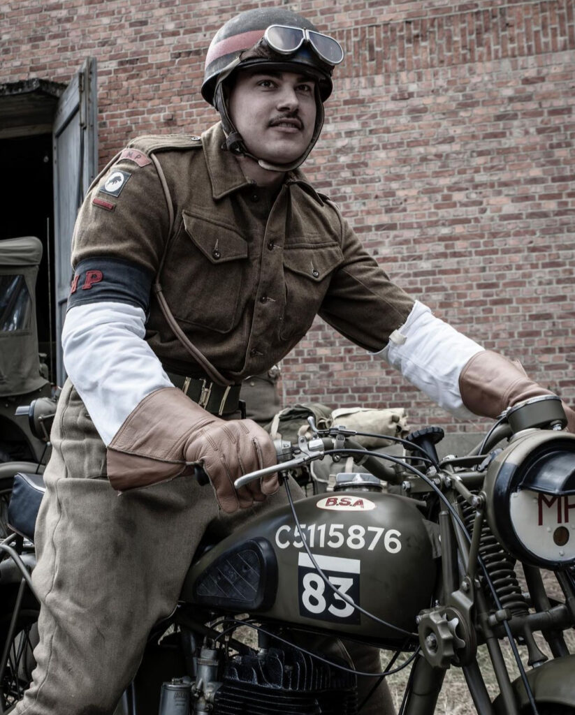
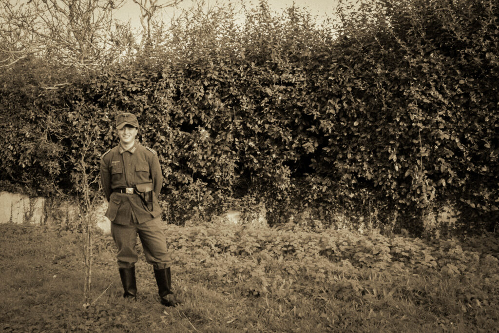
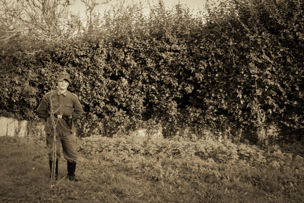
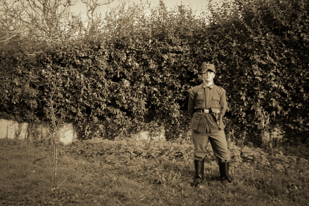
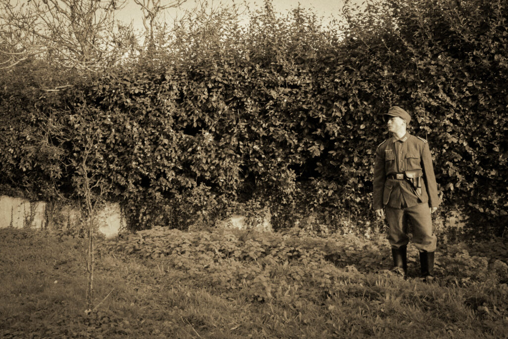
Command Phone:
Before:
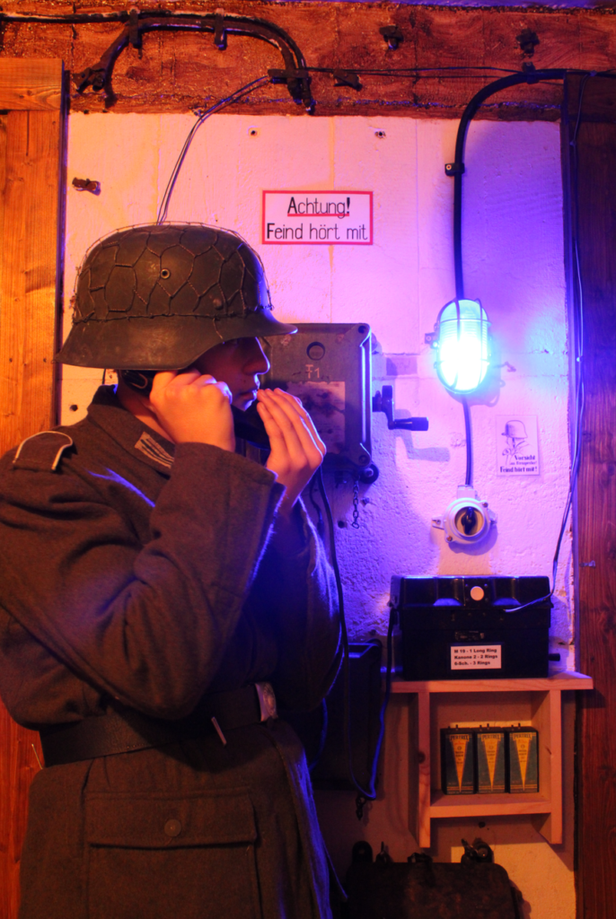
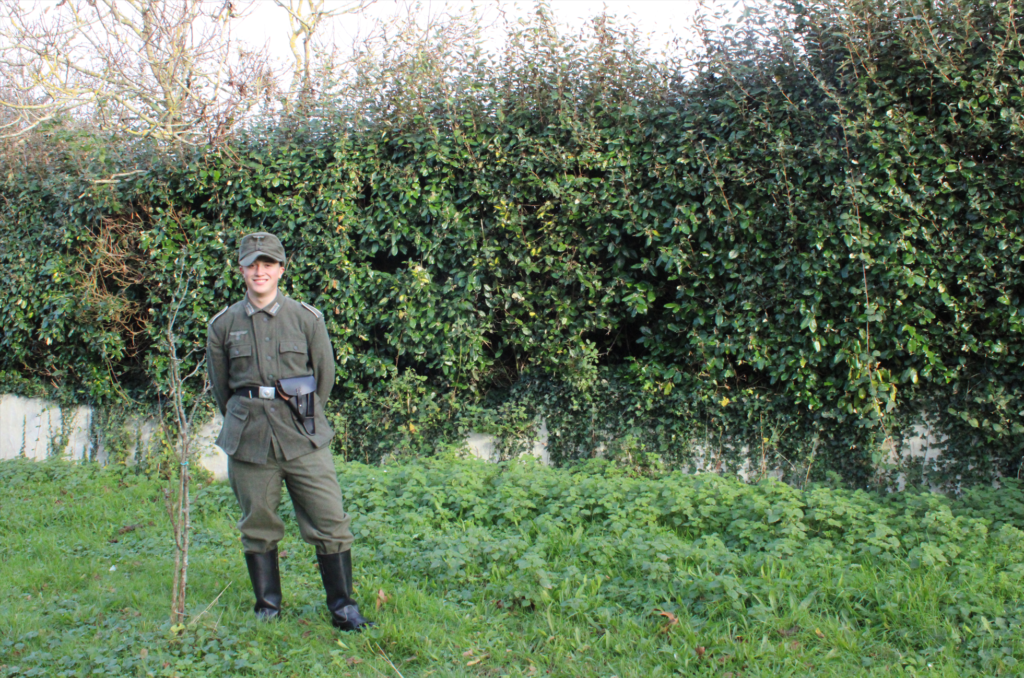
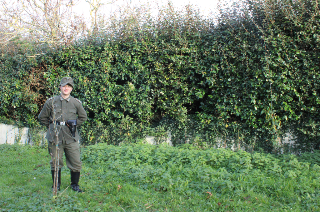
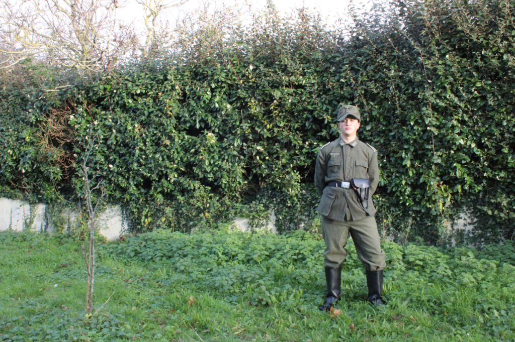
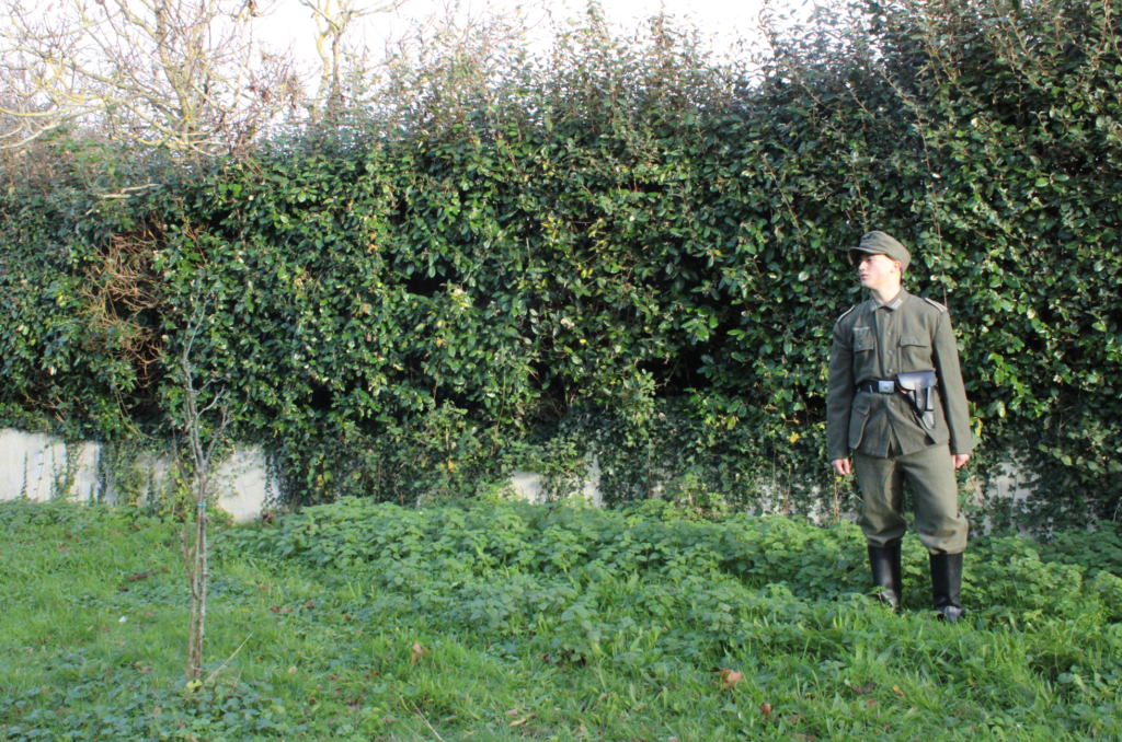
Straying away from some of the multi-crew photographs I’d thought I would try some individual shots as sort of filler photographs between the main edits.
Editing:
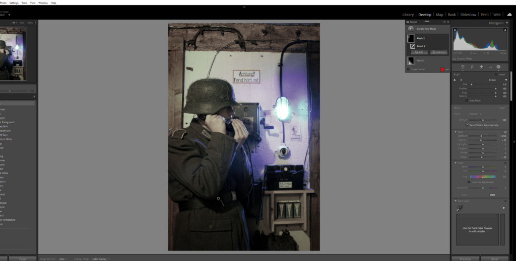
Using both a gradient filter an exposure brush, I touched up on some details I thought were lacking towards the left side of the photograph.
After:
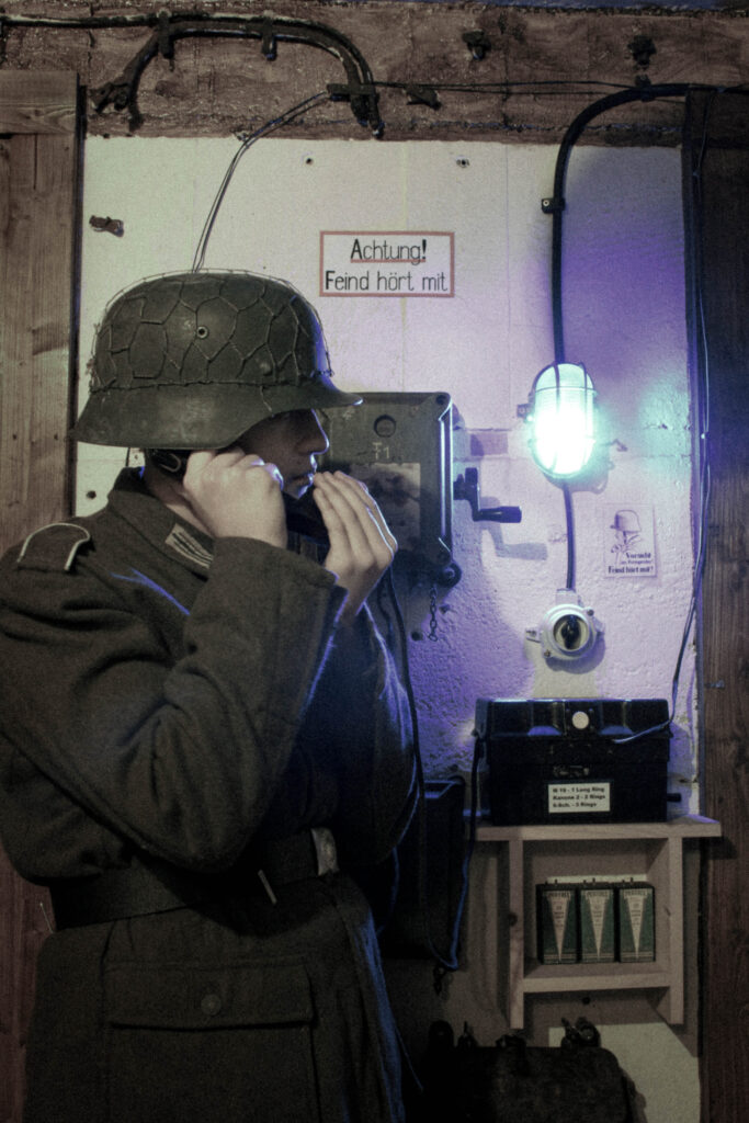
With a section of my influence based on the work of Michiel Peters, I aimed to recreate his images that feature a low-saturation to create a sense of drama and grittiness.
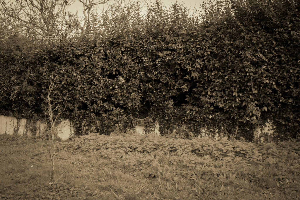
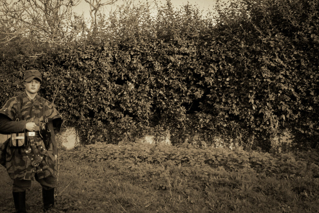
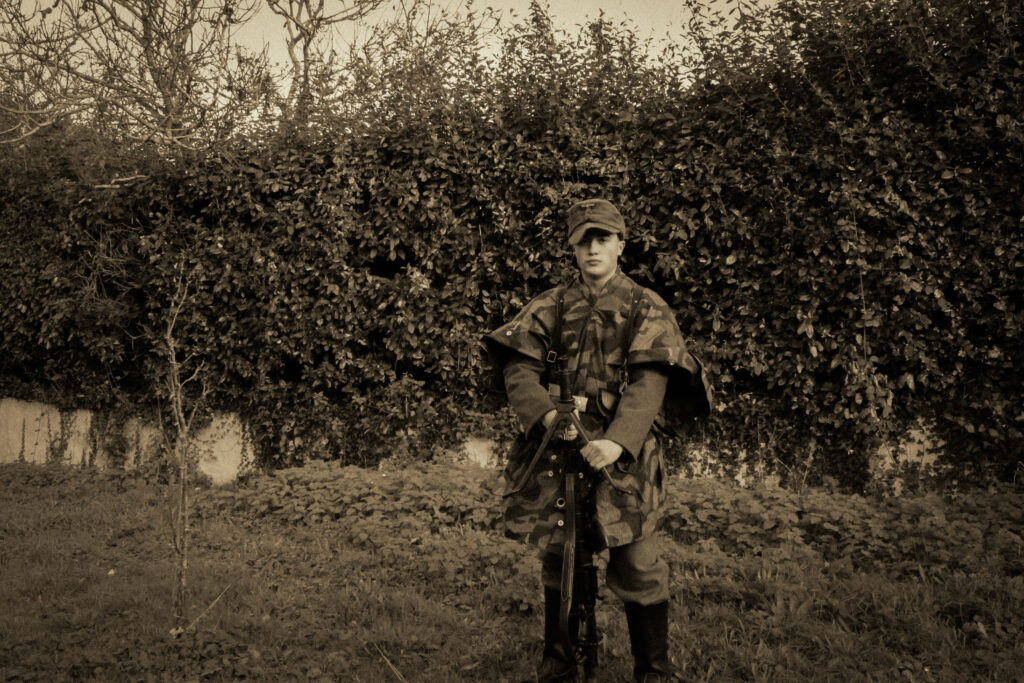
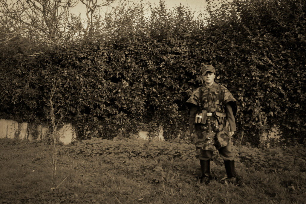
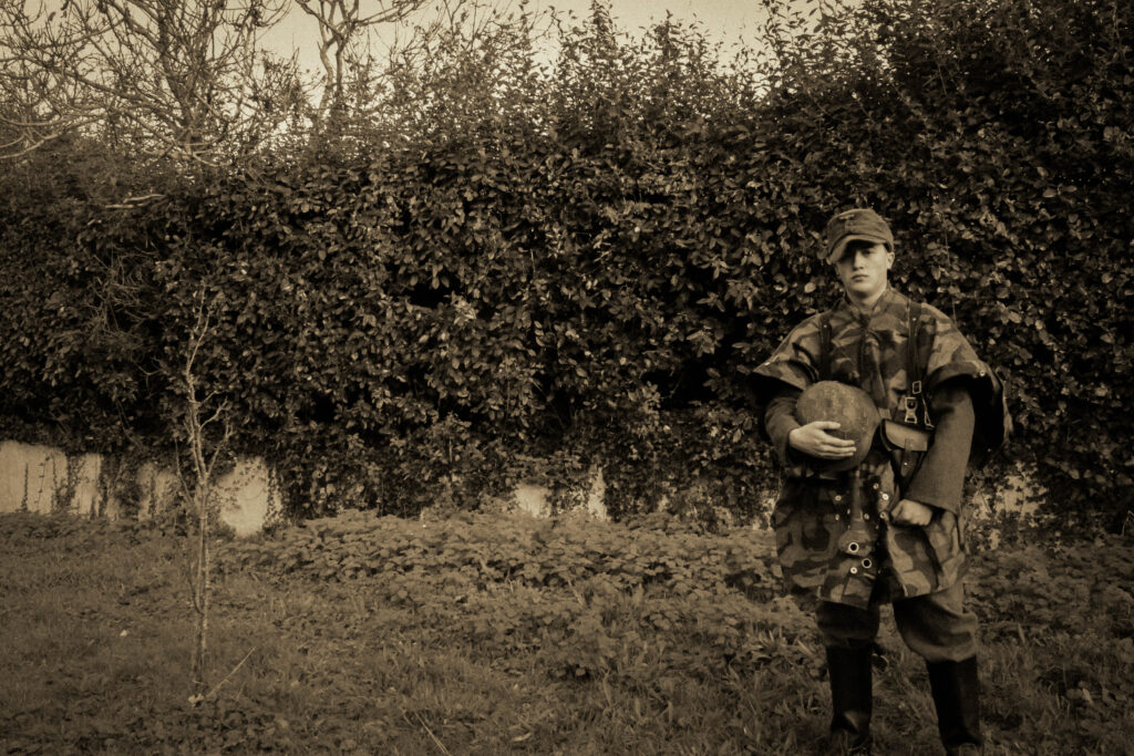
Field training:
Before:

With this image being a large one to recreate, I tried my best to copy out the poses and appearances of the individuals of each man within the original photograph of the training exercise.
Editing:
Using a blank image of my location as a basis, I edited it to my liking and then applied these settings to the set of images I wanted to implement into into it.

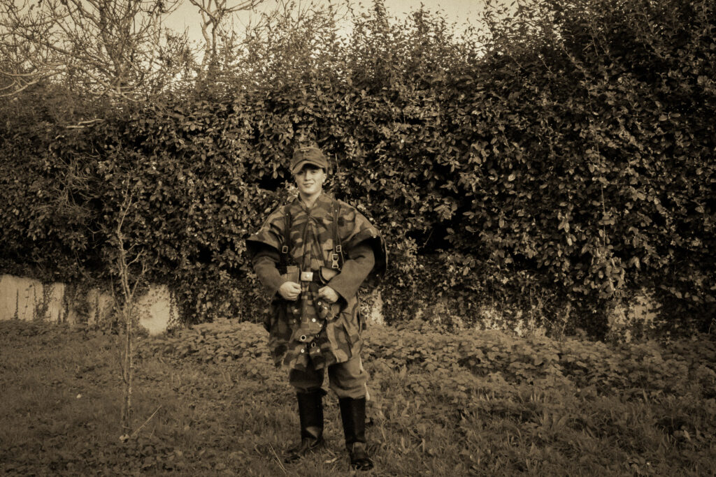
From this, I then used photoshop to merge them into one by cutting out myself into layers and piecing them together.
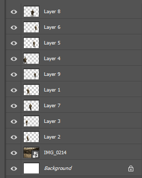
Adjusting them slightly to fill the gaps I then flattened the image to make it whole.
After:
As a result, this is what turned out:
Overall, I am very happy with this image, as editing the multiple ‘Me’s’ proved to be quite difficult. There is still some minor faults such as repetitiveness with the headdress and of course myself however this came at the expense of uniform accessories such as other hats or caps they would have worn. Cropping of the feet to was also hard, as wind direction and changes made from moving about made the lower parts seem less in quality compared to the upper, however if decide to crop by the calves this can be avoided.
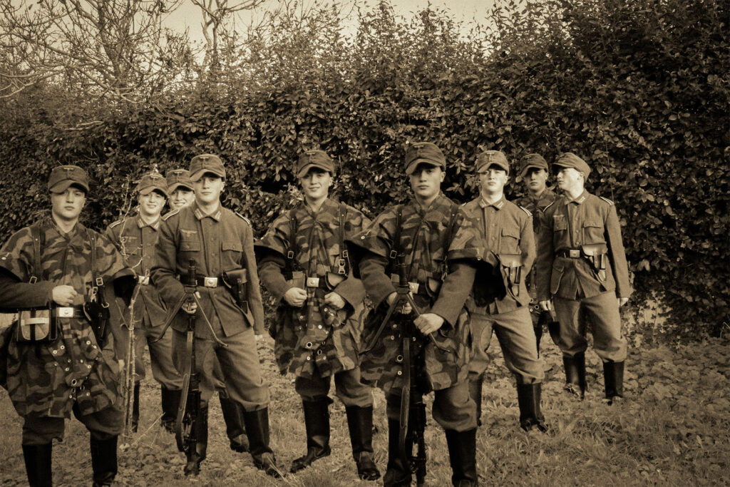
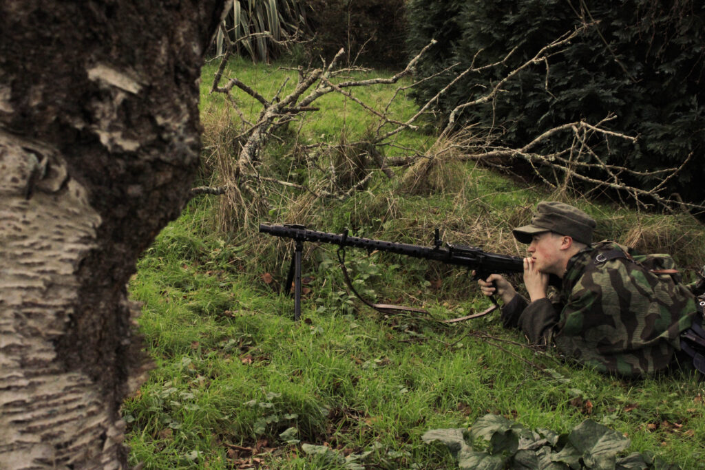
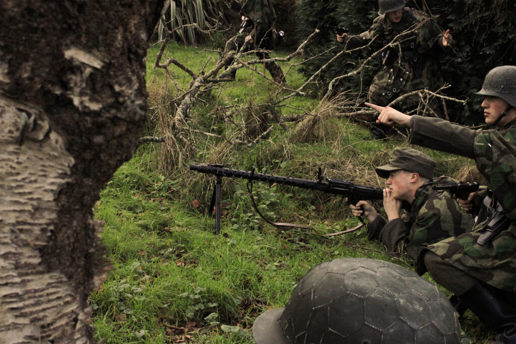
Combat Exercise:
Before:
With these Images, I aimed to show my inspiration from Paul M. Smith and his series ‘Artist Rifles’. With his photograph of multiple clones of himself making an assault charge, I found that replicating this would be perfect within the types of battle trainings the Germans had on the island.
Editing:
Editing these images, like the ones previously, I applied them to my selected photographs.
Outcome:

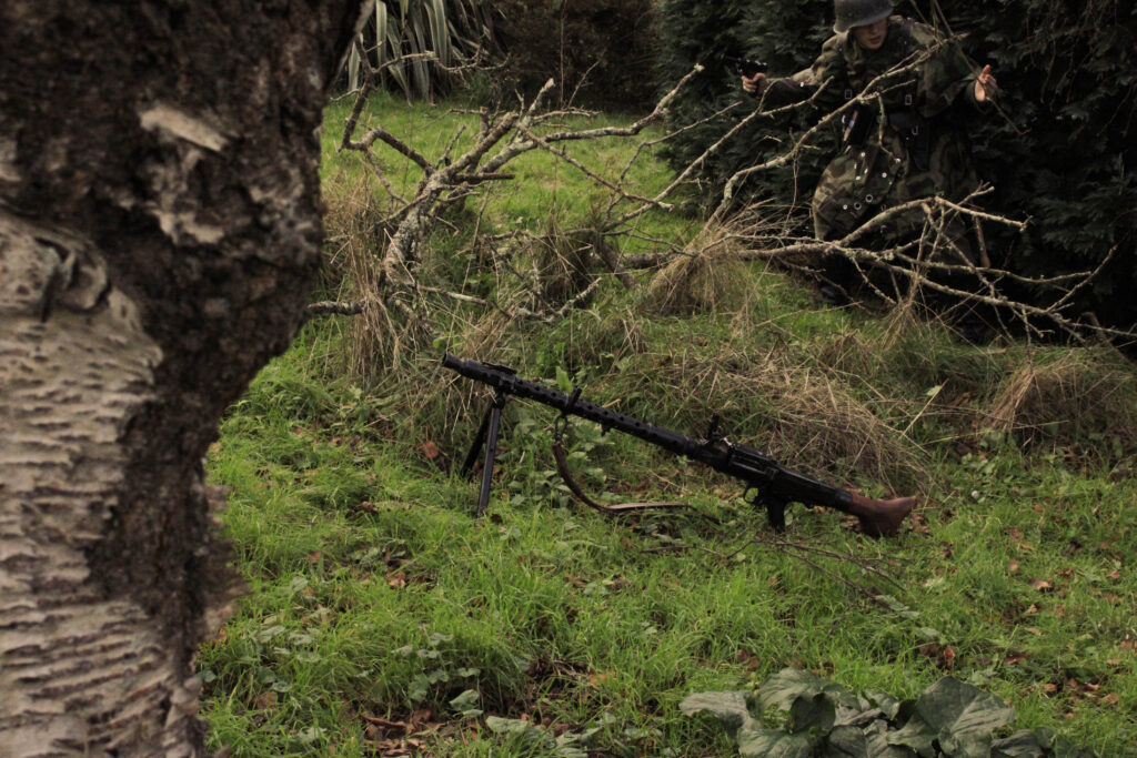
From this, I then was able to edit this further in photoshop by merging them together to give the impression of a combat exercise.
After:
Placing the various me’s, I find it has resembled the photographs of Paul M Smith and his similar creative choices regarding his series ‘Artist Rifles’ very well.
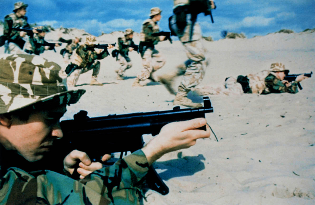
‘Artist Rifles’, 1997 – Paul M. Smith.
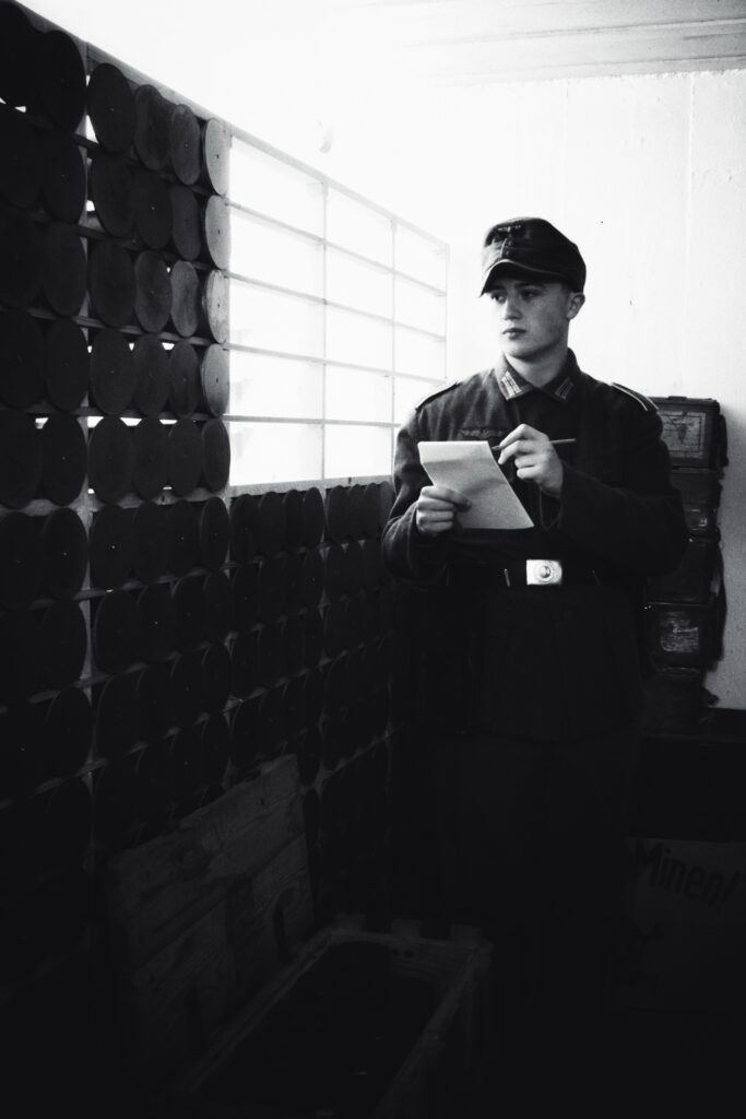
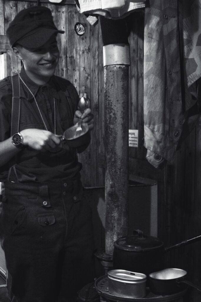
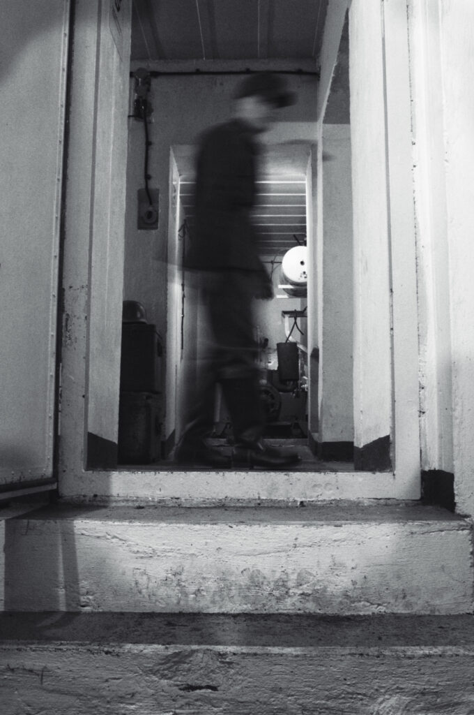
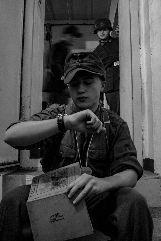
Interlude Photographs:
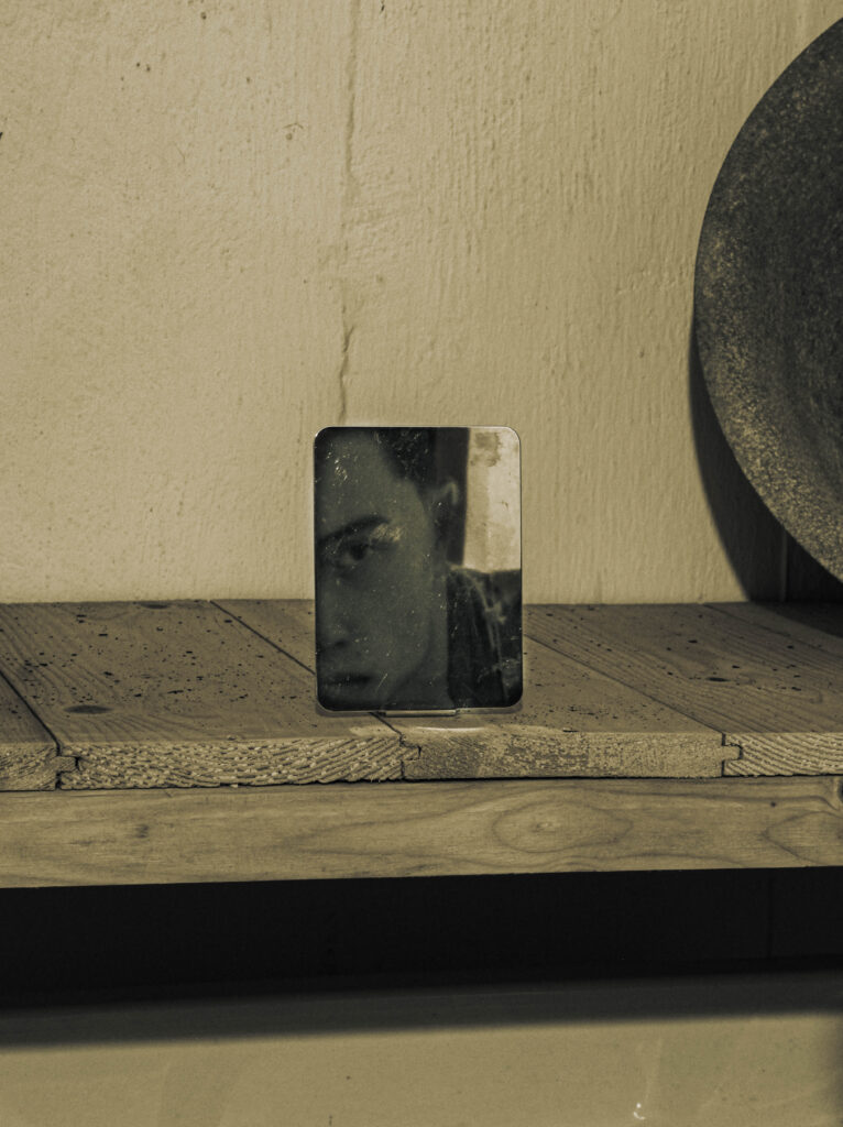
With the edits making up a lot of the book, I will add some filler ‘interlude photographs between the scenario images I made. These images don’t include to much of the clone process.
Before:
Editing:
Using these settings, I tried to replicate the colour and tone of the ammunition room photograph.
After:
Overall I am happy with the outcome of this photograph as I find that it acts a good example of the more ‘regular’ experiences they got up to which, now we can still relate to such as shaving.