
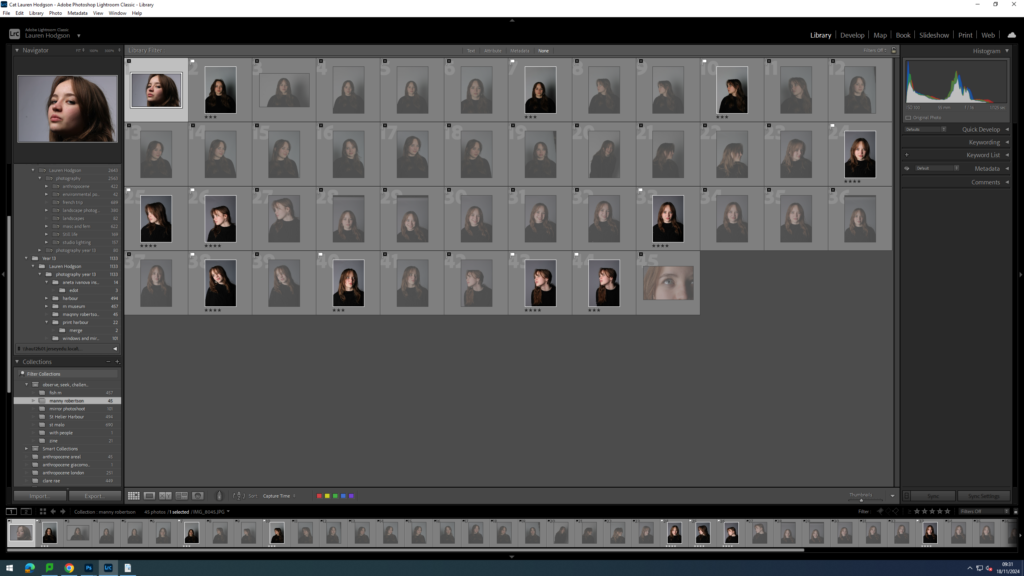
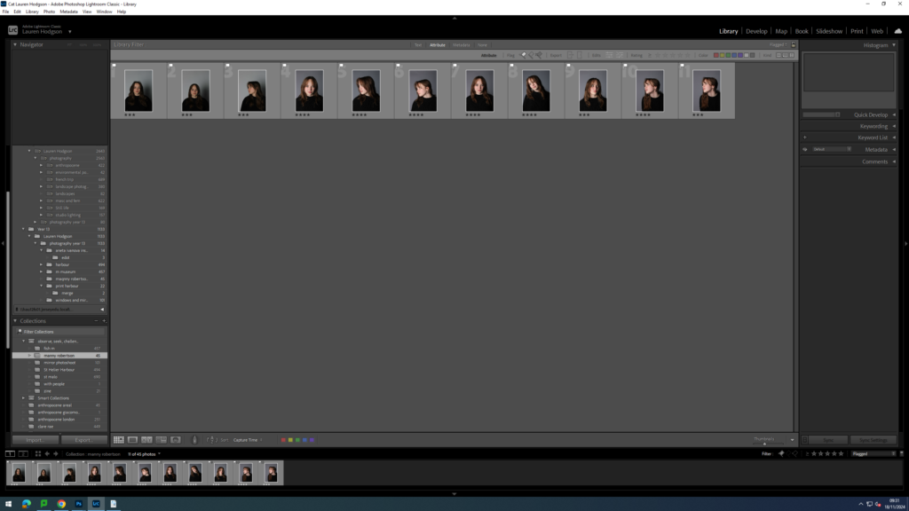
For this photoshoot, I was inspired by Manny Robertson. I began recreating his work by taking photographs of a model in the studio. I placed one of the studio lights directly in front of her face to ensure my images would be clear and without shadows. I photographed her in front of a white background as this is the background colour typically seen in his images. I then got the model to experiment with different poses for example, looking to the side or tilting her head. I then imported my images into Lightroom and began narrowing down what images I wanted to use. I did this by first giving either a white flag if I liked the image or a black flag if I didn’t like it. I then gave all my images with a white flag a ranking out of 5. 5 being the best and 1 being the worst. I then used the filter tool to make it so I could only see my images with a 4 star rating. Then I edited the contrast and exposure of each image. These are the images which I will edit in photoshop.

I then exported my photos into a folder which I could then open in photoshop. I began by opening up an image where the model’s head was tilted to the side then used the object selection tool the make a cut out of her outline and dragged the cut out onto a white piece of paper. I then opened up a different image where her head was facing upwards and used the lasso tool to go around a section of her face. Next, I pressed layer via copy and dragged that cut out onto the face on the white piece of paper. After that, I pressed on the top layer and made it black and white as seen in Manny Robertson’s work. Next, I worked on the stitching effect seen between the two faces. I recreated this effect by using the pen tool on photoshop to make marks going from one face to another then made the thickness of it lower so it looked like stitching. Finally, I wanted to emphasise the idea a mask being pulled off her face so I decided to add a drop shadow to the mask layer which created depth and the idea of her being two different people.
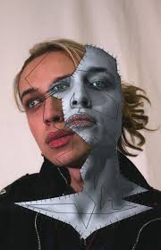
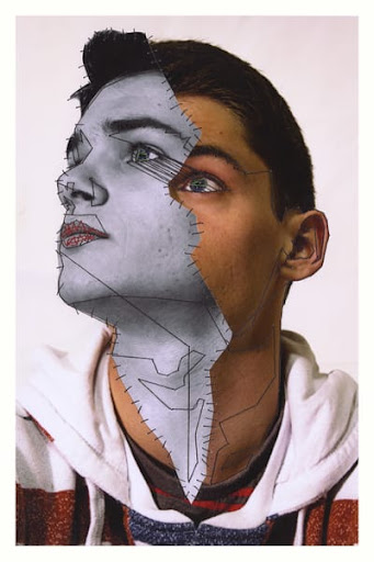
These are the images by Manny Robertson that inspired my idea.
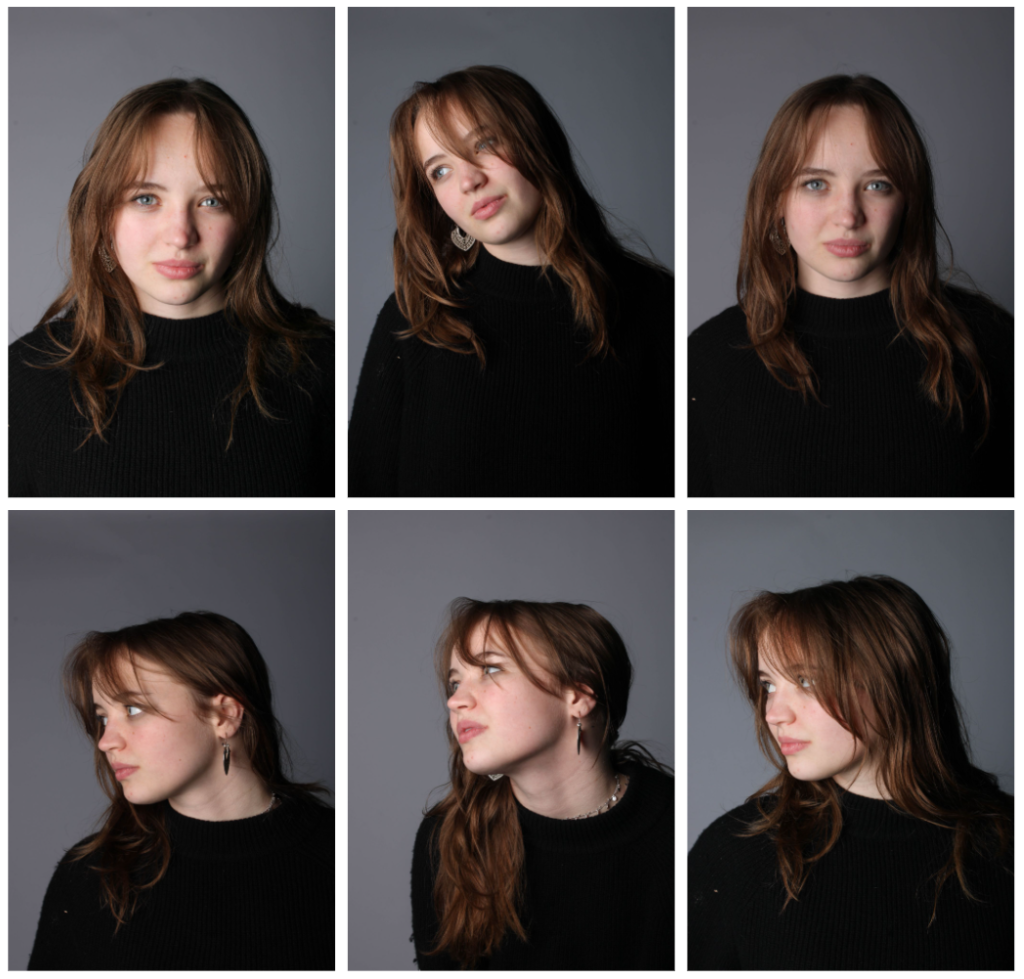
Final outcomes:
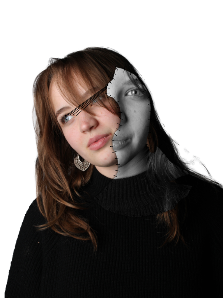
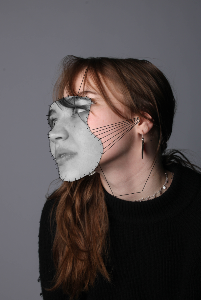
Overall, I like how this idea came out as I think I managed to successfully recreate the work of Manny Robertson and I feel like these images clearly relate to the theme of identity as it portrays the idea of people putting on masks in front of people and hiding their true identity due to fear of being cast out of society etc. However, one improvement I would make to this idea is actually stitching on the black lines instead of using the pen tool in photoshop as it would make my idea more creative in the sense of how its presented.