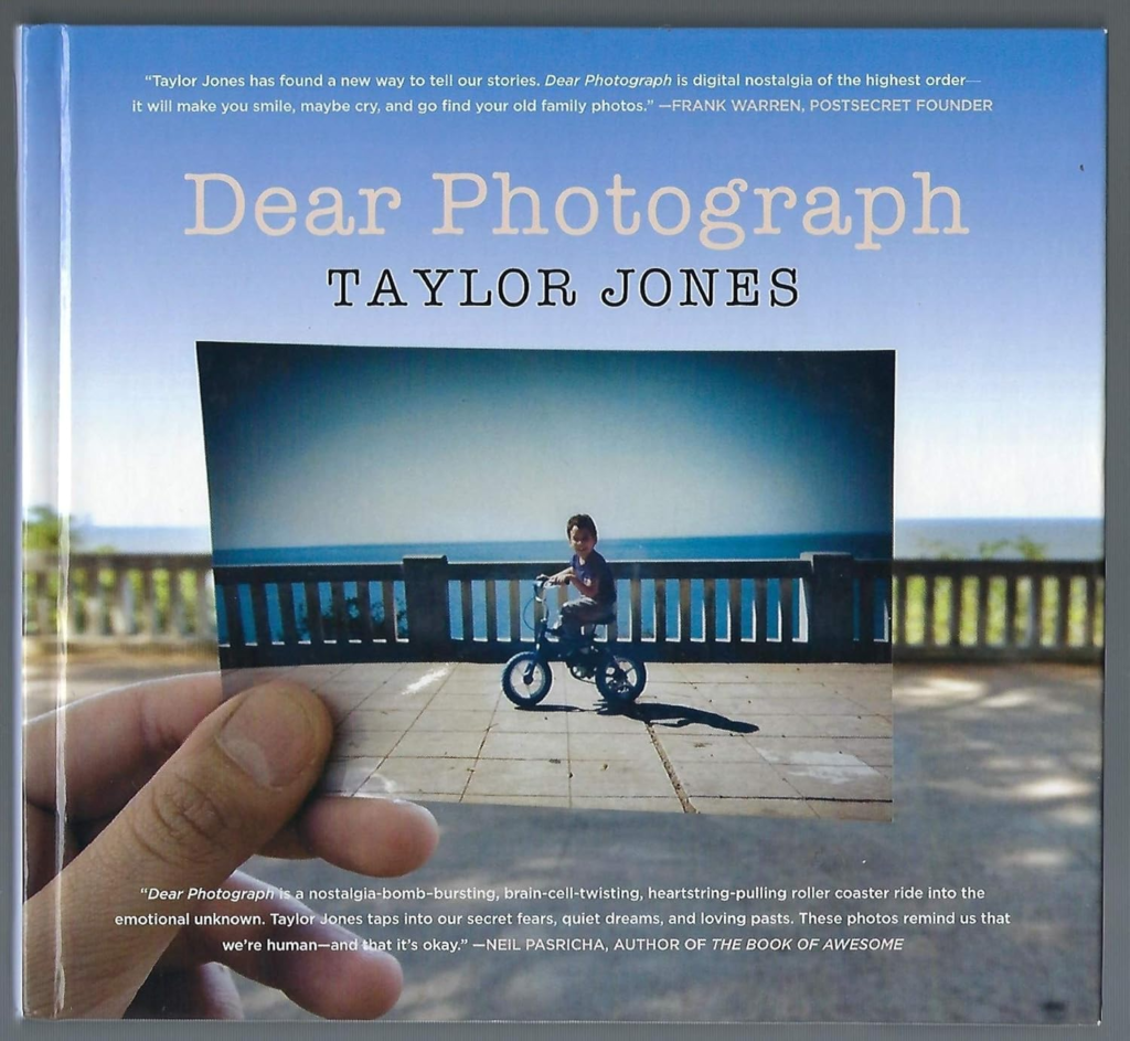
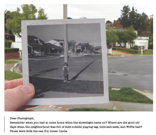
Taylor Jones created the movement ‘Dear Photograph’. He was inspired to do this when he was sitting with his family and an old photo album was taken out including hundreds of old photos. In one of these photographs Jones’ brother was sat in the exact spot he was sitting in this photograph. This prompted him to take his camera and take a shot of the old photograph lined up to its original location. He then posted this photograph along with six others on a blog. This blog had gone viral within days, he later called this blog ‘Dear Photograph’. The success of this movement enabled Jones to leave his job and create a book inspired by Dear Photograph that will feature stories along with some shots. He has also met Tv and Film executives to discuss projects based on the site such as a screenplay a friend wrote about using photographs to travel into the past.
Dear Photograph
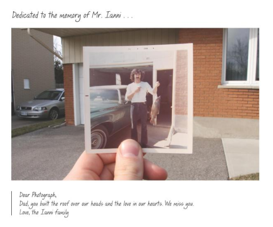
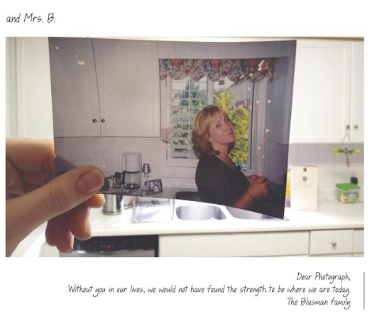
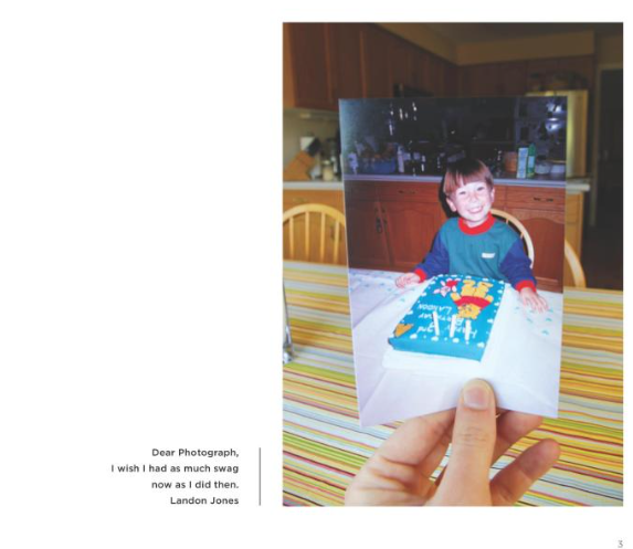
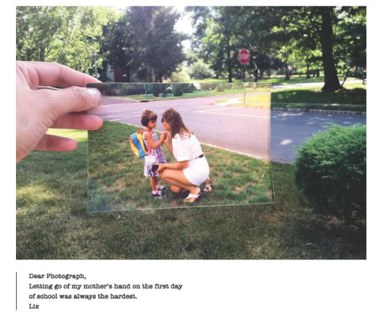
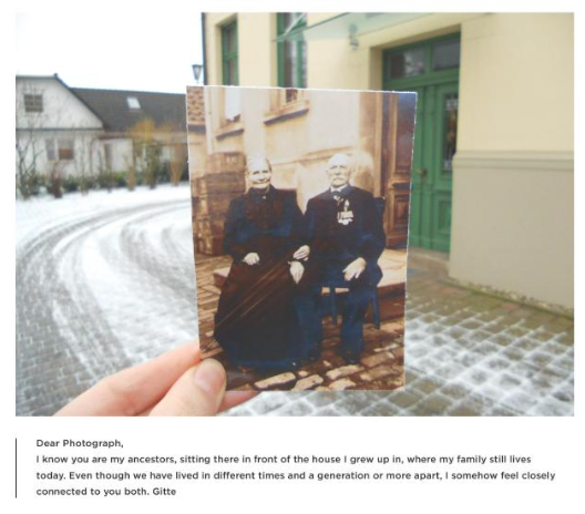
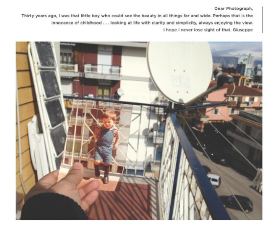
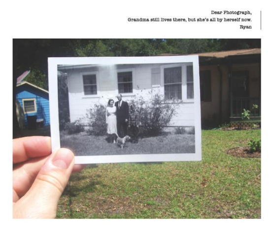
The idea of Dear Photograph revolves around memory and nostalgia and it involves holding an old photo up to the same environment where it was originally taken. This concept has resulted in powerful, emotional reflections on time, loss, and connections between past and present. Each of the photographs in the book is partnered with a sentence or note from the person who took the photograph which provides the reader with more information on the photograph as well as personal stories which enhances the viewer’s understanding of the images.
This is the original photo taken by Taylor Jones which started the whole idea of ‘Dear photograph’.
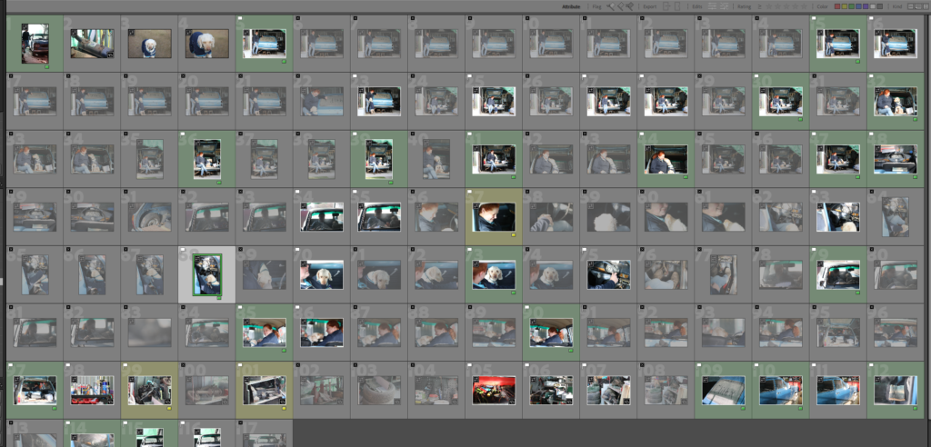
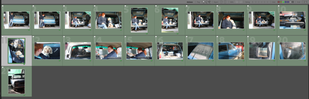
I went through the whole photoshoot, picking the best shots and flagging them, then going through the flagged options and colour coding the photos yellow and green to marking the best shots and ones I might use.
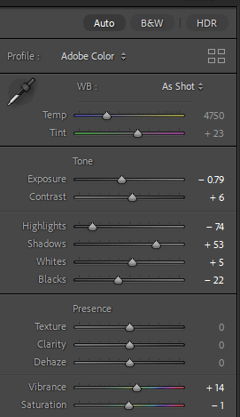
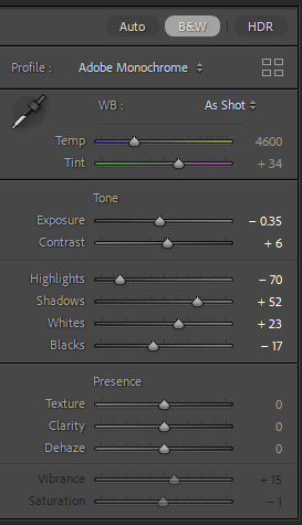
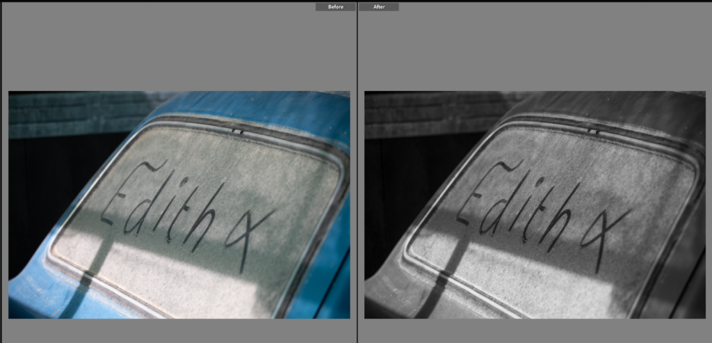
Edit One
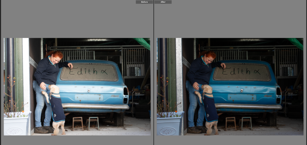
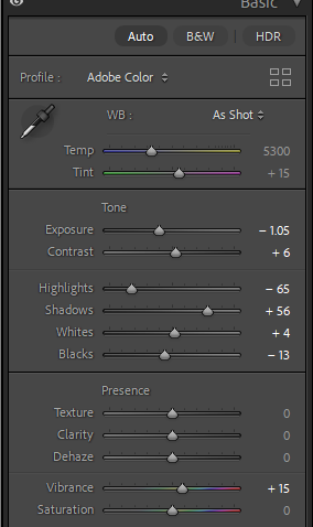
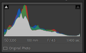
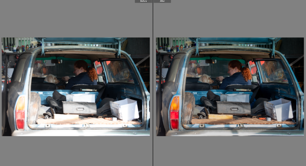
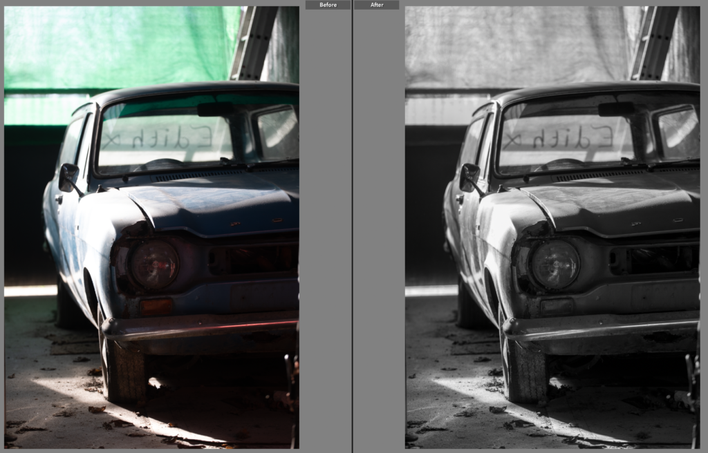
I needed to crop and reangle this photo as it was slightly slated.
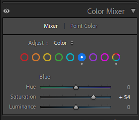
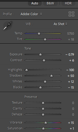
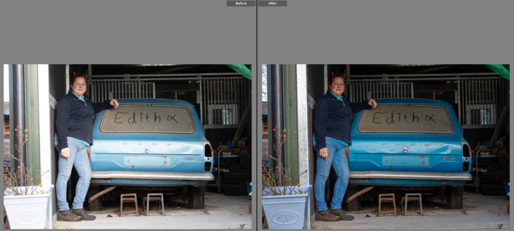
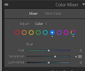
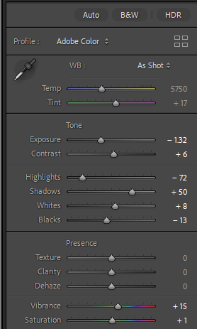
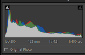
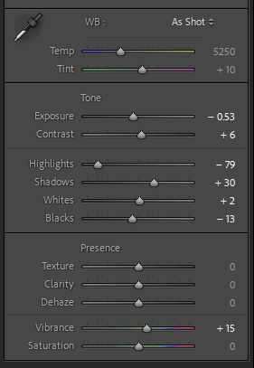
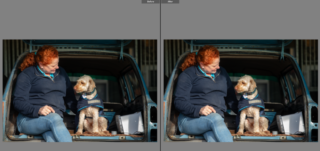
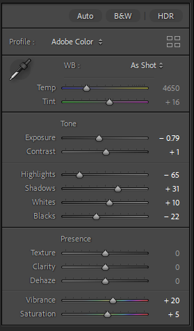
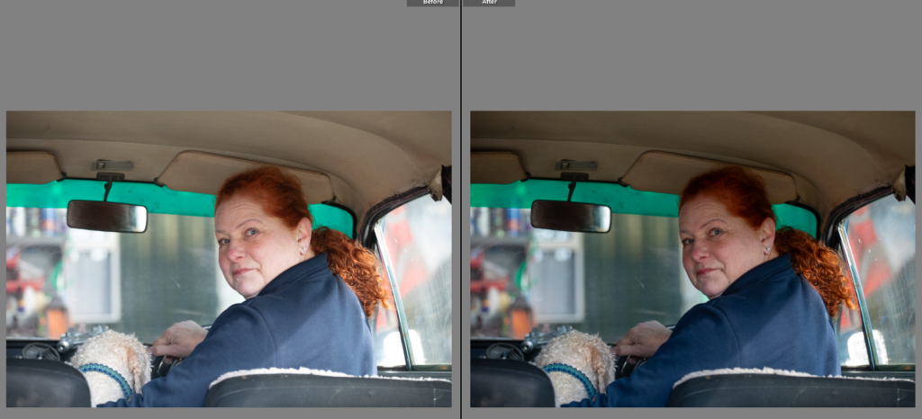
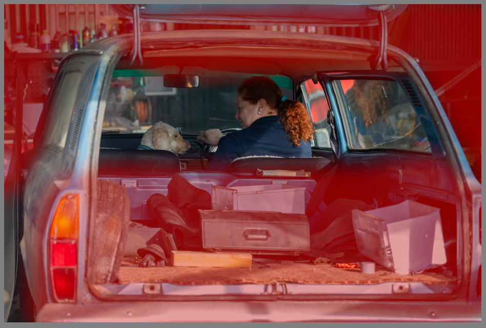
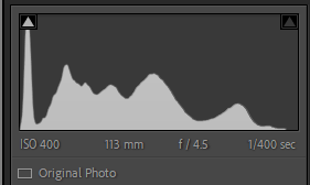
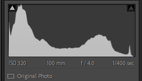
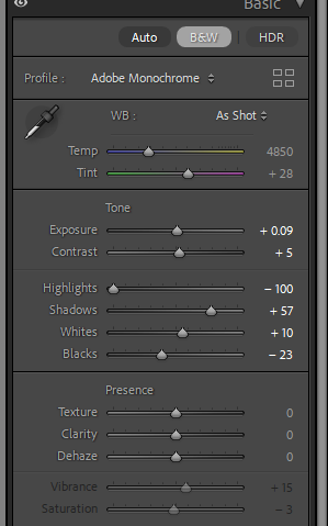
This photo needed, the highlights reduced as there was harsh lighting effecting the cars colour, once reduced I could decease the exposure and adjust the colour mixer panel. Selecting the darker blue, increasing the saturation to bring the cars true colour back to the photo.
Edit Two
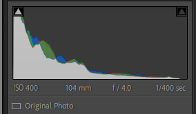
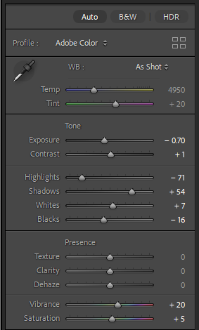
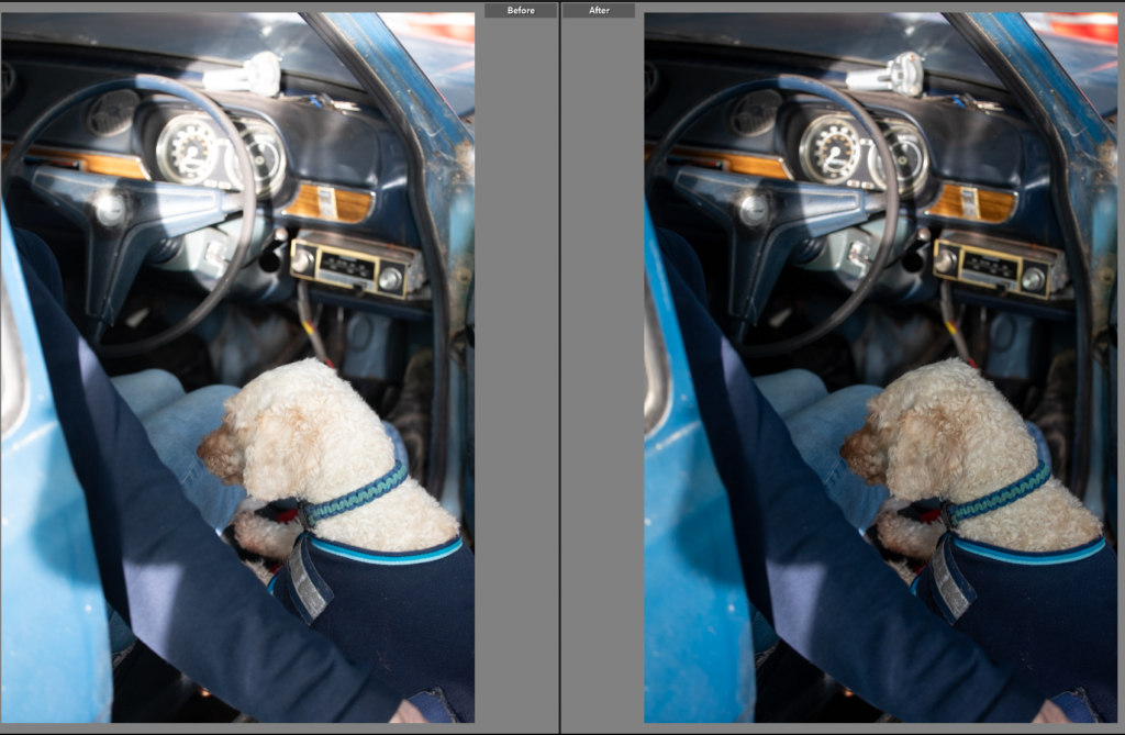
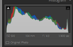
This photo is similar to the last but I liked dog jumping up in this one, adding movement to the photo. I went through a very similar editing process, with adjusting the exposure, shadows, highlights and the colour mixer board. On the colour mixer board I tried to match the cars colour not only to the true colour but the previous edits photo.
Edit Three
This one I needed to reduce the shine on the dog that appeared due to the harsh lighting. To do this I used, the exposure on a decrease, as well as the highlights. I made other small adjustments to the image solving smaller issues within it. The cropped frame meant the angle re-adjustment wasn’t needed.
Edit Four
While this photo was similar to the last I haven’t decided which one I might use. The previous one is a better photo at first glance but I like the detail of the cars shown in this one. When editing this one I had to be careful to reduce highlights without making the background too dark as the car shown is why I like this photo.
Edit Five
I did try this photo in black and white to tie to previous shoots, however I preferred the colour as the contrast between the dark navy and wooden interior is not something you get in modern cars and creates a lovely contrast within the photo. I decreased the exposure to bring out the colours of the interior.
Edit Six
he blues in this photo highlight the unusal colour of the car. The dog adds human feel to the photo.
Edit Six
I loved the textures in this photo and the framing, having the person out of focus added to this photo. The dog staring into the camera works well as its a quiet moment of the dog in the car. I decreased the exposure as the photo was slightly over exposed so this added the detail back in, and added the cars details back in as before they were a little flat.
Edit Seven
I liked this photo however I knew it would be much stronger in a low contrast black and white, I liked the slightly out of focus look and the black and white enhanced this. It gives this feeling of connection and natural environment rather than a posed photoshoot. I loved the section of light on the windshield and bonnet and the black and white enhanced this showing how I used light and the shadows to create dynamic interesting photos.
Edit Eight
The colours in this photo made an interesting photo, I did try the shot in black and white to highlight the section on light on the persons back however it took away from the image. The models red hair contrasts well with the navy jumper, beige roof lining and dog. I moved the exposure down as the soft lighting washed the model out, adding depth back to the image creates a polished photo. I like the framing of this image as there isn’t too much of the car showing but the model looking over her shoulder creates a feeling of connection.
Edit Nine
Edit Ten
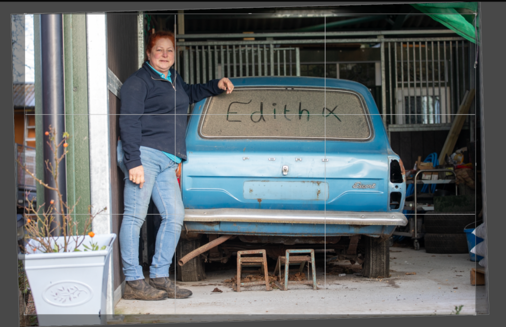
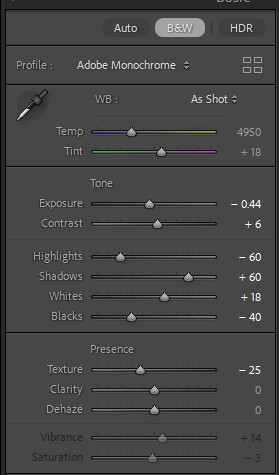
I like this photo, the nickname the car has been given has been written into the dust. The shadows add depth to the photo, almost underlining the word.
Edit Three
I tried this photo in colour, but it is much stronger in black and white. However when I first made the photo black and white I found the highlights, the bright sections of light are great at highlighting the parts of the car and making an interesting photo.
Edit Eleven
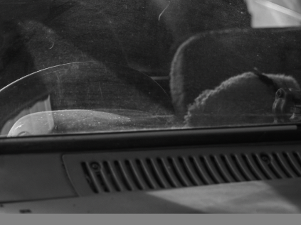
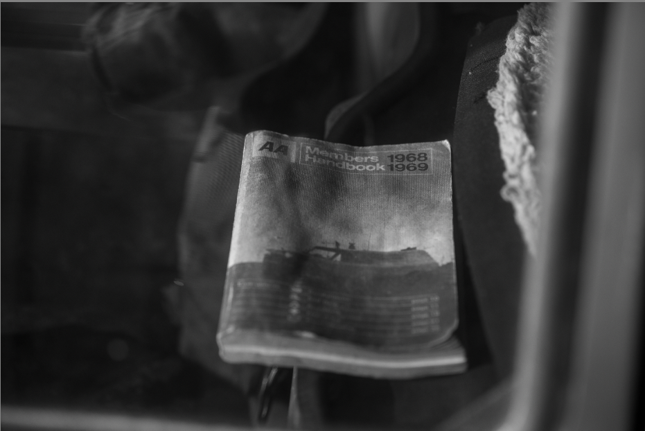
Having taken this photo through a window I was concerned here would be a glare, but instead it made the handbook standout. The left of the photo is mostly dark with different patterns and then the right side of the photo shows a section of the back of the seats. I like that you can see the age on the book, adding to the idea about the cars age. This was helped with the black and white as it removed the distracting colours from the background, leaving the focus on the book alone.
Edit Twelve
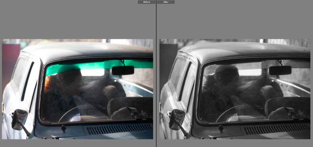
Being able to compare both photos was essential in the development of this shot, Originally I liked the colour version, with the shadows and sections of light highlighting the colour of the car. However I then compared it to the black and white version and found I liked that version better as the green mesh wasn’t as visible in the background, in fact it highlighted the writing on the cars back window. The black and white also brought out the details in the headlight and rust around it.
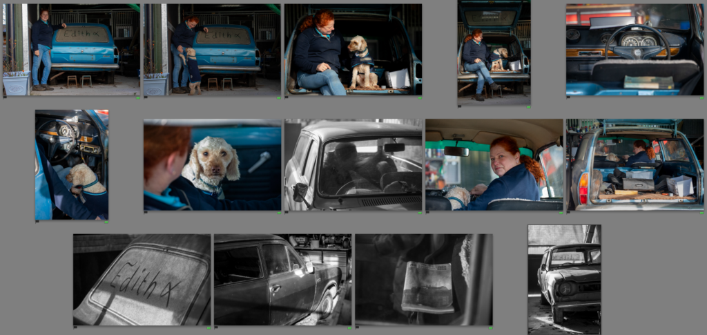
Final photos
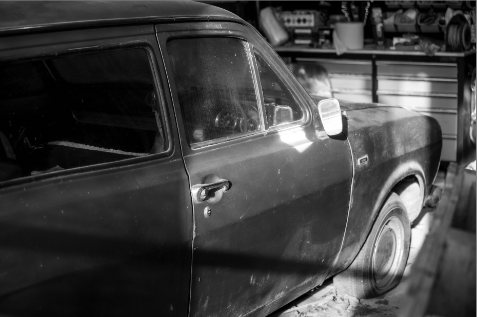
I love the final outcomes of this shoot, I think there is a great mix of colour and black and white shots. Showing details, like the the original car handbook, to the owner and the car, to the dog in the car. All have created a mini narrative within the wider project. Showing the relationship between the car and the owner. I like how apparent the dust is in each shot, showing the age of the car as well as how the passion for the vehicle hasn’t changed over time. This is what I’m aiming to show in the next photoshoot with my father and his old bike that he still loves. Hoping to show how I have been around them most of my life and it has influenced my similar passions. The lighting in this shoot was harsh but created sections of light and darker shadows adding depth and feeling to the photos.
in book add pics of just her and just landscape then my edits also the questions and answers.
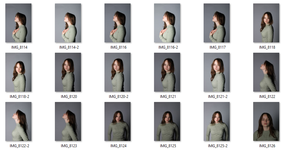
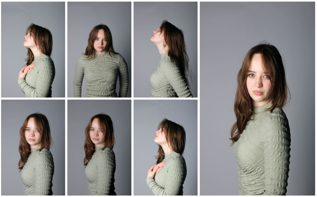
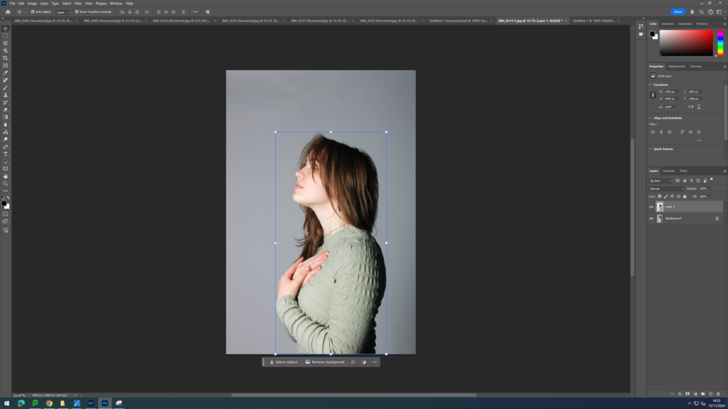
For this photoshoot, I was inspired by Aneta Ivanova. I began the process of recreating her work by first taking photographs in the studio. I first set up the space by adding tow lights directly in front of the model to ensure my images would have good lighting. I also ensured I used a white background as a key feature of her images of the blank white space behind the subject (which allows for direct focus on the subject and nothing else). I then got the model to experiment with different poses typically seen in Ivanova’s images. For example faced to the side with her arms up to her chest. My images for this photoshoot turned out quite successfully as I think it closely mimicked the positions of the models seen in her images and they are all in good focus.
For the next part of my photoshoot, I first gave some questions to my model to complete. This allowed me to take photos of things that had personal meaning to her and therefore her identity. These questions consisted of:
Where is your favourite place in jersey?
What makes you happy?
What does the word identity mean to you?
How would you describe yourself?
How would others describe you?
Her answers:
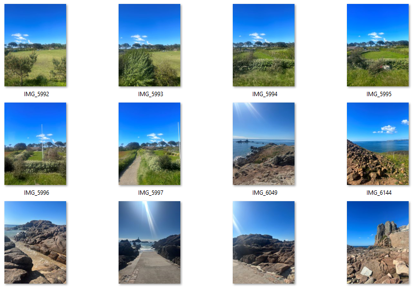
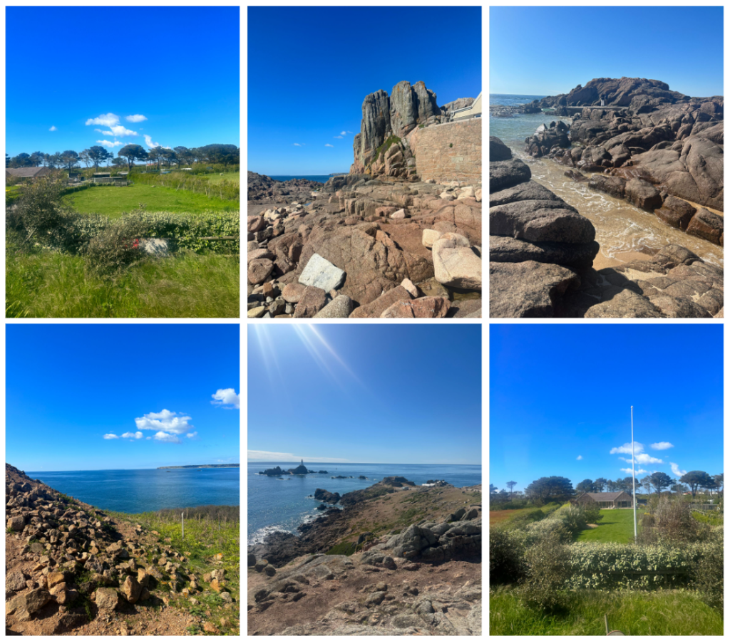
My favourite place in Jersey would probably be anywhere with nature such as the beach or forests. I specifically like Corbiere Lighthouse due to the views surrounding it.
I feel happiest when I’m being creative like creating sculptures or painting.
Identity to me means the way you express yourself and what it means to be you
I would describe myself as creative, funny, talkative and unique.
I think others would describe me as funny, creative, weird and pretty.
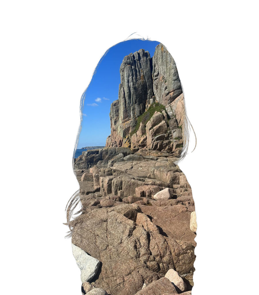
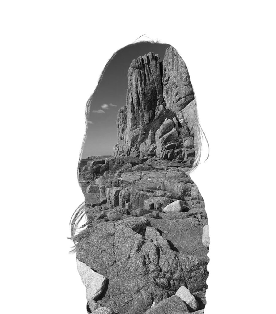
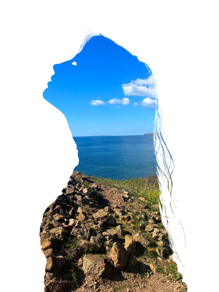
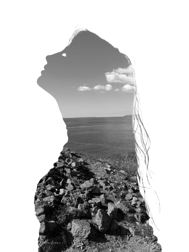
From these answers, I then visited various natural landscapes around Jersey such as Corbiere Lighthouse. I think this part of the photoshoot turned out well as the images are in good focus and will make my final piece more personal as I’m using images of nature that have a personal meaning to my model instead of picking a random environment to photograph which I originally intended to do.
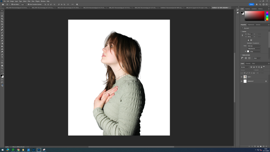
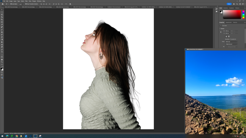
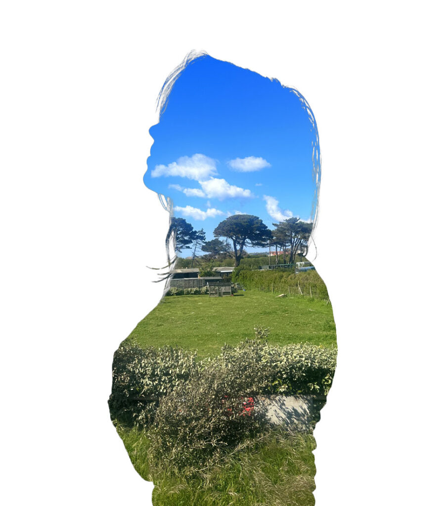
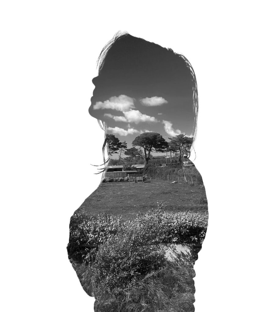
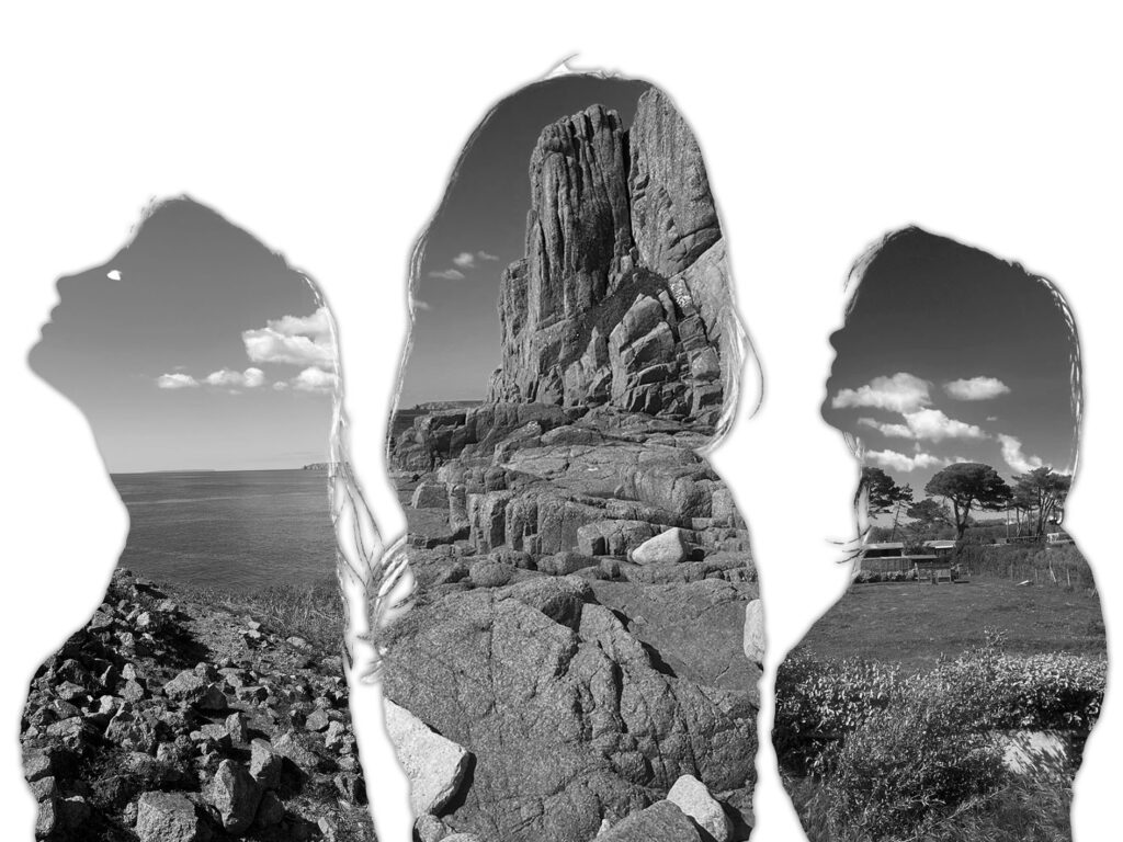
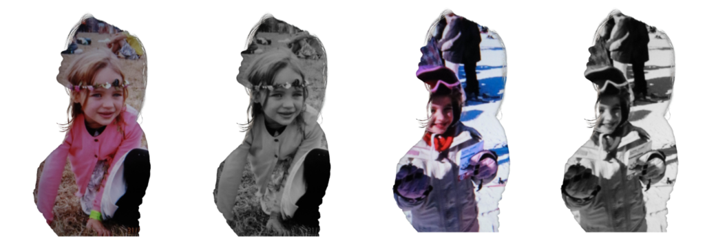
To being the editing process, I first imported all of my images into Lightroom and narrowed down the images that I wanted to edit. I then adjusted the exposure, contrast, whites and blacks of these images. Once I was happy with the edits, I then exported them into a folder which I could then open up in photoshop. I began by opening up a blank A4 page then opening up an image of the subject. I then used the object selection tool to cut around the person only, right clicked on the cut out and pressed layer via copy. I then dragged the cut out onto the white piece of paper. I did this as Aneta Ivanova’s images are all displayed on a blank sheet of white paper behind the model. Next, I opened the landscape image and dragged it onto the image. I put this layer at the bottom. Next, I pressed on the person layer and used the object selection tool once again. However, instead of cutting it on that layer, I instead went to the white layer and pressed layer via cut. This then created a hole in the white layer. Finally, I went back to the person layer and cut her out using the same process. This left me with the landscape background coming through both layers.
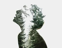
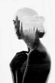
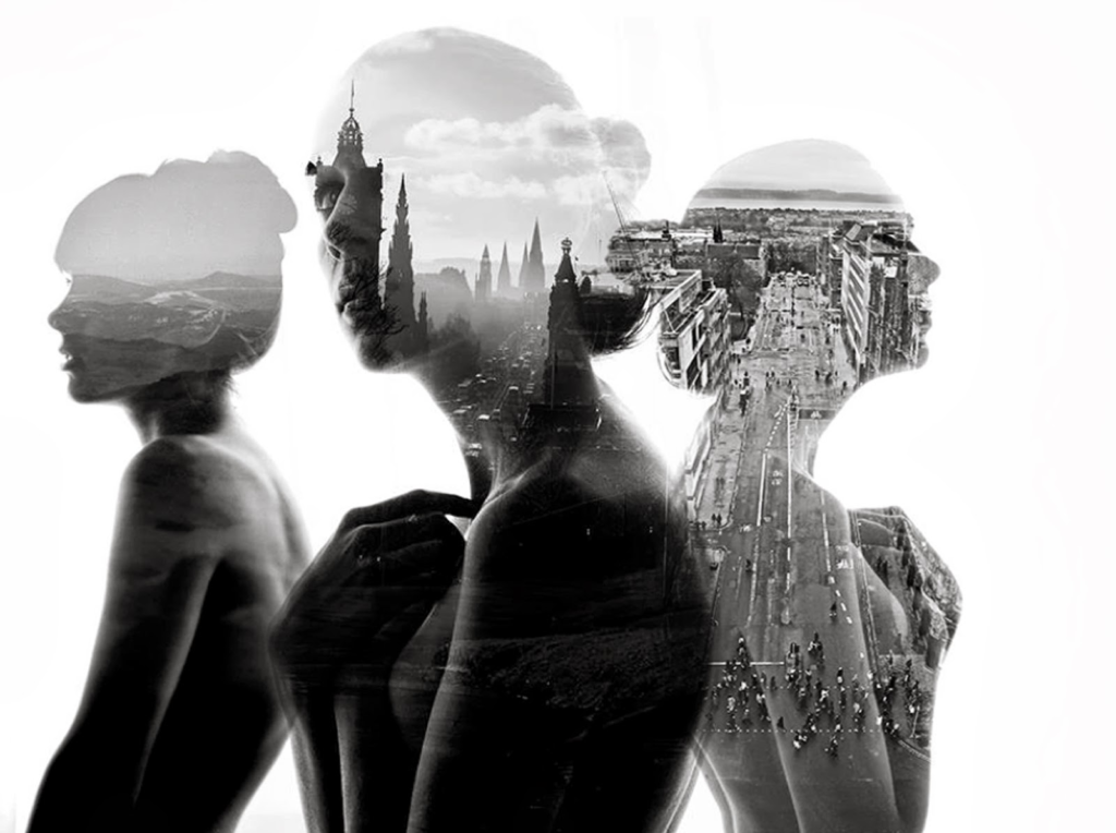
This image by Aneta Ivanova was my inspirationThese image by Aneta Ivanova were my inspiration for my photoshoot.
Next I experimented with turning the landscape black and white as some of Aneta Ivanova’s pieces are black and white instead of in colour. To finish off this first part of the idea, I added a drop shadow to the person. This helped bring some depth to my images. Overall, I like how this idea came out as I think it closely resembles the work of Aneta Ivanova and clearly displays the theme of identity and disguise as the background layer, making it so you cant see any features of the person, portrays the idea of people feeling as though they are blending into the background of life as they struggle to understand who they really are as a person. Additionally, it could also show how people try to blend in to their surroundings (disguise) as to not be judged or seen as indifferent. One thing that I could improve about this photoshoot however is the opacity of the person layer. As in my images I just cut out the person but in Aneta Ivanova’s images you can still see a vague outline of the persons facial features. This would’ve made my images slightly more exact to her images.
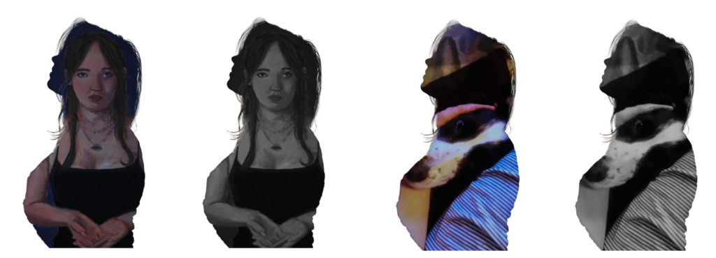
I then decided to further my idea by adding three of my different attempts of creating her work together to create one image. In order to do this, I opened up a landscape blank piece of paper on photoshop. Next I opened up the three black and white images I created above and used the object selection tool to create a cut out of the person. I then dragged each cut out onto the piece of paper and adjusted the size and placement of each cut out. Once I was happy with the layout, I finished off this design by adding a drop shadow to each of the cut outs. Overall I like how this idea came out as I think it makes the piece look more complete and advanced than just having singular people on each page. However, next time I would take a photograph of the model looking to the left (as seen on the right side of the inspiration image) in order to make my piece more replicable of the original image.
This was my inspiration image for the second part of this idea.
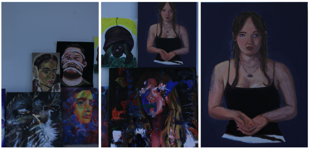
For the second part of my photoshoot, I took pictures of various art pieces in the art room that Liv and her friends had created eg paintings and sculptures. I also wanted to delve into her childhood too as that is a part of her identity so I used a projector in the studio in order to project images of her in her childhood. I will then merge these personal images with her outline. I think this will be effective in showing the different things that makes the model who she is and therefore her identity.
Final outcomes:
Overall, I think this idea came out successfully as you can still clearly see the link between the artist and my work but I have also adapted the idea to make my pieces more personal and about identity as the photographs seen inside the model’s outline has a personal meaning to her.