Candles Photoshoot 1: In Praise of Shadows

This photoshoot was set up with a tripod. I lit the candle and set the camera up with a long shutter speed. Even with the longest shutter speed I had the flame did not elongate enough to look like those from Hiroshi Sugimoto. I had several attempts at creating different looks of flame: I left the flame to burn straight for an elongated appearance, I tried manipulating the shape by blowing it for a thicker appearance but regardless of what I did the flame was always short and faint. I put some black fabric behind the flame and Set the camera up as close as possible. I tried two different candles too. One slim birthday candle I thought would burn down fast and create a longer flame and one slow burn candle I thought might burn brighter. They both ended up looking similar overall however. Because my shutter speed was so low the images also looked far too over exposed which I didn’t realised until after Id finished the shoot to fix. I also took all of them in landscape instead of portrait because I thought the flames would look thicker. In editing I made them portrait instead which I think looks much better and compliments the flames photographed. I edited the contrast and set them all in black and white however none of them had the crisp outlines that were present in Hiroshi Sugimotos images. Next time I will photograph in portrait, adjust the exposure and try to photograph a match even for it’s speed. I might also take photographs of the wax once I’ve finished.
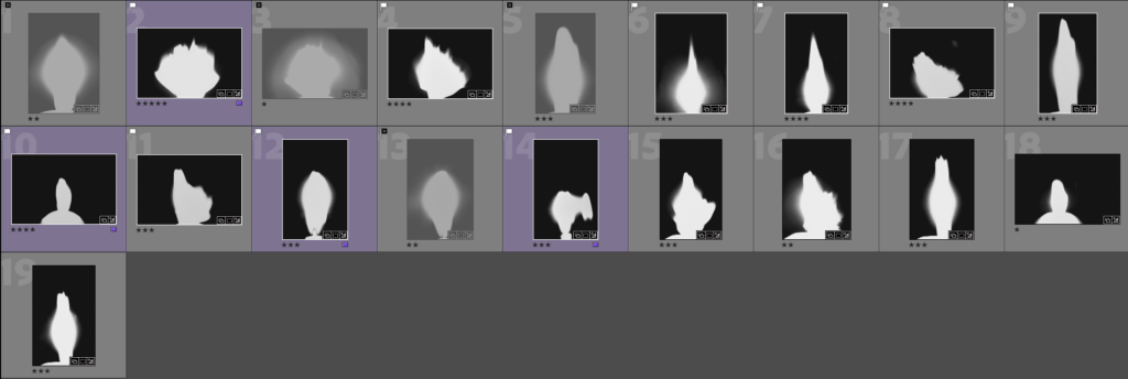
Outcomes:
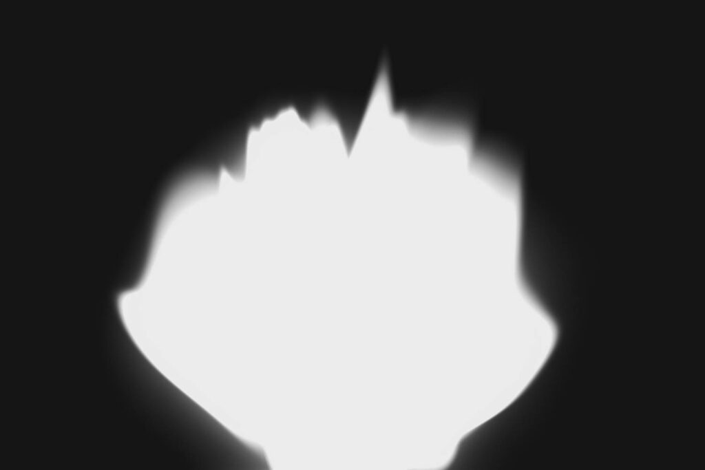
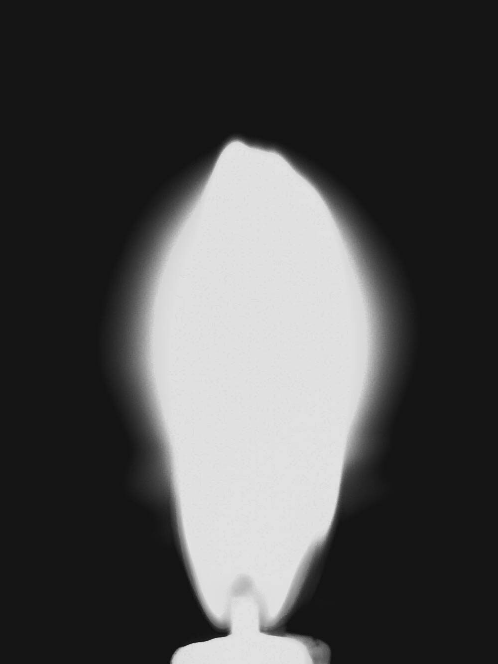
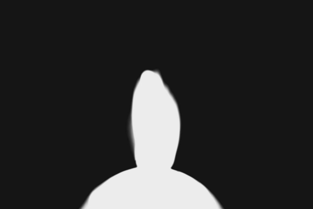
I choose these 3 images for different reasons. The first one had a unique shape, the second showed the wick of the candle and the third resembles a person which I think matches the theme of my project. I also liked the difference between how grainy the middle image was and how crisp the bottom one was. I took the bottom one one 15 seconds shutter and the others on 30 seconds shutter which meant that it was crisper compared to the others.
In terms of fitting a narrative, I think I could use either the second candle as a beacon of light amongst a dark room, the bottom works as an ominous, unidentifiable humanoid resembling a strange figure that been imagined or dreamt up. The one on the top could also work as someone blowing the candle in the dark to show that the person holding the candle isn’t alone. This makes the first and last most likely but I’m gravitating towards the last. I might take some more images which can be a mix of the first two where the wick is visible but its also been blown.
Edits:
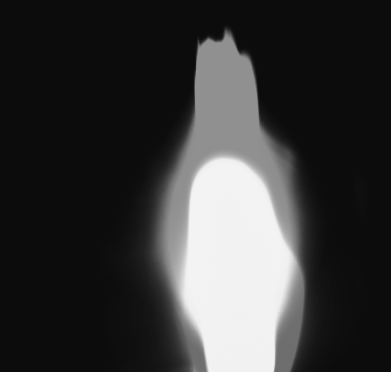
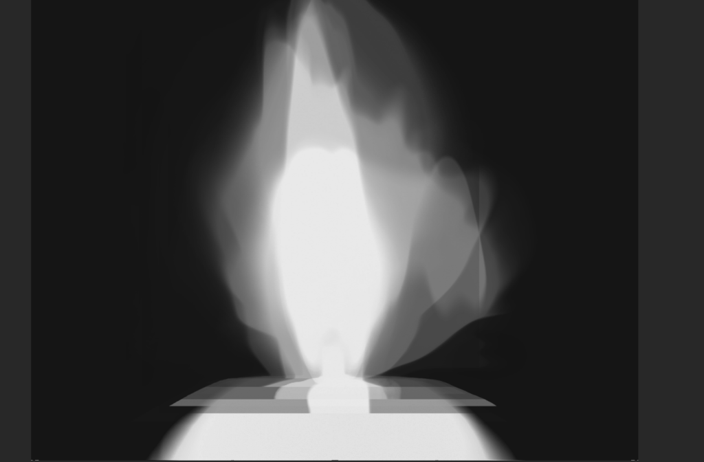
For experimenting I figured trying out multiple exposures might work well for this photoshoot since they’re all similar in set up and shape. I layered 7 images on top of each other and lined up the placement of the wick for each. Since they all had the same black background they blended together well and I just had to adjust the candle body. I adjusted the opacity of each layer until I had a shape I liked.
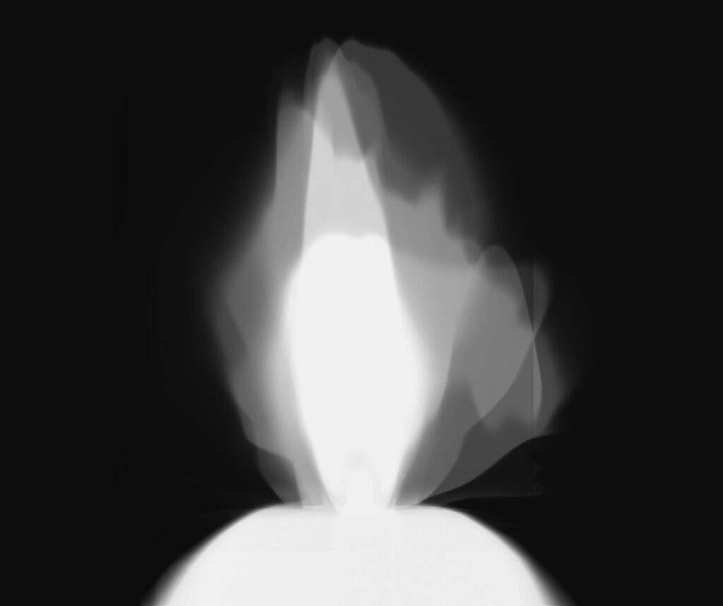
I didn’t like the outcome and removed a few of the layers to create a smaller shape. I realigned the neck area and made the background a navy instead. I like how the images shows the movement of a flame however I’m unsure how well it will fit into my project. I might try and contrast one of these with the still figure.
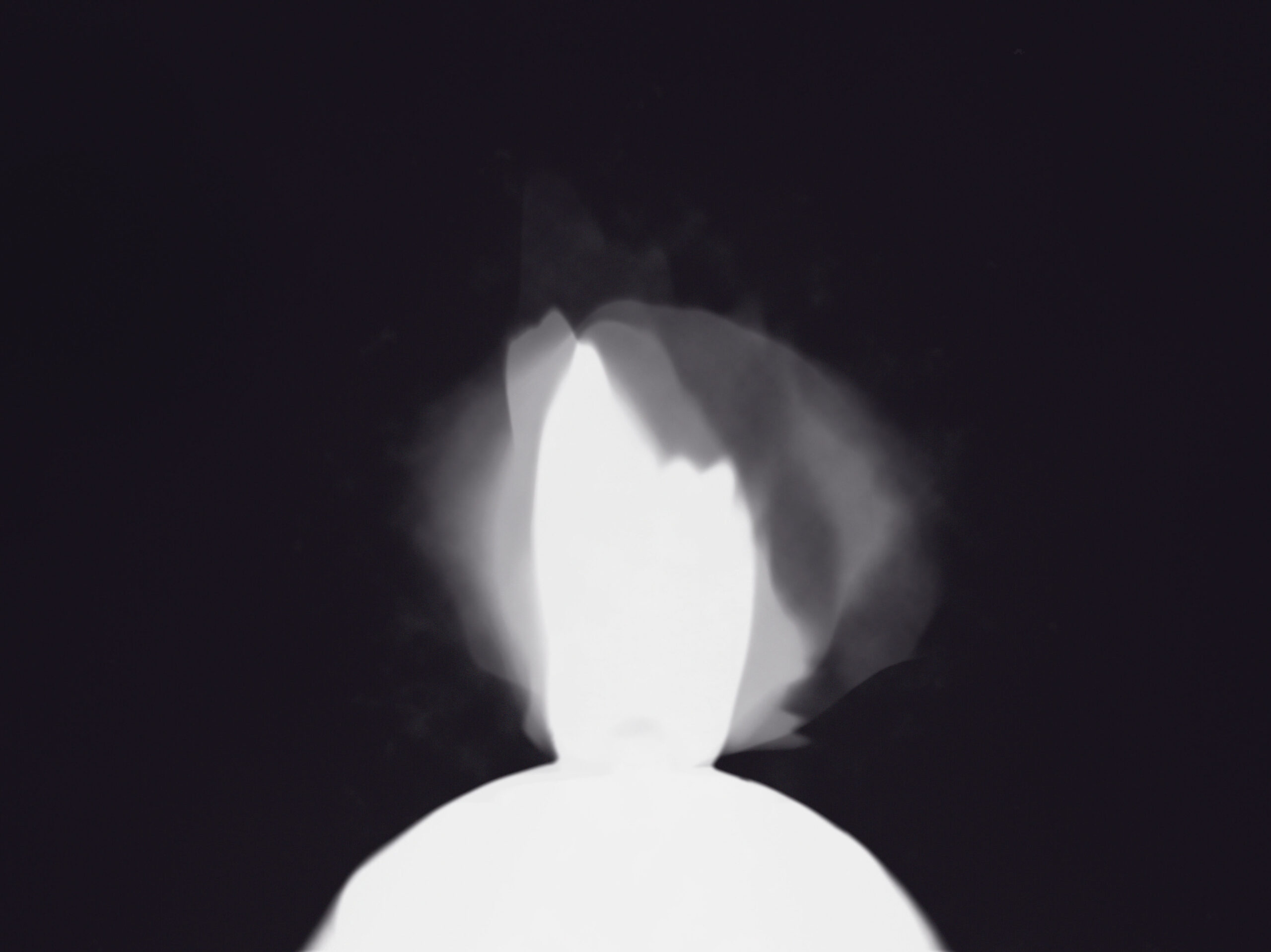
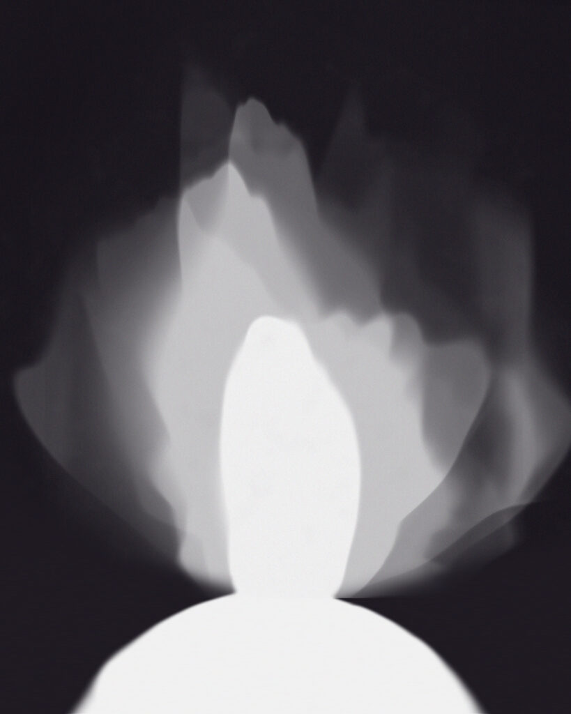
Since the flames were now extremely small around the head I added one larger one to the background and removed the rounder one in the middle. When the image is pure monochrome it almost looks yellow but when it has a blue hue it looks colder and the white looks brighter.
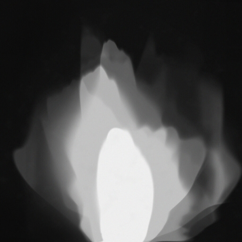
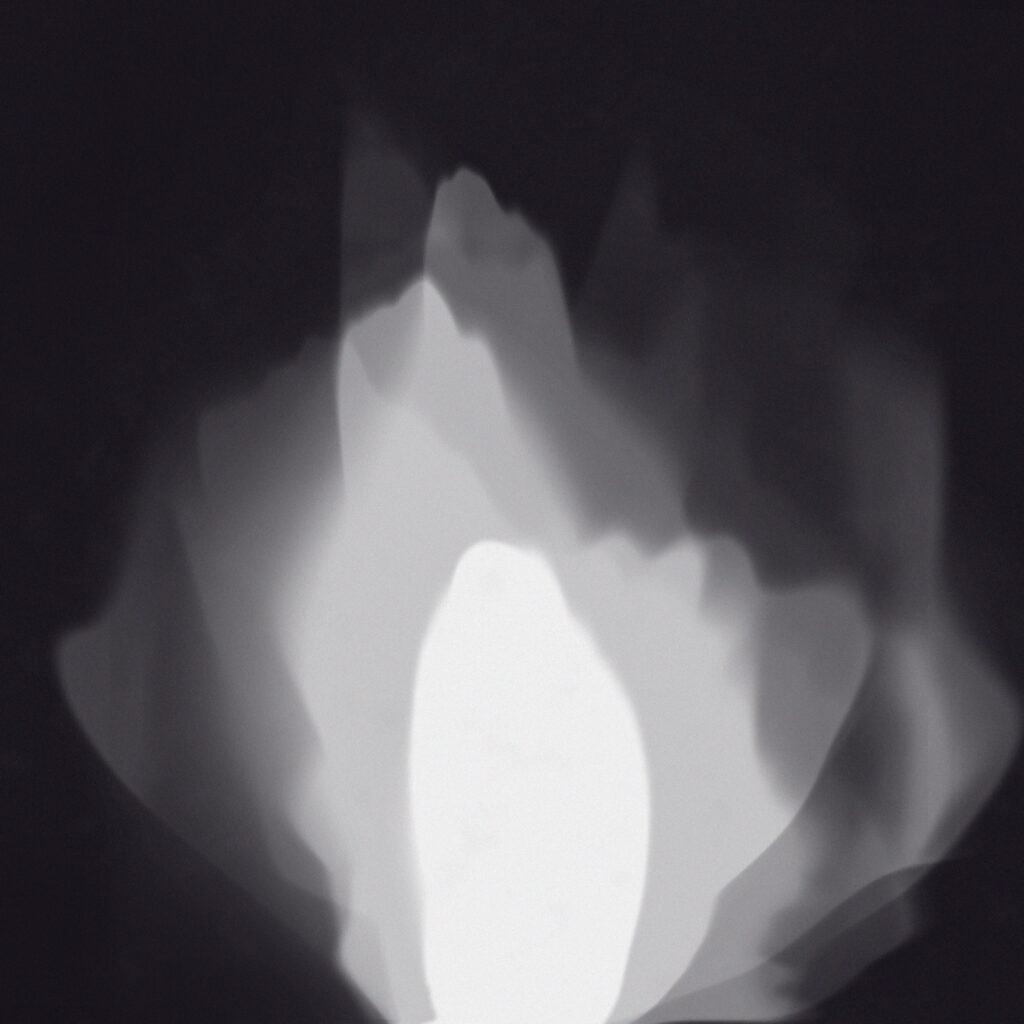
Overall I’m happy with the final outcome but I’m still unsure on its place in my project. This one shows clear layers and the flame obvious in the centre while the others merged into the layers. I like how in the image both halves have different colours. The left has a faint orange trim around the white and the right has blue.

Bronwen, you must publish new photoshoots and show further developments of your photography project. Also publish essay plan and introduction, so we can provide feedback.