
Some photos by Keith Dotson:
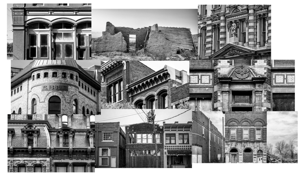
Keith Dotson is a fine art photographer who specialises in black and white photography. Keith was born in Texas, where he later graduated college and worked as a professional art director. He then went on to teach Art and Design in various colleges, before moving to Nashville, Tennessee. Although he is settled in Nashville, Keith loves to travel and capture photographs, his favourite subjects being landscapes, cityscapes and nature. Keith is drawn to historic and/or abandoned places and said that he prefers to take his photographs on gloomy days, when there is soft natural light. Keith presents his images in black and white which allows the drama and mood of the subject to shine. I personally really like his photographic style and believe that it is similar to what I try to achieve when I take my own photographs. Specifically, I am inspired by Keith Dotson’s Architectural Photography. I particularly like how he captures the details of various buildings and structures. I also like how his images have high texture and clarity.
These are some other images by Keith Dotson. I would also like to also produce detail shots like these:

Image Analysis
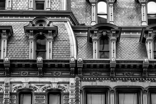
This is an image by Keith Dotson. This image has been taken in natural light and is displayed in black and white with great tonal range. The features in this image are sharp and detailed, with high texture and clarity. Furthermore, this image looks as if it would have been taken from a ladder or a heightened surface from the ground as it is almost deadpan, however, at a bit of a lower angle. When taken this image, it looks like Keith Dotson would have used a low aperture for a large depth of field and a quick shutter speed as the image is clear and not too over-exposed. Moreover, this image is aligned through the middle and looks like it uses the rule of thirds as the middle windows would made the middle horizontal third. The 2 horizontal lines above and below the middle windows draw your eyes to the windows as they sit between them. Finally, I believe that Keith Dotson has taken this image to highlight the detail of the building as all of its features are very detailed, even the roof tiles. I really like this image because I think that it has been beautifully designed and the image is very aesthetically pleasing to look at.
Alex Upton
Some photos by Alex Upton:
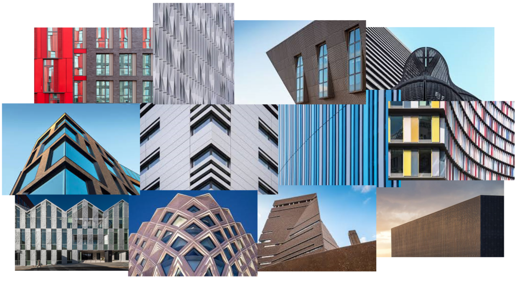
Alex Upton is a photographer who is based in London. He specialises in photographing the built environment and interiors. Alex got a first-class honours degree in Fine Arts at University of the Arts London and, since, has been working on Architectural Photography for several years. Through studying Fine Arts, Alex enhanced his attention to detail and understanding of form, space, composition and materials in relation to Architecture. To this day, he is constantly gaining knowledge and experience as his client base increases. Alex’s work covers everything from the initial stages of construction to the completion of a building. I am specifically inspired by Alex Upton’s Detail images. These images form a collection within his Portfolio and they are each presented as abstract images of buildings, with a range of shapes, colours and textures. I really like the way he takes these images as its like he views them from a different, artistic perspective than what you typically would see when you look at the building.
Image Analysis
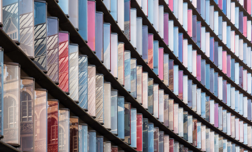
This is an image by Alex Upton. This image looks like it would have been taken in natural light with a fast shutter speed and a low aperture. Rather than black and white like Keith Dotson’s images, this image is in colour. The colours in this image are contrasting as there are both cool and warm tones and a combination as the colours are red, blue, white and purple. Furthermore, this image looks as if it has been taken from the ground, pointing the camera up at the building from an angle. The glass of the façade in this image is creating a reflection of another building nearby and it creates a sense of perspective as it appears smaller as it gets further away, towards the right side of the images. The curve of this façade leads your eyes to the main focal point which is the left side of the image, where you can see the reflections of the other building. This building appears to be an older, not modern building which I believe adds more effect in the photo as it creates juxtaposition between the architectural styles. That is why I chose this specific image to analyse as I believe it fits well with my project. Moreover, this photograph, at first glance, looks like a pattern which starts in the top right corner and is curves which get further apart each time with lines within them. Finally, I don’t think that this image follows the rule of thirds as it is abstract because it focuses on the colour, shape and lines of the building.
Comparison of Photographers
The key similarity between these photographers is that they pay close attention towards the composition of their images and the angle at which they depict the buildings from. Specifically, Keith Dotson often takes his images straight on from the building to highlight the key details, whereas Alex Upton will often approach the building from the side/at a diagonal for a more abstract approach. They key difference between these photographers is that Keith Dotson captures the details of historical and derelict buildings, however, Alex Upton captures the geometric shapes, patterns and forms of modern architecture. Furthermore, unlike Keith Dotson, Alex Upton displays his images in colour to draw your attention to the focal points and to make the images more interesting. Altogether, the work of each of these photographers have a very different approach and subject matter, creating juxtaposition when paired together.
Other Photographers
Some photos by Nick Frank:
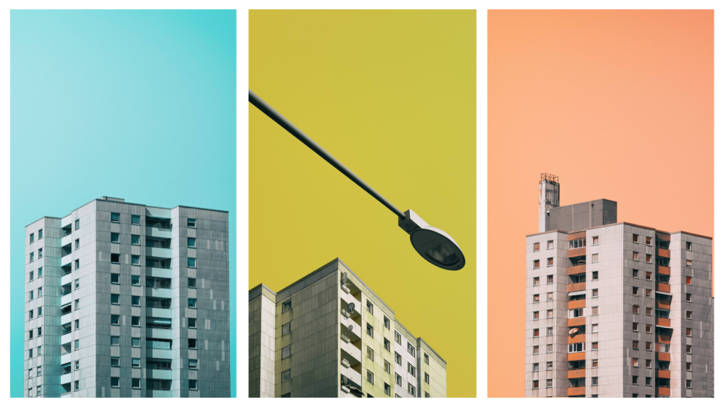
I like the style of Nick Frank’s photographs as an idea for for further experimentation. I could create photographs similar to these by using my unedited photos of buildings, opening them in photoshop and cropping out the building to paste it onto a coloured background. I could then get an image of the colour of the background and lay it on top of the entire thing, including my building, then lower the opacity.
Bernd and Hilla Becher
Some photos by Bernd and Hilla Becher:
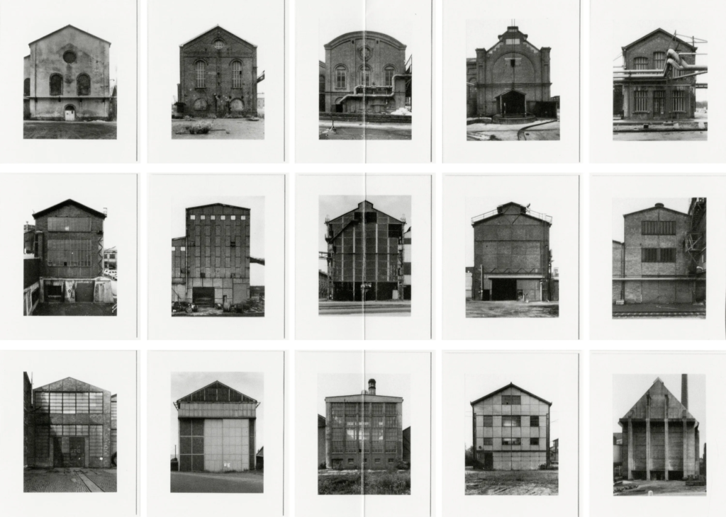
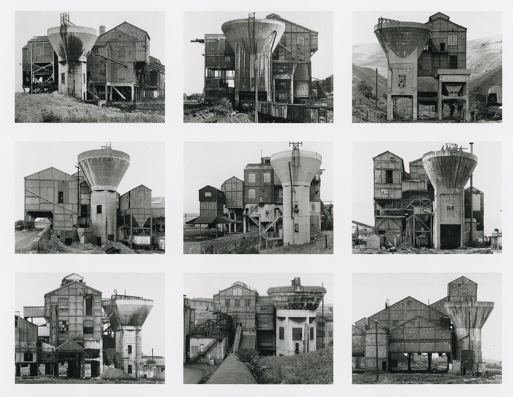
Another idea for further experimentation is to present my images as typologies. I could do this in many ways such as arranging images of buildings from the same age or creating a typology of buildings from different ages. This may make it look more like a photo story as it will illustrate the change in architectural styles over time.