Editing Shoot ONE – Ford – Personal Project

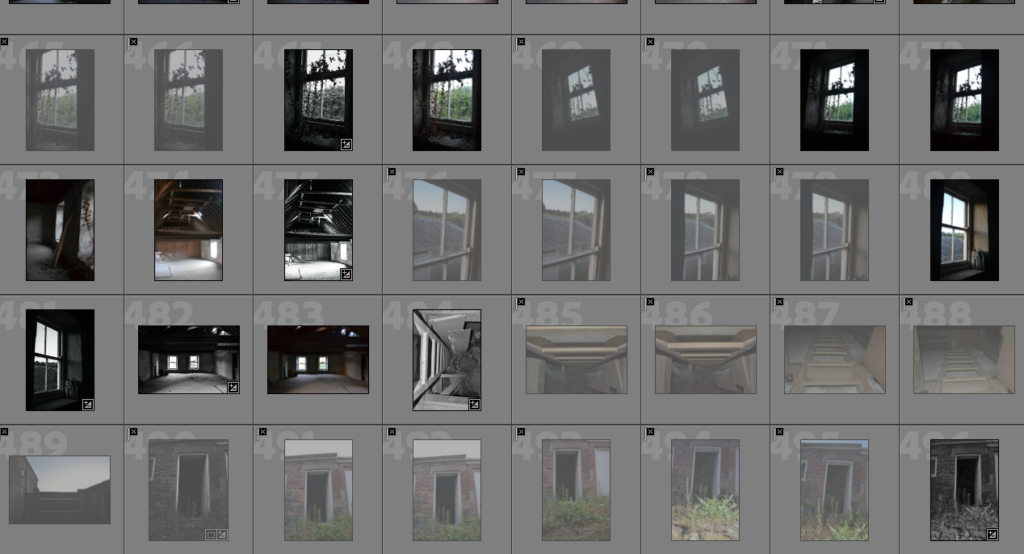
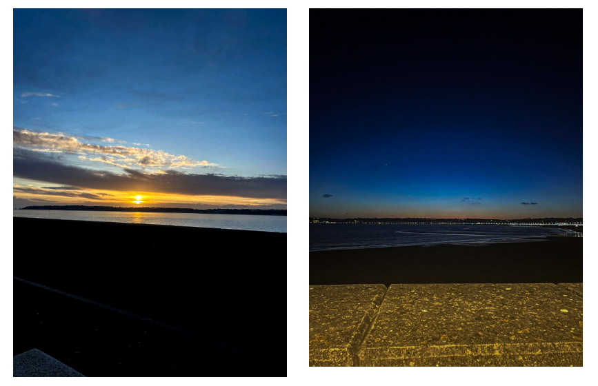
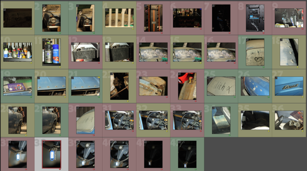
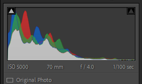
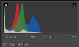
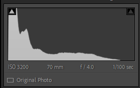
This shoot was challenging in terms of lighting and angles. After spending well over an hour shooting I only got 42 photos, I did get some good shots though. As shown above there were a few good shots but they do need some work as the lighting was yellow at times.
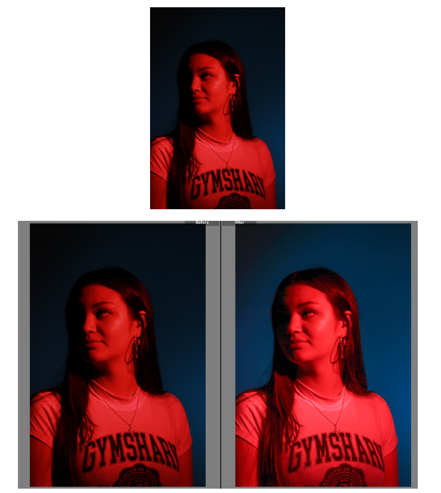
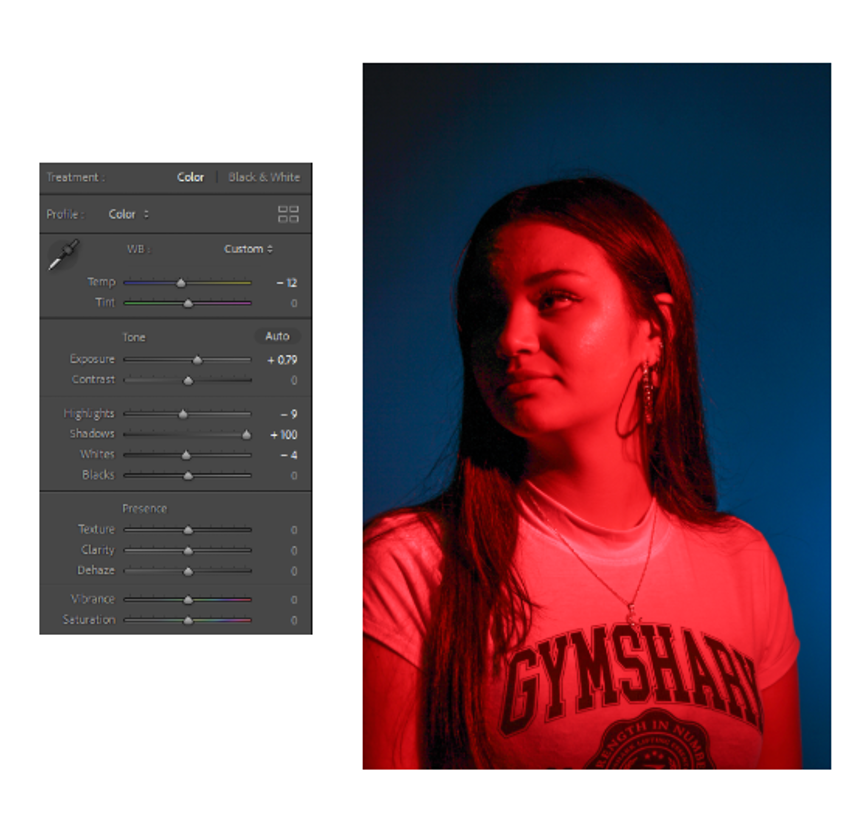
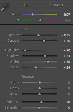
Edit One

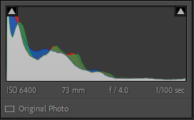
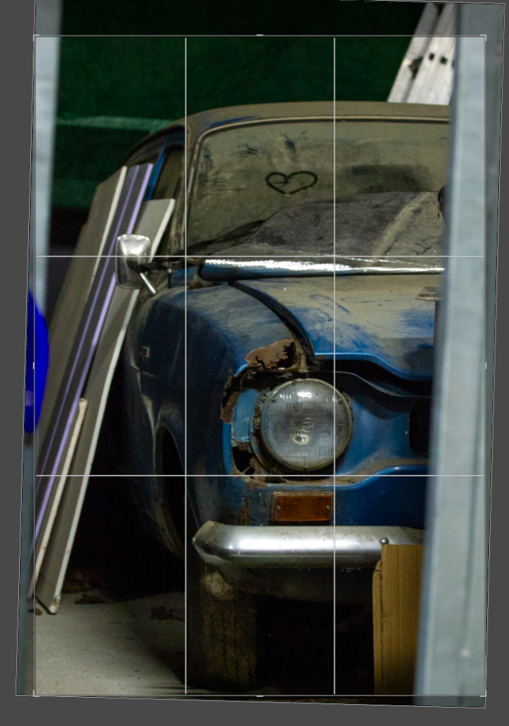
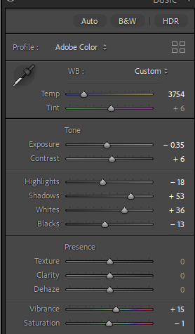
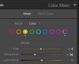
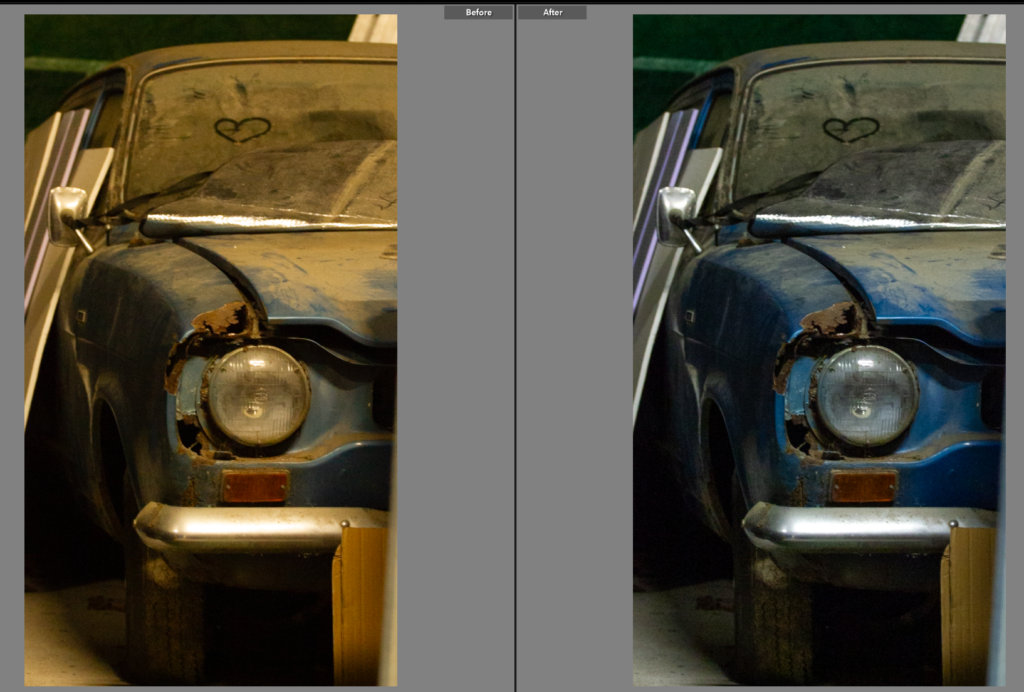
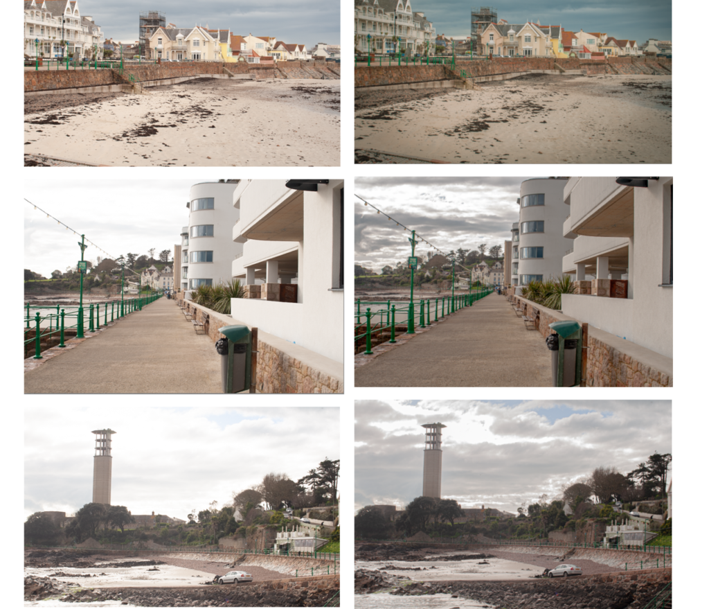
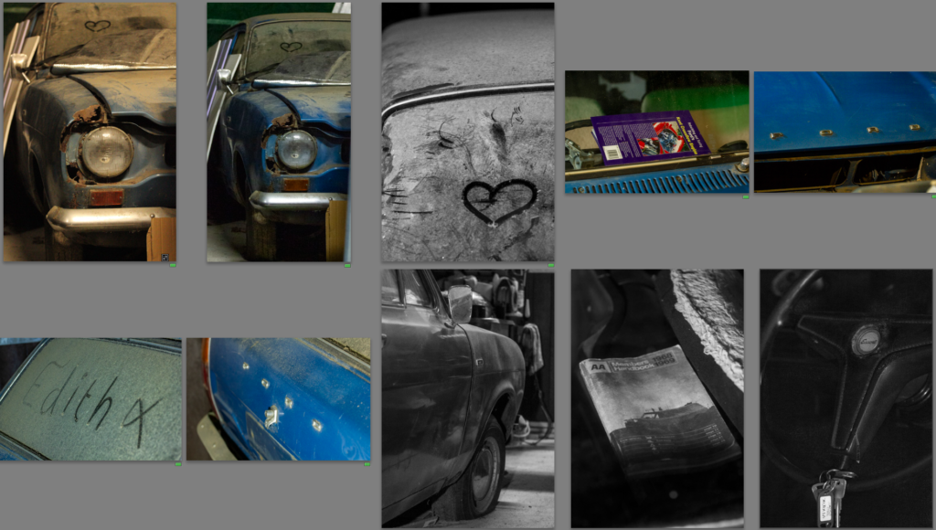
I like the composition of this photo as it has a good angle and shows a good portion of the car. However before editing the colouring is very yellow which while it does give the photo a nostalgic look to it, it would be hard to link all the photos together in terms of lighting as daylight photos. It also means the true colour of the car is shown. To change the lighting I adjusted the temperature to remove some of the blue hue, I then went into colour mixer and selected mixer and went into the yellow and chose to turn down saturation so the yellow lighting was lessoned.
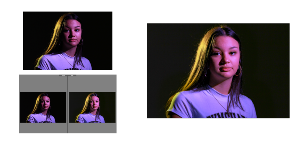
Edit Two

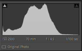
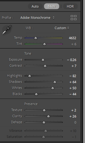
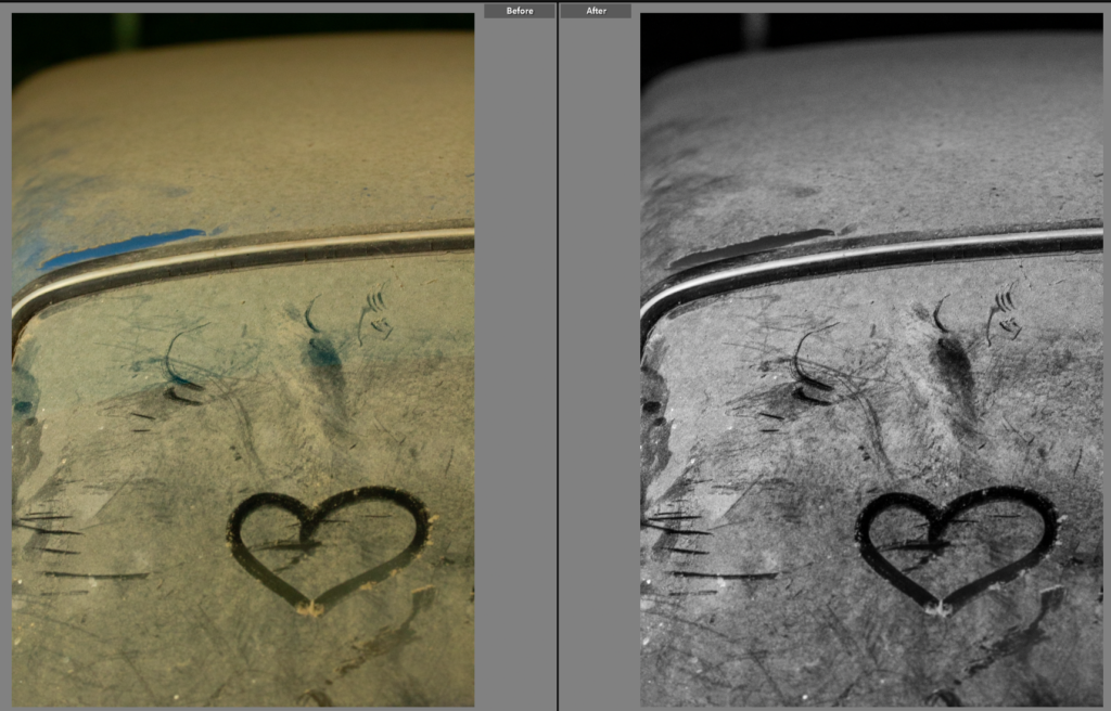
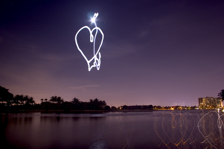
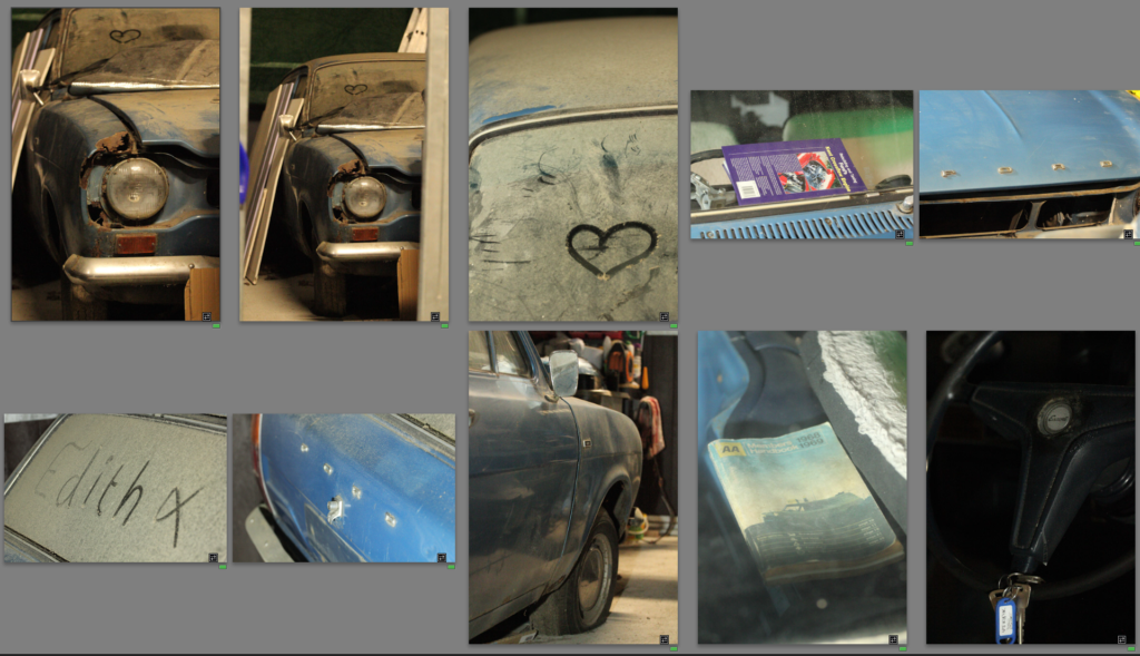
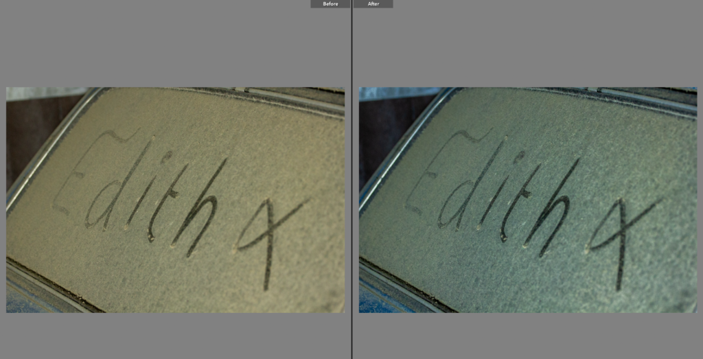
I spotted this heart drawn onto the car, it made for an interesting photo so I composed it outside of the rule of thirds as I didn’t want it to be the main focus so much as a part of the photo. I wanted a photo as I have a habit of drawing hearts onto my bike when it’s muddy so it will be a connecting shot to my own bike which probably also has a heart drawn onto it. I chose to make the shot black and white as I think it adds to the atmospheric feel to the photo. Within this edit I adjusted the tone to make it a high contrast image. This shot in itself is abstract, with minimal parts of the car shown but it will connect well with the next shoot as well as providing some family connection with the car having a heart drawn onto my mothers car and then a heart drawn onto my bike.
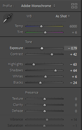
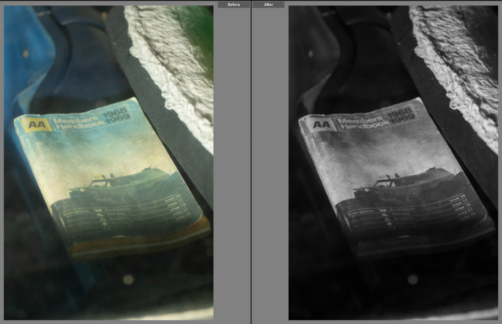
Edit Three

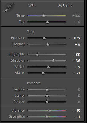
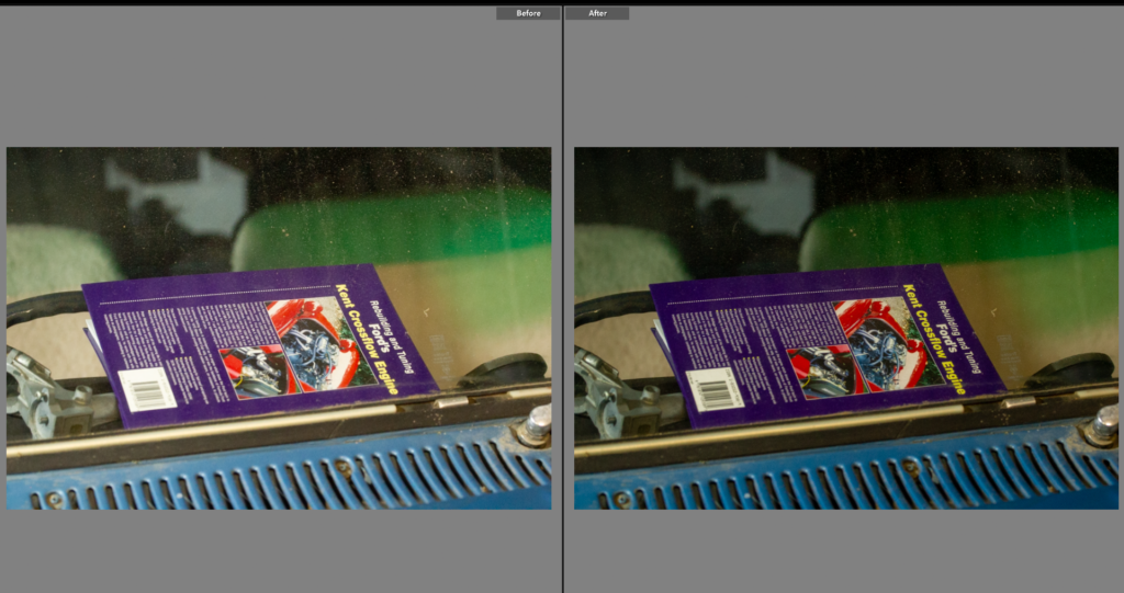
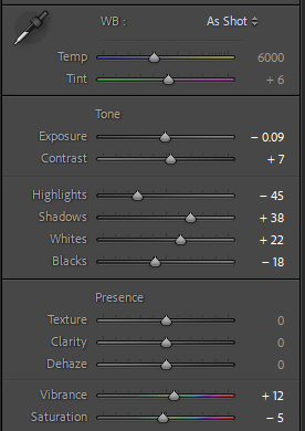
This photo is a great contextual image, I think it shows the love for the car and the age of the car being present in that all the books about it are still books not videos or online manuals. The composition of the shot is good so I didn’t need to crop it. However the colours are dulled down, so to fix this I reduced the exposure and then adjusted other contributing sliders. This helped bring out the true colours and made for a better photo.

Edit Four

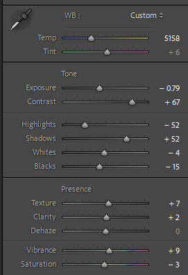
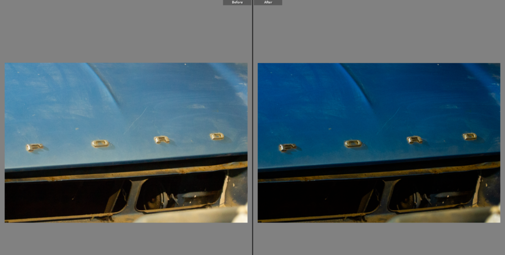
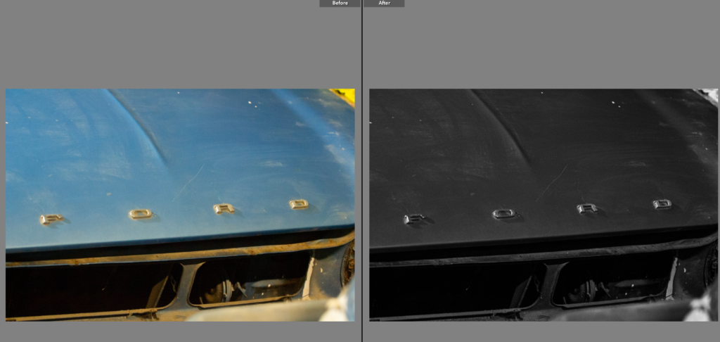
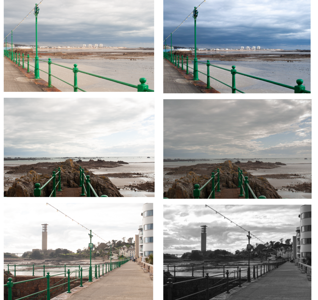
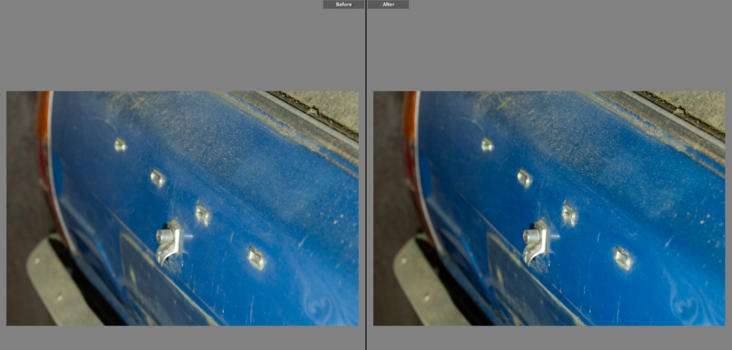
This shot was a confusing one to edit, I liked the original shot but the colour of the metal was wrong as the yellow lighting effected it. To counteract this I changed the exposure and then the highlights and shadows. I still did not love this image as now the car was not true to it’s real colour. Black and white was the next step as then the yellowness wouldn’t effect it. I chose a high contrast, stark editing style, this highlights the details and shadows of the photo. I liked this as the ‘ford’ stands out really well against the darker background.

Edit Five

This shot on the other hand didn’t need much editing as the yellow lighting suited the brown of the dust.

Edit Six

This is again another shot that doesn’t need much editing as the colours already went well. Having used the 70-20mm lens the frame is already a tightly framed shot so the composition was important, having framed the car on an angle to the lens it added dynamic to the photo as well as providing a well composed shot, with interesting angles.

Edit Seven

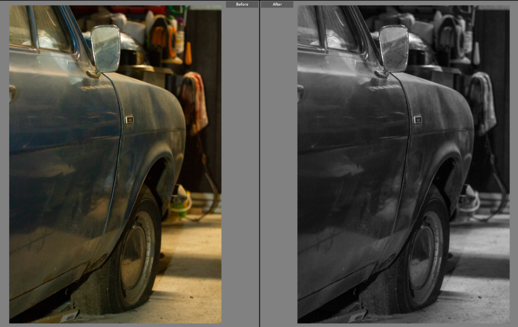
This shot is interesting within itself with the age and condition of the car showing. However I found the background distracting so decided to change the photo to black and white to add not only deeper tone to the car but remove some of the complexities in the background. This also worked really well to neutralise the yellow tone from the lighting.

Edit Eight

This shot while a creative, interesting image, having been shot through a windshield with multiple leading lines and context on the car. Overall I like this shot but it is a much more impactful image in black and white as while the book still appears worn from its age it doesn’t have the same washed out colours. The tone of the image is completely transformed once the image was edited to black and white as the high contrast shot, similarly to the previous shot it removes all the background busyness that doesn’t benefit the shot. This also provides a base for any future black and white shots as I have a style to base it off of.

Edit Nine

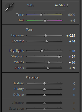
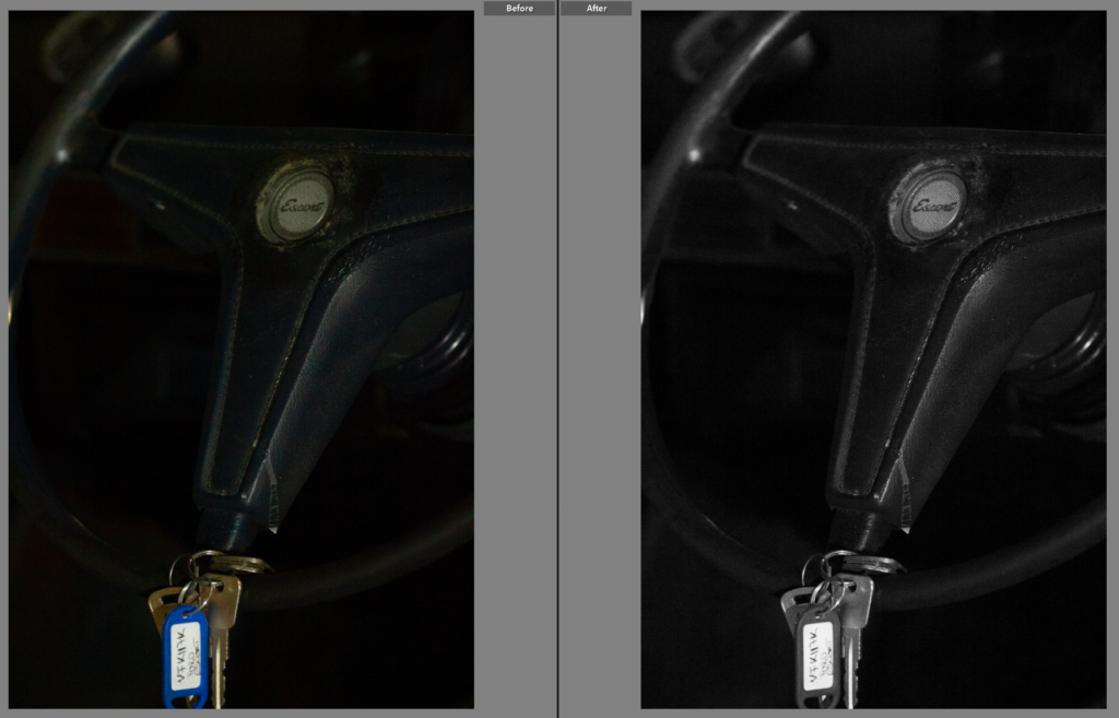
This image again is much stronger in black and white, it has removed the washed out colours and new key colour but kept the apparent wear to the car. It has also brought out the highlights in the shot, showing the badge in the steering wheel and outlining the wheel itself.

Final Images

After editing these photos I noticed, while I didn’t dislike the results I felt I could get more similar shots with a different lens. I would like to redo this shoot with a 18-105mm lens as I would have a lot more range in the shots I could get. I did however end up with a strong set of images with a mixture of colour and black and white shots. I think the detail shots were particularly successful and created a strong starting point for this project. Having researched Keith Dotson’s work on old cars in a forest, left to rot I wanted to take a similar approach using highly tonal images with a range of wider angled shots and closely framed shots, although shown in both mine and Dotson’s work neither of us feature much of the background as for wat we are trying to show in the images it is not too important and can be distracting.

My photoshoot plan

For my personal study, my inspirations come from the work of Carolle Benitah and Philip Toledano, two artists who utilise the theme of nostalgia, family, memory and loss in order to challenge events that have occurred in their lives, specifically in childhood. This is something I want to reinterpret in my own way and apply it to my own circumstances, that being growing up with a sibling who develops Bipolar disorder.

My first photoshoot idea solely comes from the work of Carolle Benitah. Benitah takes images from her own family archives, such as photo albums, and uses different mediums to symbolise different events that happened which are linked to the image itself, or the people within it.

She also uses the same consistent shade of red within each image to make them all link and be cohesive in the story that she’s trying to tell – this is something I have thought about doing but with a consistent shade of blue as this is my brothers favourite colour, however I need to think about this a bit more as I am unsure at the moment. But, if I do use this inspiration, I may be able to apply this into each photoshoot so that all my images link and show a clearer reference to Benitah.

As my inspiration, I am going to go through the images that my parents have involving my brother, whether that be just him, me and him or all of us, and photograph them. I am going to do this either by using the studio or creating my own small studio at home using black card as the background so that I can crop any spaces after. If this is unsuccessful, I will photocopy the physical image itself. This is because I don’t want to tarnish the actual picture, so by creating a copy this then allows me to be experimental with different mediums – such as paint, ink, thread, glitter – multiple times. I also do have digital images from my mum, meaning that I can print multiple copies off to also be able to experiment and not be worried about it being ineffective.

My second idea stems more from the work of Philip Toledano, looking at the still-life’s he took of his sisters belongings from before she died as a nine year old child. Toledano took an assortment of Claudia’s belongings and keepsakes from her childhood and photographed them using a birds-eye view technique.

This is going to inspire me in my second photoshoot, beginning with me asking my parents for everything and anything they kept from mine and my brothers childhood, with the objects ranging from birthday cards to baby toys. Anything I can find I am going to photograph in order to have a wider variety of images to choose from as this will enable me to be more selective in choosing which images are the best, link the story well enough, and carry the most meaning. If I do this well, I think this will make my photobook more emotive, and encapsulate the heaviness of this topic behind it. I am going to try to achieve the lighting technique that Toledano uses, being that he uses geometric shapes in order to add that ‘out of place’ tone within the images. However, if this doesn’t work I will be able to find a way to do it on Photoshop by merging the two images and making one in black and white and the other in colour, then cutting out my desired shape in the black and white image, finally layering the two over each other so that the shape I have created is the only part of the image that is in colour.

My third category of images that I am going to use is going to be of different locations that resonate with my brother and relate to his childhood. For example:

  • My house
  • Football fields
  • My estate
  • My garden
  • The hospital that he goes to

These are only just a few I can think of at the moment, however I will ask my parents where the best places to go would be as they will know from taking me and my brother.

However, I don’t want my images to just be plain landscapes that don’t really fit in with my other two photoshoots so I am going to hone in on form for these images. My second zine that I did for Jersey’s maritime museum was very focused on the form of the landscape instead of the aesthetics of it, which is why I want to use this knowledge in my own personal study, as this is a good representation of seeking out the environment around me as well as portraying the context of my brothers story better. When I go to these places, I am going to take multi-shots to be able to distinguish the best images and be able to experiment better.

Overall, a key aspect of my work is going to revolve around form and shape, specifically in my third photoshoot, however this is also going to be demonstrated in my second photoshoot in a more discreet way. My photoshoots may change as I begin to work on them next week, however I need to remember to be experimental and explore different ideas by taking risks.

Photo Analysis

Vivian Maier:

This image was taken by Vivian Maier, this is an example of candid photography. Where the people aren’t aware that they are being photographed. As you can see the little boy is looking at Maier and not the camera which shows that the camera is not distracting anyone from doing their everyday things. This image has a dynamic composition that draws the viewer’s eyes to the interaction between the two central figures. The diagonal in their posture adds visual energy. There is a strong tonal contrast between the light and dark areas, typical of black and white photographs. The lighter tones would be found on the central figures, their clothes contrast with the dark background details like the building and pedestrians. The juxtaposition of the man tying his sons shows on his knee creates a quirky and unexpected look. This photo has a very busy background which adds loads of details to the image, the fact that there are other people in the photo makes it look better, it helps to add more effect to the image. This image shows us a bond between what looks like to be son and father, this could be seen as a wholesome photo to some people, however others may think that this is a just an average image, many people can interpret different things to one image. I would say that this son and father have quite a good relationship, but it could be just for show, one image can’t tell you the whole story. It seems to be quite early, and the dad is bringing the son to school, they are dressed up in fancier clothes than everyday wear. Although this could be what they wear every day and they are just rich, back in the day and still now richer people tend to always be wearing suits rather than jeans and a top. The whole point of this image can show us that there is a lot more meaning behind an image that you may interpret. There is a lot of detail in this image that can lead to people thinking certain things about this image, really people are just guessing. This image is seen as quite modern due to the black and white effect given to the image. One thing that is controversial is the truth behind this image, different people have different views and spot different things first, it’s all about what Maier wants to represent that is important otherwise this image could mean anything. Vivian Maier states that the moment that she has photographed is forever gone, it will only happen once. This could make this photograph a lot more meaningful whether the two main people in this photograph as still alive or if they still have a close bond, there could be a plot twist where both the little boy and older man don’t know each other and its fully staged, although I do know that Maier’s images are not staged but they could still have a completely different interpretation that the viewers may perceive. Vivian states “I am a sort of spy” suggesting that she keeps an eye of her surroundings and tries to capture anything that is unusual. Things that stand out, any unspoken narratives that aren’t always visible to the naked eye. Sometimes the camera picks up things that we don’t, for example Maier’s focus would be the two boys/men in the image and not quite whets in the background, the fact that there are vans and cars help to make the image more alive and detailed. This image shows the history of what New York used to look like, things have changed such as the buildings, the roads, many plants in the surroundings and signs. It’s a captured image of the past. I do like how in the background it almost looks foggy which could be due to the black and white effect, but it almost adds its mysterious look to the photograph. It could also be the clouds as it doesn’t look like it would’ve been a good day. Overall, I do like this photo as it holds many different meanings to different people. 

Personal Study: Context

The personal study is based around the theme observe, seek and challenge.

Mind Map

Mood Board

Mood Board Analysis

My mood board includes a large range of ideas for my personal study of observe, seek and challenge, because I am not sure what theme I am planning on doing for my personal study yet, so I have included them all the get an idea of my options. I have included the themes which I have talked about on my mind map.

This is a rather large mood board containing quite a few images, compared to the usual mood boards I make, because I wanted to include a large range of themes that I could explore.

REVIEW AND REFLECT

headshots means that the portrait photo is cropped somewhere in the middle torso – so that the focus is on your face.

To take photoshoots for headshots you can either use:

Flash Lighting:

Camera settings (flash lighting)
Tripod: optional
Use transmitter on hotshoe
White balance: daylight (5000K)
ISO: 100
Exposure: Manual 1/125 shutter-speed > f/16 aperture
– check settings before shooting
Focal length: 105mm portrait lens

or, Continuous Lighting:

Camera settings (continuous lighting)
Tripod: recommended to avoid camera shake
Manual exposure mode
White balance: tungsten light (3200K)
ISO: 400-1600 – depending on how many light sources
Exposure: Manual 1/60-1/125 shutter-speed > f/4-f/8 aperture
– check settings before shooting
Focal length: 50mm portrait lens

MINDMAP & MOODBOARD:

Above is how I set up everything to take the photoshoot and below are some images from the photoshoot and the edited versions.

TOP 2 IMAGES:

These were my top choices because I loved the way its set and how the colours blend in so well with the face expressions and the mood in the image.

For my Landscape photoshoot we went to Havre De Pa and took some pictures there. A landscape is the visible features of an area of land, its landforms, and how they integrate with natural or human-made features, often considered in terms of their aesthetic appeal. The term “landscape” actually derives from the Dutch phrase landscape, which at the beginning meant “region, tract of land” however obtained the artistic connotation, “a image depicting surroundings on land” in the early 1500s (American Heritage Dictionary, 2000). landscape painting, the depiction of natural surroundings in art. Landscape art work may also capture mountains, valleys, our bodies of water, fields, forests, and coasts and might or might not include man-made structures as well as people.

When did landscape photography originate?

The earliest known evidence of a landscape photograph was taken between the years of 1826 and 1827. It was an urban landscape photo taken by a French inventor by the name of Nicephore Niepce.

Below are some images that I chose to edit, I tried to make the photos more dramatic since it would be more interesting and would catch peoples attention more.

The Anthropocene is sometimes used to describe the time during which humans have had a substantial impact on our planet. Whether or not we are in a new geological age, we are part of a complex, global system and the evidence of our impact on it has become clear.

MINDMAP & MOODBAORD:

For my first photoshoot I went to frigate beach and take photos of the sea when is high tide and when its low tide. I took three different pictures but all in the same place but just different angles just like Michael Marten did as I found it very interesting on I was curious on how he did it so perfect. These are the photoshoots Michael Marten inspired me to copy and my final outcome of the images inspired by him.

For my second photoshoot I took photos of abandoned buildings inspired by Yves Marchand & Romain Meffre. The quality of their work cannot be disagreed, and they have added great value to the medium of photography. I like the way they take photos of completely different places, places that no one hardly goes. Where its nice and calm or sometimes messy but still calm and peaceful. Their work relates to Anthropocene because they take pictures of mostly abandoned places and that shows how places can be destroyed or not wanted anymore because of the environment, could also be because of war or other any reason.

Butterfly lighting is a portrait lighting pattern where the key light is placed above the subject’s face and aimed directly at the subject’s face. This creates a butterfly-like shadow under the nose. Also known as “Paramount Lighting” after the classic Hollywood glamor photo. Butterfly lighting is a type of lighting pattern for studio portraiture. It is used for taking flattering, glamorous portrait photos. The lighting is soft on the face. It forms a butterfly-shaped shadow under the subject’s nose, which is the source of the name.

Chiaroscuro is a high-contrast lighting technique that utilises a low-key lighting setup to achieve contrast between the subject and a dark background. Chiaroscuro balances high-contrast light and shade to give the appearance of depth, creating an enhanced or more dramatic effect. Chiaroscuro creates three-dimensionality on a two-dimensional plane, darkening the background and highlighting the subject in the foreground, drawing the viewer’s focus and attention.

Artist Case Study 1: JASON D. PAGE

Jason D. Page is a photographer regarded as a leader of the light painting movement. He has had a passion in light painting photography since 2004 and has even created a website aimed at inspiring people to take up this style of photography. The website contains other light painting artists, a wide range of tutorials on light painting and the history of light painting.

Jason was born in Newport, Virginia, and moved to Florida when he was three, his farther was a Coast Guard machinery technician and an avid photographer, however after they moved he ended up divorcing Jason’s mother which had an impact on Jason. After graduating collage in 2004 Jason focused on cinematography and produced 4 award winning films about surfing.

Jason describes finding his passion as “I have had images in my brain that I wanted to create and could never figure out how to do it. That was up until a winter night in 2004 when I bumped my camera while taking a long exposure of the ocean. When I checked the exposure I saw the moon had made a streak across the sky, in that moment it all clicked for me.”

Photos by Jason D. Page

Image analysis

The image above is called Moonlight Drawing #1 and was created by Jason D. Page in 2010. It is the first of three images he created in the series Moonlight Drawings.

The main subject in the photo is the glowing heart, which was made with a slow shutter and by moving the camera so that the light from the moon creates a heart shaped trail. The heart shape could be a personal reference to the photographer’s love and passion for light painting. This reference originated when he was taking a long exposure photo of the moon in 2004 and accidentally knocked the camera, which created a light trail, this led to Jason’s discovery of light painting- and is similar to how this image was produced.

The photo uses a combination of natural light, from the moon and low light from the dusk/dawn in the horizon, as well as some artificial light in the background on the right from the buildings. This helps dimly illuminate the photo so you can see the lake and the silhouettes of the trees which gives the photo a sense of natural beauty and almost a sublime like feel to it due to the smoothness and deepness of the water which can make people wonder what is under the surface.

The water also creates the texture in the image as the bulb shutter makes the gentle ripples in the water look soft and smooth and the reflectiveness of the light gives it dark ranges of purple and black complimented by the orangish colour from the light.

Artist references

LaToya Ruby Frazier

LaToya Ruby Frazier is a talented American photographer known for her style and documentary like work which often explores race, social justice, class, and the impact of industrial decline. Her most famous project is called The Notion of Family, produced between 2001–2014, where she documents the lives of her mother, grandmother, and even herself in Braddock, Pennsylvania, a town that was and still is devastated by the sudden collapse of the steel industry.

There is definitely obvious themes within her work and these themes include:

Key Themes:

  1. Family and Identity: Frazier’s work obviously centers on her family’s experiences and revealing inter generational trauma and resilience amidst economic decline. The project also highlights the idea of family as a cultural and historical construct.
  2. Social and Economic Displacement: Her portraits and images of Braddock, highlights the connection between the destructive industrial collapse and the social decrease of working-class Black communities.
  3. Health and Environmental Issues: Her famous project foregrounds environmental racism and healthcare imbalance, engrossing on how industrial pollution and inadequate healthcare have affected diminised populations.
  4. Portraiture and Intimacy: Frazier’s raw, and personal portraits question stereotypes of Black and working-class life, handing out a refinement representation of struggle and resilience.
  5. Cultural Context: Frazier provokes the erasure of working-class, Black, and female experiences especially in mainstream narratives. This offers a window into a community that is often ignored in discussions about industrialization.

Reception:

The Notion of Family has been praised and is still being praised for its emotional depth and constant questioning of social constructs, earning Frazier an international recognition. Her work has been exhibited in major museums and is part of collections at MoMA and the Whitney. In 2015, she was awarded a MacArthur Fellowship for her contributions to art and social justice.

So in summary, The Notion of Family is an exploration of race, place, class, and blending personal narrative with broader social issues which offers a powerful, empathetic view of a undervalued community’s struggles.

Kürşat Bayhan

Kürşat Bayhan is an extraordinary Turkish artist and photographer who is known for blending themes like history, memory, identity, and contemporary socio-political issues. His interesting work combines conceptual and documentary photography, often exploring themes like migration, the urban environment, and the thick tension between tradition and modernity.

While he is not widely known especially internationally, Bayhans work is an important figure when in comes to contemporary Turkish photography. His projects challenge how personal experiences intersect with larger socio-political landscapes, often contributing to the discussions of visual culture and identity. He has exhibited his work both in Turkey and internationally, gaining recognition for his unique storytelling approach.

One project that is eye catching is the project callled “Away from Home” It is a photographic series which explores themes of feeling of displacement and migration. The work focuses on individuals who have been forced to leave their homes due to conflict or hardship which captures their emotional and psychological experiences of this difficult and unwilling exile. Through intimate portraits and documentary-style images, Bayhan humanizes the migrant experience, and reflects on feelings of mislaying, identity, and the search for belonging in foreign environments. The series also delves into the complex notion of “home,” highlighting the tension between the past and the present for displaced individuals. It also offers a personal and empathetic perspective on migration, beyond political or statistical stories.

Reference:

larubyfrazier.com

www.instagram.com

www.artforum.com

Whitney Museum of American Art

Just a moment…

Wikipedia

People: Kürşat Bayhan | The Floating Magazine

Kursat Bayhan – PhMuseum

internationalphotogrant.com

artist case study Todd Hido, Edgar Martins, Rut Blees Luxemburg – eddy

Rut Bleed Luxemburg is a German born British photographer she attended the London collage of printing where she then go on to achieve an MA in photography. how does she create her images? a lot of her images includes a long exposure to let her use the light in the streets only. this is technique is used in her images in the night that include reflections off the floor of street lights and buildings such as office blocks or even possibly capture cars moving along on the road.

One of her key interests is how the built environment shapes human experience and perception. She often focuses on the urban environment’s emotional resonance, particularly the intersections of architecture, the human body, and the passage of time. Her work can evoke both a sense of isolation and intimacy, presenting the city as a kind of stage where private, sometimes melancholic, moments unfold.

Luxemburg gained wider recognition with her series London Overground, which captured night scenes along the London Overground rail network. The images from this series depict a hauntingly beautiful, almost cinematic view of the city. The use of artificial light and the interplay of shadows give these photos an otherworldly, dreamlike quality. Her images often appear at the cusp of the real and the imagined, offering a glimpse into a hidden or forgotten side of urban life.

example images:

early life and career:

Todd Hido was born in 1968 in Ohio who had gained an interest in the American suburbs which would then become a big part of his work. His work was also inspired by documentary photography which had helped him develop his work into poetic, cinematic, and also blending aspects of narrative and fine art photography.

key themes and style of photography:

Hido’s most recognizable project would be the house hunting project from 2001. this project showed exactly what his style was about, low conditions in the night. these images in this project consisted of houses in the suburbs in the night through fog.

Another aspect of photography that Todd Hido explored was portraits. He mainly took images of women that would considered to portray the women in the portraits as vulnerable or other feelings, he did this to so people would perceive these images how they wanted to there isn’t a right or wrong answer its on what you believe

Impact and Recognition:

Todd Hido is considered one of the leading photographers of contemporary American photography. His work has been exhibited widely in galleries and museums around the world and has earned him a dedicated following. Hido’s influence extends beyond fine art photography, with his work often being cited in discussions of contemporary American culture, film, and visual narrative.

He has also contributed to a wider conversation on the nature of domestic spaces and the ways in which suburban environments can both reflect and distort human emotions.

Conclusion:

Todd Hido’s work resonates due to its exploration of mood, light, and the deeper psychological layers that landscapes can evoke. His approach to photographing ordinary suburban environments transforms them into spaces of haunting beauty and emotional complexity.

example images:

visual:

in this image i would say it contains quite a mixed tone as parts of the images contain a dark blue space on the bottom and the top left of the image however as we look in other places in the image it contains quite a bright blue coming from the source of light in the image. the from we see this image in would be 3D as we are seeing buildings form an angle that allows us to see the front and side of it. from the viewpoint we are given in this image i would say that the surface we see is quite ruff in this image as the concreate isn’t smooth with marks all over it and over grown grass creeping from under the other side of the fence.

technical:

the type of lighting we see in this image would be unnatural as its coming from a street light, however this street light has been manipulated with a long exposure leading to the colour of the light almost taking over the whole image. this image appears to be in a focused and narrow approach when it was taken with quite a cold colour for the setting of the image this could have possibly been done to watch the time of day as it was taken in the night.

conceptual:

the concept behind Todd Hido’s image is his inspiration behind documentary photography which then helped him create these sort of images which I would personally say are quite cinematic. But if we want to talk about the idea behind the images this quote says it all  ‘I wonder about how people live, and the act of taking that photograph is a meditation. ‘ which he then goes on to say that the project doesn’t have an answer and is more of a question. A rumination without resolution.

contextual:

Edgar Martins is a Portuguese-born photographer known for his evocative, contemplative, and often minimalist approach to landscape and architectural photography. His work blends formal precision with a deep sense of atmosphere, often exploring themes of place, memory, and human intervention in the environment.

Key Elements of His Work:

Landscape and Architecture: Martins frequently explores the intersection of natural and built environments. His images often focus on architectural spaces or expansive landscapes, but he presents them in ways that challenge conventional representations of these spaces. He’s known for creating photographs that blur the boundaries between the natural and the artificial.

Human Impact on Nature: In addition to exploring architectural spaces, Martins often addresses how human activity has shaped or altered natural landscapes. This can range from the environmental consequences of industrialization to the ways in which man-made structures interrupt or interact with the natural world.

Minimalism and Composition: His use of space is often quite minimal, drawing attention to the vastness or emptiness of a scene. His compositions tend to be precise and meticulously structured, focusing on light, shadow, and texture, and often leaving room for the viewer to interpret the spaces and their meaning.

Recognition and Influence:

Edgar Martins’ work has garnered critical acclaim for its intellectual depth and visual beauty. His approach to photography—combining meticulous technical skills with a deep philosophical inquiry into place, time, and human presence—has earned him recognition in contemporary photography circles. His work is included in numerous private and public collections, and he has exhibited internationally, including at major photography festivals and galleries.

His photographs are often compared to the work of other contemporary photographers who blend minimalism with exploration of place and memory, such as Richard Misrach, Hiroshi Sugimoto, and others who approach landscape and architecture with a meditative, almost existential tone.

In summary, Edgar Martins is a photographer whose work challenges the viewer to contemplate the spaces and places we inhabit, to reflect on the passage of time, and to reconsider the role of human presence (or absence) in the environments around us.

example images:

Artist reference: Yury Toroptsov

Yury LI-Toroptsov is a certified professional life coach, author and visual artist within Paris, France. Born in 1974 to a rural community in Vladivostok, a city within Russia, Toroptsov gained a prestigious scholarship in 1998 to the New School for Social Research in New York.

The core of Toroptsov’s work incorporates a multitude of culture – from his Far-Eastern origins, travels of America and his residence of France – in order to detail a story of identity, people and the permanence of myths. Nostalgic tones are rife through Toroptsov’s work too, through his recurring themes of memories and the secular(no religious connection or affiliation). Whilst living in Berlin, he explored the notion of fairy tales for adults, however the work that I am most interested in is entitled ‘Deleted Scene’.

In ‘Deleted Scene’, Toroptsov transports the viewer back to his home town within Russia to explore the echoes of his father’s memories who passed away before he turned two. With little to no memories of him alongside all reminders of him disappearing too, beside his camera, Toroptsov aims to unravel the neglected recollection of him. With his father being an amateur photographer, Toroptsov discovered his camera at age 9 with a strong curiosity due to it being the last personal thing connected to his father in his possession.

From the images that his father took, family archives of letters, keepsakes, group images paired with landscape images that seek out the distinct patterns within rural areas of nature instead of perspective images, Toroptsov highlights how the told and retold stories of his father were shared like folklore, the detail alternating on who was reciting the story. He also demonstrates the frustration of not being able to recall the early and limited time he shared with his father before his untimely death, for example one of the pictures show Toroptsov as a five-month-old baby lying on his belly on his parents’ bed fixated on the photographer – his father, who has thirteen months left to live. This dedication to someone who is so close yet still a stranger allows Toroptsov to begin trying to get to know his father even through death, and allows him to express the complete and happy family that he was part of, even if it is difficult for him to recall from such a young age. Knowing that this time was shared with his father, yet unable to relish in the memories to recollect and rewind, is represented through the mysterious tones that he depicts in this photobook.

Toroptsov includes archived images and letters in this photobook, however that is not the images that I am interested in as I have already explored the work of Phillip Toledano alongside Carolle Benitah, where they both already include this format of images in their work. Instead, I would like to look at the landscape images that he takes. Usually, I find that landscape images are very external and more documental rather than a personal, expressive image however, Yury Toroptsov seeks out the formal elements of:

  • Line
  • Form
  • Shape
  • Pattern
  • Texture

As he travels through his home town of Vladivostok, a rustic community that borders with China and North Korea, Toroptsov focuses on the smaller aspects of the environment around him instead of taking a vague, wide-shot image of the whole area around him. Alternatively, he seeks out the smaller fragments that build up the community in greater detail, as if he is zooming in with a magnifying glass and picking apart his childhood without a father figure at home.

Some examples which I could find online:

This is just a small fraction of the locational images within Deleted Scene, however within the physical book there are a variety of images that are detailing what builds up this location, and becomes depicted in the book as something that gives Toroptsov nostalgia from his childhood.

I find that by picking apart his home town and employing the visual elements of form, shape and line specifically, creates ambiguity within the composition and adds directional factors into the images that make the viewer explore themselves. Looking at the personal connection that his father shared with this location in a minimalistic way makes the images carry a melancholic tone, although some of the images have bursts of colour such as the yellow body of water, each image carries a large juxtaposition within its tonality. What I mean by this is that the changes between the tones of the image are drastic and bold, showing that they carry a lot of emotion and sentimentality.

I am going to use the work of Yury Toroptsov in my personal study by following his naturalistic images specifically focusing on tone, line, shape and form. In my own work, I am going to go to locations that are linked with mine and my brothers childhood to represent the experiences that we have shared growing up, and highlighting these nostalgic places that I share memories with him as a child. As well as this, I may take images of locations that symbolise loneliness or appear to have a melancholic tone because this is a key aspect of the meaning behind my personal study that I want to share. For example, I am going to go to FB football fields as this is where my brother spent a lot of his time when he was younger as he played football frequently as one of his hobbies, or possibly going to Fort Regent to add information about the other sports he began to do as he started to grow up, such as boxing. I may or may not incorporate objects in these images, but the main focal point within each of these images is going to be the formal elements as this will provide a more interesting perspective on the landscape in a more subjective way, rather than being objective and documental in my landscape images.

Being that it is winter, I think that this will provide a more morose tone in my work due to the gloomy atmosphere it will bring into the background, similar to Toroptsov. In order to achieve the same effect as Toroptsov I am going to have to account for both the foreground and the background in order to make the composition consistent with its patterns, so I need to really seek out these spaces and be thoughtful about my images before I shoot them so that I can get this same effect of mystery and obscurity in my work. I think this will be really successful if I can execute it well, and I am aware of what to look for as a result of the topic on Jersey’s Maritime History as in my second zine I used this technique.

This specific image from Yury Toroptsov’s ‘Deleted Scene’ was one of my favourites because of the sharp contrast between the saturated yellow tinge to what appears to be a lake, compared with a deep black colour from the natural landscape poking through underneath, such as sticks or leaves. Being the first aspect of the composition that grabs the viewers attention from its vibrancy, the sticks from underneath break this block-colour seal, disturbing its smooth blanket that it has engulfed the water in. This adds the initial layer on texture in the image, scattered throughout the lake in an erratic and unstructured way. This saturation of yellow adds a cautionary aspect to the image when paired with the chaotic sprinkling of these sticks and leaves due to their dark colour, creating a tone that already makes the viewer feel as if something has gone wrong here, not everything is the way it should be. The strangeness of the water being this colour is already warning enough, however this colour is commonly associated with warning signs of danger, meaning that this is conveyed to the viewer as unsettling. As the image is inspected more, this vibrancy isn’t actually the focal point of the image, just merely the out of focus background. Reflections of the surrounding trees are echoed into the yellow swamp below, adding an intricate pattern of lines in a variety of lengths and sizes to layer over one another. This creates a textural perspective to layer over this blanket of yellow that was initially thought to be flat, adding greater depth to the image and makes it come to life in a 3D manner. This layering of reaching arms off the branches of the trees can be interpreted as resembling his fathers connection to Vladivostok, being Toroptsov’s home town, and depicting that his heritage is all around him here. This is an obscure metaphor through the delicate pattern that the branches create which look like the veins within the human anatomy, being an accurate representation of how the blood vessels spread out in a randomised order, intertwine and vary in sizing. This could be Toroptsov’s attempt at trying to show that even if he doesn’t recall his father, he has the ability to honour his memory even if he is ultimately a stranger to him.

https://www.toroptsov.com/photographer/deleted-scene

Yury Toroptsov

Duane Michal’s sequences

Duane Michal’s is an American photographer, whose work makes innovative use of photo-sequences, often incorporating text to examine emotion and philosophy.

Michal’s first made significant, creative strides in the field of photography during the 1960s. In an era heavily influenced by photojournalism, Michal’s manipulated the medium to communicate narratives. The sequences, for which he is widely known, appropriate cinema’s frame-by-frame format. Michal’s has also incorporated text as a key component in his works. Rather than serving a didactic or explanatory function, his handwritten text adds another dimension to the images’ meaning and gives voice to Michal’s singular musings, which are poetic, tragic, and humorous, often all at once.

Story Telling

‘I’ve always told stories. And it’s all about language and ideas rather than something, some description.’

– Duane Michal’s

Psychical Adaptation of Images

Primavera, 1984; Gelatin silver print with oil paint Duane Michals—The Henry L. Hillman Fund, Carnegie Museum of Art, Pittsburgh/Courtesy of the Artist and DC Moore Gallery
Rigamarole, 2012; Tintype with oil paint Duane Michals—The William T. Hillman Fund for Photography, Carnegie Museum of Art, Pittsburgh/Courtesy of the Artist and DC Moore Gallery

Michal’s (b. 1932) has continually rebelled against and expanded the documentary and fine art traditions. At the onset, he baffled critics who knew not what to say of his work, rejecting the notion of the “decisive movement,” the supremacy of the sensational singular image, and the glorification of the perfect print. As an expressionist, rather than going out into the world to collect impressions of the eye, he looked inward to construct the images of his mind, exploring the unseen themes of life, death, sensuality, and innocence.

How then do you feel about the presentation of your pictures on the internet?

‘It’s okay. I don’t think much about it. I do like the work to unfold. At an exhibit I would stand and read the whole series. But I like the punchline to be something else. On the internet, you see the picture sequentially, you can’t see them all at once, because they’re presented one by one [in a slideshow or on a scroll]. So that works.

For me I enjoy seeing an exhibit, but the book with remain for a long time and that’s important to me. I don’t think about an audience. I’ve always just worked in terms of myself. I don’t really realize there are people out there that see this work. I live very quietly. My tastes and the way I set up my life is really turn-of-the-century. I love books, I like reading, I like poetry. I have nothing to do with contemporary tastes, what’s hot and what’s not hot. I’m in my little time capsule, which is very cosy. It suits me.’

Duane Michal’s

Michal’s interest in narrative and story telling with his photography very much aligns with mine and has inspired me to primarily format my work in a book.

his words have really made me consider captions and written word on my photographs and how I will sequence my images to tell the story’s/ legends I am trying to portray.

next steps

My next steps after reviewing how Michal’s portrays a story through his photography is to story boards and chunk the legends will be working from into recognisable and destiny important areas of the story before I begin photographing.