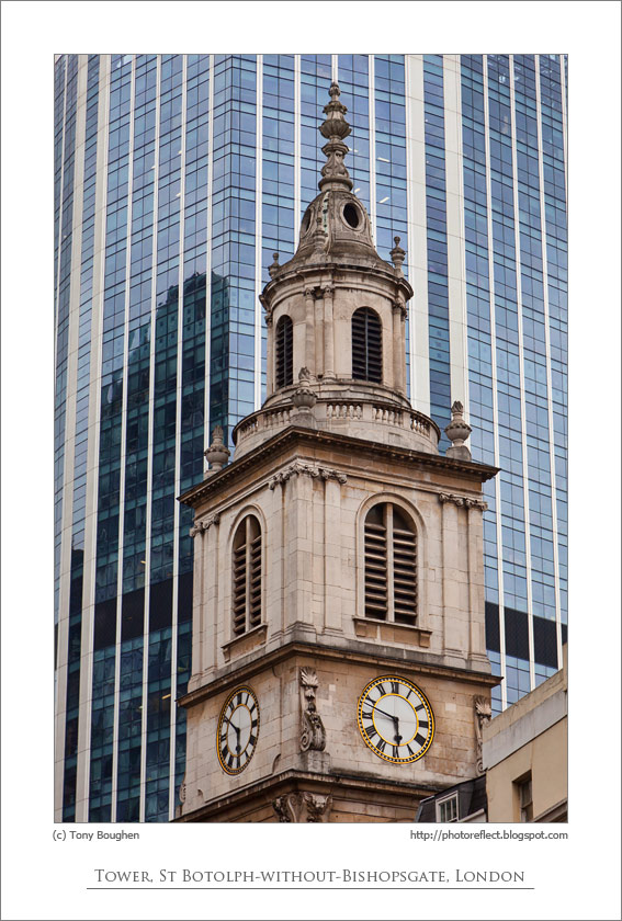
For my personal study, I would like to explore the different styles of Architecture through the ages in Jersey. I would like to do this because I am passionate about Architecture and I aspire to be an Architect in the future. I also believe that Architecture is so important and can transform the way people act and feel within a building. For this project, I will aim to capture the details and shapes of different buildings, both historic and modern. Firstly, I would like to photograph historical architecture such as the unique facades at Havre des Pas. I am interested in taking photographs of older buildings as they have great detail which gives me the opportunity to capture architecture detail photographs. A key Jersey Architect who’s buildings I would like to photograph is Adolphus Curry. Adolphus Curry is one of the most notable photographers and engineers in the history of Jersey. Curry was a member of the Societe of Jersey and played a big role in the development of the Museum and the preservation of many of the island’s historic buildings. Furthermore, Adolphus Curry was a very well-known and loved man and the week leading up to his death in 1910, there were daily updates of his health in the newspaper. Overall, Adolphus Curry was more than just a designer, he contributed to Jersey’s Community by having involvement in other things such as the harbours, railways, sports, rubbish disposal and more. Source
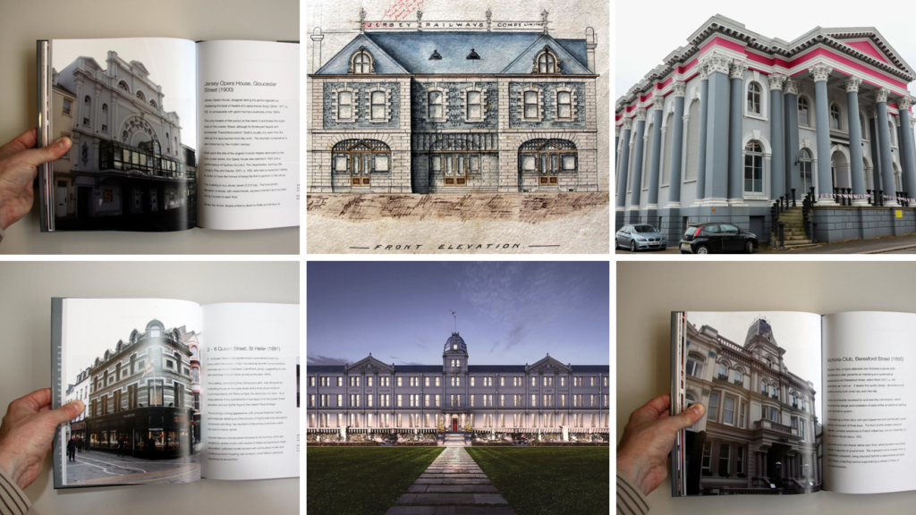
Buildings designed/altered by Adolphus Curry:
These buildings include:
Jersey Opera House
Ladies College
DeGruchy
St Helier Railway Station (At Liberty Wharf)
2-6 Queen Street
Victoria Club, Beresford Street
Ommaroo Terrace, Harve des Pas
Midland Chambers
Masonic Temple
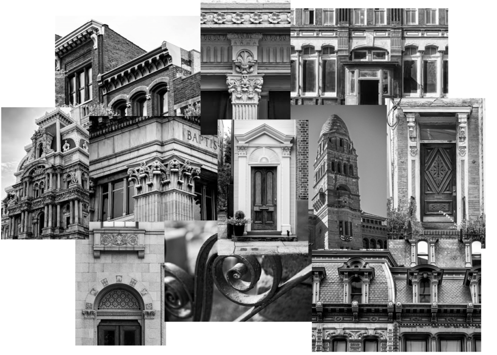
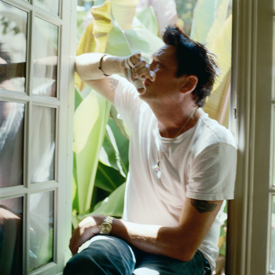
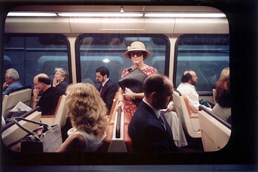
For these images, a key photographer who I am inspired by is Keith Dotson. Here are some images by him which I would like my outcomes to be similar to:
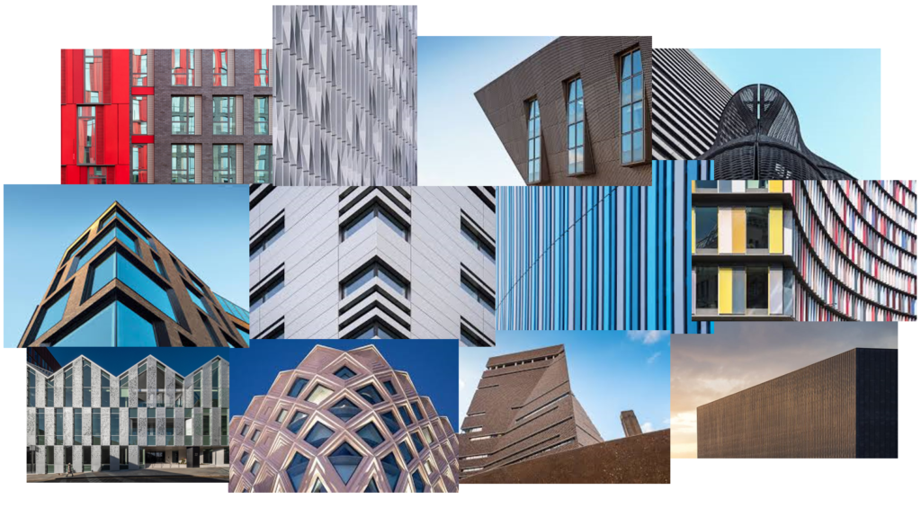
On the other hand, I would also like to photograph modern buildings and their shapes and details. I would like these results to have an abstract approach. I will do this by thinking creatively about the angles in which I take the photographs and paying attention to the framing and composition. A photographer who I am inspired by for these photos is Alex Upton. Here are some of his photos which best indicate what I would like to do:
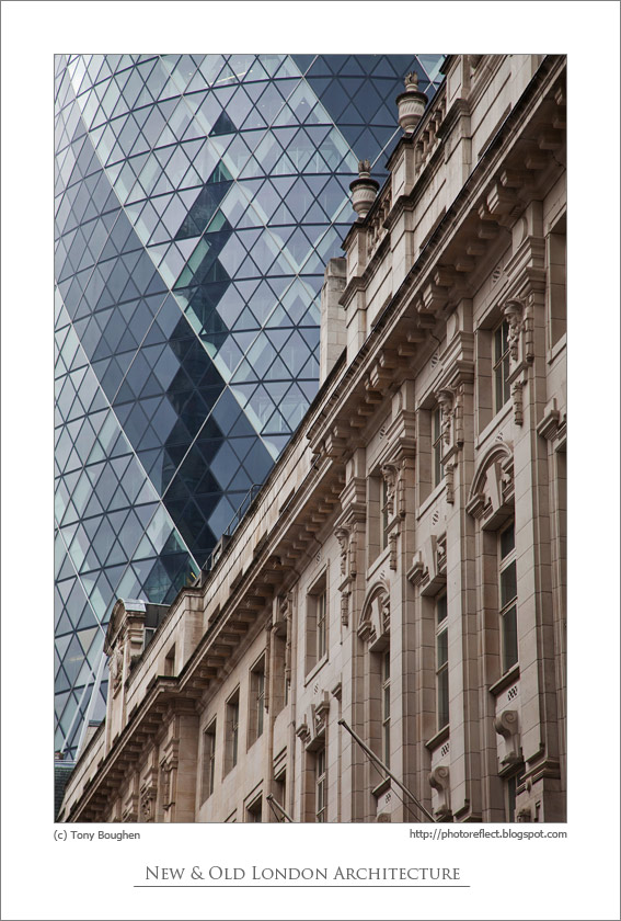
When reviewing my images, I would like to create juxtaposition between old and new architectural styles by finding images which I can match together. I would like to present my final images in a photobook, starting from historical, detailed architecture to modern, high-rise buildings and the juxtaposition between the styles.
Here are some examples of inspiration for these juxtapositions:
I can recreate these ideas by using images of high-rise buildings, such as Horizon Apartments and the International Finance Centre, and manipulate them by editing images of historical/old buildings onto them in Photoshop.
In addition, I would like to do a typology study of the external facades of buildings at Havre des Pas as they have a unique architectural style.
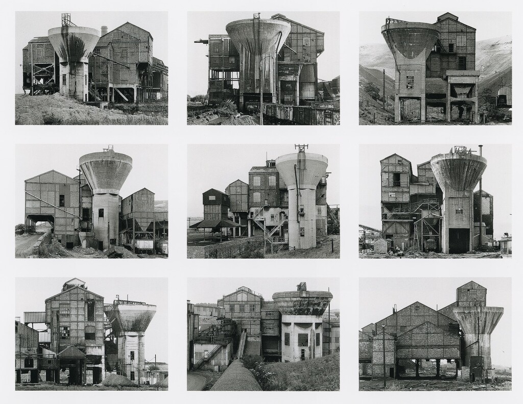
My Inspiration:
Bernd and Hilla Becher, Preparation Plants, 1966-1974
Overall, my personal study will be focused on architectural styles and details and the contrast between the old and new.
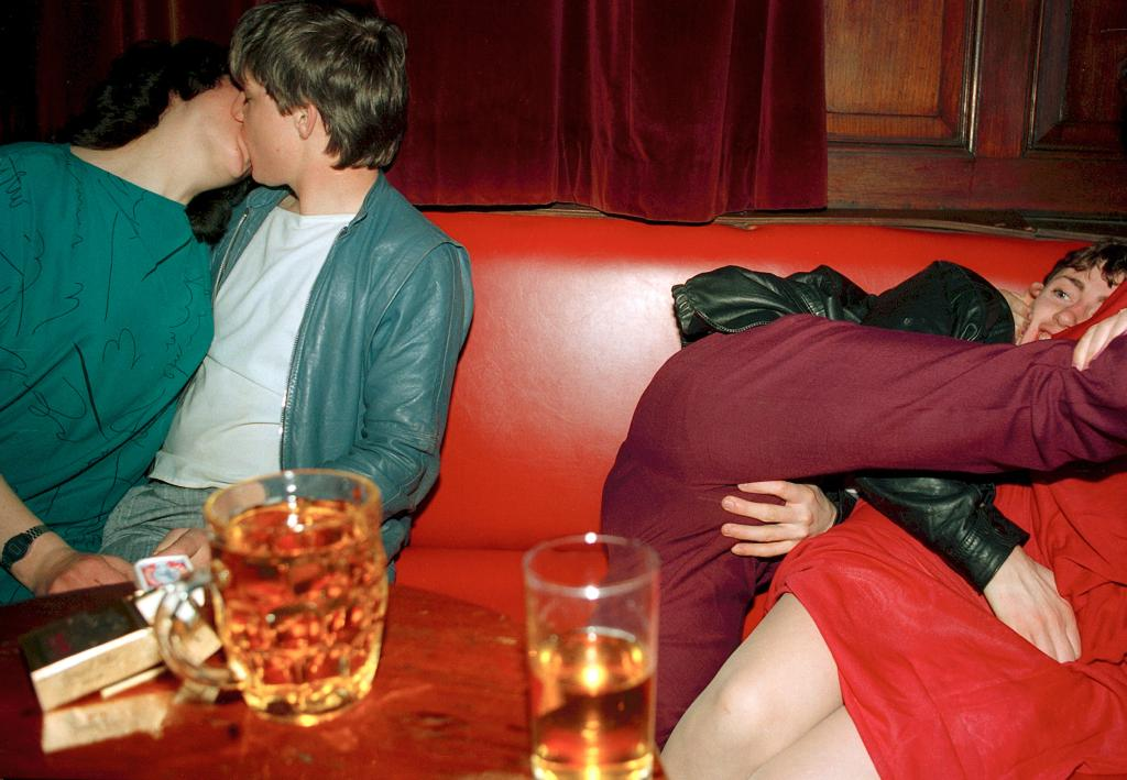
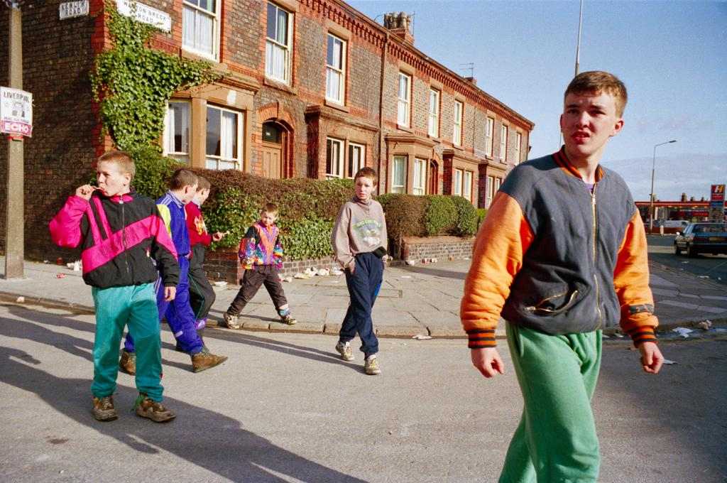
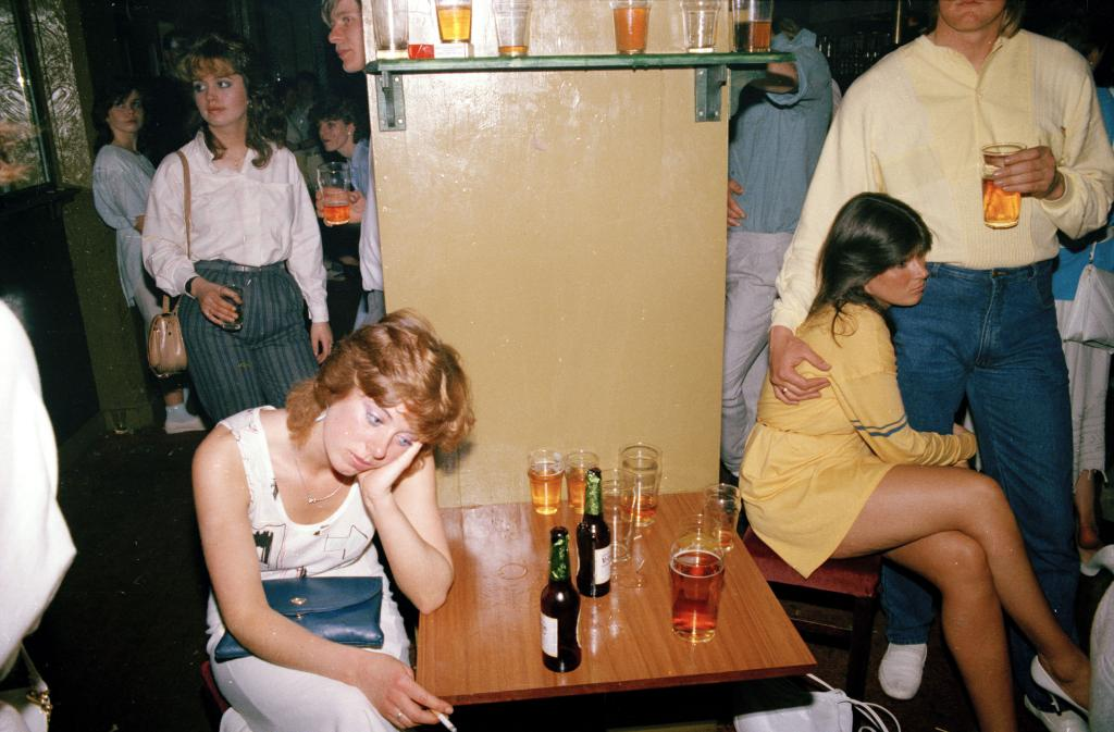
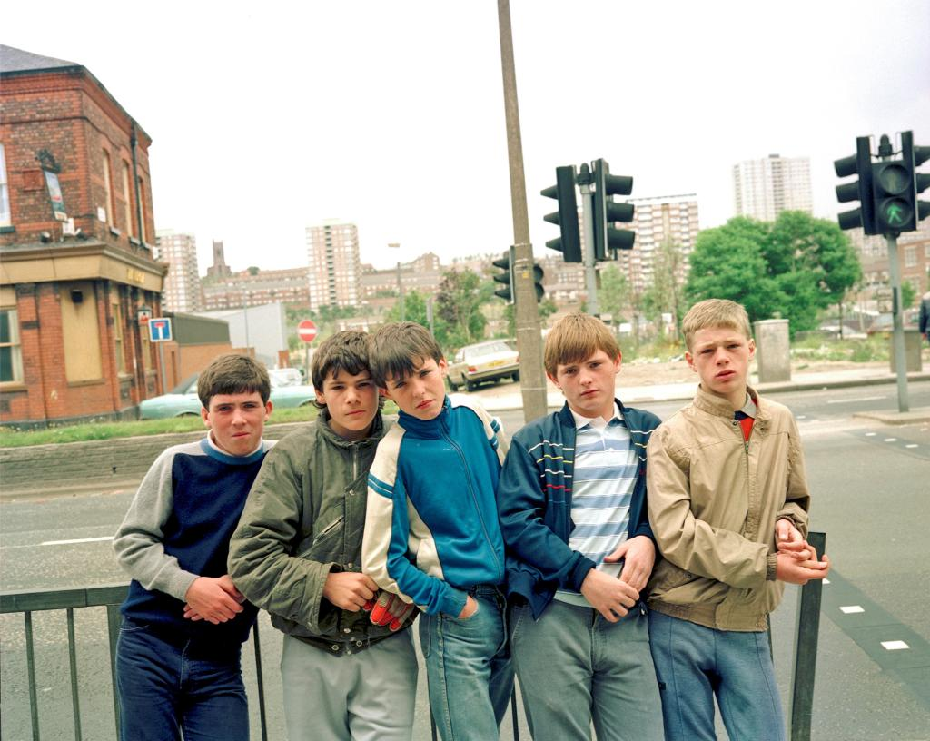
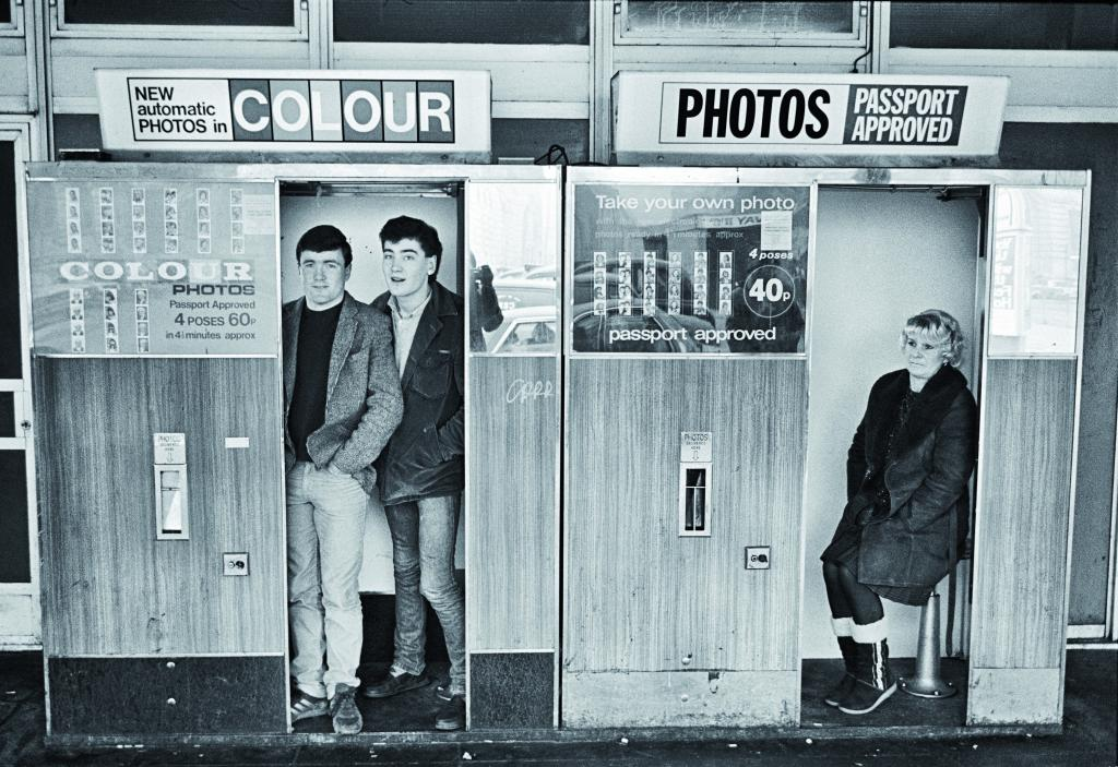
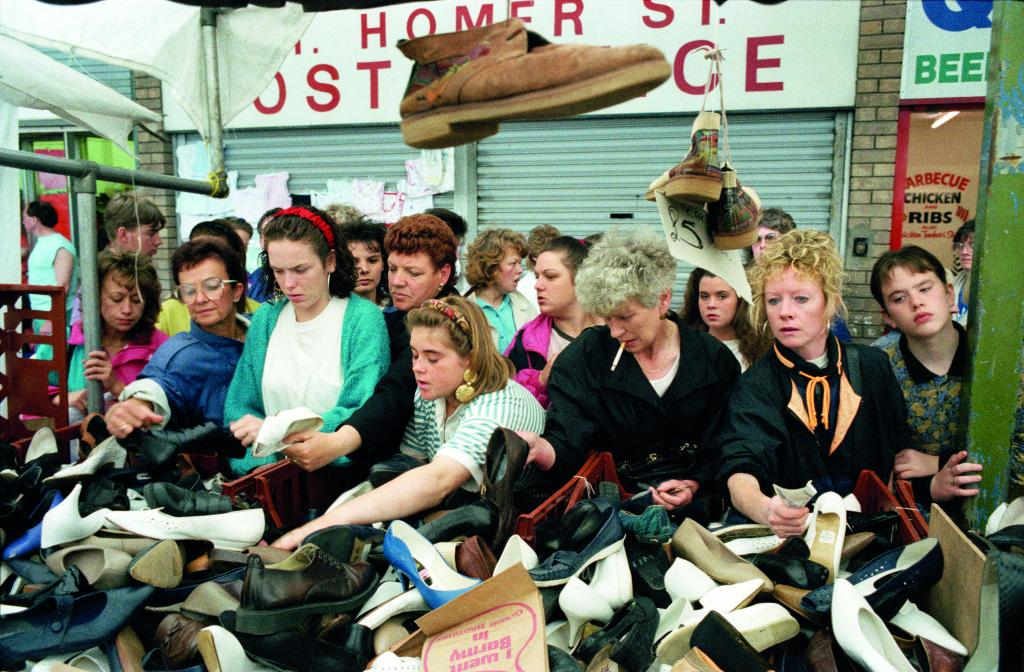
Tom Wood, born 1951, is an Irish street photographer, portraitist and landscape photographer, based in Britain. He was often known as the ‘Photie man’, as he would never forget to bring his camera around where he lived. Wood is best known for his photographs in Liverpool and Merseyside from 1978 to 2001, “on the streets, in pubs and clubs, markets, workplaces, parks and football grounds” of “strangers, mixed with neighbours, family and friends.” Most of his most famous photos where a 5 minute walk from his house in Liverpool, creating interesting stories in each of his street photos. The critic Sean O’Hagan has described Wood as “a pioneering colourist” and “a photographer for whom there are no rules”, while keeping it “up close and personal”.
‘I started doing portraits of these kids hanging around on drugs, or whatever, and some of their parents. It was really tough’
Here are some photos shown in various national museum’s in Liverpool:
As you can see, each image can be a very interesting image on its own, as the context and amount going on in each photo allows that. He didnt have a set way to take his photos, he used whatever he had at the time and walked around looking for interesting subject to take a photo of, some being staged and others being street photography. So many photographers grub about until they have a formula, and then force all their pictures into the same mould. Not Wood. Forever unsatisfied, never content to make a series when a single picture will do, his curiosity and his intellectual powers always fully engaged, he has roamed around making pictures of the world he lives in.
Partly due to cost, from time to time he has used old cine film and out of date film stock for his pictures. This lends a grainy quality to the film, most evident in Bus Journeys. However, his use of medium formats lends fine detail to the negative, allowing much more visual information to be revealed through the printing process. Wood has also tirelessly experimented with printing papers to create the exact colour balances and textures he requires. For him, analogue rather than digital printing, and making his own prints in the darkroom, are important. He sees photographing, printing, selection and editing as inseparable parts of the process of photography.
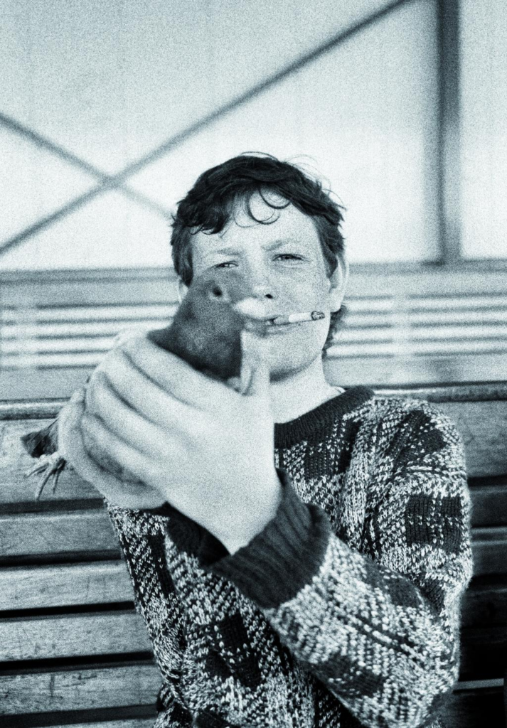
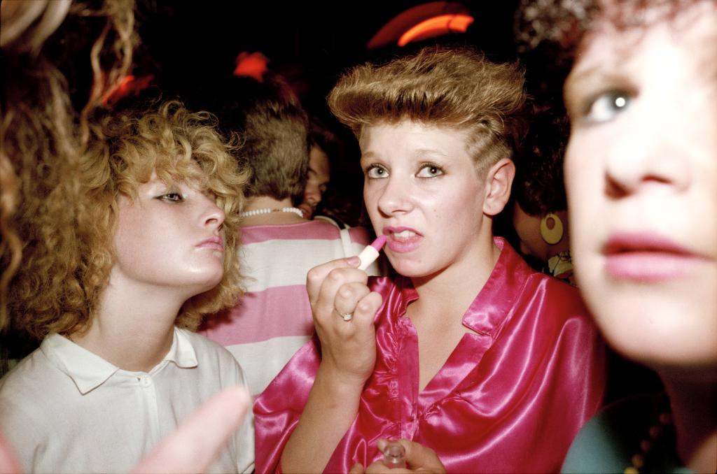
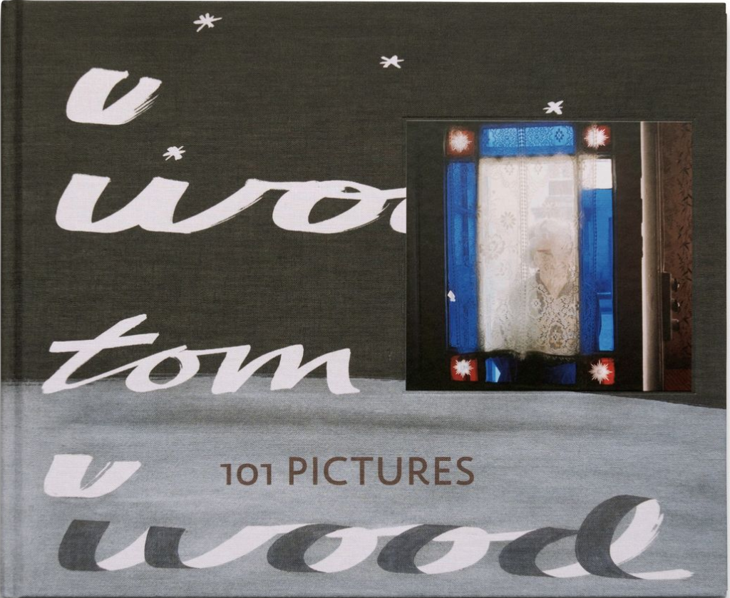
101 pictures- 2020
Here, I chose 2 photos from his book ‘101 pictures’, it includes many of his most famous photos from his many years of taking photos.
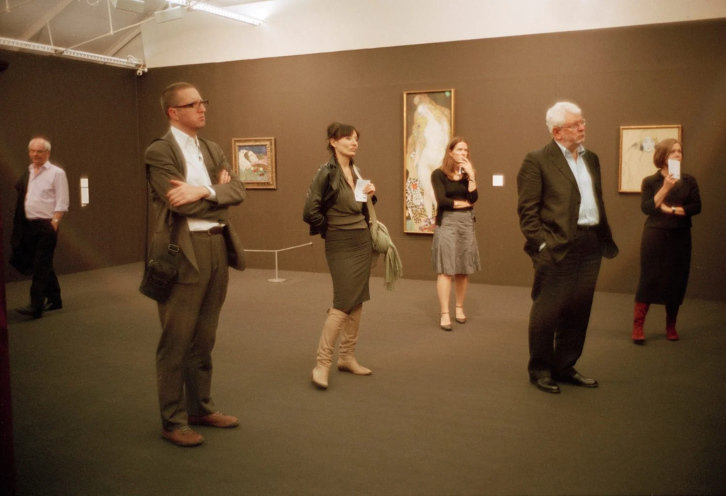
The Final Thought… Champagne PV Tate
Here you can see five people stand apart looking towards and contemplating an artwork out of the frame of Wood’s picture. The lighting is almost oversaturated, and its cropped to only show the people looking at the picture. The temperature is defiantly on the warmer side, with more red and orange colours that blue and purple. This photo is a big contrast from his usual photos, with more upper class people being included. The fact that they are standing equally apart, disconnects this image to reality. This could also be seen as the upper class disconnecting and distancing themselves to middle and lower class people. This is further added by how everyone is lost in there own thoughts, with no connection between each of them, their sobriety of behaviour matched by their dress, which is echoed in the browns of the gallery space. Even the brown, equally spaced framed images behind the subjects matches the overall boring, repetitive theme of this image. However, the 6th subject on the left seemed to have seen the camera, giving this photo some reality, allowing this image to stay somewhat similar to his others.
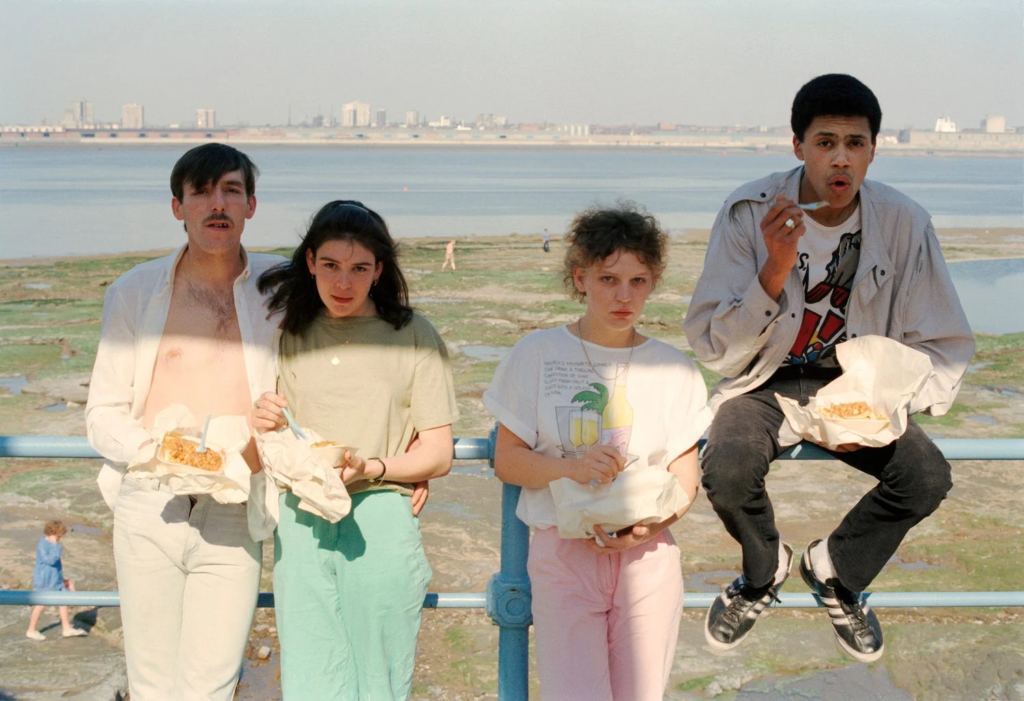
Beans and chips 2, 1990
This image is a more ‘traditional’ tom wood photo, taken in Liverpool, which contrasts the imaged I used above with everything, from the lighting to the way the subjects are portrayed. here, light is an essential feature of this image, with the suns patchy light illuminating four young people as they eat there chips and beans at the sea front, with a colourful blue rail behind them, adding a barrier between the foreground and background. The barrier also adds lines across the photo, drawing the eyes towards them, thus drawing the eyes towards the unrepetitively placed subjects. This uneven placement of people makes it seem real (documentary). Each person in this photo is wearing bold and brightly coloured clothes, further giving this image life and value. I think the best part of this image is the peoples faces, each being unique and funny, which makes the viewer think about there stories and the connections between them.
Sam Taylor-Johnson – crying men
Sam Taylor-Johnson, born in 1967, is a British film director and artist. She began her creative carrier with fine art photography in the early 1990s, collaborating with Henry bond and creating a pastiche of various things, like the photo taken by Annie Leibovitz of Lennon a few hours before his assassination. However, she isn’t known for her photographer work back when she was younger, rather her as being a famous film director. So why am I talking about her? its because she created a series called ‘crying men’ which shown many male actors crying in films. From 2002 to 2004, after Sam had battled breast cancer, as an ‘exorcism of tears‘ she photographed actors crying, a mix of old Hollywood actors as well as young up and coming actors at the time. It was a revealing look at some actors you may not have seen cry on screen and raises questions about how masculine vulnerability is portrayed on screen, as well as how society has drummed it into men not to cry. I think this series is very impactful to see, as actors like Michael Madsen can be seen crying, and he’s usually depicted as the ‘tough guy’ in films. Men’s mental health is becoming a serious issue that’s been overlooked for many years and only now people are beginning to take action. For example, the highest cause of death for men under 45 is suicide, facts like these brings more attention to the topic of men’s mental health.
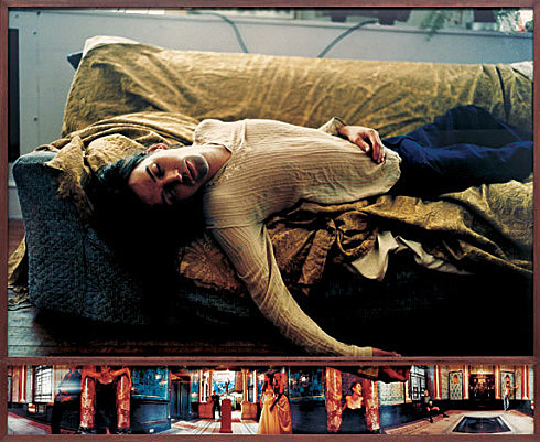
Soliloquy 1
Here is Taylor-Woods image ‘Soliloquy 1‘, we see a man exhausted on a sofa, with his right arm hanging lifeless to the floor. This pose is emulates a very popular work by painter Henry Wallis, the death of Chatterton (1856). The light source coming from behind keeps the main subject mostly in the shadows, giving a more dramatic image.
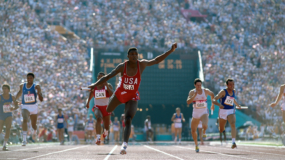
Neil Leifer
Neil Leifer (born in 1942) is probably the most well known sport photographer and created some of the most iconic shots. I will getting some inspiration from him when I turn towards sports, specifically basketball, when linking it to masculinity.
Leifer often uses unique angles and perspectives to tell a story through his images, setting him apart from other sports photographers. His style is characterized by a keen eye for composition, timing, and the use of colour and light to create dynamic and striking images, allowing him to capture the intensity and emotion of the athletes in his photographs.
Here are some photos I like:
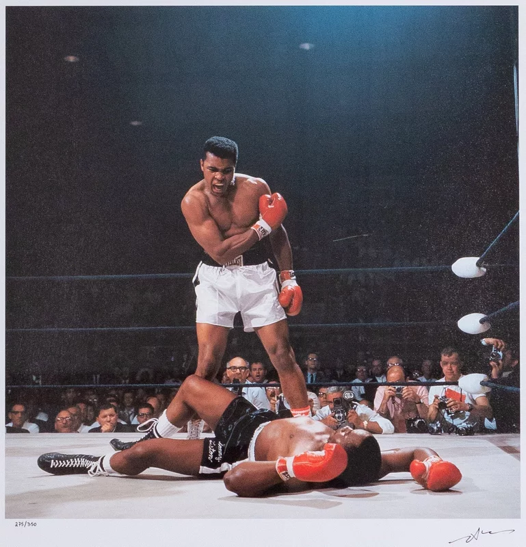
All these photos are incredibly dramatic, from the intense facial expressions to the detailed backgrounds, each with there own unique stories. The photo with Muhammad Ali (likely the most famous boxer of all time), is particularly dramatic. It shows a victorious Ali standing over the defeated Sonny Liston, shot during a 1965 world title fight. Leifer admitted that luck played a big part in getting this picture, since if he was positioned in a different part of the ring, it would the photo would never of been as famous. However, even with his luck, creating a photo like this requires lot of skill, as the cameras back then where not as easy to use as they are now, as well as trying to get that close to the ring side. The buzz and excitement is also been presented very well in this image, with countless camera all around the ring, and the tense Ali standing in the centre of the frame. Below are some quotes that I will take note on with my photos:
“I always try to tell a story with my pictures. You have to know the sport and the athletes to be able to anticipate the action.”
“Lighting is everything. The difference between a good picture and a great picture often comes down to the way the light falls on your subject.”
“I’ve always believed that you can’t be in the right place at the right time unless you’re in the right place all the time.”
Some more research that I may or may not use
I had also done a little bit of research on these photographers:
Sarah Jones
Gregory Crewdson
Jeff Wall
Tom Hunter
Philip Lorca Di Corcia
Justine Kurland
Troy Paiva
Paul M smith
Martin Schoeller
New York-based photographer whose style of “hyper-detailed close ups” is distinguished by similar treatment of all subjects whether they are celebrities or unknown. He has managed to get many famous people (like Koby Bryant) to be in his portrait photos.
Sophie Day is another photographer I will be getting inspiration from. She spent three years continuously photographing close male friends, amassing an archive of their shared experience. Along the way, she refined her own understanding of masculinity – a girl amongst boys, reflecting on their social codes and behaviours. Here are some photos I like:
Throughout this project I am going to explore the theme ‘Street photography.’ I feel there is much more to explore within street photography, as what usually goes unnoticed is actually the most interesting thing to capture. Through my interest in art and painting, it had inspired me to look differently at what makes up the streets, for example colour to features of buildings, road signs, lights, signage, posters, and letters. I feel like this alone makes the street a much more vibrant and lively place when you look closely into it, revealing alsorts of hidden features. From this I am going further experiment looking closely into visual elements such as colour, shape, texture, composition, pattern, line, and space. Looking at the graphical and structural elements that contrasts each other is what I am interested in exploring. Further developing my photos in lightroom to intensify the original colour, and formations.
o explore this concept of ‘capturing unnoticed,’ as this will not only engage the viewer but reveal something. Exploring this I
Why it matters to you?
Through knowing different styles of art, I look at the streets in more artistic was paying closer attention to minor details, colours or formations which all work together to create very visually appealing streets. I like admiring colours expressed through graphical signs/ prints and on architectural buildings, to further looking closer at relfections and shadows or people and other interesting objects that make up the street. Fomalism is abstract art. The particular way colours are distinguished between more colours, separated by distinct lines is further represented within the streets whether we notice it or not. This concept really inspires me as I admire this contrasting effect formed through different ways. The graphical prints created by the sold block colours which are further expressed with details create this type of contrast as unusual shapes and outlines are formed through this.
How you wish to develop your project?
Inspiring artists Saul Leiter and Lee Friedlander, show how they use similar techniques being inspired by formalism. I am going to take various approaches they use, in particular abstraction. This idea of presetting photos in an unrecognisbae way, but engages you through the use of expressive formations and vibrant colours presents a unique perspective of street photography.From for example using popele as subjects withtin the street. This will allow me to create a contrasting feature to explore with overall adding more to the image.
I want to use aspects of street photography within my own work, inspired by Lee Friedlander and Saul Leiter. Then further zooming into aspects that are personal. For example looking at signs, then seeing this in relation to someone within a photo, like getting their expressions and relation to the words. Further developing this by zooming in on how this signing and wording has a relationship with them personally. This will create this documentary and series of photos that express this gripping narrative, and unique approach to street photography. Exploring this through the composition of lines, pattern, space, form to colour, texture and tones, which will help me achieve this high contrast effect between these different elements, working together communicating this engaging and visually appealing narrative.
Which form you wish to present your study (photobook, film, prints etc)
When and where you intend to begin your study?
I am going to start off with capturing interesting formations and structured elements that i and interesting and unique, from signs and wording, to reflections of people through windows to buildings which will create this visually appealing composition. When taking the photo I want to have in mind this element of high contrast which I am going to express through the photo; layouts, lines, how the person is displayed within this, overall creating engaging shapes and colours.
how you interpret the themes of ‘OBSERVE, SEEK, CHALLENGE’
Throughout Observe, seek and challenge I am going to explore street photography and people but making it personal through using people I know and places I am familiar with, documenting a story that personal to me, following . Inspired by Saul Leiter, I love his use of bold compositions created by contrasting elements through colours, reflections, lines, shapes. I love this structural look created by colour, shape, texture, composition, pattern, line, space ,
This will overall help me a I feel this approach wiI want to show a journey throughout, creating a sequence of photos.
I am going to take photos at different points of the day, for example during peak hustle and bustle times of the day, to during the evening and at night.
At night – capture people going out, in their outfits,
look at buildings that have a meaning around time then focus in on someone – follow them i the moment
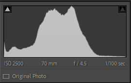
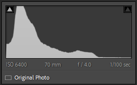
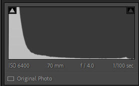
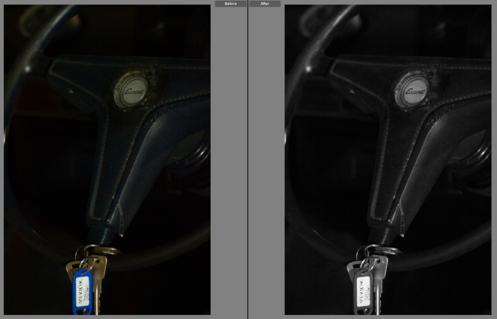
This shoot was challenging in terms of lighting and angles. After spending well over an hour shooting I only got 42 photos, I did get some good shots though. As shown above there were a few good shots but they do need some work as the lighting was yellow at times.
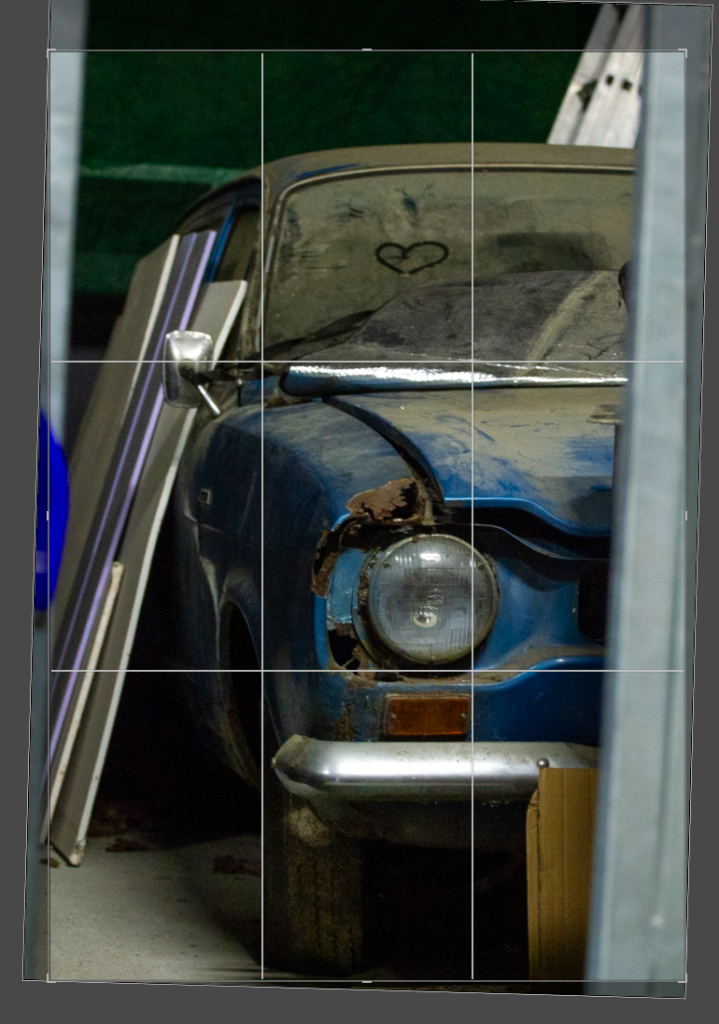
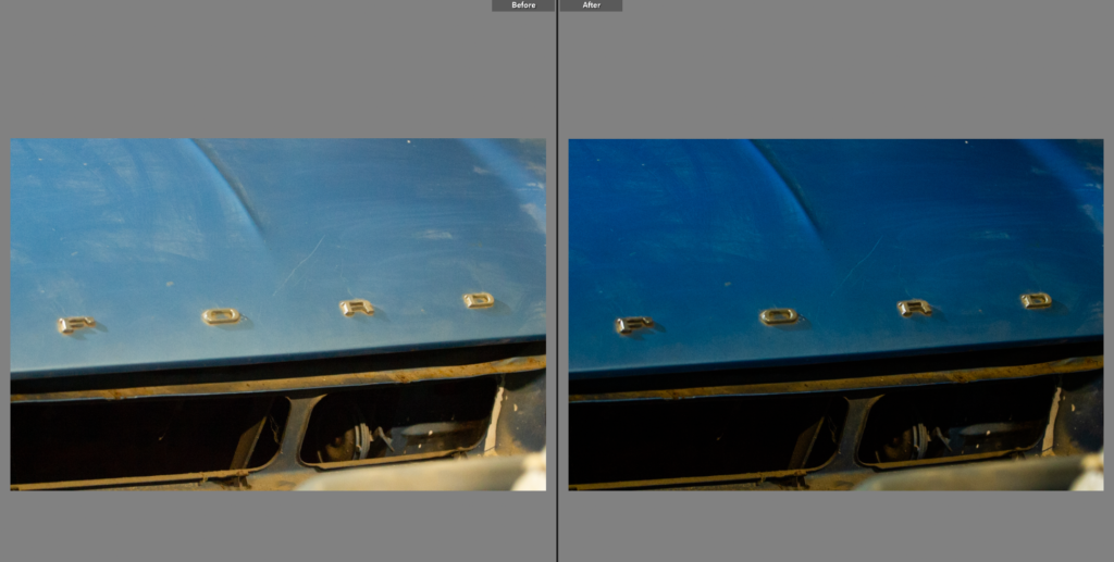
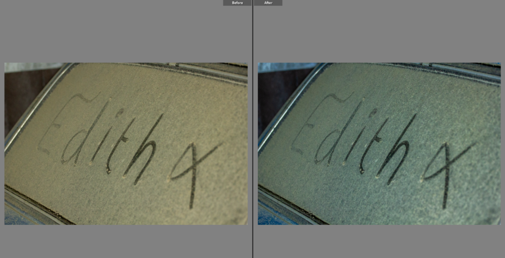
Edit One
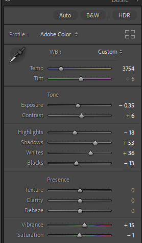
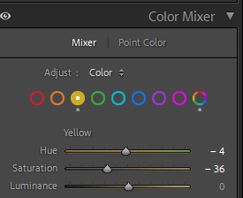
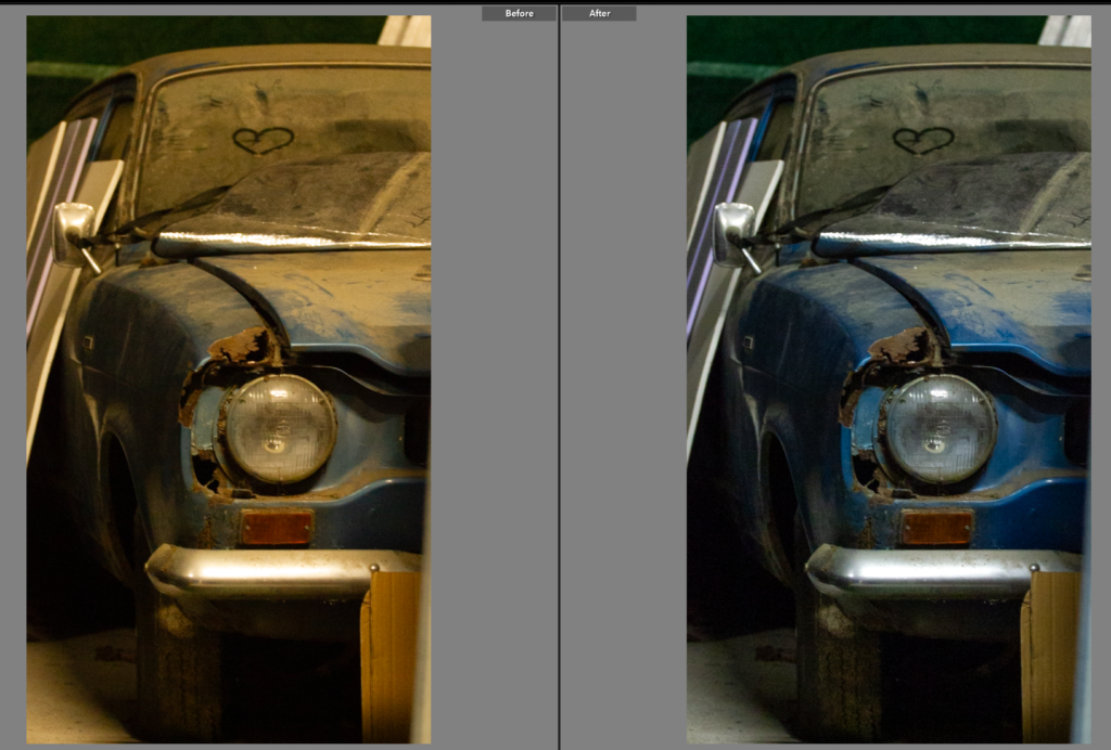
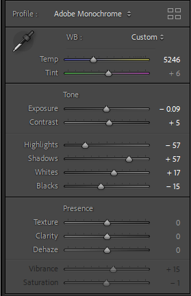
I like the composition of this photo as it has a good angle and shows a good portion of the car. However before editing the colouring is very yellow which while it does give the photo a nostalgic look to it, it would be hard to link all the photos together in terms of lighting as daylight photos. It also means the true colour of the car is shown. To change the lighting I adjusted the temperature to remove some of the blue hue, I then went into colour mixer and selected mixer and went into the yellow and chose to turn down saturation so the yellow lighting was lessoned.
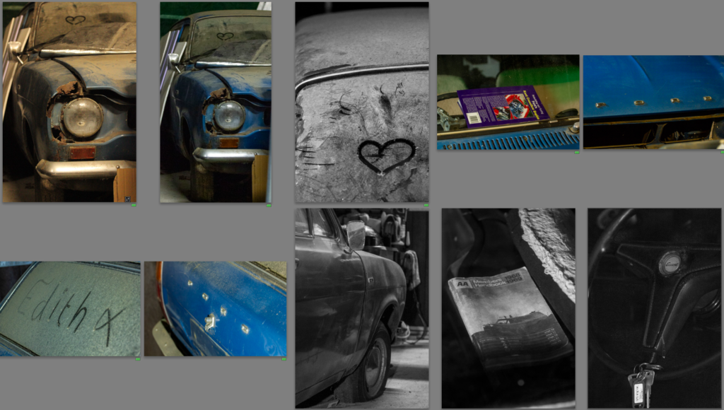
Edit Two
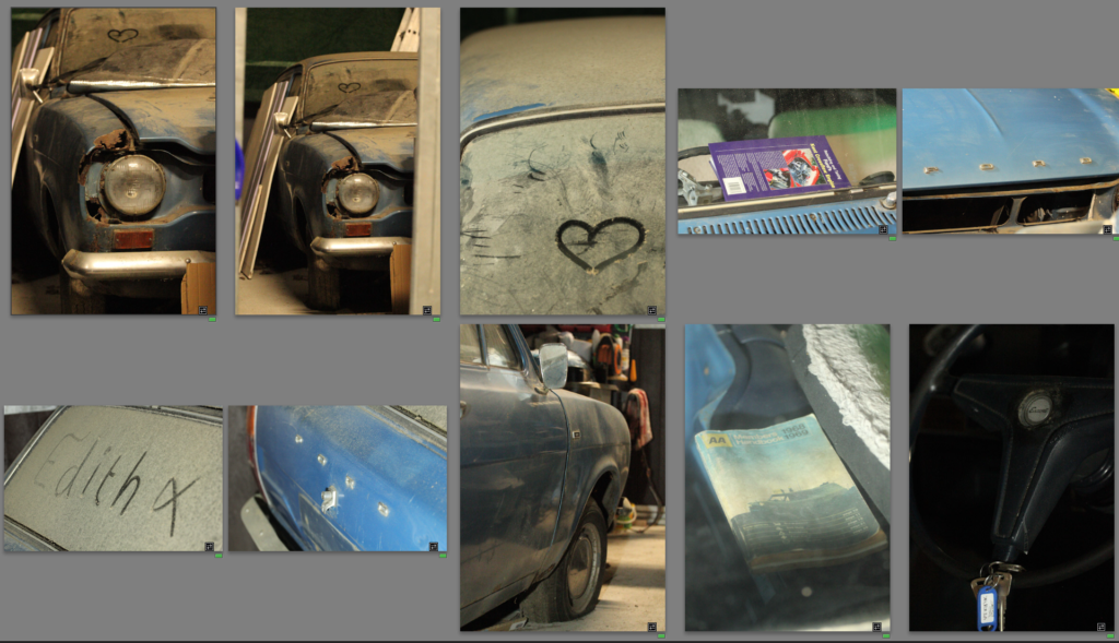
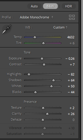
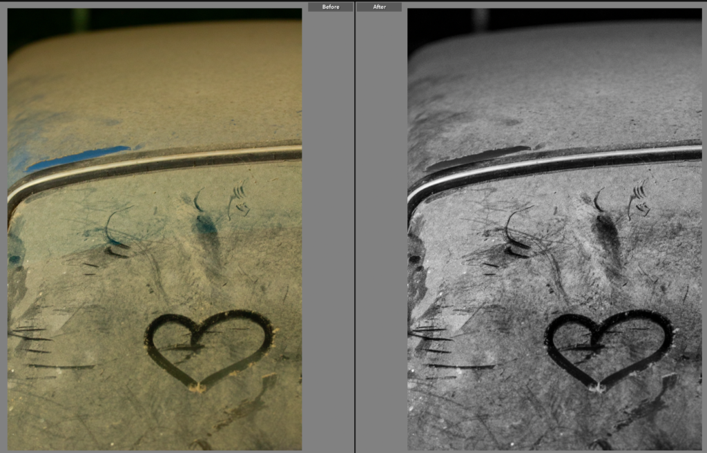
I spotted this heart drawn onto the car, it made for an interesting photo so I composed it outside of the rule of thirds as I didn’t want it to be the main focus so much as a part of the photo. I wanted a photo as I have a habit of drawing hearts onto my bike when it’s muddy so it will be a connecting shot to my own bike which probably also has a heart drawn onto it. I chose to make the shot black and white as I think it adds to the atmospheric feel to the photo. Within this edit I adjusted the tone to make it a high contrast image. This shot in itself is abstract, with minimal parts of the car shown but it will connect well with the next shoot as well as providing some family connection with the car having a heart drawn onto my mothers car and then a heart drawn onto my bike.
Edit Three
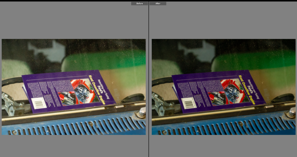
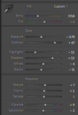
This photo is a great contextual image, I think it shows the love for the car and the age of the car being present in that all the books about it are still books not videos or online manuals. The composition of the shot is good so I didn’t need to crop it. However the colours are dulled down, so to fix this I reduced the exposure and then adjusted other contributing sliders. This helped bring out the true colours and made for a better photo.
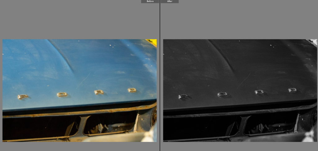
Edit Four
This shot was a confusing one to edit, I liked the original shot but the colour of the metal was wrong as the yellow lighting effected it. To counteract this I changed the exposure and then the highlights and shadows. I still did not love this image as now the car was not true to it’s real colour. Black and white was the next step as then the yellowness wouldn’t effect it. I chose a high contrast, stark editing style, this highlights the details and shadows of the photo. I liked this as the ‘ford’ stands out really well against the darker background.
Edit Five
This shot on the other hand didn’t need much editing as the yellow lighting suited the brown of the dust.
Edit Six
This is again another shot that doesn’t need much editing as the colours already went well. Having used the 70-20mm lens the frame is already a tightly framed shot so the composition was important, having framed the car on an angle to the lens it added dynamic to the photo as well as providing a well composed shot, with interesting angles.
Edit Seven
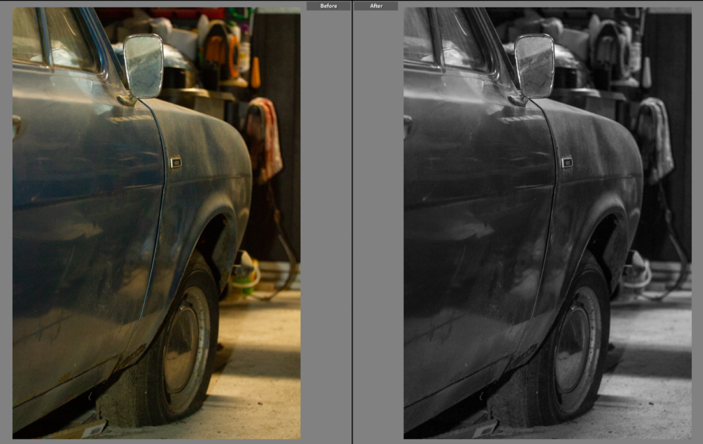
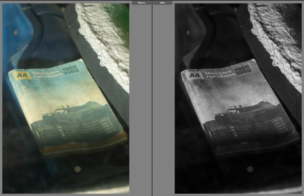
This shot is interesting within itself with the age and condition of the car showing. However I found the background distracting so decided to change the photo to black and white to add not only deeper tone to the car but remove some of the complexities in the background. This also worked really well to neutralise the yellow tone from the lighting.
Edit Eight
This shot while a creative, interesting image, having been shot through a windshield with multiple leading lines and context on the car. Overall I like this shot but it is a much more impactful image in black and white as while the book still appears worn from its age it doesn’t have the same washed out colours. The tone of the image is completely transformed once the image was edited to black and white as the high contrast shot, similarly to the previous shot it removes all the background busyness that doesn’t benefit the shot. This also provides a base for any future black and white shots as I have a style to base it off of.
Edit Nine
This image again is much stronger in black and white, it has removed the washed out colours and new key colour but kept the apparent wear to the car. It has also brought out the highlights in the shot, showing the badge in the steering wheel and outlining the wheel itself.
Final Images
After editing these photos I noticed, while I didn’t dislike the results I felt I could get more similar shots with a different lens. I would like to redo this shoot with a 18-105mm lens as I would have a lot more range in the shots I could get. I did however end up with a strong set of images with a mixture of colour and black and white shots. I think the detail shots were particularly successful and created a strong starting point for this project. Having researched Keith Dotson’s work on old cars in a forest, left to rot I wanted to take a similar approach using highly tonal images with a range of wider angled shots and closely framed shots, although shown in both mine and Dotson’s work neither of us feature much of the background as for wat we are trying to show in the images it is not too important and can be distracting.
For my personal study, my inspirations come from the work of Carolle Benitah and Philip Toledano, two artists who utilise the theme of nostalgia, family, memory and loss in order to challenge events that have occurred in their lives, specifically in childhood. This is something I want to reinterpret in my own way and apply it to my own circumstances, that being growing up with a sibling who develops Bipolar disorder.
First Idea:
My first photoshoot idea solely comes from the work of Carolle Benitah. Benitah takes images from her own family archives, such as photo albums, and uses different mediums to symbolise different events that happened which are linked to the image itself, or the people within it.
She also uses the same consistent shade of red within each image to make them all link and be cohesive in the story that she’s trying to tell – this is something I have thought about doing but with a consistent shade of blue as this is my brothers favourite colour, however I need to think about this a bit more as I am unsure at the moment. But, if I do use this inspiration, I may be able to apply this into each photoshoot so that all my images link and show a clearer reference to Benitah.
As my inspiration, I am going to go through the images that my parents have involving my brother, whether that be just him, me and him or all of us, and photograph them. I am going to do this either by using the studio or creating my own small studio at home using black card as the background so that I can crop any spaces after. If this is unsuccessful, I will photocopy the physical image itself. This is because I don’t want to tarnish the actual picture, so by creating a copy this then allows me to be experimental with different mediums – such as paint, ink, thread, glitter – multiple times. I also do have digital images from my mum, meaning that I can print multiple copies off to also be able to experiment and not be worried about it being ineffective.
Second Idea:
My second idea stems more from the work of Philip Toledano, looking at the still-life’s he took of his sisters belongings from before she died as a nine year old child. Toledano took an assortment of Claudia’s belongings and keepsakes from her childhood and photographed them using a birds-eye view technique.
This is going to inspire me in my second photoshoot, beginning with me asking my parents for everything and anything they kept from mine and my brothers childhood, with the objects ranging from birthday cards to baby toys. Anything I can find I am going to photograph in order to have a wider variety of images to choose from as this will enable me to be more selective in choosing which images are the best, link the story well enough, and carry the most meaning. If I do this well, I think this will make my photobook more emotive, and encapsulate the heaviness of this topic behind it. I am going to try to achieve the lighting technique that Toledano uses, being that he uses geometric shapes in order to add that ‘out of place’ tone within the images. However, if this doesn’t work I will be able to find a way to do it on Photoshop by merging the two images and making one in black and white and the other in colour, then cutting out my desired shape in the black and white image, finally layering the two over each other so that the shape I have created is the only part of the image that is in colour.
Third Idea:
My third category of images that I am going to use is going to be of different locations that resonate with my brother and relate to his childhood. For example:
My house
Football fields
My estate
My garden
The hospital that he goes to
These are only just a few I can think of at the moment, however I will ask my parents where the best places to go would be as they will know from taking me and my brother.
However, I don’t want my images to just be plain landscapes that don’t really fit in with my other two photoshoots so I am going to hone in on form for these images. My second zine that I did for Jersey’s maritime museum was very focused on the form of the landscape instead of the aesthetics of it, which is why I want to use this knowledge in my own personal study, as this is a good representation of seeking out the environment around me as well as portraying the context of my brothers story better. When I go to these places, I am going to take multi-shots to be able to distinguish the best images and be able to experiment better.
Overall, a key aspect of my work is going to revolve around form and shape, specifically in my third photoshoot, however this is also going to be demonstrated in my second photoshoot in a more discreet way. My photoshoots may change as I begin to work on them next week, however I need to remember to be experimental and explore different ideas by taking risks.
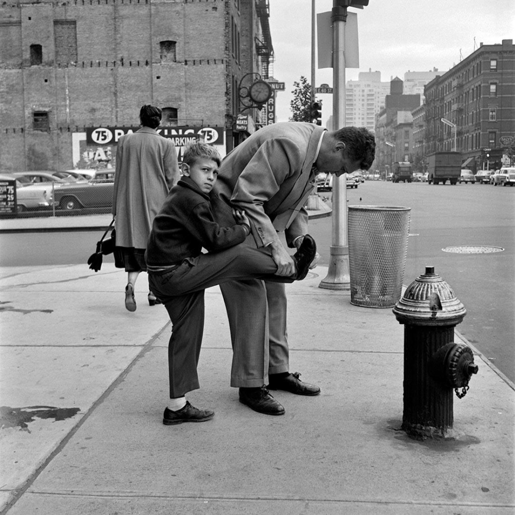
This image was taken by Vivian Maier, this is an example of candid photography. Where the people aren’t aware that they are being photographed. As you can see the little boy is looking at Maier and not the camera which shows that the camera is not distracting anyone from doing their everyday things. This image has a dynamic composition that draws the viewer’s eyes to the interaction between the two central figures. The diagonal in their posture adds visual energy. There is a strong tonal contrast between the light and dark areas, typical of black and white photographs. The lighter tones would be found on the central figures, their clothes contrast with the dark background details like the building and pedestrians. The juxtaposition of the man tying his sons shows on his knee creates a quirky and unexpected look. This photo has a very busy background which adds loads of details to the image, the fact that there are other people in the photo makes it look better, it helps to add more effect to the image. This image shows us a bond between what looks like to be son and father, this could be seen as a wholesome photo to some people, however others may think that this is a just an average image, many people can interpret different things to one image. I would say that this son and father have quite a good relationship, but it could be just for show, one image can’t tell you the whole story. It seems to be quite early, and the dad is bringing the son to school, they are dressed up in fancier clothes than everyday wear. Although this could be what they wear every day and they are just rich, back in the day and still now richer people tend to always be wearing suits rather than jeans and a top. The whole point of this image can show us that there is a lot more meaning behind an image that you may interpret. There is a lot of detail in this image that can lead to people thinking certain things about this image, really people are just guessing. This image is seen as quite modern due to the black and white effect given to the image. One thing that is controversial is the truth behind this image, different people have different views and spot different things first, it’s all about what Maier wants to represent that is important otherwise this image could mean anything. Vivian Maier states that the moment that she has photographed is forever gone, it will only happen once. This could make this photograph a lot more meaningful whether the two main people in this photograph as still alive or if they still have a close bond, there could be a plot twist where both the little boy and older man don’t know each other and its fully staged, although I do know that Maier’s images are not staged but they could still have a completely different interpretation that the viewers may perceive. Vivian states “I am a sort of spy” suggesting that she keeps an eye of her surroundings and tries to capture anything that is unusual. Things that stand out, any unspoken narratives that aren’t always visible to the naked eye. Sometimes the camera picks up things that we don’t, for example Maier’s focus would be the two boys/men in the image and not quite whets in the background, the fact that there are vans and cars help to make the image more alive and detailed. This image shows the history of what New York used to look like, things have changed such as the buildings, the roads, many plants in the surroundings and signs. It’s a captured image of the past. I do like how in the background it almost looks foggy which could be due to the black and white effect, but it almost adds its mysterious look to the photograph. It could also be the clouds as it doesn’t look like it would’ve been a good day. Overall, I do like this photo as it holds many different meanings to different people.
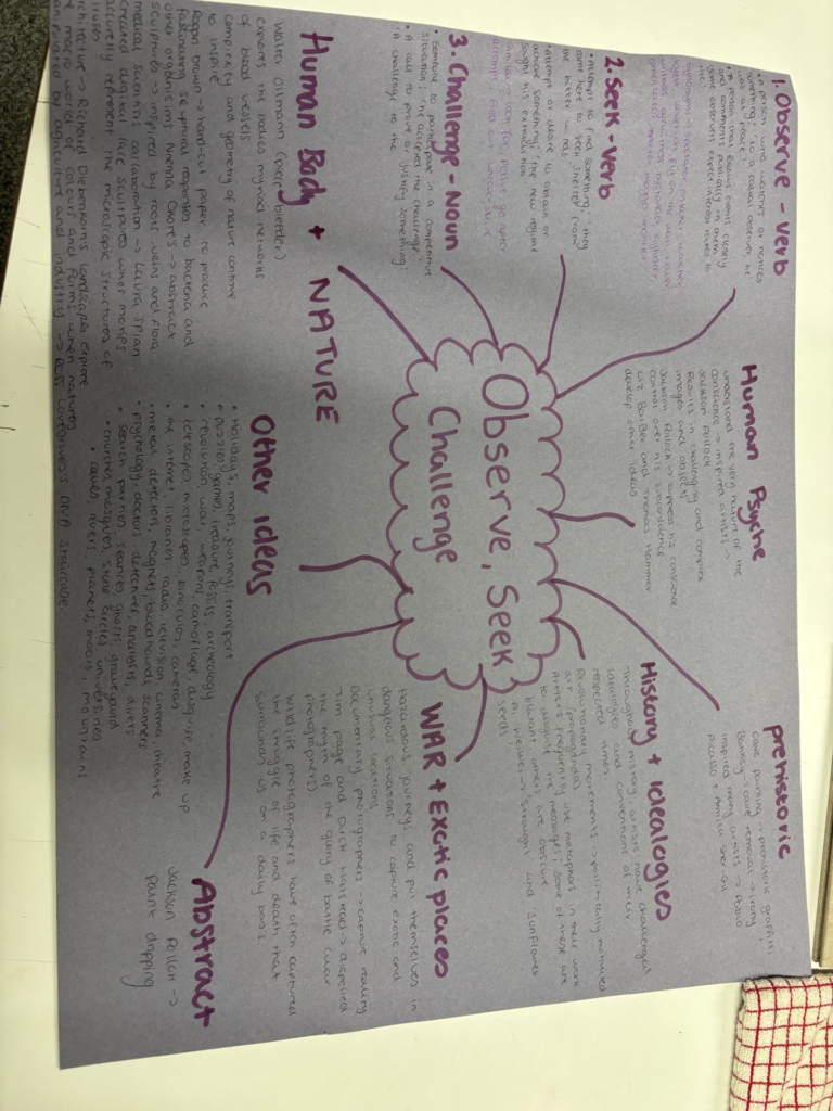
The personal study is based around the theme observe, seek and challenge.
Mind Map
Mood Board
Mood Board Analysis
My mood board includes a large range of ideas for my personal study of observe, seek and challenge, because I am not sure what theme I am planning on doing for my personal study yet, so I have included them all the get an idea of my options. I have included the themes which I have talked about on my mind map.
This is a rather large mood board containing quite a few images, compared to the usual mood boards I make, because I wanted to include a large range of themes that I could explore.