Justine Kurland
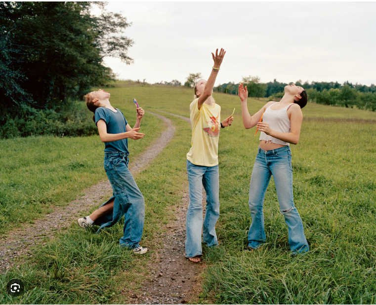
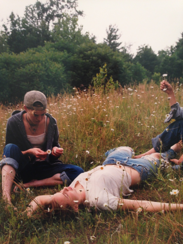
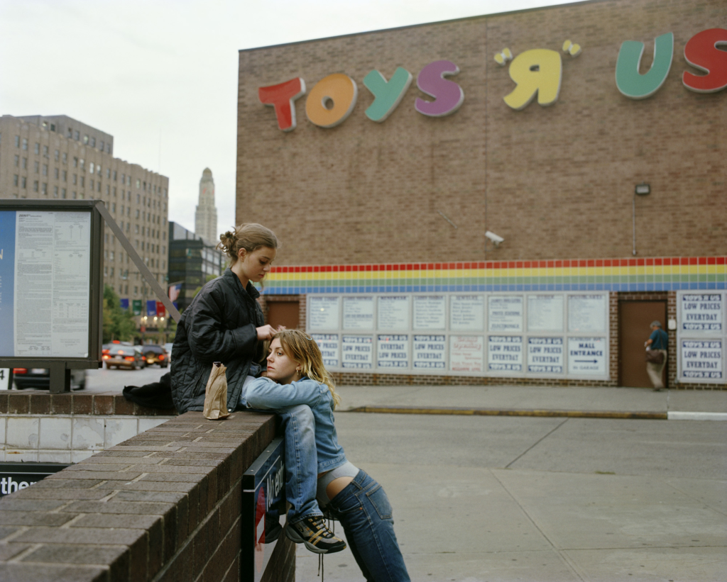
Justine Kurland was born in 1969 and is an American fine art photographer, based in New York City. She first gained public notice with her work in the group show, called Another Girl, Another Planet (1999), at New York’s Van Doren Waxter gallery. The show included her large c-print staged tableaux pictures of landscapes inhabited by young adolescent girls, half-sprites, half juvenile delinquents. This was her first exhibition of a photographic interest that lasted from 1997, when she began taking pictures of her mentor Laurie Simmons’s babysitter and her friends, to 2002. Altogether, Kurland published 69 pictures of girls in a series called “Girl Pictures.” The staged photos take place in urban and wilderness settings, with girls depicted as though to imply they are runaways, hopeful and independent. As landscapes she chose the ‘secret places’ of late childhood; wasteland on the edges of suburbia, ‘owned’ only by a feral nature and unsupervised children. Her book Spirit West (2000) featured similar work on a more ambitious scale. In early 2001 Kurland spent several months in New Zealand, where she created similar work with schoolgirls there.
About ‘Girl Pictures’
‘The girls were rebelling. The girls were acting out. The girls had run away from home, that much was clear. They were trying on a version of themselves that the world has thus far shown them was boy.’ Floating a raft down the Mississippi. Tucking smokes into the sleeve of a T-shirt. Having a rumble. Living off land. Cowboys, sailors, pirates, hitchhikers, hobos, train hoppers, explorers, catchers in the rye, lords of the flies- you name it, all the dominion of boys. If you wanted a place in the narrative, you had to imagine yourself inside of it. – Justine Kurland.
This is the first paragraph in Justine Kurland’s book, where she sets the narrative of her ‘Girl Pictures’ for the viewers. The narrative of this story is that these girls have ran away from home, so that they can explore and have fun and be whoever they wish to be. She sets this narrative in these tableaux images, by having the girls pose doing all these different activities, such as swimming in rivers, or camping in forests.
She also explains what she wants the viewers to take in from this book and from her images, which is that you too can be anything you dream of in your imagination. She states that they are pirates, cowboys etc, because in ‘Girl Pictures’ these girls aren’t just girls, they are whoever they want to be. She also states that they are trying on ‘boy,’ because in society standards it is more socially acceptable for boys to act in this rambunctious manor, rather than girls. This is due to stereotypes seen through genders. I feel like in this book ‘Girl Pictures’ she is trying to fight against these stereotypes of young girls, and this is an important matter to her and all other girls, because they have grown up being told they should be or behave a certain way due to their gender. She is fighting against these stereotypes, by having these young girls act in a way that is seen as more masculine and not socially acceptable for these girls.
Kurland also began dating women shortly after completing her ‘Girls’ series, working with an undercurrent of sex and female sexuality. As of 2018 she had been dating her current female partner for three years. I think that, because of her work fighting against stereotypes it impacted her and also allowed her to fight stereotypes and socials norms in her own personal life.
Girl Pictures
Analysis of one image

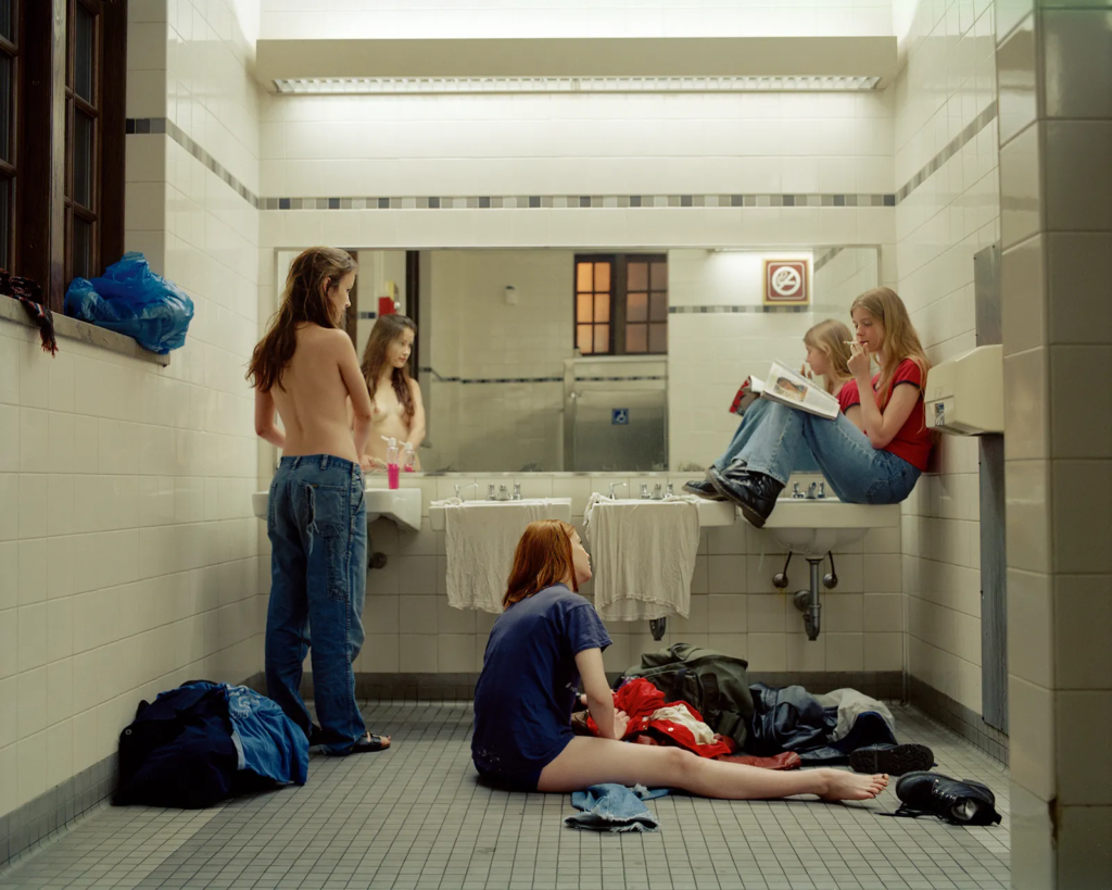
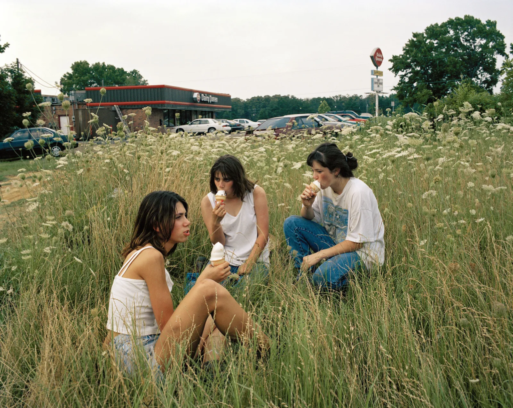
The lighting used in this image is artificial lighting, because the image is taken inside. The image also has a high level of control, because it is a staged tableaux image, where the girls position, distance and location was manipulated the way Justine Kurland thought best fitted. This image is a colour image and has quite warm tones throughout out, because of the warmness of the light (not a harsh florescent light). The layout of these girls was manipulated, so that there was a foreground, middle ground, and background, which leads the viewers eye around the page from front to back. This make the girls the main viewpoint of this image.
This photograph displays ‘run away’ girls living out of public restrooms, as they are exploring their sexuality and ‘trying on boy.’ This photo is largely about fighting against stereotypes, as they are acting in a way that is seen as more masculine, as they are travelling and acting in rambunctious ways.
This image is also a mirror image, because it is a reflection of Justine Kurland the photographer. It is a reflection of her and very internal to her, because she is a lesbian photographer, who also had to grow up in these stereotypes and during these social norms that girls had to behave a certain way, that was socially acceptable. It is also a tableaux image, even though it looks like a documentary candid image. This is because it is a staged image.
Doug Aitken- New Opposition
Doug Aitken is an American multidisciplinary artist. Aitken’s body of work ranges from photography, print media, sculpture, and architectural interventions, to narrative films, sound, single and multi-channel video works, installations, and live performance. He was born in 1968 in Redondo Beach, California. He moved to New York in 1994 where he had his first solo show at 303 Gallery. He is best known for his work with video, and the characteristics that define that medium are apparent within ‘New Opposition.’
Aitken has a large range of work, including an array of site- specific installations, sometimes synthesizing interactive media with architecture, for example New Horizon. He has also made video installations since the mid 1990s and has created them by employing multiple screens in architecturally provocative environments, for example the diamond sea (1997). He has also made outdoor film installations. He has also written books, done sound experiments, made sculptures, light boxes and taken photographs.
About ‘New Opposition’
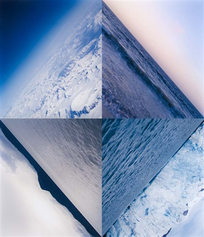
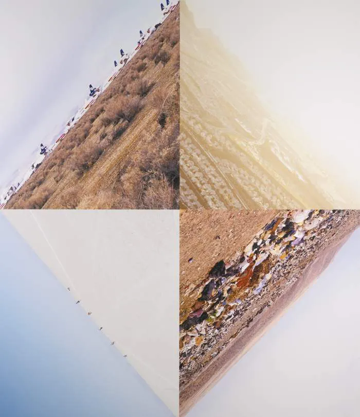
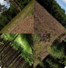
Aitken is well known for his many photographs, which often explore spatial and temporal disruption and narrative suggestion like his installations. In ‘New Opposition’ the photographs do not work as the self-sufficient one-off frames, but rely on each other for meaning. The optical tricks that the landscapes form when put together give the impression to the viewer that they are either falling into the centre of the earth, or are on top of it looking down as if from the apex of a pyramid. The active involvement by the viewer and the three-dimensional sculptural sensations of the photographs can also be seen in the elaborate installations that often accompany hid videos.


‘The series New Opposition consists of three pieces and was started in 2001. I was interested in the fragmentation of the image. I wanted to formulate an image that was whole but also broken apart. So these are multiple images working as one. I wanted to find a way to blend together different moments in time, different spaces and different locations. I wanted to bring them together in a central unifying image. They are not portraits or cityscapes but more an entropic progression. As the series progresses it becomes increasingly abstracted and denser and you get a sense of motion. The elements in the last image are ones you might just walk past in dally life – there is nothing special about the land. You can imagine someone who is surveying the land taking them. I really like the idea of banality and repetition being used to generate the images, which are simple and unobstructed and not captivated by composition. The images create a cycle of different places, but they can all be tied together through the central unifying theme of the horizon, which cuts, perpendicular, through them. I was after a three-dimensional quality. Working as well are the ideas of montage and editing, basically filmic concepts, as is a repetition. I wanted the eyes to constantly search for the horizon. When the images are brought together they collapse and create a feeling of retreating or expanding.’ – Doug Aitken.
New Opposition
Analysis of an Image

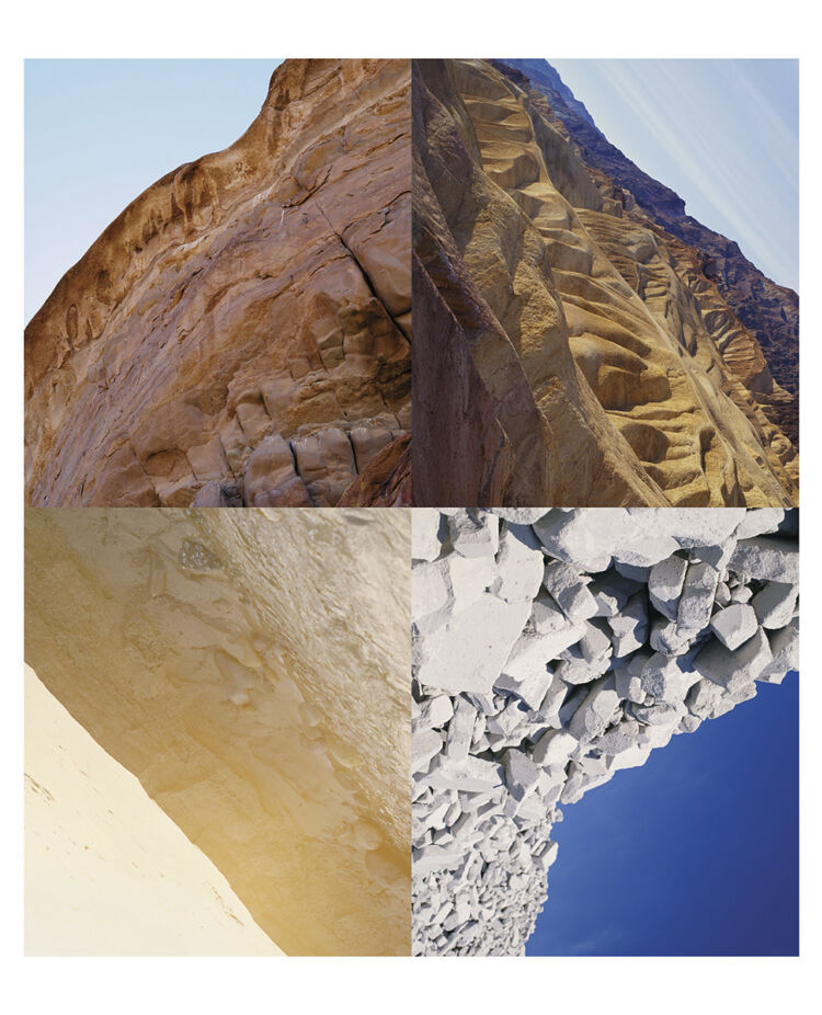
The type of lighting used in this image was natural daylight in all four of the sections, because these are all landscape images. There is also shade within this image, especially in the top two sections of this image, because it looks like a rocky mountain range to me, which would create a lot of shade, due to the rocks blocking the sun. There is little control in this image, because Doug Aitken cannot manipulate the landscape. However, he can manipulated the position he is in, where he point the camera, his editing and the distance he wants to stand at, and this can alter the levels of light, shade and just how the images look. There is lots of warm tones throughout this image, as the colours in this image are sandy brown colours. However, the bottom right section is the exception and has more cool tones, as the colours in this image are blue and a chalky white. There are quite a few dark and light tones throughout these images, due to the shade and lighting within them. There is also a lot of texture throughout these image, as you can see the texture of all the different rocks. The image is also very 3D due to its editing and due to the chosen landscapes. There is also lines and a pattern of repetition in his work, because of the lines separating the four quadrants.
The composition of these images are organised and arranged into their four sections during the editing process. The images are cropped and the angle of them is manipulated to create these images. The viewpoint of this image is the horizon. There is also harmony between the images, as they are all similar landscapes, but there is also contrast between the bottom right section and the other sections, due to the change in tone and colour. The editing in this image also gives depth of surface illusion, as it looks like the images are falling.
Doug Aitken wanted to create these images of ‘boring’ landscapes and create an image that would capture the viewers eye and leave the searching for the horizon in the image. He was also interested in the fragmentation of the image, as he wanted to form an image that is broken but whole. He did this to blend together different locations at different times.
This image is a mirror, because it is a documentary image of four different landscapes that have been pieced together. These images show the exterior world and are not a reflection or internal to Doug Aitken, because they do not reflect him in any way. These images have not been staged or manipulated.
