Zine Design, Layout & Evaluation

After choosing my photos for my zine, I created the pages I wanted using the settings: width: 148mm,
height: 210, pages: 16, orientation: portrait, columns: 2, column gutter: 5mm, margins: top, bottom, inside, outside: 10mm, bleed: top, bottom, inside, outside: 3mm. and then experimented with the layout and where each photo was going to go. I had to find a few more images as the structure I was going for didn’t work for the amount of images I had.

I began adding writing which was focussed on the history and development of Jersey’s harbour which I thought was a good choice of topic as every picture was taken at the harbour. I used writing on a previous blogpost for this. I made sure to add the writing in empty spaces such as the one above where its positioned in the sky which means the image doesn’t look too busy or confusing. I made sure to keep the writing to a minimum so it doesn’t disrupt the image any further. In this particular page, I only wrote on one photo as it was the largest and the other images would’ve been too small to add writing and the image would be ruined and the writing probably would be lost.

After choosing each photo and making my final decision on them all, I chose where to arrange the photos and which ones worked well next to each other. I decided to keep a pattern of 3 photos on one page then 1 photo then 3 photos etc. I think this worked well because then the layouts were switched up a little and not completely the same throughout. I added two more photos at the end as I hadn’t completely filled up all the pages. I printed the booklet using the correct settings and then folded it over in the order it came out the printer in. After flattening the edge, i stapled the sides twice and then used the trimmer to get rid of all the white boarders around the booklet.

Evaluation

Overall, I think my zine turned out well however I think I could’ve improved it a lot more. I liked the selection of photos I chose and I think I did well will picking my best ones. I liked the layout that I picked as it did as isn’t just stay as a continuous page spread of one photo or 2 instead I alternated the layout by keeping a 1 photo then a 3 photo design. I made sure to keep my favourite landscape photos on the 1 photo page so that they are noticed more. I think keeping all the images in their original colour with some editing was a good idea as it makes the images pop more and draw more attention. However, I think I could’ve been more creative by adding som emote advanced editing to some of my images to make them more interesting and unique. I also think I could’ve tried to get more images that would work together to create a story in my zine as I don’t have much of a story for the images I chose. Each page has similarities but there isn’t an obvious story to it.

Plan

Where?

  • Streets in jersey
  • school environment
  • home
  • Studio

Who?

  • teachers
  • students
  • friends
  • family
  • strangers
  • landscapes

Aim

  • To make photos that relate to my artist studies.
  • To create creative photos that tell a story.
  • To present images that show either ‘window’ or ‘mirror’

How?

  • Go around school taking pictures.
  • go around streets in jersey capturing the moment photos
  • setting up the studio and taking pictures
  • staging my home and taking photos

Artist Studies

  • Jill freedman
  • Henri Cartier-Bresson
  • Gregory Crewdson
  • Shirin Neshat
  • more

Photo Assignment

Task: A creative response to documentary (realism/factual/public/candid) and tableaux (romanticism/fiction/private/staged) photography.

What is documentary Photography?

Documentary photography is a genre that captures real-life events, environments, and people to tell stories and convey truths about the world. It often aims to provide a candid and honest representation of subjects, focusing on social issues, cultural narratives, and everyday life. (window)

What is tableaux photography?

Tableaux photography is a style of photography that creates staged scenes, often resembling a painting or a theatrical tableau. This genre typically involves carefully composed arrangements of subjects, props, and backgrounds to convey a narrative or evoke a specific emotion. (Mirror)

  • Base on the theme of observe, seek and challenge.

Relevance to artist study

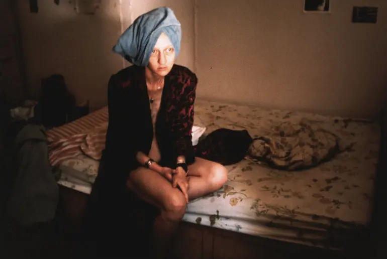
Gregory Crewdson

Shirin Neshat

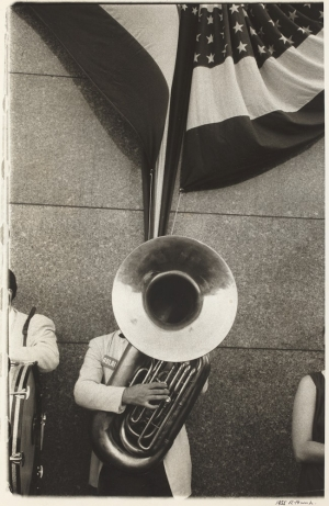
Jill Freedman

Artist Study

Gregory Crewdson

Gregory Crewdson is an American photographer renowned for his elaborately staged and surreal scenes that explore themes of suburban life, isolation, and the uncanny. Born on September 26, 1962, in Brooklyn, New York, he studied photography at the State University of New York at Purchase and later received an MFA from Yale University.

Crewdson’s work is characterized by its cinematic quality, often resembling stills from a film. He meticulously constructs his images, utilizing elaborate sets, dramatic lighting, and a variety of props to create a sense of narrative and emotional depth. His series, such as “Beneath the Roses,” “Twilight,” and “Cathedral of the Pines,” feature hauntingly beautiful depictions of domestic settings that evoke a sense of mystery and tension.

His photographs often comment on contemporary American life, merging realism with surreal elements. Crewdson’s approach has earned him widespread acclaim, and his works are held in major collections, including the Museum of Modern Art in New York and the Los Angeles County Museum of Art.

In addition to his photography, Crewdson has taught at various institutions and has contributed significantly to the field through his lectures and workshops. His unique vision continues to influence both photographers and filmmakers, solidifying his status as a key figure in contemporary art.

Shirin Neshat

Shirin Neshat is an acclaimed Iranian artist and photographer known for her powerful exploration of themes related to gender, identity, and cultural conflict, particularly in the context of Iranian society. Born on March 26, 1957, in Qazvin, Iran, she moved to the United States for her education in the late 1970s, attending the University of California, Berkeley, where she studied art and later earned her MFA.

Neshat’s work often combines photography, video, and installation art, utilizing striking imagery and complex narratives to challenge stereotypes and provoke discussions about the role of women in Islamic culture. One of her most notable series is “Women of Allah,” which features portraits of women adorned with calligraphy and symbols, addressing issues of femininity, martyrdom, and the interplay between oppression and empowerment.

Her films, such as “Taste of Cherry” and “Fervor,” further delve into these themes, earning her numerous accolades, including the Silver Lion at the Venice Biennale in 1999. Through her art, Neshat continues to engage audiences worldwide, sparking dialogue on the nuances of identity and the complexities of cultural heritage.

Jill Freedman

Jill Freedman was an influential American photographer known for her poignant and intimate portrayal of everyday life, particularly in urban settings. Born in 1939, Freedman began her career in the 1960s, capturing the essence of street life and the human experience. She gained recognition for her work documenting the lives of the marginalized, including her notable series on the New York City firehouse culture and her empathetic portrayals of homeless individuals.

Freedman’s style combined a strong sense of storytelling with a keen eye for detail, often blending elements of photojournalism and fine art. Her photographs were characterized by their emotional depth and authenticity, allowing viewers to connect deeply with her subjects. Over the years, she published several books and exhibited her work internationally, earning accolades for her contributions to documentary photography.

In addition to her artistic endeavors, Freedman was dedicated to teaching, sharing her passion for photography with aspiring photographers. Her work continues to resonate, inspiring new generations to explore the complexities of the human condition through the lens. Freedman passed away in 2021, leaving behind a rich legacy that highlights the power of photography to capture truth and evoke empathy.

Essay Plan: How can photographs be both ‘mirrors’ and ‘windows’ of the world?

  1. Read two texts above (John Szarkowski’s introduction and review by Jed Pearl) and select 3 quotes form each that is relevant to your essay.
  2. Select two images, one that represent a mirror and another that represents a window as examples to use in your essay.
  3. Use some of the key words that you listed above to describe what the mirrors and windows suggest.
  • ‘A photograph provides, to use Szarkowski’s word, an “autobiographical” response to a realist situation.’
  • ‘Much of the work included in the show is meant to strike us with its surprising imagery – a private vision so riveting as to leave a permanent imprint on the mind.’
  • ‘that use of the medium, by its very nature, presupposes a “generous and inclusive acceptance of fact, objective structure,” and that the selection among these facts is the romantic, personal opposite’
  • “The distance between them is to be measured not in terms of the relative force or originality of their work, but in terms of their conceptions of what a photograph is.”
  • “is it a mirror, reflecting a portrait of the artist who made it, or a window, through which one might better know the world?”
  • “a mirror – a romantic expression of the photographers sensibility as it projects itself on the things and sights f this world; or as a window – through which the exterior world is explored in all its presence and reality.’

Essay plan
Introduction (250 words): Reflect on the origin of photography and describe in your own words the difference between the two photographic processes, Daguerreotype and Calotype. Consider how they could be viewed as either a mirror or a window of the world according to John Szarkowski’s thesis. Choose one quote from Szarkowski’s text and comment if you agree or disagree.

Paragraph 1 (250 words): Choose an image that in your view is a mirror and analyse how it is a subjective expression and staged approach to image-making. Choose one quote from Szarkowski’s thesis and another from Jed Pearl’s review which either supports of opposes Szarkowski’s original point of view. Make sure you comment to advance argumentation in providing a critical perspective.

Paragraph 2 (250 words): Choose an image that in your view is a window and analyse how it is an objective expression rooted in the notion of realism. Choose one quote from Szarkowski’s thesis and another from Jed Pearl’s review and follow similar procedure as above ie. two opposing points of view and commentary to provide a critical perspective.

Conclusion (250 words): Refer back to the essay question and write a conclusion where you summarise Szarkowski’s theory and Pearl’s review of his thesis. Describe differences and similarities between the two images above and their opposing concepts of objectivity and subjectivity, realism and romanticism, factual and fiction, public and private.

Essay: How can photographs be both ‘mirrors’ and ‘windows’ of the world?

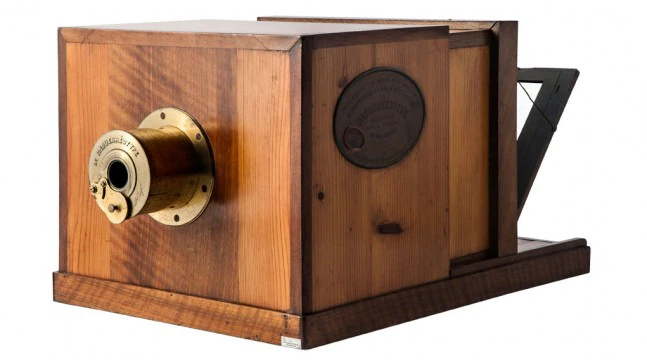
Photography, in the early 19th century, has evolved into a profound medium of expression, allowing both documentation and artistic interpretation. Among the earliest methods, Daguerreotype and Calotype stand out for their distinct approaches. The Daguerreotype, introduced by Louis Daguerre in 1839, produced a unique, highly detailed image on a silver-coated copper plate. This process emphasized precision and clarity, often resulting in strikingly lifelike portraits. In contrast, the Calotype, developed by William Henry Fox Talbot shortly thereafter, utilized paper coated with light-sensitive chemicals, allowing for multiple prints from a single negative. This method, while less detailed than the Daguerreotype, embraced a softer, more ethereal quality, capturing a broader range of tones and textures. According to John Szarkowski, photography can serve as both a mirror and a window to the world. He argues that it reflects personal perspectives while also providing a glimpse into reality. One notable quote from Szarkowski states, “The photographer is not only a recorder but also a maker of meaning.” I agree with this assertion, as it highlights the dual role of the photographer—balancing subjective interpretation with objective representation, which is crucial in understanding the complexities of photographic imagery.

Photographs as Mirrors

When we consider photographs as mirrors, we recognize that they often reflect the photographer’s perspective, emotions, and identity. Each image is imbued with the subjective experiences of the photographer, revealing personal truths and cultural contexts. For instance, a portrait taken by a photographer may not just capture a person’s likeness but also convey their inner thoughts, feelings, and social environment. The choices made in composition, lighting, and subject matter contribute to this reflection, allowing viewers to glimpse the photographer’s worldview.

Moreover, photographs can serve as mirrors for the audience as well. When we engage with an image, we project our own experiences and emotions onto it. A photograph of a serene landscape might evoke memories of a peaceful vacation, while a candid shot of a bustling street can remind us of our own experiences in urban life. This personal connection creates a sense of intimacy, enabling viewers to see aspects of themselves reflected in the image. In this way, photographs not only depict reality but also invite introspection and self-discovery.

I chose this photo by Gregory Crewdson as a mirror image. Gregory Crewdson’s photograph of a girl floating in water in a house at twilight serves as a profound mirror, reflecting viewers’ inner emotions and subconscious thoughts. The surreal and haunting imagery invites introspection, prompting personal connections to themes of vulnerability, isolation, and nostalgia.

The floating girl, suspended in an otherworldly scene, evokes a sense of helplessness and tranquility simultaneously. This juxtaposition allows viewers to project their own experiences and feelings onto the image, creating an intimate dialogue between the artwork and the observer. The stillness of the water, combined with the twilight setting, enhances the emotional weight of the photograph, suggesting a moment of transition and uncertainty.

John Szarkowski’s quote, “What a photograph is is a thing that has been touched by light,” underscores the essential relationship between light and photography, emphasizing how light influences the perception and emotional resonance of an image. In Gregory Crewdson’s photograph of the girl floating in water in a house at twilight, this concept becomes particularly relevant.

The interplay of light in Crewdson’s work is critical to its emotional impact. The twilight setting creates a soft, ethereal glow, enveloping the scene in a dreamlike atmosphere. This manipulation of light not only enhances the visual appeal of the photograph but also evokes a sense of mystery and introspection. The way light reflects off the water and the girl’s figure adds depth to the image, creating a delicate balance between reality and surrealism.

By emphasizing that a photograph is shaped by light, Szarkowski’s quote suggests that the viewer’s experience is fundamentally influenced by this element. In Crewdson’s photograph, the haunting quality of the twilight and the reflective surface of the water serve as metaphors for emotional vulnerability and the subconscious. The gentle illumination invites viewers to explore their feelings of isolation and uncertainty, allowing the image to function as a mirror of their inner lives.

Conversely, Jed Perl, in his critique of staged photography, argues, “The carefully constructed tableau can create a distance between the viewer and the subject, leading to a sense of artificiality.” This comment suggests that while staging can evoke certain emotions, it can also risk alienating the viewer from a genuine connection to the subject. Perl’s perspective raises an important point about the potential limitations of Crewdson’s approach: the meticulous staging may create a barrier that can detract from the immediacy of emotional engagement.

While Perl’s critique highlights a valid concern regarding the artificiality of staged photography, it is essential to consider that Crewdson’s work deliberately embraces this quality as a means of exploring deeper emotional truths. The tension between reality and artifice is central to understanding the complexities of human experience. By crafting an overtly staged scene, Crewdson invites viewers to question the nature of their own perceptions and the narratives we construct around them. The photograph does not merely reflect a moment in time but serves as a catalyst for exploring broader themes of existential uncertainty and the search for meaning in modern life.

Photographs as Windows

Conversely, photographs also function as windows, providing viewers with glimpses into lives and experiences beyond their own. This capacity to capture and communicate reality enables photography to serve as a powerful documentary tool. For instance, photojournalism can illuminate social issues, such as poverty, conflict, and environmental challenges, by presenting stark visual narratives that demand attention. Images from war zones, refugee camps, or communities affected by natural disasters offer insights into human suffering and resilience, fostering empathy and understanding.

Furthermore, photographs can transport viewers to different cultures, places, and moments in time, enriching their understanding of the world. A photograph of a traditional festival in a remote village can introduce viewers to customs and practices they may have never encountered, broadening their horizons and challenging preconceived notions. This ability to act as a window into diverse realities underscores the importance of representation in photography; it is essential for capturing a wide array of experiences to foster a more comprehensive understanding of humanity.

Henri Cartier-Bresson’s photograph of children fighting alongside another child on crutches exemplifies how photography can function as a window, offering viewers a glimpse into the realities of childhood experiences and social dynamics. These images encapsulate moments that reflect broader themes of conflict, vulnerability, and resilience, allowing viewers to engage with the complexities of human life.

Cartier-Bresson is renowned for his ability to capture the decisive moment—those fleeting instances that reveal deeper truths about society. The photograph of the children fighting captures a raw, unfiltered moment of childhood aggression, embodying the spontaneity and intensity of youthful interactions.

John Szarkowski once said, “The camera is an instrument that teaches people how to see without a camera.” This quote highlights the camera’s power to reveal the ordinary in extraordinary ways, allowing viewers to observe and reflect on life’s complexities. Cartier-Bresson’s photographs exemplify this idea by portraying unembellished moments that prompt viewers to consider the social and emotional realities of childhood. The authenticity of these images fosters a connection with the viewer, inviting them to engage with the subjects’ experiences without the interference of artistic manipulation.

Conversely, Jed Pearl critiques the notion of realism in photography, asserting that “the great danger of realism is that it can lead to a kind of banality, reducing the subject to mere documentation.” This perspective raises concerns that while Cartier-Bresson’s images capture real moments, they may lack the emotional depth or narrative richness that elevates them beyond mere observation. Pearl’s critique invites a critical examination of whether these photographs truly convey the complexities of childhood or simply document fleeting instances.

While Pearl’s concern about the potential banality of realism is valid, it is essential to recognize that Cartier-Bresson’s mastery lies in his ability to elevate everyday moments through his keen observational skills and timing. The spontaneity of the children fighting and the vulnerability of the child on crutches evoke emotional resonance that transcends mere documentation. Rather than reducing the subjects to banal representations, these images challenge viewers to confront the realities of childhood, prompting reflection on the joys and struggles inherent in growing up.

In conclusion, Cartier-Bresson’s photographs function as a window into the lives of children, revealing their complexities and vulnerabilities. Through objective expression rooted in realism, these images invite viewers to engage with the social and emotional dimensions of childhood experiences. By juxtaposing Szarkowski’s perspective on the camera as a tool for observation with Pearl’s critique of realism, we gain a nuanced understanding of how Cartier-Bresson’s work transcends mere documentation, ultimately enriching our perception of the human experience.

In conclusion, the discussion surrounding how photographs can serve as both “mirrors” and “windows” of the world reveals the nuanced interplay between personal expression and social commentary in visual imagery. John Szarkowski’s theory underscores the idea that photography is not merely a record of reality but an interpretation shaped by the photographer’s vision, making the medium a powerful tool for conveying deeper meanings. Conversely, Jed Pearl critiques this approach, cautioning that a focus on realism can sometimes result in a banal representation of subjects, stripping away emotional depth.

The contrasting images of children fighting by Henri Cartier-Bresson and the girl floating in a house at twilight by Gregory Crewdson exemplify the dual nature of photography. Cartier-Bresson’s work embodies a moment of raw, unfiltered reality, portraying the chaotic energy of youth in a way that reflects the objective social dynamics of childhood. This image serves as a window into the public sphere of childhood interactions, while also acting as a mirror reflecting the viewer’s own experiences with conflict and camaraderie.

In contrast, Crewdson’s photograph, while rooted in a staged narrative, invites subjective interpretation through its dreamlike quality. The floating girl evokes themes of isolation and vulnerability, highlighting the private struggles that often lie beneath the surface of everyday life. This image embodies a blend of realism and romanticism, as it invites emotional engagement while also challenging perceptions of reality.

Both images explore the tension between objectivity and subjectivity, realism and romanticism, factual representation and fictional narrative. Cartier-Bresson’s photograph is more grounded in factual depiction, reflecting the public aspect of childhood, whereas Crewdson’s work leans towards the subjective, exploring the intimate and private realms of human experience. Together, they illustrate how photography can simultaneously reflect personal perspectives and provide insight into broader social contexts, ultimately enhancing our understanding of the human condition. Through this lens, photographs indeed become both mirrors and windows, enriching our engagement with the world around us.

How can photographs be both ‘mirrors’ and ‘windows’ of the world? Essay Plan.

Introduction (250 words): Reflect on the origin of photography and describe in your own words the difference between the two photographic processes, Daguerreotype and Calotype. Consider how they could be viewed as either a mirror or a window of the world according to John Szarkowski’s thesis. Choose one quote from Szarkowski’s text and comment if you agree or disagree.

Draft Introduction: In the early 19th century, photography emerged as a powerful medium for both documentation and artistic expression, with Daguerreotype and Calotype as key photographic processes. The Daguerreotype, created by Louis Daguerre in 1839, produced highly detailed images on silver-coated copper plates, emphasizing clarity and lifelike portraits. Conversely, the Calotype, developed by William Henry Fox Talbot, used light-sensitive paper, allowing for multiple prints and offering a softer, more ethereal quality. John Szarkowski described photography as both a mirror and a window, reflecting personal perspectives while revealing reality. He emphasized that photographers act as both recorders and creators of meaning, underscoring the importance of their dual role in shaping photographic imagery.

Potential quote:

  • “Is it a mirror, reflecting a portrait of the artist who made it, or a window, through which one might better know the world?”

Paragraph 1 (250 words): Choose an image that in your view is a mirror and analyse how it is a subjective expression and staged approach to image-making. Choose one quote from Szarkowski’s thesis and another from Jed Pearl’s review which either supports of opposes Szarkowski’s original point of view. Make sure you comment to advance argumentation in providing a critical perspective.

Paragraph 2 (250 words): Choose an image that in your view is a window and analyse how it is an objective expression rooted in a sense of realism. Choose one quote from Szarkowski’s thesis and another from Jed Pearl’s review and follow similar procedure as above ie. two opposing points of view and commentary to provide a critical perspective.

Conclusion (250 words): Refer back to the essay question and write a conclusion where you summarise Szarkowski’s theory and Pearl’s review of his thesis. Describe differences and similarities between the two images above and their opposing concepts of objectivity and subjectivity, realism and romanticism, factual and fiction, public and private.

Essay; How can photographs be both ‘mirrors’ and ‘windows’ of the world?

Photography as we know it was created with two entirely different processes: the Daguerreotype and the Calotype. One could be described as a ‘mirror’ and the other a ‘window’, a theory created by John Szarkowski. “the distance between is to be measured not in terms of the relative force or originality of their work, but in terms of their conceptions of what a photograph is: is it a mirror, … or a window?”1 The Daguerreotype, created by Louis Daguerre, acts as a mirror. This is both in a literal sense, being created with metals and glass, but also in a more subjective matter. A mirror is a synthetic, staged and manipulated while also holding personal meaning. A Daguerreotype only yields one final product (kept in a wooden box lined with velvets) which will result in more manipulation in the pre-production. The final outcome is a highly personal and unique ‘mirrored memory’. As the photographs were largely portraits resembling paintings it was a long process requiring manipulation of pose and expression. Additionally a mirror “reflects a portrait of the artist who made it”2. Louis Daguerre not only named his process after himself but also released his findings months after Henry Fox Talbot as direct competition making the Daguerreotype inherently a mirror of himself. The Calotype, created by Henry Fox Talbot, is the opposite in many ways. It represents the window meaning documentary, authenticity and realism. These images are objective, like looking through a window which is described as: “through which one might better know the world?”3 A calotype creates a negative which can be mass produced meaning the images produced are more public and less private then a Daguerreotype.


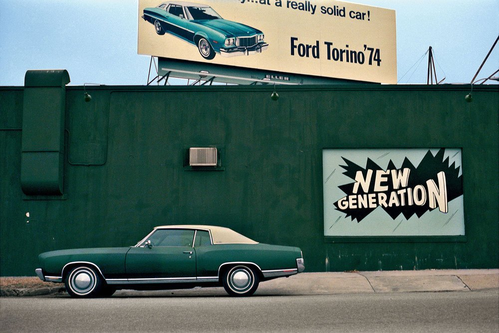
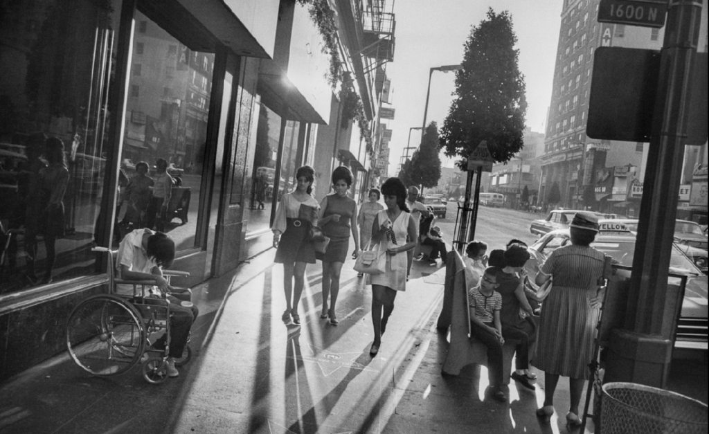
Garry Winogrand – Los Angeles, 1969 Gelatin-silver print

This image, by Szarkowski’s system, is a window. It acts as a snapshot of a road in Los Angeles in 1969. This image is a style of street photography and showcases realism. Realism is the accurate and detailed depiction of life. Garry Winogrand philosophy when it comes to photographs should clearly align with windows as he does not interfere and doesn’t believe in inserting himself and his motivations into his photographs. Additionally this photograph is like literally looking through a window. It is an authentic view of the streets of Los Angeles in 1969, letting us “better know the world” 4 as all ‘windows’ do. However the process of taking a photograph requires some level of a personal response. The photographer must see and decide to want to take the photograph, unconsciously letting bias influence the images. Jed Perl stated that “A photograph provides … an “autobiographical” response to a realist situation.”5 No image is going to fit either group perfectly. Despite how much this image might seem to fit the ‘Window’ group, no image is entirely separate from the photographer.


Cindy Sherman, 1977 – 1980. Untitled Film Stills

This image is a mirror. It was taken by Cindy Sherman of herself making it an obvious reflection. It is manipulated as she was photographing herself to reflect film stills, meaning she was embodying a character and acting a part. Since a mirror “reflects a portrait of the artist who made it”6 This image fits the category by reflecting her own opinions and feelings towards being a woman such as the glamour as well as expectations she might feel influenced by such as cooking/cleaning in a kitchen making it subjective and personal. Jed Perl stated that “The very technology of photography contains an admission that the “world exists independent of human attention” —a photograph is, after all, a record of nature, of the world’s lights and shadows.”7 This means that all images are in some way a documenting the subject. This means that even if the subject is ‘manipulated’, all photographs are real and in some ways a ‘window’ as a camera cannot lie. What a photograph shows cannot be a ‘lie’ and accurately shows what it was pointed at regardless of whether or not the subject was adjusted previously.


All images are in a way both mirrors and windows. Although a form of categorising these images can be helpful and make ‘reading’ them easier there is a dilemma that no image will fit one category completely. The categories works better as a spectrum however as all images are varying levels of objective and subjective as the categories are set on “uncertain foundations”8. Jed Perl stated that photography should be viewed as an “abstract art.”9 as abstract art doesn’t attempt to represent external reality and uses colours, shapes and textures to achieve its purpose. It isn’t easily categorised between two binary opposites. Both of these images cover similar themes and showcase American women around the 1970s. Both could act as a representation of the time period acting as documentary snapshots. Both showcase glamour and tell a similar story. Cindy Sherman’s image seems much more personal and intimate as it is just her in her kitchen. It feels like were getting to know her character. Garry Winogrand however is looking at the women from a distance. Its not personal and we don’t feel as though we get to know the women. Both images are very different and would sit on opposite ends of the spectrum but don’t appear like polar opposites instead just seem like slightly different approaches to tell a similar story. The images shouldn’t be shoehorned into a category since “The possibilities of photography, like the possibilities of any art, are as great or as small as the visions of artists.”10


  1. John Szarkowski, 1978 ↩︎
  2. John Szarkowski, 1978 ↩︎
  3. John Szarkowski, 1978 ↩︎
  4. John Szarkowski, 1978 ↩︎
  5. Jed Perl, 1978. Mirrors And Windows: Messages From Moma. ↩︎
  6. John Szarkowski, 1978 ↩︎
  7. Jed Perl, 1978. Mirrors And Windows: Messages From Moma. ↩︎
  8. Jed Perl, 1978. Mirrors And Windows: Messages From Moma. ↩︎
  9. Jed Perl, 1978. Mirrors And Windows: Messages From Moma. ↩︎
  10. Jed Perl, 1978. Mirrors And Windows: Messages From Moma. ↩︎

Essay: ‘How can photographs be both mirrors and windows of the world?’

  1. Read two texts above (John Szarkowski’s introduction and review by Jed Pearl) and select 3 quotes form each that is relevant to your essay.
  2. Select two images, one that represent a mirror and another that represents a window as examples to use in your essay.
  3. Use some of the key words that you listed above to describe what the mirrors and windows suggest.

Paragraph 1 (250 words): Choose an image that in your view is a mirror and analyse how it is a subjective expression and staged approach to image-making. Choose one quote from Szarkowski’s thesis and another from Jed Pearl’s review which either supports of opposes Szarkowski’s original point of view. Make sure you comment to advance argumentation in providing a critical perspective.

Paragraph 2 (250 words): Choose an image that in your view is a window and analyse how it is an objective expression rooted in the notion of realism. Choose one quote from Szarkowski’s thesis and another from Jed Pearl’s review and follow similar procedure as above ie. two opposing points of view and commentary to provide a critical perspective.

Conclusion (250 words): Refer back to the essay question and write a conclusion where you summarise Szarkowski’s theory and Pearl’s review of his thesis. Describe differences and similarities between the two images above and their opposing concepts of objectivity and subjectivity, realism and romanticism, factual and fiction, public and private.

My Essay

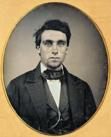
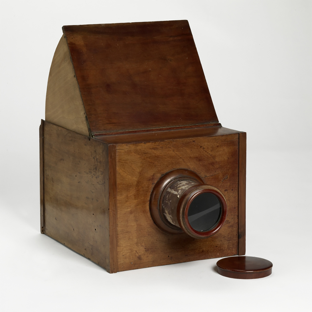
The origin of photography started back in 1822, when Nicephore Niepce created the Niece Heliograph, which is the earliest photograph produced with the aid of the camera obscura. In 1829 Niepce partnered up with Louis Daguerre, who continued to experiment and improve the heliograph after Niepce’s death in 1833 and he went on to create the Daguerreotype. To create a daguerreotype image a daguerreotypist polished a sheet of silver-plated copper to a mirror finish, then he would use an air gun, so that there was no dust on this plate, that would ruin the photograph. Then it is exposed in a camera for as long as was judged to be necessary, which could be as little as a few seconds for brightly sunlit subjects or much longer with less intense lighting. Next, he torches it, with mercury vapour, so that the image is visible. Then, he removed its sensitivity to light by liquid chemical treatment, which was rinsing it with cool water to cool the hot metal plate down and dried it and then sealed the easily marred result behind glass in a protective enclosure.

The images produced by a daguerreotype tend to represent a mirror in photography, because the image is on a mirror-like silver surface, so light was reflected back through the image. The image was also on the edge of being present, as it was on the surface of the metal mirror, instead of like paper, where the image sinks into it. This meant that the metal one could be wiped away with a finger. These images were also described as, ‘a mirror with a memory.’ This images were often also portraits of people, which has a very personal element to them. They were also often tableaux images that were taken, as the image was staged and manipulated, instead of a candid shot. The daguerreotype also took a lot of time and effort to use to create the images, so the images taken by it also are also very personal to the photographer, because of the time taken and the effort they put in to produce these images. This makes it represent a mirror also, because of how personal the images now become to the photographer due to the daguerreotype.

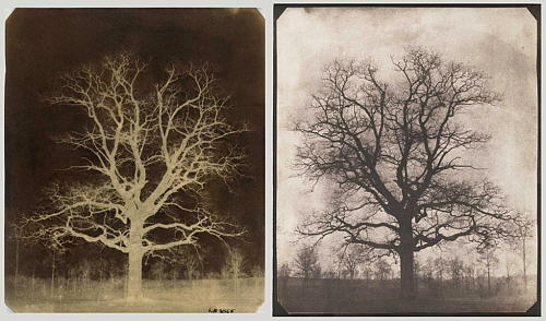
In 1841, Henry Fox Talbot created another photographic process, which was called the calotype. Talbot first began with a piece of high-quality writing paper, which was first washed with a solution of sodium chloride (table salt), left to dry, then evenly coated in the dark with a solution of silver nitrate, and left to dry once more. When objects such as lace or ferns were placed on the sensitized side of the paper and exposed to sunlight, a negative silhouette would be created. Exposure times were fairly long, and areas not protected from the sun gradually darkened. Since the silver deposits on the paper reacted and changed tones during exposure, this was called a “printing-out” process. The print would then be washed in another solution of sodium chloride, which stabilized the image and reduced its sensitivity to light. Overall, calotypes were extremely better than Daguerreotypes due to it being easily distributed, reproduced and were much cheaper. Whilst they both used light sensitive silver salts, the Daguerreotypes required a lot more tools and metal plates which had high monetary value.

The images produced by a calotype tend to represent a window, because they were most commonly used for taking pictures of the external world. These images were documentary images, because they were candid images and not staged, but instead truthful. These images have a level of realism to them, as they are objective. Henry Fox Talbot also tended to take images of the external world, such as ferns and trees etc. which are window images, as the lens is like the window that you are looking through onto the world. Compared to the daguerreotype these images could be produced quicker and many positive images could be produced from the negative image, whereas with the daguerreotype this wasn’t the case. This meant that it didn’t take as much time and effort for the photographers to create the photos, so this also takes away that deep personal element of the images, because they didn’t have to work as hard or put as much time into creating these images. This represents a window even more so now, because there is even less of a personal element to the images now.

Mirrors

For my example of photographs as mirrors, I have used an image by Cindy Sherman. Cindy Sherman is a female photographer, who took images of herself dressed up as many different female stereotypes. In this image the stereotype that she is presenting is a generic housewife, who is in the kitchen. This image is a powerful image, because back in 1970-1980, which is when this image was taken, the ‘norm’ for women and the social standard for women was to be very domestic and stay at home to cook, clean and look after the children, while the men went out to work.

This image is a mirror, because it is a reflection of herself as a women and a reflection of her identity, because this is the stereotype she had to live through and this is what was considered to be socially acceptable of her and all other women in this time. This is also very personal and internal to her, as she is the one who has lived her life this way and being told she must live her life this way. She has also manipulated this image and staged the image, by using kitchen props in a kitchen setting. She has manipulated and positioned the props in the way she thought was best. She is also dressed up wearing an apron to really portray the housewife stereotype. She is also posing in this image, which makes it not a candid shot, but instead a tableaux image. This image is also very subjective and can interpreted in many different ways by the viewer, because it is such a simple, yet powerful image of her stood in the kitchen, with an apron on. This image is also a mirror, because it is a self-portrait of herself, that she had taken on a timer for her camera.

Szarkowski idealises that ‘a mirror, reflecting a portrait of the artist who made it,’1 however, Jed Pearl suggests that ‘Szarkowski thesis gives little value to photography’s a priori status as a realist activity. The very technology of photography contains an admission that the “world exists independent of the human attention”- a photograph is, after all, a record of nature, of the world’s light and shadows. A photograph provides, to use Szarkowski’s word, an “autobiographical” response to a realist situation.’2

Windows

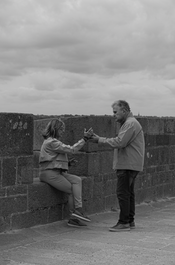
For my example of photographs as windows I have used an image by Rafal Milach. He took this image during a road trip across Iceland. He travelled across Iceland stopping at certain point to take images. This was a image he took in either a bar/ diner of a couple and their friend.

This image is a window, because he travelled across Iceland taking documentary candid images of whatever he saw that interested him, and in this image it was these three people. This image is very external to him, because he does not know these people, and most likely never saw them again, but he spotted a decisive moment and acted. He is looking out onto these people for this image, instead of looking at his reflection, or onto himself. There is also an element of realism and truthfulness in this image, which is what makes it a window, because it is a documentary image, instead of a candid image, which is staged or fictional.

Szarkowski’s thesis of ‘a window, through which one might better know the world?’3 and Jed Pearl’s review stating ‘It is the realist view that the world exists independent of human attention,’4 support this image as a window, because this image is a ‘realist view,’ because this image was not staged, but instead a documentary image, instead of a candid shot.

To conclude, photographs can be both windows and mirrors of the world, because windows, such as Rafal Milach’s image above, are realist documentary images, which present the truest form of the exterior world. Window images are candid images, so they present the world in it’s truest form. These images present to the viewer our exterior world. The importance of these images is that they are objective, they are used to present to the viewer the exterior world, and this can be really important for specific issues, such as war etc. These window images present issues of the world, as well as just landscape images. These images are metaphorically known as window images, because it is like you are looking out of a window (the camera lens) onto the exterior world. However, mirror images, such as Cindy Sherman’s image above, are tableaux images that are subjective to the viewer, so the viewer can interpret the image in any which way. This is important, because the viewer can interpret this intimate image, and may be able to relate to it and apply it to their own lives, as well as the photographers. These images are metaphorically called mirrors, because they are a reflection of the artist who made it, so this can be really important for photographers, so that they can display a sense of themselves through their work. They can also be used to display issues that are important and relate to the viewer, similarly how window images can be used to spread awareness.

The opposing concepts of photography: objectivity, subjectivity; documentary, tableaux; interior, exterior etc. provide alternative perspective of what photography is. However, these opposing concepts can overlap and cause ‘blurred lines.’ For example, these opposing concepts can overlap when the photographer takes documentary images that also reflect themselves etc. Therefore, photography may not be as split as Szarkowski and Jed Pearl state. The function and purpose of the photographs can and will change depending on who wields the camera and what they point their camera at, and how these images are presented.

  1. Szarkowski John. (1978). Mirrors and windows. New York; Museum of Modern Art  ↩︎
  2.  Jed Pearl. Review published in the photography magazine, Aperture in spring 1978. ↩︎
  3. Szarkowski John. (1978). Mirrors and windows. New York; Museum of Modern Art ↩︎
  4.  Jed Pearl. Review published in the photography magazine, Aperture in spring 1978. ↩︎

Windows & Mirrors

Photographs that are windows and those that are mirrors are binary opposites to each other, being metaphorical in order to categorise them. Binary opposites are words or concepts which are opposed in meaning, being set off by one another and mutually exclusive terms. Images that are categorised as windows are those that take an objective stance and have a perspective that is documentary-style. This allows the exterior world to be explored in all its presence and reality, getting to know the world around us better. On the other hand, mirrors are images which are personal to the photographer and have an element of privacy. These images are curated in order to be reflective of the photographer to create a subjective viewpoint instead. This paints a romantic picture of the photographer’s sensibility, making them open to personal interpretation. This raises the question of whether an image is external of the photographer or an internal reflection.

John Szarkowski:

Szarkowski curated this exhibition of American photography at the Museum of Modern Art, New York (MoMa) in July of 1978 in an attempt to categorise the work which largely reflected the subjectivity of the artist in comparison with those whose work largely sought to see outside themselves. Szarkowski wrote a catalogue essay to accompany the exhibition:

The quote above by Szarkowski stood out to me because it is looking at photography from a different perspective, being that photography isn’t defined by how original your images are or what is within the image, but focuses on the different perceptions of photography and the different associations made. I think this quote is really important because it shifts the narrative of photography from being technical and critical, and instead more conceptual, intentional and meaningful.

Images that are mirrors are associated with the word tableaux this is known as a static scene in acting containing actors or models silently, typically with scenery or props and posed in a cautious way. This word is applicable to images categorised as mirrors because they are manipulated scenes of fiction that are staged. The topic of romanticism is also associated with these reflective images due to its subjective nature, emphasizing imagination and emotion.

One the other hand, the topic of windows is associated with realism due to its straightforward, truth-telling tone. These images are also associated with words such as optical and candid because they are documenting external matters.

This self-portrait image above of Cindy Sherman comes from her ‘Untitled Film Stills’, in which she depicts stereotypical roles of women, gaining inspiration from films of the 1950s and 1960s. I see this image as a mirror due to it being staged, representing a fictional character in a manipulated environment. Additionally, this may be an internal reflection of Sherman’s emotion, feeling stereotyped and prejudiced due to her gender, hinting that she may have a distorted perception of herself alone. This reveals a private side to herself, letting the viewer know of her inner thoughts and feelings. The setting of this image may have been taken in a studio with props set up however, Sherman may have also taken this in her home for example as that is a domestic area and would be able to convey the message well. This would also have helped make the image a mirror as her home is a personal area that she is sharing with the viewer. I think that her expression of looking over her shoulder surrounded by this large empty space on her left suggests that she may feel as if she is forced to fit into these traditional roles against her will, for example representing women in the 50s and 60s as a female photographer when in these times, this would have been frowned upon and unheard of. Because she has turned to look over her shoulder, large diagonal shadows have been created behind her which may connote her hidden rage or distress, representing how these stereotypical viewpoints can be damaging and hurtful. The black and white tones of this image also help portray her emotions well as this is a more dynamic approaching, perhaps draining all the colour from the image to show the seriousness of the message she is sending, making the concept behind it more solemn.