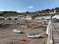
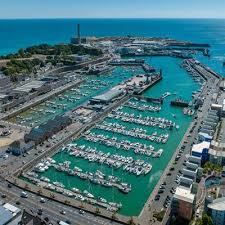
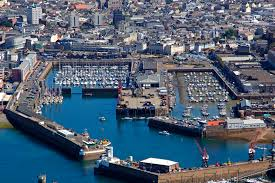
We explored Jersey 3 marinas and along the harbours in St Helier, taking images of boats, harbours, cranes, tools, equipment, people working, fresh fish and more. We explored multiple fish places. Either where they sell fresh fish, like Fresh Fish Co and Jenna-Dee-Scallops. We also explored Aquamar, where they captured and held crabs, lobsters and cray fish and more.
The fish were captured at the harbour, or out at sea and held at Aquamar. They are then sold at Fresh Fish Co and Jenna-Dee-Scallops.
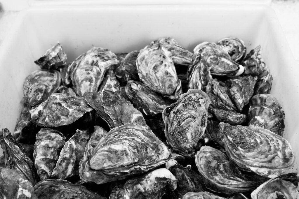
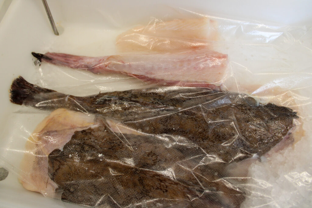
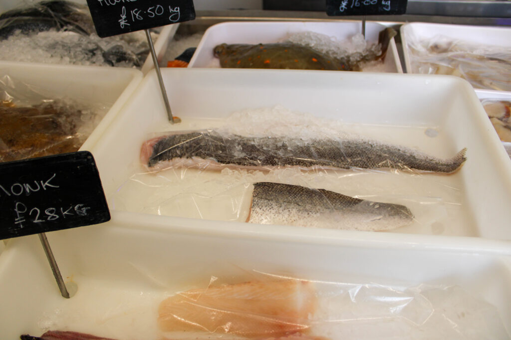
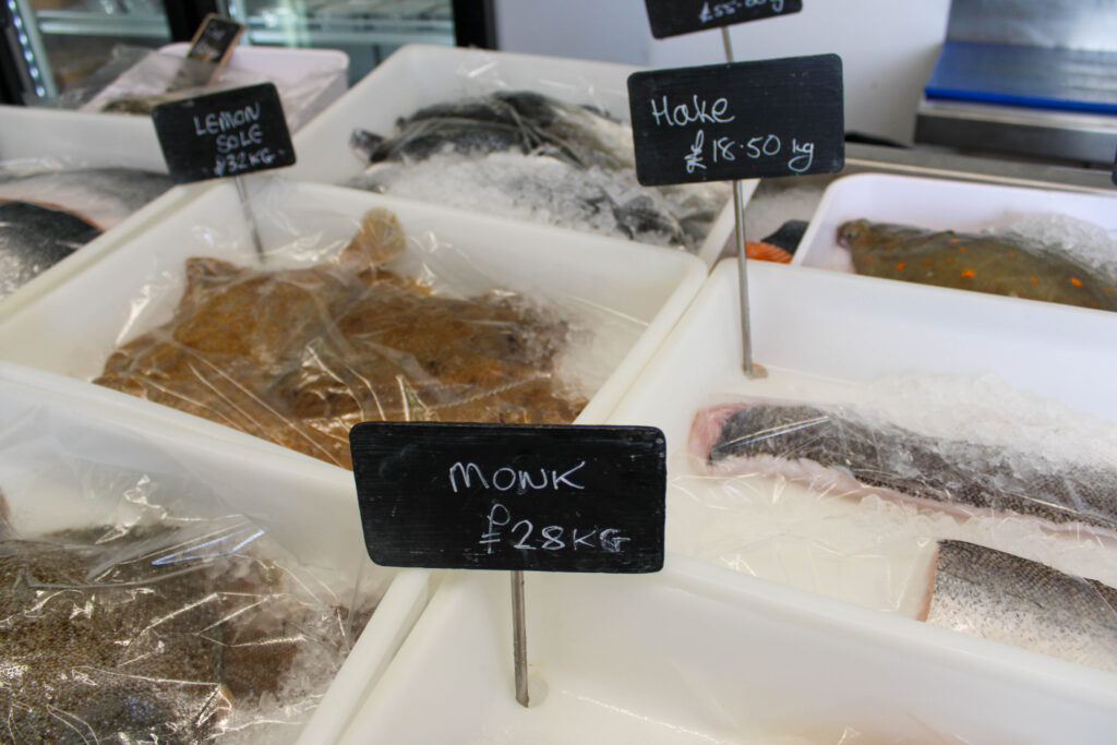
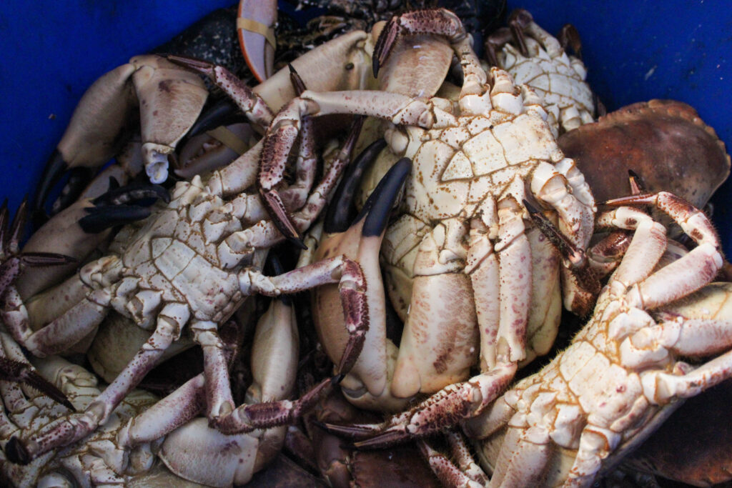
They sold many different types of fresh fish, such as many different types of crabs, including spider crabs etc, prawns, lobsters, cod, oysters etc.
Contact Sheet
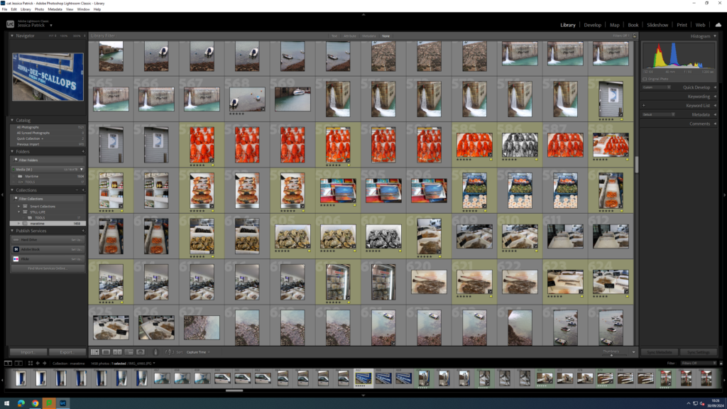
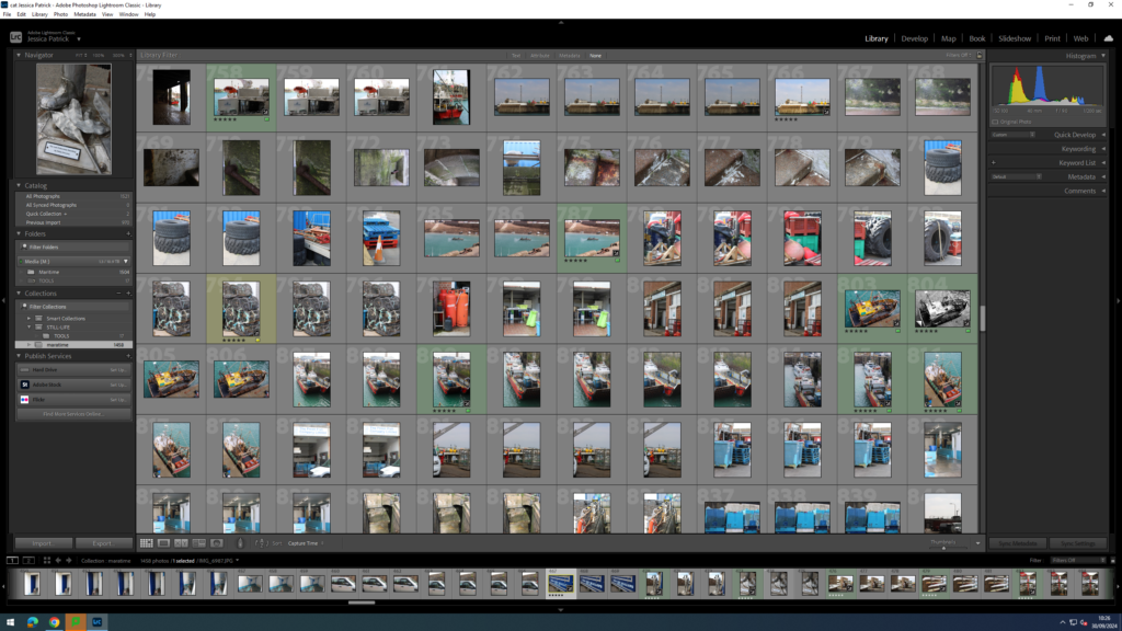
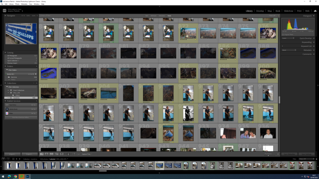
The images which are highlighted yellow are the images I have chosen to edit from this photoshoot. I have chosen these images, because they have the best composition and are my best images.
Edits
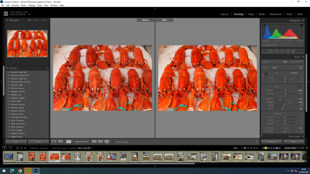
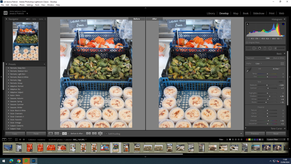
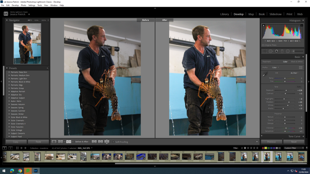
I edited this image by increasing the exposure, contrast, shadows and vibrancy, while decreasing the highlights, whites and blacks. I did this, so that the orange/red colour of the lobsters would be more vibrant and pop out more.
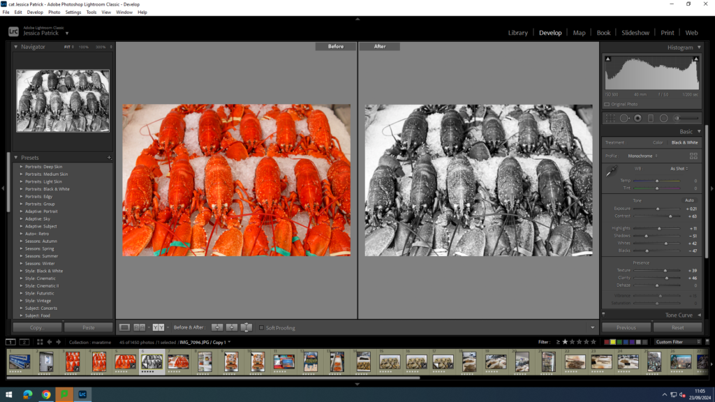
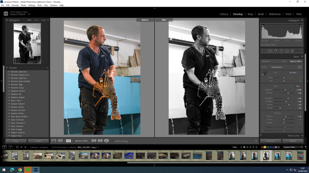
Then, I made a virtual copy of the edited image and created a black and white copy and increased the contrast, highlights and whites, while decreasing the blacks and shadows, so that the image would have a much higher contrast and more shades of grey throughout. I also did this so the texture of the lobsters would stand out more.
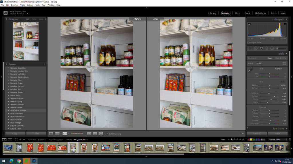
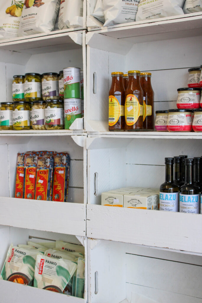
I edited this image by increasing the exposure, contrast, shadows, vibrancy, saturation and whites, while decreasing the highlights and blacks. I did this, so that the image was brighter and the items on the shelves were more saturated and vibrant, especially against the white background. I also wanted the background to be more of a pure white.
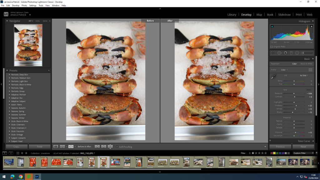
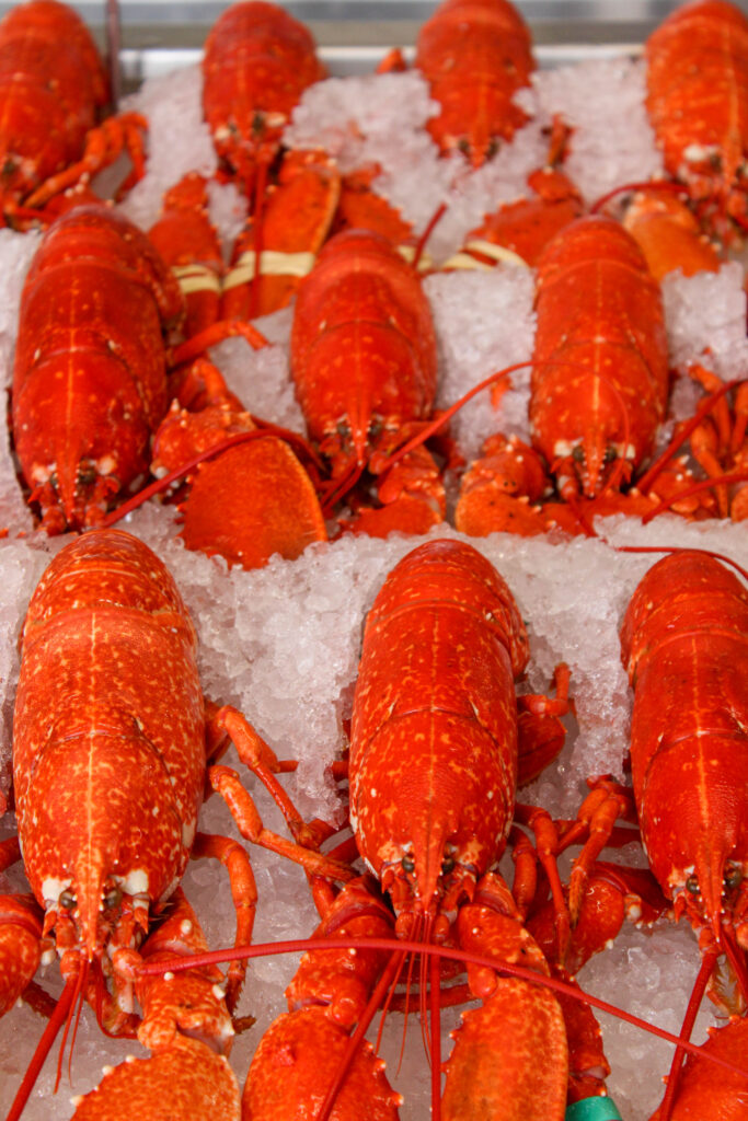
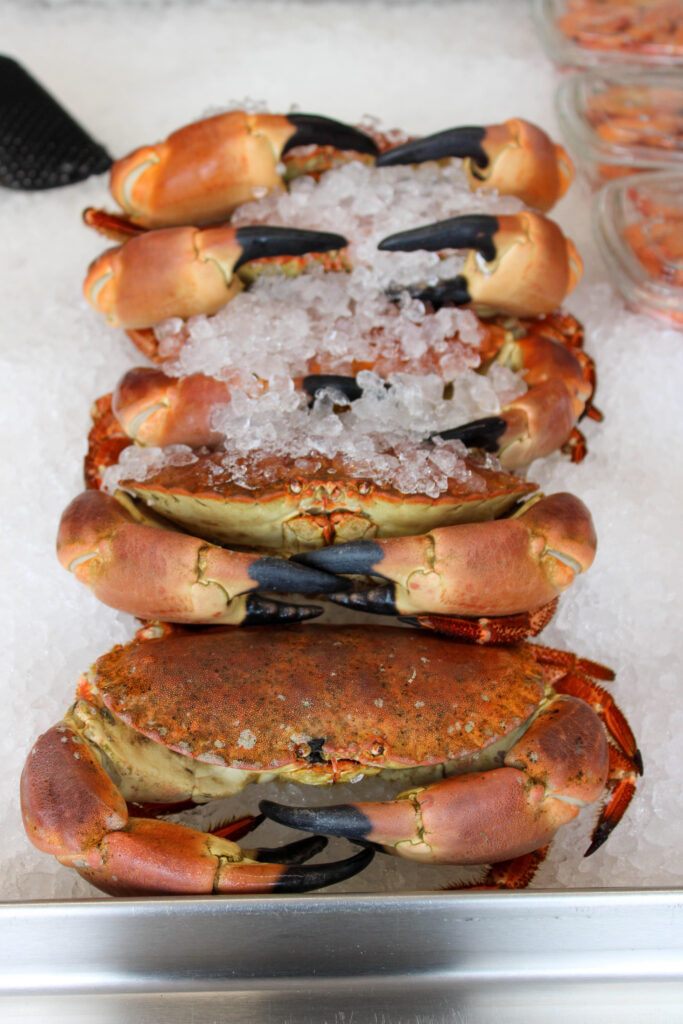
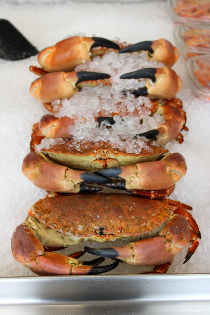
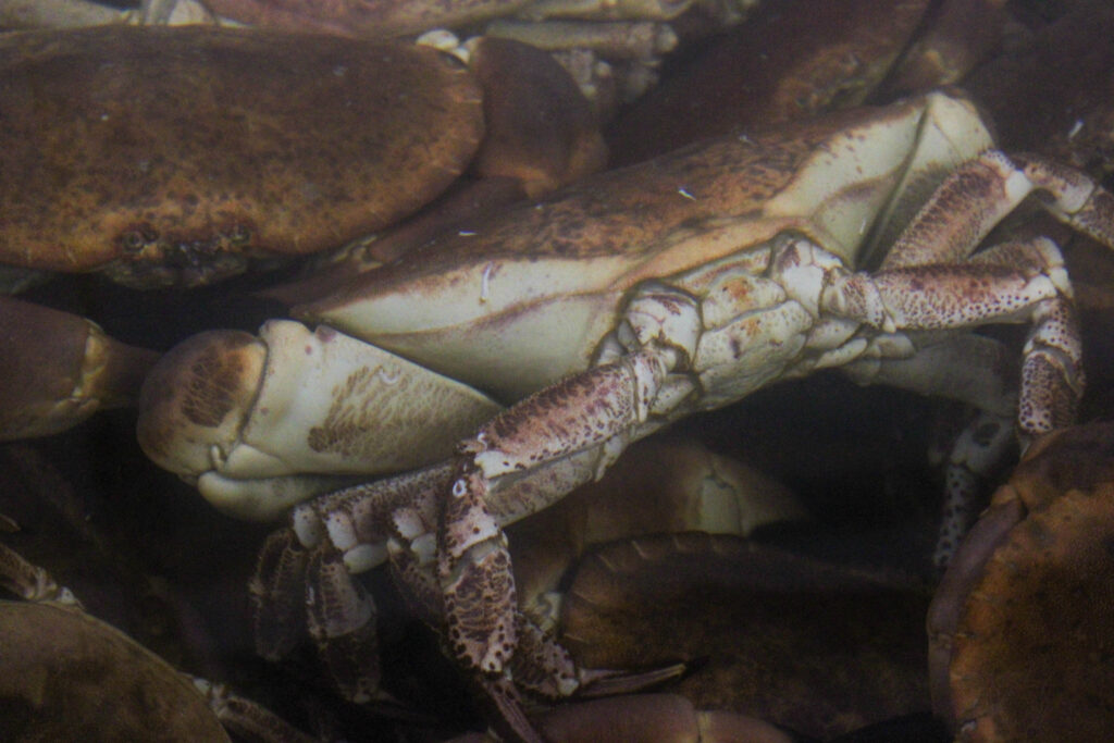
I edited this image by increasing the contrast, shadows, whites and vibrancy, while decreasing the highlights, exposure and blacks. I did this, so that the crab was slightly more vibrant and stood out more against the white ice background.
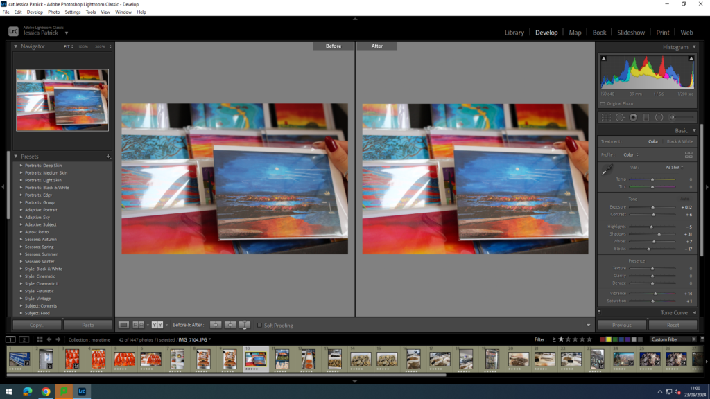
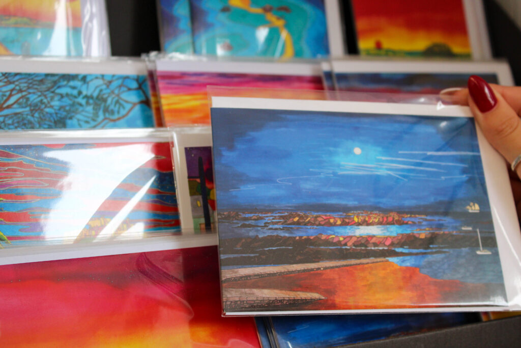
I edited this image by increasing the exposure, contrast, shadows, whites, saturation and vibrancy, while decreasing the highlights and blacks. I did this, so that the post cards of the harbour, which were already very colourful, were even more vibrant and beautiful.
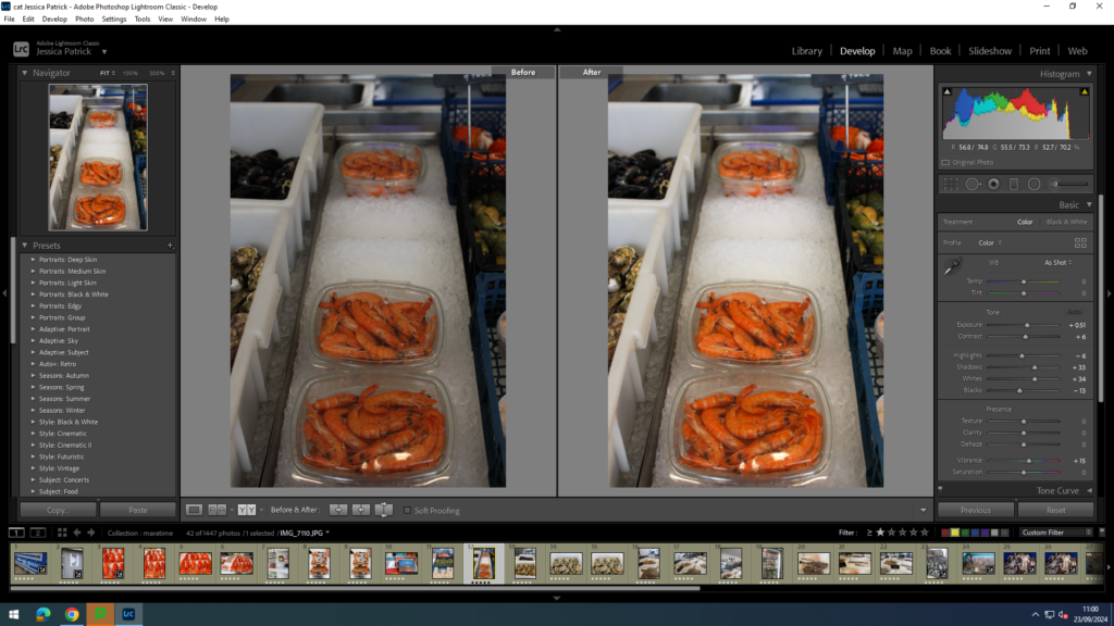
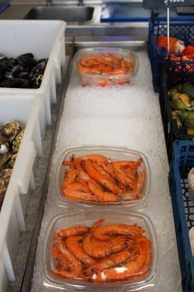
I edited this image by increasing the exposure, contrast, shadows, whites and vibrancy, while decreasing the highlights and blacks. I did this, so that the image was brighter, because I thought it looked a bit dark and the so the prawns in this image were more vibrant and stood out more.
I edited this image by increasing the contrast, shadows, white, saturation and vibrancy, while decreasing the highlights, exposure and blacks. I did this, so that all the different colours in this image pop. I also like this image, because the orange and green in this image contrast and compliment each other well, as they are almost directly opposite each other on the colour wheel.
I edited this image by increasing the contrast, shadows, whites, saturation and vibrancy, while decreasing the highlights, exposure and blacks. I did this, so that the different colours within the shell stood out and contrasted each other more, and so the texture of the shells were more visible.
Then, I created a virtual copy of the edited image and increased the contrast to 100%. I did this, so that the texture of the shells stood out even more.
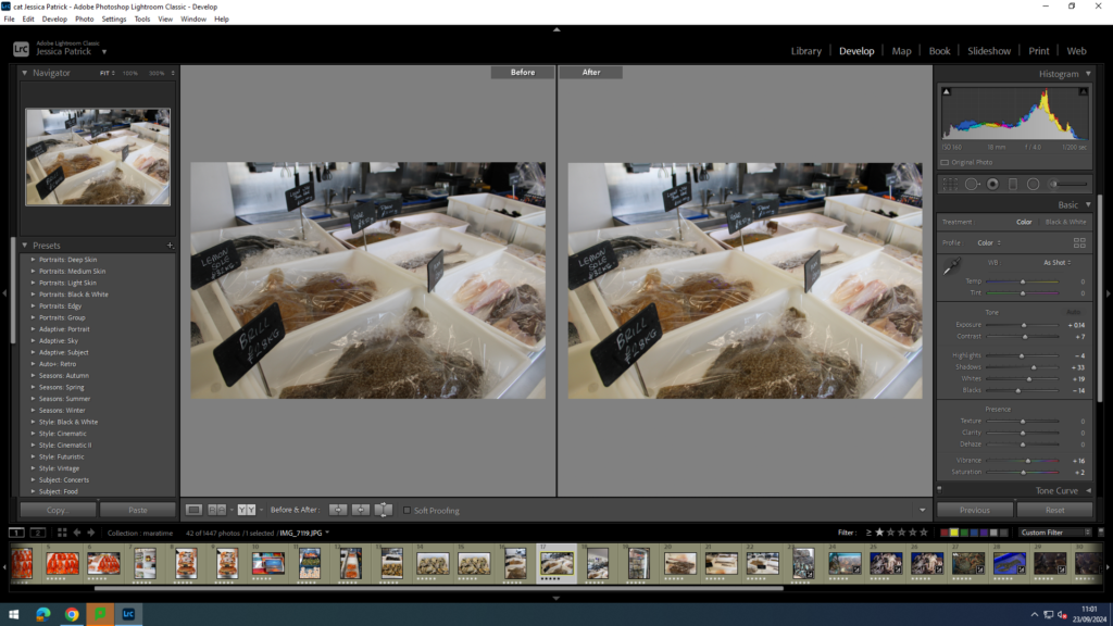
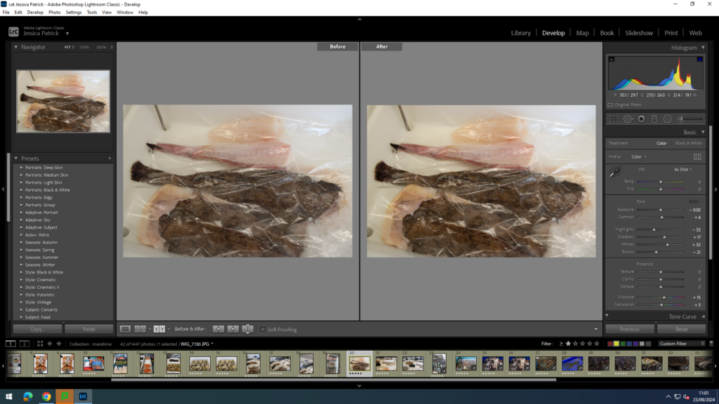
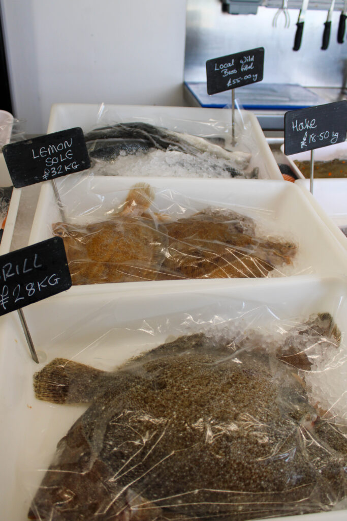
I edited these images by increasing the exposure, contrast, shadows, whites, saturation and vibrancy, while decreasing the highlights and blacks. I did this, so that the images were slightly brighter and more vibrant, so it was more visible, as so the texture of the fish were also more visible.
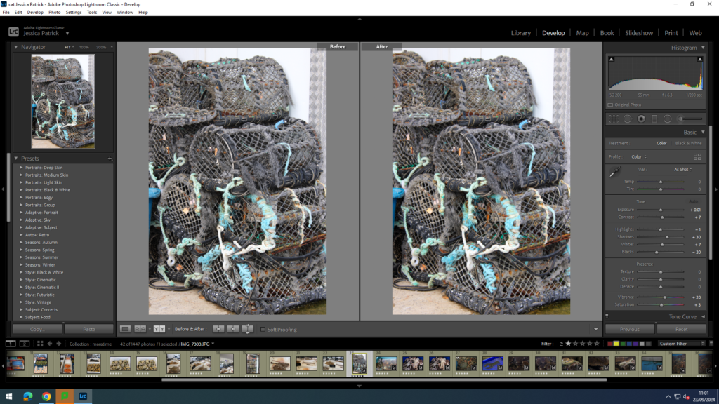
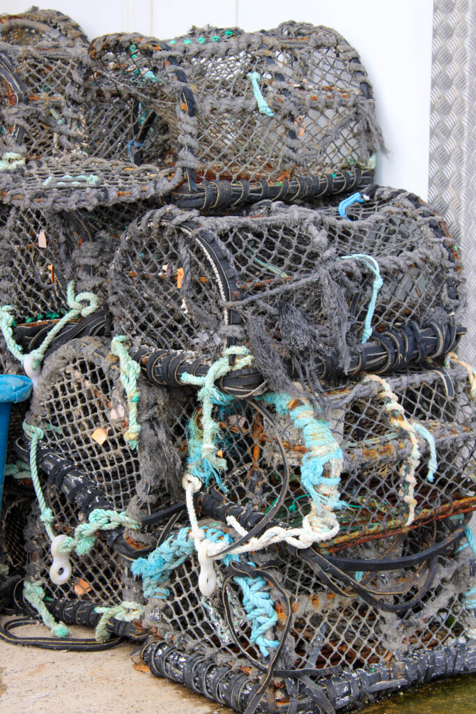
I edited this image by increasing the contrast, exposure, whites, shadows, saturation and vibrancy, while decreasing the highlights and blacks. I did this, so that the texture of the cages were more visible, and so the blue fishing wire would be more vibrant and a pop of colour.
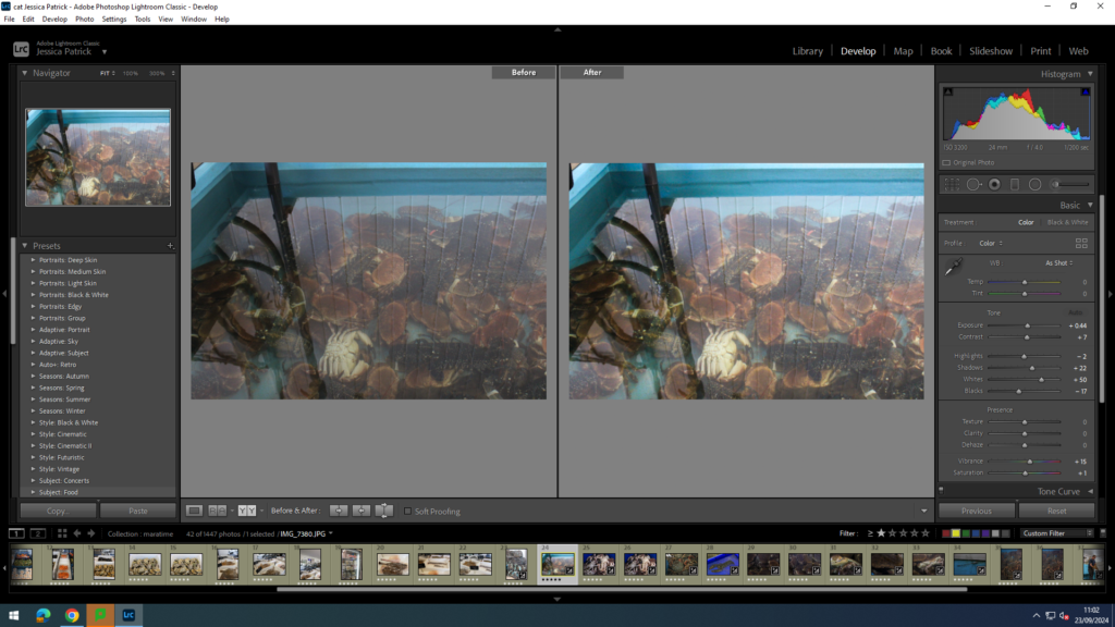
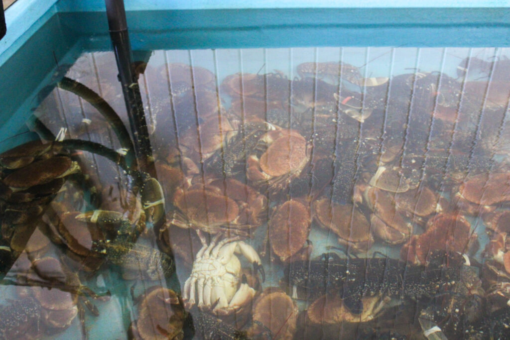
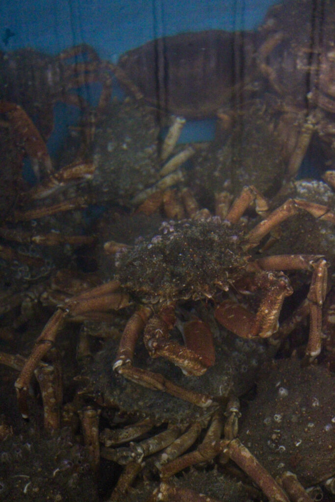
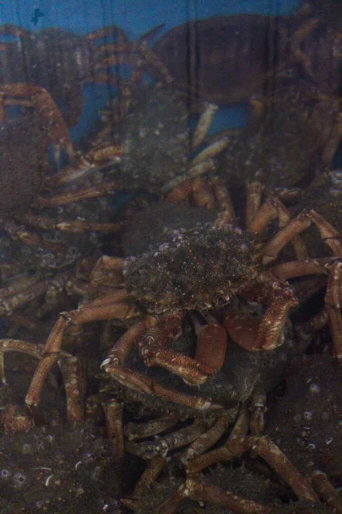
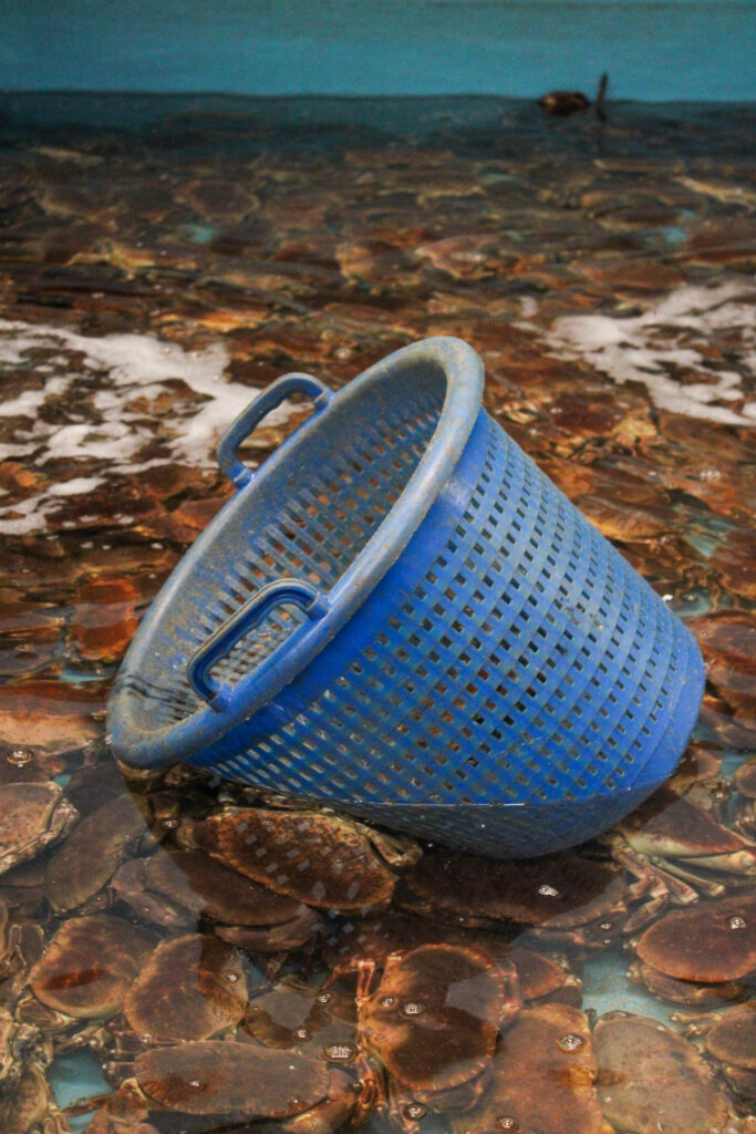
I edited this image by increasing the contrast, exposure, whites, shadows, saturation and vibrancy, while decreasing the highlights and blacks. I did this, so that the image was brighter, so that the crabs can be seen much more clearly through the water.
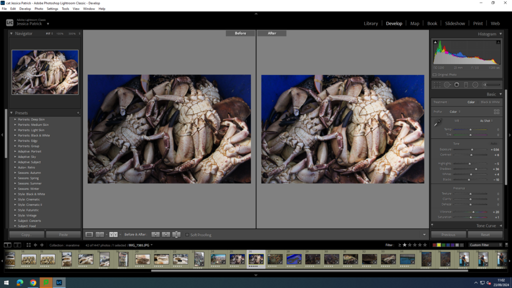
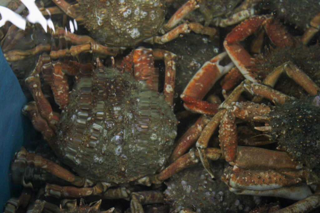
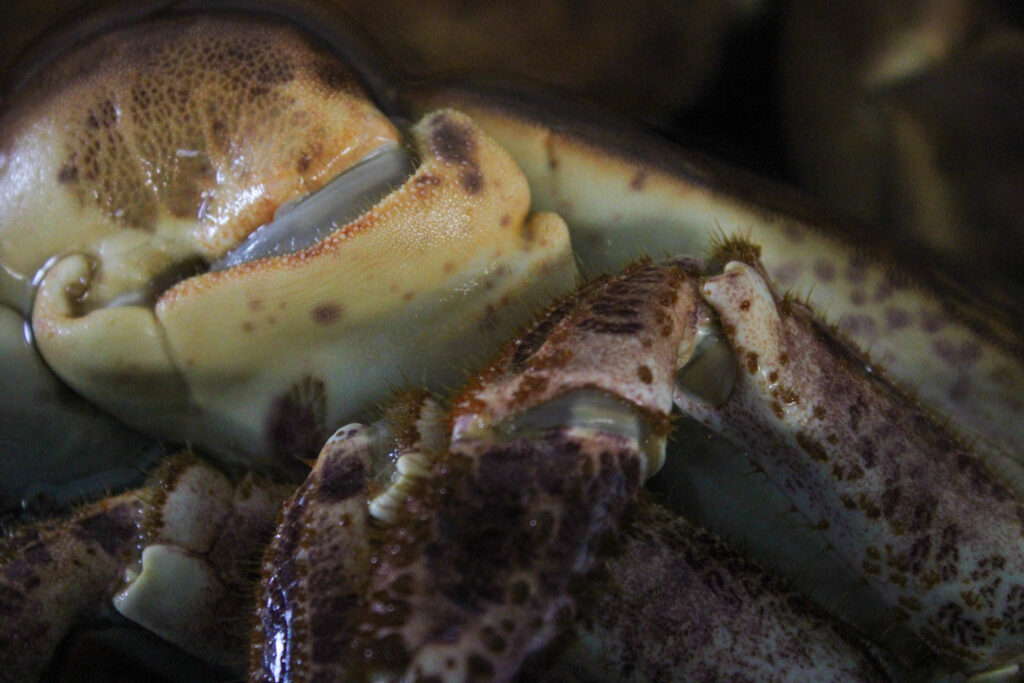
I edited this image by increasing the contrast, exposure, whites, shadows, saturation and vibrancy, while decreasing the highlights and blacks. I did this, so that the crabs under belly was brighter and more white, so that they stood out more, and so the texture is more visible.
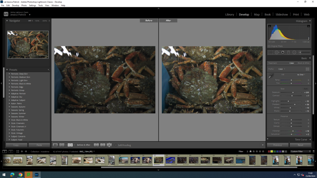
I edited this image by increasing the contrast, exposure, shadows, saturation and vibrancy, while decreasing the highlight, whites and blacks. I did this, so that the image is brighter, so the crabs are more vibrant and more visible through the water.
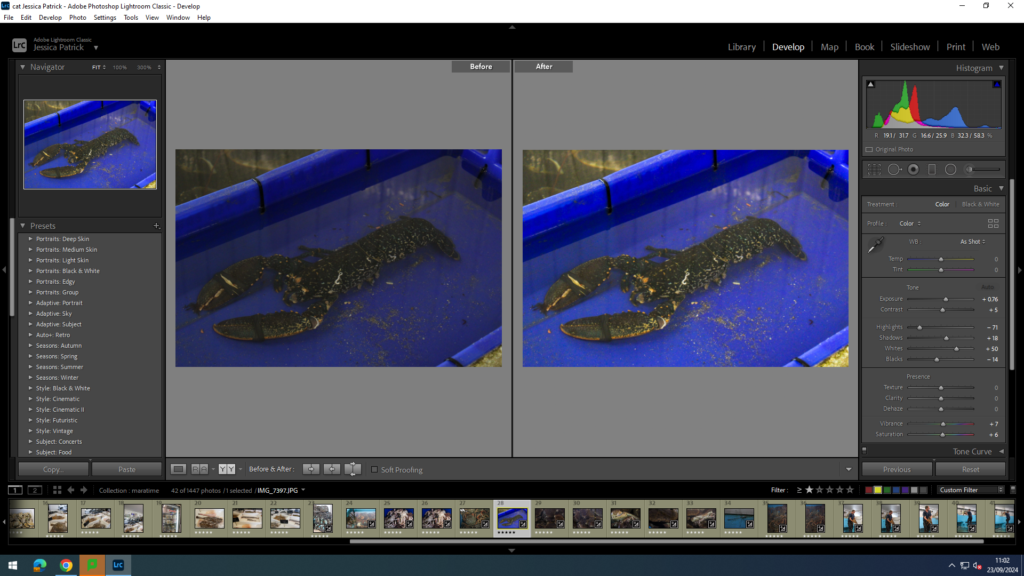
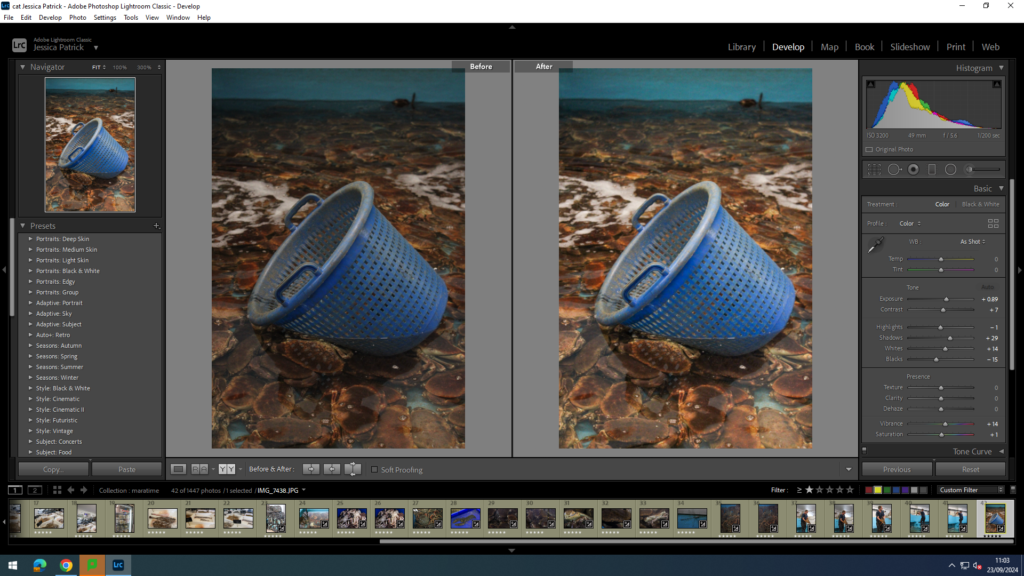
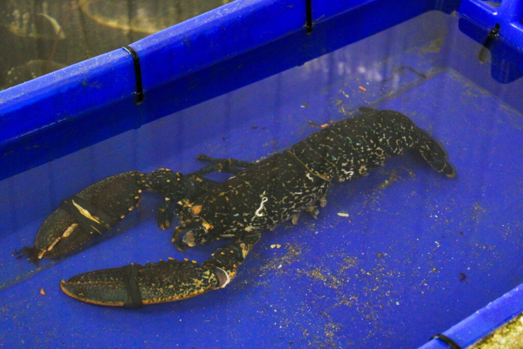
I edited this image by increasing the contrast, exposure, whites, shadows, saturation and vibrancy, while decreasing the highlights and blacks. I did this, so that the lobster was more vibrant, along with the bright blue container.
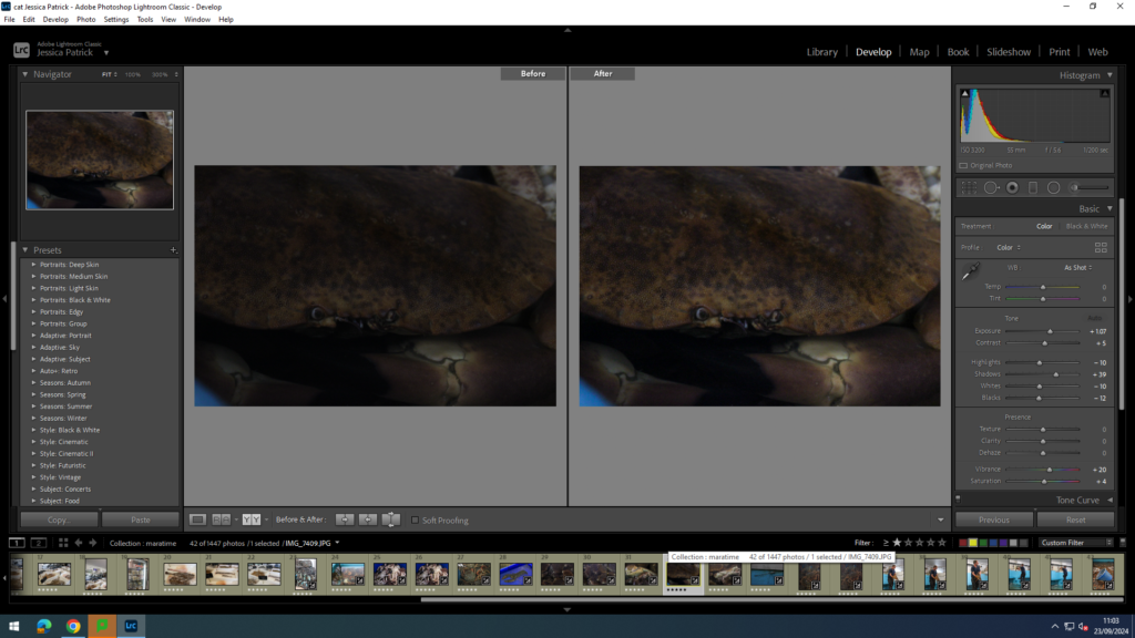
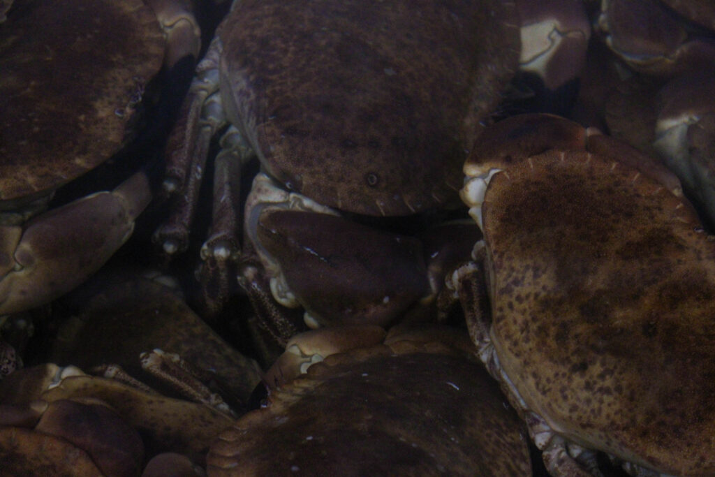
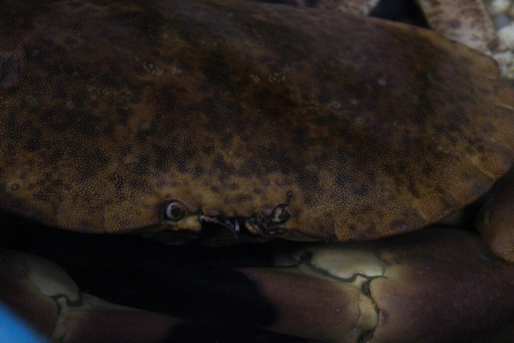
I edited this image by increasing the contrast, exposure, shadows, saturation and vibrancy, while decreasing the whites, highlights and blacks. I did this, so the image was brighter, because it was a very dark picture. I also wanted the crab and his eyes to be more visible.
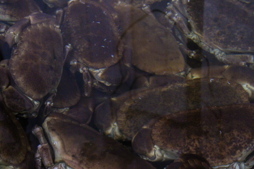
I edited this image by increasing the contrast, exposure, whites, shadows, saturation and vibrancy, while decreasing the highlights and blacks. I did this, so that the image was brighter, so the crabs were more vibrant and visible.
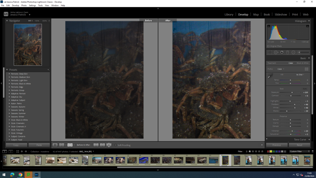
I edited this image by increasing the contrast, exposure, whites, shadows, saturation and vibrancy, while decreasing the highlights and blacks. I did this, so that the whole image was brighter and more vibrant, so it would look less dull. I also wanted the cray fish to be much more vibrant, so it can stand out much more.
Next, I created a virtual copy of the edited image and created a black and white version. Then, I increased the highlights, contrast, whites, shadows and decreased the blacks, so that the image had many shades of grey running through it, so there was more of a contrast. I also increased the texture in this image, so that the textures and patterns on the cray fish’s back were more prominent.
I edited this image by increasing the contrast, exposure, whites, shadows, saturation and vibrancy, while decreasing the highlights and blacks. I did this, so the crabs and the blue bucket would be more vibrant and brighter, so that the picture would be less dull.
Final Images

Evaluation
In conclusion, I think this photoshoot went well, because I was able to capture the fresh fish, which is one of the main things the harbour is used for. I thought this photoshoot represented the harbour well, because fishing goes on here, there are fishing boats, fishermen and people selling and salting the fresh fish. I was also able to capture a man at work, with the still alive shellfish. I explored and captured how they stored these shellfish and watched and captured them at work.
I also thought I edited these images well, using coloured images as well as black and white images. I was able to manipulate the lights, darks, contrast, vibrancy, saturation and more, so I can improve my images. However, next time I would like to have spent more time experimenting with photoshop and cropping some of my images. I also thought the composition of my images was quite good, as I used different angles and had centred images, along with non-centred images, but I could have experimented more with cropping to improve them even more.
I also like how I managed to capture similar images, or images that can be presented together in either pairs or a triage or more. I think this really improved the presentation of my final images.
Analysis

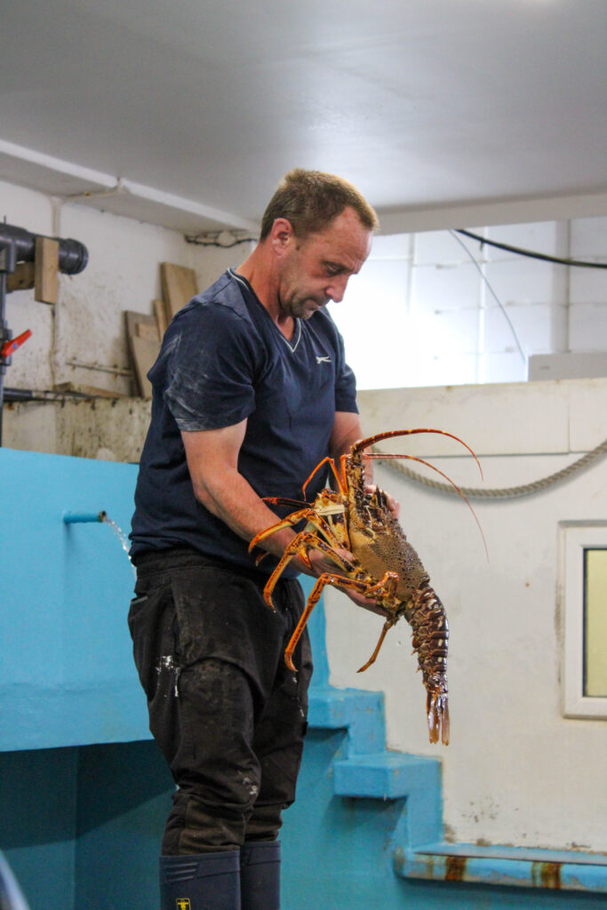
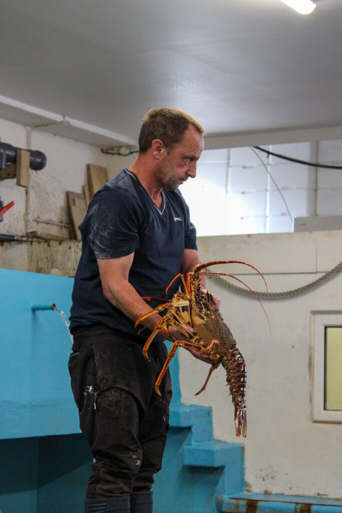
This image is of a man at work at the harbour. He is a fisherman, who catches live crab, lobsters etc. and keeps them in this building, which we are currently in, which has lots of pools of sea water inside, which is where these live animals are kept, until they are killed for us to eat.
This image may upset certain people, such as vegetarians, because they do not believe in the slaughtering of animals just for us humans to eat, because they believe it is cruel. Personally, I eat fish and meat.
In this image I used artificial lighting, because we were inside a building. I had no control over the position of the man at work, or the location of the photo, because it was just an opportunity photo, so nothing was manipulated by me. However, I did have control over the distance and position I was from the man, because I was able to move around to take my images, and I was able to zoom in and out on my camera.
Camera settings:
- F stop: f/9
- Exposure: 1/200 seconds
- ISO speed: ISO 100
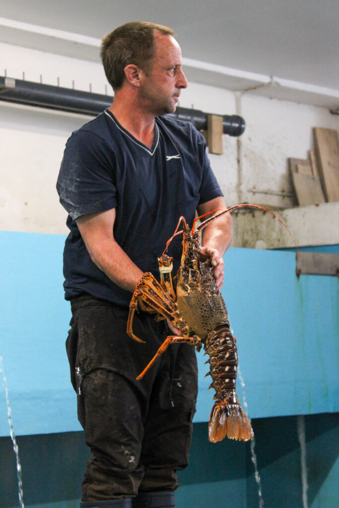
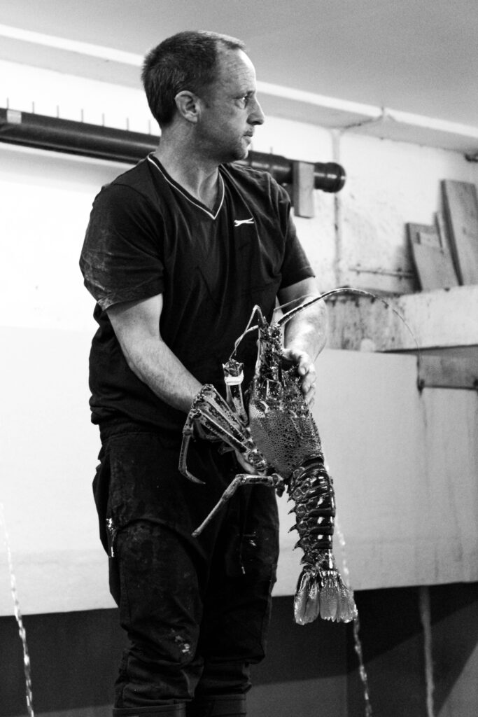
This image is in black and white, so is cool toned and has lots of different shades of grey running through it. It also contains lots of light and dark tones, due to the different shades of grey running through the image. This has also created lots of contrast in the image, between all the lighter and darker tones. You can also see some texture in this image, on the crayfish, because you can see the roughness and the lumps and bumps on the back and legs of the crayfish.
The main focus point of this image is mainly the crayfish, but also the man holding it, because I wanted to capture the man at work as well. The main focus point of this image is centred in the frame and there is not a lot of negative space around him, because I zoomed in with my camera, so I was able to crop most of it out.
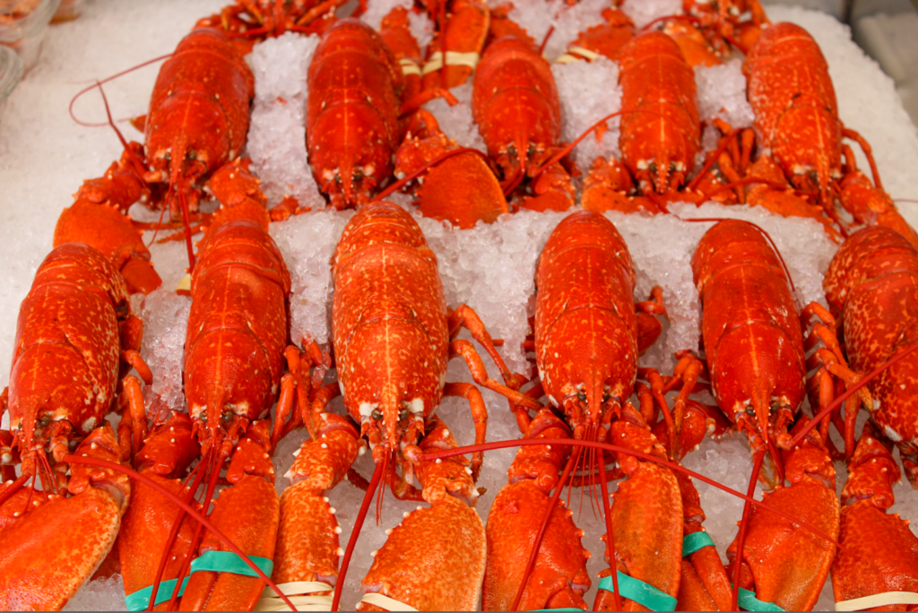
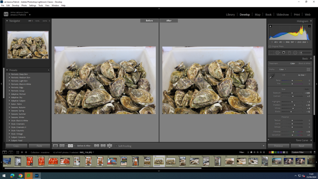
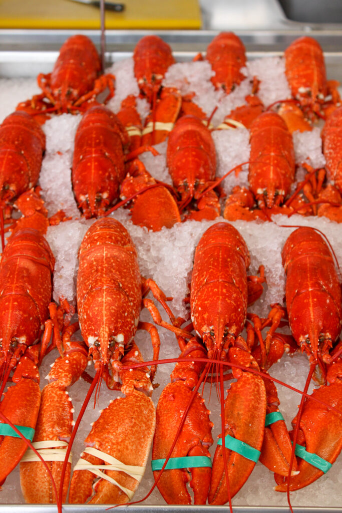
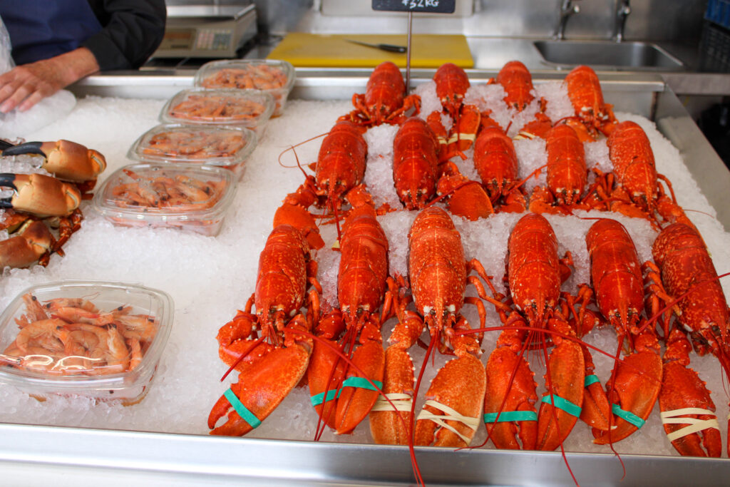
This is an image of dead fresh lobsters that are being kept cool on ice in a small little shop at the harbour, so they are ready to sell to people to eat.
This image may upset certain people, such as vegetarians, because they do not believe in the slaughtering of animals just for us humans to eat, because they believe it is cruel. Personally, I eat fish and meat.
In this image there is artificial light, because we were inside a little shop, but there was also natural lighting coming through into this image, because of the large open doors and windows at the front of the shop. I had no control over the positioning of the lobsters, because they were in this position when we found them, and I was not able to touch them to manipulate their position. However, I liked the position they were in. Even though I could not be in control of their positioning, I was in control of where I stood and how zoomed in or out my camera was.
Camera settings:
- F stop: f
- Exposure:
- ISO speed:
This image is a coloured image, which is very warmed toned, because of the colours of the lobsters. The lobsters are quite vibrant and saturated, so they are quite bright. This image also includes light and dark tones, but mainly light tones, due to the ice that the lobsters are rested on. This image also includes lots of texture, because I was able to capture the lumps and bumps on the lobsters backs and claws. There is also a 3d distinct shape in this image, because all the lobsters are such similar shapes, so it looks very repetitive.
The layout/ composition of the lobsters in this image is also very repetitive, because they are all laid out in exactly the same way next to each other, which creates a visual element of organisation. However, I do think I could have improved the image by cropping it and having them more centre in the frame, so I can crop out some of the negative space on the left hand side of the frame.
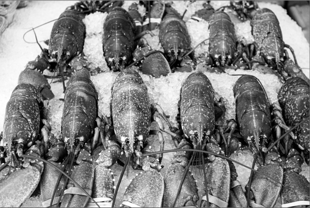
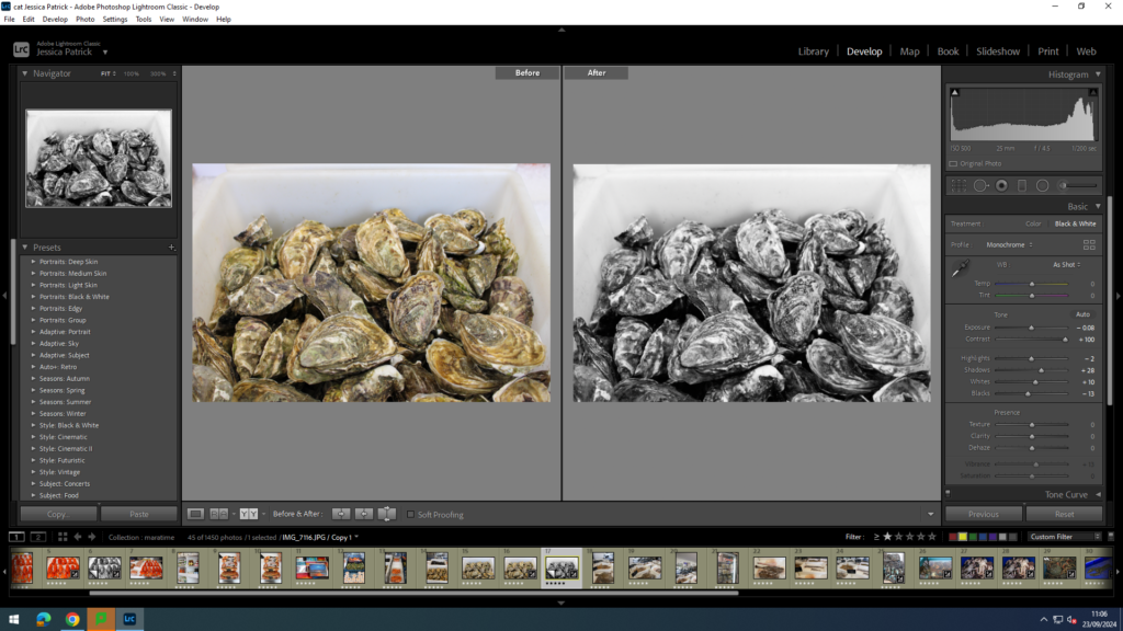
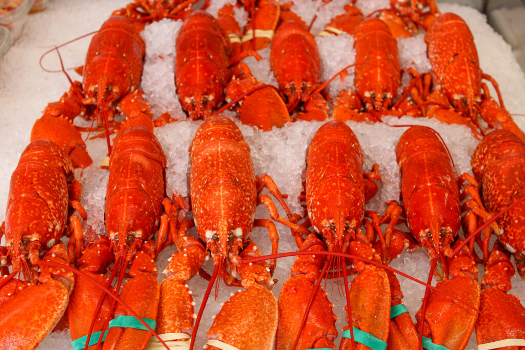
This is an image of dead fresh lobsters that are being kept cool on ice in a small little shop at the harbour, so they are ready to sell to people to eat.
This image may upset certain people, such as vegetarians, because they do not believe in the slaughtering of animals just for us humans to eat, because they believe it is cruel. Personally, I eat fish and meat.
In this image there is artificial light, because we were inside a little shop, but there was also natural lighting coming through into this image, because of the large open doors and windows at the front of the shop. I had no control over the positioning of the lobsters, because they were in this position when we found them, and I was not able to touch them to manipulate their position. However, I liked the position they were in. Even though I could not be in control of their positioning, I was in control of where I stood and how zoomed in or out my camera was.
Camera settings:
- F stop: f
- Exposure:
- ISO speed:
This image is in black and white, so is cool toned and has lots of different shades of grey running through it. It also contains lots of light and dark tones, due to the different shades of grey running through the image. This has also created lots of contrast in the image, between all the lighter and darker tones. You can also see some texture in this image on the back of the lobsters and on their claws. There is also a 3d distinct shape in this image, because all the lobsters are such similar shapes, so it looks very repetitive.
The layout/ composition of the lobsters in this image is also very repetitive, because they are all laid out in exactly the same way next to each other, which creates a visual element of organisation. However, I do think I could have improved the image by cropping it and having them more centre in the frame, so I can crop out some of the negative space on the left hand side of the frame.