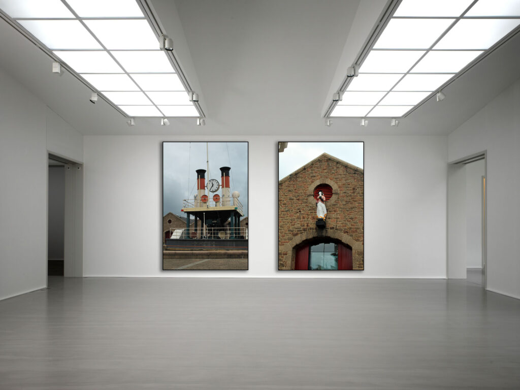
Windows and Mirrors

What are the differences between photograph’s that are WINDOWS and MIRRORS.

The difference is windows can be seen as less personal to the photographer, almost as if the photographer is looking down at someone else’s life. A Window is described as an exterior world that is explored in all its presence and reality. Where as mirrors is a photograph of a something you can relate to, something that reflects who you are. In other words a mirror is a romantic expression of the photographer’s sensibility as it projects itself on the things and sights of this world. It’s almost like putting it as a window is something you look out of therefore its not something related to you, its what is outside the window that matters and a mirror is a reflection yourself, how you could portray yourself as in a photograph, what the photo reminds you of. “Mirrors” were images meant to mirror the photographer’s own sensibility. “Windows” were photos meant to act as a window for the viewer to see something that is primarily factual and external to the photographer’s own sensibility.

Words and quotes for mirrors and windows:

Binary opposite: Two theoretical opposites are strictly defined and set off against one another. Windows (exterior) and mirrors (interior) are completely different to each other. Windows are seen as being truthful and honest they show you the true colour of an image and help the viewer open there eyes to see a new perspective to the image. Whereas Mirrors are seen more as lies and staged.

 “A window is a story that sheds light into the other’s experience whereas a mirror is a story that reflects your own experiences and helps you build your self, your own identity.”

John Szarkowshi

John Szarkowshi wrote this book as a way of understanding himself the difference between windows and mirrors throughout the years. He stated that windows were seen as an direct observation whereas mirrors were an introspective narrative. although Szarkowski does state that photographers can not be categorized as purely one or the other and that you can find aspects of both in the many photographers work, this helps me understand that each image can have a factor of both windows or mirrors if the image is analysed correctly. The thought that an image can be categorised only into one category makes it challenging to see which one as there are counterargument’s depending on each persons perspective. argues for the importance of looking carefully and bringing to bear every bit of intelligence and understanding possessed by the viewer states that students should read his book to help identify the importance of looking carefully and bringing to bear every bit of intelligence and understanding possessed by the viewer looking at an image, arguing that each photo has a deep meaning to it, some which is hidden and some that is very well seen by the viewer. Another thing by Szarkowsk stated was argues for the importance of looking carefully and bringing to bear every bit of intelligence and understanding possessed by the viewer.
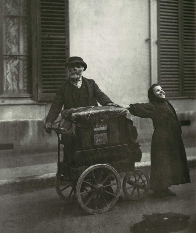
window: This image would be seen as a window due to the fact that its not personal to the photographer, its not really showing a specific identity or portraying a specific story it shows us the basics of the photo where an older man is standing still with a younger girl next to him, this image shows us the perspective of looking out a window down onto the exterior of peoples lives. This image clearly is showing someone’s else perspective and not the photographers experience, However some could argue that this image is a mirror as it could portray the life of the photographer’s family which makes the image quite personal and sincere. You could say that the man is looking in the direction of the camera almost as if he is looking at himself and his reflection. It could be a self portrait of the people and the camera is set up which makes the image direct to these people. The girl could be posing knowing the photo is being taken making it a staged image or it could be a hidden camera taking the photo and the girl is expressing her happiness without realising she is being photographed.

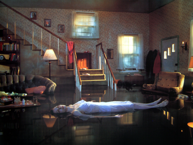
Mirror: This image is clearly a mirror as it could be seen as a reflection of this ladies mind, she is laying on the floor looking quite helpless, this could be a reflection of the ladies mind, she could be depressed or maybe missing something. Although her house might not be looking really messy, she is laying on the floor looking vulnerable and quite weak. The room is still quite lit up and looks quite cleaned up, which could reflect the idea that there is something making her still content to an extent. People could suggest that this image is a window almost as if the photo was taken through a window looking at someone’s else’s perspective.
Narrative & Sequencing

STORY: What is your story?
Describe in:

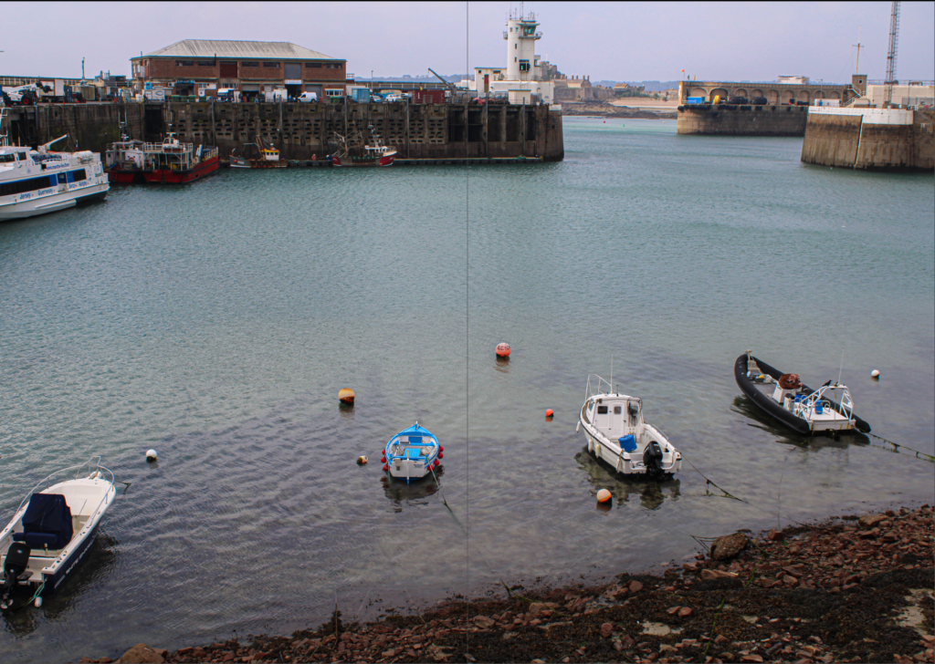
  • 3 words: Saint Helier Harbour
  • A sentence: What goes on at the harbour
  • A Paragraph: I wat to tell the story of what happens at st Helier harbour and the life of it, in general and have sections dedicated to parts of the harbour such are people and places.

NARRATIVE: How will you tell your story?

  • Images: I will use images from both the photoshoots at the harbour as well as archived images.
  • Archives: I want at least one page comparing the harbour to what is is today as it is important to focus on its long history. I will use photos from the photo-archive for this.
  • Texts > Write a short introduction or statement about your picture story, image captions
  • Typography: For the font I want to use a unique font to help my zine stand out, but not a font which is too over the top. I can use the font for my title for the zine which I will display in large on my front cover.

Mood board

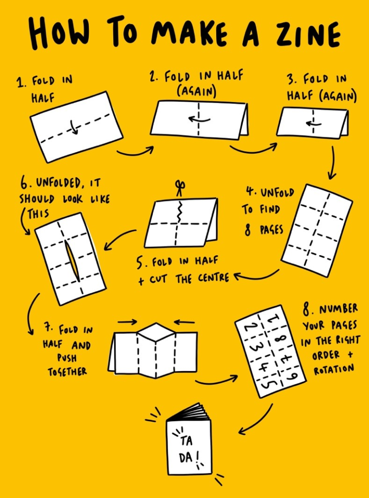
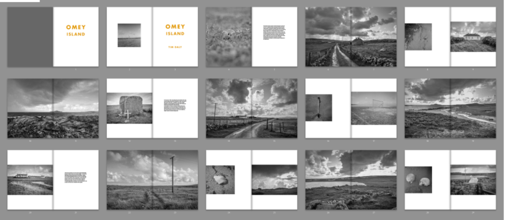
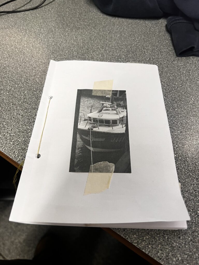
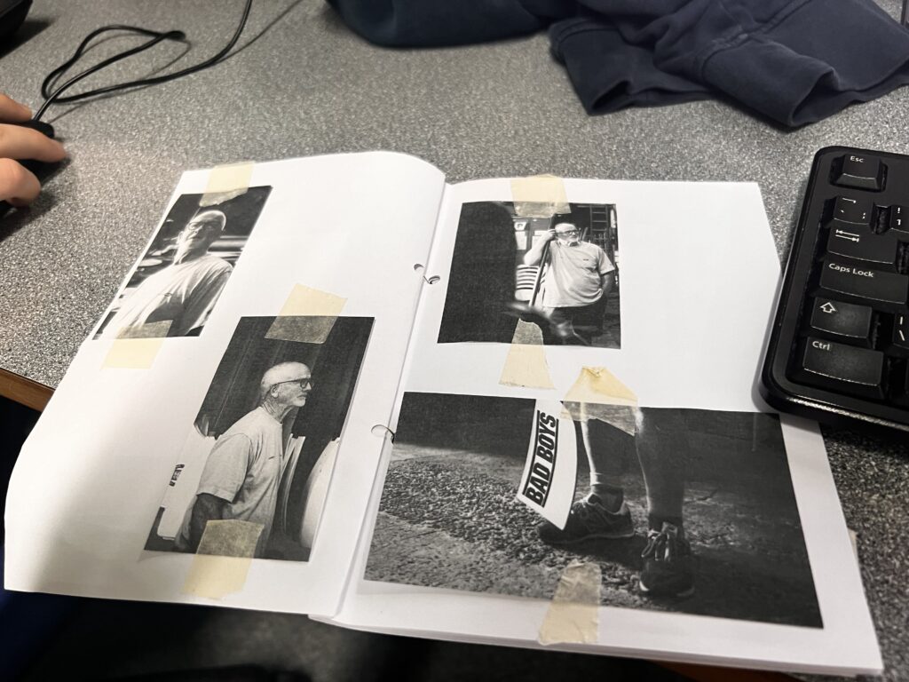
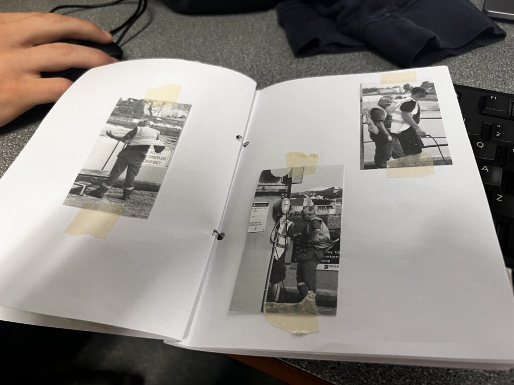
creating a concept zine for laying out and sequencing my photos

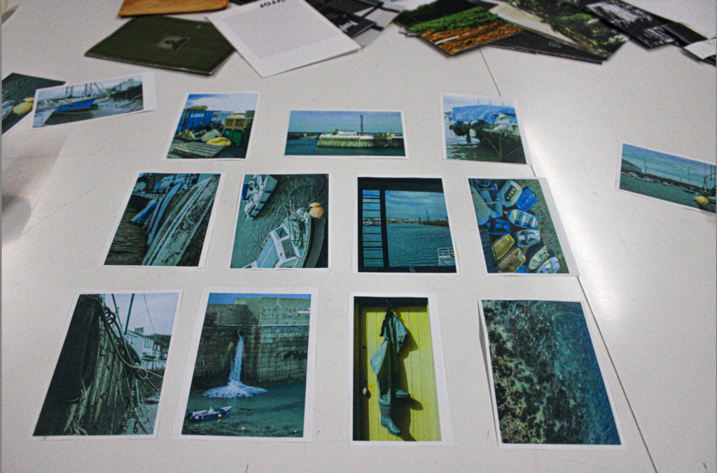
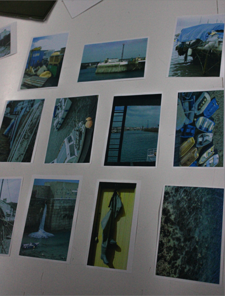
I printed out the photos I wanted to use for my zine and created a rough layout to help me decide what photos to use and where they will go in my zine. It really helped when I was creating my actual zine as I knew roughly what and were my photos will go.

^Front Cover

Origin Of Photography

Photography is very good at turning the ordinary into the extraordinary. A usual everyday occurrence could be captured in a photograph and be completely transformed. Something such as as clouds in the sky, which is a usual thing for people to see in their everyday lives, could be captured in a photo to make it more dramatic and unique.

Camera Obscura

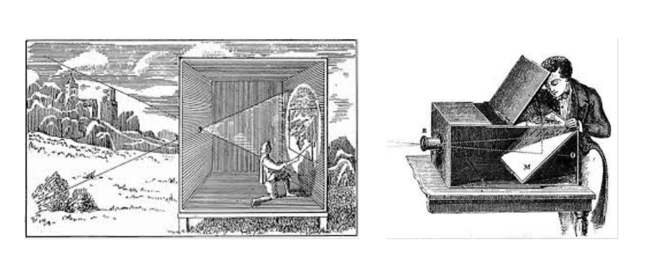
The camera obscura (dark chamber), is a device that has been very important in the history of photography. Its function involves light passing through a small aperture into a darkened room or box which would then project an inverted image of the outside scene onto a plain surface inside. During the Renaissance, artists and scientists began to utilize the camera obscura as a tool for drawing and understanding perspective.
Describe how an image is produced using a camera obscura – making the room pitch black and making sure there is no light coming through anywhere. create a hole somewhere where the light will be able to pass through. This process of waiting for the light to show could take up to an hour or two until the cut out shape is able to be shown on the other side of the room

Nicephore Niepce

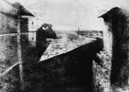
Nicephore Niepce is known for creating one of the earliest permanent photographs. He was born in 1765 in Chalon-sur-Saône, France. In 1826 or 1827, his first successful photograph was titled “View from the Window at Le Gras.” The exposure time for his image was around eight hours which ended up producing a blurred image however it was recognisable. He studied law at the University of Dijon but developed a keen interest in science and mechanics. Niépce came from a well-off family and was the son of a wealthy merchant. He later inherited his father’s estate. In 1829, Niépce partnered with Louis Daguerre, who was a theatrical designer and inventor. Although their collaboration was cut short by Niépce’s death, it set the stage for significant advancements in photography.

Heliograph- To make the heliograph, Niépce dissolved light-sensitive bitumen in oil of lavender and applied a thin coating over a polished pewter plate. He inserted the plate into camera obscura and positioned it near a window in his second-story workroom. After several days of exposure to sunlight, the plate yielded an impression of the courtyard, outbuildings, and trees outside.

Louis Daguerre

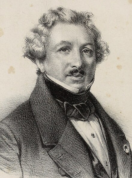
Louis Daguerre 18 November 1787 – 10 July 1851) was a French artist and photographer, recognized for his invention of the eponymous daguerreotype process of photography. In 1829, Daguerre partnered with Nicéphore Niépce, an inventor who had produced the world’s first heliograph in 1822 and the oldest surviving camera photograph in 1826 or 1827.

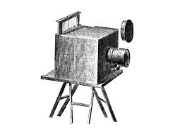
After Niépce’s sudden death, Daguerre continued experimenting, and evolved the process which would subsequently be known as the daguerreotype. To create this, he exposed a thin silver-plated copper sheet to the vapour given off by iodine crystals, producing a coating of light-sensitive silver iodide on the surface. The plate was then exposed in the camera.

Henry Fox Talbot

William Henry Fox, 11 February 1800 – 17 September 1877, was an English scientist, inventor, and photography pioneer who invented the salted paper and calotype processes. Shortly after.Louis Daguerre’s invention of the daguerreotype was announced in early January 1839, Talbot asserted priority of invention based on experiments he had begun in early 1834.

Differences

Henry Fox Talbot experimented using paper and shoe boxes which he called “mousetraps” to create his image where as Louis Daguerre used a mirrored metal plate instead of paper. Talbot was not an experienced artist as it was known that he couldn’t draw very well whereas Daguerre was an academically trained painter who sold his own work. Daguerre’s invention of the Daguerreotype eventually became less successful and Talbot’s Calotype became more popular.

similarities

Both processes are long and tedious. Both invented in 1839 which meant there would be a competition between the two as they were invented in the same year. both processes fix an image.

He took unremarked photos of Murdock Ans turned ordinary into extraordinary. Andre. Control that transformation- art of photography. “how can something that reveals so much keep so much to itself”. shows the secret strangeness. instantaneous. secrets behind the world

Richard Maddox

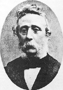
Richard Leach Maddox was born at Bath, England, on 4 August 1816. Maddox was prominent in what was called photomicrography, which was photographing minute organisms under the microscope. 

In photography, the Collodion process was invented in 1851 by Frederick Scott Archer. This invention required only two to three seconds of light exposure to produce an image. When he noticed that his health was being affected by the ‘wet’ collodion’s ethervapor, Maddox began looking for a substitute


George Eastman

George Eastman (July 12, 1854 – March 14, 1932) was an American entrepreneur who founded the Eastman Kodak Company. This was an American public company that produces various products related to its historic basis in film photography. Working as the treasurer and later president of Kodak, he oversaw the expansion of the company and the film industry.

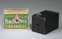
Kodak (Brownie)

The Brownie was a series of camera models made by Eastman Kodak and first released in 1900. This was a basic cardboard box camera which was initially aimed at children.  An improved model, called No. 2 Brownie, came in 1901, which produced larger 3.25-by-2.25-inch photos, cost $2, and was also a huge success. Many iconic shots were taken on brownies such as images produced from the Titanic disaster or even taken to war by soldiers. The cameras continued to be popular, and spawned many varieties such as Boy Scout edition in the 1930s. Six-20 Flash Brownie in 1940, Kodak’s first internally synchronized flash camera, using General Electric bulbs. In 1957, Kodak produced the Brownie Star flash, Kodak’s first camera with a built-in flash.

Film/Print Photography

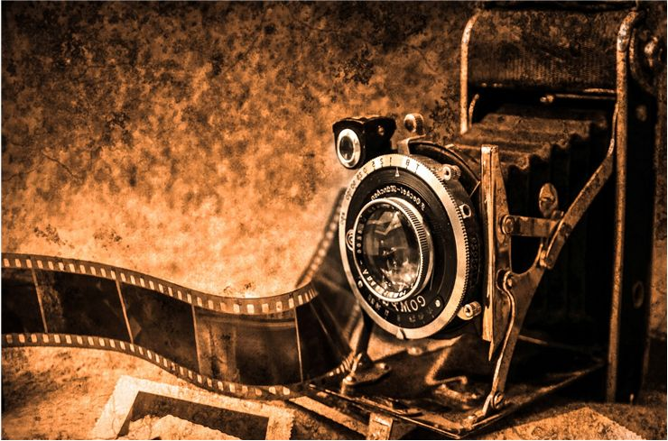
The first film that was in a roll and flexible was made by George Eastman in 1885, but it wasn’t synthetic but on paper.  “Safety film” was introduced by Kodak in 1908, made of cellulose acetate and was invented as a replacement for dangerous nitrate film. in 1855, The first Photographic plates that could produce images in colour appeared however this included long exposure time which was very unpractical. Colour film was used for home movies and photographic cameras but was still too dark and much more expensive than black and white. It took 40 years for colour film to become standard and for black and white to be used for low-light and art photography.

Digital Photography

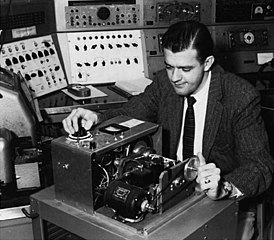
The history of digital photography began in the 1950s. in 1957, American computer engineer Russell Kirsch developed the first rotating drum scanner and software that could digitally record images. Digital photography is a complex technological process that utilizes optical physics, materials engineering, and data science to transform light into electrical signals that are converted into photo elements that comprise a digital image. 

Final Zine + Evaluation – Seek, Observe, Challenge

Virtual Gallery

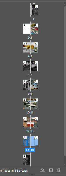
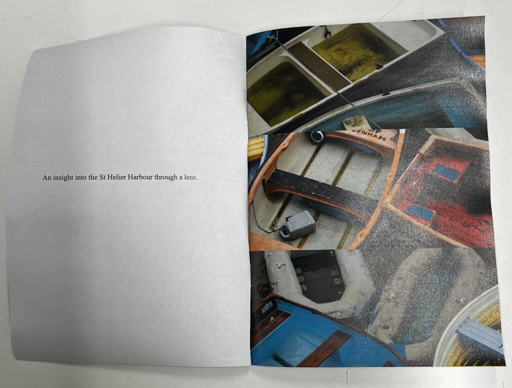
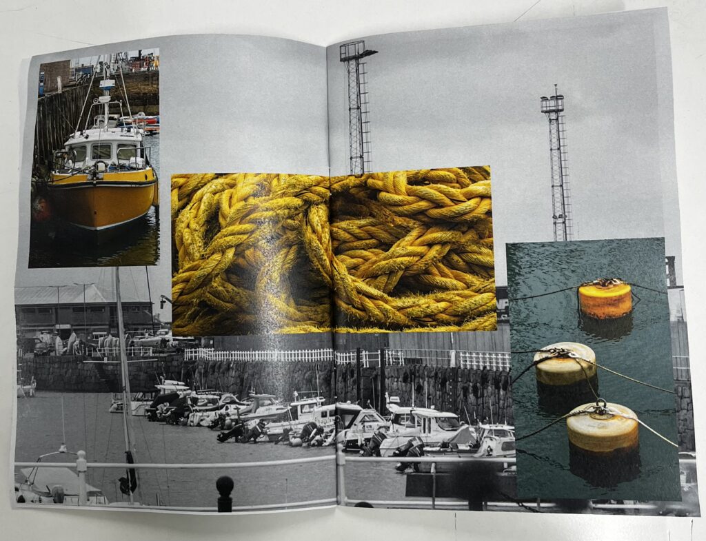
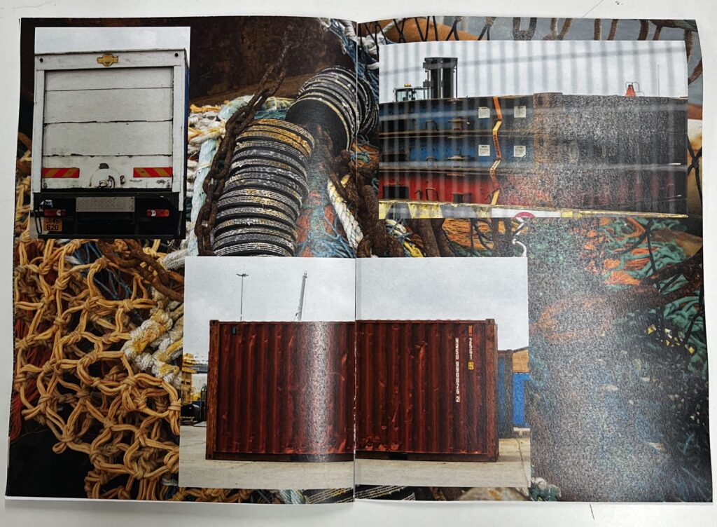
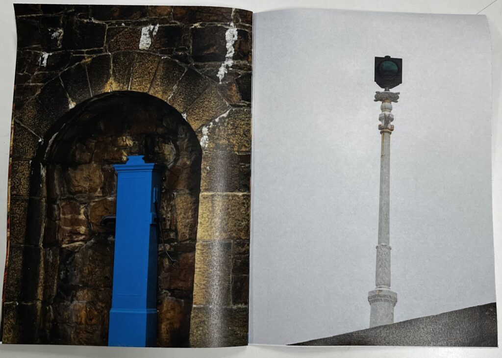
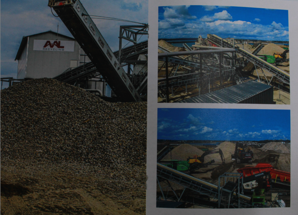
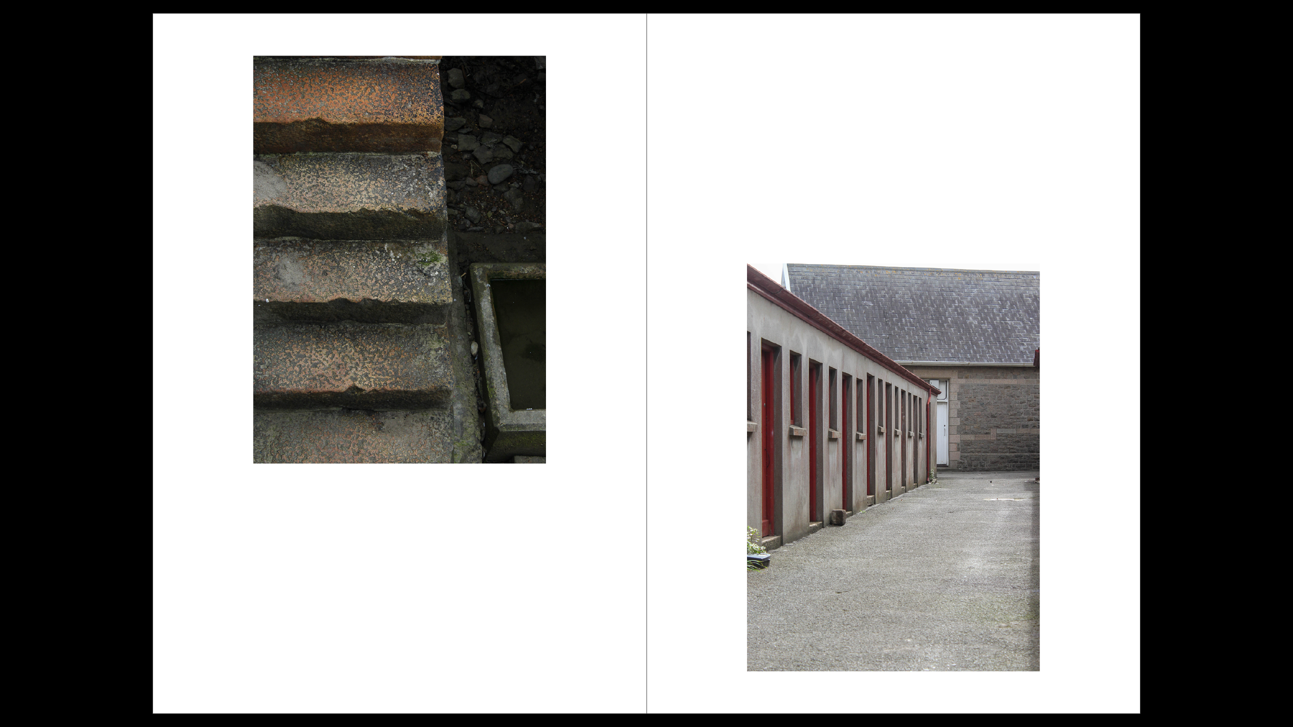
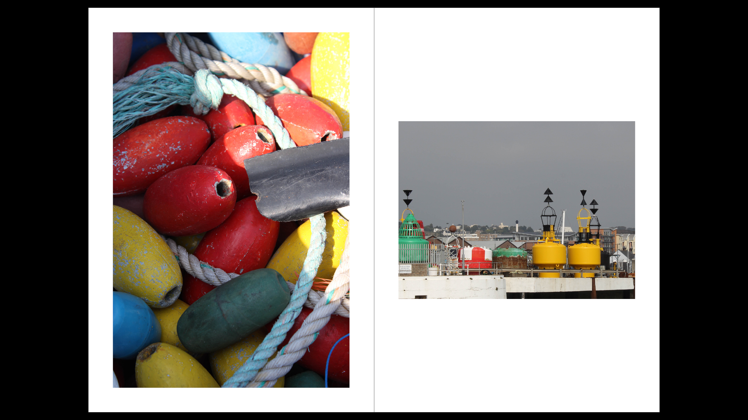
Overall my zine made good progress form the raw photos to the final product. I went through a lot of editing to pick the best photos from multiple shoots, I then found some photos I liked originally didn’t fit with the rest of the photos I had to re edit the image or pick one to replace it. It was a tricky balance between picking good photos technically and picking photos that went together and told the story I wanted to tell, an insight into the harbours. I found a mixture of detailed, abstract shots and wider perspective shots of the harbour made for the most comprehensive narrative. To keep cohesiveness throughout the zine I matched colours of photos, for example on one page I put three predominantly yellow photos on a black and white background photo. I also thought about this seeing the success of it in the zine when creating my virtual gallery I used a similar technique paring photos with similar colours, themes and textures together. A particularly good page in my zine is the second to last double spread, it shows the industry not only in detail with the background shot being a close up but the in the bigger picture with the bigger photos, with this page I thought back to the visit to Societe Jersiaise and how the industry has changed over the years from horse and cart and doing everything mostly by hand to now the machines and even how the scale of the industries has hugely increased while it’s not cod fishing anymore, over here, the harbour is still a huge part of the islands income and essential to the island. I also chose to use deep colours on this page contrasting the old photos of the harbours industries. Overall I am very happy with how the zine came out and I think I made great use of all the research I did into the history as well as capturing the new elements of the harbour of Jersey.
Zine.
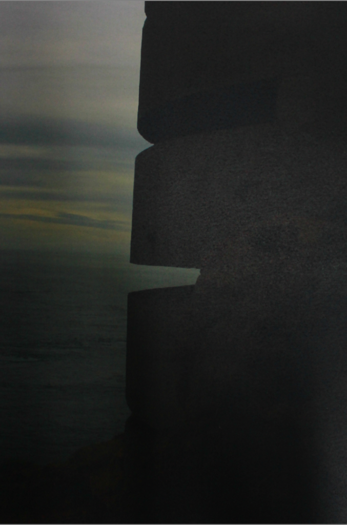
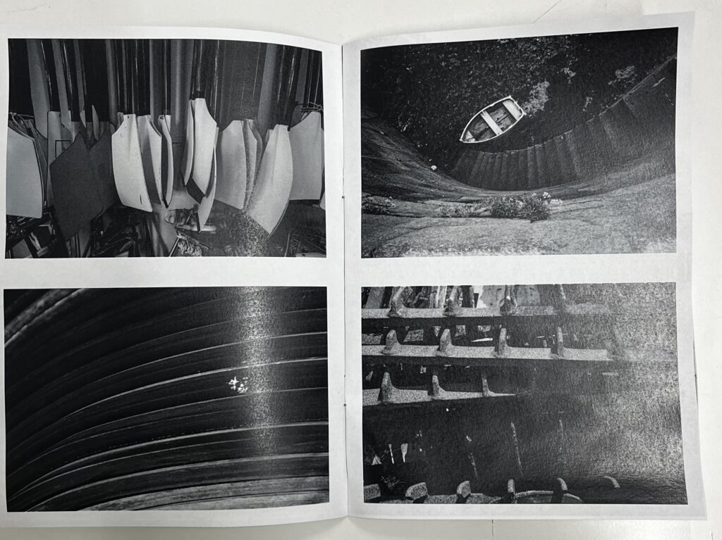
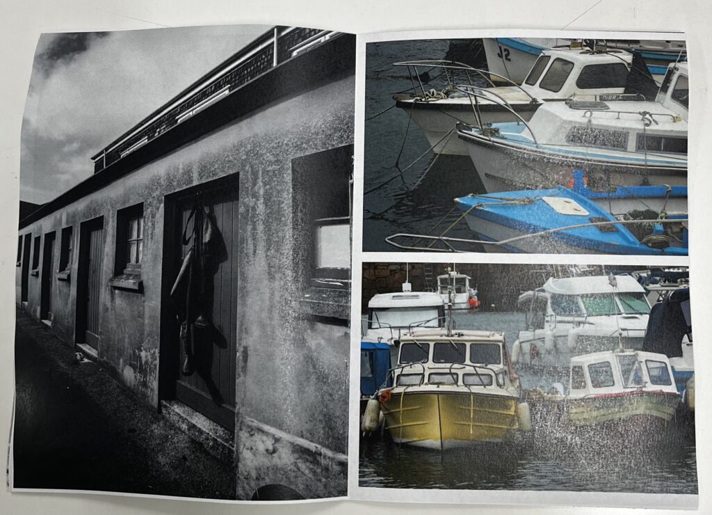
For my zine I am creating a collection of photos of St Helier and Jersey Maritime Museum. I will create this photobook on Adobe InDesign.
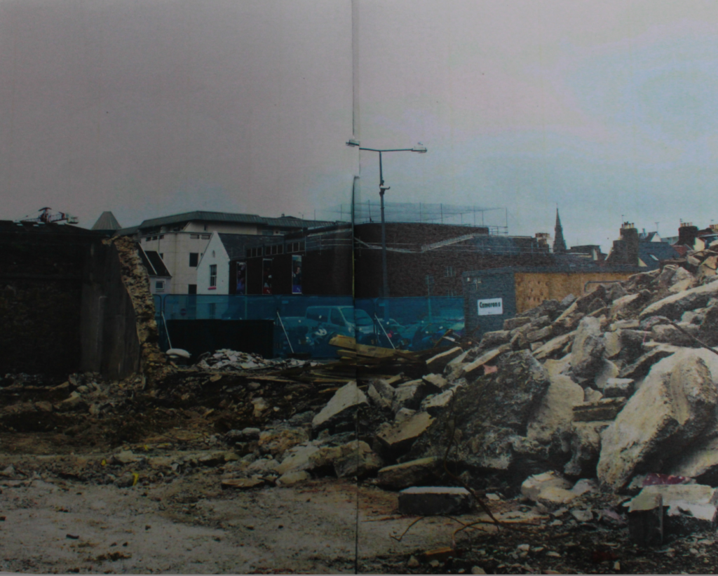
Mood board and Ideas.

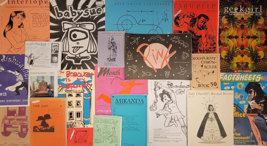
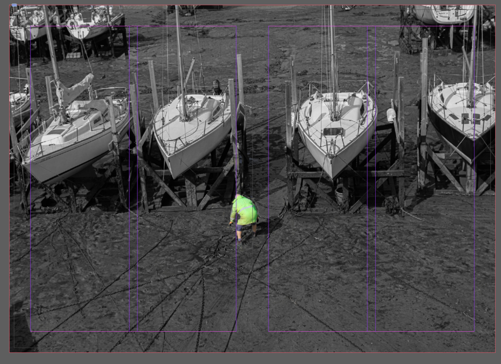
Here are some examples of Zines previous students have produced that I would like my images to be inspired by. I really like the dark theme which displays the construction and mechanical aspect of Jersey harbours.

My Images Ideas.

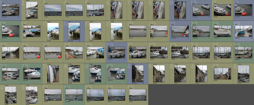
These are my selection of images I am going to choose from when creating my zine.
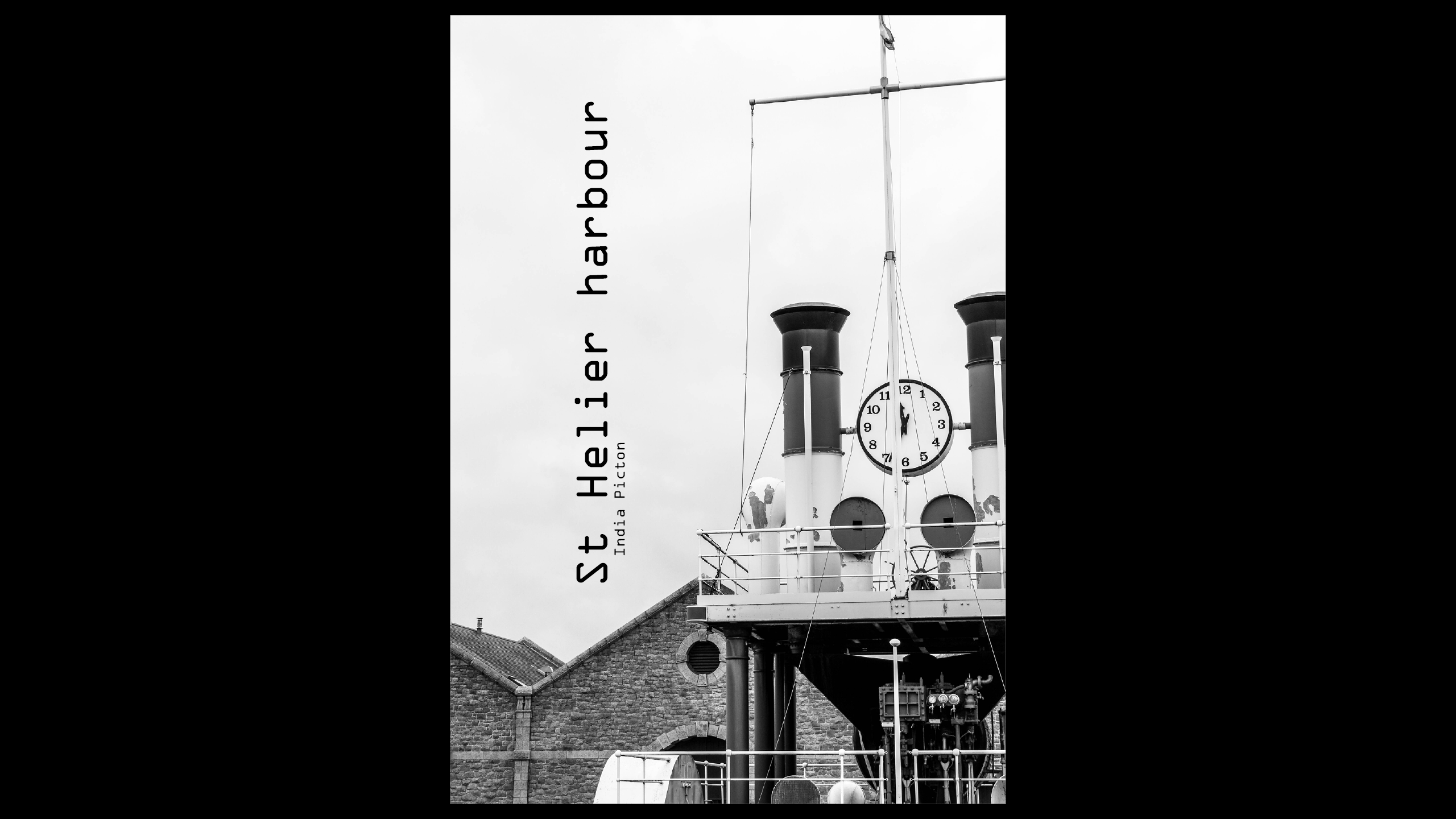
3rd St Aubin’s Harbour Photoshoot.
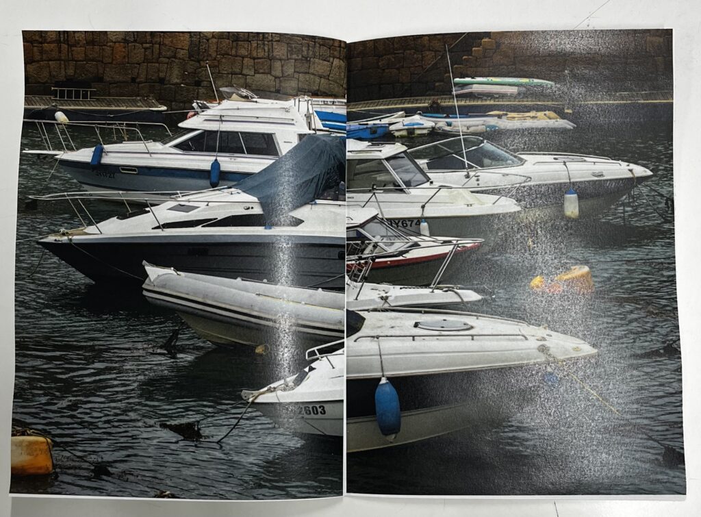
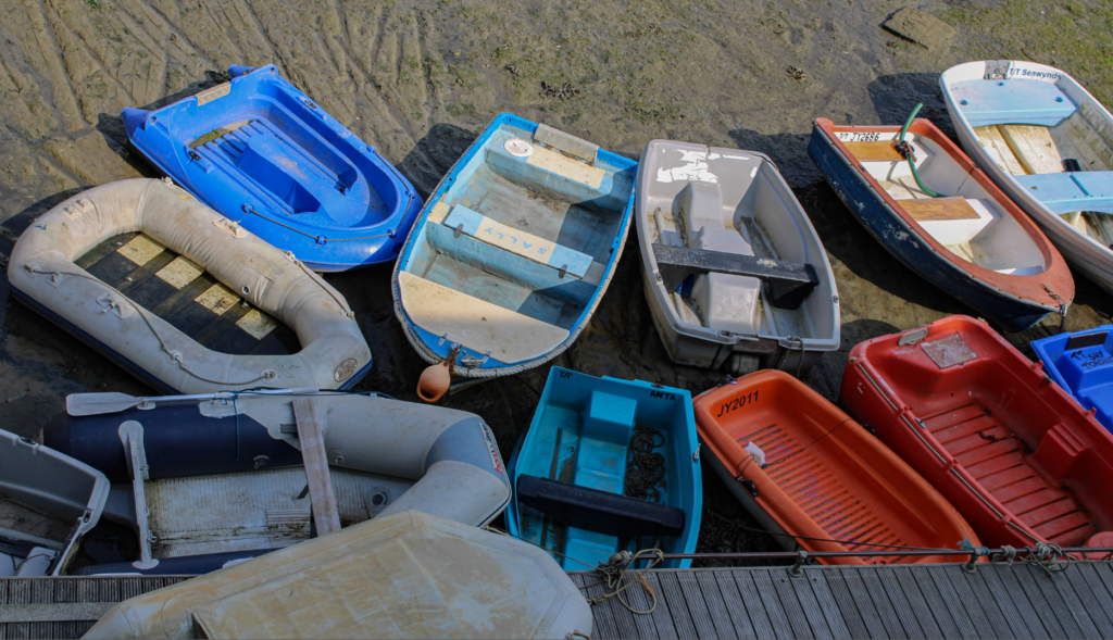
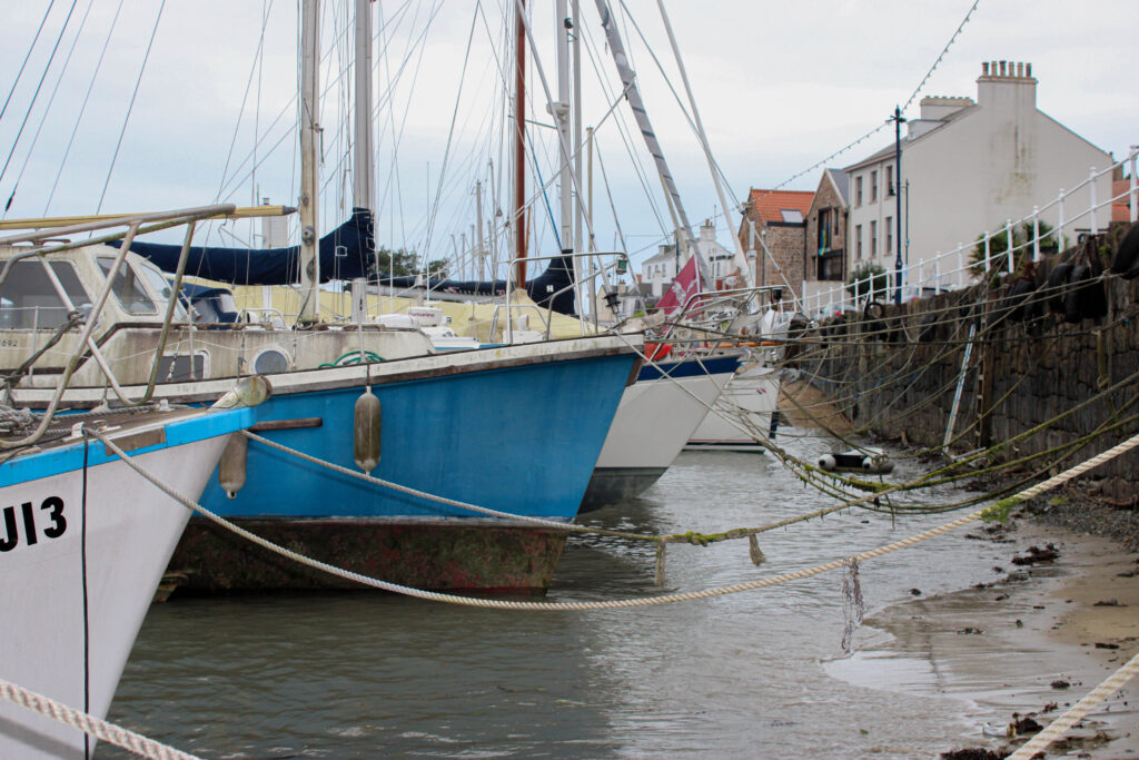
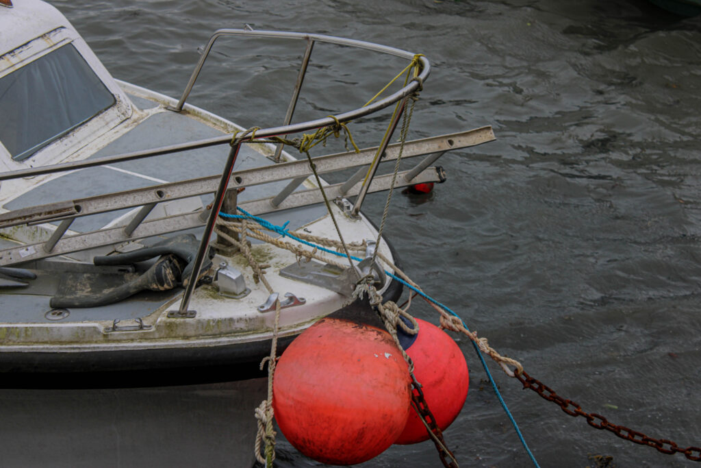
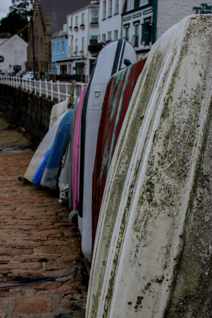
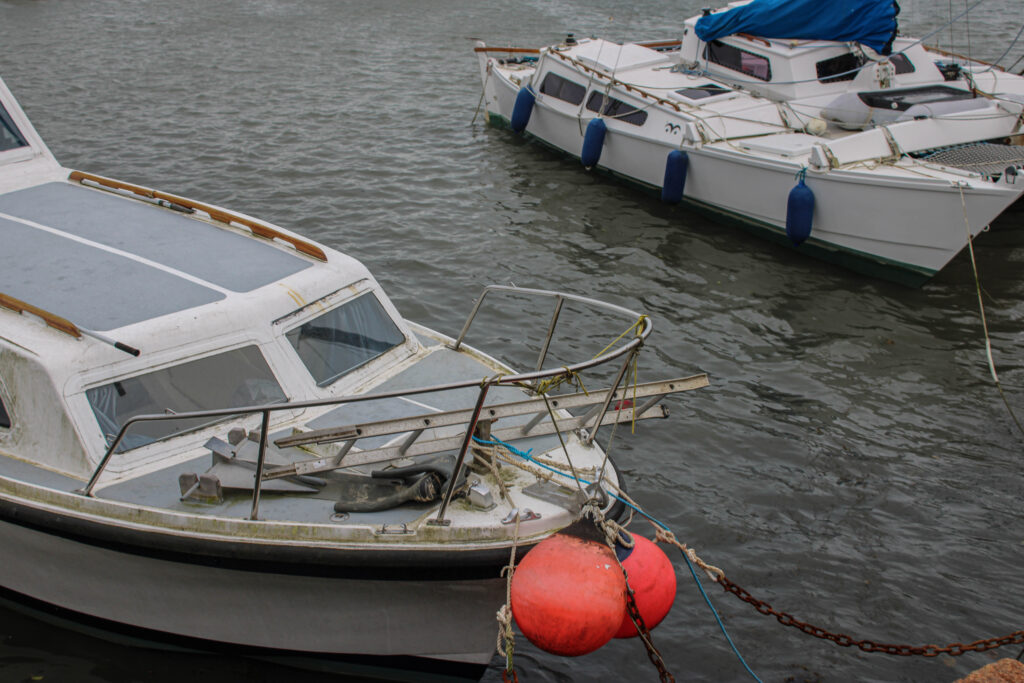
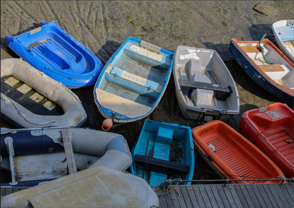
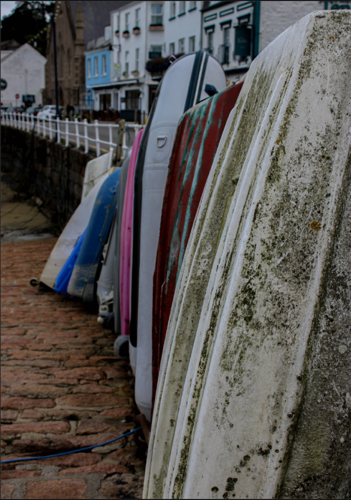
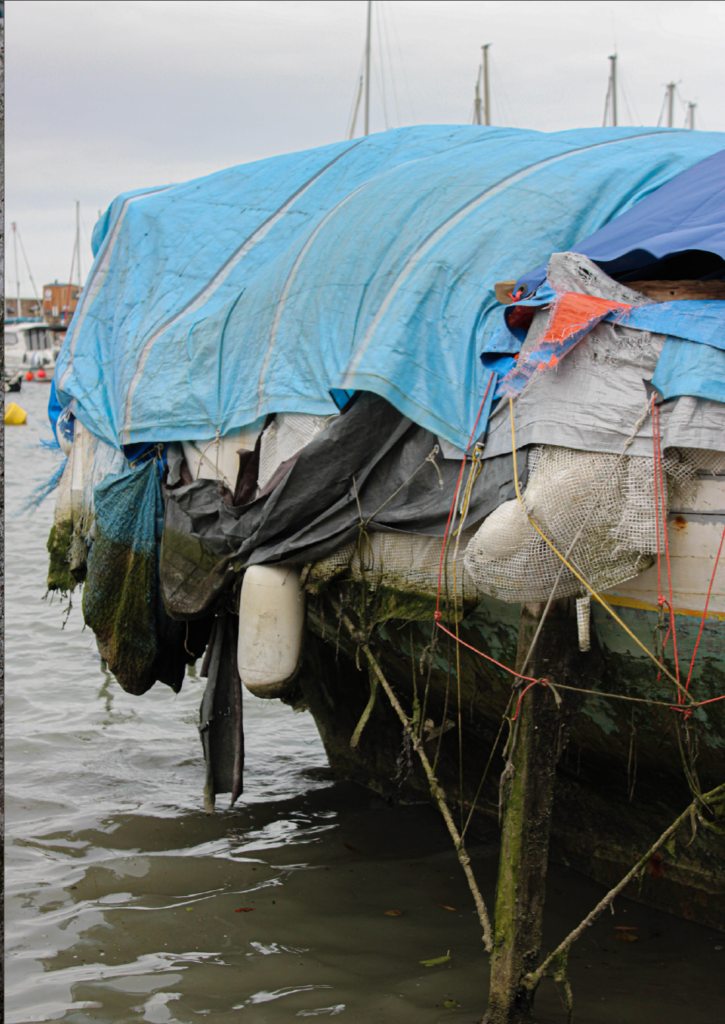
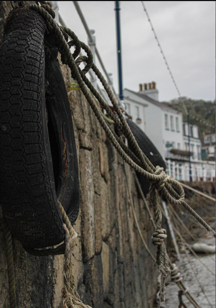
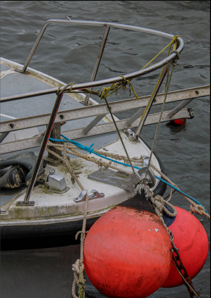
After arranging images I may want to use, I went and did one more small photoshoot in St Aubin’s harbour to gather more images I may want to use. I decided to attempt to get more close up and in depth images of boats at St Aubin’s harbour.

These are my favourite images out of the photoshoot I took at St Aubins harbour. I will use 3 or 4 of these to use in my Zine.

Design and layout.

I would like my zine’s images to fit the page. I want to include double and single page spreads with no more than one image to a page. I also want this image to completely fill the page with no white gaps as I personally don’t like how it makes the image look. I am attempting to do a 16 page Zine which consists of around 3 double page spreads and the rest being single page spreads.

Narrative and visual concept.

I have printed the photos I would like to use in my Zine and created them into an arrangement that I like. This helps me to visually sort each image into the right place I can also experiment which images to add and not include in my final product. I printed 4 images to an A4 piece of paper in colour to give me a rough overview of what they will look like. I have rearranged them into different orders to see which arrangement looks best.

Format size and orientation.

These are the settings I have used for my Zine, my page size is A5.

Image and text

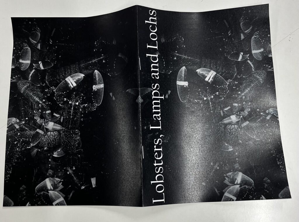
I have come up with the title of this is because I think it perfectly displays the concept of my Zine in a few words.

Research zines and newspaper designs.

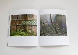
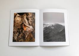
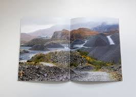
Whilst researching Zines online. I came across a particularly interesting interpretation from the Royal Photographic Society. I also found out that this project was used to encourage the public to go outside and take photographs in order to produce their own Zine. The Zines had to fit with their ‘definition of Landscape which was  “Landscape photography is defined as the photographic portrayal of all elements of the land, sea and sky whether natural or built or influenced by human endeavour. “

People were allowed to photograph things such as

  • Mountains
  • Hills
  • Bodies of water
  • Coasts
  • Forests

By researching different Zines and organisations I have gained knowledge and understandings on different styles. I particularly like the Zines on landscapes. I also like how these images slightly related to mine and have helped give me inspiration.

Final Layout.

Final Images.

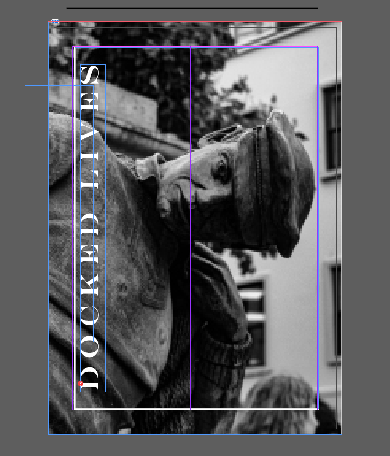
Originally I wanted my front cover to be this image…

However, I decided I could most likely find a stronger and more suitable image for my front cover. So after searching Lightroom I found an image…

I also wanted my front cover to relate to my final page this is so that when the book is being looked at , then the final page is seen and the book is closed, the front page is relevant and similar. For example:

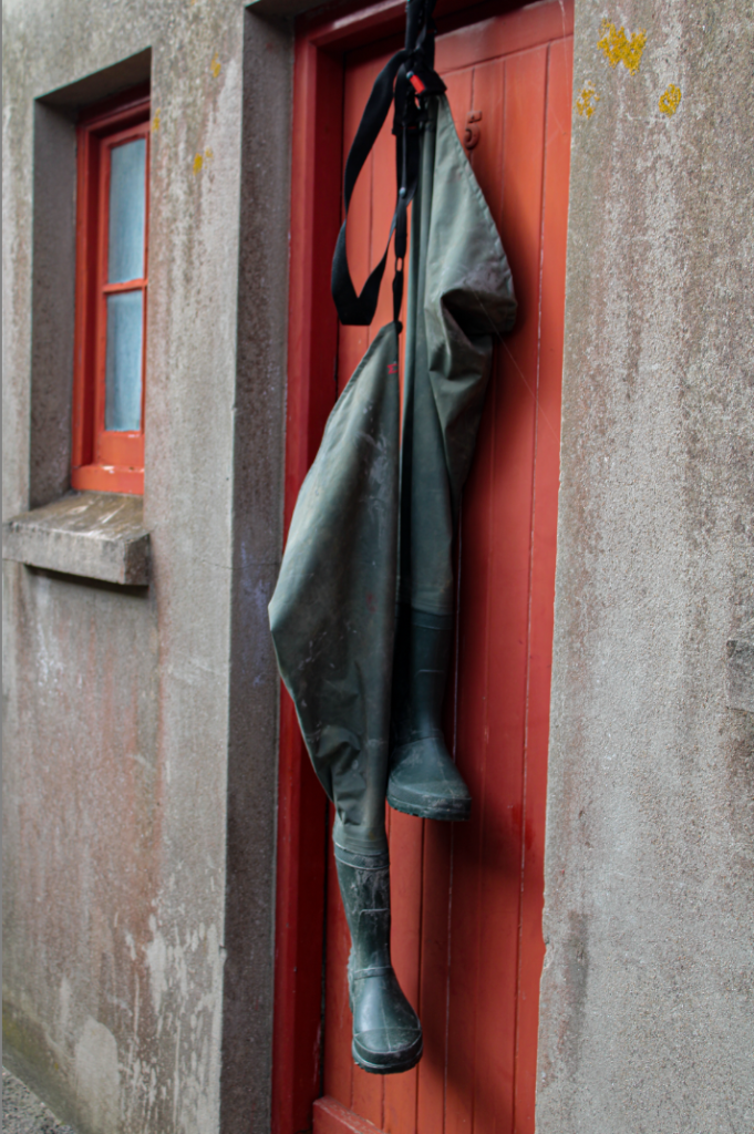
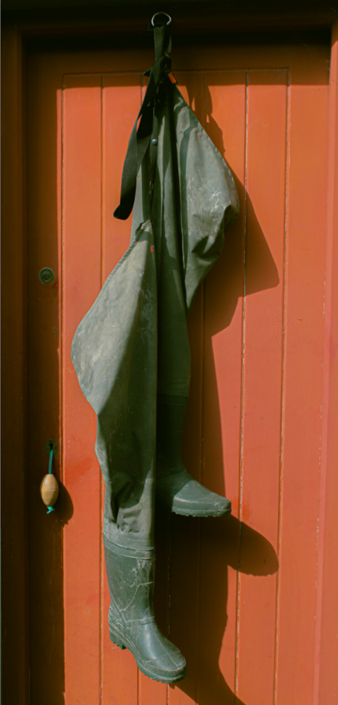
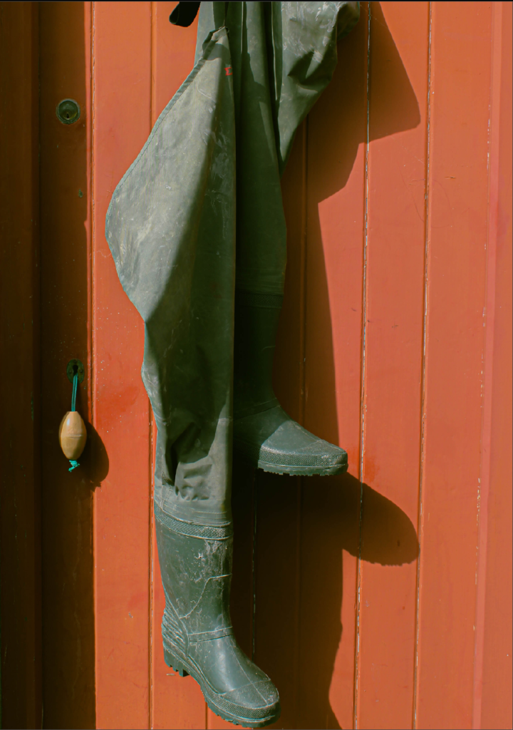
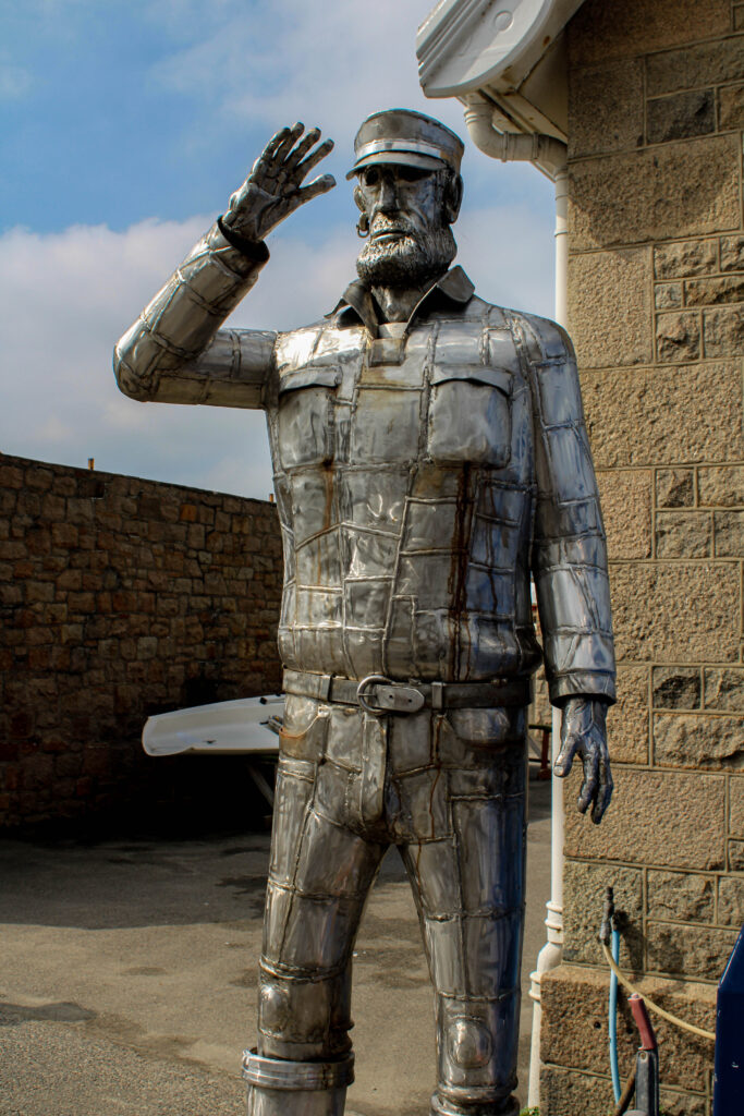
These two images are both relevant to sailors, employees and fishing. The statue is celebrating sailors and workers, whilst the final page gives a sort-of sense that the sailors have gone to work or finished their work for the day, leaving their boots behind. I felt this would be a good metaphor for the last page.

Zine: design & layout – George Blake

Practice –

Making a paper mock-up this allowed for me to create a rough idea on how and where my images should be positioned, As well as an idea of creative a story/narrative with my photographs in my shoots.

Altering around their positions, spacing and size, I was able to create an idea of how my images could be arranged, choosing to stick similar images taken around the same spot or same subject together, this to me showed an early example on how I can create my narratives.

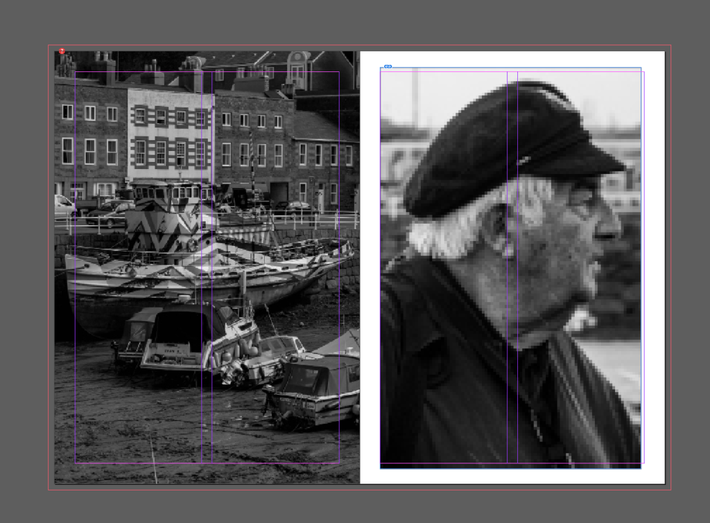
Selecting my final images, I began the process of creating my final zine. Using the rectangular tool and font styles I was able to create an interesting minimalistic aesthetic for my front cover.

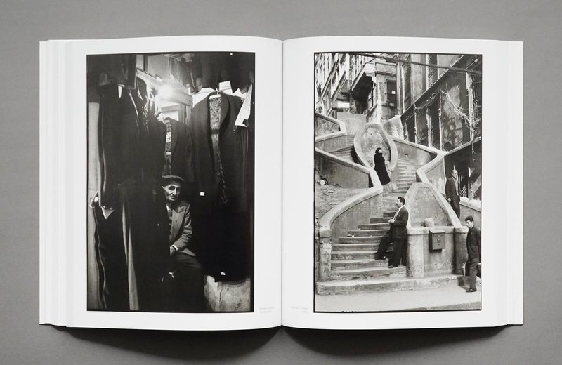
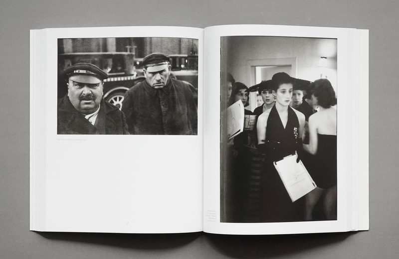
Taking Inspiration from Henri Cartier-Bresson’s Photobook ‘Europeans’, I Based some of my page layout designs on his work. Featuring images covering 2 pages as well as some fulling almost 1, this inspired me with some of the placement of images in my work.

zine: deisgn & layout

I firstly designed a paper copy of my zine to give myself ideas on what my story is and how each photo should be places and give a vibe of the final product.

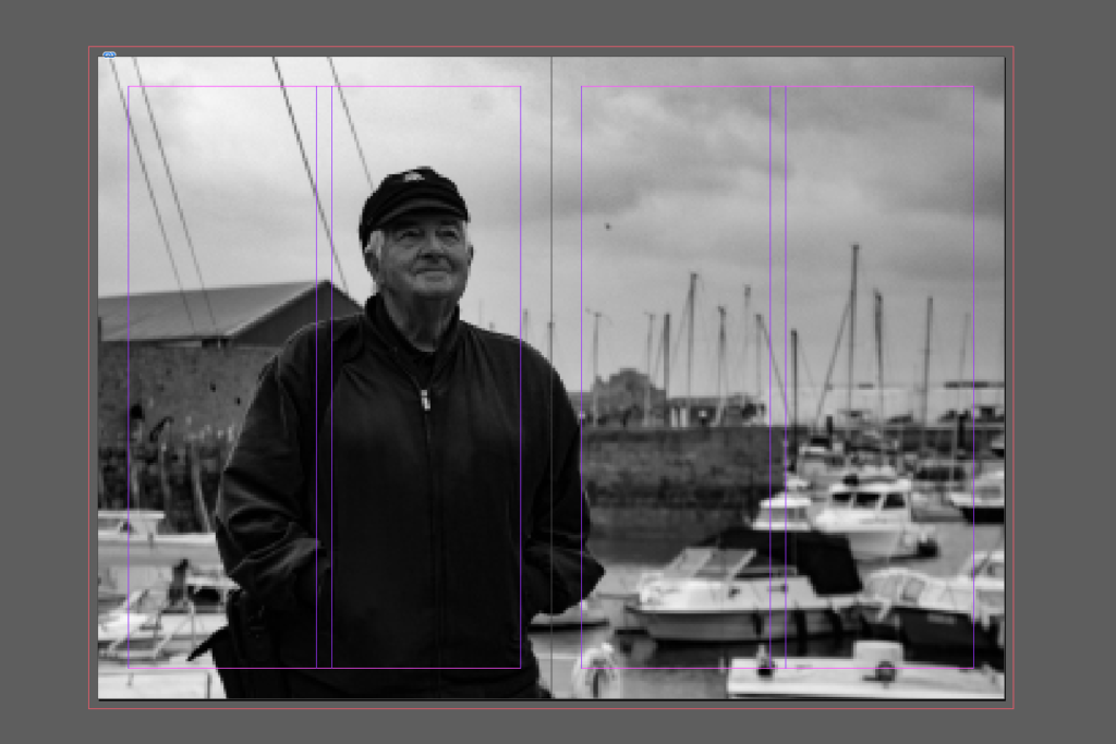
Then I went on to InDesign and made a online book of blank pages and began my zine. This is the front page of my zine, I decided to use this image as I though a lot of my portraits where very strong photos, this one also fits well with the title of fishermen’s footsteps, as it implies that I’m also saying this is Captain Bryans life and his footsteps, or journey through St Helier harbour.

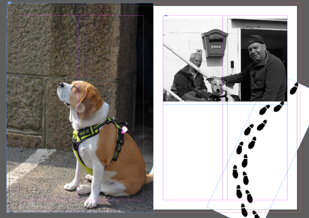
This is my second and third page, I decided to add an introduction to give a vibe or an idea of what my zine would be showing, but I decided to do the introduction in sea shanty form, I also added footsteps throughout this page to look like a fisherman is walking through telling the story, walking his journey linking it to the title.

This is the 4th and 5th pages, I used one photo that I really liked and I thought fitted in well with my zine to link to the title even more ad continue the story showing someone working in the harbour like fishermen would back in the day and continue to this day.

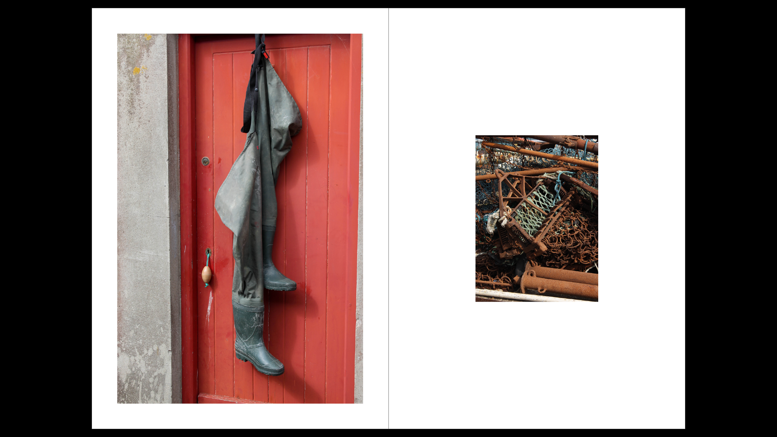
In these two pages I matched having the red and same area together, I also added more footsteps to continue the journey and keep everything linked, I also like the photo of the boots because I thought that added well into the fishermen’s footsteps.

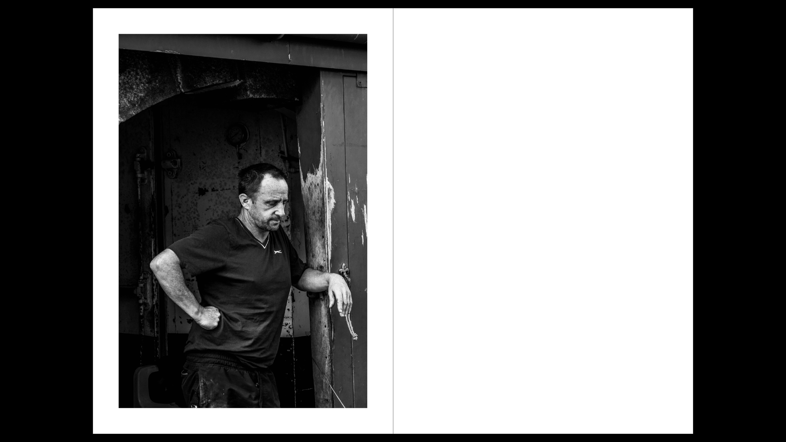
Once again I brought in the footsteps and added another portrait as I liked all my portraits and thought they told theory own story.

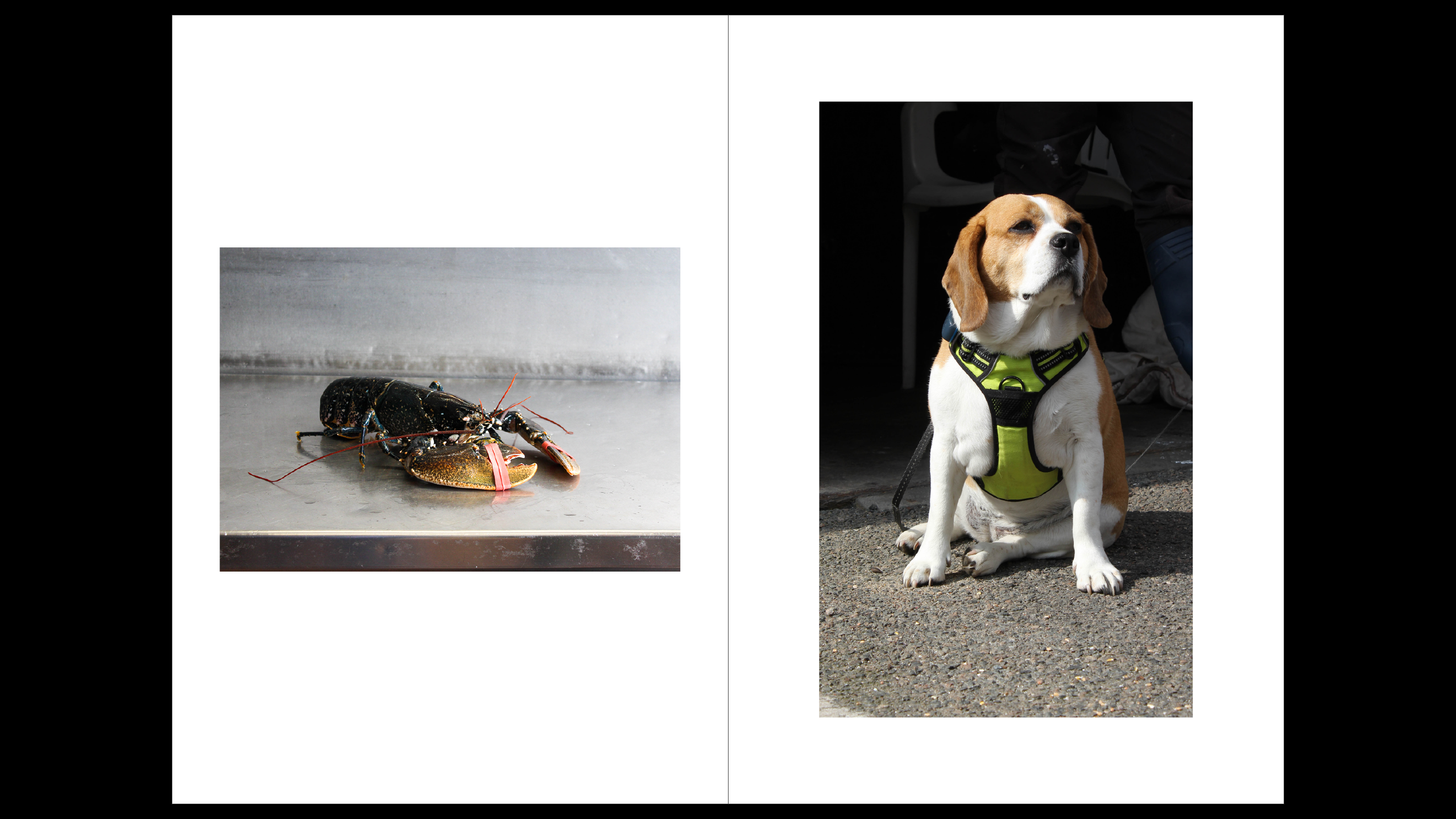
I continued to add the footsteps, as this image both has dogs I thought it linked very well together, I also considered adding some dog footprints but thought it might be random addition.

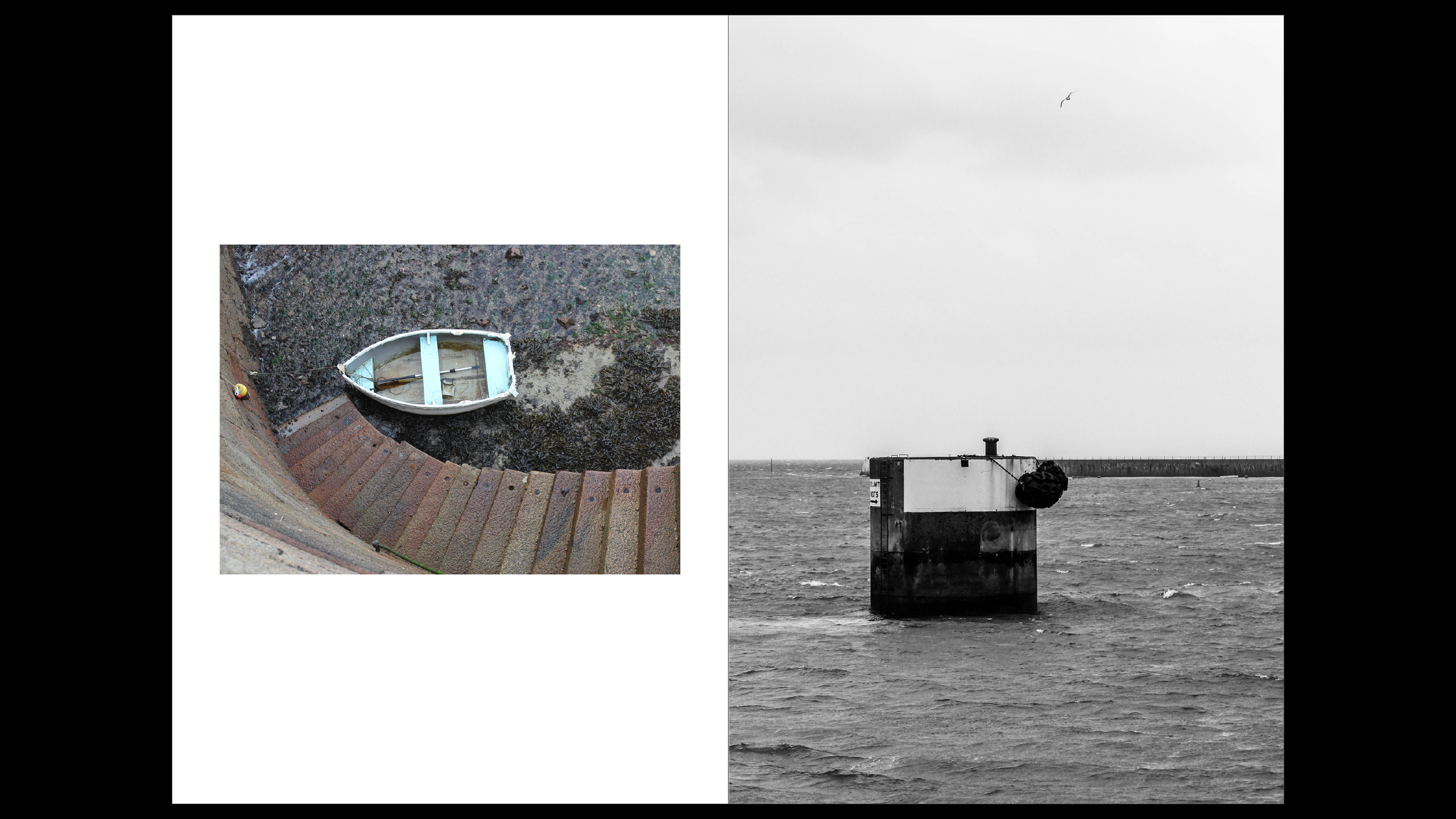
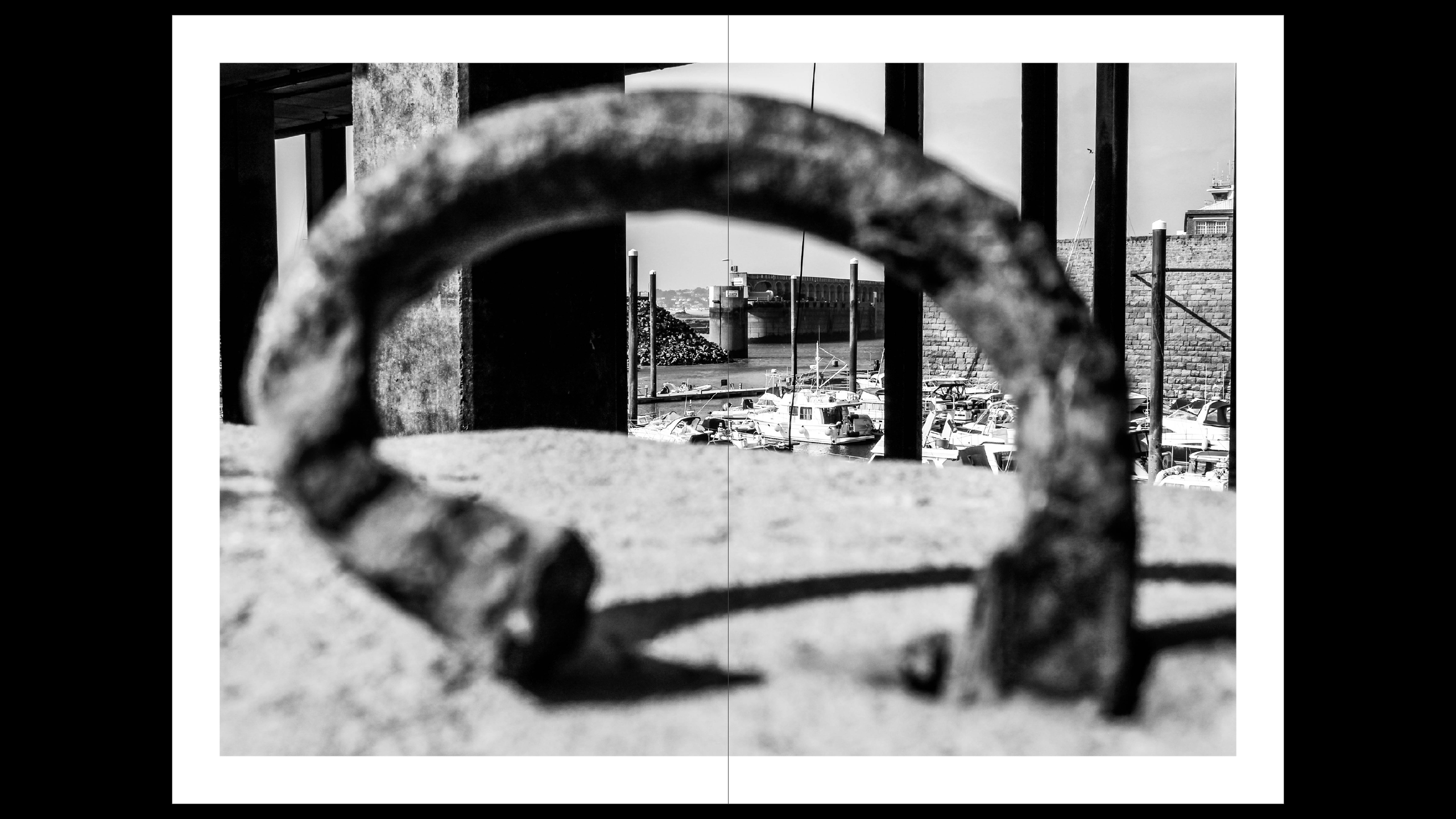
This was another full bleed image across both pages, i added the sea to kind of say how fishermen go into the sea a lot, most of their journey contain the sea and that why it takes up two pages, I also tried to have majority land images before this image and after this are all things that come from the sea or what fishermen catch.

these images all link together into my story as these are the fish that make fishermen FISHermen, they all link as well because it is either lobsters or an actual lobster catcher.

this is my final page, the back photo and I had it have bright red colours to link with other red photos in the book. I also felt it was a strong image to have last.

Evaluation

This is my final zine, which I printed out. I was really pleased with the outcome of it, my first photo, was one of my favourites as it was a portrait and thought it fitted really well with the title, it was a full bleed image that was warm coloured and matched well with the title font, I liked this image because not only was it fun to take and showed some of my best work it began the story strong. one thing I did not like was the background as it was boring but it did go well because it was the St Helier harbour. After that my first two pages was an introduction in sea shanty form, I was actually really pleased and enjoyed writing it, and thought it went well and was a funny contribution to my zine. The next photo was a good photo and I really liked it but I thought the black border didn’t look as good as as I wanted, and thought it was a random place to put it. Then it was another full bleed image which I really liked and fit really well as it was a fishermen working in the harbour. After that I created the 6th and 7th page this was red theme and reintroduced Captain Brian, the images worked well together as they were in the same area and they both linked back to the title page continuing the story on throughout my zine. I didn’t love the photo of the shoes because of the angle it didn’t work as well as I wanted. Then I had another portrait which was another good attribute to my zine, because it linked with the title and the previous page. They also both went with each other because they are in black and white and are of the same area. The second image I didn’t like as much because I gave an old aesthetic look which wasn’t what I was aiming for in my zine. I once again had these images linked together because they both have a dog in them, I didn’t like how one image was black and white but it edited better that way. I added another full bleed image across two pages, I liked this photo of the sea because I thought it looked aesthetic, and went well for my story as they headed in the sea and fishermen are in the sea a lot. Then I had the photos of the lobsters and lobster catcher, this was one of my favourite pages because of how well everything linked with each other and I really liked the bright colours as it was just a happy page. My final page was also another image I enjoyed taking and editing and it linked back to the red because of the red colouring. Overall I was more than pleased with how my zine turned out.

final zine

Final layout

Evaluation

All together I believe this was successful. The photos are ordered I away that the themes of the photos run smoothly running from living beings to geometrical photos, to more abstract images. I do wish I could of spent more time down at the harbour or maybe had a more concise plan for when I was at the harbour.

Virtual Gallery – St Helier Harbour and further Evaluation

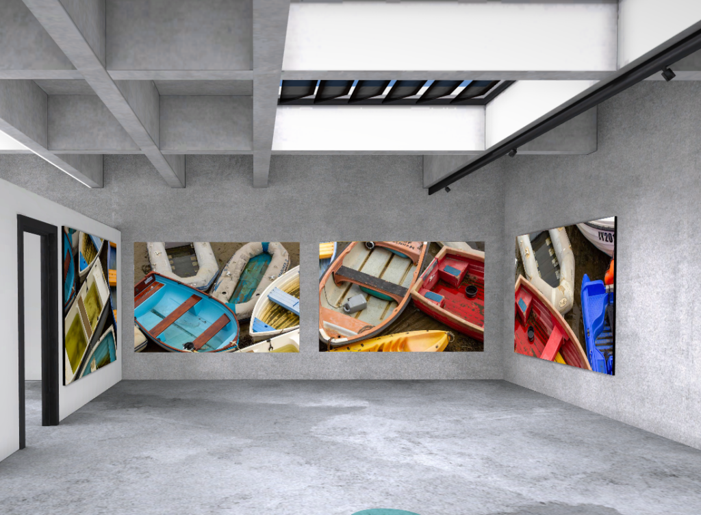
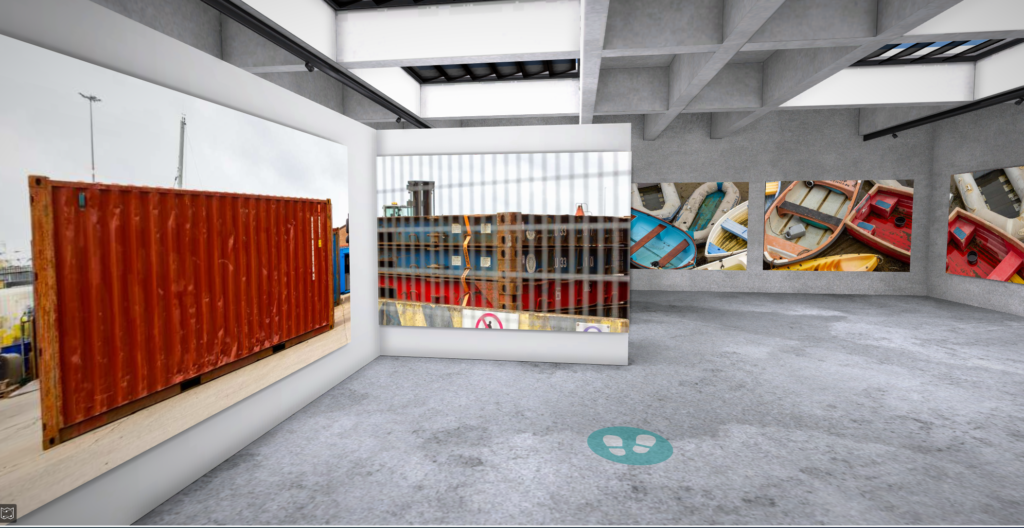
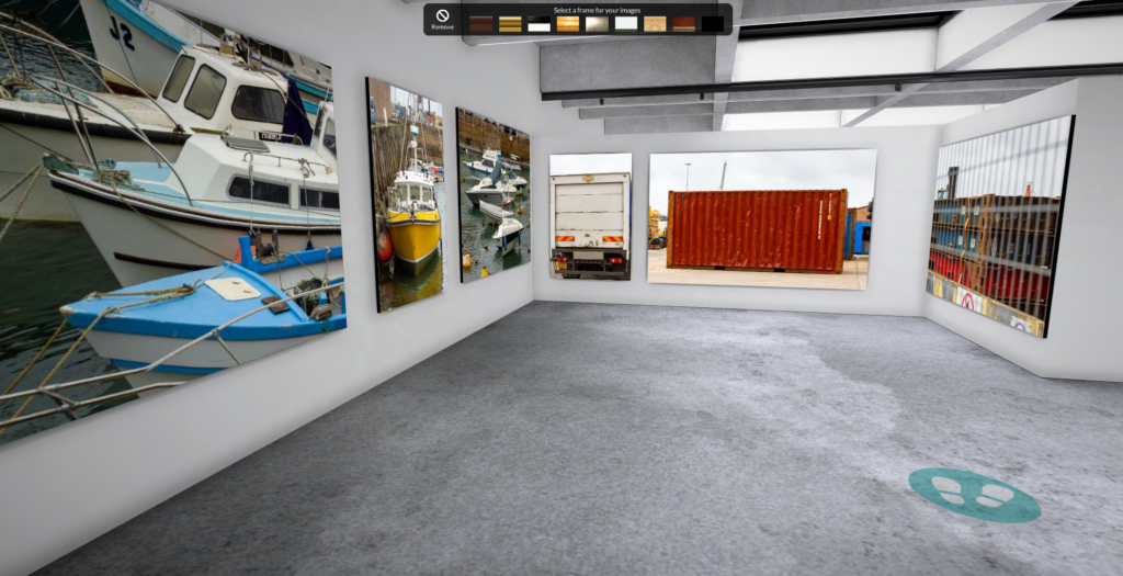
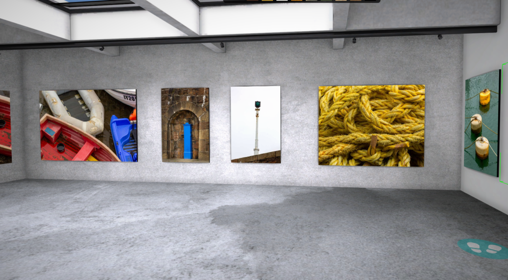
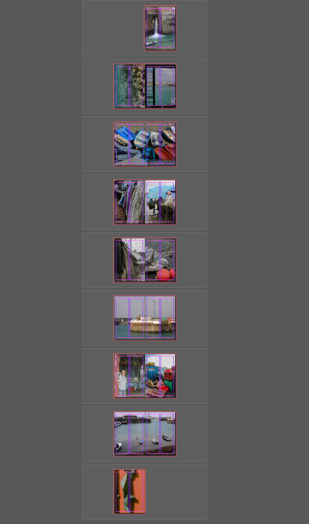
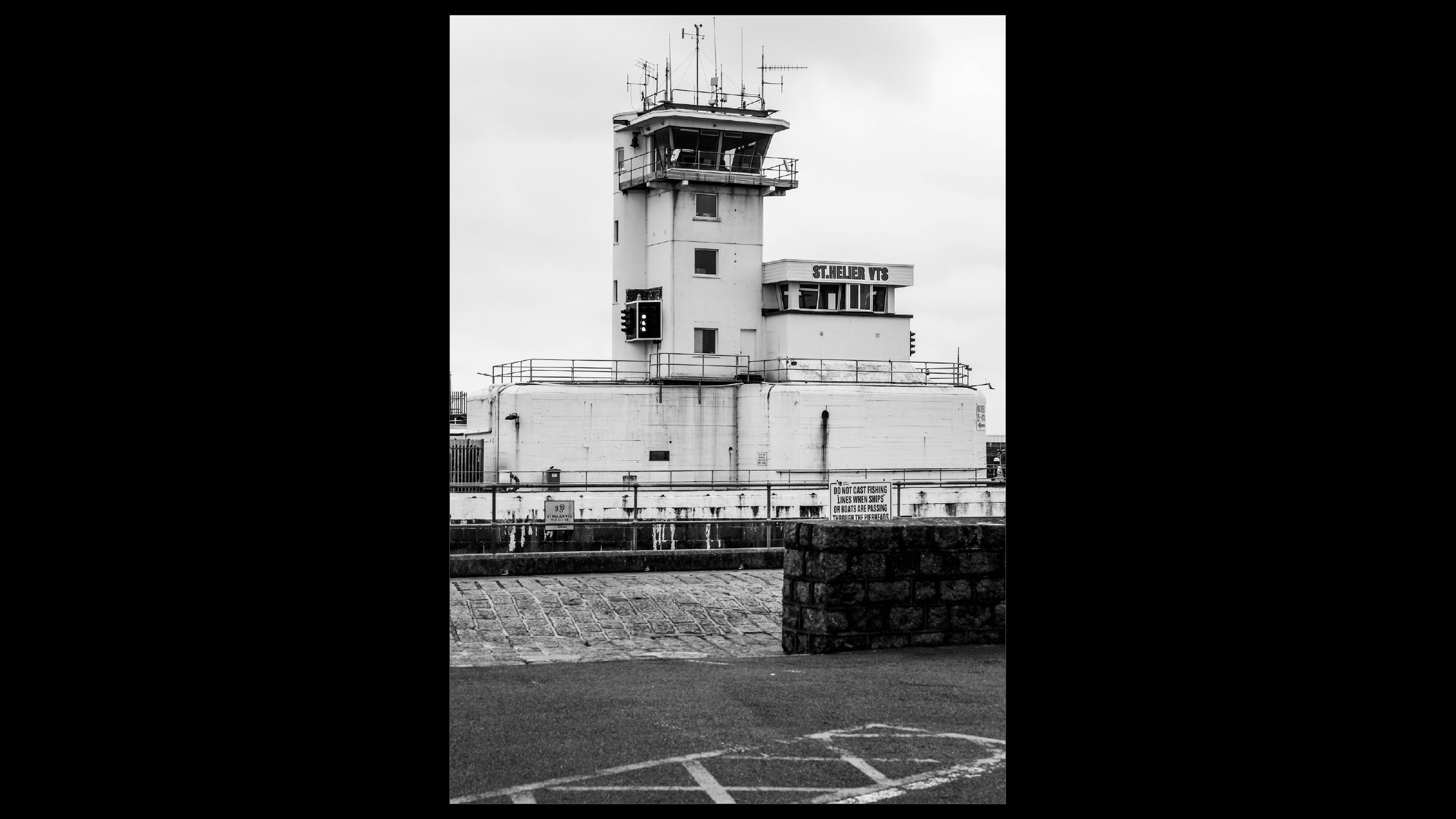
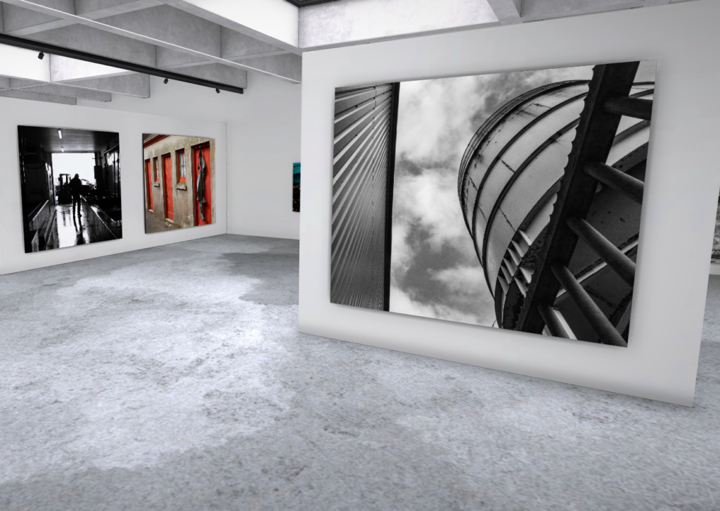
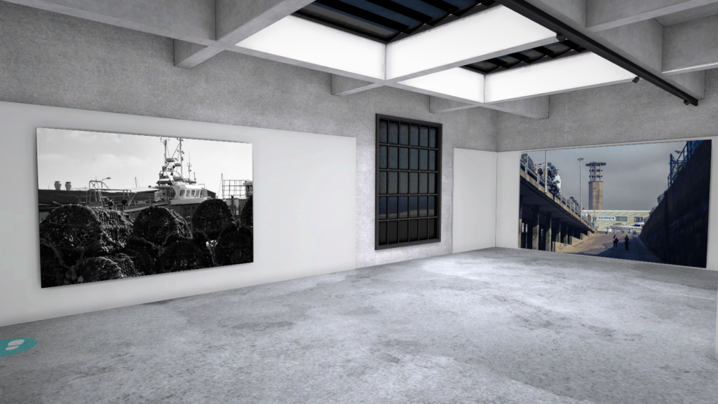
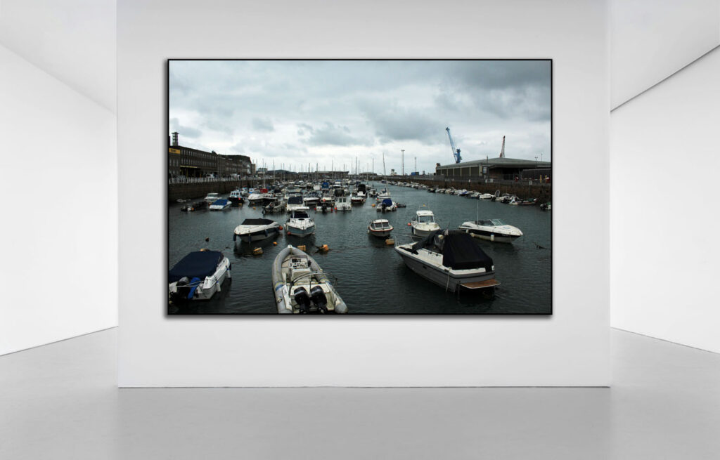
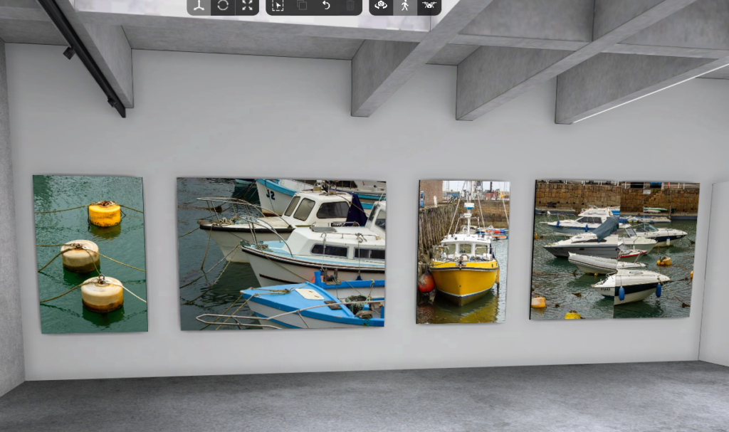
Below are some screenshots of the gallery presenting my photos from the photoshoots taken in the St Helier harbour. I laded them out in controlled order with photos containing wide open spaces having a larger frame than close up photos. I also grouped similar images together to make the viewing less confusing.

Evaluation of the whole topic:

the topic of Jerseys marine life was initially quite interesting to me as I have now lived on this island for over 7 years and I’m always interested in learning new things about the island. The Jersey marines was particularly interesting because it my dad has always been into fishing and I often join him, so learning about the interesting and often overlooked history of jersey cod trading was fun to learn about. Using the Jersey Archives as a research tool helped me massively to find out what was going on from over 300 years ago to now in Jersey. It helped me answer many questions about Jerseys history, like sources of income, common jobs, ext.

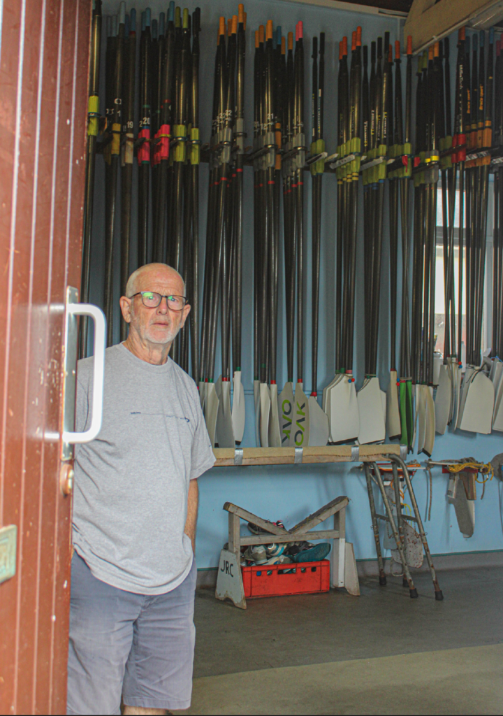
For the first photoshoot we went around the the St Helier harbour with 2 tour guides, one being the old captain of the marine which one of my final images has him as the subject:

I like this image as Its almost a capsule into the past, with no new items in the frame. It also has a lot of context to it, with him being the old captain of the harbour. The geometric background also complements the subject nicely, as well as drawing the eye towards the captain. His happy expression passes onto the viewer, making this a very enjoyable photos, while also making the past seem fun and exciting as well.

I have a few other photos that I like from the first photoshoot which I explain in previous blog posts.

For the second photoshoot, our school gave us a tour around the maritime museum which was a very interesting experience, as all my research was now viewable, with old boats, paddles, fishing requirement and so much more, all used to help create the rich history of Jerseys marine industries. Here is a photo from the museum:

As you can see it was packed with history, making it a valuable place for my research and understanding of the Jersey marine history. For example did you know that in the 19th century Jersey was one of the largest producer’s of boats in the British Isles. This was partly due to its very cheap tax rates and its large labour work force.

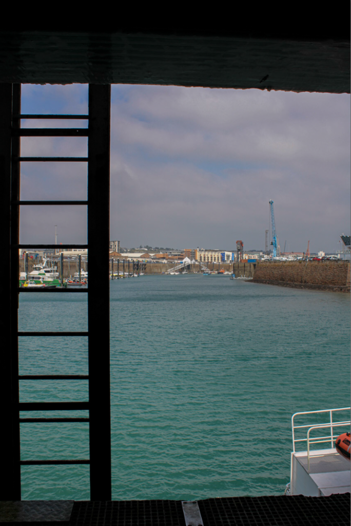
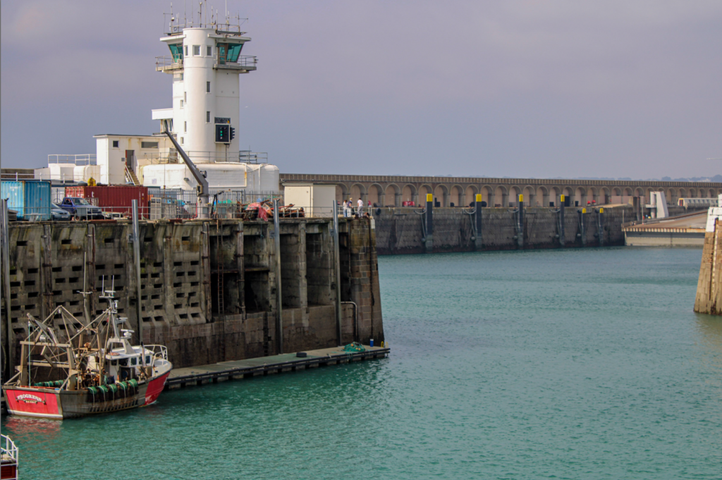
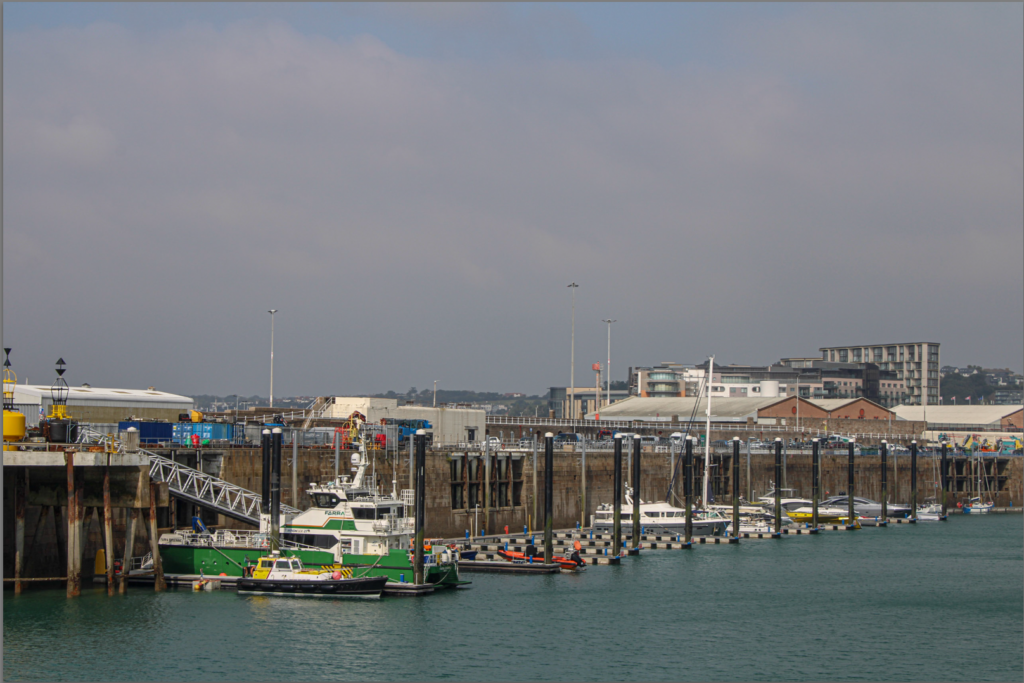
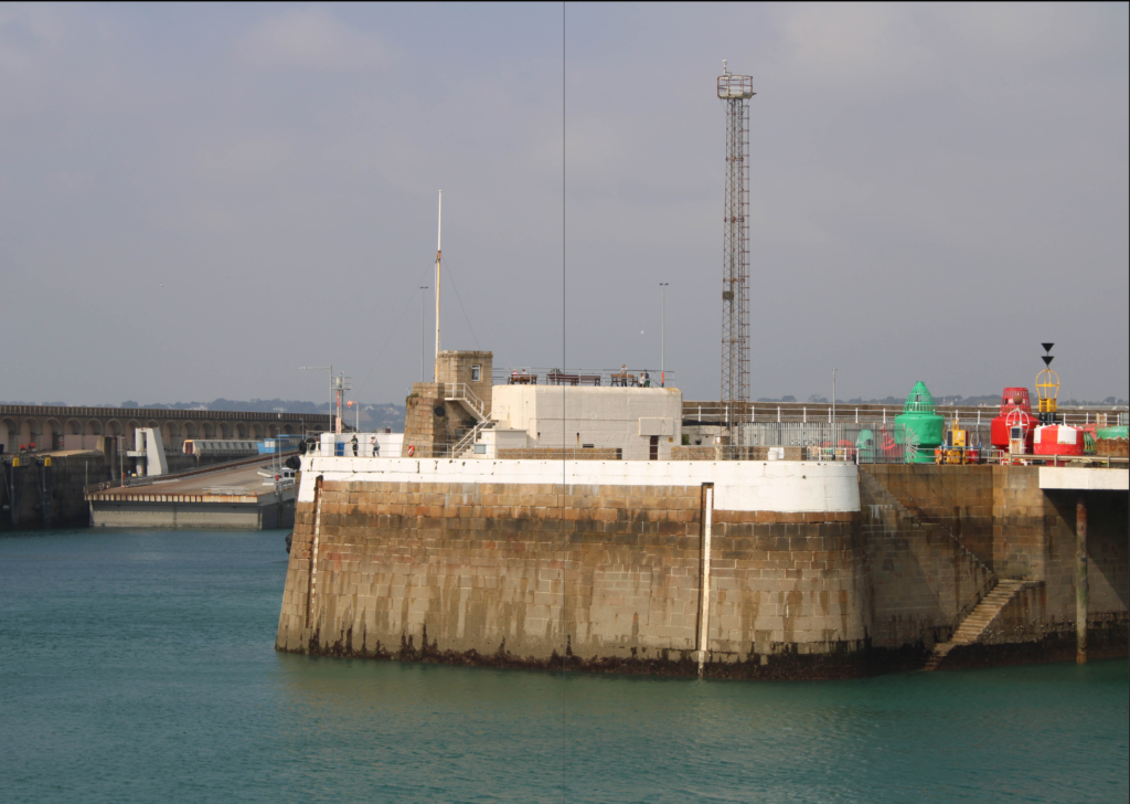
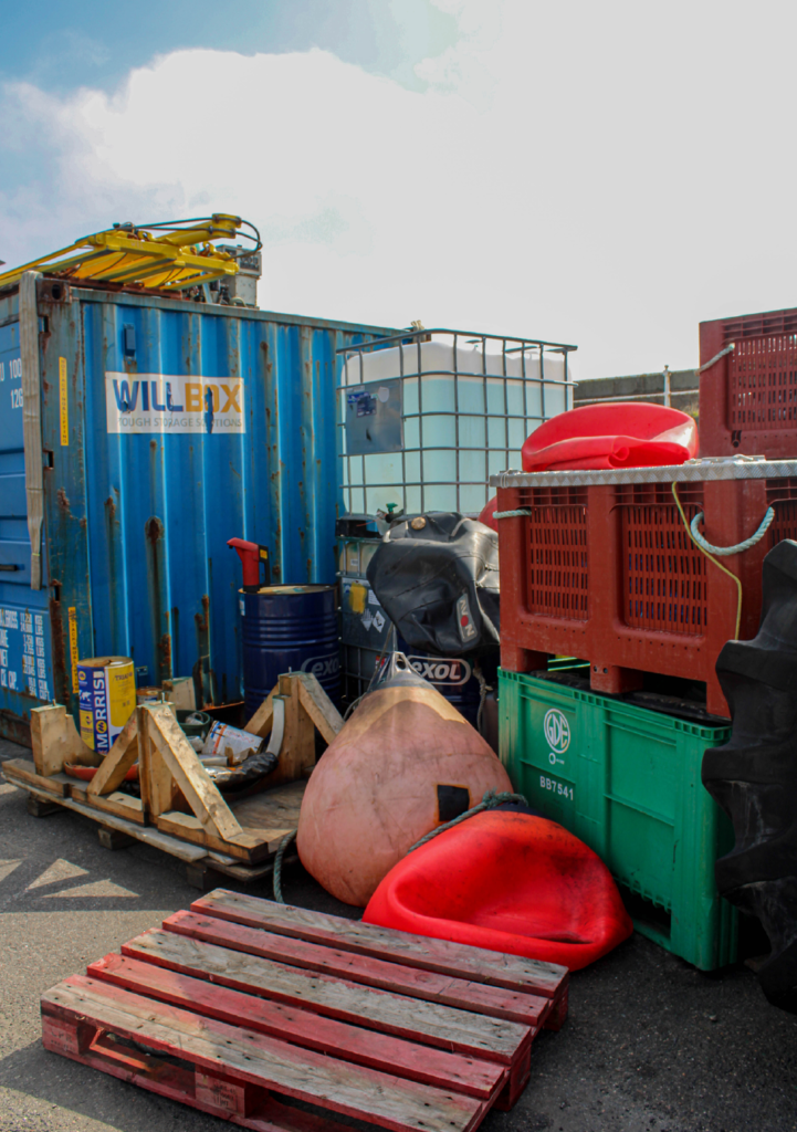
We also took more photos of the harbour after the museum, which I am very pleased about, as I tried many photography techniques like taking photos at unexpected angles, using various camera settings like a long exposure time to create a blurred effect, and more.

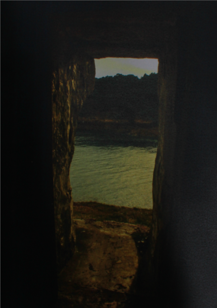
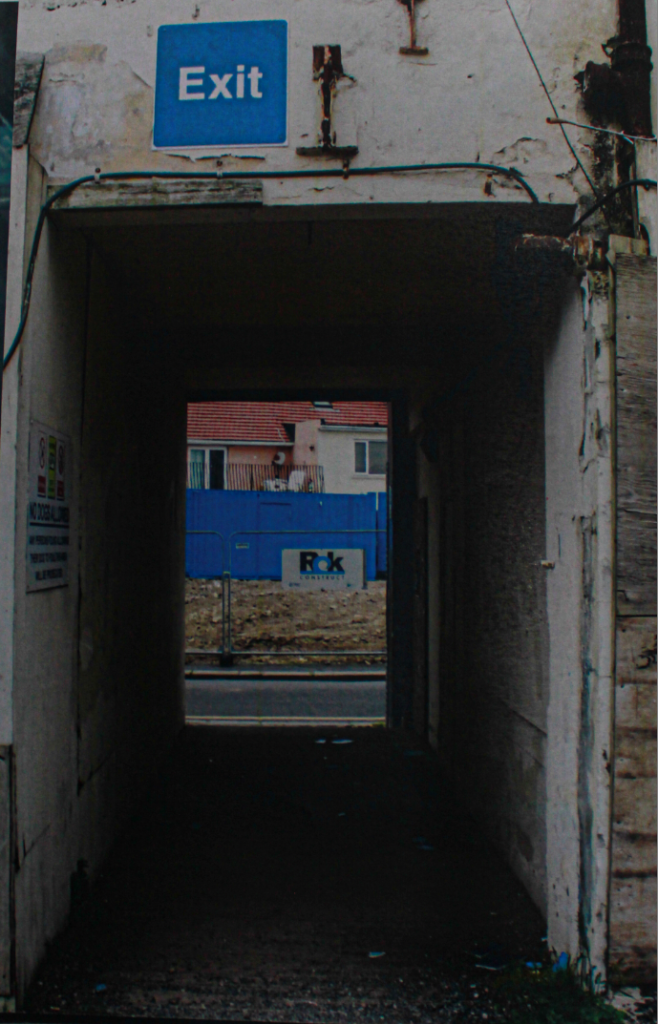
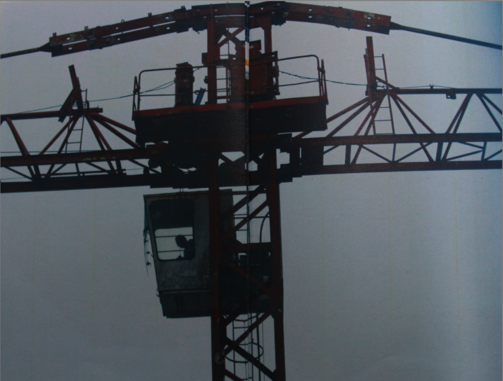
After the two photoshoots I am very pleased with my final images, each being very unique and having a lot of context to them.