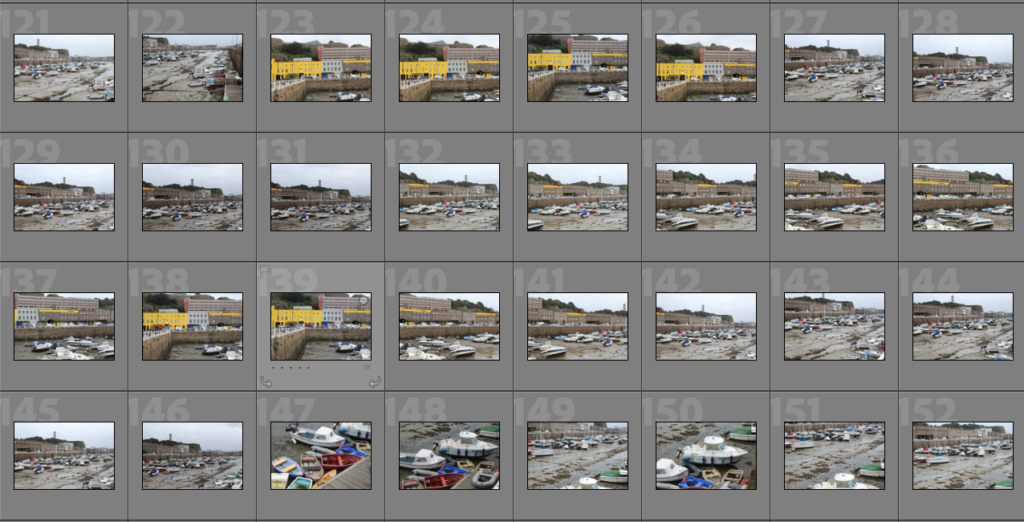
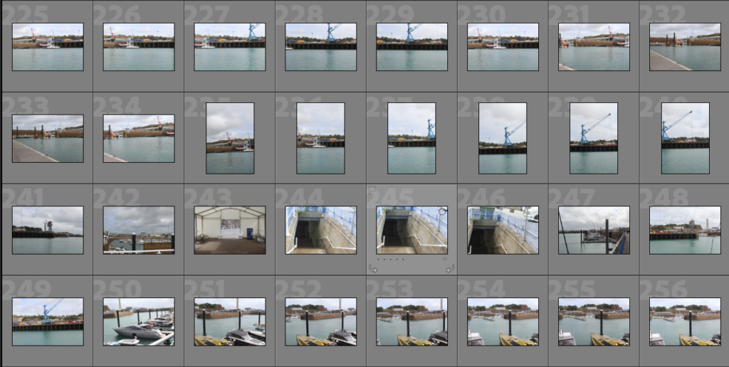
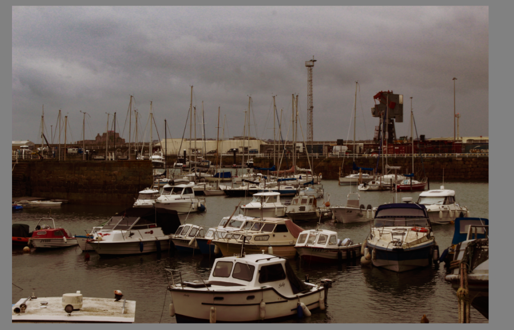
My story will be seen as something that has a mixture and comparison of past and present. It might also show some form of the future in the St Helier harbour. This is to manipulate a realisation towards the audience for them to actually realise how quickly the time is passing and how quickly Jersey, more specifically, St Helier harbour, is evolving.
NARRATIVE:
I will have my own produced images with a comparison and incorporation of mixture of images from the Archives and will also get the future images from a folder my teacher has provided me which shows a variety of future lookalikes that St Helier harbour may become.
At the beginning of my zine, I will have an introduction of the history, facts and more about the St Helier harbour. The first couple of pages will consist of landscapes of the St Helier harbour (present). Then I will have some past and present images, using the archive images and my own picture to compare. In this group of images, I will have the year it was taken and where. Then using some picture from the archive, I will incorporate the past people or objects from the past pictures and place them on my own, present images of St Helier harbour. These images will be placed on one side of the page and the next page won’t have any images because I will put a poem about St Helier harbour or sayings that people have said about St Helier harbour
I plan to have my font-types quite antic tone to them with words that change colors depending on the image that is shown (black and white or colored). The cover of the zine will be black and white with an image that indicates what the zine will be about. The text will be shown vertically on the right side of the cover on the middle. These words will be black and white
The reason I have chose this title is because of its strong connotations, the way that trade and communication flow together, like they are dependant on one another. I chose a black and white image o give a historic feeling, a visual element that makes you think something is old. I have relied heavily on contrast due to want to expose the granite wall and portray all of its cracks to exclaim how old it is.
I took this image in natural daylight, to portray it naturally rather than making it look unnatural by using things like a flash. The colour balance of the image is very cold and dark. There is a lot of texture within this image to show how the wall has changed throughout many years, creating a very 3D image. The 3D elements lead the eye to all the white and bright areas, due to there high contrast to the darkness of the image. I think that there is harmony with the image and the font of the title, due to the title being written in black and outlined in white, a bit like the image is, mostly black but that’s what pulls you to the white element’s. This image has a context with the light on the pole which lets traders know when the ports were open, green for go and red for stop, like a traffic light. The essence of my work was to create a historic meaning, making people think way back to the 1900s, while still allowing room to change the essence to something more modern.
Page Spread One
I chose these images so that I could stick with the black and white theme, and I wanted to leave some room for text so that I could explain my ideas, like an intro.
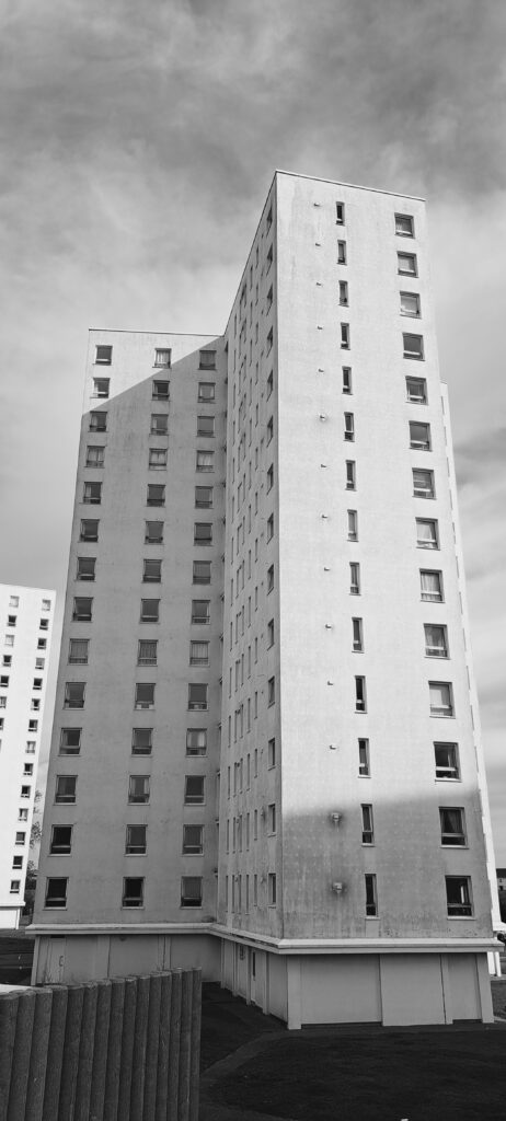
These images were taken in daylight, on a cloudy day. This gives a natural effect due to having a high level of control as the sun wasn’t exactly beaming. The images are quite short and sharp, they get straight to there point. I don’t think the images are either warm nor cold, I would describe them as very neutral, almost numb, just black and white. The images are quite 3D and textured allowing you to see the use on the boats, and the grainy sand. They both have a simple layout with the centre of the image being what you look at. They both have a similar historical context in the sense that they’re both used boats. The conceptual meaning behind my work on this page spread, was to gain historic value by adding text, to make peoples eye go toward the images, let them think about the image, and then get told the ‘answer’ within the text.
Page Spread Three
I am still keeping with the black and white historic theme, but slowly adding more shading to make a smooth transition to colour.
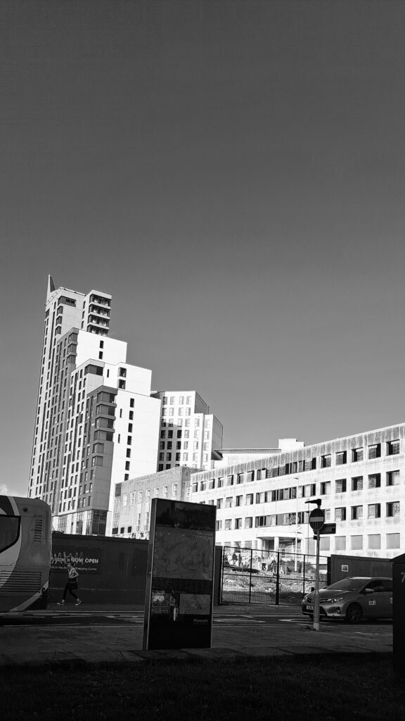
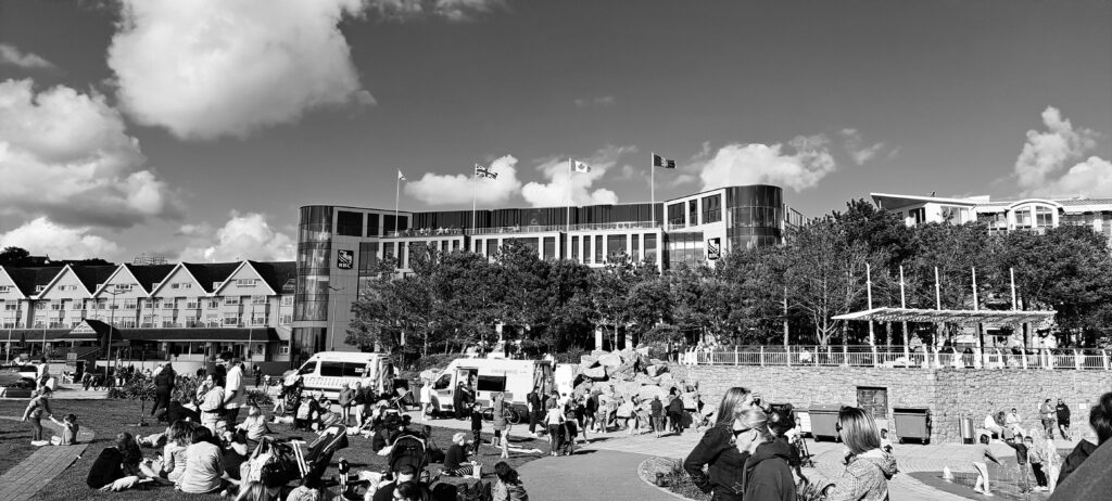
These were all taken in natural daylight, but you can see between the pier and the boat how the sun moves, going from a lit up area and dark skies, to a dimly lit area and a bright sky. The sun didn’t really give me a good level of control within these images, as the sun was behind clouds but still really bright making it difficult to evaluate what ISO to use. All these photos were taken on a very wide angle, some zoomed all the way out and some zoomed all the way in. For example the brick buildings were taken from very far away and all the way zoomed out in order to be able to fit all of the buildings into one landscape shot, whereas the image of the boat was taken very far away but very zoomed in to make the boat the main subject of the image. The images contain a lot of panning so that I could capture a wide area of space. There is a lot of tonal range within the three images, they contrast each other with there bright whites and dark blacks, giving them all a similar tone but also so different.
Page Spread Four
I have used colour popping to transition my images into colour and create a less historic feel, moving towards modernism.
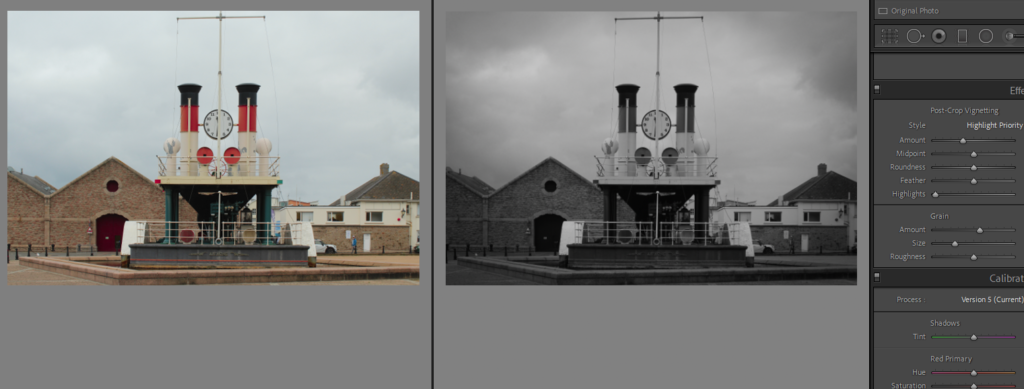
This image was taken in daylight, with the sun coming from behind my camera lens. The image has a high tonal range, with a lot of blacks and whites but then also a pop of red, this creates a warm autumnal feel. I took this image in a portrait way with a small angled lens, due to already being very close to the object. The image has a sharp depth of field, focusing on the colour, and text, with main anchorage points. The image is mildly textured, with the anchor showing a lot of historic elements, but the board which explains the anchor is very smooth and minimal. I have used a clear organisation of visual element’s. I have selection cropped the image to create a clear element. This image has a high amount of historical context, with a lot of explaining that context but also justifying it by using the anchor. My idea behind my image was actually to just create anchorage by using an anchor, to create a meaning and dealing with text and imagery.
Page Spread Five
This image is colour popped again but creates some more brighter colours to crate a more intense shift into modernism.
This image was taken in daylight, you can see this through the reflection/glare on the water. It creates a more florescent atmosphere compared to all the other images in black and white. This image was taken in a very wide angle, taken very very far away but is also very zoomed in to really shift focus onto the signage. I think that by using colour popping within the image it has created a simple colour accuracy, something that flows, how the simple light greys go with the whites and the darker greys and the blues. By colour popping the blue it has also slightly coloured the sea, creating a smooth background with not much texture. There is a pattern and repetition of the blue within the sea and within the sign. There is strong containment within the frame, the sign being just the main thing, and an easy view of how everything else is outside of the frame, in the background. There is a wider narrative to this image, the sign says thank you for visiting creating a story that someone has gone to the harbour and got on a boat.
Page Spread Six
The is my first page spread with images that are all in colour, and it also has the most text out of all my images.
Both of these images were taken in natural daylight, but I love the contrast between them where you can see how the sun shifted throughout the day. I had a high level of control when taking these photos, which you can see through the bold bright crisp colours within my images. There both very focused photos, with signage which creates a pathway for me to write facts about the images. This page spread really all flows together. They both have quite a bright tone, with bold whites. The ferry speed image is a lot more textured than the pier sign, this is to portray all the wear and tear of trade, and how active trade still is over here. There is a lot of space within my images, creating a 3D open context, by not bombarding people with a million things in there face I have created a calmer environment where people can really use their brains and get there minds wrapped around the meanings of my page spread. I wanted to create something that showed how bustling the harbour and trade still is , without throwing it in peoples faces.
Page Spread Seven
This page spread is very minimal, to leave something to be subjective, rather than bombarding people with text.
The use of daylight and colour popping and also a white background creates a major contrast, a massively bright image that gave me a good level of control to make the whole images vibrant and pop but without looking messy or childish. I think the light reflects the distance in which the images were taken from, a up-close image which is reflected from a glare on the sign, or a further away image which is reflected by the length. There is a lot of patterned repetition within the images, repeated use of colour and anchorage. This creates a conceptual feeling or modernism, allowing me to create that smooth shift from black and white histories.
Page Spread Eight
I have laid out three images so that there us no text bombarding again, leaving this to be seen and interpreted.
These images were taken in three different instances of daylight, as you can see the shift of the sun between them, it creates a contrast of our stormy harbours. In this page spread I have included imagery of the riches, a golden boat and also a description of images that include simple trade. By using a café you are creating a trade, which shows just how alive it still is as these cafes are in use every single day. I used a layout which creates harmony between the three images.
Last Page
I have put this image sideways to crate a more out of the ordinary zine. A zine is basically a silly magazine, something that doesn’t really need to be formatted to influence and attract an audience, it is very informal.
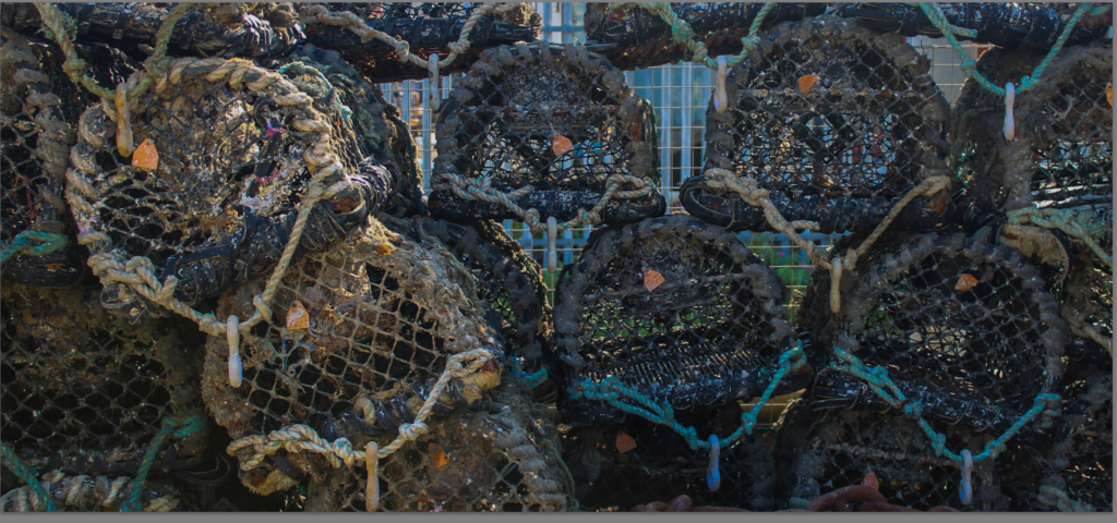
This image is very technical it manipulates the brain by the use of texture and detail, but portraying hoe historic this is but also how real it is. It makes you think about what would happen if trade went under, us as a small island would be in the dark and have nothing. A lot of people see the harbour as something that is aged and old, although it is that it us important to incorporate how it is still vividly in use every day.
Overall Evaluation
Overall I think all my planning and work that went into my zine made it turn out to have the exact narrative I planned. I wanted my zine to be a timeline and I think that I have created that through the use of key things like conceptual feelings and colour popping. Although I did miss a photoshoot day I think that my other photoshoot made up for that, and gave me all the create tools that I needed to create a timeline narrative about trade in st heliers harbours.
“Most of my likeness [daguerreotypes] do look unamiable; but the very sufficient reason, I fancy, is because the originals are so. There is a wonderful insight in heaven’s broad and simple sunshine. While we give it credit only for depicting the merest surface, it actually brings out the secret character with a truth that no painter would ever venture upon, even if he could detect it.” (Holgrave in Nathaniel Hawthorne’s The House o f the Seven Gables, 1851)
we approach the photographs in the show either as mirrors, reflecting the photographer’s consciousness and concerned primarily with self- expression, or windows, openings onto the external world concerned primarily with exploration.
The idea of photographs functioning like windows makes total sense. Like a camera, windows frame our view of the world. We see through them and light enters the window so that we can see beyond. Photographs present us with a view of something. However, it might also be possible to think of photographs as mirrors, reflecting our individual view of the world, one we have shaped with our personalities, our subconscious motivations, so that it represents how our minds work as well as our eyes. The photograph’s surface reflects as much as it frames. Of course, some photographs might be both mirrors and windows.
Windows
a window in photography is an objective view of the world around this could include documentary, realism, candid, optical photography.
With window photography it is difficult to infer much about the photo and requires little to no creativity to create.
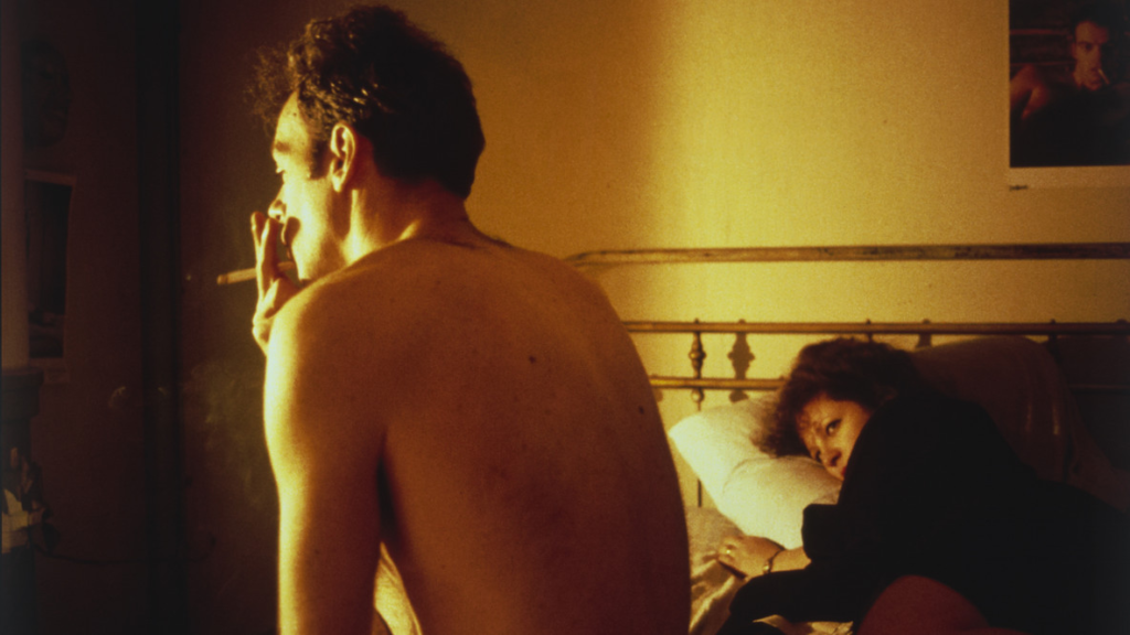
Nan Goldin – Nan and Brian in bed, NYC. 1983 Cibachrome
this would be considered a window photography because it is an honest, unedited, unfiltered view of the world around.
Mirrors
A Mirror is a reflection of the photographers subconscious and conscious self expression. “Mirrors” were images meant to mirror the photographer’s own sensibility.
Robert Heinecken – Figure Sections/(Multiple Solution Puzzle), 1966
this image is very subjective and clearly the photographer is trying to communicate a deeper message than is objectively presented in the image
Cross-Over
of course in some photos there is cross over between the two contrasting approaches to photography where the photo at first seems objective and could be considered a Window to the outside world but upon deeper inspection the could also be considered Mirror because of the subtle inference and and underlying themes.
is this photo a window or mirror?
when first approaching this image i believe it to be an objective photo taken of perhaps and football pitch, with the chalk lines framing the photo but upon further research i discovered this is a image by Richard Long and is named– A line made by walking, England 1967, this image was created through longs performance after of walking in a line over and over and and killing/treading down the grass bellow his path and then documented through photography. so in fact despite its appearance this image is quite subjective. I believe it to be a combination of both approaches.
This was my first ever mock plan. I liked the Sequence of the photos however I didn’t really like the Layout of it and the fact that there was too much images to produce so this plan was rejected.
Indesign plan:
I liked the layout more and the features however the fonts and writing weren’t what I was looking for and there was too little images so I wanted to incorporate more images so this plan was rejected.
Actual Indesign plan:
I loved everything about it, I liked the layout the sequence of images and most important the fonts and placement of the text. The design of the zine was also something that I was extremely proud of.
What are the differences between photographs that are WINDOWS and MIRRORS?
“Mirrors” are photographs through which a photographer is trying to tell us how he feels about himself.“Windows” are those in which he is trying to tell us how he feels about the world. Although both are expressive, they can be subjective due to the fact a photo can be both. “Mirrors” were images meant to mirror the photographer’s own sensibility. “Windows” were photos meant to act as a window for the viewer to see something that is primarily factual and external to the photographer’s own sensibility. Keep in mind that Szarkowski stressed this was not a very strict dichotomy.
In metaphorical terms, the photograph is seen either as a mirror – a romantic expression of the photographer’s sensibility as it projects itself on the things and sights of this world; or as a window – through which the exterior world is explored in all its presence and reality.”
The exhibition Mirrors and Windows, anexhibition of American photography since 1960, opened at The Museum of Modern Art, New York in July of 1978. The curator John Szarkowski’s attempted to categorise photographers whose work largely reflected the subjectivity of the artist in comparison with those whose work largely sought to see outside themselves. Szarkowski wrote in the catalogue essay that accompanied the exhibition:
“The distance between them is to be measured not in terms of the relative force or originality of their work, but in terms of their conceptions of what a photograph is: is it a mirror, reflecting a portrait of the artist who made it, or a window, through which one might better know the world?” — John Szarkowski, 1978
This quote explains the difference between mirrors and windows, but also states that there is a range of where they can be within mirrors and windows. In fact, an image can be both and it is not a strict dichotomy.
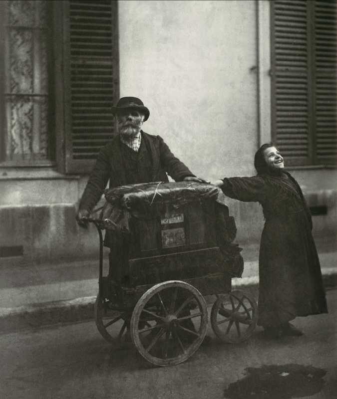
Eugene Atget 1898
Nan Goldin – Nan and Brian in bed, NYC. 1983
I would personally place this images within this range;
For the ‘ window’ image, I personally would say it fits more of a window, as the image is of street musicians in 1898. This image does not link to the photographer, instead the photographer is making the image about what he can see, rather than what is behind the camera. I would say it documents, is real, public and objective. However, for the ‘ Mirrors’ image, I would personally say it fits more of the mirrors side, as it is an image of the artist himself, and another. Its very personal due to them being in bed and shows who they are through expressions such as smoking and lying in bed. It is very subjective as it is showing a lifestyle, and everyone’s life style is different. Whereas, in contrast to windows which is very objective and documentary.
What is the difference between photographs that are mirrors or windows?
Mirrors tends to classed as quite subjective and romantic. It has denotations of a photographers sensibility of view which is a projection of self. Windows is objective, it explored the exterior region and illustrates reality and presence
Read two texts above (John Szarkowski’s introduction and review by Jed Pearl) and select 3 quotes form each that is relevant to your essay.
John:
“The pictures included here are arranged in two sections,”
Szarkowski suggests that there is a, “fundamental dichotomy today between photographers who believe that all art is concerned with self-expression and those who see it as a means of exploration”
“Art is a mirror, reflecting a portrait of the artist who made it, and those who see it as a window, through which one may better know the world”
Jed:
White, toward an idealist, “romantic” goal of “self-expression,” a “mirror” that primarily describes the self; Frank, toward an introverted “realism,” involved with the “exploration” of a private “window” on the world.
“the general movement in American photography in the past quarter-century has been from public to private concerns”
Now, in Mirrors and Windows, he presents a binary theory of photography as art: an evolution from public to private concerns
RE-DO this
2.Select two images, one that represent a mirror and another that represents a window as examples to use in your essay.
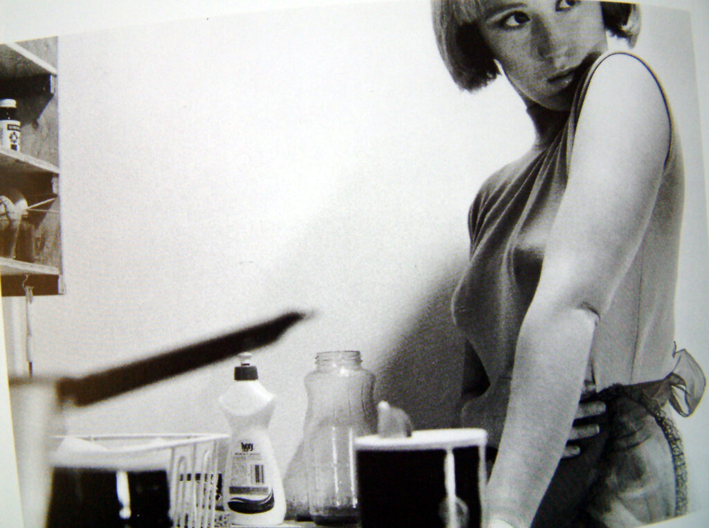
Mirror-Cindy Sherman
Windows- Henri Cartier-Bresson
3. Use some of the key words that you listed above to describe what the mirrors and windows suggest.
Mirrors: subjective, personal, romantic, sensibility, private, expression, projection and complex,
Windows: objective, exterior, documentary, tableux, public, escape, landscape, still life, explore, world and elements
Windows and mirrors is an exhibition ‘Mirrors and Windows’ anexhibition of American photography since 1960, opened at The Museum of Modern Art, New York in July of 1978. This was John Szarkowski’s attempt at categorising photographers, whether their photos were mirrors or windows.
What is a Mirror Photo?
A mirror photo is a photo that is subjective to yourself, one that you can design or create before hand or see as a reflection of yourself through photography. Another way of thinking of it is, does it capture/represent you as an artist, either through an abstract or planned scene? This is often an editorial style of photography or a personal project for a photographer.
What is a Window Photo?
A window photo is the opposite of a mirror, instead capturing the world true to life. A version of this being documentary photography or journalism photography. By reflecting the truth a photographer has little to no personal influence or output onto the photo as it is as others would see the scene.
Do Mirror and Window Photography Cross Over?
Szarkowski – ‘is it a mirror, reflecting a portrait of the artist who made it or a window, though which one might better know the world.’
Mirrors and windows often cross over, for example recreating a crime scene. This is posed and being directed by someone but it is also a capture of what supposedly happened at the time. In many mediums there is a cross over of mirrors and windows, but in particular photography is guilty of this. Many photographers will use mirror photos to get a point across and have ‘perfect’ photos or said better, an accurate representation of what they imagined, however this also occurs in ‘window’ photos. While a true window photo will be snapped completely candidly sometimes photographers have an idea that cannot be completed just using candid work but want the style to remain similar to a window photo. Photographers might also start with a window photo, snapped at chance and then find it inspires them to get a particular planned shot (a mirror photo) the next time they come across a similar situation or even planning a whole shoot around that one window photo.
Photo Analysis
This is a photo from ‘Mirrors and Windows’ the book but I think it accurately shows the blend between mirrors and windows at times, this could be a candid portrait as the subject is just in their home preparing to go out, but it also has elements of a mirror photo as it is planned and a thought out image. I find that may times when mirrors and windows cross over it is because they want to tell a personal story or capture something that just isn’t regularly captured without planning but the photographer wants to do so in a documentary style. This is a very successful photo when it comes to be able to break it down and pick interesting elements from a very basic photo, it is also quite impactful as it is something not normally seen, normally curlers aren’t normally seen anywhere but the comfort of the subjects home and not a normal subject in a photo as he is just ready for a night in rather than composed, formal portraits.
This is the template for my zine and where the images that I have chosen will go. I’m going to have some of the images on full pages and some that are going to have a blank page of the other side.
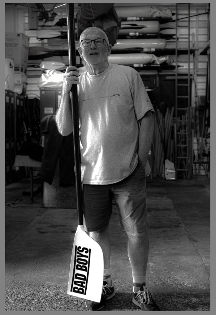
This is my first page of the zine and it shows that the zine is about his life and what he did as a harbour master and throughout his life as a captain.
This is one of the full page layouts and I have extended the image to the edge of the page so that there is no white border around the image.
These two images contrast really well against each other because its the one big boat contrasted against the three boats. It compares them as one being in great detail and the other picture shows the three boats in not as much detail.
This is my final layout for my zine and it starts with similar images at the beginning and at the end to show the start and end of his life as captain and a harbour master.
During 1928, it was the invention of photography, and was described as ‘fixing the shadows.’ In terms of ‘shadows’ this could imply whatever the subject could have been, and what we see. As the camera was invented the image or shadows we see, were then fixed in terms of they weren’t just there when you looked to see them, instead they were brought to life through the image produced on the camera.
It was the frame around the image that was important, and what was further told beyond, through intuition. Photography turned the ordinary in the extra ordinary, displaying secrets beyond the world from what the people saw giving away specific moments, while keeping secrets from people.
This process created one off images which was described as mirror of the memory. The light operates differently as its being reflected. The images produced where best described as not alive but on edge of being present, taking hours if not days to be produced.
A plate was added to the camera that was polished , print was scratched and later poured with water.
Camera Obscura & Pinhole photography
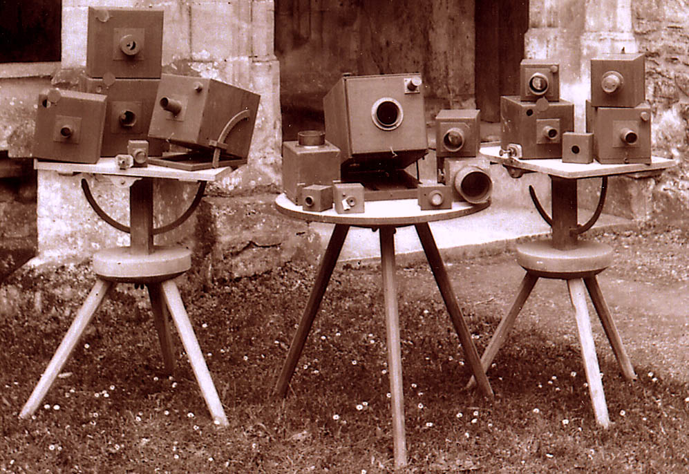
It began by using camera obscura, which is essentially a small camera box with a small whole in, which is how the image was created. The small whole is a tight beam of light that pours into the camera box. Light was reflected off of objects in the natural world entering the box through a lens of the small hole, and projected an upside down image on the opposing side. The pinhole was the lens, so if made smaller it achieved s sharper but dimmer image,, however if made too small there would be no image due to diffraction. Later on in practice , a lens was used rather than a pinhole, as this gives a larger aperture, so gives a correct brightness and stable focus.
Camera Obscura has been used since the 16th century, being a popular method used to help with drawings and paintings. The technology was further developed during the 19th century, as the camera box was later used to expose light sensitive objects and materials projecting the image. This method was effectively used to capture solar eclipses, as you weren’t at risk of directly looking at the sun. It produced highly accurate images which could later be used and studied.
JosephNicephore Niepce & Heliography
The photographic process began in France named after Nicephore Niepce. Niepce is well known for making the earliest known photograph by nature that survived.
He new that by using Bitumen de Judea which is an acid resistant natural tar, would harden with exposure to light. So in experiments he use this to coat particular metals such as plates of glass, zinc, copper/ silver surfaced copper plus many more, which resulted in the surface that was exposed to the most light produced lavender oil and petroleum, leaving the uncoated shadow to be revealed through acid etching (acid cut into the metal revealing a design) as well as aquatint (revealed lines and tones, otherwise known for how colour was made).
Having limited success using light sensitive paper and a handmade camera obscura, didn’t however reveal a permanent image. So he adapted the process using low sensitivity estimating the exposure time would be 8 hours.
Below, the photograph is a View from the Window at Le Gras by Nicéphore Niépce, it is a heliographic image also know the oldest surviving image made by a camera.
Invented by Louis Daguerre during1940s and 1950s, ‘Daguerreotype,’ the name of the process and what the end image is called, was the most commonly used photographic process. During this period it was one of the first publicly available process used to make photographs, which is what made it so popular.
This process was created with a very detailed image on a copper plated sheet, then with another thin layer of silver. This was all without the use of a negative, making it only a positive process. To make the image the daguerreotypist would polish a sheet of silver plated copper until a mirror finish was displayed, treating it with fumes that made it light sensitive, then was highly exposed for as long as it was necessary until a latent image was produced, only visible by fuming it with mercury liquid vapor.
Between 1800 – 1877, Talbot developed three primary stages of photography , developing, fixing and printing. He found that exposing light onto photographic paper, would actually produce an image, however this process required a long time to create an image. Soon after, he accidently discovered there was an image produced after a very short exposure – although this was only seen when chemically developed. The image was fixed with a chemical solution, which removed the light-sensitive silver enabling the picture to be viewed in bright lights. Talbot realised he could repeat the process of printing from the negative , allowing this process to make any number of positive prints called ‘calotype.’
Richard Maddox
During 1871, Richard Maddox was an English photographer who invented ‘the lightweight dry gelatine plate’ process used for photography. Exposure happened while the emulsion was still wet and was further processed immediately, after exposure in the camera.
However his health started to become effected by the wet collodions ether vapour so he started to look for a substitute. So he suggested that chemical such as cadmium bromide and silver nitrate should be coated in a glass process of gelatine. Gelatine became useful when examining things under the microscope, with its specific use of holding and preserving things on a slide under a microscope. So he would trail a number of plates, exposing them through contact printing, by using other negatives and different exposure trials.
An advantage of this was that photographer could use commercial dry plates, which saved them making and preparing their own emulsions in a hand made darkroom. Cameras were later made to be hand held , had fast exposure times leading to snapshot photography leading to cinematography.
Eastman was an American Entrepreneur founded the Eastman Kodak company. After spending lots of time experimenting in photography he sold a roll film camera which meant that amateur photography was now available to the general public for the first time.
Originally he had worked at a bank, before becoming interested in photography and later became the founder of Eastman Dry plate company which sold plates. In 1885, he experimented on creating flexible film rolls that could replace plates altogether and later given a license allowing him to sell the film roll. Then he switched his focus onto creating a camera where he could use it. In 1888 he was allowed to release, which was called the Kodak camera. Having film which could cover up as many as 100 exposures. After it had been used the camera was then sent back to Eastman Kodak company, where the company would process the film, make a print of each exposure, load another film, then send the camera back to the photographer.
Eastman became aware that most of his revenue came from the camera rolls rather than actual camera. So he primarily focused on selling this making it good quality and affordable to all. He also sold his camera rolls to other manufacturers.
Kodak otherwise known as brownie was a series of camera models made by George Eastman which was first released in the 1900s. Introducing snapshot photography, meant that it was very expensive costing families their wage for that whole month. A basic cardboard box camera with a very simple convex-concave lens (disperses a light beam by diffraction). It was invented for the Eastman Kodak Company, initially it was aimed at children, aiming for them to popularise photography. However the very simple design and operation meant it could produce very good results under the right conditions, therefore making it popular for all audiences.
Many iconic shot were taken on the Brownie. Bernice Palmer used Kodak Brownie 2A model A to photograph the iceberg that sunk the titanic, the survivors, the ship Palmer travelled on. Also they were taken to war used by soldiers.
Film/Print photography is a strip of a transparent film base, with one side coated with gelatine emulsion with small microscopically light sensitive crystals. The sizes of the crystals determines the the sensitivity, contrast and resolution of the film. Each frame on the film separates each photograph.
Black and white photographic film consist of only one layer of silver halide crystals, which when exposed to light the silver halide is converted to metallic silver. This blocks the light, appearing as the black part of the film negative. Colour film has three sensitising layers, combining three sensitising dyes, the first layer is blue, followed by they yellow which stops any blue dye from mixing with the below layers. Again just like the black and white film, the silver crystals are converted to a metallic silver. The by products are combined with the chemicals which produce the coloured dyes.
Digital Photography uses cameras that contain arrays of electronic photodetector which interface to an analogue converter which produces images that are focused by a lens rather than the exposure on a photographic film. Digital images are created mostly by computer, without having to process the image in chemicals. Originally chemicals were used in the process to create the image as this would develop and stabilise it.
During the early 20th century digital photography had started becoming more mainstream, with smaller developments being made.
Digital cameras were marketed in the late 1990s, where professionals slowly started to use the cameras as much of their work required using digital files as demand was high. Then digital camera’s were made on phones.
Robert Cornelius was an American photographer. His daguerreotype self-portrait was was taken in 1839 and was know for being the first accepted portrait taken in the United States. A portrait is a representation of a person in which the face is always the main focus, the person is often looking at the photographer which successfully engages the subject with the viewer. The photo isn’t a sap shot, it is a composed image of person that displays potential characteristics for the viewer such as their personality, mood, and likeness.
Julia Margeret Cameron & Pictorialism
Inspired by illustrative images from mythology, Christianity and literature, she depicts this through her soft focus close-up images of famous Victorian men. ‘Soft Focus’ is an effect made when fine textures are blurred making sharp edges across the high contrasted areas.
With connections to pictorialism
Pictorialism is an art movement strongest between 1885 and 1915. There was no true meaning behind pictorialism, it was best described as a ‘focused on the beauty of subject matter and the perfection of composition rather than the documentation of the world as it is‘