what are the differences between photograph that are mirrors or windows?
Photos that are mirrors are a romantic expression of photographers sensibility as it projects itself on the things and sights of this world, when a window is through the exterior world is explored in all presence and reality.
Key Words associated with;
Mirrors:-
tableaux
subjective
romanticism
fiction
staged
personal
reflective
manipulated
Windows:-
documentary
objective
realism
candid
public
straight
optical
views
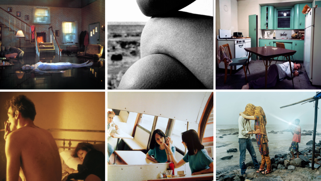
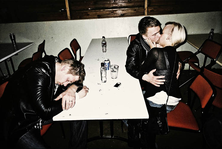
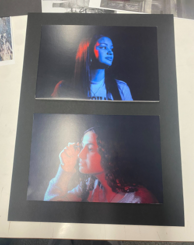
This photo was given to me yesterday in class and i had to decide whether it was a mirror or window photo then evaluate why.
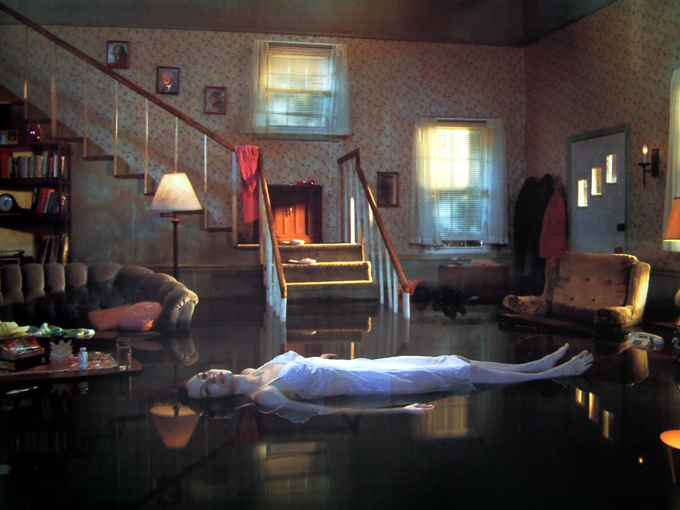
This photo is done by Gregory Crouton, he was inspired by Millais Ophelia. This image is a Mirror, as it is subjective not objective, it does not show and explore actual reality, and everyone could understand something different from this image. Gregory Crouton stages all his images like a film set, behind this image is actually a set of this room with a built pool underneath, which is created into this magnificent piece. Mirror images are staged like how this one is. Although this image is fiction and manipulated it is personal as everyone who looks at it can see something new or different and could find a way it relates to them in a personal way.
I actually did not evaluate this photo yesterday, but decided to evaluate it now. to show my understanding of a window image.
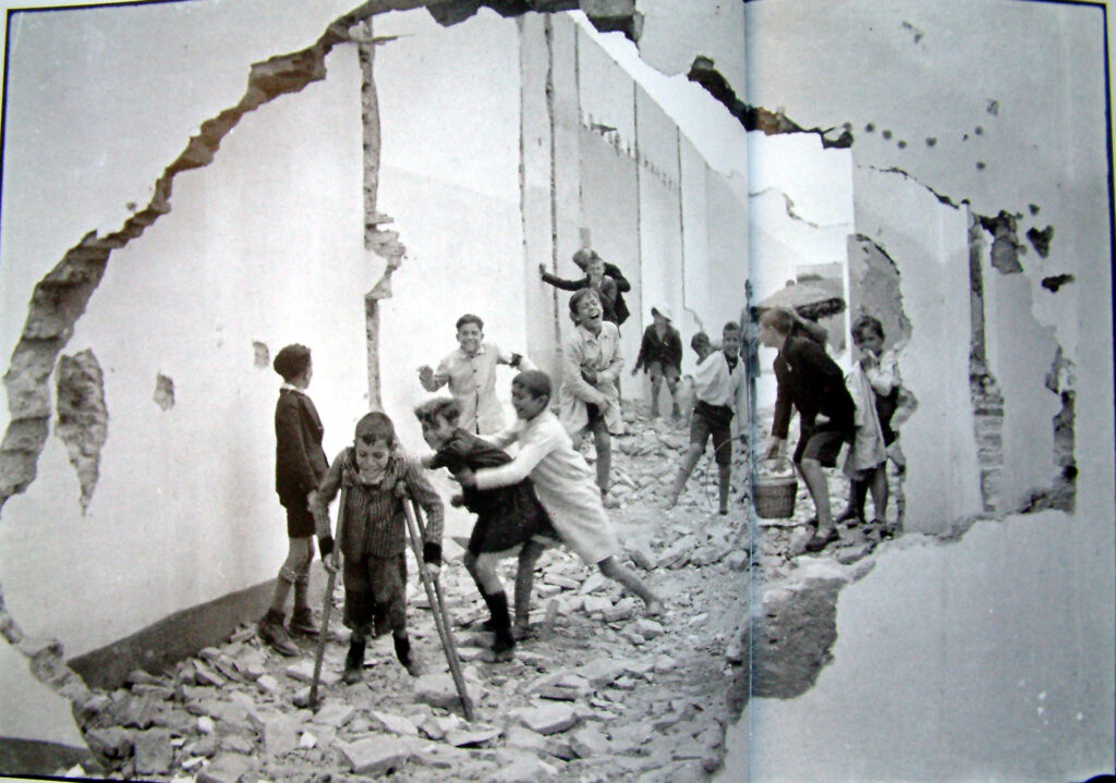
This image is a window, this is because it isn’t staged or manipulated, as it was done by Henri Cartier-Bresson who focused on the decisive moment and street photography, he captured this moment as it was actually happening, yes you can still subjectively look at it but most of Cartier-Bresson work is quite objective in a sense as you can see what is happening quite clearly. He also documents his work well to show clearly what happens in todays world, and in this photo amongst kids. This photo is also very realistic and public.
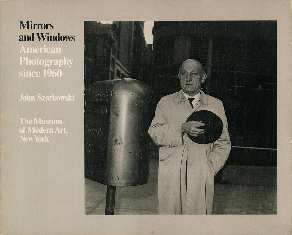
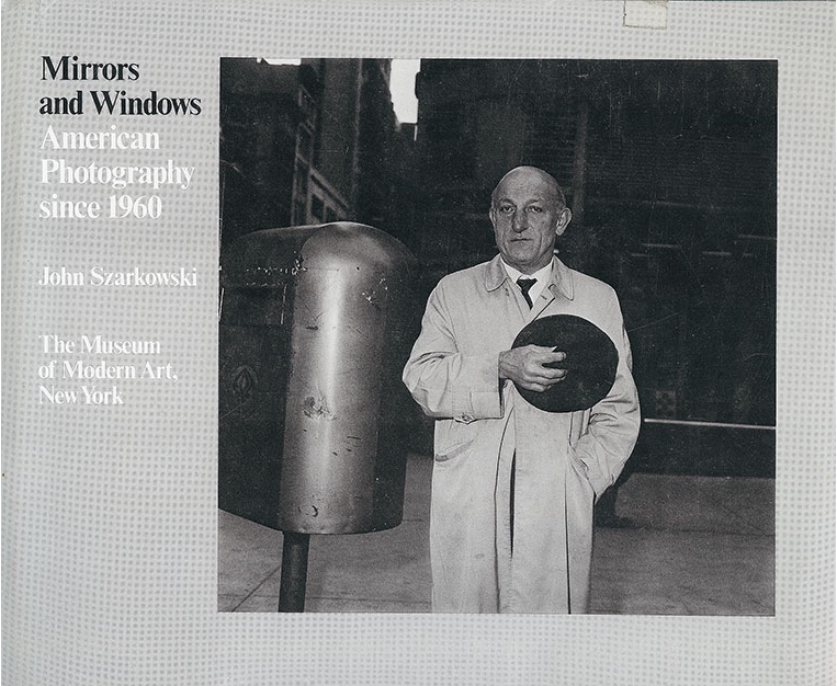
Mirrors and Windows was an exhibition at the Museum of Modern Art in New York in July 1978. The curator of this exhibition was John Szarkowski, an American photographer who attempted to categorise the work of various photographers into two components; Mirrors or Windows.
What are the differences between photographs that are MIRRORS and WINDOWS?
Mirrors
Mirrors are metaphors for photos that reflect the beliefs and interests of the artist who took it or its subject. These images are often staged in order to portray a message. An example of a mirror image could be an environmental portrait.
Words associated with Mirrors:
Romanticism
Fiction
Staged
Subjective
Reflective
Personal
Windows
Windows are metaphors for images which are a documentation of reality. These images are truthful and have clear objectives. Examples of window images are newspaper images used to display events which are taking place to raise awareness.
Words associated with Windows:
Documentary
Realism
Public
Candid
Objective
Truthful
Examples
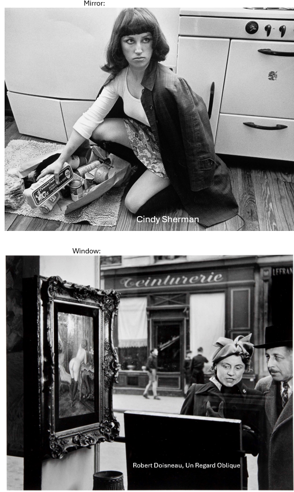
‘Mirror’ Image
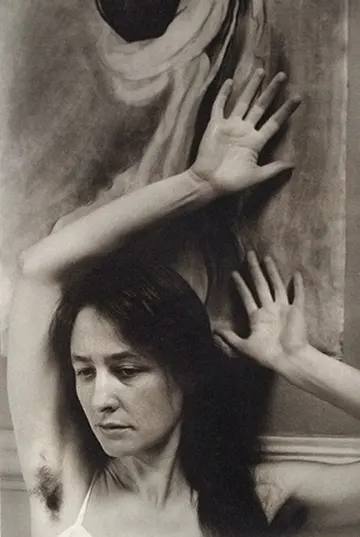
This is an image of Cindy Sherman attempting to oppose patriarchy by posing as female stereotypes. This would be a mirror image as it is personal and reflective of her beliefs that women are not less superior than men. Another reason as to why this would be a mirror image is because it is staged, rather than showcasing real events.
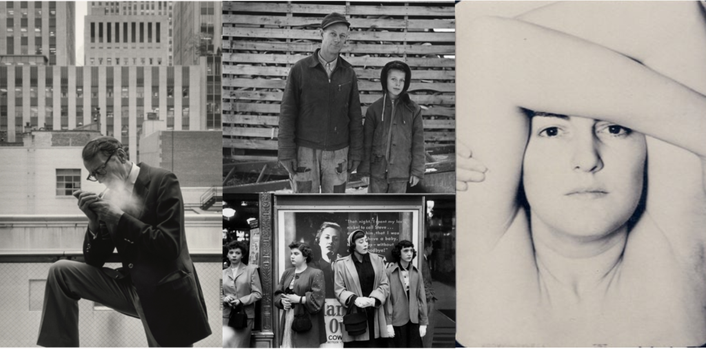
Other Mirror Images:
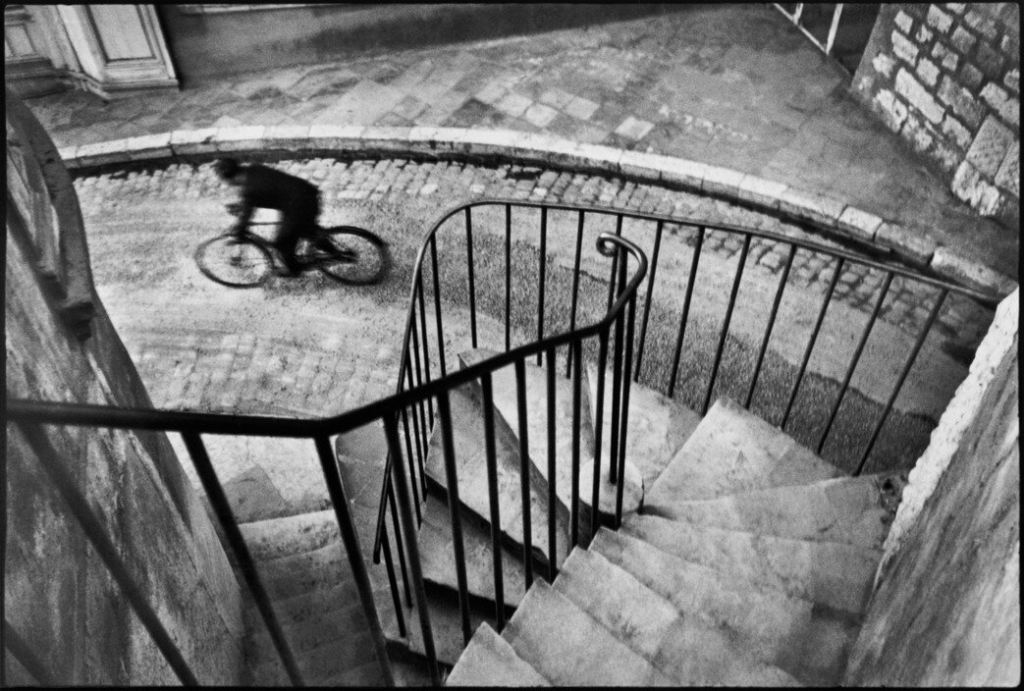
‘Window’ Image
This is an image by Henri Cartier Bresson, a photographer know for capturing the Decisive Moment in his work, as previously researched on an earlier blog of mine. This is an example of a window image as it is a candid photograph of a cyclist who was passing Henri at the time.
John Szarkowshi’s expedition ‘windows and mirrors’, held in New York, since the 1960s, categorised the work that reflected a portrait of the artist who made it (mirror) and work that largely sough to see outside themselves (window).
Szarkowski is fond of creating categories. In the anthology The Photographer’s Eye, published in 1966, he described five “characteristics and problems that have seemed inherent in the medium.” Now, in Mirrors and Windows, he presents a binary theory of photography as art: an evolution from public to private concerns and at the same time a potential toward either self-expression or exploration in the unique sensibility of each photographer
Mirrors
As already explained, a mirror is basically a staged or personal image that matches the photographers vision. words that associate with mirrors include: tableaux, subjective, romanticism, fiction, staged, personal, reflective, internal, manipulated, biased.
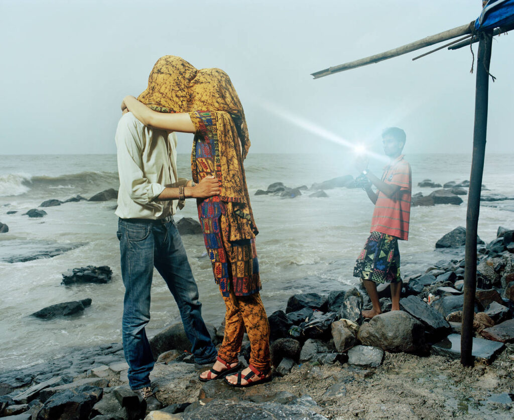
The photo I got given to analyse was, as I decided, a mirror photo:
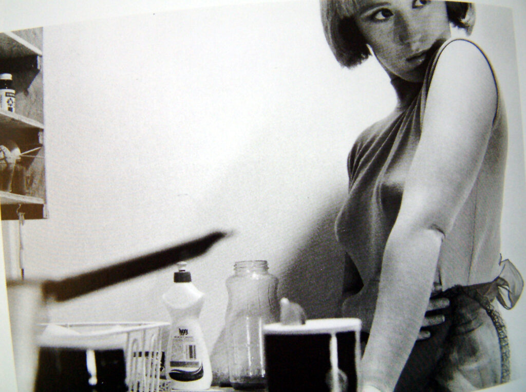
Max Pinckers
I think this is a mirror photo as it seems incredibly unlikely to happen naturally, from the boy using the flash in the day, to the good composition in the photo. It also just gives off a ‘staged’ feel. Here are some other examples of mirror photography:
Hanna Starkey
Cindy Sherman
Windows
Think of a window photo as the polar opposite of mirrors, with words like documentary, objective, realism, candid, public, external, truthful, straight, optical, unbiased to describe photos in that category. its basically an image that was not modified by the photographer. This is very uncommon so most images are usually a mix between the two categories, but still leaning towards one side. Its also uncommon to see an image that perfectly matches the photographers vision, making it slightly more window like. Here are some examples of window photography:
Lauren Greenfield
Rafal Milach
A quote about mirrors and windows in photography:
“The two creative motives that have been contrasted here are not discrete. Ultimately each of the pictures in this book is part of a single, complex, plastic tradition. Since the early days of that tradition, an interior debate has contested issues parallel to those illustrated here. The prejudices and inclinations expressed by the pictures in this book suggest positions that are familiar from older disputes. In terms of the best photography of a half-century ago, one might say that Alfred Stieglitz is the patron of the first half of this book and Eugène Atget of the second. In either case, what artist could want a more distinguished sponsor? The distance between them is to be measured not in terms of the relative force or originality of their work, but in terms of their conceptions of what a photograph is: is it a mirror, reflecting a portrait of the artist who made it, or a window, through which one might better know the world?” — John Szarkowski, 1978
Here Szarkowski considers Alfred Stieglitz as a leading figure in the “photography as a mirror” function, and Eugène Atget as a leading figure in the “photography as a window” function:
Alfred Stieglitz
Eugène Atget
Through the theoretical separation that the mirror/window bipolarity produces, and the questions that arise regarding the ways in which a work can be a mirror of the photographer, a problem emerges concerning the relationship of the self with the mirror: how to conceive of the relationship between what is seen of the self and what the self is in its totality, as well as between the “Ego” and the “I take a photograph”. This major question can be tackled through some related ones, such as those concerning the concepts of the “truth of the photographer” (to what extent does the person who photographs enters some synchronous -to their personality- qualities, beliefs and preferences in the image) and of the “truth of photography” (what constitutes a photographic image?).
What are the differences between photographers that are windows and mirrors?
Window photography depicts the outside world. Showing the world outside of the artists life. While mirror photography depicts either the artists life or includes the artist in some creative way, weather its self portrait or showing their life through a photoshoot.
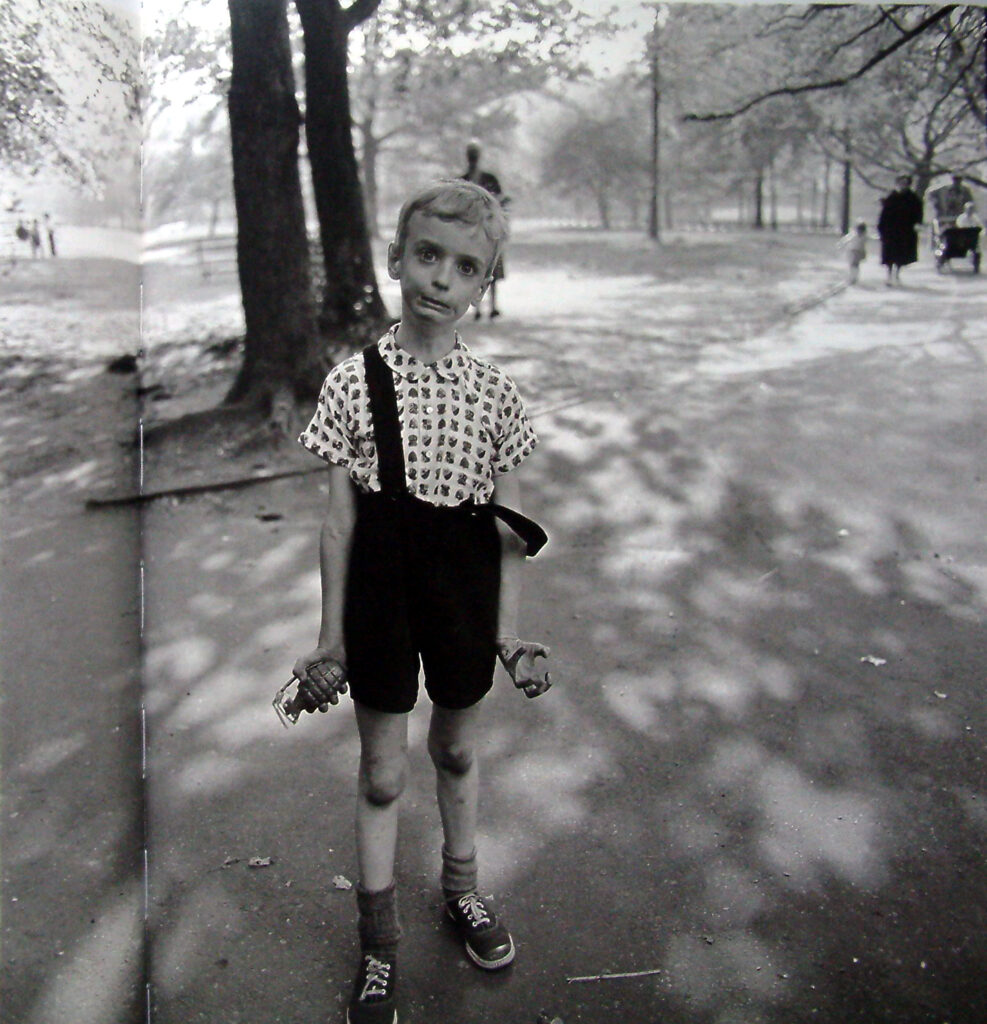
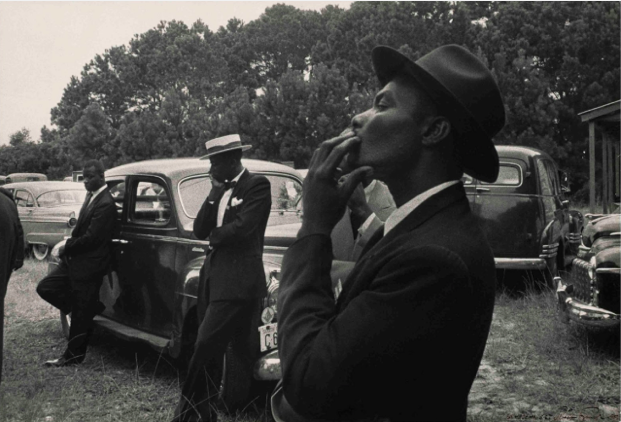
This photograph is a great example of window photography, that I know, it doesn’t have any connotations surrounding the artist ( Diane Arbus ) and this photo is called “the child with the toy hand grenade in central park”
Diane Arbus photographed the out of the ordinary; strippers, nudists, carnival performers, and more. Her intimate black and white photos is what she is most known for.
Question: What are the differences between photographs that are windows and mirrors?
Mirror photographs are romantic expressions of the photographers sensibility and shows a reflection of the photographer. Mirror documentation in photography provides an insight into our inner world, projecting our own subjective interpretation or attempting to reveal our inner world to an outside audience.
Window photographs show the exterior world in all its presence and reality. They document the world around us and provides the viewer with a window on that world.
The difference between these two images is that the first one clearly looks staged, and it is reflecting the artist as if it is a mirror. Whereas, the second one looks more natural and it is an example of viewing the exterior world in all it’s reality, through a metaphorical window.
John Szarkowski
John Szarkowski was an American photographer, curator, historian, and critic; best known for his role as the director of the Museum of Modern Art’s Department, from 1962 through 1991. Szarkowski himself is one of the great influencers of photography and played a significant, if not primary role, in moving the market for the professional photographer from publications to the gallery.
Examples of his work:
Mirrors-
Windows-
“The subject and the picture are not the same thing, although they would afterwards seem so”
In 1964, Szarkowski curated The Photographer’s Eye, where he promoted the democratisation of photography by attributing value to the vernacular as well as the professional or artistic photograph. Szarkowski makes no attempt to categorise the photographs he selects, nor does he reference the visual artists that predate photography. He sees photography as a self contained art that has created its own traditions and, in doing so, its own vocabulary.
Szarkowski argues that the successful photographer recognises that photography has an inseparable relationship with the reality that surrounds us, a reality that provides an endless array of wondrous things and important moments. The photographer’s skill is to see beyond the reality and find the “still invisible” picture and that it is this relationship between reality, the photographer and the picture that is unique to photography.
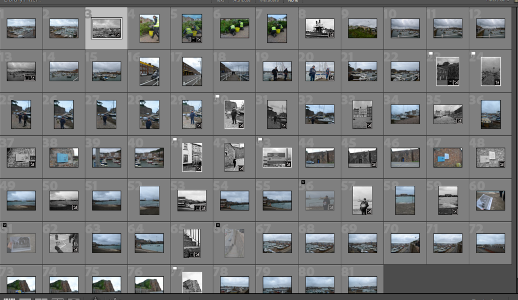
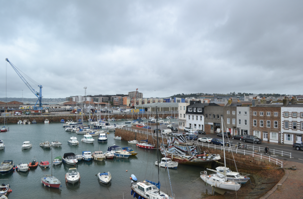
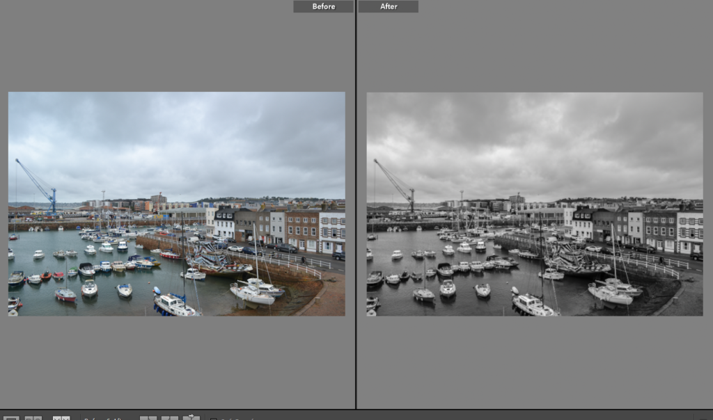
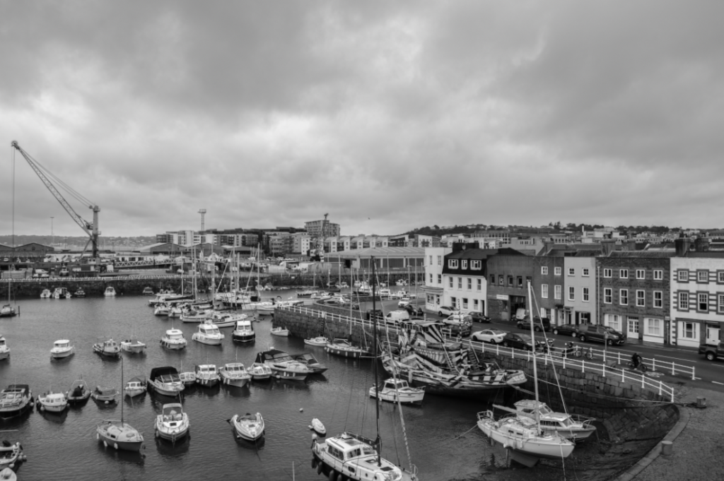
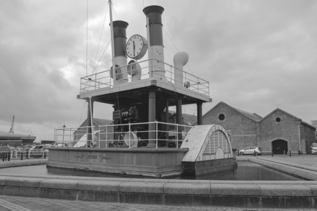
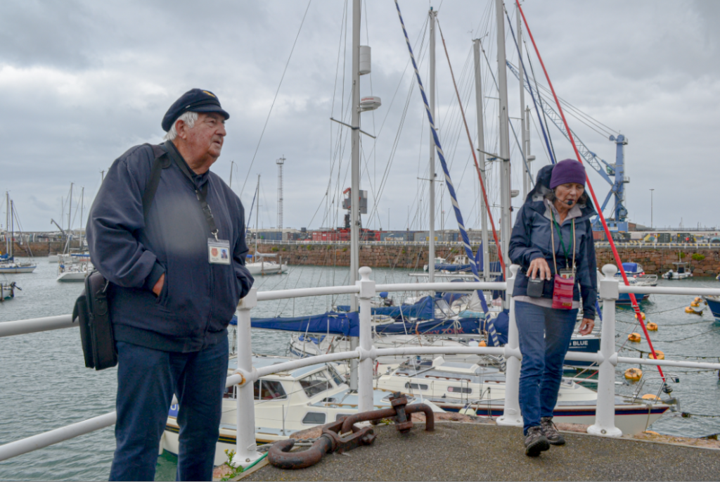
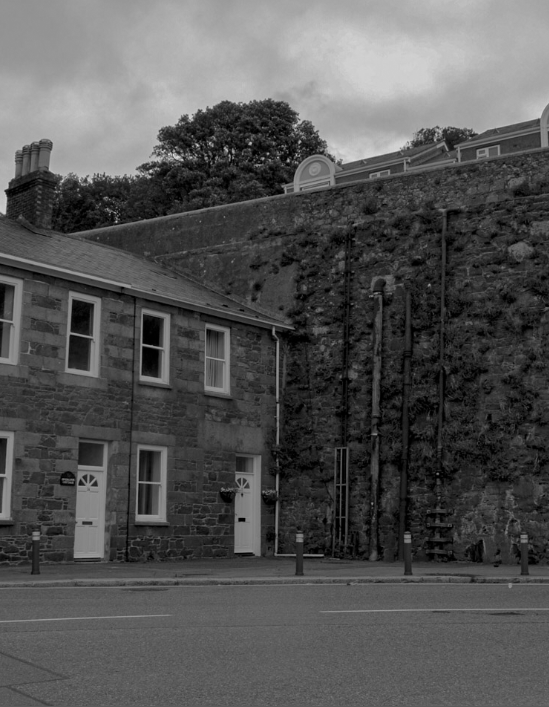
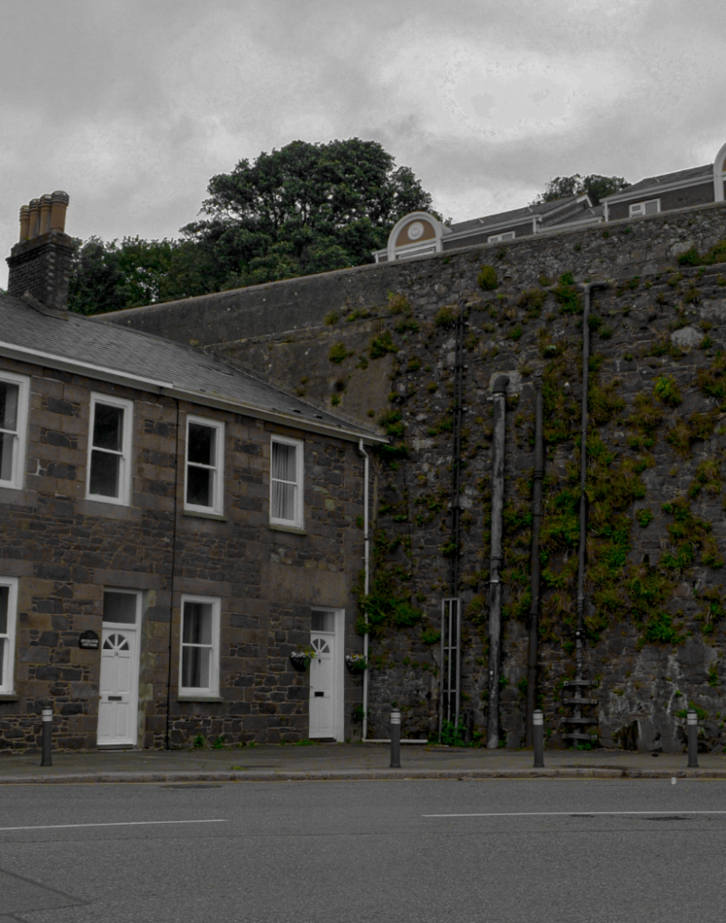
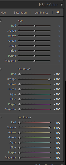
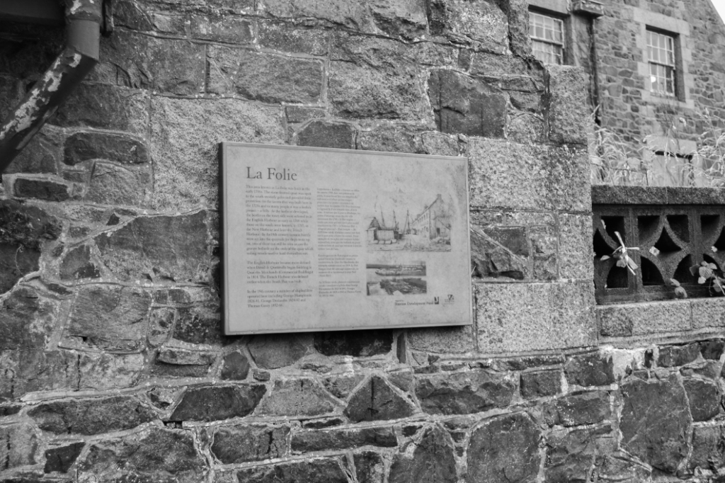
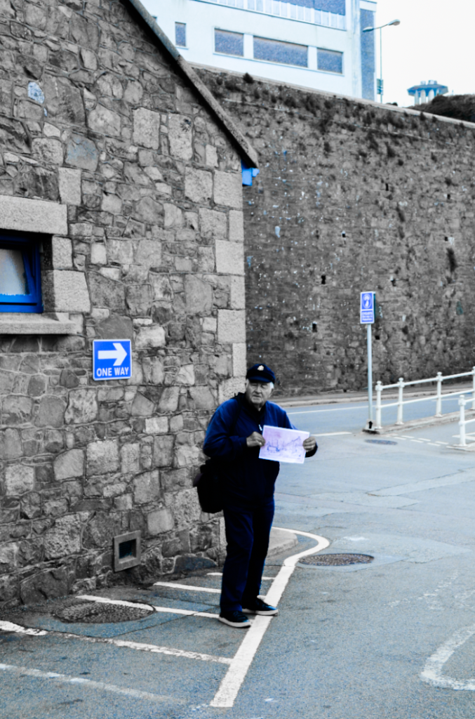
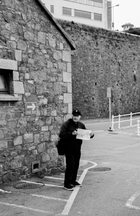
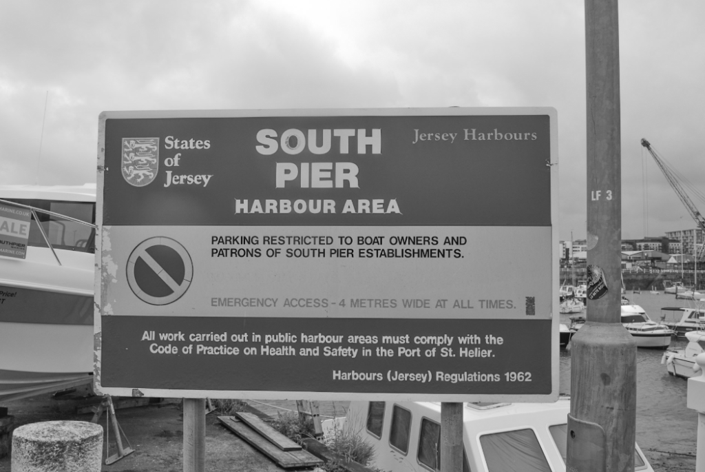
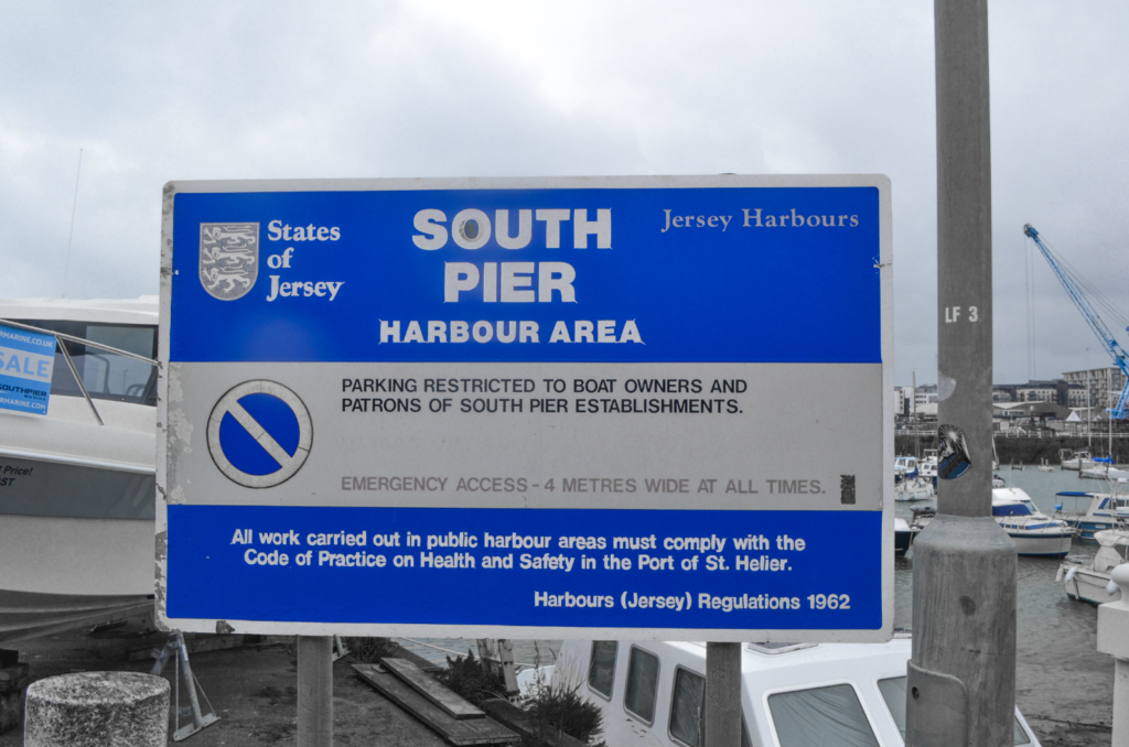
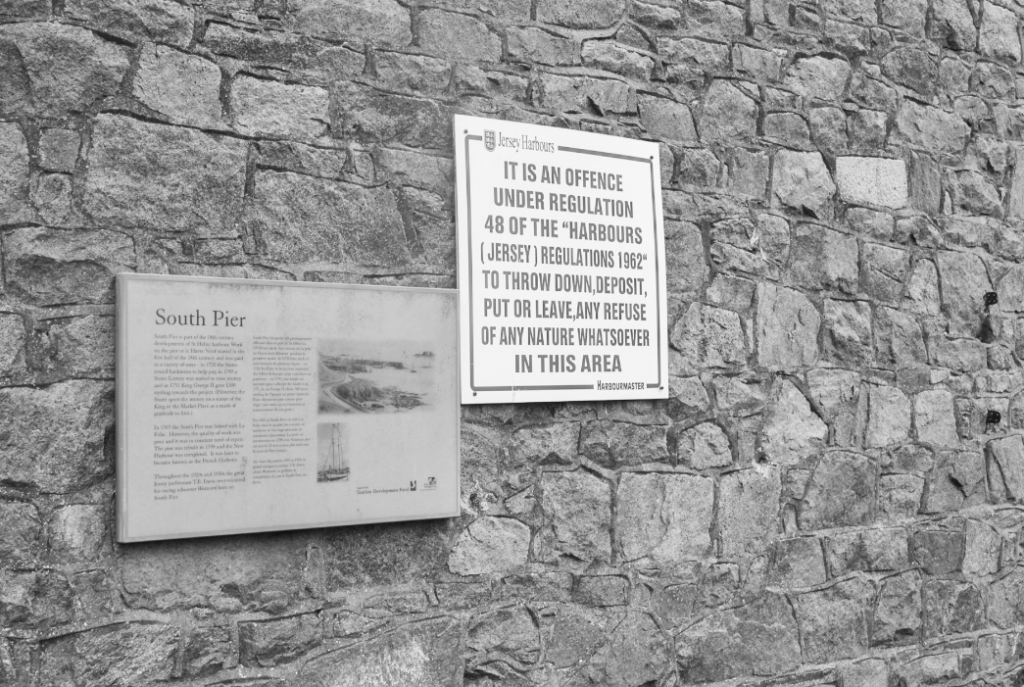
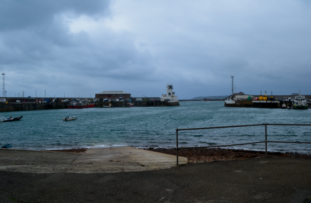
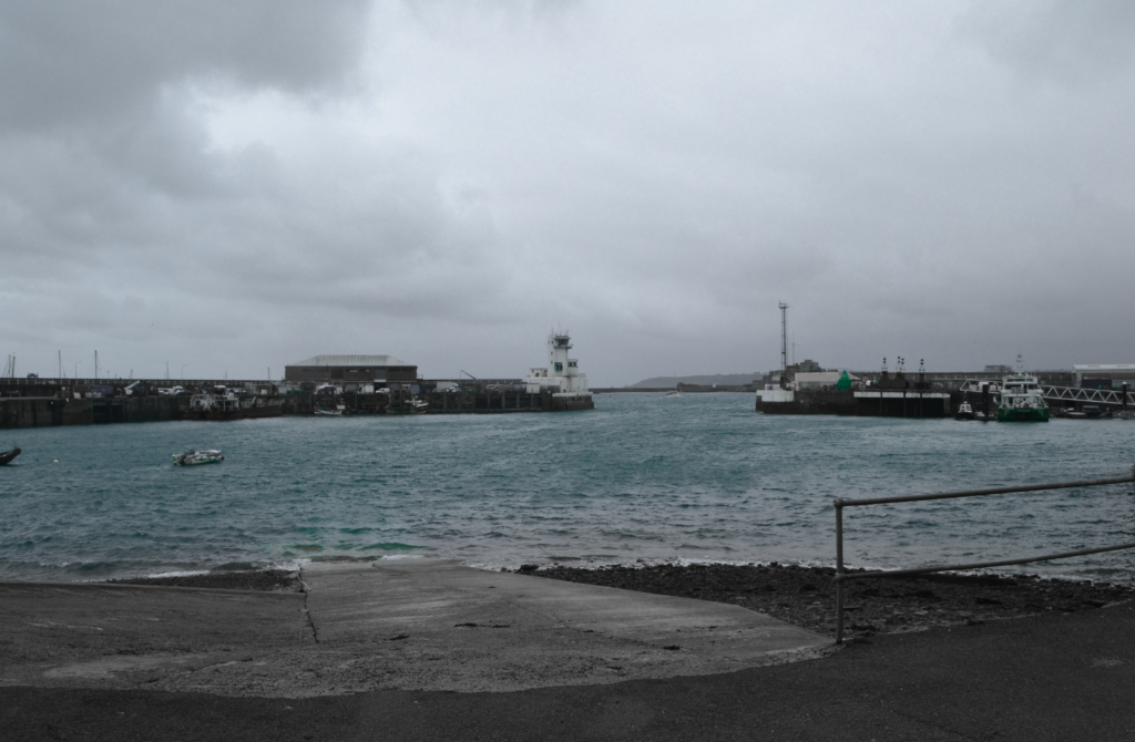
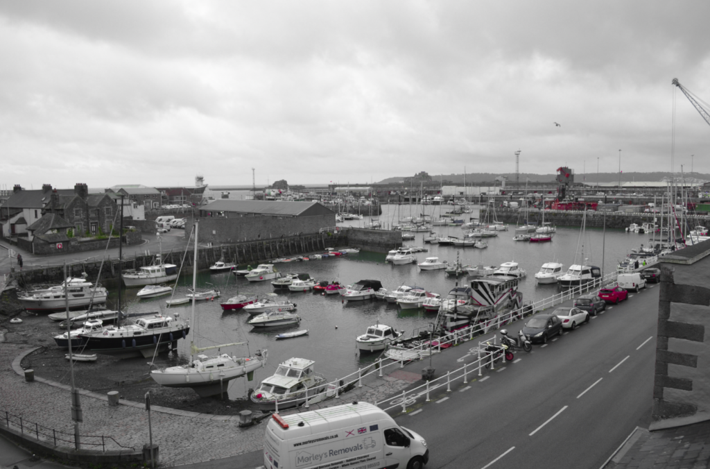
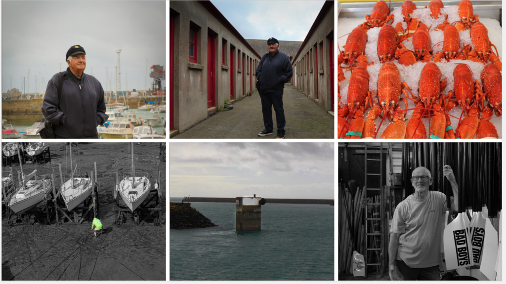
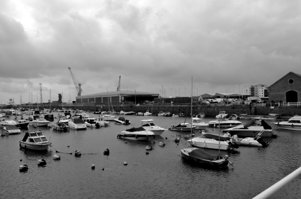
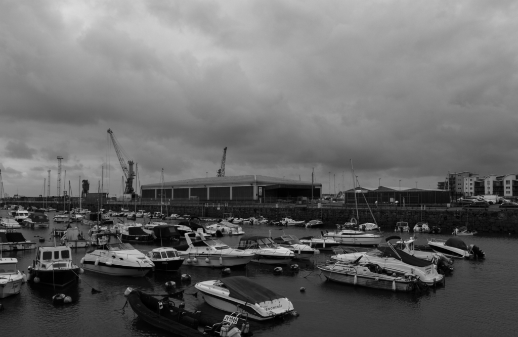
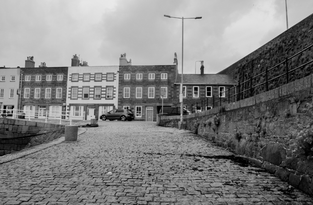
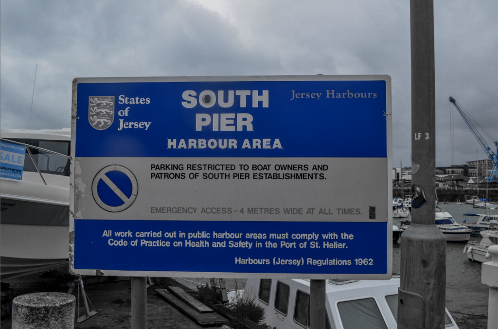
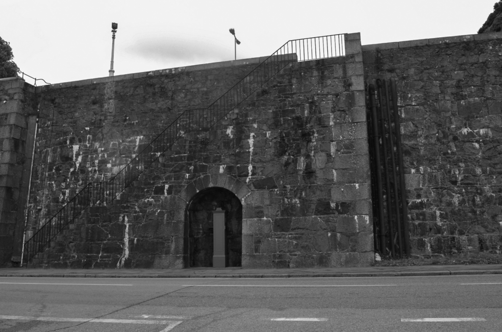
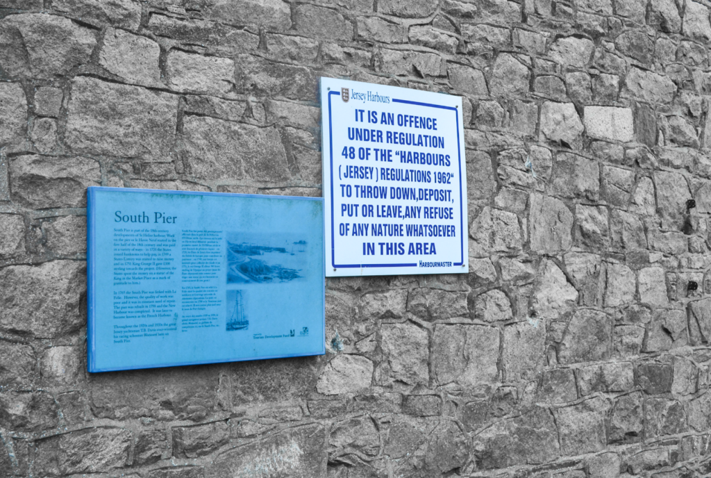
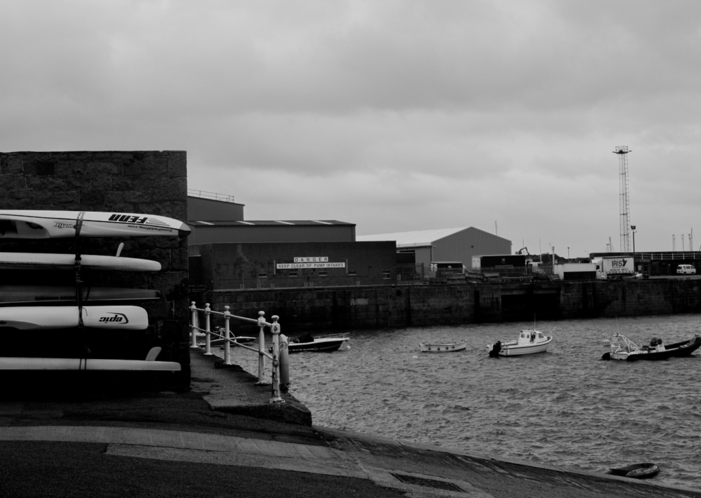
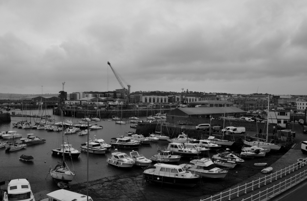
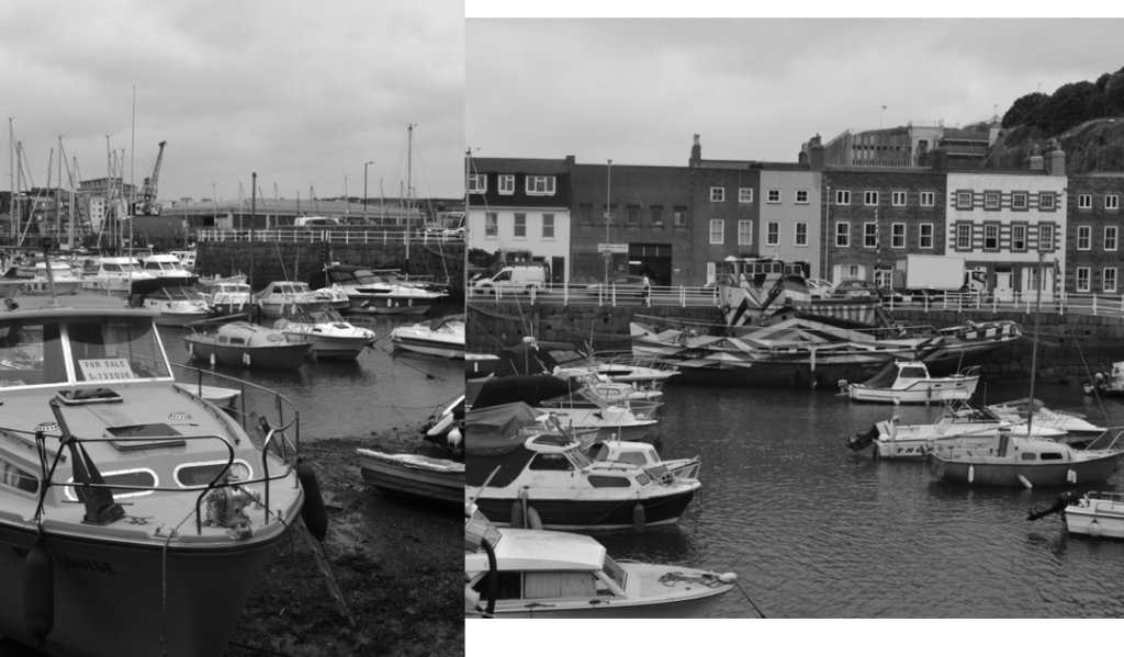
We went to Société Jersiaise Photographic Archive and St Helier Harbour to take pictures.
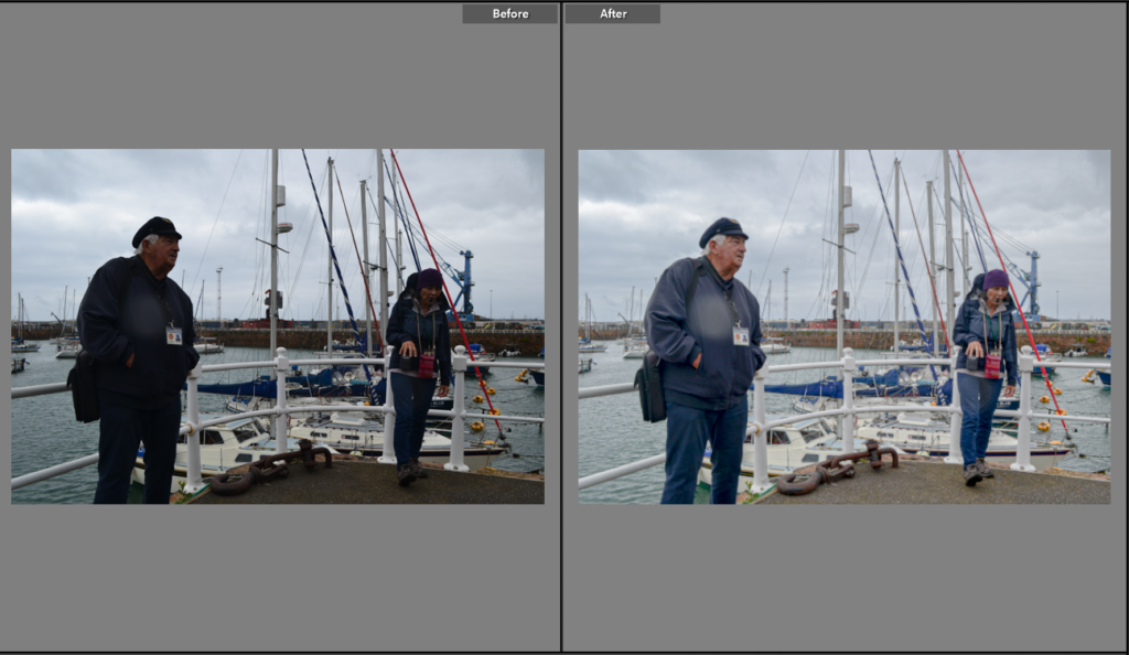
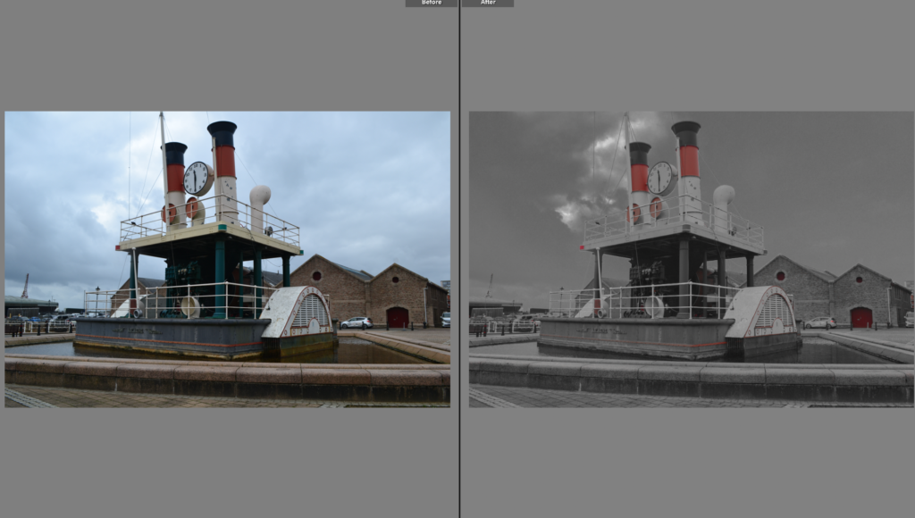
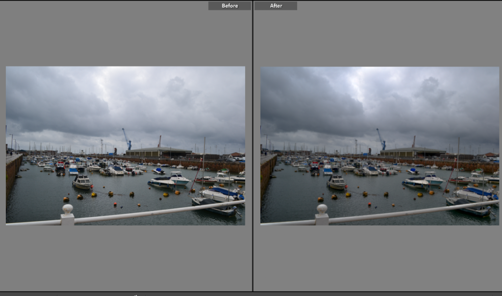
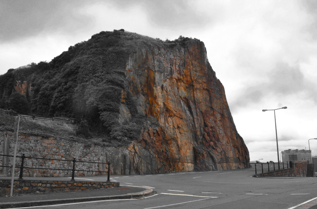
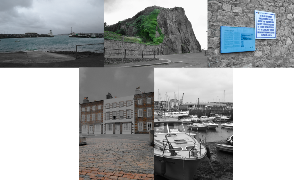
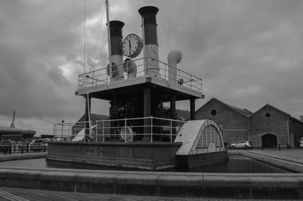
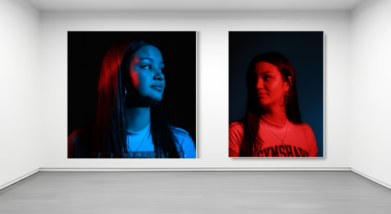
For this edit I wanted to try and leave it black and white but also add some colour to it to see how it turned out. I edited it by decreasing all the colours on HSL saturation and luminance expect orange. I also decreased the contrast, highlights and the shadows.
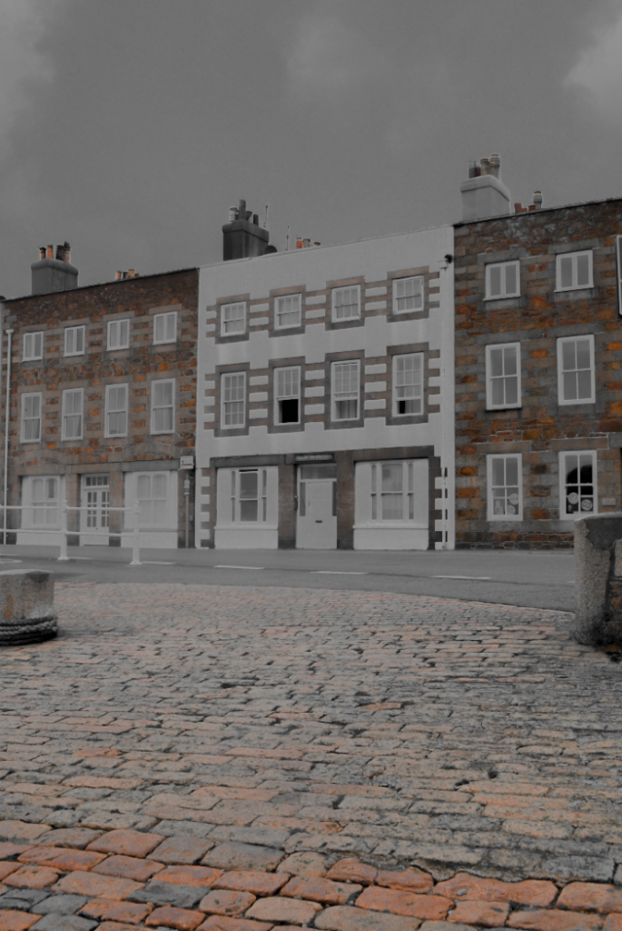
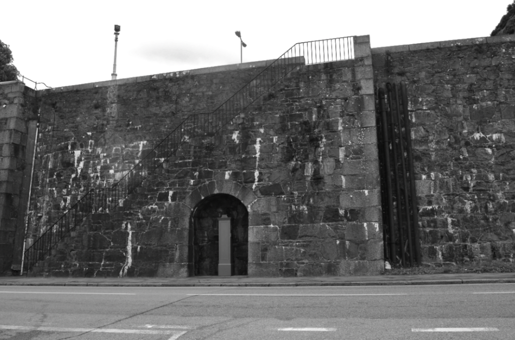
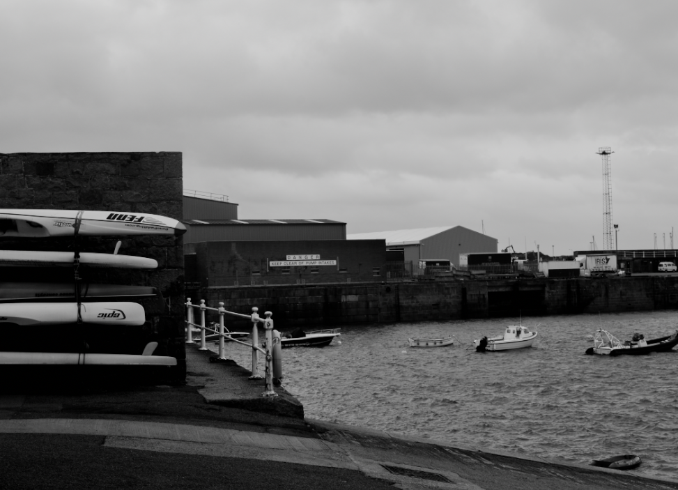
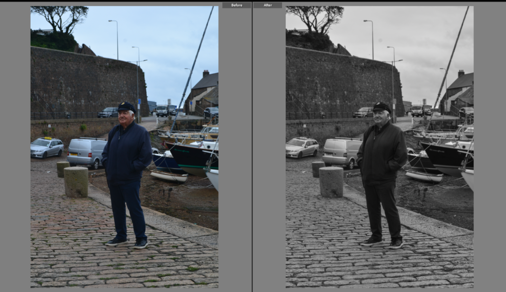
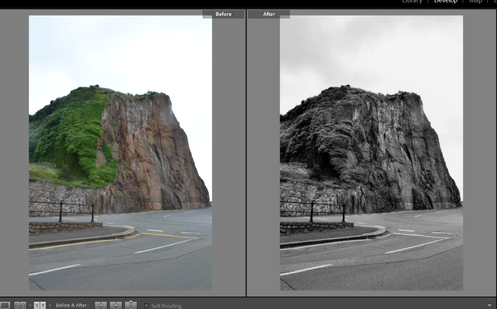
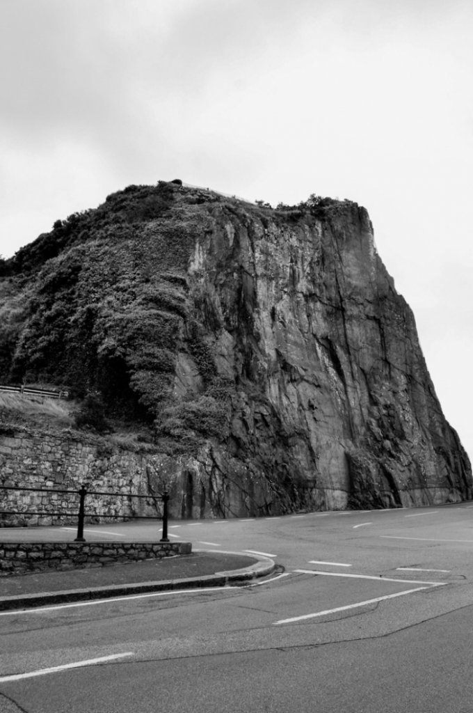
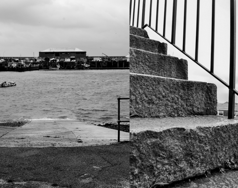
For this image I decided I wanted to make it have a high contrast and shadows and decrease the white and black in the image which I think turned out really nice. The black and white in this image makes it looks more interesting and detailed with all the mix shadows and shaded of black and white. I would say it’s my favourite image.
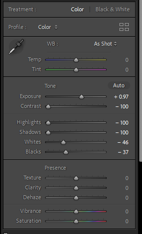
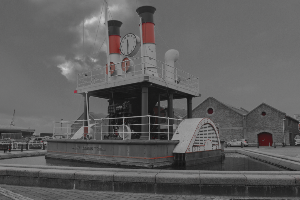
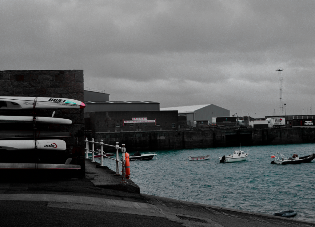
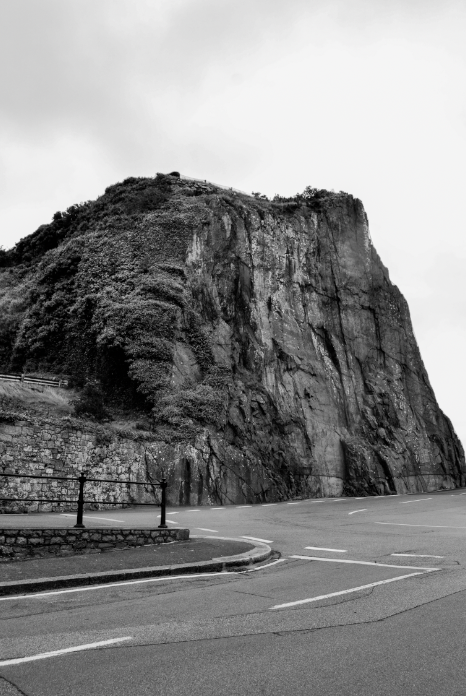
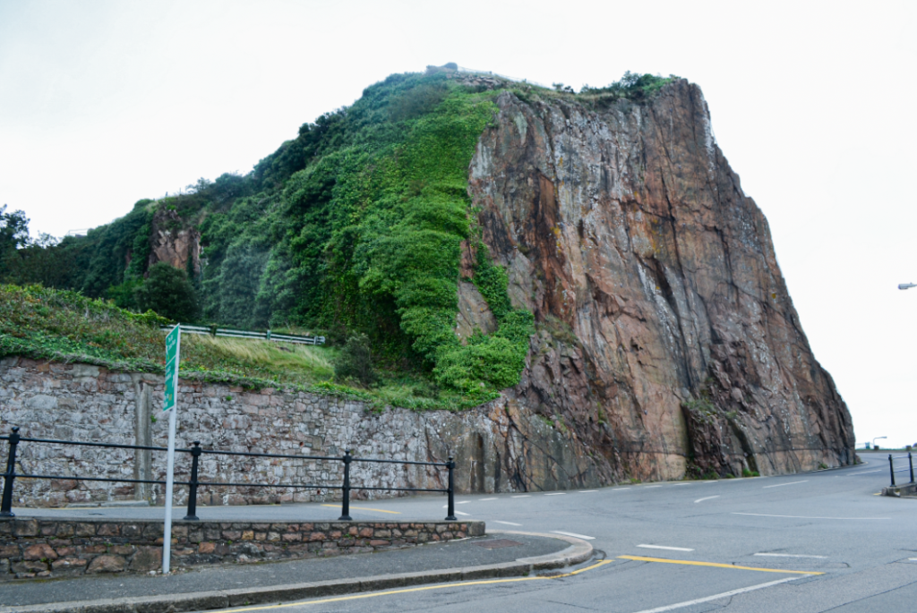
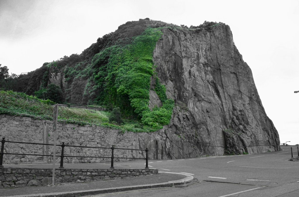
Since I really liked the black and white version of this image I wanted to try out giving it a bit of colour by using HSL which was quite interesting. I was hoping that all of the top part of the mountain would turn green but only most of it did but didn’t turn out as bad as i thought because it lightens up at the top and blends in well with the whit and black.
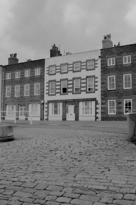
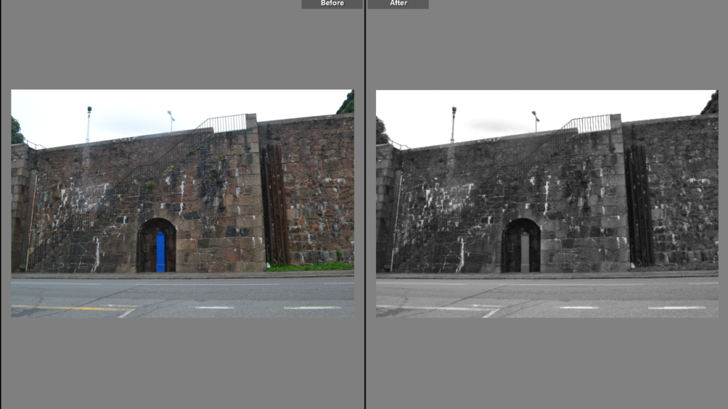
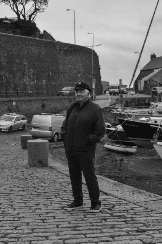
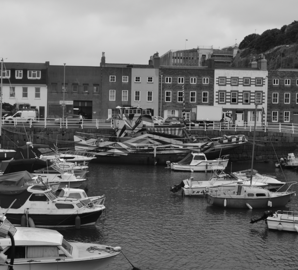
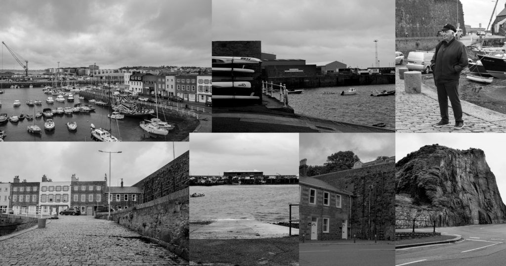
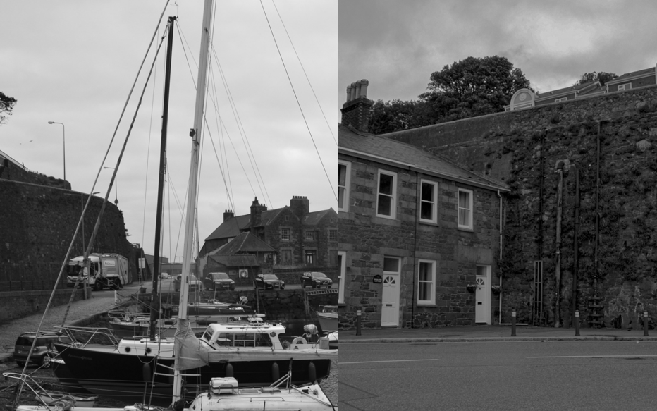
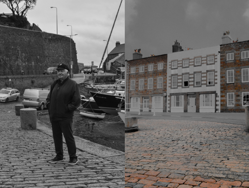
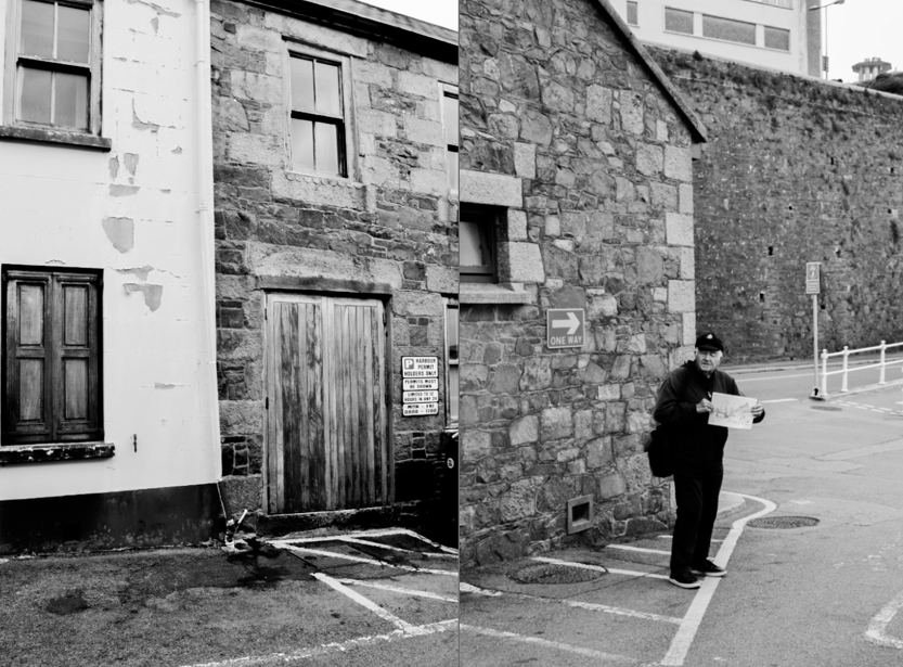
These are the best edited images I have. I edited all of the best images to black and white because I love the way it looks and how there is so many different shades of black and grey. The black and white photos makes the imagine looks more dramatic and with black and white images it’s never has over-expose highlights, makes the image more exiting in a way because of the dramatic dark colours in random places in the photos. Coloured images are beautiful most of the time but so is black and white images, and in black-and white it expresses reality better.
A sentence: I plan to tell a story throughout the harbour on fishing and a fishermen’s footsteps, on how we get our fish.
A paragraph: I took a very long time to decide until I realised I liked a lot of my portraits and found some images correlated well with each other, My zine will tell the story through the book of fishermen, and how there is lots of jobs to do to the boat before evening heading to the sea, it will clearly show the things you have to do on land until you enter the sea, it will then show things that fishermen collect from the sea and how they collect them, what they use. Of course the story will still be subjective and I hope everyone can find their own story within it but the clear main story is of a fishermen life, which helped as we met Captain Brain who comes into my story a bit, nothing is clearly said but I hope my images and the order it is done is clearly shown.
NARRATIVE:How will you tell your story?
I plan to tell my story by carefully ordering the images throughout my zine book, there will be portraits and full bleed images to especially show the importance and main idea of every image and to hopefully highlight what story I am trying to tell.
I will have my own produced images . At the beginning of my zine, I will have an introduction of St Helier harbour. throughout my entire zine pages will be landscapes of St Helier harbour or portraits, I also plan to have black footprints walking through all the pages.
I plan to have my font-types a friendly playful tone as it isn’t in the book much but think it works well with the image I have thought for my front cover so they will compliment each other. The cover of my zine will be one large portrait that is in colour and edited to be a bit of a warmer tone, the title will be right above the man in the photo and my name will be in the right hand bottom corner, in black so it all stands out.
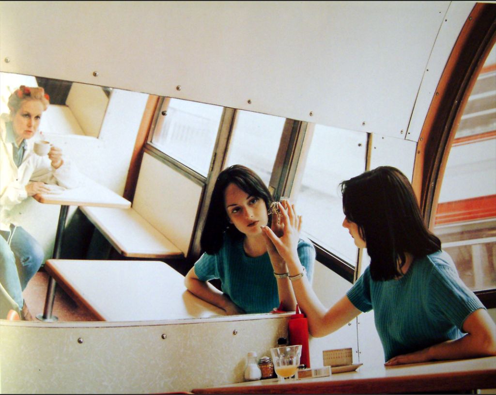
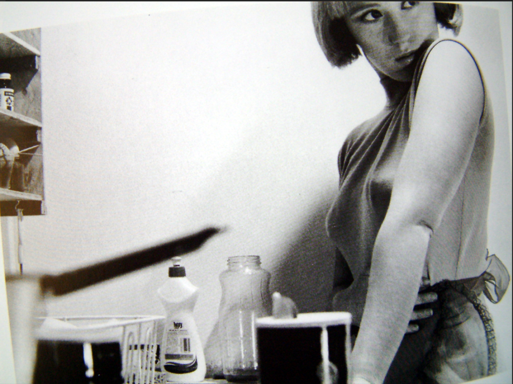
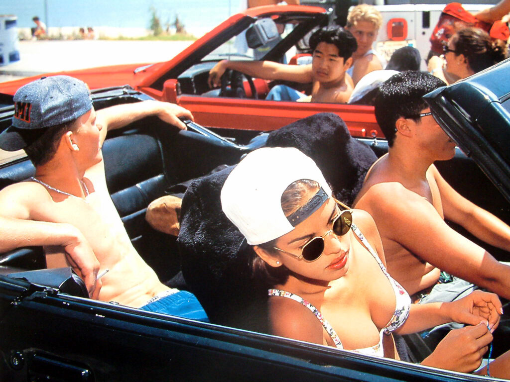
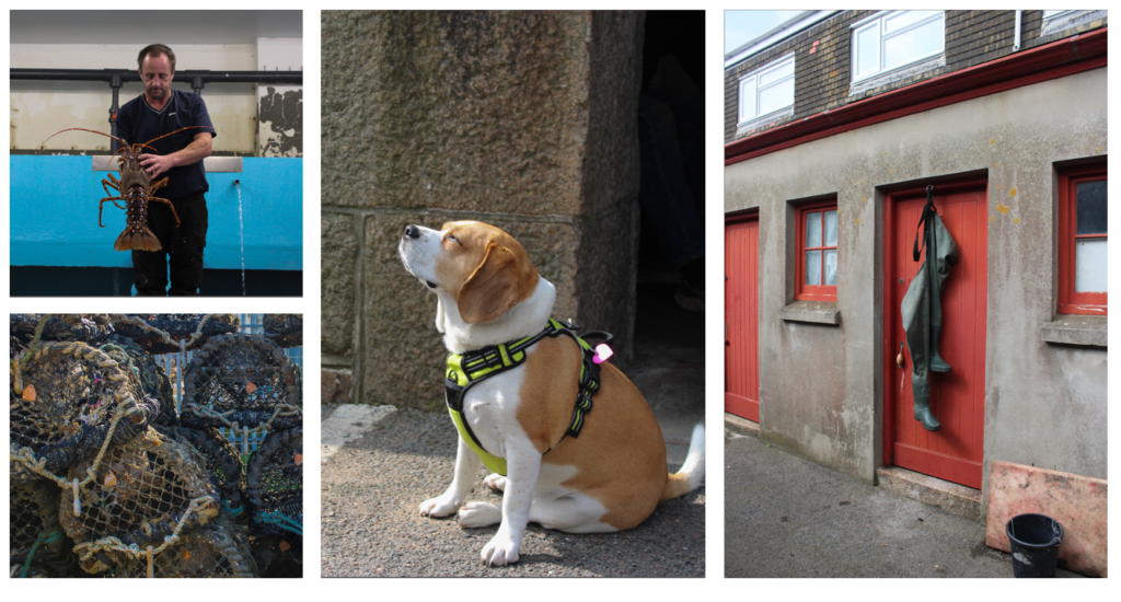
Mood board of images I will use:
Text I will add in my zine
As it is all to do with fishing and fishermen and their story I will have a small introduction in the beginning that is presented in sea shanty form.
Narrative is essentially the way a story is told. For instance, you have the option to narrate various versions of the same tale. It is a highly subjective process with no correct or incorrect answer. Whether your photographic story is of good quality is a different question.
A narrative takes shape as you establish connections between multiple images (and/or text) and display them together. The way you choose and arrange images in a story is crucial for shaping the narrative. The photo-zine’s structure and design also reflect this idea. Yet, it is crucial to determine the nature of your story before deciding on the approach you want to take in conveying it.
How to Plan:
Create a detailed specification outlining your approach and strategy for exploring A Love Story. You must plan to complete a minimum of 3 photoshoots within the next 2-3 weeks, which may involve specific photo tasks. What kind of appearance and atmosphere do you want your images to have? Incorporate artists and photographers’ visual references regarding style, approach, intentions, aesthetics concept, and outcome. Keep in mind that the end result should be a 16-page photo magazine, so you must edit a final set of 12-16 images that, when sequenced together, form a story that visually represents your love story.
Lewis Bush discusses various books he has created that offer diverse narrative structures, ranging from straightforward to avant-garde. Books that reinterpret the stories from other books, books that allow for reading in both directions, and books that have no predetermined storyline. I am currently developing a narrative that moves back and forth in time simultaneously, as well as another book that will not be real, meaning its narrative will not exist either.
‘One story can spawn many narratives, a fact that, in contrast to photography, is well understood in literature and cinema….when I say ‘I’m going to tell you a story’ I actually tell you a narrative of that story.’
In a follow article titled ‘Photographic Narrative: Between Cinema and Novel,’ Lewis Bush discusses various examples from cinema, literature, and photography, identifying the unique strengths and weaknesses of each medium.
In Bush’s view, photography’s narrative strength is:
‘It’s sheer power of description.’ A single photograph can depict a scene with a verisimilitude which pages of written account would still fail to capture. It is this quality which led photography to be first employed for practices like crime scene and incomplete , in place of the unreliable memory and incomplete notes that had previously been relied upon.
MY STORY:
My story will be the looking at the history of jersey by looking at the photos and seeing how the harbour is now.
NARRATIVE:
Decided to keep most of the images black and white because it makes it look more interesting since the harbour is pretty old. For the second page of my booklet I’m going to talk a bit about Jersey Marina and on the 4th page I am going to talk a bit about Brian Nibbs who is the CEO of Jersey Harbours All the other pages are going to be portraits or landscapes of the harbour.
These are the images I am thinking to use: (10 – 16 pages)