Within the origin of photography, there are two photographic processes; Daguerreotype and Calotype. The Calotype process first produced a photographic ‘negative’ in the camera, from which many ‘positive’ calotype prints could be made, whereas daguerreotypes were a one-off image.
Louis-Jacques-Mandé Daguerre was a French artist and photographer, recognized for his invention of the daguerreotype process of photography. The daguerreotype is a direct-positive process, creating a highly detailed image on a sheet of copper, plated with a thin coat of silver (without the use of negative). The process required great care, the silver-plated copper plate had to be cleaned first and polished until the surface looked like a mirror. But the daguerreotype had serious limitations, the mirror-like surface of the image could only be viewed from a narrow angle.
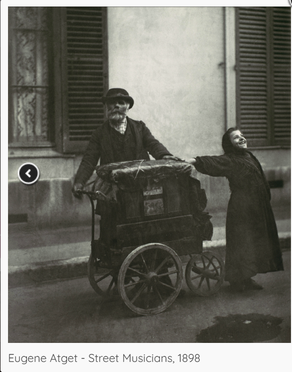
According to John Szarkowski‘s thesis, the daguerreotype can be considered as a mirror image rather than a window image. This is because Daguerre focused on taking photographs of people rather than of the world, and I believe this category of images are more personal and subjective and could possible reflect feelings and emotions of the photographer. This may be due to the fact that images of others hold great value as they capture that moment that one is able to reflect on after the moment passes. This was a useful technique from Daguerre as it also gives the viewer a hint of history and context behind the photograph, while also allowing us to find out a little bit more about the artist himself, and potentially find out why he took these images and what his passion behind his methods was. Additionally, centuries later we are able to see what photographs looked like in the 1800s, seeing how greatly photography has evolved since then, which I think is effective as it reflects historical contexts within photography and specifically portraits. This is because through a portrait, one is able to see a lot deeper than just the photograph, as we can see the expressions of the person, background of the image, clothing etc which can also bring us to ask questions and compare todays photography to Daguerre’s time. Szarkowski states “a mirror – a romantic expression of the photographer’s sensibility as it projects itself on the things and sights of this world.” To a high extent I agree with this quote because sensibility means being able to appreciate and respond to complex emotional or aesthetic influences, which is shown through how the image is taken. For example, a mirror image often expresses a person’s hobbies, habits or personal experiences.
William Henry Fox Talbot invented the original positive and negative process, the calotype is sometimes called a “Calotype.” This process uses a paper negative to make a print with a softer, less sharp image than the daguerreotype, but because a negative is produced, it is possible to make multiple copies. Fox Talbot’s images were made so that when they were exposed to light, they were easy to producer and distribute. However, these images faced many drawbacks such as the people in the images being described as looking ‘on the edge of present’, meaning they did not quite look alive due to low sharpness and graininess. The process was superseded in the 1850s by the collodion glass negative. A lot of calotype photographs show scenery in the image rather than people or things that associate with the artist specifically. This method can ultimately show history because it was introduced in 1941. A lot of calotypes fit into realism, public and optical. John Szarkowski stated: “The distance between them is to be measured not in terms of the relative force or originality of their work, but in terms of their conceptions of what the photograph is: Is it a mirror, reflecting a portrait of the artist who made it, or a window, through which one might better know the world? I personally would agree with this statement because I believe each artist is different with unique and different views 5 on what an image is or the meaning behind it. According to John Szarkowski‘s thesis, in my personal opinion Fox Talbot’s images are more associated with windows in comparison to mirrors, mainly because his common subject throughout his photographs is trees or buildings.
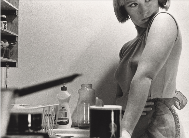
Mirrors chosen image:
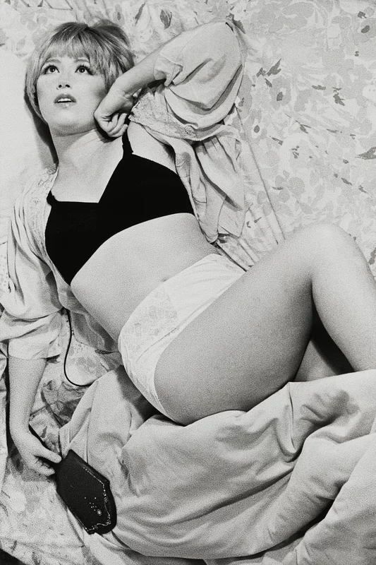
Cindy Sherman’s Untitled Film Stills is a suite of 70 black and white photographs in which the artist posed in the guises of various generic female film characters (working girl, vamp, and lonely housewife). Staged to resemble scenes from 1950s and ’60s Hollywood movies, printed images mimic often-staged “stills” used to promote films. By photographing herself in such roles, Sherman inserts herself into a dialogue about stereotypical portrayals of women. I chose this image to analyse for my mirrors as it is a subjective expression and definitely has a staged approach, which immediately makes me question why this image was taken. I find this image intriguing as the context behind it successfully links to the assumptions and interpretations I can make from first glance as a viewer. For example, this image was taken by Sherman in 1977, which was a time when women’s rights were not as valued as men’s rights, when women were not seen as equal to men, rather, they were objectified. I believe this image effectively portrays these historical challenges against women and feminism because Sherman is fitting into the female stereotypes and representations, such as being aesthetically pleasing to men. I can assume this from the minimal clothing she is wearing, as well as wearing an extremely seductive makeup look. These factors contribute to women being sexualised because in the 60s and 70s because women supposedly didn’t have much purpose other than to nurture their children or please their husbands. Therefore, from this I can gather that perhaps Sherman took these images to please men, potentially to gain male attention as back in the 70s it was challenging for women to be seen as worthful. Furthermore, the construction of the overall image executes these representations because Sherman is clearly the main subject in this image, as there isn’t much background and the camera angle is focused on just her body and face. This immediately draws my attention to Sherman’s facial expressions and body language, which indicate her awareness of how she has been viewed and sexualised. In addition, Sherman is portraying the “female gaze” in this image, which is an issue of representing women as subjects having agency and also adds to the ideology of women being objectified. I believe this image is a mirror image as it favourably feeds into representations of women, and by reflecting these historical contexts as a viewer I am able to gather an ideology of how strongly Sherman feels about these stereotypes. Through the positioning of the camera as a deadpan angle directly above Sherman, as well as Sherman gazing away from the camera gives me the impression that this image was staged. As the artist herself is the model in the image, this tells us that the aim of her Untitled Film was to reflect herself as a photographer and perhaps disagree with the challenges women have had to face over the decades.
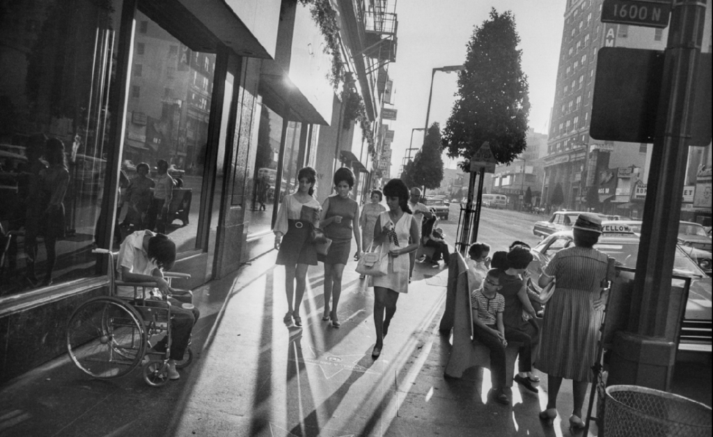
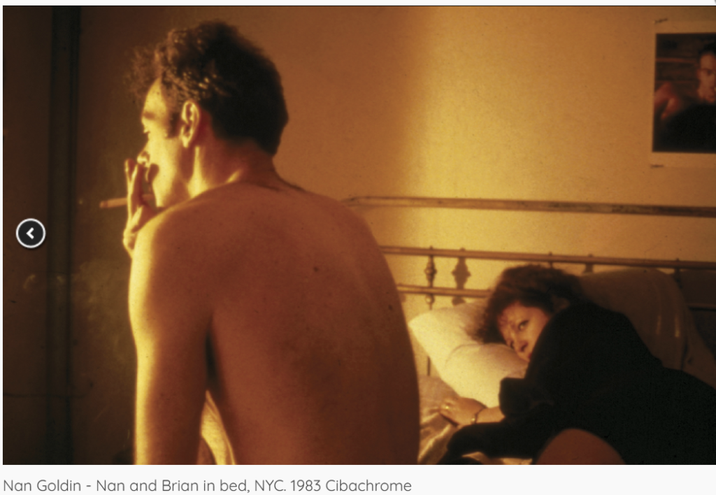
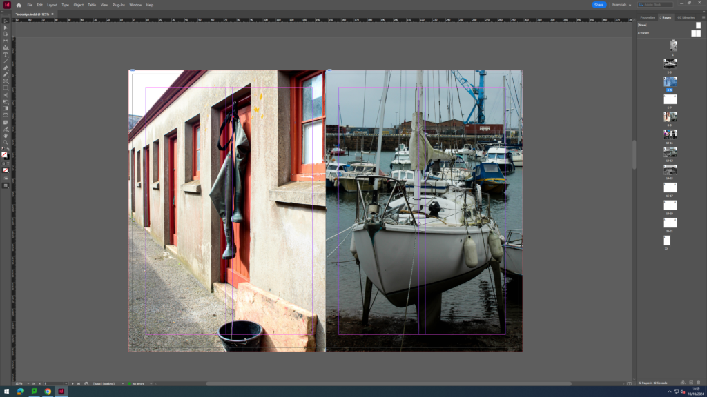
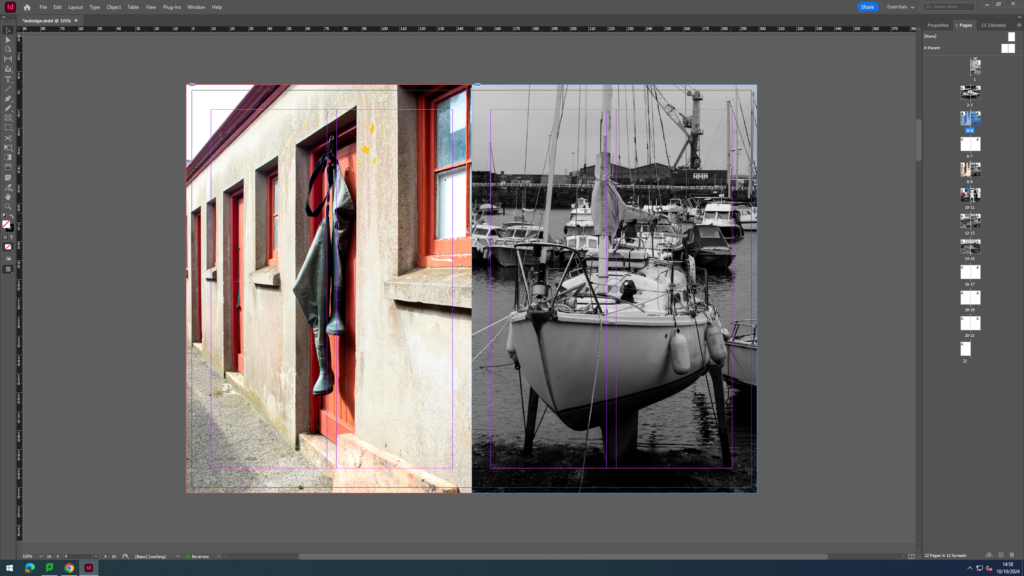
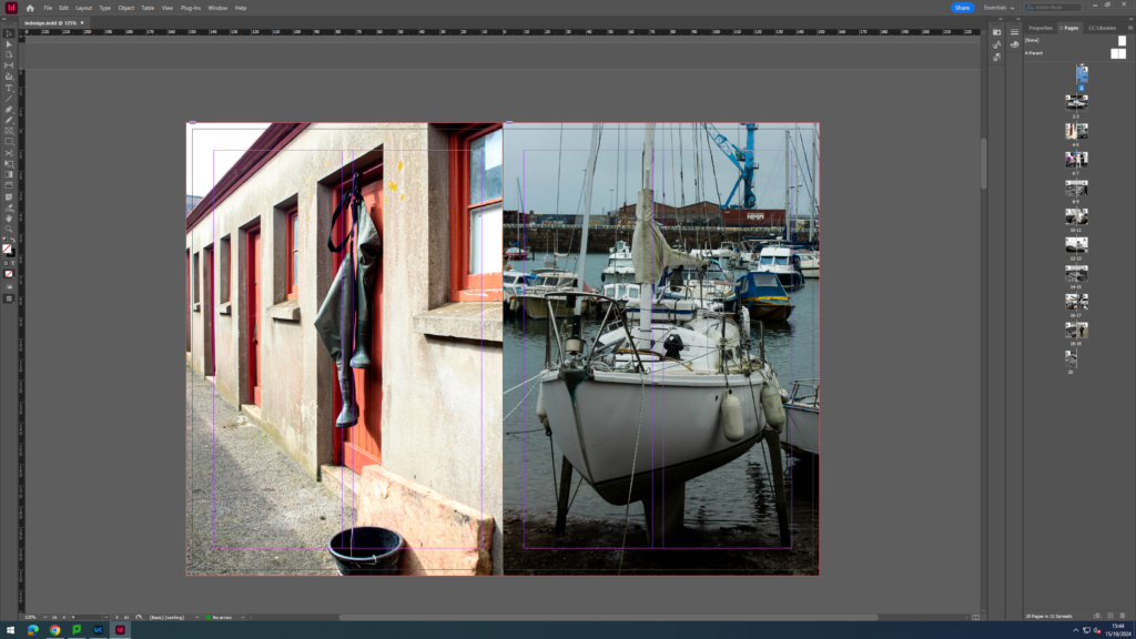
Windows chosen image:
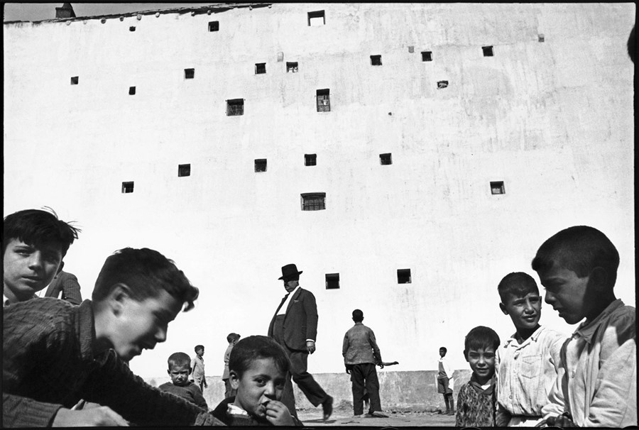
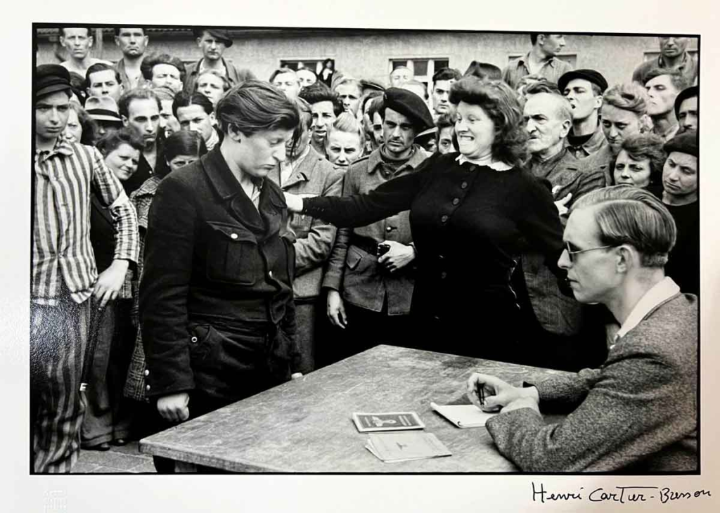
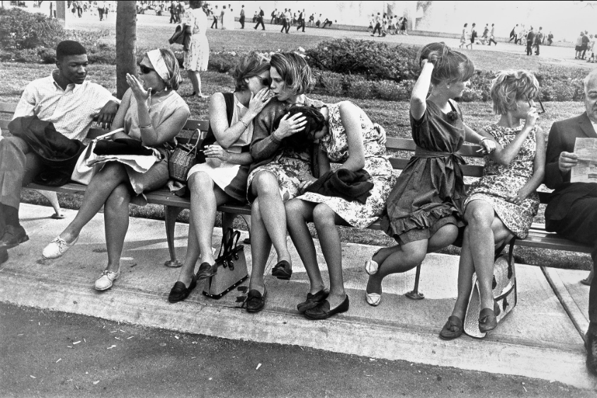
This image was taken by Henri Cartier Bresson, a French artist and humanist photographer considered a master of candid photography, and is one of his most celebrated images. He pioneered the genre of street photography, and viewed photography as capturing a decisive moment. Bresson was “profoundly inspired by the idea of capturing life as it unfolded in the streets.” This quote from Bresson himself tells me immediately that he was a street photographer who focused on taking objective images that were less personal to him, rather, they focused on capturing a moment that could not be easily replicated or staged. In addition, John Szarkowki stated “… or as a window – through which the exterior world is explored in all its presence and reality.” This also illustrates that window images should be more documentary rather than a reflection of the photographer, which I believe Bresson’s images fit perfectly into because he is known for capturing the Decisive Moment, which he describes as the exact instance when a unique event is captured by the photographer – when something that may never happen again is frozen in the frame. Through using the scale below, I was able to confirm Cartier Bresson’s images were windows rather than mirrors:
I identified this through the adjectives used on the right side of the scale, which I can associate with his images more accurately as he was a street photographer. Street photography is a genre that records everyday life in a public place, and I believe Bresson’s work executes this successfully as it presents an intersection of artistic skill and journalistic documentation. His works reflect on the most tragic and significant moments of the twentieth century, and can also help us learn more about the recent past. These factors also compliment the idea that this image is a window image as it links into publicity and realism, adding to the theme of objectivity. I have noticed there is often movement throughout his photos which can also interlink with this ideology as it clearly portrays the image as not being staged, which is another element that catches my eye. Despite this, it could be argued that Bresson’s images do not successfully highlight realism as this image in particular is in black and white. Because of this, we can conclude that the image has been edited which overall contrasts with the concept of window images as it does not show the image the way the human eye would see it. Therefore, this brings in the fact that the mirror and windows scale theory shown above can be viewed as a delicate range rather than harshly separated and opposing each other completely. This is because many images by different photographers can be placed on the scale differently as they incorporate unique factors from one another. Shown in Pearl’s review, Szarkowski claims “this thesis is not a rigid pattern, but as a continuous axis, the two poles of which might be described by the terms proposed above”, which compliments this idea. However, I would say this image by Bresson specifically falls into the windows category only as it clearly was not influenced by personal elements, rather, it has a solid expression of authenticity due to the location of the image as well as the movement included. This ultimately concedes a documentative aesthetic as it shows that the people in the photograph have not adjusted or changed their behaviours for the image. Henceforth, I agree with Szarkowski’s statement “… or as a window- through which the exterior world is explored in all its presence and reality” as Bresson’s experimentation with street photography as well as the Decisive Moment acknowledge a more realistic side of photography showing non-staged moments of life.
Conclusion:
In conclusion of the mirrors and windows theory executed by Szarkowski and Jed Pearl, an image by any artist can be categorised into either mirrors or windows, and arguably some images fit into both categories. Szarkowski attempted to categorise photographers whose work reflected the subjectivity of the artist themselves in comparison with those whose work largely sought to see outside themselves. Szarkowski himself stated that photographs are either mirrors- a subjective image that reflects the artists opinions/feelings/beliefs on the world, or windows- an image that portrays the exterior world with an unstaged approach and a more objective expression shown through it. Through the use of the scale which identifies whether an image is a mirror or a window, it suggests that a photographic artist of the twentieth century finds himself, consciously or unconsciously, somewhere along a “continuous axis” from romantic to realist. Yet it can be argued that use of the medium presupposes a “generous and inclusive acceptance of fact, objective structure,” and that the selection among these facts is the personal opposite built into any photograph.
In contrast to Szarkowski, Jed pearl made a review in spring 1978 critiquing Szarkowski’s theory. He started his review by stating ‘Szarkowski is fond of creating categories’ which immediately shows he disagrees with Szarkowski’s ideology, and believes images should not fit into a rigid structure of categorising. He continues with ‘Szarkowski claims this thesis not as a rigid pattern, but as a “continuous axis, the two poles of which might be described by the terms proposed above”, displaying his opinions of how any photograph can fit into either the mirrors or the windows classification. However, I mostly agree with Szarkowski’s theory as I believe it is a successful way of interpreting an image at first glance, and is an immediate way of determining the purpose behind a photograph. By using this theory, as a viewer I can also make accurate assumptions on why the image was taken and what it is trying to illustrate to people. Therefore, Szarkowski’s theory on mirrors and windows is a good approach to use when photographing as it reveals hidden information about the image, yet also still leaves the viewer questioning elements within the photograph.
Similarities and Differences between Sherman and Cartier-Bresson:
Within these 2 images taken by the different artists, immediately I can recognise several opposing concepts between them. Firstly, within the concept of objectivity and subjectivity I can determine an obvious difference, as Bresson’s image executes a clear tone of objectivity whereas Sherman’s image lacks this aspect. This is due to the fact both images have different camera angles: a deadpan angle from a worms-eye view, and a deadpan angle from a birds-eye view. Straight away, this tells me that Sherman’s image is staged as a set-up would be needed in order to portray this, as well as Sherman’s posing in the photograph. Through these factors I can specify that Sherman had a message she wanted to carry out: that message being herself portraying stereotypes of women in the 1970s. Whereas, Bresson’s image shows a sense of documentation through the non-staged approach of the camera angle, therefore forcing the image to lack a romantic expression. However, a similarity between these two photographs is that they are both edited into black and white. The theme of black and white decreases the element of objectivity as we do not see the world in black and white, therefore it is clear that both images have been edited. Another difference between these two photographers is the public and private aspect. Sherman’s portrait is a private image as she was the photographer as well as the model in the image, showing that she was depicting a reflection of herself and her own views on the subject matter. Bresson’s image is clearly a public image as it was taken outdoors with members of the public, decreasing the subjectivity. Additionally, I can infer that Cartier Bresson was an artist that tapped into significant moments of the twentieth century, which increases the likelihood of his work having factual elements rather than being influenced by personal feelings. This idea can also be determined by the people in Bresson’s image, who are performing naturally and are not changing their mannerisms in order to suit the image, which ultimately links back to his Decisive Moment experimentation.