Windows

Mirrors
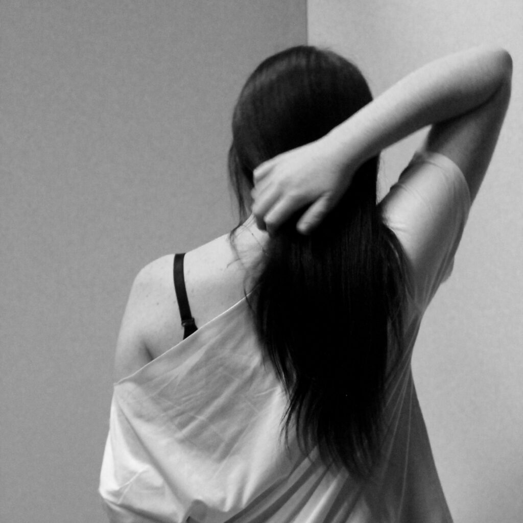
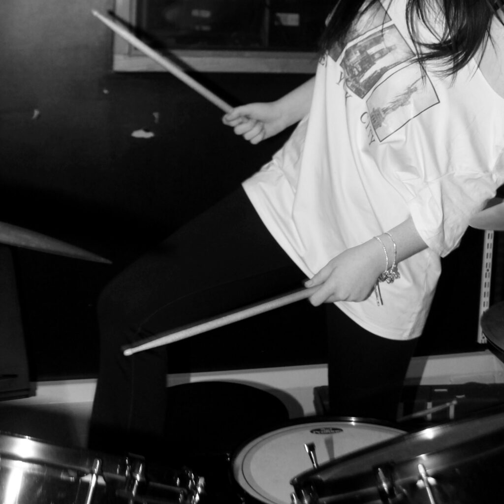
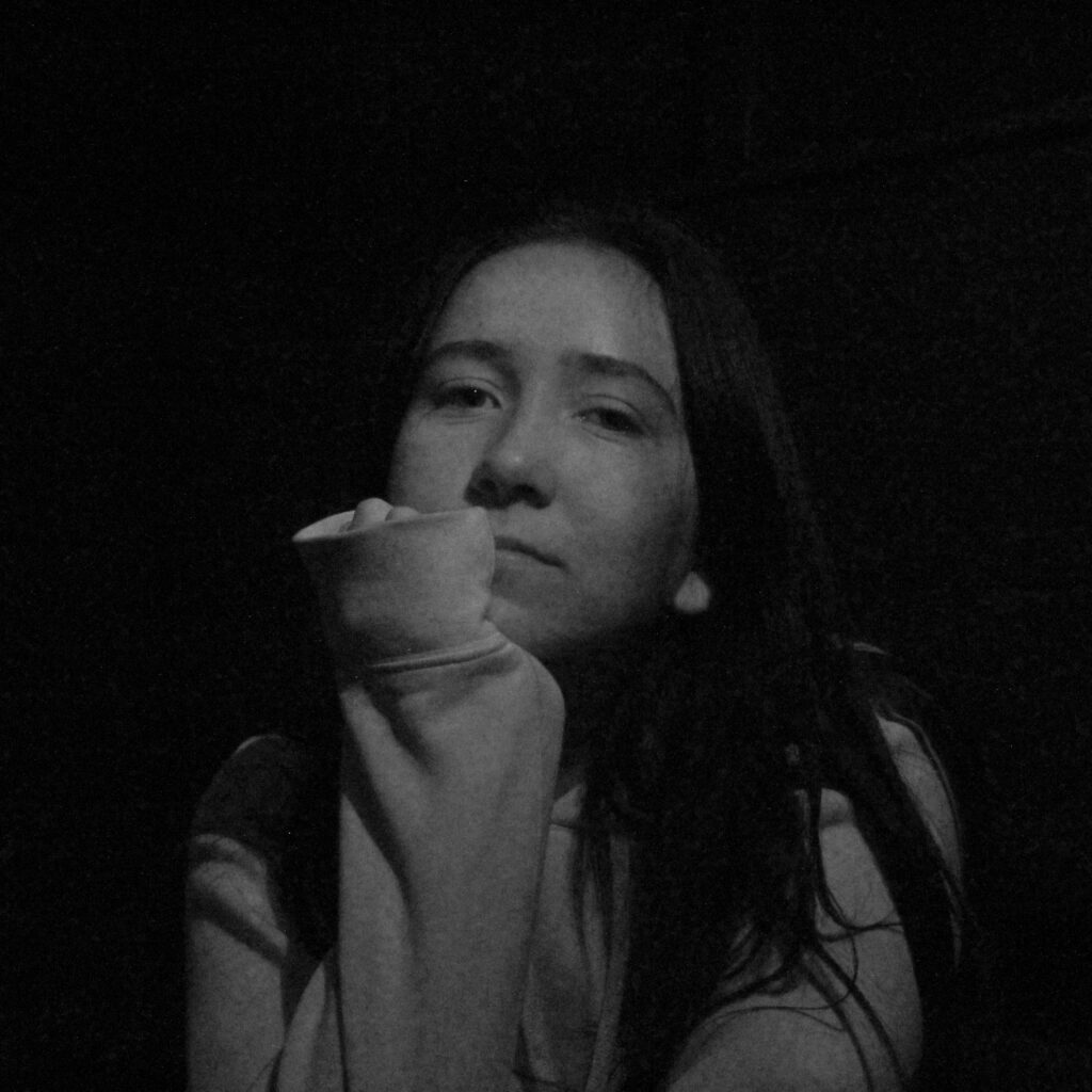
Windows


Mirrors


Bill Henson is an influential Australian photographer known for his evocative and atmospheric images that often explore themes of youth, identity, and the passage of time. His work typically features moody, dreamlike compositions with a distinctive use of light and shadow, creating a sense of intimacy and emotional depth. Henson often incorporates elements of the surreal and the sublime, blurring the lines between reality and fantasy. His subjects frequently include young people in ambiguous settings, prompting viewers to reflect on the complexities of adolescence and the human experience.
Bill Henson’s images can also be analysed through the lens of the male gaze (which refers to the way visual arts are often constructed from a masculine perspective, objectifying women and presenting them for male pleasure). In Henson’s work, the representation of young subjects, particularly adolescents, often invites scrutiny regarding their portrayal. While his images are celebrated for their beauty and emotional depth, they can also evoke discomfort due to their sexualised undertones and the ambiguity of the relationships depicted. The focus on youth and vulnerability may reinforce traditional gender dynamics, prompting questions about power, agency, and the viewer’s role in interpreting these images. However, Henson’s approach also complicates the male gaze by imbuing his subjects with a sense of complexity and introspection, often portraying them in contemplative, ambiguous situations. This can challenge viewers to reflect on their own perceptions and assumptions, rather than simply consuming the images in a passive manner. Thus, while his work may engage with the male gaze, it simultaneously subverts and critiques it, inviting a deeper examination of the relationships between artist, subject, and audience.
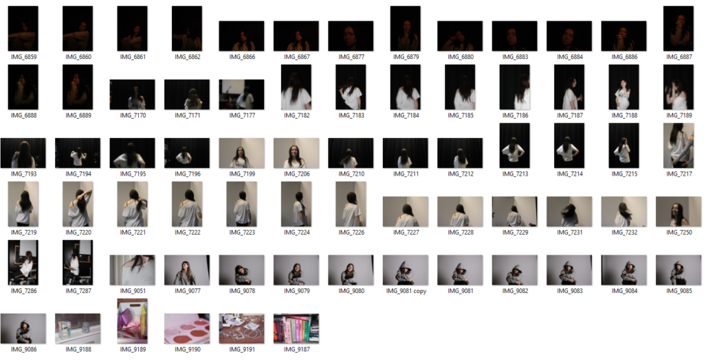
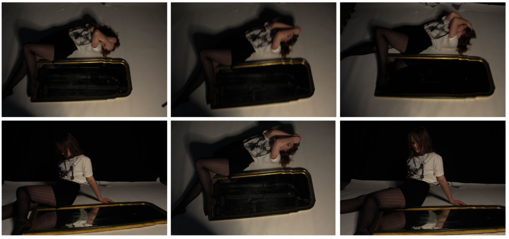
For this photoshoot, we decided to go into the studio, turn off the main lights and decided to rely on the smaller dim lights to get a darker, moody tone to our images as seen in Bill Henson’s images. The model also wore revealing clothes eg a skirt as the girls depicted in his images often wore short dresses. This helped to bring a sense of vulnerability to our images. We then experimented with different complex, abstract positions such as laying over a chair etc and different angles eg a Birds Eye view, straight on etc. We decided to keep the models face covered for the majority of the images to convey the idea of male gaze in which men tend to objectify women and look at them as objects instead of real people. By having her face covered, you are more drawn to her body which represents the idea of the male gaze.
we also wanted to incorporate the idea of a distorted reality by taking some images of the model lying on top of a chair. Then, once we had the images uploaded onto the computer we then used photoshop to remove the chair in order to give the effect of the person floating. I did this by using the remove tool. However, due to the white floor in the studio, it ruined the idea as in Bill’s images it looks like they’re in the middle of the air but in our you can still see the cut between the floor and background, destroying the illusion of floatation.
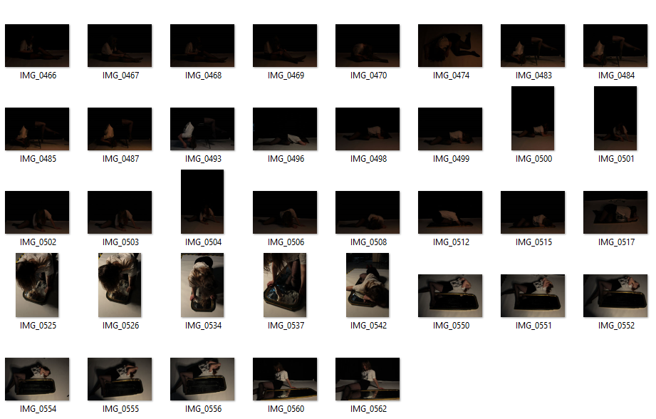
Once I had removed the stool legs from the image, I then wanted to try and fix the floor issue. So, I went onto google and looked for images of fairy lights with a background. I did this as in his images, you can see small dots of light around the model. When I had found an image, I then copied and pasted it into photoshop and dragged into on top of my original image. Next, I used the eraser tool to get rid of the part of the image which was covering up the girl behind. I then used the blur tool to try and make the contrast between the two images move smoother but it still looks quite obvious. If I were to do this photoshoot again, I would try and get a black floor instead of white so that it actually looks like she’s floating and have fairy lights already in the image instead of transporting a photograph from google which then makes it look clearly edited. I think this was a good first experimentation but has a lot of improvements to be made.
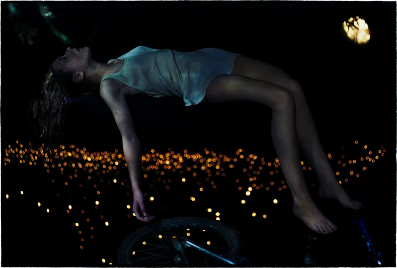
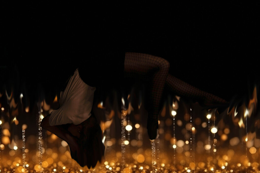
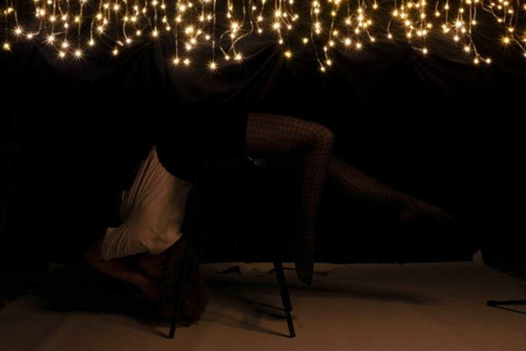
These are my final attempts of recreating his original idea.
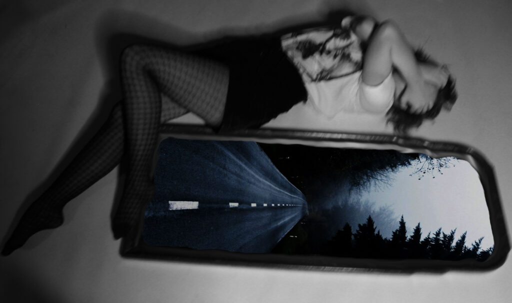
For these next images, I decided to experiment with my own ideas. I wanted to add an image into the mirror seen beside the model so I searched up empty dark streets on google and picked an image which I thought linked to the aesthetic of Bill Hensons images. I then copied and pasted it into photoshop and put it in a layer below the mirror layer. I then used the eraser tool once again and made a hole in the mirror so that the bottom layer would show through it. Finally, I wanted to make the line between the two layers more smoother so used the blend tool to do this. I then experimented with turning the top layer black and white to add further to creepy vibe of the image. Overall, I like how this experimentation came out although it doesn’t directly link to any of Bill’s pieces.
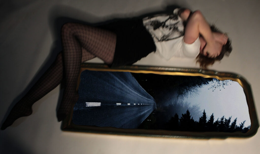
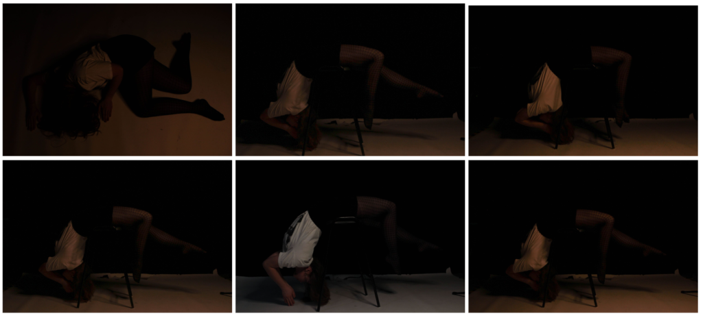
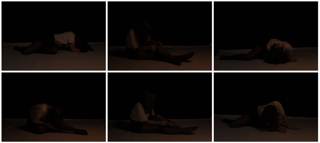
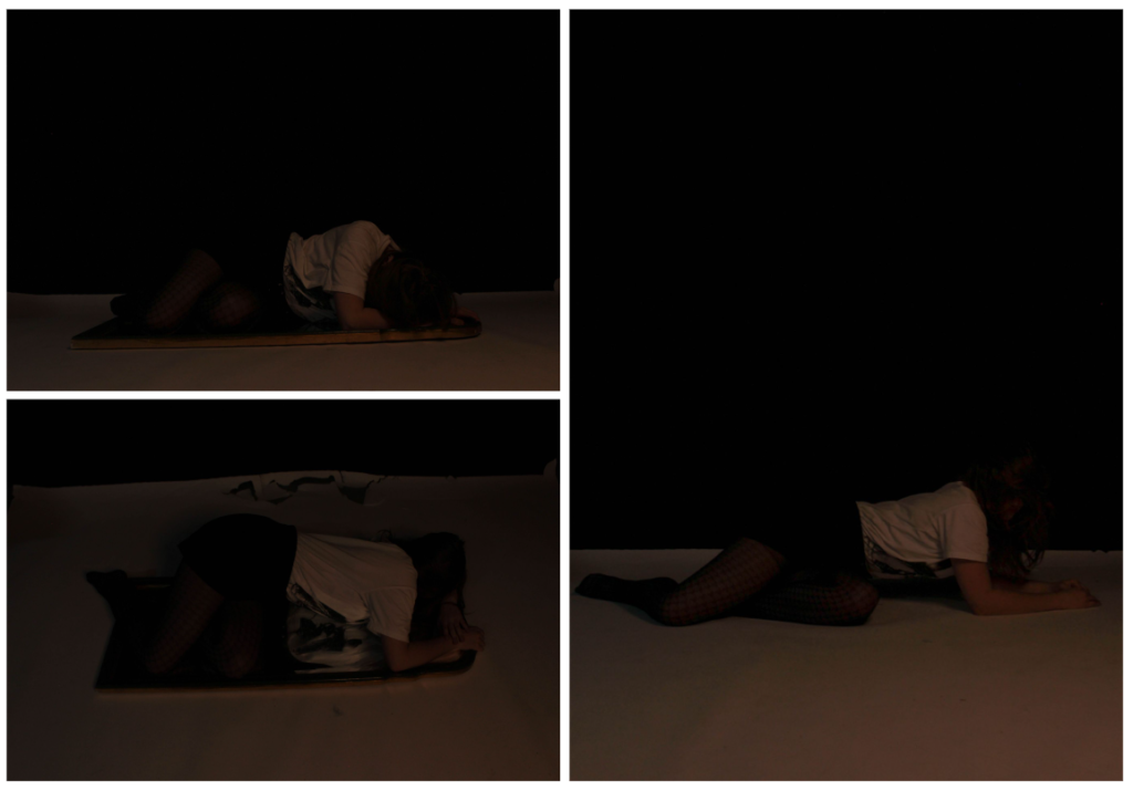
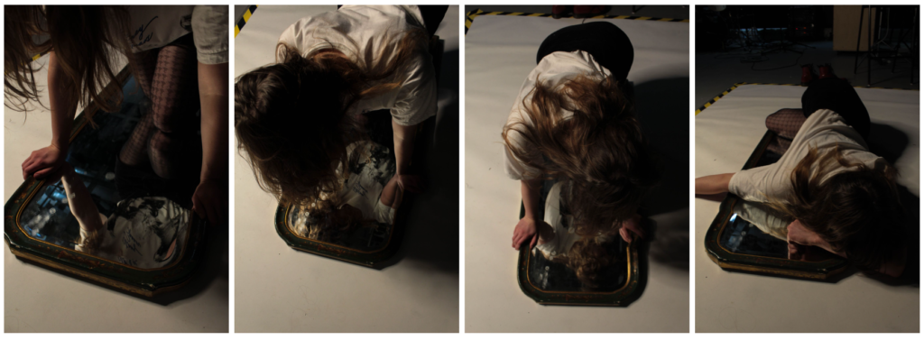
In these last four images, you can see yellow and black tape in the background. I didn’t like this as it was distracting and took the focus away from the model. If I were to improve these images, I would get rid of yellow lines in background.
Improvement:
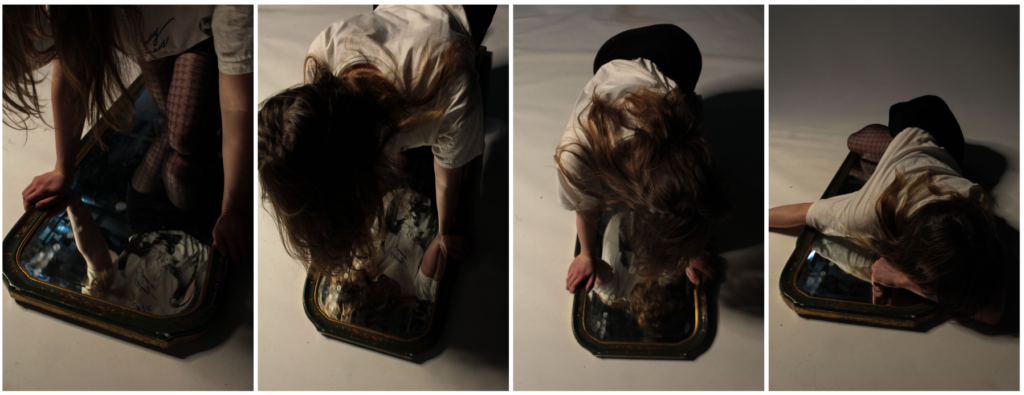
Here, I decided to go back to this photoshoot and corrected this by using the remove tool on photoshop. This got rid of the black and yellow line and made the background all one colour which means the attention is now on the model only.
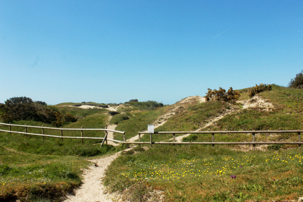
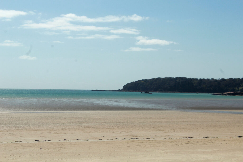
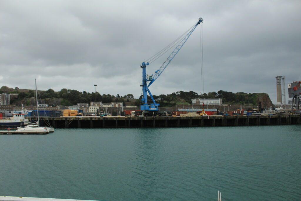
These are 3 examples of window images that I have taken. They show the exterior world and are objective and real. I took the photograph without making any adjustments to the landscapes; they’re all natural.
