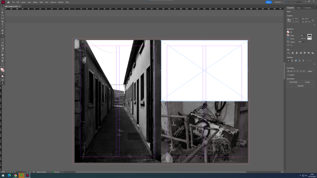
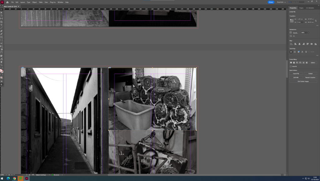
I created a zine with my photos I had taken at the harbour. I started by transferring my images from Lightroom onto InDesign. I made sure to pair images that had some correlation to ensure the images made sense with each other. I edited all the images in black and white and I really liked how it turned out because it creates a dramatic look. The title of my zine is “Life at the Harbour”. I chose this title because all my images are at the harbour and it shows what the people that work at the harbour see everyday all day during their job.
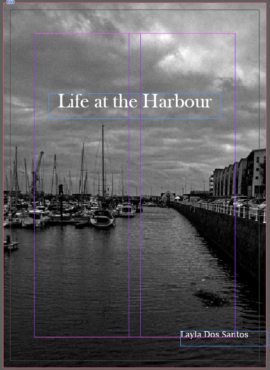
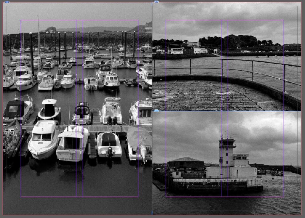
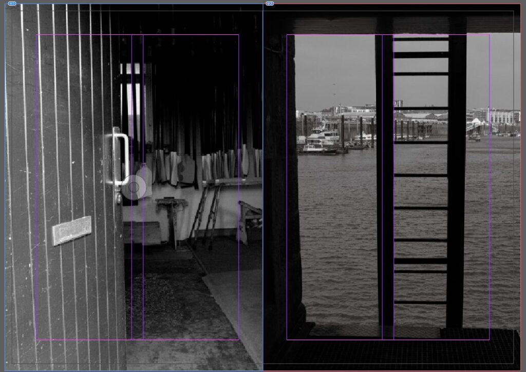
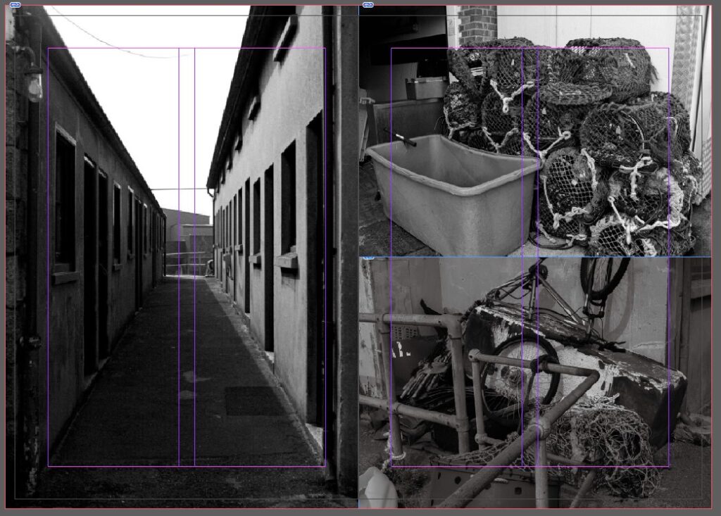
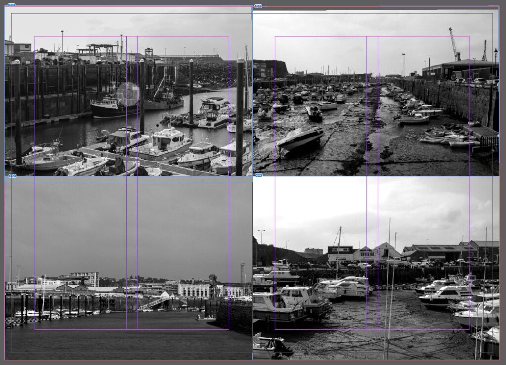
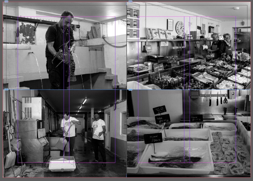
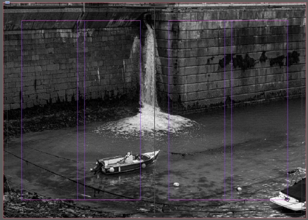
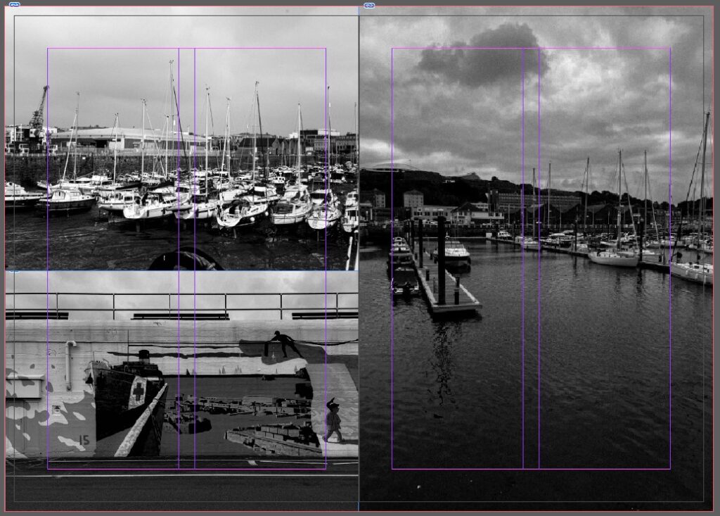
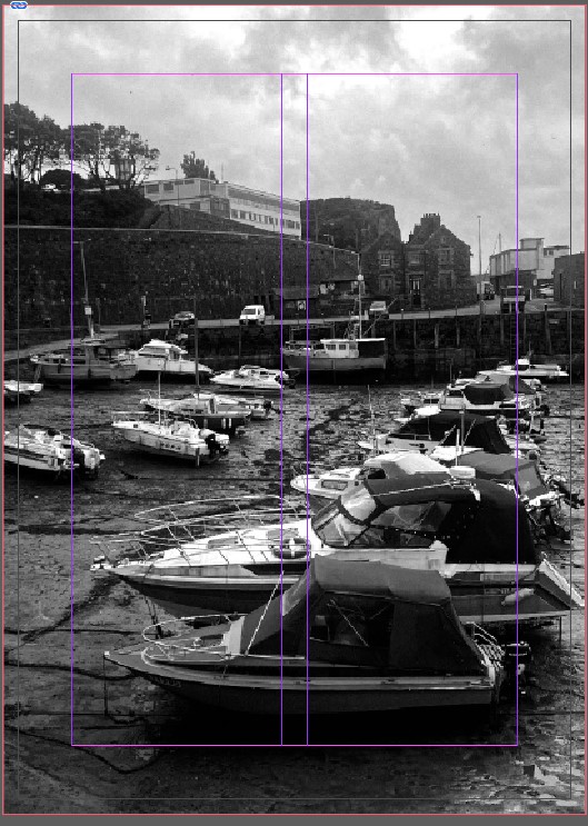
These are the images that are in my zine. Some pages on my zine are 1 image and take up the entirety of the page, I did this because some of the images didn’t match others and therefore I figured they would look better on their own. I like the page of the workers at the harbour and the images of what they do for work. I think these images are really interesting because not many people know what goes on at the harbour, and these images show what the workers do.
I enjoyed creating my zine because I liked experimenting with the different photos and seeing which photos went well together. If I were to create another zine at the harbour, I would take more up close pictures. This is because most of my images from the harbour are from a distance and think it would be more enticing to the viewers if there were more close ups of the boats and the harbour.

3 NOV JAC some slight improvements…working on each blog post in correct order will help you develop a clear sense of momentum…
Get yourself up to date and move forward with new ideas!