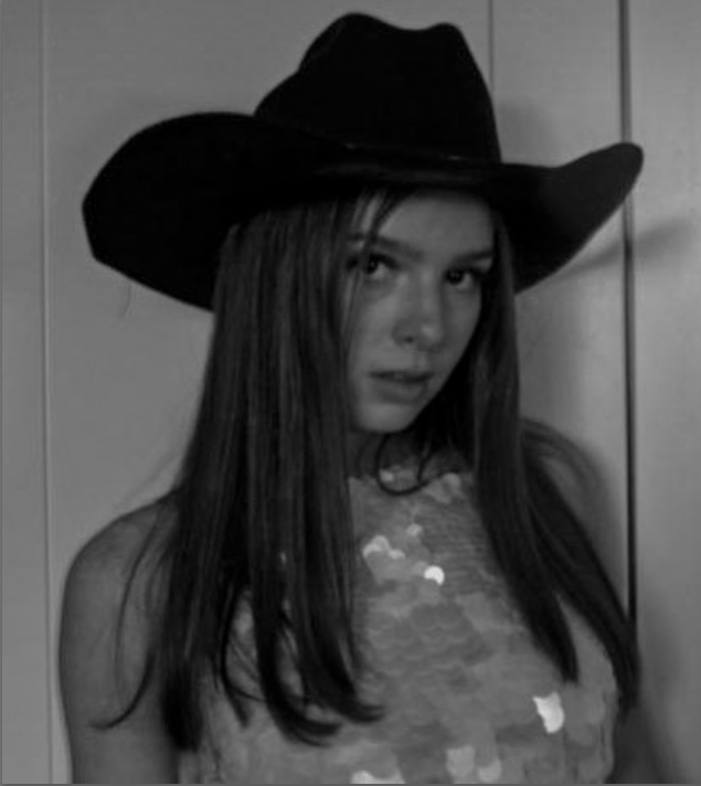
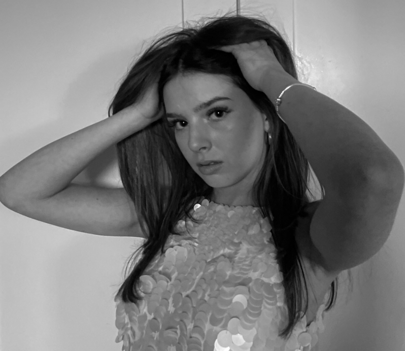
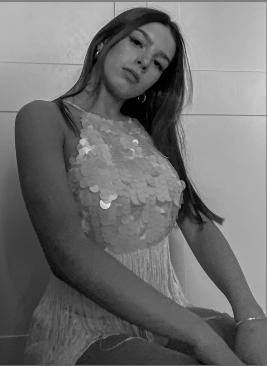
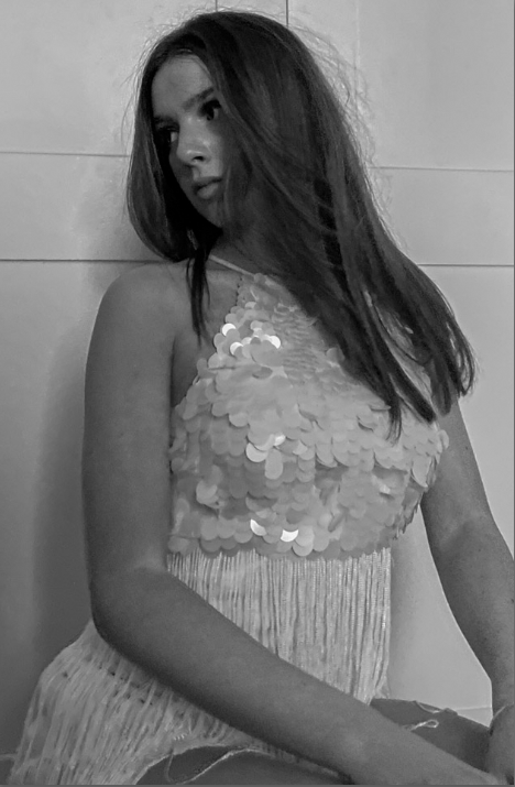
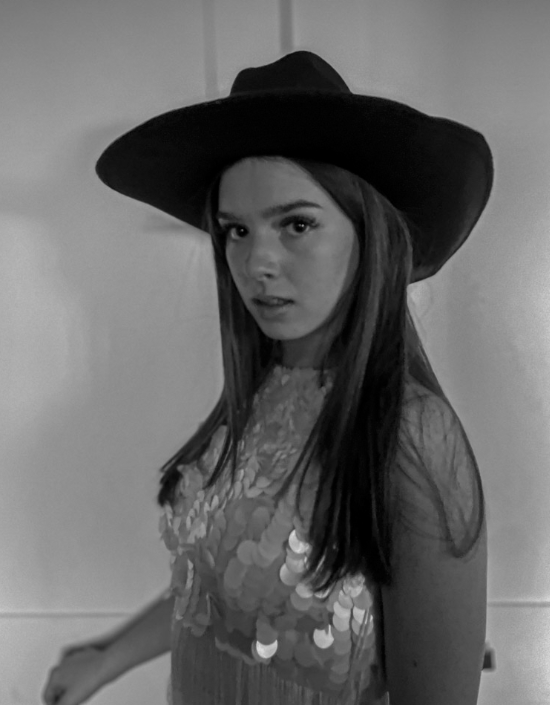
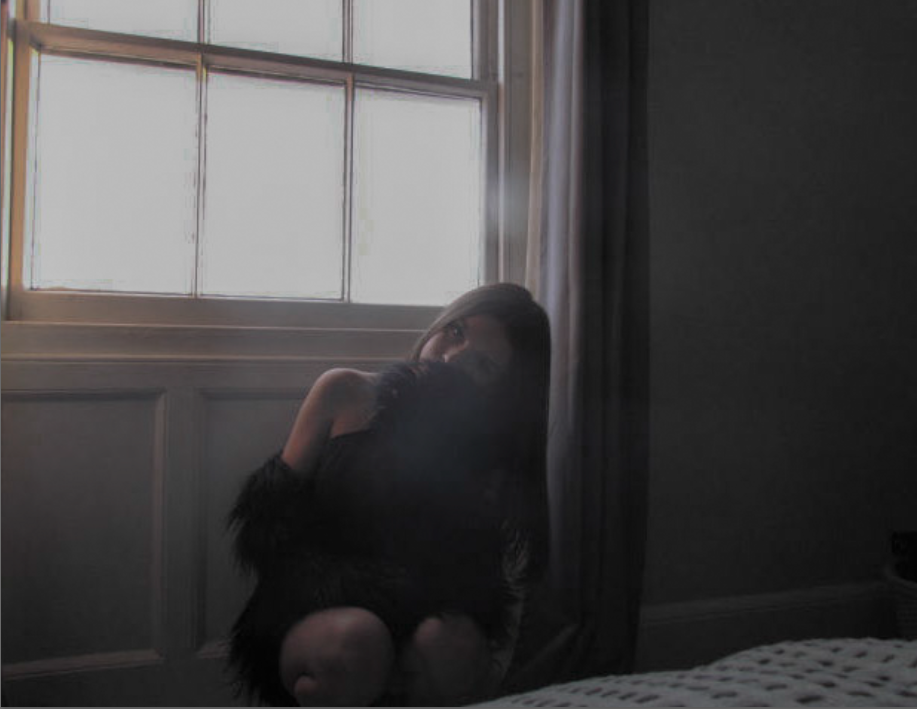
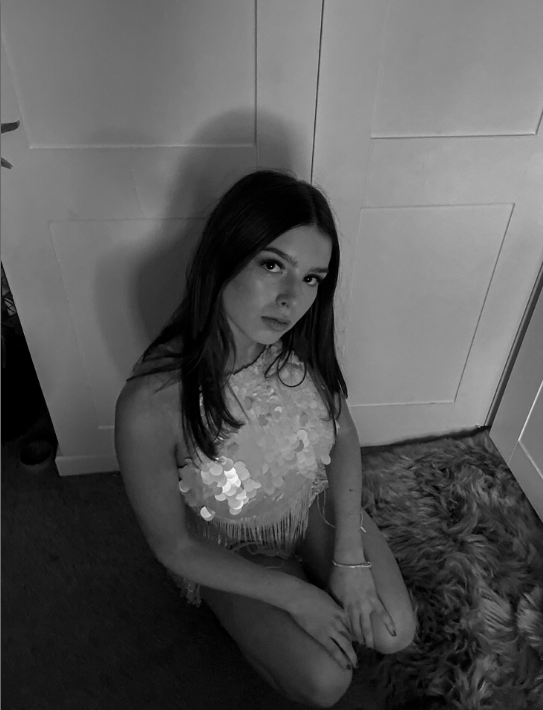
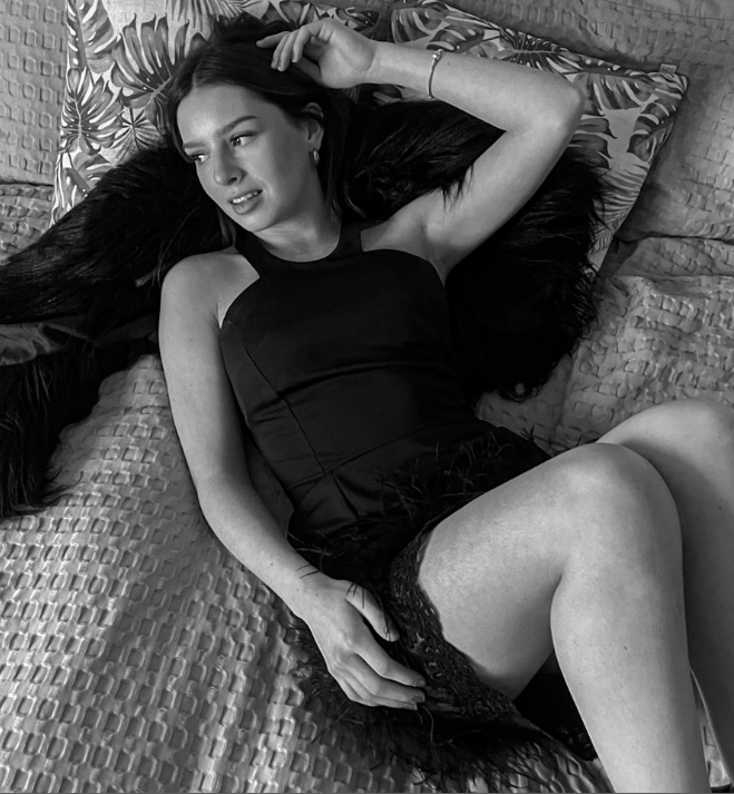
review & reflect

REVIEW

In the first year of photography, I learned many important lessons and now in my second and last year of photography I can tell you that, I’m still learning different and important aspects of photography.

Can you even define photography?

Many may bluntly say that photography is taking pictures from a camera or a type of art however I would like to argue that photography is much more than that. From all the projects that I have done, I can strongly state that photography is a complex art. I learned that, not all photographs can be edited or taken the same way, they all have their own type of ‘impurities’. There is many angles we need to consider when producing a photograph, photography isn’t something that is easily learnt, you have to know how to use a camera, how to change settings in the camera in regard of the surroundings and most importantly, knowing when to capture the perfect moment, a decisive moment.

I have learnt that photography can be a form of preserving a memory as it encapsulates moments in time and I’ve realised this by studying many artist in the 20th century, artist like Ansel Adams, Claud Cahun, Cindy Sherman and so much more talented artist’s. This preservation of memories enabled me to understand the development and contribution towards photography. Photography has also enabled me to express my views, what inspires me and most importantly what I love most. Producing photographs has allowed me to discover my style and format. I’ve also learned that, photography documents the social, cultural, present and historical issues. It brings awareness. After studying about an artist called Jason Jackson who preached about BLM, it brought me insight about what racism actually was and it’s impact.

Photography act’s as a watchdog, a term created by David Hesmondhalgh which is where the media is checked to ensure it’s accurate and fair

Proof that photography is a watch dog is by evidence I have gathered after studying a variety of artist that explored different topics. This allowed me to be aware of certain topics I wasn’t as aware of. One topic that I explored in photography that effected me the most was identity. It brought me awareness of how identity can be shown in many different ways and everyone has different type’s of perspectives in terms of identity. Nan Goldin was an incredible artist that completely changed my perspective towards identity, she redefined photography by recording the promiscuous lives of her unique friends and herself.

Overall photography taught me numerous things. It taught me how to become an artist, it taught me things I had no clue about, it taught me that, different is better, and lastly it taught me to view world differently than others.

REFLECT

Masculinity and Femininity:

Masculinity is often referred to the behaviours, roles traditionally linked with being a male and qualities, which are many times emphasised traits like strength, independence and assertiveness. Femininity is seen as something that has roles and qualities which are typically linked to being female, highlighted as nurturing, sensitive and empathy. The concepts or terms are both culturally and socially constructed which basically means they can vary across different time periods and societies within a community.

Someone who I studied and challenged femininity and masculinity was called Claud Cahun. She was a French photographer and an artist that showed her surreal self and was famously know for her self-portraits. She also explored identity and gender fluidity. Her provoking imagery challenged many traditional norms which made her a key individual in feminist art.

I learnt that, she was very evolved in her time period and her advanced thinking made her different to everyone. This challenged people, it made people have a different perspective of what identity actually was and even opened peoples eyes to gender fluidity. The project that I produced in response to her work, taught to me think outside of the box. It challenged me in many ways. It challenged me with defining what masculinity and femininity actually was and especially how I was going to express it without being stereotypical. It allowed me to be creative and open within my work.

Previous:
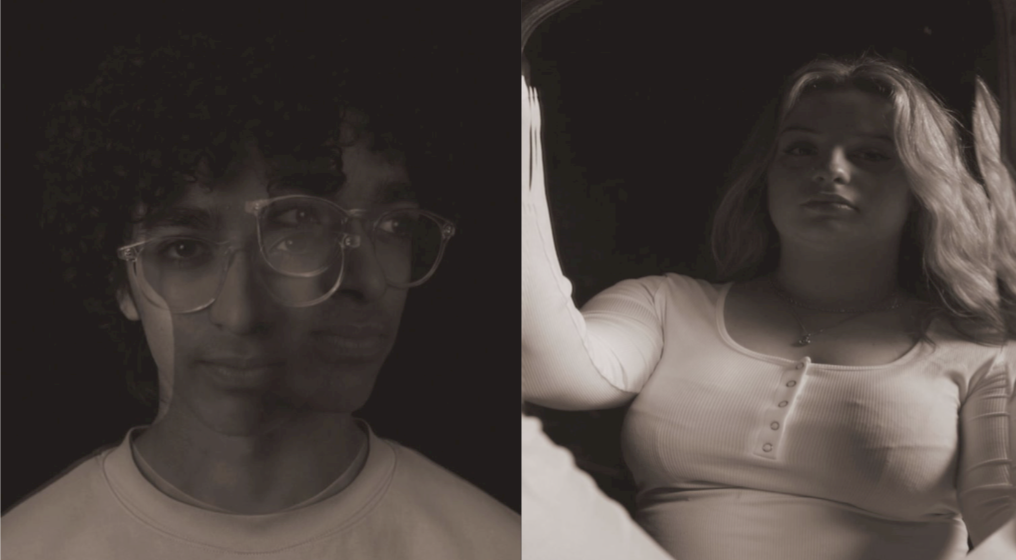
inspiration:
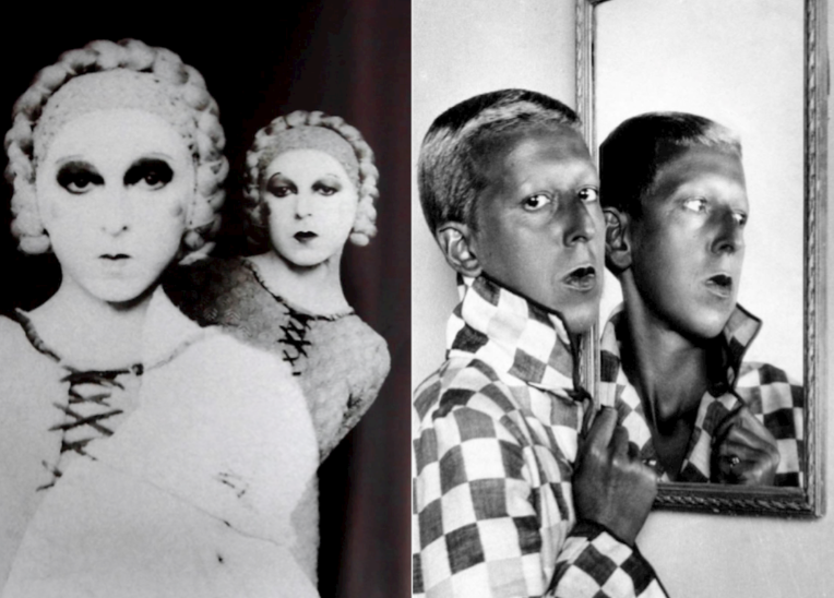
Evaluation:

My images had clear inspiration by Cahun’s work. I really liked my final outcomes and how I was able to mimic her techniques and ideas into my own perspectives, however if I was to repeat this study and response, I would try to be more accurate in colouring and editing.

Romanticism:

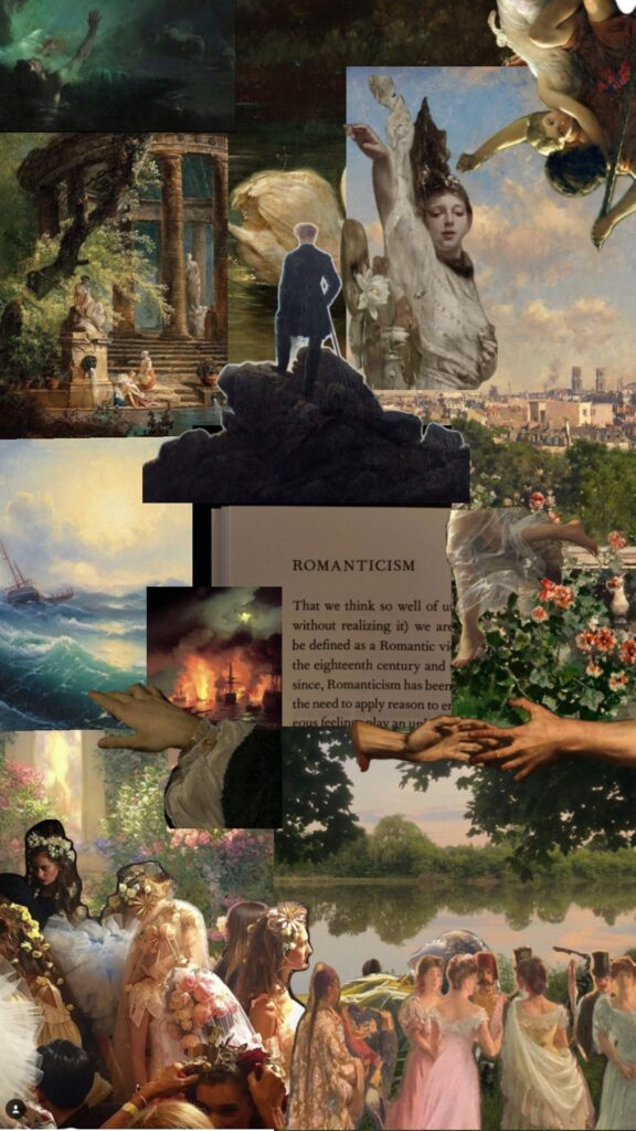
Romanticism was a literary and artistic movement from the late 18th to mid-19th century which sympathised emotion, nature and individualism. It evaluated imagination and often protested against traditional norms, the sublime and celebrating feelings.

An artist that I looked into that investigated romanticism was the talented artist called Robert Adams. He was known for his black and white landscapes of the American west where he compared the themes of human impact and nature. One of his project I looked into was ‘The New West’. He showed industrialised towns and often challenged these towns by capturing these towns with the background of the images being nature. He often put towns at the front and the nature in the back to comment on the effects that industrialisation was creating. The effect that he had when he put nature as the background was ground braking. Him doing this implied that we were forgetting about nature and worrying more about the human species and its ever growing population. His work brought me awareness and anger. It made me realise how much we have selfishly ruined and defrosted many fields to sustain our never-ending population. With this realisation, I was able to show this within my images. I was able to make urbanisation as something that was dark and bad in my images and make the nature/rural part of my image lighter, just like he did.

Previous:

inspiration:
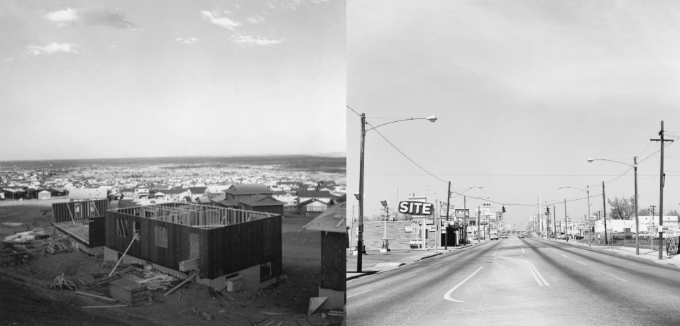
Evaluation:

This topic was one of my favourite topics I got to explore. I really liked how awareness was brought to me via images and how eye opening it was. I enjoyed producing images that brought awareness and with these images, I could use them as a way to shout at the human population about the mass urbanisation but not literally. I did it through my images. However, if I was to repeat this again, using my final images, I would take images of towns instead a place that wasn’t as highly populated. This would’ve brought even more awareness about the mass population and the message Roberts wanted to imply.

Identity:

Identity mentions the qualities, beliefs and characteristics that make a person or a group distinct So, identity is about how each individual person perceives themselves and how they are seen by others. Identity is often influenced by experiences and social contexts.

A artist that I really liked learning about her work was an artist called Clare Rae. She is an Australian photographer who is famously known for her intimate portraits which explore themes of femininity and identity. Her work combined fine art and documentary styles where she would use light and composition to create evocative narratives. Her work was unique. She expressed her frustration towards objection in women, directly or indirectly. Positioning herself in awkward poses, enabled her to show that and communicate things that she could say or didn’t want to say directly. I learned that a body is a very powerful message. Without using words or implication, you can use your body to show how you feel or perceive something and I find that powerful. I also learned that we can use our surroundings to produce and image and when you combine those two things, a body and a surrounding, you get a striking message.

Previous:

inspiration:
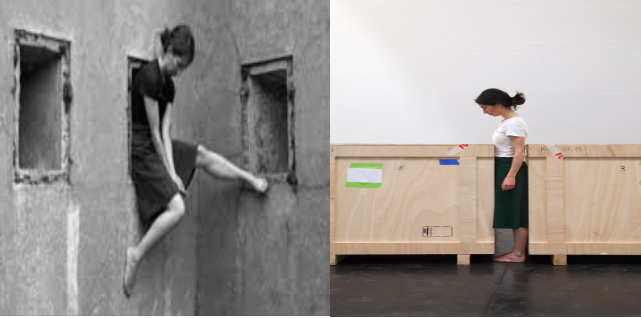
Evaluation: I really liked my outcomes that were inspired by Rae’s work. I think that I powerfully showed my inspiration and awkwardness in my images, just like Clare. The poses in awkward settings, enabled me to be creative and inspiring. However, if I was to repeat this topic and response. I would do Self-portraits instead of taking images of others because Clare did that, to indicate an important and persuasive message.

Narrative and Sequence-St Helier Harbour

STORY: 

If I were to describe my photo zine in three words they would be: Reflection, Calm and Exploration.

NARRATIVE: 

In this visual narrative, the readers/ audience gain more than a view, they get a window into the spirit of St. Helier’s and its harbour.

My zine is designed to capture and celebrate the unique essence of St. Helier Harbour through a carefully crafted narrative. This structure emphasizes the journey through the harbour’s different textures and the varied sights, framed through the experiences of a person walking along the waterfront.

In terms of narrative, the imagery invites viewers to imagine walking beside you along the harbour. Using close-up shots to introduce small details, like weathered rope textures, rusted anchors, and chipped paint on boat hulls. These visuals are intimate and set the tone for the journey.

As the zine progresses, it introduces various elements that make St. Helier Harbour unique: Capturing boats from different angles highlights the diversity of the vessels from classic fishing boats to sleek yachts, giving a feel for the harbour’s role as a commercial space.

As well as that it gives a glimpse into the life of fisheries and their workers, using candid shots, adding a human element to the harbour’s mechanical and industrial tones. The zine also showcases bustling market spaces and shoreline scenes to add vibrancy and contrast to the industrial focus of boats and machinery.

(Typology) In my zine, I used creative, maritime-themed fonts that provoke the essence of the sea and marine life. As well as that I experimented with typewriter fonts and larger typefaces to introduce sections and captions.

I kept captions short, using poetic language to evoke the image’s essence inside my zine but also with my title page.
Below, I have curated a selection of 10-16 final images for a mood board gallery page. I tried to blend the current images and experiment with juxtaposition by placing shots of the fishing vessels and boat rigging against scenes of calm water and sky, giving a sense of both the harbour’s working and tranquil sides.
I also used a repeat of the image as a background and coloured it so that it differentiates effectively and shadows to evoke the changing times of day/ temperature of the image depending on location, which adds an emotional rhythm to the gallery.

Review and Reflection.

Portraiture and Lighting Techniques.

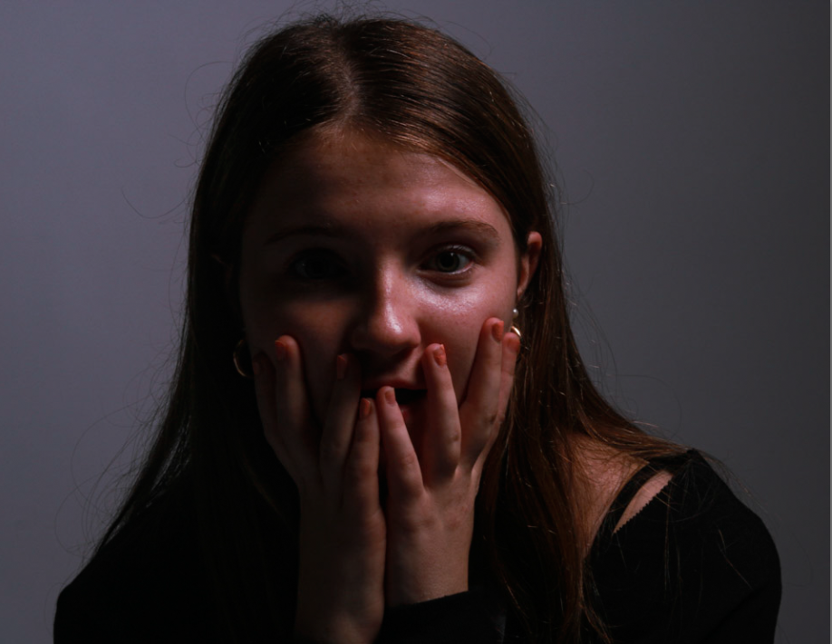
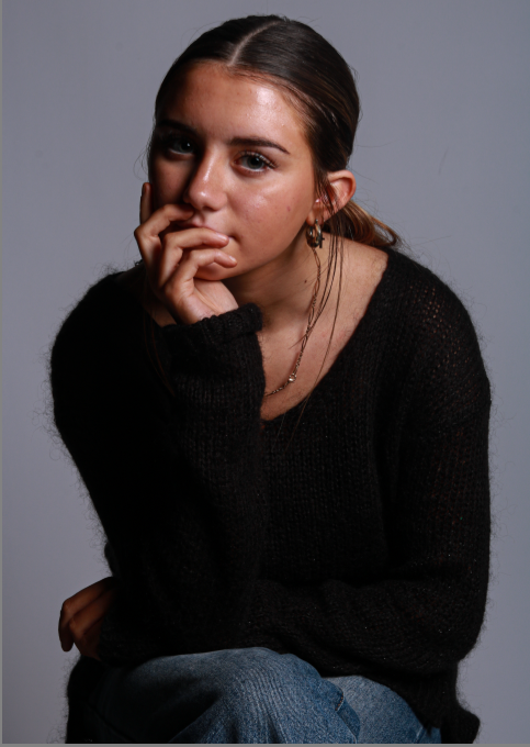
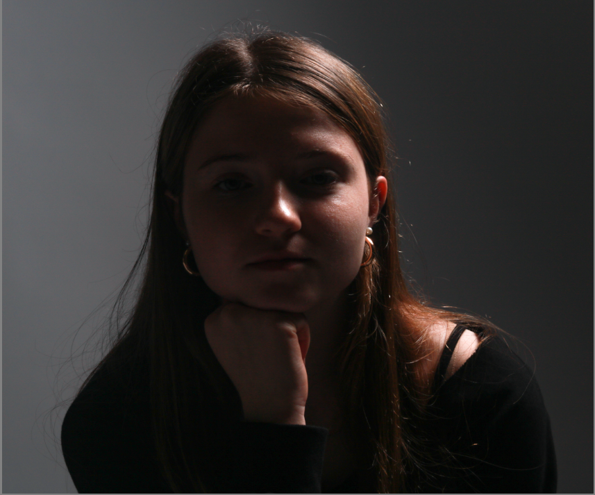
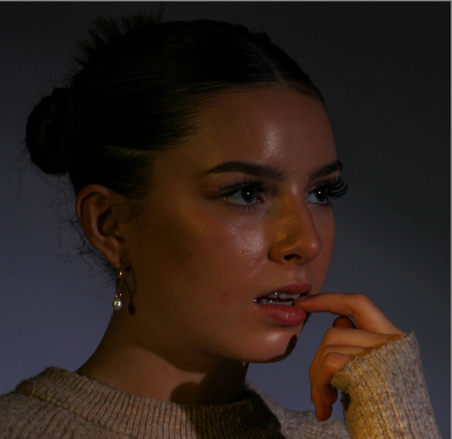
My first favourite topic we studied in November 2023 was lighting techniques in the studio. I particularly liked photographing people and my friends and then further editing whilst developing new skills on Adobe Lightroom.

  • Rembrandt Lighting– Rembrandt lighting is characterized by an illuminated triangle under the eye of the person, particularly on the less illuminated side of the face. It’s a popular technique because it creates images that look both dramatic yet natural.
  • Butterfly Lighting– Butterfly lighting is a lighting technique used by photographers where a light source such as a flash head is placed right above and ever so slightly in front ‘an exact 45-degree angle’ of the models face. This creates a small butterfly-shape made from a shadow under the nose. This technique is often used to make the model look thinner and their eyes look larger.
  • Chiaroscuro Lighting– Chiaroscuro was a compositional device developed by Ugo da Carpi, however high renaissance artists Leonardo da Vinci was found out to have also helped to ‘pioneer’ the creation of Chiaroscuro lighting. Chiaroscuro is a renaissance painting technique which means “light-dark” in Italian. The theory of Chiaroscuro is that it is always best achieved by the effect of light falling on the model/ subject however it must also allow the shade to give two-dimensional figures a sense of volume.

This method of photography also helped me gain knowledge on tools used during photographs which I did not know were necessary. these photography tools called ‘reflectors‘ help to redirect light onto my model, I must remember that it does not It doesn’t create any light but it will move and redirect light that is created by a flash head create fill light and lessen shadows.

Portraiture and Experimenting with Colour.

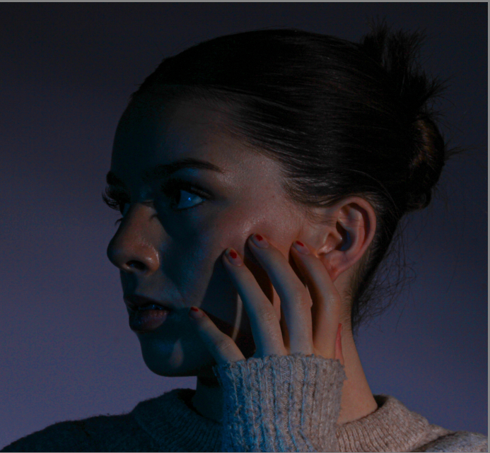
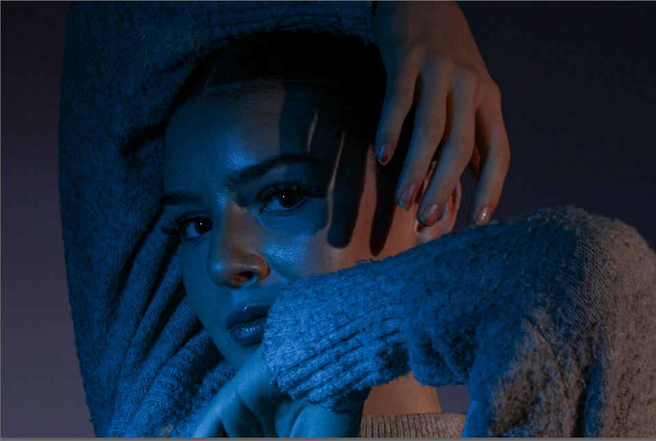
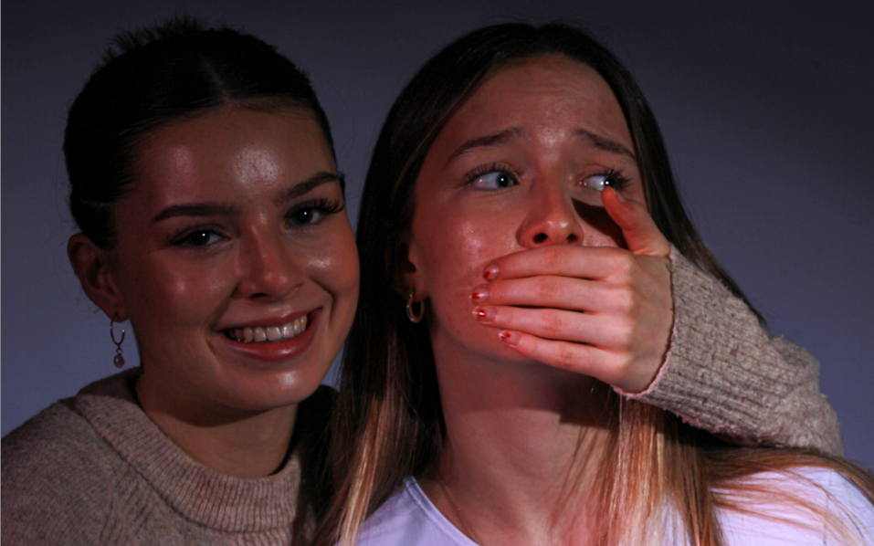
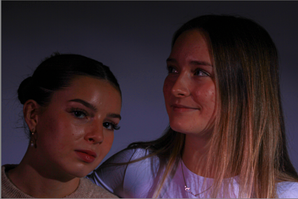
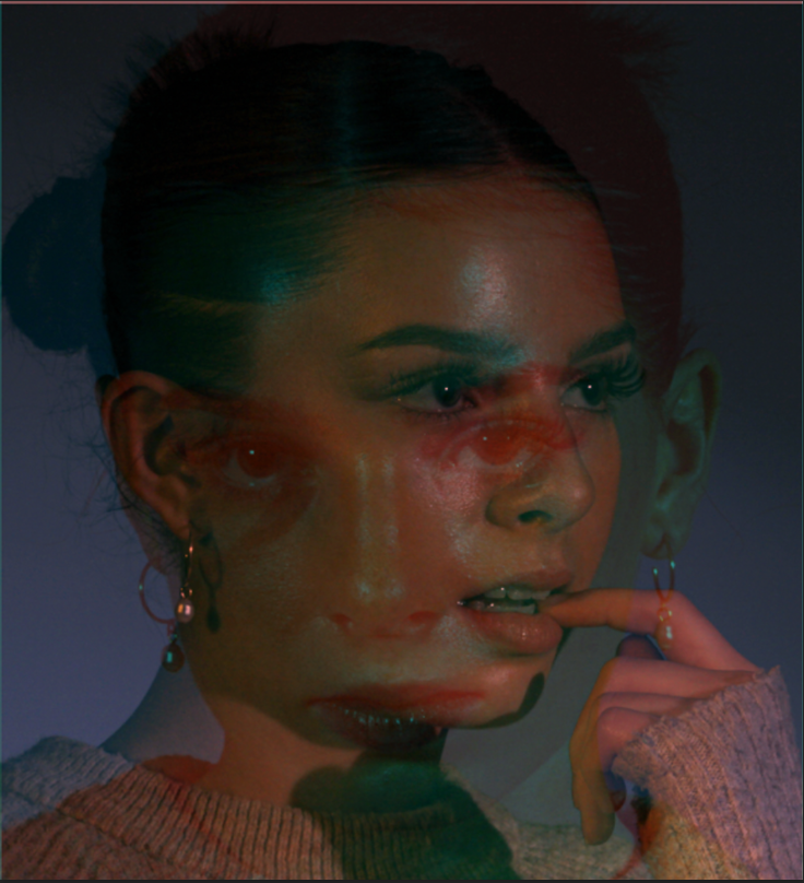
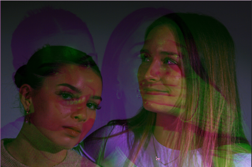
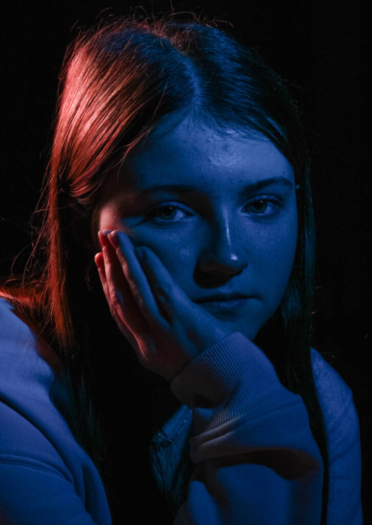
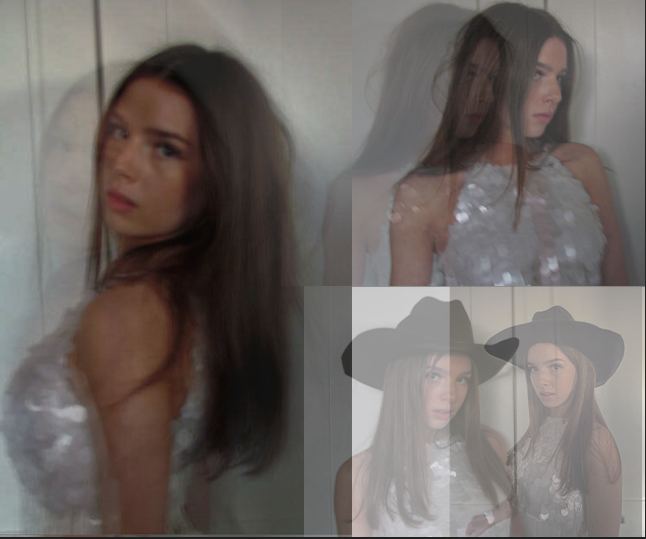
During this topic particularly enjoyed using different models and using a honeycomb head and a snout head on the lights. I had one person standing next to the lights and holding the coloured gels. I wanted this person to be interchanging with multiple colours such as pink, purple, red, blue, yellow, white and green. I loved experimenting and having my models use different expressions and facial expressions to display their emotions. I wanted my photos to convey a sense of ‘false identity’ and mystery as they could possibly show the persons real ‘self’ or ‘story’.

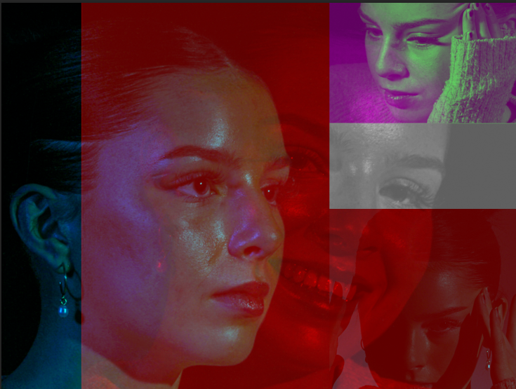
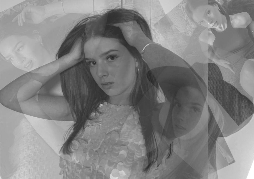
This project also then extending my editing skills on Adobe Photoshop, as I experimented with different layering and colours to create a picture. I really enjoyed working with brightness opacity and colour settings to create optical illusions through my images. I really like this double exposure effect for my photos and I think it helps improve their meaning behind it.

Edits:

Experimenting with colour has helped me when doing the editing process of my images and how these different colours can reflect different moods and emotions in a piece of work through the characters.

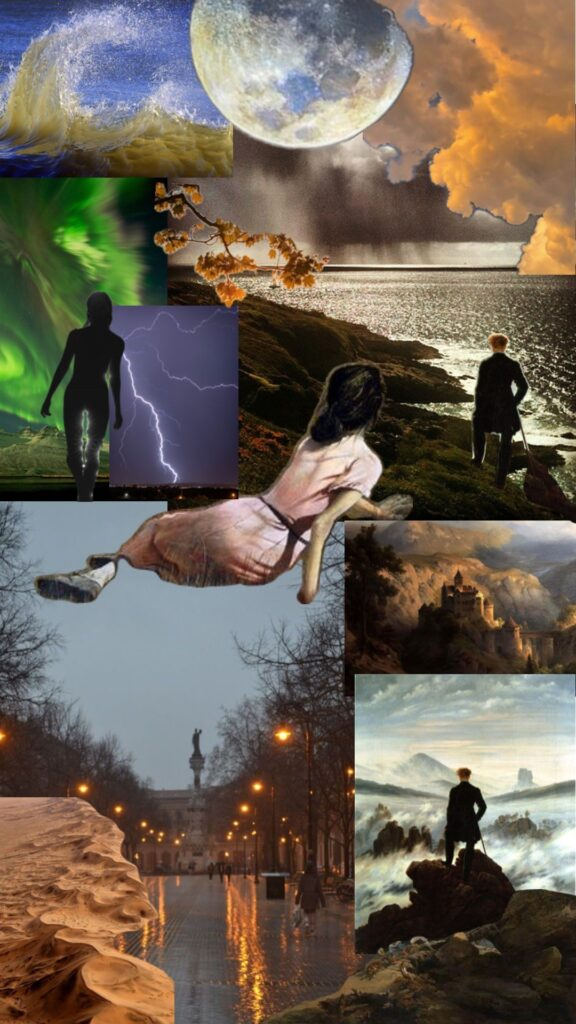
Romanticism and The Sublime.

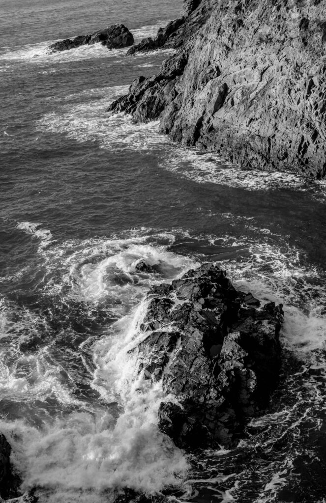
I really enjoyed researching and learning more about the history behind Romanticism and The Sublime, however I slightly struggled with the concept of creating photos to convey the concept of these eras in photography and art.

Romanticism– An artistic and intellectual movement which originated in Europe. Artists have been painting the landscape since ancient times. Wall paintings of landscapes were also created by the Greeks and the Romans. After the Roman Empire, people temporarily stopped appreciating pure landscapes and the landscapes were seen only as a setting for religion. This carried on until around the 16th century, then artists began to truly appreciate landscape as an important subject. Landscape first became popular in The Netherlands and people began to use it for painting, this worked perfectly for middle class protestants seeking art for their homes and wanting unique pieces of artwork.

The sublime–  A combination of the internal/emotional and the external/natural world. It explores how humans allow our emotions to overwhelm our rationality as we experience the wonder of creation. It can also be described as the quality of greatness in multiple ways such as physically, morally, intellectually, metaphysically, aesthetically, spiritually and artistically. The term especially refers to a ‘greatness beyond all possibility’ of calculation, measurement, or imitation.’

My Mood Board.

Femininity and Masculinity.

Overall, I believe my favourite subject we have studied in photography was Femininity and Masculinity. This is due to the fact It is a fascinating topic for me and I really enjoyed researching different artists and photographers who dedicate their career to these themes and topics amongst gender and identity. For example:

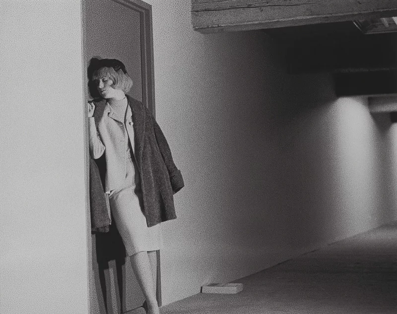
Cindy Sherman:

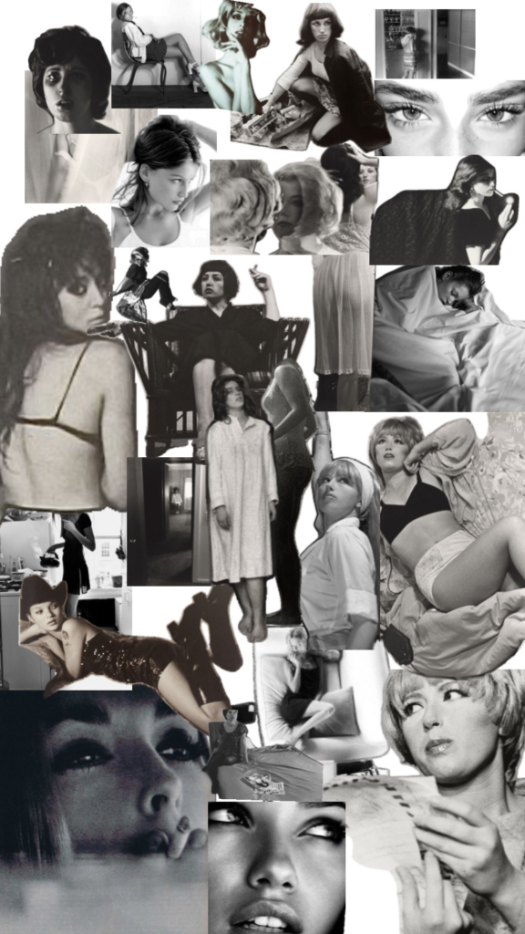
This photographer takes the topic of Feminism and how women are domesticated. Her work on ‘Untitled Film Stills‘ particularly influenced me to attempt to replicate some of her photos for myself. These images encapsulate the images of femininity that, through the media culture of movies, had a hold on America’s collective imagination at the time.

My Mood Board.

Edits:

Femininity and masculinity, self-expression, gender stereotypes and identity is a subject I would like to revolve my personal study around. Due to the fact I have learnt lots about Cindy Sherman, Identity politics and culture wars. I believe this will help me to convey my ideas and portray the message I am attempting to create. I really enjoyed using historical context to produce a photoshoot that looks like its from the past.

Essay: How can photographs be both mirrors and windows of the world?

Within the origin of photography, there is two photographic processes; Daguerreotype and Calotype. The main difference between the daguerreotype process and Talbot’s calotype process was reproducibility. The calotype process first produced a photographic ‘negative’ in the camera, from which many ‘positive’ calotype prints could be made, whereas daguerreotypes were a one-off image. The calotype was first created by Henry Fox Talbot. He created images when exposed to light, these images were easy to produce and easy to distribute. However, they faced many drawbacks such as the people in the photos looking ‘on the edge of being present’ and seen as looking not quite alive due to a low sharpness and graininess, this caused a loss of fine detail. However, these images were popular as they captured a moment in time, fixed into place which was profitable and popular at this time. Furthermore, Louis Daguerre was recognized for his invention of the Daguerreotype. The daguerreotype is made by after capturing the image exposing it to mercury vapour which brings the visible image to life. The image also then needs to be rid of any unexposed silver iodide. This is achieved by completely covering the image in a salt or sodium thiosulfate solution. Daguerreotypes are also very detailed and clear which makes them stand out amongst other images from around the 1840s and 1850s.  Louis decided to create the daguerreotype as he knew the world was seeking a photographic process which was easier to put into practice, since exposure times were only of a few minutes. So by creating his own process of photography, he became very successful and made Louis Daguerre world famous. In my opinion, I would say that calotypes are more fitting into windows, rather than mirrors. This is because calotypes brought more disadvantages, such as when taking images of people it had low sharpness and graininess. Therefore, people using calotypes typically took pictures of scenery and environments. This means that it would fit windows more due to it being objective, not personal and even documentary. A lot of calotype photographs show the scenery which ultimately show history because it was introduced in 1941. A lot of calotypes fit into realism, public and optical. Furthermore, I would personally say that the daguerreotype fits more into Mirrors as it is typically known for photographing other people as the camera has evolved to do it successfully. Daguerreotypes are also very detailed and clear which makes them stand out amongst other images from around the 1840s and 1850s. In contrast to the calotype, this photographic process invention was much better for taking images of people which Henry Fox Talbot executed himself and became famous. Moreover, this means that it fits more of a mirror side due to the fact they are more subjective, reflective and personal, showing expressions and personality of people. Although, it doesn’t necessarily reflect the artist behind the camera entirely, it does reflect their style and the subject of people. John Szarkowski 1998 stated ‘The distance between them is to be measured not in terms of the relative force or originality of their work, but in terms of their conceptions of what the photograph is: Is it a mirror, reflecting a portrait of the artist who made it, or a window, through which one might better know the world?’ I personally agree with this statement as originality of artists work is on a large range and simply cannot be measured as it is subjective. However, I think Szarkowski’s division on how to measure these images work as an image is either reflecting the artist itself, or showing the exterior world. This is because it is based off facts, rather than it being subjective. Although, to a certain extent I disagree because some images could not be fitting into either of these categories. For example, an artist could take images of another person without it linking to the photographer or the exterior world. Or even, a photo could be both.

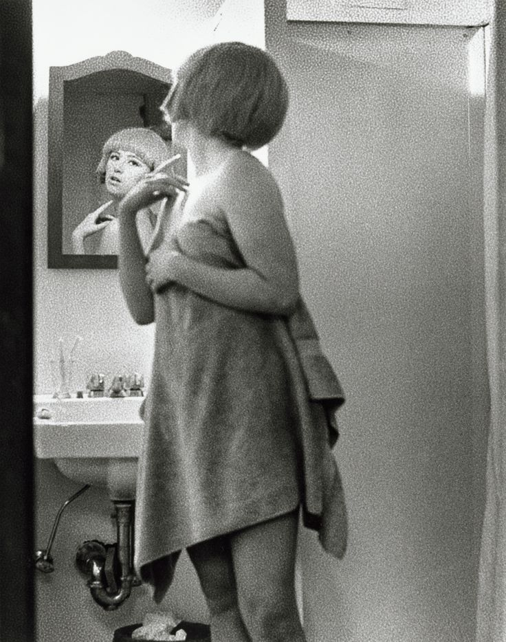
Mirrors- Chosen image

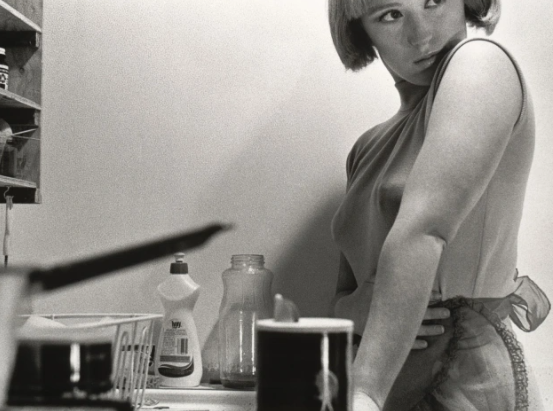
Cindy Sherman – 1977

By way of description, the image depicts a domestic scene in which the character – seemingly a housewife – stands at her kitchen sink. The construction of the picture hints at a number of possible narratives and is open to a range of analyses. Though almost cropped from the picture, the woman’s gaze – out of frame and away from the viewer, accentuated by eye makeup surely unnecessary in her own kitchen draws my attention. For me, though the image offers a portrait that I read as a stereotypical representation of a housewife from the late 1950s or early 1960s. Sherman’s gaze indicates an awareness of the world beyond the confines of the frame; the way her hand rests protectively on her stomach suggests the possibility that this is not without threat, creating a tension within the image. I think this image is a mirror due to the fact it is reflecting as of the artist herself. I also think it is a mirror as she is trying to intend an element and theme of gender roles within society during this time, but how she feels about it. She is also wearing an apron to emphasize the role she is playing. As well as this, the photo is set up to take an image of herself. It is obvious it is a staged approach due to the unfocused saucepan pointing directly at her, and the placement of the camera, clearly being on the counter to see from a lower angle. Furthermore, the gaze away from the camera also tells us it is a staged photoshoot and is not natural in any way, purely to reflect the artist. I think this image is a subjective expression, as in a way every viewer could have a different take on it. For example, as she is portraying gender roles in society in the late 1950’s she could not be intending to express herself, but how women as a whole felt during this time through a sense of reality. Therefore, she would be expressing the external world during this time. This is when this factor comes to debate as many images are subjective which makes it hard to agree with Szarkowski’s division on categories within images as everyone’s view and opinions are different which is what makes photography unique as you have to analyse. Szarkowski presented a binary theory of photography, but they are not opposites they are on a scale. Jed Pearl spring 1978 states ” world exists independent of human attention.” continued by “a photograph, after all, a record of nature.” and ” a photograph is is seen either as a mirror- a romantic expression of the photographer’s sensibility as it projects itself on the things and sights of the world; or as a window- through which the exterior world is explored in all it’s presence and reality.” I agree with Jed Pearls quote ” a photograph, after all, a record of nature.” because whether the artist is reflecting themselves through the exterior world, through them selves, or the exterior world as a whole, all of these options and elements are a result of nature. Humans, evolution of society etc is all nature. However within Sherman’s images, is the only thing natural herself? Which brings into the debate if every photograph is a record of nature. I disagree to this statement by Szarkowski as I believe the two categories cannot be fitted into two, instead a range. ” A photograph is is seen either as a mirror- a romantic expression of the photographer’s sensibility as it projects itself on the things and sights of the world; or as a window- through which the exterior world is explored in all it’s presence and reality.” For example, this famous image of Cindy Sherman, reflects her as an artist, however meanwhile reflecting stereotypes of women in the 70’s.

Windows- Chosen image

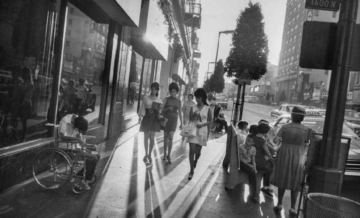
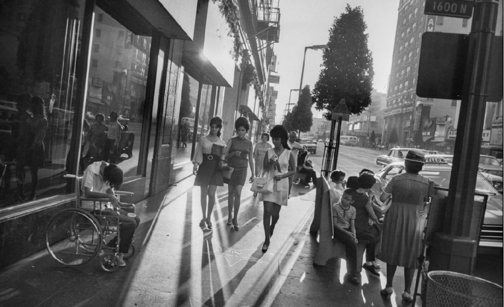
Garry Winogrand- Los Angeles, 1969 Gelatin silver print

Garry Winogrand was an American street photographer, known for his portrayal of U.S. life and its social issues in the mid-20th century. Photography curator, historian, and critic John Szarkowski called Winogrand the central photographer of his generation. Winogrand used not only light but interesting angles to create dynamic photographs. By tilting his camera when taking photos of people in action, especially on the street, he created pictures that emphasized movement. His tilting technique brings a rushed feeling and a sense of urgency to his photographs. Through looking at this;

This told me Winogrand’s images were windows. A way they are windows is that Winogrand was a street photographer which instantly told me that he was more of a documental photographer rather than a reflective. Another way I knew this is that Winogrand focuses on social issues in the mid 20th century which brings in an element of realism and publicity. However, the fact this image is in black and white does not exactly include the realism factor. This is because we do not see life in black and white, however with a camera and editing we like to change it too black and white, therefore this creates a fake element to this image as ‘ windows’ is suppose to show the exterior world the way it is. This brings in the fact that the theory windows and mirrors can be measured on an range rather than separated. This is shown through Pearl’s review ” Szarkowski claims this thesis not a rigid pattern, but as a ‘ continuous axis, the two poles of which might be described by the terms proposed above’.” This image is very objective as they are not influenced by personal feelings or opinions in considering and representing facts. This image is seen to be documentative with a realism expression as it is in the middle of the street in LA of three well dressed women walking past the unfortunate on each side. Another factor that significantly stuck out to me was how the unfortunate are in the dark, in contrast to the three females in the light. These unfortunate events could be through social and political problems and Winogrand is expressing the effects through his photographs. Therefore, he is documenting the exterior world through realism. The fact the people in the photograph are not posing or have not adjusted their behaviour or mannerisms makes it look public and very real. This links to Henry Cartier Bresson’s work of the ‘ Decisive moment’ which Winogrand would of had to execute in order for this image to not have a staged- approach. The use of light shining within the three females and not the people around, and the effect of the shadows from the women, could be metaphorical symbolizing the political issues around women during this time. This images are not personal or subjective which makes me believe that this image fits into the category of windows. a photograph is is seen either as a mirror- a romantic expression of the photographer’s sensibility as it projects itself on the things and sights of the world; or as a window- through which the exterior world is explored in all it’s presence and reality.” This makes me agree more with Szarkowski due to the fact this image is not a romantic expression and simply does not reflect the artist himself. Instead he shows and views the exterior public world to document the street photography. This is because it is explored in all its presence and reality. Therefore, this image is reflecting the problems in society around the 1950’s, rather than reflecting on the photographers sensibility.

Conclusion-

Images can be both ‘mirrors’ and ‘windows’ of the world specifically in relation to Szarkowski’s theory and Pearl’s review. In summary, Szarkowski attempted to catergorise photographers whose work reflected the subjectivity of the artist in comparison with those whose work largely sought to see outside themselves. Szarkowski believed that a photograph was either ‘mirrors’ which was a photograph that was subjective and reflected the artist themselves in a way or ‘windows’ that shown the exterior world through whether the photograph was objective and an element of realism within in it. This is shown through “The photograph is seen either as a mirror- a romantic expression of the photographer’s sensibility as it projects itself on the things and sights of the world; or as a window- through which the exterior world is explored in all its presence and reality.” The key words is ‘ either’ and ‘or’, this emphasizes how Szarkowski suggests that the photographic artist of the twentieth century finds himself, consciously or unconsciously, somewhere along a “continuous axis” from romantic to realist. Yet it can be argued that use of the medium, by its very nature, presupposes a “generous and inclusive acceptance of fact, objective structure,” and that the selection among these facts is the romantic, personal opposite built into any photograph. In contrast, Jed pearl made a review in spring 1978 being rather critique on Szarkowski’s theory. He starts his review by stating ‘Szarkowski is fond of creating categories’ beginning with a rather negative outlook continuing with ‘ presents a binary theory’. Pearl continues with ‘Szarkowski claims this thesis not as a rigid pattern, but as a “continuous axis, the two poles of which might be described by the terms proposed above”.’ This suggests that Pearl is evaluating what Szarkowski executed and said, meanwhile critiquing and expressing his opinions through acknowledgment. I think Szarkowski’s idea of the division of mirror and windows work, but with evaluating I believe there is a strong range and that it sometimes cannot be fixed onto one category simply.

Within these images- Differences and similarities

The first similarity that stood out to me was the fact both these images are in black and white. The theme of black and white decreases the element of realism as it is not how we see the world through our eyes. However, the camera allowed us to do that. However, within realism the first image does not obtain the element of realism as it is obvious it has a rather staged approach through the positioning of the camera and the objects, as well as the posing and the looking away from the camera. Sherman, the artist herself purposely was attempting to portray the housewife stereotype of women in the 70’s and one thing that stands out to me is where the pan is pointing and the apron she is wearing. This image is also private as Sherman is taking the image of herself, telling us it is a self portrait. This tells the viewer this photograph definitely has a staged approach which decreases the element of this photograph being documentative. Therefore, this makes this image have an romantic expression and more subjective. This is reflective and more personal as Sherman could be representing how she feels in society through the theme of gender roles. However, this could be argued as she could be attempting to represent women in society as a whole. Which could make it less personal considering it is a self portrait. Another similarity within these images I chose was that the main subject were females. However, within the second image it obtains more of a realism and factual factor as Winogrand is photographing and portraying societal and political problems. Winogrand is a street photographer which is known for this however he puts his art and creativity into it. Therefore this photograph is more public as it is a problem within America at the time. This makes this image more objective than subjective in comparison to Sherman’s as it is not influenced by personal feelings or opinions in considering and representing facts. Winogrand’s doesn’t look like a staged approach due to no change in behaviour and mannerisms. However there are significant factors such as the more fortunate females walking are in the light in comparison to the people in the dark on each side.

Essay: How can photographs be both mirrors and windows of the world?

As photography began with the Camera Obscura dated back to 4th century BC and known as an ancient building block for photography where an image is reflected into a dark room upside down using only natural light, which is still used by photographers to this day. It was then developed by French photographer Nicephor Niépce in 1822 who is named the father of photography, his first photograph was a view from his window in Burgundy, France. He used a sheet of pewter coated with bitumen, which required at least 8 hours of exposure time. Painter Louis Daguerre heard about this achievement and he decided to partner with Niépce. Daguerre continued to develop with the process by using silver-plated copper sheets and mercury vapor. As he continued to develop this process, Daguerre was able to reduce the exposure time.

In the same year of 1839 William Henry Fox Talbot invented the calotype process. Calotype is an early photographic process, using paper coated with silver iodide. Paper texture effects in calotype photography limit the ability of this early process to record low contrast details and textures. Despite their flexibility and the ease with which they could be made, calotypes did not replace the daguerreotype. The calotype produced a less clear image than the daguerreotype. The texture of the paper was visible in prints made from it, making an image that was grainy or blurry compared to daguerreotypes, which were usually clear.

A daguerreotype would be seen as a window image as they document reality through the photographs and portraits of real people. A calotype would been seen as a mirror image as they can be manipulated as they weren’t typically used for documenting portraits of people and can be taken of anything as they were easier and cheaper. Using one of Szarkowski’s quotes ‘is it a mirror, reflecting a portrait of the artist who made it, or a window, through which one might better know the world?”

Mirror Image

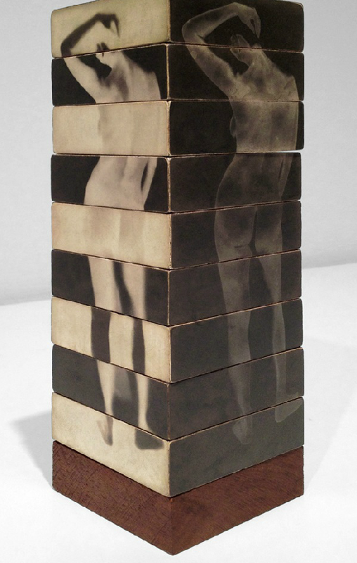
Robert Heinecken – Figure Sections/(Multiple Solution Puzzle), 1966

This image is a mirror image as it has been highly edited and manipulated. I have chosen to analyse this image as I think there is a lot to talk about where every part of the image has been edited in some sort of way, for example the woman has been edited onto a stack of wooden blocks and reflected the same image on both sides. The body has been put on two sides of the blocks and one side has got a combination of black and white blocks where the body is shown more in the black parts and in the white parts the body is much lighter and almost transparent. On the other side where all the blocks are black and the body is also a more transparent figure yet is more visible and more obviously a body than the side that has a combination of black and white. The artist could have seen this image as a way to express the same body but differently, The two different colours on each side of the blocks could reflect on how the artist is feeling like feeling seen in different situations and referred to on the blocks. “The distance between them is to be measured not in terms of the relative force or originality of their work” I agree with this quote about photographs because it tells you that a photograph isn’t just about the originality of the picture its about how they do it and what the story behind the photo is whether its reality or made up and romanticized.

Window Image

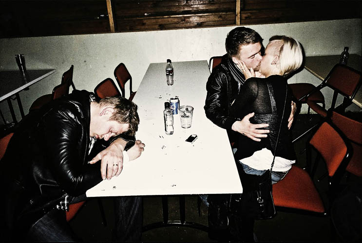
Rafal Milach, ICELAND, Saudakrokur, 2010, Annual horse gathering country ball.

I think this image is a window image as it has been taken of three people clearly under the influence. This Image to me is objective, shows realism and presents the effects of alcohol is young adults. This would be a window image as it is not staged and is taken authentically of three adults, one asleep or resting on the table and two kissing. This could also be seen as a more subjective image and therefore a mirror image but I think the realism of this proves otherwise. The actions that these adults are presenting can clearly show the influence of alcohol. a quote that I think goes well with this image from John Szarkowski’s thesis would be “The distance between them is to be measured not in terms of the relative force or originality of their work, but in terms of their conceptions of what a photograph is: is it a mirror, reflecting a portrait of the artist who made it, or a window, through which one might better know the world?” I agree with the quote because photographs can be objective where the subjects in the photo are real and representing what is in the image clearly with realism and truth or subjective where you get to make up a story and choose what the story is behind the image. “generous and inclusive acceptance of fact, objective structure,” and that the selection among these facts is the romantic, personal opposite built into any photograph of merit.” This quote from Jed Pearls review argues with John Szarkowski’s thesis that an image is either a window or mirror is argued from Jed Pearl that photographs all have romanticism included and that each photography has their own subjective story as it is personal to the photographer and each person that looks at it.

I think that John Szarkowski’s theory and Jed Pearls review has made sense of the idea of window and mirror images and has been put together well where John Szarkowski had put his idea out and Pearl has reviewed it and made it make sense. The difference between mirror and window images are that the mirror image has been manipulated and edited highly whereas the window hasn’t and is authentic. The subjectivity behind the mirror image is in the imagination of the people who sees it and has a selective story behind it. Whereas the window image has got truth behind it and is objective as there is what is in the image and that is it. “an evolution from public to private concerns and at the same time a potential toward either self-expression or exploration in the unique sensibility of each photographer” Is a quote Jed pearl used in his review of Szarkowski’s thesis and I think it has value towards what the thesis is getting across with mirror and window images as both include the photographers vision where a mirror is a reflection of the photographer and a window is what the photographer sees as objective and real where he wants to document the message they try to get across.

Review and Reflect

Portraits

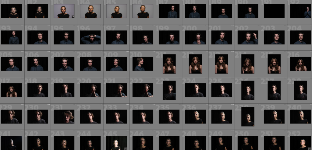
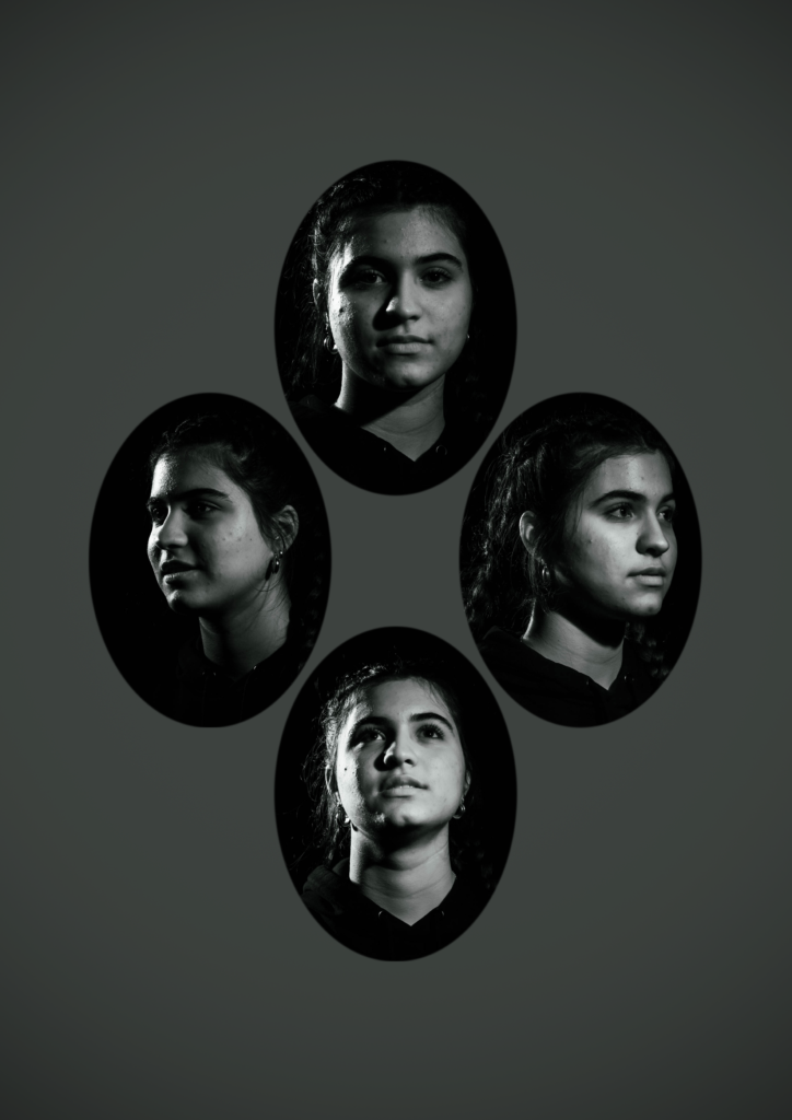
In my opinion I think that my favourite project was when I did portraits, here are some of my images that I took and analysed, edited too.

Portraits can contain an individual or multiple subjects. At a minimum, the subject is captured from their head to their shoulders, but many artists enjoy telling a story with the whole body. Before the advent of photographs, the most accurate way to preserve the visual essence of somebody was in a portrait picture.

The lighting of each of my pictures are so different, some of them appear to be a natural daylight image whereas the others appear saturated and toned down. I love this project because you can show so many different versions of people and you are able to position lights and people in so many different ways whether it looks staged or not. There is a range of aperture but with the darker, my personal favourite ones they are more of a blurred aperture. The shutter speed seems to differ from image top image but for the darker it is underexposed but it does vary even with the editing. (The brighter images are overexposure). Lastly the ISO and white balance is high sensitivity and cool temperature for the darker, edited cooler images which I used for my mock exam.

I enjoy doing portraits because its such a popular form of photography used by everyone day to day and its a beautiful form of art. It show history and I love the way it shows you so much about people, shows their beauty and it tells a story just within a picture. It can show everything from culture to religion.

The visual elements’ of portraits and the one – the tones are light and dark, there is almost a constant pattern of repetition within the poses and the face symmetry. I made one image upside down and edited it on light room, highering the contrast and colours etc.

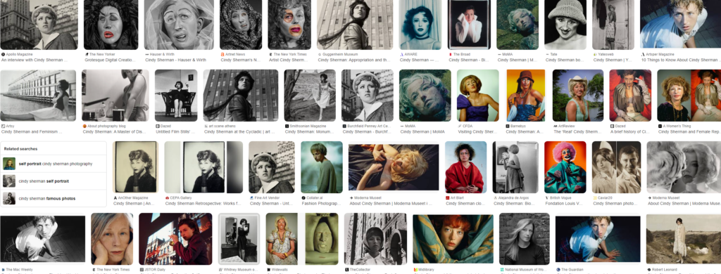
Cindy Sherman

I am really inspired by her images.

Cindy Sherman began her career in the late 1970s, she posed as various female characters. Her work challenges traditional representations of women in media and art, making her a key figure in contemporary photography and feminism.

Cindy Sherman is famous for her self-portraits that really make us think about what it means to be a woman. In her photos, she transforms into different characters, showing how women are often viewed in a parochial society. It’s an interesting way to reflect on your own identity and how you see yourself. Sherman’s images challenge stereotypes, by using costumes and makeup, she shows that identity isn’t fixed; it can change and evolve. In today’s world of social media, her work makes us think about how we represent ourselves and what’s real. Looking at Sherman’s art can help young people understand themselves better which could help with self esteem and maybe even things people go through… It’s a powerful reminder that everyone’s story is unique and everyone matters no matter who you are.

I could start my personal study based on her with some of my images relating to hers – here is some examples!

Conclusion

I love the idea behind these images and the messages they portray and this is why I want do something like this. The essence of work means so much to females and could be a big move in the 20th century. The ideas in this idea of a project are aesthetic and all com together. This is why its an amazing idea for someone like me to do my personal study base on this.

Review and Reflect

Still life

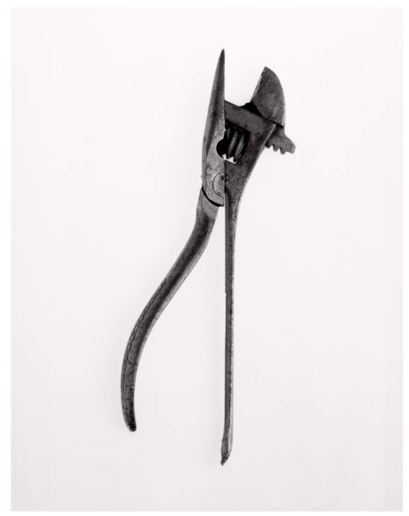
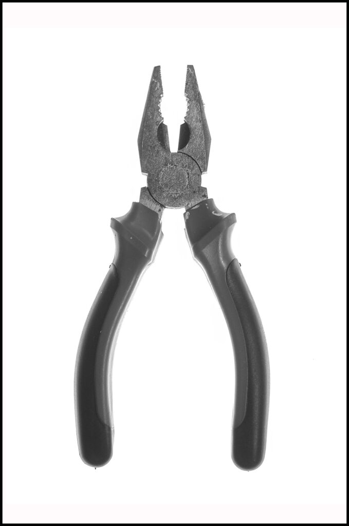
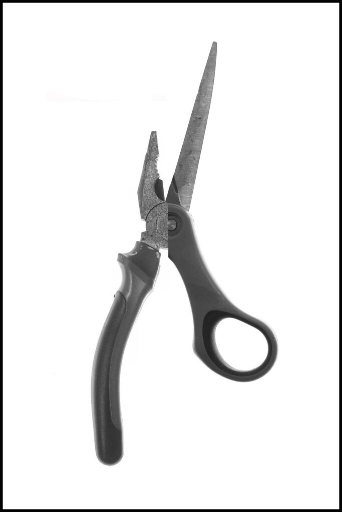
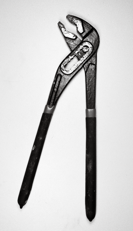
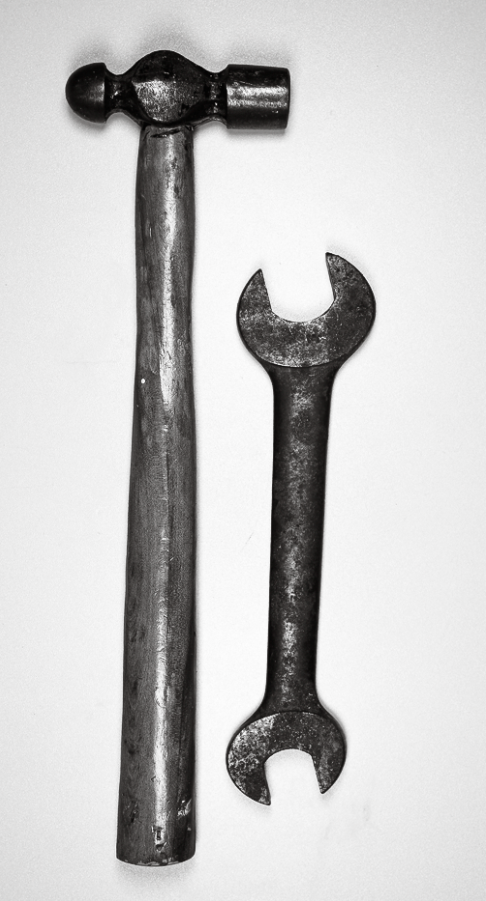
For still life I was inspired by Walker Evans and Darren Harvey-Regan. Walker Evans photographed mundane house tools to turn them into a spectacle while Darren Harvey-Regan combined two generic tools in separate images to create a unique pieces. While I’m not sure I will be developing images like these further, I would like to include some still life in some regard.

If I do take still life, they will likely be single images in front of a white background. They will be different objects with a different theme. From this project I will be using the different lighting techniques I learned. I haven’t done much with objects however I think the outcomes had varying success.

Portraits

Cindy Sherman

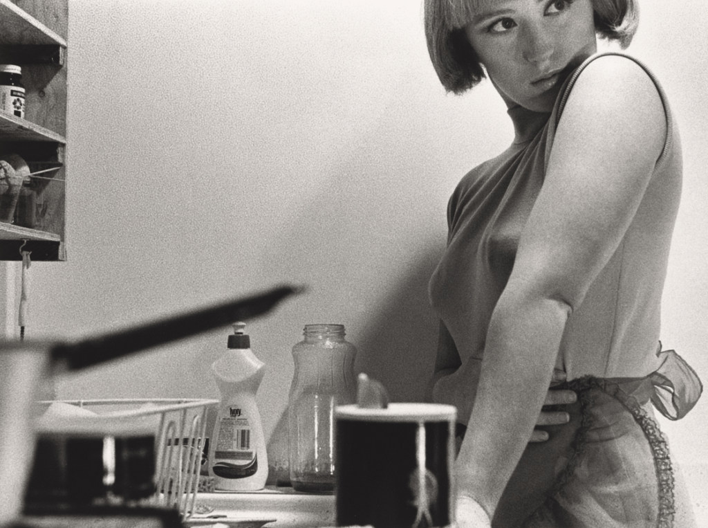
Cindy Sherman took staged environmental portraits like this one. This worked as an environmental portrait of a character. Her work tells a story about a person and how their environment shows that.

I liked working on this project and I think my outcomes were successful. I would like to experiment further with this as I believe it could work as an interesting way to evaluate an idea. I did like my outcomes however going forwards I would like to create more as I only really had one good photoshoot for this project.

Street Photography

Henri Cartier-Bresson

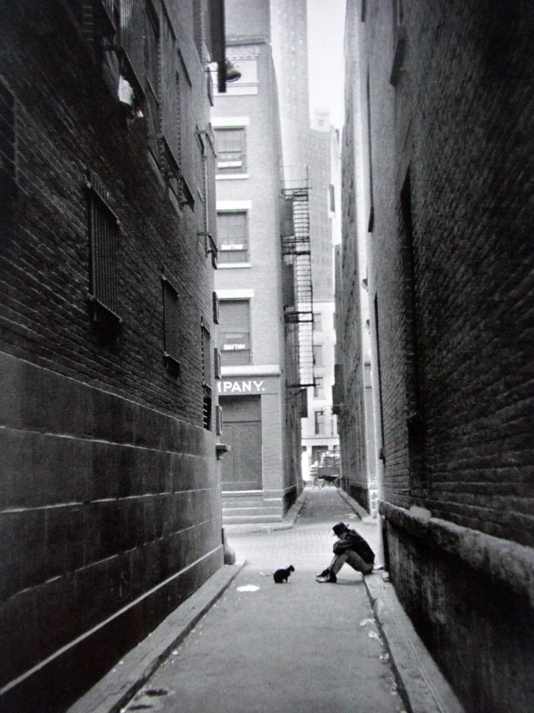
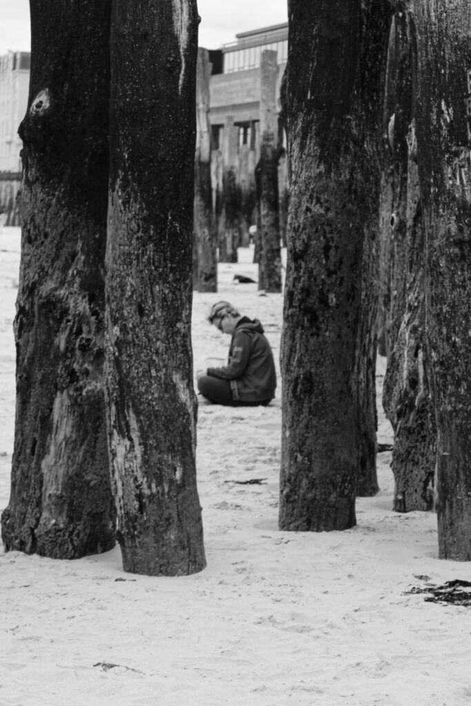
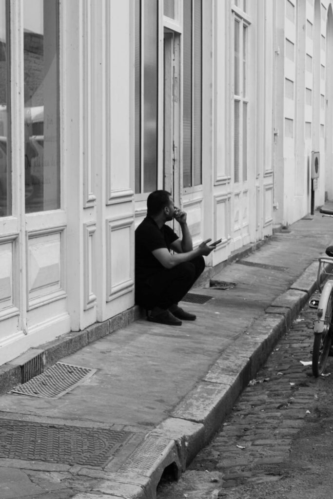
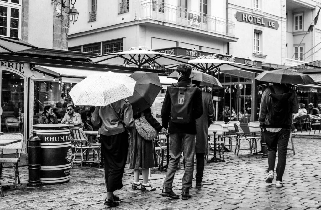
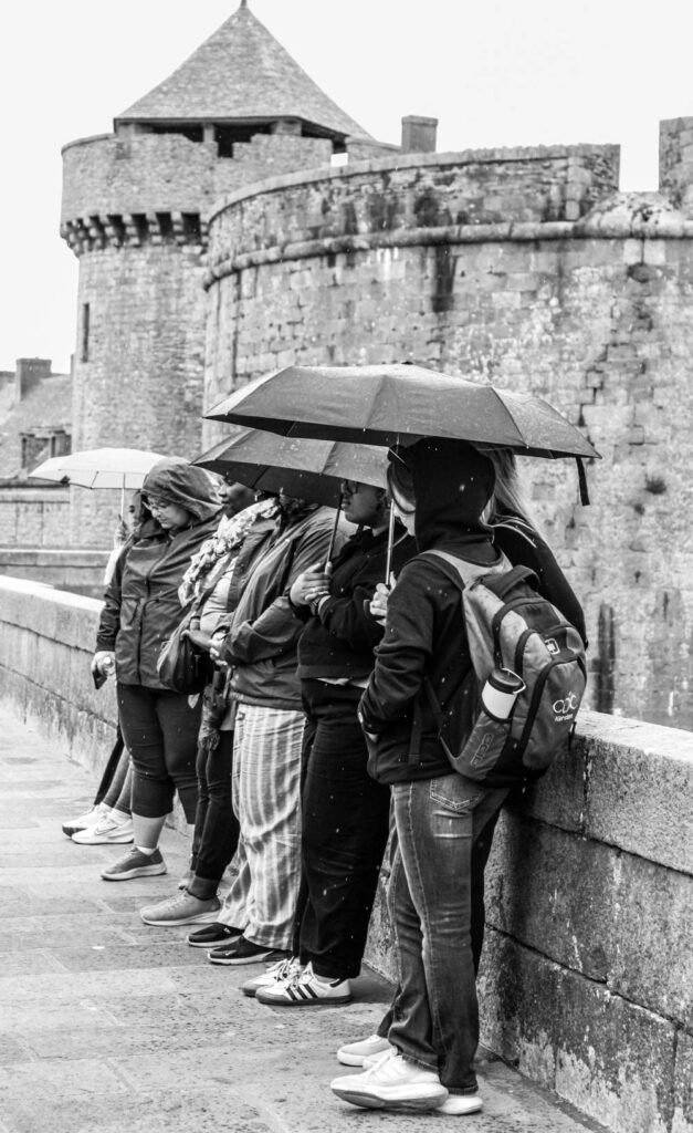
Henri Cartier-Bresson was a pioneer in the street photography space. His work never interfered and acted as observations instead. He believed in the decisive moment and photographing fleeting moments. I do like how these photographs look and the process of taking them however I would be shifting my focus.

I think I had varying success with my street photography. I enjoyed this project some outcomes were pretty decent. If I did continue these ideas, I wouldn’t focus so much on the decisive moment and instead a specific theme.