Essay: How can photographs be both mirrors and windows of the world?

John Szarkowski –

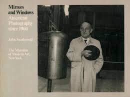
” The two photographers characterize opposite
modes of the new photography, with its divergence be
tween those who believe that art is a mirror, reflecting a
portrait of the artist who made it, and those who see it as a
window, through which one may better know the world.”

Jed pearls opinion –

White, toward an idealist, “romantic” goal of “self-expression,” a “mirror” that primarily describes the self; Frank, toward an introverted “realism,” involved with the “exploration” of a private “window” on the world. 

Plan –

Introduction (250 words): Reflect on the origin of photography and describe in your own words the difference between the two photographic processes, Daguerreotype and Calotype. Consider how they could be viewed as either a mirror or a window of the world according to John Szarkowski’s thesis. Choose one quote from Szarkowski’s text and comment if you agree or disagree.

Paragraph 1 (250 words): Choose an image that in your view is a mirror and analyse how it is a subjective expression and staged approach to image-making. Choose one quote from Szarkowski’s thesis and another from Jed Pearl’s review which either supports of opposes Szarkowski’s original point of view. Make sure you comment to advance argumentation in providing a critical perspective.

Paragraph 2 (250 words): Choose an image that in your view is a window and analyse how it is an objective expression rooted in a sense of realism. Choose one quote from Szarkowski’s thesis and another from Jed Pearl’s review and follow similar procedure as above ie. two opposing points of view and commentary to provide a critical perspective.

Conclusion (250 words): Refer back to the essay question and write a conclusion where you summarise Szarkowski’s theory and Pearl’s review of his thesis. Describe differences and similarities between the two images above and their opposing concepts of objectivity and subjectivity, realism and romanticism, factual and fiction, public and private.

Final draft –

The difference between the Calotype and Daguerreotype photographic processes, is that Talbot’s calotype involved coating paper with silver iodide, which made it light-sensitive. After exposing the paper in a camera, the image was developed using a solution of gallic acid, resulting in a negative image. This was revolutionary because it allowed for the creation of multiple copies from a single exposure, unlike the daguerreotype, which produced a unique positive image. The daguerreotype process involved exposing a silver-plated copper sheet to iodine vapor, which created a light-sensitive layer of silver iodide. After exposure in a camera, the plate was developed using mercury vapor, and then fixed with a salt solution. This process produced highly detailed images with a unique quality, making it the first practical form of photography. The Daguerreotype is definitely viewed as mirror photography, as it was usually used for taking self-portraits of wealthy men and woman of the 1830’s early 1840’s, which helps show an insight into that person’s life and due to the long development time, would be classified as mirror photography. It shows the staged and personal insight of the artists life. The Calotype process would be viewed as window photography, due to its regular use in the 1930’s for taking photos of architecture and landscapes, showing the ‘window’ into the outside world and not depicting anything about the artist, sticking to the reality and rawness of the outside world.
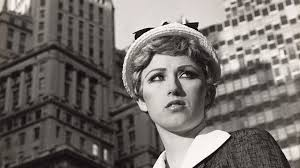
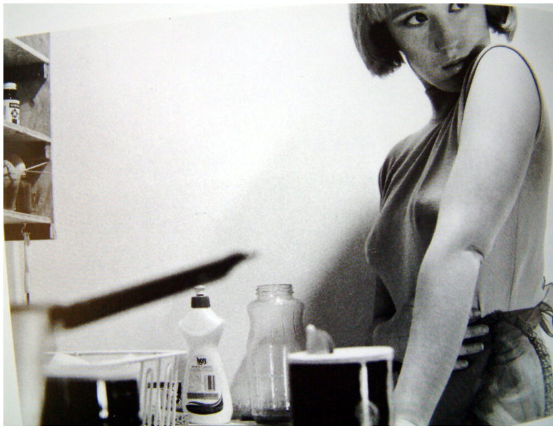
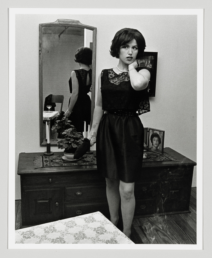
This image by Cindy Sherman is a great representation of Mirror photography, the thought that went into it is clearly immense. The use of self-portraiture, especially in the 1970’s is a very powerful form of self-expression for women. The costume and makeup show almost a shield or mask and in this 70’ era, could be symbolic to the oppression of woman at that time, and Cindy Sherman wanted to shield herself from that. This photo was taken in public in full view of anyone in New York city at the time, staged in the street with a camera. This photo shows a true view on woman empowerment not just with the costume but also the makeup and the overall photo. John Szarkowski said in his thesis that ‘The two photographers characterize opposite modes of the new photography, with its divergence between those who believe that art is a mirror, reflecting a portrait of the artist who made it, and those who see it as a window, through which one may better know the world.’ Jed pearl had an additional thing to add to Szarkowski’s thesis, “While toward, an idealist, ‘romantic’ goal of ‘self-expression’ a ‘mirror’ that primarily describes the self; Frank, toward an introverted ‘realism’ involved with the ‘exploration’ of a private ‘window’ on the world.” This shows that although Jed had a agreement about this with John, he argued that its almost like a state of mind, if someone is looking at a mirror like a self-expression, the idea of window photography, is an introversion issue, he sees window like introverted realism, so he believed that seeing the world or self this way, is personal to how you want to project yourself.
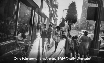
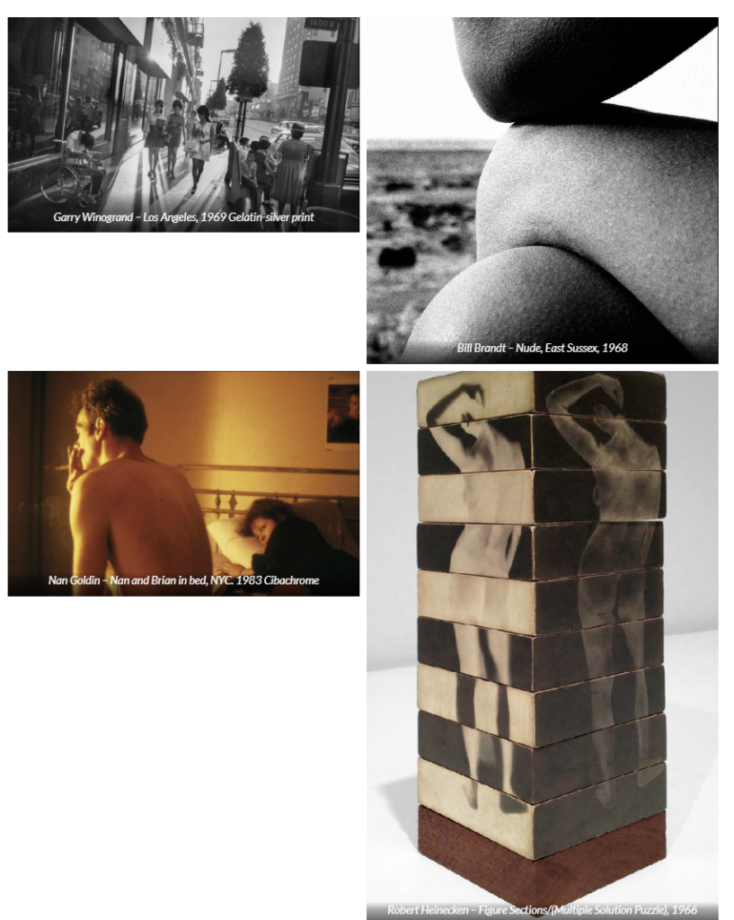
This photo by Garry Winogrand is clearly window photography, the eye view of a public space showing individual separate lives of people undenounced to the artist. A public area of Los Angeles in the 1969, is a very busy rowdy area, perfect for capturing lives of bystanders. The obscure angle that the photo was taken gives the photo itself an unusual ideology alone. The interesting action of people watching makes the viewers in captured in lives that aren’t their own. It its intriguing and leaves the viewer enticed to find out more, just from the little window they have been given into these people’s lives. This photo also shows a kind of individuality to the people in it, the outfits, makeup and atmosphere is also very interesting, especially due to the ear difference of 45 years, its like a different world from the one we are living in now, in 2024. Going back to the quote from John Szarkowski ” The two photographers characterize opposite modes of the new photography, with its divergence between those who believe that art is a mirror, reflecting a portrait of the artist who made it, and those who see it as a window, through which one may better know the world.” This photo supports the idea that window photography is like a window into a better world, a world we don’t always see. John Pearl’s idea that it is a mindset of what you want to see and what you don’t bother to look at. When you take some time to look around at the world, there is so much that you might be missing.

The question ‘how can photographs be both windows and mirrors of the world’ poses a great discussion. Overall, I believe that the use of subsections of photography are extremely innovative, the skill of being able to pinpoint characteristics of both subsections like windows, being an way of viewing the outside world and mirrors, being a perfect way to show self-expression and experiences can be an extremely successful way of talking about photographs, not just the photographs themselves but helping artists become more in touch with their understanding of photography and the more difficult ideas that come with it. The two photos I used in this explanation, the first one by Cindy Sherman and the second by Garry Winogrand have so many differences between them, differences that do not only segregate them as photos but characterize them into categories. Window photography is all about documentation, observing and watching people’s lives through the photographs you take, while mirror photography is subjective to the artist themself, as they choose to put it out into the world to see. Another difference that segregates window and mirror photography is that mirror photography is not always real, and by real I do not mean physically real, but after editing, manipulation is common, while in window photography usually the photos are more candid and truthful. Mirror photography can also be seen as very romantic, indulging in romanticism is common for this area. Artists could occasionally romanticize their work; in mirror photography their work reflects their lives, so it is not surprising to see this through their art. While through window, artists may want to show a raw and objective view through their work to help keep the authenticity. 

Mirrors&Windows

What are the difference’s between photograph’s that are mirrors or windows?

Mirrors have an element of candid and naturalistic.

Mirrors:

  • Subjective (open to interpretation)
  • Reflects artist
  • Reflections
  • View into your own life
  • Manipulated
  • Synthetic
  • Personal

“A mirror – a romantic expression of the photographers sensibility as it projects itself on the things and sights of this world; or as a window- through which the exterior world is explored in all its presence and reality” – JOHN SZARKOSKI 1978 “is it a mirror, reflecting a portrait of the artist who made it or a window, through which one might better know the world” JOHN SZARKOSKI 1978. This is essentially saying that mirrors reflect the society we are in and can reflect a lot about us and how we do things. Mirrors” are photographs through which a photographer is trying to tell us how he feels about himself. The study of texts that reflect their own identities, experiences and motivations. They also provide insight into the identities, experiences and motivations of others 

Windows protect us (public). They have elements of reality, subjectivity and there’s this element between objectivity vs subjectivity when it comes to mirrors and windows. “Windows” are those in which he is trying to tell us how he feels about the world. For the former, only sincerity will do.

Windows:

  • Objective (not open to interpretation)
  • Outside world
  • Documents
  • Real
  • Public

Binary Opposites

Inside / Outside

Subject / Object

Staged / Candid

Fiction / Non-Fiction

Image Analysis

These are all elements within photography and how exactly you could frame a window and mirror shoot. Inside and outside to show life and what people can do in their day to day life. (objectivity and subjectivity) which focuses on one pin point or multiple things which could be anything to outside world or just one person in a room. Staged such as Cindy Sherman pictures, staged female to allude to a stereotypical women with kids cleaning, whereas a mirror image is much more candid and natural such as capturing the beauty of the nature which also follows along the lines of fictional or non fiction which you could factor in for both mirrors and windows, it could be fake or real (stage or candid). Last but not least, imagery analysis is the extraction of meaningful information from images. How and why you go to were you are – could you elaborate on this? That is all about image analysis.

— Floris Neusüss

The idea of photographs functioning like windows makes total sense. Like the camera viewfinder, windows frame our view of the world. We see through them and light enters the window so that we can see beyond. Photographs present us with a view of something. However, it might also be possible to think of photographs as mirrors, reflecting our particular view of the world, one we have shaped with our personalities, our subconscious motivations, so that it represents how our minds work as well as our eyes. The photograph’s glossy surface reflects as much as it frames. Of course, some photographs might be both mirrors and windows.

A window is a resource that offers you a view into someone else’s experience. A sliding door allows the viewer to enter the story and become a part of the world. A mirror is a story that reflects your own culture and helps you build your identity.
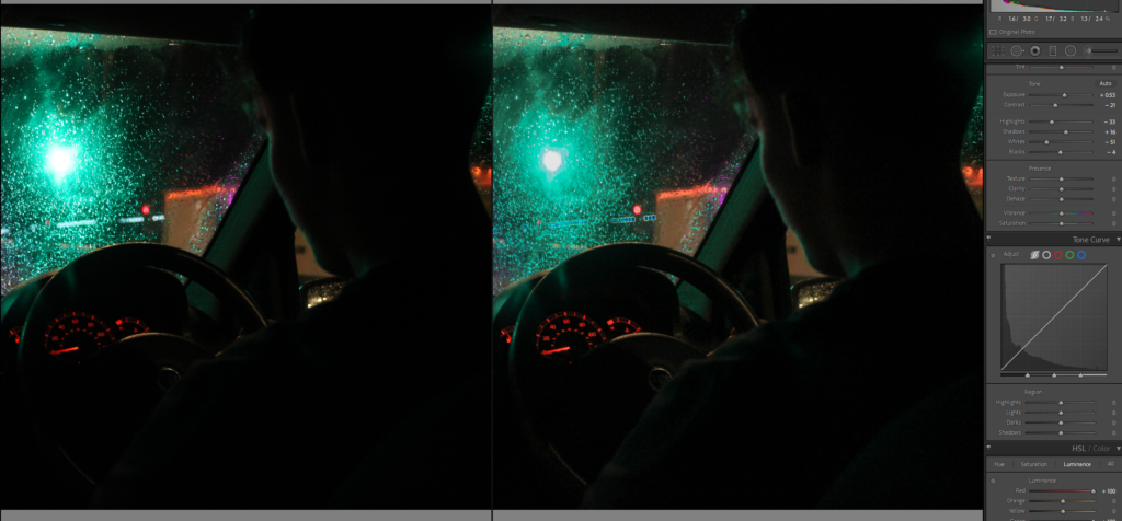
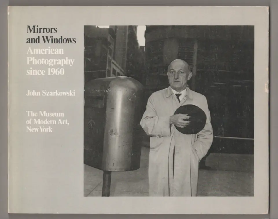
Photo-historian, Gerry Badger who was part of the editorial team producing the television series The Genius of Photography wrote in the introduction of the book of the same name that John Szarkowski’s distinction of photographs as ‘mirrors’ or ‘windows’ is useful, but only to a point, ‘because most photographs are both mirrors and windows.’ (Badger 2007:8)

https://www.moma.org/documents/moma_catalogue_2347_300062558.pdf?_ga=2.54789417.324587201.1678794436-79728838.1664367708

Mirrors and Windows

Is it a mirror, reflecting a portrait of the artist who made it, or a window, through which one might better know the world?John Szarkowski

What are the differences between photographs that are Mirrors and Windows?

The difference between mirror and window photography is a mirror is a romantic expression of the photographer’s sensibility as it projects itself on the things and sights of this world. A mirror image is staged and subjective, they reflect the photographer and therefore called a mirror image. A window photograph is a photograph that shows realism and are objective. They are called window images because they show what is real in the image, like looking out of a window.

Key Words

Mirrors: Romanticism, Subjective, Naturalistic,  Fiction, Tableaux, Reflective, Personal, Internal

Windows: Authentic, Objective, Documentary, Realism, Candid, Public, External, Truthful

Binary Opposites

Inside / Outside

Subject / Object

Staged / Candid

Fiction / Non-Fiction

Image Analysis

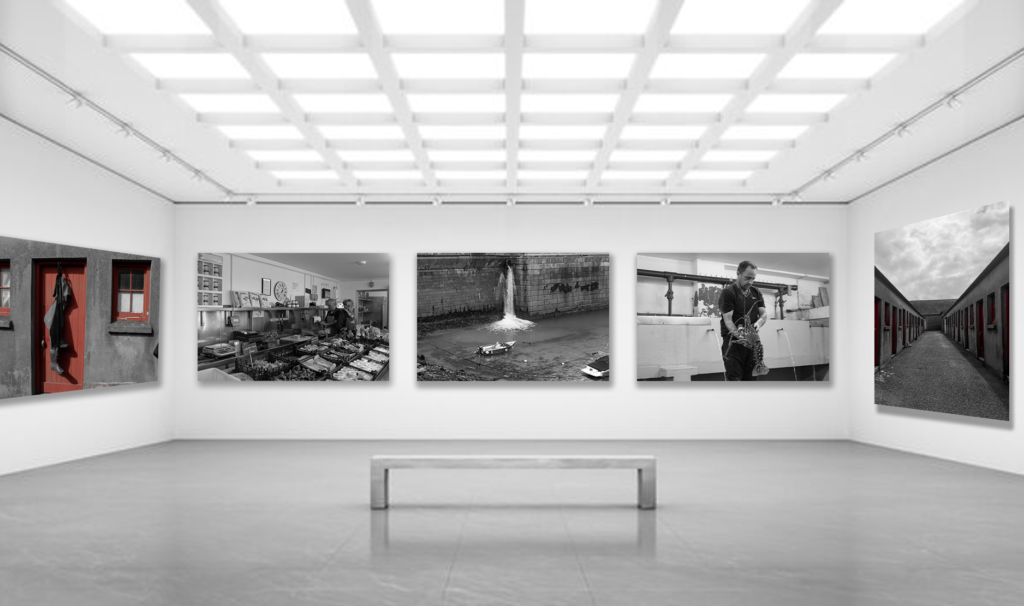
Virtual Gallery – Maritime

I have created a gallery for my favourite images because I can’t fit them all into one gallery so I put the images that best fit and look best together into one gallery.

I chose to put these images together in my gallery because they are the ones that I have put together in my zine and because they all are in black and white so in my opinion they look good together in the gallery.

Final Zine and Evaluation

Evaluation

Overall, I think my zine creates a good idea about the harbour and maritime history in jersey because of my different selection of images of and around the harbour throughout my zine. What could have improved my zine is if there were images of the maritime museum which could have added more diversity in my zine but they were my least favourite and didn’t have the best quality out of all the pictures that I took.

Zine: Design and Layout

Front Page:

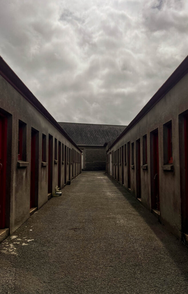
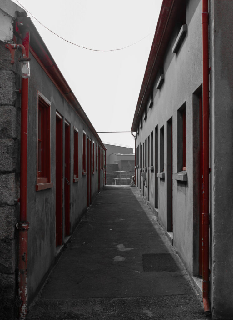
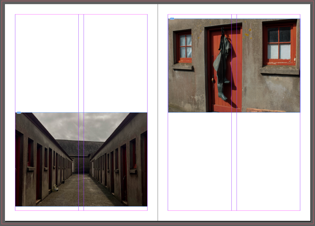
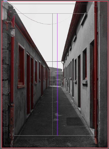
I chose this image of fishermen’s storage rooms as my first page. I did this because it creates a sense of mystery and intrigue. I knew I wanted this because I knew I wanted to have the front page and the back page to correspond with each other and I thought this image was interesting as my front page as your not too sure what is inside the zine yet causing the person to be interested.

First page:

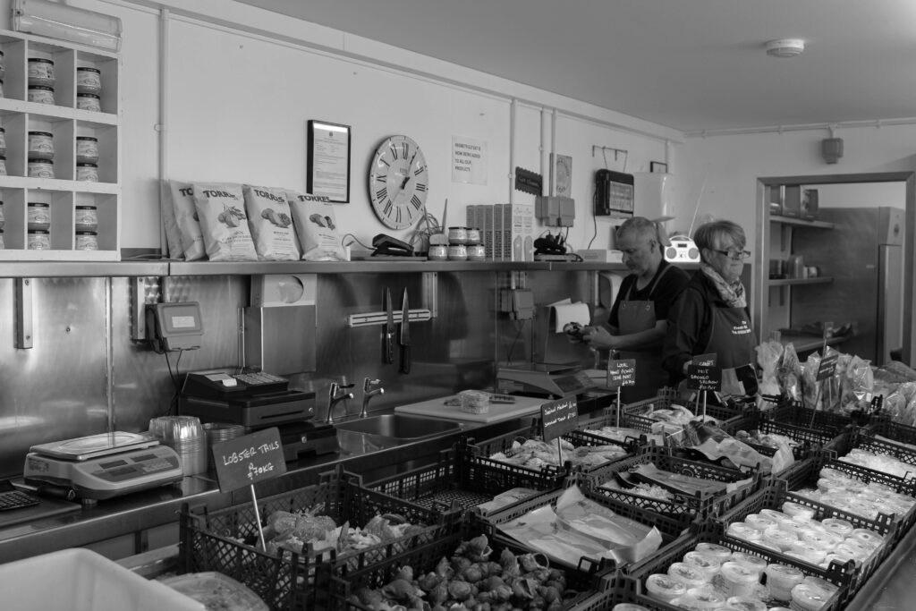
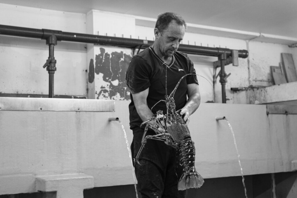
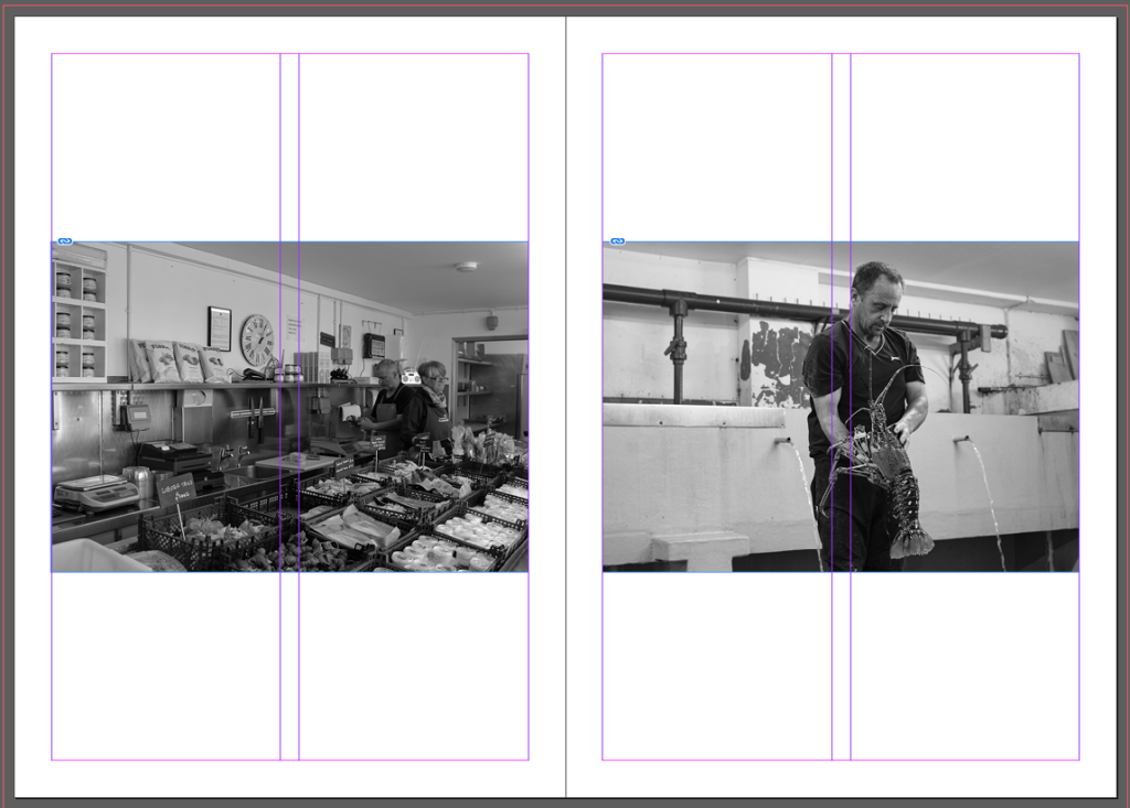
The first page of my zine I did two pictures straight across from each other of people working in and around the harbour. I put these two images together because both include people working with fish/sea animals within the same area just doing two different jobs. The left image of a fish shop showing the workers and the fish they sell and the right image being of a man working with big crayfish and some other sea animals that you can’t see in the image. I chose to put both pictures straight across from each other because it looked clean with both pictures being in black and white creating the sleek look that I wanted with my zine.

Second page:

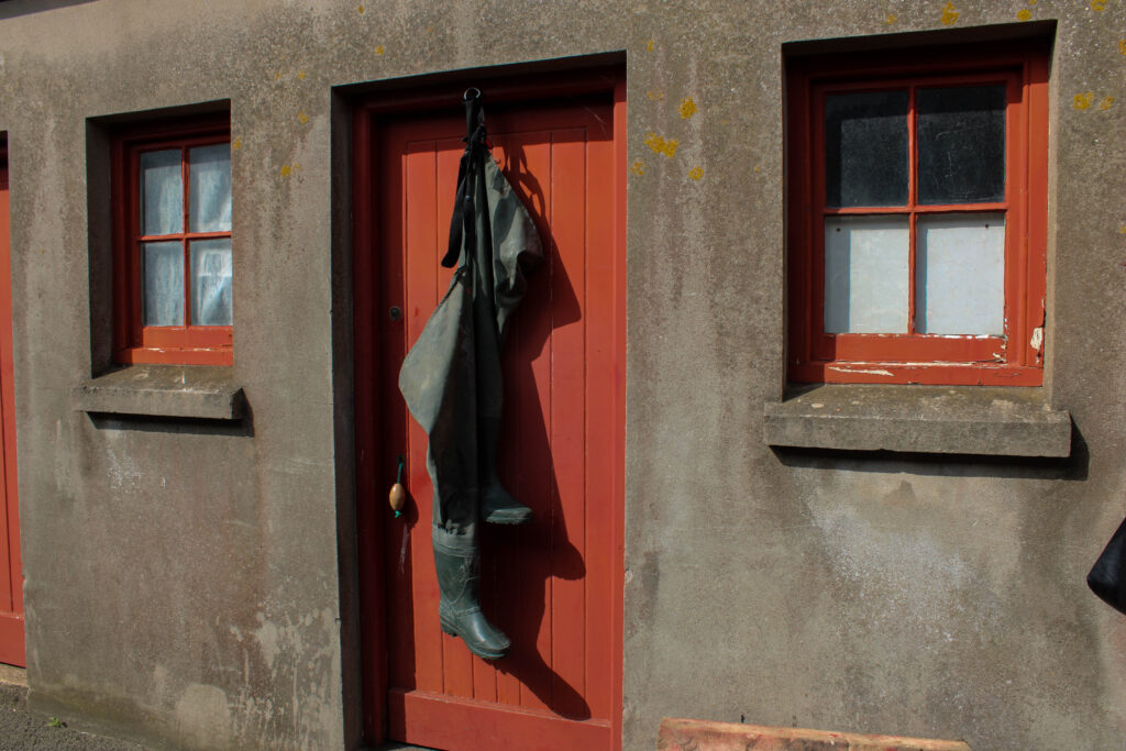
For the second page I chose two pictures of fishermen’s storage rooms, one angled down through all of them and one more upfront of one store room. The image on the left page shows all the lockers as if you were standing and looking straight through them. The image of the right page shows one storage room with wellies hanging from the door, this shows that the old lockers that have been used for hundreds of years are still being used today by fishermen. I wanted these pictures in my zine because they resembled the front and back of the zine but these ones are in colour, you cant see the colour in the front and back page apart from the red I kept in them. I originally had these two pictures straight across from each other but it looked boring as I have done that for other pages as well so I put the left picture at the bottom and the right picture at the top for more structure in the zine but still looks clean and sleek.

Third page:

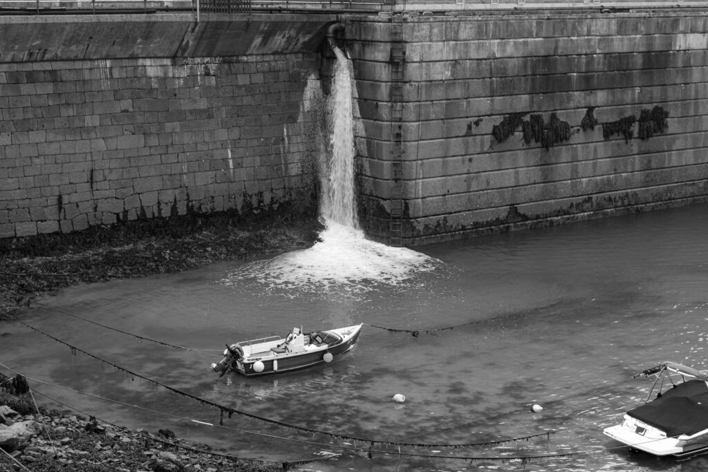
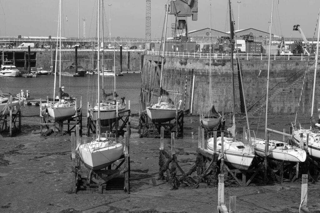
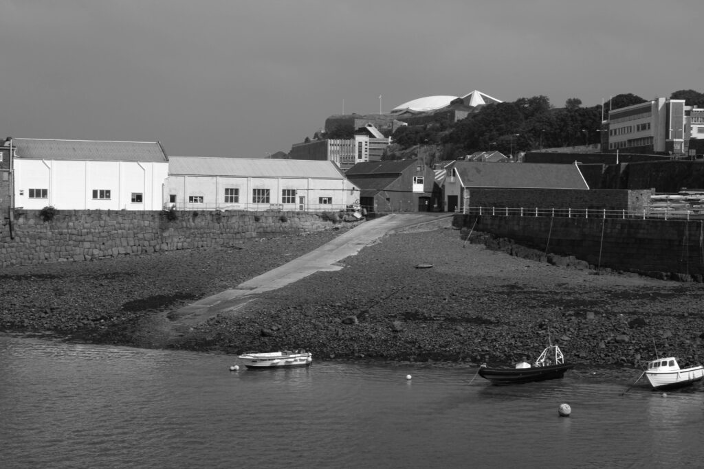
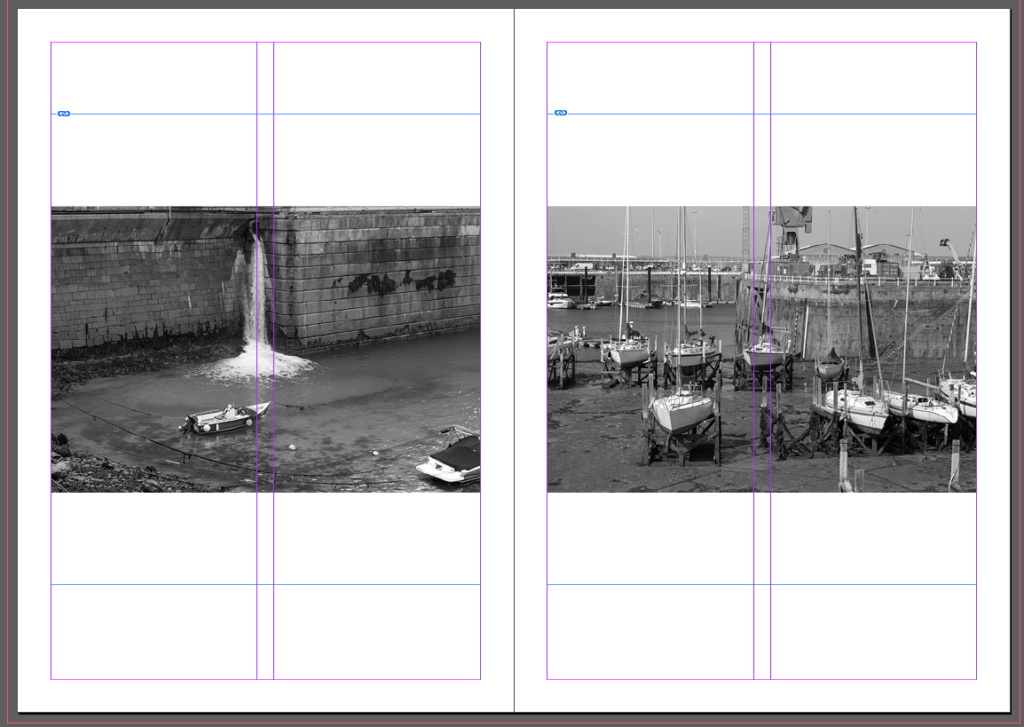
The third page of my zine consists of two images of boats. The image on the left page is of one singular boat with low tide visibly in the image. The left image also creates a sense of mystery as the main feature of the image is the boat alone with the back of another boat being in the image you can’t tell if its just them two or more boats around them. The right image shows more boats lined and propped up on wooden beams with no water around. Both images look like they could have been taken a while ago because of the boats within them. These images, in my opinion go well together because both include the visibility of how old the harbour is and how one boat can have lots of space and within a 5 minute walk boats can be cramped together.

Fourth page:

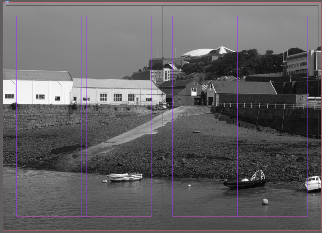
I chose this image of a hill going down towards the boats with lots of buildings in the background because Its different to my other images because non of the others have this kind of perspective of being at sea and looking onto land and at the same time it blends in well with my other images as it carries the same older and vintage aesthetic. I put one large landscape image across two pages in my zine and made the image go all the way to the end of the margin lines I created so it was a full bleed photo. I wanted a couple of these in my zine because I like the way it looks and contrasts to other pictures in my zine that have borders or don’t completely fill the page.

Fifth page:

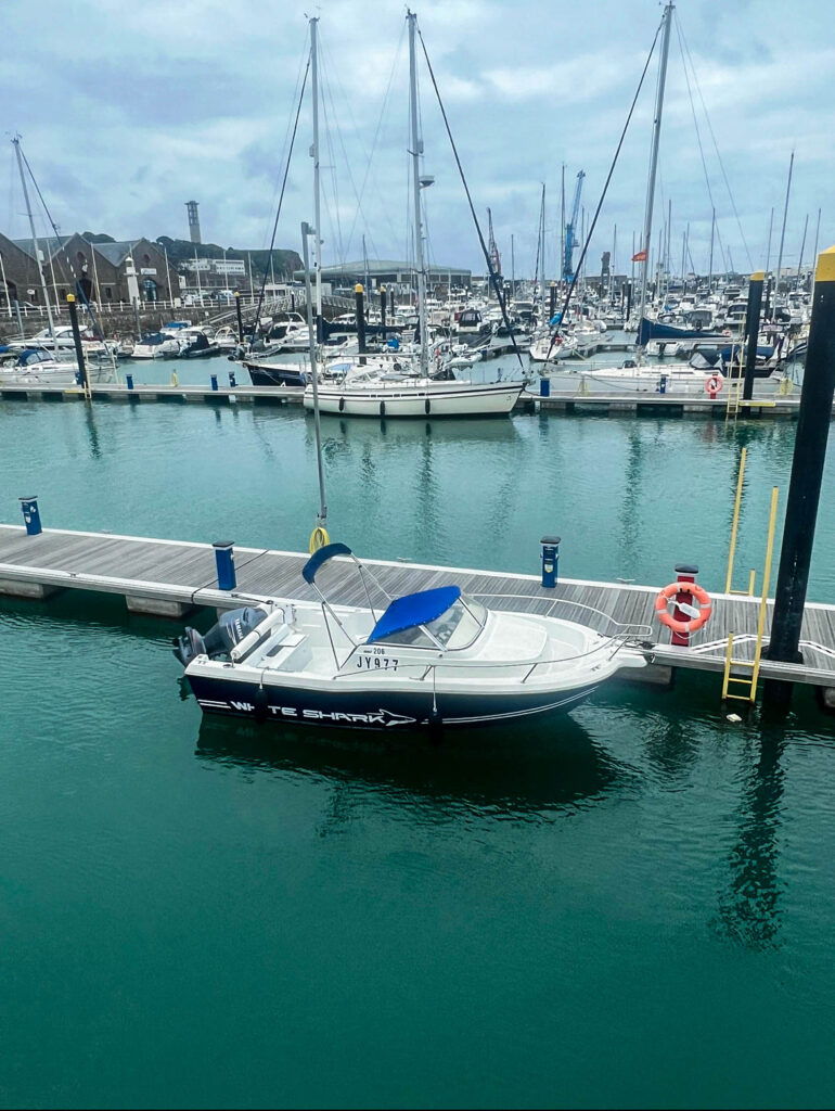
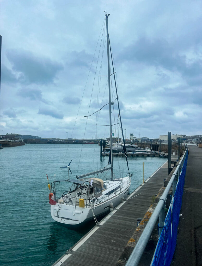
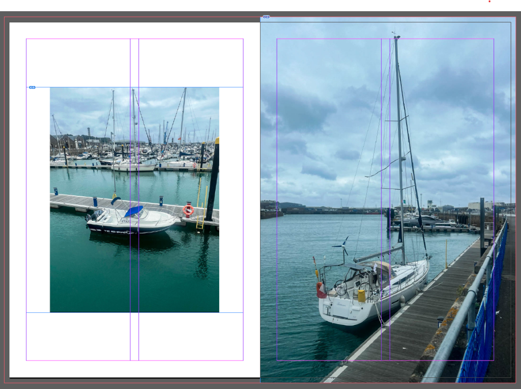
For the fifth page I put two pictures in colour of boats. I did the left page smaller and with a border and my other one full bleed to create a nice contrast effect where one has a border and the other is full bleed. I liked this compared to my other pages with two images on that are the same size and either straight across or diagonal. These two images contrast with every other image in this photo but I like how it is different and adds a big pop of colour throughout my zine compared to all the other black and white or beige coloured images. These two images were taken on the other side of the harbour from the others with all the more modern and newer boats so I thought it would be best to leave these in colour.

Sixth page:

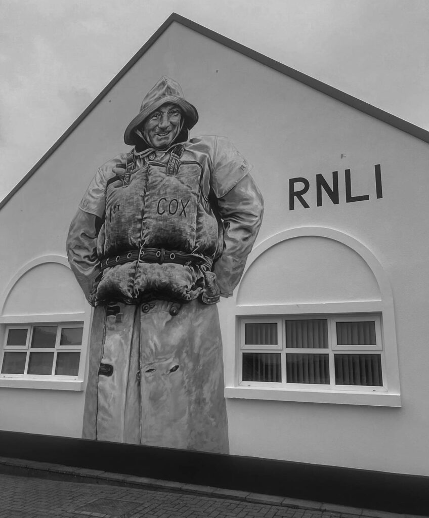
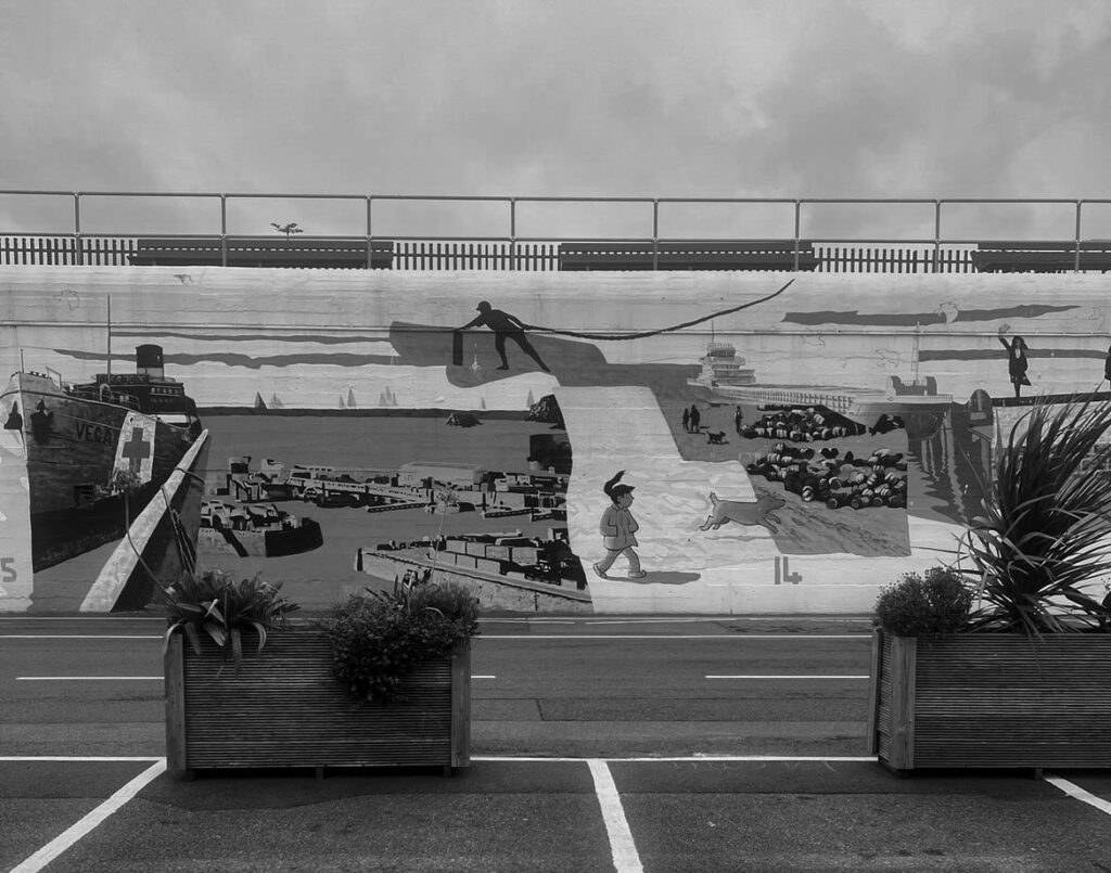
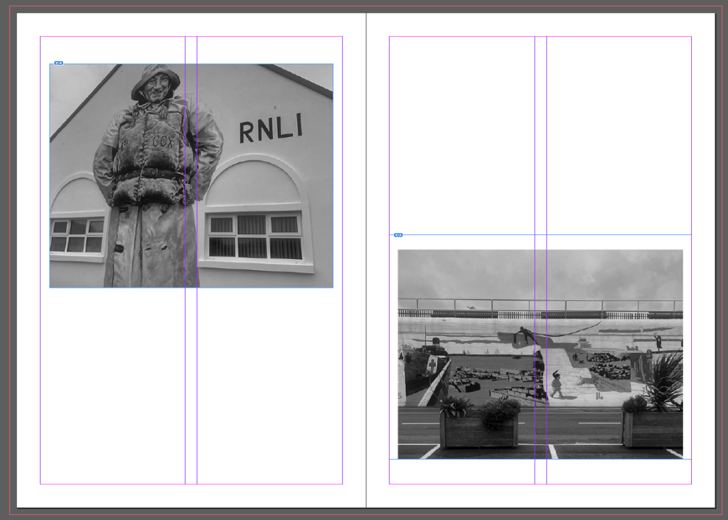
I chose these pictures of wall art across the harbour to be in my zine because it creates a different aesthetic compared to all the boats and other harbour related images in the zine where they are all of actual real things whereas these images are of art on a wall. I put these in black and white and diagonal from each other similar to my fishermen’s store rooms for more effect and structure throughout the zine.

Seventh page:

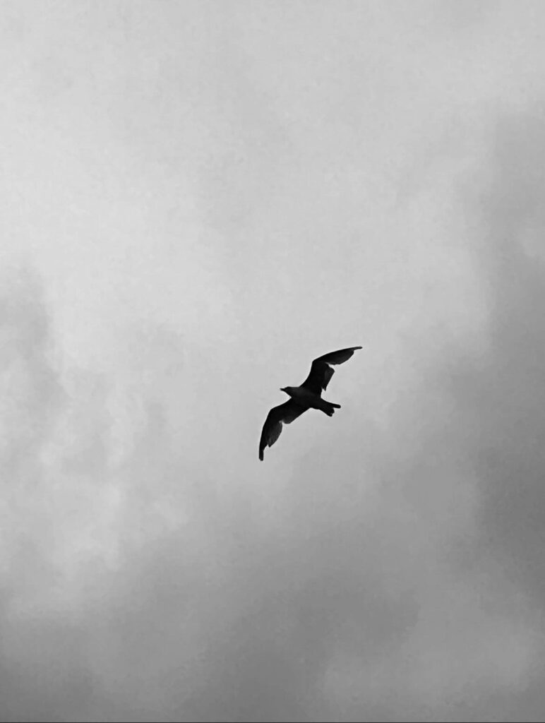
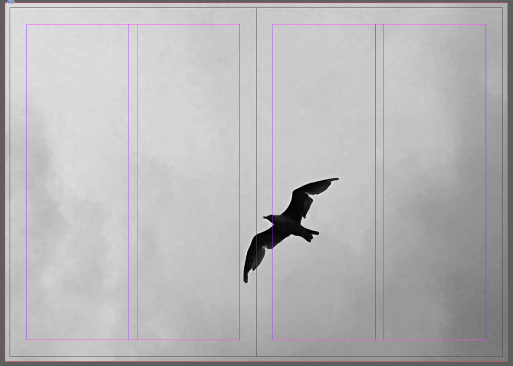
For the final page I chose this picture of a seagull. I originally had this image with the two wall art pictures but I put it on its own page because it looked squished when I put all three on one page. I made this full bleed because I wanted to have all my pages with one picture on the be full bleed and I thought it looked cool that the bird spread across two pages. I chose the bird to continue the aesthetic of mystery throughout my zine.

Back Page:

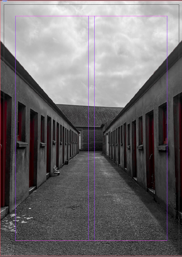
I chose this as the back page because it goes with the front cover but from a different angle. I did it like this because I liked the effect it created on the back and front of the zine where it’s the same picture and location but at a different angle. It makes the zine tell a story like the front you are going through the store rooms and then throughout the zine two more pictures of the lockers show up, one of an actual store room and then finally you reach the opposite end of the rooms like you reach the end of the zine.

Photoshoots

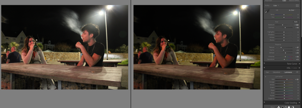
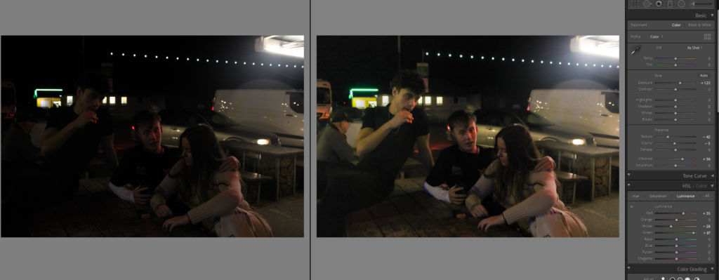
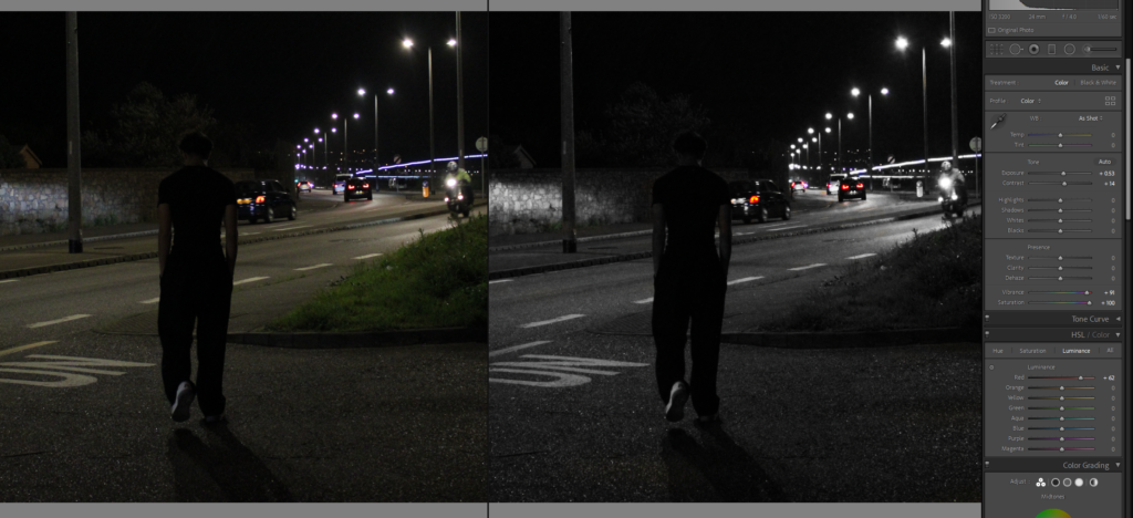
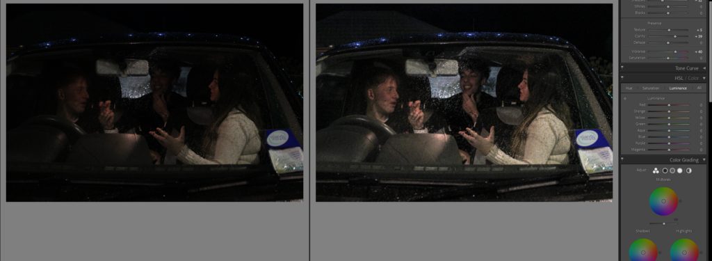
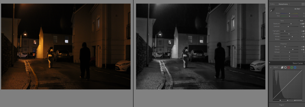
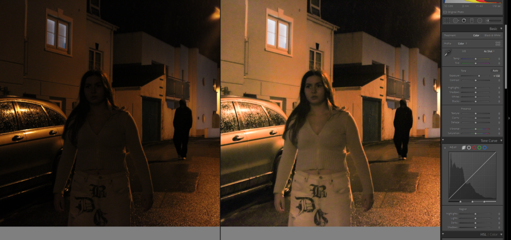
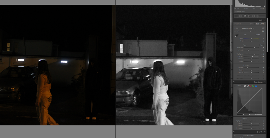
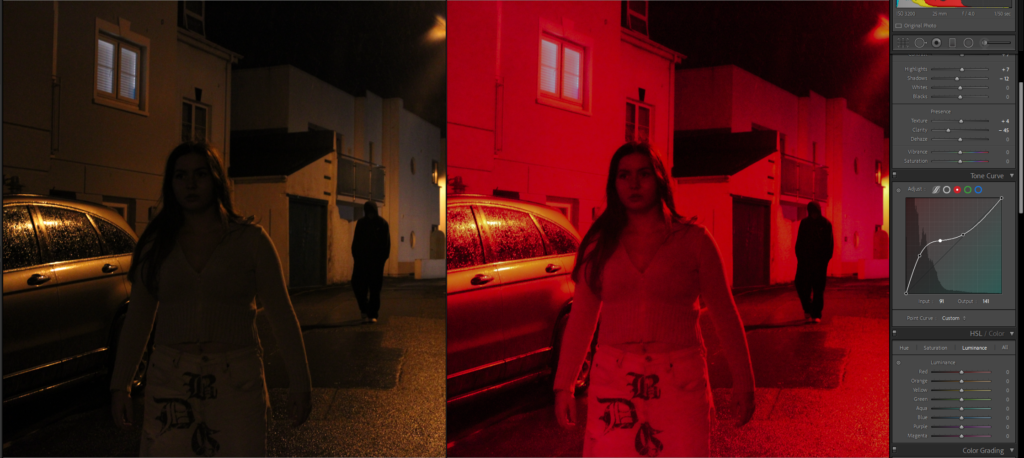
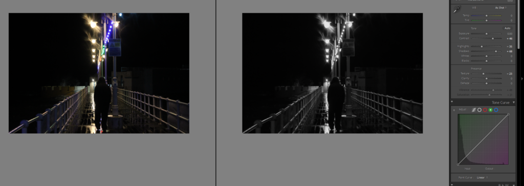
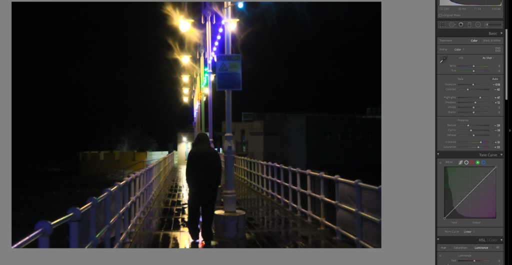
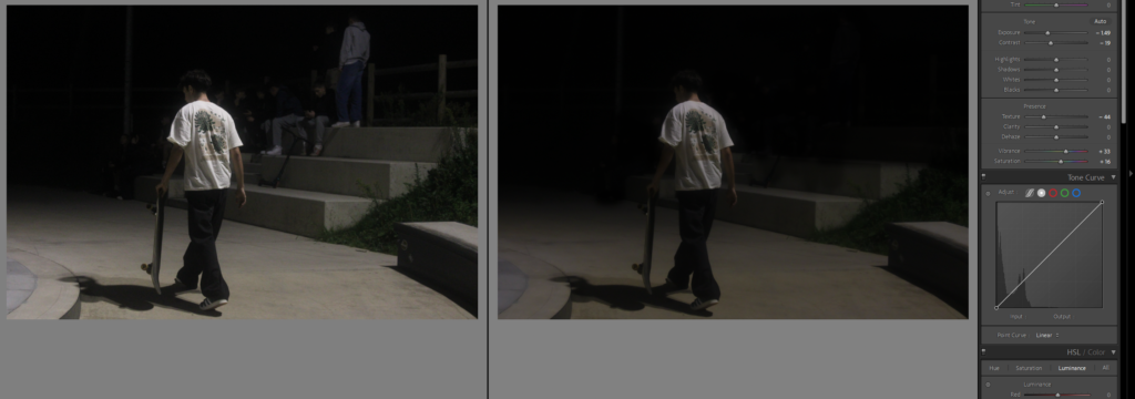
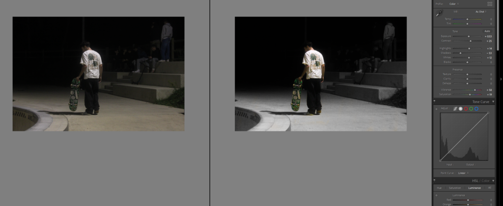
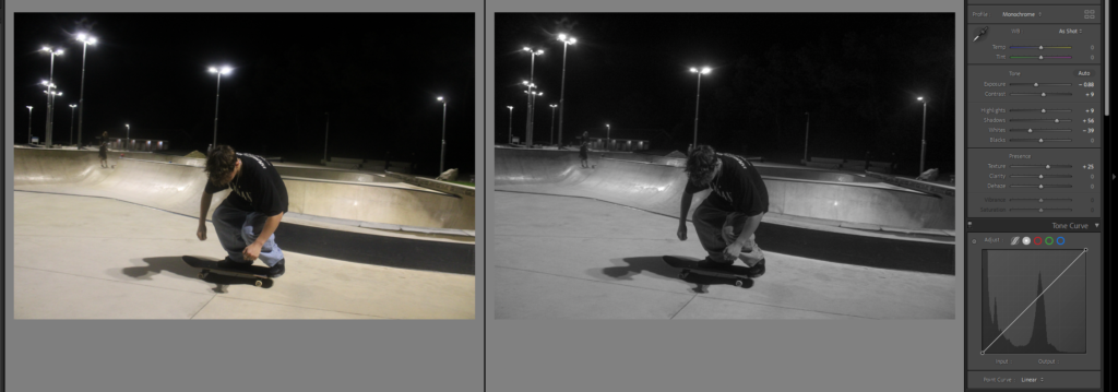
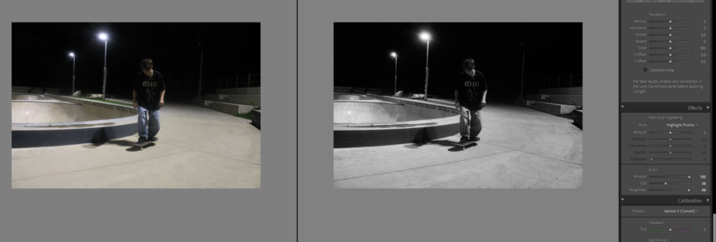
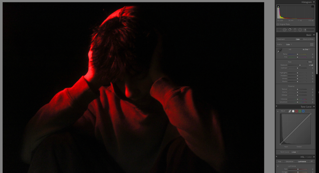
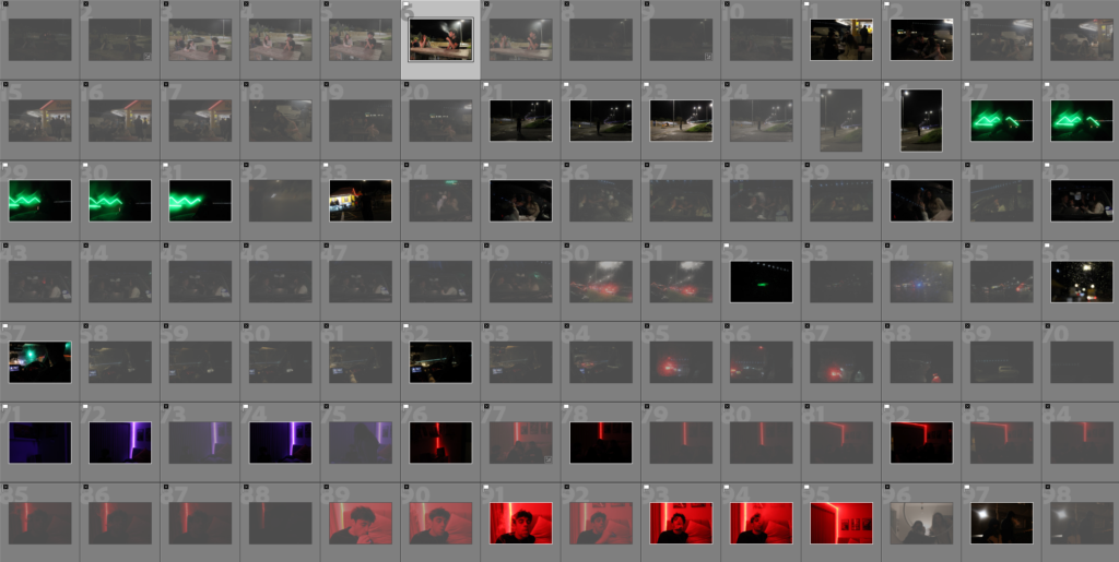
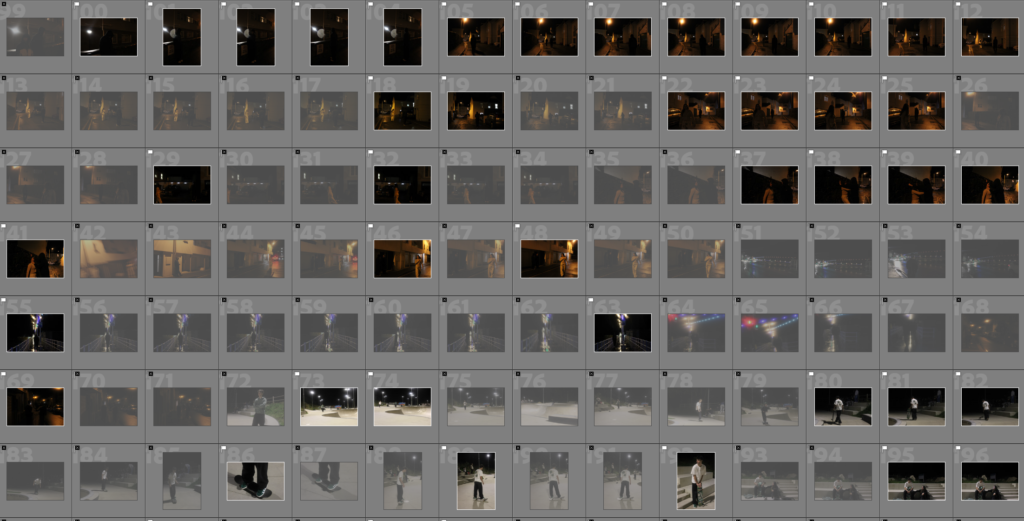
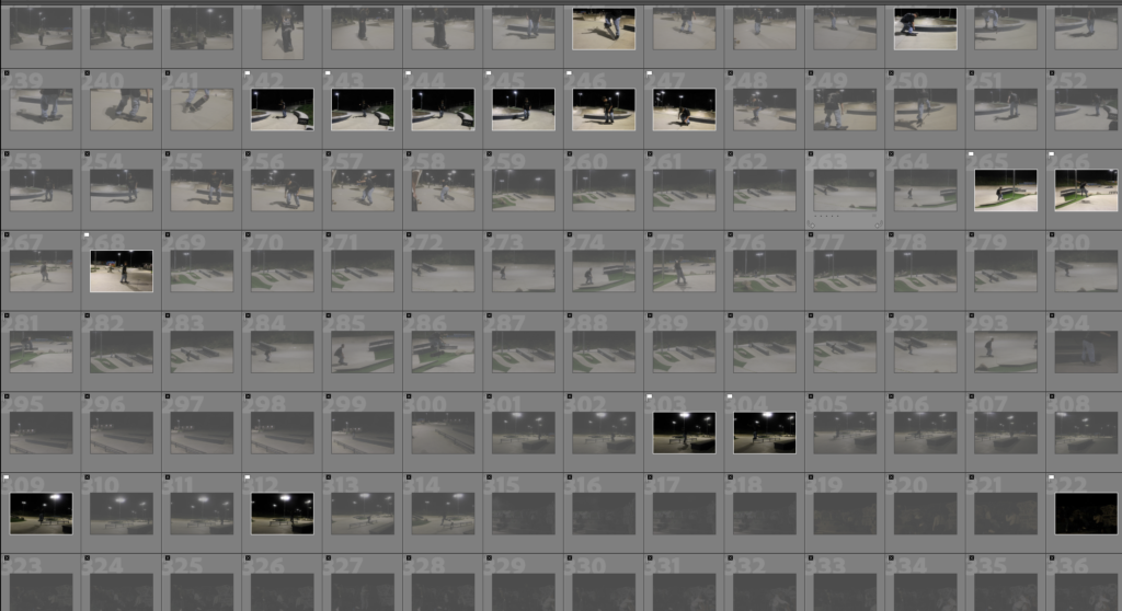
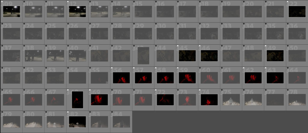
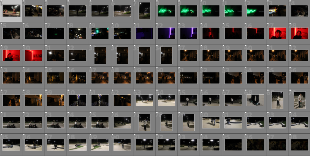
This is my first photoshoot, I went around the skatepark and kiosk and corbiere to take photos, of reality of teenage life, and the depressed side and also sexism and sexual harassment towards women. these photoshoots are mainly my mirrors photos.

I then went through and selected which images I wanted to keep and which I wanted to get rid of.

I was left with 109 photos.

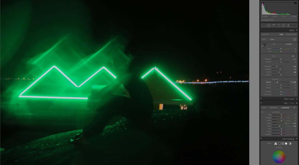
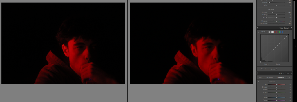
I then took a few mope photos in the studio, but struggled with lighting.

Independent Study- Essay Question: How can photographs be both Mirrors and Windows of the world?

Reflecting on the origin of photography, the practice of it has been evolving for many hundreds of years through the first use of the Daguerreotype in the 1840s-50s(gaining widespread popularity, particularly for portraiture), to the use of Calotypes invented in 1841.

According to John Szarkowski, photography can be viewed as either a mirror or a window. A mirror reflects reality as it is, while a window offers a view into another world or perspective. Daguerreotypes can be seen as mirrors, capturing a detailed reflection of reality, while Calotypes function more as windows, inviting viewers to explore and interpret the image beyond mere representation.

Both processes use much of the same equipment though a daguerreotype is a sharply detailed image preserved on a copper plate. In contrast, a calotype is a negative image developed on paper. Apart from that Photography has gone through many changes such as the evolution of Heliography to Daggurretypes to Calotypes to the first permanent photography being taken “View from the Window at Le Gras” to the first Kodak camera being invented in 1888.

One quote from John Szarkowski that stands out is: “It can be argued that the alternative is illusory, that ultimately all art is concerned with self-expression. If so, the illusion of this alternative is no less important, and its character
perhaps defines the difference between the romantic and the realist visions of artistic possibility. The distinction may be expressed in terms of alternative views of the artistic function of the exterior world. The romantic view is that the meanings of the world are dependent on our own understandings. The field mouse, the skylark, the sky itself, do not earn their meanings out of their own evolutionary history, but are meaningful in terms of the anthropocentric metaphors that we assign to them
”.

I agree with this idea; he tells us that some art seeks to show the world as it is, while other pieces of art are reflections of what the artist feels and thinks about the world.. Through both processes, photography not only documents reality but also enhances our understanding and perception of it. Even though these perceptions can blur, the opposition between seeing the world and seeing it how we interpret it gives us distinct artistic experiences.

Photography can serve as a means for reflection and self-expression. The mirror metaphor emphasizes the “subjective nature” of photography, where the image becomes a reflection of the photographer’s emotions, beliefs, and worldview. Photographs taken in this mode often reveal more about the individual behind the camera than the subject in front of it. This is particularly relevant in portraiture or self-portraiture, where the photographer uses the medium to explore identity, memory, and personal history.
The act of photographing can be deeply personal, allowing the photographer to project their inner thoughts or emotions onto the image. This idea is supported by theorists such as Roland Barthes, who, in Camera Lucida, writes about the notion of the “punctum”(a detail in a photograph that speaks directly to the viewer’s personal experience, triggering emotion or memory). For him, a photograph can reflect an individual’s subjective reality, a private connection that mirrors their world.
Moreover, photographers such as Cindy Sherman have used the camera as a tool to explore identity by creating highly stylized self-portraits that challenge societal norms and question the nature of identity itself. Her work in her Untitled Film Stills series reflects how photography can mirror societal expectations while simultaneously critiquing them. In this sense, photography as a mirror offers a way to interrogate identity, revealing as much about the photographer’s internal world as the subject being captured.

The image presents a subjective and staged approach to image-making, embodying what John describes as the mirror in photography rather than depicting reality. In the image itself, Cindy presents a female character that seems to be drawn from a 1950s dark film, placing herself within a carefully composed scene that hints at a bigger story behind it. The vagueness in the image is a critical aspect of Sherman’s work which often relies on staged elements to explore themes such as identity, gender, and media stereotypes. The photo is less about the subject e.g. the woman in the scene but more about Cindy Sherman’s exploration of how identity can be both constructed and deconstructed through visual symbols.

Szarkowski’s Mirrors and Windows supports this interpretation, as he says, “The romantic view is that the meanings of the world are dependent on our understandings.” This quote aligns with Cindy’s work as her images are constructed with her subjective vision which is shaped by the cultural/ societal expectations she explores. Her work invites viewers to consider how these “meanings” are imposed upon the image through a culturally constructed lens which can embody John’s concept of the mirror by reflecting society’s inner psychological landscape rather than an “objective” truth about the character she portrays.

Jed Perl argues that while Sherman’s images are captivating they also risk becoming “staged impersonations” that sometimes can lack the depth of genuine self-reflection. He suggests that such work can sometimes feel like performative constructions rather than genuine mirrors of the artist’s psyche. This critique introduces a layer of tension within Cindy Sherman’s approach that questions whether her work captures self-expression or simply recreates surface-level models

Overall, the image illustrates Szarkowski’s notion of the mirror. Yet as Perl’s critique suggests Sherman’s staged approach raises questions about authenticity and whether her images fully achieve the “self-expression” John envisions. This debate enriches the interpretation of Sherman’s work which emphasizes the complexities within staged photography as both personal expression and social commentary.


On the other hand, photography can act as a window into the world, by providing an objective or semi-objective view of the external reality. In this example, photography is seen as a tool for documentation and observation, allowing viewers to witness events, places, or moments they might never personally experience. The window metaphor can highlight the transparent nature of photography where the camera becomes a medium through which the viewer can access the world beyond their immediate surroundings.

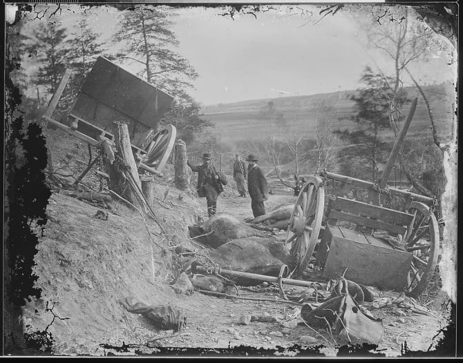
The origins of photography are deeply tied to its use as a window. Early photographers like Mathew Brady, who documented the American Civil War used the medium to capture historical moments with an eye toward objectivity. These photos served as windows into the reality of war, which offered viewers a direct glimpse into a brutal and chaotic world. This function of photography as a window persists in photojournalism/ documentary photography where the aim is to capture reality as truthfully and as authentic as possible.

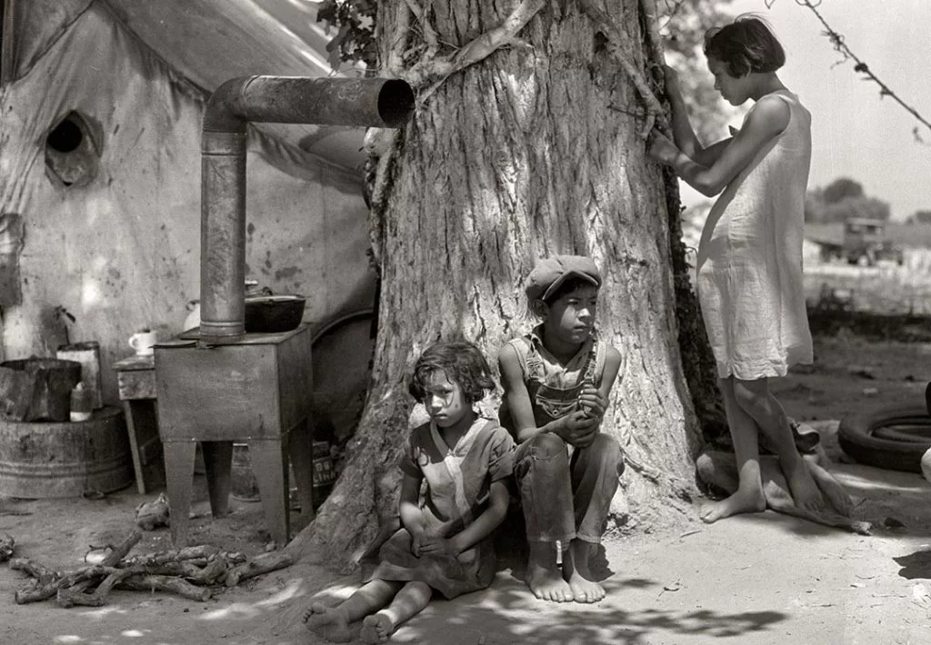
According to John photographs that function as windows allow viewers to look beyond their personal experience and into the lives of others, which fosters a sense of empathy and understanding. Documentary photographers like Dorothea Lange, who captured the struggle of migrant workers during the Great Depression, used their cameras as windows to reveal societal issues and human suffering, hoping to inspire social change through the power of visual storytelling.

Additionally, photography as a window extends to the exploration of the natural world and landscapes. The works of photographers like Ansel Adams depict vast, majestic scenes of nature that offer a window into the sublime beauty of the world. These images provide viewers with access to places they may never visit, acting as visual windows that transport them to new environments and experiences.


While photography can function as either a mirror or a window, many images blur the line between the two, serving as both a reflection of the photographer’s perspective and a view of the external world. The very act of taking a photograph involves a blend of subjectivity and objectivity. Even in documentary or journalistic photography, where the aim is to capture an objective reality, the photographer’s choices—what to include in the frame, when to take the shot, and how to present the image—introduce a level of personal interpretation.

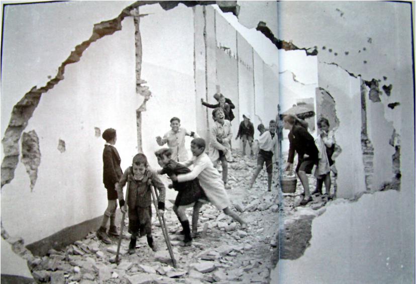
Street photography, for example, often embodies this tension between mirror and window. The photographer captures candid moments in public spaces, offering a window into everyday life. Yet, at the same time, the choice of subject, angle, and framing reflects the photographer’s unique vision and interpretation of the scene, turning the photograph into a mirror of their worldview. The work of photographers like Henri Cartier-Bresson demonstrates this balance, where the “decisive moment” captures reality while also conveying the photographer’s sense of timing, composition, and emotion.

Furthermore, in contemporary art photography, many images intentionally play with the concepts of mirrors and windows, inviting viewers to question the boundaries between reality and representation. Andreas Gursky’s large-scale photographs, for instance, offer expansive views of urban and industrial landscapes, functioning as windows into the complexity of modern life. However, his manipulation of the images—through digital editing—challenges the idea of photography as a transparent window, instead turning the image into a reflection of how we perceive and construct reality in the digital age.


In conclusion, photography can be understood as both a mirror and a window, offering reflections of the photographer’s subjective reality while simultaneously providing views into the external world. The distinction between these two roles is not always clear-cut, and many photographs function as both—revealing personal perspectives while documenting the world in a way that invites interpretation and engagement. Theoretical approaches by figures such as Barthes, Szarkowski, and others highlight the complexity of photography’s relationship to truth, identity, and representation. As both a mirror and a window, photography remains a powerful medium for exploring the self and the world, constantly negotiating the boundaries between reality and perception.

Essay: How can photographs be both ‘mirrors’ and ‘windows’ of the world?

Every photograph has an implication. Whether it is to express an emotion, or to demonstrate a beautiful landscape, a photo is taken by a photographer with the intention of showing people something. However, according to John Szarkowski, what the photographer shows is one of two things; a reflection of the photographer “reflecting a portrait of the artist who made it”, or an exploration of the exterior world. Even the world’s first experimental daguerreotype photographs from the early 1800s fall under this distinction.

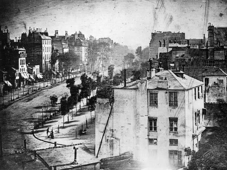
Boulevard du Temple, 1838, Louis Daguerre

A daguerreotype is essentially an ionized copper plate coated in silver that is sensitive to light. This makes it possible to create an image on the plate using a camera obscura, an effect which uses a pinhole in a dark box to create an inverted reflection of the world outside of the pinhole, the same effect that our eyes use to see. The plate is then fumed with mercury vapour to freeze the resulting image after the plate is exposed to light for a long enough time. The result is the image above. This photo was taken by Louis Daguerre, the inventor of the daguerreotype, in Paris. What we are actually seeing is a window into the past, a message speaking to us from nearly 200 years ago, and the first ever image of a human being. Through a window into the past, the mirror of a human reflects back at us, a testament to John Szarkowski’s belief that “the two creative motives that have been contrasted here are not discrete”, but ultimately can overlap each other and coexist in a single photo.

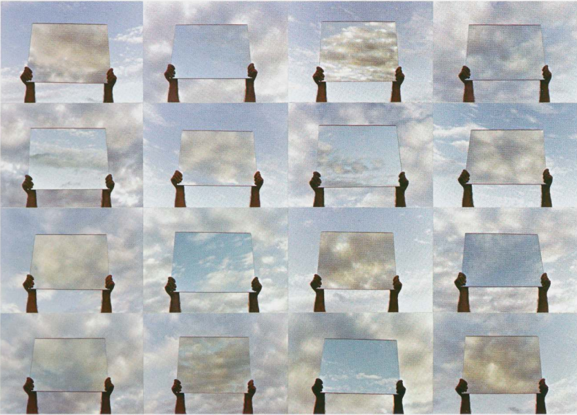
Here is an extract from Szarkowski’s book, a piece named “20 minutes in April” by Gary Beydler. Although a mirror is involved in this piece, in my opinion each photo is a window into the randomness of entropy, a snapshot in time that can never be replicated. This piece is rooted in the notion of realism, a demonstration of Gary Beydler’s love for the beauty of this chaotic world. John Szarkowski describes this as a “pursuit of beauty: that formal integrity which pays homage to the dream of meaningful life”, a romantic view of how a photographer can find meaning through the unpredictable nature of the world. However, an alternative realist view is provided by Jed Pearl in his review of Szarkowski’s book. Jed Pearl describes the photos in the book as “predictable images that tell us nothing of life”, demonstrating the realists acceptance of fact; that there exists no deeper meaning to the randomness of clouds, and that any meaning that is found is overruled by logic. In my opinion, I believe that the meaning of one’s life is subjective to their beliefs, and it evolves and changes through time as they develop a greater understanding of the world around them. “20 minutes in April” simply provides an insight into the chaotic and beautiful nature of clouds, however the meaning of this is not directly provided by the creator, Gary Beydler, instead it is meant to be inferred by the viewer to aid them in finding their own meaning to their own life. To state that this piece ‘tells us nothing of life’ is ignorant of this fact, but ultimately it is up to the viewer whether to find meaning or not.

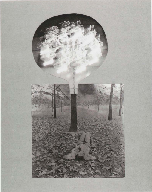
Here is another extract from Szarkowski’s ‘Mirrors and Windows’, a photomontage named ‘A Special Place’ by Joseph Bellanca. The piece consists of two contrasting images, an outdoor photo that depicts a lone woman lying on the woodland floor, and an indoor photo of a bright chandelier hanging from a chain, cut out similar to the shape of a head. In my opinion, this piece is a mirror of human consciousness, an attempt at expressing how it feels to be human; trapped within the boundaries of our physical and mental limitations, lost somewhere in the expanse of a limitless world. To me, the image portrays the feeling of dreaming; when the imagination lights up inside the brain and creates an artificial world that perceptually mimics reality. This is something that is impossible to photograph physically, therefore the only approach to express one’s own subjective reality in photographic form is to stage it, or to make it artificially, like the way Joseph Bellanca does perfectly here as well as the many other photographers featured in ‘Mirrors and Windows’. “Much of the work included in this show is meant to strike us with its surprising imagery”, Jed Pearl states in his review, “yet few of the photographs are closely, richly detailed enough, or surprising enough, to be separated from the mediums past characterized as new – as a vision dredged up from the depths of consciousness”. This quote describes the majority of the photos in ‘Mirrors and Windows’ as boring and emulative of the works from the ‘Romantic vs Realist’ debate of the 19th century, rather than contributing a new perspective of photo analysis to the modern world. However, John Szarkowski argues that dulling a photo down to right or left, romantic or realist, merely describes a singular intention in a photo, hidden within the photographers whole conscious intent, whether they even know it or not, “One can draw many sections through a house that will help one better comprehend the structure of the whole. It must be understood, however, that these section views are merely analytical devices, and therefore, by definition, describe less than the whole”.

Essay plan

Paragraph 2 (250 words): Choose one quote from Szarkowski’s thesis and another from Jed Pearl’s review which either supports of opposes Szarkowski’s original point of view. Make sure you comment to advance argumentation in providing a critical perspective.

Conclusion (250 words): Refer back to the essay question and write a conclusion where you summarise Szarkowski’s theory and Pearl’s review of his thesis. Describe differences and similarities between the two images above and their opposing concepts of objectivity and subjectivity, realism and romanticism, factual and fiction, public and private.