For this project the first thing I had to figure out was what I liked and what I didn’t. I realized I didn’t want to have this story based on repetitive photos of boats so I decided I wanted to use some of my more abstract photos and focus of specific items within the harbour and use the close ups of those objects and materials.
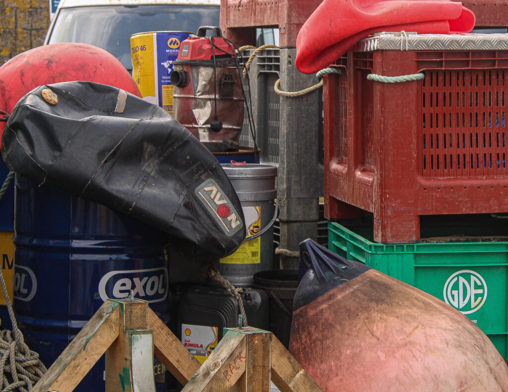
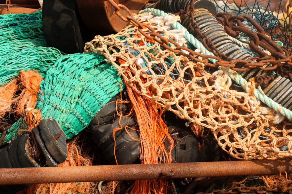
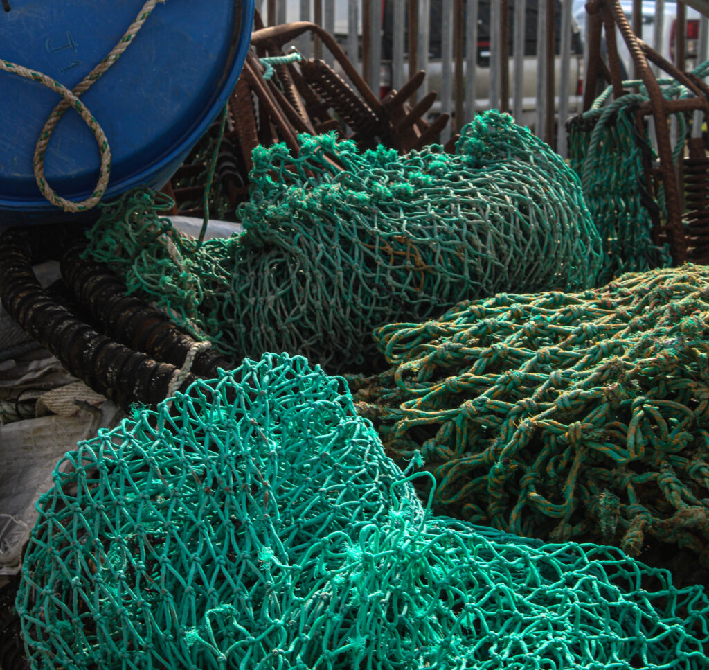
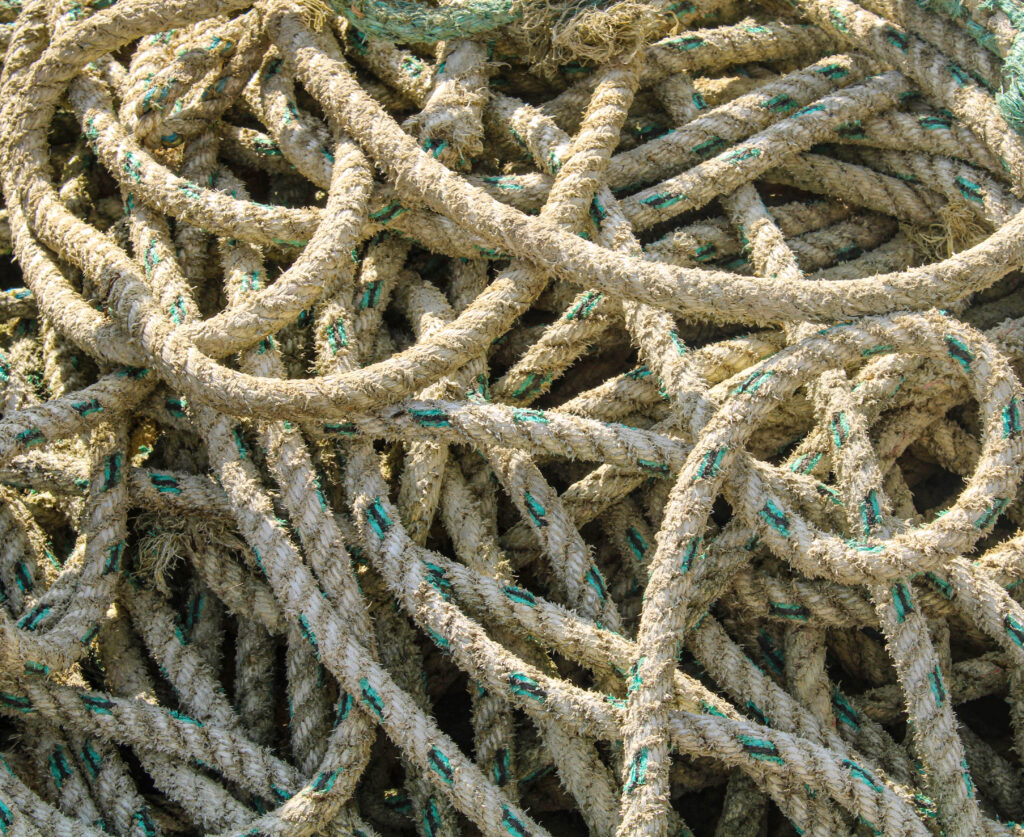
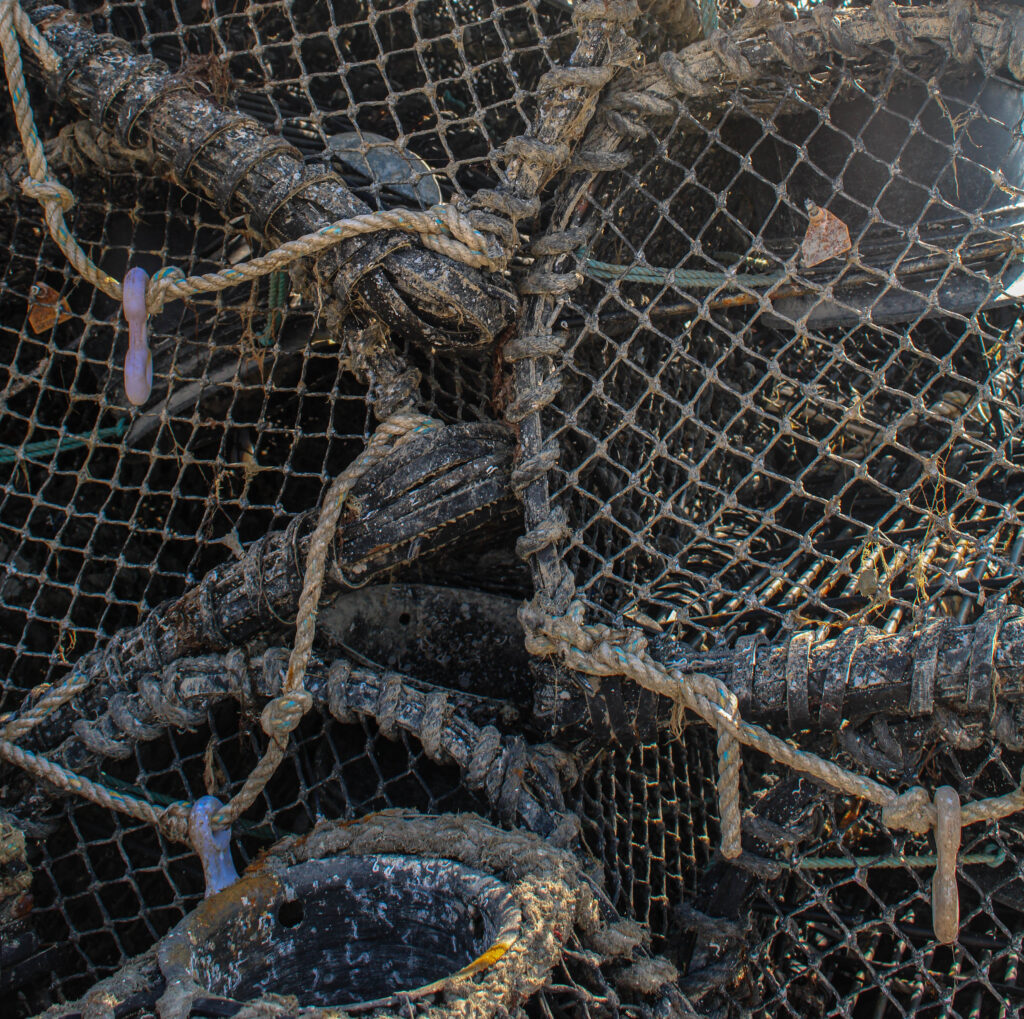
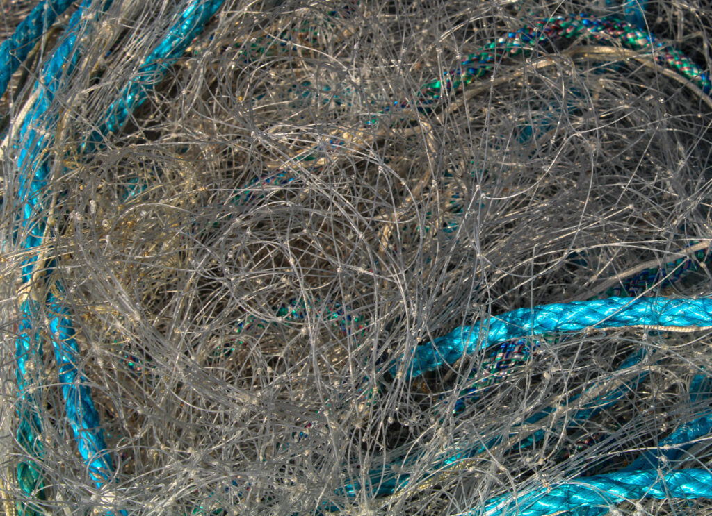
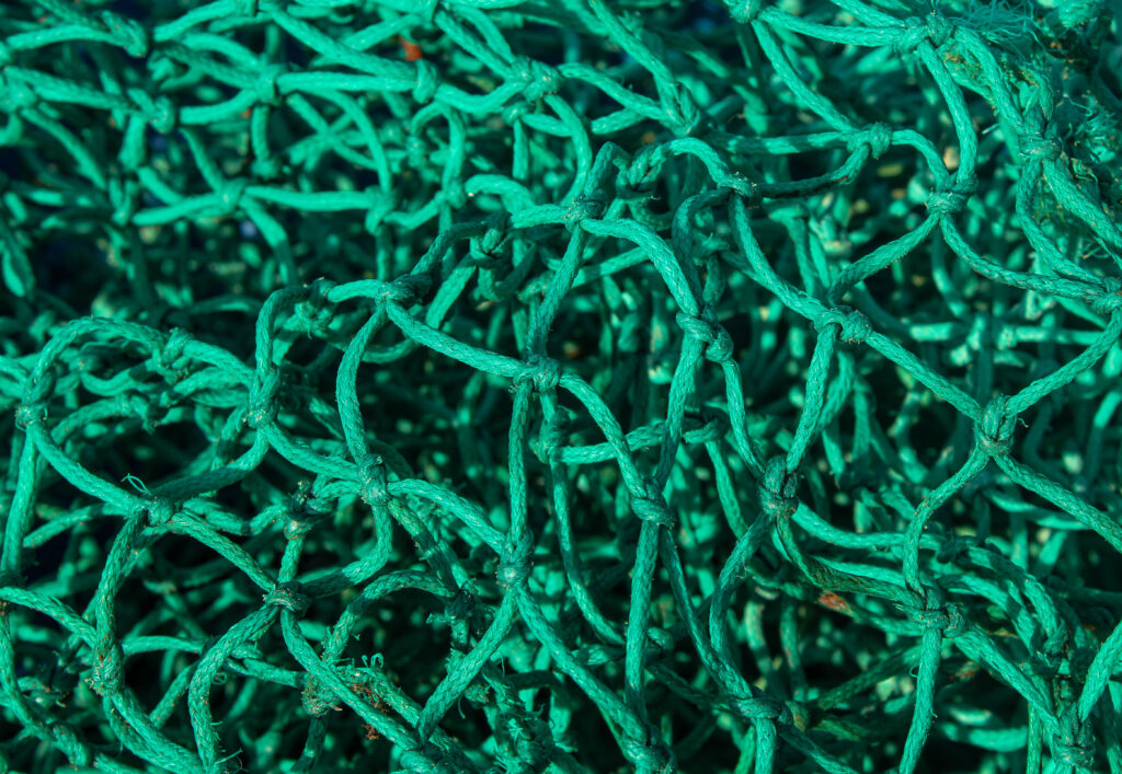
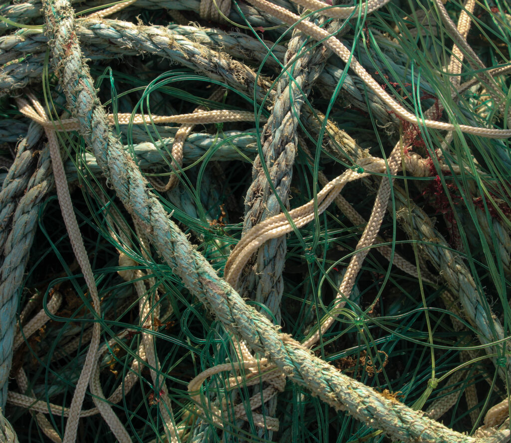
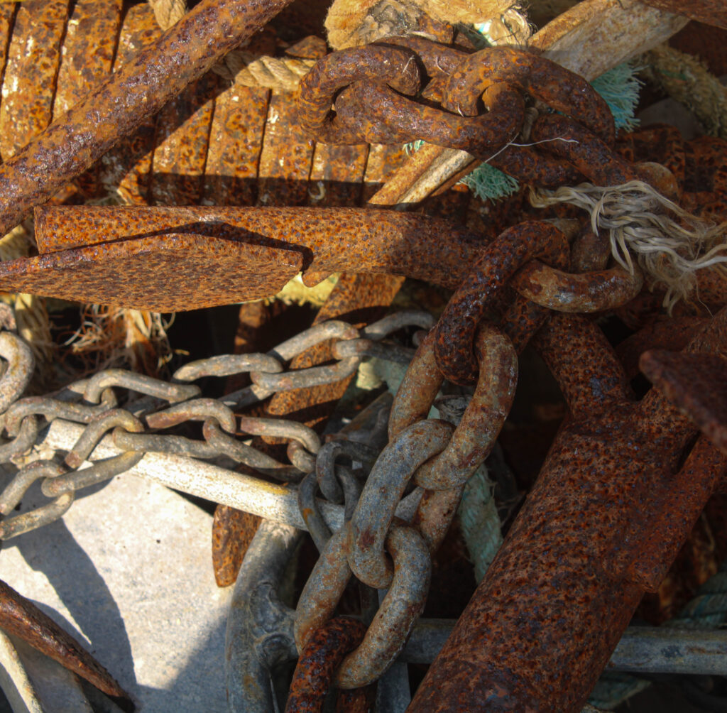
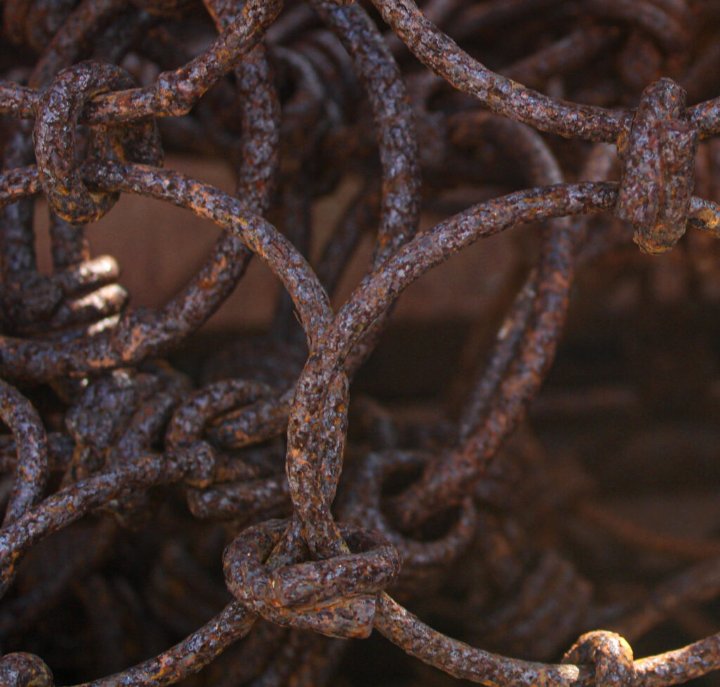
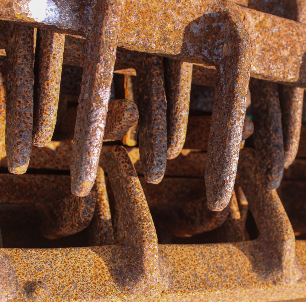
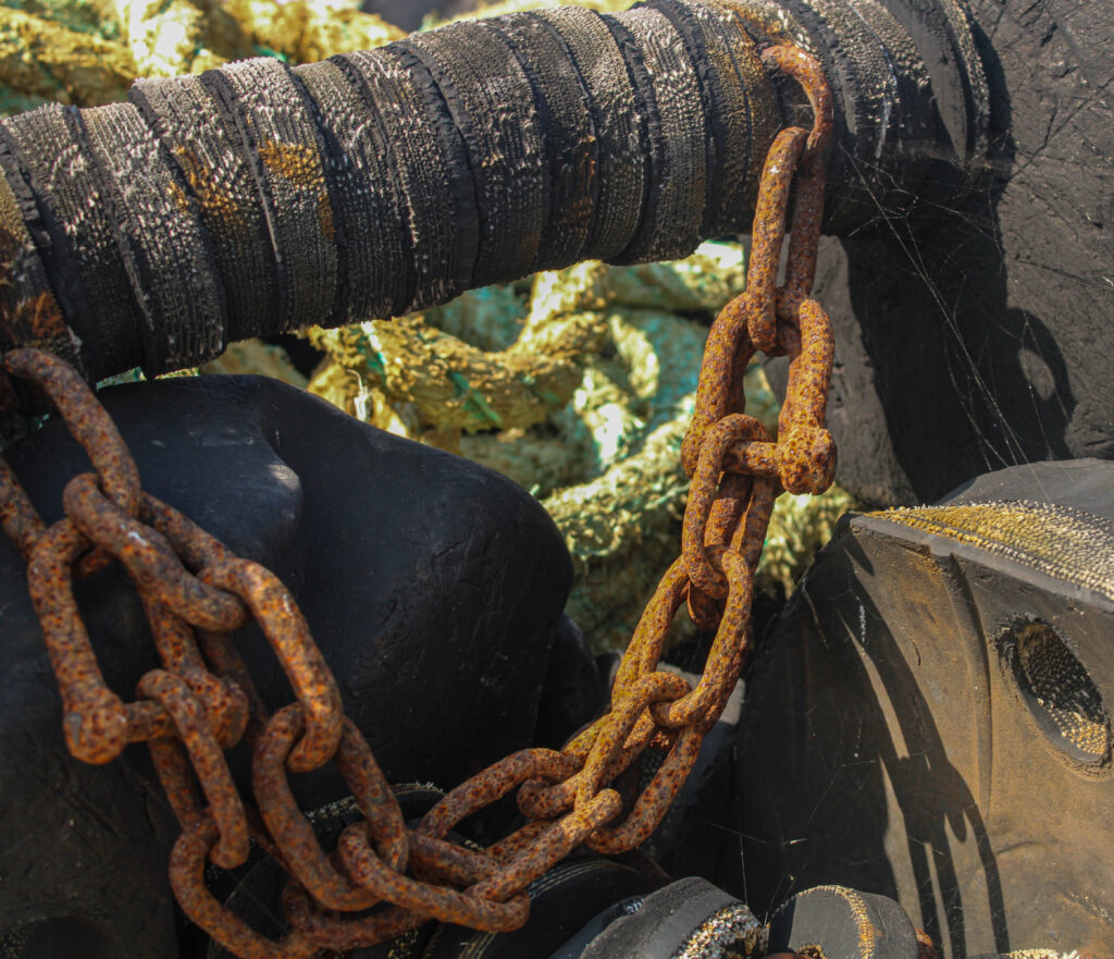
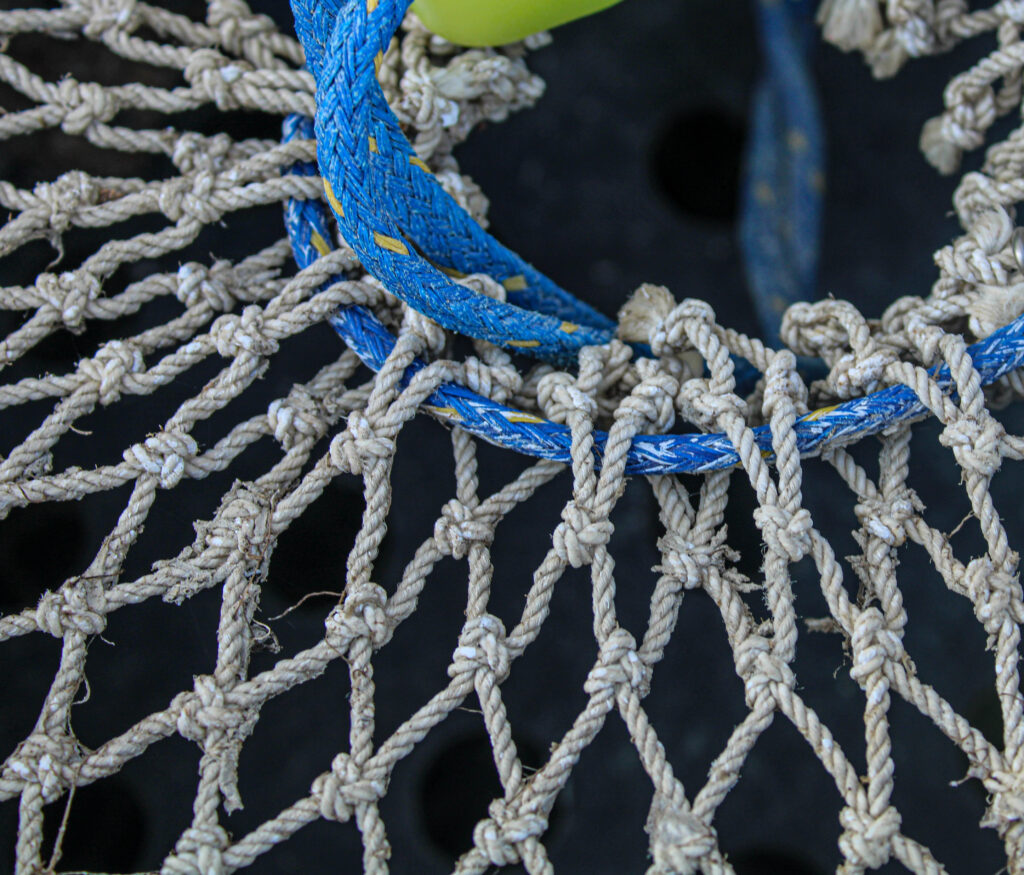
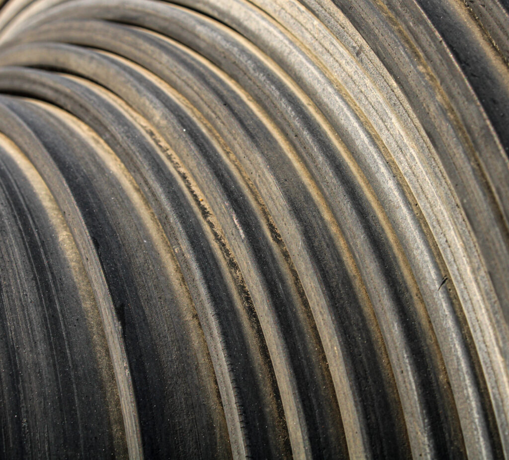
These were the final images I had selected to become part of my zine.
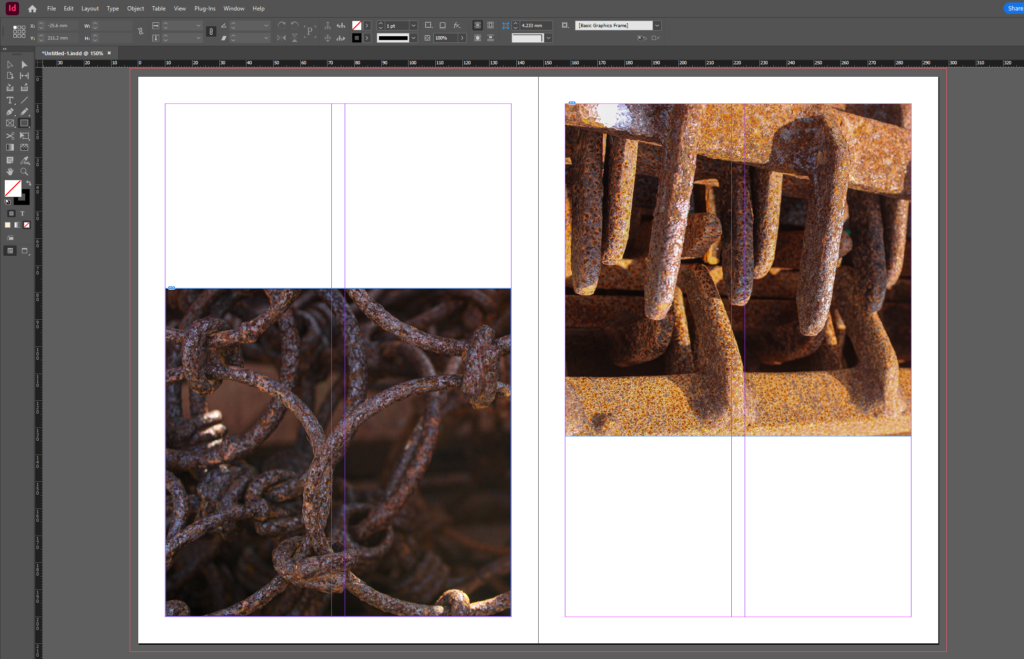
The first decision came with the photos and where they were going to be placed on the page as originally I felt that because the photos themselves were so detailed I wanted the background to be plain white to draw more attention to the images. So I started to play around with placing the photos in different spaces around the page.However i did end up deciding to keep in centered in the end as i felt as though they looked alot more cohesive as a story in the same place.
Then I tried to add colour to the background as I felt as if it was looking kind of boring I started off with selecting what I found to be one of the most powerful colours within the photo and using it as the background colour which I has really liked.
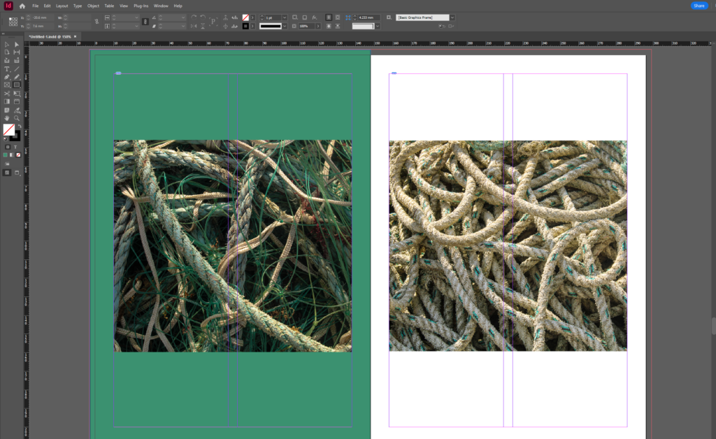
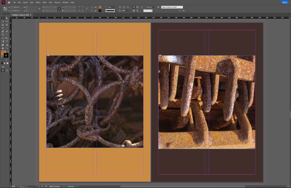
I also tried to switch the colours so if the image on the left was quite bright orange and the image on the right was dark brown the image on the left would have a dark brown background. I really liked this for a while as it added lots of contrast between the images.
At one point I was also considering not to use the coloured backgrounds as I felt they felt really flat and it wasn’t working so I tried to use another photo from my photoshoots and lower the opacity to create the background. This I felt didn’t work there was too much going on and made everything look messy. So i decided to forget about that idea and went back to the coloured backgrounds.
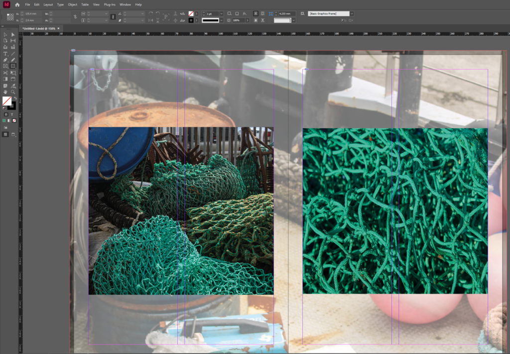
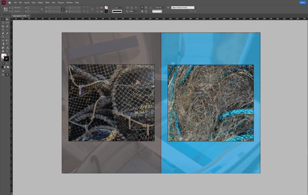
That’s when I then tried still using the coloured background but adding a simple image behind them which I felt looked better than the pervious idea but there was still something that looked off about them.
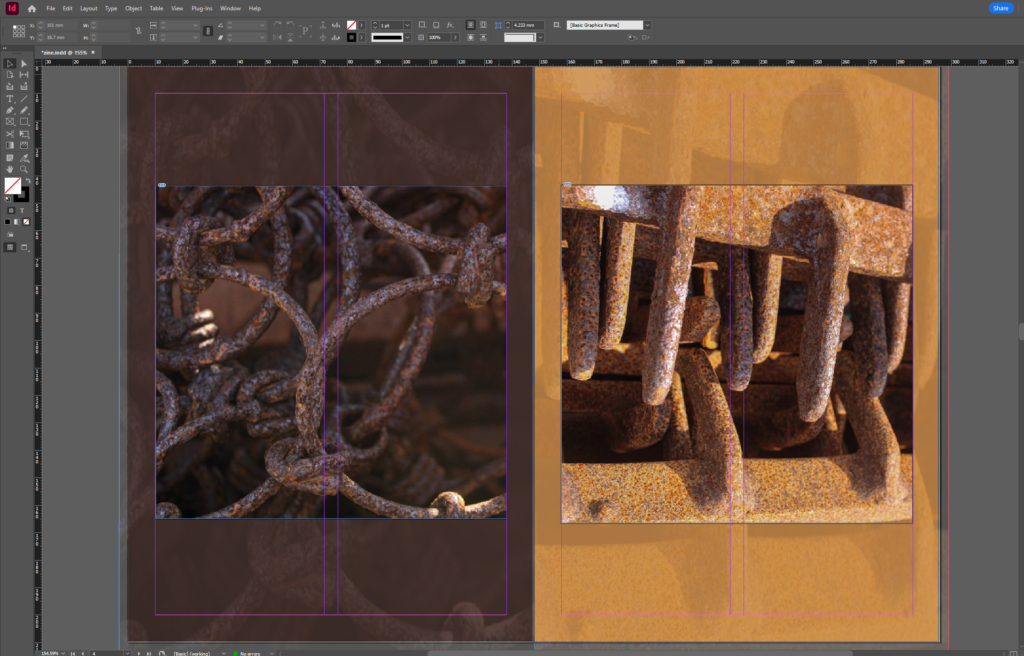
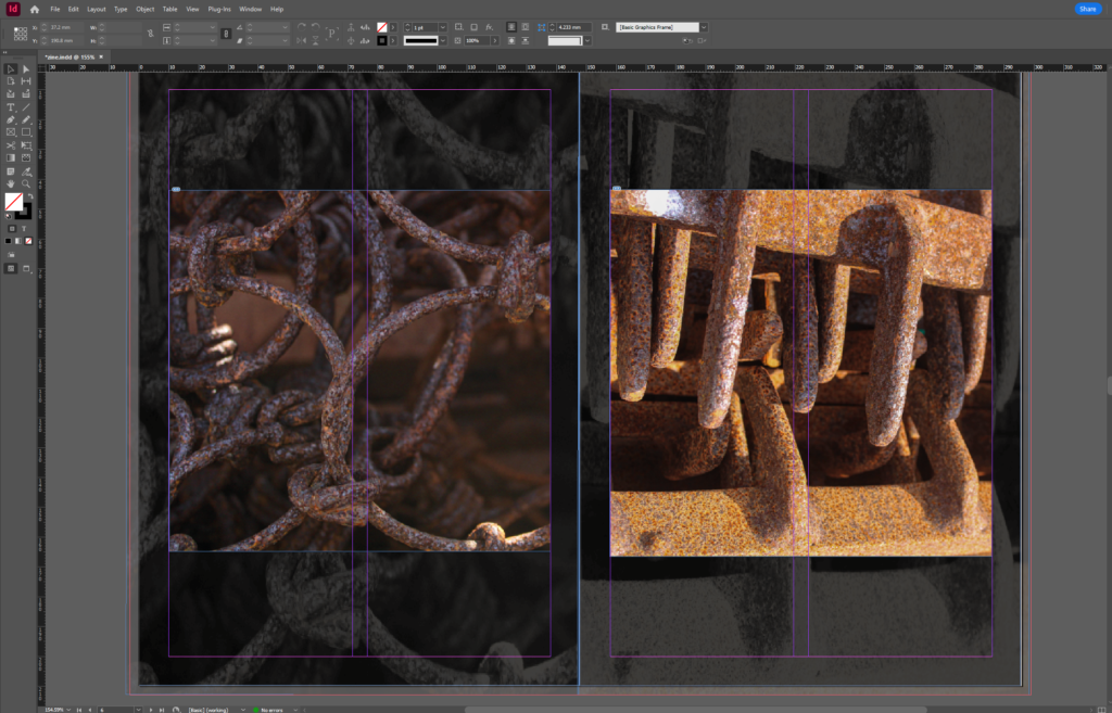
Finally I had decided on using the actually image itself to go behind. I felt like that worked perfectly because it obviously had the same shapes so it matched very well and yet because the opacity was a lot lower it was drawing your attention away and it wasn’t like it was trying to just expand the image. The only thing I had to decide on was weather I was going to have the images in black and white or with the colour. I decided on using the colour for behind the images as I felt that the black made the the originally photo look different and it was kind of taking away my attention from the main image to the page as a whole which is not what I originally wanted.

JAC 3 NOV urgent action required in order to achieve target grade!
Please use all available study time to process and complete each blog post on your checklist.