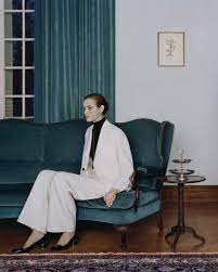
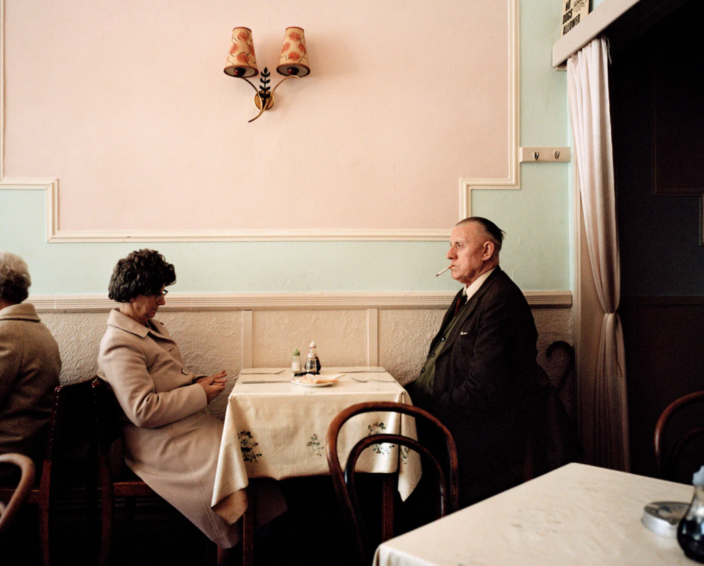
Essay: how can photographs be both mirrors and windows of the world

We can never determine where and who started photography due to the fact that in the time that photography was being invented, many individuals were exploring and working in similar things in relation to photography. However what is certain, is the fact that many revolutionary people contributed to the history and origin of photography and many are credited till this day. The two most important processes that were introduced in the early forms of photography is the two processes called Daguerreotype and Calotype. Daguerreotype was a direct-positive process which created a highly detailed image on a sheet of copper plated with a thin coat of silver without the use of negative which was invented by Louis Jacques Mandé Daguerre. Calotype was a technique created by William Henry Fox Talbot where it consisted of a sheet of paper coated with silver chloride that was then exposed to light in camera obscura. Some may say that in terms of John Szarkowski’s thesis where he states that the world can be viewed through a ‘mirror’ or ‘window’, these two processes can be applied towards the ‘mirror’ side of the thesis. This is because most pictures produced using these two processes, were pictures of family or portrait images of people, so they were quite personal and reflective of the people who made it. Szarkowski’s implies that ‘Art is a mirror, reflecting a portrait of the artist who made it‘ which contributes to the statement above. There is a strong agreement towards this saying as I believe that a mirror can be a reflection of what the artist see’s and interprets. However, some may contradict that the process Calotype views the world as ‘window’. Some images produced using a Calotype, were quite documentary in style, and showed a better and different perspective of the world. We can prove this by the saying that is said in Szarkowski’s thesis, which is ‘window, through which one may better know the world‘. Many may even say that these two processes are both ‘windows’ as they both document the past.

The image that has been chosen that shows ‘mirror’ in terms of Szarkowski’s thesis is the image shown below. This image is seen as a ‘mirror’. This is because the image is quite subjective itself. The time, 1997, that this image was taken was the time that women were seen as housemaids and things that had to have motherly features and attitudes. This is a self portrait taken by Cindy Sherman where it shows her in a very provocative outfit doing household chores. She projects that women in those times needed to look presentable for their husband for visual pleasure yet needed to act like a responsible and role model to their kids, taking care of the chores which was something that women were obligated to do in those time periods. This image reflects Sherman’s ‘Self’ especially her views, its almost like its quite a personal and private subject for her but she still chose to use her voice and express her views using photography. This picture also connects to the theorist Laura Mulvey, who explores the male gaze and states that representation of women is quite objective and defines their identity in relation to male character, which is exactly what Cindy Sherman is posed as. Laura Mulver implies that “Woman’s desire is subjugated to her image (…) as bearer, not maker, of meaning”. This was said the good reads, a website filled with her quotes. This acts in accordance with Shermen’s intention because Laura Mulvey indicates in the quote what women are stereotypical portrayed as which Cindy also explores in the image show below and in many of her images. This picture wholeheartedly reflects the person she is which is someone who is interested in exploring identity and she even said that, “I wish I could treat every day as Halloween, and get dressed up and go out into the world as some eccentric character” which was said in the MoMA website
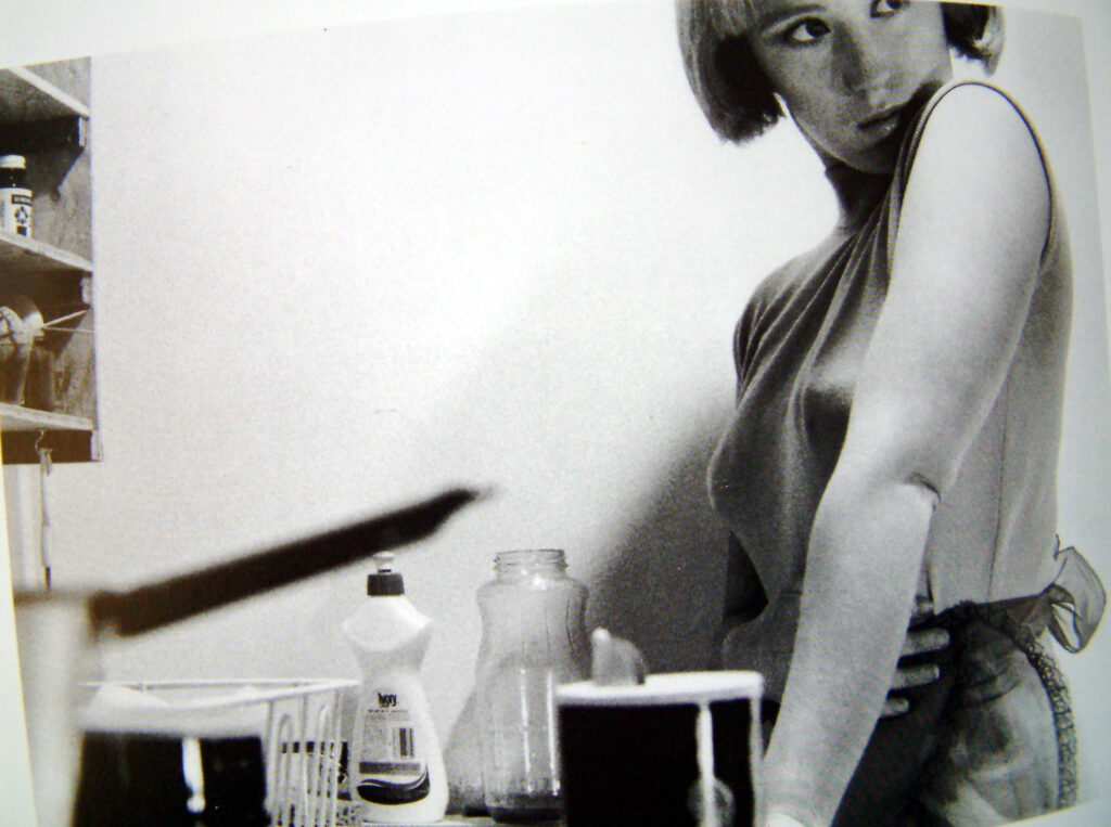
Szarkowski’s states that the “general movement in American photography in the past quarter-century has been from public to private concerns.”. Cindy’s images are subjective and private and we can extract the part where Szarkowski’s mentions the private concerns and apply it to her image. Although her images are quite controversial and ‘out there’, it is still private. How women were portrayed in that time was a private subject and something that was forbidden in terms of protesting about such roles within the female population. In Jed Perl review, Szarkowski’s comments on Minor White’s work as “romantic” and “self-expression,” which is something that is exactly represented in Sherman’s work. This strongly supports Szarkowski’s statement about how mirror is described.

The image that has been chosen that shows ‘window’ in terms of Szarkowski’s thesis is the image shown below. This image is seen as a ‘window’. This is because the image is objective. It literally states what its showing, it is common sense. This image was taken in 1933, Seville and entitled as, “Children Playing in Ruins”. Even in his descriptions he was objective and clear. After this image, The Spanish Civil War broke out, in the cities Henri Cartier-Bresson had navigated through. Although he did not know this would be the outcome, a war, this ruined building and crippled children became associated with the horrors of that war. If we look at Szarkowski’s theory about what a window is defined as, he says that “through which one may better the world” which is something that is exactly shown. Cartier-Bresson took this picture without realizing that three years after, war would unleash, which massively effected the way this image was read. It showed the possible outcomes of war and documented the distress of war, unintentionally.
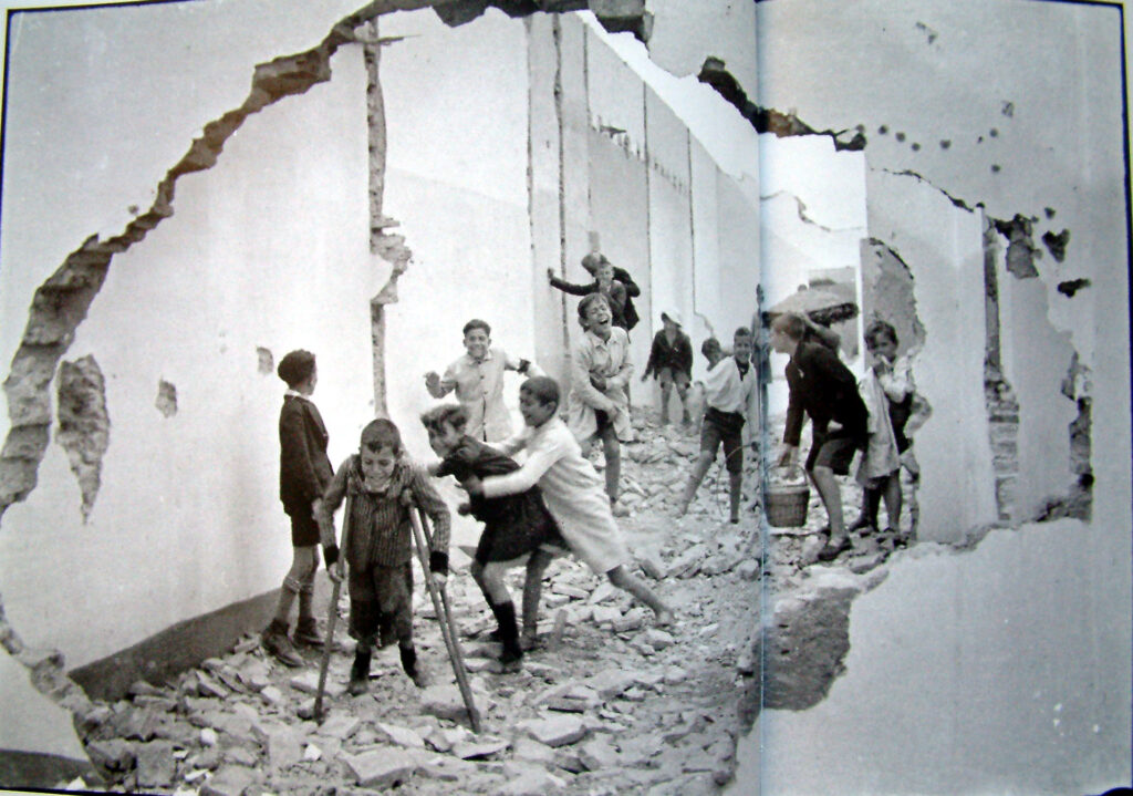
Szarkowski’s observes that “there is a fundamental dichotomy today between photographers who believe that all art is concerned with self-expression and those who see it as a means of exploration” seen in the website called MoMA’s . Cartier-Bresson’s work, especially this image had a tendency of being documentary like and we can actually apply and extract a part from Szarkowski’s suggestion about the ‘concern’ of ‘exploration’ and apply it to this image. Especially with the known fact that this was taken few years before the Spanish Civil War in Saville. Again proof of his dangerous exploration. In Jed Perl review, Szarkowski’s comments in franks work, and notices that his work explores “realism,” and “exploration”, again complying with the first statement done by Szarkowski. It is certain that Henri’s work has a certain realism to it, the realism of War and the youth that are effected by it. Henri declares that “Of all the means of expression, photography is the only one that fixes a precise moment in time.” which was shown in John Paul Caponigro’s blog. This obey’s Szarkowski’s theory as it basically implies that expression is shown as something that is documentary like, it captures the past.

If we refer back to the question, ‘how can photographs be both mirrors and windows of the world’. If we look at Szarkowski’s theory in summary, it is obvious that he see’s mirror’s as something that is “art, reflecting a portrait of the artist who made it, and window, as those who may better know the world”. However in Perl’s review, Szarkowski’s reviews and observes mirrors as something romantic and self-reflection and windows as realism and expression. We can agree and say that photographs can be both mirrors and windows especially with the two images that were analysed, above, especially when applying Szarkowski’s theory and Jed’s review. They have similarities and these are the way they have people in the images, creating a door to a more public approach something that is considered as mirror. Both images are factual, however very different. One is about the Spanish Civil War, showing realism, and the other is about the realities of how women were portrayed, this is romanticism of how women were seen, in a specific time period. However, the image that shows how a women is projected is quite fictional. The image is made up, it was creatively constructed by the artist, even though it was factual, because that was exactly how women were characterised, it was also exaggerated and staged. Lastly if we look at the images, they can be both be mirror and windows however they individually have sides that they lean more to so in conclusion I think that in images there are mirrors , windows and in-between’s.

Artist reference: Doug Aitken

Doug Aitken is an American multidisciplinary artist who explores every medium from photography, sculpture, print media, to creating narrative films, sound, single and multi-channel video works, installations, and live performance. He currently lives in California, Venice and New York City. With his work blurring the boundaries between the various genres and expressions of art, Aitken is most widely recognised as immersive, collaborative and engaged with both the art world and the wider world.

What I am most intrigued by is his project named:

‘New Opposition’:

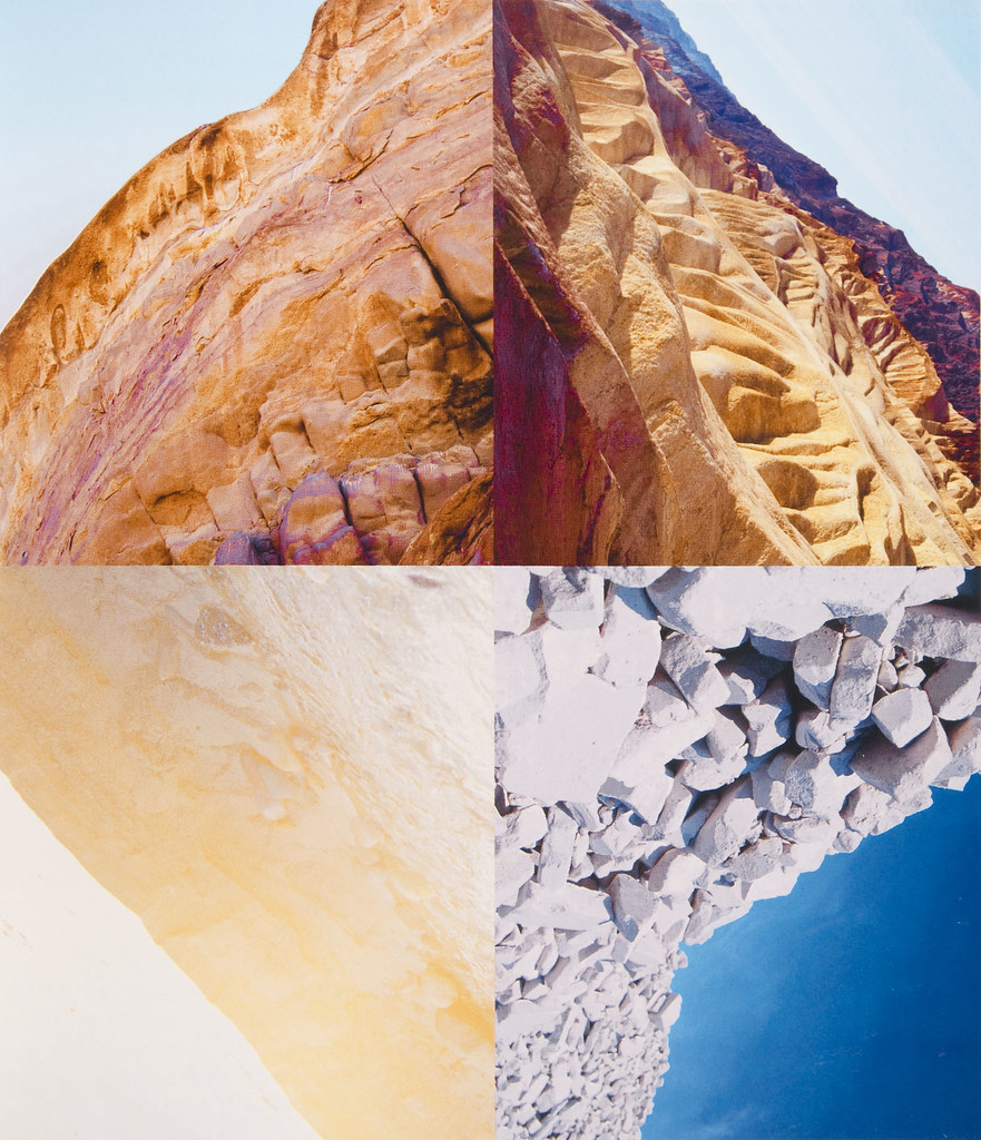
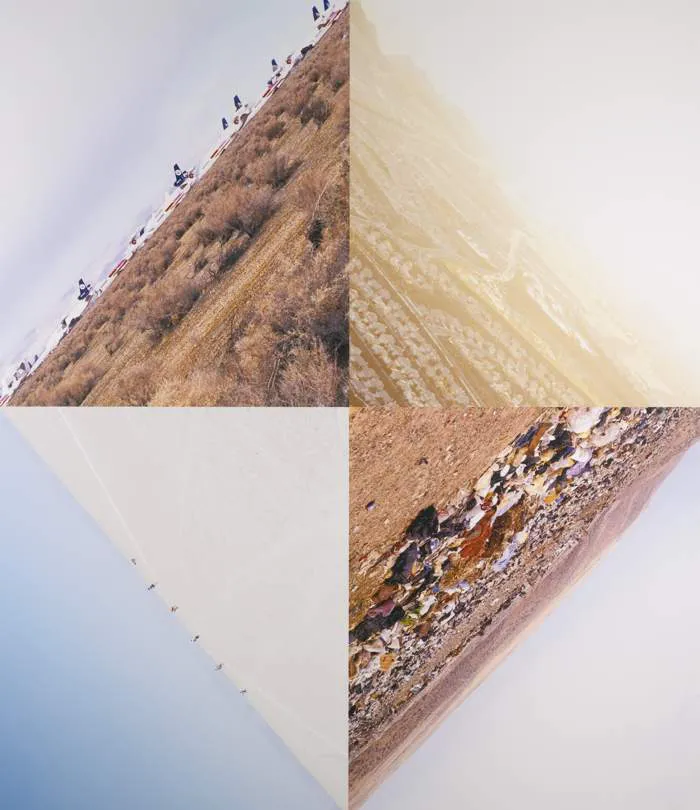
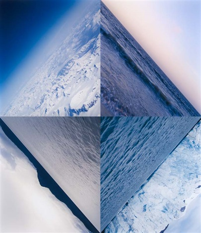
Aitken shoots landscape images of various locations around the world at horizontal angles, then editing and cropping them into a dynamic format. He uses these multi-textured landscape images that involve various colours in order to create the illusion of an angled cube in the centre on the image. He creates these images by combining four different images that include similar tonal scales and forming an alternative viewpoint for landscape photography that is a more abstract way of representing these natural spaces whilst keeping it documentary. The alternating orientations of different materials, typically natural, add directional lines to the image, either being parallel to the opposing image or being reflective. This causes the viewers eyes to move around the ridges off each of the images and explore it more, attracting the eye from a distance. Each image highlights individualism, being unique within the composition whilst simultaneously flow with all of the other images in the set.

I think this is a perfect example of windows photography as this provides an external exploration around the world and the materials that the Earth provides for us, as well as the multitude of textures, tones, colours and strange shapes created too. Landscape photography can sometimes blend in more, however by arranging the images in these cropped patterns, this attracts the eye more due to the bold lines that the composition comes to have and is more attracting to the eye due to it standing out.

In my photoshoot, I am going to achieve this by taking a compilation of landscape images and then importing them into Lightroom and editing them using the cropping tool. I will then import the images into Photoshop and combine four of them into a single document.

Windows and Mirrors- Photoshoot Plan.

Based on the theme of ‘OBSERVE, SEEK, CHALLENGE

3 images that are documenting reality – ‘windows of the world’

 3 images that are staging reality – ‘mirrors of the world’.

A window is a resource that offers you a view into someone else’s experience. A sliding door allows the viewer to enter the story and become a part of the world. A mirror is a story that reflects your own culture and helps you build your identity.

Documentary– Windows

Realism-A way of thinking and acting based on facts and what is possible, rather than on hopes for things that are unlikely to happen.

Factual-Something that is factual is concerned with facts or contains facts, rather than giving theories or personal interpretations. 
Public– Public means relating to all the people in a country or community

Candid-. free from reservation, disguise, or subterfuge; straightforward.
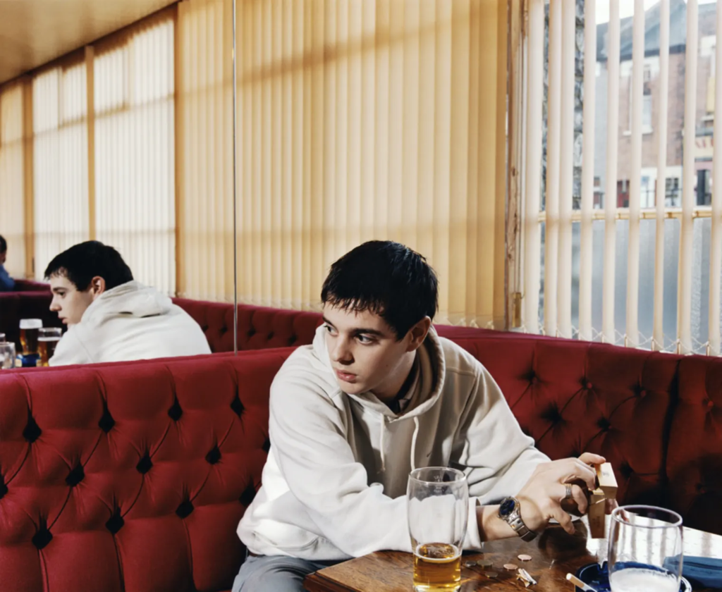
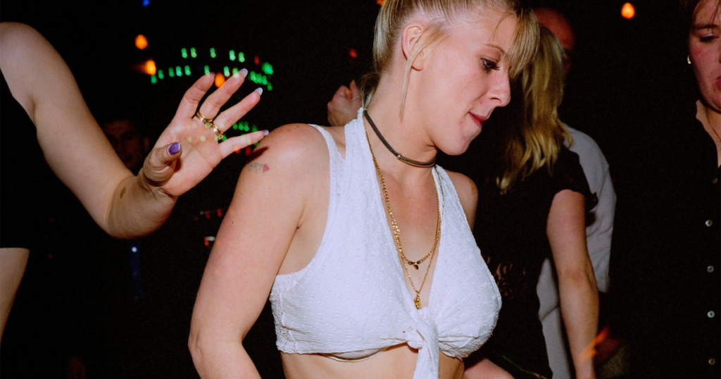
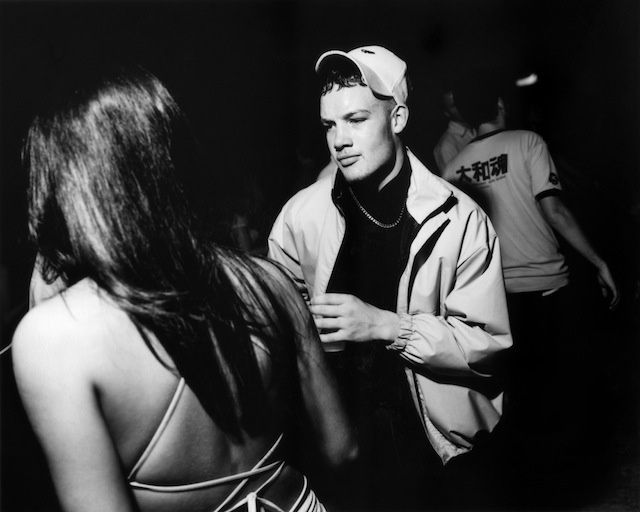
Ewen Spencer

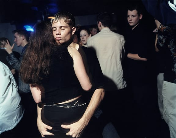
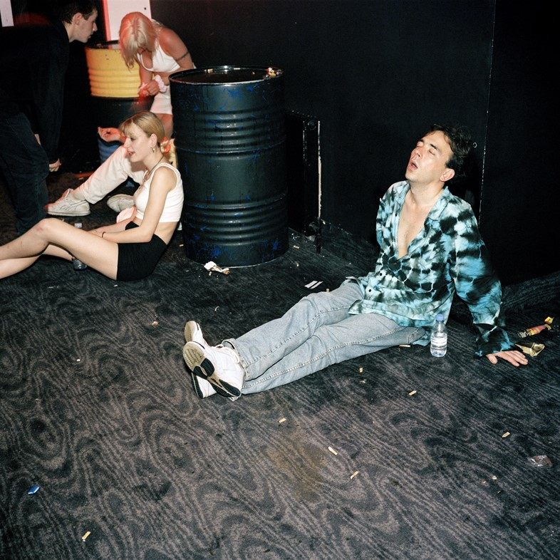
Ewan Spencer’s work is primarily of youth and subcultures which I find fascinating and appropriate for my age group. His work started as he photographed shows from their first UK tour onwards, including candid backstage photographs. He has now mostly moved to capturing the ‘grime’ music scene in London. I like how how much these photos are rich in detail and almost make the viewer feel like they are there at the scene. Although I would like my photos to differ slightly as they display the mayhem and emotions that you feel in that scene by using a longer exposure to show more blurry and hazy pictures which make the viewer feel more 1st person as if they are there amongst all the people.

Tableaux– Mirrors

Romanticism– Romantics celebrated the spontaneity, imagination, and the purity of nature. Along with these elements it also incorporated a deep feeling of emotion as an authentic source of experience which put new emphasis on emotions such as apprehension, horror and terror, and awe.

Fiction– A fiction is a deliberately fabricated account of something. It can also be a literary work based on imagination rather than on fact, like a novel or short story. 

Staged– Contrived for a desired impression. It was a staged, rather than spontaneous, demonstration of affection. Something that has been ‘set up’ manually to create a certain message.

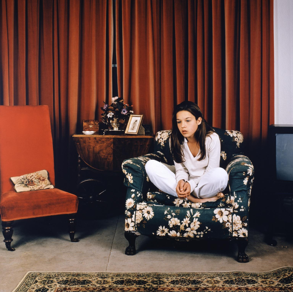
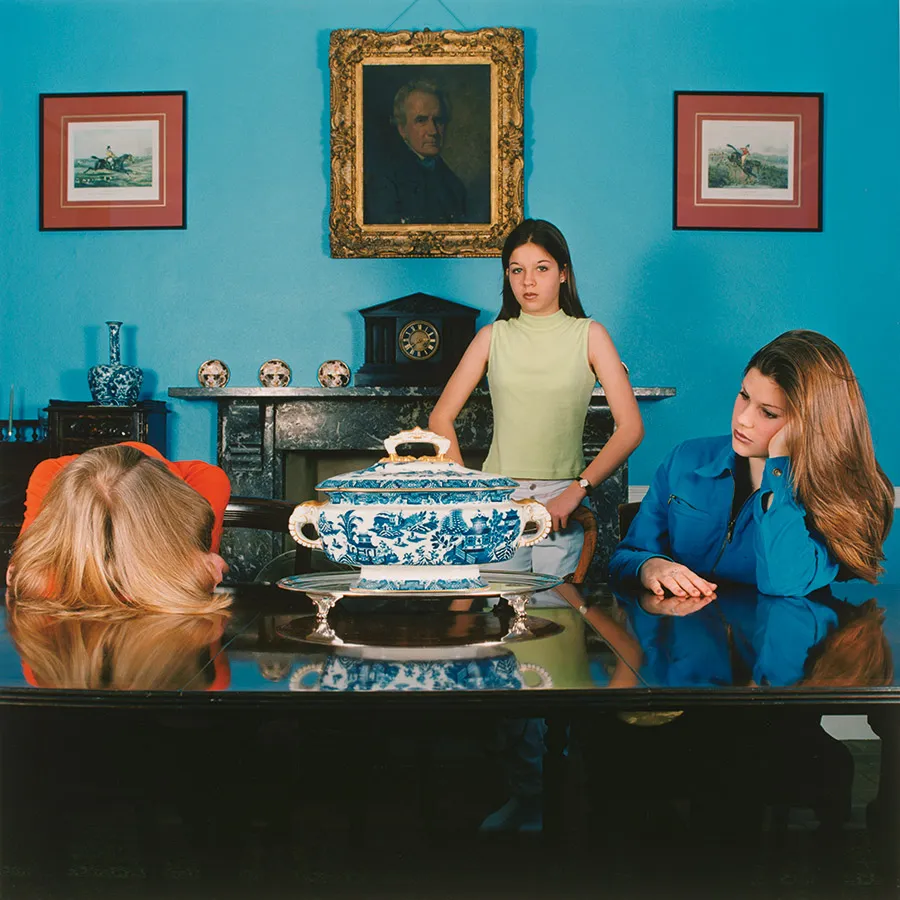
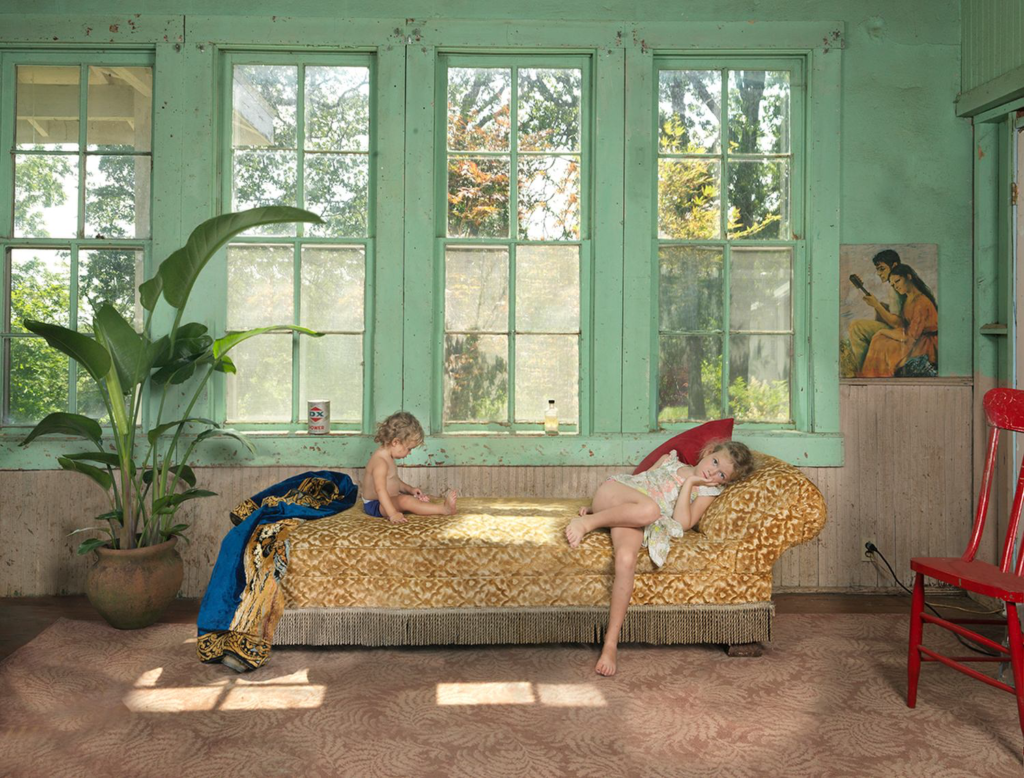
Sarah Jones

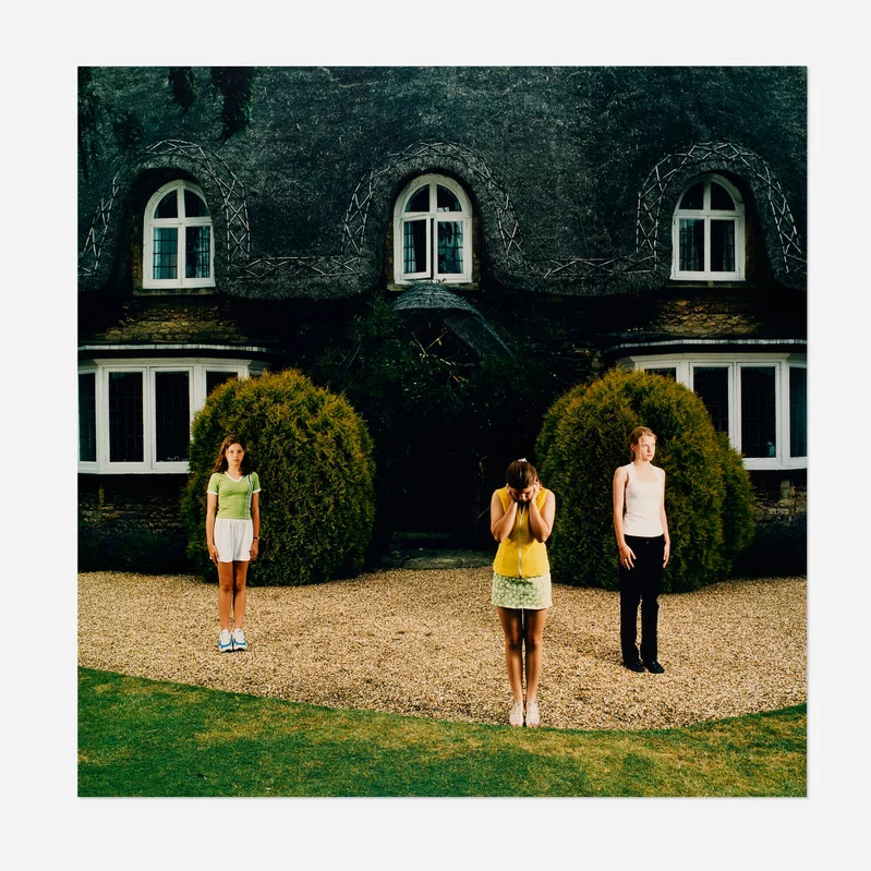
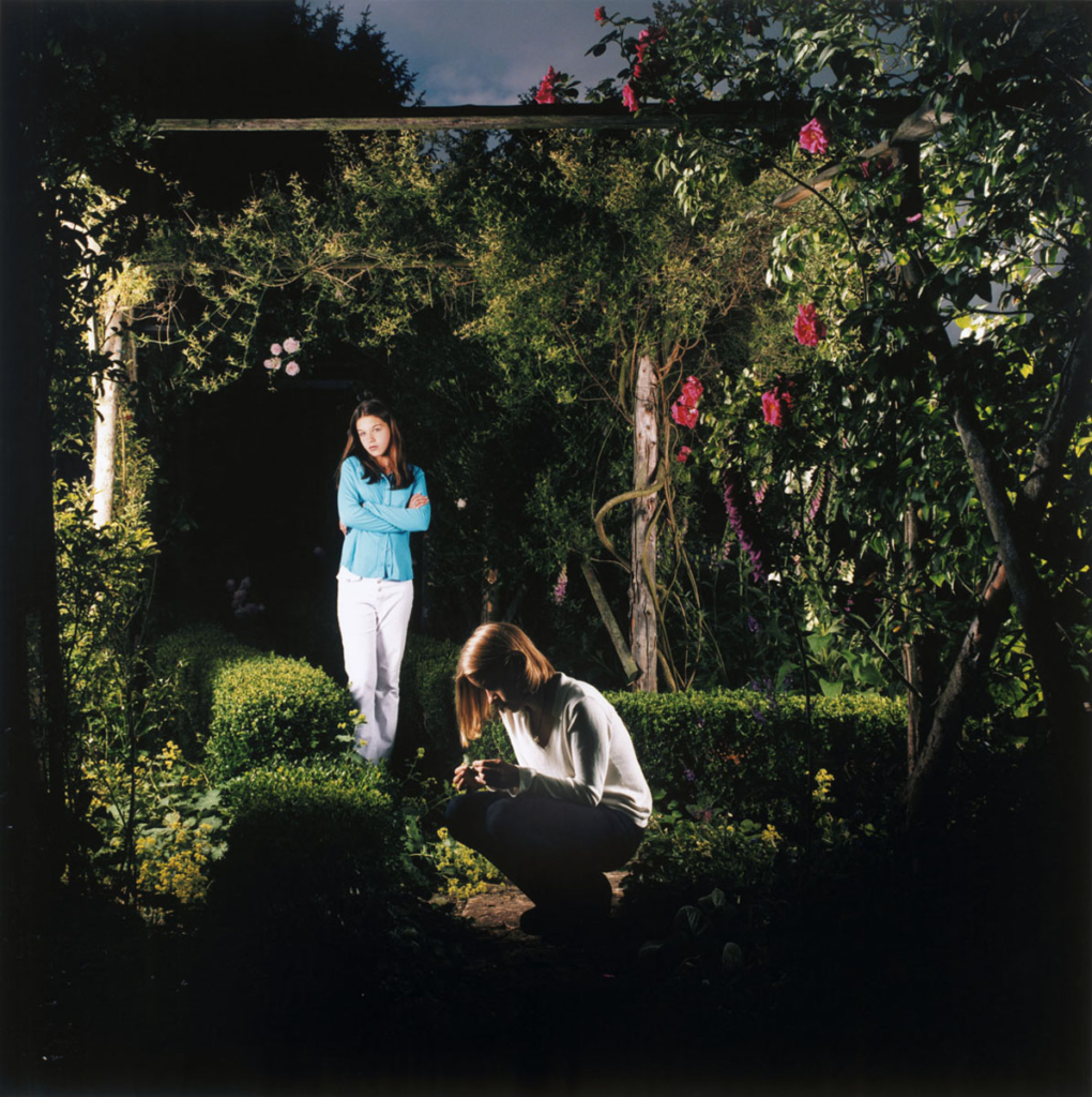
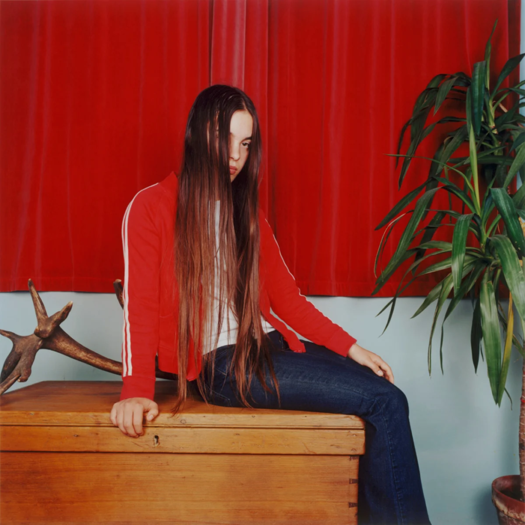
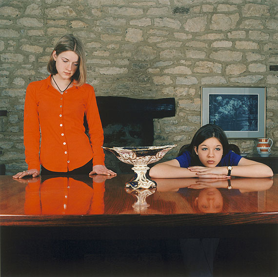
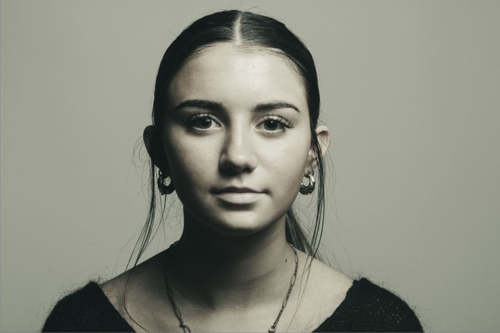
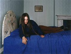
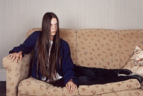
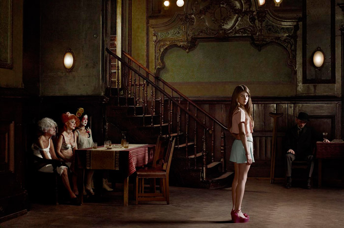
I have been particularly drawn to the work of Sarah Jones due to the fact she focuses on topics such as art history, as psychoanalysis, adolescence, and the Victorian period. This interests me as It is easy to replicate myself around the topic of adolescence, loneliness and confusing surrounding he topic of ‘growing up‘. Jones enjoys photography for its capability to scrutinize something, freezing a moment to look more closely at it. Her work is also Jones’ images are narrative in nature, and she is interested in how a narrative is constructed. I also would like to take into consideration, the format in which Sarah Jones photographs. By using the square format of a standard 150 x 150 cm, this makes this photos unique as they are a specific shape and size.

I also like this aspect to her photography and I think I would enjoy attempting to replicate these photographs. I would put them into this black and white format.

Editing Practice.

In Adobe Lightroom, I have experimented with black and white editing, whilst having a beige/yellow tint to it, In case I decide this is the approach I would like to take when editing my photos. This has helped me to develop my skills when editing. However, I think the photoshoot I may go with is the Sarah Jones work on adolescence and identity as I feel this is easier to convey a story through my work.

Be creative and use this opportunity to experiment with ideas or approaches to image-making that you might want to extend further in your Personal Study. The expectation is that you make a set of images during the lesson using the school environment (inside or outside) creatively. The photographic studio is also available where you can explore different ideas using different lighting techniques…Rembrandt lighting…Butterfly lighting…Chiaroscuro…reflected light…coloured gels etc.

Photoshoot 1 Planning

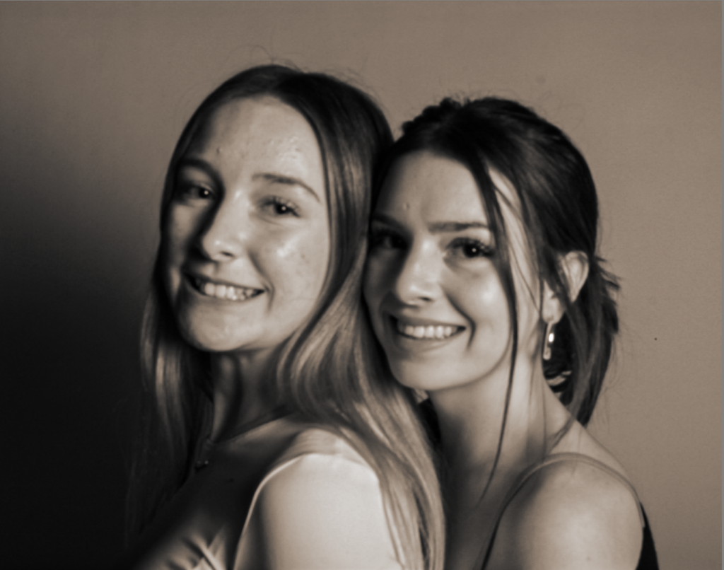
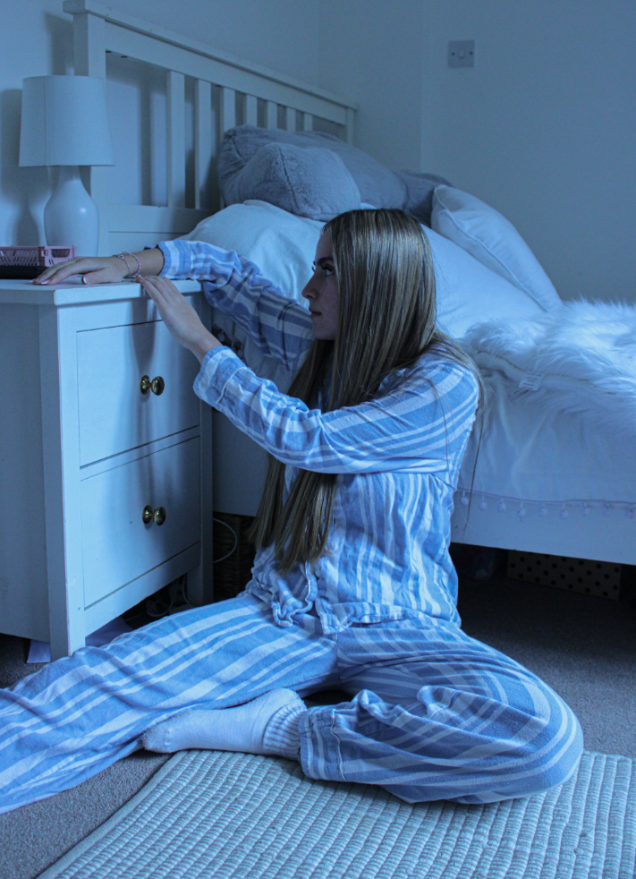
I would like my two female models to pose in similar poses and I would like to do a photoshoot that gives a feeling of darkness and miserableness as this is the feeling I feel Sarah Jones’ work conveys. For this I am choosing my two friends to pose in settings such as bedrooms, living rooms and bathrooms around my house. I want my photos to differ from Sarah’s work slightly and I want them to be less bright and eye-catching, and more deep and meaningful through lighting.

I have chosen to have a blue tint to my photos as sadness has been associated with blue since the 1600s around the world.  blue represents sadness or melancholy, which is why I’ve chosen it to further portray my narrative and tell my story about isolation and loneliness.

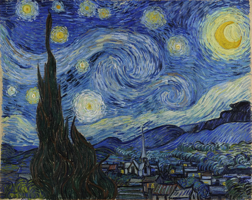
For Example, In Van Gogh’s ‘Starry Night’ The main colour of blue helps to show the intention of the picture of as the meaning can be derived from the large cypress tree which is a symbol of graveyards, mourning, and death. This helps to encapsulate the essence of human emotion and creativity. Van Gogh used the different blues in the sky to show his emotion. I found this information from the quote ‘The vibrant blues are a common colour during his bouts of mental illness.’

Photoshoot 2 Planning

Mirrors Photoshoot 1

For this photoshoot I decided to do a Sarah Jones inspired photoshoot. This is because, due to the fact she conveys the idea of ‘tableaux’ photography through her work, it perfectly shows the message I am trying to show.

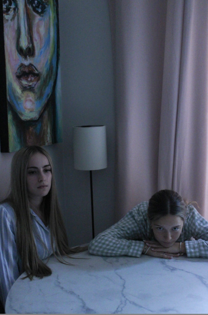
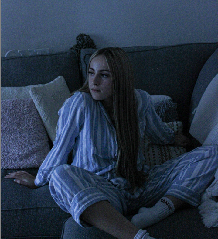
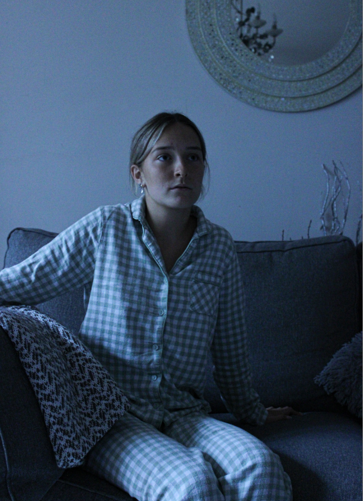
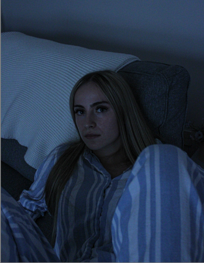
I found this genre of photography slightly challenging as my models were unsure what poses to demonstrate and how we could produce the message we wanted to show through a few simple pictures. To create my first message I had my models wear pyjamas which are long sleeve and have matching patterns. This is to…

1. Create a feeling of innocence and adolescence/ childhood through the two girls wearing matching sets of patterns which children and young people may wear.

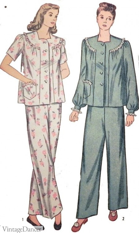
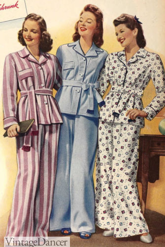
2. Create the feeling of the ‘older times’ from a period of time from the past. After researching nightwear from different era’s, I decided long sleeve matching pattern pyjamas was an effective outfit choice, to show the girls are possibly related but are matching and familiar with one another.

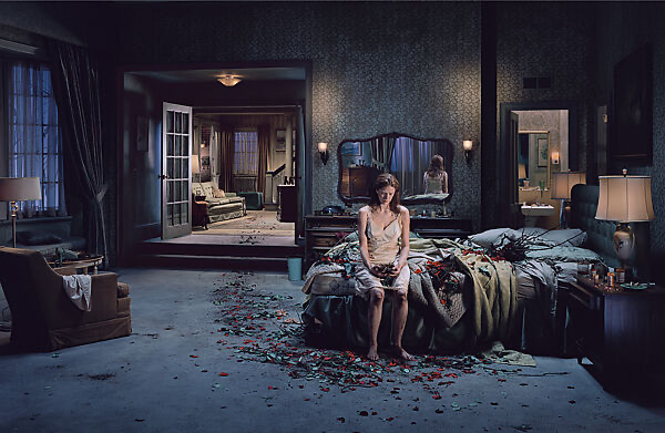
I wanted to pay attention to the fact Sarah Jones’ practice is rooted in art history, and she draws influence from topics such as psychoanalysis, adolescence, and the Victorian period. Due to these facts, I wanted to make my photos of two teenagers (to tie into adolescence) and I also anted my models to have blank expressions on their faces. Due to the fact Sarah’s work ties a lot around ‘psychological theory and therapy that treats mental conditions’ I felt these blank expressions would create an eerie and morbid feel to my photos. I also decided to use a cool tone to edit my photos to create a ‘cold’ and dismal look to my photos, to express the emotion of loneliness and identity confusion.

Definition of Psychoanalysis^^

My Top 4 Images.

My Image.

Sarah Jones’ Image.

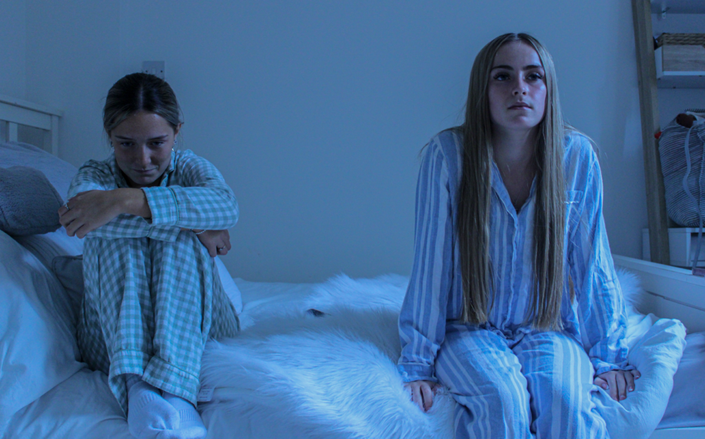
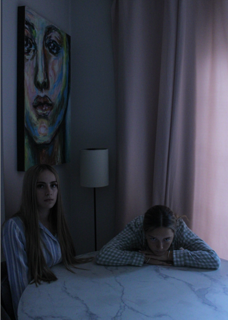
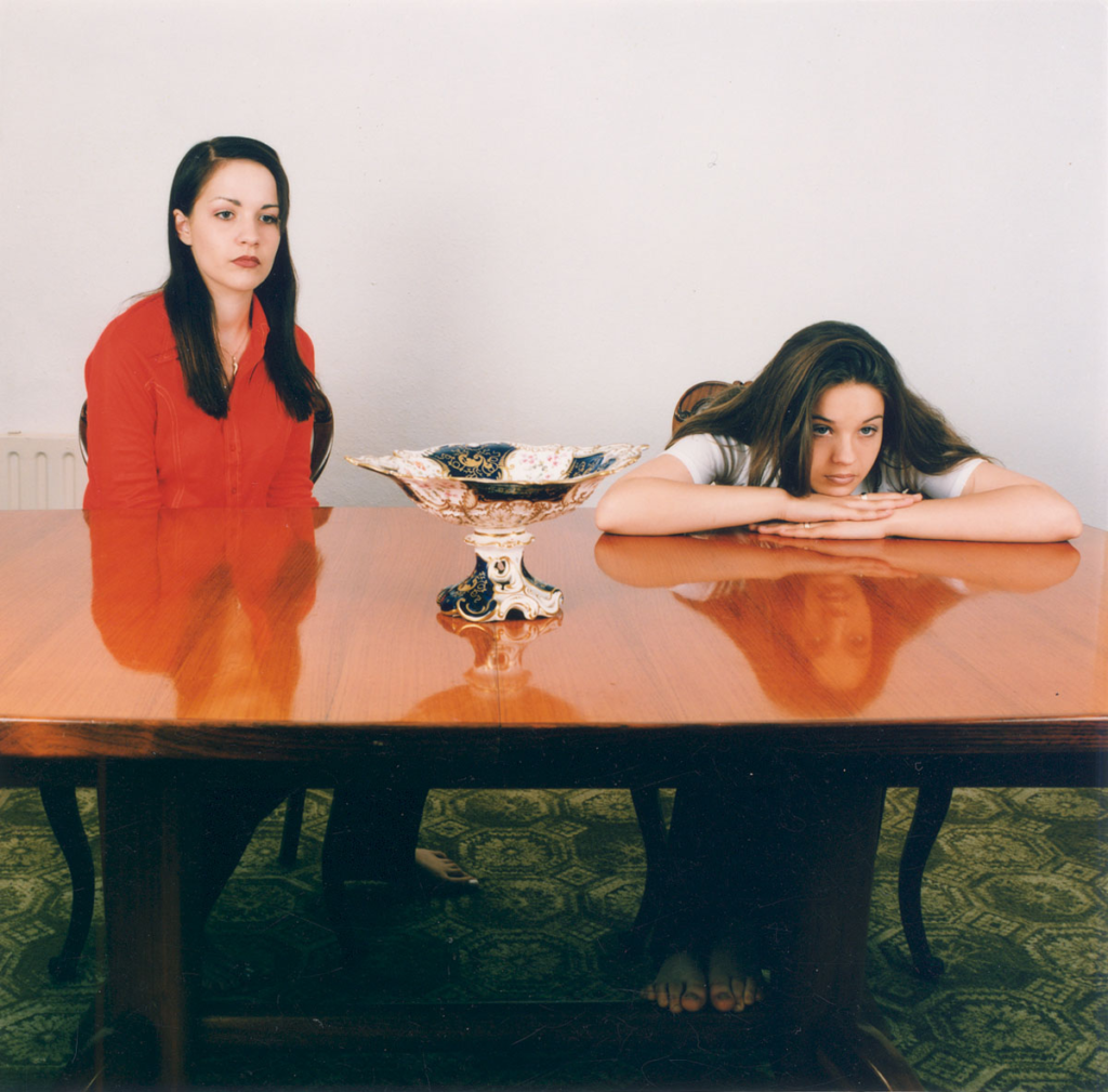
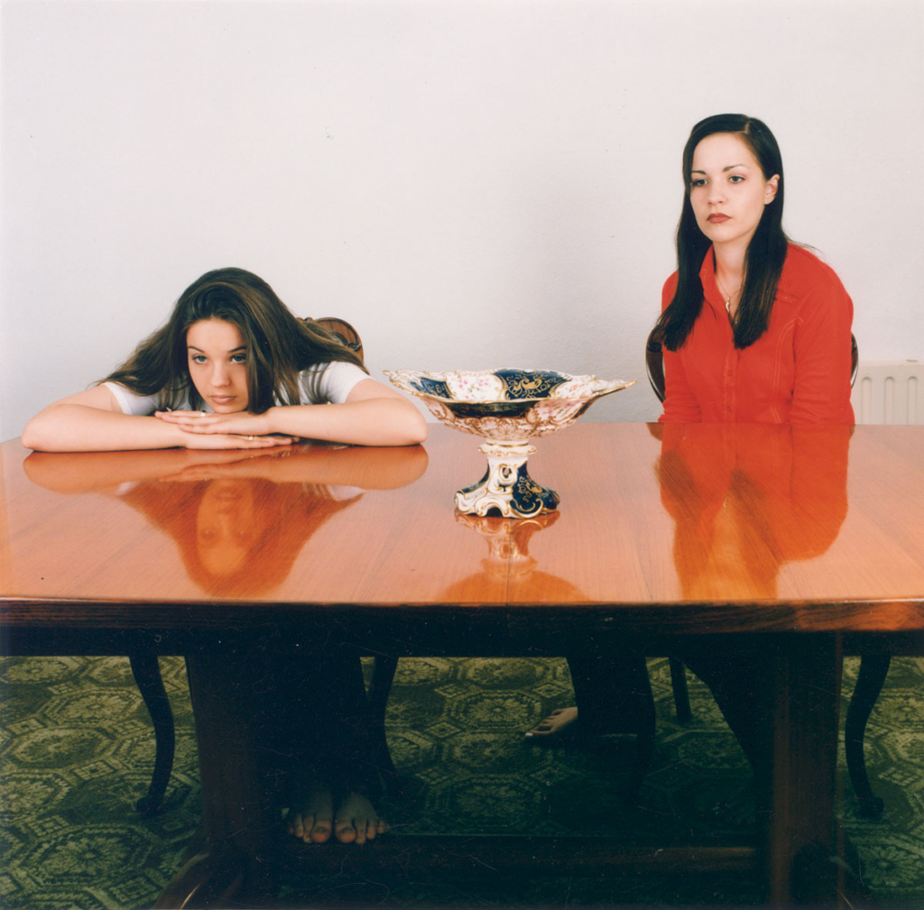
This image is my favourite images due to the fact my model on the left is looking straight into the camera with the look of fear, concern and a desperation for help. My other model is sat with a slouched position which shows she is possibly younger or confused with her feelings. I like how they are sat in two different positions as this causes different dimensions in the photo. To improve on this photo, I would like it to be lighter and for the photos to have less of a dark, grainy look to them. However, I would like to play this to my advantage and make these images dark and dismal to convey the models mood through the colours of the photo. Although Sarah’s photographs have a more bright approach with eye-catching colours and colourful objects. I wanted a more tonal background.

My Image.

Sarah Jones’ Images.

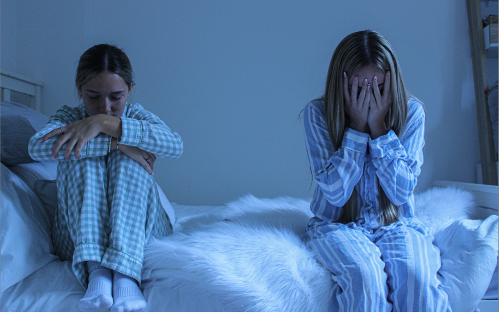
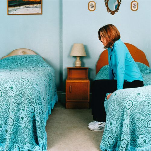
These two images are very similar to each other and demonstrate my models feelings and how they are the same but are portrayed differently. This demonstrates tableaux photography as I am attempting to tell a story through my photographs which tie mainly around the themes of feminism and adolescence. My model on the left is showing emotions of conflict and distress through their body language of sitting slouched in a positions as they seek comfort and help. Whereas my model on the right looks like she is attempting to either ‘clear their head’ or think about how to handle a certain situation or feeling that is currently occurring.

My Image.

Sarah Jones’ Images.

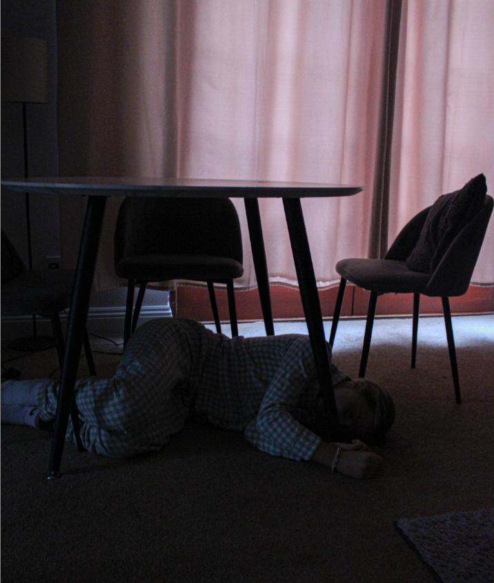
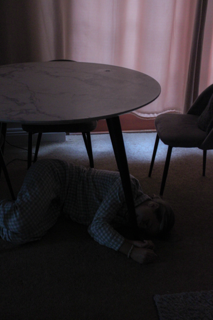
My Image.

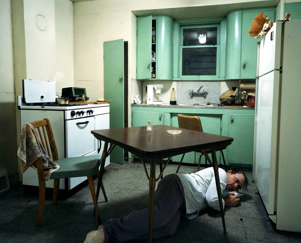
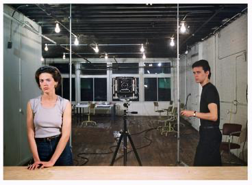
Jeff Walls’ Image.

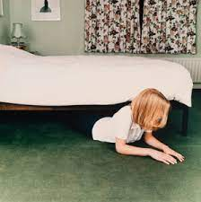
I chose for this photo to represent another photographers work named Jeff Wall. I decided to do this one photograph as I particularly like this photograph and how it relates to Tableau photography. I feel that the viewer feels almost immediately connected with this image. This photographer uses Narrative to help the audience understand the concept he is trying to portray in his work. I like this photo as the model is under the table in a position which shows psychological stress and also shows it has been created in a ‘scene’ as they pose in order to show their emotions. This photo shows the true effect of psychological problems and effects they may have on a person and how it alters their day-to-day life.

Overall, I enjoyed this photoshoot and helped me gain knowledge in how I can set up a scene to tell a story through a single photo and attempt ‘Mirrors’ or ‘Tableau photography in my own way, whilst taking inspiration from other photographers and how they can influence my work. I would next like to create a ‘Windows’ or ‘Documentary’ photoshoot, which I feel may be more challenging for me as I feel I will find it more difficult to express candid photography as I prefer a narrative setup where my photos are planned out and specific.

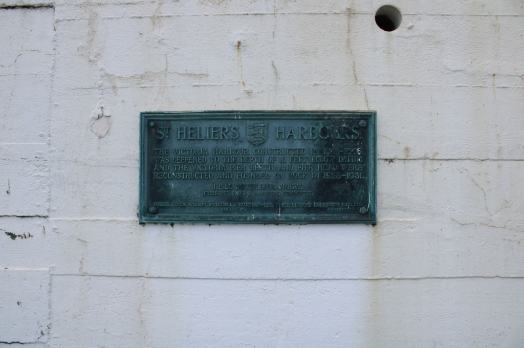
Narrative and Sequence-St Helier Harbour

STORY: 

If I were to describe my photo zine in three words they would be: Reflection, Calm and Exploration.

NARRATIVE: 

In this visual narrative, the readers/ audience gain more than a view, they get a window into the spirit of St. Helier’s and its harbour.

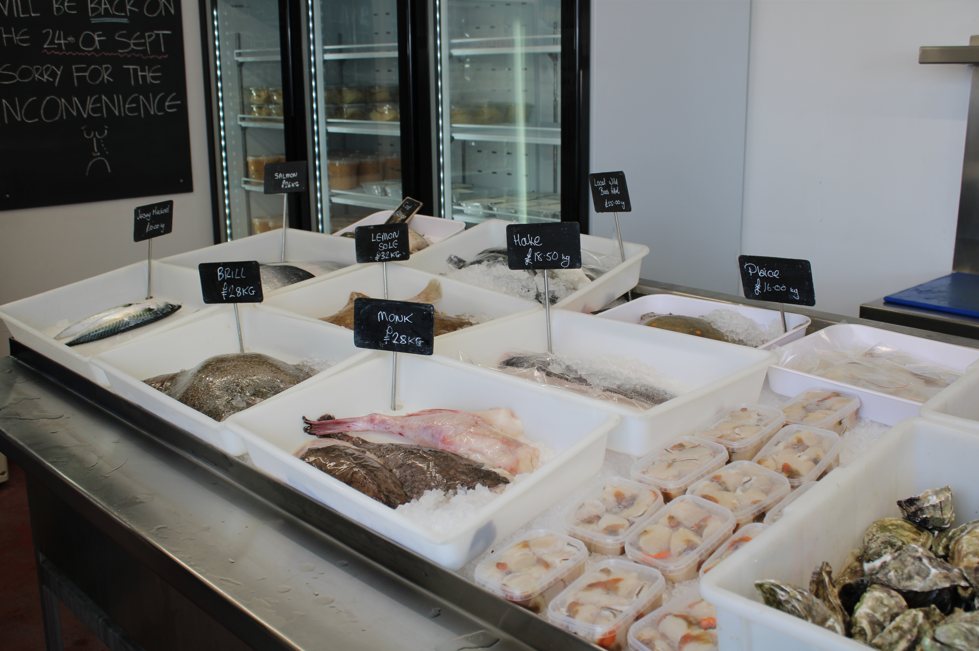
My zine is designed to capture and celebrate the unique essence of St. Helier Harbour through a carefully crafted narrative. This structure emphasizes the journey through the harbour’s different textures and the varied sights, framed through the experiences of a person walking along the waterfront.

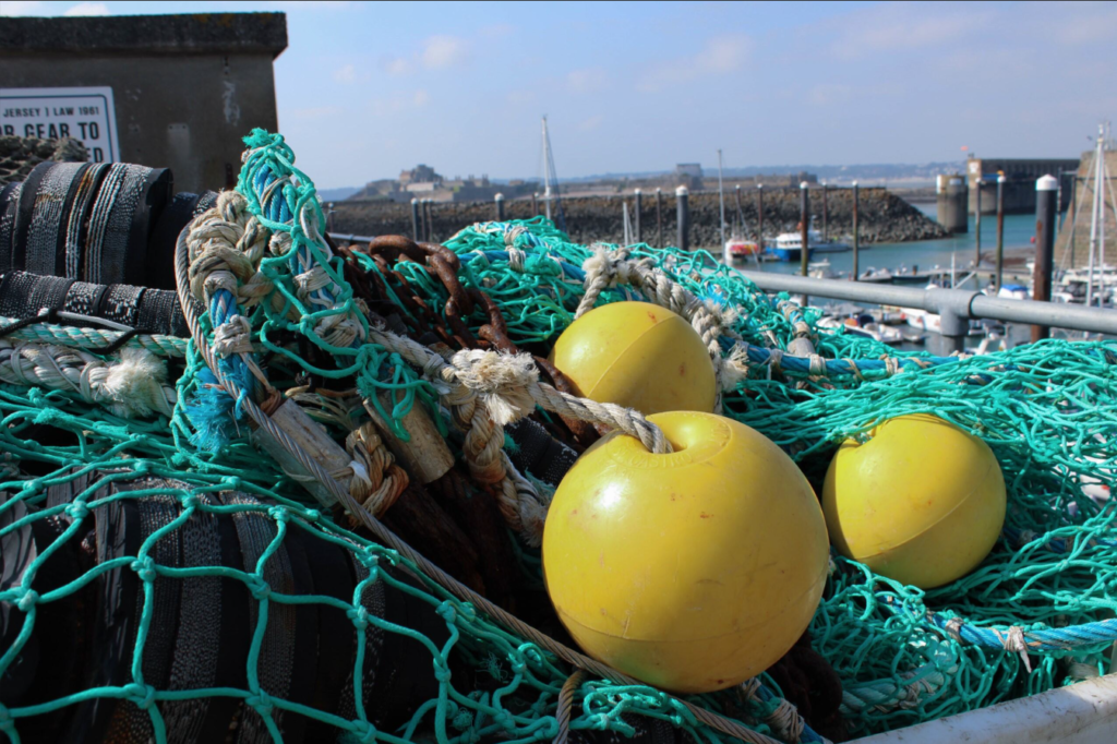
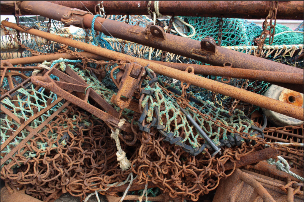
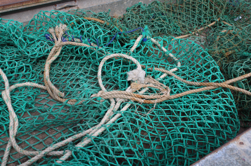
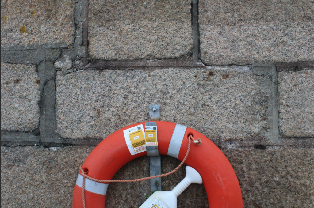
In terms of narrative, the imagery invites viewers to imagine walking beside you along the harbour. Using close-up shots to introduce small details, like weathered rope textures, rusted anchors, and chipped paint on boat hulls. These visuals are intimate and set the tone for the journey.

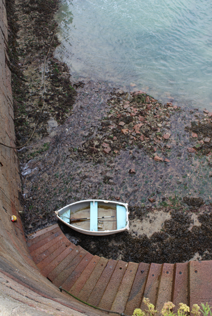
As the zine progresses, it introduces various elements that make St. Helier Harbour unique: Capturing boats from different angles highlights the diversity of the vessels from classic fishing boats to sleek yachts, giving a feel for the harbour’s role as a commercial space.

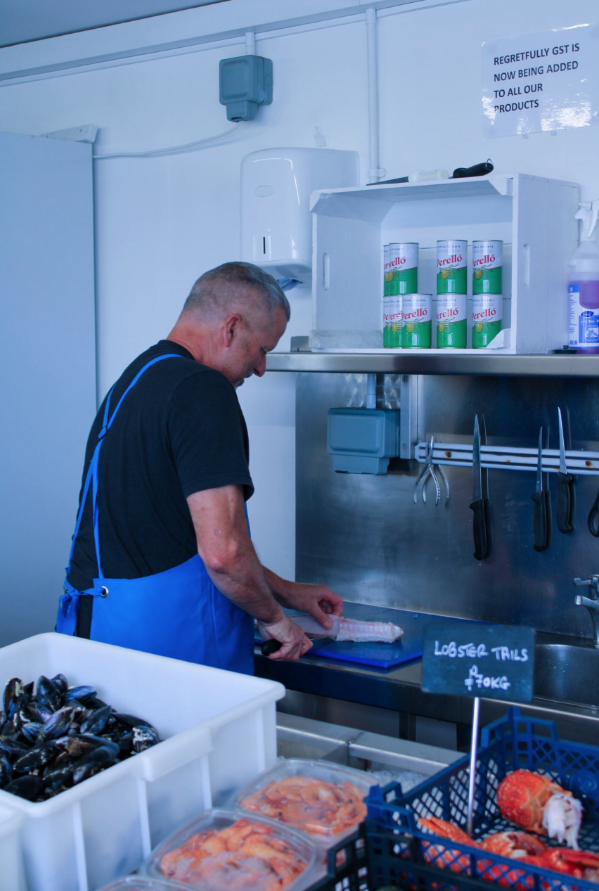
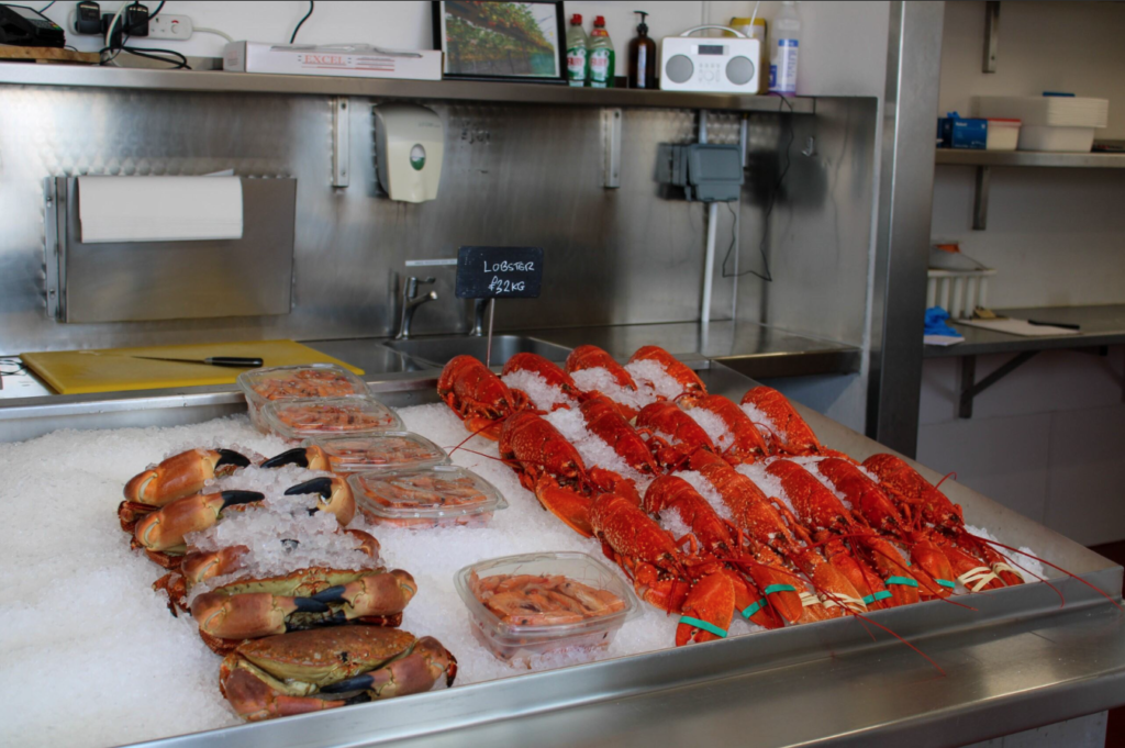
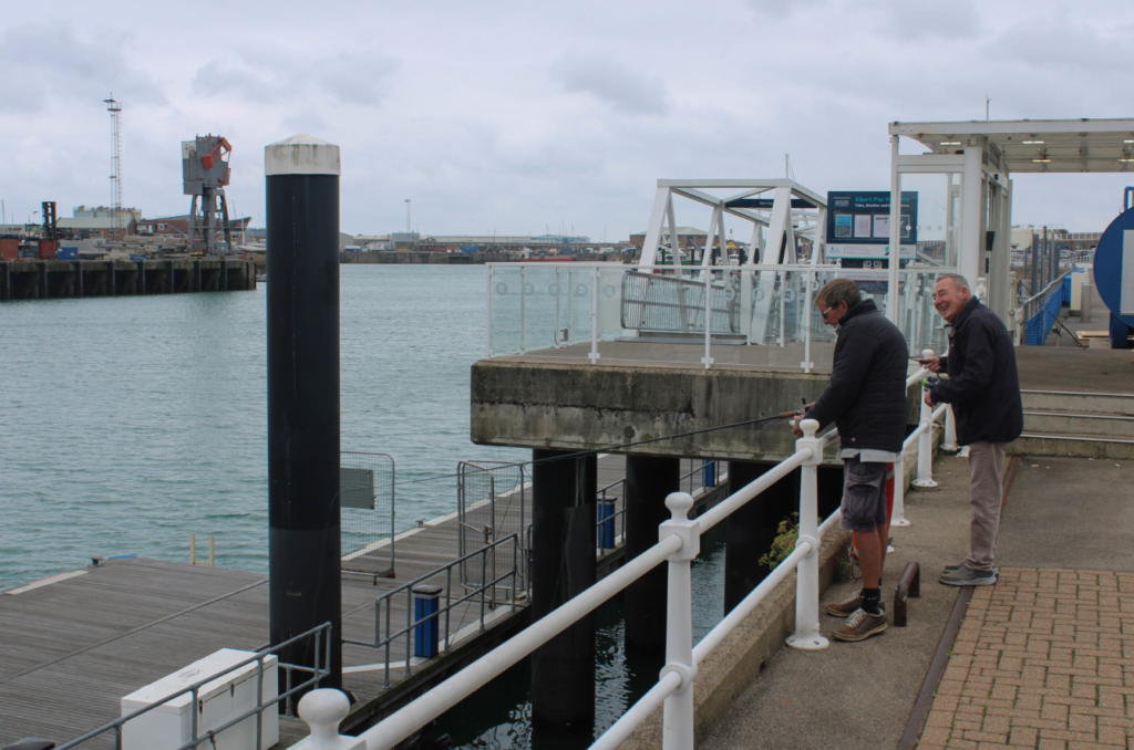
As well as that it gives a glimpse into the life of fisheries and their workers, using candid shots, adding a human element to the harbour’s mechanical and industrial tones. The zine also showcases bustling market spaces and shoreline scenes to add vibrancy and contrast to the industrial focus of boats and machinery.

(Typology) In my zine, I used creative, maritime-themed fonts that provoke the essence of the sea and marine life. As well as that I experimented with typewriter fonts and larger typefaces to introduce sections and captions.

I kept captions short, using poetic language to evoke the image’s essence inside my zine but also with my title page.

Below, I have curated a selection of 10-16 final images for a mood board gallery page. I tried to blend the current images and experiment with juxtaposition by placing shots of the fishing vessels and boat rigging against scenes of calm water and sky, giving a sense of both the harbour’s working and tranquil sides.

I also used a repeat of the image as a background and coloured it so that it differentiates effectively and shadows to evoke the changing times of day/ temperature of the image depending on location, which adds an emotional rhythm to the gallery.

Artist reference: Edgar Martins

Edgar Martins is a Portuguese photographer and author who resides in the UK, best known for his documentary work on conflict, war and testimony. However, many of Edgar Martins work also represents personal, internal conflicts within himself and stories told from his life through using staged fictional depictions.

Edgar Martins work is represented internationally at numerous renowned museums as well as many other collections such as:

  • PS1 MoMA,
  • MOPA,
  • MACRO,
  • MAAT, 
  • CIAJG,
  • The Gallery of Photography Dublin,
  • The National Media Museum,

Martins has also become the recipient of many awards such as:

  • RCA Society Book Art Prize (2002),
  • The Jerwood Photography Award (2003)
  • The New York Photography Award (2008),
  • The BES Photo Prize (2008),
  • The IPA (Fine Art— Abstract category, 2010)
  • The SONY World Photography Awards (2018),

Some of Edgar Martins work:

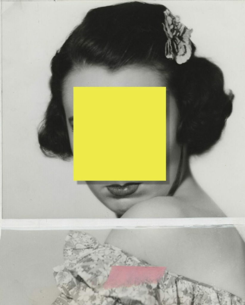
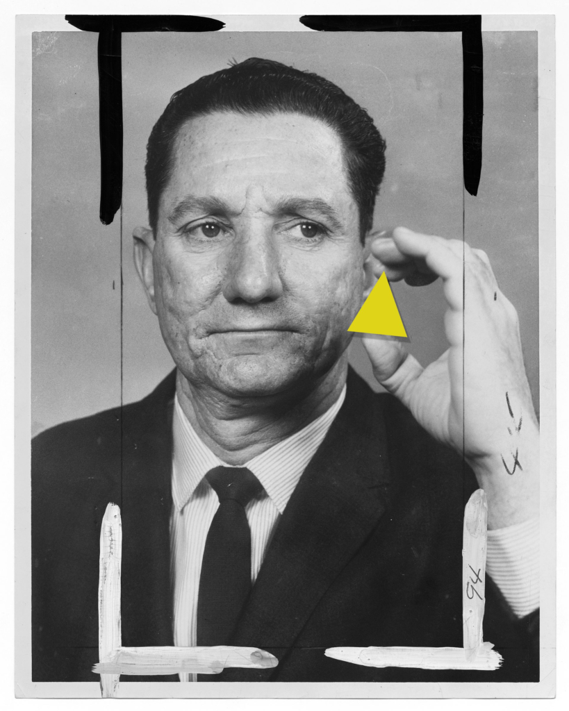
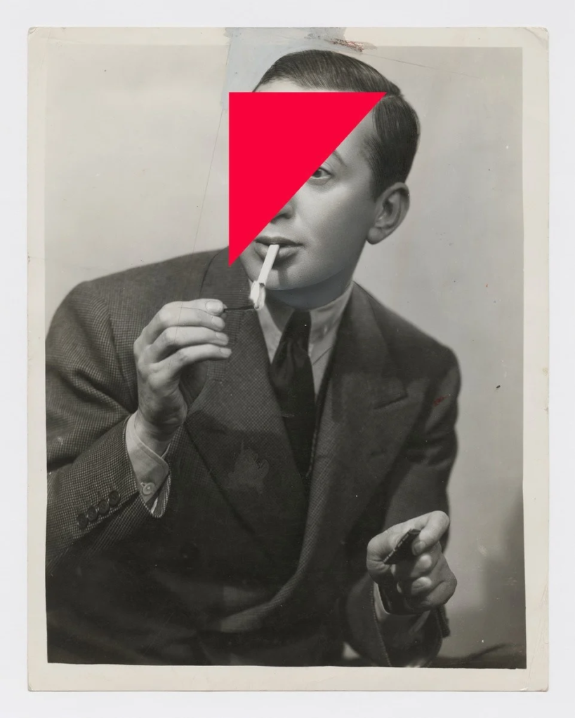
Martins work has a lot of abstract concepts within it, for example the first image that I have displayed shows two sides to the same photo, with the image on the left initially making the viewer believe that some sort of mirror is being held over a persons face, however when this shape is removed it reveals a man holding a chain into his mouth as if he is swallowing it. This consists of a lot of deception towards the viewer and tends to make them ‘think about the bigger picture’, really getting them to question it conceptually rather than just seeing the composition alone face on for what is within the frame. I really like this idea especially through the topic of ‘mirrors of the world’ because it portrays this subjectivity and storytelling nature, full of fictional components that transform an image into a visual piece of art.

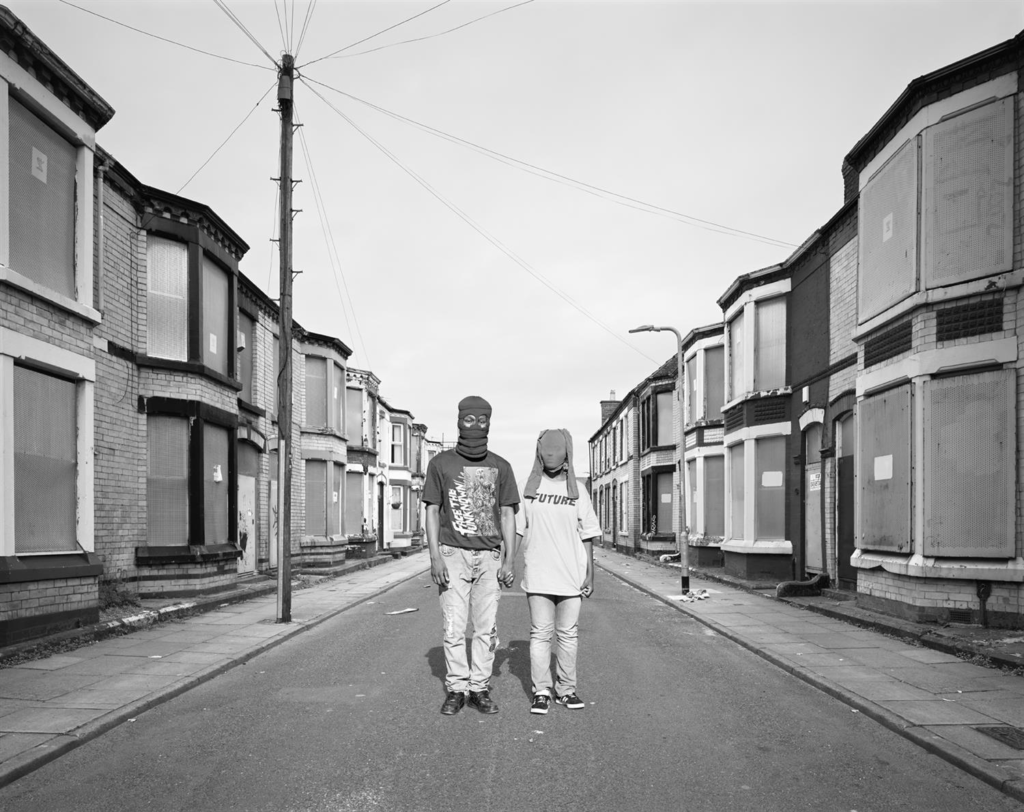
In this image, the first thing that draws my eye is the leading lines down the centre of the image leading to the two subjects in the centre. With their identities concealed, I think that this image makes the viewer question who they are and what their backstories are – the fact that they are holding hands connoting themes of community, relationships and togetherness. However, the desolate streets they are standing on looks off-putting and almost wrong, as if it shouldn’t be occurring in this way as it is so odd and uncanny. This weird composition is very obscure and intends to make the viewer feel uncomfortable so that they really acknowledge the personal reflection that is being shown here. Once again, the draining off of colour from the image makes it appear more sincere and serious as that level of vibrancy is gone, making the image speak for itself without any colour to try to evoke or support the emotion being portrayed. The boarded-up windows placed on each house gives the image a sense of danger and a need to be cautious because we don’t know what is being hidden here or what has occured in order for the past events to be covered up. The plainness of the image, for example the sky only having few electric lines spanned across or the one street light stemmed in the far background, ensures that the two people in the foreground are the focal point of the image and highlights to the viewer that there is a story here that needs to be heard as it is so unusual.

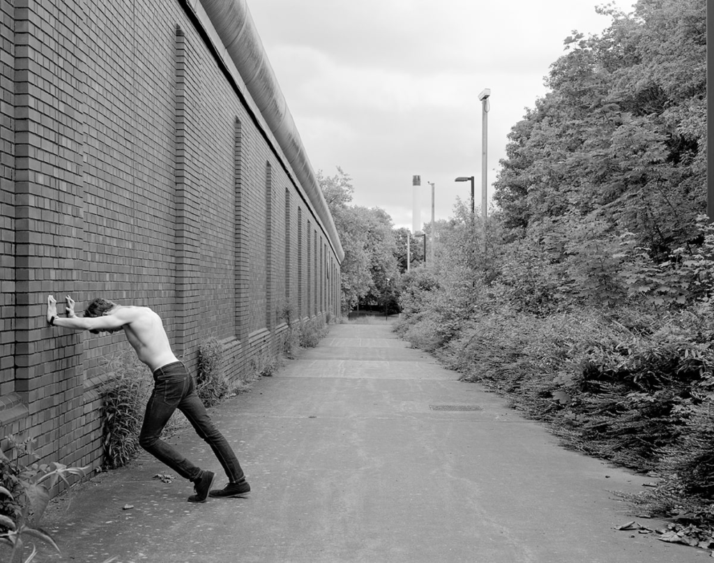
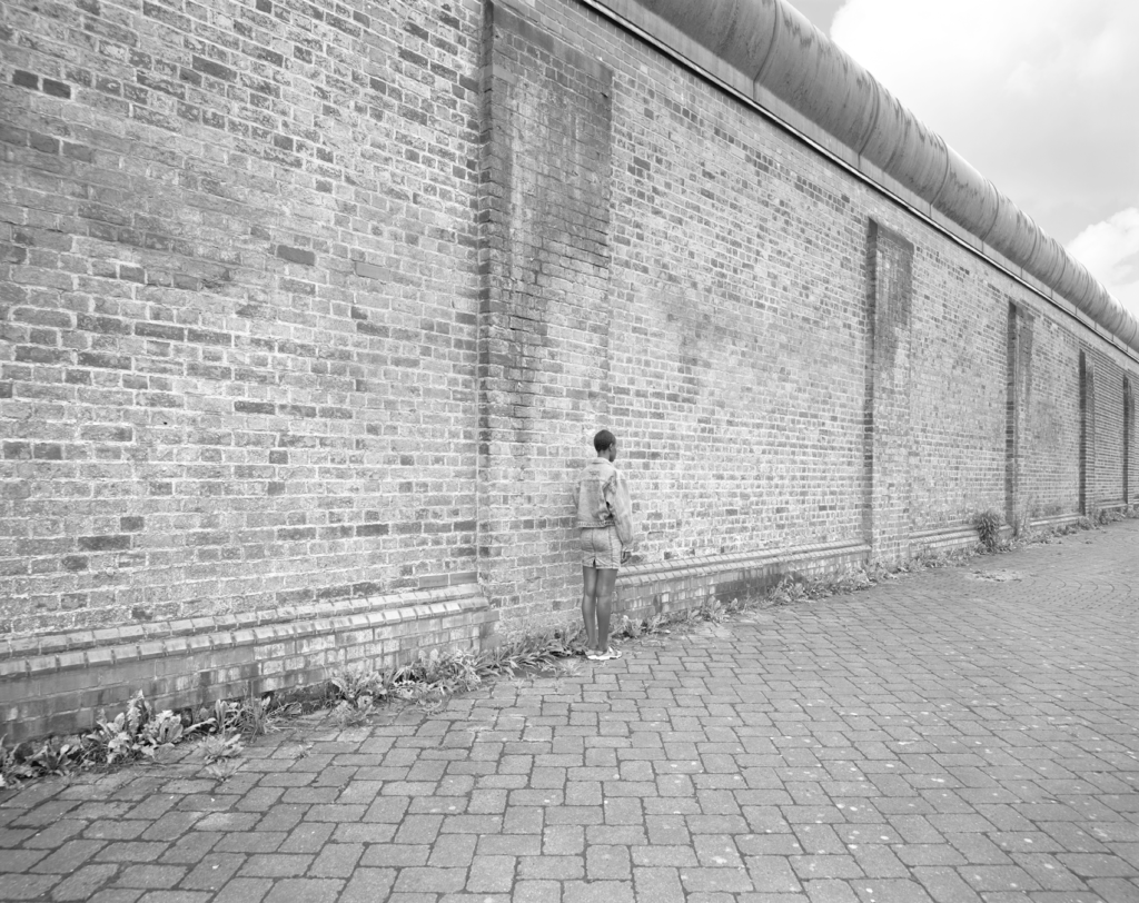
Similarly, the leading lines that oppose the practically blank sky makes the image appear uncanny and abnormal, leading off into a darkness concealed by trees to highlight that area of mystery and suspense. On the left is a elongated wall of purely bricks, opposing an entire block of vegetation. This gives a visual version of a binary opposite, man-made versus natural, bordered by a pathway. I think this works really well as this could be used as a concept for the way that humans are consistently wanting to use these harsh man-made techniques in order to develop society instead of sustainable sources. The subject leaning against the wall creating dynamic shapes with his leg, connotes emotions of anger and distress. Because he is turned away from the greenery that is appearing to reach out towards him, suggests that he may feel shame due to his conscious or unconscious contribution to polluting and ultimately destroying the world.

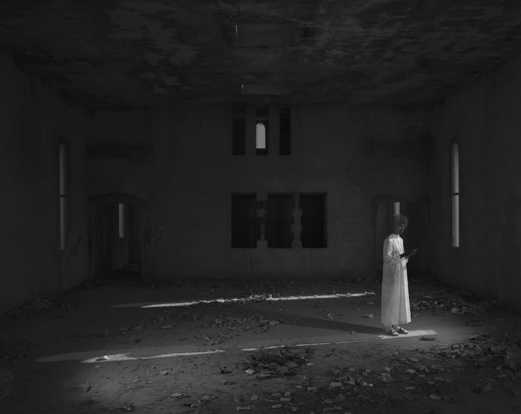
In this image, the figure looks almost translucent which suggests that this is the result of a double exposure edit on photoshop, for example. The emptiness of the room emphasises the dirt and decay that’s spread around the room, adding emotions of loneliness and isolation. The parallel lines placed in the centre of the room lead the viewers eyes to opposing ends of the room so that they focus on the entire image instead of just the brightened area. The exposure of the room is quite low, however its bright enough to ensure that the viewer can see the stains arranged on both the ceiling and the floor in-between the patterns of leaves. The ghostly aura this image inhabits stems from the project Anton’s Hand is Made of Guilt, tributing to his late friend Anton Hammerl. The way that he figure in the room is the only thing that is brightened gives them a sense of purity and cleanliness especially due to the gown that they are wearing. Aesthetica Magazine interviewed Martins on the backgrounding concepts behind this image:

Because of the many similar tones in this image, the model almost goes undetected when the viewer initially looks at the image but as it is further inspected, the subject begins to appear. While the patterns are similar, the small contrasting differences add depth and dimension to the image making the composition visually appealing.

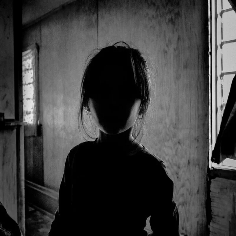
For my images reflecting ‘mirrors of the world’, I like the way that Edgar Martins uses the concealment of identity as well as graphic design because this turns the image into a question on who the person is in the image and what their backstory is. Some of his work is incredibly moving and documentary for activism purposes, such as war in poor countries, however some of his images are also taken in an interpretive way as his own reflection of the world which intrigues me.

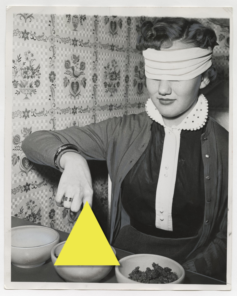
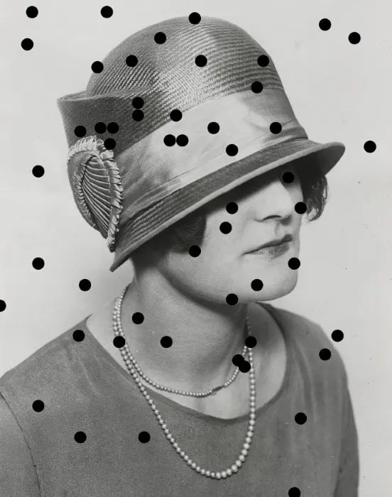
Edgar Martins uses a lot of form in his work, for example the leading lines down a path or different kinds of shapes placed in sudden places which is something I would like to incorporate into my own photoshoot as this adds a sense of direction and structure into my work so that the composition settles positively. I would like to recreate the graphic design that Martins has used on his piece entitled “Disrupted Identity”. To do this, I will be getting models to dress up as different identities to resemble these old drama stills, then putting them in black and white with a warm tone to give the appearance of archived images. Then, I will be using Photoshop to create graphic shapes to place over certain parts of the models face in order to conceal their identity a little bit as I think this will be very effective due to the contrast in vibrancy – going from bold, neon colours to then layer over a monotone image. I think this idea of deception and mystery will be something that I can portray in my work in a bold and powerful way. As my final selection will only be 3 images, it is important that I guarantee each image is as striking as the other so that they can individually tell a story.

Final Zine / Evaluation

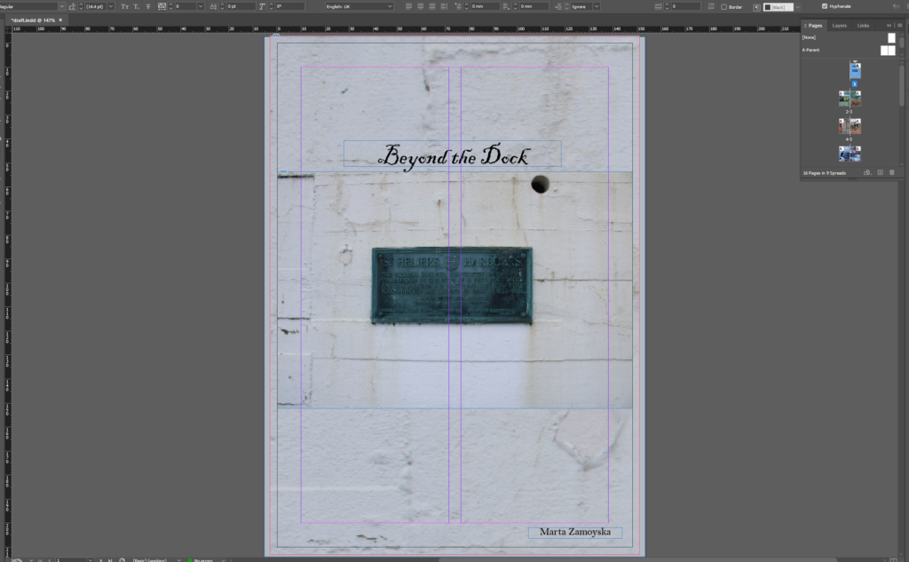
Beyond the Dock is a photo zine I created in Adobe InDesign, dedicated to capturing the raw beauty and unique character of St. Helier Harbour. This project is more than mere documentation. It is an experience that invites viewers to explore the often-overlooked details and hidden stories found around the harbour’s edge. Each page is designed to take the reader on a visual walk through the harbour’s diverse features as mentioned previously, from its working boats and rustic fisheries to the daily rhythms of life along the docks.

The design of Beyond the Dock reflects the layered textures and rich atmosphere of the harbour. My selection of photographs highlights different facets of the harbour, from up-close shots of weathered equipment to sweeping views of the marina. I wanted every image to echo the essence of this place which is a blend of timelessness and fishery/ vessel activity.

To enrich the narrative, I included both contemporary shots and archival materials, placing the past and present side-by-side. The captions are purposefully short and poetic, guiding the viewer without overwhelming the images, letting the harbour’s character speak for itself. In essence, Beyond the Dock is a personal homage to St. Helier, celebrating its complexity while inviting others to see beyond the ordinary shoreline.

I’ve been able to create a visual story that feels both cohesive and authentic to the location. Seeing it laid out in InDesign has shown that the zine achieves the atmosphere I aimed for, blending the present in a way that feels timeless.

I am satisfied with the final outcome as it captures exactly what I set out to achieve which is a layered narrative that invites viewers to experience the harbour from the perspective of an observer wandering its edges.

Photo Zine: Design & Layout

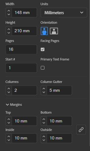
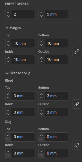
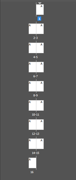
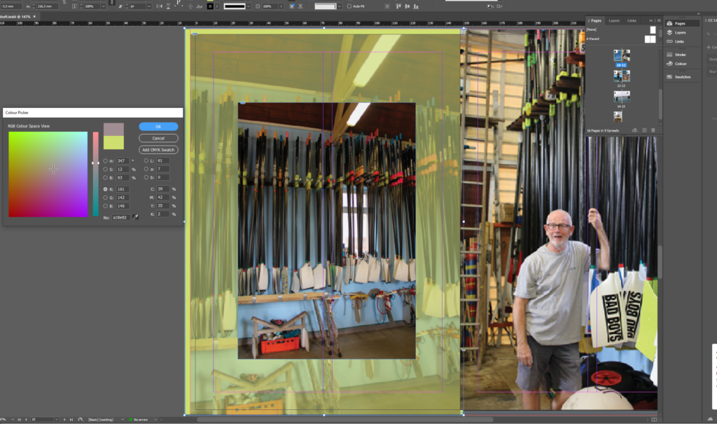
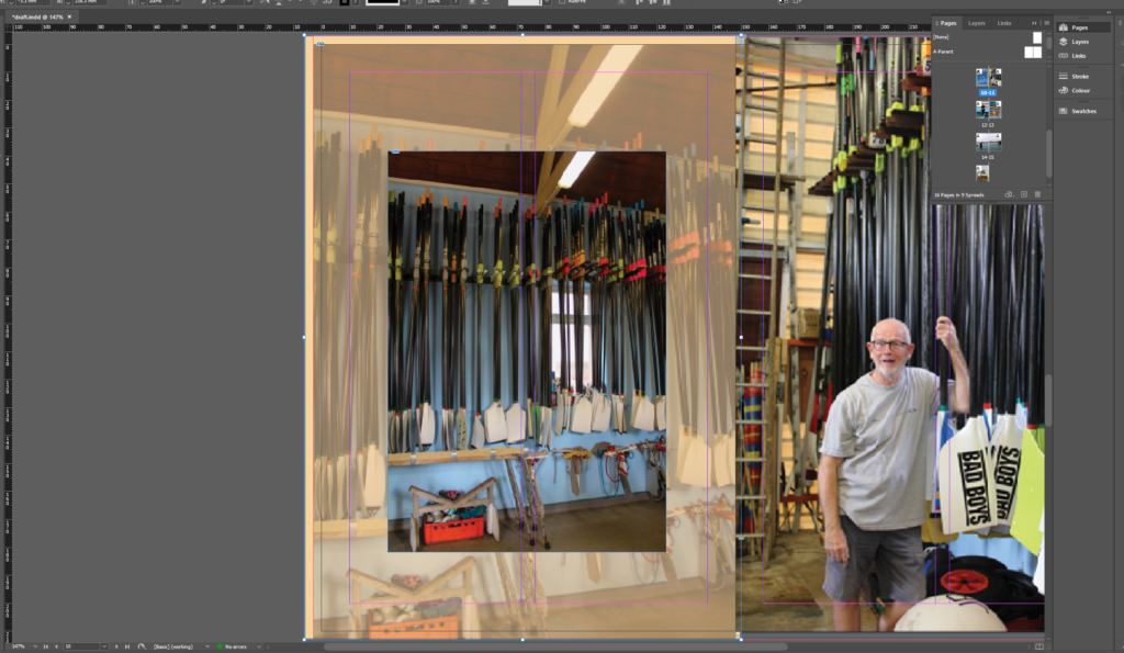
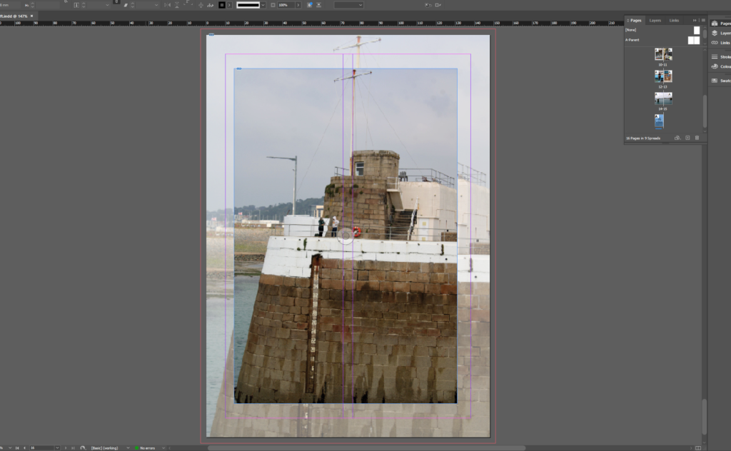
In terms of the layout I creating a 16 page photo zine/guide book which has displayed the photos around the St Helier Harbour. Each page captures an aspect of the harbour, offering viewers a virtual tour of its boats, fisheries, boardwalks, and shoreline scenery. By displaying these photos in a structured layout, the zine becomes more than just a collection of images—it’s a story that readers can explore and experience as if they’re walking through the harbour itself. In order to produce the display we present it through the app InDesign and add specific measurements and adjustments to see in a 2D format whereas to a 3D real life photo zine.

Using specific measurements is important when creating a photo zine as you need to make sure that the photo is of high quality for printing as well as having a consistence layout. Having the photographs in a layout that is easily readable and appealing to a viewer is key as visual representation is everything.

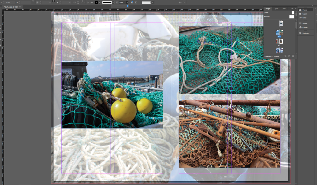
It’s important to set precise measurements. Using InDesign’s ruler guides and grids, I can create consistent margins, spacing, and alignment across each page. This precision is essential for a photo zine that is visually clean and professional, making each image stand out without feeling cluttered.

With InDesign’s flexibility, I can move images, text, and other elements freely to see how they work together visually. The layout can be adjusted to emphasize the most important parts of the harbour, focusing on details like close-up textures or wide views of the docks, allowing me to create visual flow that keeps the reader engaged.

When working in InDesign..Typography plays a big role in setting the mood of the zine. InDesign’s font and type tools make it easy to try out different fonts, sizes, and styles until I find the ones that best reflect the harbour’s vibe, whether it is a bold typeface to introduce each small section or smaller, minimalist captions for the photos.The software offers many options for grids, guides, and master pages, which help maintain a cohesive look across all pages of the zine. These tools ensure that images and text are aligned and well-balanced, creating an organized flow that feels natural to readers.

InDesign supports high resolution images and allows for precise color control, I can ensure that each photo in the zine will look sharp as well as true to life. This quality is essential for a project like this, where capturing the details and textures of St Helier Harbour is key.

Below I have shown some examples of the tools being put into place and shifted around:

The final zine will have 16 pages with a mix of full-page images, collages, and paired text. Each page or spread has been planned to better the experience of moving through the harbour, and using the software InDesign, I can visualize how the final printed piece will look and feel, ensuring that the reader’s journey through Beyond the Dock is immersive and captivating.

Virtual Gallery- Zine Photos.

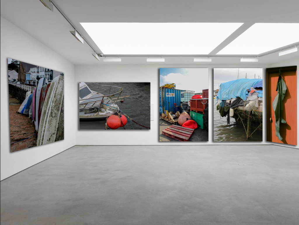
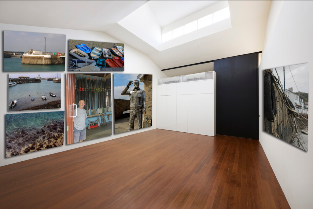
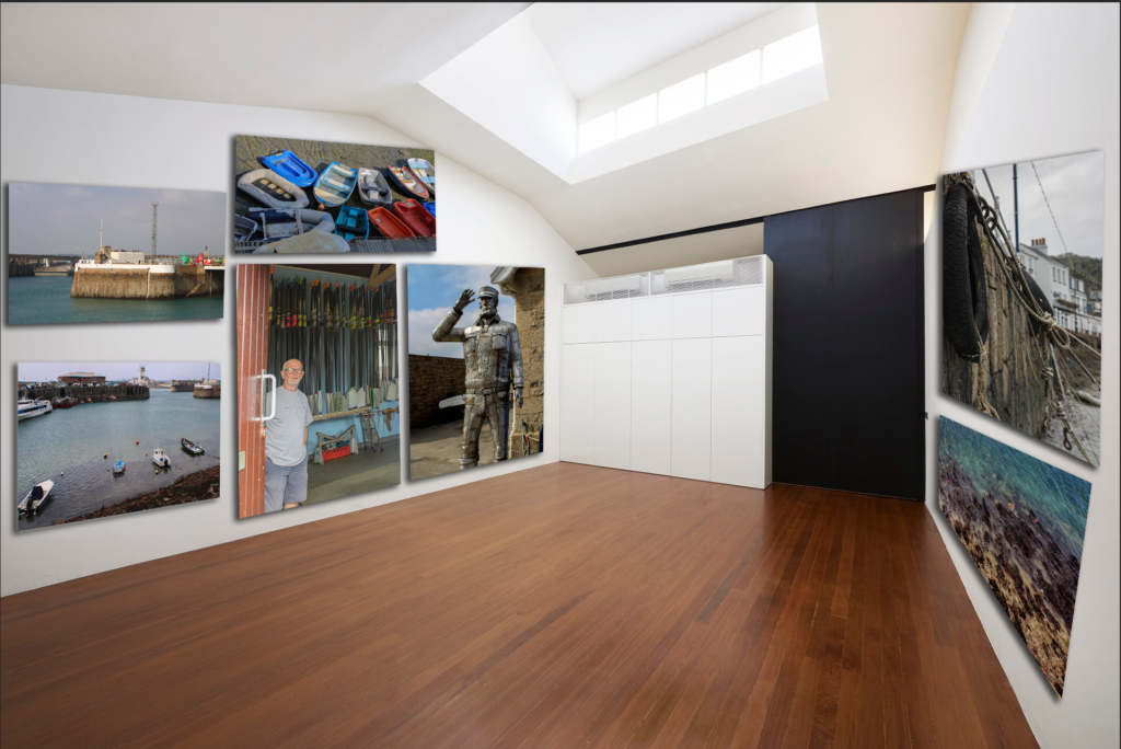
I created my first virtual gallery using an empty gallery image from online. I then imported it into Adobe Photoshop. I then imported 5 images that I felt were relevant to each other and would look effective on a wall together. I decided this was the best arrangement for my photos and I carefully put them in a good order and add a drop shadow and changed the ‘skew’ and ‘perspective’ necessary to make it look 3D.

For this virtual gallery I attempted to put 7 images in one virtual gallery. This was possibly a less effective idea as the wall looks very cramped and too ‘busy’ in my opinion. I then tried two different arrangement in order to see which one looks best. However, next time I would do two separate empty gallery images to import m images, this will make these virtual galleries more high quality and effectively convey the message I am trying to create.

Photoshoot Plan

For my photoshoot in response to documentary and tableaux photography, I think it would be really beneficial for me to research many different artists, both images with windows and mirrors, in order to get a broad spectrum to choose from that I feel most drawn to and also ensure that I completely understand the concepts and motives behind the images I am going to shoot.

Mood Board:

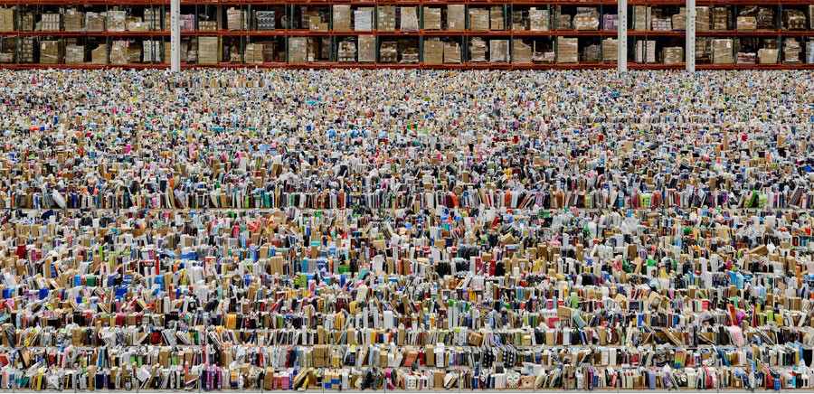
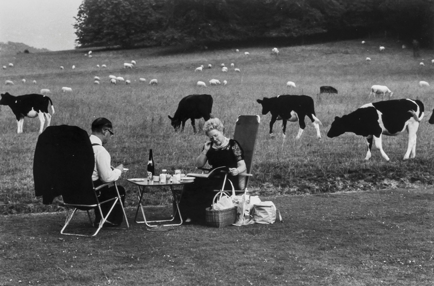
Many of these photographers have really deep intentional meaning behind them whilst others explore the world in both abstract and documentary ways. If I do decide to use a photographer with images that have controversial or deep personal meaning behind them, I need to ensure that I carry out my own photoshoots in a respectful and considerate way in order to be aware of the concepts, purposes and symbolisation behind what the photographer intended with their own images.