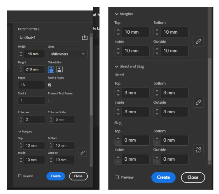
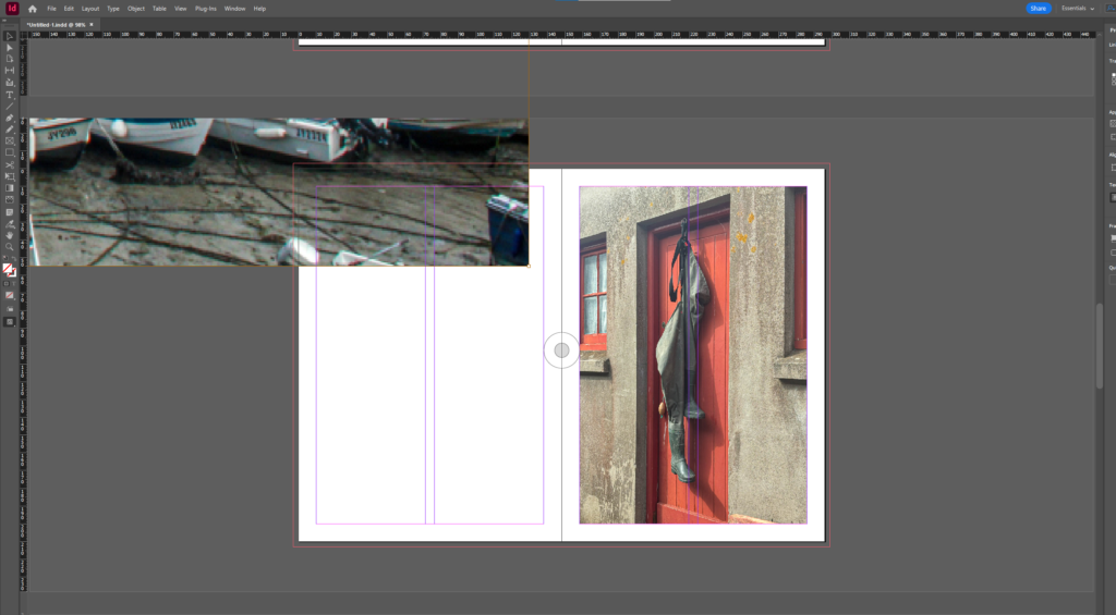
After choosing my photos for my zine, I created the pages I wanted using the settings: width: 148mm,
height: 210, pages: 16, orientation: portrait, columns: 2, column gutter: 5mm, margins: top, bottom, inside, outside: 10mm, bleed: top, bottom, inside, outside: 3mm. and then experimented with the layout and where each photo was going to go. I had to find a few more images as the structure I was going for didn’t work for the amount of images I had.
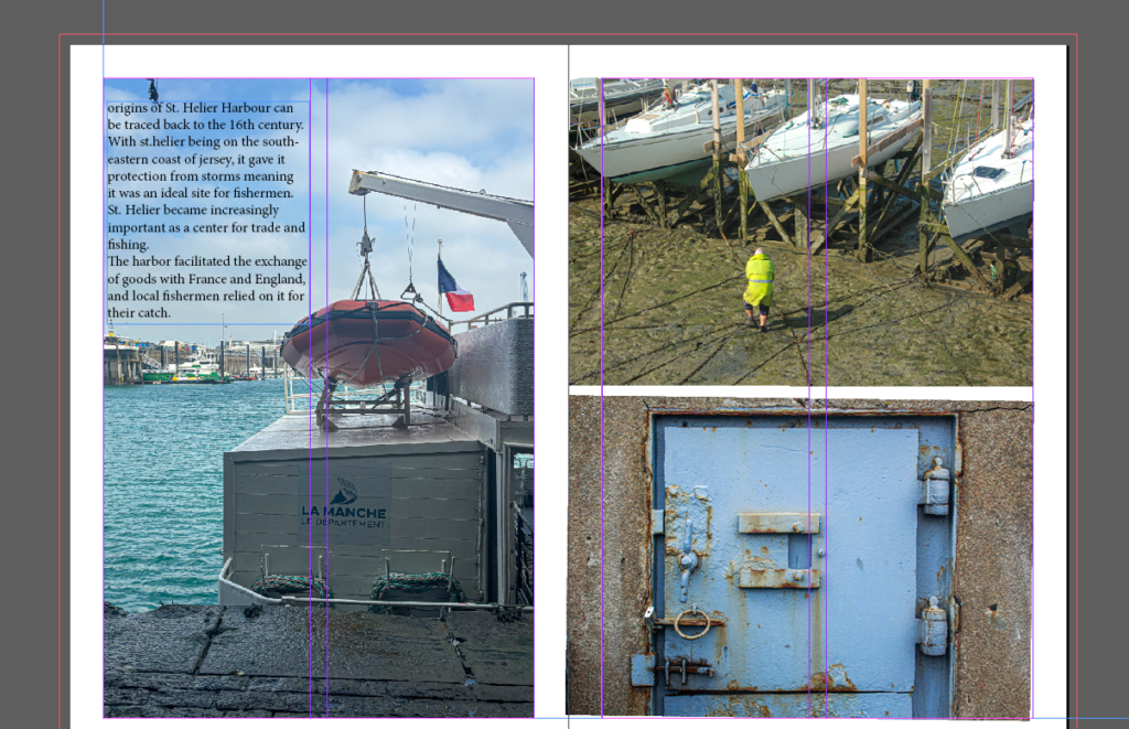
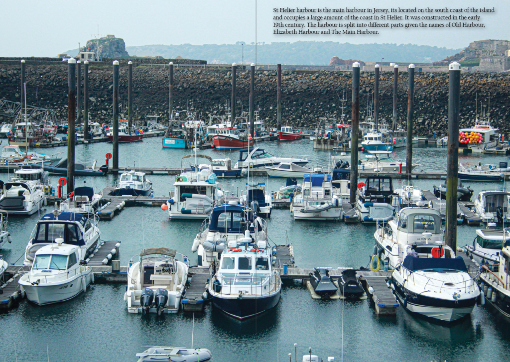
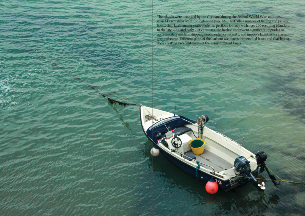
I began adding writing which was focussed on the history and development of Jersey’s harbour which I thought was a good choice of topic as every picture was taken at the harbour. I used writing on a previous blogpost for this. I made sure to add the writing in empty spaces such as the one above where its positioned in the sky which means the image doesn’t look too busy or confusing. I made sure to keep the writing to a minimum so it doesn’t disrupt the image any further. In this particular page, I only wrote on one photo as it was the largest and the other images would’ve been too small to add writing and the image would be ruined and the writing probably would be lost.
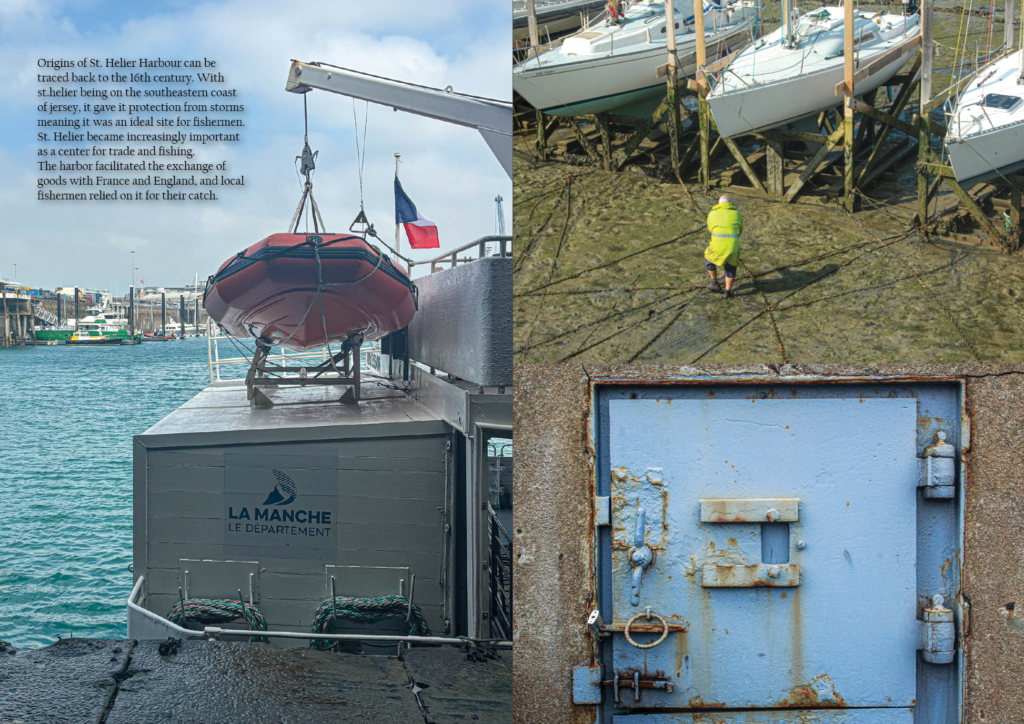
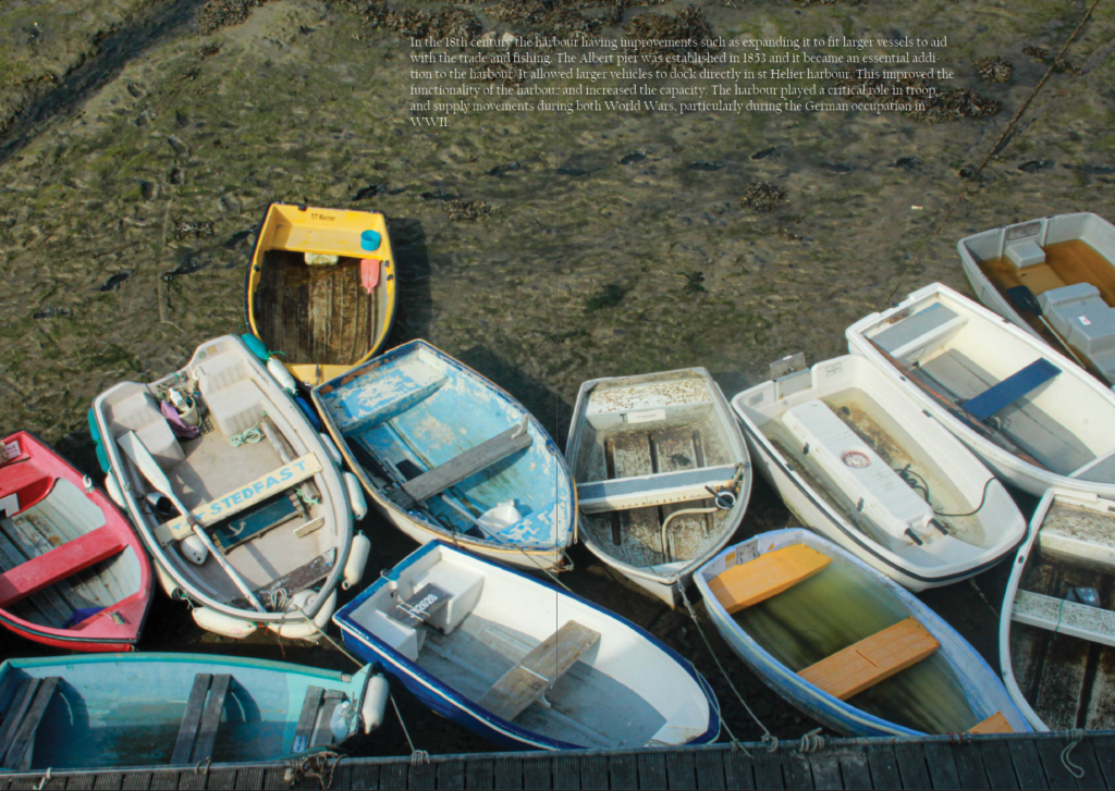
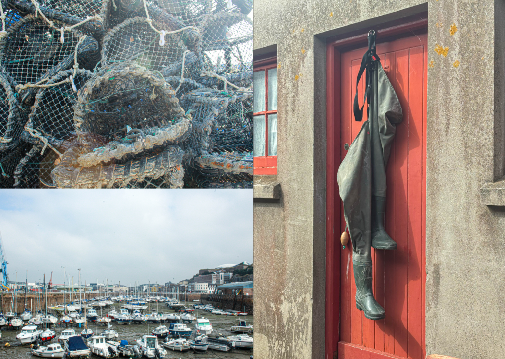
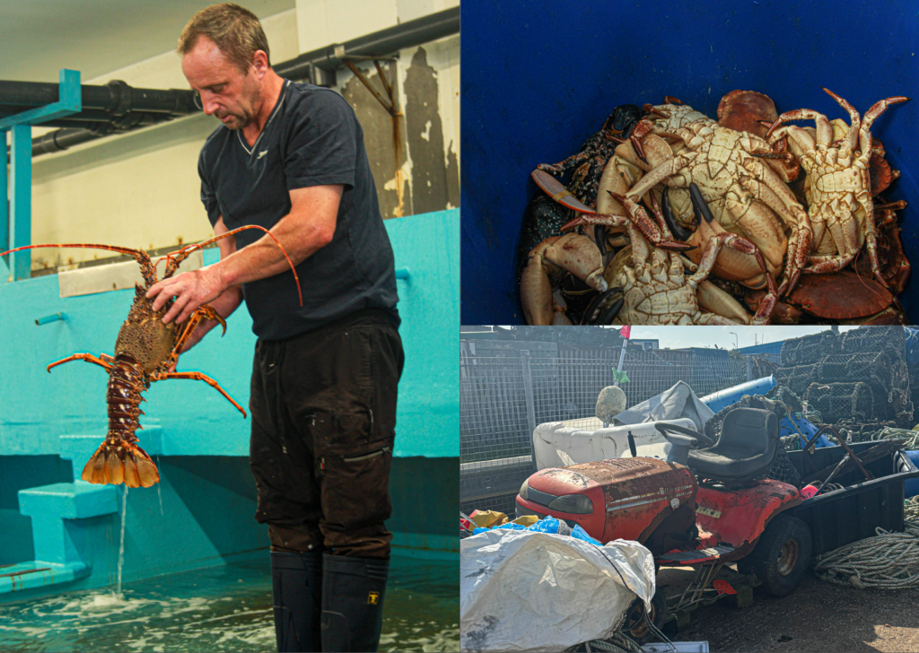
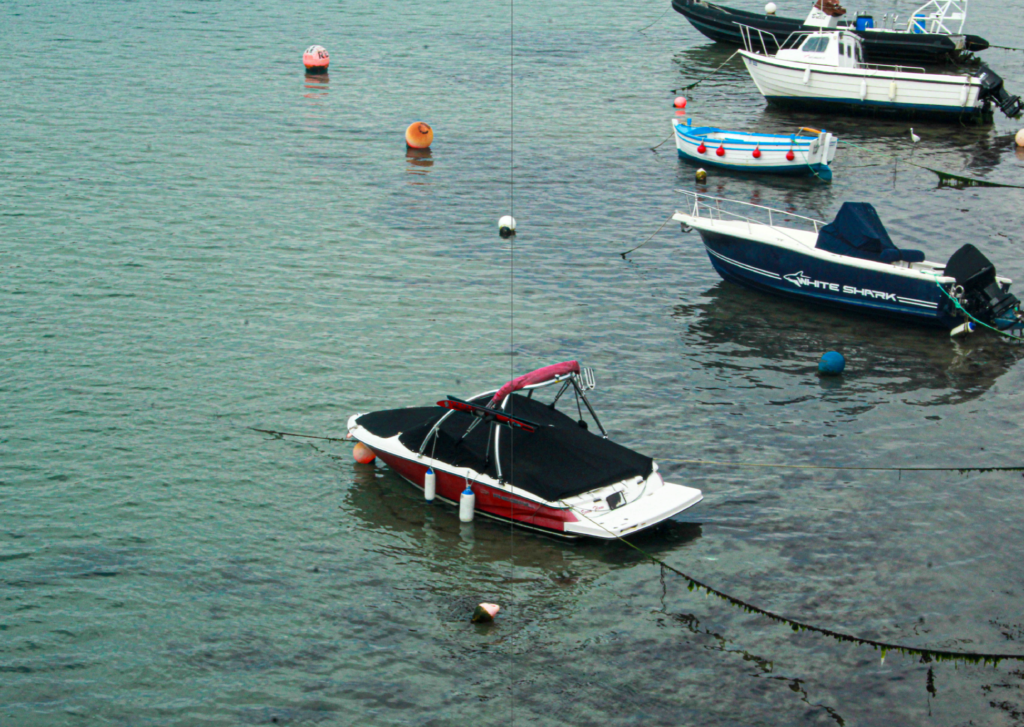
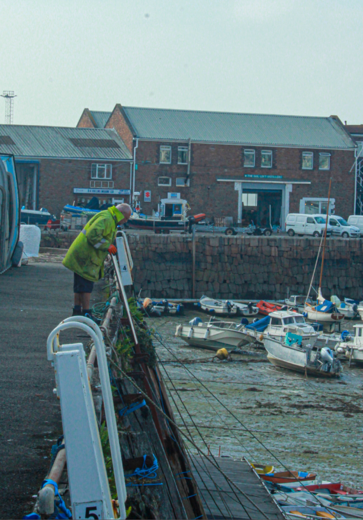
After choosing each photo and making my final decision on them all, I chose where to arrange the photos and which ones worked well next to each other. I decided to keep a pattern of 3 photos on one page then 1 photo then 3 photos etc. I think this worked well because then the layouts were switched up a little and not completely the same throughout. I added two more photos at the end as I hadn’t completely filled up all the pages. I printed the booklet using the correct settings and then folded it over in the order it came out the printer in. After flattening the edge, i stapled the sides twice and then used the trimmer to get rid of all the white boarders around the booklet.
Evaluation
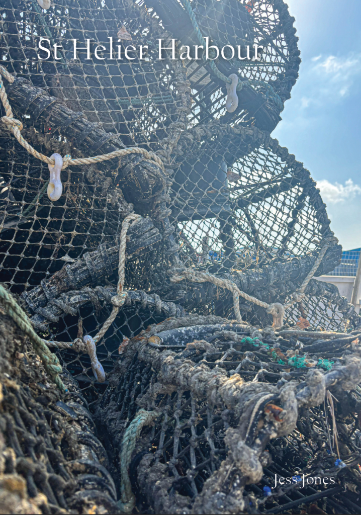
Overall, I think my zine turned out well however I think I could’ve improved it a lot more. I liked the selection of photos I chose and I think I did well will picking my best ones. I liked the layout that I picked as it did as isn’t just stay as a continuous page spread of one photo or 2 instead I alternated the layout by keeping a 1 photo then a 3 photo design. I made sure to keep my favourite landscape photos on the 1 photo page so that they are noticed more. I think keeping all the images in their original colour with some editing was a good idea as it makes the images pop more and draw more attention. However, I think I could’ve been more creative by adding som emote advanced editing to some of my images to make them more interesting and unique. I also think I could’ve tried to get more images that would work together to create a story in my zine as I don’t have much of a story for the images I chose. Each page has similarities but there isn’t an obvious story to it.
