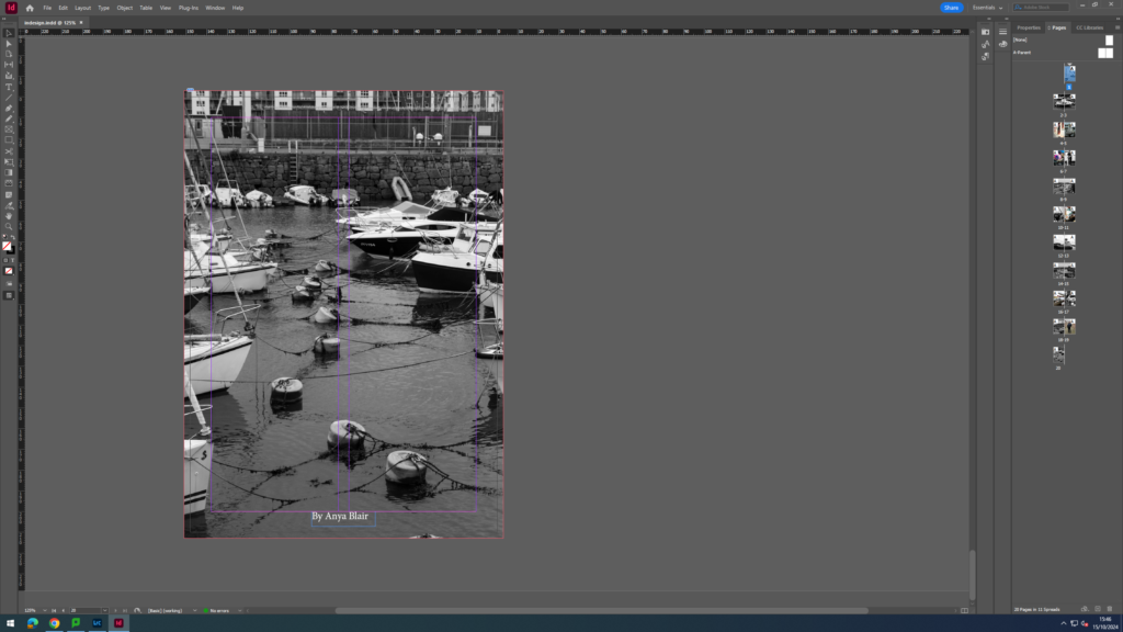
I began to experiment with the front cover, I knew I wanted a simple but engaging front page that would immediately catch your eye, making you want to fick through.
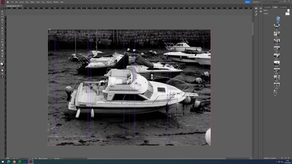
I played around with the layouts having an more zoomed in angle of the photo, while also having the title just off the centre, that aligns with the bouys in the water. The small detail draws you in, as it leads your eyes into the photo as its in a sequencing order.
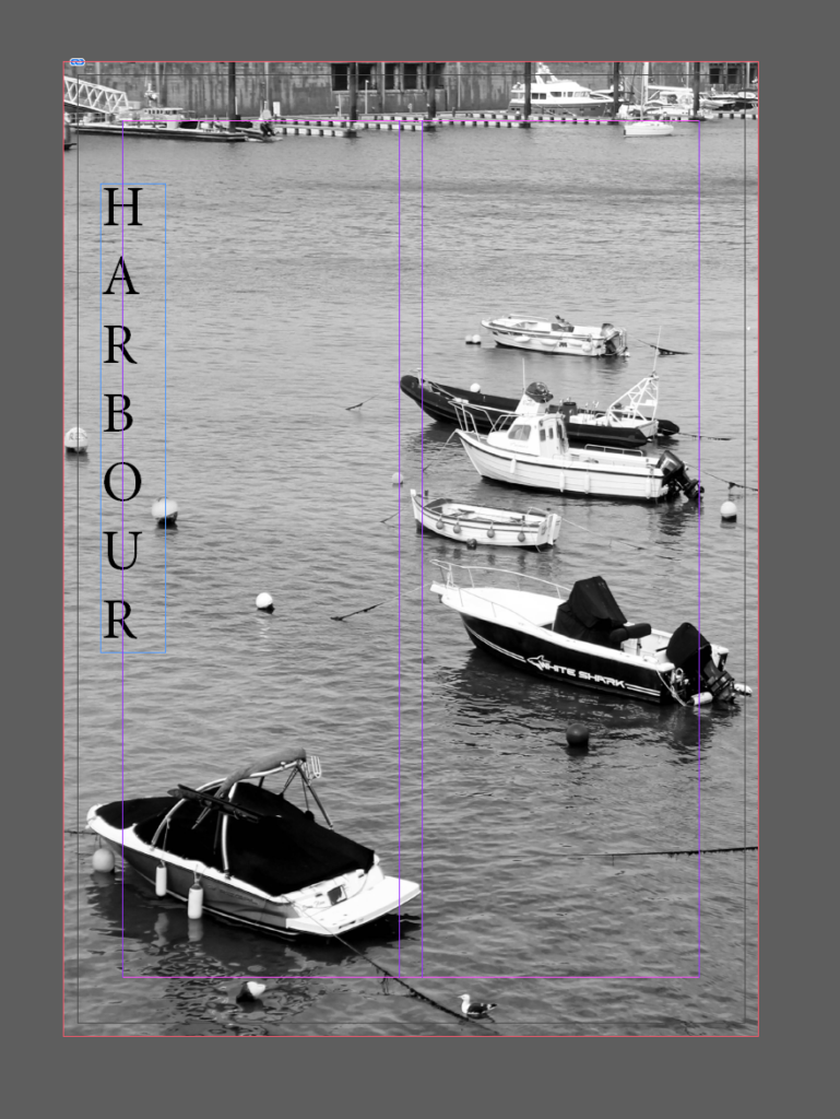
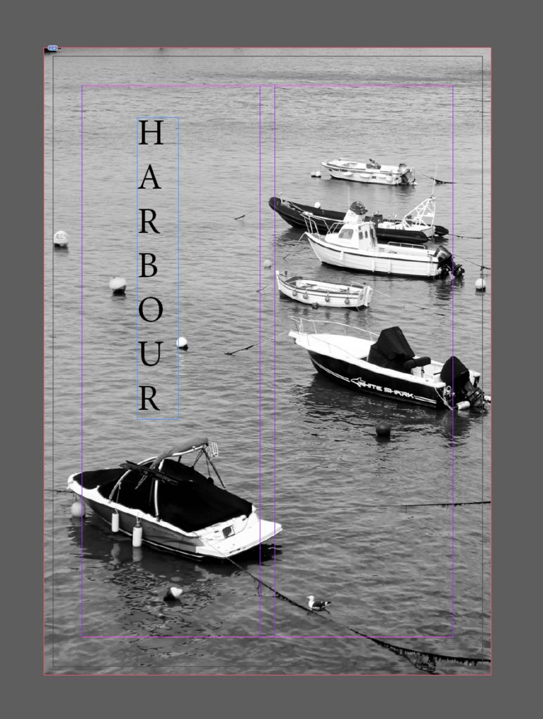
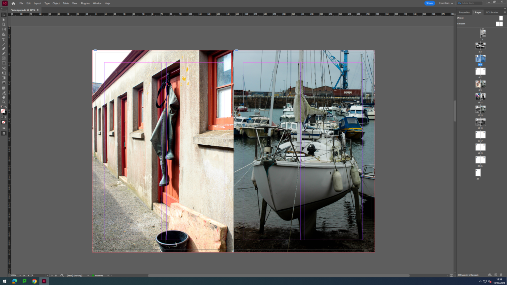
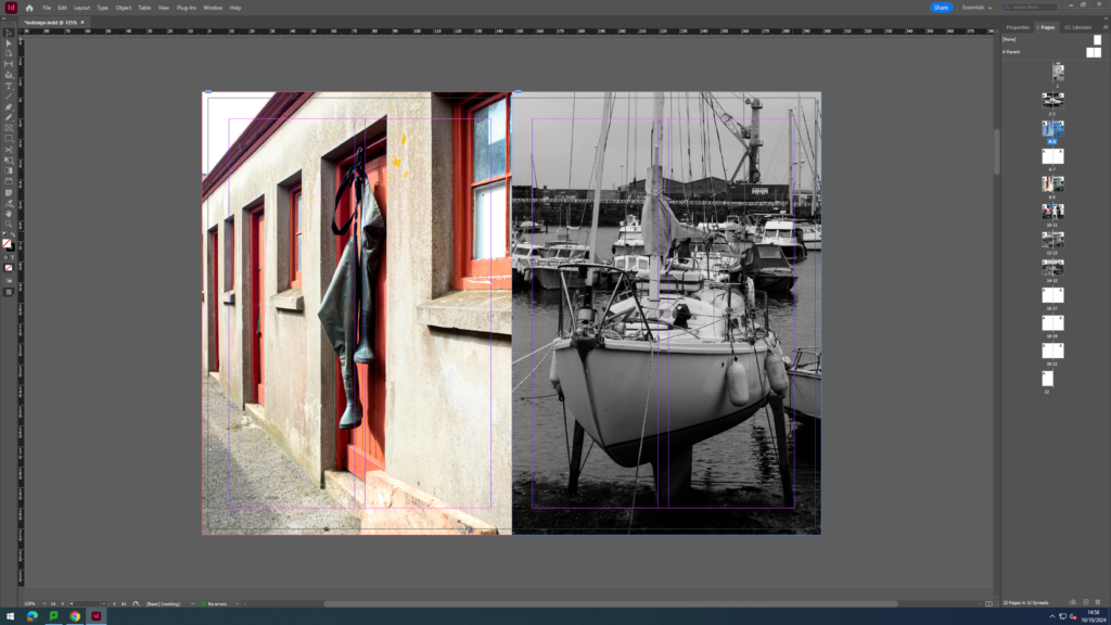
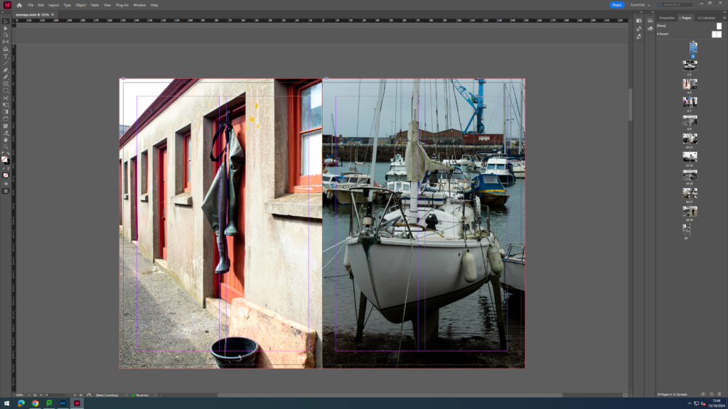
I then started to experiment with different versions of the same photograph that would be displayed on a double page spread, with one being in black and white- showing an interesting contrast, while the other being in colour – bringing out the interesting colours and highlights. I thought each gave a unique photo, however the colour version really stood out to me because I found the colour schemes went nicely alongside the the first photo – the fishermans boots, as it related more, showing a sequencing story.
Originally I wanted to
Final:

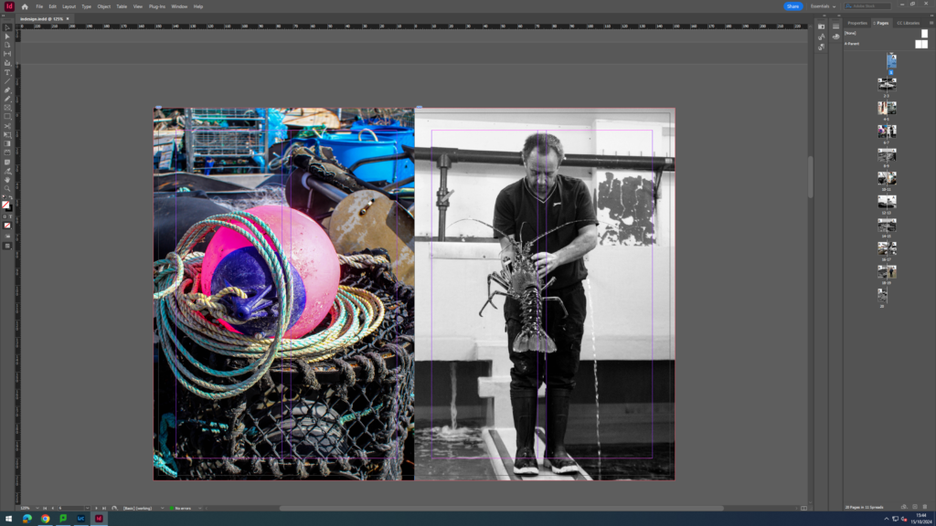
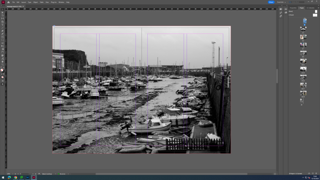
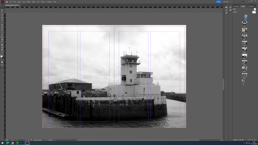
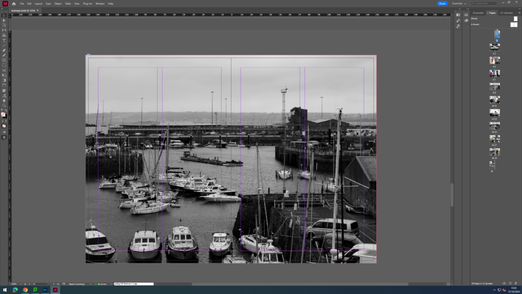
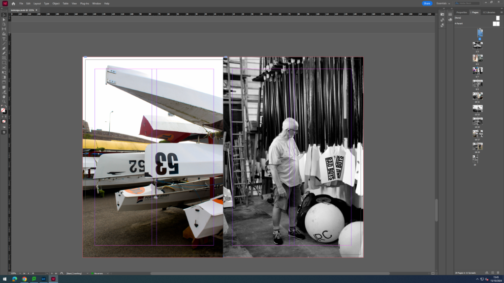
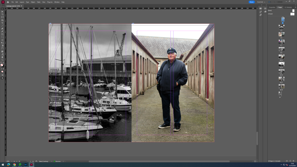
I wanted the portrait of Captain Brian Nibbs, to be the very last photo inside the zine, giving the impression he he was overall incharge of the fishing,
