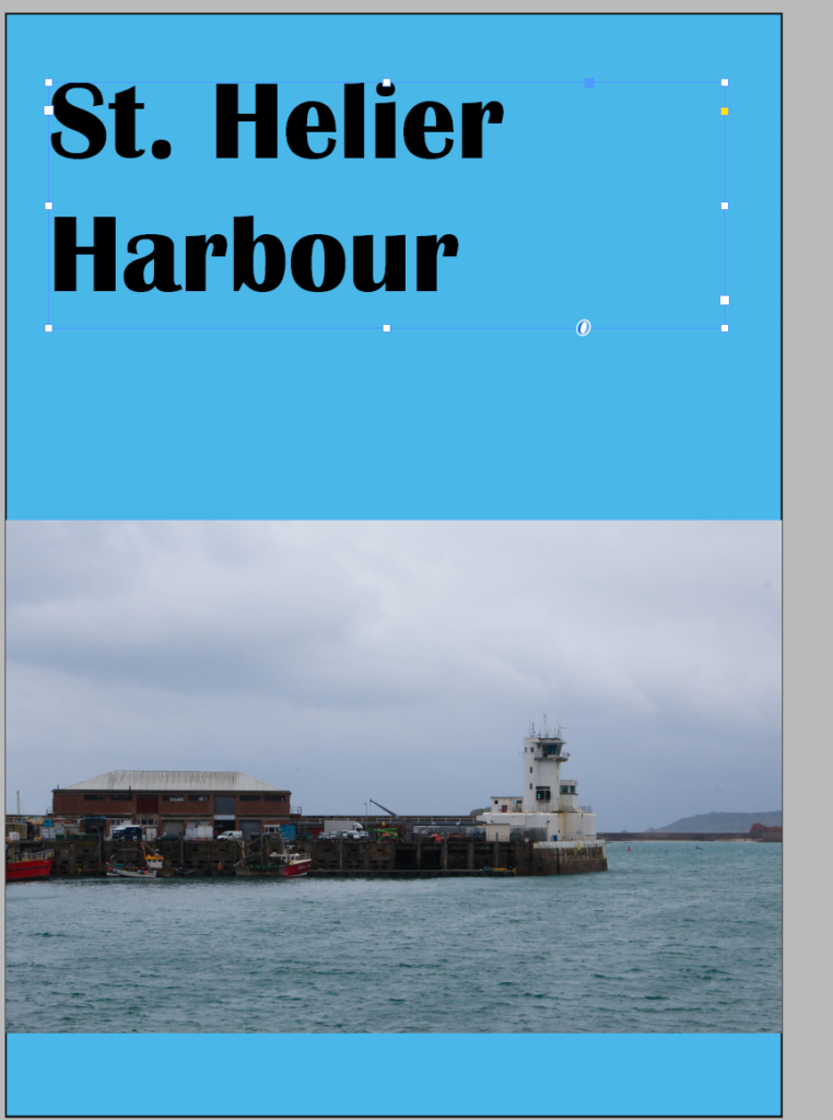
I started with experimenting with a front cover for my zine I wanted the colour scheme of my zine to be blue and white because it reminds me of the sea


for my first page I wanted to do a comparison of the harbour a long time ago vs today I started by creating the layout with placeholder shapes.


I started by designing the layout of four images and then chose the four I wanted. I ended up swapping the top right image to the one in the screenshot above, from one I took of the new quay, as I wanted the page to look more vibrant and the original photo looked out of place.
Back cover


For the back cover I originally wanted to have an image of the old harbour, however it sadly didn’t look right, I couldn’t position it correctly so it looked good and there was too much blank space. I ended up starting again and using a different image this time a portrait image which would fit better which I also wanted to use on the zine. Overall I am much happier with how it turned out and think it looks a lot better than before.

Thankfully I could use the image more appropriately as a double page spread because I needed another two pages because I had 18 pages and I needed 20 so it would print without any blank pages. Because the image is a panorama it is wider that a standard landscape image so it was a lot better having it stretched out across two pages.
