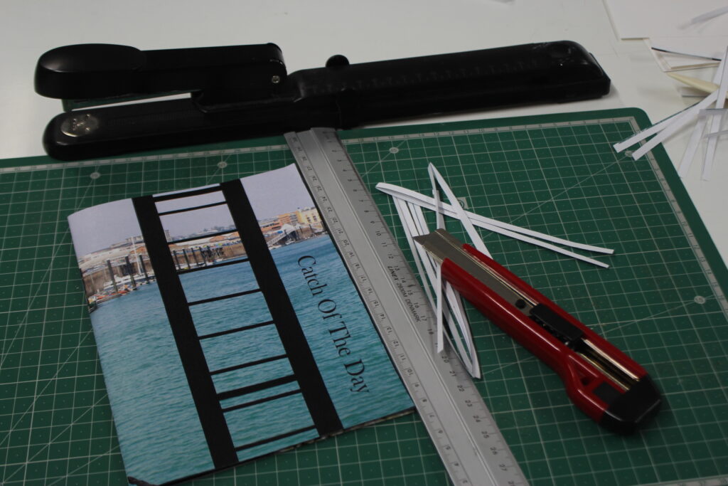
I printed out my images from Adobe InDesign and created my zine:

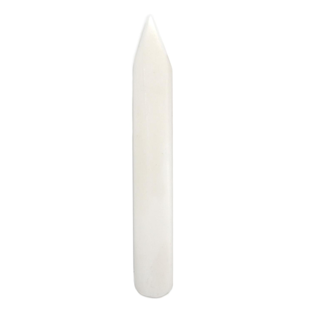
To do this, I had to ensure that all the pages matched up, specifically the images that I had put onto a double-page spread so that the full picture was together. Then, I had to make sure that both edges of the sheet were aligned, then use a tool called a paper bone:

This enabled me to get a smooth and precise fold in the centre of the paper. By doing this, all my images would line up perfectly in the middle so that I could staple them easily, but it also meant that either side would be even so that my zine wouldn’t look wonky. One I had folded all the pages, I stapled them down the spine.
Then, I used a knife to slice off the white edges to get a clean and even edge so that it would look more professional and smooth.
After I created my zine, I created a virtual gallery to showcase my images using Artsteps so I could show my work in two mediums – physically and digitally.
EVALUATION AND CRITIQUE:
Overall, I am quite pleased with the outcomes I have produced within the topic of Jersey’s maritime history. Initially when we were researching the islands maritime history, I didn’t really enjoy it as I found it fairly tedious and dull, however when we began doing photoshoots I began to gain a little bit of motivation. In the first photoshoot we took down at Société Jersiaise Photographic Archive and St Helier Harbour, my expectations were that I was going to try and highlight Jersey’s fishing culture and history. Whilst some of my images were very successful (for example capturing a seagull flying), I don’t feel that I could be entirely creative with this as I didn’t particularly notice any specific details that I thought would be beneficial to my work and didn’t explore the area entirely. Due to this, many of my images were similar. However, my second photoshoot was where I think I was able to really get engrossed in my work and seek out unnoticed aspects of the harbour, leading to me having a vast selection of images to select from. Here, I was able to make the topic my own by exploring the harbour in detail instead of just taking images of the parts that were the most visible or just shooting pictures of the boats at the harbour in an unstructured way like I had in the majority of my images during the first photoshoot. As well as this, I made colour and texture the foundation of my images so that when I did go to create my zine, this would make it easier for me to form a narrative behind my images. As this shoot was taken down at the Maritime Museum, The Fresh Fish Company and around the Marina, this let me know that I had many options to choose from when deciding what I wanted my zine to be about. Despite that, while the images I took at the Maritime Museum provided a high amount of historical value and contextual importance into my work, I didn’t want to use any of them within my work or experiment with them any further because it didn’t fit in with my intentions behind this topic and were not as effective as the other photos I took, yet I am still glad that I did include them in my blogpost because this ensured I had that awareness behind what I was creating instead of doing it blindly. As a result of my images being successful, I ended up planning to create two zines with two separate After this, I began to prepare to create my zine by researching about narratives and sequencing, trying to spark a story by describing both my zines intentions with 3 words, a sentence and then a paragraph. I think this activity was really beneficial to me because it made me sit and think properly about what I wanted to produce and how I wanted to use the topic of Jersey’s maritime history, a topic that didn’t excite me at all, to create an artistic zine. Once I had figured this out, I found it quite a straightforward process in beginning to choose what images I was going to put in my zine. What helped me decide further was physically creating final selections by printing out various images in both black and white and colour. I think this activity was also really valuable because it meant I had to be critical about my work as I used process of elimination and be realistic about what images worked with each other and which ones didn’t. Once I started using InDesign, everything came together smoothly and I found it easy to show the storyline I had intended. I am really happy with how my zines came out, however if I did this again I would have liked to have made a black and white version and layout my images in a different way, with images overlapping the page or multiple on one page, or using text. I didn’t do this in my zines because I wanted each image to speak for itself, however it would’ve been good to do this because then I would have more variety in my work.
