Design & Layout:
Practice –
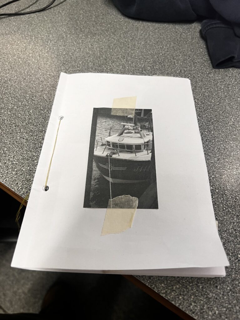
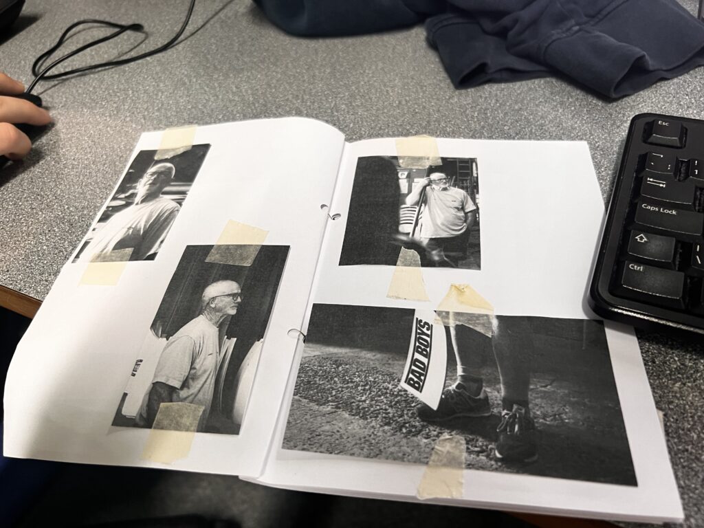
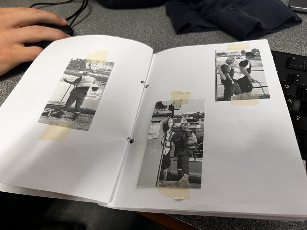
Making a paper mock-up this allowed for me to create a rough idea on how and where my images should be positioned, As well as an idea of creative a story/narrative with my photographs in my shoots.
(Rough paper mock-up of Zine).
Altering around their positions, spacing and size, I was able to create an idea of how my images could be arranged, choosing to stick similar images taken around the same spot or same subject together, this to me showed an early example on how I can create my narratives.
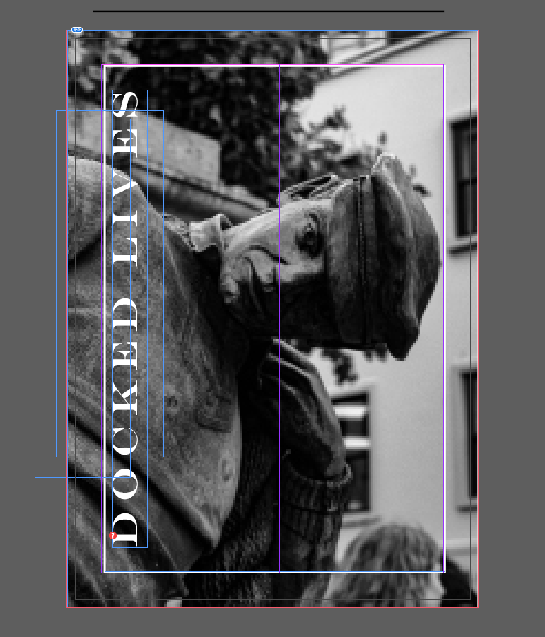
Layout on InDesign.
Selecting my final images, I began the process of creating my final zine. Using the rectangular tool and font styles I was able to create an interesting minimalistic aesthetic for my front cover.
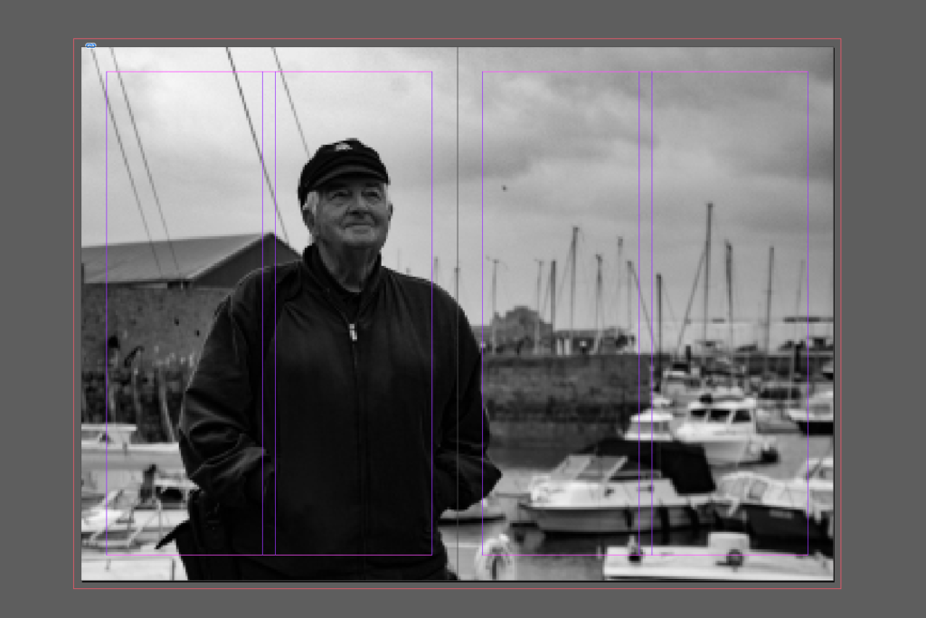
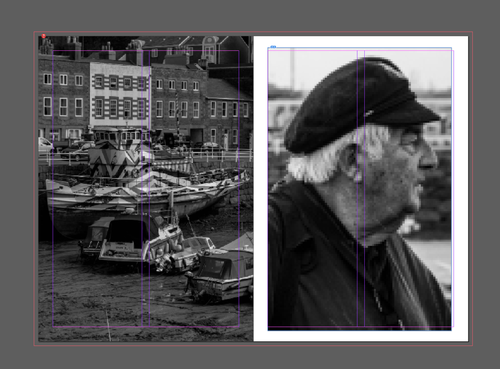
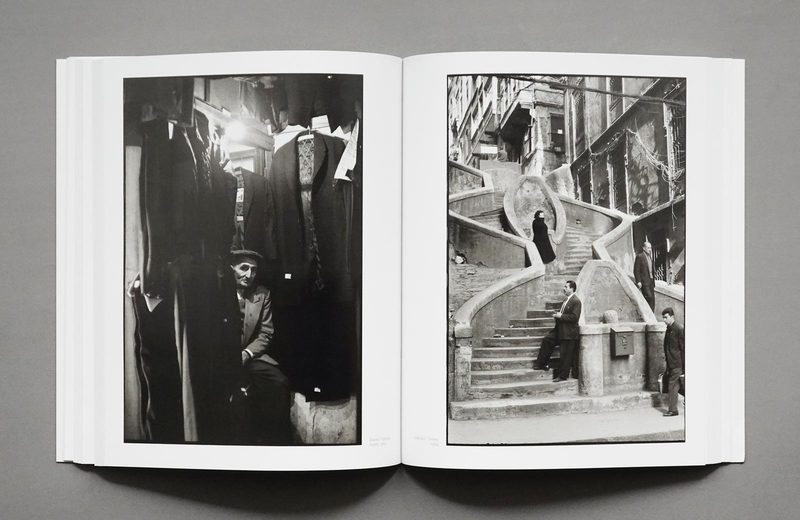
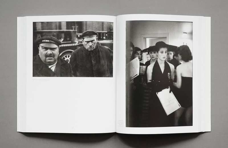
Taking Inspiration from Henri Cartier-Bresson’s Photobook ‘Europeans’, I Based some of my page layout designs on his work. Featuring images covering 2 pages as well as some fulling almost 1, this inspired me with some of the placement of images in my work.
(Some page examples of ‘Europeans’ By Henri Cartier-Bresson).
