For my zine I am creating a collection of photos of St Helier and Jersey Maritime Museum. I will create this photobook on Adobe InDesign.

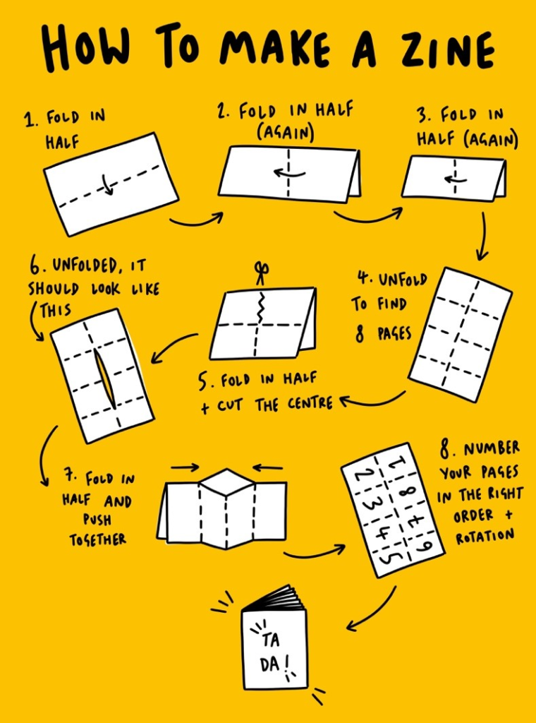
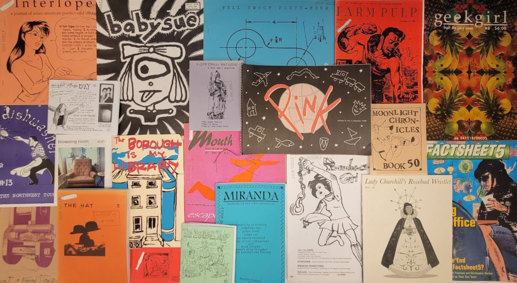
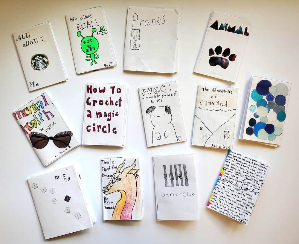
Mood board and Ideas.
Here are some examples of Zines previous students have produced that I would like my images to be inspired by. I really like the dark theme which displays the construction and mechanical aspect of Jersey harbours.
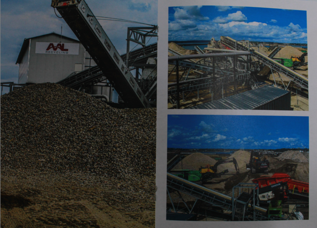
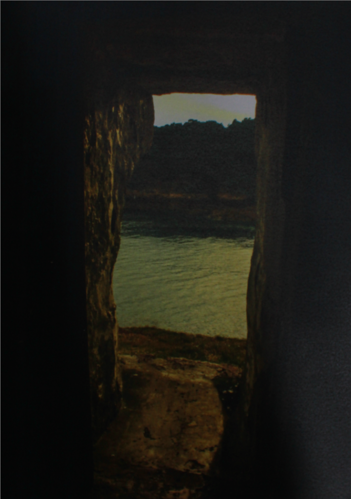
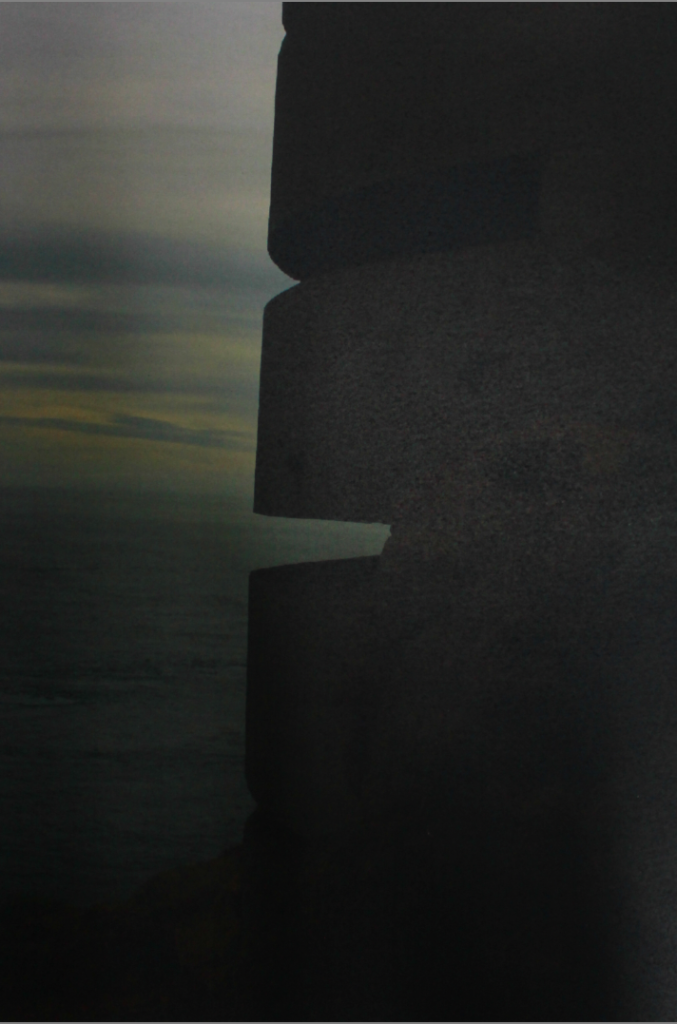
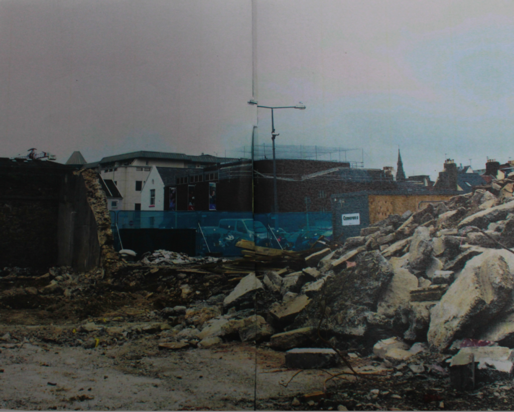
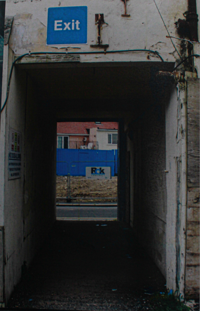
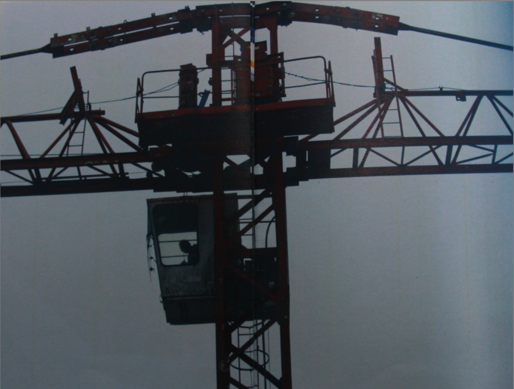
My Images Ideas.
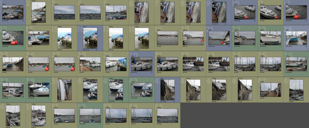
These are my selection of images I am going to choose from when creating my zine.
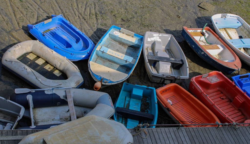
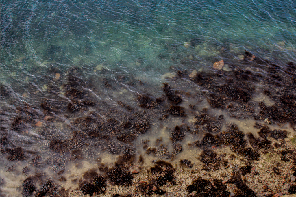
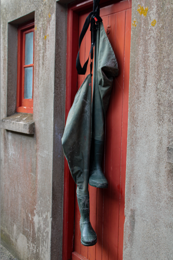
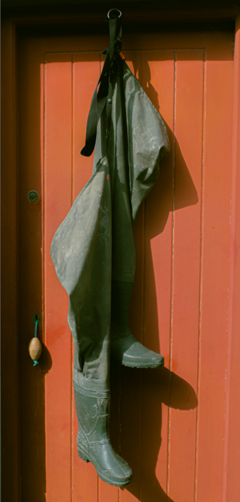
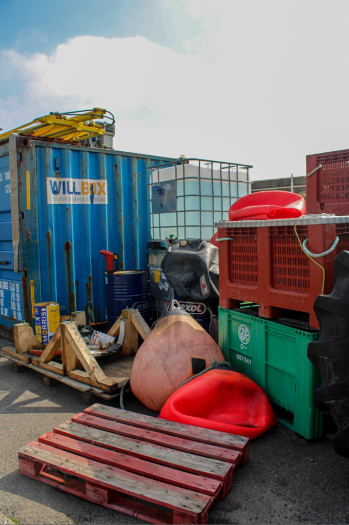
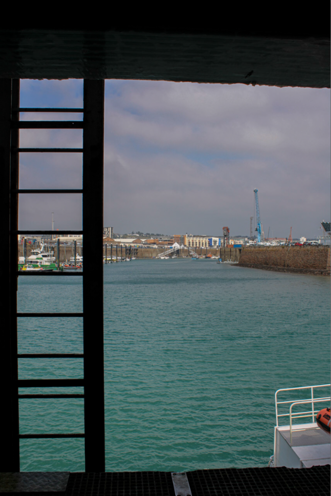
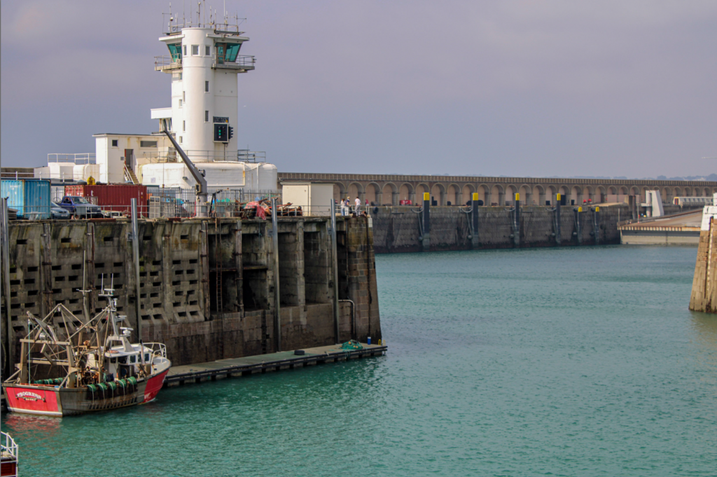
3rd St Aubin’s Harbour Photoshoot.
After arranging images I may want to use, I went and did one more small photoshoot in St Aubin’s harbour to gather more images I may want to use. I decided to attempt to get more close up and in depth images of boats at St Aubin’s harbour.
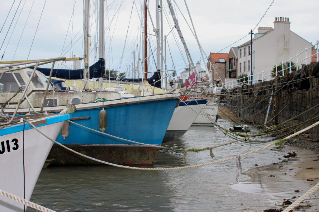
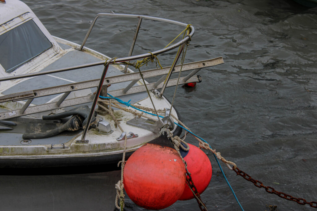

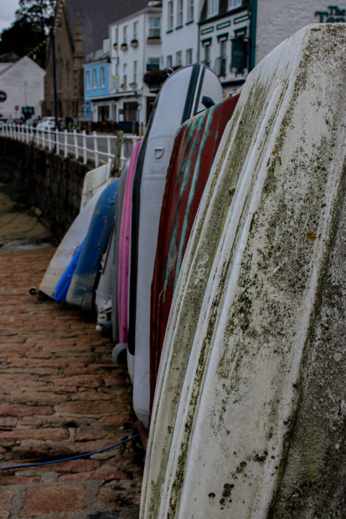
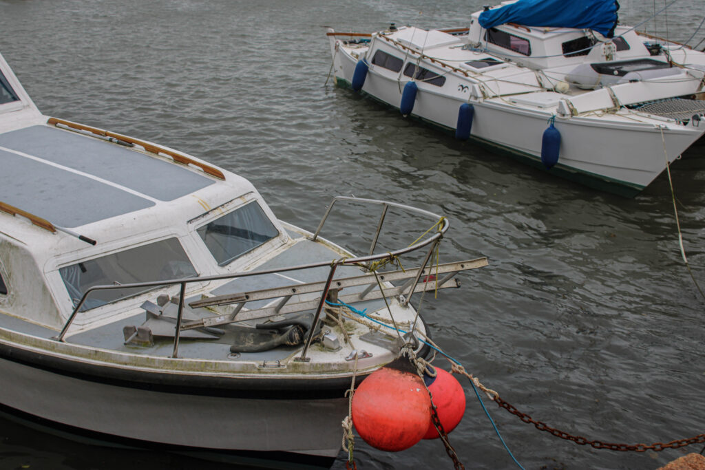
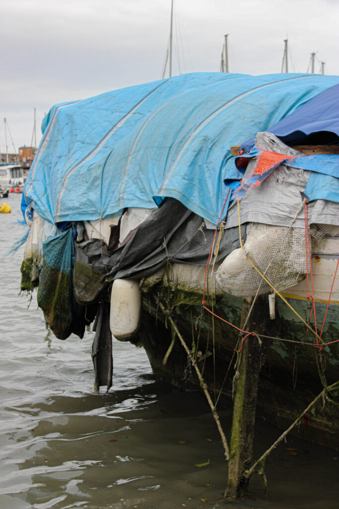
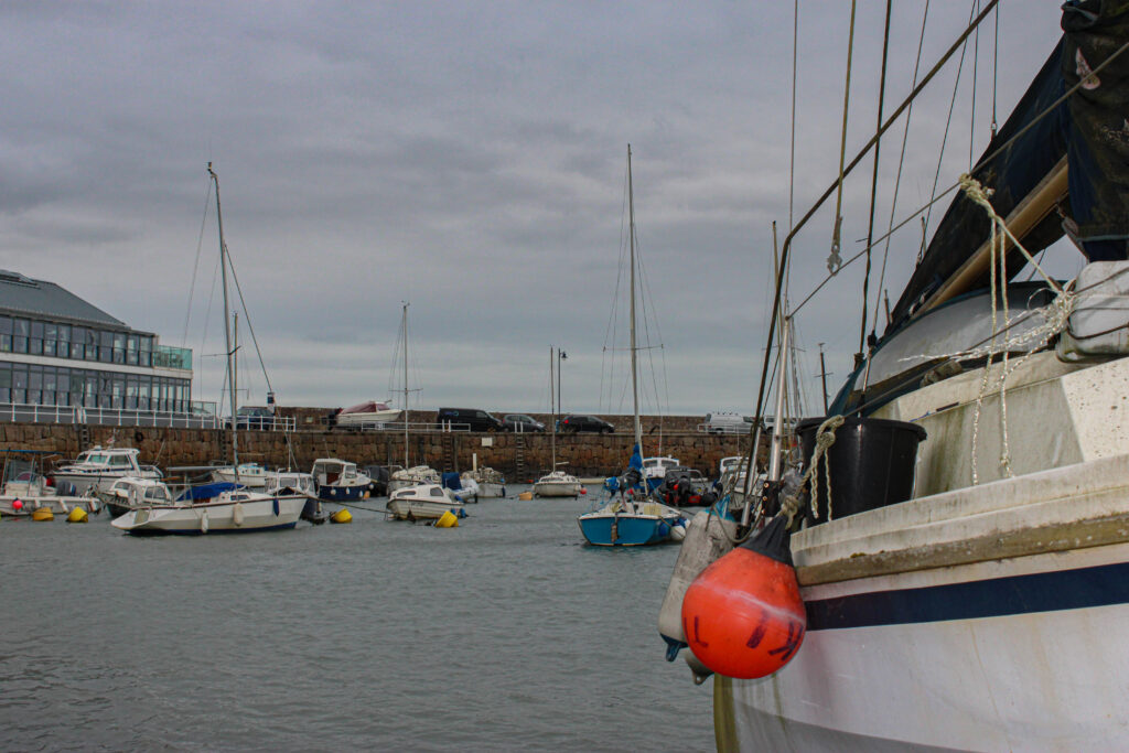
These are my favourite images out of the photoshoot I took at St Aubins harbour. I will use 3 or 4 of these to use in my Zine.
Design and layout.
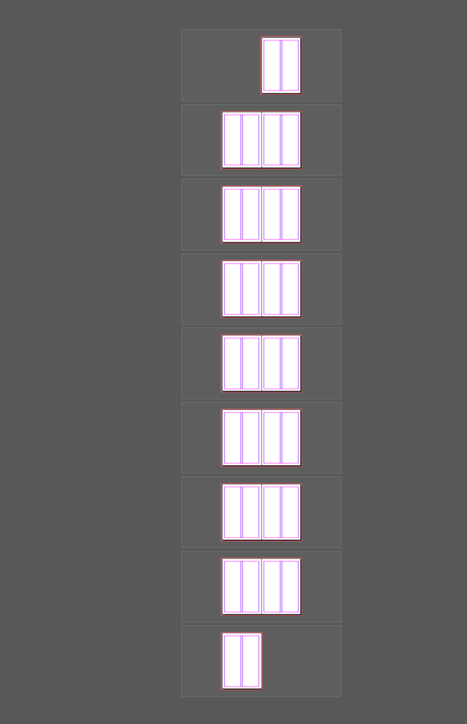
I would like my zine’s images to fit the page. I want to include double and single page spreads with no more than one image to a page. I also want this image to completely fill the page with no white gaps as I personally don’t like how it makes the image look. I am attempting to do a 16 page Zine which consists of around 3 double page spreads and the rest being single page spreads.
Narrative and visual concept.
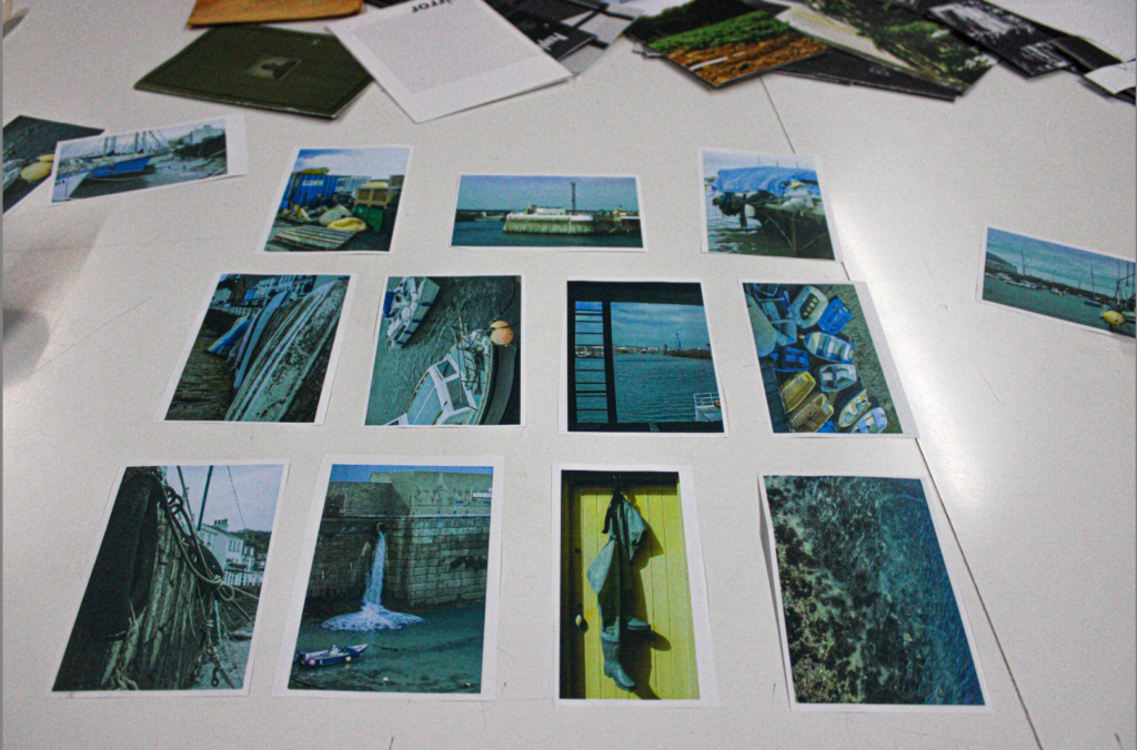
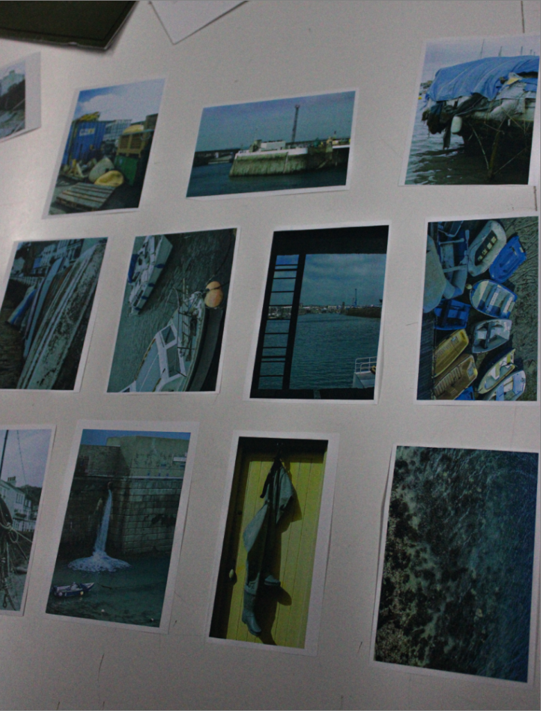
I have printed the photos I would like to use in my Zine and created them into an arrangement that I like. This helps me to visually sort each image into the right place I can also experiment which images to add and not include in my final product. I printed 4 images to an A4 piece of paper in colour to give me a rough overview of what they will look like. I have rearranged them into different orders to see which arrangement looks best.
Format size and orientation.
These are the settings I have used for my Zine, my page size is A5.

Image and text
I have come up with the title of this is because I think it perfectly displays the concept of my Zine in a few words.
Research zines and newspaper designs.
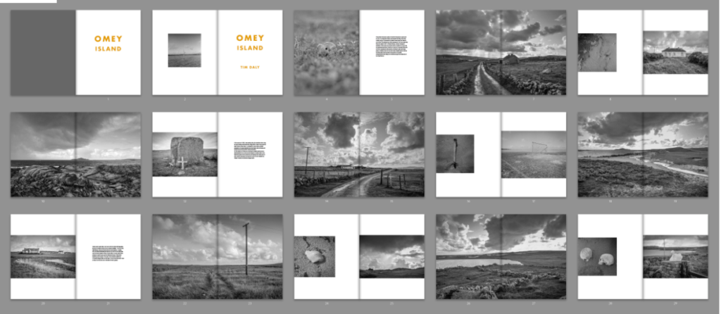
Whilst researching Zines online. I came across a particularly interesting interpretation from the Royal Photographic Society. I also found out that this project was used to encourage the public to go outside and take photographs in order to produce their own Zine. The Zines had to fit with their ‘definition of Landscape which was “Landscape photography is defined as the photographic portrayal of all elements of the land, sea and sky whether natural or built or influenced by human endeavour. “
People were allowed to photograph things such as
- Mountains
- Hills
- Bodies of water
- Coasts
- Forests
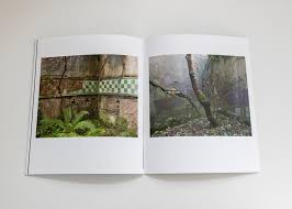
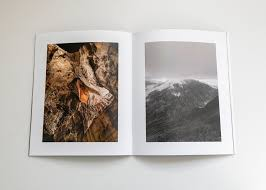
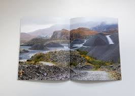
By researching different Zines and organisations I have gained knowledge and understandings on different styles. I particularly like the Zines on landscapes. I also like how these images slightly related to mine and have helped give me inspiration.
Final Layout.
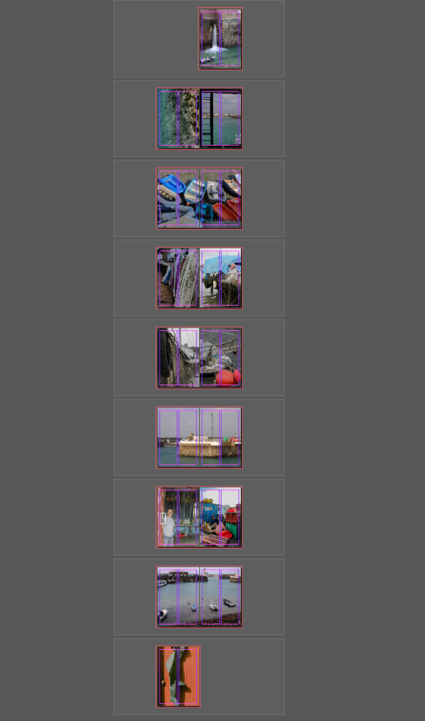
Final Images.
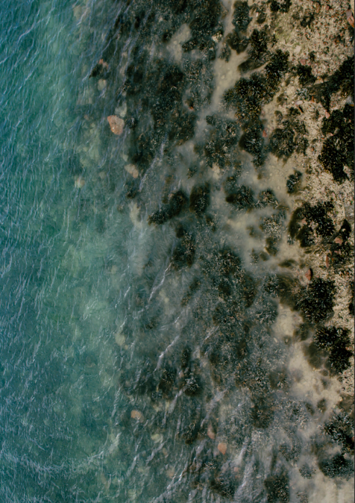
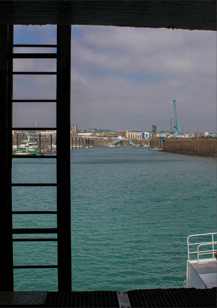
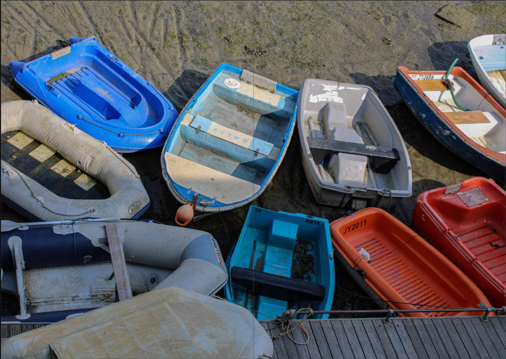
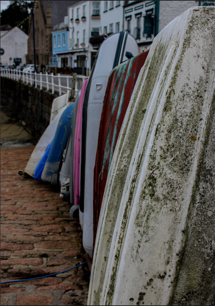
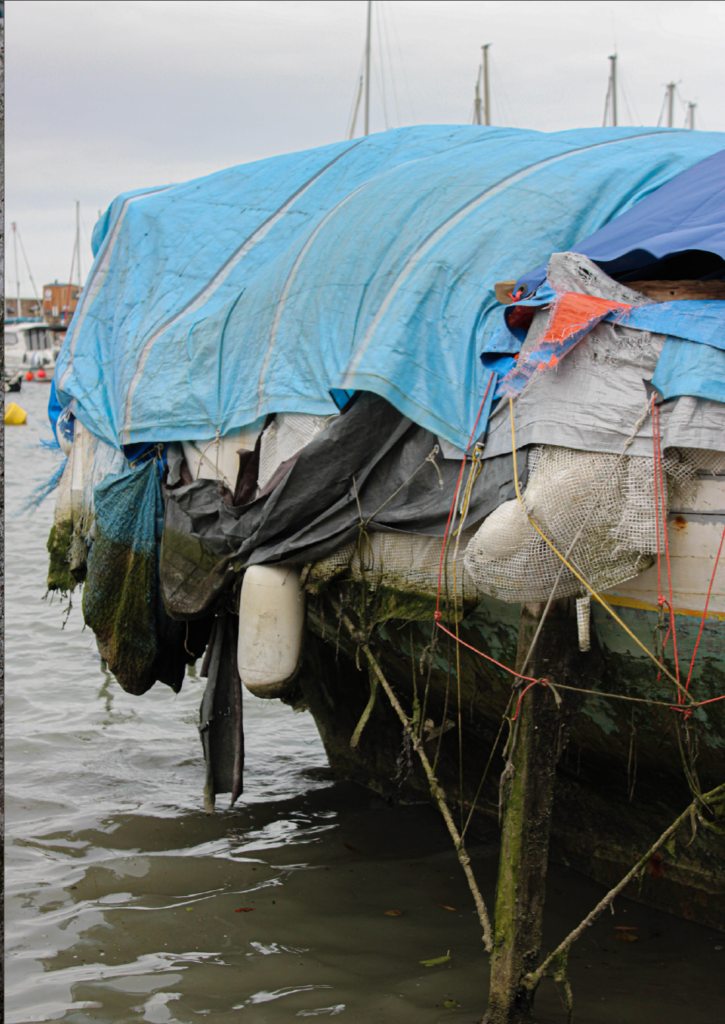
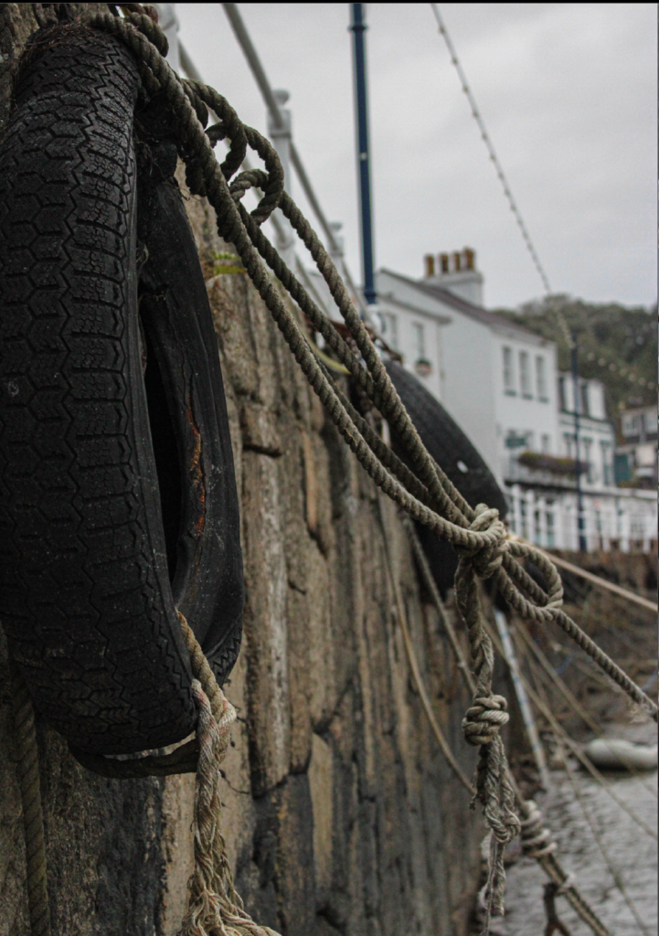
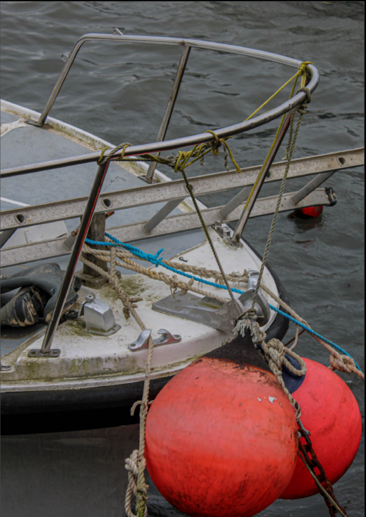
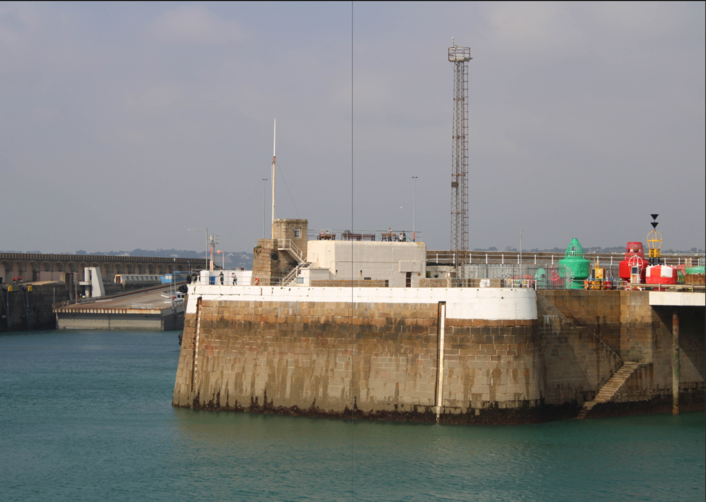
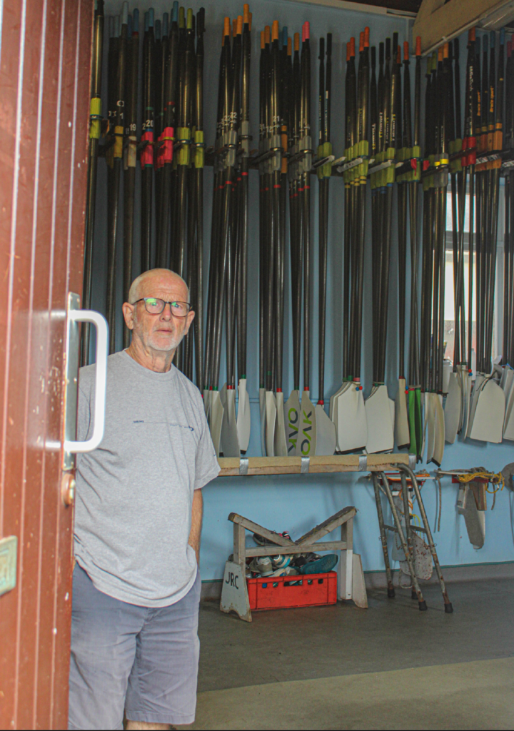
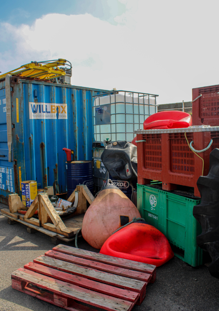
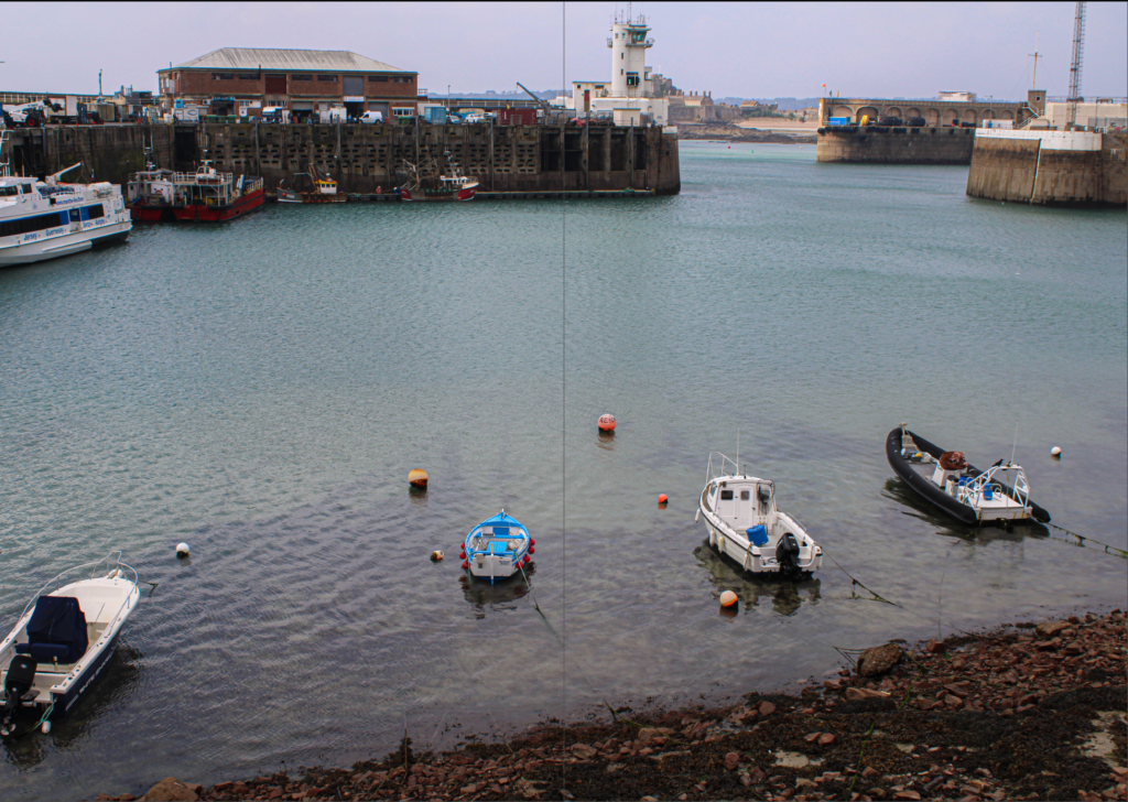
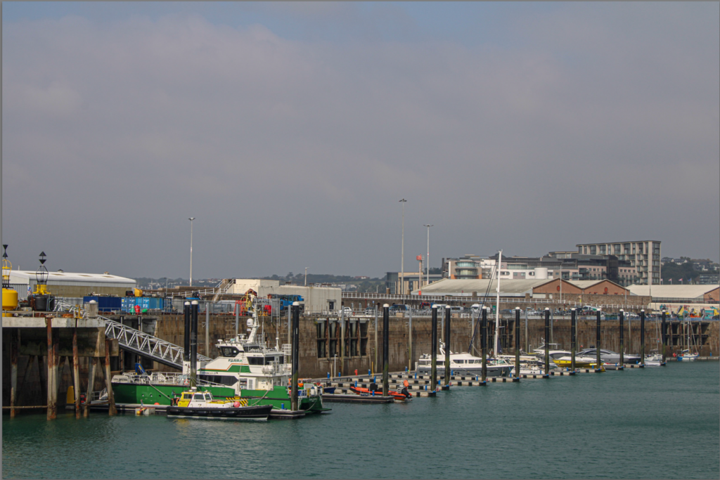
Originally I wanted my front cover to be this image…
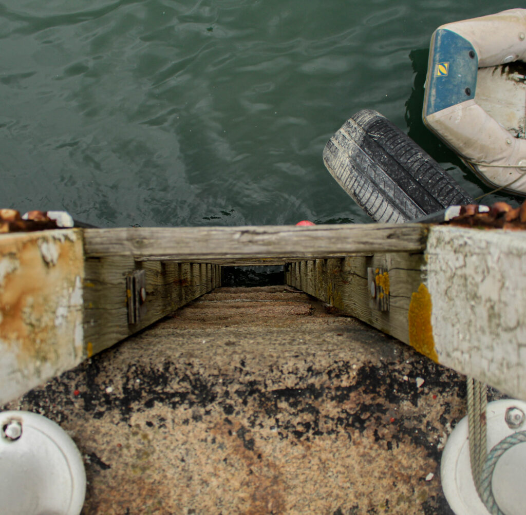
However, I decided I could most likely find a stronger and more suitable image for my front cover. So after searching Lightroom I found an image…
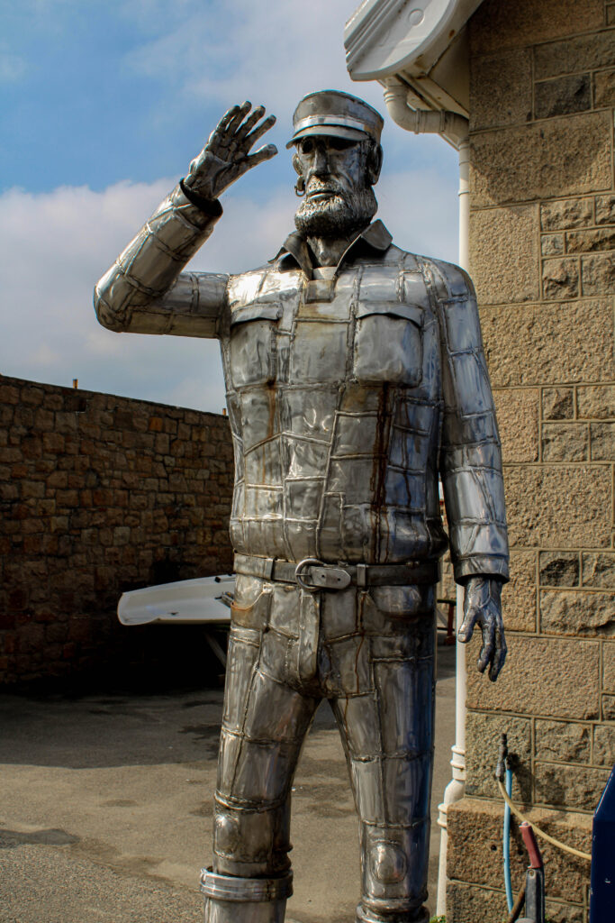
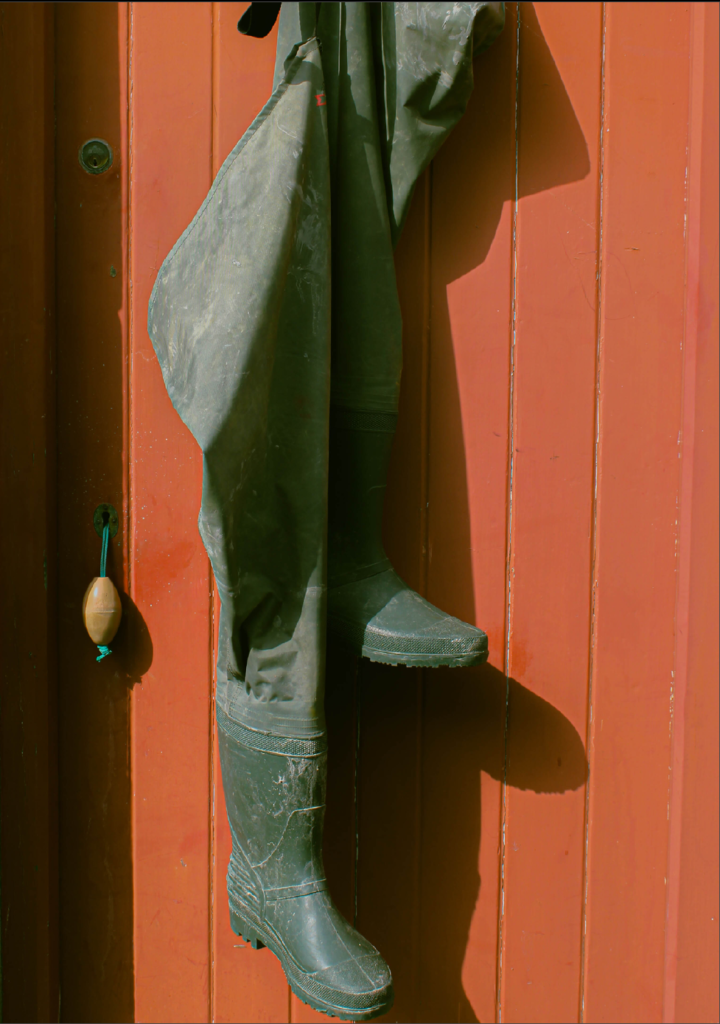
I also wanted my front cover to relate to my final page this is so that when the book is being looked at , then the final page is seen and the book is closed, the front page is relevant and similar. For example:


These two images are both relevant to sailors, employees and fishing. The statue is celebrating sailors and workers, whilst the final page gives a sort-of sense that the sailors have gone to work or finished their work for the day, leaving their boots behind. I felt this would be a good metaphor for the last page.
