Zine.

For my zine I am creating a collection of photos of St Helier and Jersey Maritime Museum. I will create this photobook on Adobe InDesign.

Mood board and Ideas.

Here are some examples of Zines previous students have produced that I would like my images to be inspired by. I really like the dark theme which displays the construction and mechanical aspect of Jersey harbours.

My Images Ideas.

These are my selection of images I am going to choose from when creating my zine.

3rd St Aubin’s Harbour Photoshoot.

After arranging images I may want to use, I went and did one more small photoshoot in St Aubin’s harbour to gather more images I may want to use. I decided to attempt to get more close up and in depth images of boats at St Aubin’s harbour.

These are my favourite images out of the photoshoot I took at St Aubins harbour. I will use 3 or 4 of these to use in my Zine.

Design and layout.

I would like my zine’s images to fit the page. I want to include double and single page spreads with no more than one image to a page. I also want this image to completely fill the page with no white gaps as I personally don’t like how it makes the image look. I am attempting to do a 16 page Zine which consists of around 3 double page spreads and the rest being single page spreads.

Narrative and visual concept.

I have printed the photos I would like to use in my Zine and created them into an arrangement that I like. This helps me to visually sort each image into the right place I can also experiment which images to add and not include in my final product. I printed 4 images to an A4 piece of paper in colour to give me a rough overview of what they will look like. I have rearranged them into different orders to see which arrangement looks best.

Format size and orientation.

These are the settings I have used for my Zine, my page size is A5.

Image and text

I have come up with the title of this is because I think it perfectly displays the concept of my Zine in a few words.

Research zines and newspaper designs.

Whilst researching Zines online. I came across a particularly interesting interpretation from the Royal Photographic Society. I also found out that this project was used to encourage the public to go outside and take photographs in order to produce their own Zine. The Zines had to fit with their ‘definition of Landscape which was  “Landscape photography is defined as the photographic portrayal of all elements of the land, sea and sky whether natural or built or influenced by human endeavour. “

People were allowed to photograph things such as

  • Mountains
  • Hills
  • Bodies of water
  • Coasts
  • Forests

By researching different Zines and organisations I have gained knowledge and understandings on different styles. I particularly like the Zines on landscapes. I also like how these images slightly related to mine and have helped give me inspiration.

Final Layout.

Final Images.

Originally I wanted my front cover to be this image…

However, I decided I could most likely find a stronger and more suitable image for my front cover. So after searching Lightroom I found an image…

I also wanted my front cover to relate to my final page this is so that when the book is being looked at , then the final page is seen and the book is closed, the front page is relevant and similar. For example:

These two images are both relevant to sailors, employees and fishing. The statue is celebrating sailors and workers, whilst the final page gives a sort-of sense that the sailors have gone to work or finished their work for the day, leaving their boots behind. I felt this would be a good metaphor for the last page.

zine: deisgn & layout

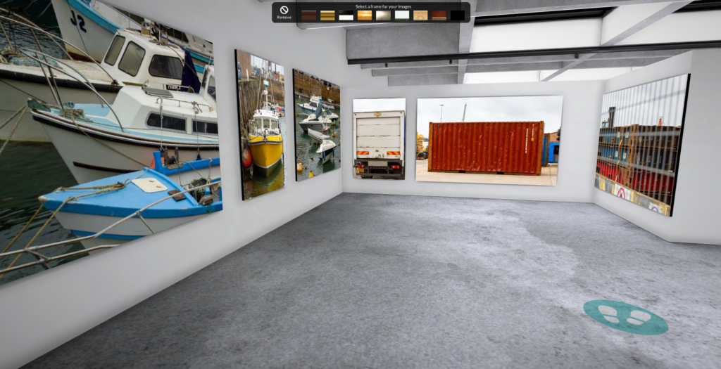
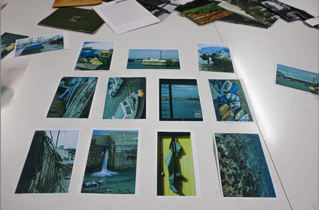
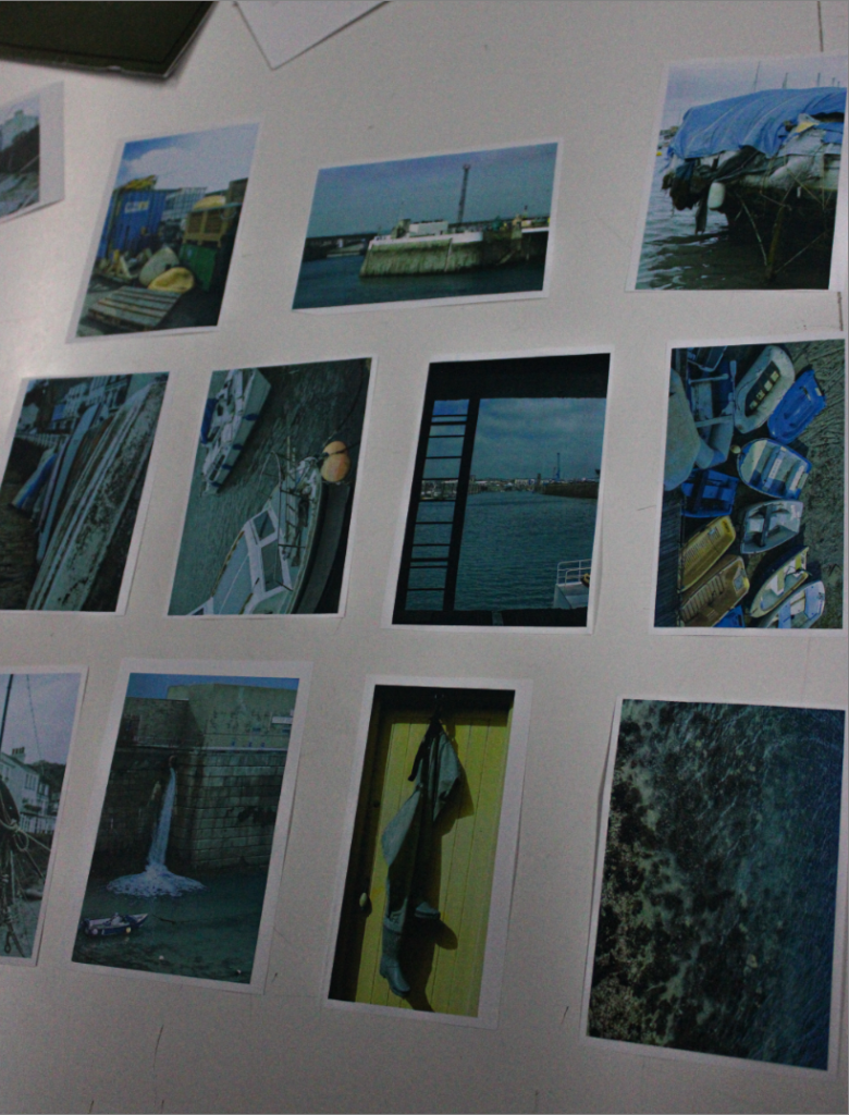
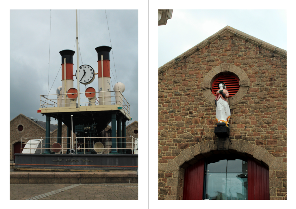
I firstly designed a paper copy of my zine to give myself ideas on what my story is and how each photo should be places and give a vibe of the final product.

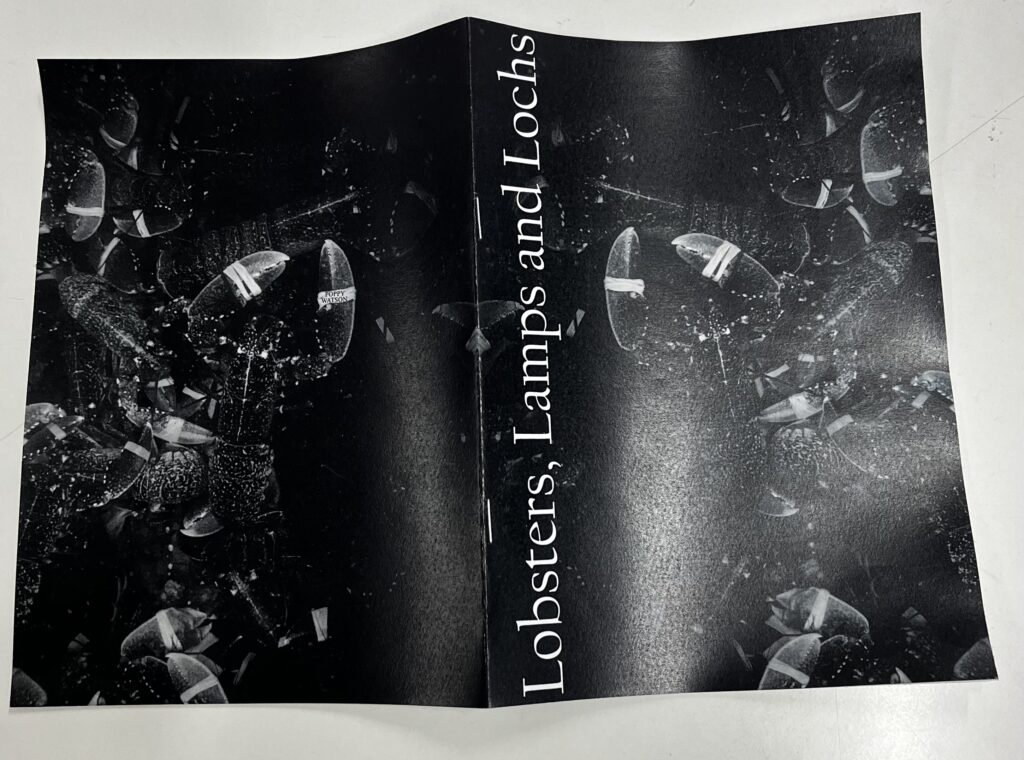
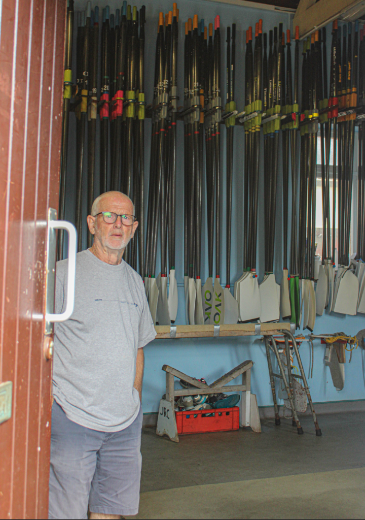
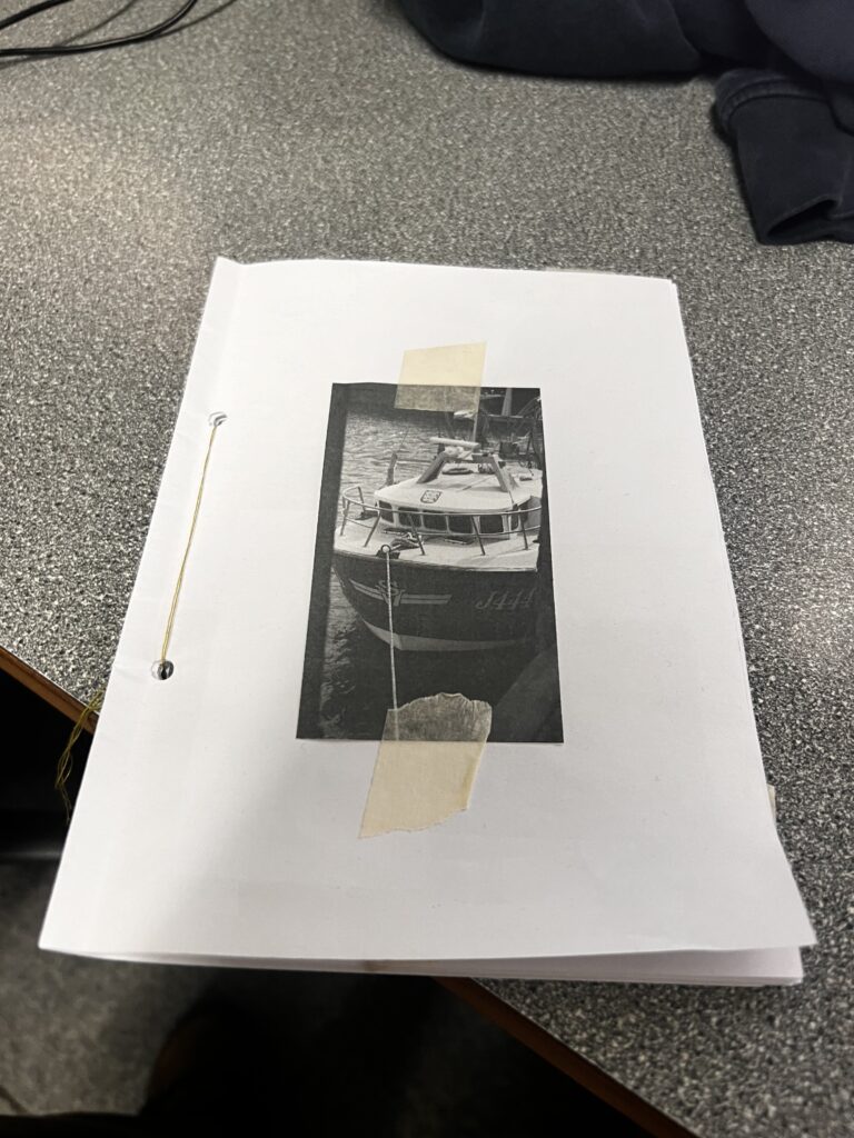
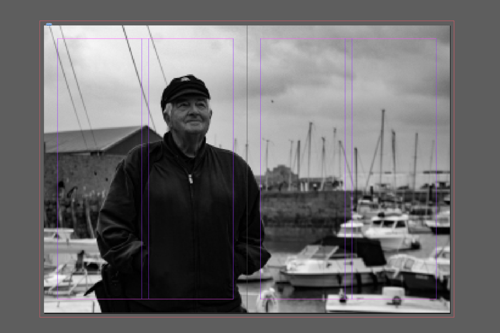
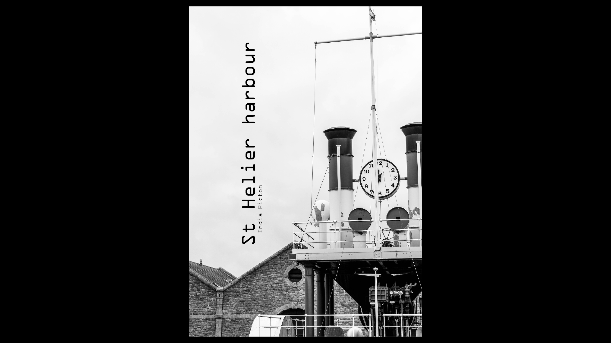
Then I went on to InDesign and made a online book of blank pages and began my zine. This is the front page of my zine, I decided to use this image as I though a lot of my portraits where very strong photos, this one also fits well with the title of fishermen’s footsteps, as it implies that I’m also saying this is Captain Bryans life and his footsteps, or journey through St Helier harbour.

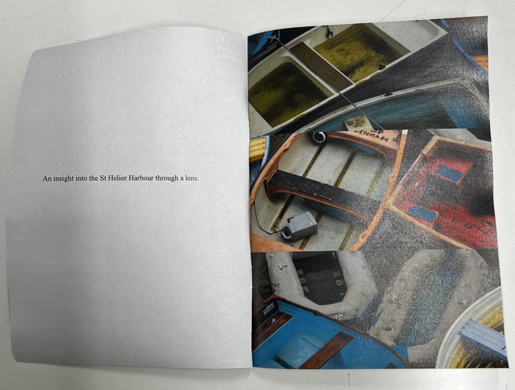
This is my second and third page, I decided to add an introduction to give a vibe or an idea of what my zine would be showing, but I decided to do the introduction in sea shanty form, I also added footsteps throughout this page to look like a fisherman is walking through telling the story, walking his journey linking it to the title.

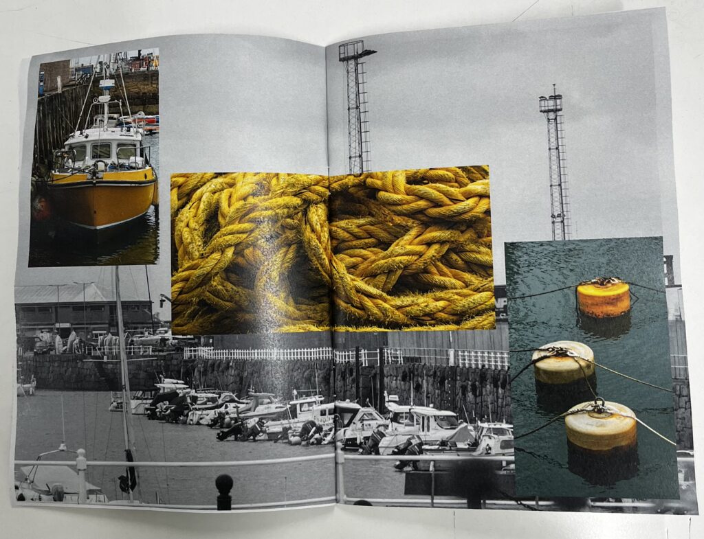
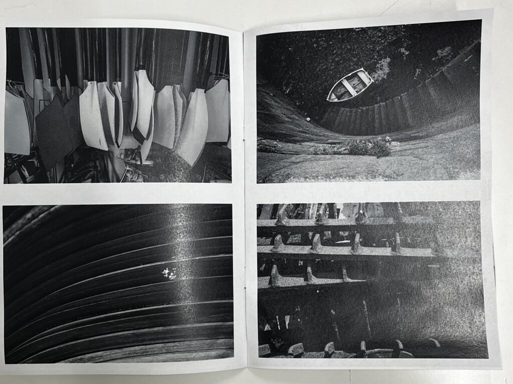
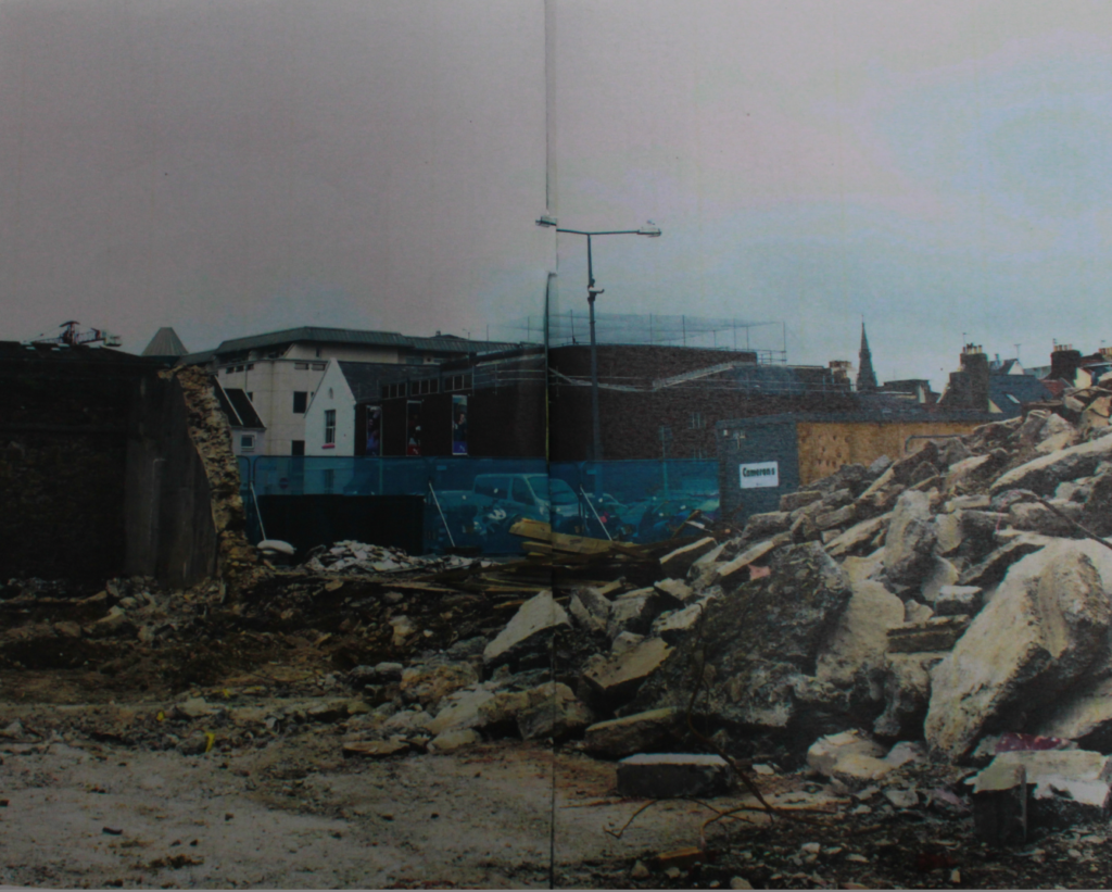
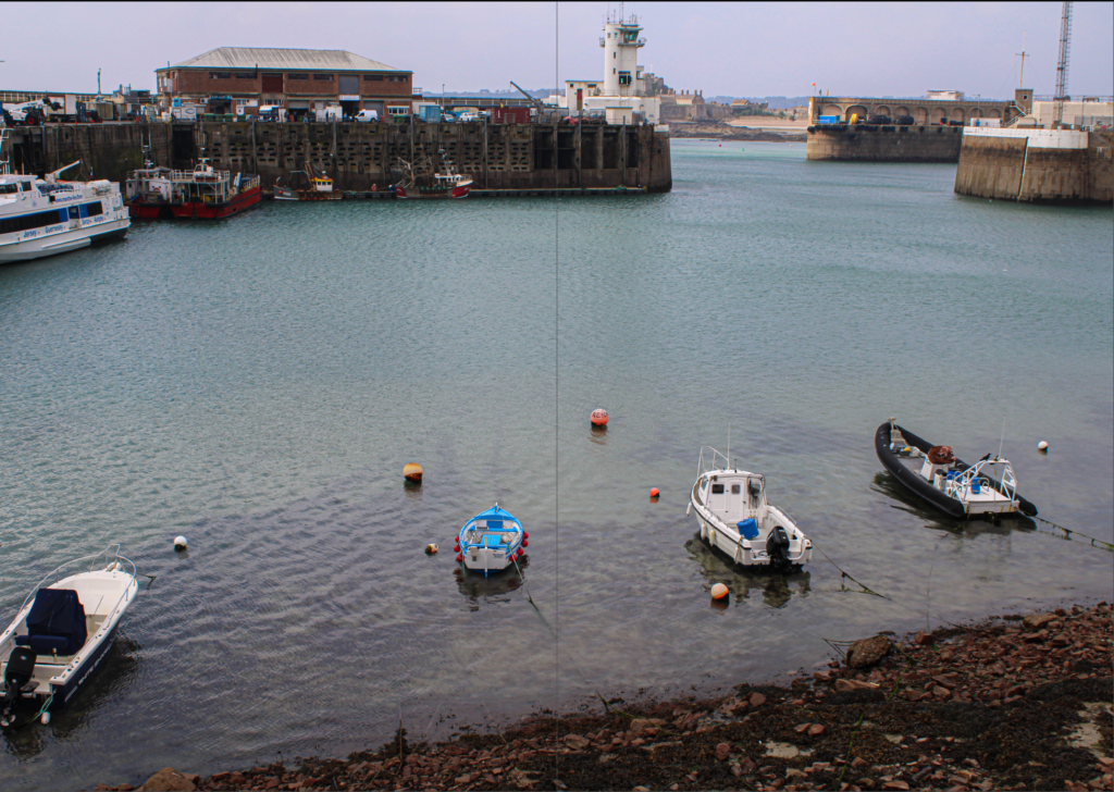
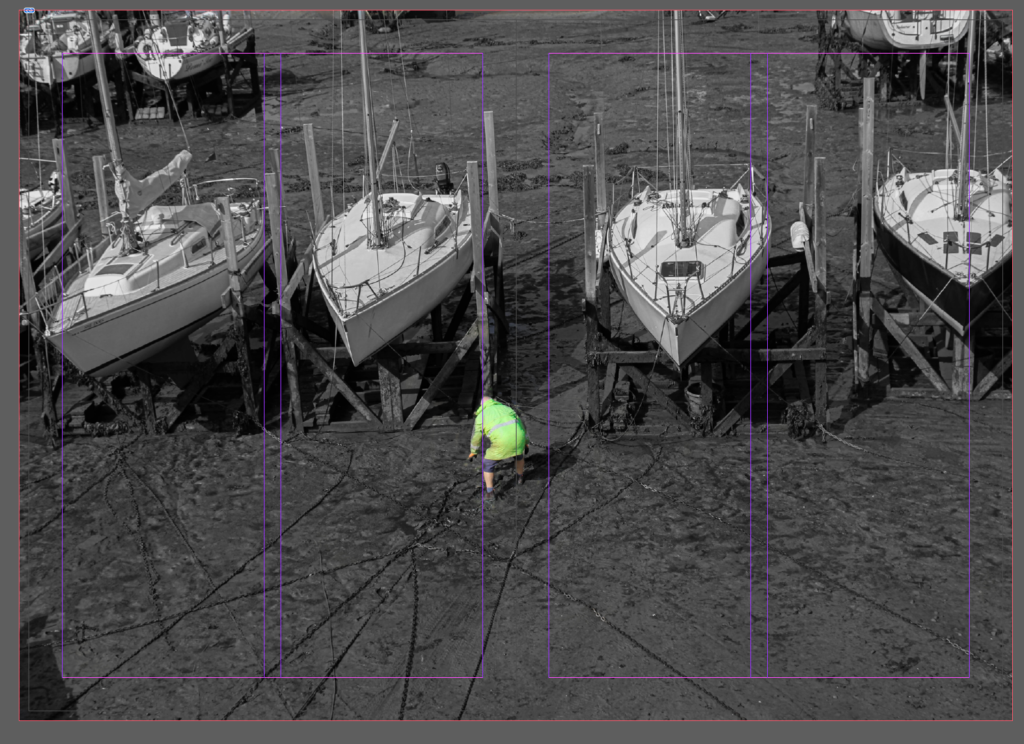
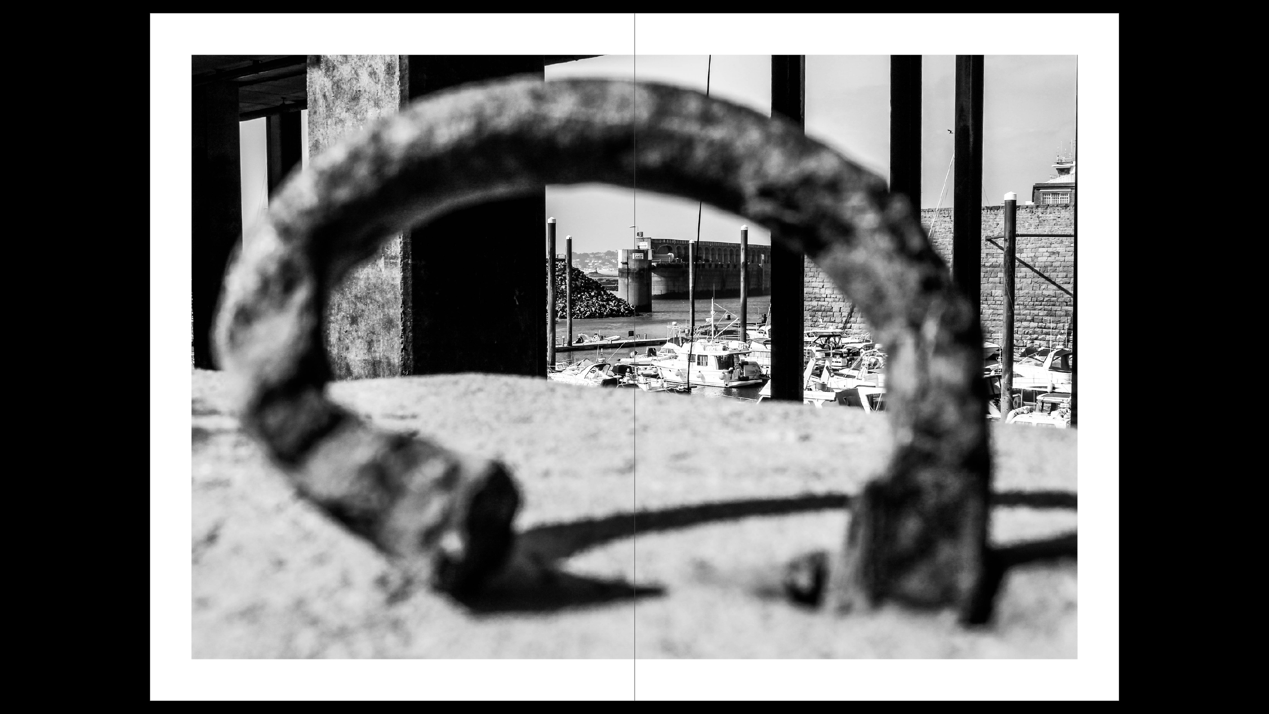
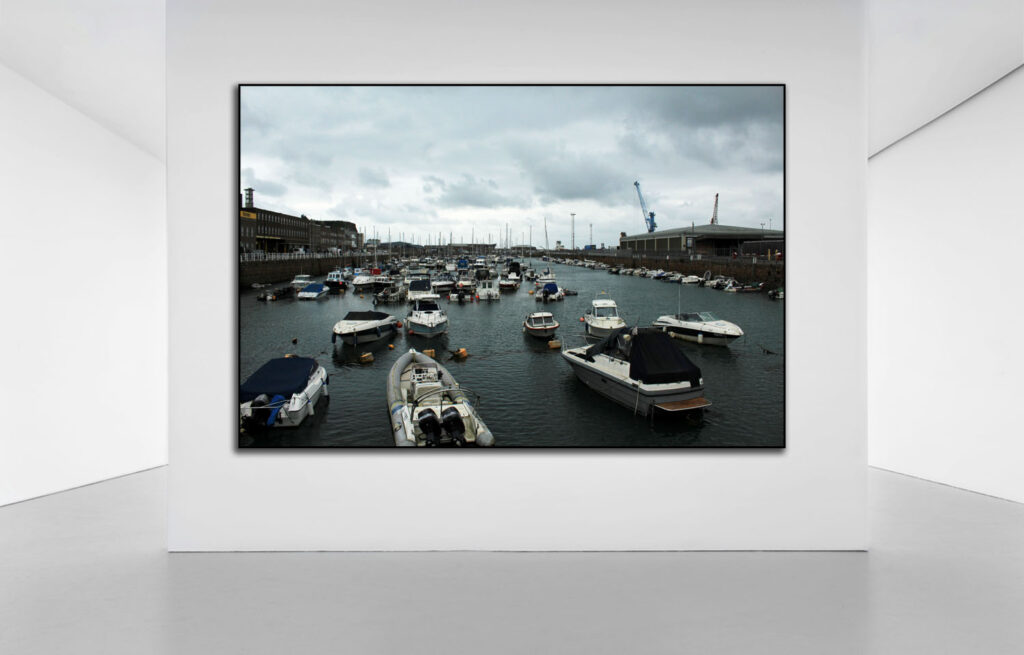
This is the 4th and 5th pages, I used one photo that I really liked and I thought fitted in well with my zine to link to the title even more ad continue the story showing someone working in the harbour like fishermen would back in the day and continue to this day.

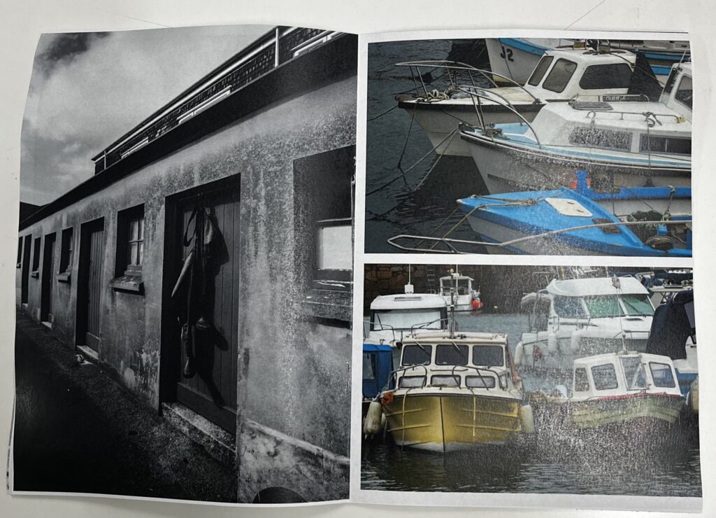
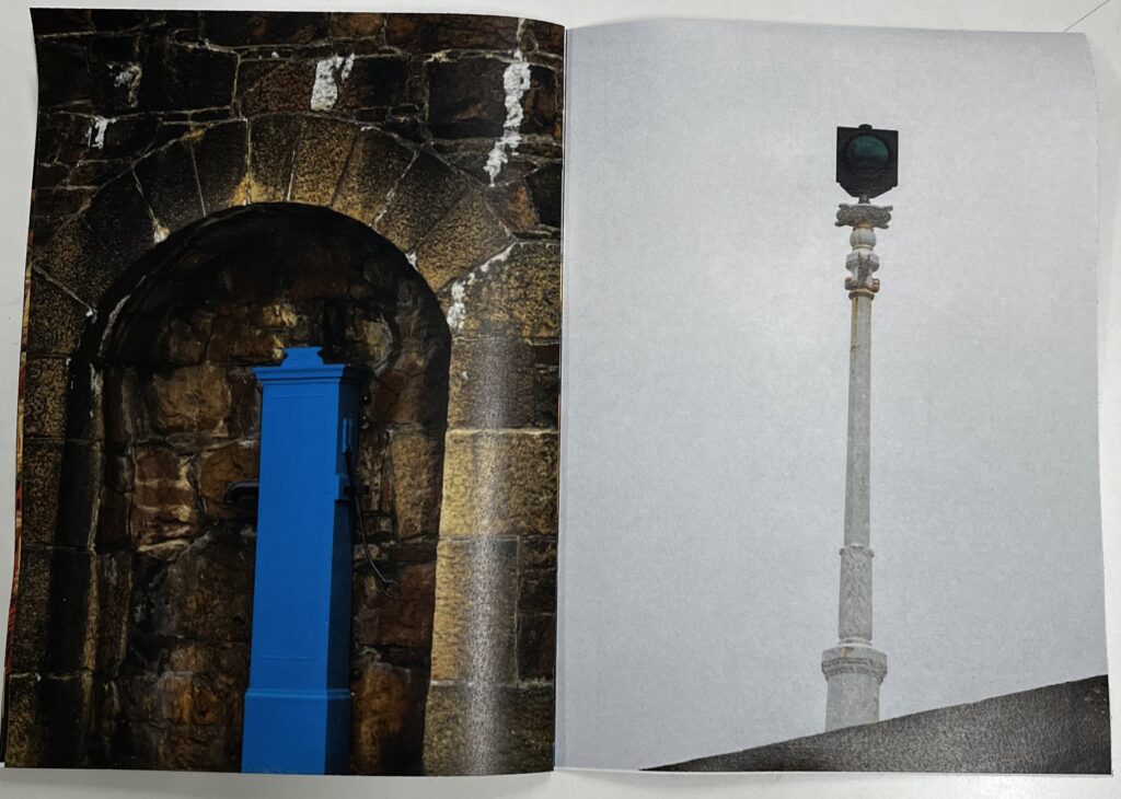
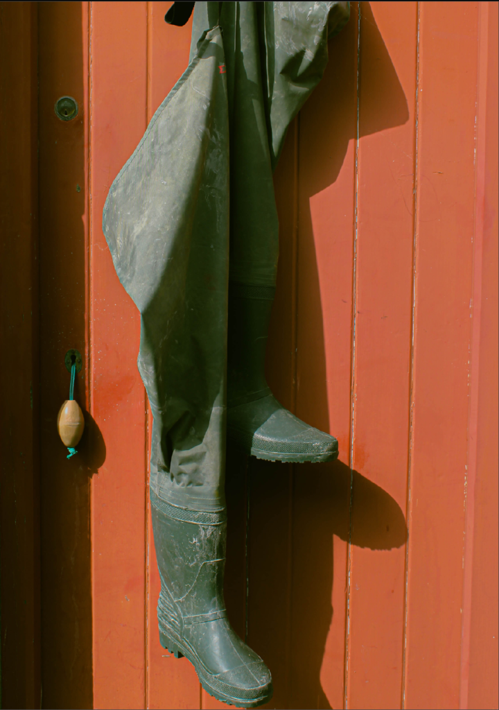
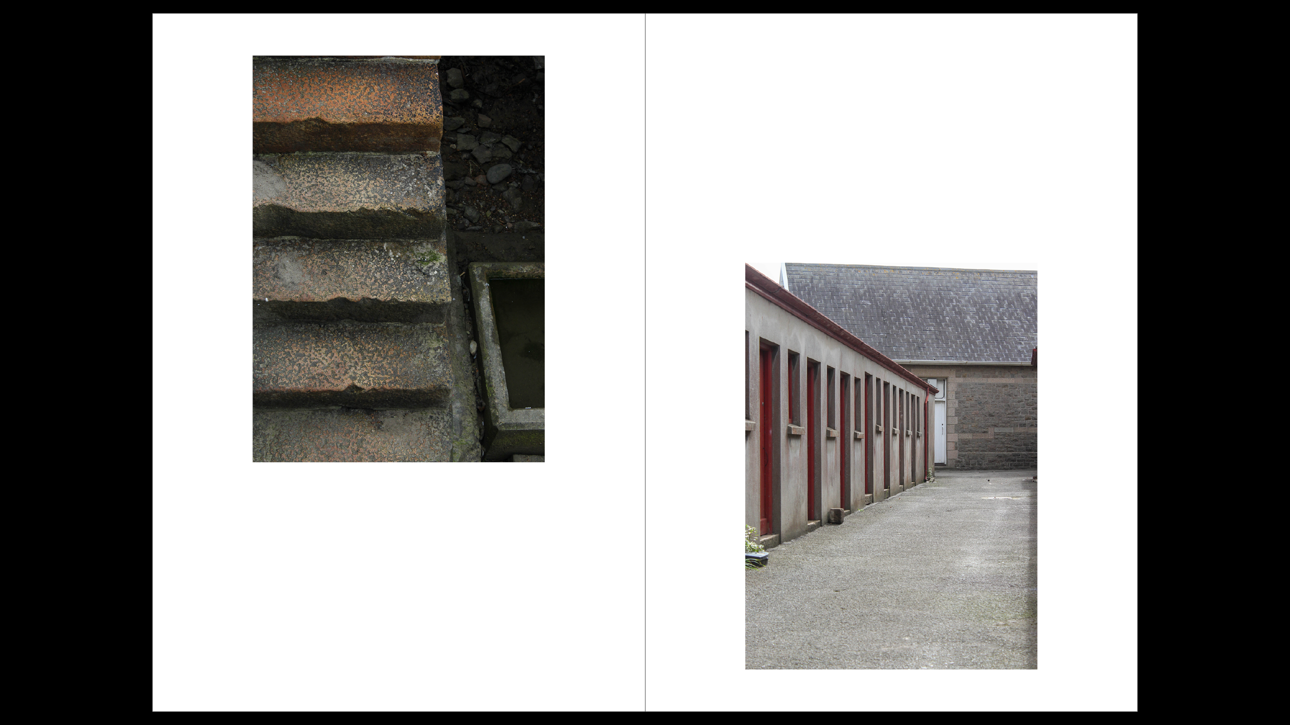
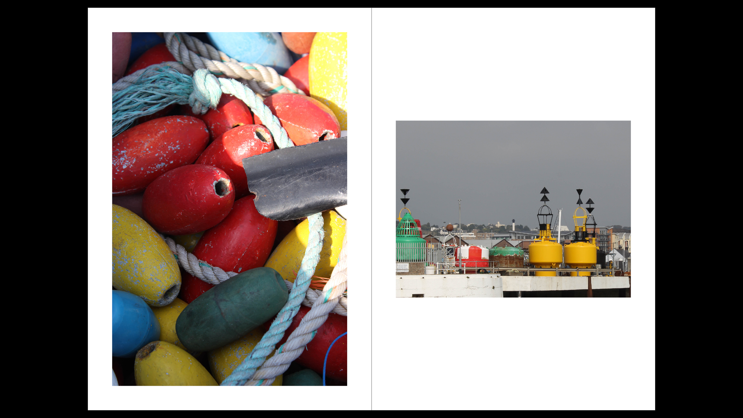
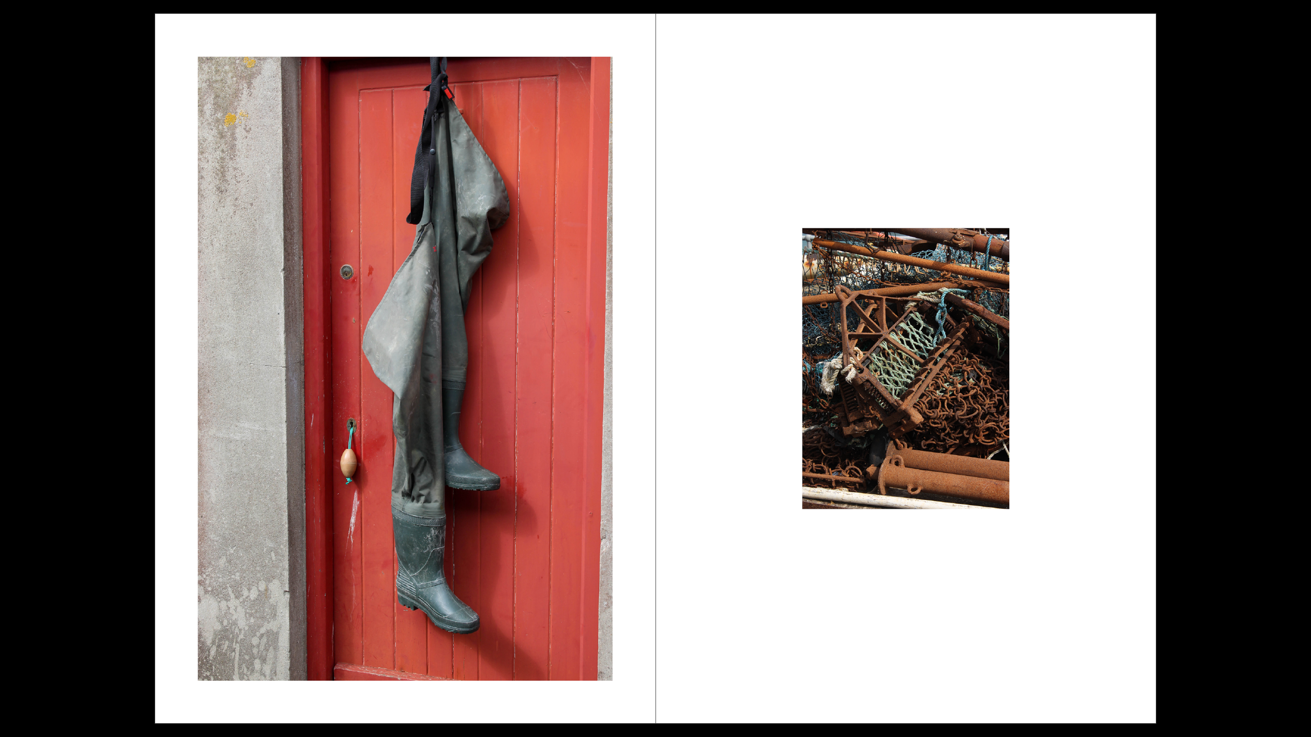
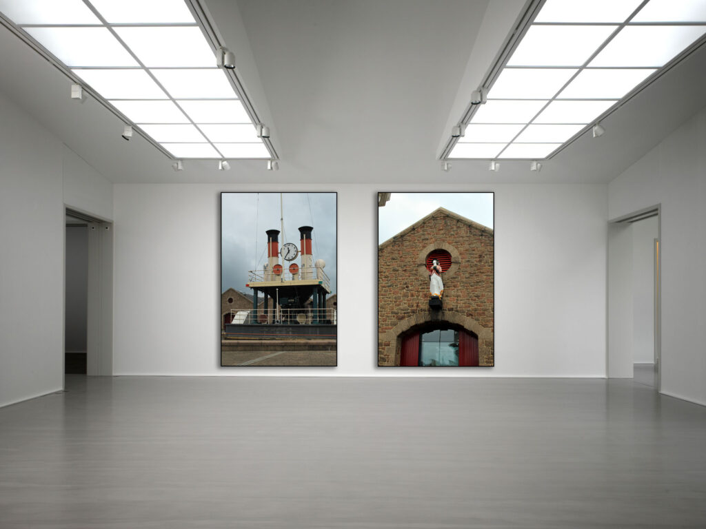
In these two pages I matched having the red and same area together, I also added more footsteps to continue the journey and keep everything linked, I also like the photo of the boots because I thought that added well into the fishermen’s footsteps.

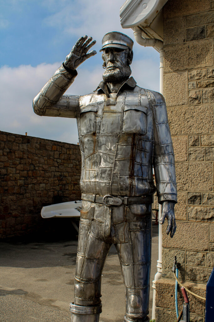
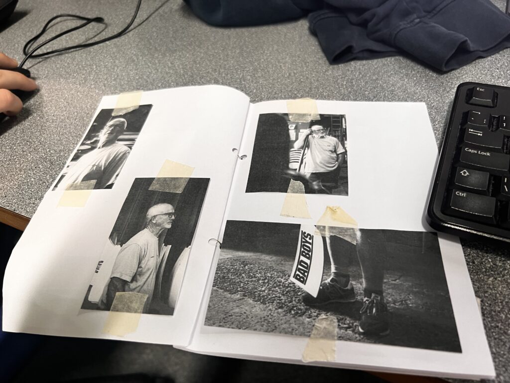
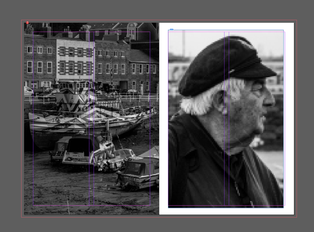
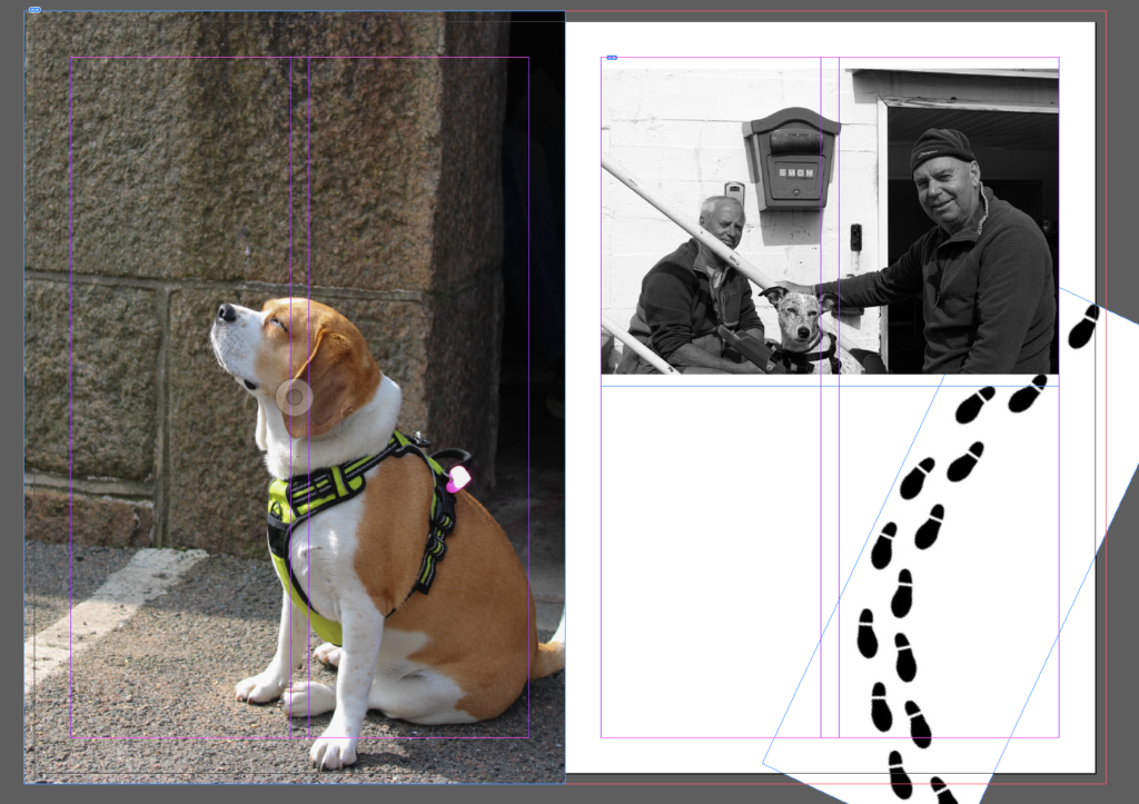
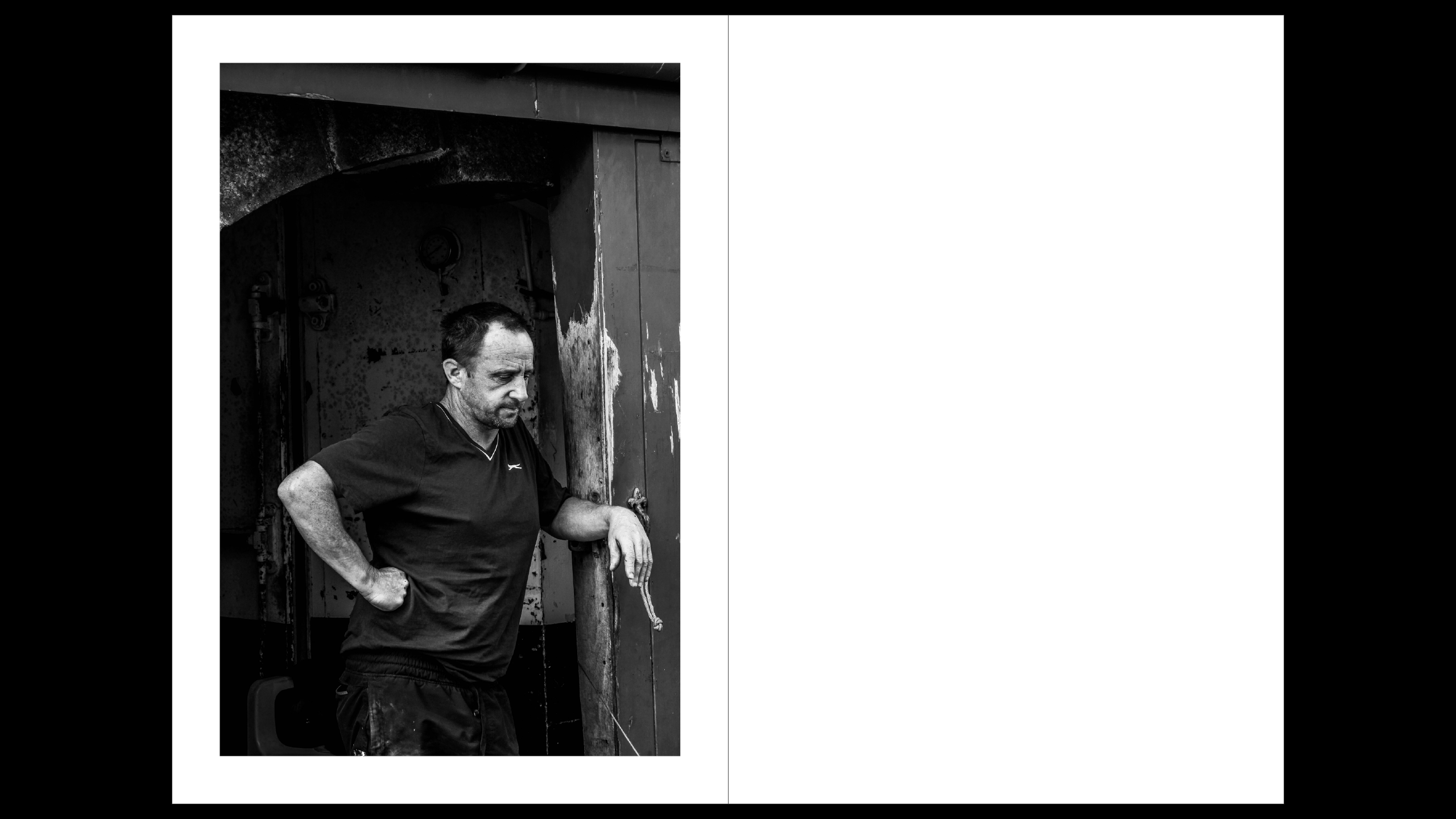
Once again I brought in the footsteps and added another portrait as I liked all my portraits and thought they told theory own story.

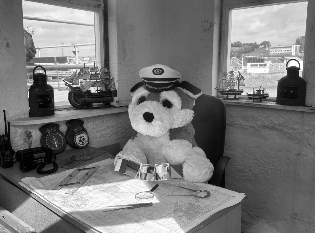
I continued to add the footsteps, as this image both has dogs I thought it linked very well together, I also considered adding some dog footprints but thought it might be random addition.

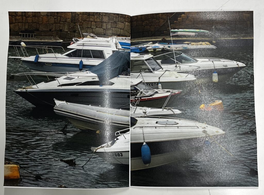
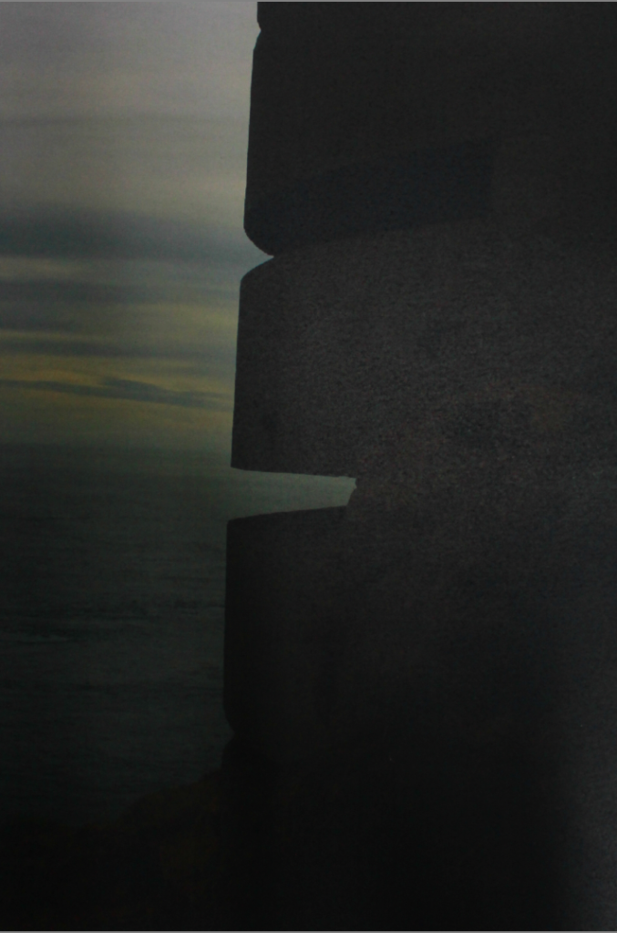
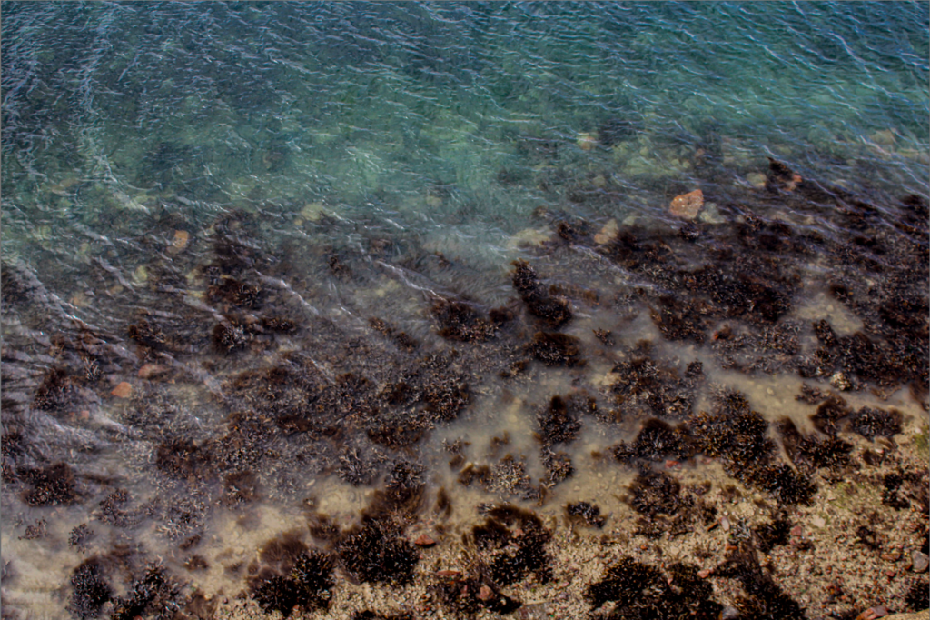
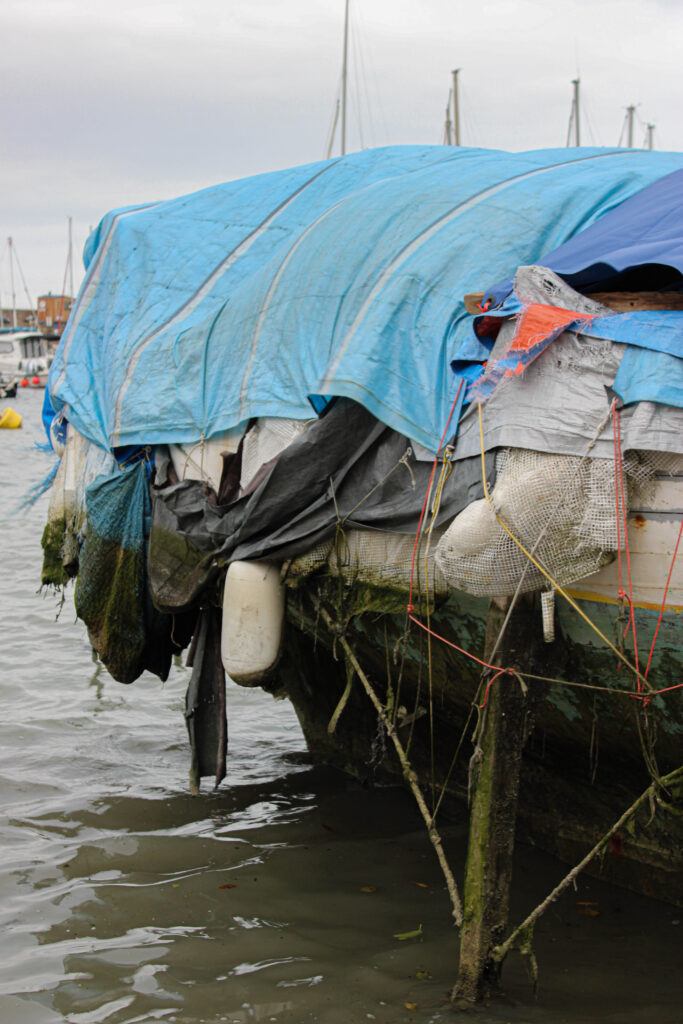
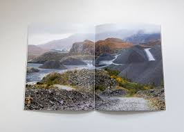
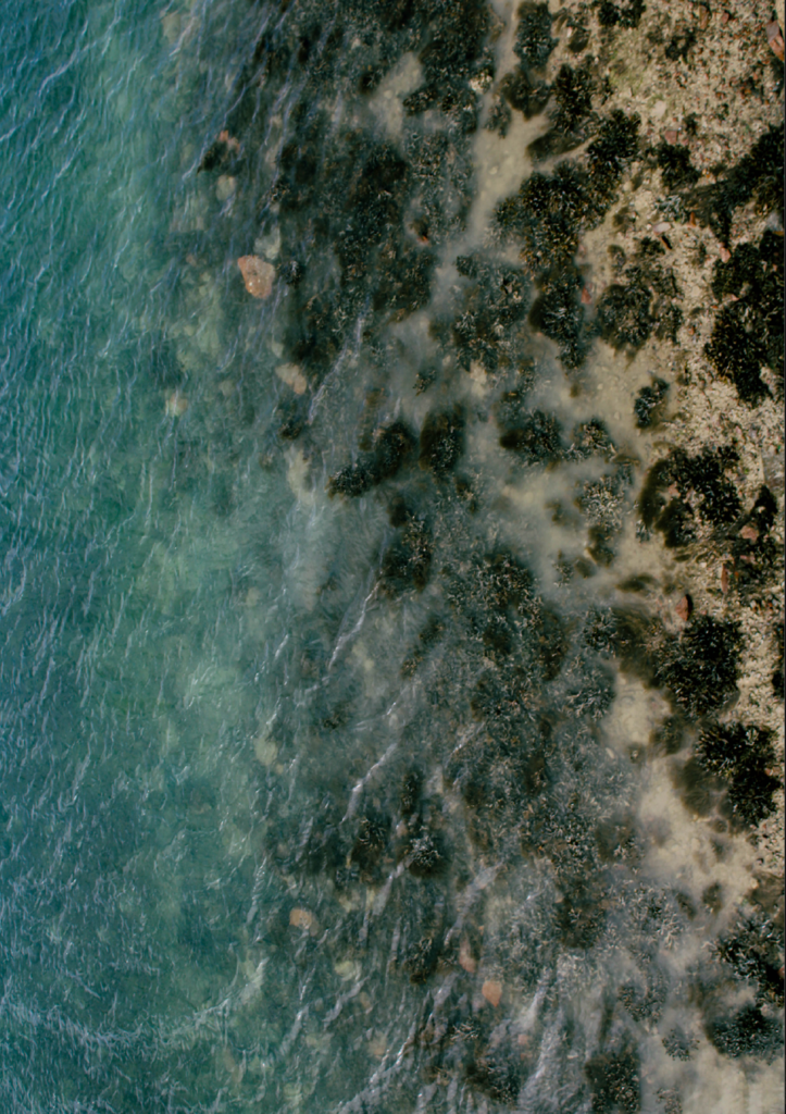
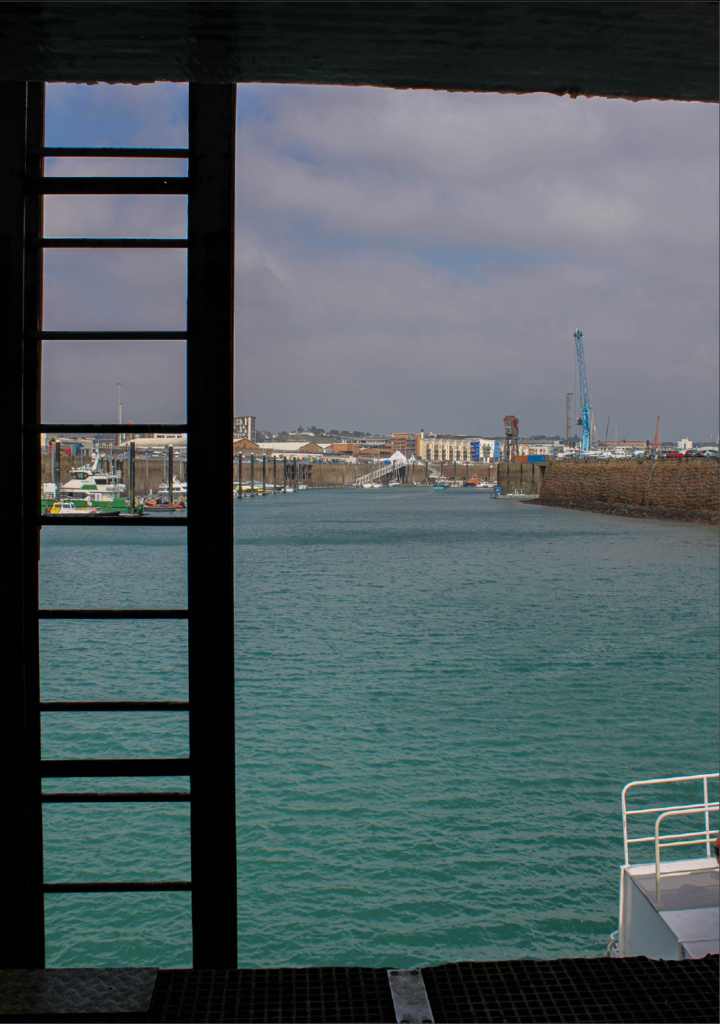
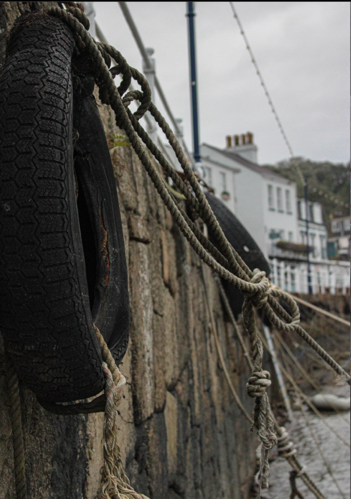
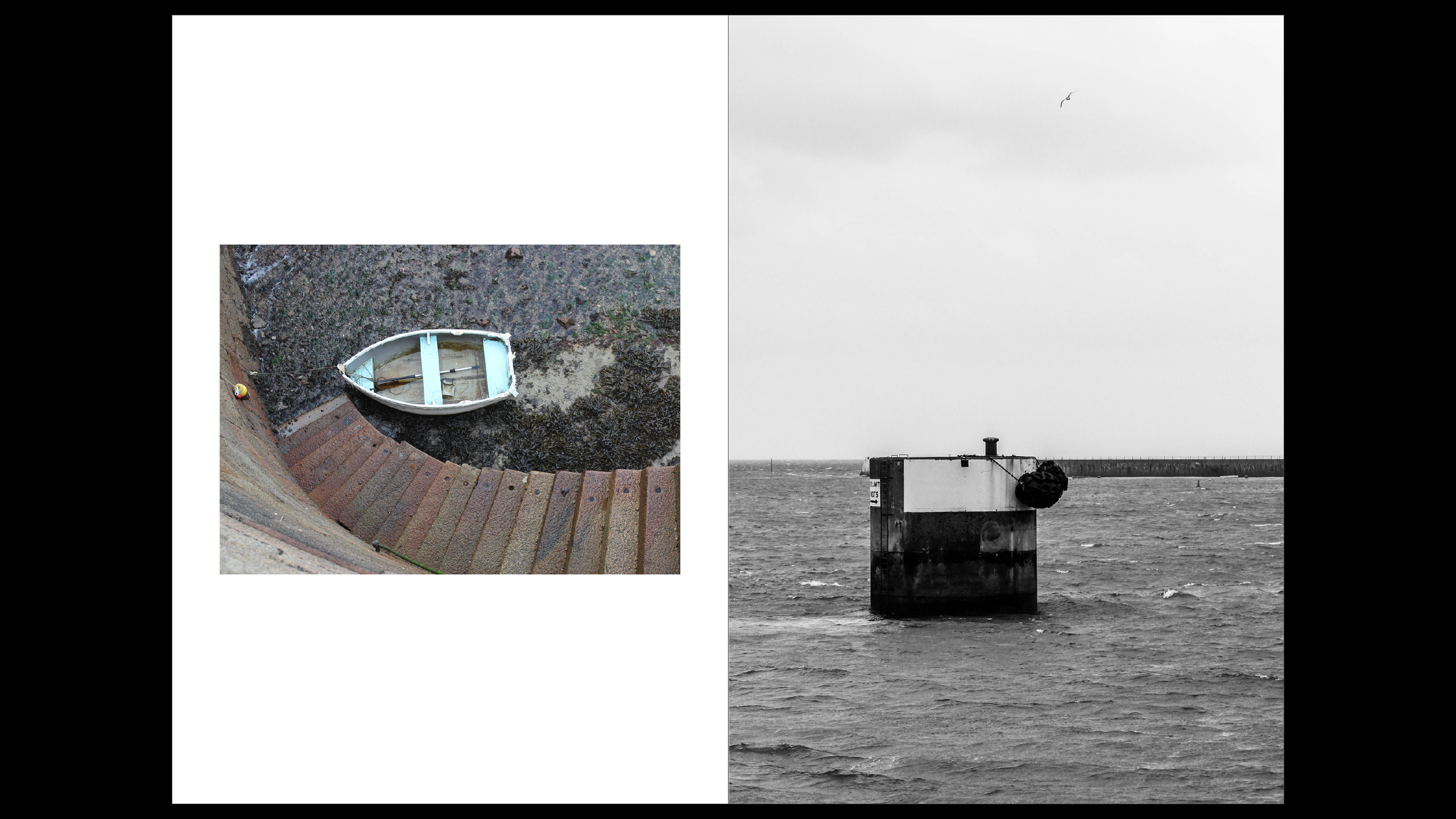
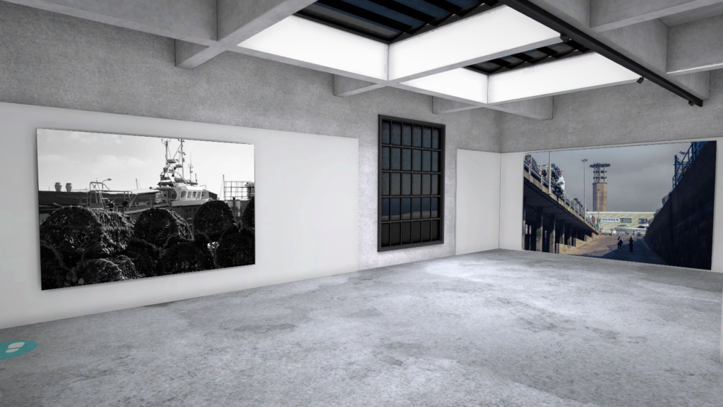
This was another full bleed image across both pages, i added the sea to kind of say how fishermen go into the sea a lot, most of their journey contain the sea and that why it takes up two pages, I also tried to have majority land images before this image and after this are all things that come from the sea or what fishermen catch.

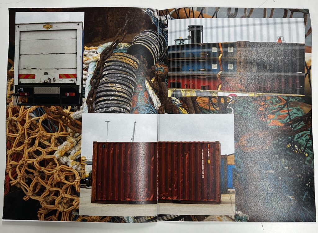
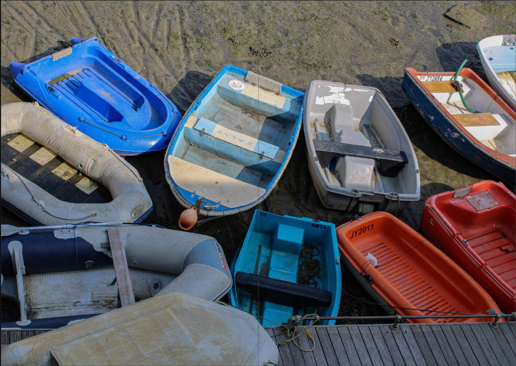
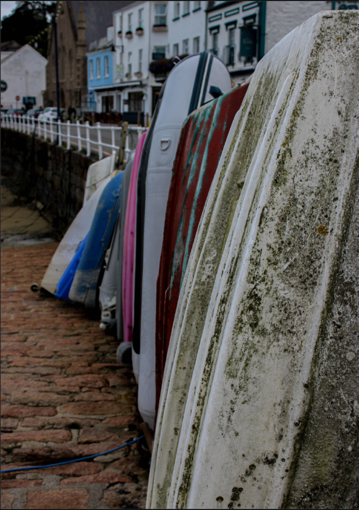
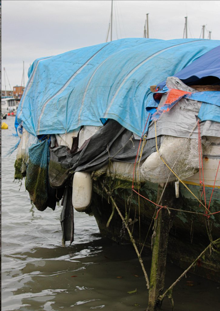
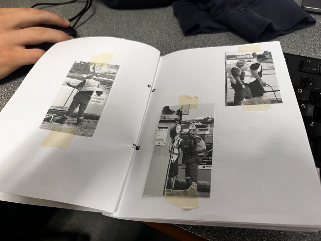
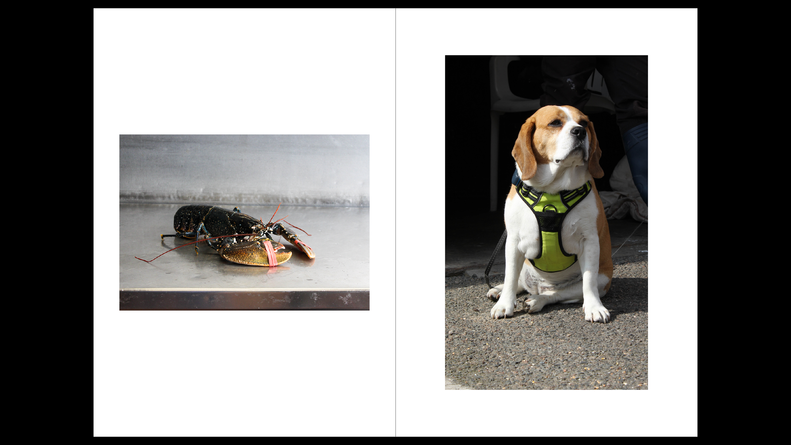
these images all link together into my story as these are the fish that make fishermen FISHermen, they all link as well because it is either lobsters or an actual lobster catcher.

this is my final page, the back photo and I had it have bright red colours to link with other red photos in the book. I also felt it was a strong image to have last.

Evaluation

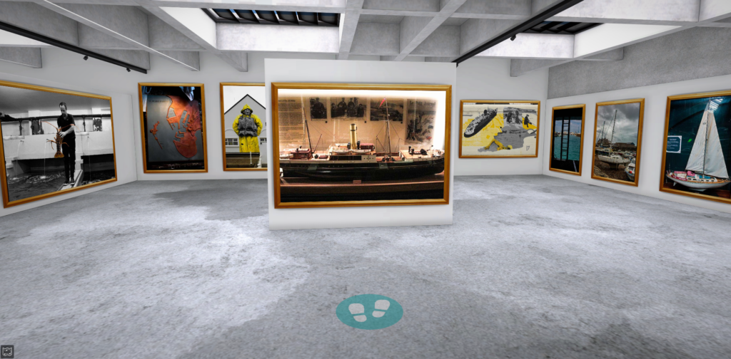
This is my final zine, which I printed out. I was really pleased with the outcome of it, my first photo, was one of my favourites as it was a portrait and thought it fitted really well with the title, it was a full bleed image that was warm coloured and matched well with the title font, I liked this image because not only was it fun to take and showed some of my best work it began the story strong. one thing I did not like was the background as it was boring but it did go well because it was the St Helier harbour. After that my first two pages was an introduction in sea shanty form, I was actually really pleased and enjoyed writing it, and thought it went well and was a funny contribution to my zine. The next photo was a good photo and I really liked it but I thought the black border didn’t look as good as as I wanted, and thought it was a random place to put it. Then it was another full bleed image which I really liked and fit really well as it was a fishermen working in the harbour. After that I created the 6th and 7th page this was red theme and reintroduced Captain Brian, the images worked well together as they were in the same area and they both linked back to the title page continuing the story on throughout my zine. I didn’t love the photo of the shoes because of the angle it didn’t work as well as I wanted. Then I had another portrait which was another good attribute to my zine, because it linked with the title and the previous page. They also both went with each other because they are in black and white and are of the same area. The second image I didn’t like as much because I gave an old aesthetic look which wasn’t what I was aiming for in my zine. I once again had these images linked together because they both have a dog in them, I didn’t like how one image was black and white but it edited better that way. I added another full bleed image across two pages, I liked this photo of the sea because I thought it looked aesthetic, and went well for my story as they headed in the sea and fishermen are in the sea a lot. Then I had the photos of the lobsters and lobster catcher, this was one of my favourite pages because of how well everything linked with each other and I really liked the bright colours as it was just a happy page. My final page was also another image I enjoyed taking and editing and it linked back to the red because of the red colouring. Overall I was more than pleased with how my zine turned out.

Virtual Gallery – St Helier Harbour and further Evaluation

Below are some screenshots of the gallery presenting my photos from the photoshoots taken in the St Helier harbour. I laded them out in controlled order with photos containing wide open spaces having a larger frame than close up photos. I also grouped similar images together to make the viewing less confusing.

Evaluation of the whole topic:

the topic of Jerseys marine life was initially quite interesting to me as I have now lived on this island for over 7 years and I’m always interested in learning new things about the island. The Jersey marines was particularly interesting because it my dad has always been into fishing and I often join him, so learning about the interesting and often overlooked history of jersey cod trading was fun to learn about. Using the Jersey Archives as a research tool helped me massively to find out what was going on from over 300 years ago to now in Jersey. It helped me answer many questions about Jerseys history, like sources of income, common jobs, ext.

For the first photoshoot we went around the the St Helier harbour with 2 tour guides, one being the old captain of the marine which one of my final images has him as the subject:

I like this image as Its almost a capsule into the past, with no new items in the frame. It also has a lot of context to it, with him being the old captain of the harbour. The geometric background also complements the subject nicely, as well as drawing the eye towards the captain. His happy expression passes onto the viewer, making this a very enjoyable photos, while also making the past seem fun and exciting as well.

I have a few other photos that I like from the first photoshoot which I explain in previous blog posts.

For the second photoshoot, our school gave us a tour around the maritime museum which was a very interesting experience, as all my research was now viewable, with old boats, paddles, fishing requirement and so much more, all used to help create the rich history of Jerseys marine industries. Here is a photo from the museum:

As you can see it was packed with history, making it a valuable place for my research and understanding of the Jersey marine history. For example did you know that in the 19th century Jersey was one of the largest producer’s of boats in the British Isles. This was partly due to its very cheap tax rates and its large labour work force.

We also took more photos of the harbour after the museum, which I am very pleased about, as I tried many photography techniques like taking photos at unexpected angles, using various camera settings like a long exposure time to create a blurred effect, and more.

After the two photoshoots I am very pleased with my final images, each being very unique and having a lot of context to them.

St Helier Harbour photoshoot 1

Me and Tama Walked around the Old harbour, the English & French harbours and the Albert pier, taking a total of 263 photos along the way.

Below are the photos I flagged as pick because I felt like these images stood out more compared to my other photos. It also made it easier to add colour labels to help me select my beat images. The photos with the blue colour label being environmental/portraits and and purple having more of a topographical approach.

Selecting the best images from the shoot

After a lot of time and consideration I narrowed it down to eleven photos which I felt were the most interesting and related to the St. Helier harbour. Now I am going to begin the editing process

The editing process

I edited all my best images. Below are the ones I edited the most and experimented with. The other images I did minor adjustments such as cropping and slight changes to the colour or tone as they didn’t need much and I didn’t want to overedit them.

For this photo I change it to black and white to experiment to see if it suited the photo and it did so I kept it like that.

Edit 2

For this edit, I cropped the photo to make it more centred and did some selective colour on the yellow and blues. I also increased their vibrancy because as when I was editing this photo those colours stood out.

Edit 3

The first thing I did when editing was to crop and level my image. Afterwards I slightly increased the contrast which made the pier look better and more darker and I decreased the temperature of the image which gives it a blue tone which quite I like.

Presenting my best images

Evaluation & Analysis

Overall I found the first photoshoot I did at the St. Helier harbour was successful, it would have been nice if the sun was out a bit more, however I am pleased with how I captured the harbour life.

Out of all my images I would probably say this one is my best, it was a really hard choice to make because I love all of my best images however this photo with the toy dog is quite unique as you wouldn’t expect this at the harbour and it puts a fun spin on the photo of the harbour room.

the photo was taken at the end of the albert pier in a small room where a harbour worker/master would have once sat. The photo is black and white and contains no colour, the photo also fully uses natural light provided by the two windows which creates a nice shadow on the table. The toy dog is in the centre of the image as it is the main subject and takes the place of where a harbour worker would have once sat, it also gives the centre of the image a softer texture, compared to the rough walls and solid desk. The photo contains a wide tonal rage with dark black areas of the shadows and light white areas where there is a lot of light, there is also a wide range of different shades of grey which is due to the contrast of all the levels of light.

Final Zine & Evaluation

Overall, I am very happy with how this zine turned out. I was able to make it exactly how I intended when I made a mock up version. My images are presented in an order to take you through and around the harbour, ending in the maritime museum to show the detailed artefacts. My narrative, is to show different aspects of the harbour rather than one area in detail. So, I decided to add in a couple of images of different harbours/ different views of the harbours as the main images and then I added different features of the harbour to summarise the local environment. I think that the images I used and paired with each other on the pages, work really well together and makes the zine better than if I had just added images in. I used photographs which had relations to each other and which were good quality. I think I have developed this project well after making it into a zine, making me able to portray my best images.

History and development of St Helier Harbour

St Helier harbour is the main harbour in Jersey, its located on the south coast of the island and occupies a large amount of the coast in St Helier. It was constructed in the early 19th century. The harbour is split into different parts given the names of Old Harbour, Elizabeth Harbour and The Main Harbour.

origins of St. Helier Harbour can be traced back to the 16th century. With St. Helier being on the south-eastern coast of jersey, it gave it protection from storms meaning it was an ideal site for fishermen. St. Helier became increasingly important as a centre for trade and fishing.

The harbour facilitated the exchange of goods with France and England, and local fishermen relied on it for their catch. In the 18th century the harbour having improvements such as expanding it to fit larger vessels to aid with the trade and fishing. The Albert pier was established in 1853 and it became an essential addition to the harbour. It allowed larger vehicles to dock directly in St Helier harbour. This improved the functionality of the harbour and increased the capacity. The harbour played a critical role in troop and supply movements during both World Wars, particularly during the German occupation in WWII. The islands were occupied by the Germans during the Second World War, and most island-based ships went to England in June 1940. Initially a number of fishing and private boats, then later smaller craft, made the perilous journey with over 200 escaping islanders.

In the late 20th and early 21st centuries, the harbor underwent significant upgrades to accommodate modern shipping needs, enhance security, and improve facilities for passengers and cargo. Different parts of the harbour are places for personal boats and that has to dock creating excellent views of the many different boats and

The harbour increases jersey tourist numbers with its ferry services that travel to the other Channel Islands and the mainland. Many events can be held at the harbour including the boat show which is a popular attraction on the island

Jersey’s maritime history and cod-trade

What was the involvement of Jersey mariners in the Canadian cod-fisheries and the Transatlantic carrying trade?

A few hundred years ago, the first islanders went to plunder the cod-rich seas of the American and Canadian coast. Fisherman travelled to these parts and, by 1580, around 10,000 European fishermen were making the transatlantic voyage to the area each year to fish for cod. between 60 and 70 Jersey vessels, manned by up to 2,000 Jersey men and boys (10% of the entire population), were involved in the trade. By 1763, Jersey was shipping more Newfoundland cod than any other British port.

Fishing out in sea was usually pretty easy to catch the Cod however, getting closer to shore was far more difficult. Though it was a challenge, this was commonly where they would be fishing since here was where the Channel Island fishermen got their biggest catches. Some men were employed to catch the cod, others carried fish to the processing site, where others cut off the heads.

The cod trade significantly impacted the economy of Jersey, opening up jobs and providing income for many islanders. The trade routes established during this period laid the groundwork for future maritime commerce.

By the late 19th and early 20th centuries, the cod trade began to decline due to overfishing,

Jersey went through a financial crisis and the Jersey Banking Company collapsed as a result of fraud and embezzlement. head offices relocated to Canada where assets were beyond the reach of Jersey creditors, and as the cod industry went into decline.

Which ports did Jersey ships sail to and trade with?

Fisherman originally belonging to the channel islands were amongst these people and  by the 1750s Jersey fishermen participated in this lucrative trade, catching cod and exporting it to Europe, particularly to countries like Portugal and Spain. they had set up trade routes between Canada, Europe and America. Cod was traded in Europe, South America, North America, in the Mediterranean, and Africa

What type of goods did Jersey merchants exchange for cod-fish?

Jersey traded the cod for things such as rum, molasses, coffee, brazil and mahogany. Fortunes made through the North Atlantic cod trade were most probably the wealth for the construction of some 18th and 19th century houses in Jersey’s town and countryside.

Jersey cod-merchants also exported cod-fish to British colonies in the West Indies and later Brazil too in exchange for plantation goods, such as sugar, molasses, rum, cotton, coffee and tobacco which it brought to markets in America, Europe and the UK (inc. Jersey). 

Zine: Final Layout and Evaluation

I printed out my images from Adobe InDesign and created my zine:

To do this, I had to ensure that all the pages matched up, specifically the images that I had put onto a double-page spread so that the full picture was together. Then, I had to make sure that both edges of the sheet were aligned, then use a tool called a paper bone:

This enabled me to get a smooth and precise fold in the centre of the paper. By doing this, all my images would line up perfectly in the middle so that I could staple them easily, but it also meant that either side would be even so that my zine wouldn’t look wonky. One I had folded all the pages, I stapled them down the spine.

Then, I used a knife to slice off the white edges to get a clean and even edge so that it would look more professional and smooth.

After I created my zine, I created a virtual gallery to showcase my images using Artsteps so I could show my work in two mediums – physically and digitally.

Overall, I am quite pleased with the outcomes I have produced within the topic of Jersey’s maritime history. Initially when we were researching the islands maritime history, I didn’t really enjoy it as I found it fairly tedious and dull, however when we began doing photoshoots I began to gain a little bit of motivation. In the first photoshoot we took down at Société Jersiaise Photographic Archive and St Helier Harbour, my expectations were that I was going to try and highlight Jersey’s fishing culture and history. Whilst some of my images were very successful (for example capturing a seagull flying), I don’t feel that I could be entirely creative with this as I didn’t particularly notice any specific details that I thought would be beneficial to my work and didn’t explore the area entirely. Due to this, many of my images were similar. However, my second photoshoot was where I think I was able to really get engrossed in my work and seek out unnoticed aspects of the harbour, leading to me having a vast selection of images to select from. Here, I was able to make the topic my own by exploring the harbour in detail instead of just taking images of the parts that were the most visible or just shooting pictures of the boats at the harbour in an unstructured way like I had in the majority of my images during the first photoshoot. As well as this, I made colour and texture the foundation of my images so that when I did go to create my zine, this would make it easier for me to form a narrative behind my images. As this shoot was taken down at the Maritime Museum, The Fresh Fish Company and around the Marina, this let me know that I had many options to choose from when deciding what I wanted my zine to be about. Despite that, while the images I took at the Maritime Museum provided a high amount of historical value and contextual importance into my work, I didn’t want to use any of them within my work or experiment with them any further because it didn’t fit in with my intentions behind this topic and were not as effective as the other photos I took, yet I am still glad that I did include them in my blogpost because this ensured I had that awareness behind what I was creating instead of doing it blindly. As a result of my images being successful, I ended up planning to create two zines with two separate After this, I began to prepare to create my zine by researching about narratives and sequencing, trying to spark a story by describing both my zines intentions with 3 words, a sentence and then a paragraph. I think this activity was really beneficial to me because it made me sit and think properly about what I wanted to produce and how I wanted to use the topic of Jersey’s maritime history, a topic that didn’t excite me at all, to create an artistic zine. Once I had figured this out, I found it quite a straightforward process in beginning to choose what images I was going to put in my zine. What helped me decide further was physically creating final selections by printing out various images in both black and white and colour. I think this activity was also really valuable because it meant I had to be critical about my work as I used process of elimination and be realistic about what images worked with each other and which ones didn’t. Once I started using InDesign, everything came together smoothly and I found it easy to show the storyline I had intended. I am really happy with how my zines came out, however if I did this again I would have liked to have made a black and white version and layout my images in a different way, with images overlapping the page or multiple on one page, or using text. I didn’t do this in my zines because I wanted each image to speak for itself, however it would’ve been good to do this because then I would have more variety in my work.