Final Layout
This is the final layout of my Zine:

This is the front cover of my zine. I really like this photo as it is compositionally and contextually interesting. This makes it perfect for a noticeable front cover. I also wanted to have a straightforward title that could directly link to what the images inside display; the fishing industry of St Helier Harbour.

This is the first page of my zine when you open it up. I have put this here as it is an overview shot of the harbour, featuring many fisherman boats at the Old French Harbour.

For this page, I wanted to display an archive image with one that I have taken. I have chosen these images as they are the closest match out of all my photos and I have made them the same size on the page.

This is the next page of my zine and I wanted it to display the fisherman at St Helier Harbour as part of the fishing industry. I have made the image on the right larger as it will be the first you see when you turn the page and I personally prefer the image as the one on the left has a blurred background. This is also why I have made it smaller.

Both images on this page display men working on their boats, one of them pressure washing and the other welding. I have made the image on the left a full page to draw the viewers’ attention to it as when they turn the page over they will initially gaze to the right.

On the right is a fisherman, Will, doing his job and on the left is where he works. I have made the image on the right larger so that it matches the layouts of the rest of the pages.

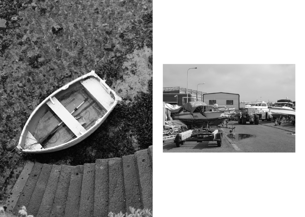
This page displays stationary boats. There is juxtaposition between these 2 images as one is the seabed and the other is on land.

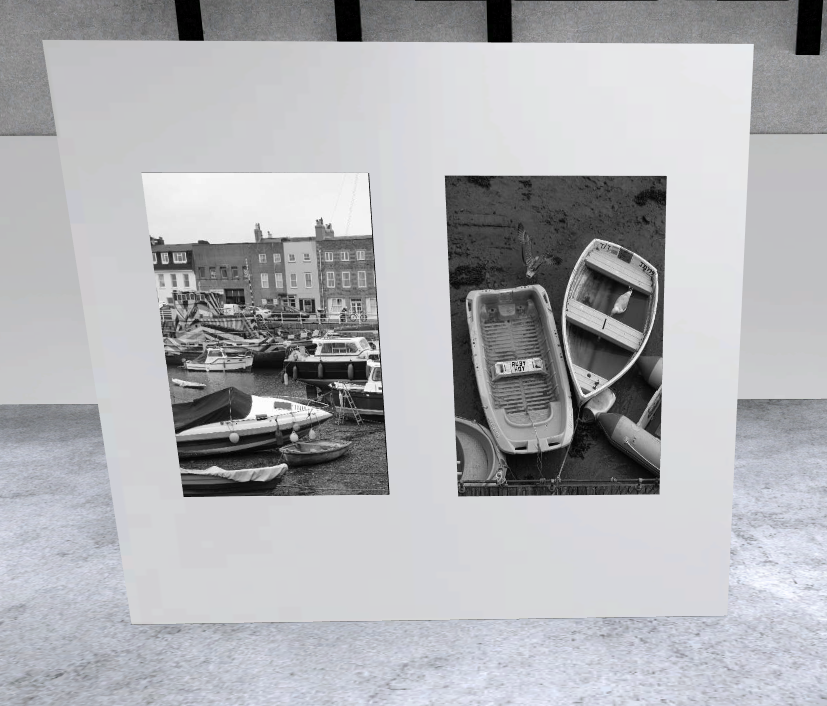
This is my last pages of my zine. I have made these also a double page, similar to the front pages so that there is balance within the zine. I have aligned this image so that the page splits between the 2 boats.

This is the back cover of my zine. I have photoshopped my name onto the number plate as the original number plate had the same amount of letters. I also used this photo as it features a seagull with open wings in negative space which makes the image more interesting, whilst also engaging the viewer.
Evaluation
Overall, I think that my zine well presents the narrative I was going for and is cohesive and well thought out. I have started off the zine by displaying an overview of the harbour with an archive image to demonstrate how it has changed over time. This then links to the fisherman within their work environments, the harbour. Finally, the zine comes to an end displaying fishing boats tethered in different locations. My zine also holds a continued theme of black and white images throughout which helps keep the cohesiveness and remove any distractions caused by bright colours.
Virtual Gallery


Confident and clear progress throughout…well done on lots of hard work here.
Please check you have understood and completed the research and development tasks and then add these too!