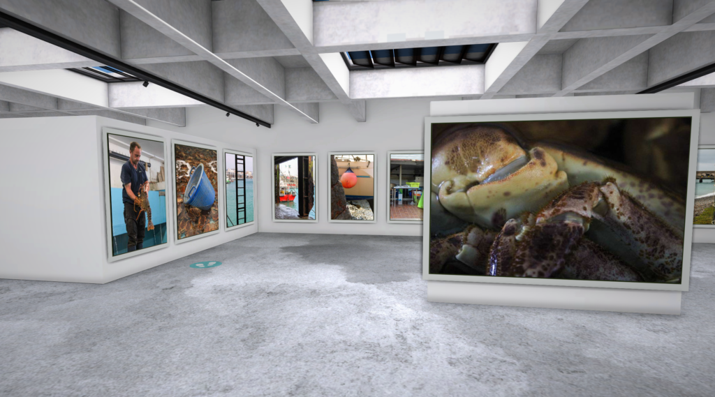
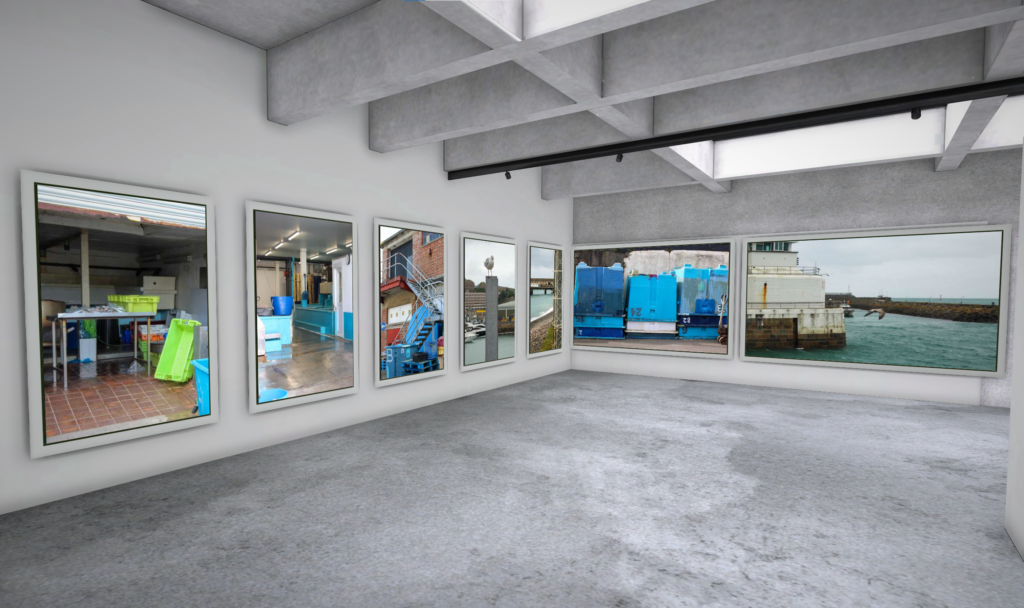
I created two virtual galleries to display the final images I used within my two zines using ArtSteps. My second gallery however shows a smaller amount of images as some of my images were shared between the two zines:
Zine 1:
Zine 2:
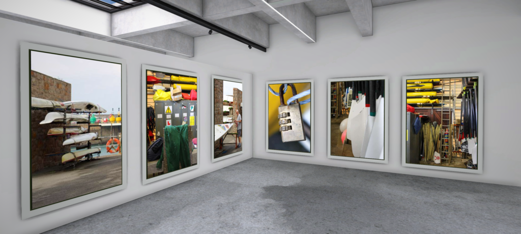
I created two virtual galleries to display the final images I used within my two zines using ArtSteps. My second gallery however shows a smaller amount of images as some of my images were shared between the two zines:
Zine 1:


Zine 2:


Photos used:


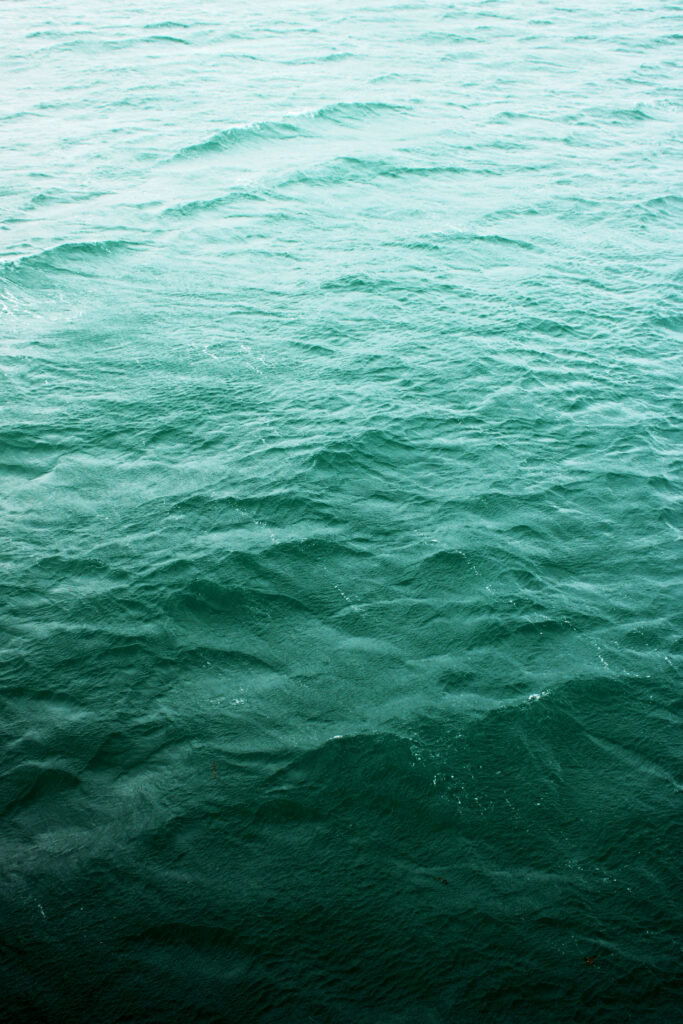


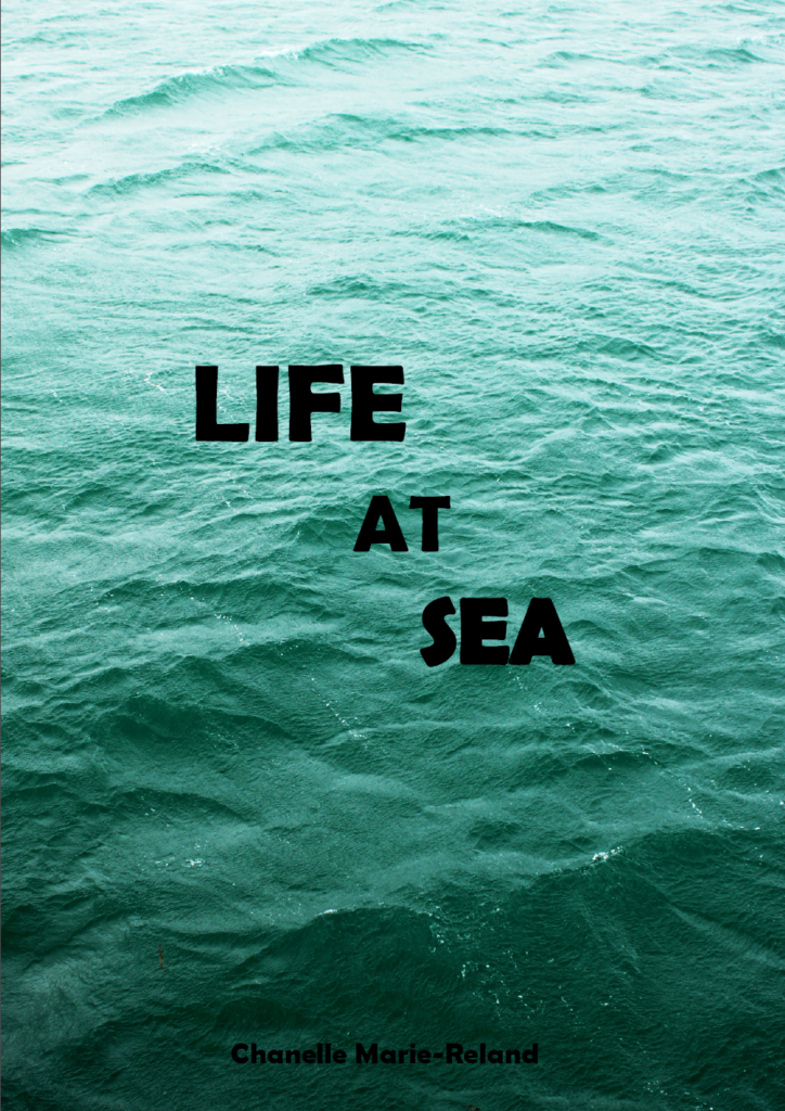
These were the photos that i thought would create a good story line and show the real life of working around the sea, i collected these photos from the 3 photoshoots i had done, although the maritime photoshoot didn’t help me with this zine it did help me collect ideas for this zine. I did the basic editing on these photos adjusting the levels and curves and maybe making each photo slightly brighter to grab the attention of the naked eye. The idea for the front cover and back cover was to have a simple photo so i could add a good title however the front cover did take up the whole page and i had to add the title at the bottom which did add a cool effect as i added a while outline on the letters. I also added the title on the back cover along with my name to help identify its my work, i really like the back cover as its still related to the topic but is more subtle.
Final Outcome



This was the final outcome for my zine, i really liked how it turned out as at the beginning I didn’t have a vision in mind, When collecting my photos together I tried to put the colours that matched the best together. Also when considering putting certain pictures together I tried to mix what side each photo look best on, which did have an impact. As my photoshoots didn’t go too well I didn’t have many pictures that I liked and wanted to use therefore made some of the pictures take over the whole page. This made these pictures show a great importance. I also tried to get a picture of the surroundings and then next to it a picture of a person doing their job to show what surroundings each person could be in, although this could not be the case for every page for example the last page with the man opening his truck wouldn’t be near some stairs leading the the sea but I thought that the colours and concept of these photos look good together.
Evaluation:
Overall the St Helier topic was quite off putting at the beginning as I didn’t have much interest in it, though after the photoshoot i started to use my imagination to create ideas of what to take pictures, also when creating my zine I started to develop certain story lines, although this topic still hasn’t grown on me it still is interesting to see what people who work around the see do, when doing my first photoshoot I just took pictures of what looked interesting and didn’t have a specific idea or reason for taking what I took. For my second photoshoot, I started observing more of what was around me and what could be a good representation of the sea. I started having more ideas of what the St Helier harbour was and how it had changed throughout the years when given photos and information about when and why it was created. Throughout my research I found it quite difficult to get the right information to look at and this made the topic even more repetitive and dull. I had managed to find some details about the harbour but not much which was quite irritating and made it hard for me when it came to the photoshoots and I didn’t have anything specific to look for. I would say the best photoshoot I had done would have been the maritime museum as it has many funky items inside that explained a lot and helped with my research. There were many examples of what a boat sounded like and what each sound represented and meant, there were interactive activities which helped all of us to engage with the topic and the idea of why we are researching all these things about the harbour. I did like making the zine for this project as I did manage to capture some good pictures to use, I had captured a good set of images that worked well with each other, whether it was the colours or the representation of the images. Although I didn’t quite enjoy this topic it was still a good topic to explore and gain some knowledge on. I did find it hard to capture some good quality images as the harbour isn’t something that I have great interest in, I feel like if I were to do this again I would try and get some inspiration on photoshoots such as using different angles to portray different meanings and find different textures to capture that represent the harbour. I did manage to capture some good quality images but a plan would have helped out more in which direction I was going with these images.

Do you remember the picture of a large bay window, the first paper negative ever to be made – that we watched in the film Fixing the Shadows – episode one of the first major television series devoted to the medium of photography, The Genius of Photography.
In the summer of 1835 William Henry Fox Talbot experimented with various chemicals to develop paper coatings suitable for use in a camera. He placed small wooden cameras that his wife called “mousetraps” all over his estate. The earliest surviving paper negative dates from August 1835, a small recording of the bay window of Lacock Abbey (left). In 1978, the German photographer Floris Neusüss visited Lacock Abbey to make photograms of the same window. He returned again in 2010 for the Shadow Catchers exhibition at the V&A to create a life-sized version of Talbot’s window (below right).


That 1978 photogram was the start of our adventures in creating photograms of large objects in the places where we found them […] we took our equipment to Lacock Abbey and made a photogram of a fixed subject. This particular subject was for us not just a window in a building but an iconic window, a window on photography, opened by Talbot. The window is doubly important, because to be able to invent the photograph, Talbot first used photograms to test the light sensitivity of chemicals. His discovery became a window on the world. I wonder what percentage of our understanding of the planet we live on now comes from photographs?
— Floris Neusüss
The idea of photographs functioning like windows makes total sense. Like the camera viewfinder, windows frame our view of the world. We see through them and light enters the window so that we can see beyond. Photographs present us with a view of something. However, it might also be possible to think of photographs as mirrors, reflecting our particular view of the world, one we have shaped with our personalities, our subconscious motivations, so that it represents how our minds work as well as our eyes. The photograph’s glossy surface reflects as much as it frames. Of course, some photographs might be both mirrors and windows.
A window is a resource that offers you a view into someone else’s experience. A sliding door allows the viewer to enter the story and become a part of the world. A mirror is a story that reflects your own culture and helps you build your identity.
Photo-historian, Gerry Badger who was part of the editorial team producing the television series The Genius of Photography wrote in the introduction of the book of the same name that John Szarkowski’s distinction of photographs as ‘mirrors’ or ‘windows’ is useful, but only to a point, ‘because most photographs are both mirrors and windows.’ (Badger 2007:8)


The exhibition Mirrors and Windows, an exhibition of American photography since 1960, opened at The Museum of Modern Art, New York (MoMa) in July of 1978. The curator John Szarkowski’s attempted to categorise photographers whose work largely reflected the subjectivity of the artist in comparison with those whose work largely sought to see outside themselves. Szarkowski wrote in the catalogue essay that accompanied the exhibition:
“The two creative motives that have been contrasted here are not discrete. Ultimately each of the pictures in this book is part of a single, complex, plastic tradition. Since the early days of that tradition, an interior debate has contested issues parallel to those illustrated here. The prejudices and inclinations expressed by the pictures in this book suggest positions that are familiar from older disputes. In terms of the best photography of a half-century ago, one might say that Alfred Stieglitz is the patron of the first half of this book and Eugène Atget of the second. In either case, what artist could want a more distinguished sponsor? The distance between them is to be measured not in terms of the relative force or originality of their work, but in terms of their conceptions of what a photograph is: is it a mirror, reflecting a portrait of the artist who made it, or a window, through which one might better know the world?”
— John Szarkowski, 1978
MIRRORS AND WINDOWS has been organized around Szarkowski’s thesis that such personal visions take one of two forms. In metaphorical terms, the photograph is seen either as a mirror – a romantic expression of the photographer’s sensibility as it projects itself on the things and sights of this world; or as a window – through which the exterior world is explored in all its presence and reality.
READ a pdf of the original book Mirrors and Windows: American Photography Since 1960 here and MoMa’s original press release (1978) here. As a critical point of view read also a a review here by Jed Pearl published in the photography magazine, Aperture in spring 1878.
Take a look at the images below. Think about whether, in your opinion, they are mirrors or windows.
You could draw a horizontal line with the word ‘Mirror’ at one end and ‘Window’ at the other. You could add a list of words that help to describe what these words suggest.

Now, try placing each of these images somewhere on this spectrum. Annotate the images to explain your decisions.


HOMEWORK: Independent Study
TASK 1: 1000 word mini-essay
Essay question: How can photographs be both ‘mirrors’ and ‘windows’ of the world?
DEADLINE: Wed 23 OCT
Follow these instructions:
Essay plan
Introduction (250 words): Reflect on the origin of photography and describe in your own words the difference between the two photographic processes, Daguerreotype and Calotype. Consider how they could be viewed as either a mirror or a window of the world according to John Szarkowski’s thesis. Choose one quote from Szarkowski’s text and comment if you agree or disagree.
Paragraph 1 (250 words): Choose an image that in your view is a mirror and analyse how it is a subjective expression and staged approach to image-making. Choose one quote from Szarkowski’s thesis and another from Jed Pearl’s review which either supports of opposes Szarkowski’s original point of view. Make sure you comment to advance argumentation in providing a critical perspective.
Paragraph 2 (250 words): Choose an image that in your view is a window and analyse how it is an objective expression rooted in the notion of realism. Choose one quote from Szarkowski’s thesis and another from Jed Pearl’s review and follow similar procedure as above ie. two opposing points of view and commentary to provide a critical perspective.
Conclusion (250 words): Refer back to the essay question and write a conclusion where you summarise Szarkowski’s theory and Pearl’s review of his thesis. Describe differences and similarities between the two images above and their opposing concepts of objectivity and subjectivity, realism and romanticism, factual and fiction, public and private.
TASK 2: Photo-assignment
A creative response to documentary (realism/ factual/ public/ candid) and tableaux (romanticism/ fiction/ private/ staged) photography
DEADLINE: Fri 25 Oct
RECORDING > Based on the theme of ‘OBSERVE, SEEK, CHALLENGE’ – and with relevance to your Personal Study – produce 3 images that are documenting reality – ‘windows of the world’ and another 3 images that are staging reality – ‘mirrors of the world’.
PLANNING > Produce a blog post where you plan and sketch out a few ideas in relation to the photo-assignment. You may use some of the images or artists references we looked at earlier in the week as inspiration and put together a mood-board, that will act as inspiration for your shoot.
In the next lesson tomorrow (Wednesday) you will be given a camera to make initial responses. Be creative and use this opportunity to experiment with ideas or approaches to image-making that you might want to extend further in your Personal Study. The expectation is that you make a set of images during the lesson using the school environment (inside or outside) creatively. The photographic studio is also available where you can explore different ideas using different lighting techniques…Rembrandt lighting…Butterfly lighting…Chiaroscuro…reflected light…coloured gels etc.
DEVELOPING >In post-production you can incorporate different editing techniques…monochrome/ colour adjustments…montage/ composite…juxtaposition/ triptychs/ grids etc…using Lightroom, Photoshop, AI technology if appropriate to your intentions. The focus here is on creativity, imagination and experimentation. Add images to your essay as photographic responses to Szarkowski’s thesis and evaluate.
GUIDELINES: ESSAY WRITING

Literary Sources:
Bibliography:
List all the literary sources that you have read and arrange in alphabetical order. For example:
Szarkowski, J. (1978), Mirrors and Windows: American Photography Since 1960. Museum of Modern Art: New York
Quotation and Referencing:
Why should you reference?
What should you reference?
How should you reference?
Use Harvard System of Referencing…see Powerpoint: harvard system of referencing for further details on how to use it.
Here is an full guide on how to use Harvard System of Referencing including online sources, such as websites etc.
Final Layout
This is the final layout of my Zine:

This is the front cover of my zine. I really like this photo as it is compositionally and contextually interesting. This makes it perfect for a noticeable front cover. I also wanted to have a straightforward title that could directly link to what the images inside display; the fishing industry of St Helier Harbour.

This is the first page of my zine when you open it up. I have put this here as it is an overview shot of the harbour, featuring many fisherman boats at the Old French Harbour.

For this page, I wanted to display an archive image with one that I have taken. I have chosen these images as they are the closest match out of all my photos and I have made them the same size on the page.

This is the next page of my zine and I wanted it to display the fisherman at St Helier Harbour as part of the fishing industry. I have made the image on the right larger as it will be the first you see when you turn the page and I personally prefer the image as the one on the left has a blurred background. This is also why I have made it smaller.

Both images on this page display men working on their boats, one of them pressure washing and the other welding. I have made the image on the left a full page to draw the viewers’ attention to it as when they turn the page over they will initially gaze to the right.

On the right is a fisherman, Will, doing his job and on the left is where he works. I have made the image on the right larger so that it matches the layouts of the rest of the pages.
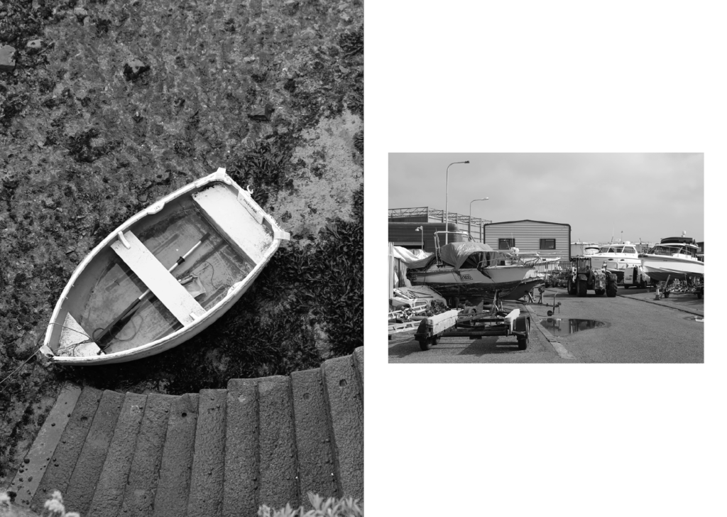
This page displays stationary boats. There is juxtaposition between these 2 images as one is the seabed and the other is on land.

This is my last pages of my zine. I have made these also a double page, similar to the front pages so that there is balance within the zine. I have aligned this image so that the page splits between the 2 boats.

This is the back cover of my zine. I have photoshopped my name onto the number plate as the original number plate had the same amount of letters. I also used this photo as it features a seagull with open wings in negative space which makes the image more interesting, whilst also engaging the viewer.
Evaluation
Overall, I think that my zine well presents the narrative I was going for and is cohesive and well thought out. I have started off the zine by displaying an overview of the harbour with an archive image to demonstrate how it has changed over time. This then links to the fisherman within their work environments, the harbour. Finally, the zine comes to an end displaying fishing boats tethered in different locations. My zine also holds a continued theme of black and white images throughout which helps keep the cohesiveness and remove any distractions caused by bright colours.
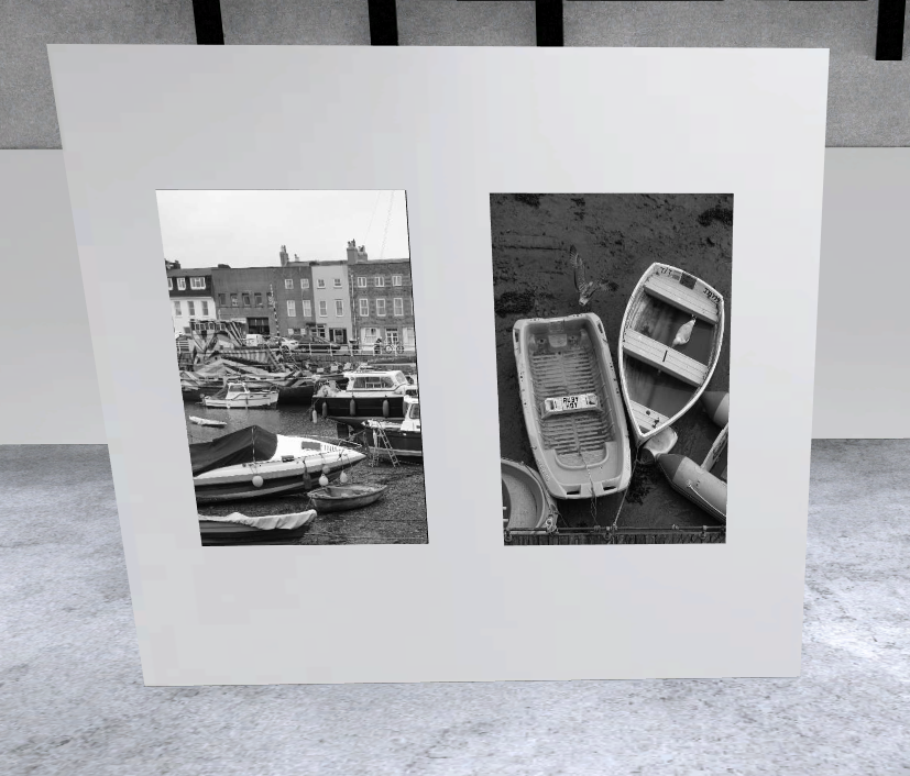
Virtual Gallery


Final image:




Evaluation:
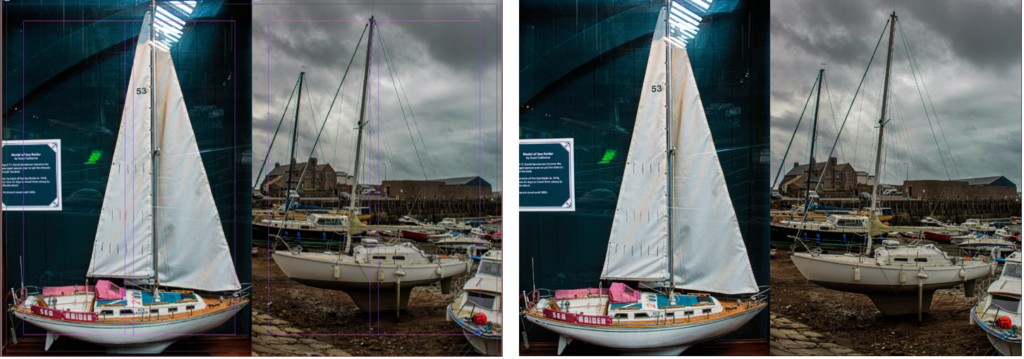
Overall, I am really pleased with how my zine turned out. Initially, I used these same images but in a different order to experiment with the layout and find which one I liked the best. Eventually, I liked this order and layout the best because the images flowed well to create a story. I chose to use 2 images together that linked to each other really well, or one image by itself which I think worked well.
Camera obscura –
Camera obscura is an optical device that uses a darkened room or box with a small hole ( aperture ) on one side. When light passes through this hole, it projects an inverted image of the outside scene onto a surface inside the room, or box. This effect occurs because light travels in straight lines.

This term ( camera obscura ) comes from Latin, meaning ‘ dark chamber. ‘ Historically, it was used to by artists to help them draw and understand perspective, as well as scientists to study optics. The basic principle of the camera obscura is also foundational to the development of modern photography and cameras.
Pinhole photography –
Pinhole photography is a simple and direct form of photography that uses a pinhole camera, which is essentially a light tight box or container with a small hole ( the pinhole ) instead of a lens. When light passes through this small aperture, it projects an image of the scene outside onto a photosensitive surface inside the camera such as film or photographic paper.

Unlike traditional cameras that use lenses to focus light, pinhole cameras rely solely on the pinhole to create an image. This results in a unique softness and depth of field in the photos.
Because the aperture is so small, pinhole cameral typically require longer exposure times compared to regular cameras. This means that you might need to leave the camera open for several minutes to capture a proper image, depending on the lighting conditions.
Pinhole cameras have almost an infinite depth of field, which means that objects at various distances from the camera can appear in focus.
Photographers often use pinhole cameras artistic purposes, as the images can have a dreamlike quality and unique characteristics that differ from conventional photography.
Nicephore Niepce –
Nicephore Niepce was a French inventor and one of the pioneers of photography. He is best known for creating the first permanent photograph in the early 19th century. In 1826 or 1827, he captured an image called ‘ View from the window at le gras’ which is considered the oldest surviving photograph.

Niepce used a process called heliography, which involved a bitumen-coated plate that hardened in proportion to the light exposure. The image required a long exposure time of about 8 hours, resulting in a blurry but significant breakthrough in the history of photography.
The long exposure time and the need for a stable setup made the process cumbersome, but it was a ground-breaking step in the in the development of photography. Niepce’s work demonstrated that it was possible to capture and preserve images using chemical processed, paving the way for future advancements in photographic technology.
Heliography –
Nicephore’s heliography process, also known as ‘sun writing’, was quite innovative for its time. He used a pewter plate coated with a light sensitive substance called bitumen of Judea, which is a type of asphalt
He placed the plate inside a camera obscura and exposed it to light for several hours, the bitumen hardened in areas where it was exposed to light, while the parts that stood in the shadows stayed soft.
After the exposure, he washed the plate with a mixture of oil and lavender and white petroleum. This solvent dissolved the unexposed, soft bitumen, leaving behind only the hardened areas that had been exposed to light.
The result was a permanent image etched onto the plate, showing a direct positive representation of the scene outside the camera obscura.

Louis Daguerre and the Daguerreotype –
Louis Daguerre was a French artist and photographer, best known for inventing the daguerreotype, the first successful method of photography that was publicly announced in 1839. His work built upon the earlier experiments of Nicephore Niepce, with whom he collaborated.
The daguerreotype process involved exposing a silver-plated copper sheet to iodine vapor, which created a light-sensitive layer of silver iodide. After exposure in a camera, the plate was developed using mercury vapor, and then fixed with a salt solution. This process produced highly detailed images with a unique quality, making it the first practical form of photography.
Daguerre’s invention was a significant milestone in the history of photography, leading to the widespread adoption of photographic techniques and influencing many future developments in the field. His contributions helped establish photography as a legitimate art form and a valuable tool for documentation.

Henry Fox Talbot and the calotype process –
Henry Fox Talbot was an English scientist, inventor, and photography pioneer, best known for developing the calotype process in the 1830s. This process was one of the first methods to produce photographic negatives, which could then be used to create multiple positive prints.
Talbot’s calotype involved coating paper with silver iodide, which made it light-sensitive. After exposing the paper in a camera, the image was developed using a solution of gallic acid, resulting in a negative image. This was revolutionary because it allowed for the creation of multiple copies from a single exposure, unlike the daguerreotype, which produced a unique positive image.
His work laid the foundation for modern photography, and he is often credited with being one of the key figures in its early development, alongside Nicephore Niepce and Louis Daguerre. Talbot also published several important texts on photography, contributing to the understanding and acceptance of the medium as an art form.

Robert Cornelius –
Robert Cornelius was an American pioneer in photography, known for taking one of the earliest self-portraits in history. In 1839, he created a daguerreotype of himself, making it one of the first photographs of a person. Cornelius was also an early advocate for the use of photography and worked to promote the medium in the United States.
He operated a photography studio in Philadelphia and contributed to the development of photographic techniques during the early days of the medium. His self-portrait is significant not only for its historical value but also for showcasing the potential of photography as a means of personal expression.

Self portraiture –
The history of self-portraiture in photography dates back to the early days of the medium itself. After the invention of photography in the 1830s, artists and photographers began to explore self-portraiture as a way to express their identity and artistic vision.
One of the earliest known self-portraits in photography was taken by Robert Cornelius in 1839. He created a daguerreotype of himself, which was significant not only for its historical value but also for establishing self-portraiture as a legitimate form of artistic expression in photography.
As photographic technology evolved, so did the techniques for creating self-portraits. The introduction of the box camera in the late 19th century made it easier for people to take their own photographs. This led to a surge in self-portraiture, as individuals could now capture their likeness without needing a professional photographer.
In the 20th century, self-portraiture became more widely embraced by artists, with photographers like Cindy Sherman and Francesca Woodman using self-portraiture to explore themes of identity, gender, and the self. The rise of digital photography and social media in the 21st century has further transformed self-portraiture, giving rise to the phenomenon of selfies, where individuals share their self-portraits instantly online.
Self-portraiture in photography has evolved significantly over the years, reflecting changes in technology, art movements, and societal attitudes toward identity and self-representation.

Julia Margret Cameron –
Julia Margaret Cameron was a British photographer who became one of the most important portraitists of the 19th century. Born in 1815, she took up photography relatively late in life, at the age of 48, when she received a camera as a gift. Despite her late start, she quickly developed a distinctive style characterized by soft focus and dramatic, often allegorical compositions.
Cameron’s work was groundbreaking for its time. She often used long exposures and soft-focus techniques to create ethereal, almost dreamlike images. Her subjects included many notable figures of her time, such as Charles Darwin, Alfred Lord Tennyson, and Sir John Herschel, as well as numerous portraits of women and children.
Her approach to photography was highly artistic and unconventional, sometimes criticized for its lack of sharpness and technical precision. However, her work has since been recognized for its emotional depth and artistic innovation, influencing future generations of photographers.
Julia Margaret Cameron’s contributions to photography were significant in establishing the medium as a legitimate art form, and her work continues to be celebrated for its beauty and expressive power.

Pictorialism –
Pictorialism was an artistic movement in photography that emerged in the late 19th century, primarily between the 1880s and the early 1900s. It sought to elevate photography to the status of fine art, emphasizing aesthetic expression over mere documentation of reality.
The movement was characterized by its use of soft focus, creative composition, and manipulation of the photographic print to create images that resembled paintings or other artistic mediums. Pictorialists often employed techniques such as gum bichromate printing, photogravure, and various darkroom manipulations to achieve their desired effects.
Key figures in the Pictorialism movement included Alfred Stieglitz, Edward Steichen, and Gertrude Käsebier. They believed that photography should convey emotion and artistic intent, rather than just serve as a tool for capturing reality. This led to a focus on subjects such as landscapes, portraits, and allegorical scenes, often imbued with a sense of mood or atmosphere.
Pictorialism also played a crucial role in the establishment of photography as a recognized art form, with photographers forming organizations like the Photo-Secession in the United States. However, as the 20th century progressed, Pictorialism began to decline in favor of more modernist approaches to photography, which emphasized clarity, sharpness, and the inherent qualities of the photographic medium.
Pictorialism significantly influenced the development of photography and left a lasting legacy on how photographers approach artistic expression today.

Henry Mullins –
Henry Mullins was by far the most prolific of the first generation of Jersey photographers in the mid-nineteenth century. He produced thousands of portraits of islanders between 1848 and 1873 at his highly successful studio in the prime location of the Royal Square, St Helier.
As a commercial photographer he consistently embraced the rapid technical progress that ran in parallel with his career. While numerous photographic studios opened across the town of St Helier in the 1850s and 1860s, Henry Mullins continued to be the photographer of choice for leading members of Jersey society and successful local and immigrant families. Mullins’s productivity was matched by the technical standard of his work; qualities that are exemplified in the richness of the portraits of Victorian islanders preserved on the pages of his photograph albums.
