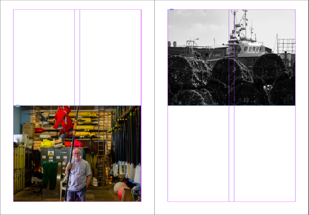
Here is my first mock up of my zine design, using inspiration from my printed pictures:


I then tried adding some text to or next to images to add more context to them, making them more interesting for people looking at the zine. I also rearranged some photos here:


I also tried making the margins from 12.7mm to 7mm so the photos fill up more of the page. I think it looks more clean and better now:

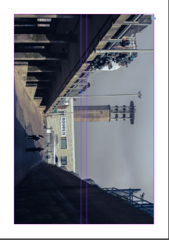
Now I have a free page that needs filling. To do this I’m going to find some photos that will complement well with the current images in the zine:

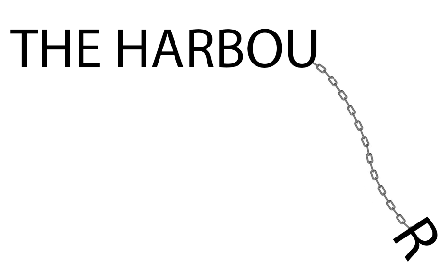
I also changed the name to:

I tried a funky design in photoshop to use for my title but I think it looks better to just use ordinary text:

The print:
After printing, using booklet settings, I collected the pages and folded them neatly using a bone folder and put them together in order. The I stapled the spine of the zine and trimmed the edges. Here is are some images from the final product:


Evaluation
Overall I am very happy with the final zine. It has many photos in without looking too busy as I has some pages with less images. The photos I chose also brings the viewer through a little story as they explore the harbour with my zine, without missing much as most of the harbour is included. However I do think I could add more ‘story’ elements instead of headers on some of my pages. It turned out very similarly to my mock up designs which I am pleased about, with the improvements further enhancing the zine. The zine also helped my present my best images in the order and format (e.g. the size) that I want, which would naturally improve the images.
