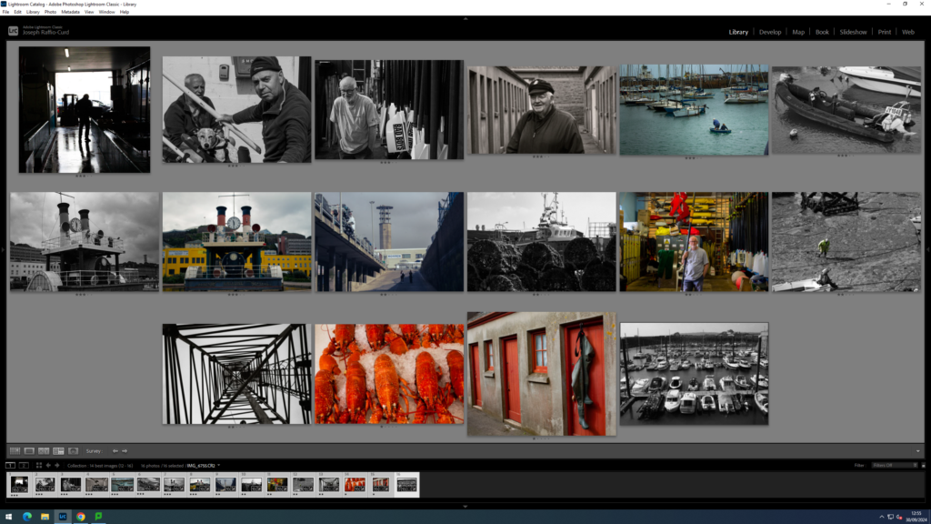
To select Images. I looked through the Images I have already rated on lightroom:


Then chose 16 unique Images that I can use to tell a story. I tried to include some busy Images which have wide and detailed shots. As well as including some simpler images to complement them and to add a negative space effect to the little magazine. I also wanted to include a lot of images with human subjects as they are usually the most interesting.
Here are the Images I decided to chose:

I might decide later to swap out the 4th image so I can put these to images next to each other as I think they contrast each other nicely:


I then printed out the 16 images I decided I want to use, cut them up and laded them out so I can decide which order they are placed and how they are placed in the zine:

I used other zines that you can see above my images to give me inspiration for the layout. I think for the steam clock I might add a few more photos to that page to create a topology of the steam clock.
I Then stuck the images inside a mock up zine with tape to see how it would look like. The size of the images will change later on as I will re-design them inside InDesign:

