
The marititme museum is based in St Helier, next to St Helier Harbour.

It is full History and many fun interactive ways to help you learn. For example, there were these pipes you could smell that had smells relating to what it smelt like for the fishers out at sea e.g. fish, rope, wine etc.


The museum also has lots of information scattered around, so that you can get the best understanding of the Jersey Harbours, cod fisheries, different boats, knot tying and so much more.

Contact Sheet


I edited the images which are highlighted blue, because they have the most information and are my best images, because they have the best layout and composition and are the most interesting photos.
Edits

I edited this image by increasing the exposure, contrast, whites, shadows, vibrancy and saturation, while decreasing the highlights and blacks. I did this, so that the image was more exposed and brighter.

Then, I made a virtual copy and created a black and white copy, which I increased the contrast, shadows and whites, while decreasing the blacks and highlights. I did this to create more contrast and a range of light and dark tones.

I edited this image by increasing the exposure, contrast, whites, shadows, vibrancy and saturation, while decreasing the highlights and blacks. I did this, so that the image was brighter and more vibrant.

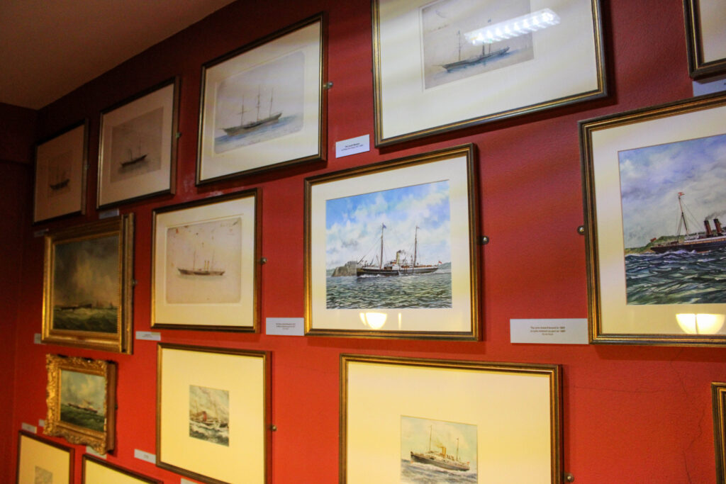
I edited this image by increasing the exposure, contrast, whites, shadows and vibrancy, while decreasing the highlights and blacks. I did this, so that the photo was brighter.

I edited this image by increasing the exposure, contrast, whites, shadows and vibrancy, while decreasing the saturation, highlights and blacks. I did this, so that the image is more vibrant and the photographs are more visible.
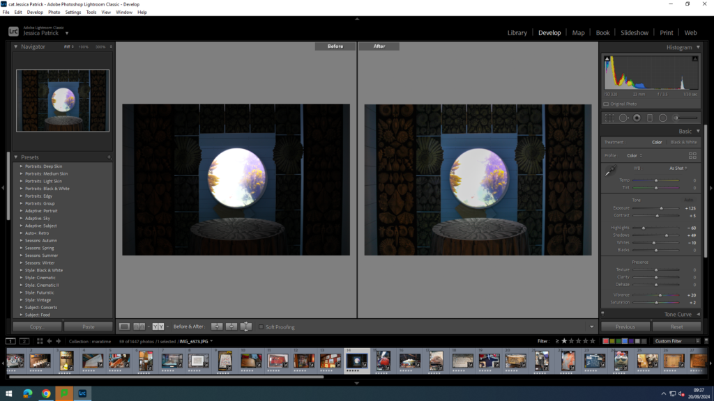
I edited this image by increasing the exposure, contrast, shadows, vibrancy and saturation, while decreasing the whites and highlights. I did this, so the shells around the window to the water are visible, as I made the image more exposed and brighter, as it was taken in a dark room.

I edited this image by increasing the exposure, contrast, whites, shadows, vibrancy and saturation, while decreasing the highlights and blacks. I did this, so that the red ‘land’ on the earth was more vibrant and bold, so it stood out more.
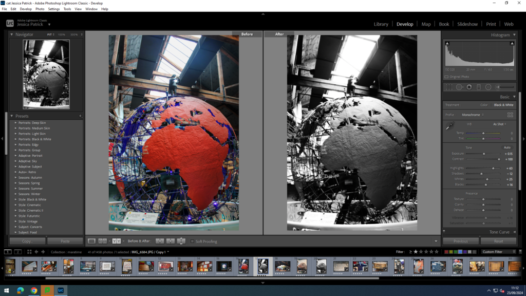
Then, I created a virtual copy and created a black and white version and increased the contrast and highlights more, while decreasing the shadows. I did this to create more contrast.

I edited this image by increasing the exposure, contrast, whites, shadows and vibrancy, while decreasing the highlights and blacks. I did this, so that the image was less exposed from the bright light directly above the bottles, to make the bottles more visible.

I edited this image by increasing the exposure, contrast, whites, shadows and vibrancy, while decreasing the highlights and blacks. I did this, so the image was brighter and the writing more visible.

I edited this image by increasing the exposure, contrast, whites, shadows and vibrancy, while decreasing the highlights and blacks. I did this so the image was brighter and the wood colour more vibrant, so the carving stood out more.

I edited this image by increasing the exposure, contrast, whites, shadows and vibrancy, while decreasing the highlights and blacks. I did this, so the colour on the boat were more vibrant and stood out more.

I edited this image by increasing the exposure, contrast, whites, shadows, vibrancy and saturation, while decreasing the highlights and blacks. I did this, so the boat inside the bottle is more visible.
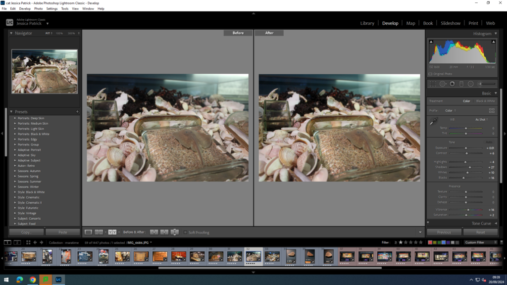
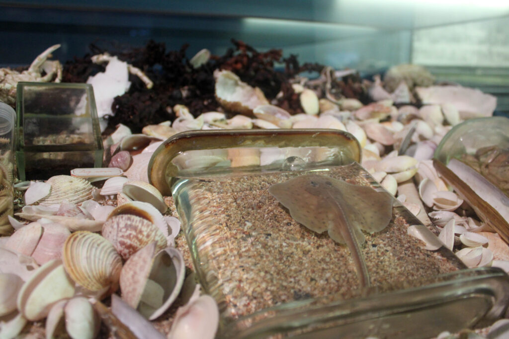
I edited this image by increasing the exposure, contrast, whites, shadows, vibrancy and saturation, while decreasing the highlights and blacks. I did this, so that the image was slightly more vibrant, so the stingray could be seen more, as it camouflaged into the sand.

I edited this image by increasing the exposure, contrast, whites, shadows, vibrancy and saturation, while decreasing the highlights and blacks. I did this, so that the image was more vibrant, so all the colours in the tank stood out more, especially the shrimp.
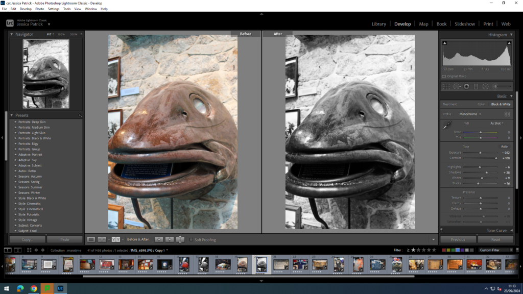
I made a black and white version of this photo and increased the shadows, whites and contrast, while decreasing the exposure, highlights and blacks. I did this to increase the contrast in the image.
Cod Fisheries
In the museum there is information about the cod fisheries, which is one of the main topics I researched in order to get a better understanding of the History and of what I am taking pictures of. This was very beneficial for me, because it allowed me to get even more of an understanding and the images tie in well with my photos of the harbour.
Final Images- Cod Fisheries


On the bottom of this headstone it says Gaspe, Newfoundland, but Gaspe is not actually in Newfoundland. This was written, so that it could deceive people, so they wouldn’t come to Gaspe and fish and steal the locals business.

The jumpers are called ‘jersey’s’, because Jersey fisherman would often knit while waiting for fish to get caught on their line, so that they could pass the time.


Final Images- Jersey Harbours


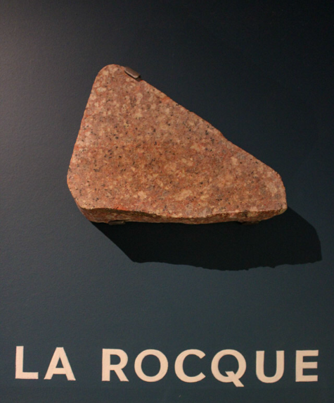

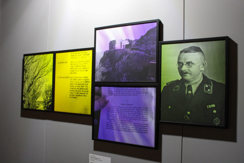
Final Images-WWII
In the maritime museum there was also a WW11 section, which had crochet tapestries of scenes during the war, which were knitted by local Jersey citizens.


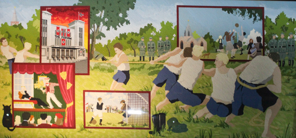
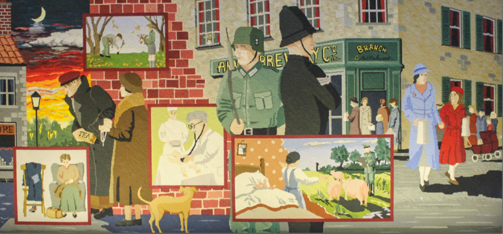
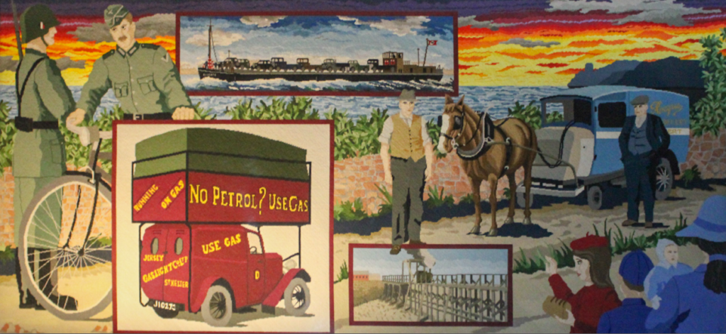




Final Images







Evaluation
I think this photoshoot went well, because I was able to capture lots of the fun elements of the museum, like the interactive smelling tubes, while also being able to capture lots of information, for example about the cod fisheries. I was also able to capture fun interesting images with a good composition and layout.
I also think my editing went well in this photoshoot, as I experimented with coloured images, as well as black and white images. I was able to adjust contrast, vibrancy and saturation etc, so that I could improve these images. However, next time I would like to experiment with photoshopping and cropping more, as I didn’t have a lot of time to do so in this topic.
Analysis of top 3 images

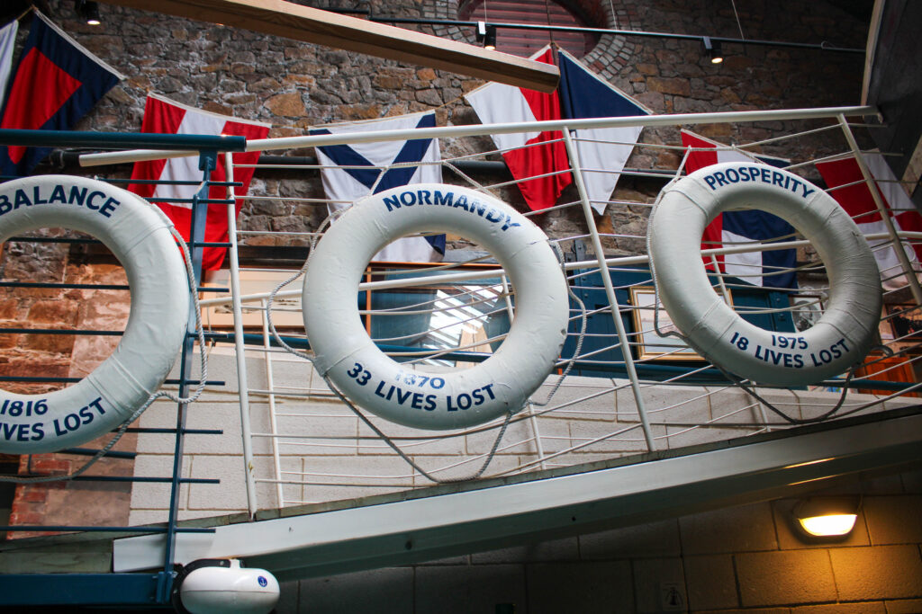
The lighting in this image is artificial lighting, because the photo was taken inside. I had no control over the placement of the life rings, but I did have control over where I was stood and how zoomed in or out the image was, because I could zoom in and out on my camera. This image has lots of contrast, as the image is in black and white and contains a range of grey shades. There is also lots of light and dark shades throughout this image, which creates the contrast. This image also contains only cool tones.
Camera settings:
F stop- f/4.5
Exposure time- 1/30sec
ISO- ISO-320
The layout in this image is very repetitive, because of the three identical rings in this image. That creates a repetitive pattern. The organisation of these rings also give the image a good composition. However, I wish I had zoomed out, because the rings are cropped out of the frame. The main viewpoint in this image is the rings, which is why I would have preferred all three in the frame.
There is a deeper meaning in this image though, because the rings state the places that they were kept, because they are life saving rings, that are thrown to save people who are drowning. On the rings, it also states how many lives have been lost at these Jersey beaches, to people drowning. The rings also state what year the lives were lost in.
The point of this photograph and the rings with this information is to present how many lives are lost, to make people really think and mourn these victims.

The type of lighting used in this image is artificial lighting, because I was inside. I had no control over the position or location of the objects, but I did have control over where I stood and how zoomed in or out my camera was.
Camera Settings:
F stop- f/3.5
Exposure time- 1/30sec
ISO- ISO-1600
This image contains quite warm tones, because it contains lots of red and sandy colours. It also contains lots of lighter tones. This image also contains lots of texture, because of the texture of the sand and shells surrounding the stingray. There is also lots of repetition in this image, because of the large amount of shells that are scattered around, which all look quite similar.
The layout of this image has a lot of depth to it, because of the angle the photo was taken. This gives it a depth of surface illusion. The main viewpoint of this image is the stingray, even though it is not center of the image. It is in the foreground of the image, with the background being slightly more blurred.
This image is of a stingray, which has been sealed in a silicone like substance. Some people may find this cruel and may not like this image, because they may believe the stingray was killed for this purpose, which it may have been, but it may have died naturally and someone just wanted to create art from that.
This photograph is useful, because it presents what a stingray looks like close up. The silicone around it is also useful, because it allowed me to get close up, without being in danger.

The type of lighting used in this image is artificial lighting, because I was inside. I had no control over the position or location of the objects, but I did have control over where I stood and how zoomed in or out my camera was. This image was quite under exposed and dark, because it was quite dark in the room, so there wasn’t much artificial lighting. Instead, I had to edit the image to increase the exposure to make it brighter. In future, I’d use my flash on my camera.
Camera Settings:
F stop- f/3.5
Exposure time- 1/30sec
ISO- ISO-320
There are lots of brown/ red colours in this image, as well as the bright blue water, looking into the tank through the window. There composition and layout of this image has lots of pattern and repetition and 3D shapes in this image, because of the pattern of the shells. There is also lots of texture in this image, because of the shells and the coral. The main viewpoint in this image is the circle window looking out onto the sea like view, which is in the center of the image. There is also lots of contrast between the very bright water and the darker surroundings. There is also a depth of surface illusion in this image.
This image presents what it would look like and feel like to be on the lower deck of the boat, looking out the window. This relates to the theme, because it gives us a sense of what it was like to be a fisherman at the harbour with the cod fisheries, as well as what it is like today.
