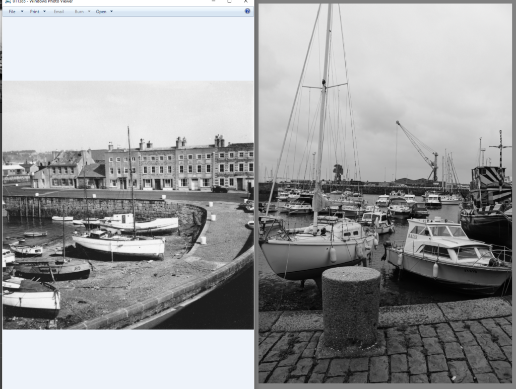
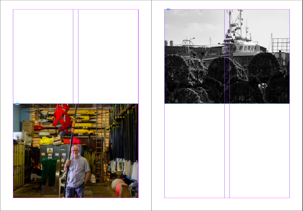
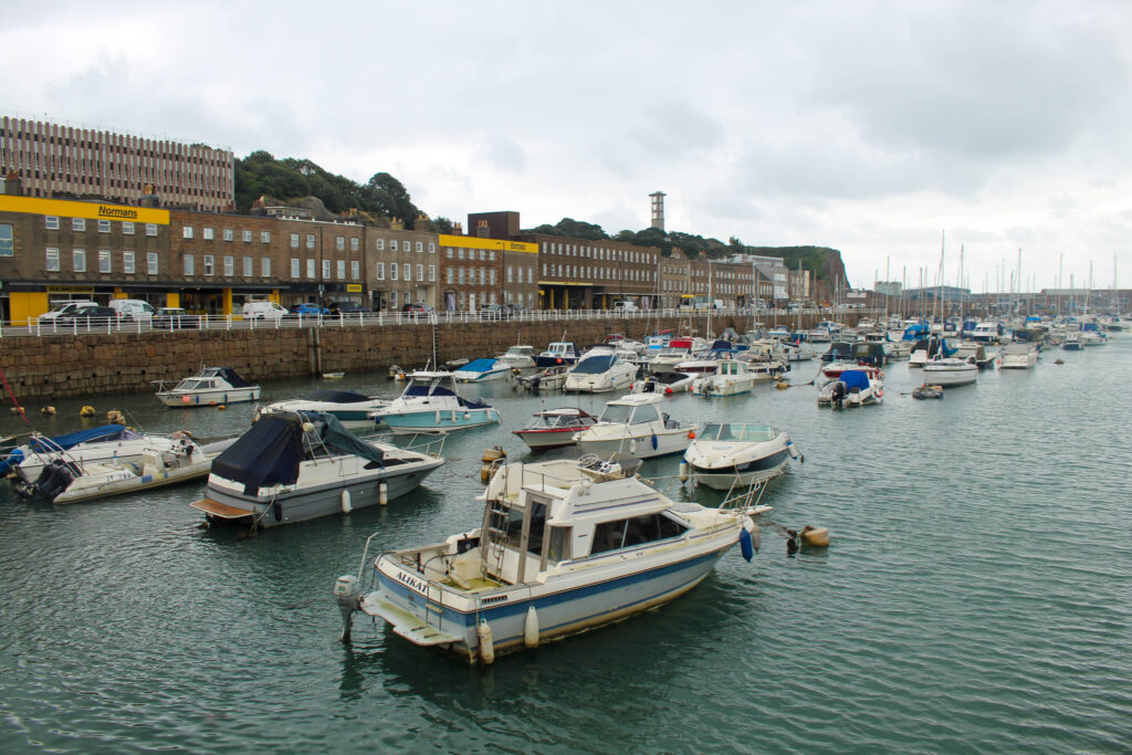
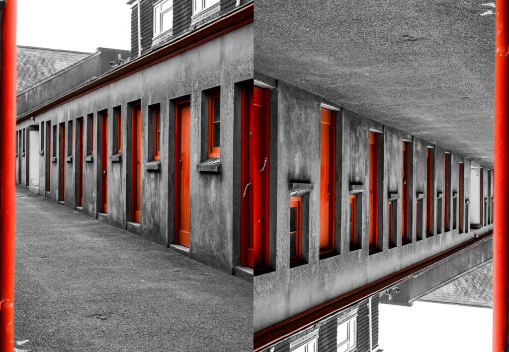
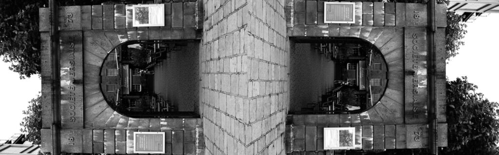
I am not very satisfied with this page as I don’t feel like it fits in with the rest of the zine or with the narrative I am trying to display (fishing industry), therefore, I am going to find an archive image that is similar to one that I have taken and display them together.
Use of Archive Images
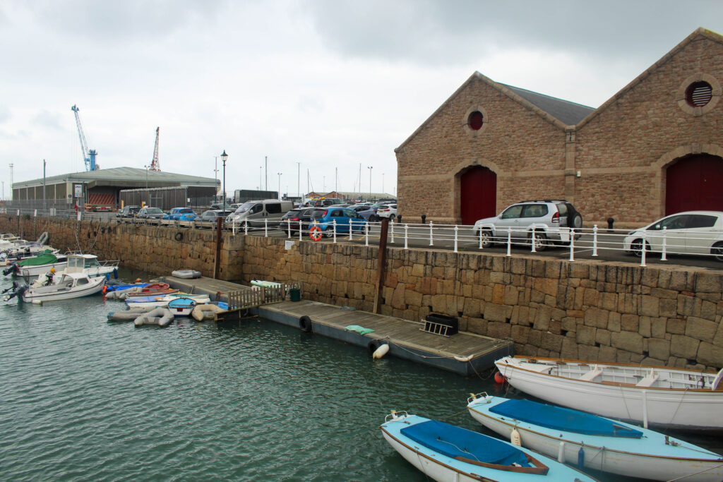
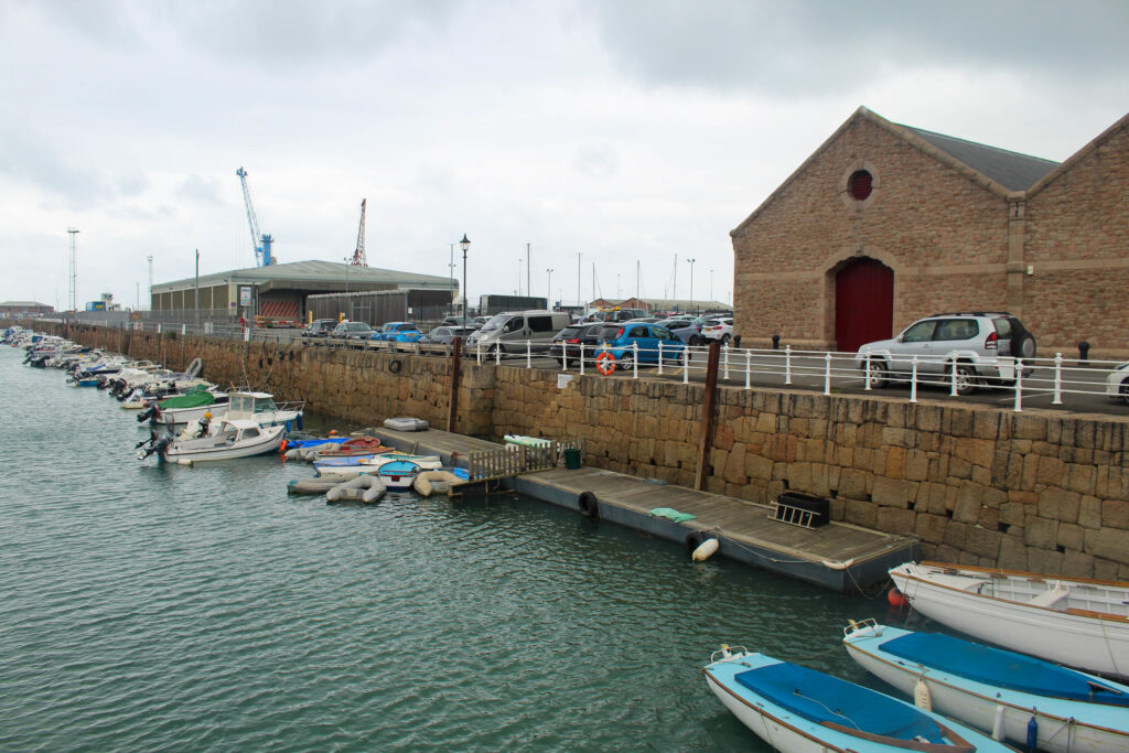
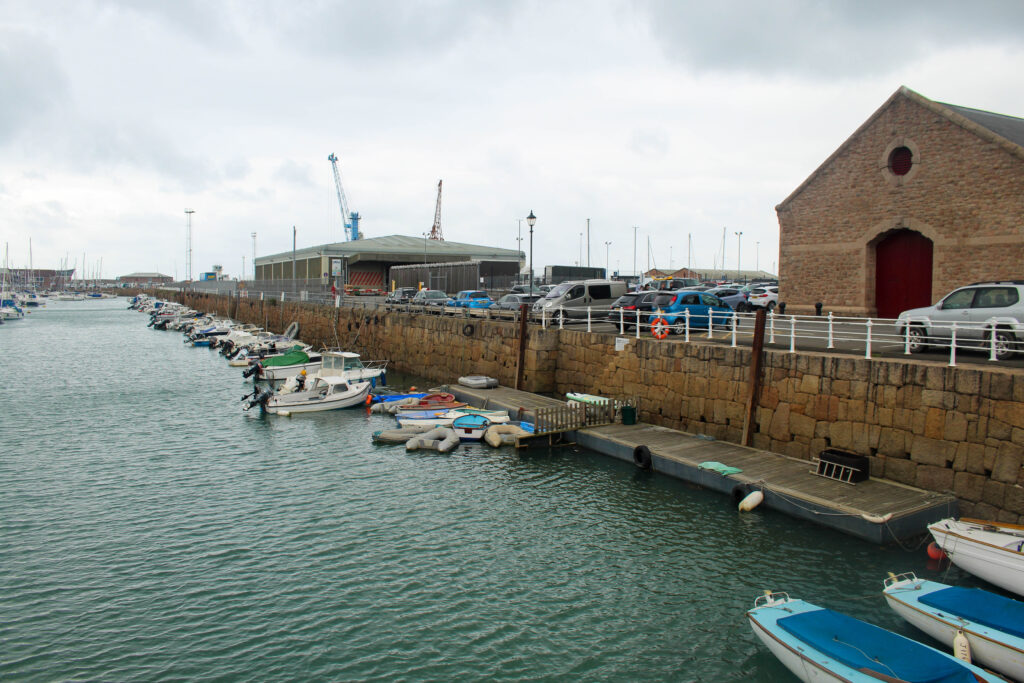
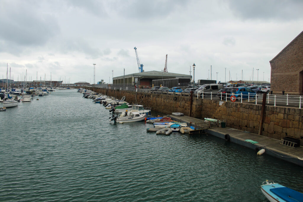
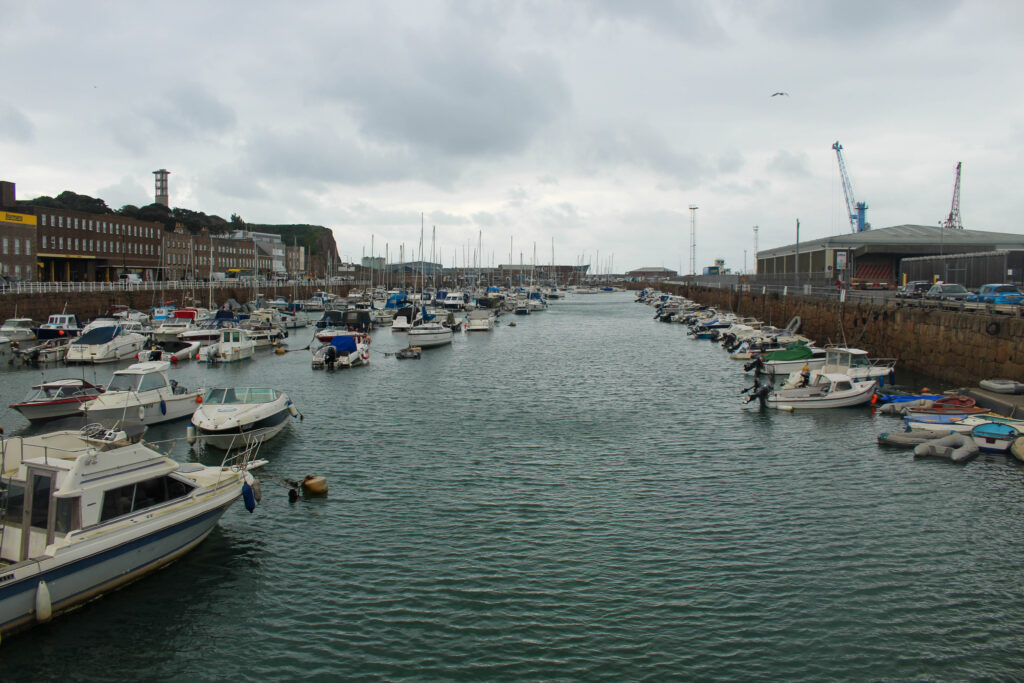
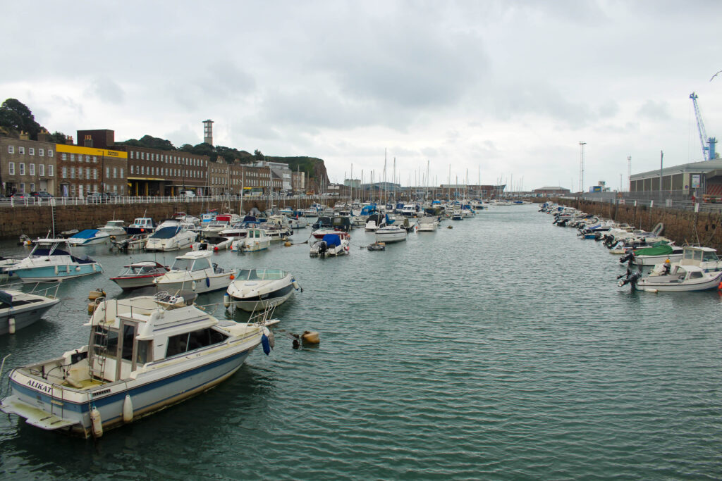
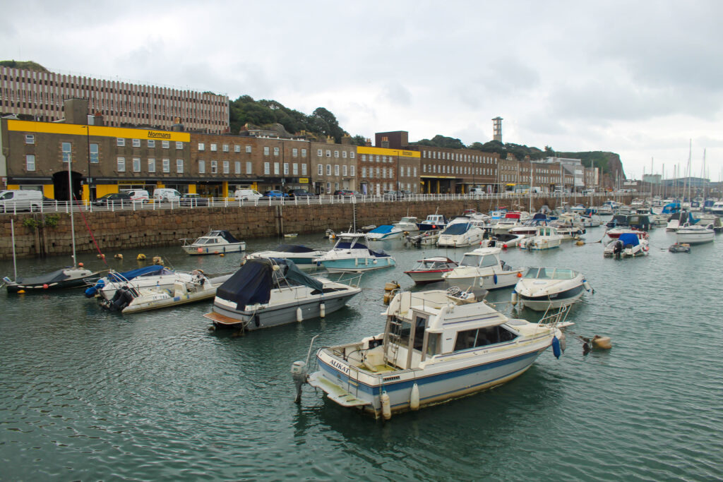
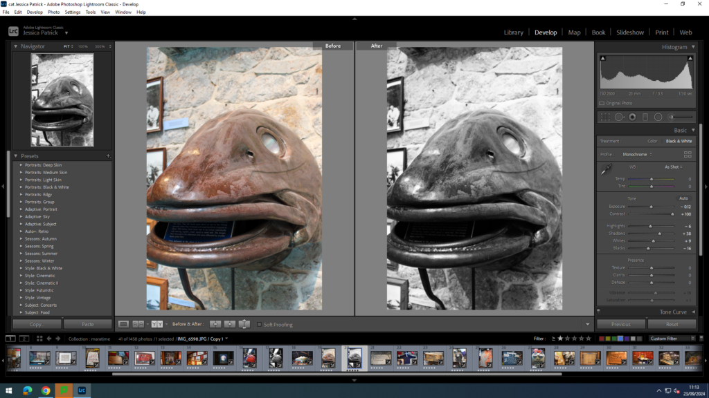
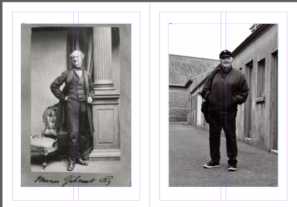
These are my two options of archive photos. I am going to go for the first option as it is more clear that they were taken at the same place and they still relate to the fishing industry, therefore, will fit in with the rest of the zine.
I re-edited this photo and lowered the clarity so that it would fit in better with the archive one.
I then rearranged the pages to what I thought was a more suitable layout:
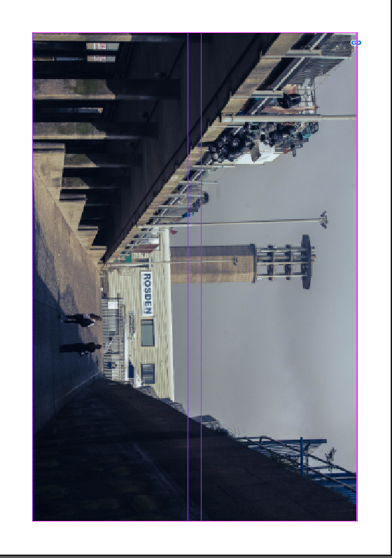
I then added the title ‘St Helier Harbour’ to my front cover.
I then decided to put the subtitle ‘Fishing Industry’ below.
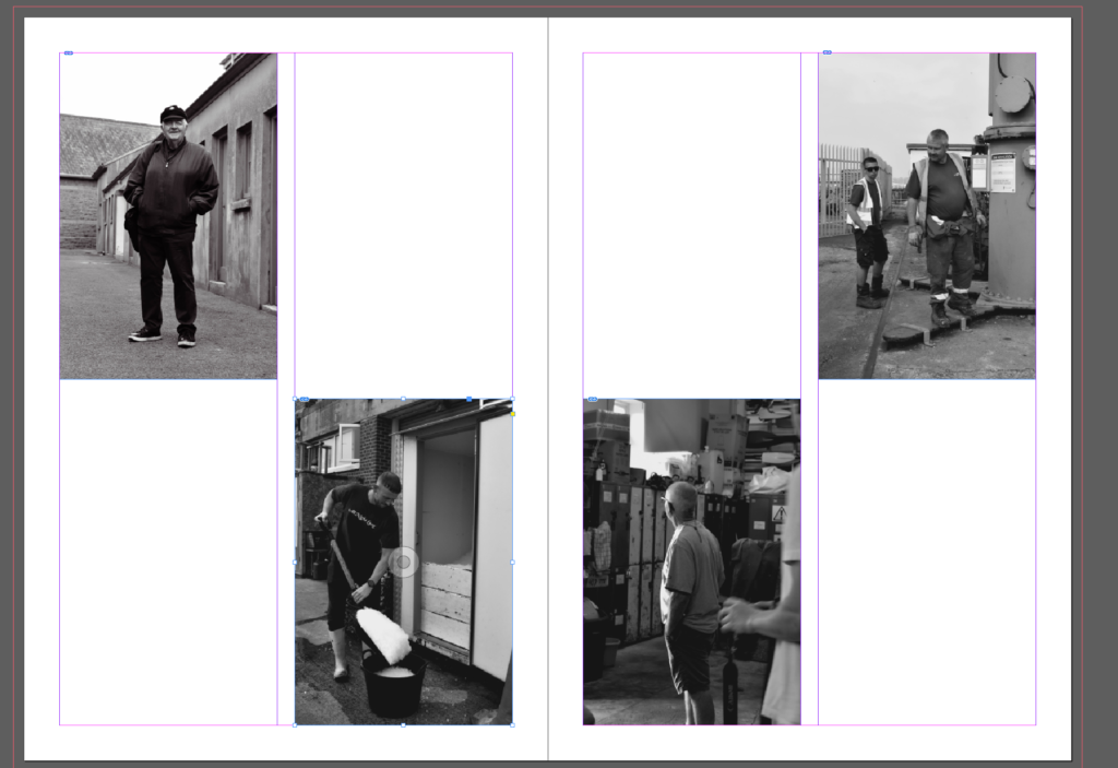
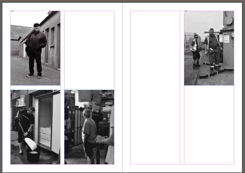
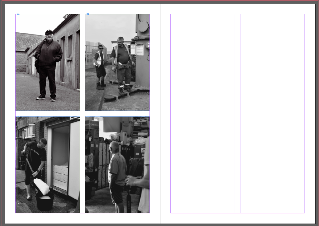
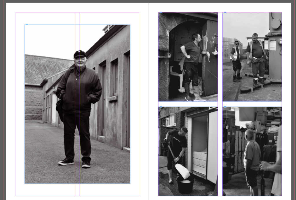
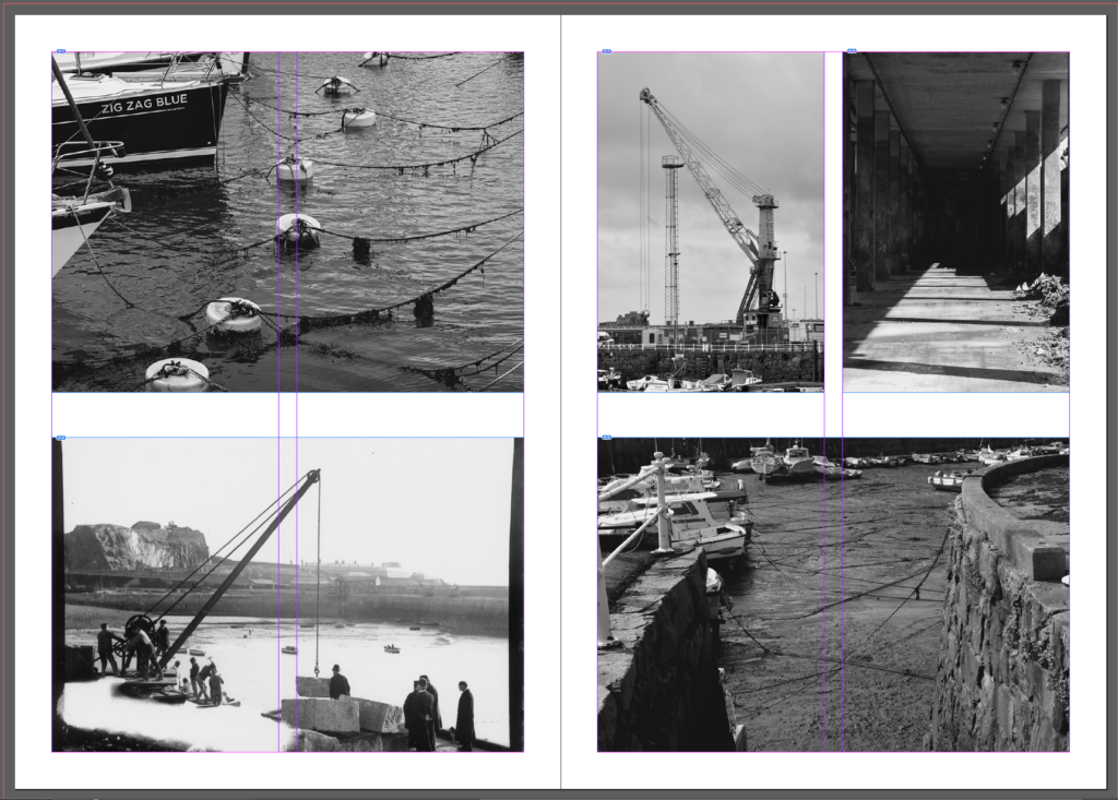
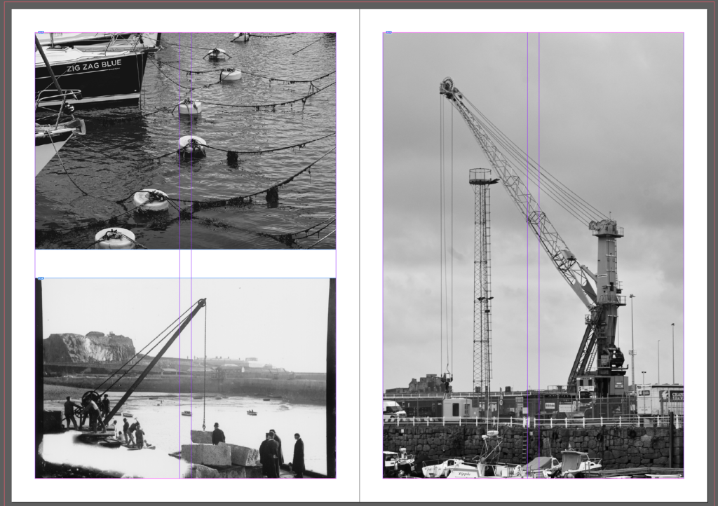
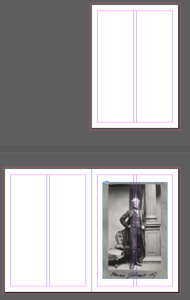
I then changed the layout of some of my pages to get a more efficient layout overall:
Photography was invented by Frenchman Nicéphore Niépce in 1822. Niépce developed a technique called heliography, which he used to create the world’s oldest surviving photograph, View from the Window at Le Gras (1827). Heliography was conceived in response to camera obscura theories dating back to ancient history.
Camera Obscura & Pinhole photography
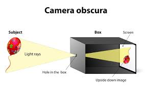
Camera obscura was an optical phenomenon which was created to project images from the outside into a dark room. By completely darkening a room apart from a small hole in the wall allows rays of light to enter, letting the outside world pour in. This process takes around an hour and projects an upside down image into the dark room. This process is admitted for being all natural, deep and primitive as it uses old historical technology instead of new and upcoming tech. After being used for many centuries, camera obscura was developed by using different camera filter and adjustments to make images stronger and clearer. Pinhole photography is a similar process which uses a tiny hole in a camera to allow light to come in. This creates an image onto photosensitive material. As light hits material such as photographic film or paper the inverted image is created, with a long exposure time of around several seconds to minutes, the small hole incision only lets a small amount of light through which makes it very unsuitable for fast- moving objects. However, due to the fact it it’s simple, accessible and inexpensive with a unique looking vignette, the style of photography became increasingly popular.
Nicéphore Niépceand Heliography
Niépce called his process heliography, which literally means “sun drawing”. 7 March 1765 – 5 July 1833) He was a French inventor and one of the earliest pioneers of photography. In 1822, he used it to create what is believed to have been the world’s first permanent photographic image, a contact-exposed copy of an engraving of Pope Pius VII, but it was later destroyed when Niépce attempted to make prints from it. Within the time period of 1826 and 1827, he created the first ever permanent photograph which was named ‘View from the Window at Le Gras’. This introduced the process of Heliography. This process he created consists of the sun reflecting its light to create images. To achieve this he used a pewter plate which was covered with Bitumen of Judea which is a light sensitive substance. This substance hardens when it is exposed to light. The process takes up to eight hours and this time period is essential as the sensitivity of materials was much lower than modern materials. The plate is then needed to be washed with a solvent, this removes the Bitumen of Judea and leaves a permanent image. This process was particularly essential to the development of photography. In the mid-1820s, he used a primitive camera to produce the oldest surviving photograph in a real world scene.
Louis Daguerre & Daguerreotype
Louis Daguerre was a French artist and photographer, recognized for hisinvention of the daguerreotype process of photography. He became known as one of the fathers of photography. This method preserving images and capturing them was a huge historical moment and made a large breakthrough. The daguerreotype is made by after capturing the image exposing it to mercury vapour which brings the visible image to life. The image also then needs to be rid of any unexposed silver iodide. This is achieved by completely covering the image in a salt or sodium thiosulfate solution. These images are very reflective and change when exposed to different angles of view. Daguerreotypes are also very detailed and clear which makes them stand out amongst other images from around the 1840s and 1850s. Louis decided to create the daguerreotype as he knew the world was seeking a photographic process which was easier to put into practice, since exposure times were only of a few minutes. So by creating his own process of photography, he became very successful and made Louis Daguerre world famous.
Henry Fox Talbot & Calotype
Henry Fox Talbert is very well known for being a successful pioneer of photography, scientist and inventor. Amongst his other successes he created a method of photography by using a ‘calotype’ which is a negative-positive process which is also known as the ‘paper negative’. He created images when exposed to light, these images were easy to produce and easy to distribute. However, they faced many drawbacks such as the people in the photos looking ‘on the edge of being present’ and seen as looking not quite alive due to a low sharpness and graininess, this caused a loss of fine detail. However, these images were popular as they captured a moment in time, fixed into place which was profitable and popular at this time. He used different light sensitive chemicals and salts such as silver nitrate and silver chloride. The original negative and positive process invented by William Henry Fox Talbot, the calotype is sometimes called a “Talbotype.” This process uses a paper negative to make a print with a softer, less sharp image than the daguerreotype, but because a negative is produced, it is possible to make multiple copies. The image is contained in the fabric of the paper rather than on the surface, so the paper fibers tend to show through on the prints. The process was superceded in the 1850s by the collodion glass negative. Because of Talbot’s patent rights, relatively few calotypes were made in the United States.
Richard Maddox
Richard Leach Maddox (4 August 1816 – 11 May 1902) was an English photographer and physician who invented lightweight gelatin negative dry plates for photography in 1871.
In photography, the Collodion process was invented in 1851 by Frederick Scott Archer. This invention required only two to three seconds of light exposure to produce an image, but plates had to be sensitized at the time of exposure, exposed while the emulsion was still wet, and processed immediately after exposure in the camera.
When he noticed that his health was being affected by the ‘wet’ collodion’s ethervapor, Maddox began looking for a substitute. Richard Leach Maddox, M.D., photography was given an early impetus to become a disseminator of medical knowledge. His interest in the camera, combined with his poor health and his medical training, enabled him to invent the gelatin bromide negative that is the backbone of today’s photographic film.
Dr. Richard Maddox created a dry plate technique that allowed photographers to develop photographs without using the wet methods of the collodion process. This technique involved using gelatin instead of glass to make photographic negative. The dry plate process quickly replaced the wet plate collodion process that required the mixing of dangerous chemicals and immediate exposure of the wet plate.
George Eastman
George Eastman was an American entrepreneur who founded the Eastman Kodak Company and helped to bring the photographic use of roll film into the mainstream.
George Eastman changed the world through his entrepreneurial spirit, bold leadership, and extraordinary vision. He will be remembered throughout history for founding the Eastman Kodak Company and revolutionizing the photography, film, and motion picture industries. The first successful roll-film hand camera, the Kodak, was launched publicly in the summer of 1888. Inventor George Eastman received a patent (number 388,850) for the camera’s shutter and the trademark (number 15,825) for the Kodak name on September 4, 1888. In the 1880s, Eastman developed a convenient method of preparing ready-to-use plates. Improvements led to flexible, roll film as well as photo processing and printing done by mail order. Millions of people worldwide captured memories using cameras and film, leaving all the chemistry to Kodak.
Kodak (Brownie)
The Brownie helped to put photography into the hands of amateurs and allowed the middle class to take their own “snapshots” as well. Eastman Kodak introduced the new Brownie dollar box camera in 1900; the release was supported by a major advertising campaign.
The Brownie was a series of camera models made by Eastman Kodak and first released in 1900.
It introduced the snapshot to the masses by addressing the cost factor which had meant that amateur photography remained beyond the means of many people; the Pocket Kodak, for example, would cost most families in Britain nearly a whole month’s wages.
The Brownie was a basic cardboard box camera with a simple convex concave lens that took 2+1⁄4-inch square pictures on No. 117 roll film. It was conceived and marketed for sales of Kodak roll films. Because of its simple controls and initial price of US$1 (equivalent to $37 in 2023) along with the low price of Kodak roll film and processing, the Brownie camera surpassed its marketing goal.
Film/ Print Photography
The first flexible photographic roll film was sold by George Eastman in 1885, but this original “film” was actually a coating on a paper base. As part of the processing, the image-bearing layer was stripped from the paper and attached to a sheet of hardened clear gelatin. Once the film is processed, it is then referred to as a negative. The negative may now be printed; the negative is placed in an enlarger and projected onto a sheet of photographic paper. Many different techniques can be used during the enlargement process. Two examples of enlargement techniques are dodging and burning. The first film that was in a roll and flexible was made by George Eastman in but it wasn’t synthetic but on paper. Photographic film is a material used in photographic cameras to record images. It is made of transparent plastic in a shape of a strip or sheet, and it has one side covered with light-sensitive silver halide crystals made into a gelatinous emulsion. When a photographic film is exposed to light by a photographic camera, it chemically changes depending on the amount of light absorbed by each crystal. These changes create an invisible latent image in the emulsion, which is then fixed and developed into a visible photograph. Black and white photographic films have one layer of silver halide crystals, while the color film has three layers, each sensitive to a different color. Some color films have even more layers.
Digital Photography
The history of digital photography began in the 1950s. In 1951, the first digital signals were saved to magnetic tape via the first video tape recorder. Six years later, in 1957, the first digital image was produced through a computer by Russell Kirsch. It was an image of his son. The photography changed from film to digital in the 1990’s. The early 1990s brought a dramatic change with the advent of digital technology. Instead of using grains of silver embedded in gelatin, digital photography uses silicon to record images as numbers. Computers process the images, rather than optical enlargers and tanks of often toxic chemicals.
Manufactured by Kodak, the QuickTake was the first color digital camera for under $1,000.
Here is my first mock up of my zine design, using inspiration from my printed pictures:
I then tried adding some text to or next to images to add more context to them, making them more interesting for people looking at the zine. I also rearranged some photos here:
I didn’t want to add to much information otherwise it would be become more of a tourist booklet instead of a zine. These images are all the same so it makes sense to put them together. Its also the first page in the zine so it shouldn’t be too overwhelming.I put these images together as they are different in almost every way, reducing repetition through the zine.I put 2 pages together as I think there was too many close to empty pages I kept the people photos in the left and the others on the right. The top left and bottom right of the zine where images from the same location so to reduce confusion when looking I placed them diagonally. I’ve kept this image as a full page because I want to further enhance the vastness of this image, since originally it seemed quite compact. This makes the subject look more isolated, creating a more dramatic image. I added a grey border to this photo since most of the image is grey, it would reduce distraction. This photo is another very isolating feeling image since the buildings completely overwhelm the subjects. The final image of a zine is normally impacts the viewer the most so putting this image of the back further increases this impact.
I also tried making the margins from 12.7mm to 7mm so the photos fill up more of the page. I think it looks more clean and better now:
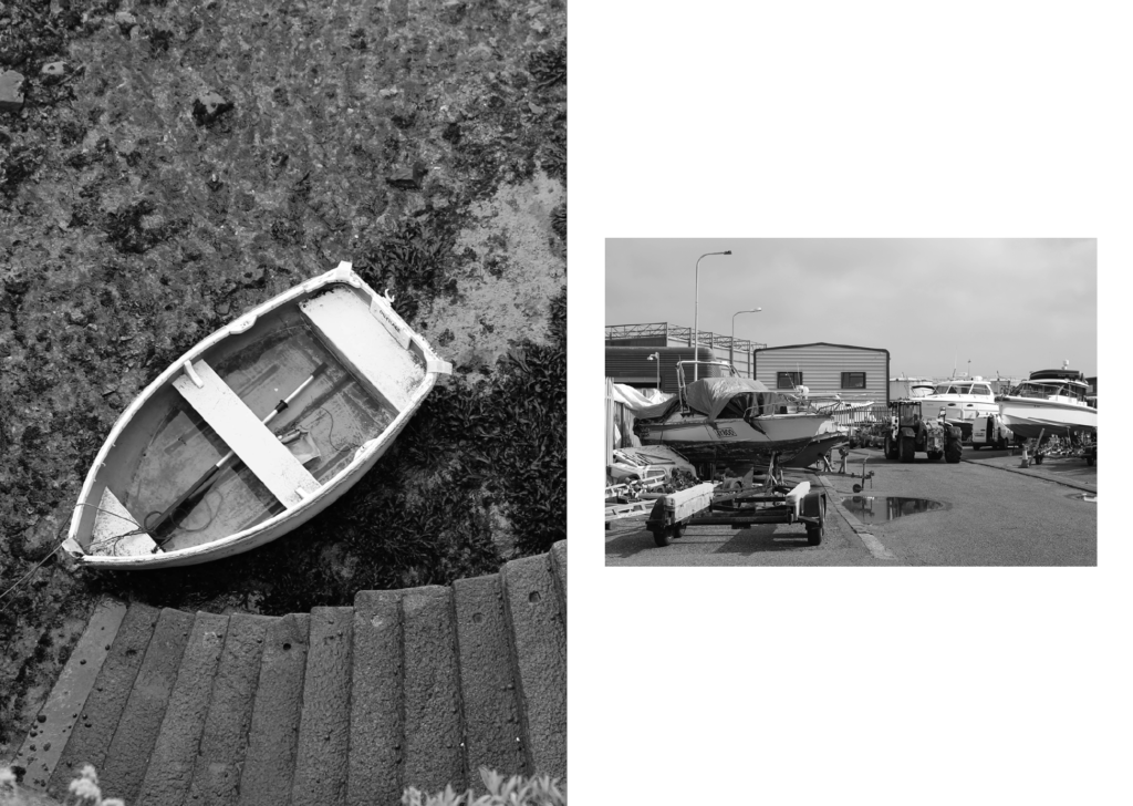
All these images work well together so I put them together to act as almost a separate part of the zine, keeping it interesting when the viewer flicks through it.
Now I have a free page that needs filling. To do this I’m going to find some photos that will complement well with the current images in the zine:
Here I wanted to add some contrast to the images, with one being organic and one being very robust. This will keep the zine interesting.
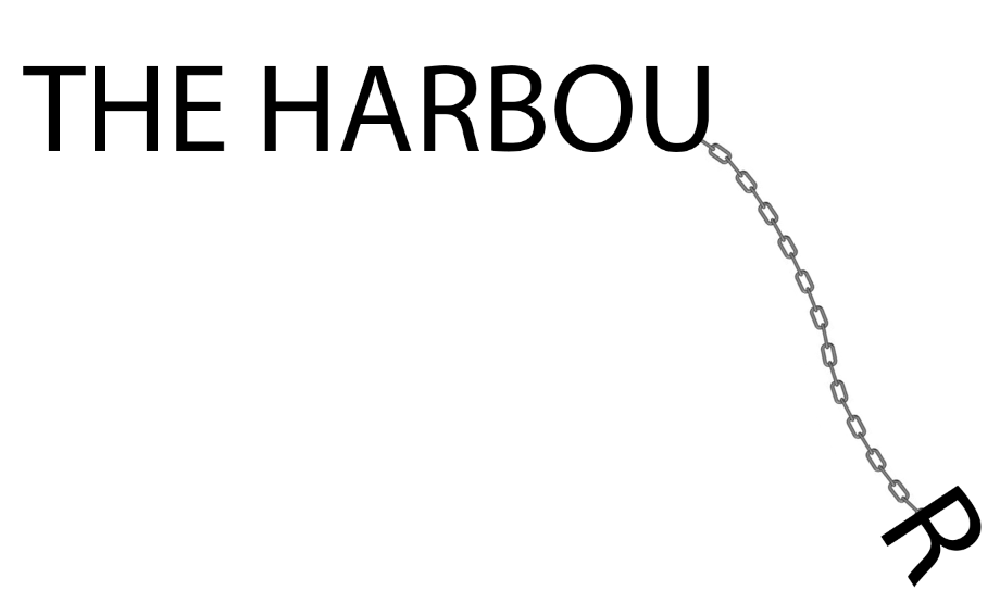
I also changed the name to:
I tried a funky design in photoshop to use for my title but I think it looks better to just use ordinary text:
The print:
After printing, using booklet settings, I collected the pages and folded them neatly using a bone folder and put them together in order. The I stapled the spine of the zine and trimmed the edges. Here is are some images from the final product:
Evaluation
Overall I am very happy with the final zine. It has many photos in without looking too busy as I has some pages with less images. The photos I chose also brings the viewer through a little story as they explore the harbour with my zine, without missing much as most of the harbour is included. However I do think I could add more ‘story’ elements instead of headers on some of my pages. It turned out very similarly to my mock up designs which I am pleased about, with the improvements further enhancing the zine. The zine also helped my present my best images in the order and format (e.g. the size) that I want, which would naturally improve the images.
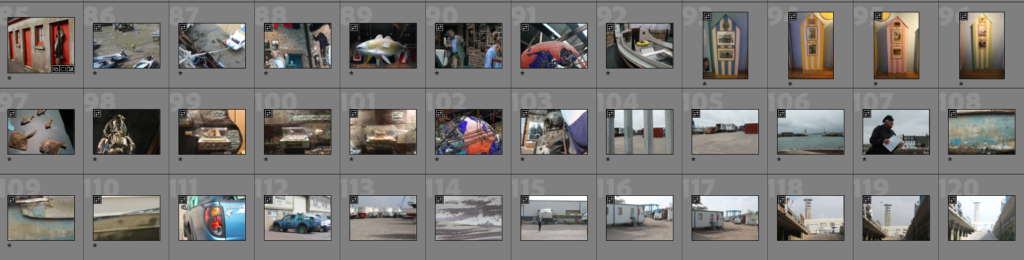
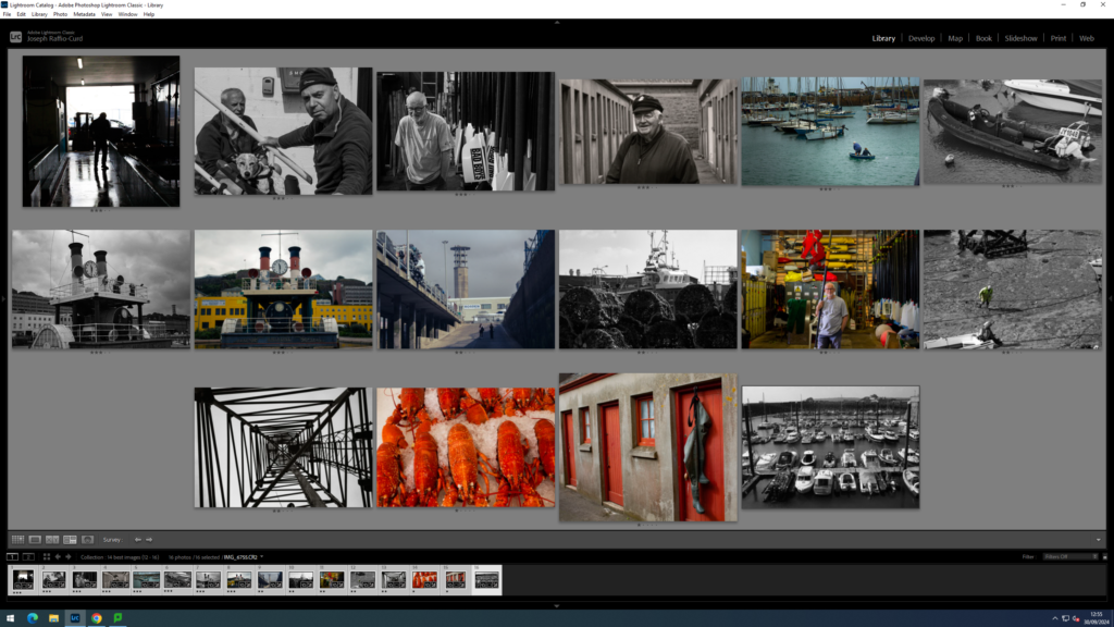
To select Images. I looked through the Images I have already rated on lightroom:
Then chose 16 unique Images that I can use to tell a story. I tried to include some busy Images which have wide and detailed shots. As well as including some simpler images to complement them and to add a negative space effect to the little magazine. I also wanted to include a lot of images with human subjects as they are usually the most interesting.
Here are the Images I decided to chose:
I might decide later to swap out the 4th image so I can put these to images next to each other as I think they contrast each other nicely:
I then printed out the 16 images I decided I want to use, cut them up and laded them out so I can decide which order they are placed and how they are placed in the zine:
I used other zines that you can see above my images to give me inspiration for the layout. I think for the steam clock I might add a few more photos to that page to create a topology of the steam clock.
I Then stuck the images inside a mock up zine with tape to see how it would look like. The size of the images will change later on as I will re-design them inside InDesign:
Photography originated back in 1822 as an instantaneous form of revealing secrets beyond the world in a nonchalant form, giving nothing away at the same time. Due to the etymology of photography being ‘drawing with light’ this art form is to turn the ordinary into the extraordinary, evoking a variety of emotions and thoughts, creating wonder about what lies beyond the frame of the image.
Camera Obscura
The camera obscura was created along with the pinhole camera in order to ‘fix the shadows,’ in 1010-1021. However, it was said that the camera obscura was a tool used since 400bc. A camera obscura consisted of a large box (eg a blackout room) with a hole in it (small hole at window) which projected an image of its surroundings onto the wall inside. This allowed the outside world to pour in and act as an optical phenomenon. The time taken for the image to be displayed ranged from several minutes to several hours depending on the desired image that was being projected. The environment projected would be presented upside-down and ‘twice as natural’, used for artists to sit inside the box and create paintings or drawings of this area, using darkness to see light. This was called pinhole photography. Now, in more modern times, the camera obscura has been made into an electronic chip.
The camera obscura is a natural optical phenomenon, which has been around long before 1939. This however, is totally natural and not been invented by anyone.
Below is an example of the camera obscura in use more recently. This was done by Abelado Morell of the Santa Maria Della sauté in Venice 2006
Nicephore Niepce
Joseph Nicéphore Niépce, was a French inventor who is recognised widely as one of the earliest pioneers of photography through his development of heliography, creating arguably the oldest surviving image made with a camera.
The Niépce Heliograph was made in 1827, during this period of fervent experimentation. It is the earliest photograph produced with the aid of the camera obscura known to survive today.
The photograph was made by Joseph Nicéphore Niépce, who was born in 1765 and passed in 1833. He was born to a prominent family at Chalon-sur-Saône in the Burgundy region of France. He was motivated by the growing popular demand for affordable pictures. Niépce’s photographic experiments were conducted with the dual aims of copying prints and recording scenes from real life in the camera. At his family estate in the nearby village of Saint-Loup-de-Varennes, he produced legible but fleeting camera pictures. He called them points de vue, in 1816. Over the next decade he tried an array of chemicals, materials, and techniques to advance the process he ultimately called héliographie, or ‘sun writing.’
To make the heliograph, Niépce dissolved light-sensitive bitumen in oil of lavender and applied a thin coating over a polished pewter plate. He inserted the plate into a camera obscura and positioned it near a window in his second-story workroom. After several days of exposure to sunlight, the plate yielded an impression of the courtyard, outbuildings, and trees outside. Writing about his process in December 1827, Niépce acknowledged that it required further improvements, but was nevertheless “the first uncertain step in a completely new direction.”
In 1829 Niépce entered into formal partnership with Louis-Jacques-Mandé Daguerre (French, 1787–1851), proprietor of the famous Diorama in Paris. Daguerre continued to make vital improvements after Niepce’s death and introduced his “Daguerreotype” process in 1839.
The first photograph of Nicephore’s courtyard.
Louis Dageurre
Louis Daguerre was born in 18 November 1787, in Cormeilles-en-Parisis and died 10 July 1851. He was a French artist and photographer. He became one of the fathers of photography, because of his daguerreotype. He is most famous for his contributions to photography, but he was also an accomplished painter, scenic designer, and a developer of the diorama theatre. He was the first panorama painter.
In 1829, Daguerre partnered with Nicéphore Niépce, an inventor who had produced the world’s first heliograph in 1822 and the oldest surviving camera photograph in 1826 or 1827. Niépce died suddenly in 1833, but Daguerre continued experimenting, and evolved the process which would subsequently be known as the daguerreotype. After efforts to interest private investors didn’t work, Daguerre went public with his invention in 1839. At a joint meeting of the French Academy of Sciences and the Académie des Beaux Arts on 7 January of that year, the invention was announced and described in general terms, but all specific details were withheld. He presented the daguerreotype to a few individuals and presented his photographs and news of the daguerreotype quickly spread.
Daguerreotype
The daguerreotype was the first publicly available photographic process, which was widely used in the 1840-1850’s. ‘Daguerreotype’ also refers to an image created through this process.
Invented by Louis Daguerre and introduced worldwide in 1839, the daguerreotype was almost completely superseded by 1856 with new, less expensive processes, such as ambrotype (collodion process), that yield more readily viewable images. There has been a revival of the daguerreotype since the late 20th century by a small number of photographers interested in making artistic use of early photographic processes.
To make the image, a daguerreotypist polished a sheet of silver-plated copper to a mirror finish, then he would use an air gun, so that there was no dust on this plate, that would ruin the photograph. Then it is exposed in a camera for as long as was judged to be necessary, which could be as little as a few seconds for brightly sunlit subjects or much longer with less intense lighting. Next, he torches it, with mercury vapour, so that the image is visible. Then, he removed its sensitivity to light by liquid chemical treatment, which was rinsing it with cool water to cool the hot metal plate down and dried it and then sealed the easily marred result behind glass in a protective enclosure.
The image is on a mirror-like silver surface, as light was reflected back through the image. The image was on the edge of being present, as it was on the surface of the metal mirror, instead of light paper, where the image sinks into it. This meant that the metal one could be wiped away with a finger. These images were described as;
‘A mirror with a memory’
Henry Fox-Talbot
William Henry Fox-Talbot was born on 11th February 1800 and died 17th September 1877. He was an English scientist, inventor, and photography pioneer who invented the salted paper and calotype processes, precursors to photographic processes of the later 19th and 20th centuries. Talbot first began by applying silver salts onto salted paper, creating silver nitrate reactions from the light-sensitivity. This was then exposed to light for many days and then darkened producing negative images. These appeared like shoebox sized cameras and were named mousetraps and were very difficult to use because if it was disturbed it may just get darker and darker so that its only experienced momentarily.
Negative Images- Images are totally inverted. Light areas are dark vice versa and left side is on the right vice versa.
Overall, calotypes were extremely better than Daguerreotypes due to it being easily distributed, reproduced and were much cheaper. Whilst they both used light sensitive silver salts, the Daguerreotypes required a lot more tools and metal plates which had high monetary value.
Henry Fox Talbot – Latticed Window, 1835 The first photograph to produce a negative image, a paper negative taken with a camera obscura by William Henry Fox Talbot, of a latticed window in Lacock Abbey, Wiltshire. This early process was known as calotype and the original negative, labelled with the photographer’s own handwriting is preserved in London’s Science Museum. This image has still survived to this day. (Photo by William Henry Fox Talbot/Getty Images).
Richard Maddox
Richard Maddox was born on the 4th August 1816 and died on the 11th May 1902. He was an English photographer and physician who invented lightweight gelatin negative dry plates for photography in 1871.
Long before his discovery of the dry gelatin photographic emulsion, Maddox was prominent in what was called photomicrography. He would photograph minute organisms under the microscope. The eminent photomicrographer of the day, Lionel S. Beale, included as a frontispiece images made by Maddox in his manual ‘How to work with the Microscope.’
In photography, the Collodion process was invented in 1851 by Frederick Scott Archer. This invention required only two to three seconds of light exposure to produce an image, but plates had to be sensitized at the time of exposure, exposed while the emulsion was still wet, and processed immediately after exposure in the camera.
When he noticed that his health was being affected by the ‘wet’ collodion’s ether vapor, Maddox began looking for a substitute. He suggested in the 8 September 1871 British Journal of Photography article An Experiment with Gelatino-Bromide that sensitizing chemicals cadmium bromide and silver nitrate should be coated on a glass plate in gelatin, a transparent substance used for making candies.
The gelatin or dry plate photographic process involved the coating of glass photographic plates with a light sensitive gelatin emulsion and allowing them to dry prior to use.
The advantages of the dry plate were obvious: photographers could use commercial dry plates off the shelf instead of having to prepare their own emulsions in a mobile darkroom. Negatives did not have to be developed immediately. Also, for the first time, cameras could be made small enough to be hand-held, or even concealed: further research created ‘fast’ exposure times, which led to ‘snapshot’ photography.
George Eastman
George Eastman was born on July 12th 1854 and died March 14th 1942. He was an American entrepreneur who founded the Eastman Kodak Company and helped to bring the photographic use of roll film into the mainstream. After a decade of experiments in photography, he patented and sold a roll film camera, making amateur photography accessible to the general public for the first time.
He provided quality and affordable film to every camera manufacturer. In 1885, he received a patent for a film roll, and then focused on creating a camera to use the rolls. 1888, he patented and released the Kodak camera.
Kodak- a word Eastman created.
It was sold loaded with enough roll film for 100 exposures. When all the exposures had been made, the photographer mailed the camera back to the Eastman company in Rochester, along with $10. The company would process the film, make a print of each exposure, load another roll of film into the camera, and send the camera and the prints to the photographer. In 1889 he patented the processes for the first nitrocellulose film along with chemist Henry Reichenbach.
Kodak (Brownie)
The brownie is a series of camera models made by Eastman Kodak and first released in 1900. The brownie was a basic cardboard box camera with a simple convex-concave lens that took 2 1/4 inch square pictures on number 117 roll film. It was conceived and marketed for sales of Kodak roll films, because of its simple controls and initial price of US$1 (equivalent to $37 in 2023) along with the low price of Kodak roll film and processing, the Brownie camera surpassed its marketing goal.
Film/Print Photography
Photographic film is a strip or sheet of transparent film base coated on one side with a gelatin emulsion containing microscopically small light-sensitive silver halide crystals. The sizes and other characteristics of the crystals determine the sensitivity, contrast, and resolution of the film. Film is typically segmented in frames, that give rise to separate photographs.
The emulsion will gradually darken if left exposed to light, but the process is too slow and incomplete to be of any practical use. Instead, a very short exposure to the image formed by a camera lens is used to produce only a very slight chemical change, proportional to the amount of light absorbed by each crystal.
Digital Photography
Digital photography uses cameras containing arrays of electronic photodetectors interfaced to an analog-to-digital converter (ADC) to produce images focused by a lens, as opposed to an exposure on photographic film. The digitized image is stored as a computer file ready for further digital processing, viewing, electronic publishing, or digital printing. It is a form of digital imaging based on gathering visible light.
I chose certain images to edit and crop, so that I could experiment with my images, as well as hopefully improve, or produce better images.
Photoshop
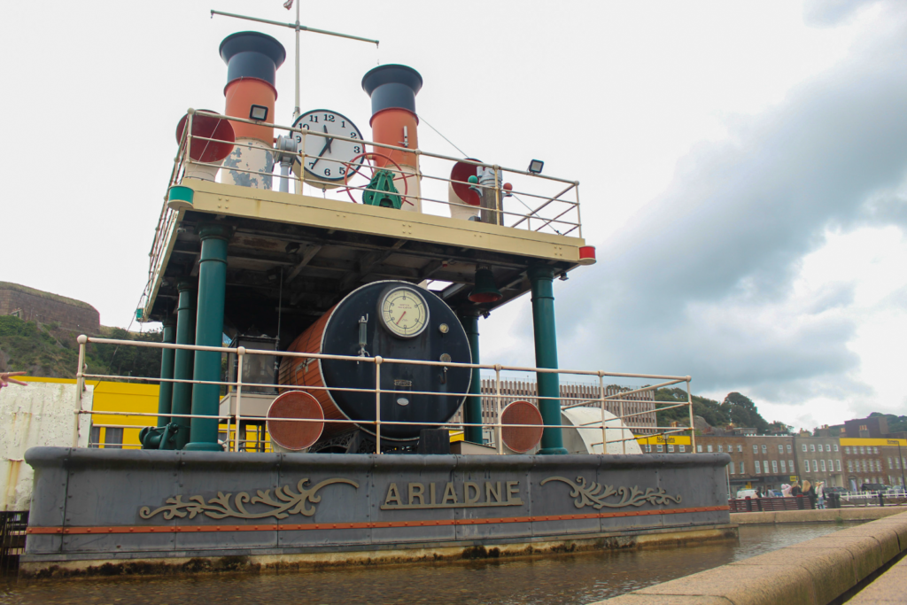
I experimented with colour selection in Lightroom. I chose this image to edit.
I chose this image, because it had quite a lot of green and red, so I wanted to use that to my advantage.
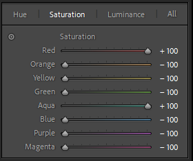
First I went to develop, then scrolled down to colour, selected saturation and put every colour but red and aqua to -100, and turned red and aqua up to 100.
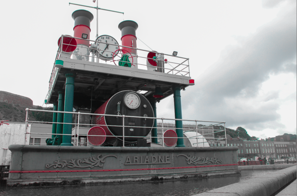
This was the result.
Evaluation
I think the image came out well, as I achieved what I was trying to do (colour pop), but I do prefer the original image, just because I think it not only looks better, but it also ties in with the theme of the harbour better, whereas this image doesn’t really have a good relationship with my other images now. However, in the future I could have made other colour popping images, so that there was a relationship, but I didn’t want to, just because I preferred this original photograph better.
Cropping
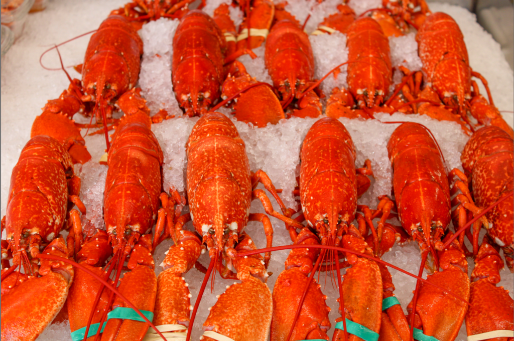
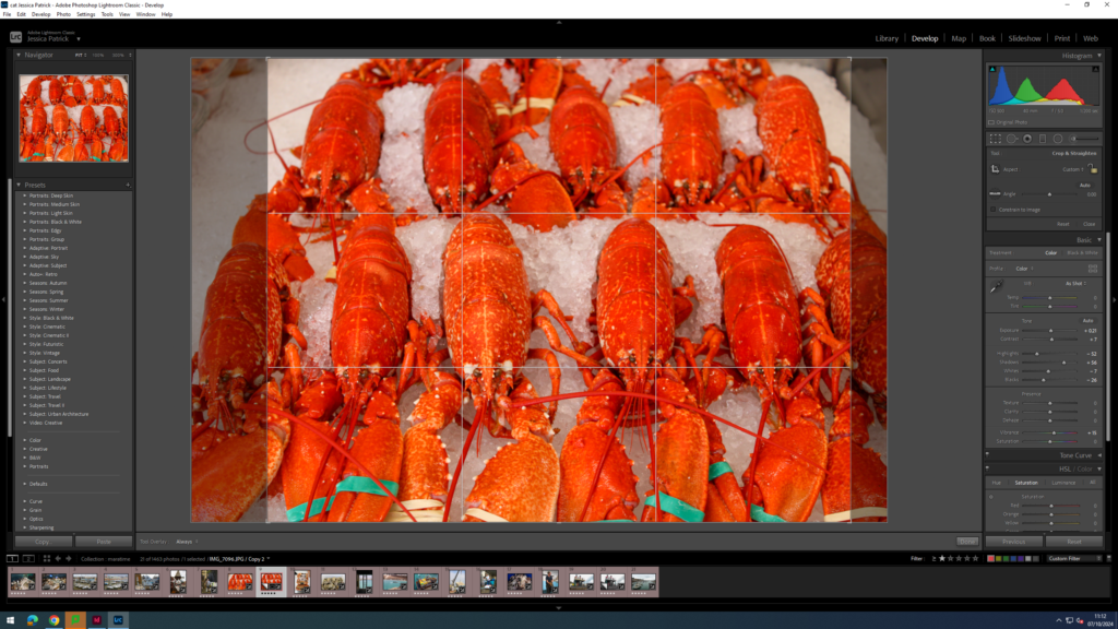
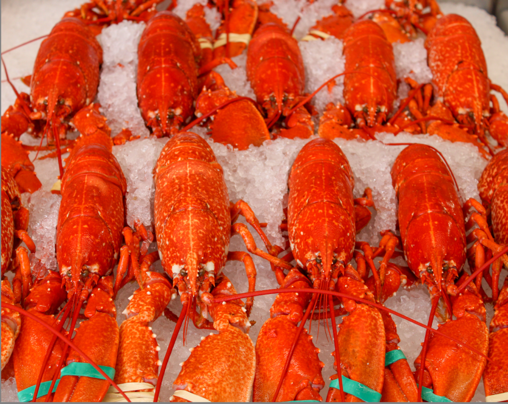
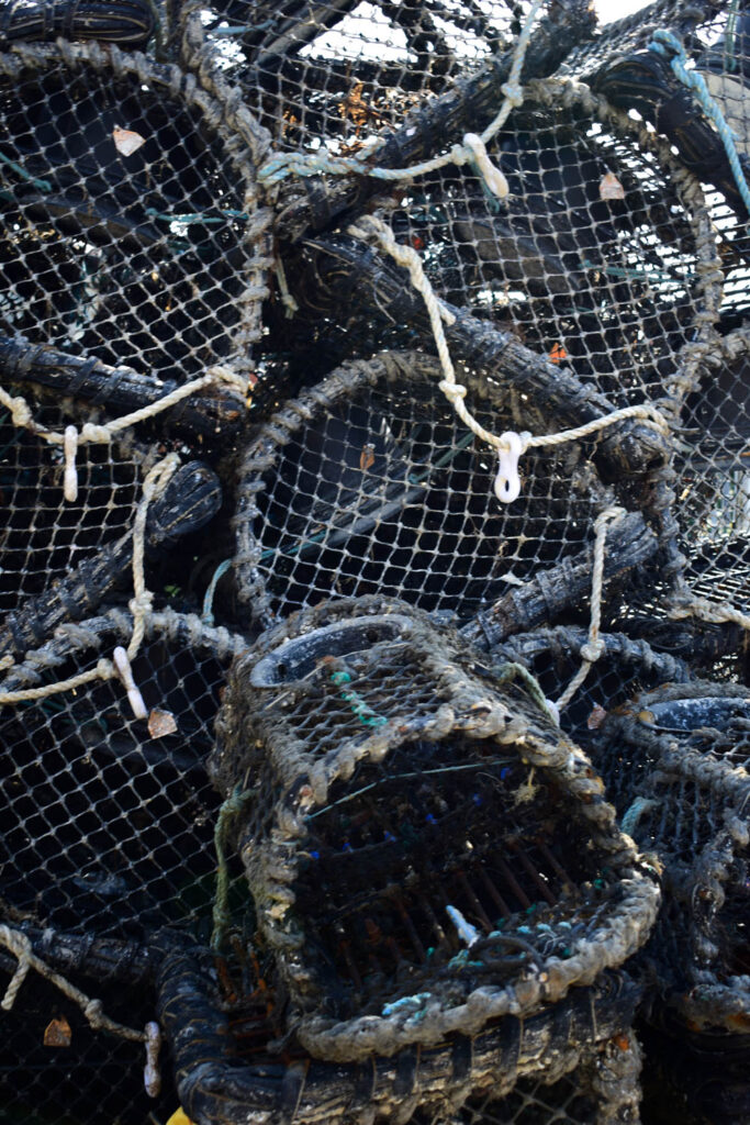
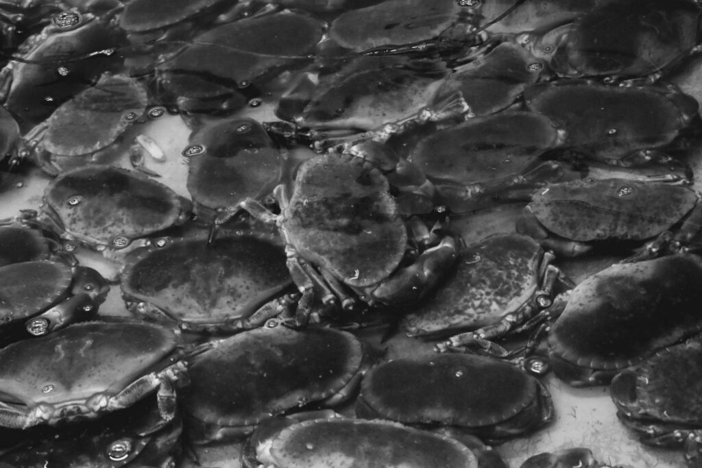
I chose this image to crop, because I wanted to crop out the negative space of the ice on the top left and right side.
I used the cropping tool on Lightroom to do this. I chose my desired crop to improve my image.
The final result.
Evaluation
I prefer the cropped photo of the lobsters, because it eliminated the useless negative space, so the viewer is only focused on the lobsters and the repetitive pattern they are in. Lightroom is also the easiest cropping tool to use, so I am glad I used Lightroom. However, in the future I would like to experiment with cropping a few more images in Lightroom, and maybe use photoshop to do some more advanced cropping, like circle cropping.
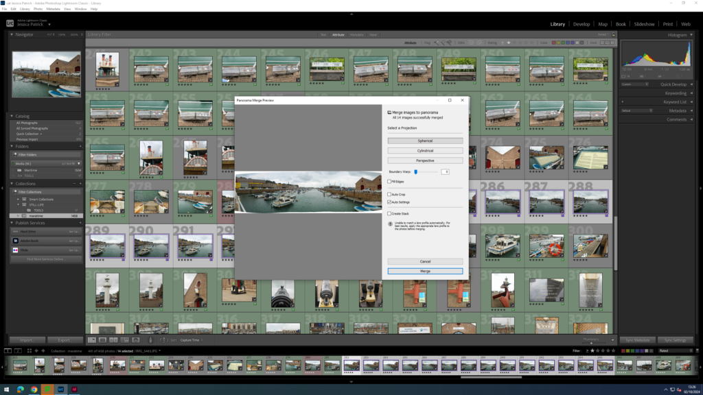
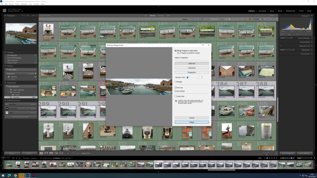
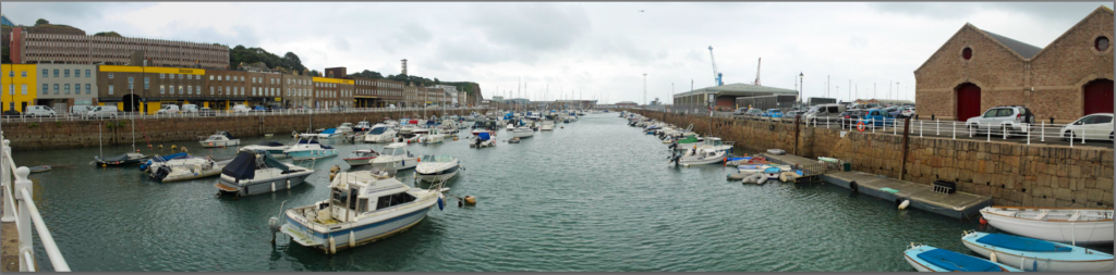
Panoramic
I used these images below to create my panoramic with;
I was able to make a panorama with these images, because I took images panning from one side of the harbour to the other, while keeping the camera as level as I could, with just my hands. Next time, if I were to do this I would use a camera stand/ tripod.
First, I selected my images on Lightroom, right clicked and selected photo merge. Then, I chose panorama.
It created this for me, but the edges were jagged, so I clicked auto crop and it crops the image, so the edges are straight.
Finally, I clicked done.
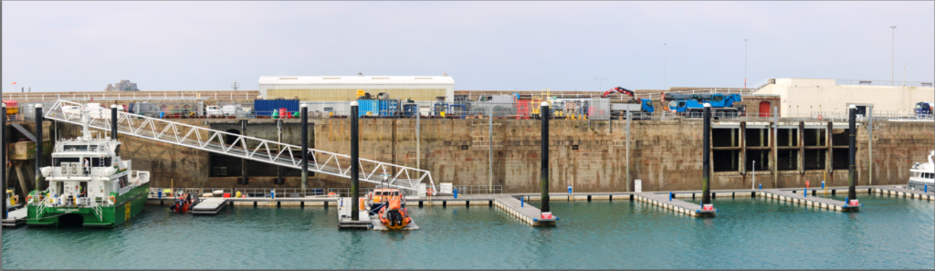
Then, I repeated this with some of my other images.
Evaluation
I think these images came out really well, especially considering I didn’t have a tripod for the camera when I was taking the panning images. These images show more of the harbour in one frame, and I think they have come out really well and fit the theme really well. I do think my first panorama is the best one though.
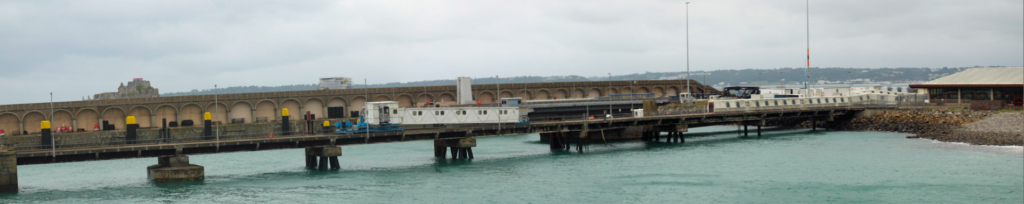
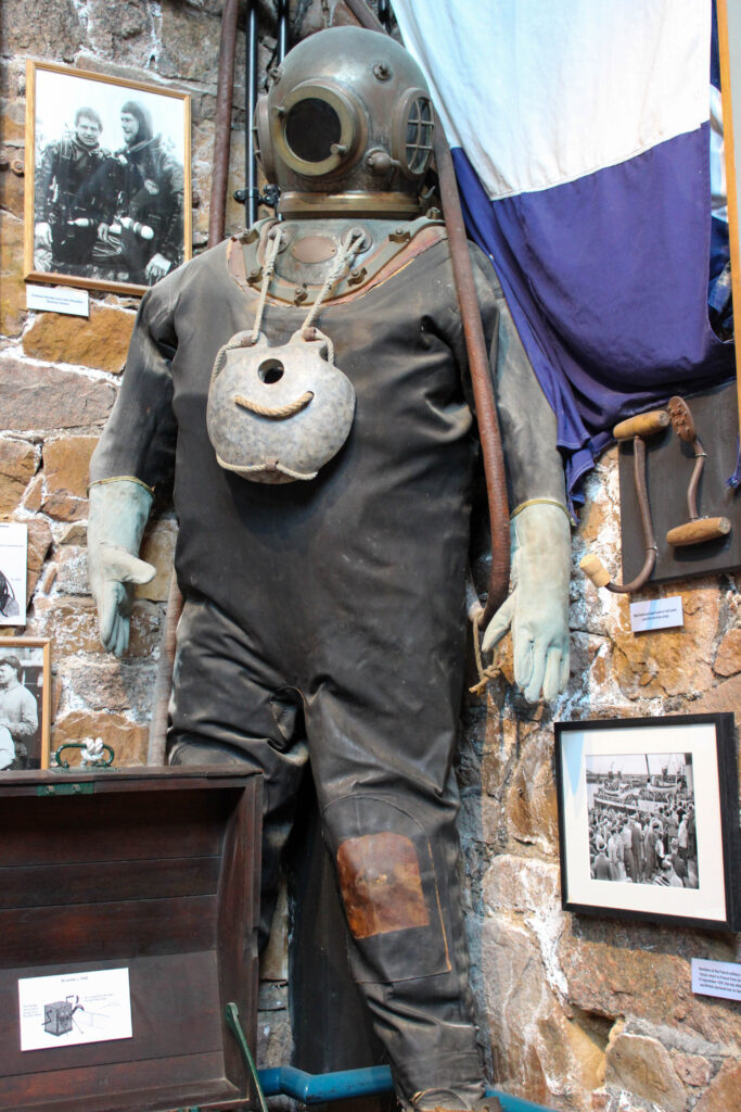
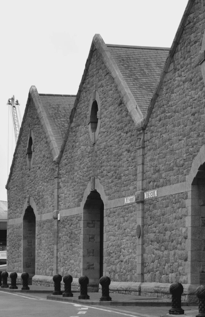
The marititme museum is based in St Helier, next to St Helier Harbour.
It is full History and many fun interactive ways to help you learn. For example, there were these pipes you could smell that had smells relating to what it smelt like for the fishers out at sea e.g. fish, rope, wine etc.
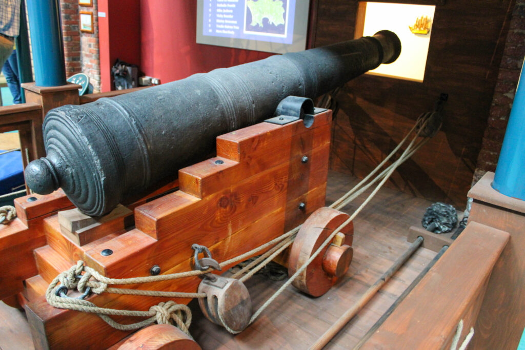
The museum also has lots of information scattered around, so that you can get the best understanding of the Jersey Harbours, cod fisheries, different boats, knot tying and so much more.
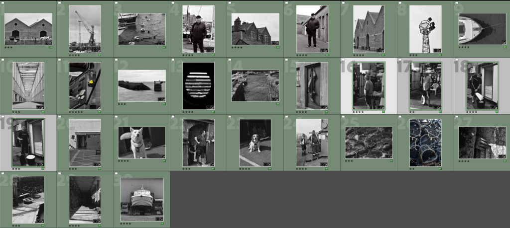
Contact Sheet
I edited the images which are highlighted blue, because they have the most information and are my best images, because they have the best layout and composition and are the most interesting photos.
Edits
I edited this image by increasing the exposure, contrast, whites, shadows, vibrancy and saturation, while decreasing the highlights and blacks. I did this, so that the image was more exposed and brighter.
Then, I made a virtual copy and created a black and white copy, which I increased the contrast, shadows and whites, while decreasing the blacks and highlights. I did this to create more contrast and a range of light and dark tones.
I edited this image by increasing the exposure, contrast, whites, shadows, vibrancy and saturation, while decreasing the highlights and blacks. I did this, so that the image was brighter and more vibrant.
I edited this image by increasing the exposure, contrast, whites, shadows and vibrancy, while decreasing the highlights and blacks. I did this, so that the photo was brighter.
I edited this image by increasing the exposure, contrast, whites, shadows and vibrancy, while decreasing the saturation, highlights and blacks. I did this, so that the image is more vibrant and the photographs are more visible.
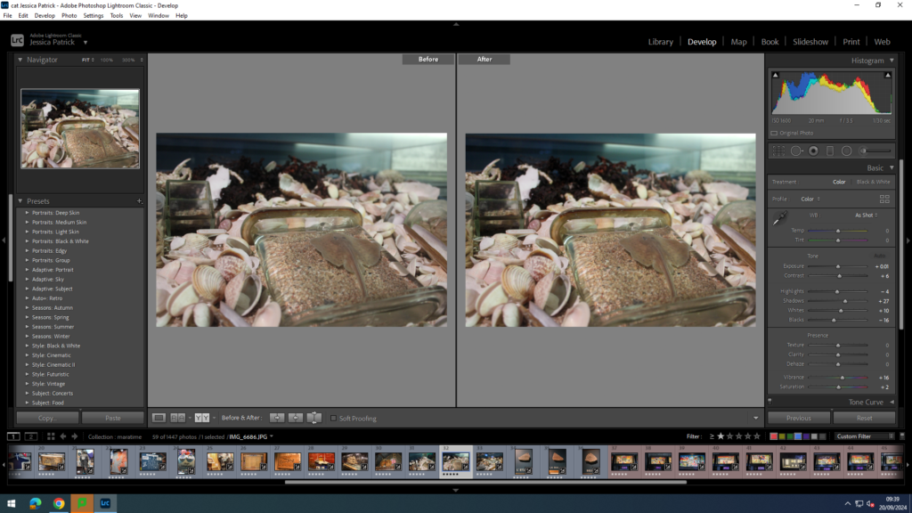
I edited this image by increasing the exposure, contrast, shadows, vibrancy and saturation, while decreasing the whites and highlights. I did this, so the shells around the window to the water are visible, as I made the image more exposed and brighter, as it was taken in a dark room.
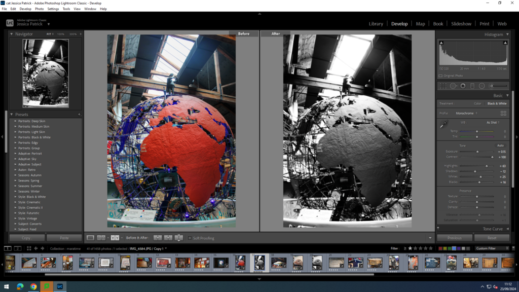
I edited this image by increasing the exposure, contrast, whites, shadows, vibrancy and saturation, while decreasing the highlights and blacks. I did this, so that the red ‘land’ on the earth was more vibrant and bold, so it stood out more.
Then, I created a virtual copy and created a black and white version and increased the contrast and highlights more, while decreasing the shadows. I did this to create more contrast.
I edited this image by increasing the exposure, contrast, whites, shadows and vibrancy, while decreasing the highlights and blacks. I did this, so that the image was less exposed from the bright light directly above the bottles, to make the bottles more visible.
I edited this image by increasing the exposure, contrast, whites, shadows and vibrancy, while decreasing the highlights and blacks. I did this, so the image was brighter and the writing more visible.
I edited this image by increasing the exposure, contrast, whites, shadows and vibrancy, while decreasing the highlights and blacks. I did this so the image was brighter and the wood colour more vibrant, so the carving stood out more.
I edited this image by increasing the exposure, contrast, whites, shadows and vibrancy, while decreasing the highlights and blacks. I did this, so the colour on the boat were more vibrant and stood out more.
I edited this image by increasing the exposure, contrast, whites, shadows, vibrancy and saturation, while decreasing the highlights and blacks. I did this, so the boat inside the bottle is more visible.
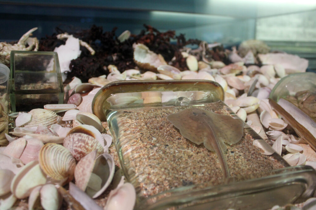
I edited this image by increasing the exposure, contrast, whites, shadows, vibrancy and saturation, while decreasing the highlights and blacks. I did this, so that the image was slightly more vibrant, so the stingray could be seen more, as it camouflaged into the sand.
I edited this image by increasing the exposure, contrast, whites, shadows, vibrancy and saturation, while decreasing the highlights and blacks. I did this, so that the image was more vibrant, so all the colours in the tank stood out more, especially the shrimp.
I made a black and white version of this photo and increased the shadows, whites and contrast, while decreasing the exposure, highlights and blacks. I did this to increase the contrast in the image.
Cod Fisheries
In the museum there is information about the cod fisheries, which is one of the main topics I researched in order to get a better understanding of the History and of what I am taking pictures of. This was very beneficial for me, because it allowed me to get even more of an understanding and the images tie in well with my photos of the harbour.
Final Images- Cod Fisheries
On the bottom of this headstone it says Gaspe, Newfoundland, but Gaspe is not actually in Newfoundland. This was written, so that it could deceive people, so they wouldn’t come to Gaspe and fish and steal the locals business.
The jumpers are called ‘jersey’s’, because Jersey fisherman would often knit while waiting for fish to get caught on their line, so that they could pass the time.
Final Images- Jersey Harbours
Map of Jersey
Corbiere Lighthouse
Corbiere Lighthouse sign in book.
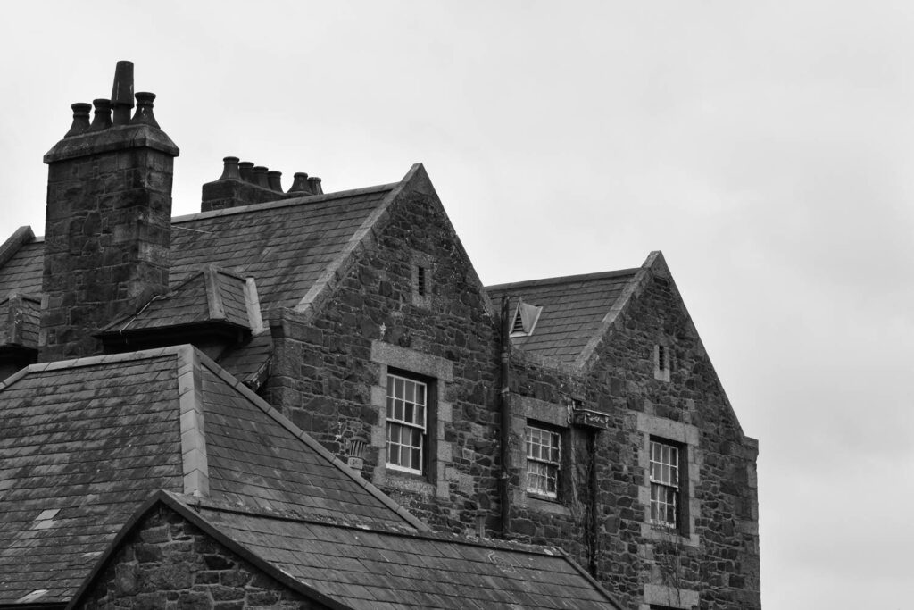
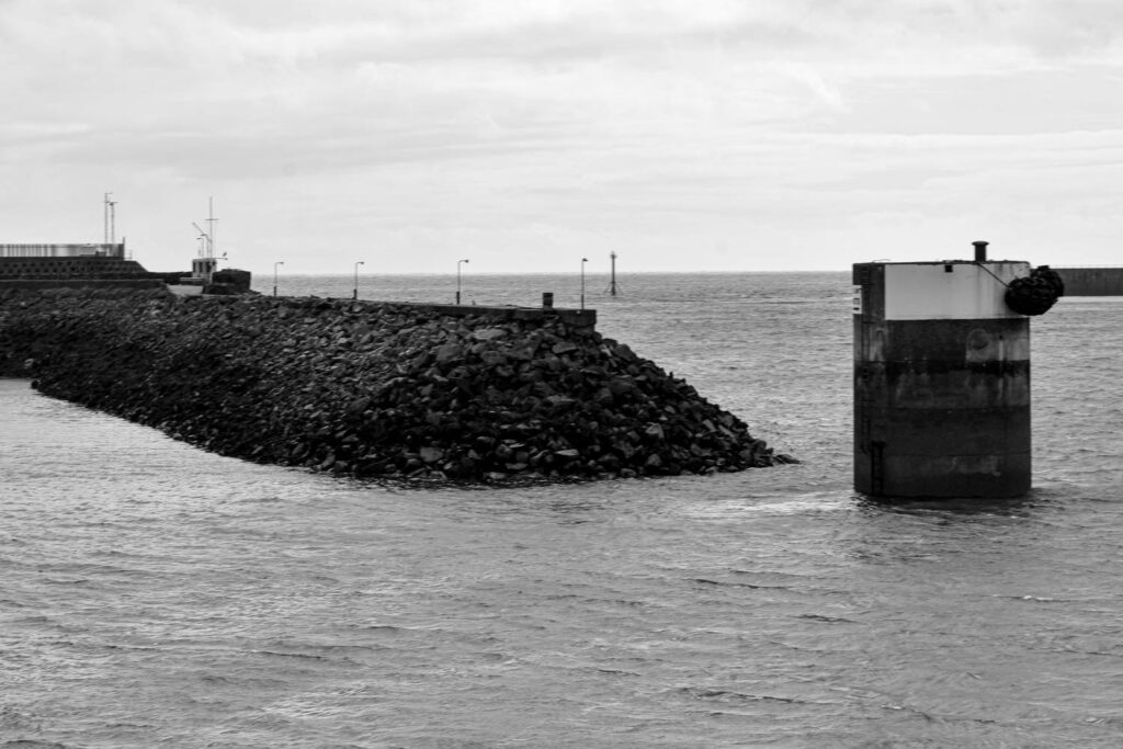
St Helier Harbour.
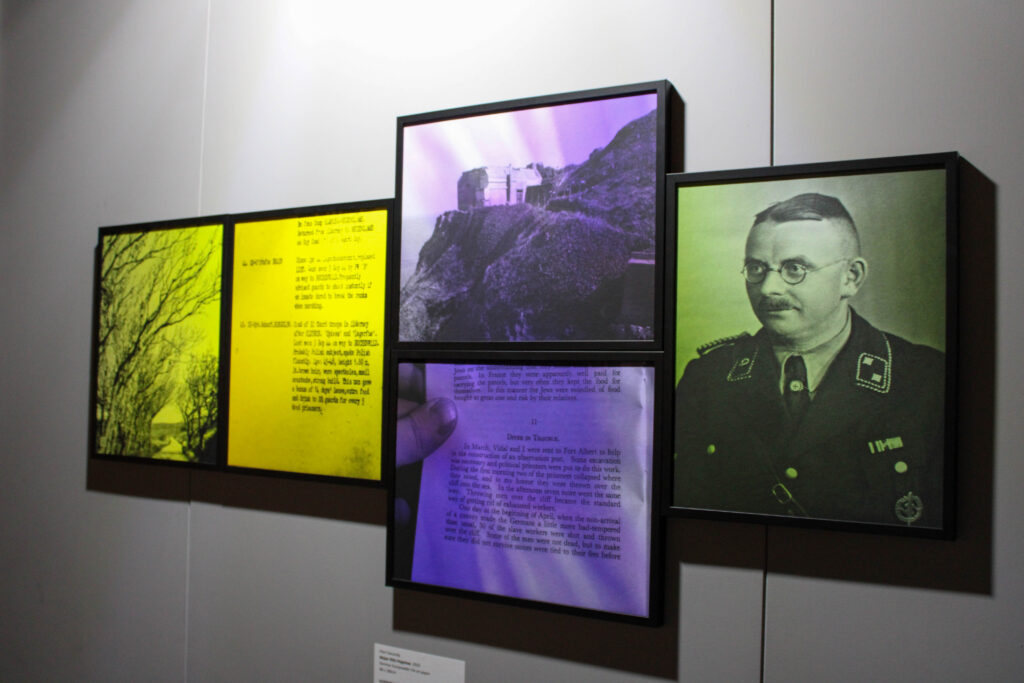
Final Images-WWII
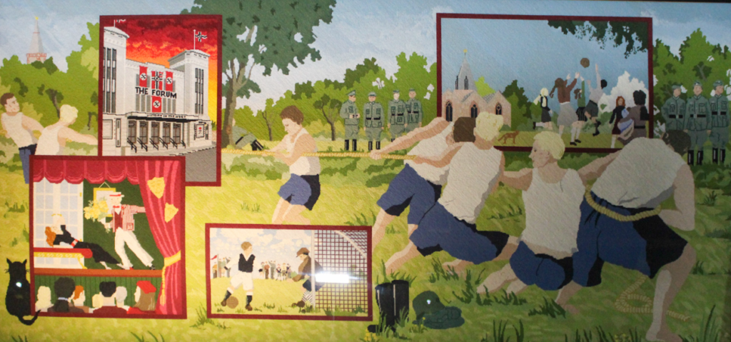
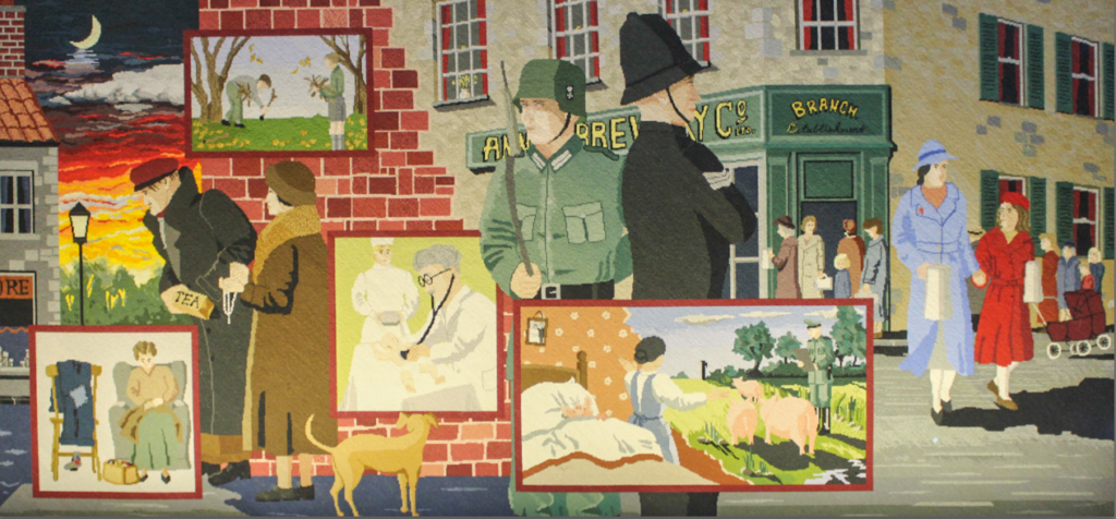
In the maritime museum there was also a WW11 section, which had crochet tapestries of scenes during the war, which were knitted by local Jersey citizens.
Final Images
Evaluation
I think this photoshoot went well, because I was able to capture lots of the fun elements of the museum, like the interactive smelling tubes, while also being able to capture lots of information, for example about the cod fisheries. I was also able to capture fun interesting images with a good composition and layout.
I also think my editing went well in this photoshoot, as I experimented with coloured images, as well as black and white images. I was able to adjust contrast, vibrancy and saturation etc, so that I could improve these images. However, next time I would like to experiment with photoshopping and cropping more, as I didn’t have a lot of time to do so in this topic.
Analysis of top 3 images
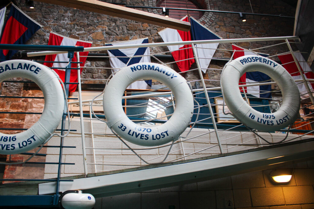
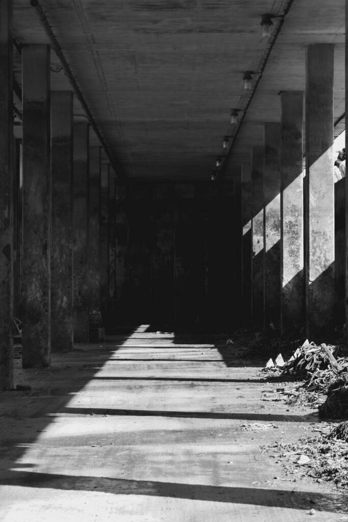
The lighting in this image is artificial lighting, because the photo was taken inside. I had no control over the placement of the life rings, but I did have control over where I was stood and how zoomed in or out the image was, because I could zoom in and out on my camera. This image has lots of contrast, as the image is in black and white and contains a range of grey shades. There is also lots of light and dark shades throughout this image, which creates the contrast. This image also contains only cool tones.
Camera settings:
F stop- f/4.5
Exposure time- 1/30sec
ISO- ISO-320
The layout in this image is very repetitive, because of the three identical rings in this image. That creates a repetitive pattern. The organisation of these rings also give the image a good composition. However, I wish I had zoomed out, because the rings are cropped out of the frame. The main viewpoint in this image is the rings, which is why I would have preferred all three in the frame.
There is a deeper meaning in this image though, because the rings state the places that they were kept, because they are life saving rings, that are thrown to save people who are drowning. On the rings, it also states how many lives have been lost at these Jersey beaches, to people drowning. The rings also state what year the lives were lost in.
The point of this photograph and the rings with this information is to present how many lives are lost, to make people really think and mourn these victims.
The type of lighting used in this image is artificial lighting, because I was inside. I had no control over the position or location of the objects, but I did have control over where I stood and how zoomed in or out my camera was.
Camera Settings:
F stop- f/3.5
Exposure time- 1/30sec
ISO- ISO-1600
This image contains quite warm tones, because it contains lots of red and sandy colours. It also contains lots of lighter tones. This image also contains lots of texture, because of the texture of the sand and shells surrounding the stingray. There is also lots of repetition in this image, because of the large amount of shells that are scattered around, which all look quite similar.
The layout of this image has a lot of depth to it, because of the angle the photo was taken. This gives it a depth of surface illusion. The main viewpoint of this image is the stingray, even though it is not center of the image. It is in the foreground of the image, with the background being slightly more blurred.
This image is of a stingray, which has been sealed in a silicone like substance. Some people may find this cruel and may not like this image, because they may believe the stingray was killed for this purpose, which it may have been, but it may have died naturally and someone just wanted to create art from that.
This photograph is useful, because it presents what a stingray looks like close up. The silicone around it is also useful, because it allowed me to get close up, without being in danger.
The type of lighting used in this image is artificial lighting, because I was inside. I had no control over the position or location of the objects, but I did have control over where I stood and how zoomed in or out my camera was. This image was quite under exposed and dark, because it was quite dark in the room, so there wasn’t much artificial lighting. Instead, I had to edit the image to increase the exposure to make it brighter. In future, I’d use my flash on my camera.
Camera Settings:
F stop- f/3.5
Exposure time- 1/30sec
ISO- ISO-320
There are lots of brown/ red colours in this image, as well as the bright blue water, looking into the tank through the window. There composition and layout of this image has lots of pattern and repetition and 3D shapes in this image, because of the pattern of the shells. There is also lots of texture in this image, because of the shells and the coral. The main viewpoint in this image is the circle window looking out onto the sea like view, which is in the center of the image. There is also lots of contrast between the very bright water and the darker surroundings. There is also a depth of surface illusion in this image.
This image presents what it would look like and feel like to be on the lower deck of the boat, looking out the window. This relates to the theme, because it gives us a sense of what it was like to be a fisherman at the harbour with the cod fisheries, as well as what it is like today.
‘A photo zine is a self-made, printed issue built of photos and captions. The term comes from the word “magazine”, as zines follow the style of magazines with headings, text, and illustrations put on a grid. An important feature of a photo zine is visual storytelling.‘
Mood Board
Focus Of Experimentation
I want to experiment with they key elements of a photo form, colour, shape and texture and work with combining those elements in order to create and interesting and stimulating photo zine.
I also what to experiment with mirroring and flipping images to create optical illusions throughout.
Narrative is the way a story is told. It is subjective and can vary between each person telling the same story. A narrative is told by stringing along images in a sequence. You can choose how to portray elements in a story to create a narrative. A story however is a factual account of the events.
Story
In three words id describe the story as:
Identity
Work
History
The story I aim to show in my zine is the day cycle of a fisherman. Work is a big part of someone’s identity which I wanted to showcase with a day/work cycle.
As an island, we were and still are heavily reliant on the sea for import/export of food, amenities and revenue. This would not be possible without workers such as fishermen, ferrymen and sea captains. Having a title and tales however does not exclude these individuals from the mundane and unexciting day like everyone else.
Narrative
I will be using archival image’s and my own images. I will be using minimal text and typography.
Zine creation and selection
I have two images with pops of colour in this set which I might not keep since they stand out too much against the other monochrome images. Additionally I will need to remove some of the portraits as I am limited because the zine will have a total of 20 pages. Some pages could have multiple images on them but I also want to include some archival images so I will make my final selections based on those.
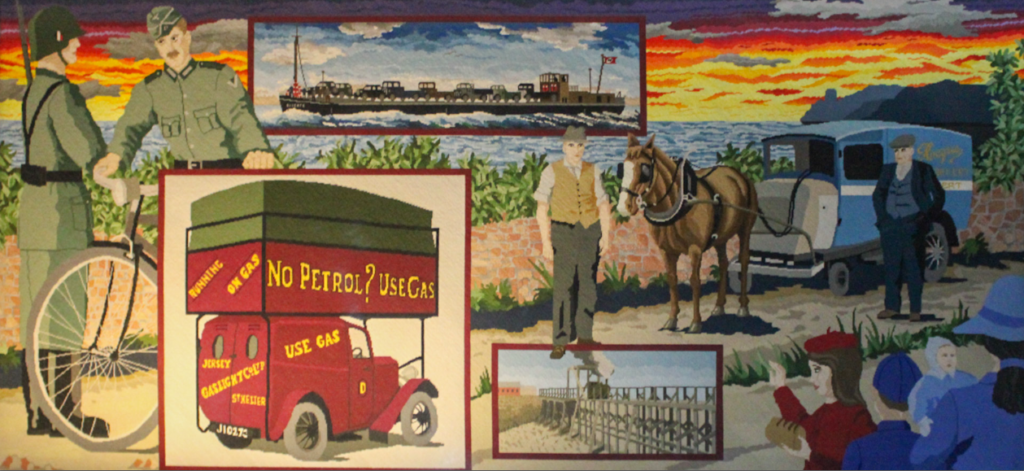
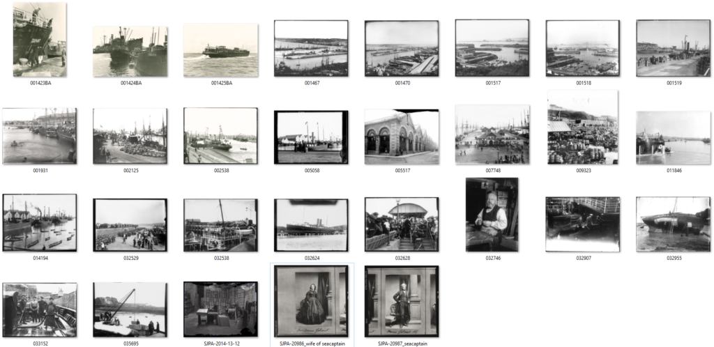
The archive images I found related to the harbour and merchants were the following:
I didn’t take many images of the whole harbour to compare with the old ones however the portraits would make for nice comparisons. I think that because my story focuses on how trade has changed, comparing to old images would be beneficial to the overall narrative.
Paper mock up
I created a paper mock up to begin sequencing my images to construct a narrative. I knew I wanted a flow from the people to the actual job and boats which would end with the buildings. I knew I also wanted to include older archival images to show how this cycle has been carried out in part throughout the history of our marine endeavours.
Design and Layout
Pages
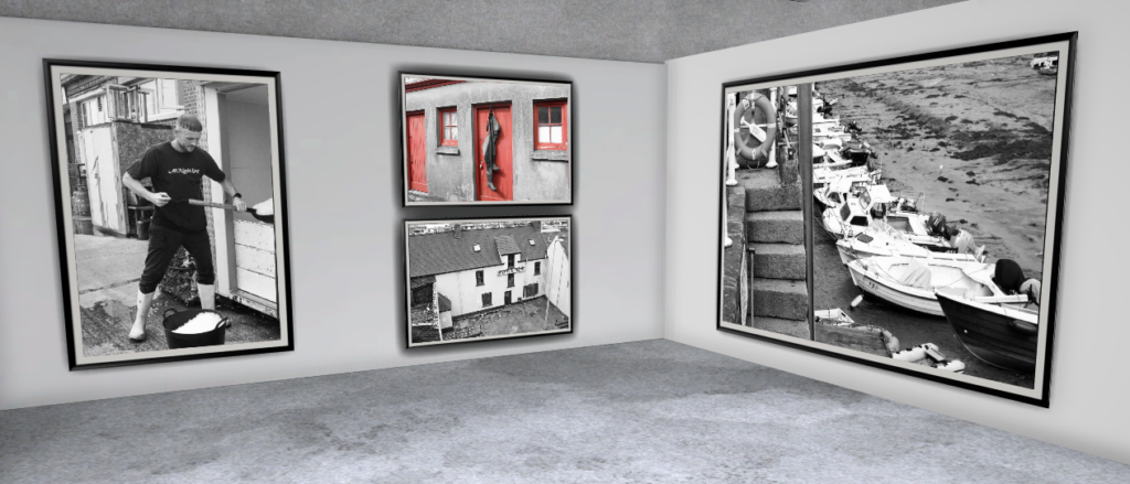
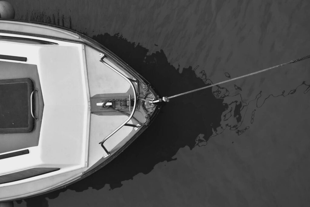
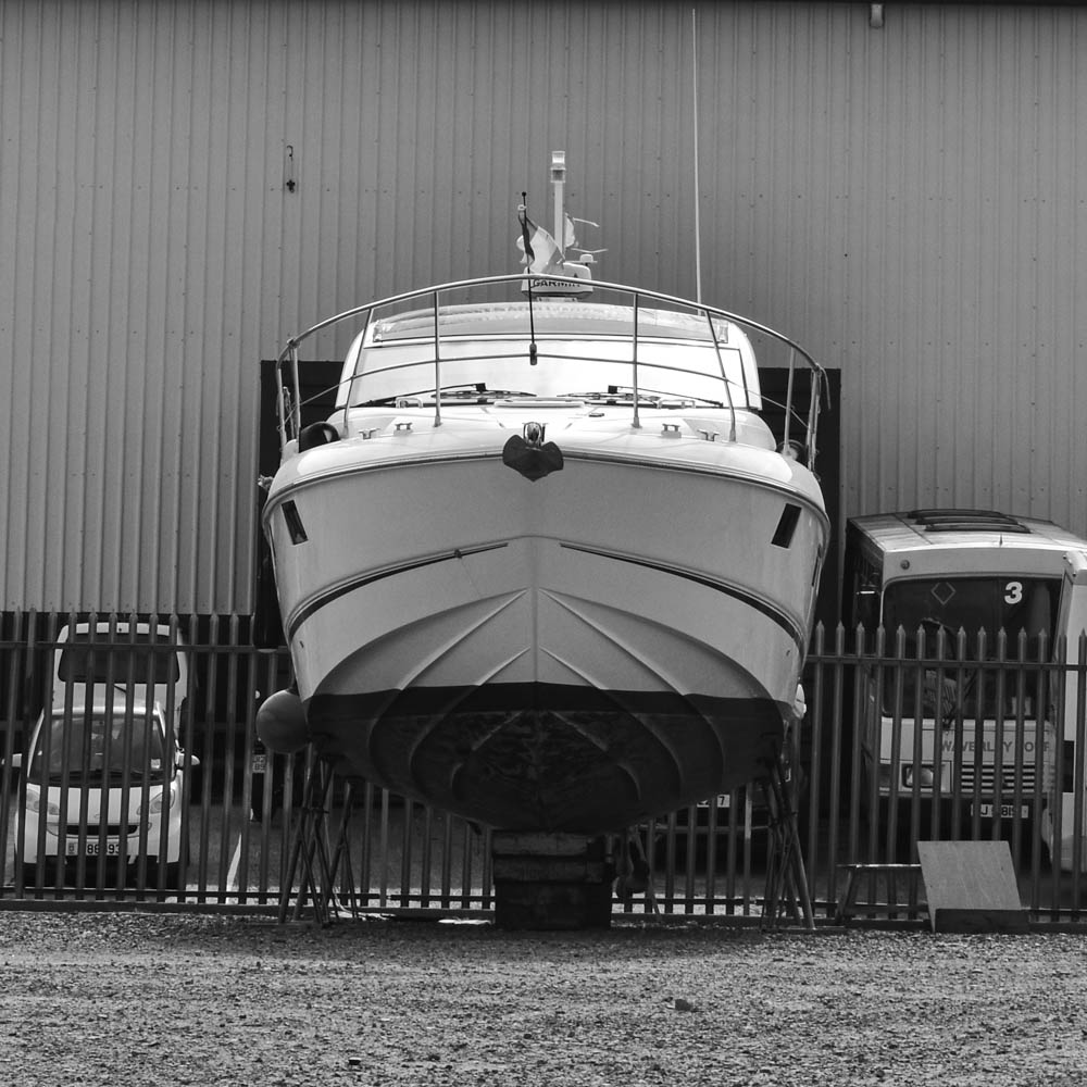
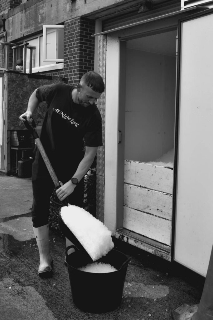
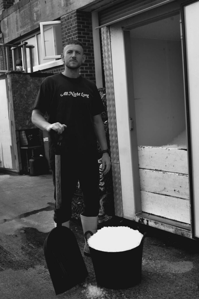
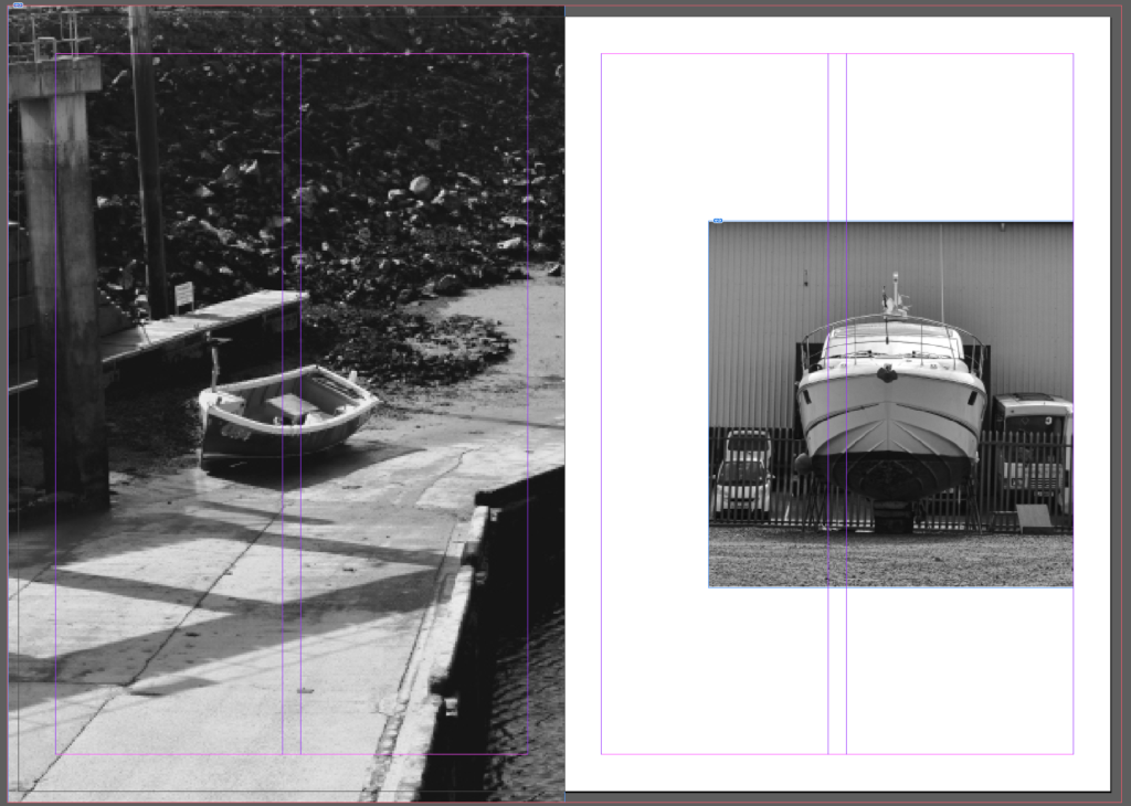
I grouped these two images together as they were both grounded boats but since they had different shapes I wanted to try different sizes too. I made one full bleed and one smaller for some variety.
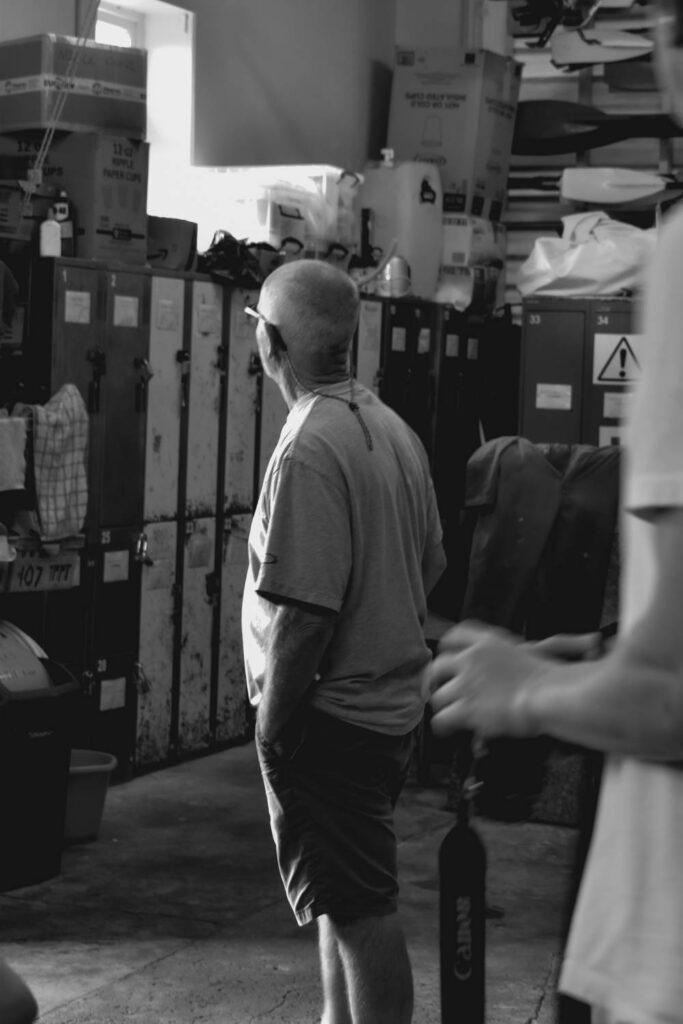
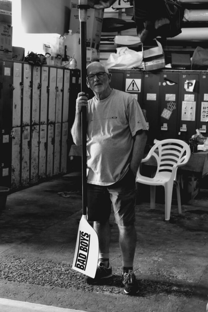
I tried a few things for the double portrait spread:
If I was going to include words I would use one where the images were more spread out however I didn’t plant on writing too much so I chose the grid instead.
I added one more portrait to the grid so I could keep one larger.
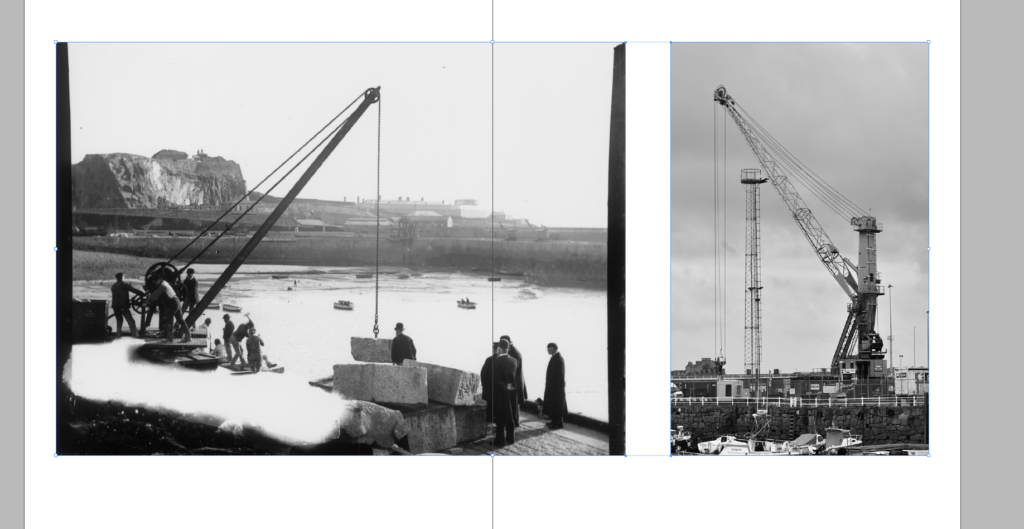
In order to make each set of pages unique, I also created a double page spread. I chose this image for the double spread because first of all it was landscape but additionally because I thought the image stood out on its own.
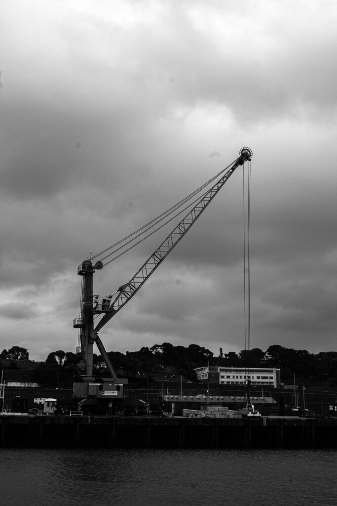
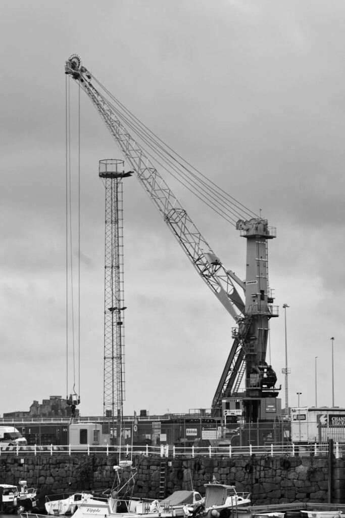
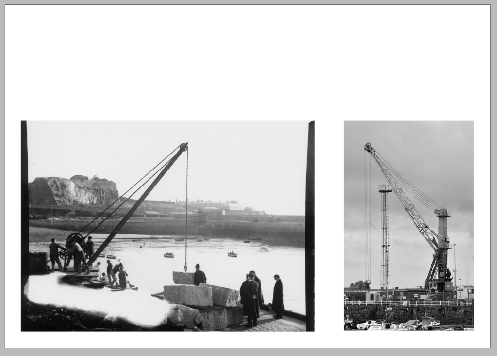
For these two pages I was struggling to decide on the layout. The first option was a little too busy however I liked all the images. I tried removing one but then the layout didn’t work at all. Eventually i decided to keep the crane alone which looked better but I decided to try an additional layout.
This option only had both cranes with one spreading over the page. While I liked how unique this looked, I thought there was too much unused space above and below. I liked both options and I was leaning towards the two only so that not all of my pages showed a near full bleed.
I decided to slightly adjust the ratios and move it into the bottom.
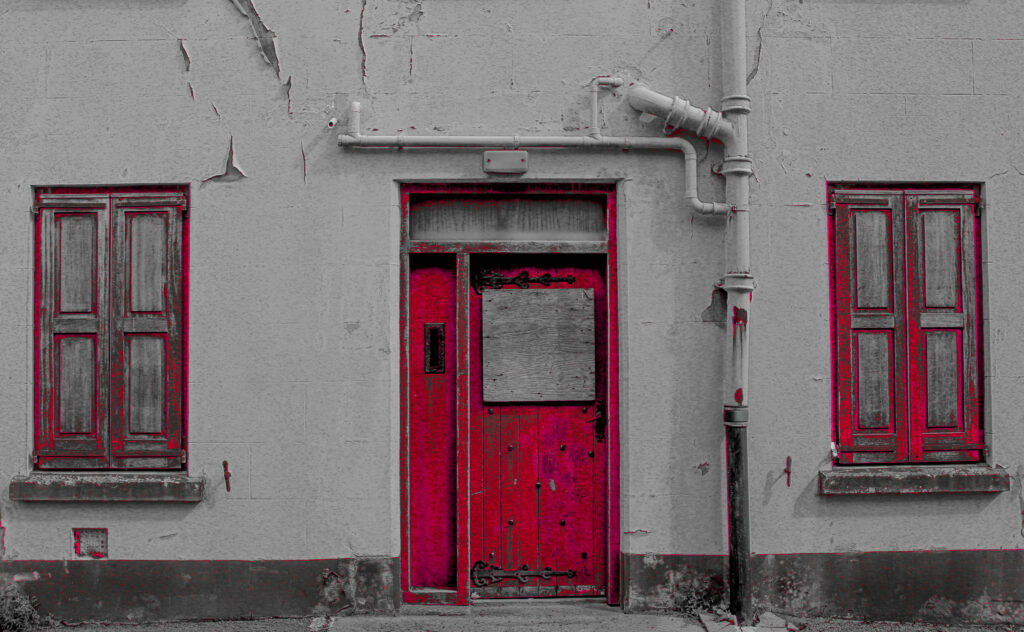
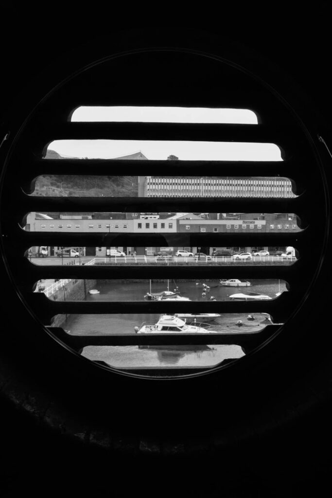
I compared 2 layouts. The first kept the cut out and the second did not. I started the first with the window where I could place text in white around the window. For the final I used the pub and I added 2 additional images. In the first layout I had less images and used 2 less pages.
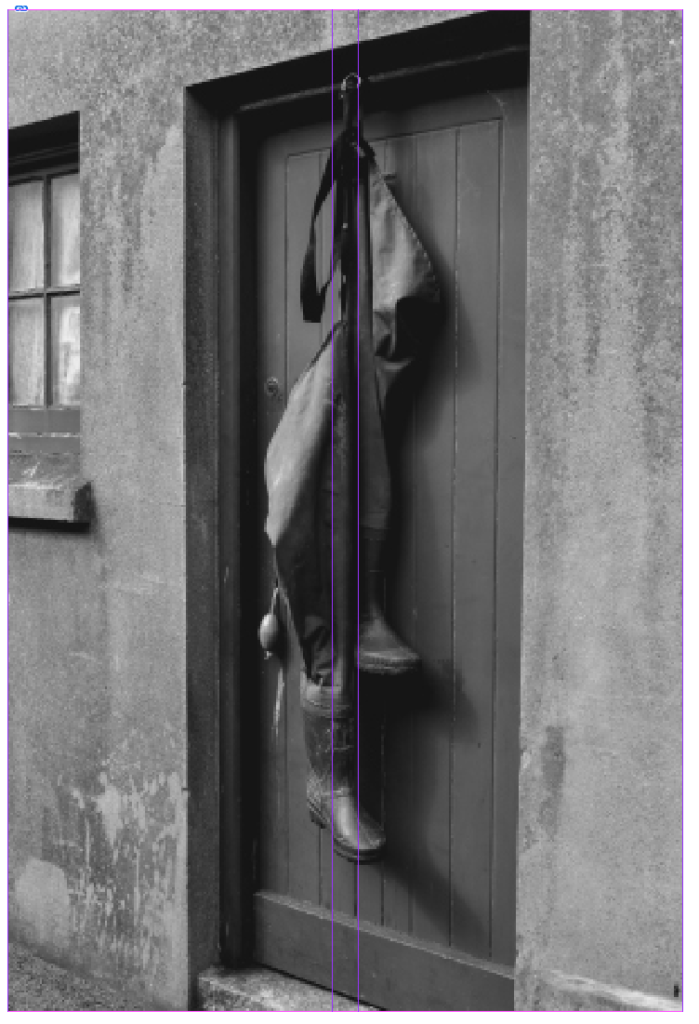
End Page
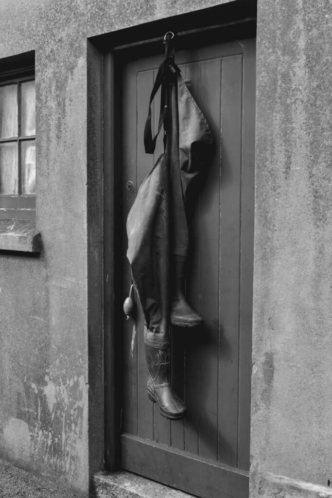
For the end page I wasnt sure between this image ^ and this image >
For the boots I thought it could show hanging up the wellies for the day to symbolise finishing the job but the window shows being inside a building and looking out over the harbour to reflect on the day. I think the window would make more sense in terms of a story however.
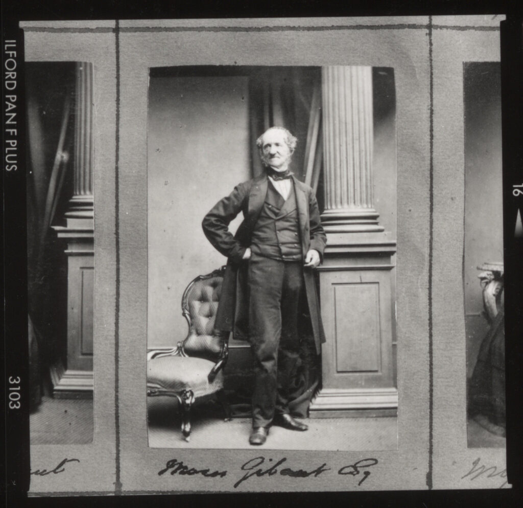
Title page
For these pages I compared two portraits of captains. I was originally going to use the other portrait since the head placement was much more similar however this portrait looked better. This was going to be the first two pages however since I wasn’t sure on the cover I also had the idea of using one image and creating a cut out for the cover to resemble an ID image.
Since my idea for the overall narrative of my story was the identity and work of fishermen, I wanted to show an ID image to start and flip through pages to show the day cycle. I started with the people for identity, moved through boats for work, then cycled through the harbour for an end day reflection and ended on buildings to show leaving work or going home for the day.
In term of a title, I was mulling over options regarding identity and fishermen but couldn’t find one in particular I liked. I used an AI generator to generate some baseline ideas based on the input ‘Marine history and identity’ which came out with:
Waves of Change: Exploring Marine Identity
Anchors of the Past: A Journey Through Marine History
The Sea Within: Understanding Our Maritime Heritage
Tides of Time: The Evolution of Marine Identity
Beyond the Horizon: The Legacy of Marine History
The only ones I kind of liked were: Waves of change, tides of time or beyond the horizon but I figured these were too vague. I figured I would used anchor however as it prevents drifting. Its also used as a metaphor for stability. Our history as an island stems from marine technologies which we are more dependant on now then ever with our electricity and foods coming from off-island. Our financial stability also stems from marine trade.
I decided to change the name to something relating to the sea captain on the cover. I wanted to keep the anchor as imagery on the cover instead however I thought it made the cover too busy.
I was struggling to pick a title and though of maybe: Mémoire of a Magister Navis. Mémoire meaning memory and Magister Navis meaning sea captain. However I decided to use Jèrriais instead. I wanted something along the lines of: Story from a Sea Captain = Conte d’un Capitaine d’la Mer or the identity of a Sea Captain = L’Identité d’Un Capitaine d’Mer.