Design Layout 1
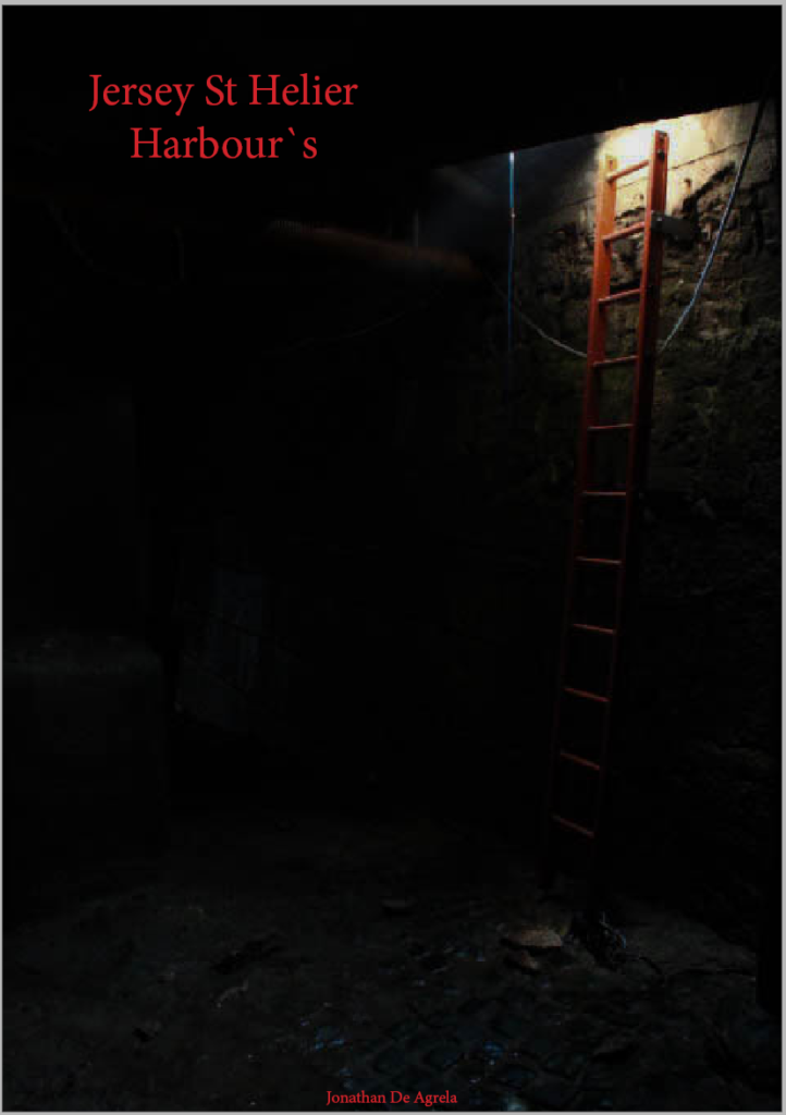
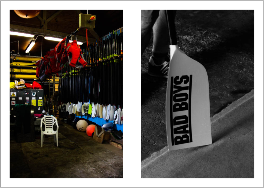
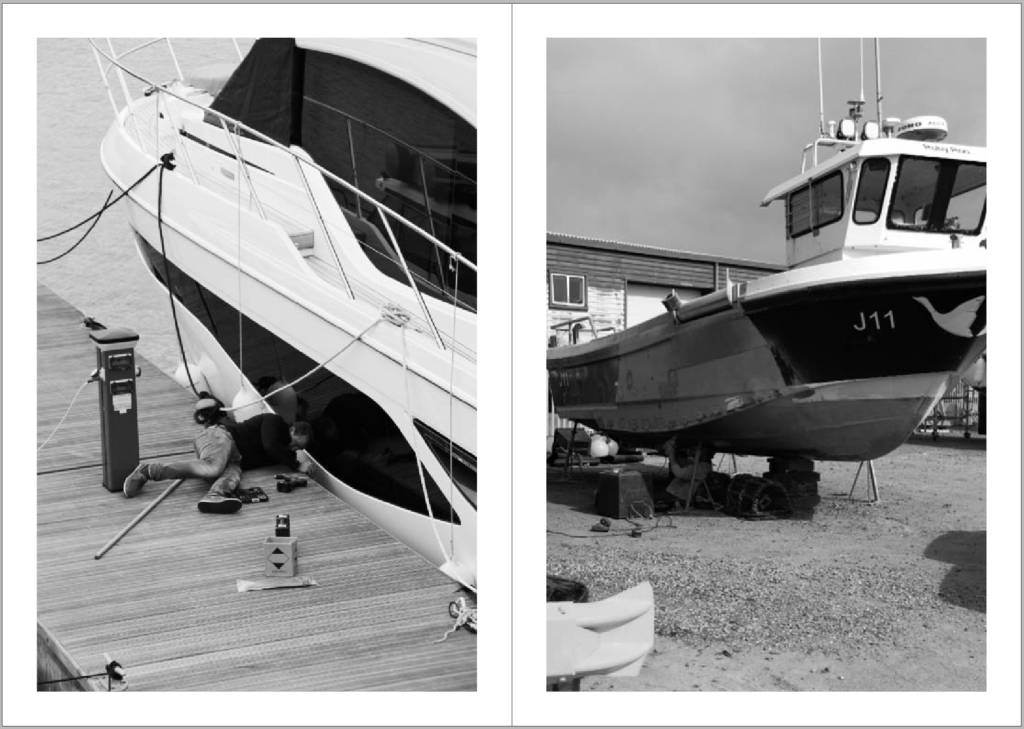
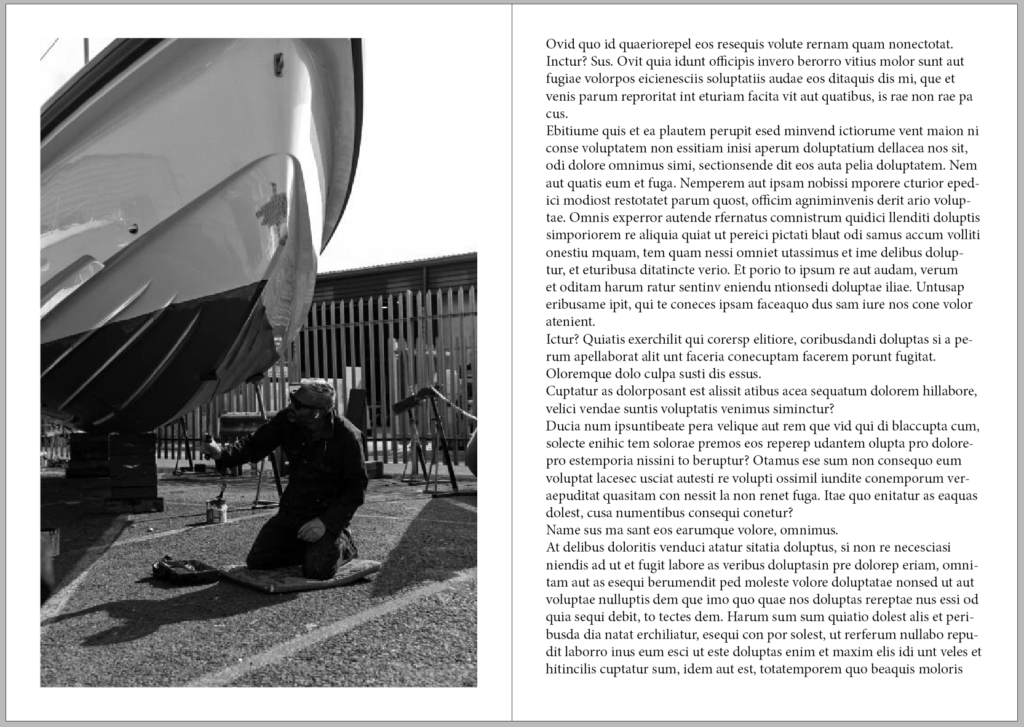
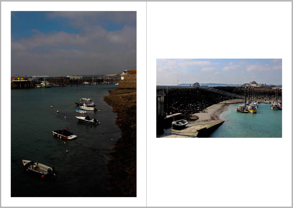
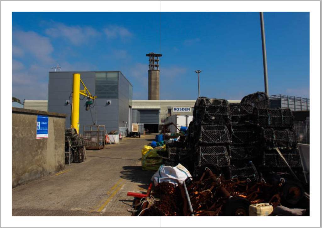
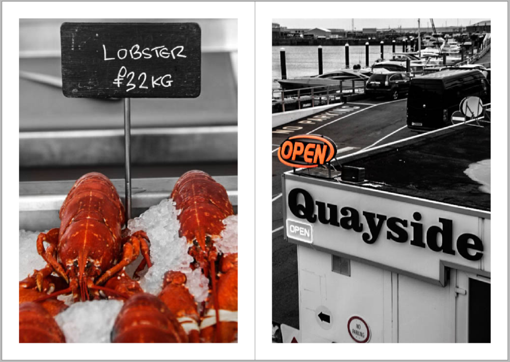
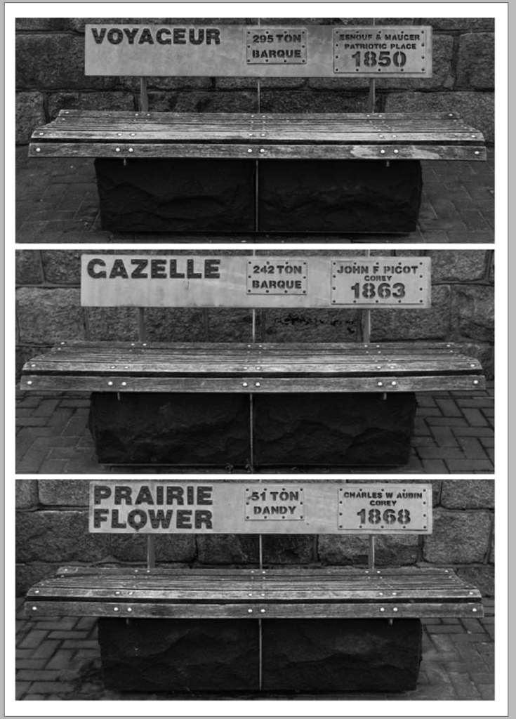
In my first design layout for the zine, I appreciate the chronological order of the photographs as they display the order in which the images were taken, creating a smooth flow throughout the pages. However, I think that the placement and fitting of the images could be more interesting and bold because currently, the arrangement of the images are quite bland and does not catch the visual interest I am trying to create. Also, I am not happy with the title of my zine: “Jersey St Helier Harbours” as I feel that the title is too straightforward and does not actually express the feeling of the stories behind the photographs. Another thing I like in this layout of my zine is that there is a page simply with just writing, I think this was a good idea because it gives the viewer/reader a break from the visuals or images and gives them time to reflect on the images in the zine. I think that the balance between images and writing is important in a zine, as it allows the readers to engage properly and thoughtfully with the content. Additionally, it also lets me express my thoughts and give context behind the photographs that the images themselves cannot show. Overall, even though the layout has a good base, the design and arrangement of the photos can definitely be improved.
Design Layout 2
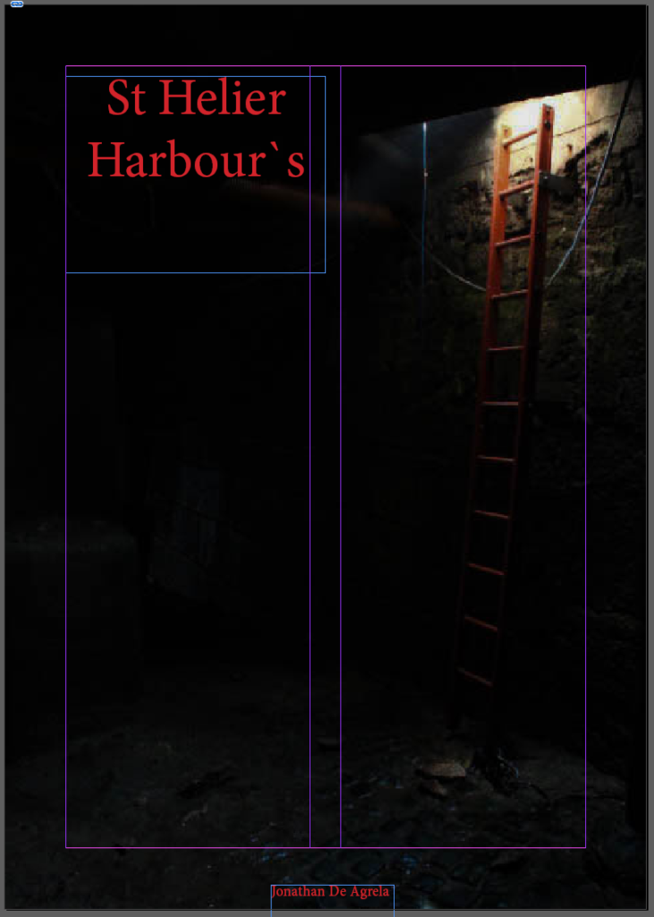
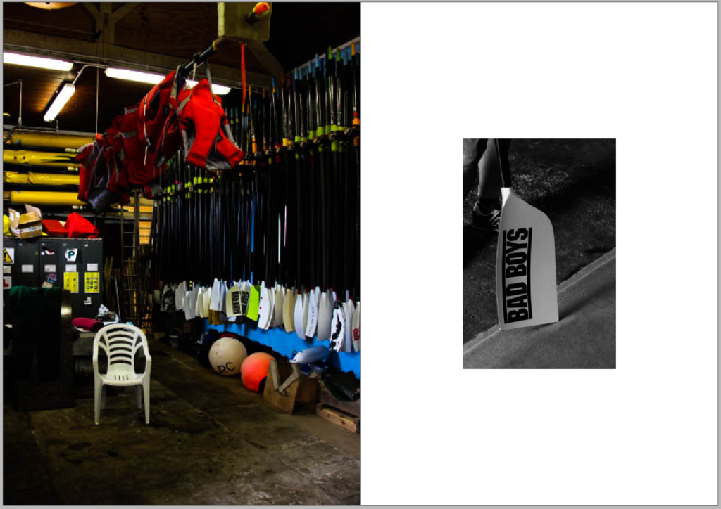
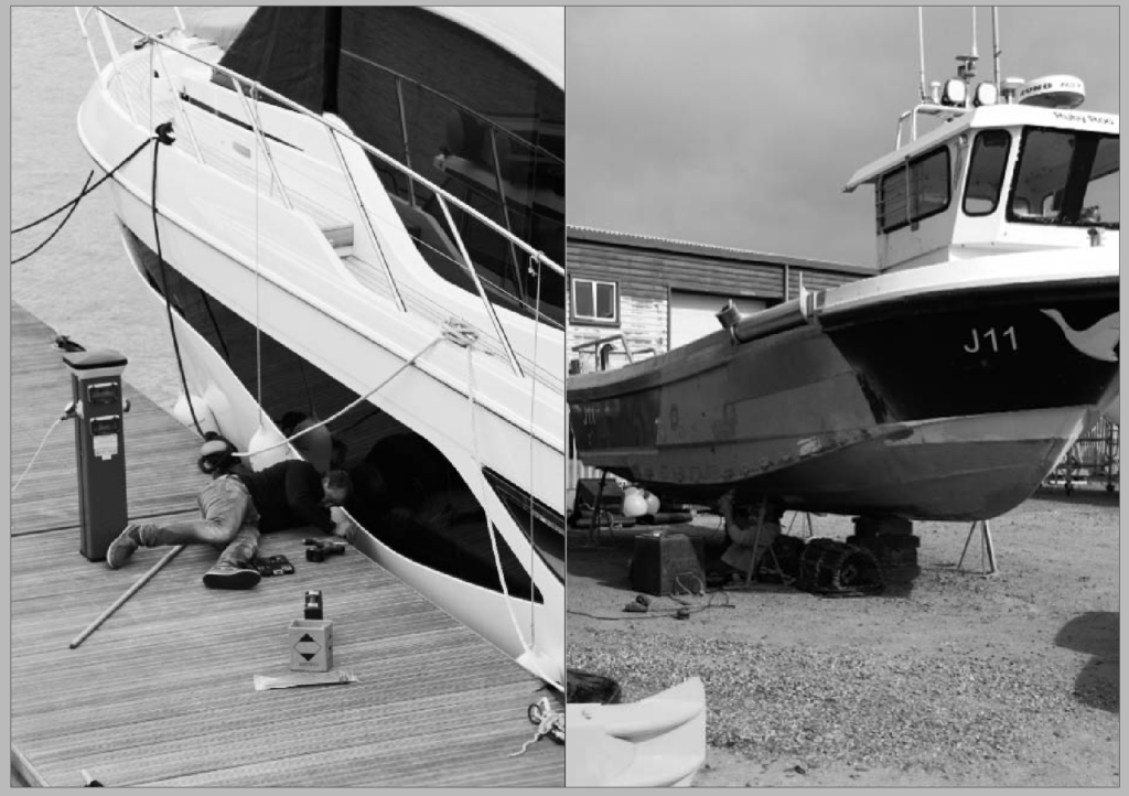
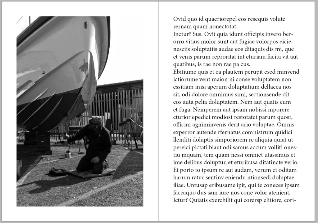
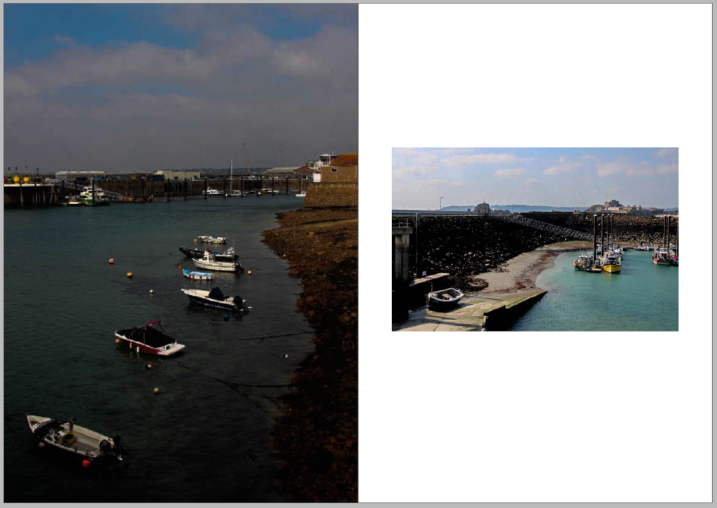
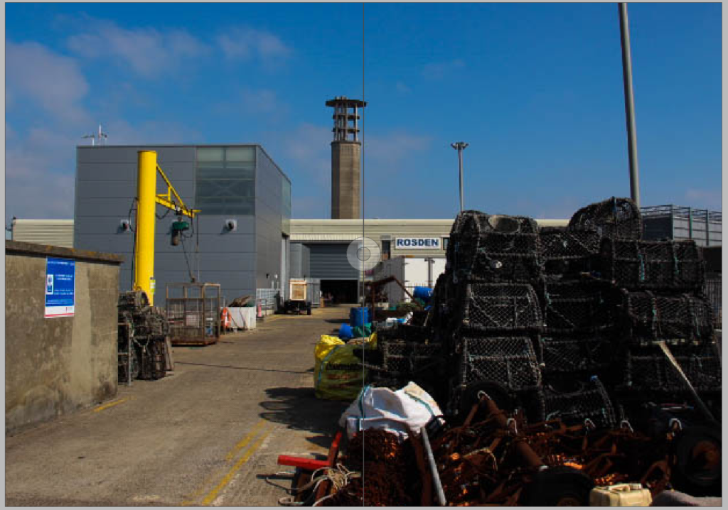
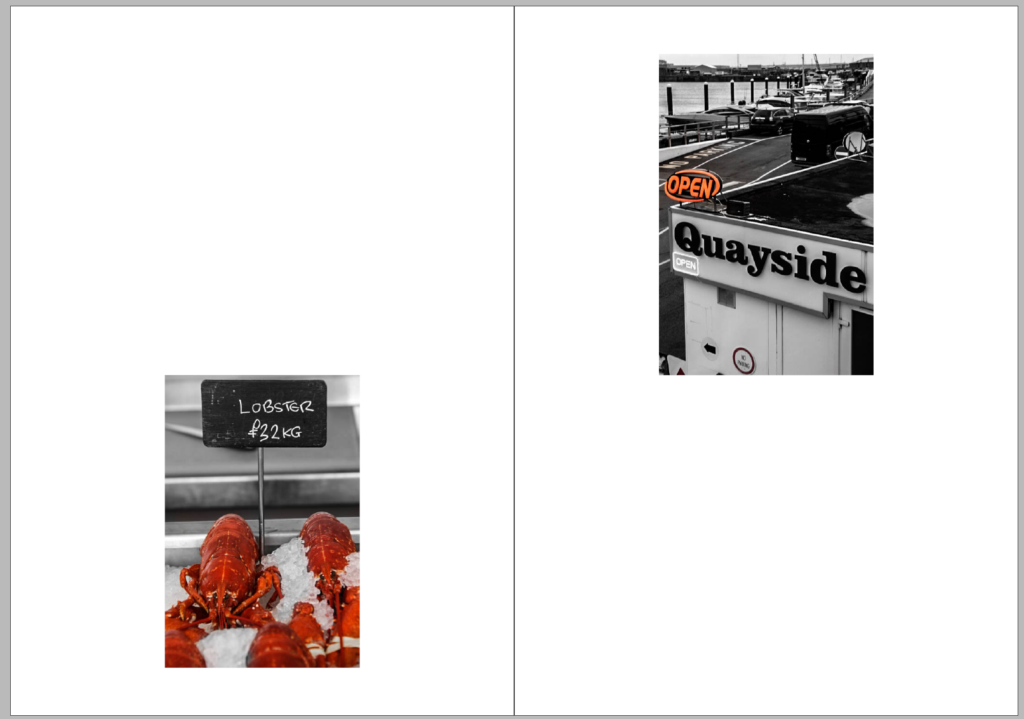
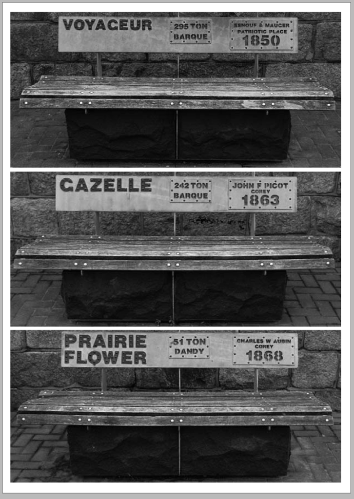
In my second design layout, I decided to keep the chronological order of the photos as I think that it clearly tells the story I wanted to share. In addition, I kept the one page dedicated to writing, which improves the readers connection to the images and allows the reader to understand some context behind the photographs. To differentiate this layout, I changed the arrangement and fitting of most images, for example, making some images full bleed, and including some smaller ones. The contrast with this arrangement adds an element of surprise and gives more visual interest towards my zine. I also think that my landscape photograph taking up a double page has a strong impact on my zine, giving the reader time to fully indulge in the setting/scene. Additionally, I have not changed the title yet, because I could not think of one that fits the zine perfectly. However, I plan to include a new title in Design Layout 3. Overall, I think that these changes and slight tweaks grant a more engaging and interesting layout to my zine.
Design Layout 3
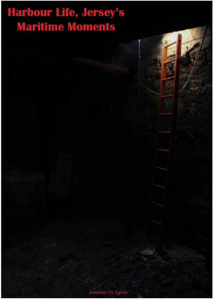


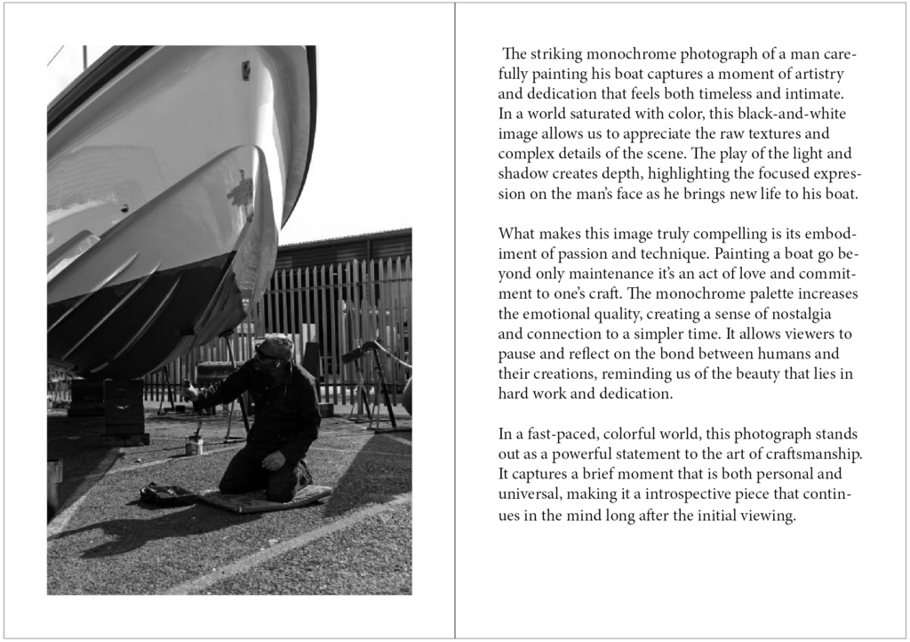
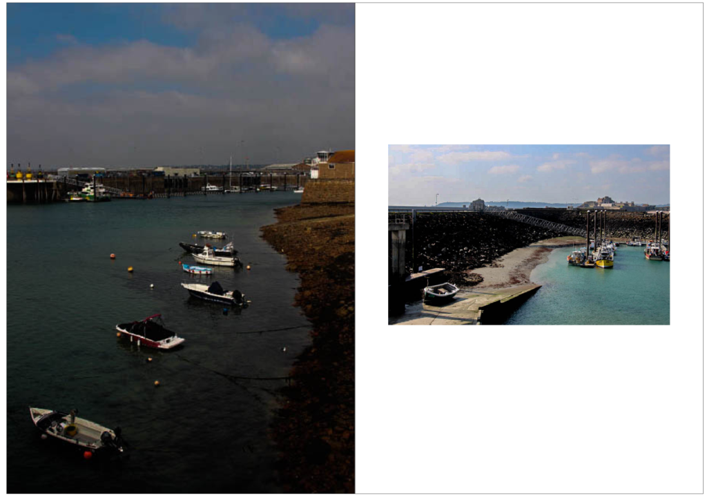

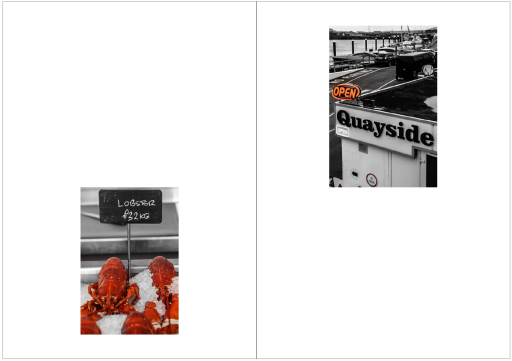
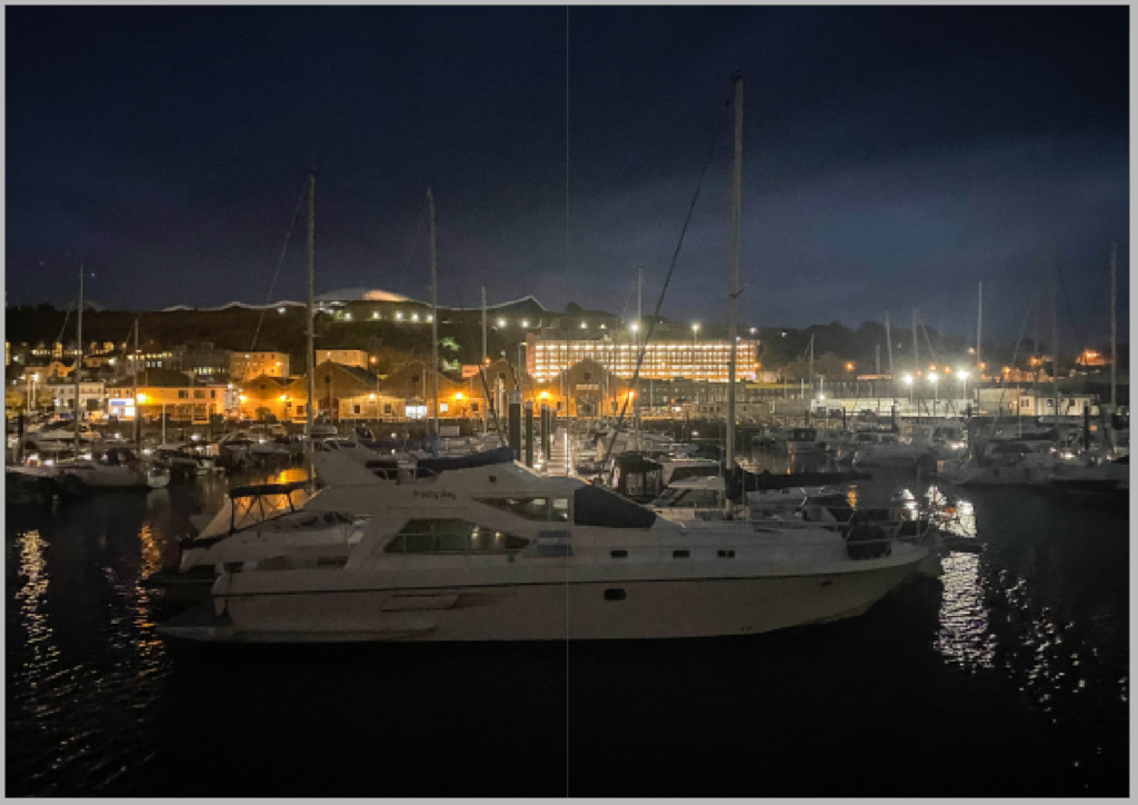
This is my Final Design layout; I have included several needed improvements that strengthens the overall design and impact of my Zine. First, I updated the title from Jersey’s Harbour’s to Harbour Life, Jersey’s Maritime Moments, I think that this title is more expressive and fits with the theme of the content within my Zine. Also, I replaced the placeholder text on one of my pages with my own writing, giving context and my personal opinions engaging the reader more. So that the zine kept a professional appearance, I added a double page spread containing a landscape image of Albert pier during the night, keeping to the needed multiple of four pages. Another thing in this design layout different to others is that I changed the regular font to Britannic Bold for both my name and the title of my zine, making the bold red title a focal point. These changes have improved the aesthetic of my zine and also have evolved the storytelling aspect of my zine. Making the zine more engaging Overall.

Jonny
There are far too many missing blog posts here…you must develop a working routine that enables you to complete and publish work more fluidly.
The work you have is of a good standard…but it is often disjointed and incomplete.