What is a zine?
My Zine pages:
The Front Page

For the front page I decided to use this image as I liked how the negative space framed the title of my zine, which I chose to be ‘Life of Jersey Harbour’ as my zine is going to explore not only the outside view of the harbour but also the inside perspective and the history behind it.
Page 1-2

For my first two pages I chose to focus more on the outside view of the harbour and how many people see it. I included two black and white photos as well as two coloured images. I included views from the harbour above as well as at a close up view. I also added the commercial buildings into the second page as they are an iconic area of the harbour and they are well recognised. In order to make it stand out I made the Normans buildings yellow and the rest of the buildings black and white.
Page 3-4

I then added two pages which focus the Maritime Museum, both outside and inside of it. I wanted to include the museum as it is another iconic part of the jersey harbour and it holds a lot of history from the Jersey Harbour.
Page 5-6

For these pages I wanted to include some detailed shots of the coloured boats as they are an important part of the harbour as people need them to get to and from their boats. I placed coloured images in opposite corners of each other and in the other corners I added the photos which only consisted of one coloured boat.
Page 7-8

In these pages I chose to focus on Brian Nibb’s, a former Harbour master, who gave us a tour and talk around the harbour.
Page 9-10

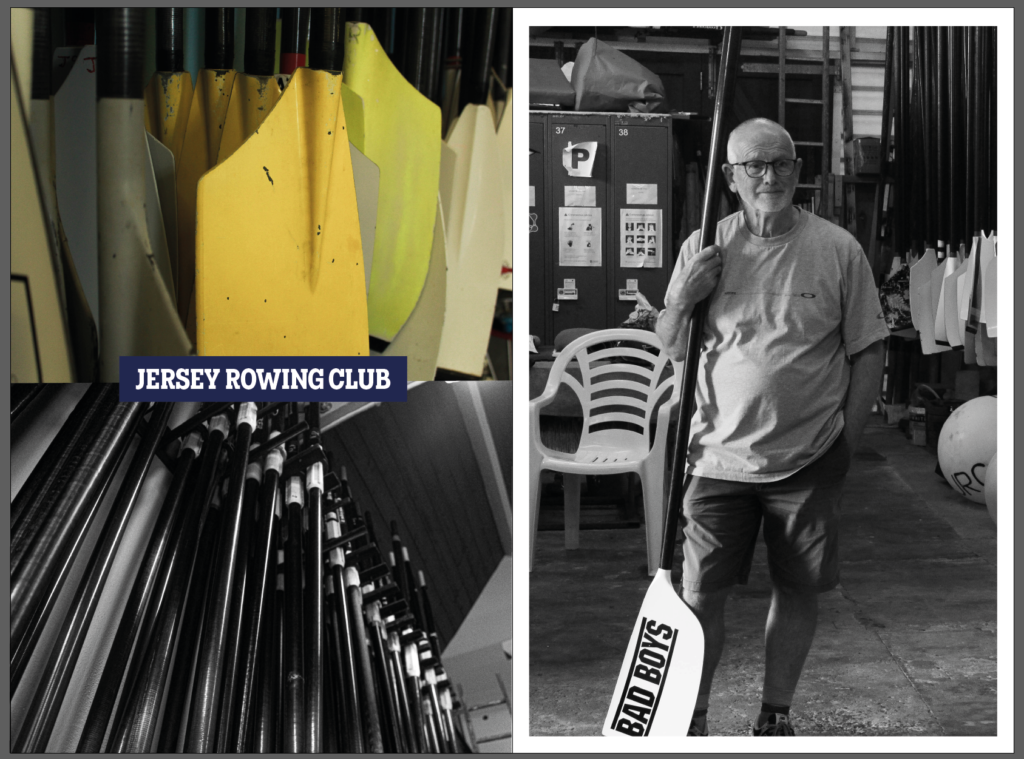
I then started to focus on the different businesses of Jersey Harbour as they symbolise the Life of the harbour more than anything as it is their way of making a living. This is why I included the Jersey Rowing Club as it is an important business down the harbour as it is not only a way for the workers to make a living but also a way for people to come together to do sports.
Page 11-12

The second business I included was the Jersey Fishery. I included an observational portrait of the man working as well as two detailed shots of the fish and crabs that they sell.
Page 13-14

Then I added a page which shows one of the fisherman who provide the products to the Fishery on the previous pages. I included an environmental portrait and two detailed shots.
Back Page

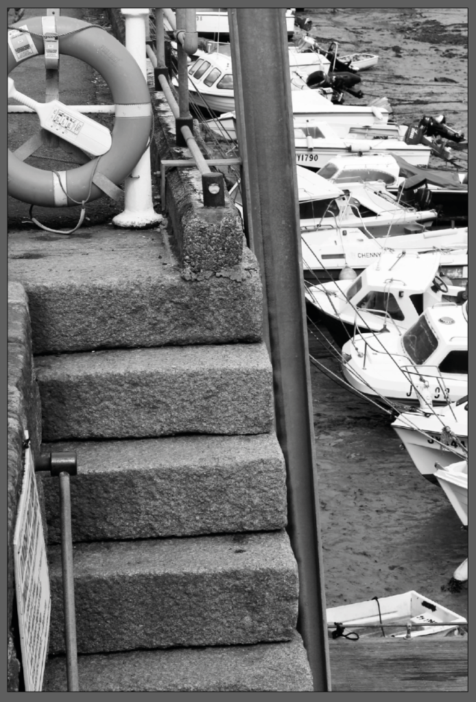
I wanted to use a simple yet effective image for the last page which is why I chose to use this close up of the stairs with the boats in the background.
