Final Layout-


Evaluation and critique
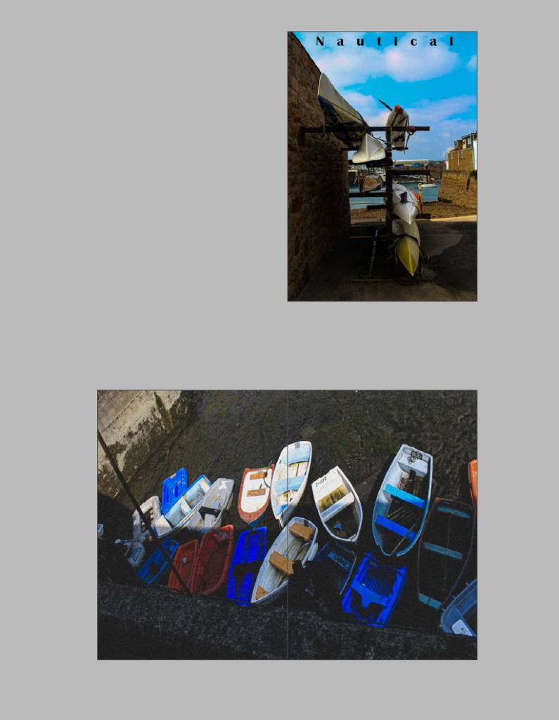
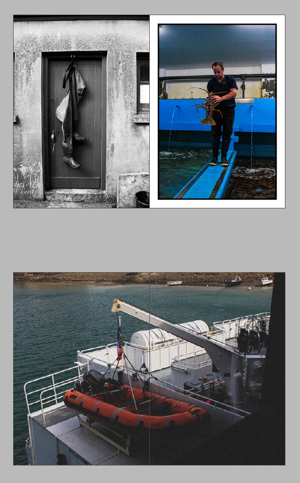
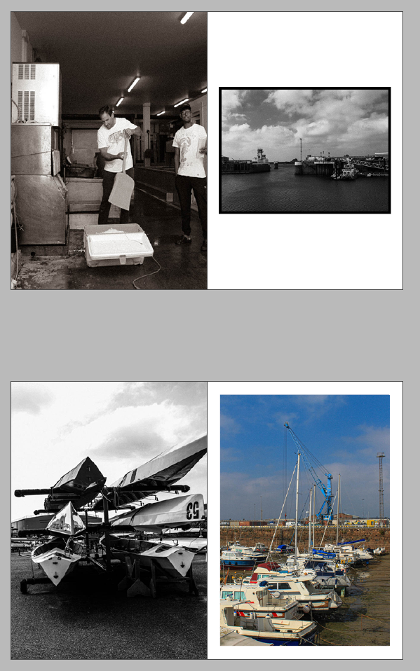
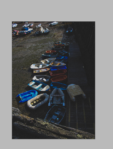
Personally, I liked the images I chose as they all link to a nautical theme however I added heavy grain and filters to give them an older aesthetic due to the history of Jersey Maritime and harbours. I also liked how when I put two images on a double page they contrasted significantly together. The use of some black and white images with coloured images created variation to make every image differentiated. The boarders on some images also created variation so every page would look different, creating the unexpectant. I liked how the second image and the last image have the same subject, but from different angles as I think it closes my zine very significantly and allows to show different angles. I kept those images in colour as the colours are vibrant and different which contrasted each boat and made the images more eye catching to viewers. Each image I chose had historical elements if looked into depth. For example, the last image with the historical factors of rowing as these boats are the old rowing boats that also have an old aesthetic. The water sports boats showed more evolution in society as water sports had grown to be more and more popular throughout generations. The picture of fishermen boots contrasting with the fishermen as historical context as the storage rooms fishermen used started many generations ago. The fishermen contrasts significantly as the occupation of fishermen is permanent as society needs fishermen and what they do. I liked how I emphasized the contrast in these images by one being in black and white, and one in colour as they are very different looking images, but link very significantly. I chose my first image to be my first image as I liked the shadows underneath the main subject; watersports equipment. As well as this, I liked the significance of the background; the harbour contrasting with the foreground. The different range of colours in my first image is eye catching which is why I kept it in colour rather than black and white. Another reason I kept it in colour, is the growth in watersports in society as it is more of a modernized hobby. Therefore, as it is more modernized I kept it in colour as black and white images create the sense of a vintage old aesthetic due to the origin of photography. Lastly, I chose this image as it includes the working element in the background through the harbour, and the more fun and hobby side through the equipment. This shows all factors of historical growth within maritime in Jersey. Therefore, this is why I labelled my zine as ‘ Nautical’ as every element in the first image continued with the rest of my zine, obtains subjects to do with the sea.
On the other hand, I could’ve edited my second image to get rid of the large shadow in the centre of the boats as some of the boats are in the light. I would of liked to get rid of the pole on the left hand side of the image by standing or photographing in a different angle. On the image of the watersports equipment in black and white, I would of lowered my exposure levels on my camera settings so the sky and the clouds were more clear, rather than blurry. On the last image, I like how half of the boats are in the light as it looks much more significant on this image however I would of liked to get rid of the branch in the foreground of the image. From another perspective, the branch in the foreground can be seen as purposeful to create differentiation. Aside from this, I liked how many images were edited to reach all the bleeds to make less gaps and white areas on the zine. However still maintaining some images normal size to create high contrast and comparison. Overall, I liked my end result and how they link within the theme of ‘ Nautical’ in lots of different ways to stop my zine from being dull. Instead, it is thought out in depth with editing techniques to show viewers the importance of contrasting and comparing meanwhile linking.
