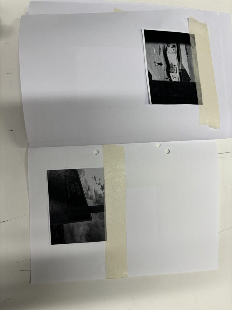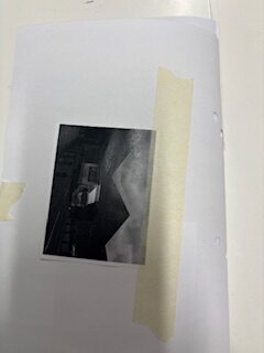


I printed out all of my zine photos onto one big sheet of A3 paper, fitting 18 images to a page. I then cut the images out and laid them onto A4 paper which I had folded to create a small book.
The reason I did this was to create a smaller scale mock-up of my zine so I could see how my images worked together. I was not able to print my images in colour, and the images are of course not to the scale how I would have them in my final print, but I wanted to just create a small mock-up to really see if I enjoyed my storyline and how well it all flowed together. I also have not added my text anchorage to my mock-up because some people will just not even bother with reading the text, so I think this gives me more of a feel of what the real one would be like than if I did add my text.
**I took these photos on my phone and then emailed them to my school account so therefore they may not be the best quality. **
Cover Page

I will have this image fit the whole page and have a title but I think it is a good historic cover page.
1st Page Spread

These images will also have text, and create historic anchorage and cover both pages.
2nd Page Spread

For my second page spread I have kept with the black and white theme, but will include some colour popping to smoothly transition to newer modern photos.
3rd Page Spread

This image will be bigger across the page as a bold statement.
4th Page Spread

This image will be bigger with colour to create a better sharper transition
5th Page Spread

I want this page spread to be the start of the modernisms.
6th Page Spread

I want to use this page spread as a visual, something to make people think rather than just telling them the answer.
7th Page Spread

This will be a very factual page, meaning it will include text with facts about ferry speed and the pier.
Back Page

My last page is more of a loop, a final connection to the cover page.
