Front page-


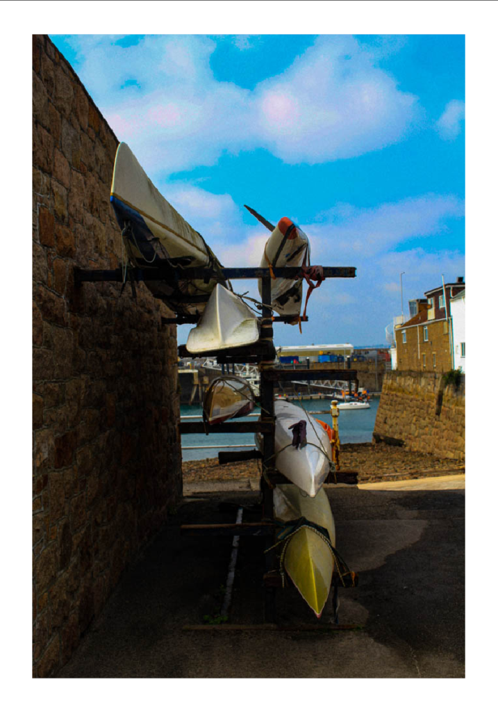
Why I chose this image- I chose this image because the main subject is water sports which can be seen as significant as it shows an element of enjoyment and humour rather than working boats to allow company’s to operate efficiently. This decreases less tension and creates an element of fun and casual aesthetic which is important for the front cover. However, this image still obtains the working operations in the background such as the harbour and boats to bring supplies in. This makes a contrast of two important things. Another reason is because after I edited the image the left side is more shaded and dark in contrast to the bright sea and sky which shows variation and colour. The dehaze increased made the clouds more emphasised which they are seen as circle shapes, which contrast to the shapes of the canoes.
Page 2- Double page spread:


I decided to chose this image as it shows an element of history and also enjoyment, because these type of boats ( rowing boats) can be used for fishing etc, but also used to be a means of transportation. They were extensively used in the Mediterranean trade. The different colours of boats stuck out to me. To add more potential to this image, I added a heavy grain and a matte filter to make it have more of a historic aesthetic and to make it look like it has been taken from an old camera. I like that it doesn’t say a lot unless fully in depth. I like how they can be seen as an enjoyment sport such as rowing, pleasure or fishing. The origin of rowing began in the earliest regatta was held on 16 September 1274 in Venice, Italy. Which represents the historical aspect of this picture.
Page 3-


I chose these specifically together because the two images contrast well together. The left image’s main subject is fishermen boots hanging from a fishermen’s store room. This obtains some element of a historical factor due to these storage rooms being in Jersey for years, and had many people on a waiting list to gain one. Therefore, I added a heavy grain and a black white filter to give more of an old aesthetic. I think this contrasted significantly to the right image due to the main subject being a fishermen and his profession of catching sea creatures. The main reason why I put these images together is because the right image is modernized and more visible that it is the present due to me keeping it clear when editing, in contrast to the left image. Therefore, these two images relate on a factor, but are also slightly different as they are portraying the same thing, in different times. Within the first image, these cottages for fishermen had been located since the first ever harbour, and colour was still difficult within photography. This is why I made it black and white to emphasize the historical aesthetic, to compare with the coloured modernized image.
Page 4-


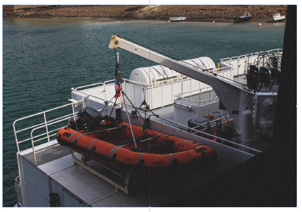
I chose this image because there isn’t a lot in it, yet shows a lot. The main subject is visibly the safety boat however in the background there is 3 fishing boats not in use. I liked the vibrant colour of red in contrast to the opposite, blue. This instantly makes the viewer of the image draw their eyes to the safety boat. I put the image on a double side spread to show the environment around it. I added heavy grain to make the image look more vintage and old, but kept the colour to keep it modernized as safety has and always will be a priority. I like the way the sea is highly texturized in contrast to the texturized rocks in the background. As well as the foreground, having a completely different textures and even shapes. This shows a varied image showing different elements in one image.
Page 5 experiment 1-


Page 5 experiment 2- Adding borders

Why did I chose these two images?
I decided my left image for my zine because it shows a story. Not only does this show peoples professions, such as fishermen and selling the sea creatures they sell but it also has an element of the ‘ Decisive moment’. This is because I caught the right moment of the main subject in the centre of the image getting ice. Whereas, although the viewers eye will instantly go to the centre of the image, the man on the right side of the image is still very significant. The background of the image shows the environment and operations needed to operate their employment. The contrast of darker and lighter shades make it have an older aesthetic with deepened shadows. I decided not to make this black and white as I thought the brown and cooler filter made it look more natural to match it with the image, as the image and the people are completely natural. Which is a very big key factors of ‘ Decisive moments’ as people may change their behaviour and mannerisms. I contrasted and compared my left image to my right image because right image shows the harbour and operations on how the harbour works. The harbour is very historical due to it first being built and opened in the 1700’s and this is why I chose to put it in black and white, as photography started in the 1800’s but colour only began in 1861. This is to emphasize how long the harbour has been around to make an old and vintage aesthetic. The high contrast of the clouds and the texturized sea makes the image more interesting and drawing to the eye. The bottom half of the image has significantly dark shades whereas the top half of the image is very light which is obviously separated through the middle. I think both these images matched well as the left shows how it operates in contrast to the operations itself.
Page 6-


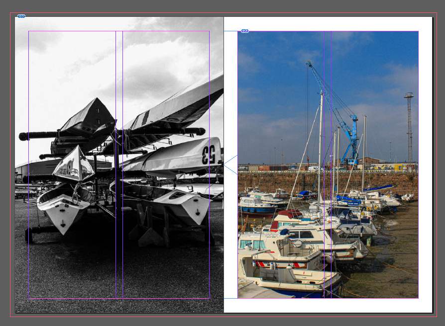
I chose the left image as they are sport boats. They are not to operate for an objective like fishermen with rowing boats. Instead, these are for pleasure and enjoyment for ones self. I liked how it shows something other than employment or operations. The contrast of the lighter sky to the dark deepened shadows on the floor is significant. Not only this, but the reflection off the kayaks creates a mystery factor due to the fact as a viewer you cannot see around the main subject, making your eyes only paying attention the centre of the image. In contrast to the right image, I personally believe it is a good match due to the fact these boats in the harbour could be for enjoyment as their main function is not to do something productive. The range of different colours stood out to me, so I kept it in colour. Another reason I kept it in colour was because when St Helier harbour began in the 1700’s the boats that came in were purely to help Jersey operate, such as trades and bringing supplies in etc. Therefore, this image shows how now there is more than that, and how the harbour has modernized. Therefore, these images contrast significantly and show more of a modernized aesthetic and look.
Page 7-

Page 8-

Page 7&8 experiment-


I chose this image because it has many geometrical shapes with different textures and colours. Although it isn’t showing a lot, it is showing the more in depth products on how the harbour operates and potentially even Jersey itself. I put it on a double page spread because the separation of colour between the metal boxes would separate nicely between two pages like so. The contrast of rectangular coloured boxes with a circular black tyre within the centre of the box is very significant and drawing to the eye. The texture of the blue wood to the right almost showing half of a triangle. The darker shade of the left box is significant as the two other boxes are bright and draws your eyes to the vibrant coloured boxes.
Final page-

I chose this image because I liked the way all the rowing boats were very close together with lots of different vibrant colours. I liked the way this image was portrait as it is following the way the boats are going. I think the wooden path on the right side of the boats is very significant due to showing different textures and shapes contrasting with the boats. In the foreground it is showing a different style of boats however, the colourful boats in the fore ground are the main subject and the most eye catching to a viewer. I wanted to make it have an older and vintage aesthetic and to do so I added a heavy grain and a matte coloured filter. I wanted this image to look like it had been taken from an older camera due to the historical factors of rowing boats, not only this but because this was taken in the harbour which had began in the 1700’s. The boats look rather rusty and looks like they have been in use for a while, so changing the style of the image to older definitely emphasises this.
Changing some bleeds-


Adding a title-

