ZINE: What is a zine?
A zine is short for magazine, being a self-published piece of work of original or appropriated text and/or images. This is typically used as a form of developing identity by expressing artistic vision about a certain topic. This is non-commercial print-work that is usually produced in small, limited batches.


I will be creating a zine to showcase my best images from my two photoshoots from the harbour and the marina.
In the zine that I produce, it’s important to select the right images and sequence them so that they link with each other and spark a narrative. To create a narrative I will need to convey relationships between the images in my zine but also creating an ideal design through InDesign. I will be experimenting with different layouts and references to the different aspects that surround the harbour, possibly resulting in producing more than one zine.
Once you have considered the points made between the differences in narrative and story and thought about what story you want to tell about St Helier Harbour and the images that that you have made in response, consider the following:
STORY: What is your story?
As I will be making two zines, I need to create a story for each as they represent two different things:
Zine 1:
- 3 words: The fishing culture.
- A sentence: The lifestyles exhibited through the fishing culture.
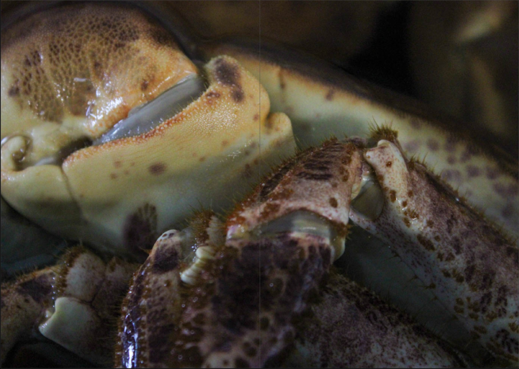
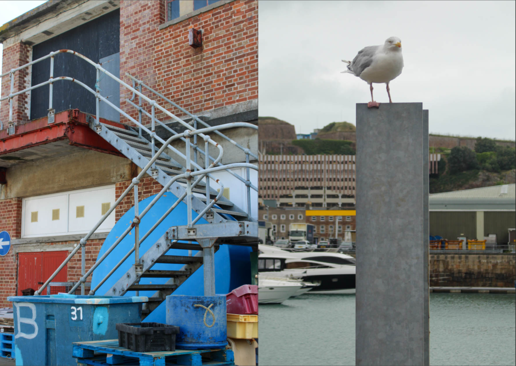
- A paragraph: The fishing industry is one that is unlike the rest, a culture that is unmatched to any other. The culture of Jersey’s fishing companies entails many different liabilities – the catch, the preparation, the retailing. Whilst this is something that is typically hidden away from the people, pushed to surround the sea, the fishing industry is something that is a crucial part of Jersey’s heritage and history which may go unappreciated if it isn’t revealed.
Zine 2:
- 3 words: Identity of a rower.
- A sentence: The Jersey Rowing Club’s way of life.
- A paragraph: The Jersey Rowing Club is something that isn’t acknowledged very much, being that it is tucked away over one side of the marina, passed by everyday by hundreds of cars. A rowers life consists of strong dedication and willpower that takes years of experience to achieve.
NARRATIVE: How will you tell your story?
Within both of my zines, a big factor I want to convey is the aspect of form because this means I can hone in on particular details of the harbour and marina, not just the simplest and most obvious sections of it. To do this, I am going to use strong directional lines because I feel that this will make my work become more bold and it will add a sense of sharpness to it. As well as this, I feel that using the same colour palette throughout my zines is important because it enables me to link each image to one another, telling the story in a more smooth way. However, I still want to have a sense of ambiguity in my work as this means that the viewer can interpret my work in their own way subjectively. Through my zine, I am not going to use text very much aside from the title because I want the images to speak for themselves instead of being an informative piece so that I can keep this subjectivity in my work, however I will be experimenting with different fonts-types, designs, colours and sizes so that I still involve some graphics too.
Because my first zine is about the fishing industry, this is going to be concerned with the colour blue predominantly as I feel that this is the colour most commonly associated with fishing, therefore this will be most effective as it correlates the most. As well as this, I am going to use more orange and brown tones as accent colours as whilst these are the colours that surround the animals that fishermen actually catch, these tones are often associated with age, for example rust, meaning that this can denote how long these companies have been running at the marina. As my second zine is concerned with the Jersey Rowing club, typically there are not colours associated with the club however I am going to use my images of the equipment, tools and location to create dynamic shapes in my work because I think that this will tell a story about the club in an implicit way, instead of just shooting these objects alone. I want to create a balance of bold block colours alongside pastels to make my work be contrasted against itself, however still continuously running smooth. Alongside this, I want to ensure that my work contains fine details instead of displays of the harbour, for example, because I want to point out the parts of the harbour that people do not typically see of associate with the marina as I think this will be really effective in representing it how it actually is. This will be completed through using depth of field tactics, making the main focal points of my images sharp and precise with the background being blurred, for example with the harbour in the background just out of focus. I think this will work really well in my zine because it ensures the viewer is aware of what my zine is actually about and where it is located, however this means I am not explicitly showing that. I will also be using different structures too to create leading lines in my work as well as shape, whether this may be squares up to ambiguous patterns.
FINAL SELECTIONS:
Initially, I printed out my best and final images and laid them out on the editing table in the photography classroom so that I could envision how my zine would physically look and then, I could piece together my images and see if the compositions would link together smoothly. By doing this, I could use process of elimination to make critical decisions of which images suited my themes and which ones were outliers.

Zine 1 mood board:


Zine 2 mood board:


