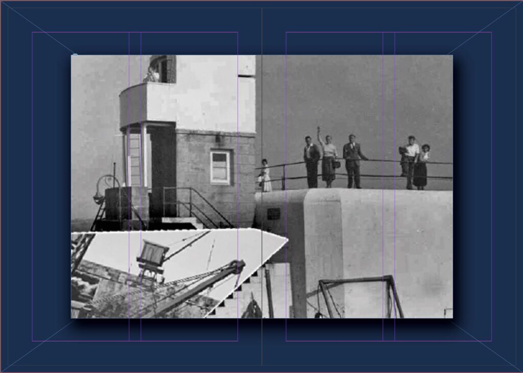
for my first image i wanted to create a combination of both colour and black and white using harsh lines and shapes to truly demonstrate what i intend illustrate throughout the zine


My focus for this zine was not to tell a story with word but in fact let the images speak for themselves using vivid colours, sharp lines and complex editing to create interesting images.
i intended to create symmetry with in the layout and images in order to create optical illusions and a sense of da-ja-vu when viewing.
