To create this zine using our harbour photoshoots, I used Adobe InDesign 2024 to execute my layout.

The first thing I did was select the ‘rectangle frame tool‘ which allowed me to choose the size of the image that would be on the page.
Ctrl + D allowed me to select which image I wanted to use and paste it into the frame.
Once I had placed my desired photos into position, I right clicked and pressed ‘fitting‘, and then ‘fill frame proportionally‘ to ensure the entire image was incorporated in frame. After this, I pressed ‘display performance‘ and then ‘high quality display‘ to increase the quality and focus of each one.
Front cover:

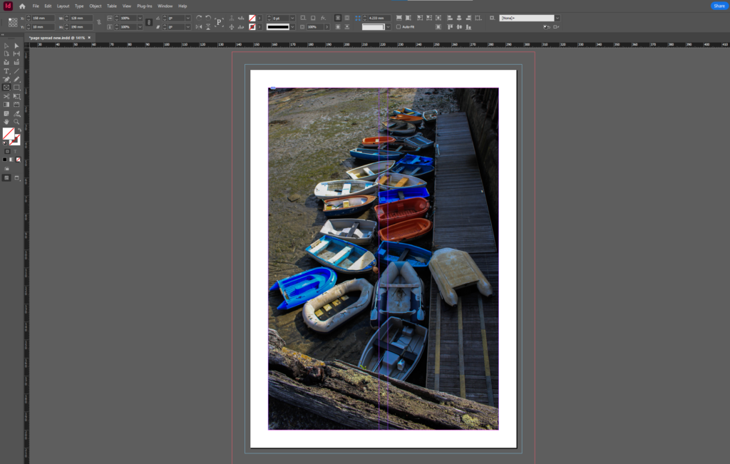
I decided this image to be my front cover because rowing boats were a significant part of Jersey’s history. Rowing boats were used often many years ago during the cod-trade, when merchants and fishermen would use them as transport to trade Jersey’s goods. However the outstanding colours and high contrast within the image brings an element of modernity, which is important and helps give the image some life, allowing the bright coloured boats to stand out. The rich colours of all the boats contrast with the dull and lifeless seaweed in the background, which helps emphasise the eye-catching colours within. The use of one of the boats being upside down on the wooden path clearly illustrates a theme of abandonment, which again links to historical contexts as they have not been used in years. The lighting in this image is also significant as there is a large shadow hovering over the right side of the image, whereas the sun is shining on the left side. I think this looks interesting as the split between the two lightings is right in the middle of the image, which helps the boats on the left side of the photo appear more striking.
Page 2:

These two images as my second page have many similarities and differences, but from first look they could look related which is why I decided to place them together. This way, I am able to show the similarities between them, as well as how they contrast with each other. I like how they both have a similar outside frame of the photograph, with a border of the wall surrounding he doors. This allows the vibrancy of the doors stand out against the wall, making it very clear what the main subject is. Although they both share a main subject of the colourful door, they are used for different things. I didn’t find much out about the blue door on the left or what it is used for as I did not get to go inside, which gives a hint of mystery to it. Whereas the red door on the right led to a storage room that fishermen rented out for their fishing gear. I think the boots hanging off the door look effective because it adds a sense of realism, showing that there is a lot of history and background behind the door.
Page 3:

With page 3 I decided to take a different approach, incorporating black and white images of historical pilots that were recruited in May 1945 by the Royal Navy. This way I am including historical contexts into my work, which helps the viewer gain knowledge and understanding about the backgrounds of the museum. I chose to edit these into black and white for some differentiation in my zine. I think these two images work very well together, specifically because they are both taken against a brick wall, which again portrays a theme of former days. Additionally, beside each image is a small description of context behind the framed photo, which I included as it is an effective way of telling a story and deepening the viewers understanding. Overall I think the two images compliment each other very well as they share similarities within displaying different jobs surrounding The Royal Navy.
Page 4:

Page 5:

Page 6:

Page 7:

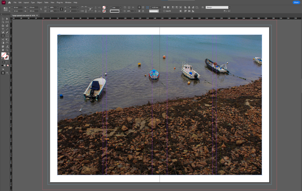
After placing these 3 images into the page, I then decided that the top image (as well as the larger image on the right) had more depth and contrast than the bottom image, therefore isolating the bottom photo. In order to make them look more alike and purposeful, I added a border onto the bottom image to create more profundity.

Page 8 – final page:

Experimentations:

Front cover:

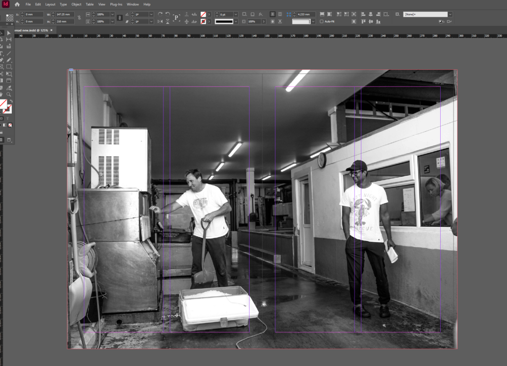
For my second experimentation, I chose to use this image as my front cover as I feel it best represents the different professions within the fishing industry, showing what different people do on a day-to-day basis. I feel this is an important aspect of my photoshoot and final zine because it differs to all of my other photos, illustrating a deeper dive into what goes on at the harbour, rather than just photographing the buildings. This image also has a strong sense of realism throughout, as you can clearly tell the man is moving as it was taken, which I think shows significance and gives purpose to the overall photograph. My title for this zine is “The Aquatic” which means relating to water. I chose this title because it symbolises
Page 2:

Page 3:

Page 4:

Page 5:

Page 6:


Page 7:
Page 8:

Page 9 – back page:


Evie, excellent blog post.
Complete the following blog posts:
1. layout of final zine and write a short evaluation.
2. Narrative & sequencing
2. Origin of photography