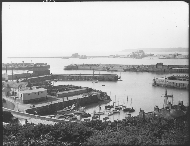
A sentence – Within St Helier Harbour the Fishing industry prepares and sells the fish, History of the harbour is shared from the locals and sites and Normality is experienced by those living in amongst the boats.
A paragraph – In the busy area of Jersey’s Harbour, much goes on within small section of Jersey. With Men and Women working hard to provide for the island their work can be seen from within the Jersey’s fishing industry, managing shipping and keeping our harbour areas clean. With such a rich history, Jersey’s past has much to offer, within the harbour this can be seen clearly with the old harbours of long before, reminiscent of events and stories of the past. With places and people such as the Maritime Museum and Captain Brian Nibs, they are here to tell this story of what has come to be of Jersey’s harbour. All though the harbour is busy with its large ships, such as the condors or shipping vessels, the harbour also has some recreational use with the varying personal vessels docked in the harbours many marinas.
Photography originated back in 1822 as an instantaneous form of revealing secrets beyond the world in a nonchalant form, giving nothing away at the same time. Due to the etymology of photography being ‘drawing with light’ this art form if to turn the ordinary into the extraordinary, evoking a variety of emotions and thoughts, creating wonder about what lies beyond the frame of the image.
THE CHRONOLOGICAL HISTORY OF PHOTOGRAPHY:
Camera Obscuras and Pinhole photography:
In his Book of Optics written in Cairo between 1012 and 1021, Alhazen (or Ibn al-Haytham), is said to have created the camera obscura alongside the pinhole camera in order to ‘fix the shadows’. However, it is said that a camera obscura was a tool used since 400BC. A camera obscura consisted of a large box with a hole in it which projected an image of its surroundings onto the wall inside. This allowed the outside world to pour in and act as an optical phenomenon, with the time taken for this alternating from several minutes to several hours depending on the desired image that was being projected. The environment projected would be presented upside-down and ‘twice as natural’, used for artists to sit inside the box and create paintings or drawings of this area, using darkness to see light. This was called pinhole photography.
Now, in more modern times, the camera obscura has been made into an electronic chip.
Example of the camera obscura
Below is an example of the camera obscura in use more recently. This was done by Abelado Morell of the Santa Maria Della sauté in Venice:
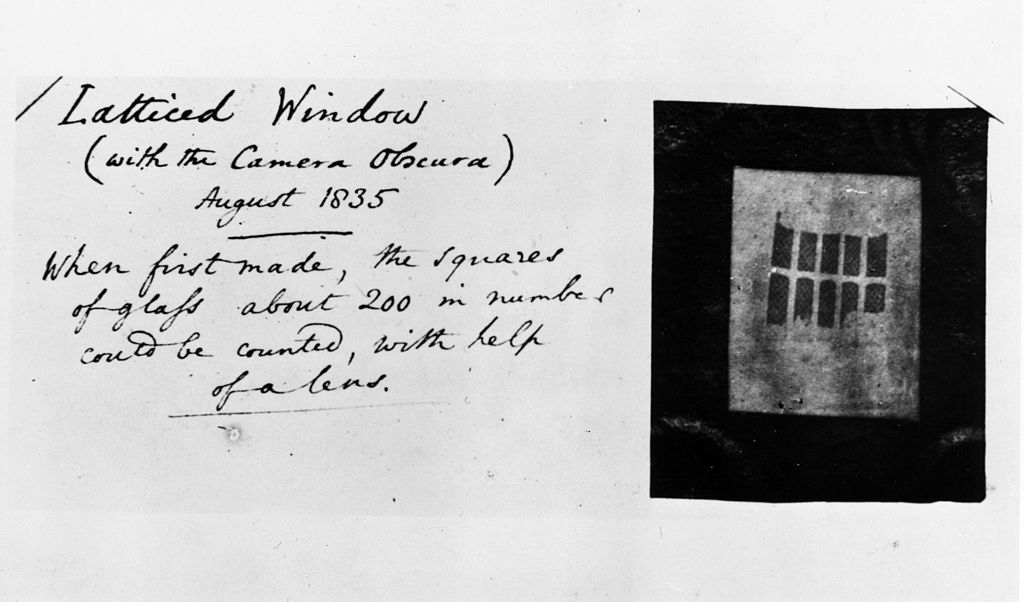
Latticed Window (with the Camera Obscura)August 1835
JosephNicephore Niepce and Heliography:
Joseph Nicéphore Niépce, was a French inventor who is recognised widely as one of the earliest pioneers of photography through his development of heliography, creating arguably the oldest surviving image made with a camera:
View from the Window at Le Gras by Nicéphore Niépce in 1826 or 1827
Heliography is a process where Bitumen of Judea (a natural tar from ancient times acting as a light-sensitive material) was coated in a thin layer on a pewter plate and was exposed to areas surrounding his estate such as buildings or the countryside. He experimented with this using zinc, glass, copper and limestone (lithography) too, creating different etches using acid. This image was exposed for 8 hours and it provides no information of the weather, time or season.
Louis Daguerre and Daguerreotypes:
In 1824, Louis Daguerre created the visual experience known as a Daguerreotype, described as ‘a mirror with a memory’ and created ‘people on the edge of being present’. This would be done initially by polishing a metal plate and laying silver grains upon the surface of it due to them being light-sensitive. Then, this would be placed inside a large format camera and exposed to light from hours to days in order for the light to be reflected back through. After this, the plate would be heated, then cooled with water with extreme caution. This was because if the daguerreotype was touched in the slightest, the image would melt away and be destroyed, wasting the many tools that had to be used. These had high monetary value too, meaning that if the Daguerreotype had been melted away, the artist would have missed out greatly.
As the daguerreotypes were so fragile, they would be specifically placed into different kinds of housing such as an open model, a folding case or in jewellery boxes: wooden ornate boxes dressed in red velvet.
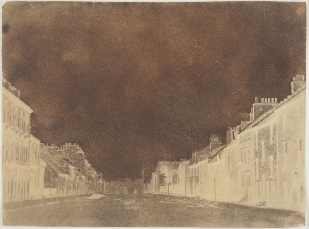
Henry Fox Talbot and Calotypes:
Henry William Fox-Talbot was an English member of parliament, scientist, inventor and a pioneer of photography for his salted paper and calotype processes. Talbot first began by applying “silver salts” onto salted paper, creating silver nitrate reactions from the light-sensitivity. This was then exposed to light for many days and then darkened producing negative images. These appeared like shoebox sized cameras and were named mousetraps and were very difficult to use because if it was disturbed it may just get darker and darker so that its only experienced momentarily.
Overall, calotypes were extremely better than Daguerreotypes due to it being easily distributed, reproduced and were much cheaper. Whilst they both used light sensitive silver salts, the Daguerreotypes required a lot more tools and metal plates which had high monetary value.
Henry Fox Talbot – Latticed Window, 1835 The first photograph to produce a negative image, a paper negative taken with a camera obscura by William Henry Fox Talbot, of a latticed window in Lacock Abbey, Wiltshire. This early process was known as calotype and the original negative, labelled with the photographer’s own handwriting is preserved in London’s Science Museum. This image has still survived to this day. (Photo by William Henry Fox Talbot/Getty Images)
Robert Cornelius and self-portraiture:
Robert Cornelius became a pioneer in photography through his daguerreotype self-portrait in 1839:
The back of the image read ‘The first light picture ever taken’, becoming the first known photographic portrait in America.
Julia Margaret Cameron and Pictorialism:
Julia Margaret Cameron was an English photographer considered to be one of the best portraitists in the 19th century. She is not only known for her soft-focus close-ups of famous Victorians but also her illustrative images which depicted characters of Christianity, mythology and literature.
However, she was often criticised by the photographic establishment for her poor technique – some images are out of focus, her plates are sometimes cracked and her fingerprints are often visible.
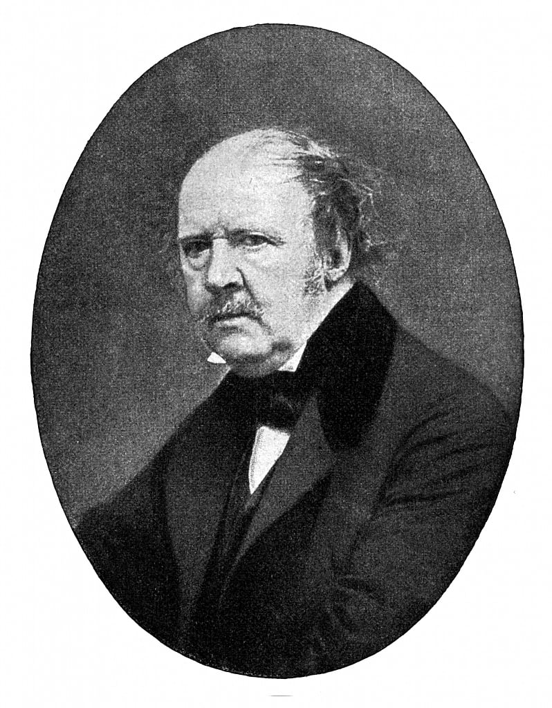
A stapling example is a photograph taken 1867 of Sir John F. W. Herschel; a scientist, mathematician and photographic experimenter. Emerging from the shadows with tousled hair and deep facial lines, it tells a story of a man devoted to the intellectual life.
Sir John F. W. Herschel
Around 1863, Cameron received a sliding-box camera for Christmas from her son-in-law and daughter, sparking her immense interest in photography. This led her to turn her coal-house into a dark room, converting the chicken coop into a studio to work in.
“I began with no knowledge of the art… I did not know where to place my dark box, how to focus my sitter, and my first picture I effaced to my consternation by rubbing my hand over the filmy side of the glass“
Whilst Cameron took up photography as an amateur, she considered herself to be an artist and took the matter very professionally, copyrighting and publishing her work. In 1865, she became a member of the Photographic Society of Scotland and arranged to have her prints sold through the London dealers P. & D. Colnaghi, with her series of prints named Fruits of the Spirits being exhibited solo at the British Museum in November 1865. Overall in her 12 year career, she produced over 900 photographs.
PICTORIALISM:‘an approach to photography that emphasizes beauty of subject matter, tonality, and composition rather than the documentation of reality‘
This was a movement which dominated photography during the late 19th and early 20th centuries. This depicted common and regular images in a more psychological and spiritual way, focusing on the compression of space and blurring detail, as well as patterning light across the image. Pictorialists also involved soft focus and the use of additions of the lens or filters in the dark room. This reinforced the idea of photography being an art alongside painting and drawing. To create this dreamy visual effect, a chiaroscuro technique was often implemented to reveal these ideals of beauty, truth and the picturesque. However, pictorialism was often criticized for being too emotionally shallow because the main point behind these images was the focus on formal qualities such as the texture, tone and composition, disregarding the content or meaning behind the actual image.
Henry Mullins and Carte-de-Visit:
Henry Mullins is one of the most prolific photographers represented in the Societe Jersiase Photo-Archive, producing in the 19th century. He captured 9,000 portraits of islanders within Jersey from 1852 to 1873 at a time when the population was around 55,000, proceeding to place them in an order of levels of social class in albums. He began his career by working at 230 Regent Street in London in the 1840s, then moving to Jersey in July 1848, setting up a studio known as the Royal Saloon, at 7 Royal Square. Initially he engaged in a partnership with someone named Mr Millward, yet very little is known about him. By the following year he was working alone and he continued to work out of the same studio for another 26 years.
Henry Mullins’ work of 19th century Jersey is highly politicised, taking images of Jersey political elite (E.g. The Bailiff, Lt Governor, Jurats, Deputies etc), mercantile families- involved in trade (Robin, Janvrin, Hemery, Nicolle etc.), military officers and professional classes such as doctors, bankers and advocates. He organised these images from the most powerful roles, to the lesser powerful.
CARTES DE VISITE:‘visiting card’ or a close-trimmed portrait photograph approximately 2¹/₄×3³/₄ in. intended as a substitute for a visiting card.
Mullins specialised in Cartes de visite, in which the photographic archive of La Société contains a large amount of these (online archive being 9600 images). The Cartes de visite small albumen print. This is described as the first commercial photographic print produced using egg whites to bind the photographic chemicals to the paper which is quite interesting as this is would be very rare to see now. Because the image emerges as a direct result of exposure to light, without the aid of a developing solution, an albumen print may be said to be a printed rather than a developed photograph. Usually, this consisted of a small thin photograph mounted onto a thicker piece of card, however Mullins placed his work into an album.
Albumen Print
Many of these images contained the island’s most affluent and influential people, alongside officers of the Royal Militia Island of Jersey, for whom it was very popular to have portraits taken, as well as of their wives and children. The images of the officers document the change in generations as they do not look like the general person today, showing the fashion for long hair, whiskers and beards in the mid-1800s. Their appearance makes it difficult for the viewer to differentiate who is who as they were styled almost identically during this time.
He then arranged this compilation of images into a diamond cameo:
Its name is derived from the diamond-like shape that the images are laid out into. These diamond cameos consisted of 4 images of the same person looking in different directions and at different angles. This is a really effective way to produce a final set of images as they are consistent and act in a poised manner of taking headshots. Also, it centers around the person and makes the image become a question of who the person is and why they have been presented at this status, depending on the kind of clothes and hairstyles they presented.
WHO IS FRANCIS FOOT?
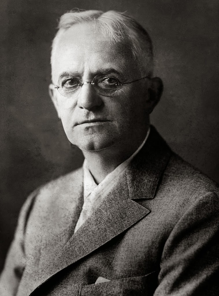
Francis Foot was born in Jersey in 1885 to mother and father, Louisa Hunt and Francois Foot. His father was a china and glass dealer along Dumaresq Street which was one of the most affluent areas in St Helier at the time. Francis Foot began his working life as a gas fitter, however shortly after this began he started to become fascinated by photography, the early phonographs and gramophone records. Through this, he realised that he could earn a living using this. Taking on a second shop on Pitt Street, Francis worked as a photographer however remaining on Dumaresq Street, his mother and father sold records, gramophones and other wares until his father passed away. After this, Francis remained working in Pitt Street.
Francis Foot outside his shop
Some of Foots images were published as postcards even though many of his images featured portraits of his family. Alongside this, he also took 16mm black and white cine films regarding many different types of events such as:
Aircraft landing on the beach at West Park,
A visit by HMS Sheffield,
Cattle shows,
The Battle of Flowers at Springfield,
The Liberation,
The visit of King George VI and Queen Elizabeth,
WW1 troops departing
Eventually the gramophone and record department of his work became increasingly more important and had to take over the larger shop on Pitt Street in which Francis sold vinyl records during the 1950s and 60s.
In 1996, La Société Jersiaise received a collection of glass plates and other photographic material, leading them to now behold 322 images of a diverse array of Jersey such as:
The Battle of Flowers,
St Helier Harbour,
Shipwrecks,
Fetes,
Coastal and country views,
The family prospered through holding the HMV franchise for Jersey, with this being painted in 1899 by Francis Barraud where it remains still intact to this day.
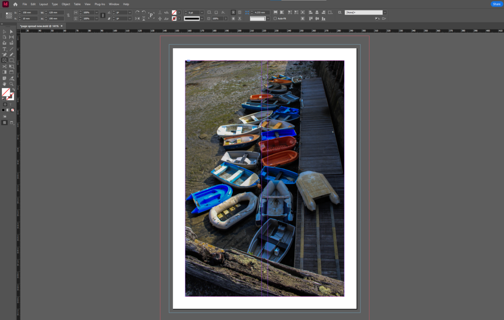
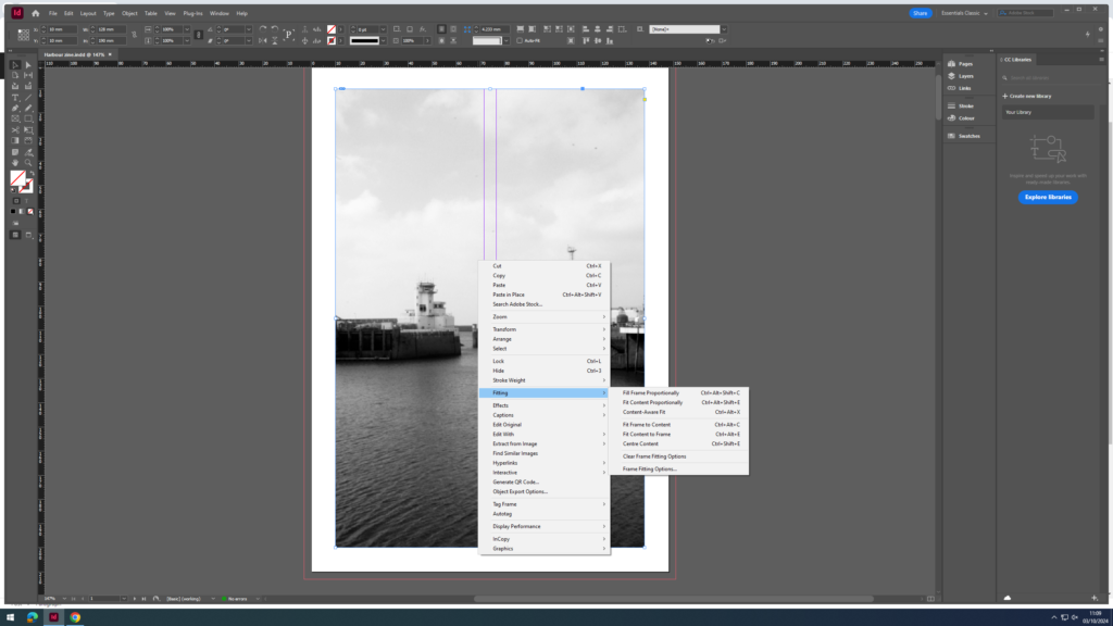
To create this zine using our harbour photoshoots, I used Adobe InDesign 2024 to execute my layout.
The first thing I did was select the ‘rectangle frame tool‘ which allowed me to choose the size of the image that would be on the page.
Ctrl + D allowed me to select which image I wanted to use and paste it into the frame.
Once I had placed my desired photos into position, I right clicked and pressed ‘fitting‘, and then ‘fill frame proportionally‘ to ensure the entire image was incorporated in frame. After this, I pressed ‘display performance‘ and then ‘high quality display‘ to increase the quality and focus of each one.
Front cover:
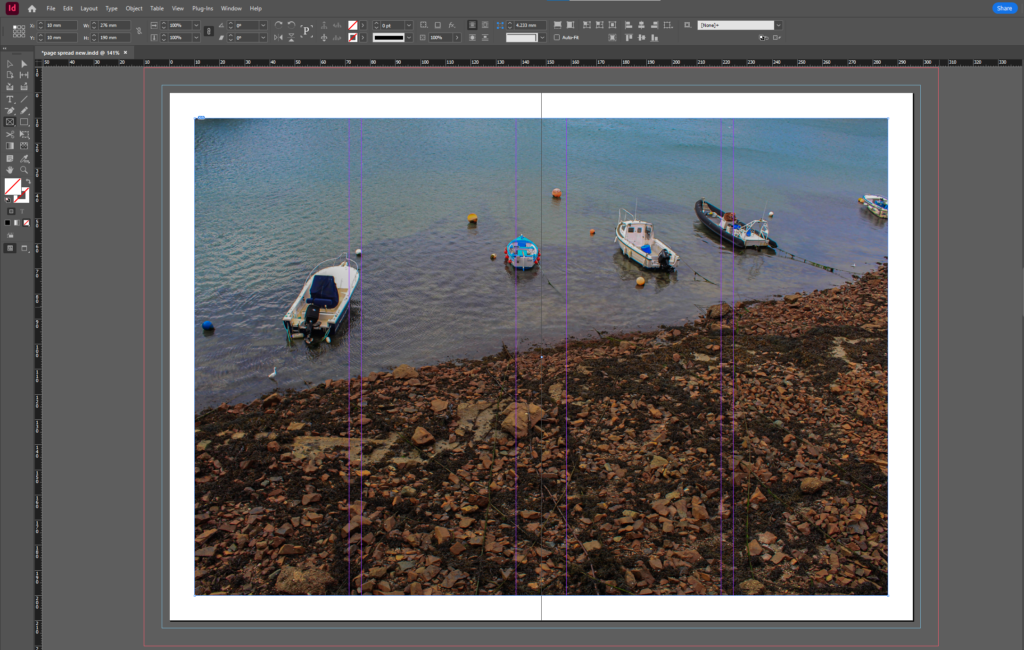
I decided this image to be my front cover because rowing boats were a significant part of Jersey’s history. Rowing boats were used often many years ago during the cod-trade, when merchants and fishermen would use them as transport to trade Jersey’s goods. However the outstanding colours and high contrast within the image brings an element of modernity, which is important and helps give the image some life, allowing the bright coloured boats to stand out. The rich colours of all the boats contrast with the dull and lifeless seaweed in the background, which helps emphasise the eye-catching colours within. The use of one of the boats being upside down on the wooden path clearly illustrates a theme of abandonment, which again links to historical contexts as they have not been used in years. The lighting in this image is also significant as there is a large shadow hovering over the right side of the image, whereas the sun is shining on the left side. I think this looks interesting as the split between the two lightings is right in the middle of the image, which helps the boats on the left side of the photo appear more striking.
Page 2:
These two images as my second page have many similarities and differences, but from first look they could look related which is why I decided to place them together. This way, I am able to show the similarities between them, as well as how they contrast with each other. I like how they both have a similar outside frame of the photograph, with a border of the wall surrounding he doors. This allows the vibrancy of the doors stand out against the wall, making it very clear what the main subject is. Although they both share a main subject of the colourful door, they are used for different things. I didn’t find much out about the blue door on the left or what it is used for as I did not get to go inside, which gives a hint of mystery to it. Whereas the red door on the right led to a storage room that fishermen rented out for their fishing gear. I think the boots hanging off the door look effective because it adds a sense of realism, showing that there is a lot of history and background behind the door.
Page 3:
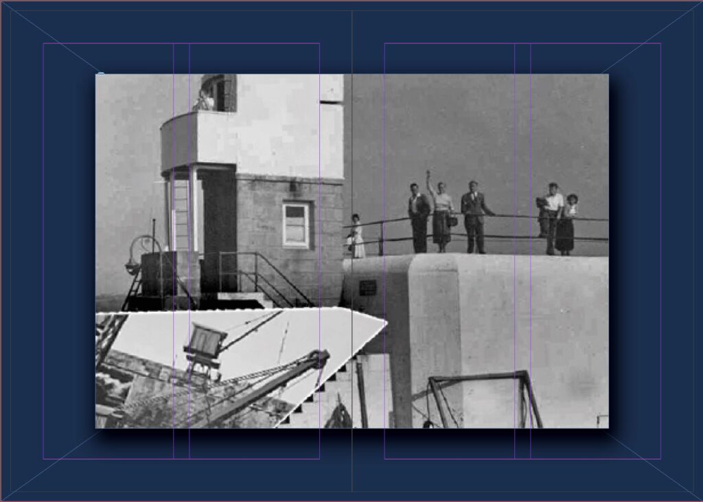
With page 3 I decided to take a different approach, incorporating black and white images of historical pilots that were recruited in May 1945 by the Royal Navy. This way I am including historical contexts into my work, which helps the viewer gain knowledge and understanding about the backgrounds of the museum. I chose to edit these into black and white for some differentiation in my zine. I think these two images work very well together, specifically because they are both taken against a brick wall, which again portrays a theme of former days. Additionally, beside each image is a small description of context behind the framed photo, which I included as it is an effective way of telling a story and deepening the viewers understanding. Overall I think the two images compliment each other very well as they share similarities within displaying different jobs surrounding The Royal Navy.
Page 4:
Page 5:
Page 6:
Page 7:
After placing these 3 images into the page, I then decided that the top image (as well as the larger image on the right) had more depth and contrast than the bottom image, therefore isolating the bottom photo. In order to make them look more alike and purposeful, I added a border onto the bottom image to create more profundity.
Page 8– final page:
Experimentations:
Front cover:
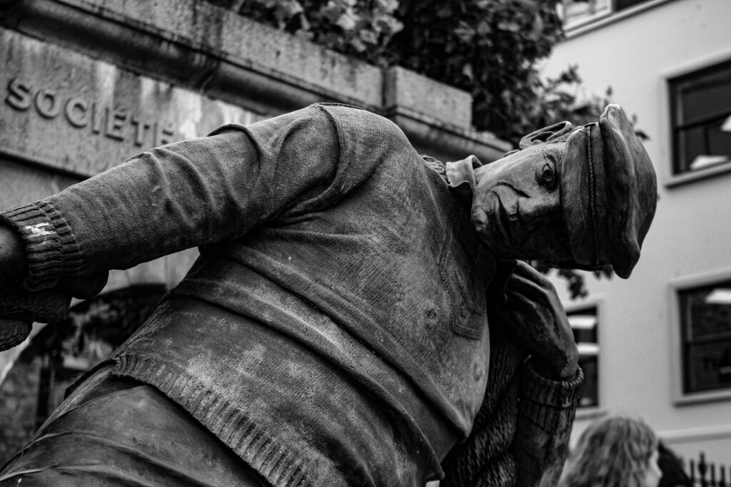
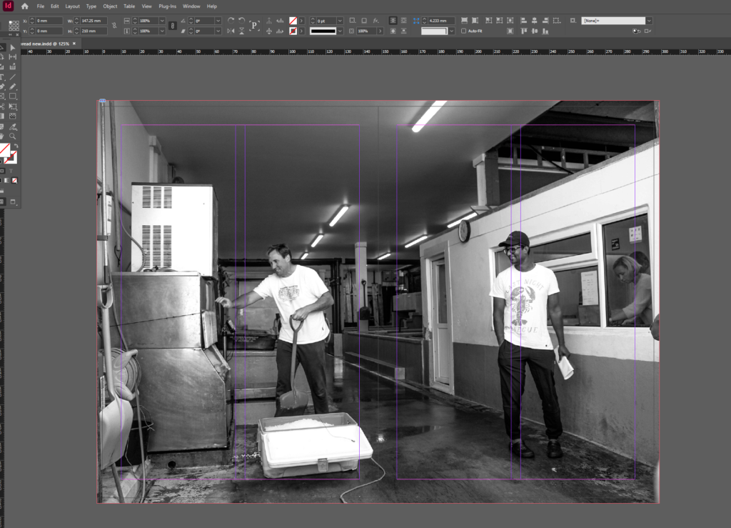
For my second experimentation, I chose to use this image as my front cover as I feel it best represents the different professions within the fishing industry, showing what different people do on a day-to-day basis. I feel this is an important aspect of my photoshoot and final zine because it differs to all of my other photos, illustrating a deeper dive into what goes on at the harbour, rather than just photographing the buildings. This image also has a strong sense of realism throughout, as you can clearly tell the man is moving as it was taken, which I think shows significance and gives purpose to the overall photograph. My title for this zine is “The Aquatic” which means relating to water. I chose this title because it symbolises
Camera obscure consists of a box, tent or room with a small hole in one side or the top. Light from an external scene such as a window passes through the hole and strikes a surface inside, where the scene is reproduced, invented, but with colour and perspective preserved. Camera obscuras with a lens in the opening have been used since the second half of the 16th century and became popular as aids for drawing and painting. The technology was developed deeper into the photographic camera in the first half of the 19th century, when camera obscurer boxes were used to expose light-sensitive materials to the projected image. The camera obscura was used to study eclipses without the risk if damaging the eyes by looking directly into the sun. As a drawing aid, it allowed tracing the projected image to produce a highly accurate representation, and was especially appreciated as an easy way to achieve proper graphical perspective. before the term camera obscure was first used in 1604, other terms were used to refer to the devices; cubiculum obscurum, cubiculum tenebrecosum and locus obscurus.
A camera obscura without a lens but with a very small hole is sometimes referred to was a pinhole camera, although this more often refers to simple lensless cameras where photographic film or photographic paper is used. Cameron Gillie is a photographer who used pinhole photography, he stated “My pinhole photography is created with a camera that is nothing more than a light-tight box with a tiny hole that projects an image on film. There is no lens and no viewfinder. A pinhole camera boils photography down to its simplest components: light and compositition, a huge contrast to today’s photography. As a formal photojournalist, I worked with digital photography since its very beginning. In contrast, my pinhole photography is the oldest form of photography. The limitations and simplicity of pinhole makes photography new again for me. This simplicity continues to teach me invaluable lessons about photography and the way I see the world.”
Nicéphore Niépceand Heliography
The Niece Heliograph was made in 1827, during this period of fervent experimentation. It is the earliest photograph produced with the aid of the camera obscurer known to survive today. The photograph was made by Joseph Nicephore Niece (1765-1833), born to a prominent family at Chalon-sur-Saone in the Burgundy region of France. Motivated by the growing popular demand for affordable pictures, Niepce’s photographic experiments were conducted with the dual aims of copying prints and recording scenes from real life in the camera. at his family estate in the nearby village of Saint-Loup-de-Varennes, he produced legible but fleeting camera pictures in 1816. over the next decade he tried an array of chemicals, materials and techniques to advance the process he ultimately called “heliographie” or “sun writing.” To make the heliograph, Niepce dissolved light-sensitive bitumen in oil of lavender ands applied a thin coating over a polished pewter plate. He inserted the plate into a camera obscurer and positioned it near a window in his work-room. After several days of exposure to sunlight, the plate yielded an impression of the courtyard, outbuildings and trees outside. Writing about his process in 1827, Niepce acknowledged that it required further improvements, but was nevertheless “the first uncertain step in a completely new direction”.
In 1829, Niece entered into a formal partnership with Louis-Jacques-Mande Daguerre, proprietor of the famous Diorama in Paris. Daguerre continued to make vital improvements after Niepce’s death and introduced his “Dagguerreotype” process in 1839. after this announcement, the Niepce Heliograph was brought forth by early supporters as evidence of his role in photography invention.
Louis Daguerre & Daguerreotype
Louis Daguerre was born on November 18th 1787 in Paris, and it was he who discovered that exposing an iodized silver plate in a camera would result in a lasting image if the latent image on the plate was developed by exposure to fumes of mercury and then fixed by a solution of common salt. In 1829, Daguerre partnered with Nicéphore Niépce. Niépce died suddenly in 1833, but Daguerre continued experimenting, and evolved the process which would subsequently be known as the daguerreotype. After efforts to interest private investors proved fruitless, Daguerre went public with his invention in 1839. At a joint meeting of the French Academy of Sciences and the Académie des Beaux Arts on 7 January of that year, the invention was announced. Daguerre explained and demonstrated the process only to the Academy’s perpetual secretary François Arago, who proved to be an invaluable advocate. Members of the Academy and other select individuals were allowed to examine specimens at Daguerre’s studio. The images were enthusiastically praised as nearly miraculous, and news of the daguerreotype quickly spread. Arrangements were made for Daguerre’s rights to be acquired by the French Government in exchange for lifetime pensions for himself and Niépce’s son. On January 9, 1839, a full description of his daguerreotype process was announced at a meeting of the Academy of Sciences by the eminent astronomer and physicist François Arago. Daguerre was appointed an officer of the Legion of Honour. In 1839 Daguerre and the heir of Niépce were assigned annuities of 6,000 francs and 4,000 francs, in return for their photographic process.
Henry Fox Talbot
Henry Fox Talbert is very well known for being a successful pioneer of photography, scientist and inventor. Amongst his other successes he created a method of photography by using a ‘calotype’ which is a negative-positive process which is also known as the ‘paper negative’. He created images when exposed to light, these images were easy to produce and easy to distribute. However, they faced many drawbacks such as the people in the photos looking ‘on the edge of being present’ and seen as looking not quite alive due to a low sharpness and graininess, this caused a loss of fine detail. However, these images were popular as they captured a moment in time, fixed into place which was profitable and popular at this time. He used different light sensitive chemicals and salts such as silver nitrate and silver chloride. The original negative and positive process invented by William Henry Fox Talbot, the calotype is sometimes called a “Talbotype.” This process uses a paper negative to make a print with a softer, less sharp image than the daguerreotype, but because a negative is produced, it is possible to make multiple copies. The image is contained in the fabric of the paper rather than on the surface, so the paper fibers tend to show through on the prints. The process was superceded in the 1850s by the collodion glass negative. Because of Talbot’s patent rights, relatively few calotypes were made in the United States.
Richard Maddox
Richard Leach Maddox (4 August 1816 – 11 May 1902) was an English photographer and physician who invented lightweight gelatin negative dry plates for photography in 1871. In photography, the Collodion process was invented in 1851 by Frederick Scott Archer. This invention required only two to three seconds of light exposure to produce an image, but plates had to be sensitized at the time of exposure, exposed while the emulsion was still wet, and processed immediately after exposure in the camera. When he noticed that his health was being affected by the ‘wet’ collodion’s ethervapor, Maddox began looking for a substitute. Richard Leach Maddox, M.D., photography was given an early impetus to become a disseminator of medical knowledge. His interest in the camera, combined with his poor health and his medical training, enabled him to invent the gelatin bromide negative that is the backbone of today’s photographic film. Dr. Richard Maddox created a dry plate technique that allowed photographers to develop photographs without using the wet methods of the collodion process. This technique involved using gelatin instead of glass to make photographic negative. The dry plate process quickly replaced the wet plate collodion process that required the mixing of dangerous chemicals and immediate exposure of the wet plate.
George Eastman
George Eastman was an American entrepreneur who founded the Eastman Kodak Company and helped to bring the photographic use of roll film into the mainstream. Eastman changed the world through his entrepreneurial spirit, bold leadership, and extraordinary vision. He will be remembered throughout history for founding the Eastman Kodak Company and revolutionizing the photography, film, and motion picture industries. Eastman came up with the name Kodak because he believed products should have their own identity, free from association with anything else. So in 1888, he launched the first Kodak camera (a few years later, he amended the company name to Eastman Kodak). The first successful roll-film hand camera was launched publicly in the summer of 1888. Inventor George Eastman received a patent for the camera’s shutter and the trademark for the Kodak name on September 4, 1888. In the 1880s, Eastman developed a convenient method of preparing ready-to-use plates. Improvements led to flexible, roll film as well as photo processing and printing done by mail order. Millions of people worldwide captured memories using cameras and film, leaving all the chemistry to Kodak.
Kodak (brownie) – George Eastman
The Brownie was a basic cardboard box camera with a simple convex-concave lens that took 2+1⁄4-inch square pictures on No. 117 roll film. It was conceived and marketed for sales of Kodak roll films. Because of its simple controls and initial price of US$1 (equivalent to $37 in 2023) along with the low price of Kodak roll film and processing, the Brownie camera surpassed its marketing goal. It was invented by Frank A. Brownell for the Eastman Kodak Company. Named after the Brownie characters, the camera was initially aimed at children. More than 150,000 Brownie cameras were shipped in the first year of production, and cost 5 shillings in the United Kingdom.
The Brownie camera was launched in 1900 to target new hobbyist photographers — children — and with its $1 price tag, it also became a favorite of servicemen. Eastman supported the military in other ways as well, developing unbreakable glass lenses for gas masks and a special camera for taking pictures from planes during World War I. In all, Eastman’s innovations started the amateur photography craze that is still going strong today.
Film / print photography
The first flexible photographic roll film was sold by George Eastman in 1885, but this original “film” was actually a coating on a paper base. As part of the processing, the image-bearing layer was stripped from the paper and attached to a sheet of hardened clear gelatin. Once the film is processed, it is then referred to as a negative. The negative may now be printed; the negative is placed in an enlarger and projected onto a sheet of photographic paper. Many different techniques can be used during the enlargement process. Two examples of enlargement techniques are dodging and burning. The first film that was in a roll and flexible was made by George Eastman in but it wasn’t synthetic but on paper. Photographic film is a material used in photographic cameras to record images. It is made of transparent plastic in a shape of a strip or sheet, and it has one side covered with light-sensitive silver halide crystals made into a gelatinous emulsion. When a photographic film is exposed to light by a photographic camera, it chemically changes depending on the amount of light absorbed by each crystal. These changes create an invisible latent image in the emulsion, which is then fixed and developed into a visible photograph. Black and white photographic films have one layer of silver halide crystals, while the colour film has three layers, each sensitive to a different colour. Some colour films have even more layers.
Digital photography
Digital photography is a process that uses an electronic device called a digital camera to capture an image. Instead of film, it uses an electronic digital sensor to translate light into electrical signals. In the camera, the signals are stored as tiny bits of data in bitmaps, tiny bits of data that form the image. Digital photography spans a wide range of applications with a long history. Much of the technology originated in the space industry, where it pertains to highly customized, embedded systems combined with sophisticated remote telemetry. Any electronic image sensor can be digitized; this was achieved in 1951. Six years later, in 1957, the first digital image was produced through a computer by Russell Kirsch. It was an image of his son. The photography changed from film to digital in the 1990’s. The early 1990s brought a dramatic change with the advent of digital technology. Instead of using grains of silver embedded in gelatin, digital photography uses silicon to record images as numbers. Computers process the images, rather than optical enlargers and tanks of often toxic chemicals. The modern era in digital photography is dominated by the semiconductor industry, which evolved later. An early semiconductor milestone was the advent of the charge-coupled device image sensor, first demonstrated in April 1970; since then, the field has advanced rapidly.
To create my zine with images from the harbour and the Maritime museum, I opened InDesign selected the amount of pages I needed then made the measurements width: 148mm, height: 210, pages: 16, orientation: portrait, columns: 2, column gutter: 5mm, margins: top, bottom, inside, outside: 10mm, bleed: top, bottom, inside, outside: 3mm.
I ma using this zine to create a story with my images taken from the photoshoots. My photos will all link in with each other and I am going to pair certain photographs together which relate to each other.
I printed out the images that I wanted to use for the zine, in small, to make a mock up zine. Unfortunately, the printer had some issues with colours but it still allowed me to make a plan for the zine. I placed the images in the order that I thought would work well together.
I started by using the rectangle frame tool to draw out the size I wanted to import my image to and where on the page I would like it.
Once this was done, I used the short cut, ctrl D, to select my chosen image. I then needed to go into fitting and decide which setting made my photo fit the best, without it cropping and without it going over the border.
for my first image i wanted to create a combination of both colour and black and white using harsh lines and shapes to truly demonstrate what i intend illustrate throughout the zine
in this image i wanted to create the impact of an optical illusion
My focus for this zine was not to tell a story with word but in fact let the images speak for themselves using vivid colours, sharp lines and complex editing to create interesting images. i intended to create symmetry with in the layout and images in order to create optical illusions and a sense of da-ja-vu when viewing.
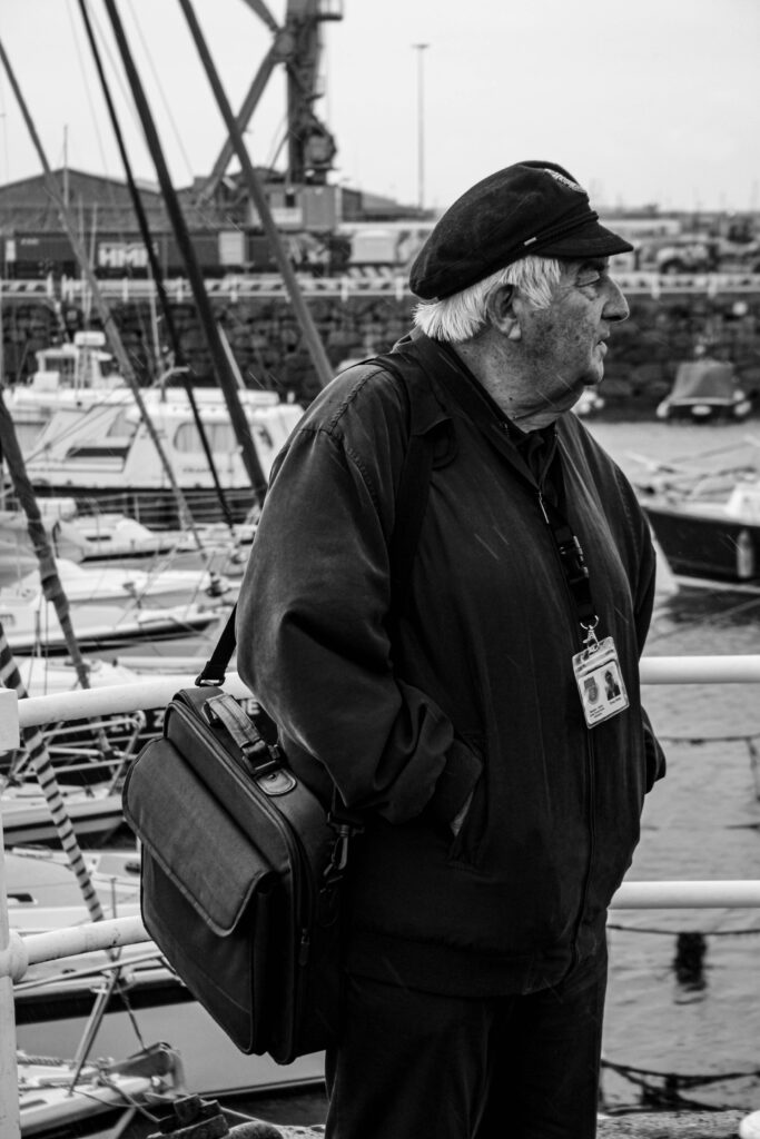
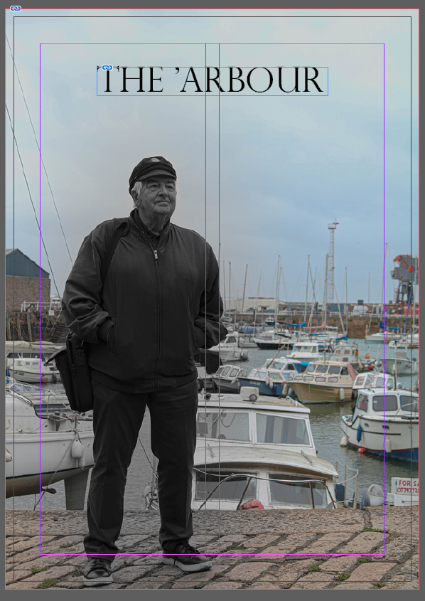
I started with the front cover being one of the ex-captain’s of the harbour as he is one of the main reasons for all of these boats and workers being able to be here.