Mock-Up One
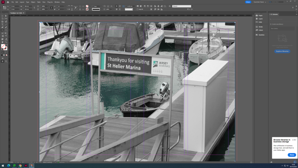
Cover Page


I wanted my cover page to be in black and white so that I could tell a story through my work, having the last page being in colour. Almost like watching a film turn to colour. I have also chosen this title because I think that my story portrays Jerseys trade and the way people communicate to carry that out.
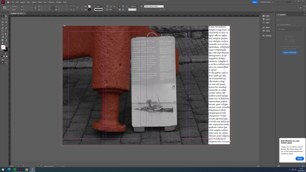
Page Spread 1

I want my first page spread to keep with the black and white theme like a story line. I wanted to include 2 images for contrast between modern and old ways of trade and fishing. I also wanted to include some text as an almost introduction to portray the story that I am trying to tell.
Page Spread 2

I wanted to have a page with just images to leave some things to peoples imagination before I add some text explaining what I am portraying. I wanted to allow people to have their own guess, but I have already interpreted in their minds a nostalgic/historic feeling due to the black and white elements and old brick building’s which have connotations of history.
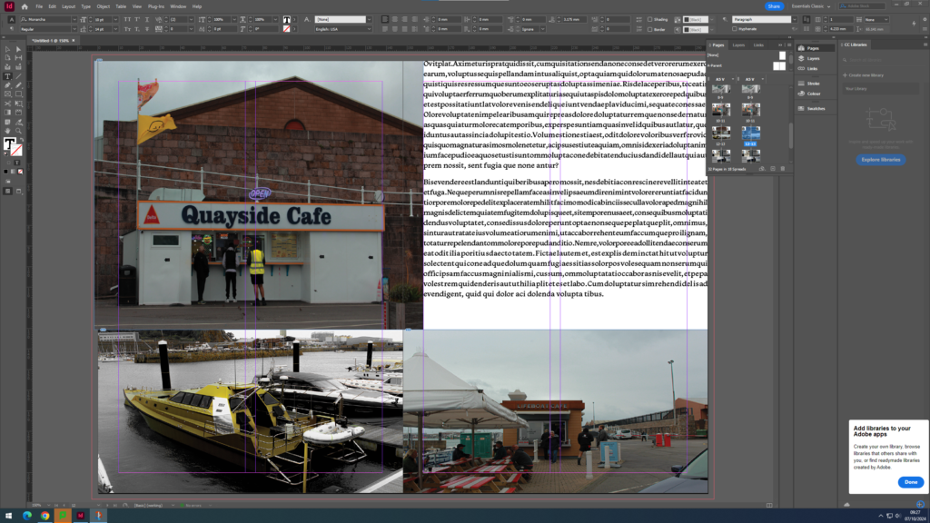
Page Spread 3


I wanted my next double page to ease into colour, using a colour popping image to smoothly move into a modernist time. I wanted to still include some text to be able to explain the contrast and my reasoning why. I wanted my image to be big so that it would mostly catch someone’s eye.
Page Spread 4

I wanted to continue with the text to further explain and give people some facts about changes within the harbour to make it what it is today. I also wanted to include signage that says ‘goodbye’ because I wanted to shift peoples gaze and thoughts onto a different element of the harbour.
Page Spread 5

I wanted this page to have a massive contrast, a massive jump in time scale. I have included a lot of text so that I can really explain what I am doing and give a true meaning of out harbour today and why these things are so important.
Page Spread 6

I wanted my last double page to include only images. I wanted to leave things to the imagination.
Last Page

I wanted my final page to be a landscape side image. I wanted people to have to move my zine to see it in the way that they want.
Mock-Up 2
Front Page

First Page Spread

Second Page Spread

Third Page Spread

Forth Page Spread

Fifth Page Spread

Sixth Page Spread

Seventh Page Spread

Last Page

Adding Text
Page Spread One


Page Spread Three


Page Spread Five


Page Spread Seven


Alternative Layout
Cover Page

Page Spread One

Page Spread Two

Page Spread Three

Page Spread Four

Page Spread Five

Page Spread Six

Page Spread Seven

Last Page


Excellent blog posts demonstrating a variety of layout options and designs. Produce one last blog post with screen grabs of final zine design and write a short evaluation.