Photoshoot Plan
We are going on another photography trip and during this trip we will be doing another 2 photoshoots, one at Victoria Pier and the other to La Collette Yacht Basin. Additionally, we will be visiting the Jersey Maritime Museum. My plan for these photoshoots are the same as the previous 2, however I would also like to try and get more Abstract shots.

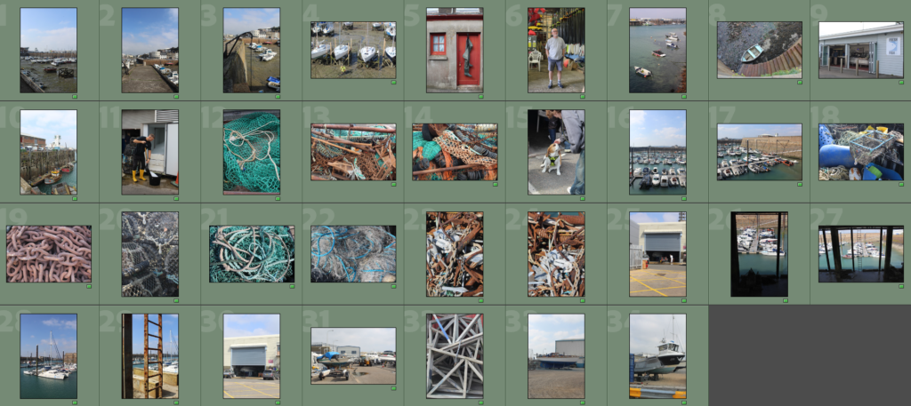
Image Selection


Image Sub-Selection
Edits
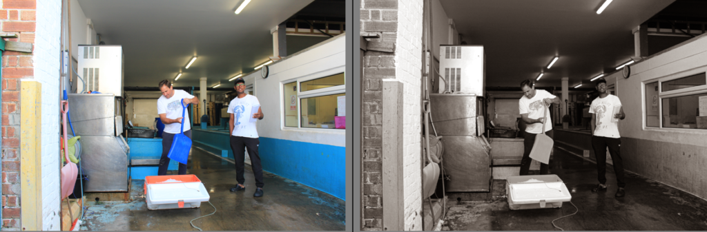
People
Edit 1


Edit 2


Edit 3


Edit 4


Edit 5


Edit 6


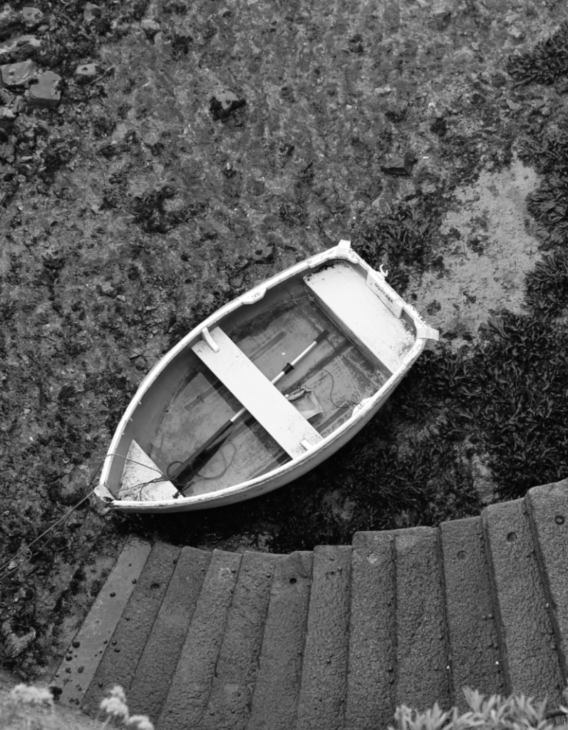
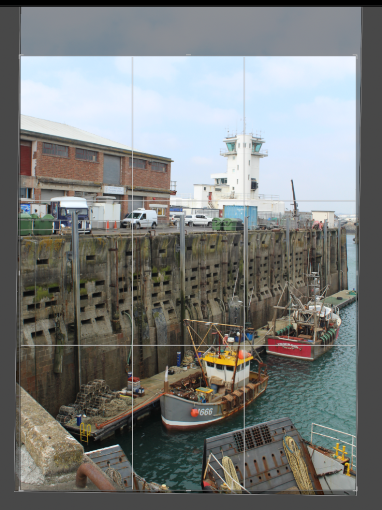
Here I used the brush tool to increase the exposure and highlights in this area so that the boat is more visible.

Edit 7


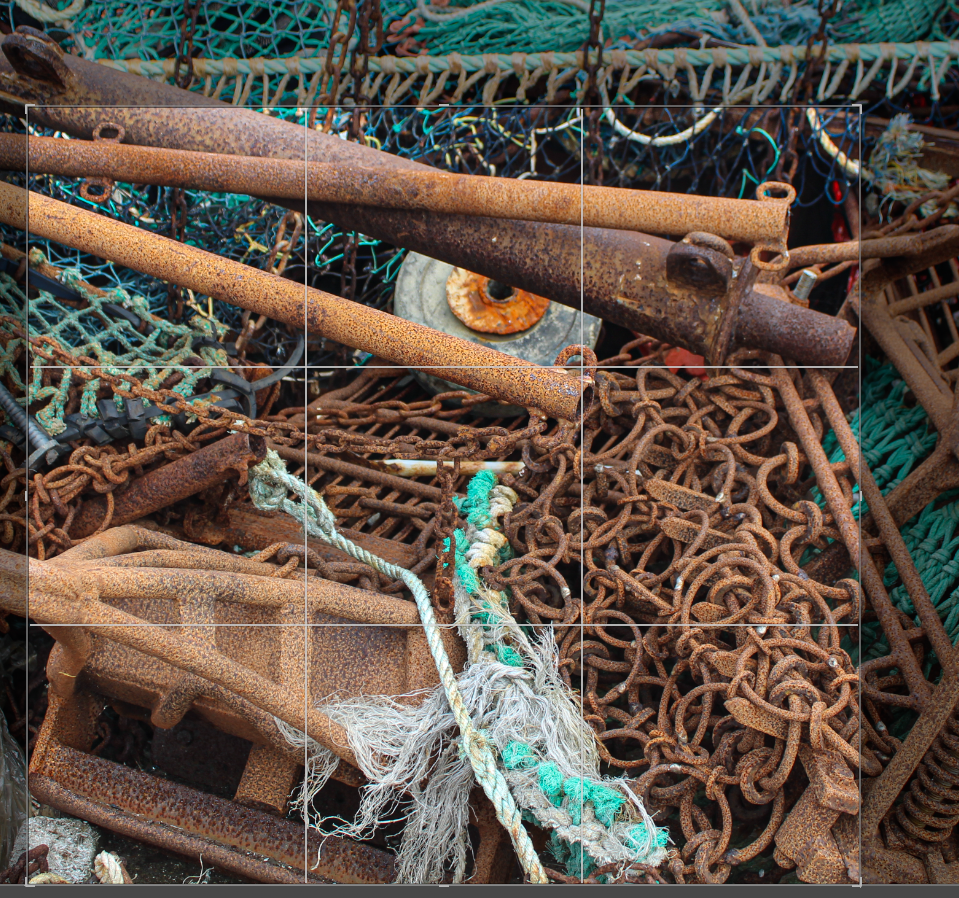
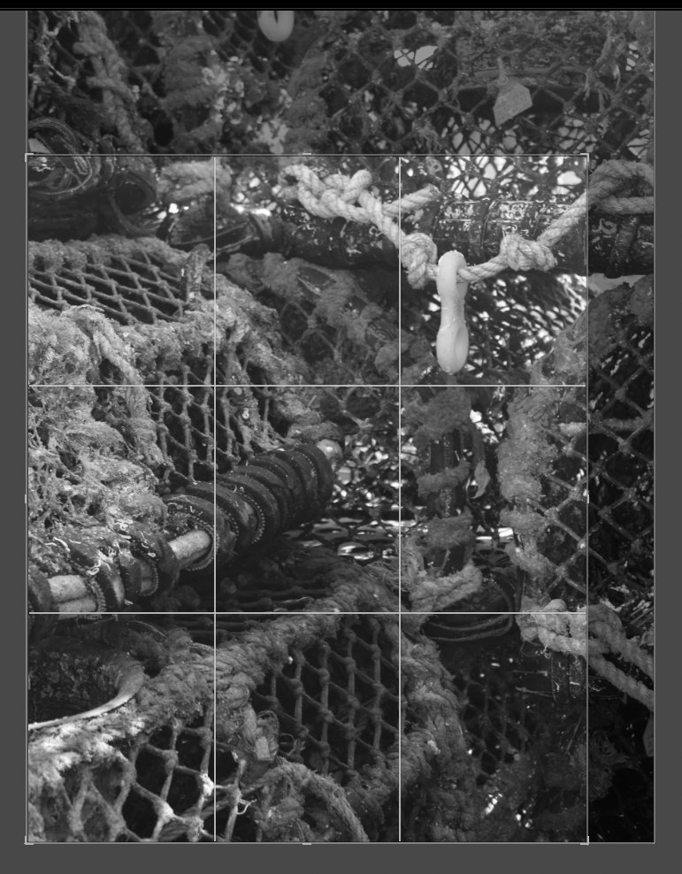
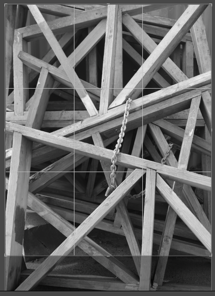
Abstract
Edit 1


Edit 2


Edit 3

Edit 4

Edit 5


Edit 6


Edit 7


Edit 8


Edit 9


Edit 10


Edit 11


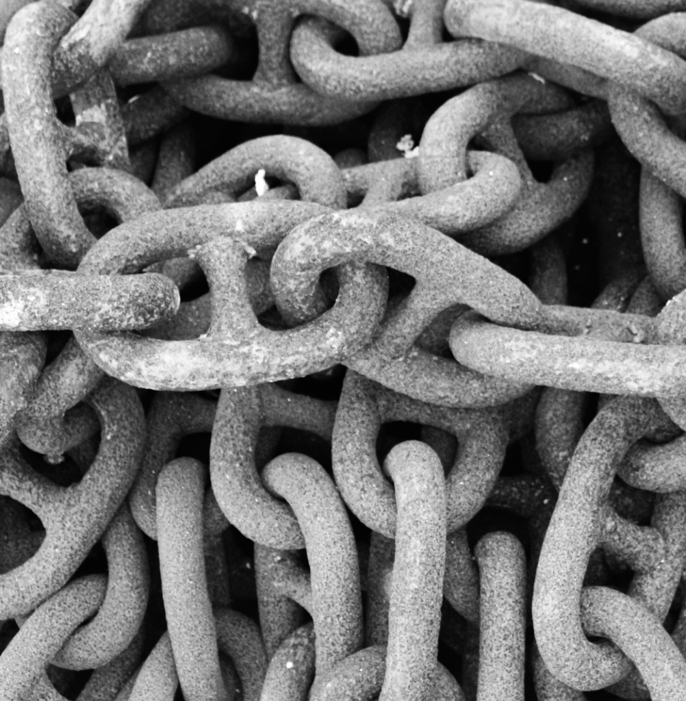
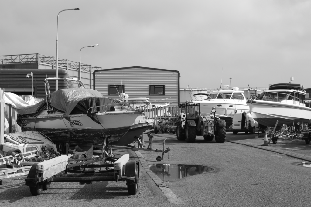
I then put this image in B&W and increased the contrast as I think it looks more effective and best highlights the details in the rope.

Edit 12


Edit 13


Edit 14


Edit 15


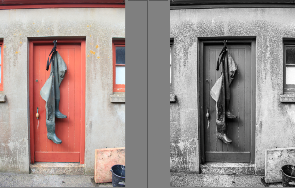
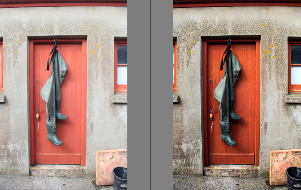
General Harbour/History
Edit 1


Edit 2


Edit 3


Edit 4


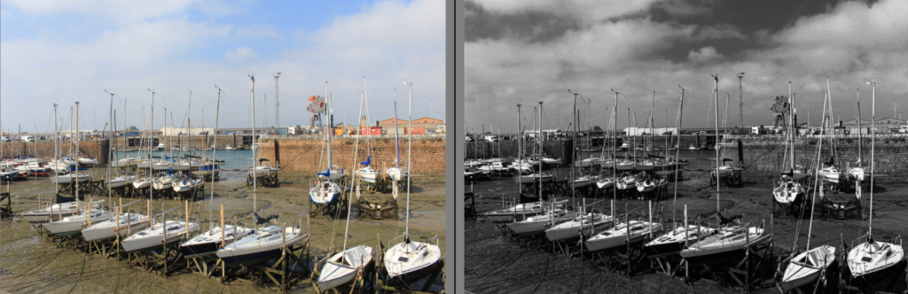
Boats
Edit 1


Edit 2


Edit 3


Gallery