At the maritime museum and along the harbour I took a total of 554 images and I flagged it down to 152 of the best images I took.


After I went through the images I flagged as my favourite I then narrowed it down again and then selected the ones that I will edit and coloured them green.

Final Edits


I have chosen to group these images because they go together well as they all have boats and the sea in each of their images. I chose to edit these in black and white because they look older, especially the first one where the boats are propped on wooden beams. The last and biggest image is of three boats with buildings in the background. The perspective is like your at sea looking onto land which I liked compared to my other images where it looks like you are on land looking out to sea.


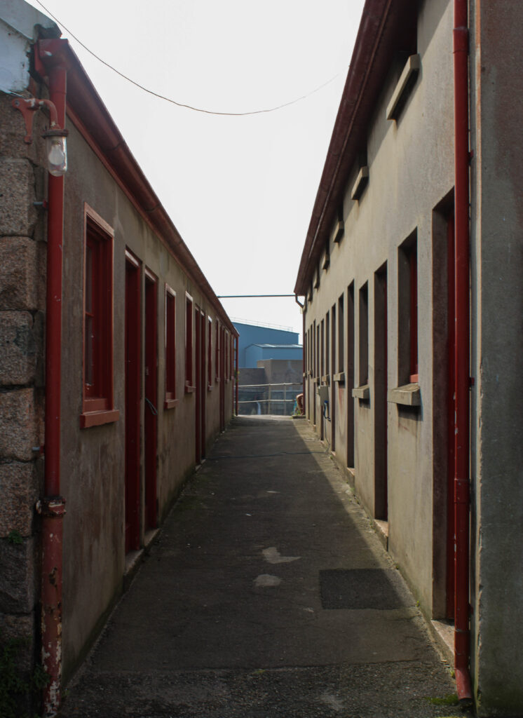
In these images are the lockers for fishermen. The first image was taken in the French harbour and the other two of these are taken nearer at the English harbour. I decided to keep these in colour as I liked the way the red looked with the original rusty colour of the area.


These images are the same as the ones above but I decided to experiment with the colour tools on Lightroom. To do this I went to the saturation section and turned all the colours down to -100 and kept the red at 0 or turned it up a bit more as it is the main colour in the pictures to make it stand out.


These two images I chose to pair together is because they are both of people at work. These two images correspond together well because all the people are working with fish at the harbour. I edited both of these in black and white and made both images darker where blacks are more prominent than whites. I chose to edit it this way so there was clear definition in each image and I liked the way the black and white looked in the working environment.


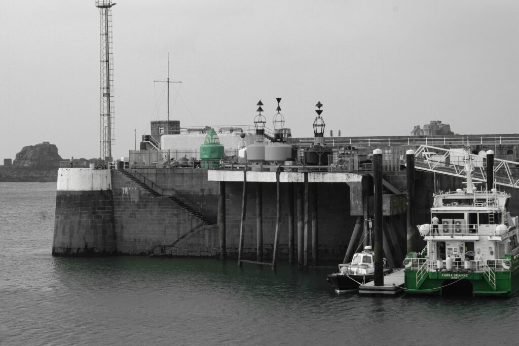
For these images I chose to experiment on Lightroom. I took these of a fishing boat at the harbour. I edited these images in black and white apart from the green popping out on the boat and around the image. To do this I went on Lightroom and turned the saturation down on all colours apart from green. I chose green as the only colour in this photo as it was the most prominent and eye-catching colour in the original, unedited image.
