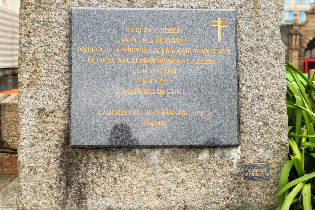
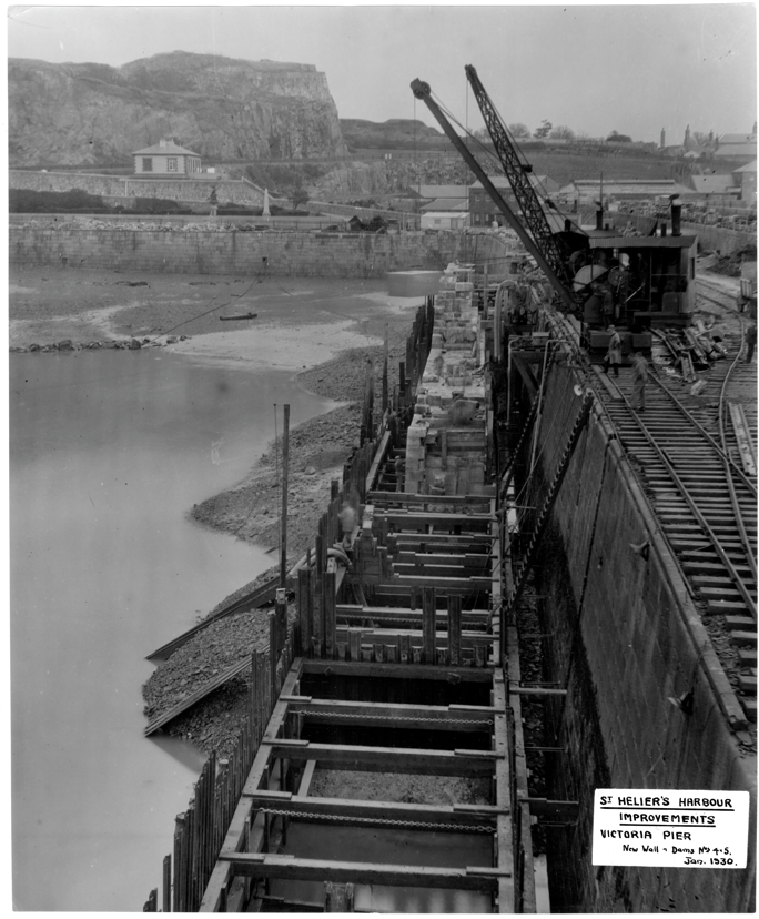
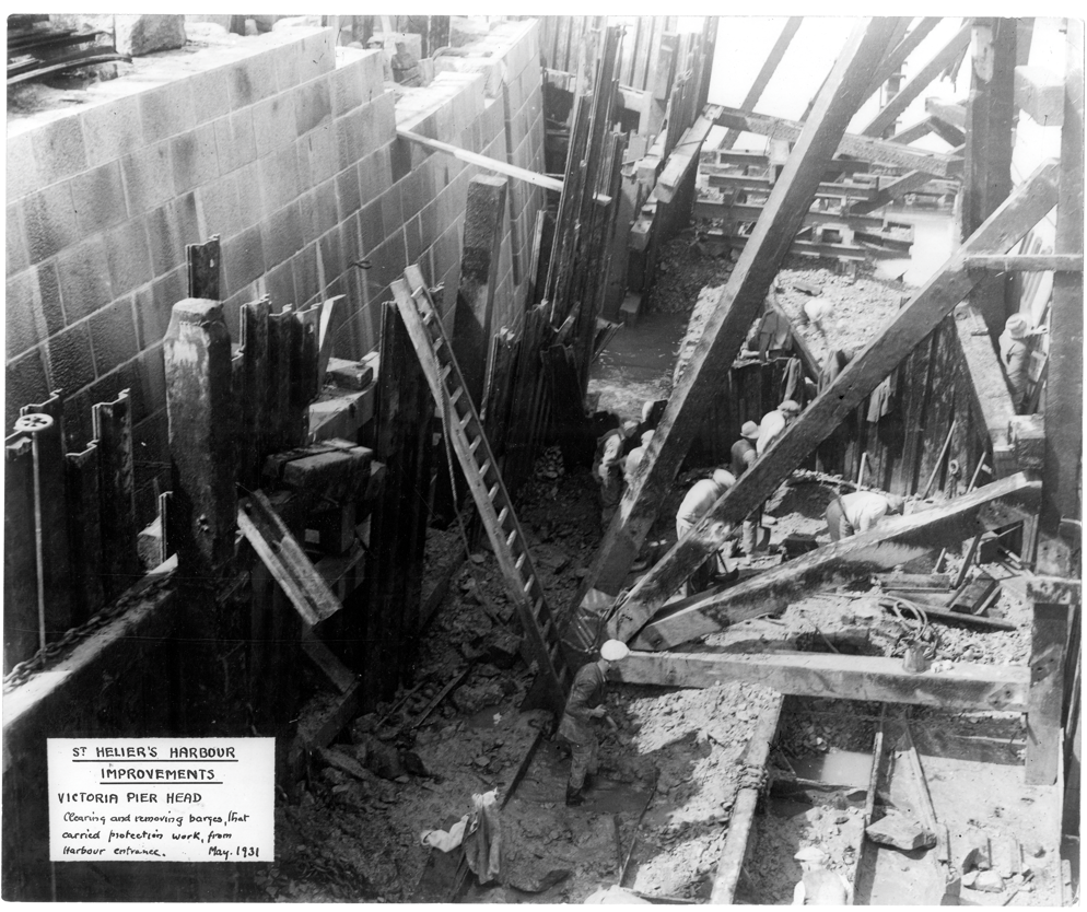
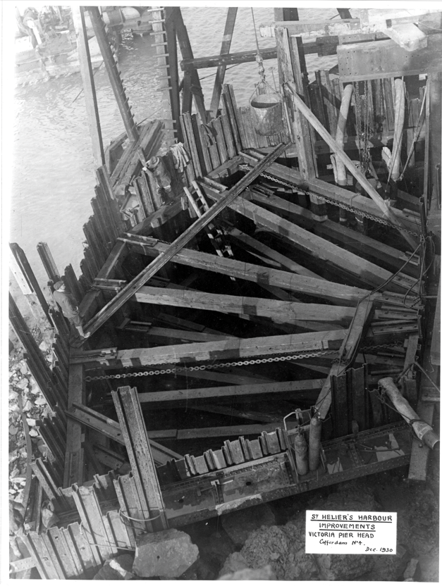
A sentence – To show how much the harbour has changed.
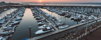
A paragraph – To acknowledge how much Jersey’s harbour has changed over the course of many years, as well as express the importance of the various industries working in this area that help with the economy of the Marine Environment.
NARRATIVE:How will you tell your story?
I will tell my story by taking relevant and meaningful photographs of the harbour architecture, local shops and workers, and items that symbolise the harbour and the modern changes to it.
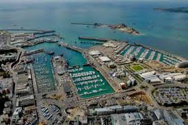
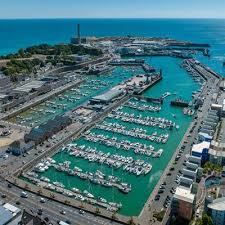
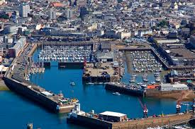
We explored all around St Helier Harbour, including the three marinas, the steam clock, maritime museum and more. Our aim was to explore the harbour and capture all the different elements and aspects of it.
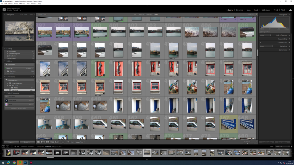
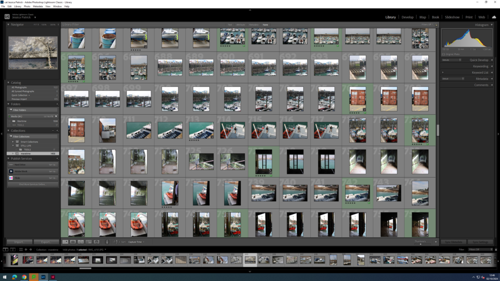
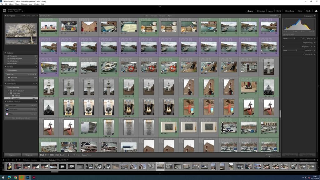
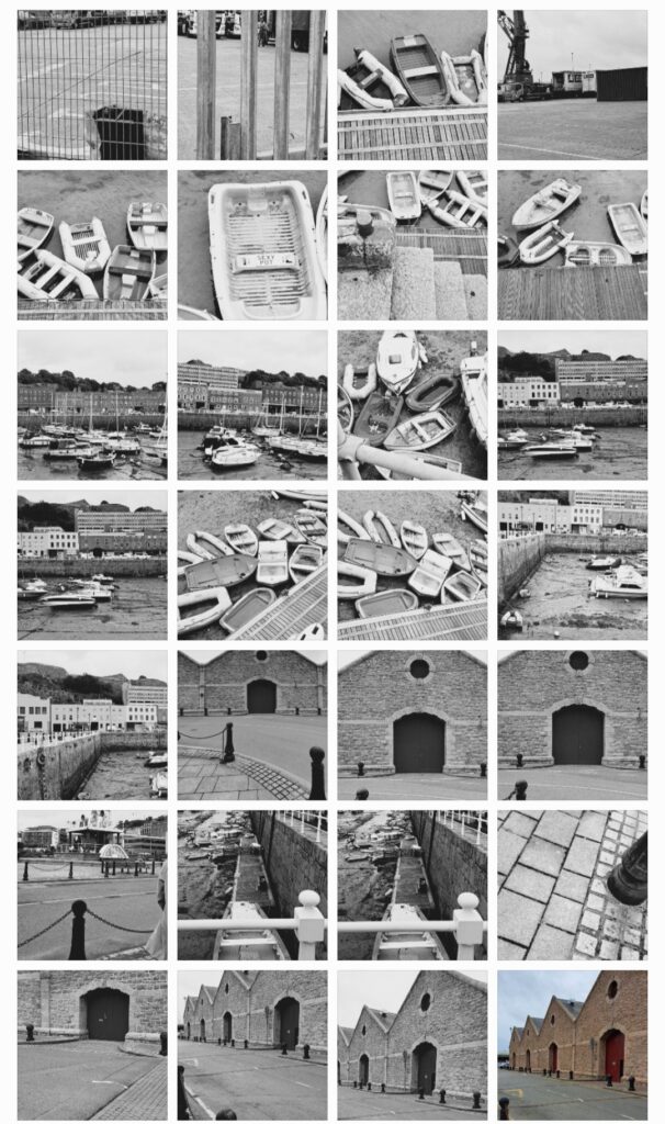
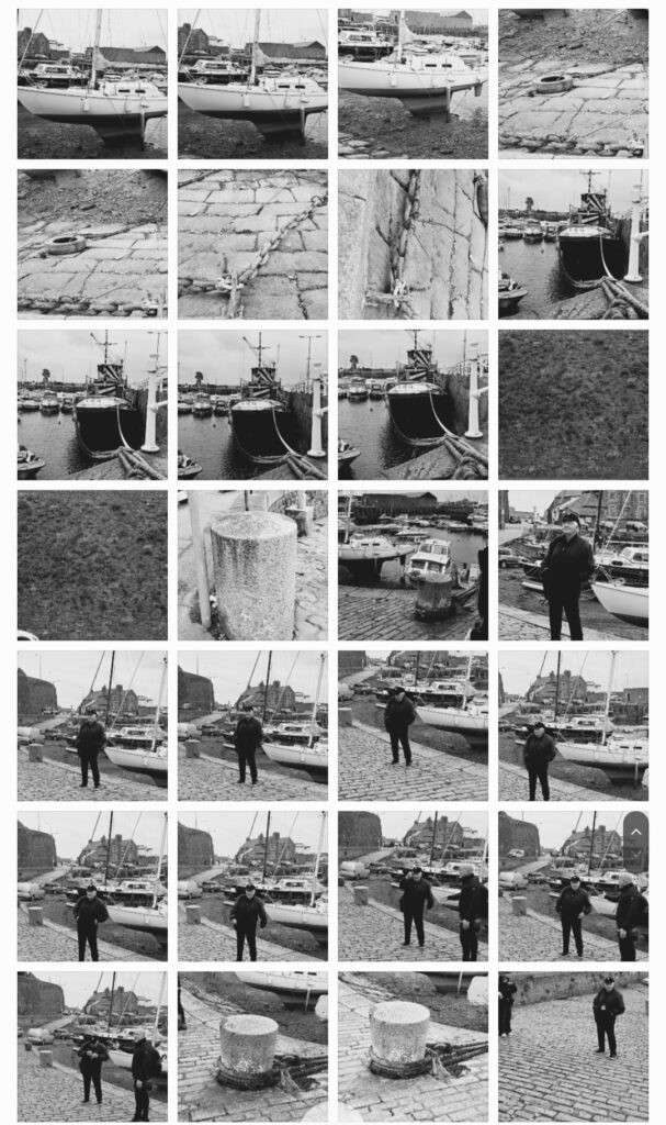
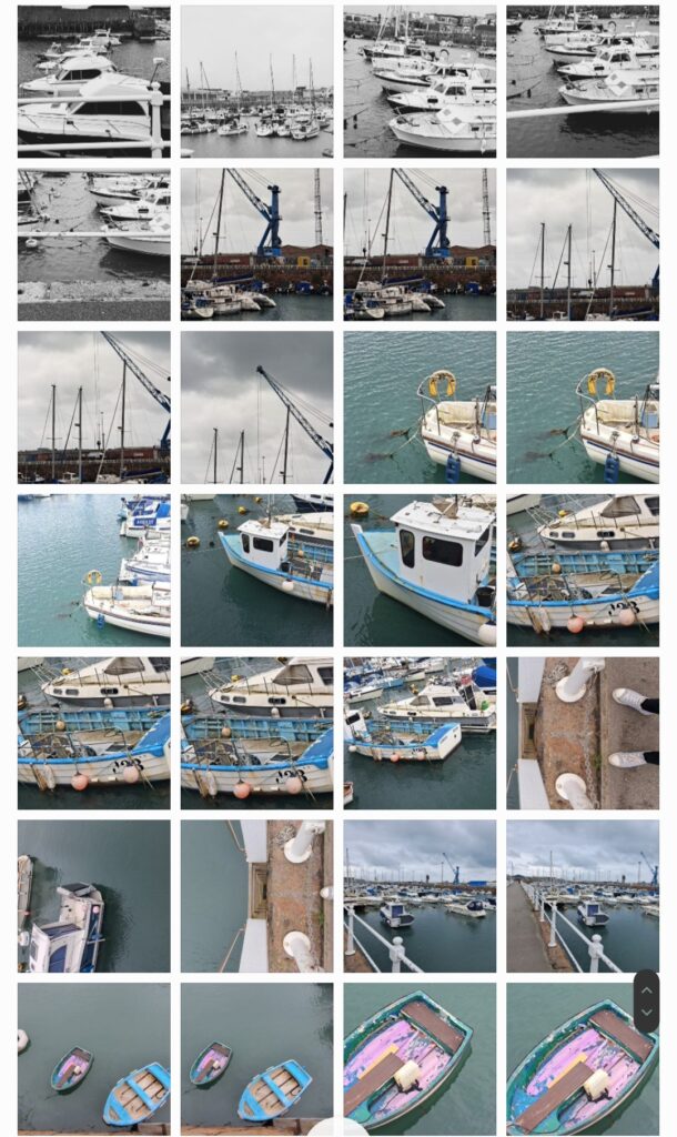
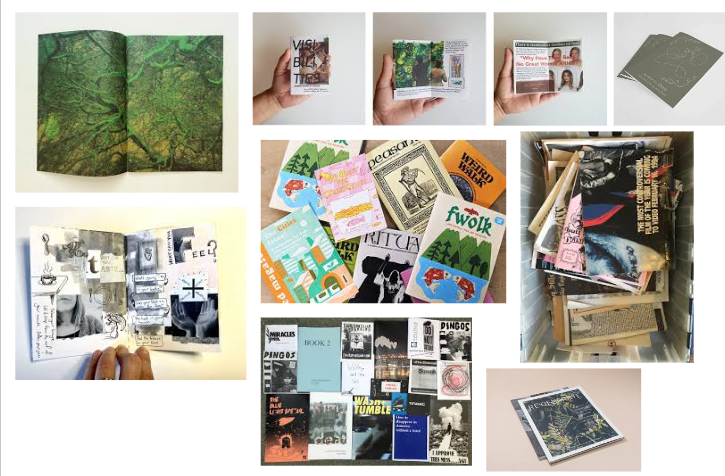
Contacts Sheet
The images which are highlighted green are the images I have chosen to edit in this photoshoot, because they present lots of different aspects of the harbour and have the best composition and layout and are my best photos.
Edits
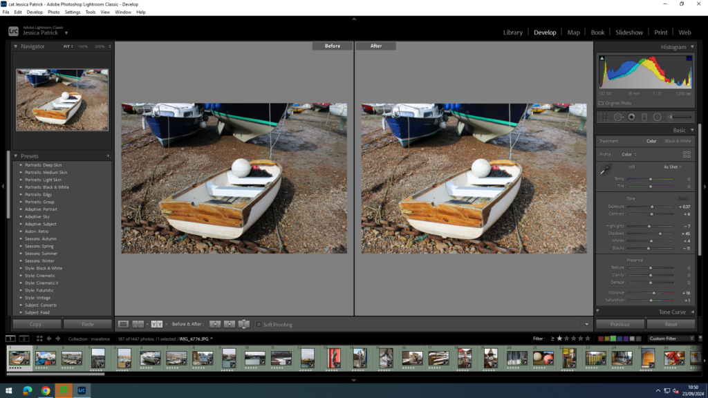
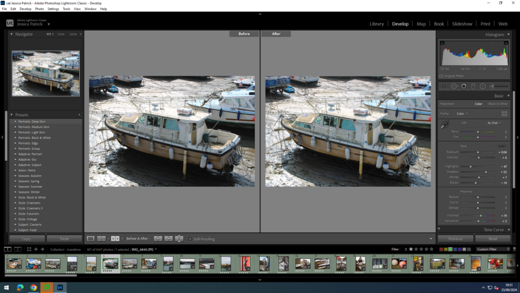
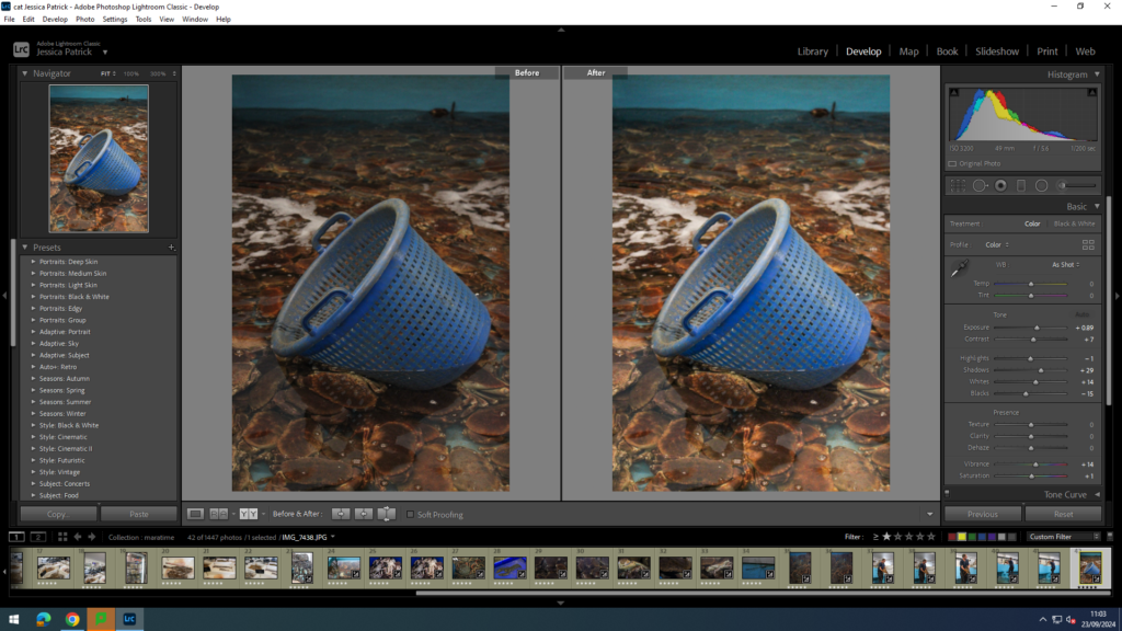
I edited this image by increasing the exposure, contrast shadows, whites, vibrancy and saturation, while decreasing the highlights and blacks. I did this, so that the image would be brighter and more vibrant, so that the boat was more bright white, and so the sand was more coloured.
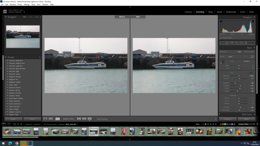
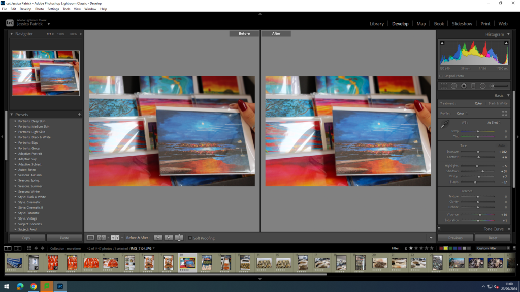
I edited this image by increasing the exposure, contrast shadows, whites, vibrancy and saturation, while decreasing the highlights and blacks. I did this, so that the boats would be brighter, as well as the sea in the background being more blue and vibrant.
Then, I made a virtual copy of the edited image and increased the contrast, highlights and whites, while decreasing the blacks and shadows. I did this to create more contrast between the different shades of grey throughout the image.
I edited this image by increasing the contrast shadows, whites, vibrancy and saturation, while decreasing the exposure, highlights and blacks. I did this, so that the image was slightly brighter and more eye capturing.
I edited this image by increasing the exposure, contrast shadows, whites and vibrancy, while decreasing the highlights and blacks. I did this so that the image would be brighter and more vibrant.
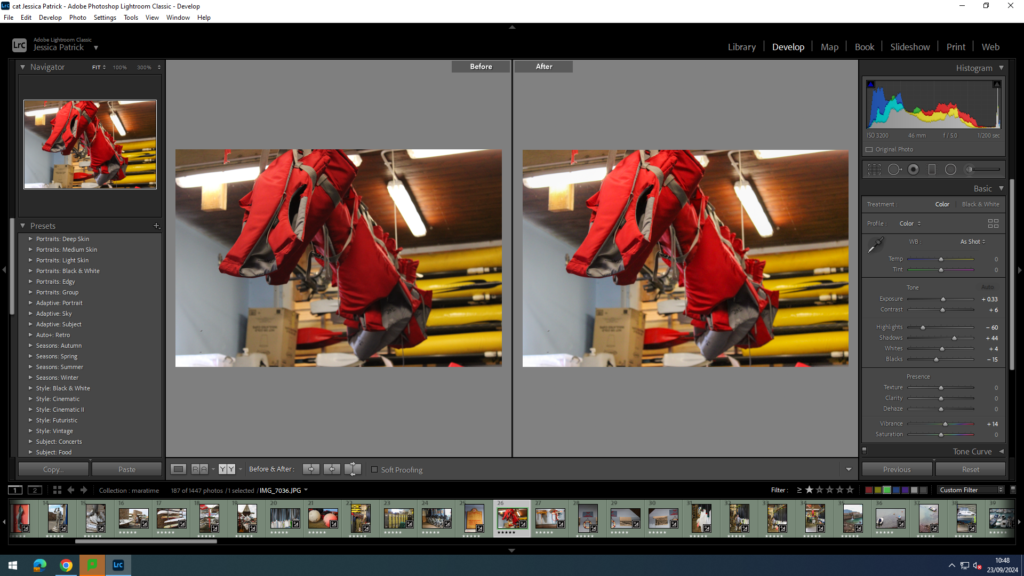
I edited this image by increasing the exposure, contrast shadows, whites, saturation and vibrancy, while decreasing the highlights and blacks. I did this, so that the boat was more vibrant and saturated, so it stood out more. I also wanted the yellow colour of the boat the be more saturated.
I edited this image by increasing the exposure, contrast shadows, whites, saturation and vibrancy, while decreasing the highlights and blacks. I did this, so the sea was a nicer blue, as well as the blue on the boat.
I edited this image by increasing the exposure, contrast shadows, saturation and vibrancy, while decreasing the whites, highlights and blacks. I did this, so the red door was more vibrant, along with the green boots, so they would compliment each other more, as they are complimentary colours.
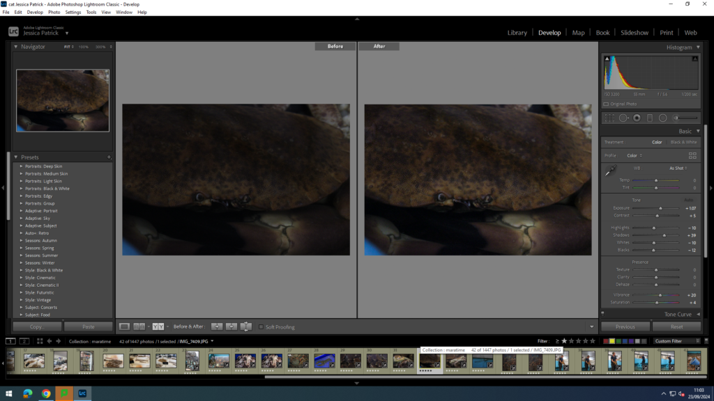
I edited this image by increasing the contrast, shadows, white, vibrancy and saturation, while decreasing the exposure, highlights and blacks. I did this, so that the tin man was brighter, as well as the rust, so it created more texture and contrast.
I edited this image by increasing the exposure, contrast, shadows, white, vibrancy and saturation, while decreasing the highlights and blacks. I did this, so that the image would be slightly more exposed.
I edited this image by increasing the exposure, contrast, shadows, white, vibrancy and saturation, while decreasing the highlights and blacks. I did this, so that the image was more exposed and more vibrant.
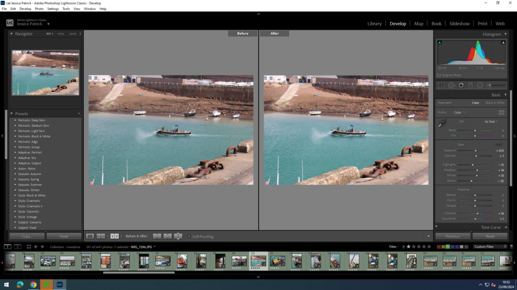
I edited this image by increasing the exposure, contrast, shadows, white, vibrancy and saturation, while decreasing the highlights and blacks. I did this, so that the image was slightly more exposed and the water brighter and more vibrant and saturated.
I edited this image by increasing the exposure, contrast, shadows, white, vibrancy and saturation, while decreasing the highlights and blacks. I did this, so that the image was slightly more exposed and the water brighter and more vibrant and saturated.
I edited this image by increasing the exposure, contrast, shadows, white, vibrancy and saturation, while decreasing the highlights and blacks. I did this, so the yellow boat was more vibrant and saturated, so it popped more.
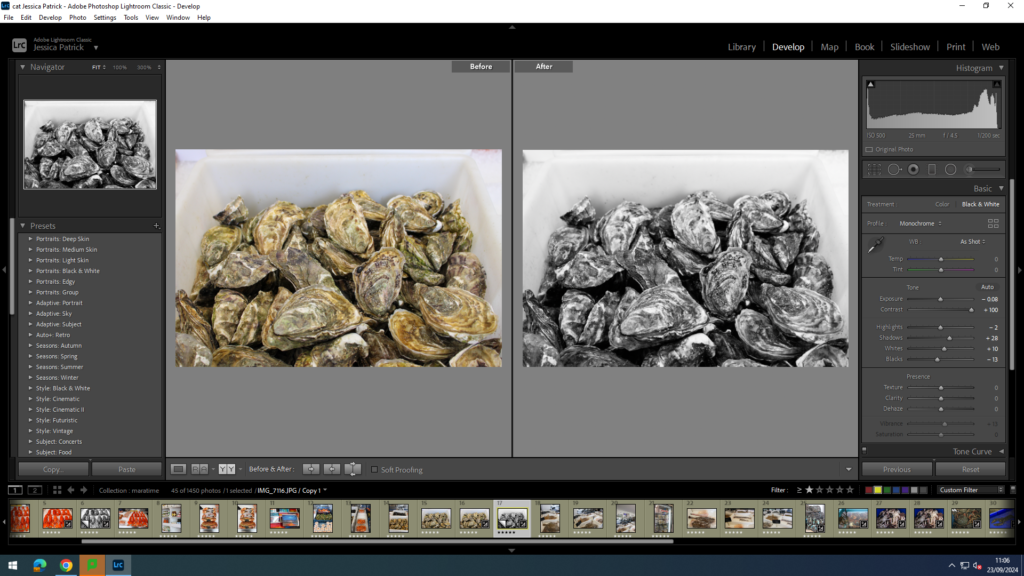
Then, I created a virtual copy and made it black and white. I also increased the contrast to the max and adjusted the highlights, blacks, whites and shadows. I did this to create more contrast and light and dark tones in the image.
I edited this image by increasing the contrast, shadows, white, vibrancy and saturation, while decreasing the exposure, highlights and blacks. I did this, so the complimentary colours (green and red) are more vibrant and therefore compliment each other even more.
I edited this image by increasing the exposure, contrast, shadows, white, vibrancy and saturation, while decreasing the highlights and blacks. I did this, so that the image would be brighter and more exposed, so it was more visible.
I edited this image by increasing the contrast, shadows, vibrancy and saturation, while decreasing the whites, exposure, highlights and blacks. I did this, so the image would be less bright.
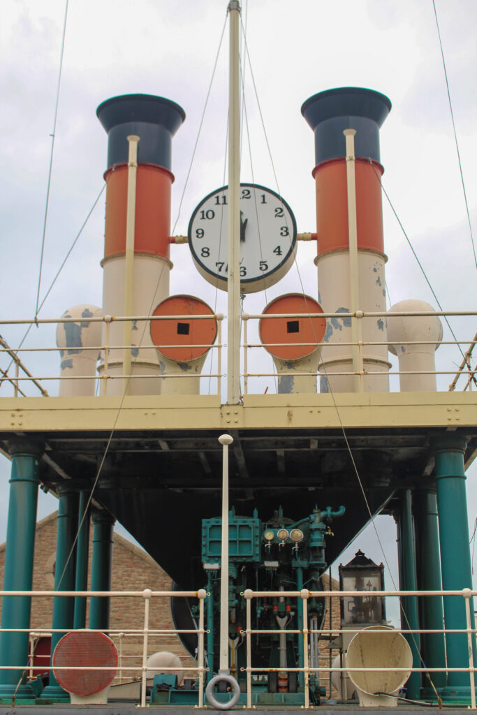
I also made a black and white copy of a similar image and increased the contrast, shadows and whites, while decreasing the highlights and blacks, so that I can create more contrast between the dark steam clock and the bright sky.
I edited this image by increasing the contrast, shadows, white, vibrancy and saturation, while decreasing the exposure, highlights and blacks. I did this, so the image would be more vibrant.
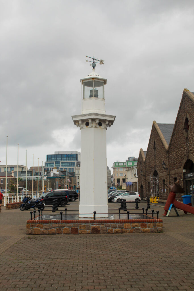
I edited this image by increasing the exposure, contrast, shadows, white, vibrancy and saturation, while decreasing the highlights and blacks. I did this, so the lighthouse would be a brighter white, instead of dull.
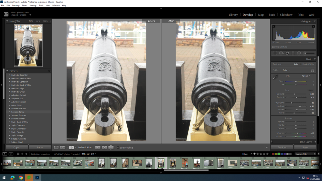
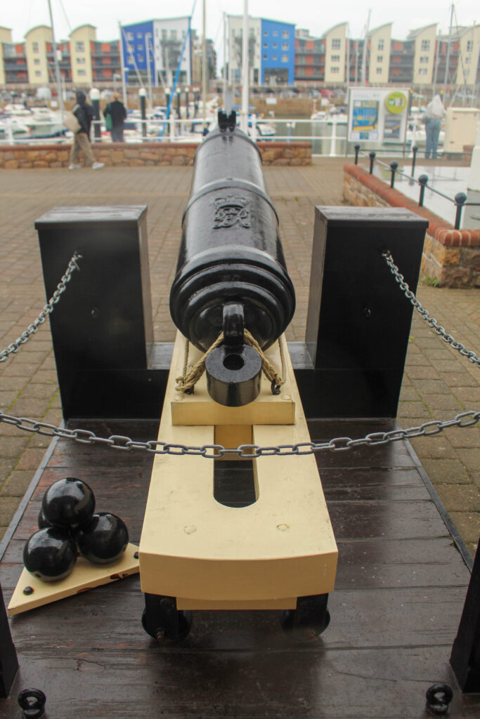
I edited this image by increasing the contrast, shadows, white and vibrancy, while decreasing the exposure, highlights and blacks. I did this, so the cannon was more visible.
I edited this image by increasing the contrast, shadows, white, vibrancy and saturation, while decreasing the exposure, highlights and blacks. I did this, so the image is more vibrant and saturated.
I edited this image by increasing the contrast, shadows, white and vibrancy, while decreasing the exposure, highlights and blacks. I did this, so that the writing in the image is more visible.
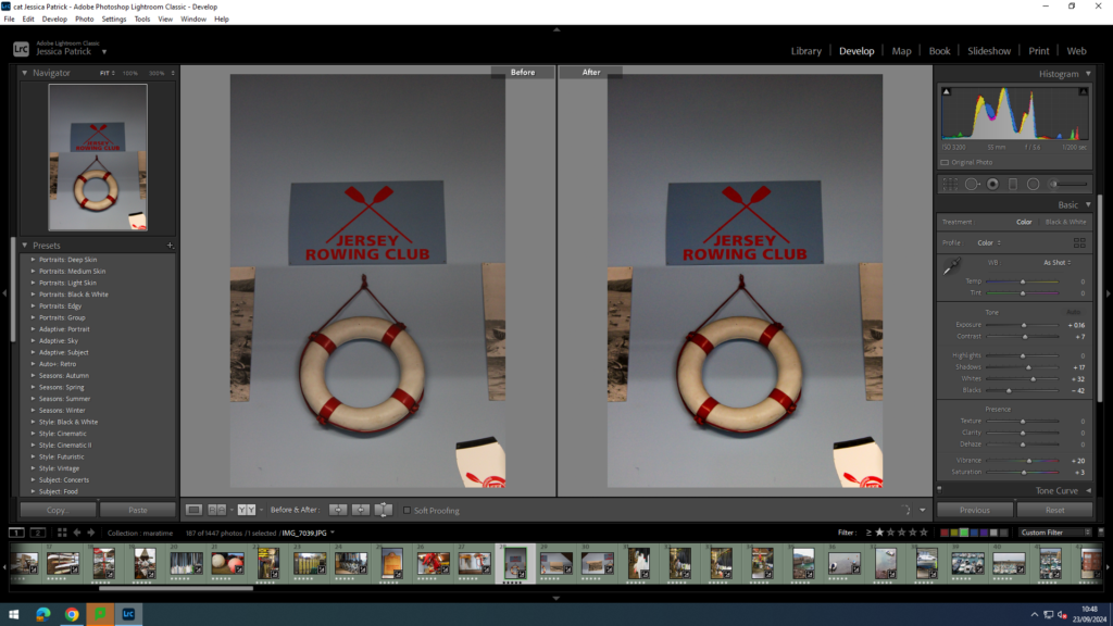
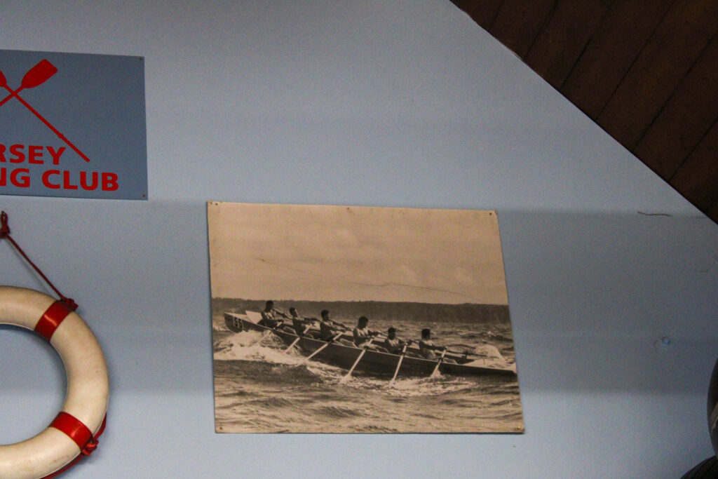
Jersey Rowing Club
The Jersey Rowing Club has a long and celebrated history dating back to the early 1960s and was officially founded in 1971 when the sport of rowing was growing fast in the Island because of the popularity of the Sark to Jersey Rowing race, which started in 1967.
The club is based in the Old Lifeboat Station at the bottom of Mount Bingham, where there is excellent boat storage facilities and direct access to the water.
The JRC runs a full race calendar of coastal and bay events ranging from 8-15km, to the great endurance races 27km Gorey to Carteret, the 26km Sark to Jersey and the 48km Round Jersey.
They have close relationships with both Guernsey and French rowing clubs and are looking to include both the Herm weekend and Cherbourg regatta into their future events calendar.
I edited this image by increasing the exposure, contrast, shadows, white, vibrancy and saturation, while decreasing the highlights and blacks. I did this, so the image is brighter and more vibrant.
I edited this image by increasing the exposure, contrast, shadows, white, vibrancy and saturation, while decreasing the highlights and blacks. I did this, so the boats are more saturated.
I edited this image by increasing the exposure, contrast, shadows, white, vibrancy and saturation, while decreasing the highlights and blacks. I did this, so that the ores and the blue background would be more vibrant and saturated.
I edited this image by increasing the exposure, contrast, shadows, white and vibrancy, while decreasing the highlights and blacks. I did this, so the image would be brighter and more vibrant.
I edited this image by increasing the exposure, contrast, shadows, white, vibrancy and saturation, while decreasing the highlights and blacks. I did this, so the image would be brighter.
I edited this image by increasing the exposure, contrast, shadows, white, vibrancy and saturation, while decreasing the highlights and blacks. I did this, so the image would be brighter.
I edited this image by increasing the exposure, contrast, shadows, white, vibrancy and saturation, while decreasing the highlights and blacks. I did this, so that the image would be brighter and more vibrant.
Then, I created a virtual copy and created a back and white version. I increased the contrast, highlights and whites, while decreasing the blacks and shadows, so that I could create more contrast and light and dark tones in the image.
I also took the same photo, but from further away. I edited this image by increasing the exposure, contrast, shadows, white, vibrancy and saturation, while decreasing the highlights and blacks. I did this, so the image was brighter and more vibrant.
Final Images of the rowing club
Final Images of Jersey Harbours
Evaluation
In conclusion I think this photoshoot went well, because I explored and captured all different areas and angles of the harbour. I was also able to obtain portraits at the rowing of Michelle, who is part of the rowing club. I think capturing portraits as well as landscapes really allowed me to explore all the different elements of the harbour.
I also think the editing of my images went well, because I was able to slightly adjust the images to make them more bold and vibrant. I was also able to experiment with creating black and white images, so I could create more cool tones and contrasting images. However, next time I would like to experiment with cropping and photoshop a bit more, because I ran out of time to experiment fully in this topic.
Analysis of top 3 images
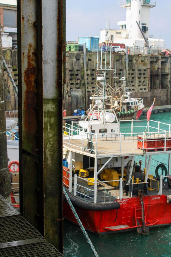
This boat is a boat that is docked at the harbour, next to the fish shop, where they keep all different types of fish, so they can later be sold and eaten by people. This fishing boat is used by the fisherman and they go out into sea and use the nets on the side of the boat to catch fish, crabs, lobsters etc.
Some people (vegetarians for example) may not appreciate this image, because they believe that capturing fish to kill them and eat them is morally wrong. However, I like to eat fish, so I appreciate this image, the boat and the work the fisherman do capturing these fish.
The type of lighting used in this image is natural lighting, because the image was taken outside in the daylight. I had no control over the composition, or the layout of the boat, or the upward angle of this image, because we could not go lower onto the deck, so had to take this image from above. However, I did have control over my distance from the boat, because I could move left or right along the top deck. However, I quite like the upward angle, looking down onto the boat, because it allows everything that is on the boat to be visible.
Camera Settings:
F stop- f/5.6
Exposure- 1/200secs
ISO- ISO-100
This image is quite saturated and contains both warm (yellow) and cool (blue/green water) tones. This image also contains a few red/ rust colours, which compliment the green water very well and create harmony in the image, as they are complimentary colours. There are also light and dark tones, which create contrast in this image, as the deck of the boat is dark and the yellow colour contains more light. There are also lots of visible textures on this boat, including the rough fishing nets hanging over the side of the boat. The vibrant, saturated colours in this image lead the eye to the boat, causing it to be the main viewpoint of this image.
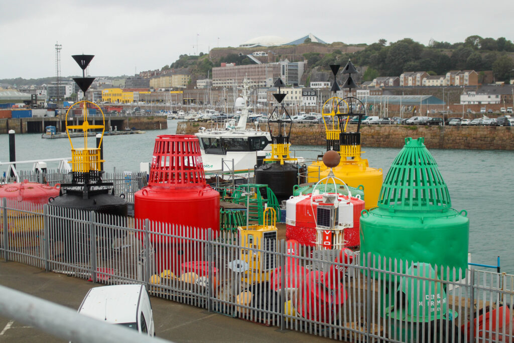
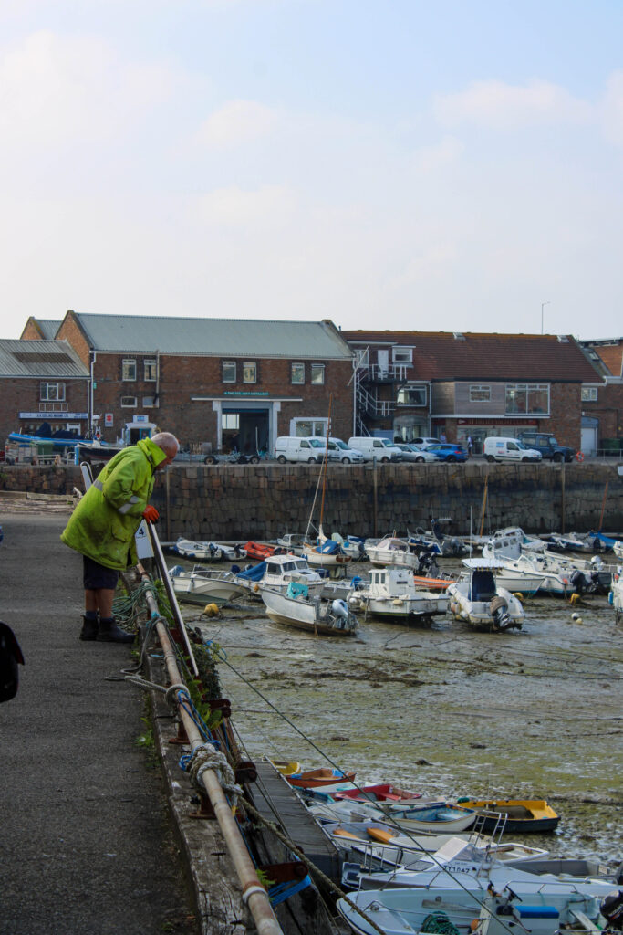
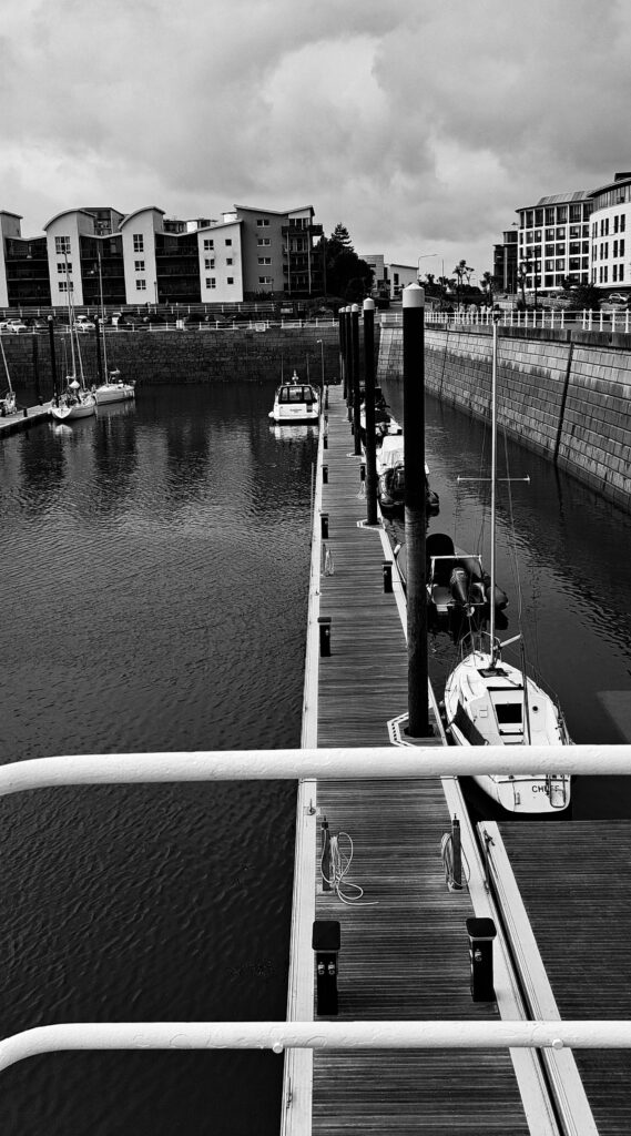
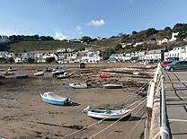
This image is of boats docked at the harbour, while the sea is out, so they are rested on the muddy, wet ground. Jersey citizens own these boats and pay money to dock them at this harbour. They may use these boats to go fishing, live on, or just to go out on a nice Summer’s day.
The type of lighting used in this image is natural lighting, because the image was taken outside in the daylight. I had no control over the composition, or the layout of the boats, because I could not manipulate the position and layout of these boats in the foreground. However, I could manipulate the angle of this image, because I was able to move left to right along the side of the harbour when taking this image. I could also manipulate the distance I was from the boats, because I was able to zoom in and out on my camera. I also like the angle and distance of these boats.
Camera settings
F stop- f/10
Exposure- 1/200secs
ISO- ISO-100
This image is in black and white, so is vey cool toned. It also has lots of light and dark tones throughout it, as there are lots of different shades of grey running through the image. There are lots of patterns of repetitive shapes throughout the image and lots of repetitive forms, because of the pattern that the boats present, because the boats are laid out exactly the same next to each other and are very similar looking boats. This gives the image a good composition and layout within the frame. The boats in the foreground are the main viewpoint in this image, but I think the sea in the distance in the background keeps the image more exciting and less boring.
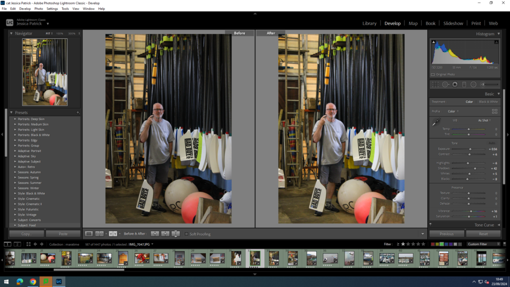
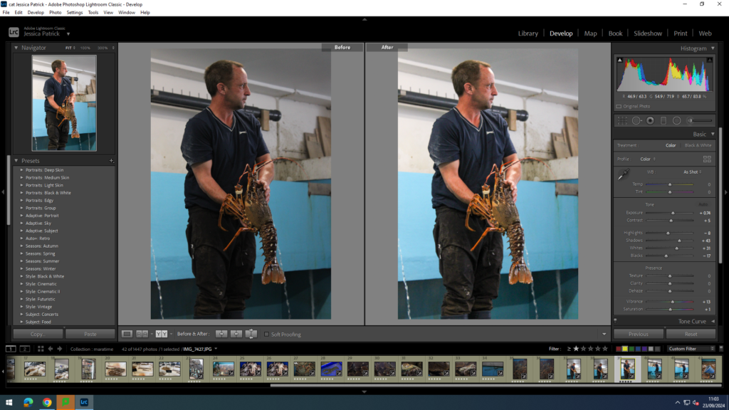
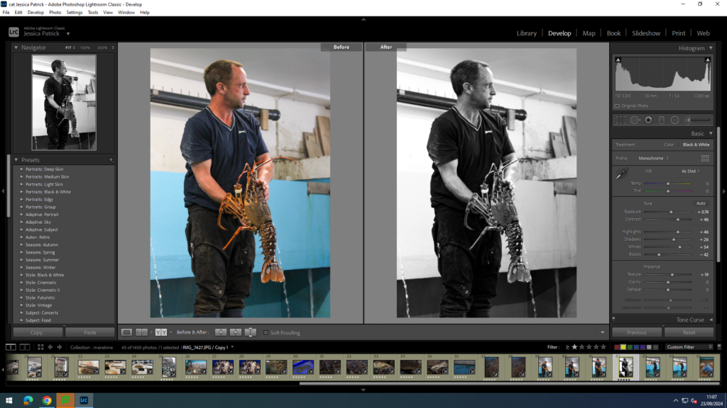
This image is of Michelle, who is apart of the Jersey Rowing Club, which is a club of rowers, who take part in competitions across the Channel Islands and France. The location of the image is at St Helier Harbour, in there stock room (where they keep all their equipment eg ores).
The lighting used in this image is artificial lighting, because this image was taken inside. I had complete control over Michelle and some of the equipment in this portrait, so I asked Michelle to hold an ore and stand next to the other ores. I also had control over the distance I stood from him and I could zoom in and out on my camera.
Camera Settings
F stop- f/4.5
Exposure- 1/200secs
ISO- ISO-3200
There are many different colours in this image, including pink, blue, brown, green, orange, yellow etc, but the main colour in this image is white, which is very bright and vibrant, while the other colours are also vibrant and saturated. There are mainly light tones in this image, because the colours are so saturated and the white is so bright. The row of ores also create a repetitive pattern in the image, with a leading line, which leads the viewers eyes to the main viewpoint of the image, which is Michelle, who is stood more in the background. This creates a sense of depth in the image.
This photoshoot took place around St Helier Marina, pier road, the Old Harbour, Albert Pier, and the English and French Harbours.
Analysis
Overall I think this photoshoot went well. I managed to capture detailed images of various architecture and a few people at work, as well as various areas of the marina like Albert Pier.
However, I wish I had taken a few more images of the harbour and people at work in order to further develop my ideas and give me a larger variety to work with to tell my story.
I chose to analyse these two images because they show my experimentation with different camera angles, such as deadpan, as well as link well with the theme of modern advancements of the harbour. Both images were taken with natural lighting from the sun in the same weather conditions. Both of them show a range of tones, the architecture in the images is almost completely black compared to the almost white clouds which creates a nice contrast and allows each subject to stand out.
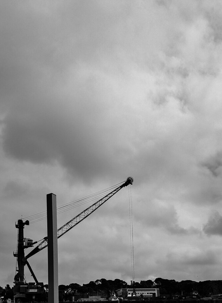
I have related back to one of my inspirations, Ansel Adams, because his work is very dramatic and tells some sort of a story. His work also consists of very detailed and textured images. I wanted to incorporate these elements into my own work because I feel it links back with how drastically the harbour has changed over the years due to modern advancements.
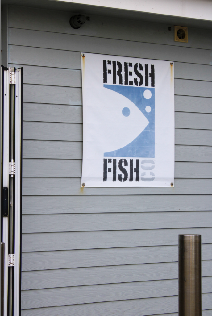
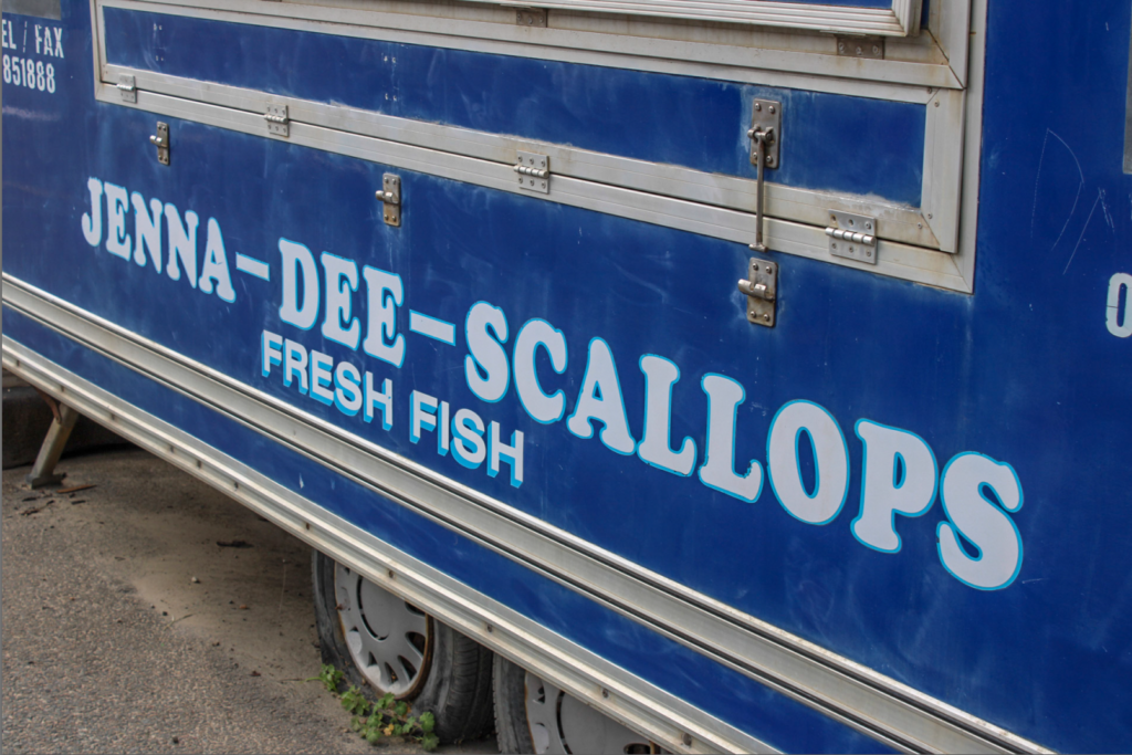
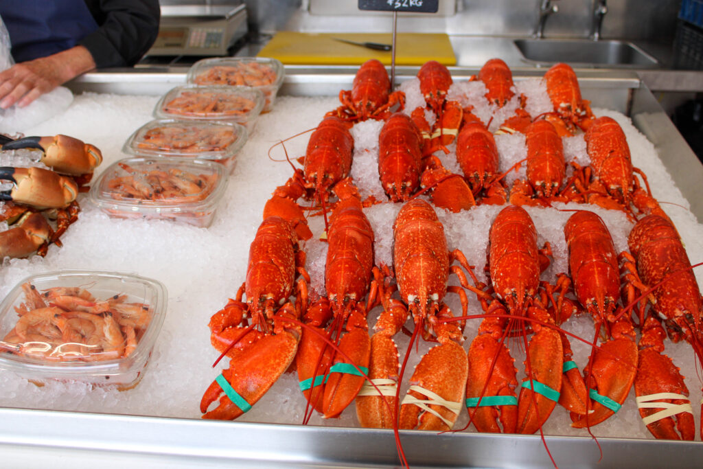
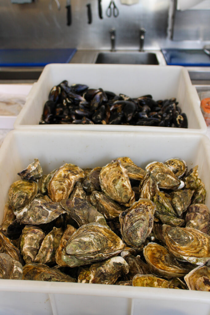
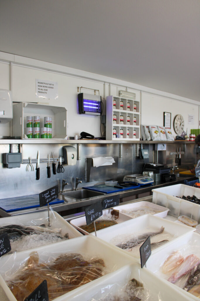
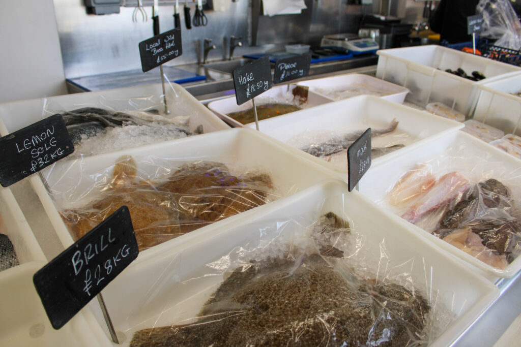
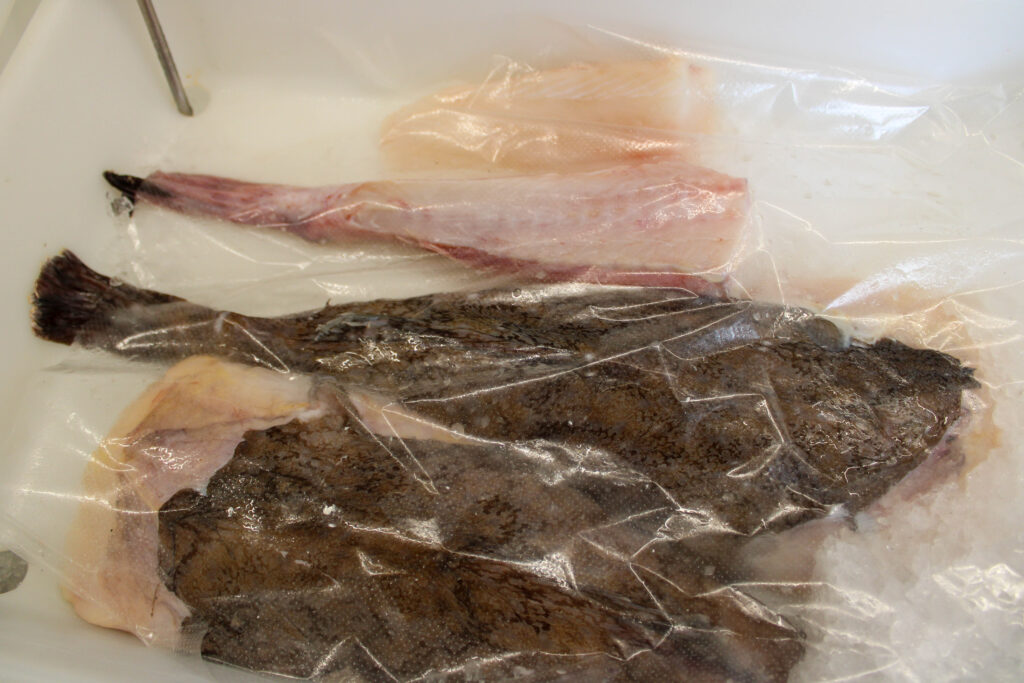
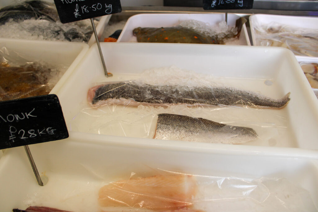
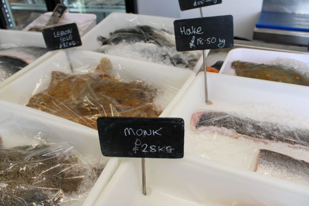
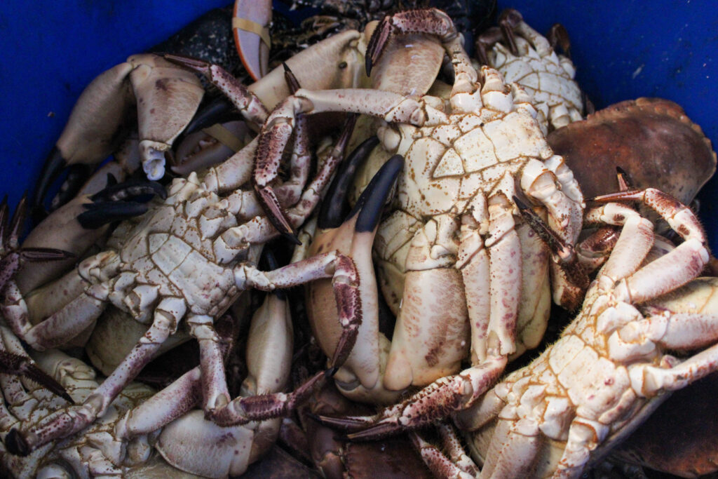
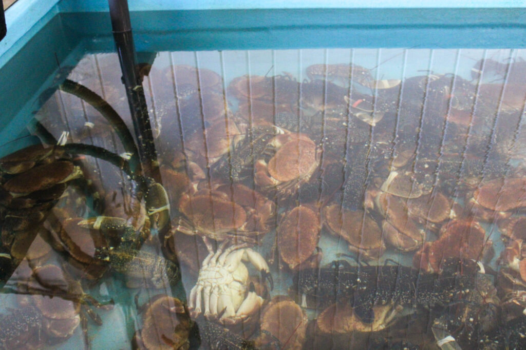
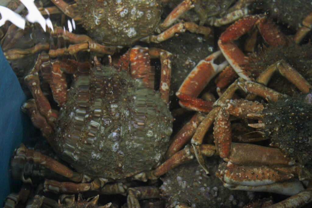
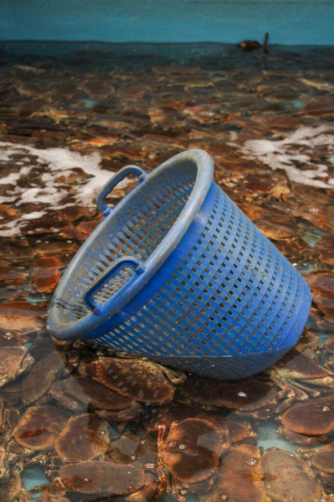
We explored Jersey 3 marinas and along the harbours in St Helier, taking images of boats, harbours, cranes, tools, equipment, people working, fresh fish and more. We explored multiple fish places. Either where they sell fresh fish, like Fresh Fish Co and Jenna-Dee-Scallops. We also explored Aquamar, where they captured and held crabs, lobsters and cray fish and more.
The fish were captured at the harbour, or out at sea and held at Aquamar. They are then sold at Fresh Fish Co and Jenna-Dee-Scallops.
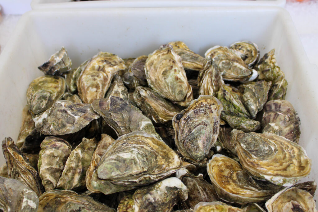
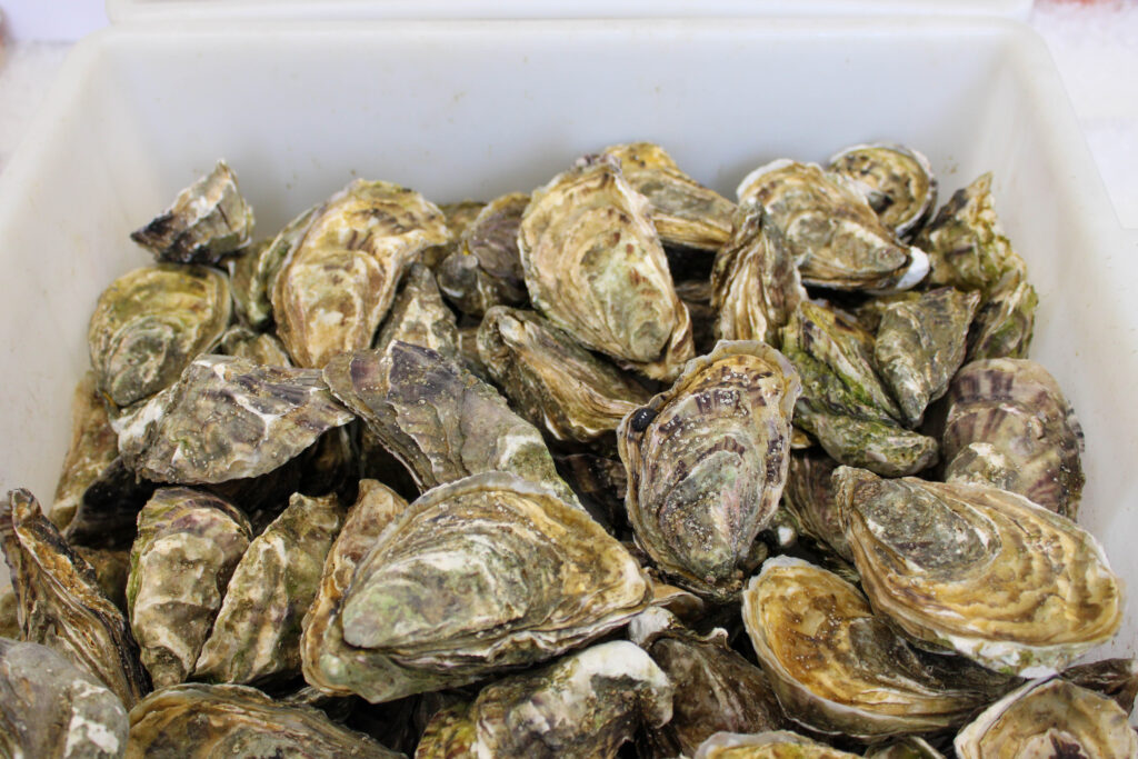
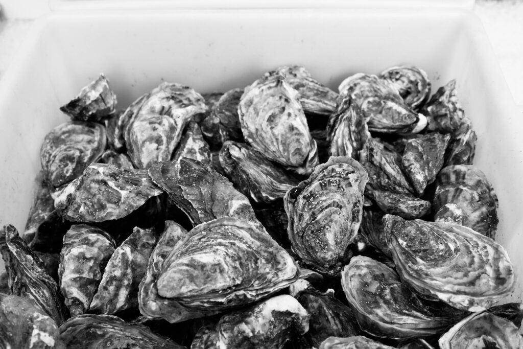
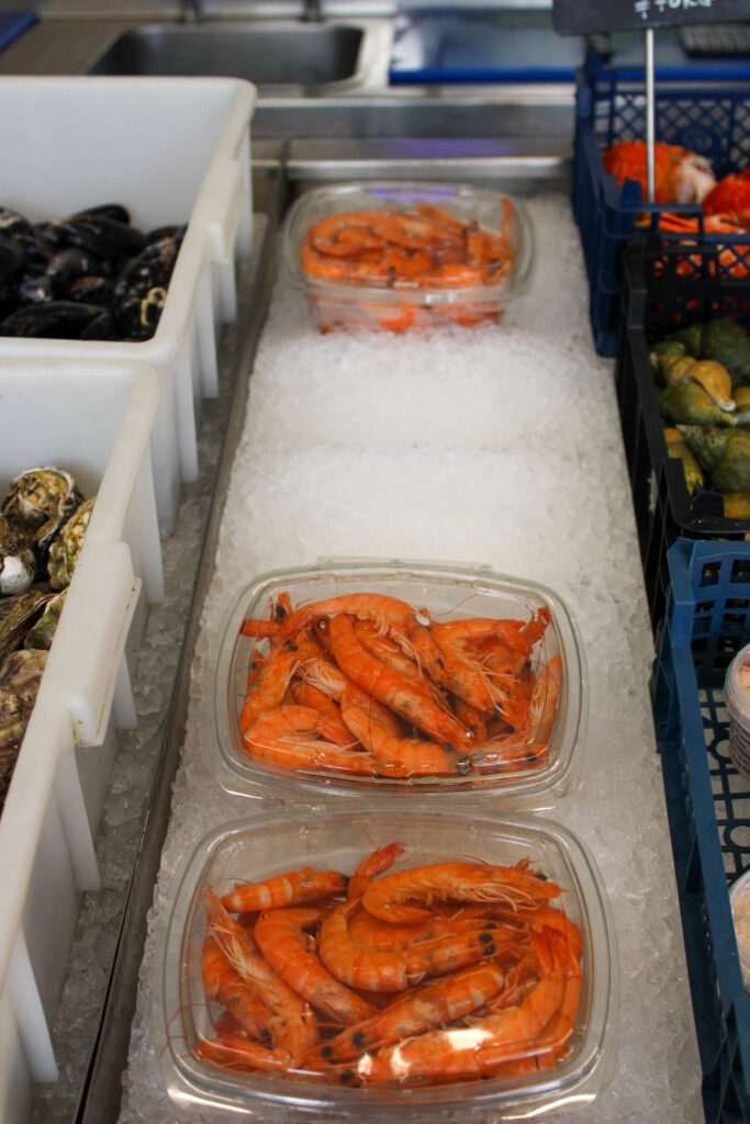
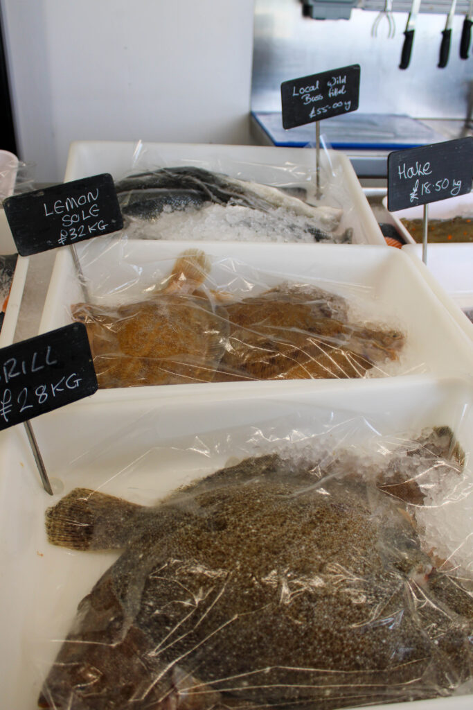
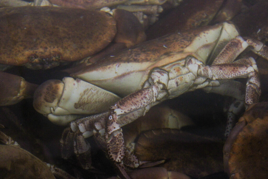
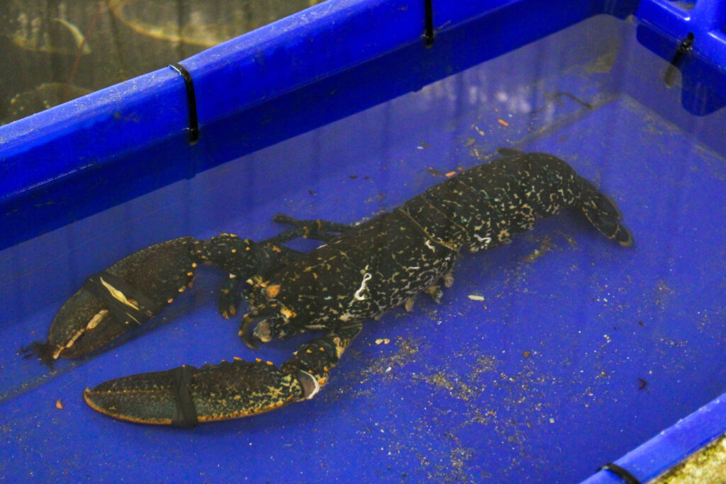
They sold many different types of fresh fish, such as many different types of crabs, including spider crabs etc, prawns, lobsters, cod, oysters etc.
Contact Sheet
The images which are highlighted yellow are the images I have chosen to edit from this photoshoot. I have chosen these images, because they have the best composition and are my best images.
Edits
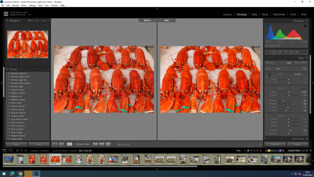
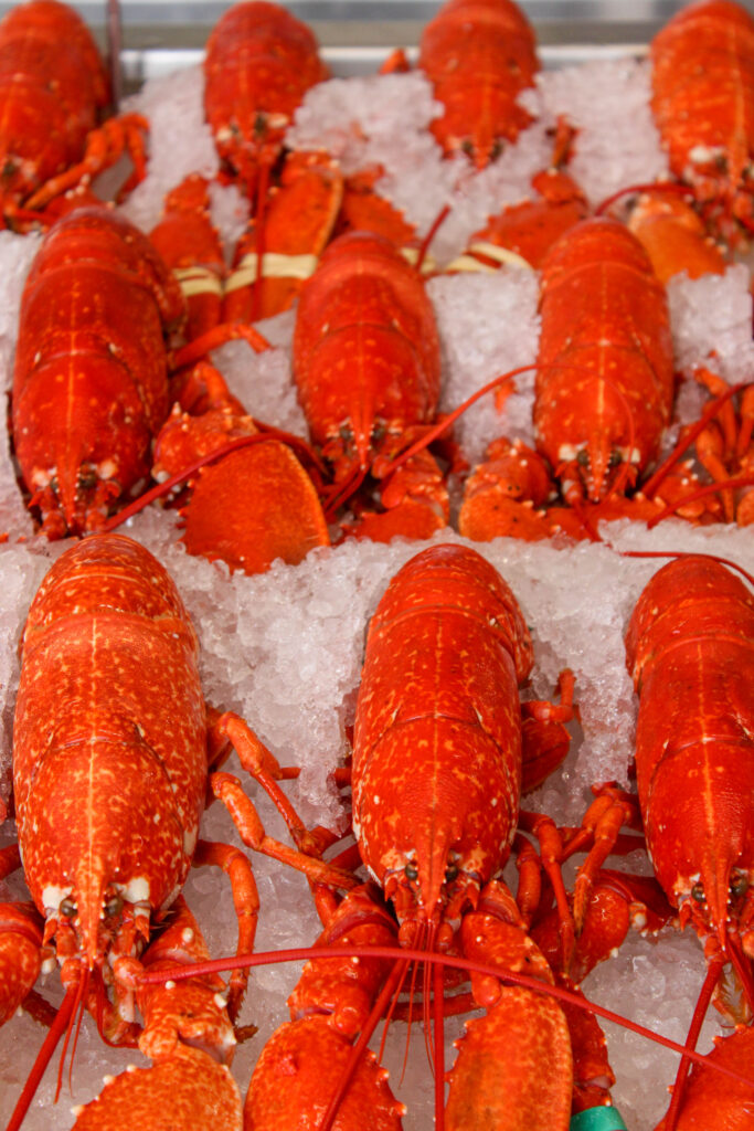
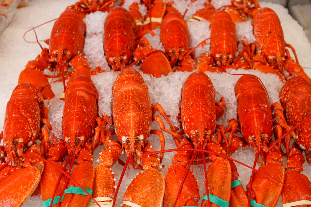
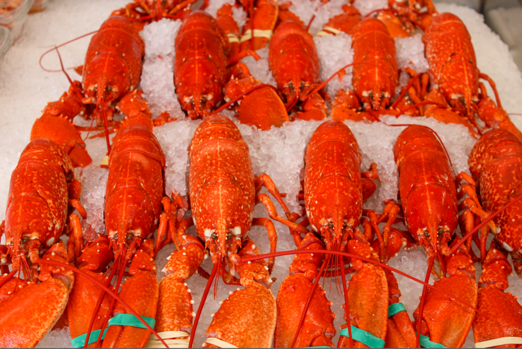
I edited this image by increasing the exposure, contrast, shadows and vibrancy, while decreasing the highlights, whites and blacks. I did this, so that the orange/red colour of the lobsters would be more vibrant and pop out more.
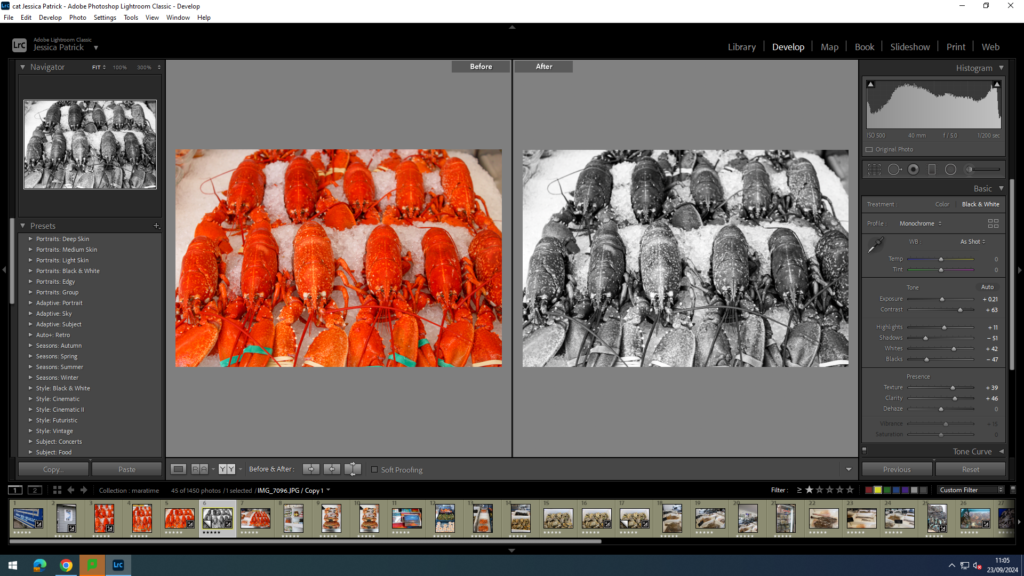
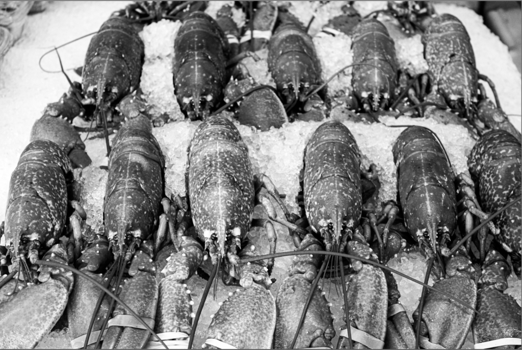
Then, I made a virtual copy of the edited image and created a black and white copy and increased the contrast, highlights and whites, while decreasing the blacks and shadows, so that the image would have a much higher contrast and more shades of grey throughout. I also did this so the texture of the lobsters would stand out more.
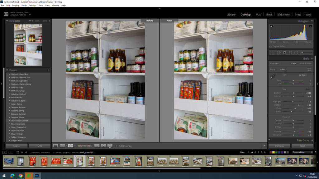
I edited this image by increasing the exposure, contrast, shadows, vibrancy, saturation and whites, while decreasing the highlights and blacks. I did this, so that the image was brighter and the items on the shelves were more saturated and vibrant, especially against the white background. I also wanted the background to be more of a pure white.
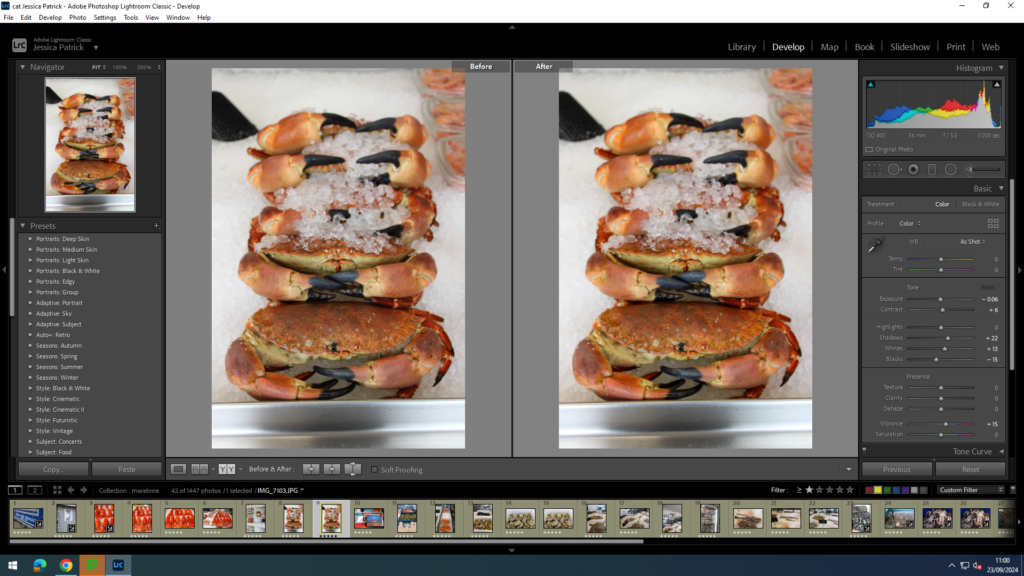
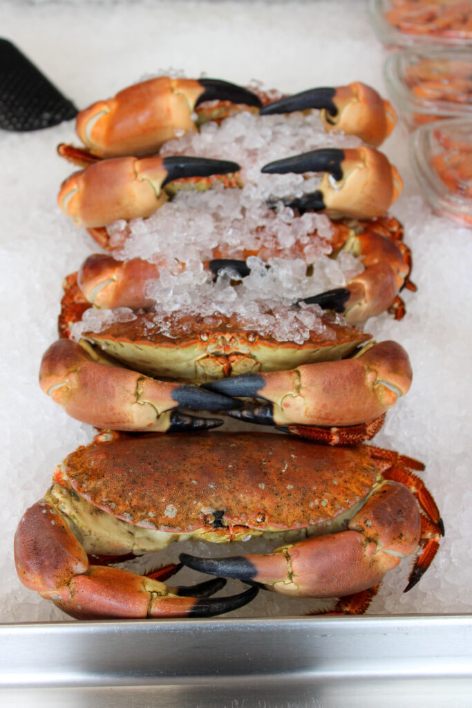
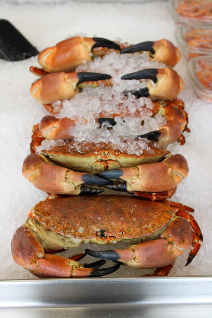
I edited this image by increasing the contrast, shadows, whites and vibrancy, while decreasing the highlights, exposure and blacks. I did this, so that the crab was slightly more vibrant and stood out more against the white ice background.
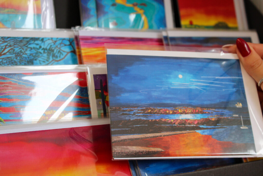
I edited this image by increasing the exposure, contrast, shadows, whites, saturation and vibrancy, while decreasing the highlights and blacks. I did this, so that the post cards of the harbour, which were already very colourful, were even more vibrant and beautiful.
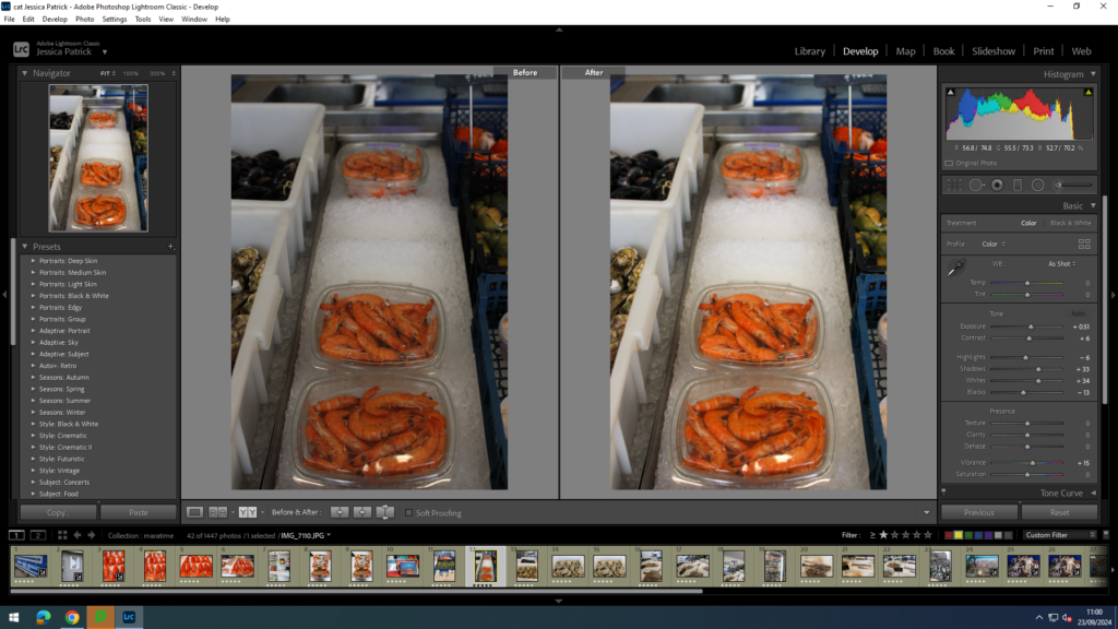
I edited this image by increasing the exposure, contrast, shadows, whites and vibrancy, while decreasing the highlights and blacks. I did this, so that the image was brighter, because I thought it looked a bit dark and the so the prawns in this image were more vibrant and stood out more.
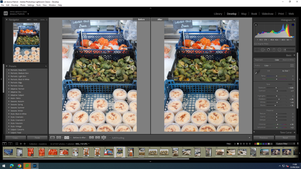
I edited this image by increasing the contrast, shadows, white, saturation and vibrancy, while decreasing the highlights, exposure and blacks. I did this, so that all the different colours in this image pop. I also like this image, because the orange and green in this image contrast and compliment each other well, as they are almost directly opposite each other on the colour wheel.
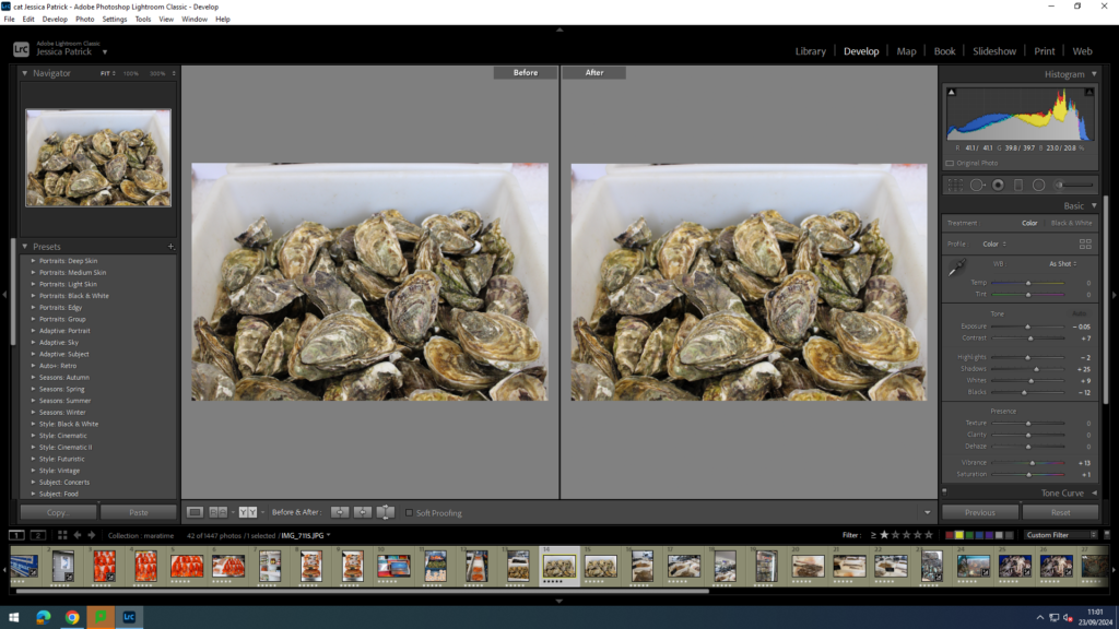
I edited this image by increasing the contrast, shadows, whites, saturation and vibrancy, while decreasing the highlights, exposure and blacks. I did this, so that the different colours within the shell stood out and contrasted each other more, and so the texture of the shells were more visible.
Then, I created a virtual copy of the edited image and increased the contrast to 100%. I did this, so that the texture of the shells stood out even more.
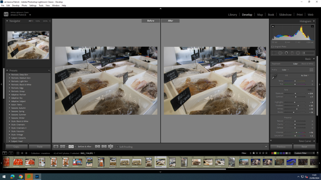
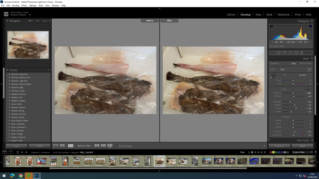
I edited these images by increasing the exposure, contrast, shadows, whites, saturation and vibrancy, while decreasing the highlights and blacks. I did this, so that the images were slightly brighter and more vibrant, so it was more visible, as so the texture of the fish were also more visible.
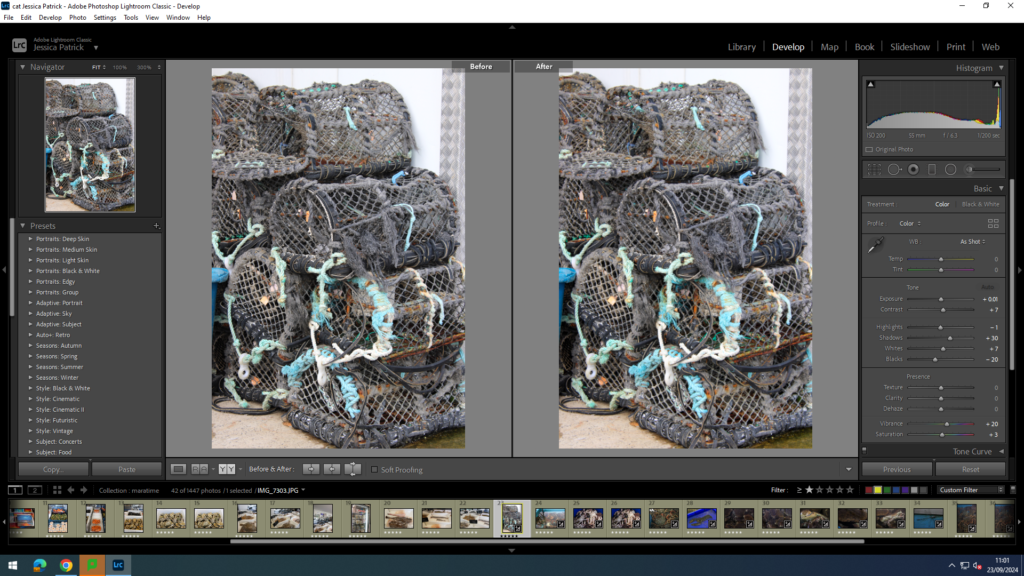
I edited this image by increasing the contrast, exposure, whites, shadows, saturation and vibrancy, while decreasing the highlights and blacks. I did this, so that the texture of the cages were more visible, and so the blue fishing wire would be more vibrant and a pop of colour.
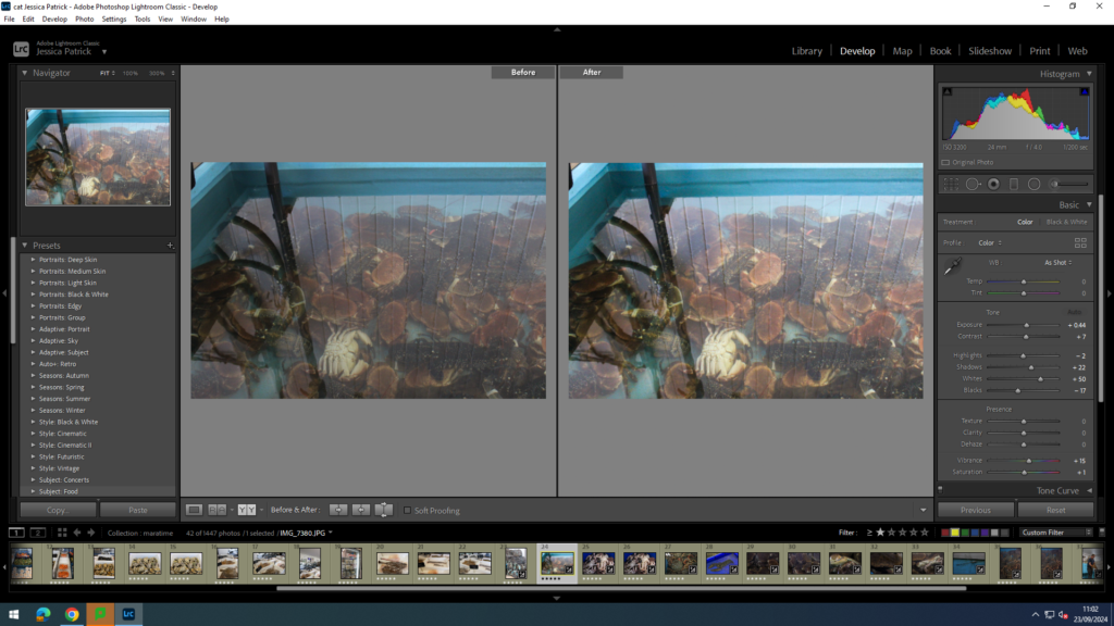
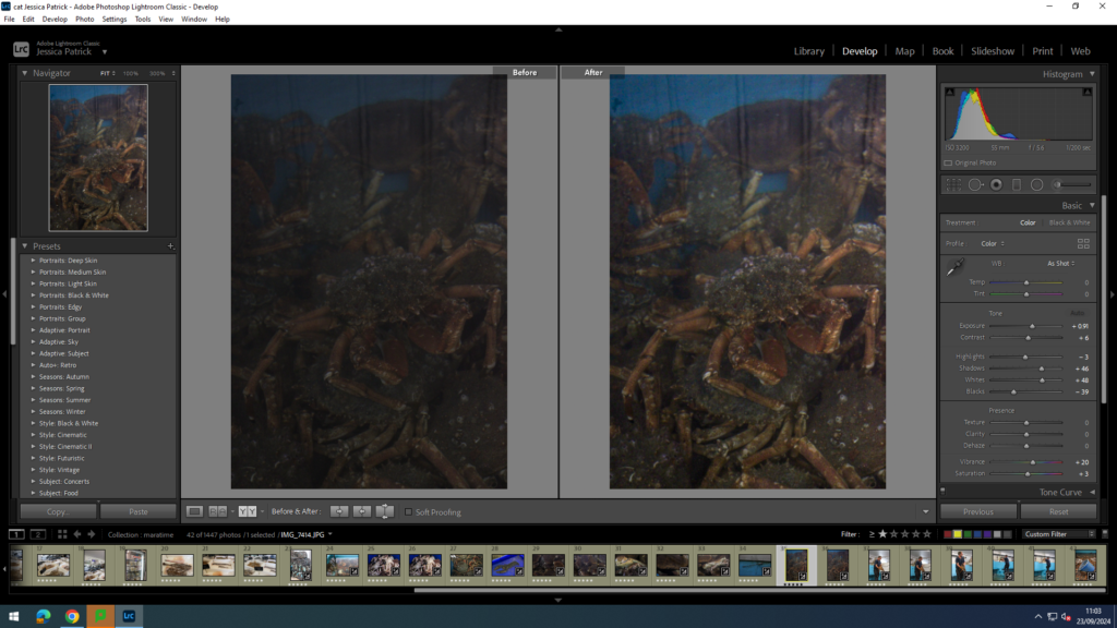
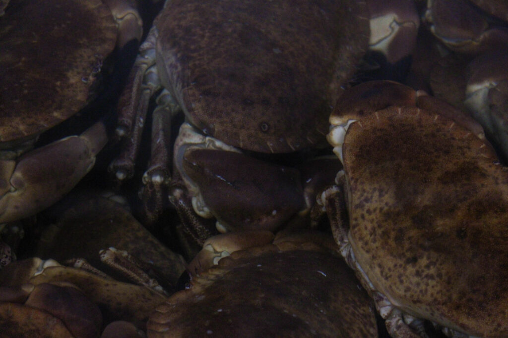
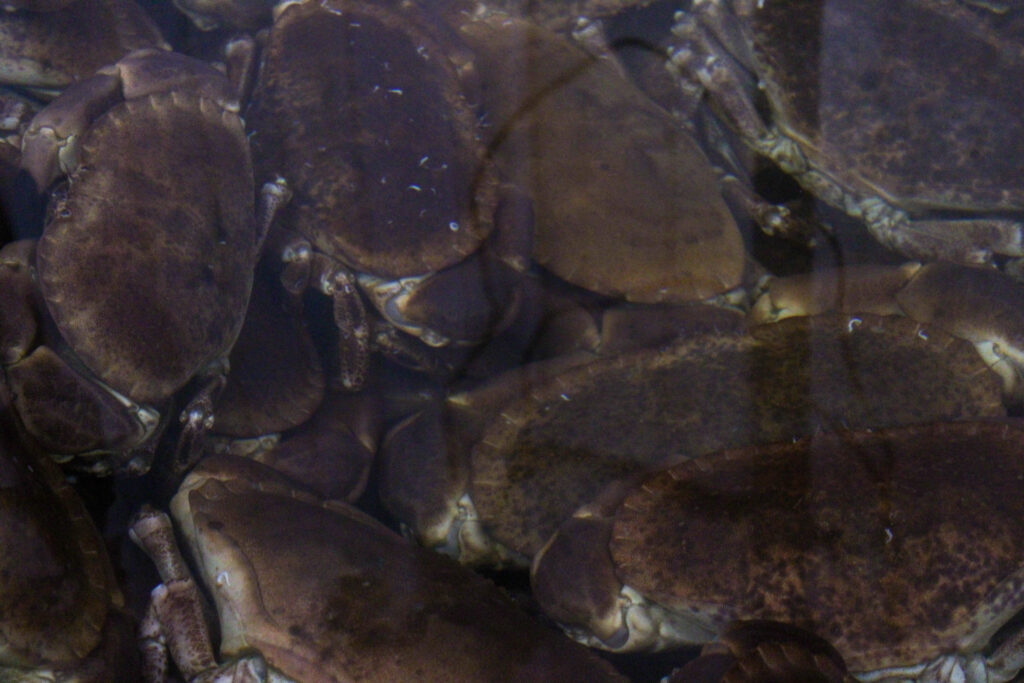
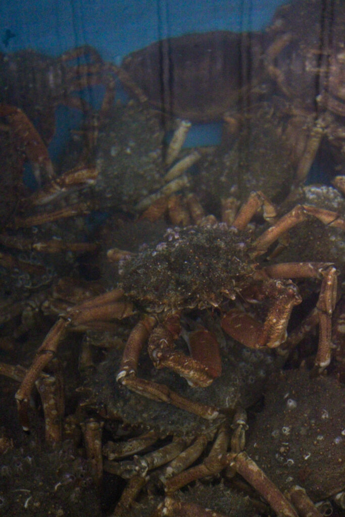
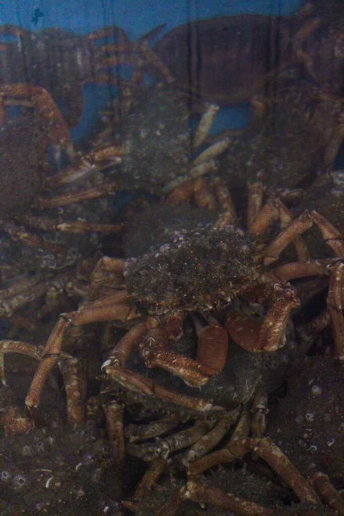
I edited this image by increasing the contrast, exposure, whites, shadows, saturation and vibrancy, while decreasing the highlights and blacks. I did this, so that the image was brighter, so that the crabs can be seen much more clearly through the water.
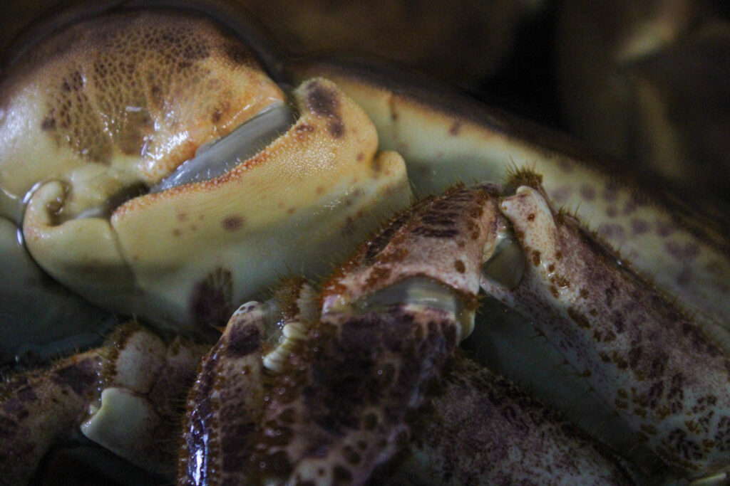
I edited this image by increasing the contrast, exposure, whites, shadows, saturation and vibrancy, while decreasing the highlights and blacks. I did this, so that the crabs under belly was brighter and more white, so that they stood out more, and so the texture is more visible.
I edited this image by increasing the contrast, exposure, shadows, saturation and vibrancy, while decreasing the highlight, whites and blacks. I did this, so that the image is brighter, so the crabs are more vibrant and more visible through the water.
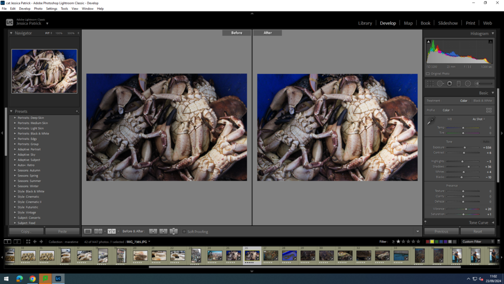
I edited this image by increasing the contrast, exposure, whites, shadows, saturation and vibrancy, while decreasing the highlights and blacks. I did this, so that the lobster was more vibrant, along with the bright blue container.
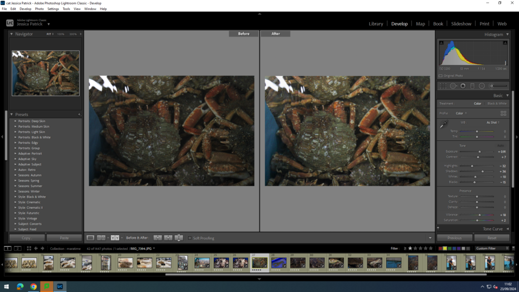
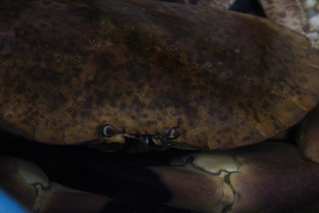
I edited this image by increasing the contrast, exposure, shadows, saturation and vibrancy, while decreasing the whites, highlights and blacks. I did this, so the image was brighter, because it was a very dark picture. I also wanted the crab and his eyes to be more visible.
I edited this image by increasing the contrast, exposure, whites, shadows, saturation and vibrancy, while decreasing the highlights and blacks. I did this, so that the image was brighter, so the crabs were more vibrant and visible.
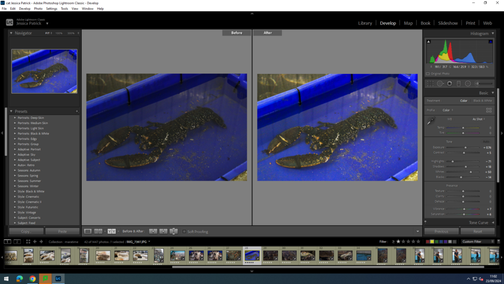
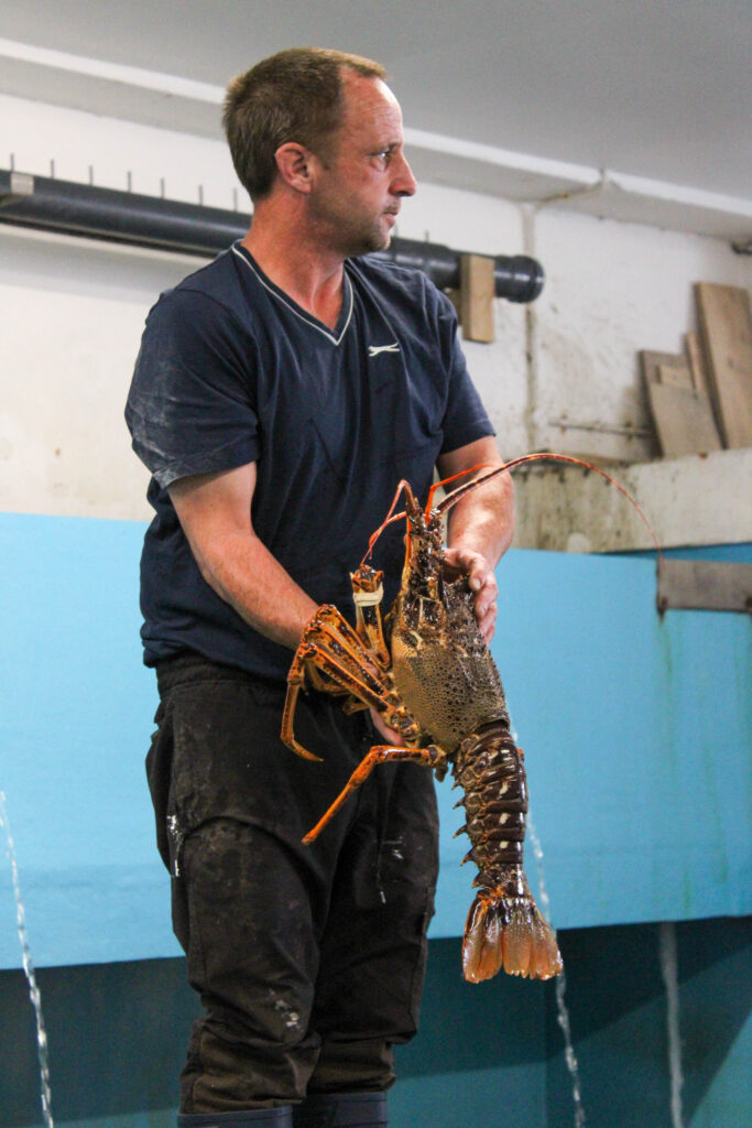
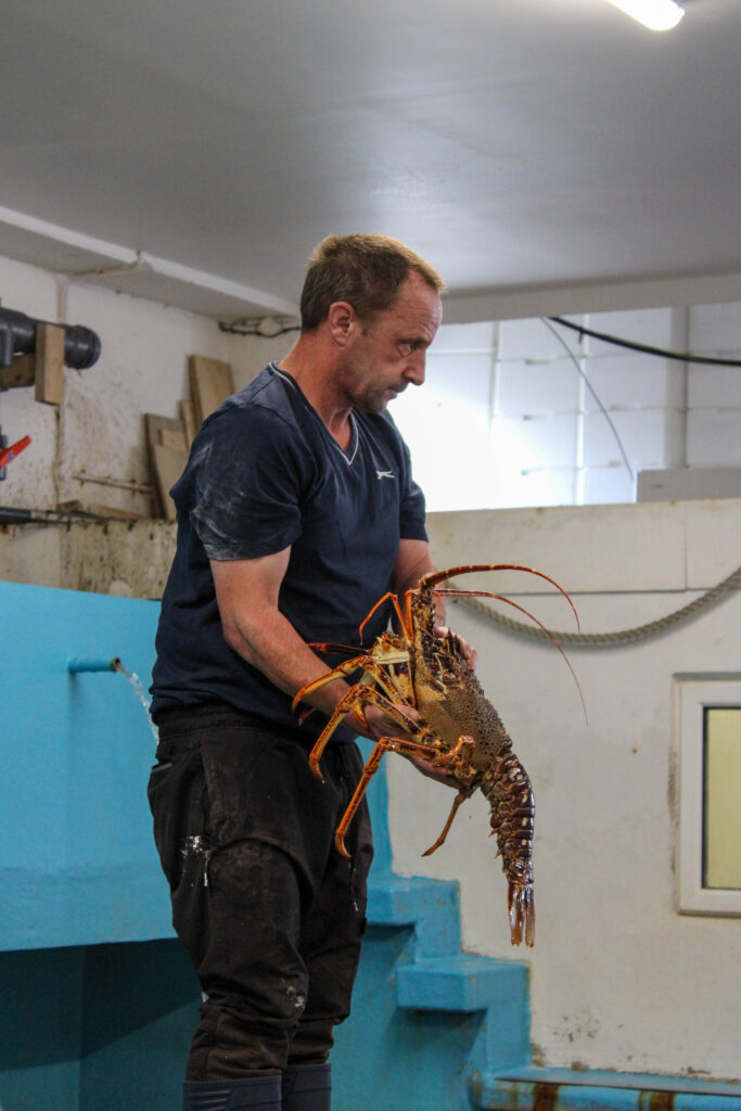
I edited this image by increasing the contrast, exposure, whites, shadows, saturation and vibrancy, while decreasing the highlights and blacks. I did this, so that the whole image was brighter and more vibrant, so it would look less dull. I also wanted the cray fish to be much more vibrant, so it can stand out much more.
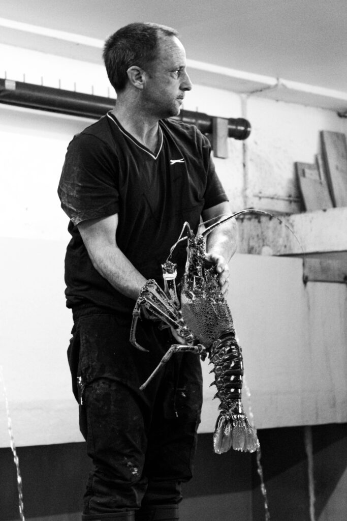
Next, I created a virtual copy of the edited image and created a black and white version. Then, I increased the highlights, contrast, whites, shadows and decreased the blacks, so that the image had many shades of grey running through it, so there was more of a contrast. I also increased the texture in this image, so that the textures and patterns on the cray fish’s back were more prominent.
I edited this image by increasing the contrast, exposure, whites, shadows, saturation and vibrancy, while decreasing the highlights and blacks. I did this, so the crabs and the blue bucket would be more vibrant and brighter, so that the picture would be less dull.
Final Images
Evaluation
In conclusion, I think this photoshoot went well, because I was able to capture the fresh fish, which is one of the main things the harbour is used for. I thought this photoshoot represented the harbour well, because fishing goes on here, there are fishing boats, fishermen and people selling and salting the fresh fish. I was also able to capture a man at work, with the still alive shellfish. I explored and captured how they stored these shellfish and watched and captured them at work.
I also thought I edited these images well, using coloured images as well as black and white images. I was able to manipulate the lights, darks, contrast, vibrancy, saturation and more, so I can improve my images. However, next time I would like to have spent more time experimenting with photoshop and cropping some of my images. I also thought the composition of my images was quite good, as I used different angles and had centred images, along with non-centred images, but I could have experimented more with cropping to improve them even more.
I also like how I managed to capture similar images, or images that can be presented together in either pairs or a triage or more. I think this really improved the presentation of my final images.
Analysis
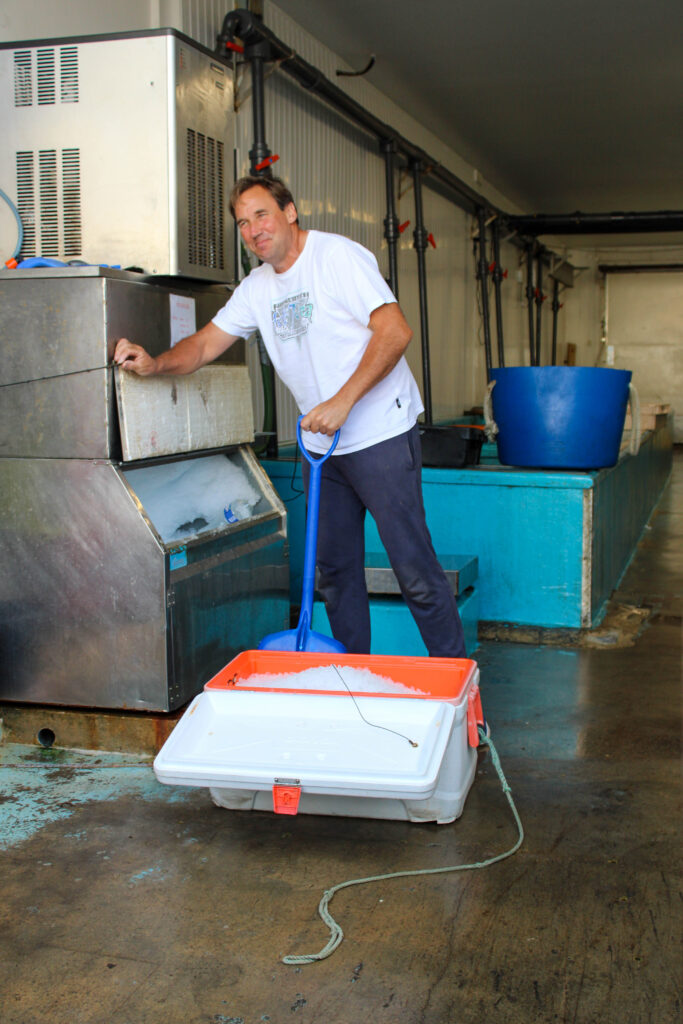
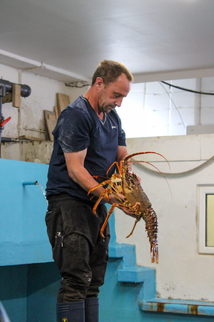
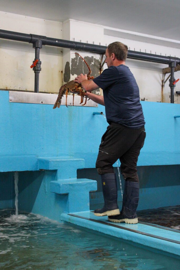
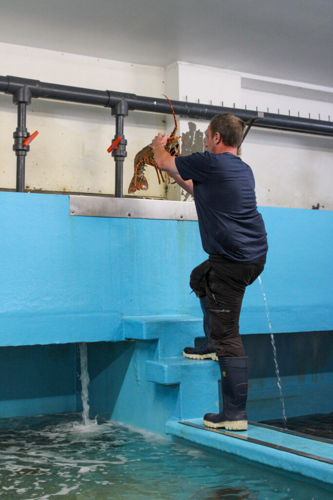
This image is of a man at work at the harbour. He is a fisherman, who catches live crab, lobsters etc. and keeps them in this building, which we are currently in, which has lots of pools of sea water inside, which is where these live animals are kept, until they are killed for us to eat.
This image may upset certain people, such as vegetarians, because they do not believe in the slaughtering of animals just for us humans to eat, because they believe it is cruel. Personally, I eat fish and meat.
In this image I used artificial lighting, because we were inside a building. I had no control over the position of the man at work, or the location of the photo, because it was just an opportunity photo, so nothing was manipulated by me. However, I did have control over the distance and position I was from the man, because I was able to move around to take my images, and I was able to zoom in and out on my camera.
Camera settings:
F stop: f/9
Exposure: 1/200 seconds
ISO speed: ISO 100
This image is in black and white, so is cool toned and has lots of different shades of grey running through it. It also contains lots of light and dark tones, due to the different shades of grey running through the image. This has also created lots of contrast in the image, between all the lighter and darker tones. You can also see some texture in this image, on the crayfish, because you can see the roughness and the lumps and bumps on the back and legs of the crayfish.
The main focus point of this image is mainly the crayfish, but also the man holding it, because I wanted to capture the man at work as well. The main focus point of this image is centred in the frame and there is not a lot of negative space around him, because I zoomed in with my camera, so I was able to crop most of it out.
This is an image of dead fresh lobsters that are being kept cool on ice in a small little shop at the harbour, so they are ready to sell to people to eat.
This image may upset certain people, such as vegetarians, because they do not believe in the slaughtering of animals just for us humans to eat, because they believe it is cruel. Personally, I eat fish and meat.
In this image there is artificial light, because we were inside a little shop, but there was also natural lighting coming through into this image, because of the large open doors and windows at the front of the shop. I had no control over the positioning of the lobsters, because they were in this position when we found them, and I was not able to touch them to manipulate their position. However, I liked the position they were in. Even though I could not be in control of their positioning, I was in control of where I stood and how zoomed in or out my camera was.
Camera settings:
F stop: f
Exposure:
ISO speed:
This image is a coloured image, which is very warmed toned, because of the colours of the lobsters. The lobsters are quite vibrant and saturated, so they are quite bright. This image also includes light and dark tones, but mainly light tones, due to the ice that the lobsters are rested on. This image also includes lots of texture, because I was able to capture the lumps and bumps on the lobsters backs and claws. There is also a 3d distinct shape in this image, because all the lobsters are such similar shapes, so it looks very repetitive.
The layout/ composition of the lobsters in this image is also very repetitive, because they are all laid out in exactly the same way next to each other, which creates a visual element of organisation. However, I do think I could have improved the image by cropping it and having them more centre in the frame, so I can crop out some of the negative space on the left hand side of the frame.
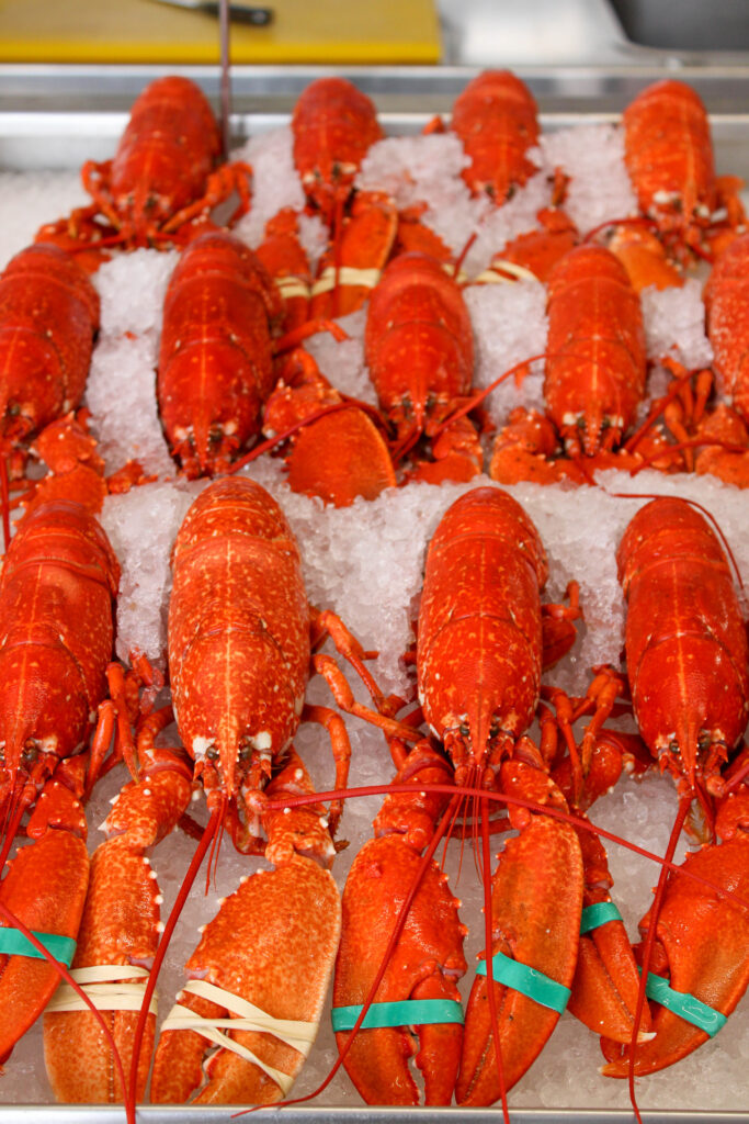
This is an image of dead fresh lobsters that are being kept cool on ice in a small little shop at the harbour, so they are ready to sell to people to eat.
This image may upset certain people, such as vegetarians, because they do not believe in the slaughtering of animals just for us humans to eat, because they believe it is cruel. Personally, I eat fish and meat.
In this image there is artificial light, because we were inside a little shop, but there was also natural lighting coming through into this image, because of the large open doors and windows at the front of the shop. I had no control over the positioning of the lobsters, because they were in this position when we found them, and I was not able to touch them to manipulate their position. However, I liked the position they were in. Even though I could not be in control of their positioning, I was in control of where I stood and how zoomed in or out my camera was.
Camera settings:
F stop: f
Exposure:
ISO speed:
This image is in black and white, so is cool toned and has lots of different shades of grey running through it. It also contains lots of light and dark tones, due to the different shades of grey running through the image. This has also created lots of contrast in the image, between all the lighter and darker tones. You can also see some texture in this image on the back of the lobsters and on their claws. There is also a 3d distinct shape in this image, because all the lobsters are such similar shapes, so it looks very repetitive.
The layout/ composition of the lobsters in this image is also very repetitive, because they are all laid out in exactly the same way next to each other, which creates a visual element of organisation. However, I do think I could have improved the image by cropping it and having them more centre in the frame, so I can crop out some of the negative space on the left hand side of the frame.
I wasn’t able to make this trip so therefore my options for images was very limited, but I was still able to edit some too incorporate within my zine.
Selected and Edited Images
Reasoning
I chose these photos because I think they fit into the historical element of my storyline about trade. I have edited them to be black and white to give off more of that old school historic vibe. When people see images in black and white they get an instant feeling that the image itself is old, due to everything now being in colour. I think that having these images at the start of my zine will create and old timey feeling allowing for development to shift the motif to modernism.
At the maritime museum and along the harbour I took a total of 554 images and I flagged it down to 152 of the best images I took.
After I went through the images I flagged as my favourite I then narrowed it down again and then selected the ones that I will edit and coloured them green.
Final Edits
I have chosen to group these images because they go together well as they all have boats and the sea in each of their images. I chose to edit these in black and white because they look older, especially the first one where the boats are propped on wooden beams. The last and biggest image is of three boats with buildings in the background. The perspective is like your at sea looking onto land which I liked compared to my other images where it looks like you are on land looking out to sea.
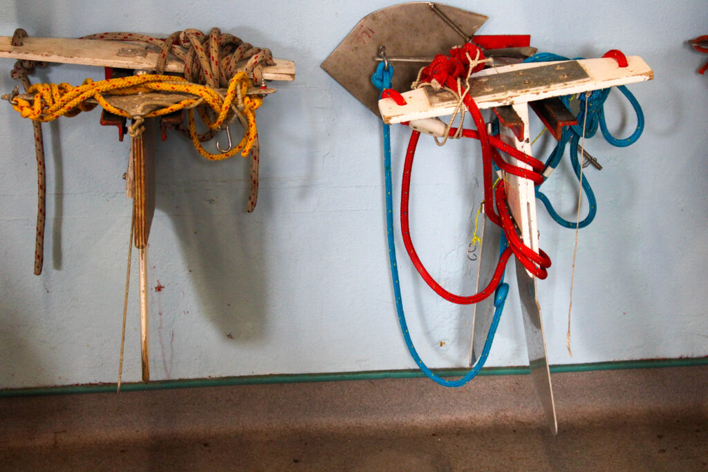
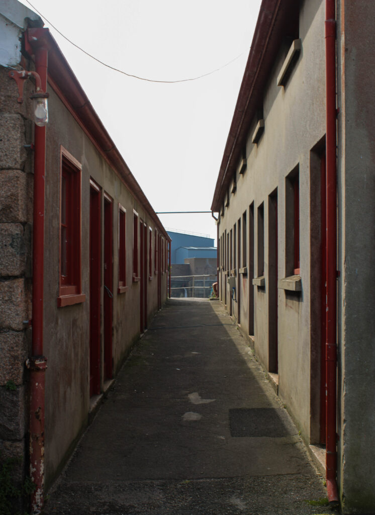
In these images are the lockers for fishermen. The first image was taken in the French harbour and the other two of these are taken nearer at the English harbour. I decided to keep these in colour as I liked the way the red looked with the original rusty colour of the area.
These images are the same as the ones above but I decided to experiment with the colour tools on Lightroom. To do this I went to the saturation section and turned all the colours down to -100 and kept the red at 0 or turned it up a bit more as it is the main colour in the pictures to make it stand out.
These two images I chose to pair together is because they are both of people at work. These two images correspond together well because all the people are working with fish at the harbour. I edited both of these in black and white and made both images darker where blacks are more prominent than whites. I chose to edit it this way so there was clear definition in each image and I liked the way the black and white looked in the working environment.
For these images I chose to experiment on Lightroom. I took these of a fishing boat at the harbour. I edited these images in black and white apart from the green popping out on the boat and around the image. To do this I went on Lightroom and turned the saturation down on all colours apart from green. I chose green as the only colour in this photo as it was the most prominent and eye-catching colour in the original, unedited image.
I started off with 60 pictures in total of and around the harbour.
After I flagged the pictures I liked I had 40 pictures remaining I then rated my images and edit them from that selection.
Edits
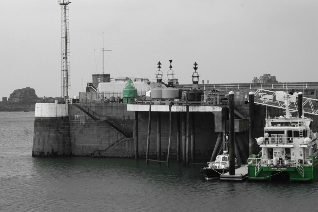
I edited these images in a similar way so that I could combine them all together. They all have a similar vibe for example I edited the water so the images are all the same shade of dark blue or green and the sky appearing moody. The top three images all feature boats ,centred in the middle, and so they complement each other well. The main image I have selected is of the pier with no boats in the image, I chose this as my main image because it is different from the other three where there are no boats just the pier making it feel dark.
For this selection of images I chose two wall art images along one of the piers at the harbour and one image of a seagull. I edited these in black and white as I liked the way each photo contrasted with each other. I turned up texture and clarity slightly to show more details in the wall art images. For the main image I have chosen this picture of a seagull. I cropped the image so that it was centred and in the middle. I turned down clarity and texture and turned up shadows and blacks to make it look less emphasised and more like a shadow. The overcast sky in each of these pictures creates a nice contrast with each subject.
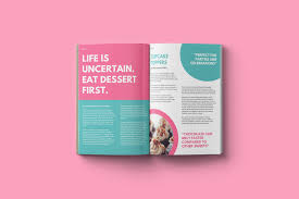
A photography zine is a small book almost of a collection of photos. They are designed to tell a story through photos and limited text, unlike like picture stories they don’t have text on every page and cannot be viewed as one page so much as a progression in story like a normal book. Each zine is completely personal to the creator/photographer some choosing bold, vibrant designs and others picking heavy white boarders around each photo. Some contain completely abstract photos others providing large overviews of the topic, most are a mixture of small detail shots and large overview photos. I personally liked the zines with detailed covers, with heavy texture or colour I found this draw me into the zine wondering what was inside rather than having an overly complex imagine that was easier to skip over. Following this, I found my favourite zines had a mixture of detail shots and larger scale photos, I found this explained the narrative the best.
What is your story?
3 words
land, sea, history
A sentence
-A brief glance into Jersey’s maritime industries new and old.
A paragraph
This zine will explore the old and current Jersey harbours, specifically the St Helier harbour we all know as ‘the harbour’ before venturing into the old French and English harbours. It will also show the narrative of the industries from fishing to sports like rowing.
What is Narrative?
Narrative is ‘a spoken or written account of connected events; a story.’ Or in photography terms, using photos to show a story to the viewer with minimal words. This can be done in many ways, in fact any photo tells and story so it can be done in a single photo or a small collection of photos like a picture story. However in this case I am creating a zine with the photos and knowledge I have gained researching and capturing the Jersey harbour’s over the past month.
How will I tell my narrative?
I will tell the story of the Jersey harbour through my photoshoot results, more specifically I will use a zine I design on Indesign. I have decided I will use negative space and backgrounds to add context as well as keep the zine interesting. By adding background images I will use photos that add context but aren’t enough for a page by themselves. Having done research I know I found the most interesting zines were the ones with a mixture of colour, texture and subjects, meaning in my zine I will use black and white as well as bold colour to my advantage emphasising detail with tonal black and white and using bright colour to represent true to life colours of the harbour and keep people interested in the zine.
Further Ideas
Text
A book or other written or printed work, regarded in terms of its content rather than its physical form.
I can use text to help add context and further the style of my zine. I will have a title to help give an idea bout the zine on the cover other than the cover photo. I might also put a small paragraph or sentence on the first page to make use of blank space and provide a small explanation before the zine is continued. This gets the reader to think with a purpose and ask questions about each photo related to the theme rather than just guessing.
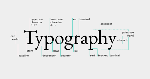
Typography
The art and technique of arranging type to make written language legible, readable and appealing when displayed.
I can use typography on any text I put in, including the title this will help create a style to the zine.
Examples: creative uses of words, letters, font-types, sizes
Mood Board
In this mood board I used a mixture of photos from the SJ archive as well as photos of how the harbour is today. I like the mixture of overview shots combined with all the smaller detailed shots. This provides contrast while keeping a full picture of the harbour from the smaller details of industries to the larger structure itself.