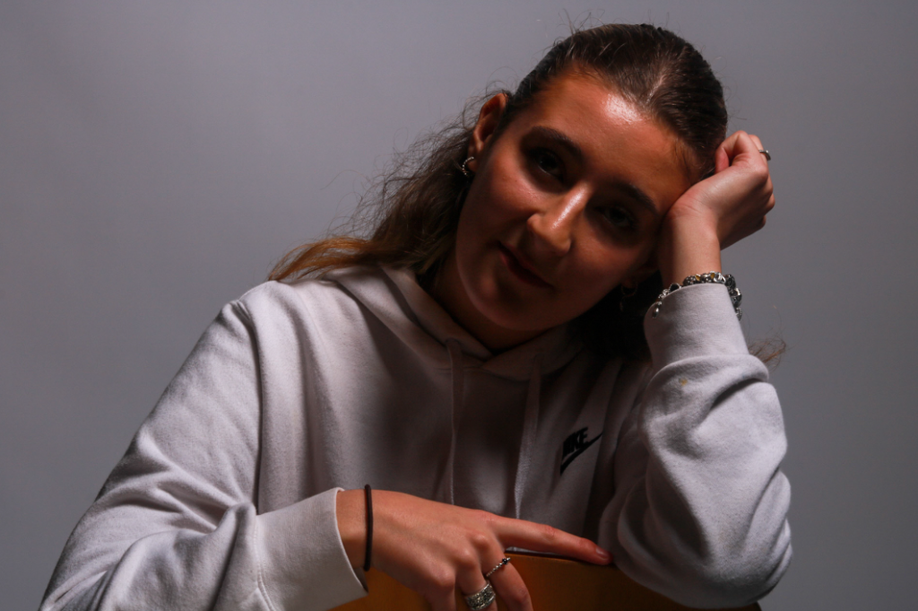
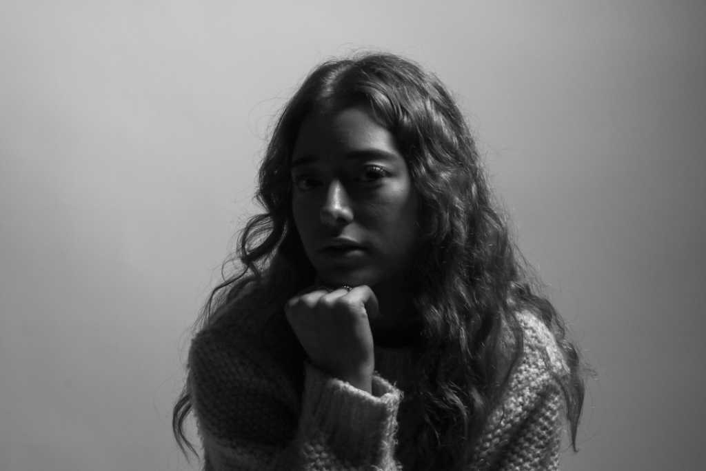
Review and Reflect – Personal Study

Romanticism

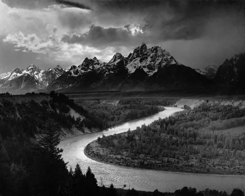
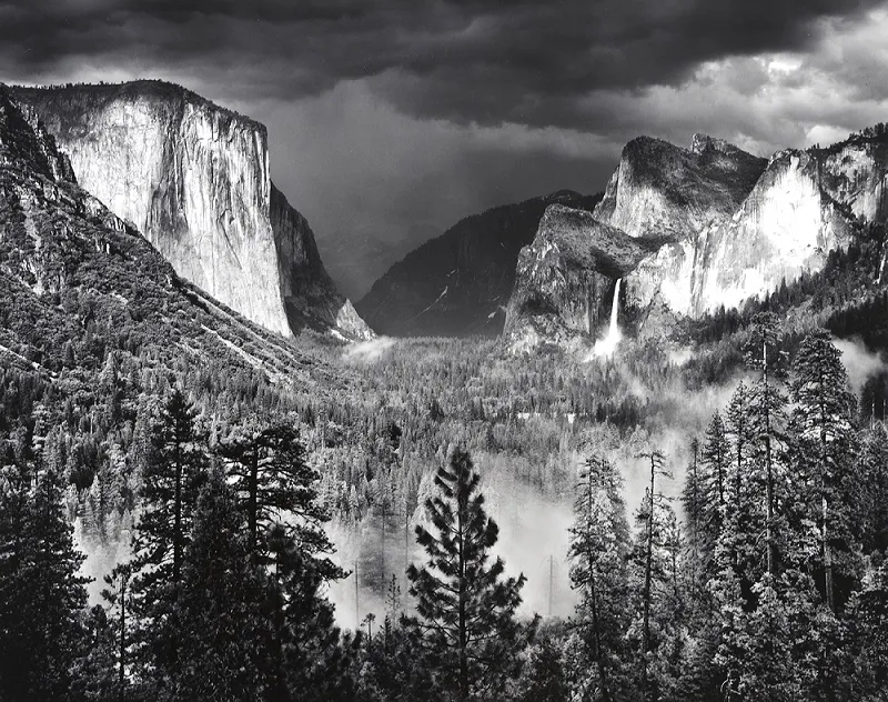
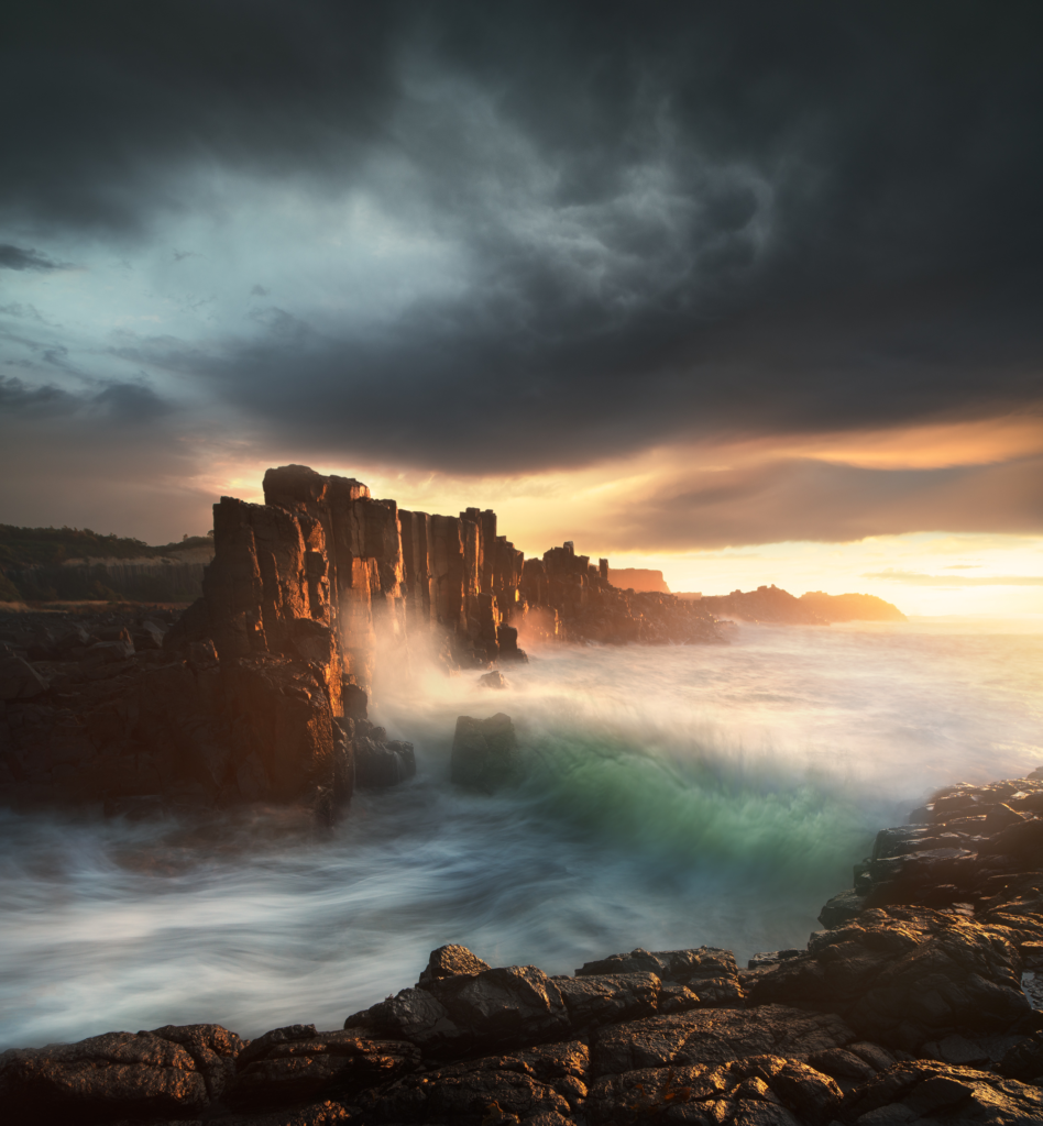
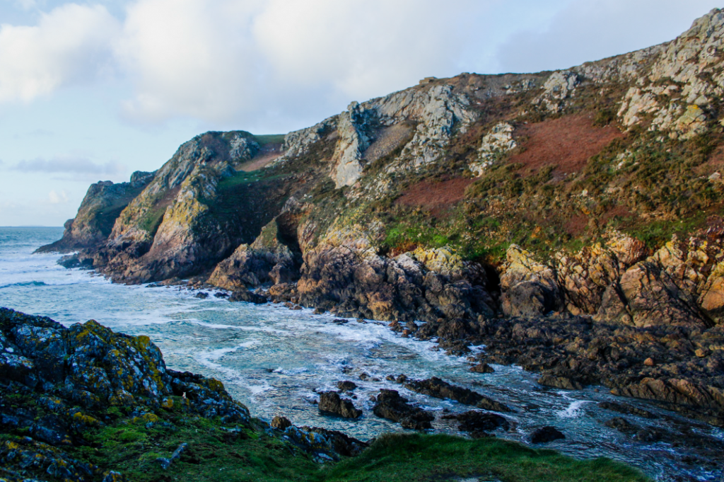
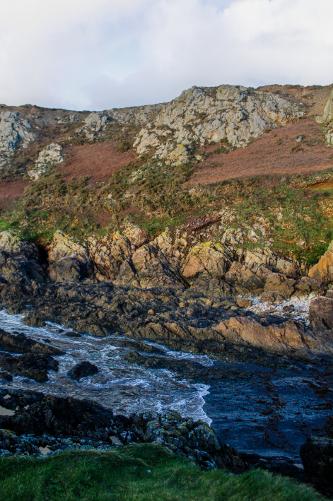
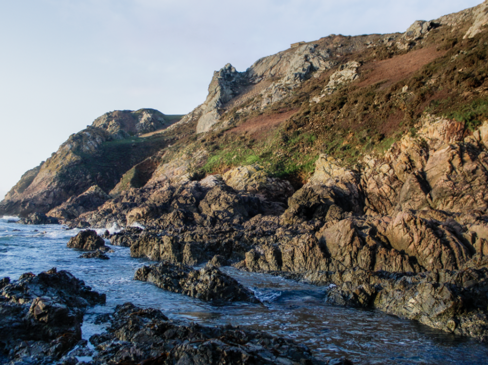
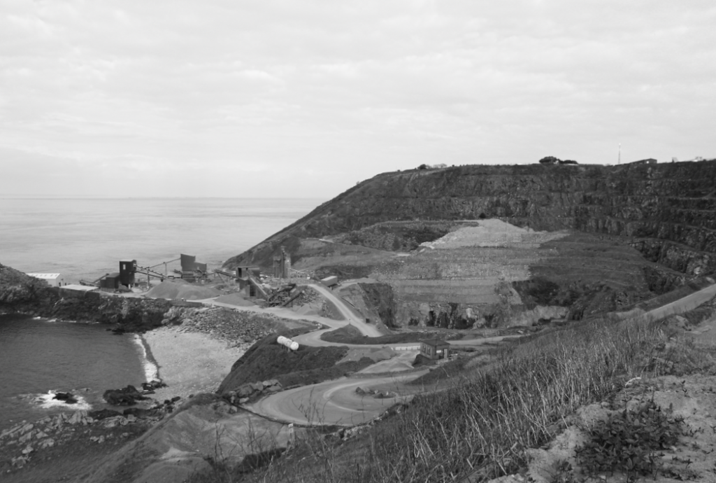
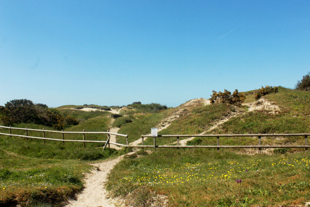
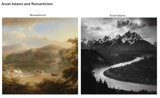
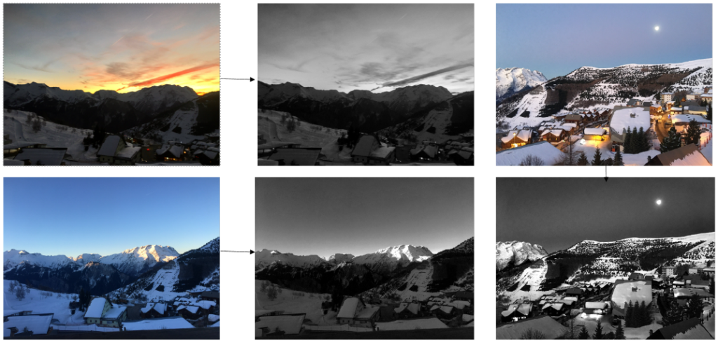
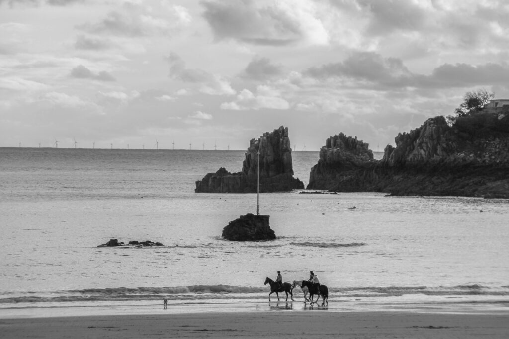
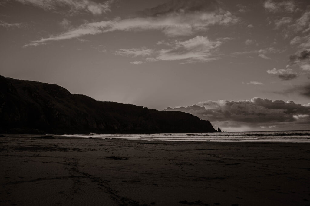
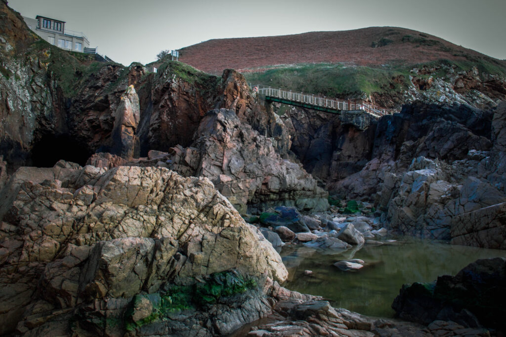
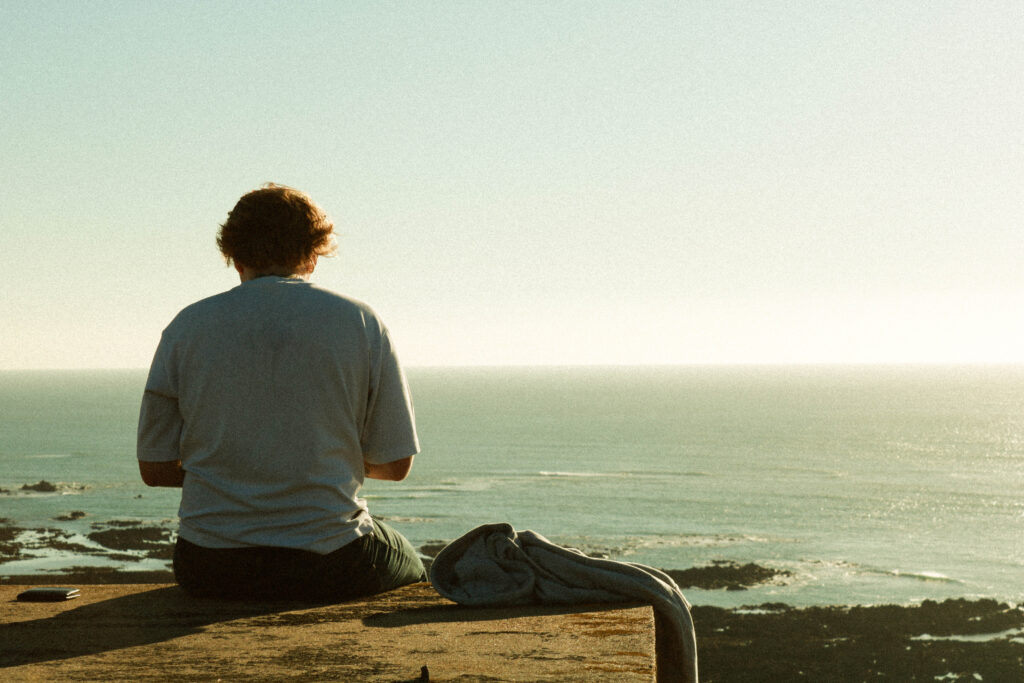
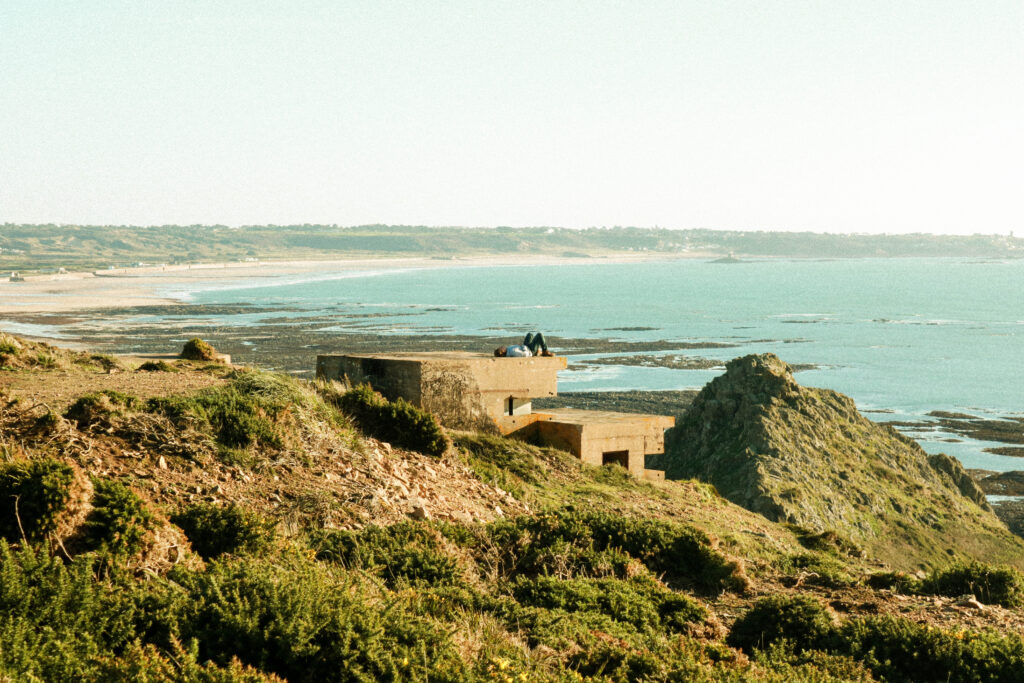
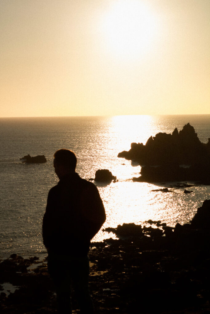
Romanticism in photography consists of capturing sublime scenes and dramatic landscapes which create a sense of awe for nature. For this topic, I created HDR Merge Images of the cliffs at Plemont and L’Etacq. This was inspired by Ansel Adams as he would photograph picturesque landscapes, mainly mountains. He also used the Colour zonal system which is a system of tonal values from black to white as his images were in B&W. This is why I used HDR Merge so that my images displayed a range of tones and colours. I really liked this project because I enjoyed capturing the beauty of the natural landscape and, at the same time, it can nice to go out and take the photos.

My Images:

The New Topographics

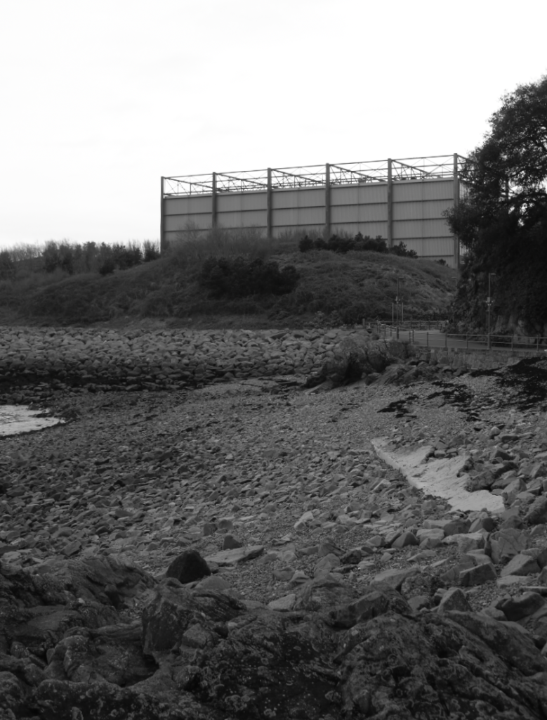
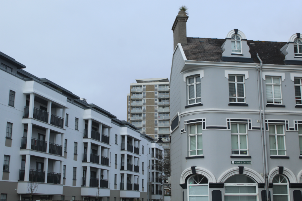
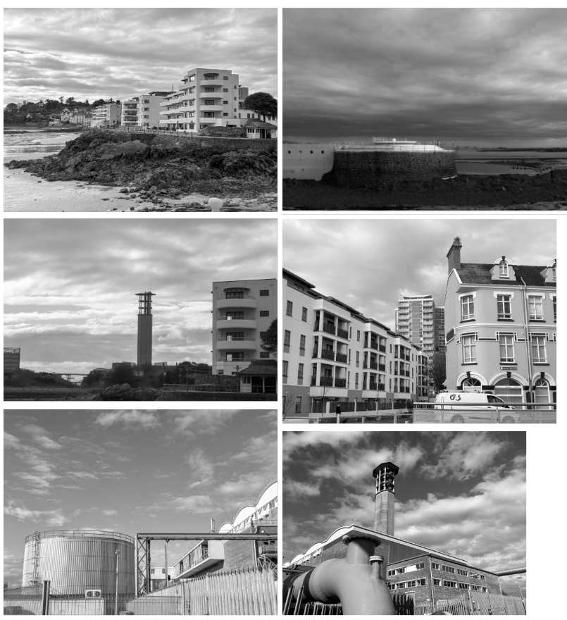
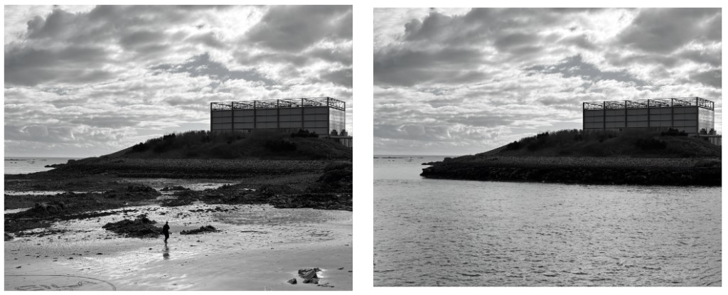
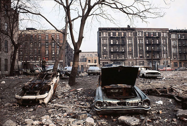
The New Topographics is a project which explores how humans have altered the natural landscape. For this project, I walked around Harve des Pas and captured images of buildings and a combination of both the natural and built environment. I really enjoyed this project and it inspires me to photograph the urban environment for my personal project.

My Images:

Anthropocene

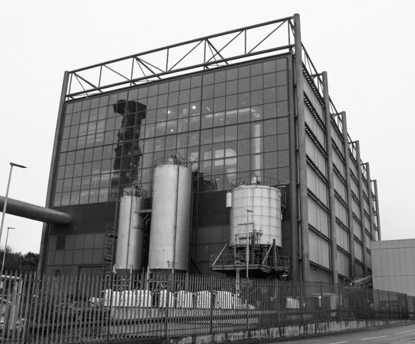
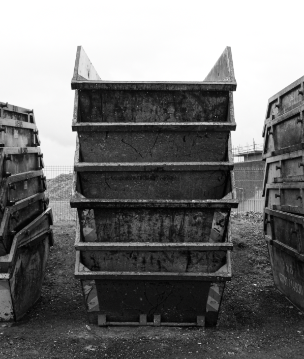
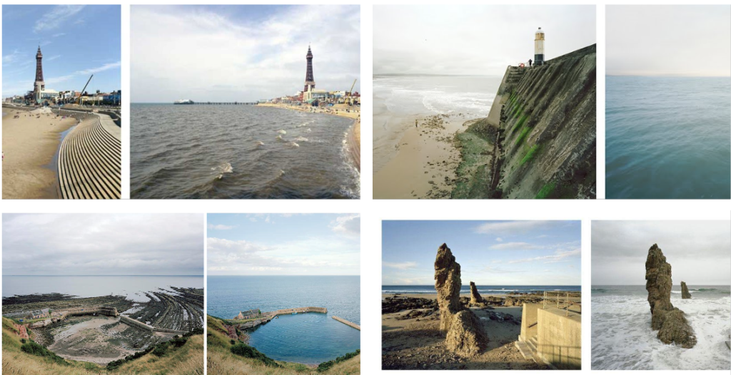
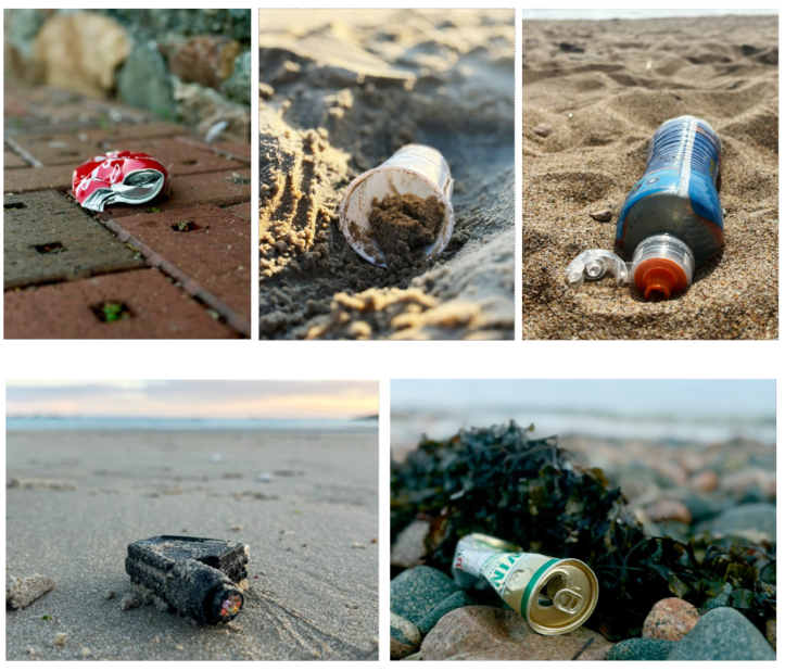
Anthropocene is a word used to describe the impact of human activity on Earth’s climate and ecosystems. For this project, I photographed industrial areas of Jersey such as La Collette, Bellozanne and the Quarry at Sorel. I enjoyed this project as it allowed me to be creative whilst also illustrating the Island’s impacts on climate change. This project inspires me to capture photographs of positive actions that the island is taking towards climate change such as the construction of sustainable buildings.

My Photos:

Mirrors and Windows Photoshoot

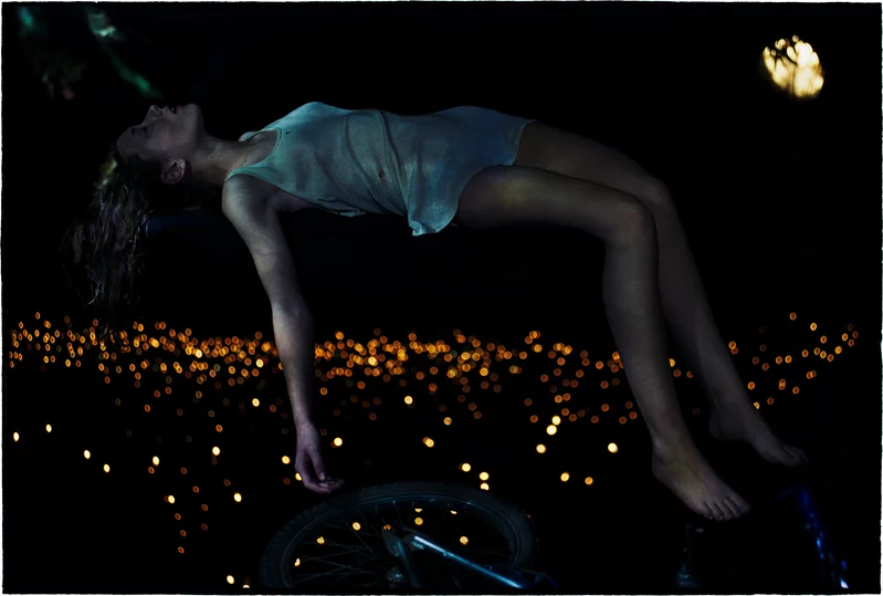
Bill Henson is an influential Australian photographer known for his evocative and atmospheric images that often explore themes of youth, identity, and the passage of time. His work typically features moody, dreamlike compositions with a distinctive use of light and shadow, creating a sense of intimacy and emotional depth. Henson often incorporates elements of the surreal and the sublime, blurring the lines between reality and fantasy. His subjects frequently include young people in ambiguous settings, prompting viewers to reflect on the complexities of adolescence and the human experience.

Bill Henson’s images can also be analysed through the lens of the male gaze (which refers to the way visual arts are often constructed from a masculine perspective, objectifying women and presenting them for male pleasure). In Henson’s work, the representation of young subjects, particularly adolescents, often invites scrutiny regarding their portrayal. While his images are celebrated for their beauty and emotional depth, they can also evoke discomfort due to their sexualised undertones and the ambiguity of the relationships depicted. The focus on youth and vulnerability may reinforce traditional gender dynamics, prompting questions about power, agency, and the viewer’s role in interpreting these images. However, Henson’s approach also complicates the male gaze by imbuing his subjects with a sense of complexity and introspection, often portraying them in contemplative, ambiguous situations. This can challenge viewers to reflect on their own perceptions and assumptions, rather than simply consuming the images in a passive manner. Thus, while his work may engage with the male gaze, it simultaneously subverts and critiques it, inviting a deeper examination of the relationships between artist, subject, and audience.
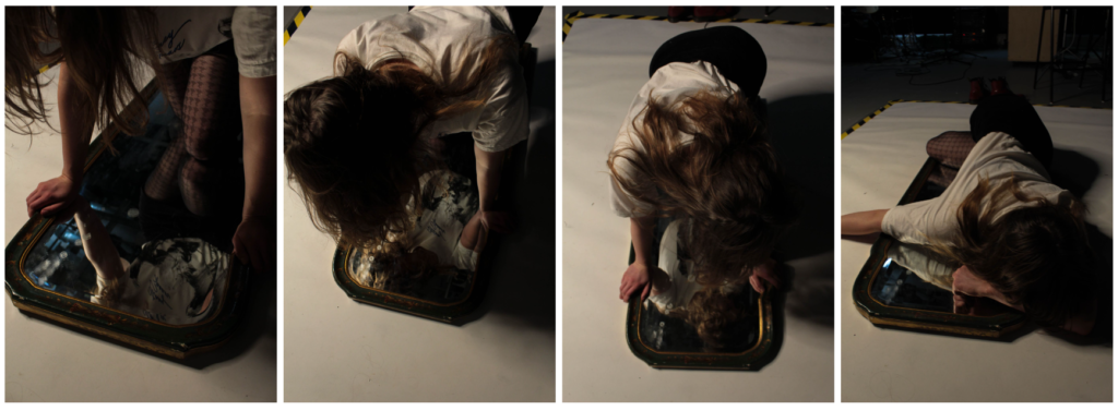
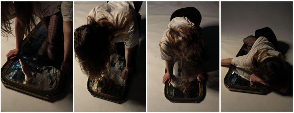
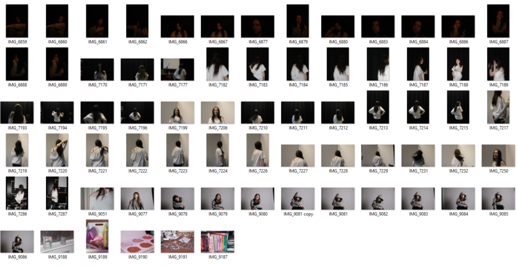
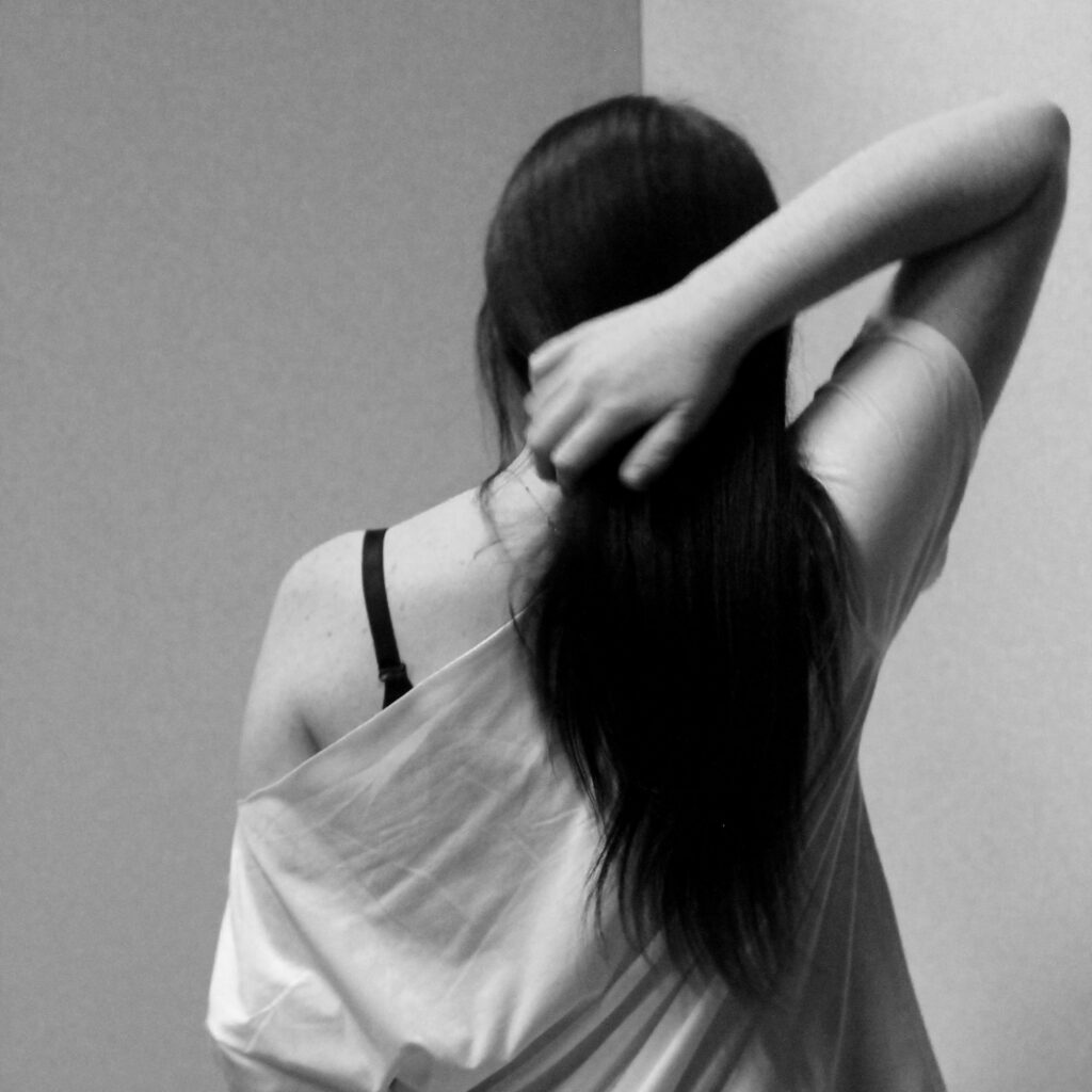
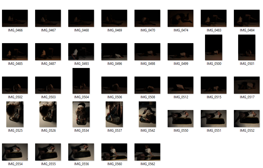
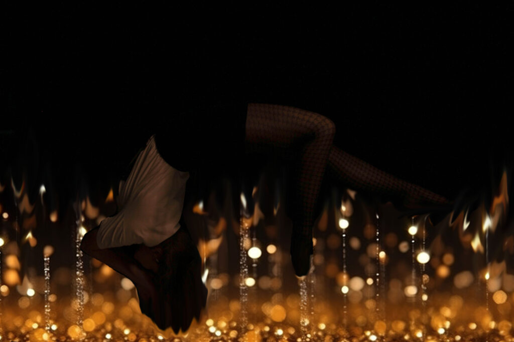
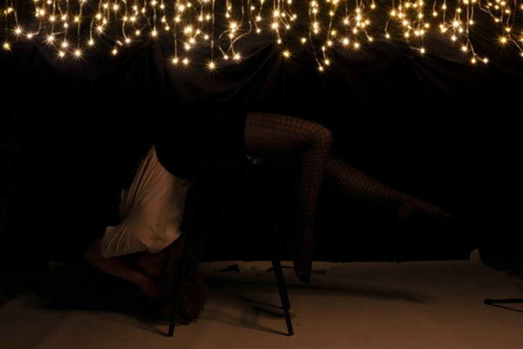
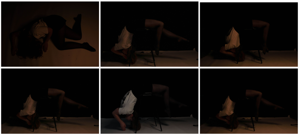
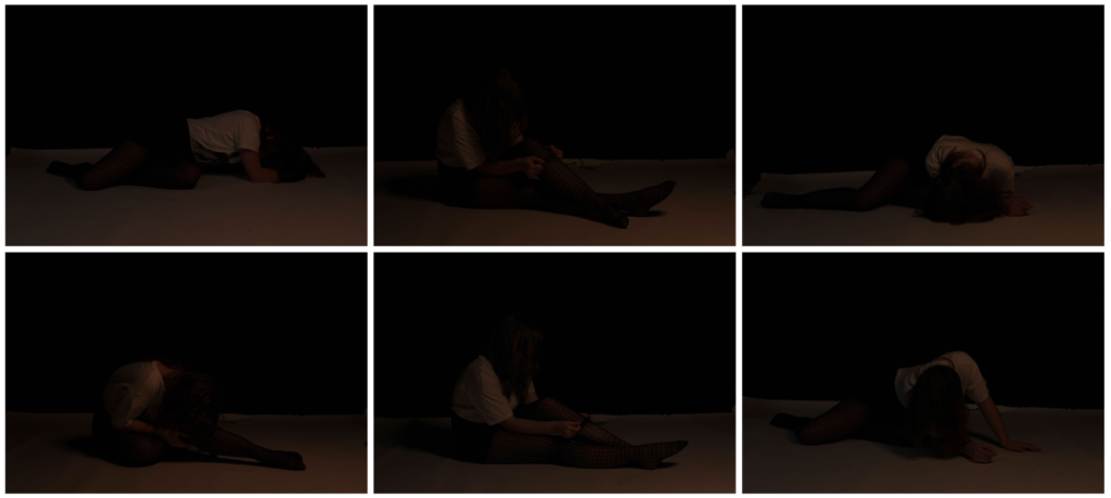
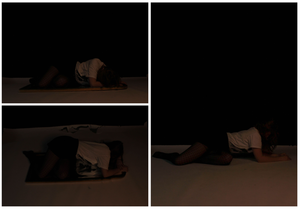
For this photoshoot, we decided to go into the studio, turn off the main lights and decided to rely on the smaller dim lights to get a darker, moody tone to our images as seen in Bill Henson’s images. The model also wore revealing clothes eg a skirt as the girls depicted in his images often wore short dresses. This helped to bring a sense of vulnerability to our images. We then experimented with different complex, abstract positions such as laying over a chair etc and different angles eg a Birds Eye view, straight on etc. We decided to keep the models face covered for the majority of the images to convey the idea of male gaze in which men tend to objectify women and look at them as objects instead of real people. By having her face covered, you are more drawn to her body which represents the idea of the male gaze.

we also wanted to incorporate the idea of a distorted reality by taking some images of the model lying on top of a chair. Then, once we had the images uploaded onto the computer we then used photoshop to remove the chair in order to give the effect of the person floating. I did this by using the remove tool. However, due to the white floor in the studio, it ruined the idea as in Bill’s images it looks like they’re in the middle of the air but in our you can still see the cut between the floor and background, destroying the illusion of floatation.

Once I had removed the stool legs from the image, I then wanted to try and fix the floor issue. So, I went onto google and looked for images of fairy lights with a background. I did this as in his images, you can see small dots of light around the model. When I had found an image, I then copied and pasted it into photoshop and dragged into on top of my original image. Next, I used the eraser tool to get rid of the part of the image which was covering up the girl behind. I then used the blur tool to try and make the contrast between the two images move smoother but it still looks quite obvious. If I were to do this photoshoot again, I would try and get a black floor instead of white so that it actually looks like she’s floating and have fairy lights already in the image instead of transporting a photograph from google which then makes it look clearly edited. I think this was a good first experimentation but has a lot of improvements to be made.
This is the image by Bill Henson that inspired my idea.

These are my final attempts of recreating his original idea.

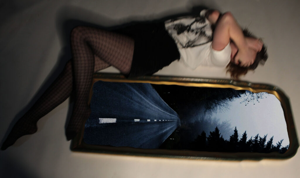
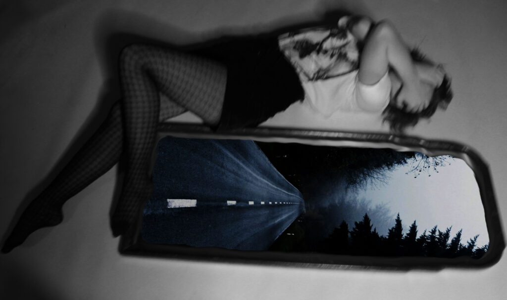
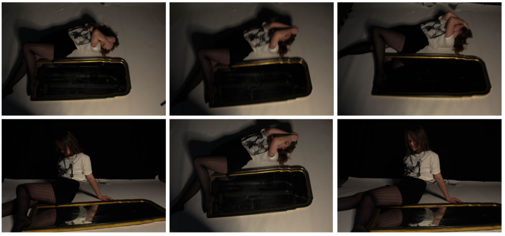
For these next images, I decided to experiment with my own ideas. I wanted to add an image into the mirror seen beside the model so I searched up empty dark streets on google and picked an image which I thought linked to the aesthetic of Bill Hensons images. I then copied and pasted it into photoshop and put it in a layer below the mirror layer. I then used the eraser tool once again and made a hole in the mirror so that the bottom layer would show through it. Finally, I wanted to make the line between the two layers more smoother so used the blend tool to do this. I then experimented with turning the top layer black and white to add further to creepy vibe of the image. Overall, I like how this experimentation came out although it doesn’t directly link to any of Bill’s pieces.

In these last four images, you can see yellow and black tape in the background. I didn’t like this as it was distracting and took the focus away from the model. If I were to improve these images, I would get rid of yellow lines in background.

Improvement:

Here, I decided to go back to this photoshoot and corrected this by using the remove tool on photoshop. This got rid of the black and yellow line and made the background all one colour which means the attention is now on the model only.

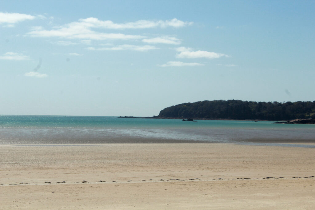
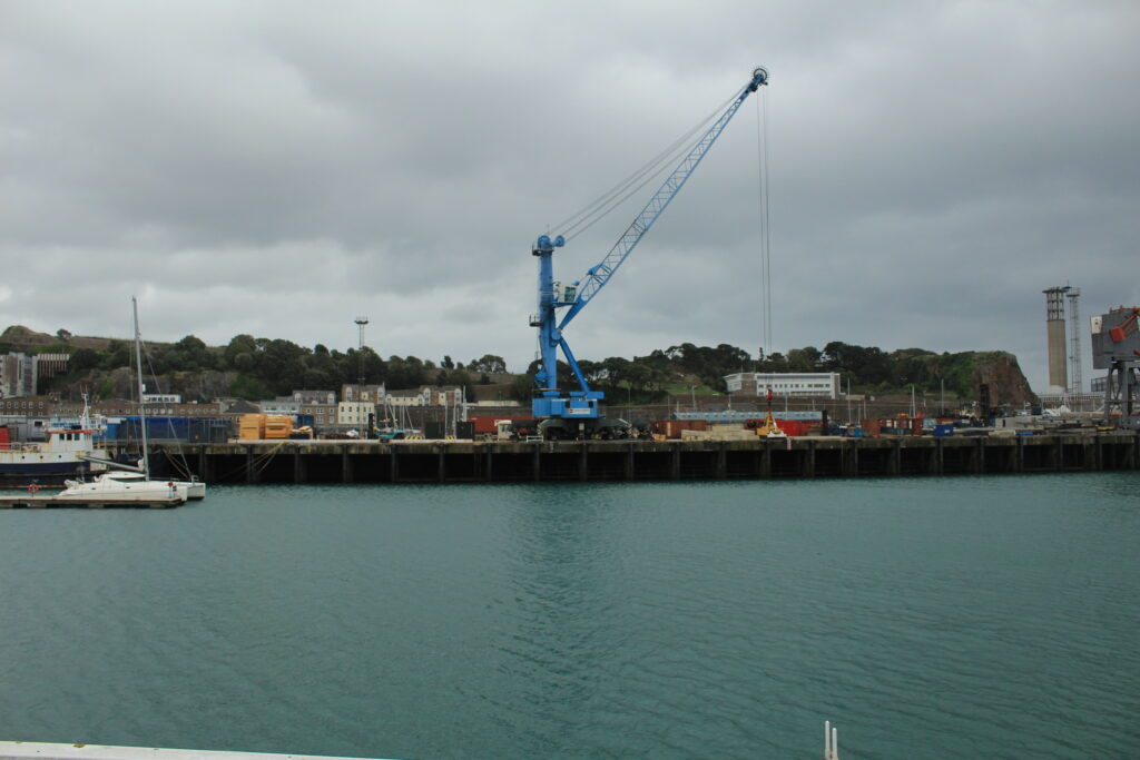
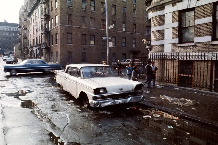
These are 3 examples of window images that I have taken. They show the exterior world and are objective and real. I took the photograph without making any adjustments to the landscapes; they’re all natural.

Mood Board and Mind Map – Personal Project

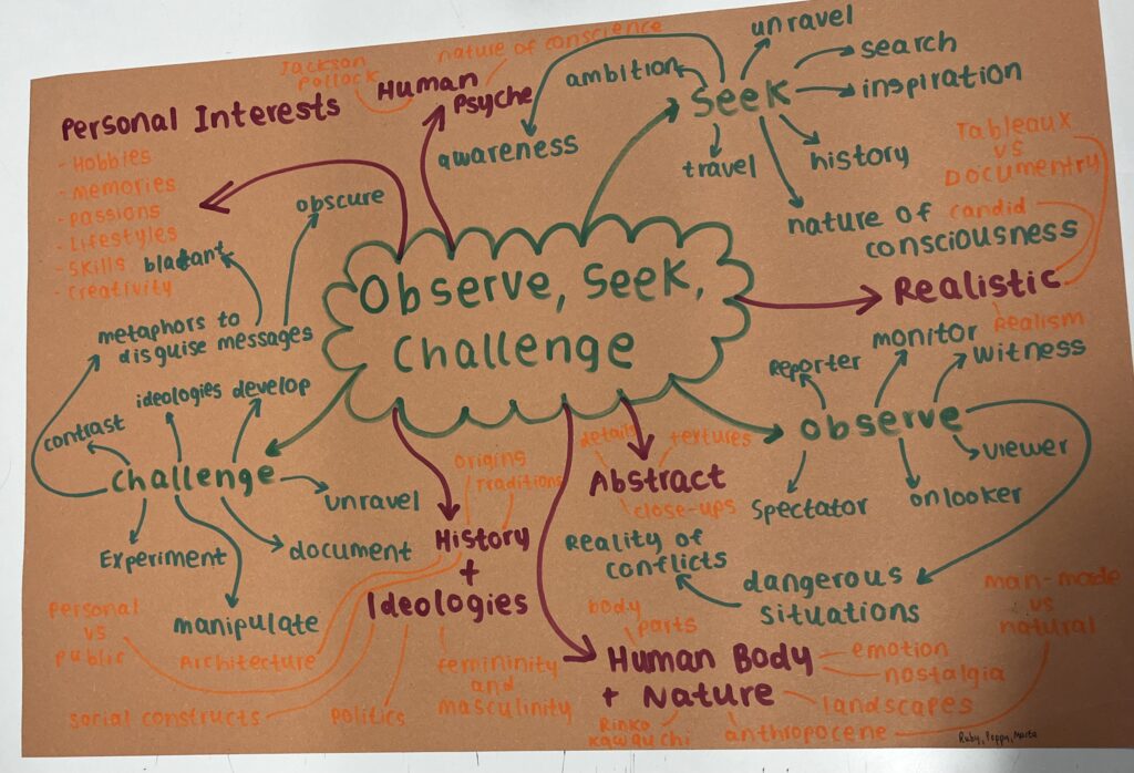
To start this project read through the exam boards notes on the theme observe, seek and challenge. I then made a mind map with all my ideas, I also used a dictionary and thesaurus to understand different concepts and add other words in relating to subtitles. I found with collaborating on the mind map helped me experiment and try new ideas, it also added knowledge and each others understandings of the words so I learnt different perspectives and ideas.

Mood boards

Abstract

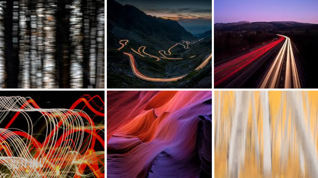
Following on from the harbour project I liked the detailed, abstract shots I had taken and then used in my zine. I like the way they can add to story and make people notice the smaller parts within a bigger picture.

Tableaux

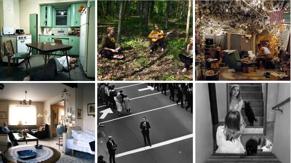
I looked at this type of photography in my mirrors and windows project and found I liked the effect of my photos. I could choose the shot down to the smallest details, making the photos powerful as I had complete control over what I wanted the photos to show.

Documentary

I really enjoyed taking photos in a documentary style for the mirrors and windows project. I photographed the twisty sprints and found I could be really creative and create dynamic, interesting photos capturing the even and how people went about it.

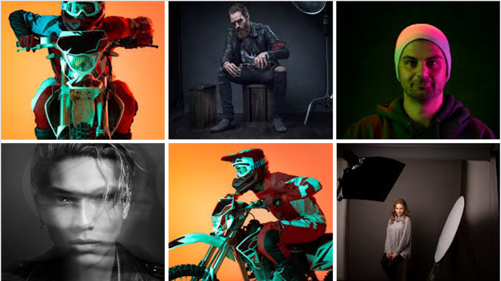
Studio Portraits

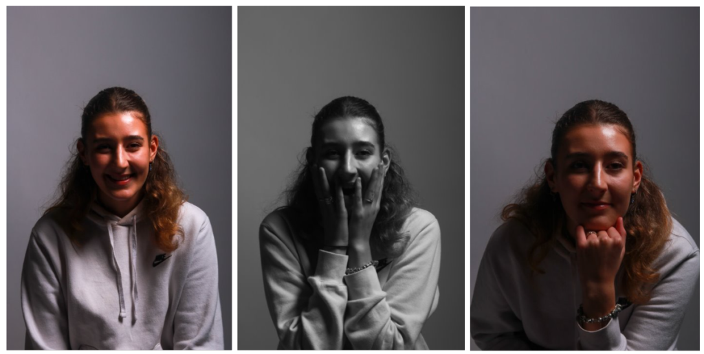
Having previously done studio portraits I found I could create interesting, detailed photos using the different lighting techniques. I like the drama and intensity you can create in the photos and I think it would be beneficial in any project with portraiture as it helps provide a solid starting point for any other types of portraits for a project.

Ideas

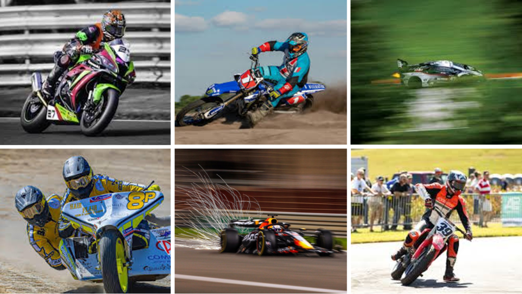
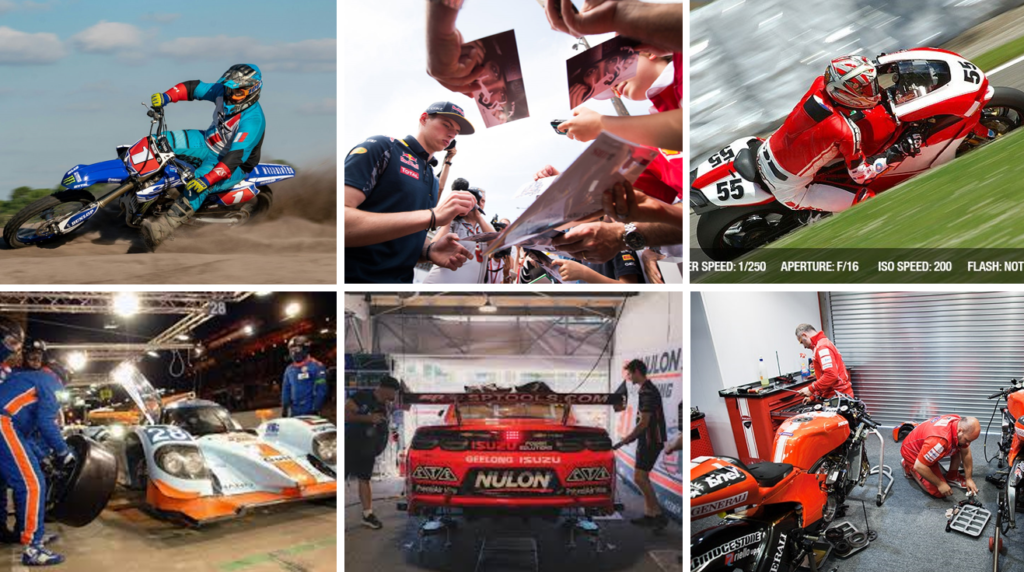
Potentially for my project I’d like to explore motorsport in Jersey, having been brought up around rally cars and motorbikes I have always have an avid interest in the motorsport in Jersey. I have always found there are great pictures of individual competitors but I found no one has quite captured the atmosphere of all the aspects of the sport, from the last minute rush to get to a part fixed or the intense wait, waiting for the scrutineering to be passed. The mood board above has a rough idea of what I would like to capture, the actual racing to the ‘behind the scenes’.

Essay: How can photographs be both windows and mirrors of the world

  1. Read two texts above (John Szarkowski’s introduction and review by Jed Pearl) and select 2 quotes form each that is relevant to your essay.

John Szarkowski quotes: “reflecting a portrait of the artist who made it” and “the exterior world is explored in all its presence and reality”.

Jed Pearl quotes: “potential toward either self-expression or exploration in the unique sensibility of each photographer” and “a photograph is not a window; it is a mirror”.

  1. Select two images, one that represent a mirror and another that represents a window as examples to use in your essay.
  1. Use some of the key words that you listed above to describe what the mirrors and windows suggest.

Window: documentary, objective, realism, candid, public, straight, optical, views.

Mirror: tableaux, subjective, romanticism, fiction, staged, personal, reflective, manipulated.

Essay plan
Introduction (250 words): Reflect on the origin of photography and describe in your own words the difference between the two photographic processes, Daguerreotype and Calotype. Consider how they could be viewed as either a mirror or a window of the world according to John Szarkowski’s thesis. Choose one quote from Szarkowski’s text and comment if you agree or disagree.

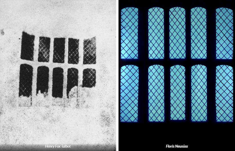
The origins of photography can be first seen through the lens of the camera obscura. This was where a small hole was made in a dark room allowing the light from outside to travel through it which then produced an upside down image of the outside world onto the wall opposite the hole. This then lead to further ways of developing photographs onto surfaces. The first example of this is the daguerreotype, invented by Louis Daguerre. This process allowed for images seen inside the camera obscura to be preserved as an object. In this process, a highly detailed image is produced on a sheet of copper with a thin layer of silver. This process is very delicate, and the sheet of copper and layer of silver must be cleaned before you start the process and must look like a mirror. The daguerreotype produces positives meaning it is a one off and cannot be copied. I think that the daguerreotype can be perceived as both window and mirror due to its documentative style and personal relation to Louis Daguerre. This is because the images often capture a variety of different people from a different period of time where this was the only way of making images into an object. So in a sense, the images are a document of how images used to be produced. On the other hand, the daguerreotype is also a mirror as the people seen on these images had personal relations to Louis. This means his images are giving people a personal insight into his life and his family/ friends, which is a key concept of mirror photography. Similarly, the images could be seen as subjective as the viewer has to try and figure out how the person in the image is related to Louis. Additionally, in the images of his family members/ friends, they are staged as they are purposefully posing for the picture. Therefore it can be seen more as a mirror image than window image which are typically naturalistic. Shortly after the Daguerreotype, the calotype was invented by Henry Fox Talbot. In this process, the sheet of paper needs to be iodised by applying solutions of silver nitrate and potassium iodide under candlelight. The same surface needs to be sensitised using a “Gallo-nitrate of silver” solution. Lastly, the piece of paper needs to be dried and loaded onto the camera obscura. This type of photography produced negatives (which means copies can be made). Calotypes made by Henry often depict photographs of windows there meaning that his images are window instead of mirror as it is not manipulated in any way and is a way of exploring the exterior world instead of things personal to him.


Paragraph 1 (250 words): Choose an image that in your view is a mirror and analyse how it is a subjective expression and staged approach to image-making. Choose one quote from Szarkowski’s thesis and another from Jed Pearl’s review which either supports of opposes Szarkowski’s original point of view. Make sure you comment to advance argumentation in providing a critical perspective.

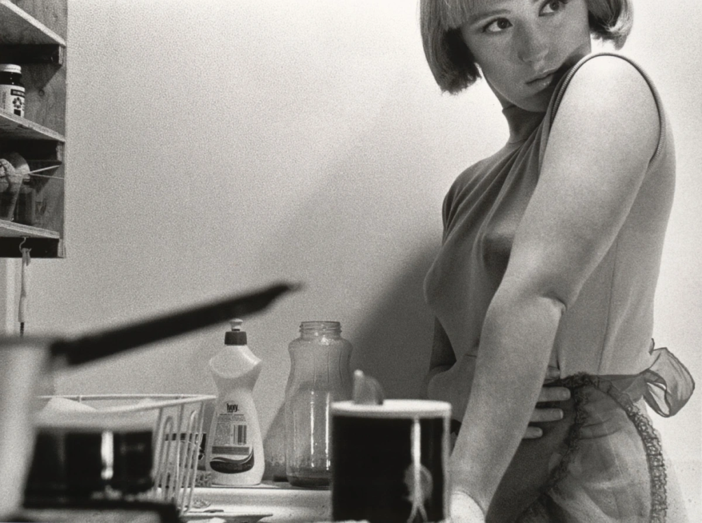
This image by Cindy Sherman is a mirror image. In the image, you can see a stereotypically attractive woman in the right side of the image who is glammed up and put together. However, on the other side of the image you can see pots, pans, dishes etc which implies the woman is in a kitchen. This feeds into the stereotypes at the time where woman were ‘destined’ to be housewives and to cook and clean for men. Szarkowski stated in his book about mirrors and windows that a mirror is “reflecting a portrait of the artist who made it”. This relates to Cindy’s image as she explores what it was like at the time to be a woman in society as she was. She shows a clear contrast to how women want to be perceived and treated though the use of makeup, clothes and hair compared to how men actually view them (as merely servants) through the use of objects and environment the woman is placed in. Jed Pearl also states a similar thing about mirror images saying its a “potential toward either self-expression or exploration in the unique sensibility of each photographer” in which Cindy clearly displays self-expression as she reveals her opinions and thoughts on how women are viewed at the time. Additionally, this image clearly takes a staged approach as Cindy Sherman deliberately chose the environment in which the model is in (a kitchen) and the pose of the model. The idea that her head is facing away from the pans and dishes could be Cindy Sherman’s way of rejecting societies perception of what a woman is and trying to separate the idea of women being seen as workers rather than real people.

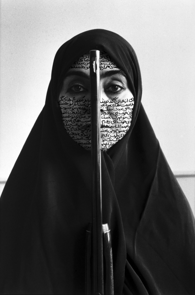
Similarly, this image made by Shirin Neshat is also a mirror image with a similar concept behind it. In this photograph, you can see a woman with a hijab and a riffle going up the middle of her face. To me, this could be highly provocative to the country in which she is from and ones with similar morals. This is because in these countries eg Iraq, women are often seen as inferior to men and weak so it will come as a shock to see a women from that sort of place pictured with a riffle in front of her, implying she now has equal power to men. However, this piece could also be referring to the stereotypes society has on Muslim people. By having a riffle up to her face, it combines the idea of people associating Muslims with terrorism and how harmful these connotations can be to innocent people. This evidently shows how subjective the image is as it can be interpreted in multiple ways therefore meaning it is a mirror image. Similarly to the other image by Cindy Sherman, this image was evidently staged in a way to cause a reaction in the person that views it (which is another feature of a mirror image).

Paragraph 2 (250 words): Choose an image that in your view is a window and analyse how it is an objective expression rooted in a sense of realism. Choose one quote from Szarkowski’s thesis and another from Jed Pearl’s review and follow similar procedure as above ie. two opposing points of view and commentary to provide a critical perspective.

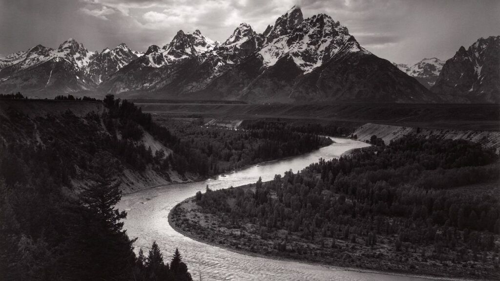
This image by Ansel Adams is an example of a window image. His work serves as a window into the natural world, revealing the beauty and majesty of landscapes which are untouched by humankind. This is a window image as its objective and a display of reality rather than something that has been manipulated (which you would typically see in a mirror image). There is no trace of humankind or any specific objects that might link the artist to this image; it’s simply showing off the beautiful scenery. This therefore supports John Szarkowski’s idea that a window image is where “the exterior world is explored in all its presence and reality”, as Ansel Adams has just captured what he’s seen in-front of him without altering anything or adding anything which would connect himself to the images. However, Jed Pearl opposes this idea by suggesting that “a photograph is not a window; it is a mirror”. This can also be seen in Ansel Adams image as there is clearly a specific reason he choses to photograph the landscapes he does; suggesting there’s a personal relationship between his images and himself, therefore making his images potentially mirror images instead of window as they give the viewer an insight into his passions and thoughts. For example, Ansel Adams photographs these natural, scenic places in order to bring awareness to how these beautiful places exist and we could actually see them with our own eye but due to our constant expansion and destruction of nature as a species, these places are going to become non-existent if we carry on at the rate we are. Therefore, the images he takes actually have a more personal meaning than what is initially thought. 

Conclusion (250 words): Refer back to the essay question and write a conclusion where you summarise Szarkowski’s theory and Pearl’s review of his thesis. Describe differences and similarities between the two images above and their opposing concepts of objectivity and subjectivity, realism and romanticism, factual and fiction, public and private.

In conclusion, I believe that an image can be both a mirror and a window contrary to John Szarkowski’s theory where he suggested that a photograph is either a mirror or a window. This can be seen in his book on window and mirror images where he described mirror images as “reflecting portrait of the artist who made it” and “a romantic expression of the photographer’s sensibility as it projects itself on the things and sights of this world”. Whereas he described window images as a way “one might better know the world” and “through which the exterior world is explored in all its presence and reality”. John Szarkowski believes that artists find themselves somewhere along a “continuous axis” from romantic to realist. In contrast, Jed Perl critiques Szarkowski’s thesis by stating ‘Szarkowski is fond of creating categories’ at the start of his review, suggesting he doesn’t agree. He goes onto say that a photograph is not just a transparent window but rather a mirror that reflects the photographer’s own perspective, emotions, and interpretations. Perl argues that photographs are inherently subjective and can distort reality, inviting viewers to consider the personal context behind the image rather than seeing it as a straightforward representation of the world. This clearly shows Jed doesn’t agree with the idea that an image is either a mirror or window. Instead, he believes that the two can exist simultaneously in the same image.

The images I chose to illustrate the idea window and mirror images have a lot of similarities and differences, the main difference being one is a window image and the other a mirror image. However, depending on the way you interpret the images, this can be proven to be false. This is because Ansel Adam’s image of the mountains could be seen as a mirror instead of window as he has a personal interest in photographing these places, making the image a reflection of his passions as a person rather than a photograph just exploring the exterior world. This highlights to me that idea that a photograph can be both a mirror and window image, depending on how one interpreted it. Another similarity between these two images is that they are both in black and white. However, Ansel Adams dramatizes the different shades of grey in his images to create a romanticised image. Another difference between the two images is that the mirror images made by Cindy Sherman and Shirin Neshat are subjective whereas Ansel Adams images are objective. This is because his images just consist of different landscapes. This leaves no/ minimal room for interpretation from the viewer. On the other hand, the mirror images can be interpreted in many ways. For example, some people may view Cindy Sherman’s images as her displaying the ‘perfect wife’ (attractive and doing the dishes) whereas others may interpret as her bringing awareness to the ridiculous standards set for women in society. Overall, although the two images are majorly different at the first look, as you look closer and understand the image more, you find there are more similarities between the two than you would expect. This may explain why John Szarkowski suggested that an image is either a window or mirror as he hadn’t properly inspected each image first and figured out how close they actually are to each other. 

Review and Reflect – George Blake

From the start of my time at Hautlieu, I have experimented with recreating my own interpretations of the different photographers I have studied and their unique styles. Through numerous themes of photography, I have enjoyed documentative photography the most. With artists such as Ansel Adams and Henri Cartier Bresson, I believe they have served as my largest inspirations through my related work.

Summer Project –

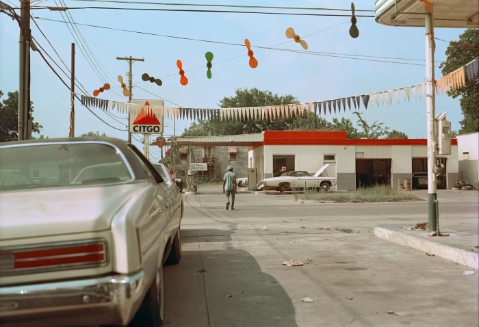
With the summer project I believe this shows my start into the documentative aspects of photography. Although recreating another artist, William Eggelston, I find his work is similar to that of Henri Cartier-Bresson. With Williamsons work however, I do find I enjoyed his naturalistic images, all an aesthetic into the vintage era of America.

William Eggelston –

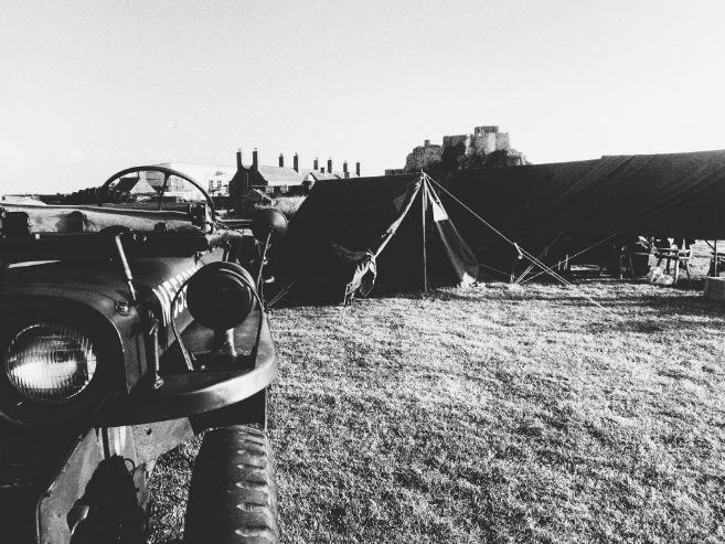
My example –

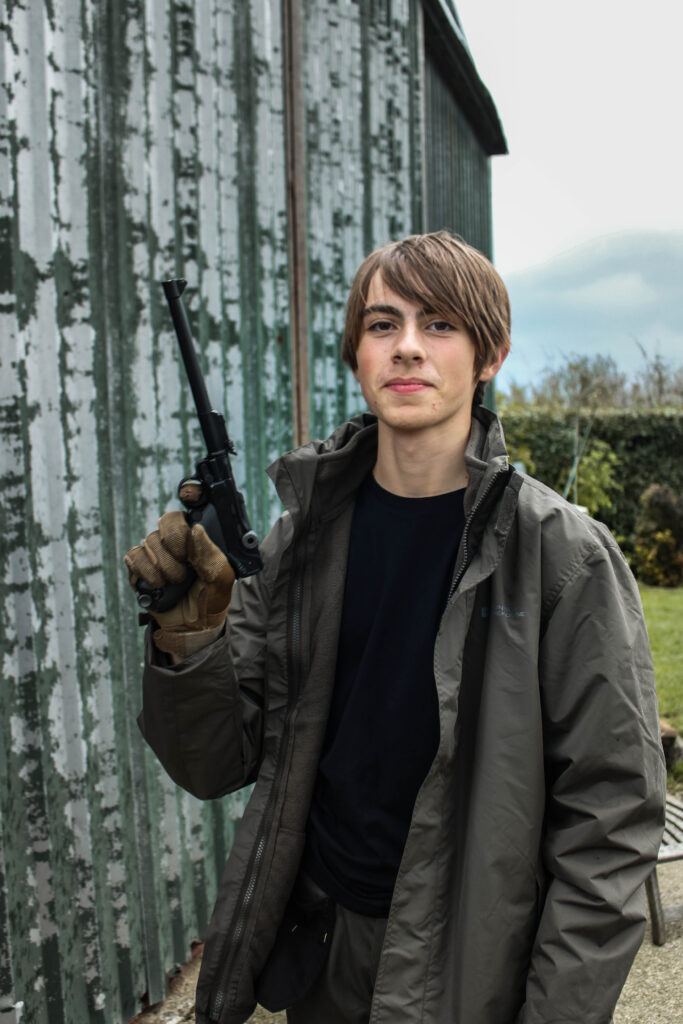
With photos such as this I felt like I recreated this well during my stay in a second world war re-enactment weekend. Captured in the candid style, commonly used through documentative images, I would take this further when I would become inspired by Cartier-Bresson’s style.

Environmental portraits –

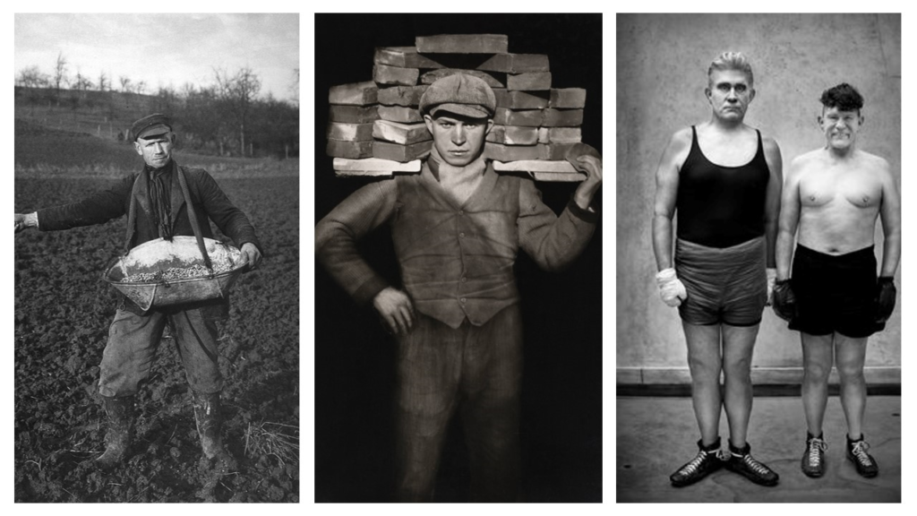
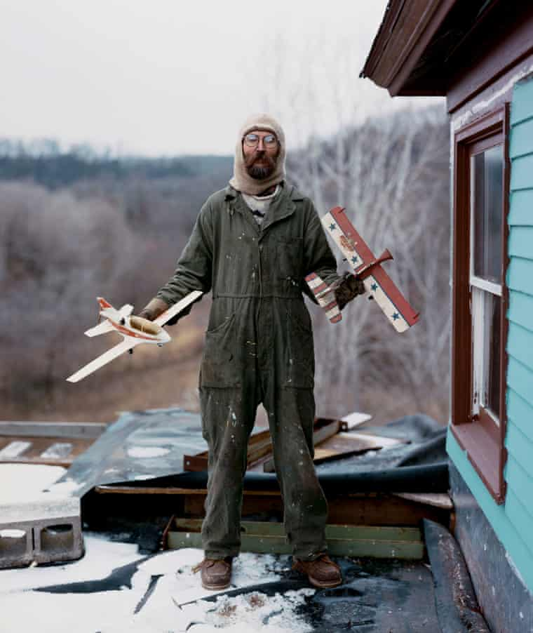
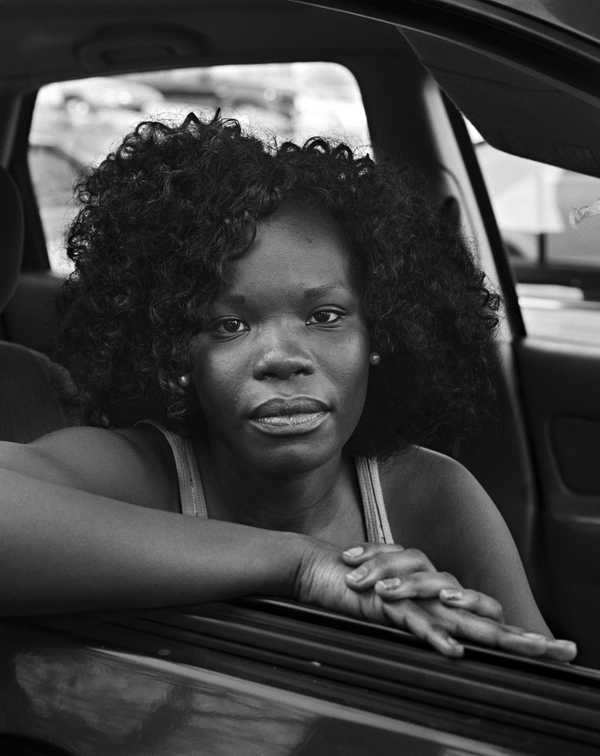
With our identity project I chose to continue with aspects of documentative photography through the study of portrait photographer, August Sander. Although not candid, these images to me still were documentative through their ability to show time through people of the past. Some other influences from this topic included Alec sloth and Vanessa Winship.

August Sander –

Alec Sloth –

Vanessa Whinship –

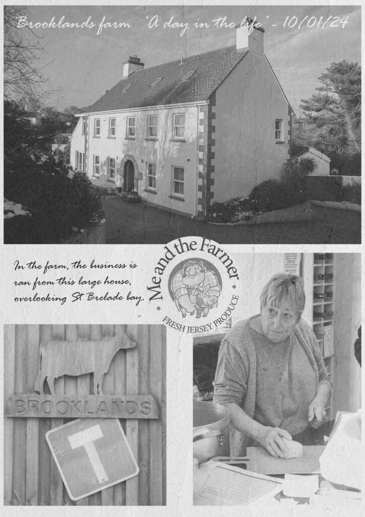
My Example –

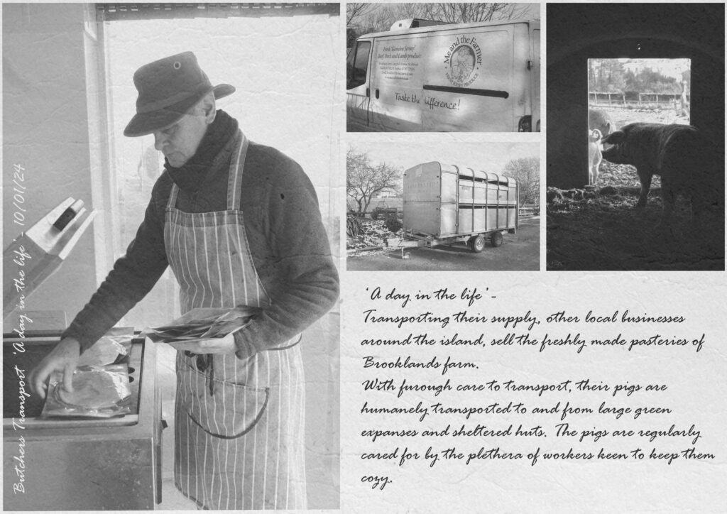
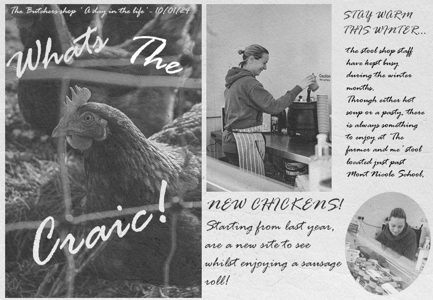
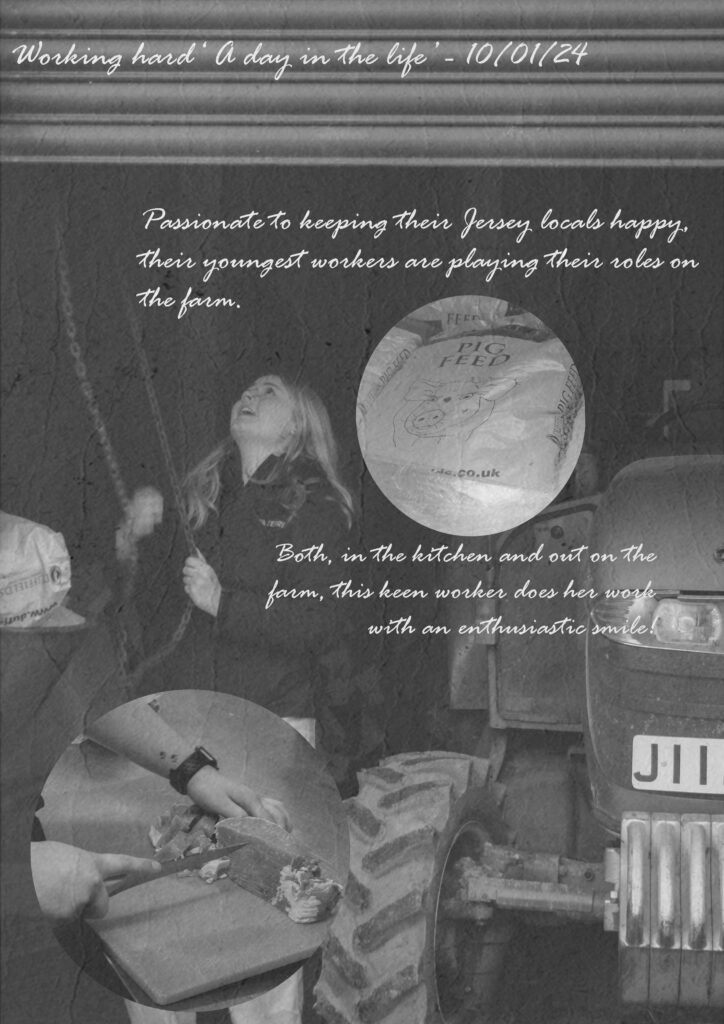
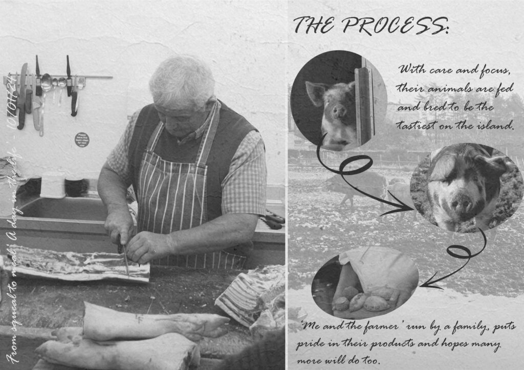
Taking this further, I took what I had learnt from analysing August Sander’s and Alec Sloth’s photographs and made a larger piece of work in my own documentative style and aesthetic. Titled ‘A day in the life’, this project centred around my family’s business and how I documented it in a vintage newspaper style.

Anthropocene –

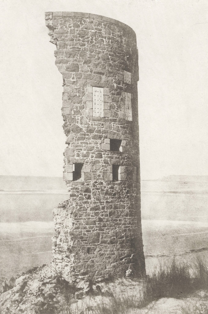
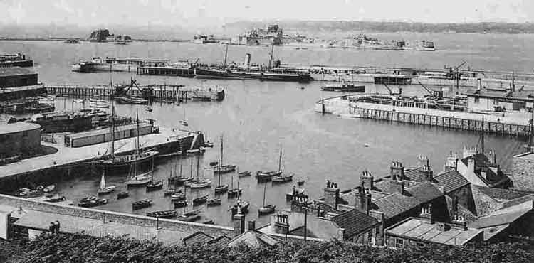
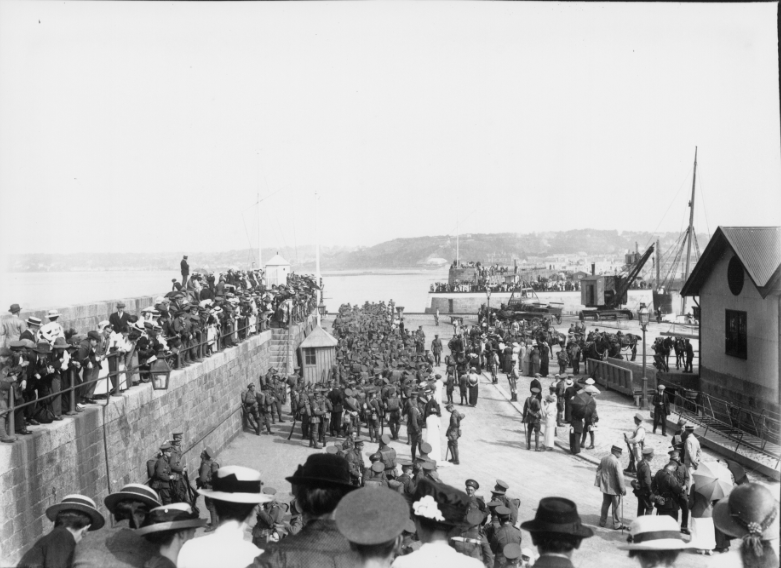
From this project, I feel as if I had a larger interest to try and explore this style of photography. With all the conceptual motives that can be applied to the style this would be explored later on in my work with the studying of other photographers such as some local examples, Thomas Sutton, Albert Smith and Francis Foot. Apart of my Anthropocene project, I looked into their varying photographic approaches, which each contain uniqueness in their outcomes. Sutton in his images often explores the anthropogenic elements of the Island, such as Jerseys recognisable coasts and historic structures, Smith on the other hand focuses more on photographing, at his time, the present environment which has since been changed over time, with his images we can see how far they’ve changed to now and get a look into out recognisable locations long before.

Tower Struck by lightning, St Ouen bay, 1854, Thomas Sutton.

St Helier Harbour, Circa 19th – 20th Century, Albert Smith.

Victoria pier, Circa 1915, Jersey soldiers load up, to possibly fight in the First World War, Francis Foot.

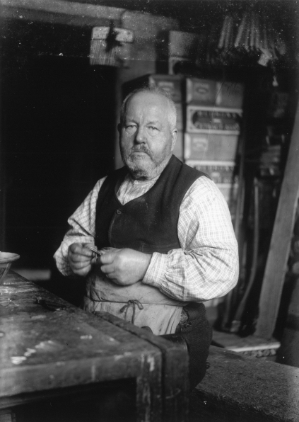
Francis Foot – Circa 1910’s, Local Islander.

My examples:

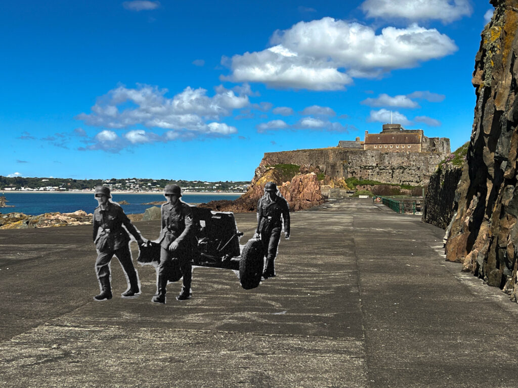
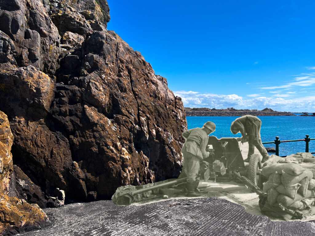
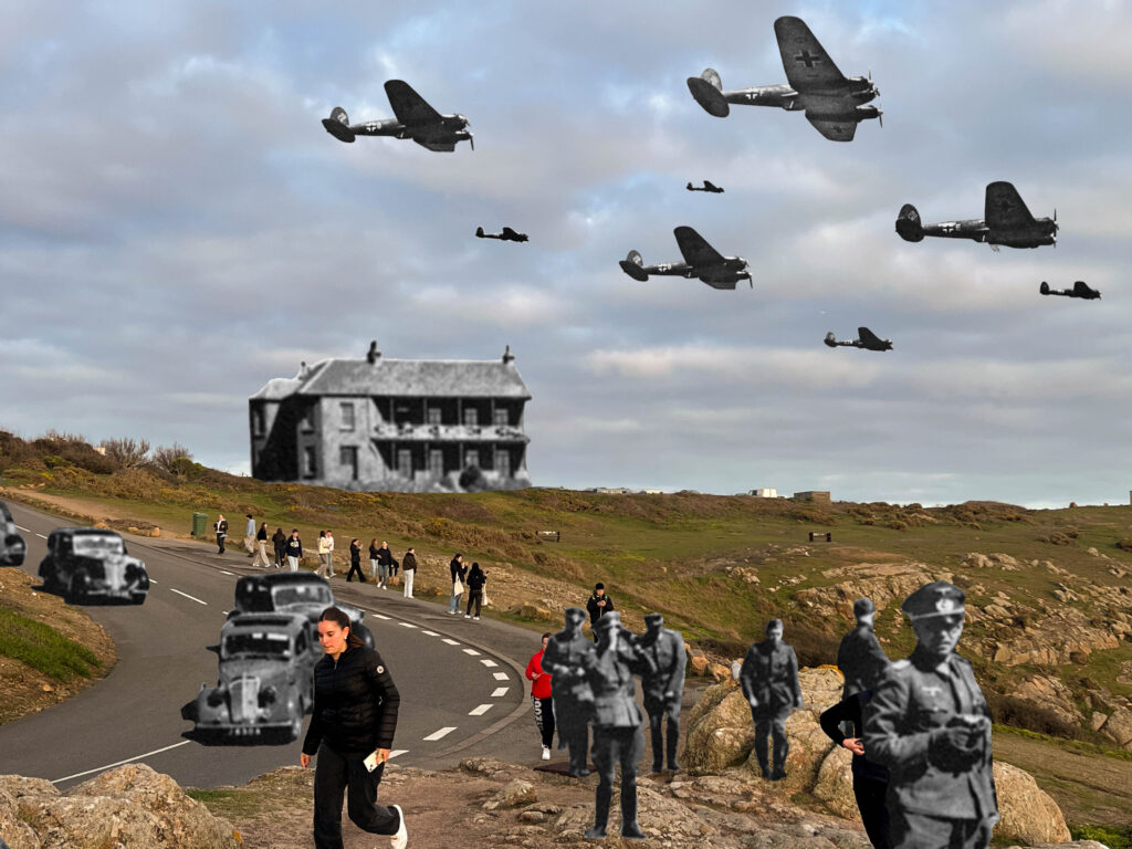
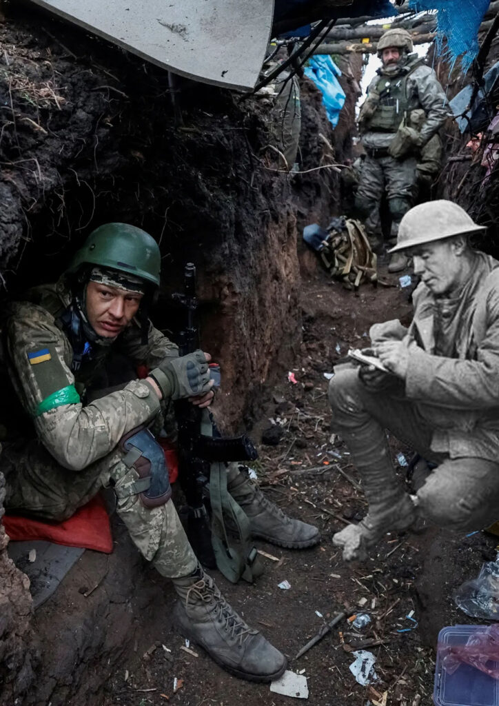
Using a historical basis of people, places and the past, I focused mine on German occupation of Jerseys recognisable structures such as Elizabeth Castle and famous tourist spots like Corbiere. I also explored the Anthropocene of war and that despite its circumstantial distances still contains similar elements of the past.

Street Photography –

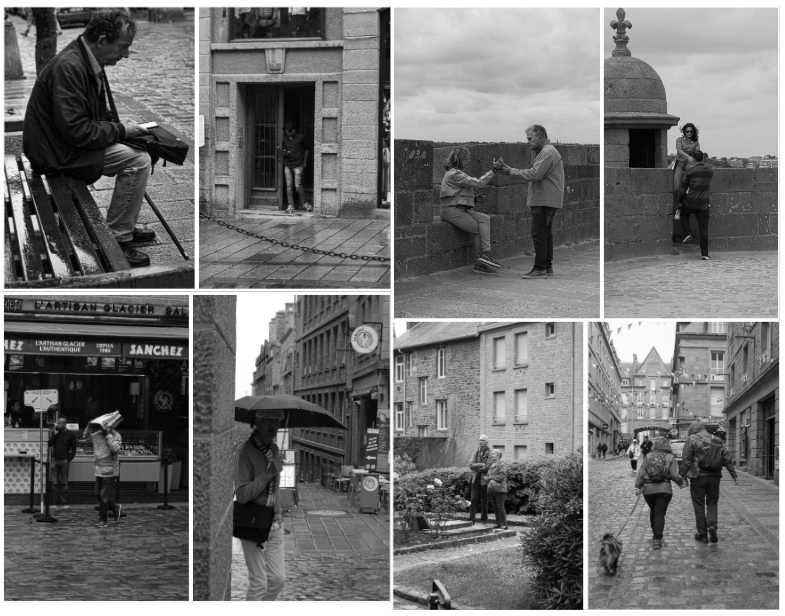
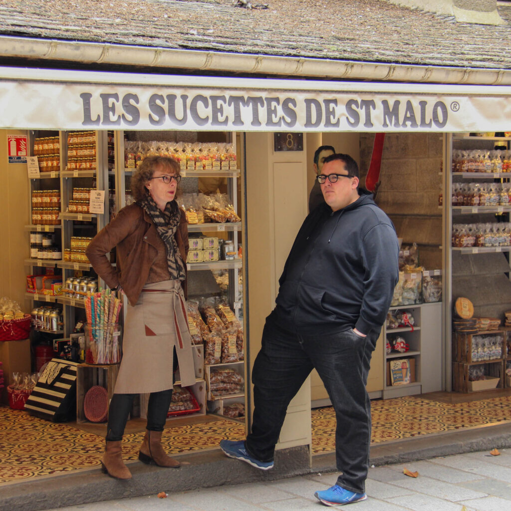
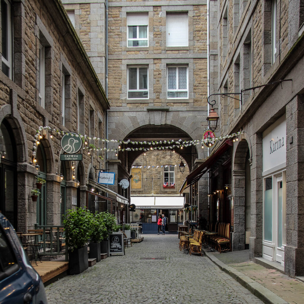
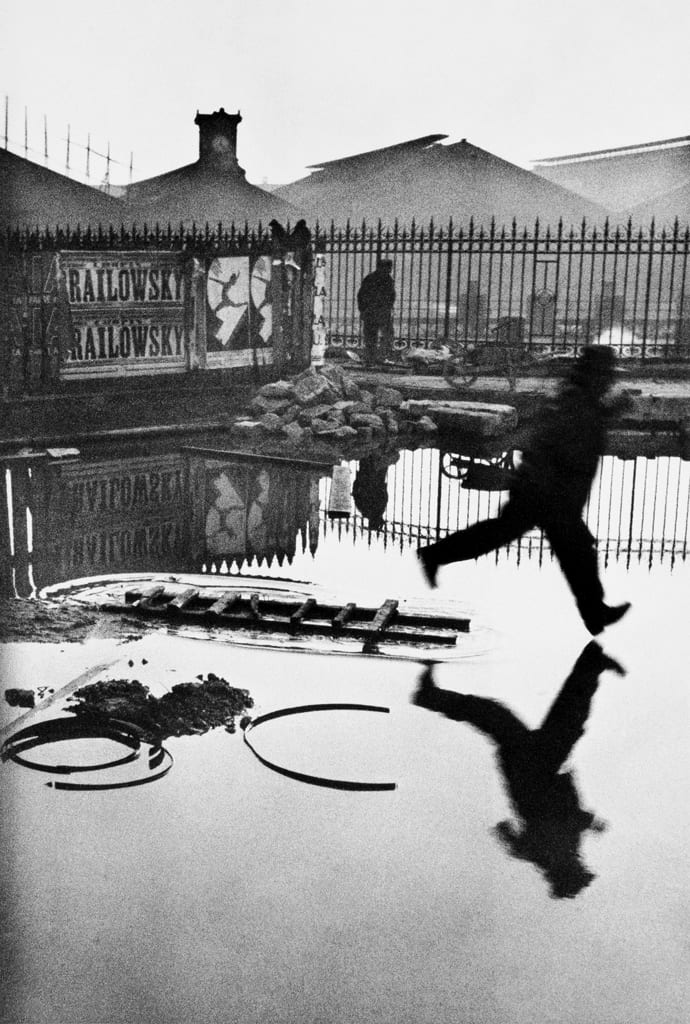
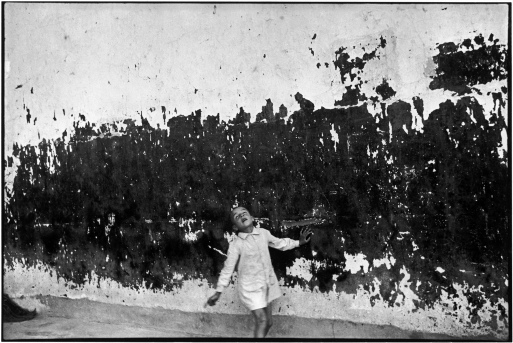
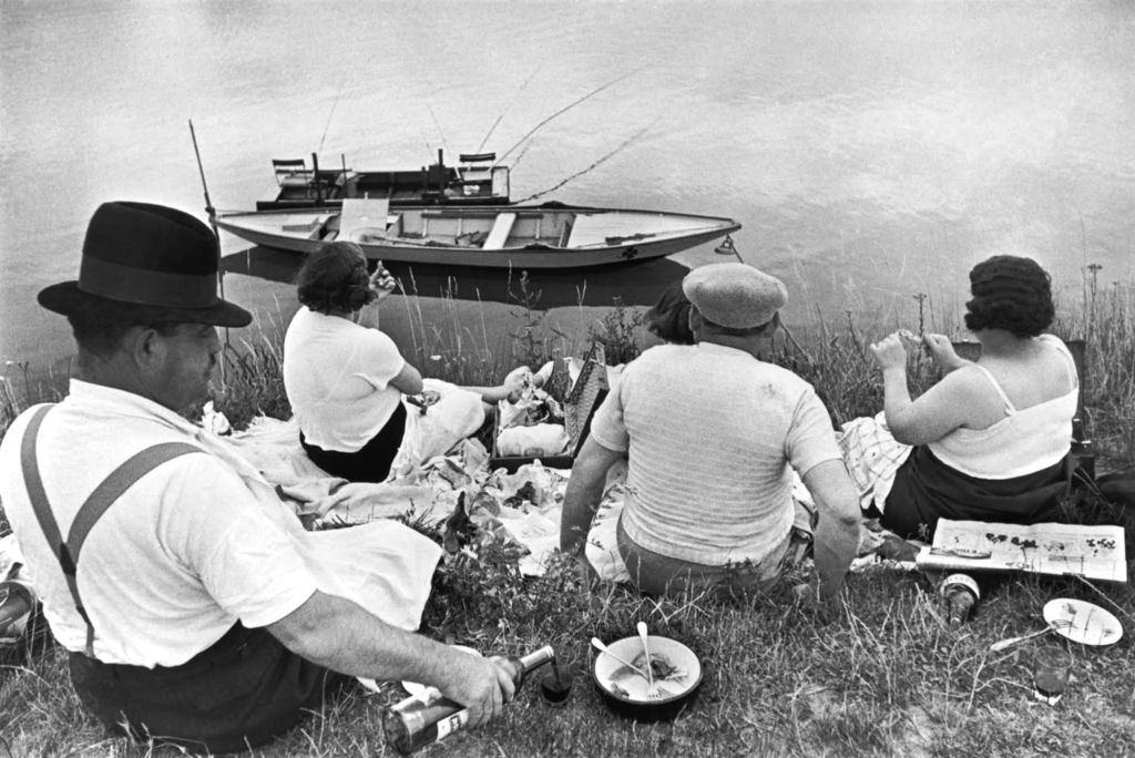
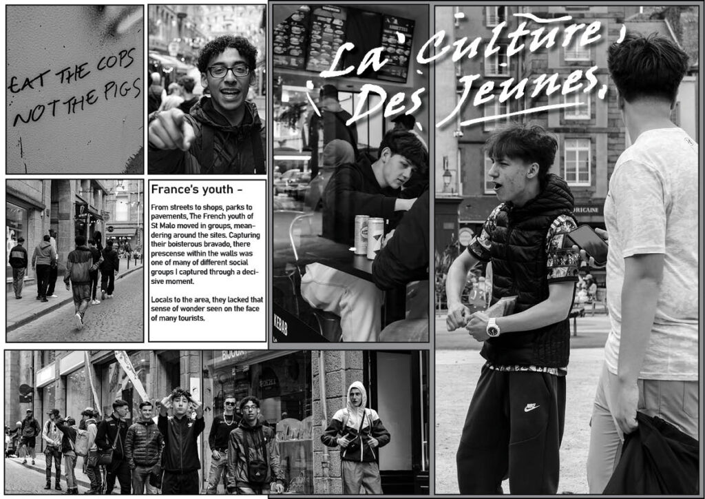
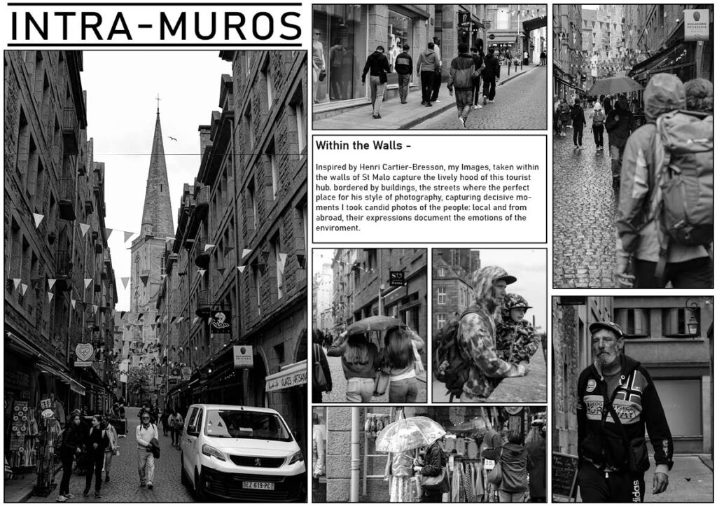
With a documentative insight to people, places and time, these 3 photographers sparked my interest for their local significance and their ability to capture island life from the mind 19th century to early 20th. With an insight further into documentative photography, I would soon discover, Henri Cartier-Bretton, where I would study his work of street photography of European towns and other places in the mid 20th century and recreate his style myself within the walls of St Malo. Cartier-Bresson focuses on the conceptual idea ‘The decisive moment’, her he states that everything that occurs happens in a flow of events, In Cartier-Bresson’s eyes, there are moments within these events that contain a perfect arrangement within a frame. These moments are always spontaneous and often never repeat themselves, therefore making the photographer vigilant to be ready to capture that decisive moment.

Henri Cartier-Bretton examples:

Henri Cartier-Bresson, Behind Gare St. Lazare, 1932.
Henri Cartier-Bresson, Valencia, 1964.
Henri Cartier-Bresson, Picnic on the Banks of the Marne, 1934.

My Examples:

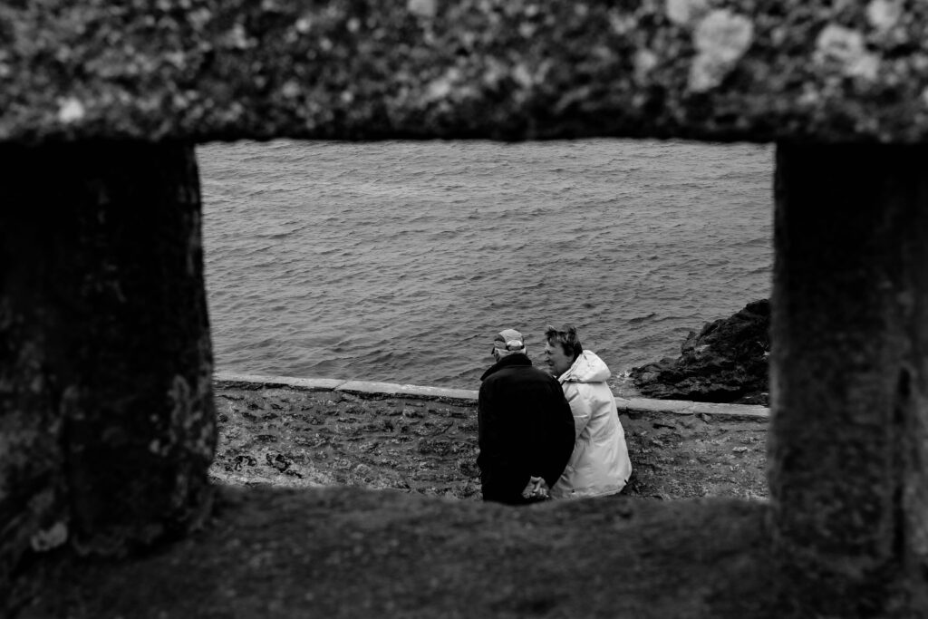
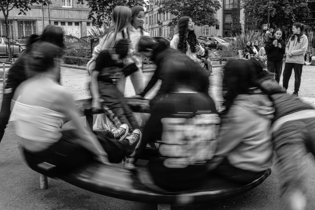
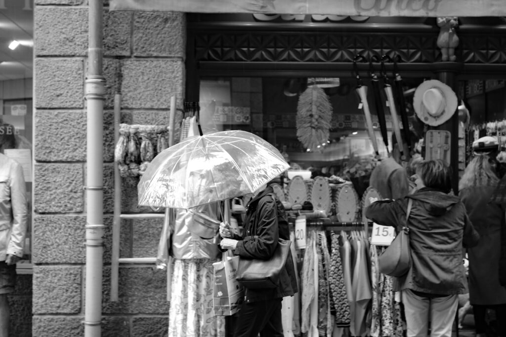
With my Images I created here, I became more appreciative of the style of Street Photography and how it could be applied to documentative photography, with its intrusive, candid style of capturing peoples lives, this really inspired to create more like images like this.

St Malo Page spreads:

Harbour Project:

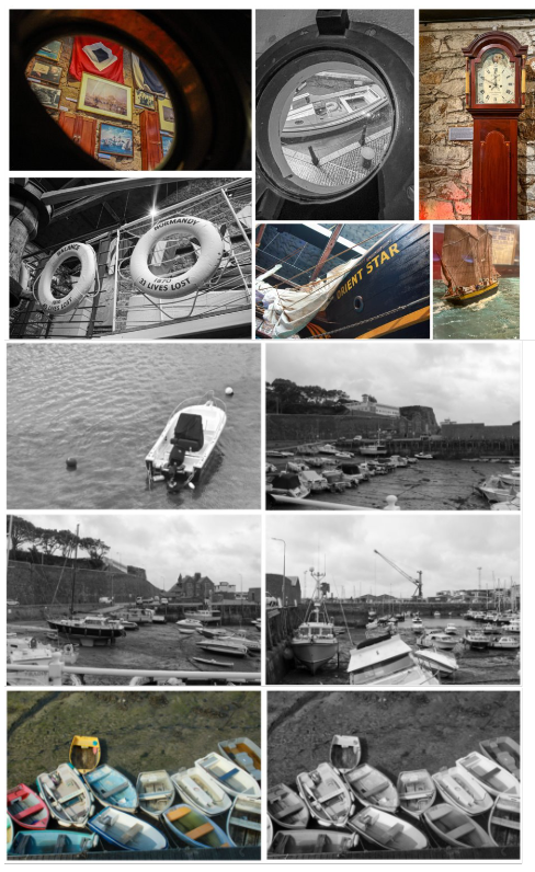
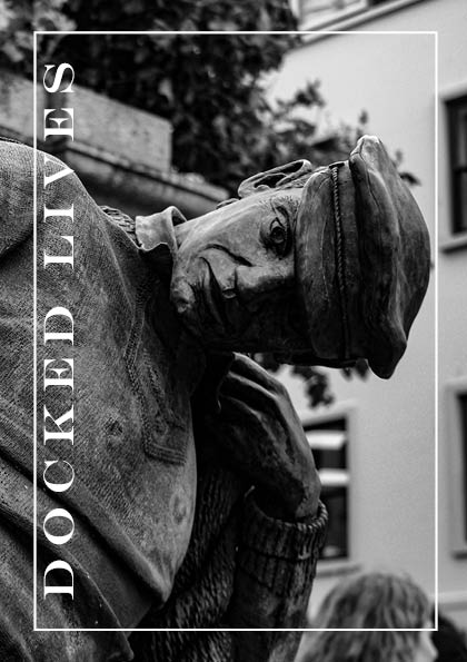
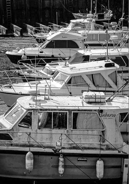
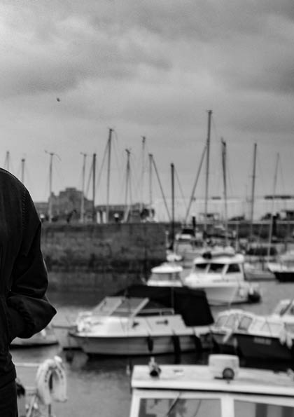
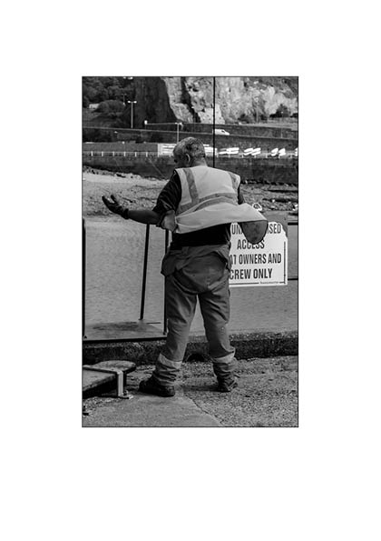
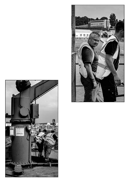
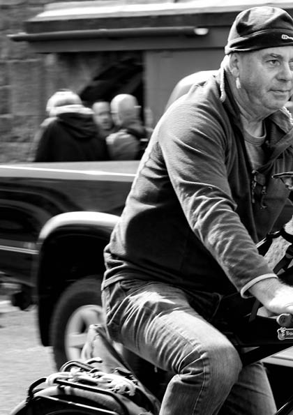
With our harbour project, we collected images for making paper books/Zines. Here I took from what I had learned from my previous project, and attempt to apply it locally and to my own style. Capturing the leisure and work aspects of the harbour my book was dedicated to documenting the characters and sites of St Helier Harbour.

Harbour Booklet/Zine:

Mirrors and windows –

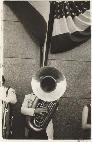
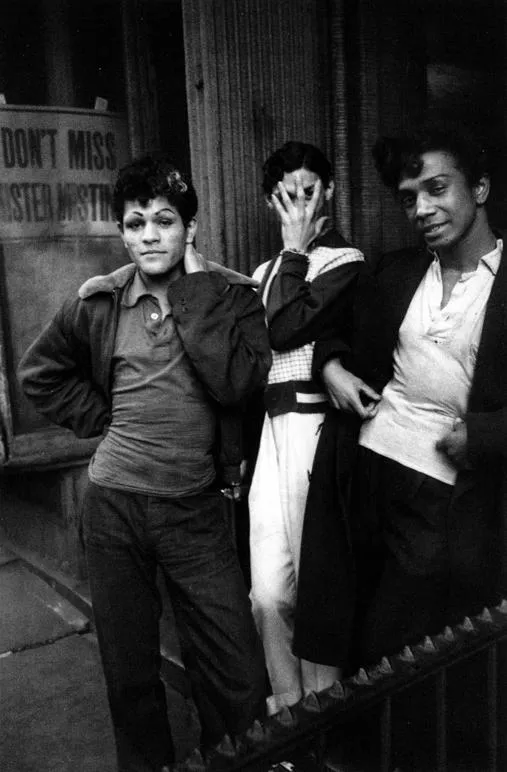
With a look into the mini-project, ‘Mirrors and Windows’, this stems from the theory of John Szarkowski, who states photography falls into 2 categories of either being Mirrors or Windows. As Szarkowski states “The distance between in terms of their conceptions of what a photograph is: it is a mirror, reflecting a portrait of the artist who made it, or a window, through which one might better know the world?”. To explain it simply, when creating a photograph, does it capture/represent you as an artist, either abstractly or normal (Mirror). Or does it show the exterior world, with all its natural elements (Window). With my past interests into documentative photography, I was more interested in the Window aspect. Looking at the Artist, Robert Frank, who was inspired by Cartier-Bresson, this inspired me to create my own outcomes to the concept of ‘Window’ photography.

Robert Franks work:

Democratic National Convention‘, 1956, Robert Frank.
New York City, Circa 1950, Robert Frank.

My examples:

With the documentative photography style, heavily implemented into my work I believe I have created various aesthetical and contemporary pieces of work which I can use to influence me in my final project outcome.

Mirrors and Windows Final Photos and Evaluation

Mirrors

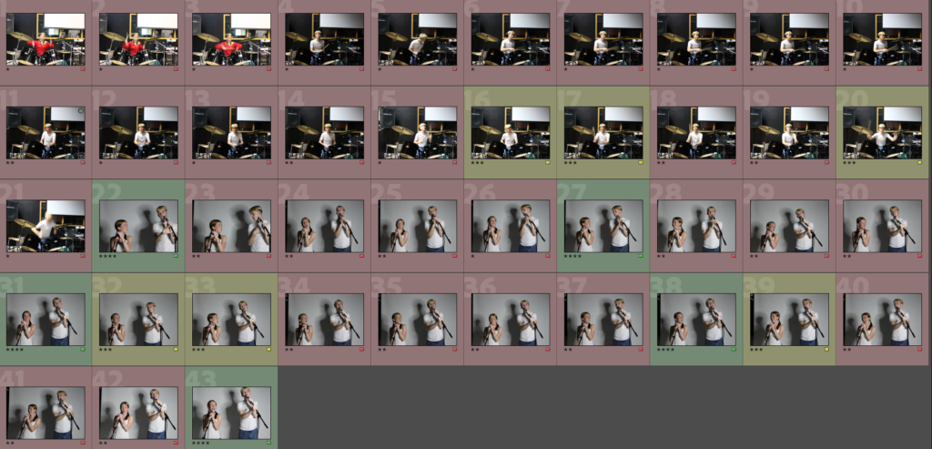
Contact Sheet

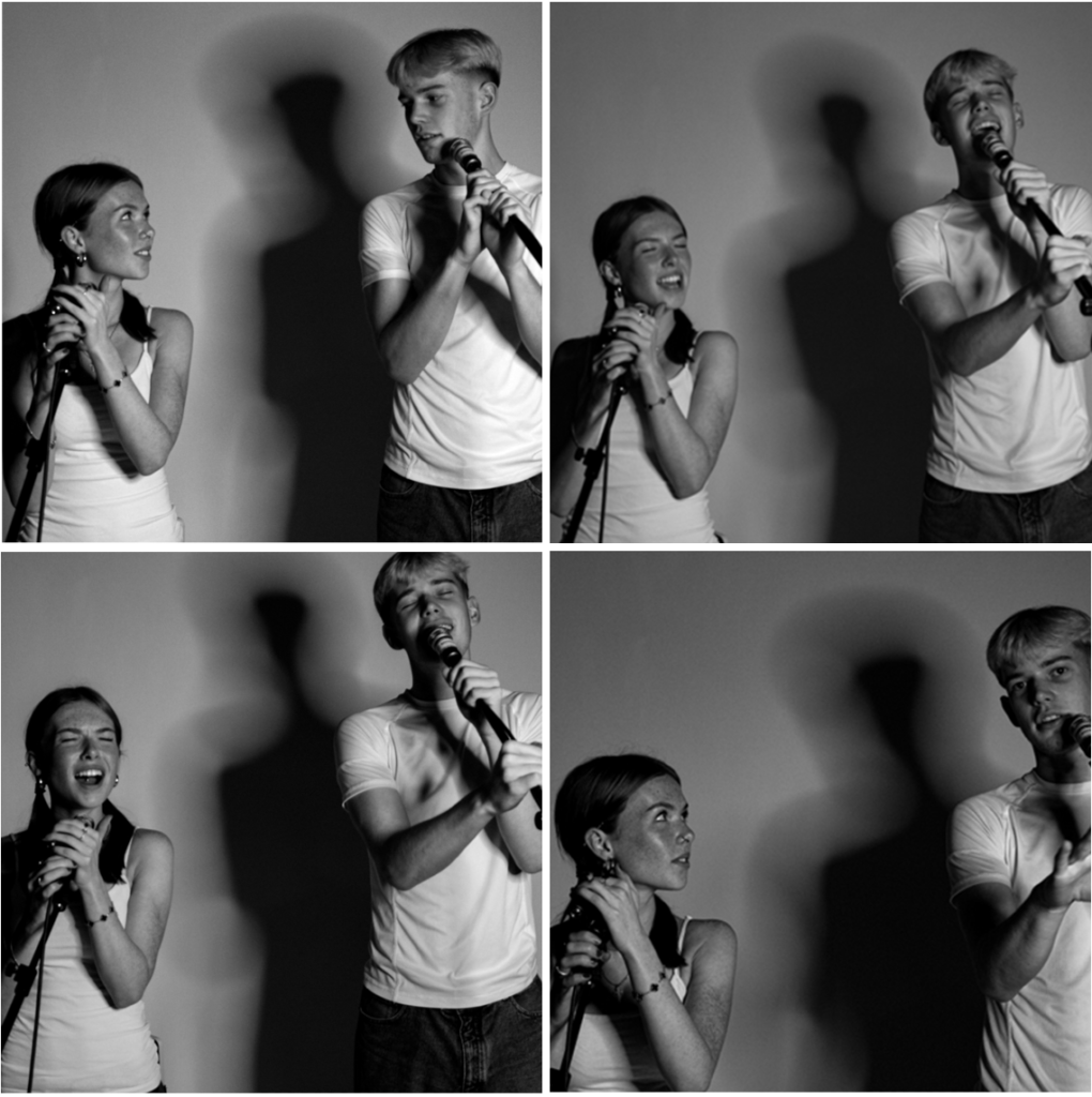
Selected Images

Editing

Edit 1

Edit 2

Edit 3

Final Images

Windows

Selected Images

These are all of the images that I think were successful.

Best Images

These are my best images out of the ones above. I have decided not to edit these photos as I would like for them to be kept natural and not be manipulated.

Evaluation

‘Mirror’ Photographs

Inspiration for Mirror Images

My Mirror Images

These are my final images. These images can be considered as mirror photos as they have been edited and manipulated. For these photoshoots, I used images of graffiti which I took when I went to Liverpool and edited them onto photos of the little white hut (Le Don Hilton) which I took in St Ouen. I think that this is an interesting combination as it takes the natural environment and displays it as an industrial one.

‘Window’ Photographs

Inspiration for Window Images

My Window Images

It is debatable whether these would be true ‘mirror’ photos as it is turning something real into something that is surreal/has been embellished. This style of photography could be classed as pictorialism as it emphasizes the natural beauty of the sea by altering reality. Since this is altering reality, you could declare that these aren’t true mirror images, however, you could also argue that this is not what your eye truly sees, but rather what the camera sees. Furthermore, these images capture the movement of the sea which is a natural process and, although these outcomes aren’t what the eye would typically see, these photographs are fully organic and have not been edited. Overall, I would say that these images are sit between the mirror and window categories but lean more towards being windows.

Review and Reflect

Anthropocene

Anthropocene in a way is a unit of time, it is used to describe the period within Earth’s history where human activity started to have a significant impact on the planets climate and ecosystems. This period is also sometimes known as the period of the great acceleration, things like carbon dioxide emissions and global warming that have significantly impacted our planet.

I have used anthropocene to create a diss at humans, so that we as people can really see what we are doing. My first artist case study was Naomi White and her Plastic Bags, where she took something so normal and dramatized it to make it portray a feeling. My second artist case study was Lucas Foglia and his ‘human nature’, where he dramatises misuse of the earth’s element’s.

Here are my responses to this –

(Naomi White Response) ‘ I wanted to take something as familiar as a plastic bag and change it into something strange, I wanted to create an image that people generally don’t want to look at, one that exposes the harsh truth that plastic won’t only end up killing all our wildlife but also us.’

(Lucas Foglia Response) ‘ I took this image up at plemont, where we spotted an old bunker, and they went in and explored while I took images. I think this portrays a massive contrast, of what that bunker would’ve been used for compared to people just using it to explore now.’

Masculinity vs Femininity

‘Femininity is a set of attributes, behaviors, and roles generally associated with women and girls. Femininity can be understood as socially constructed, and there is also some evidence that some behaviors considered feminine are influenced by both cultural factors and biological factors.’

Masculinity is a set of attributes, behaviors, and roles associated with men and boys. Masculinity can be theoretically understood as socially constructed, and there is also evidence that some behaviors considered masculine are influenced by both cultural factors and biological factors.

Portrait photographers have a lot of things to untangle when posing someone: their masculinity, femininity, or non-binary / genderfluid identity; their own perception of their gender in their industry or profession; society’s perception of their gender in their industry or profession; historical imagery of their gender and if it would be right to keep with that trend or break from it; and how lines, curves, shapes, and color are perceived in the art world with two dimensional imagery.

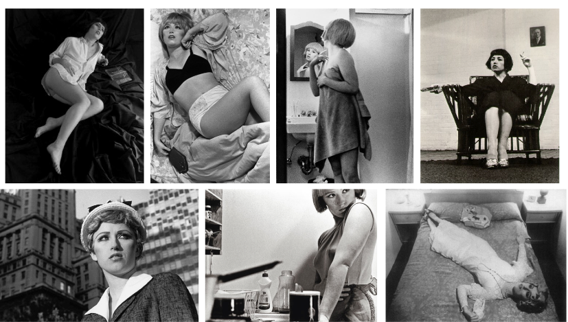
My artist case studies for this project were Claude Cahun and Cindy Sherman. Claude Cahun was a surrealist, photographer, sculptor, and activist. She is best known for her gender-fluidity in art, and her anti-Nazi resistance. Claude Cahun was an inspirational photographer, she paved the way for many other female photographers with her rebellious view on life, her not caring what other people say or think allowed for more people to do the same. Cindy Sherman has probed the construction of identity, playing with the visual and cultural codes of art, celebrity, gender, and photography. Sherman was always interested in experimenting with different identities, drawing attention to the artificiality and ambiguity of these stereotypes and undermining their reliability for understanding a much more complicated reality.

Here are my responses to this –

(Cindy Sherman Response) I have used this image due to its display of the beauty of being feminine rather than all the baggage that comes with it, a woman’s mind generally goes both ways when a male starts talking about femininity, either wondering if there about to display sexism and sterotypical explanation’s or whether theyre going to talk about the beauty of being a woman.
(Claude Cahun Response) This photo is aiming to describe what it’s like to be a man. Men are stereotyped to generally not talk about their emotions and that would make you ‘feminine’, so i have tried to capture this by photographing the ‘lone skater’. Men are known for being ‘alpha’ and like they should always have one foot forward and planning ahead, for example they should provide for the whole family, and although this may give them a purpose in life this may not be what they were personally born to do. Men have hobbies too, such as skating,skating is generally seen as masculine as its a sport of throwing yourself around, but i wanted to capture skating as a breath of fresh air, something to free a males locked up mind, by skating you can take all the pressure off your head and do something that they enjoy.

Film

Although we have not done film within photography, I have done it within media and I personally think that it is easier to portray feelings and make something subjective through photography rather than film. If my images were turned into film they would all become objective, and have everything be told, but photography for me is meant to say so little leaving so much.

Photography

I have done many photoshoots within taken photography A-level and I think that a photography is the perfect way to portray thoughts and feelings. Photography turns ordinary into the extraordinary. It transforms what it describes, and reveals so much but keeps so much too itself, which frames reality. It can be objective and subjective because it is told by a persons intuition. It fixes the shadows, before the event of digital tools. You need darkness to see light.

Documentary

Documentary photography is a genre that aims to capture real-life events, environments, and people, often with the intent of conveying a narrative or social message. It focuses on storytelling through images, documenting moments in a way that highlights authenticity and context.

I think that some examples I have made of this include –

Environmental Photography-

Environmental portrait photography is the art of taking pictures that will be used to tell a person’s story via its connection to a certain place. This connection often reflects the message that the environmental portrait photographer wants the viewer’s eye to receive.

Marine Harbour-

This image is very technical it manipulates the brain by the use of texture and detail, but portraying hoe historic this is but also how real it is. It makes you think about what would happen if trade went under, us as a small island would be in the dark and have nothing. A lot of people see the harbour as something that is aged and old, although it is that it us important to incorporate how it is still vividly in use every day.

Tableaux

Tableaux, or tableau vivant, refers to a “living picture” where a group of people poses to create a still scene or representation, often resembling a painting or a moment in history. In contemporary contexts, tableaux can also refer to staged photography where subjects are arranged to create a specific composition or narrative, often with careful attention to lighting, props, and costumes. It’s a powerful way to explore themes and evoke emotions through visual storytelling.

I think that some examples I have made of this include –

Landscape-

This image is from my landscape project, I actually really disliked this image but I think that it perfectly fits in with tableaux because it is a living picture. You can see a scene, but one that is not staged, it creates a very specific narrative of people chatting at school, also portrays the story of how phones continue to separate us as people.

Anthropocene-

This image is from my anthropocene project, I like how this image has a really effective narrative due to the clear view of the sunset. This show the exact setting of the narrative, it also creates a bolder lighting for the background making what is in the center of the frame bolder, which is a group of people talking (2people). This creates an unknown narrative, bet you would love to know what they are talking about in such a special place.

Conceptual

Conceptual photography is a genre that emphasizes the idea or concept behind the photograph rather than just capturing a moment or a realistic scene. In this approach, the artist often starts with a specific concept or theme and uses visual elements to express that idea creatively.

I think that some examples I have made of this include –

Femininity-

I feel like there is so much negativity around girlhood and womanhood so I’ve decided to try my best to portray the fun within it. The stereotype that only females can wear makeup has been around since makeups birth, and many people either frown upon this or agree, I have captured my model doing her makeup (lip-gloss), to show just how much fun something like makeup can be. Many people (mostly men) shade on makeup claiming that nowadays a woman’s beauty can be removed with ‘one wipe’, and so what? Woman have been denied fun all their lives, being shoved into stereotypes of cooking and cleaning, and when makeup was created this changed the lives of women and girls all across the globe, this is why I have captured my model in a very girly lit environment, not only to juxtapose her and her surroundings’ but also to create ambient lighting to portray the mood of female empowerment and all the happiness that comes along with it.

Urban-

The reason that I think this image is so conceptual is due to its natural black and whiteness. By using gloomy weather it has made the image as bright as a piece of paper, with main models just standing out. Also by using editing making the image more foggy I have left more to be interpreted by the viewer letting them use their own conceptual ideas. There is emphasis on the idea behind the image by leaving a lot of space and a blank canvas.

Jim Goldberg

Who is He?

Jim Goldberg is an American photographer and visual artist known for his work in documentary photography and photojournalism. He often combines text and images to create compelling narratives about marginalized communities and social issues. One of his notable works is “Raised by Wolves,” which explores the lives of homeless youth in San Francisco.

Why is he so influential?

Jim Goldberg was influential for several reasons, Innovative Storytelling, he pioneered the use of mixed media in photography by combining images with handwritten text. Focus on Marginalized Communities, his commitment to documenting the lives of underrepresented groups, particularly homeless youth and marginalized communities. Empathy and Authenticity, Goldberg’s empathetic approach fostered trust with his subjects, resulting in intimate and honest portrayals that resonate with viewers. Exhibition and Publication, his works, such as “Raised by Wolves” and “The Ballad of Sexual Dependency,” have been widely exhibited and published, influencing photographers. Impact on Visual Culture, Goldberg’s techniques and themes have inspired a generation of photographers and artists to explore the intersection of social issues and visual storytelling, reshaping how narratives are presented in photography.

How can I take photos like him?

Develop a Concept, focus on a specific social issue or community that resonates with you. This will give my project depth and purpose. Build Relationships, spend time with my subjects to build trust. Authentic connections will help me capture more intimate and genuine moments. Combine Text and Image, experiment with integrating handwritten text or quotes from my subjects alongside my photographs. This adds a personal narrative layer to my work. Use Documentary Techniques, embrace a documentary style that captures real-life moments. Allowing your subjects to express themselves naturally. Experiment with Composition, explore different compositions and perspectives. Don’t be afraid to play with framing and focus to convey emotions effectively. Focus on Emotion and Story, look for moments that evoke feelings or tell a story. Think about how my images can reflect the complexities of my subjects’ lives. Edit Thoughtfully, when editing, maintain the authenticity of my subjects’ voices and stories. Consider how the final presentation aligns with my initial vision.

Cindy Sherman

Who is She?

Cindy Sherman is an American photographer and conceptual artist known for her distinctive self-portraits that explore identity, gender, and the construction of persona. Since the late 1970s, she has created a series of works in which she assumes various roles, often drawing on cultural stereotypes and cinematic tropes.

Why is she so influential?

Exploration of Identity, she challenges traditional notions of identity and self-representation, prompting discussions about how gender, roles, and societal expectations shape who we are. Feminist Perspective, her work is a critical commentary on the representation of women in media and art. Conceptual Art, Sherman’s approach blurs the lines between photography and conceptual art. Her self-portraits provoke questions about authenticity and performance, encouraging viewers to consider the constructed nature of identity. Cinematic Influence, by drawing inspiration from film and popular culture, Sherman connects her work to broader narratives about storytelling and representation, making it accessible and relatable. Innovation in Photography, her unique style and method have paved the way for other artists to explore similar themes, influencing a generation of photographers and visual artists.

How can I take photos like her?

Explore Themes of Identity, reflect on what identity means to me. Think about how I want to represent myself and others, focusing on themes like gender, culture, and societal roles. Create a Concept, develop a series based on a specific idea or narrative. Costume and Makeup, use costumes, makeup, and props to transform myself or my subjects. This helps create distinct characters and enhances the storytelling aspect of my photos. Set Design, pay attention to the setting and backdrop. Consider how different environments can contribute to the mood and narrative of my images. Experiment with Composition, play with framing, angles, and lighting to create dramatic effects. Think about how different compositions can convey emotion or context. Embrace Performance, approach my photography as a performance. Experiment with poses, expressions, and gestures to bring my characters to life.

Tom Wood

Who is he?

Tom Wood is a British photographer known for his documentary-style work, particularly his candid street photography. He gained recognition for capturing everyday life in urban settings, often focusing on the people and environments of Liverpool, where he has lived and worked. Wood’s photography is characterized by its raw, unfiltered approach, showcasing the nuances of human interaction and the essence of place.

Why is he so influential?

Candid Approach, his documentary-style photography captures real-life moments with authenticity, providing an unvarnished look at everyday life. This approach resonates with viewers and highlights the beauty in the ordinary. Urban Exploration, Wood’s focus on Liverpool and urban environments allows him to document the socio-cultural dynamics of the city, making his work a valuable resource for understanding place and community. Human Connection, his ability to connect with subjects and portray their emotions and stories fosters a deep sense of empathy in his work, encouraging viewers to engage with the images on a personal level. Visual Storytelling, Wood’s photographs often tell rich narratives, capturing fleeting moments that reveal broader social themes, such as identity, class, and human interaction. Influence on Street Photography, as a prominent figure in street photography, Wood has inspired many emerging photographers to explore their surroundings and document the lives of people in their communities. Critical Acclaim, his work has been widely exhibited and published, earning recognition within the photography community and contributing to discussions on documentary practice and urban life.

How can I take photos like him?

Embrace Candid Moments, focus on capturing spontaneous, everyday scenes rather than posed portraits. Be patient and observant to catch genuine interactions. Explore my Environment, spend time in my local community or urban settings. Get familiar with the places where people gather and engage in daily life. Develop a Personal Style, pay attention to the visual elements that resonate with me. Experiment with composition, framing, and angles to create a signature style that reflects my perspective. Engage with Subjects, while Wood often captures candid moments, building rapport with my subjects can lead to more intimate and powerful images. Take time to connect with people in my environment. Use Natural Light, utilize natural light to enhance the mood of my photos. Experiment with different times of day to see how light affects my images. Tell a Story, think about the narrative behind my photos. Consider how each image fits into a larger story or theme, capturing the essence of the moment and its context. Be Persistent, street photography often requires patience and persistence. Don’t be discouraged by missed opportunities; keep shooting and refining my skills. Experiment with Black and White, Tom Wood often works in black and white, which can emphasize emotion and composition. Try shooting in monochrome to see how it changes my approach. Edit Thoughtfully, when editing my photos, aim to enhance the narrative without over-processing. Keep the focus on the authenticity of the moment. Study Other Photographers, look at the work of Tom Wood and other street photographers for inspiration. Analyze their techniques, themes, and approaches to storytelling.

Capturing teenage culture through photography involves a mix of technical skills and a keen understanding of youth dynamics. Some skills that I could use include: Candid photography, by using spontaneous moments and a discrete approach I will make my models feel comfortable allowing for more natural images. Storytelling, focusing on a narrative that resonates with being a teenager will make my images convey a story or theme reflecting experiences and challenges. Emotional connection, by connecting with my models (using my friends) it will build more support making more intimate photography. Composition, different framing techniques and leading lines to make my photos visually engaging. Understanding context, knowing what it is like to be a teenager living in Jersey will help me to really produce something that is meaningful. Use of colour and light, using different bright and vibrant colours to convey energy and dark and softer colors to create more intimate mood. Street photography techniques, documenting everyday life and urban environments that teenages naviagte. Editing skills, enhance the overall mood of my images. Engagement with trends, to portray a current feeling.

Digital photography will be used within my project, by taking photos digitally on a good camera I can take vibrant images which will make it easier to portray my narrative. I may include some portraiture within my project, to display a sense of emotion from a teenager to continue to my narrative. By getting an up-close personal look I can portray a lot more. Street photography will probably be one of my most used processes, this will help me to portray a story of lidr, one that can be very subjective. I will use a documentary style to show how people feel and how they lie there lives, this will portray teenager culture from the people who live and breath it. Experimental Techniques, techniques like double exposure or long exposures can create unique representations of the teenage experience, emphasizing creativity and self-expression. Lifestyle Photography, capturing moments that define teenage life, such as friendships, hobbies, and daily routines, can create a relatable and authentic narrative. Mobile Photography, using smartphones to capture spontaneous moments can be very effective. The immediacy and accessibility of mobile photography often lead to more genuine, unguarded expressions. Mixed Media, combining photography with other artistic elements, like drawings or text, can create a more layered representation of teenage experiences and feelings. Each of these processes can be tailored to reflect the specific stories and emotions that are central to being a teenager, allowing for a diverse representation of this dynamic stage of life.

Candid Shots, capture spontaneous moments to convey genuine emotions and interactions, showcasing the authenticity of teenage life. Close-Ups, focus on facial expressions or hands to highlight emotions and details that tell a deeper story. Use of Natural Light, shooting during golden hour (early morning or late afternoon) can create a warm, flattering light that enhances the mood of the images. Depth of Field, use a shallow depth of field to blur the background, drawing attention to the subject and emphasizing their emotions or actions. Composition Techniques, experiment with framing, rule of thirds, and leading lines to create dynamic and engaging images that guide the viewer’s eye. Motion Blur, capture movement to represent energy and spontaneity, such as a group of friends laughing or dancing. Perspective and Angles, try shooting from different angles—high above or low to the ground—to provide unique viewpoints that can change the narrative of the photo. Black and White Photography, strip away color to focus on emotions, contrasts, and textures, often conveying a timeless quality that resonates with feelings. Environmental Portraits, place the subject in a meaningful setting that reflects their personality or interests, telling a broader story about their life. Thematic Series, create a series of photos around a specific theme (like friendship, identity, or rebellion) to capture different facets of the teenage experience. Double Exposure, combine two images into one to represent the complexity of teenage thoughts and feelings, blending different aspects of their life. Lighting Techniques, experiment with backlighting, silhouettes, or using artificial lights to create dramatic effects that enhance the mood.

Candid Photography, capture spontaneous moments during everyday activities, showcasing genuine interactions and emotions among friends or during events. Street Photography, document teenagers in urban environments, capturing their interactions, fashion, and social dynamics in a real-world context. Documentary Photography, create a series that tells a story about a teenager’s life, exploring their routines, challenges, and celebrations over time. Lifestyle Photography, focus on moments that depict the daily lives of teenagers, such as hobbies, social gatherings, or school life, to create relatable narratives. Experimental Techniques, utilize methods like double exposure, long exposures, or light painting to add artistic flair and depth to your images, representing the complexity of teenage life. Environmental Portraits, place subjects in settings that are significant to them, like their room or favorite hangout, to provide context and insight into their world. Group Shots, capture friendships and social groups to highlight the importance of community and connection during the teenage years. Creative Composition, use framing, symmetry, or interesting angles to add visual interest and make the photos stand out, reflecting the energy of youth. Mood and Atmosphere, play with lighting and color palettes to evoke specific emotions—bright colors for joy and vibrancy, or muted tones for introspection. Action Shots, capture teens engaged in activities like sports, dancing, or hobbies to convey energy and passion. Mixed Media, combine photography with drawings, text, or other artistic elements to create layered representations of teenage experiences. By employing these methods, you can create a diverse and compelling representation of the teenage experience, capturing both the joys and challenges of this dynamic stage of life.

Using various methods, techniques, and processes to portray teenage life in photography allows you to create a rich, nuanced representation of this unique stage of life. Here are some reasons why it’s beneficial: Authenticity: Different methods, like candid photography or lifestyle shots, help capture genuine moments and emotions, making the representation more relatable and true to life. Diversity of Experience: Teenagers experience a wide range of emotions and situations. Using various techniques allows you to explore and portray these complexities, from joy and friendship to identity struggles. Visual Storytelling: Different photographic methods can help tell a compelling story. For example, documentary-style photography can highlight the everyday realities of teenage life, while portraiture can focus on individual identity. Creative Expression: Experimenting with techniques like double exposure or mixed media allows for artistic expression, providing a platform for teenagers to convey their feelings and perspectives creatively. Emphasizing Context: Methods like environmental portraits place subjects in meaningful settings, adding depth to the narrative and showing how their surroundings influence their experiences. Engagement: Varied approaches can capture the attention of viewers, making the photographs more engaging and thought-provoking. This is especially important when trying to connect with a broader audience. Highlighting Relationships: Group shots and candid moments can emphasize the importance of friendships and social dynamics, showcasing the support systems that are crucial during adolescence. Exploring Identity: Techniques like self-portraits or thematic series encourage teens to explore and express their identities, leading to a deeper understanding of themselves and their peers. Mood and Atmosphere: Different lighting and compositional techniques can evoke specific emotions, enhancing the storytelling aspect and allowing viewers to connect on a personal level. Versatility: Using a range of methods and techniques enables you to adapt to different subjects and environments, making your work more versatile and impactful.

Review and Reflection-

Throughout the past year of studying photography I enjoyed many areas of the subject from landscapes to studio portraits to looking outside the box for different elements that would fit the criteria of what defines Femininity as well and Masculinity.

I feel that my personal style and areas that I have enjoyed the most have improved my own work and my own explorations of photography. I found new ways to express my idea and I have found things that I would rather stay away from if I dont think it relates to the image i’m trying to create, I believe my personal project will explore idea that I find most interesting and what I think works best.

I explored historical areas such as the origins of photography, origins of romantism and early discoveries of still life. I also explored the works of Ansel Adams and his invention of “The Zone System” in the 1930s as well as New Topgraphics and the impact throughout the 1950s of the aftermath of The Great Depression and rural areas of America. These historical aftermath was captured by photograohs like Robert Adams and Lewis Baltz, the term “New Topographics” being coined by William Jenkins in 1975.

Using my own personal camera/lenses as well as accessing the school cameras (DSLR Canon E0S with a 18-55 IS lens) I also increased my knowledge of camera skills and techniques when manipulating a photograph and what to do when the daylight/ weather doesnt work in your favour. Softwares I have used in the course have been Adobe Photoshop as well as Adobe Lightroom Classic especially.

Below I have added a selection of photographs ranging in the different subjects below, different locations and different editing adjustments to show the range which I explored whilst being creative.

Themes/ Ideas from photographers that I liked:

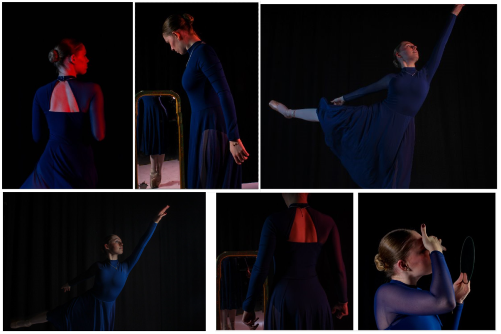
For my studio and lighting techniques I enjoyed being creative with positioning my subejct in different poses and positing the lighting to how I wanted it to appear. Lightining is very important when making photographs have a certain feel/ atmosphere. The lighting techniques we looked at were Chiarascuro, Rembrandt and Butterfly lighting. I believe I will use and experiement with these techniques in my personal project and will use the studio as a background as it could look like a interesting varied selection and look clean when producing different outcomes out of the same image and its a clean background which is easier to manipulate and adjust rather than a colourful and varied background with different complex textures tat may not look right when adding other colourful elements.

Themes/ Ideas from photographers that I liked:

Cindy Sherman’s work is cold and can be left to interepretation and usually her subjects have certain facial expressions and are positioned to appear vulnerable and objectify as the image focuses on the subject being the main element.

In this photoshoot I like the fact that the photoshoot can be manipulated and adjusted to how I want. I would like to use certain elements of Cindy Sherman’s work such as subverting narrative and playing around with the feminine atomsphere of 1950s household duties and playing into the typical stereotype.

Themes/ Ideas from photographers that I liked:

In terms of the feminity and masulinity topic I liked the fact it was left to interpretation and that I was different to what we had experimented with prior to doing the project fem and masc.

It gave me time to play around with ideas and as well as prior to doing the project we had experiemented with the studio lighting so that also played a part as in where to shine the lighting in what spots so that the textures and certain areas to be brightened more than others despite the feminity and masculinity not reallyu being focused on facial structures but more on skin on other parts of the body thaty appeared more on either sides of the project.

Themes/ Ideas from photographers that I liked:

The project explores the landscapes which also impacted aby the storm that happened last year, showcasing the stark contrasts between natural beauty and environmental degradation. Through these images, I aim to highlight the balance between human development and the natural world, raising awareness of the ongoing changes in our ecosystems.

Capturing these moments in the different shoots, they allowed me to reflect on the consequences ofv human actions, they foster a sense of urgency to advocate for more sustainable practices. Each photograph urges viewers to recognize and confront the realities of the Anthropocene despite some photos looking like theirs nothing different/ odd about them considering environmental impacts.

In this project I enjoyed planning different locations for shoots and experimenting with how I wanted the photographs to appear in my head. Despite the photographs inspiration from Anthropocenic photographs buildings massive structures and large masses of mountains hills I tried to recreate a similar effect and take inspiration from oher artists/ photographers. I tried to vary certain images through adjusting them to black and white and some in colour but adjusting them so that the textures pop more.

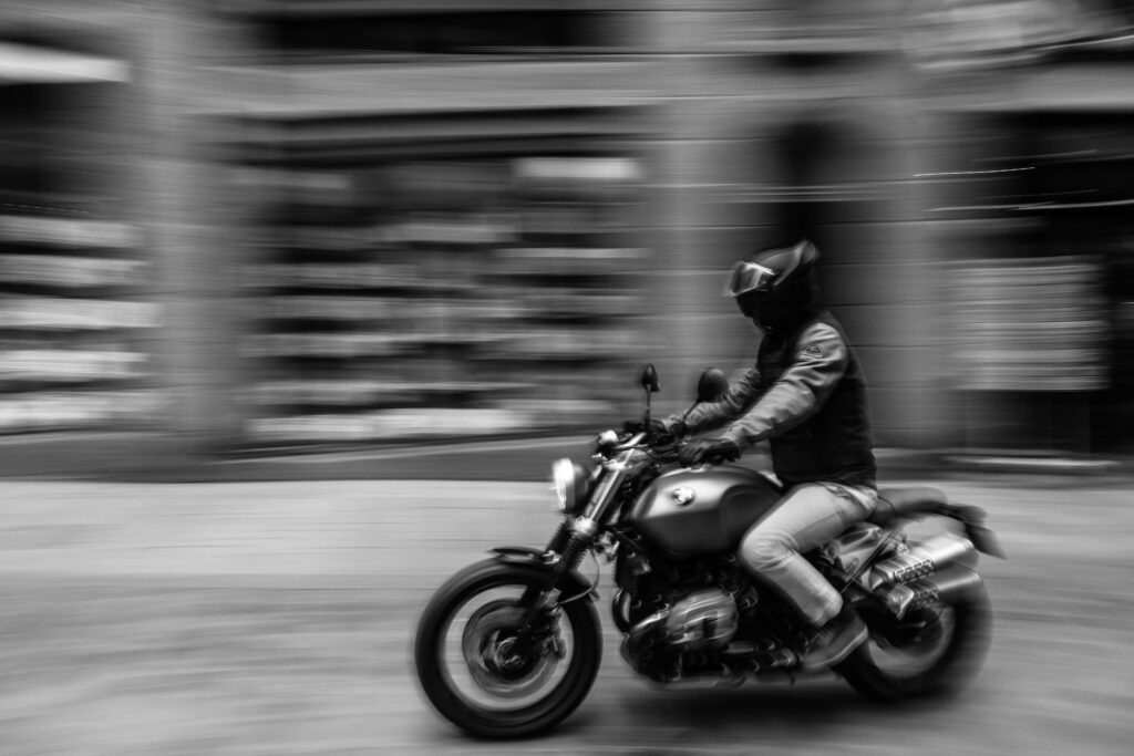
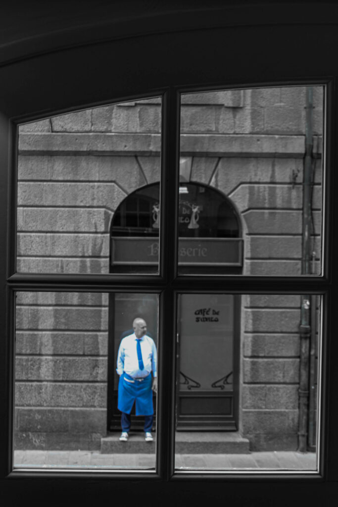
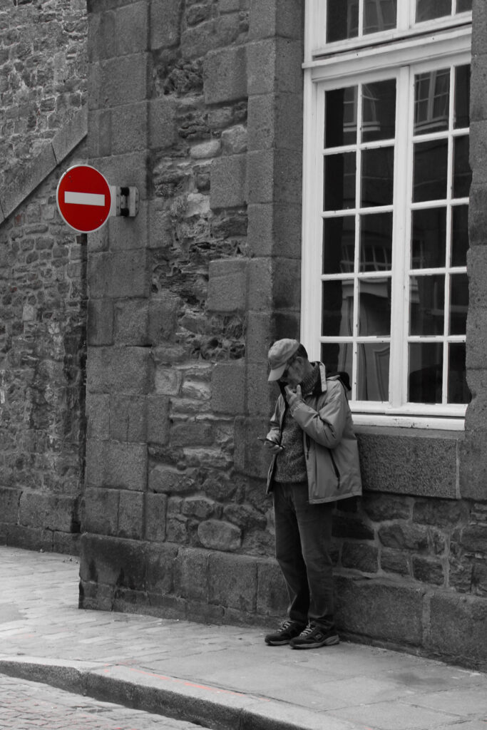
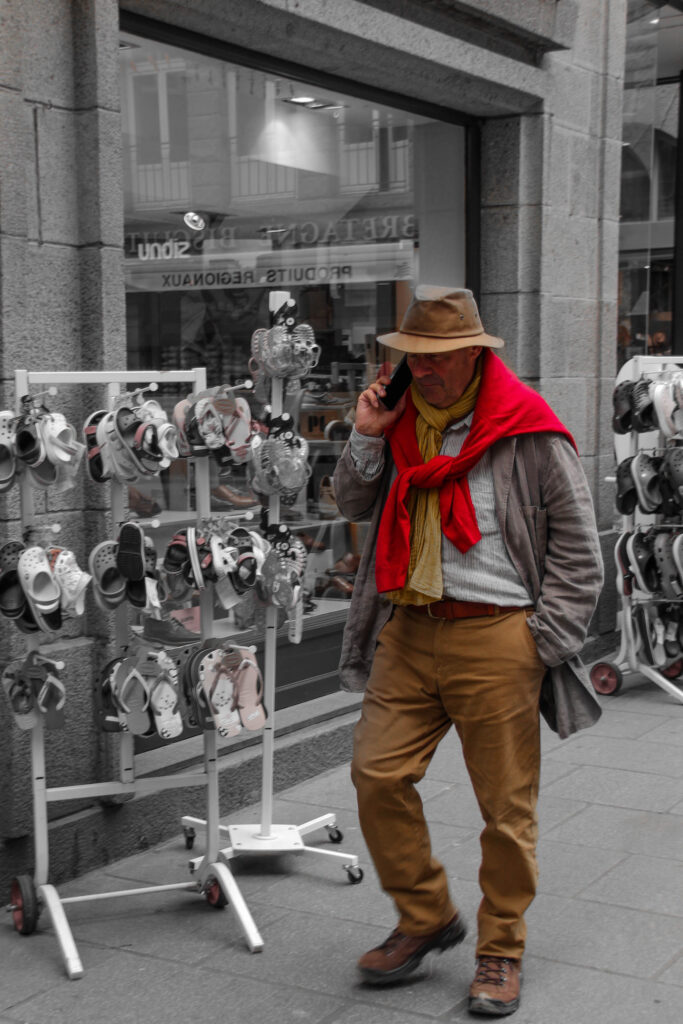
The street photography project/ photoshoot taken in St Malo gives the audience a glimpse into the city from a candid and unfiltered perspective. Through the project I took photographs thaty included candid shots of the locals and tourists, markets and the seaside moments, the photographs above as well as the overall photoshoot captures everyday life and the unique of the character of St Malo.

I see myself incorporating elements I learned in this shoot as well as experiencing as I think it could work well in terms of how to structure and how candid photography looks good in terms of shooting individuals as it is very spontanieous

The street photography photoshoot allowed me to connect with people in a different way, capturing conversation and many different expressions. I was also inspired as each click of the shutter felt like a way to document a living narrative. The process of exploring the streets, discovering hidden areas and engaging with the community made the shoot memorable, turning the art of it into an experience that celebrated both the place and its people.

Observe, Seek, Challenge- Windows Photoshoot Plan:

The objective for this photoshoot is: Capture the unfiltered reality of people’s lives and spaces by observing and photographing moments through windows, reflections, and street environments. Emphasize candid shots that reveal the quiet beauty, humor, or melancholy of everyday scenes.

Therefore my plan for this photoshoot is to doument reality and to use street photogroahy and public spaces with differnt types of people as my motive for this. I think the idea that differnt people are oding differnt thing and going in seperate direction with diffent expressions on their face makes it interesting. I want the photographs to feel candid, introspective, and observant, aiming to make viewers feel as though they are glimpsing a hidden narrative or private moment.

Locations that I may explore are:

Urban Street Corners and Cafés– Street corners, cafés, and storefronts that offer a natural setting where people are often preoccupied, providing chances to capture moments of introspection or interaction.

Residential Areas with Large Windows- Capturing private lives as visible through windows, blending elements of public and private space.

Public Transport Stops- Photographing people waiting or lost in thought, using bus or tram windows as frames, which add layers and reflections to the image.

Reflections on Buildings and Vehicles- Glass-walled buildings, car windows, and reflective surfaces on the street can add a sense of depth and allow for more complex compositions by combining elements in the foreground and background.

I may use my previous blogpost for inspiration that lists photographers that do similar work inspired by John Szarkowski’s theory of Windows.

Mirrors and Windows: Mini-shoot – George Blake

Inspired by Artists Henri Cartier-Bretton, Ansel Adams and Robert Frank, I have created a small photoshoot into the response of Mirrors and windows. Capturing both elements I aimed to envision my own concepts of the 2 In my own mini-project I will title: ‘People In Places’. Through this I will aimed to capture people I find in areas I choose to travel too. With locations being well known Jersey places, these will be recognisable to those that find interest in my work.

Henri Cartier-Bresson Juvisy, France, 1930.
Ansel Adams, The Tetons and Snake River, Grand Teton National Park, Wyoming, 1942.
Robert Frank,  Reno, Nevada, 1956.

For my project, I captured the area of L’Etaq, Battery Moltke and Corbiere. Here I aimed to capture the naturalistic landscapes and people of the areas, As well as reflect my self as someone who is connected to these locations through family residing there or passions/hobbys.

Edit 1: Before and After –

Edit 2: Before and After –

Edit 3: Before and After –

Edit 4: Before and After –

Edit 5: Before and After –

Edit 6: Before and After –

Edit 7: Before and After –

Edit 8: Before and After –

Edit 9: Before and After –

Edit 10: Before and After –

Edit 11: Before and After –

Edit 12: Before and After –

Edit 13: Before and After –

Edit 14: Before and After –

Edit 15: Before and After –

Edit 16: Before and After –

Edit 17: Before and After –

Edit 18: Before and After –

Edit 19: Before and After –

Edit 20: Before and After –

Edit 21: Before and After –

Edit 22: Before and After –

Edit 23: Before and After –

Edit 24: Before and After –