Page spread St Malo Photos: Layouts + Design

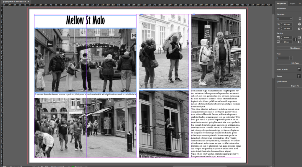
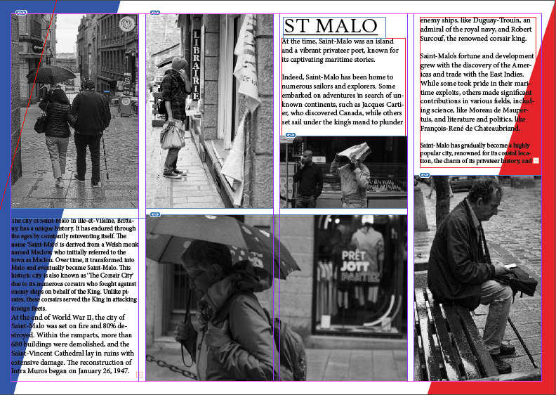
In the print screen below I have edited it so that the layout of the photographs is even. I moved around the images so that everything is put together and so the writing is placed together and not that it would un-interest the reader if it were outside the images. I like the photographs I have chosen and I believe that the black and white adds to the element of of the “Mellow” title and overall atmosphere of it.

In this print screen I have included the development of the first picture story. I included the rearrangement and movements I made of the photographs as well as the rearrangements I made to the text. I liked the arrangement of the text at the top at first but then realised that the text appears more better in between the two landscape photographs.

In this print screen I have included different variations of my photographs that I took whilst in St Malo. The development of my picture stories can be shown as the title has changed, I played around with the words and made it bolder, the text writing had some adjustments and I decided to include a drop shadow. I have included as well a border around my images so that they differ a bit from the blankness of the background.

I like how it turned out as the picture story looks full of naturey colours and it doesn’t look too in the viewer’s face.

I believe that the picture story looks good with the drop shadow as it adds to it and doesn’t make it as blank and simplistic as it could appear in general. I decided to keep the white background as I feel it would look tol heavy wih am image behind to other imges.

Jersey Maritime History

Jersey mariners and Canadian cod fishers made a fortune by trading their goods and employing people in their country. By 1763, Jersey was trading more Newfoundland cod than any other British port. Another reason why the Jersey Merchants were so successful was because they were able to speak French and English. They conducted a language called Jerriais, Jersey French this enabled them to communicate in a sense of code.

Jersey Merchants exchanged various goods for codfish. During the 17th and 18th centuries Jersey traded items such as salt because they needed it for the fish. They also traded textiles, alcohol and other local goods.

Jersey cod-merchants also exported cod-fish to British colonies in the West Indies and later Brazil too in exchange for plantation goods, such as sugar, molasses, rum, cotton, coffee and tobacco which it brought to markets in America, Europe and the UK. Within that context Jersey benefitted from the profits made in the British Empire build on a capitalist model of a slave-based economy. Jersey ships frequently sailed to ports in France particularly Normandy. they also traded with parts of the British Isles, such as England and Ireland.
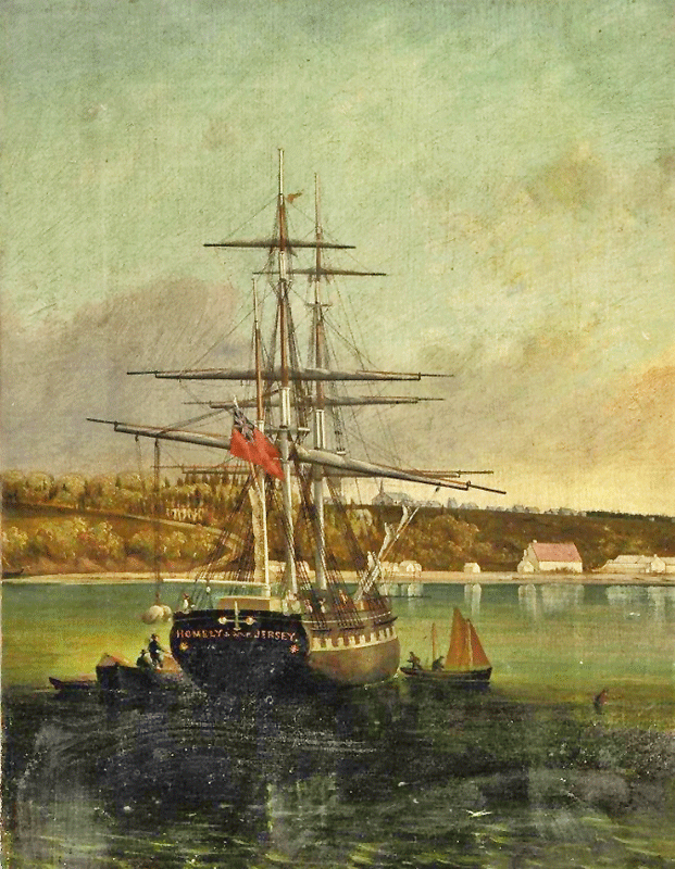
Jerseys ship building businesses became serious in the 18th century with the aim to build larger ships than the fishing boats. this enabled Jersey merchants to trade to different countries. Between 1760 and 1815 Britain was at war which affected the trading between Jersey and other countries. During World War 1 and World War 2, iron ships, steam ships and oil powered ships were built. Wooden ships which were built on island were becoming more popular and opening ports in places such as South America, Hong Kong and Australia.

Zine research and mood board

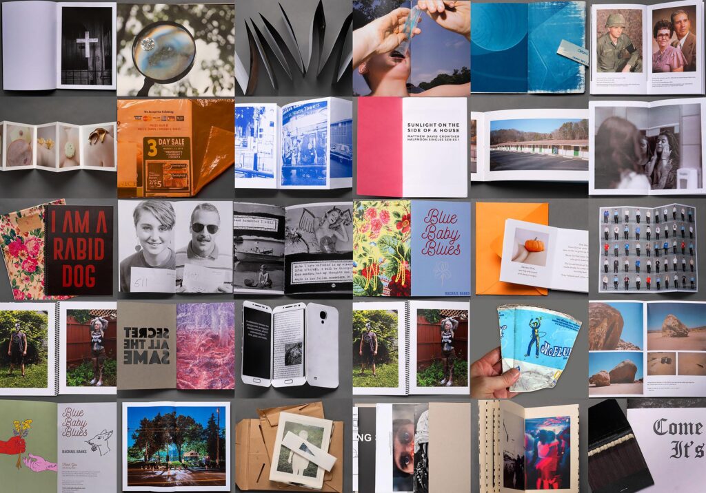
A zine is a self-published, often handmade magazine that features a collection of photographs, typically focused on a specific theme or concept. Zines can vary widely in style, format, and distribution, allowing photographers to express their artistic vision outside traditional publishing routes. They often include accompanying text, such as essays or poetry, and are created in small runs, making them accessible and personal. The DIY nature of zines fosters creativity and experimentation, encouraging photographers to engage directly with their audience.

Narrative and Sequence

Zine: A tool that photographers can use to tell a visual story, to inform an audience about a specific topic or issue, to showcase and advertise a new idea or simply create a preview of an ongoing project. Zines were originally called fanzines, alluding to the fans who made them.

Once you have considered the points made between the differences in narrative and story and thought about what story you want to tell about St Helier Harbour and the images that that you have made in response, consider the following:

A story can be linear or complex, with sub-plots, twists and turns, etc. A story usually answers the question “What’s going on?” or “What are the main events?” On the other hand, a narrative encompasses the entire narrative work, including the story itself, as well as the way it is told, structured and formatted.
STORY: What is your story?
Describe in:

  • 3 words
  • A sentence
  • A paragraph

Harbour throughout time

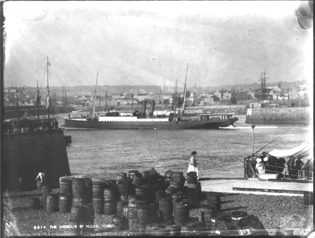
My pictures will tells a story of St Helier harbour throughout time going from the older harbour to the newer one.
The story my images will try to convey is the idea of how St Helier harbour and Jersey in general has grown and expanded. From back in the day where Jersey only consisted of one small harbour to now days where we have a newer, bigger, modern harbour. My pictures will also show how Jersey has expanded in landmass as my images show where once was sea is now land/ buildings.

NARRATIVE: How will you tell your story?

  • Images > New St Helier Harbour photographs
  • Archives > Old photographs of St Helier Harbour from SJ photo-archive or JEP Photographic Archive
  • Texts > Write a short introduction or statement about your picture story, image captions
  • Typography > creative uses of words, letters, font-types, sizes

I will convey this idea of time by using images I took of the older harbour and the modern harbour. Additionally, I will add filters over my images to enhance the idea of aging. For example, some of my images will be black and white like they would’ve been back in the day. On the other hand, some of my images will be in full colour (with some of the colours in the images enhanced to emphasise the point of how colour in photography has changed and grown). Finally, some of my images will be mainly black and white and then have one object in colour. I decided to do this in order to represent the time where colour slowly got introduced into photography.

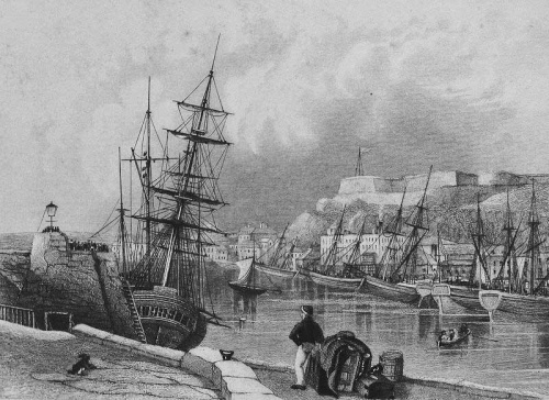
I will also use these image from the JEP photographic archive which shows the old harbour and maps of it.

Add a selection of your final 10-16 images as a moodboard/ gallery to the blog post too, including any archive material too:

These are the images I am going to use in my zine. I decided to create my zine around the idea of time. For example, the first 6 images in my zine are black and white. This is representative of the olden days where images had no colour. Next, I decided to add some colour splash images to convey the idea of colour slowing being introduced to the photography world. Finally, the last set of images in my zine are coloured. This represents the present day. The use of different colouring throughout my zine almost acts as a timeline going from when images were only black and white to now when they are full of colour.

Nostalgia & Family

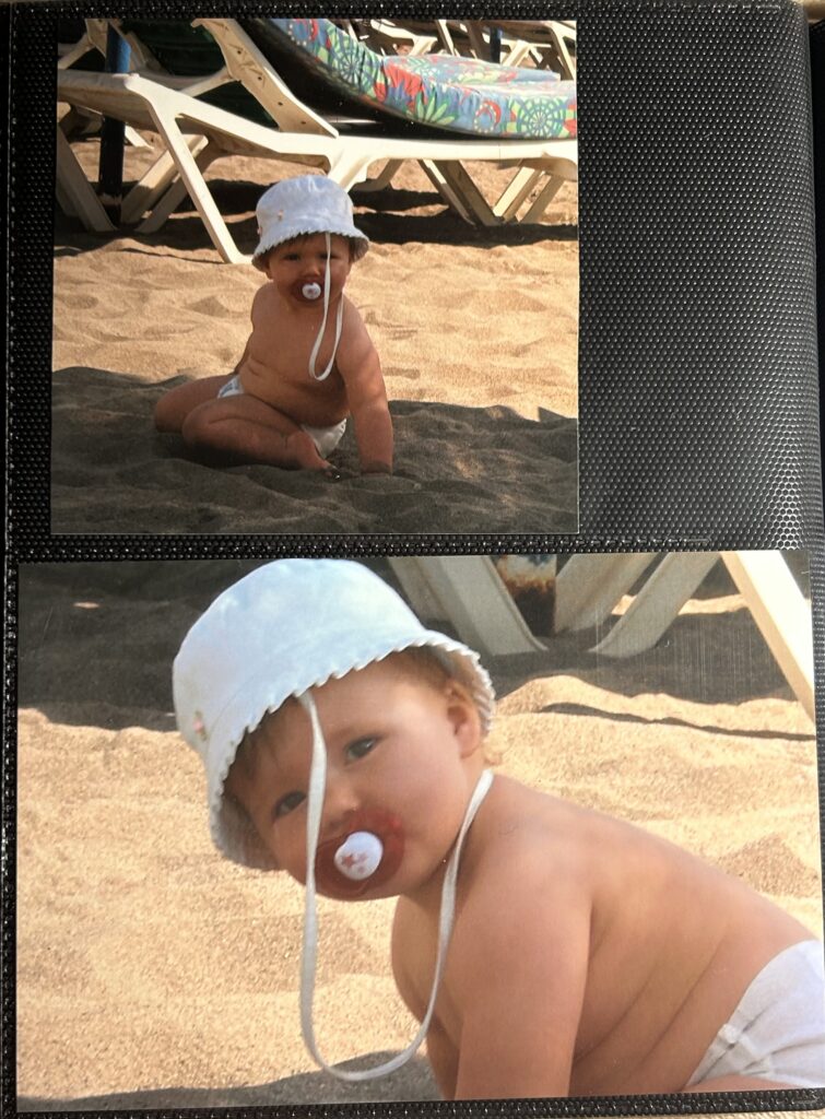
For this specific project, I chose to base my approach on myself and my own upbringing for no other reason than I know myself and my own story in the most detail. Therefore, it will be easier and sentimental for me to share memories from my childhood, as well as how they are still important to me today.

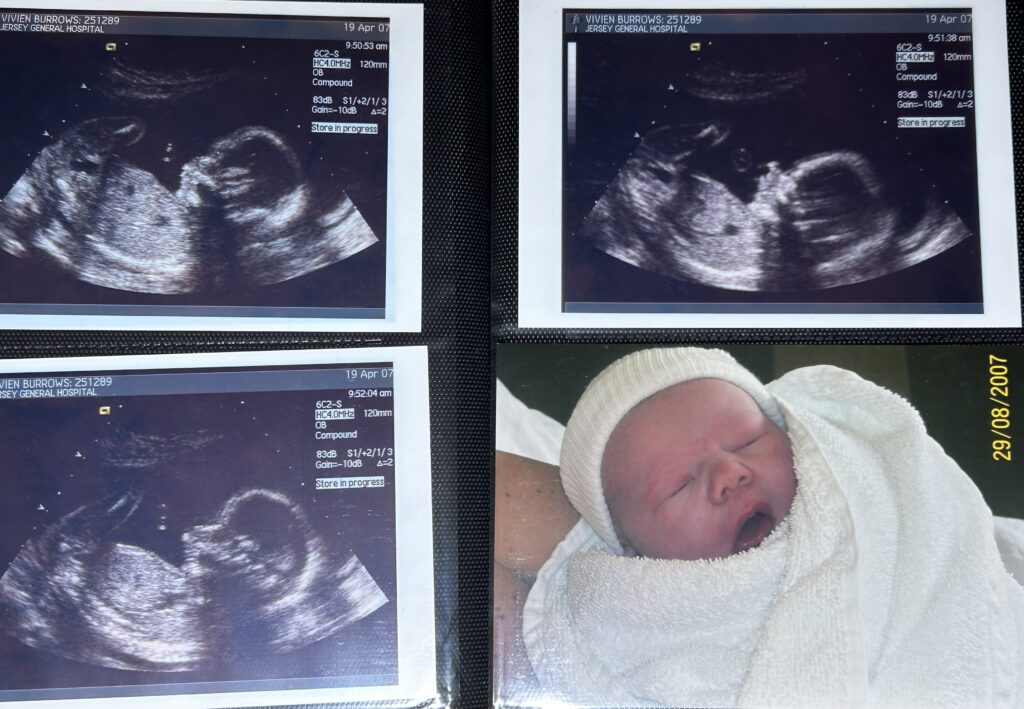
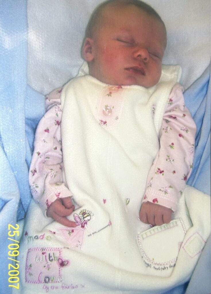
For my approach, I asked my mother to lend me a photo album from when I was little. I then photographed some of the most precious images of me during my childhood, and I will display them in a chronological order to give a more in depth effect, as well as showing a deeper meaning throughout my story.

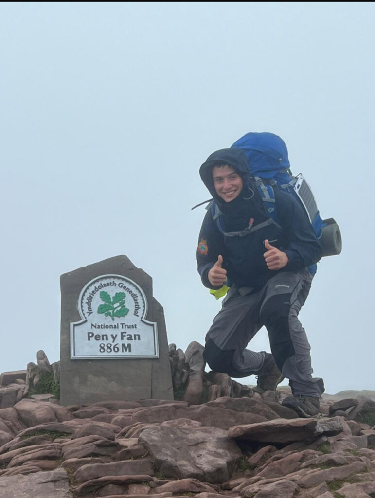
Summer Project / Part 2/ editing process -George Blake

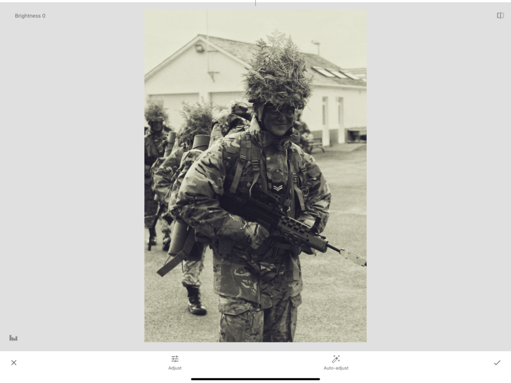
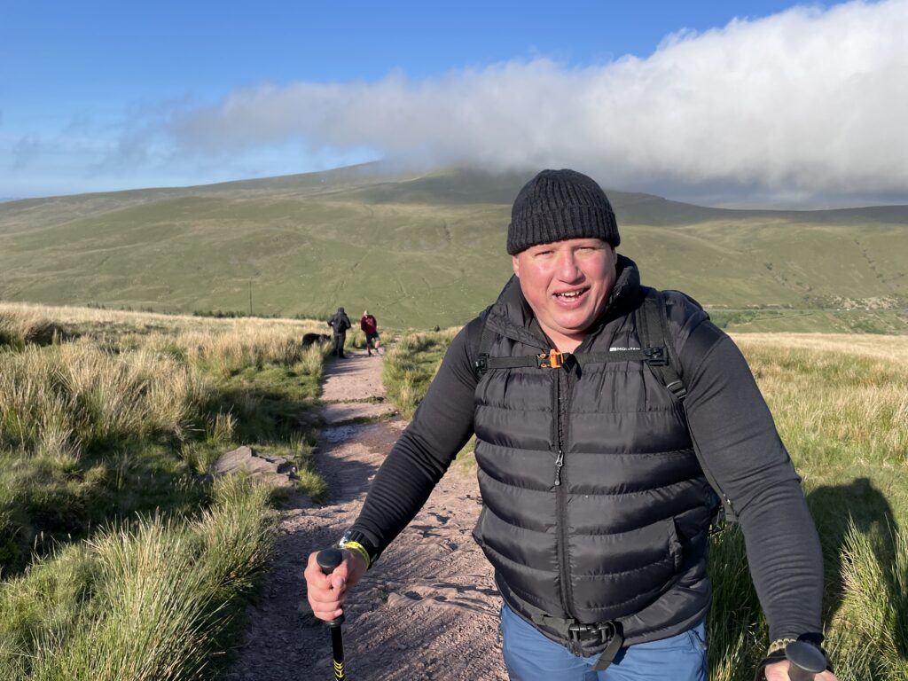
Before –

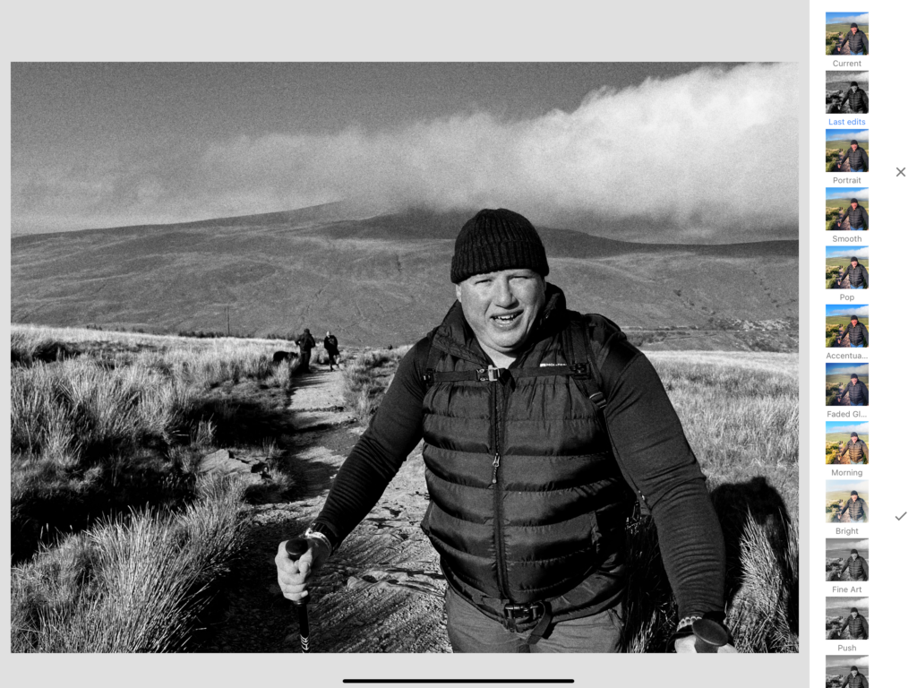
Editing:

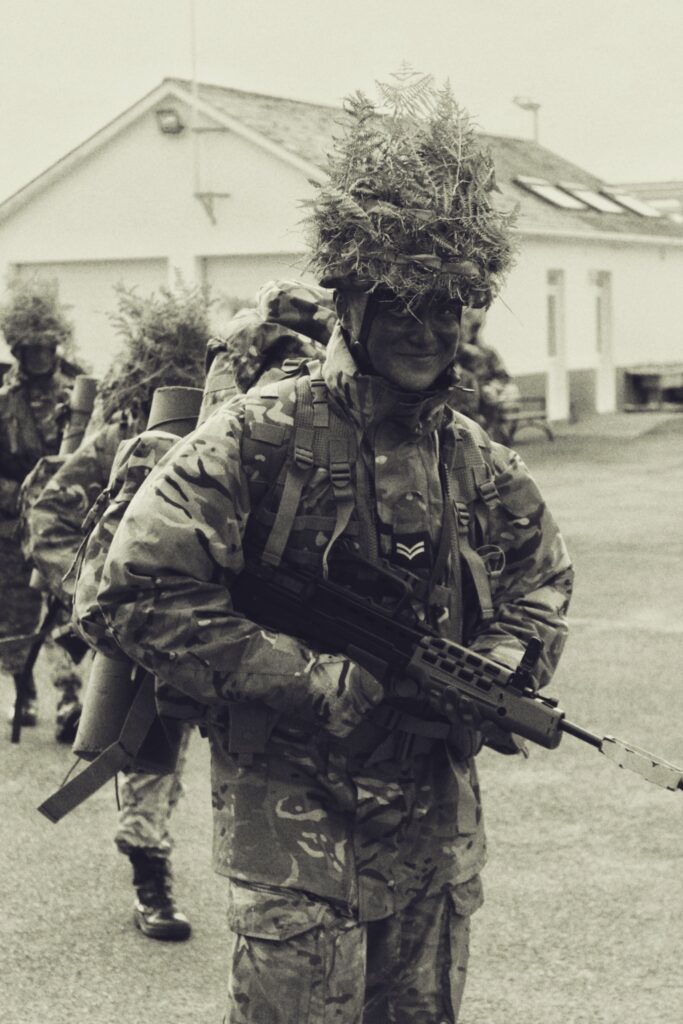
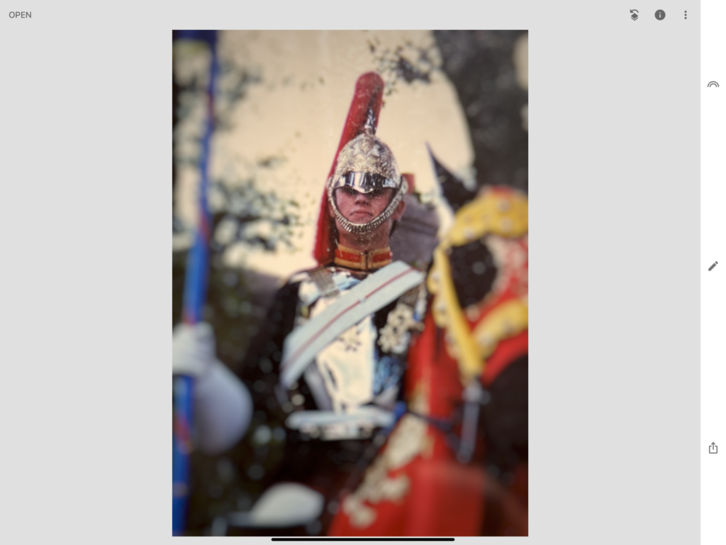
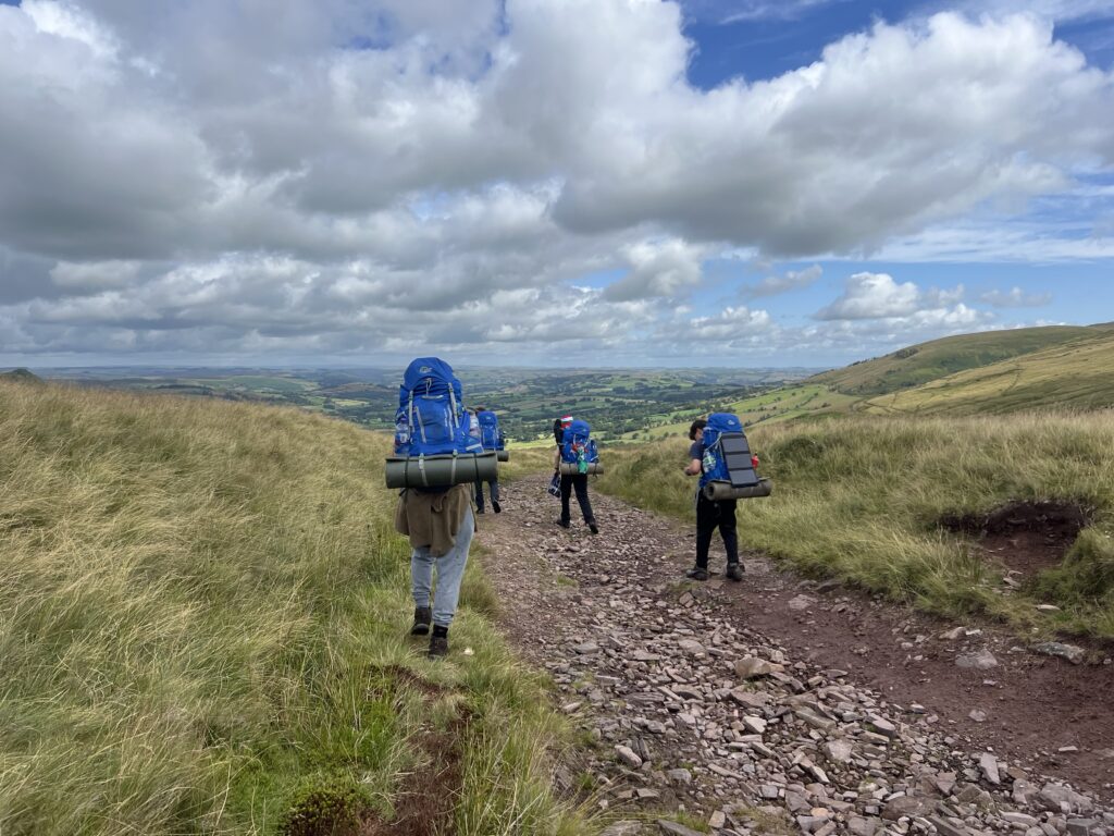
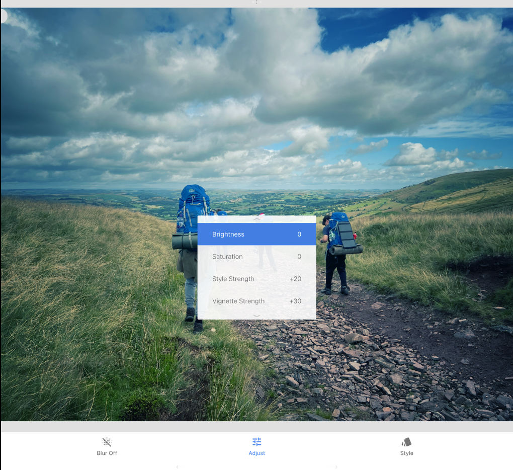
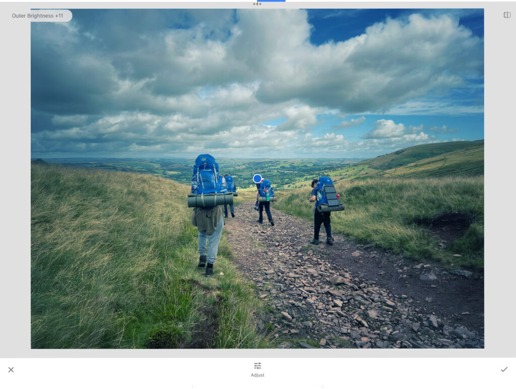
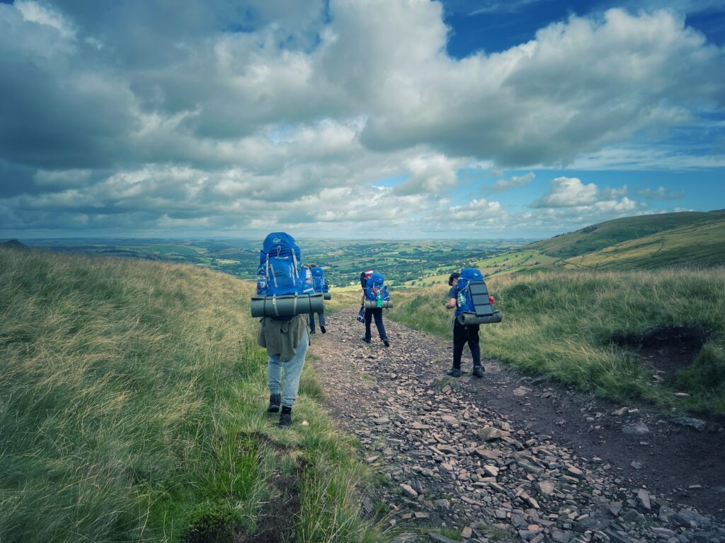
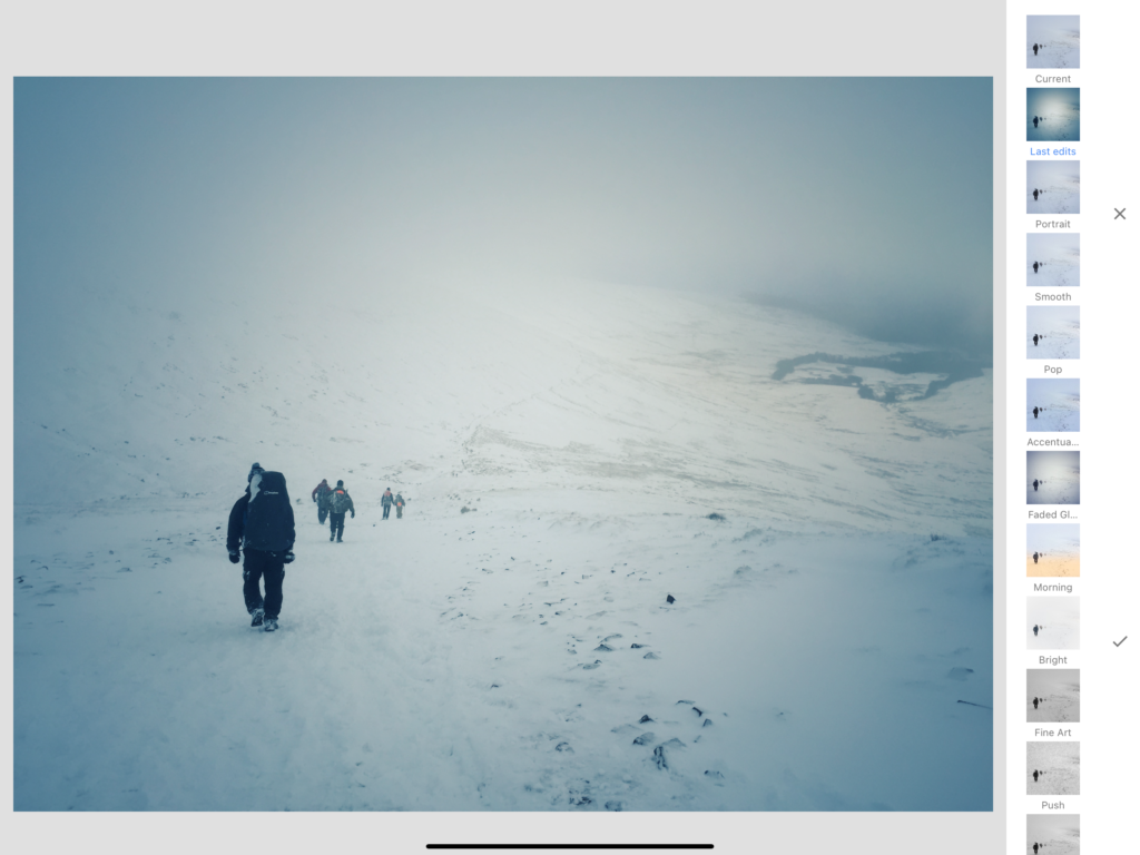
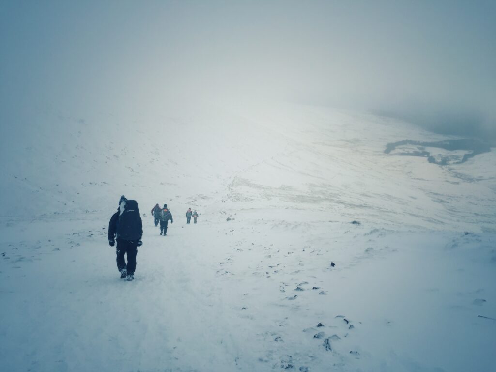
Adding a filter from the app Snapseed, I lowered the saturation and temperature to add an aged Hue to the image, Altering the highlights, I aimed to make my facial features stand out more.

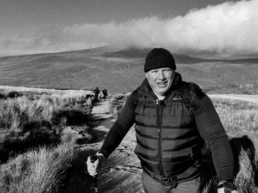
Adding grain to the image, this further helped add to the desired aesthetic of a grained image.

After –

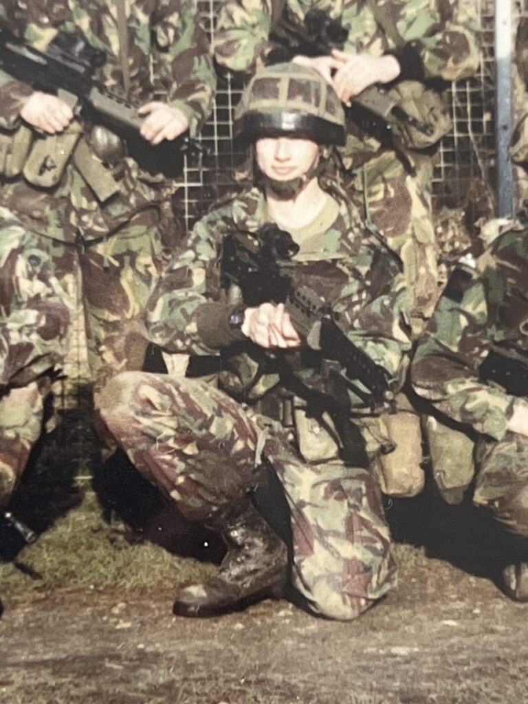
Before:

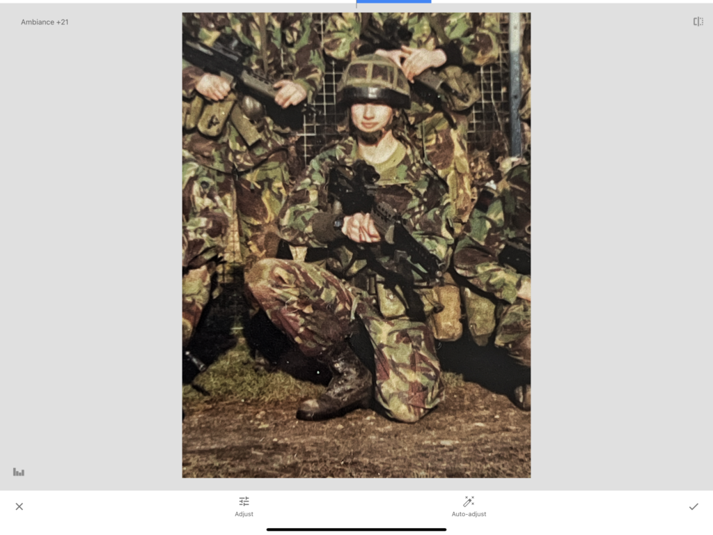
Editing:

In attempts to make this vintage image look more modern, I tried to bring out the colours more to seem more plausible to be taken from a modern camera/phone.

brightening up the image allowed for a more natural skin tone, compared to the over-saturation which has come from the camera at the time. By also adjusting the ambiance, this created a more realistic impression of warmth of the image, since the image was taken on a sunny day.

After –

Combining the works –

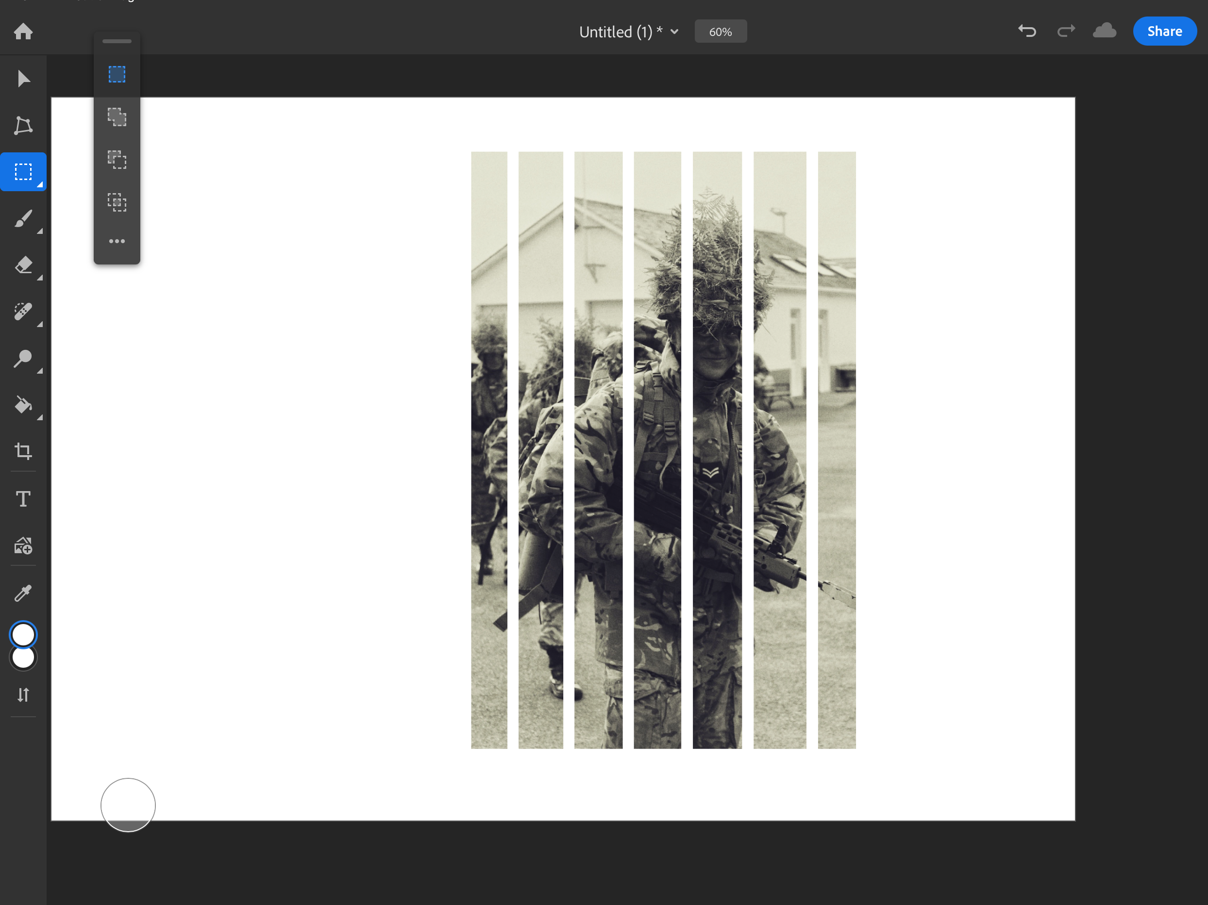
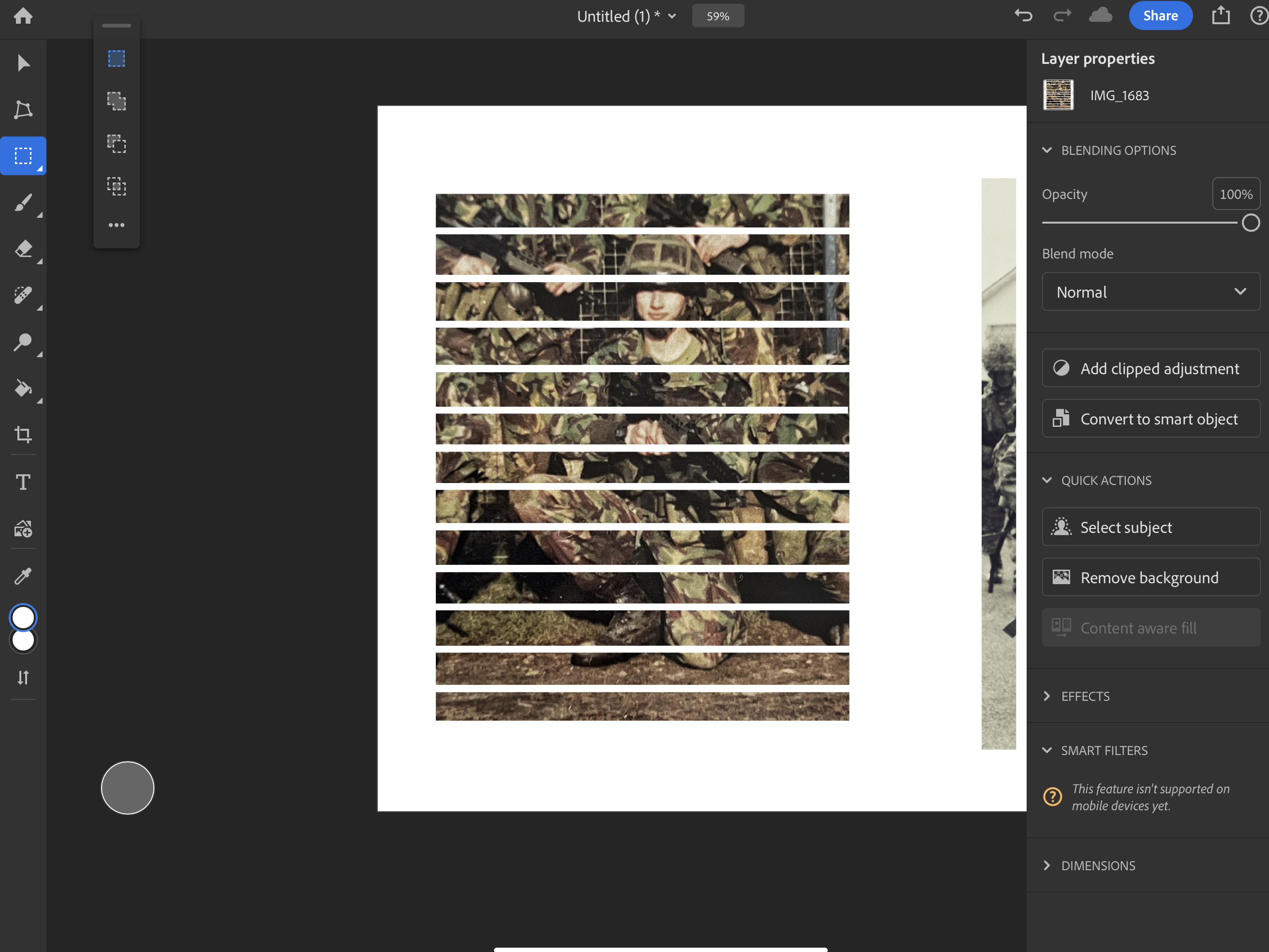
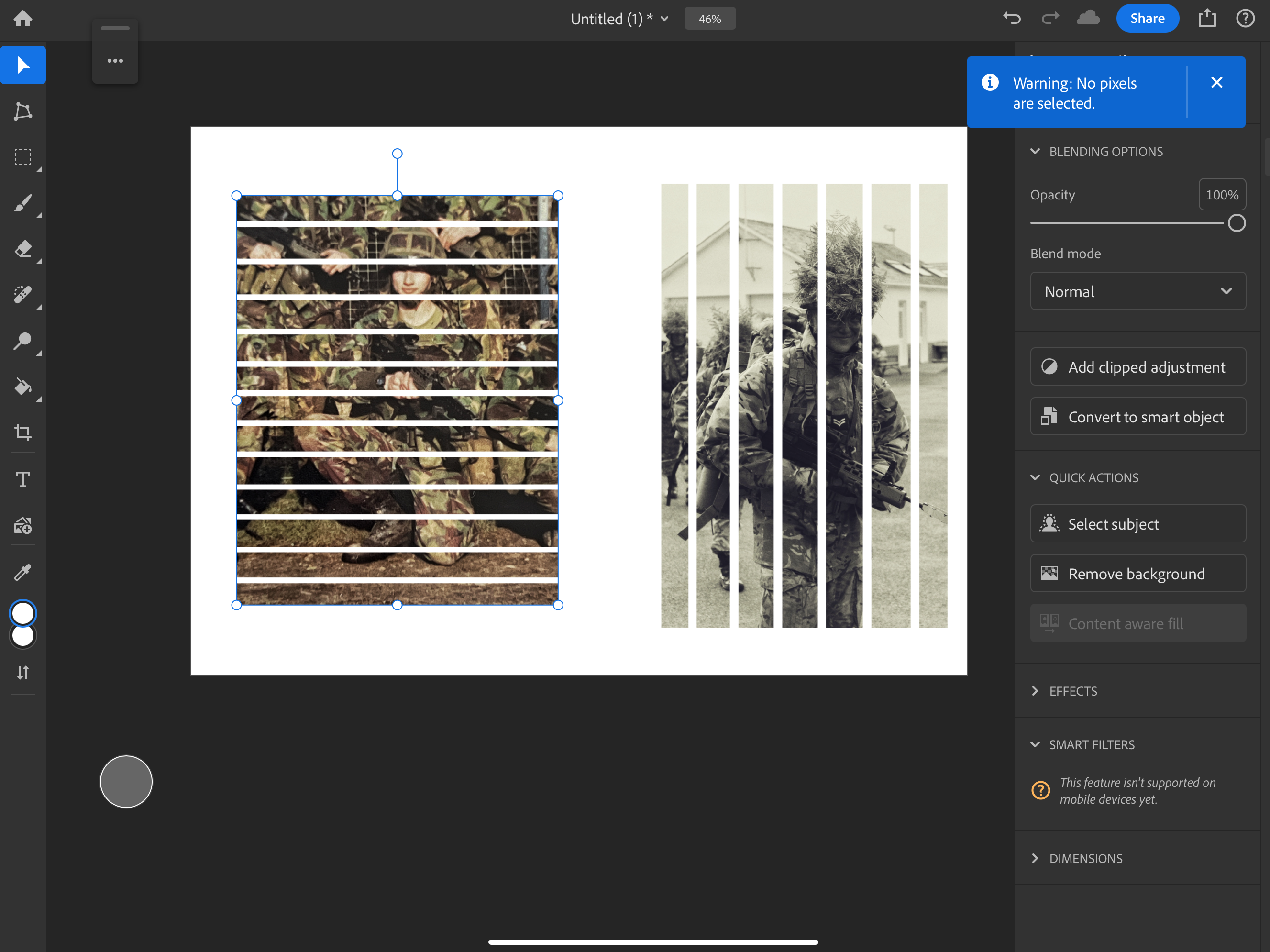
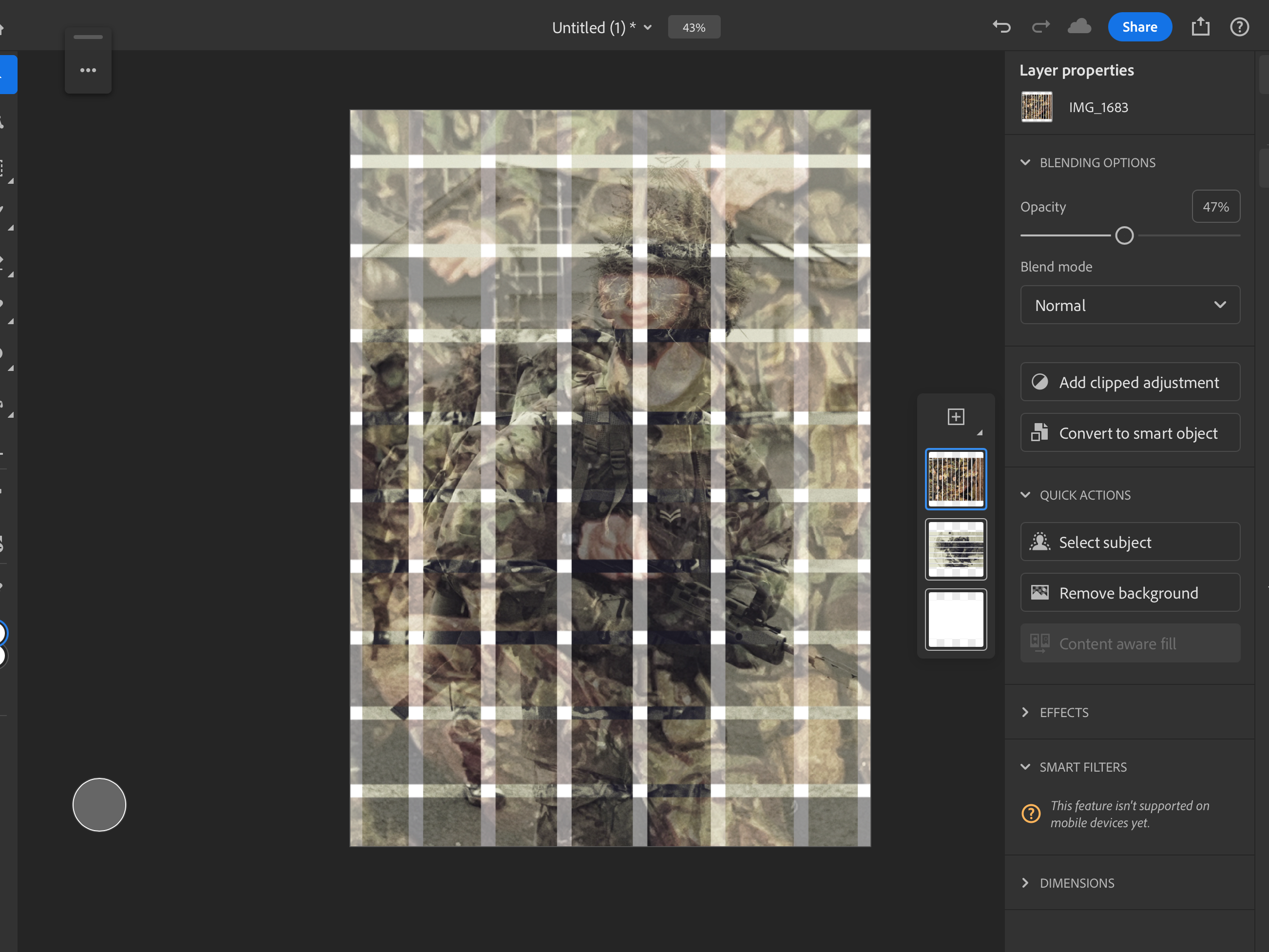
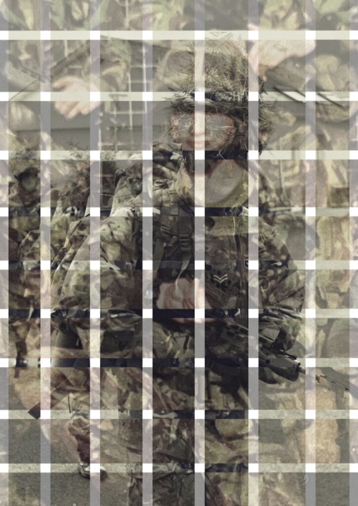
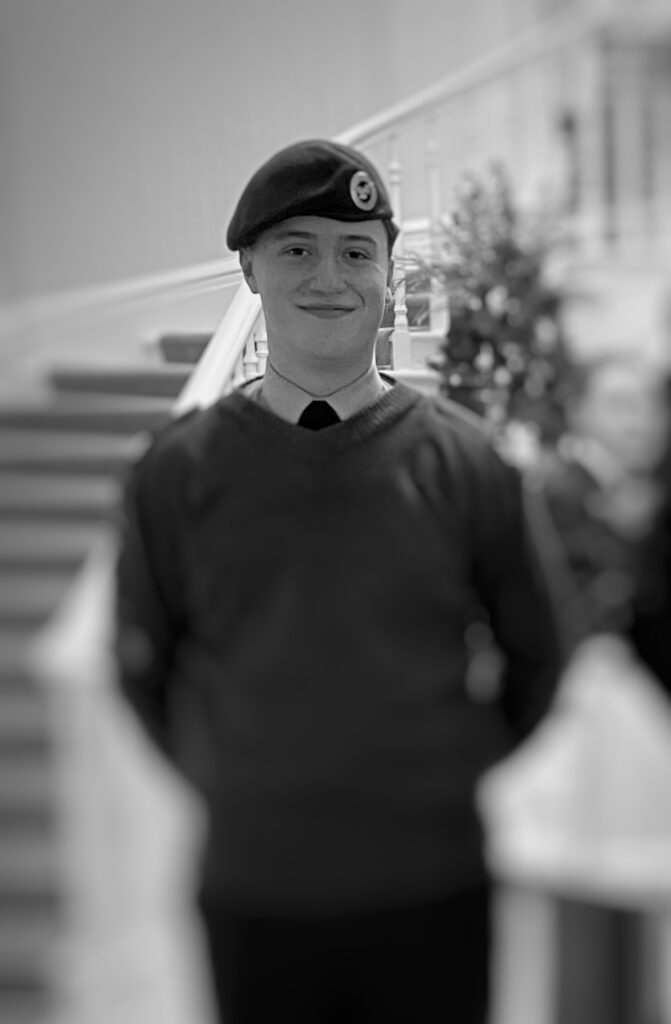
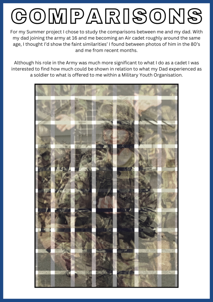
To make these edits more interesting I’ve taken an abstract approach to my images by merging with a cut-out pattern within each of them.

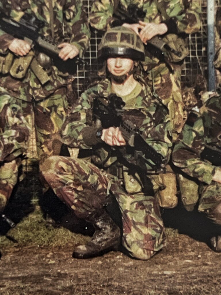
Doing vertical lines on the image of myself and horizontal on the ones of my dad It created a really interesting composition of a checkered design where both subjects (me and my dad) are visible in their pictures.

By lowering the opacity of the image of my Dad, this was how I created that subtle fade.

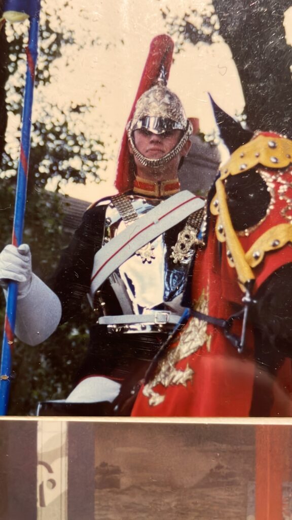
Before –

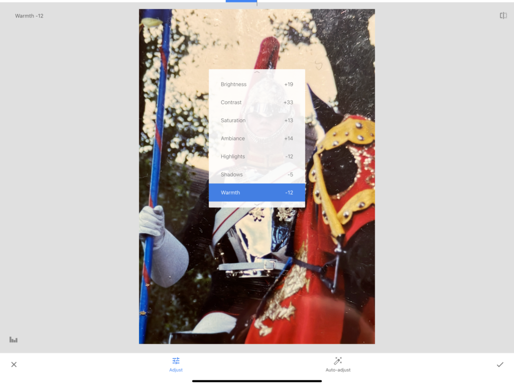
Editing:

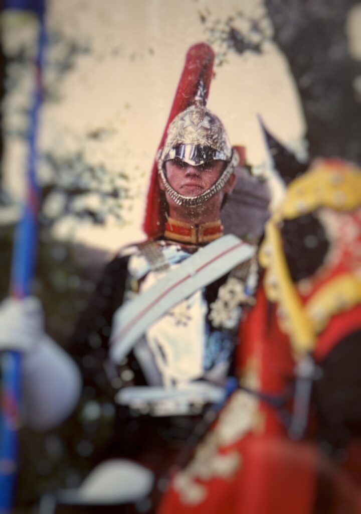
Using the editing settings shown, I did this in order to the bright cracks due to aging of the original photograph.

Furthermore I added a blur to image surrounding my Dads head, this was intentionally done as for my images final outcome I wanted to create an interesting effect which would become apparent when finished.

After –

Editing:

For this image, I had already altered it previously by converting it into greyscale, for it to work for my final project I cropped the image down and added the blur affect like my previous edit.

After –

Combining the works –

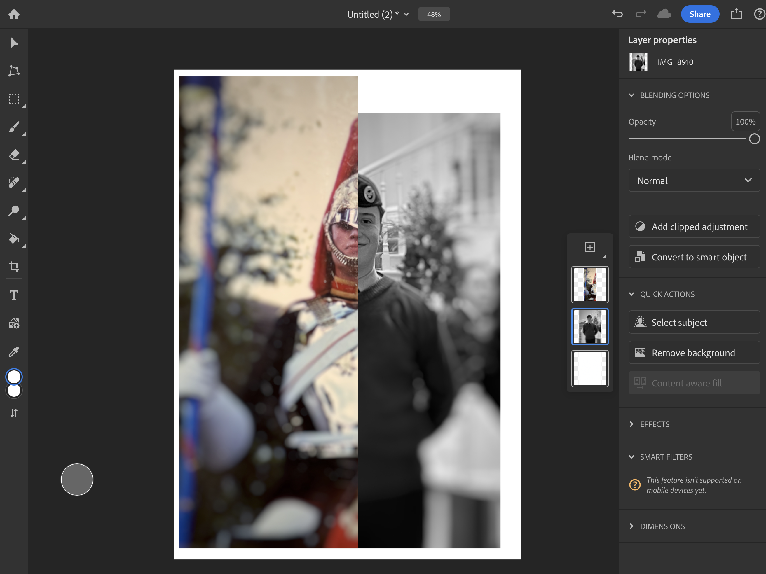
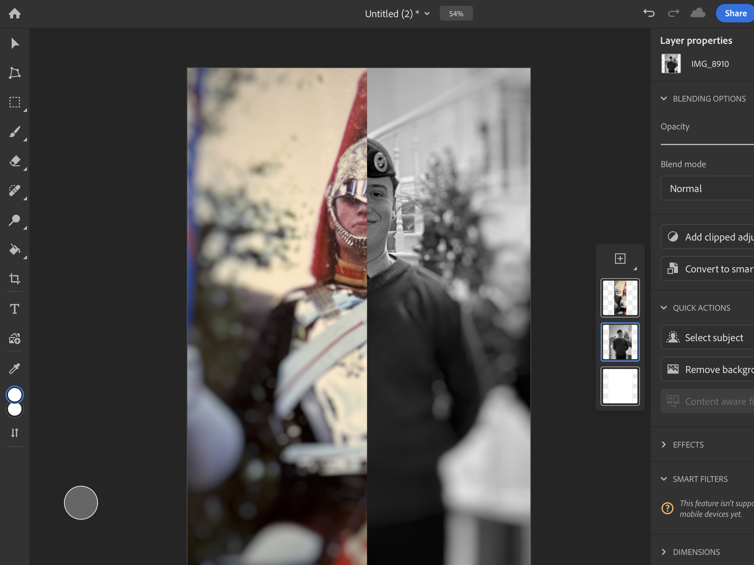
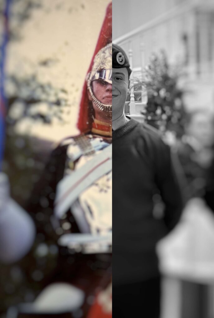
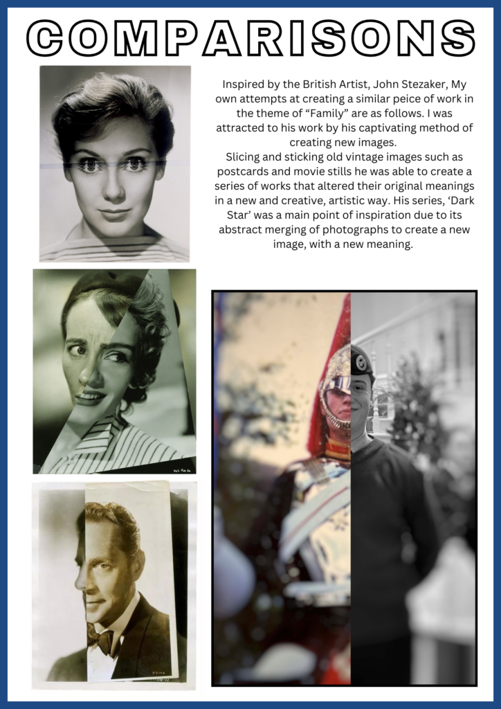
Cutting the first image in half, this allowed for me to line up the second image, with the blur effect surrounding both of our heads, this created an interesting effect, as due to the majority of the image being blurred it forces them to focus on the faces.

As a result this is what turned out.

Before –

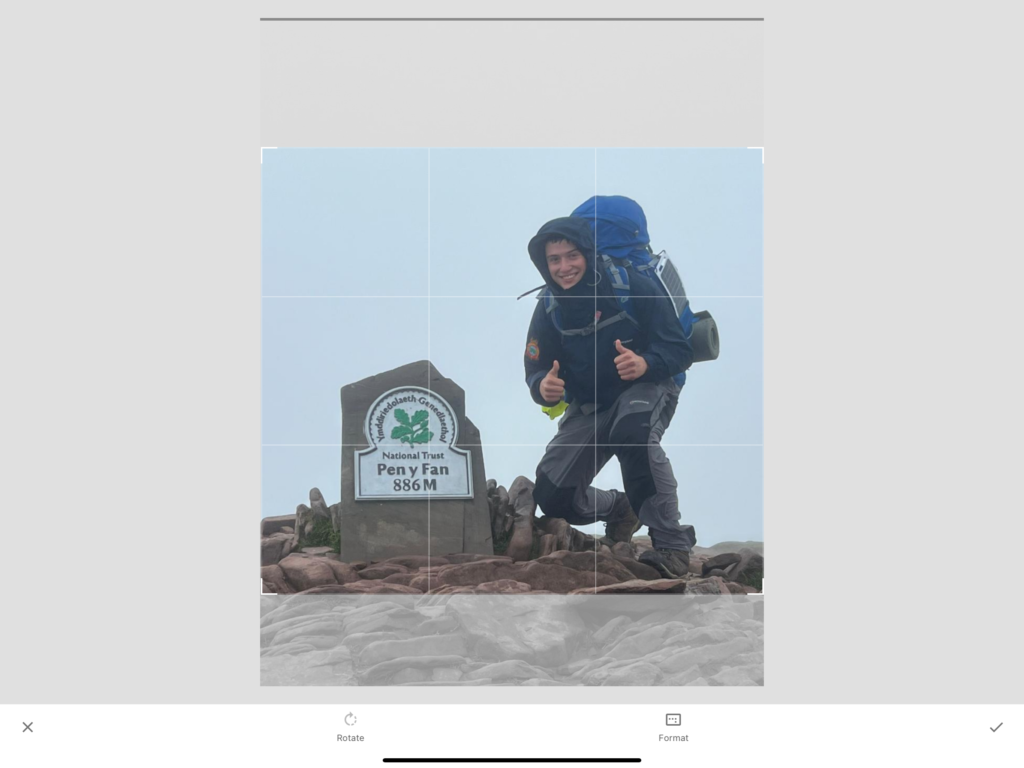
Editing:

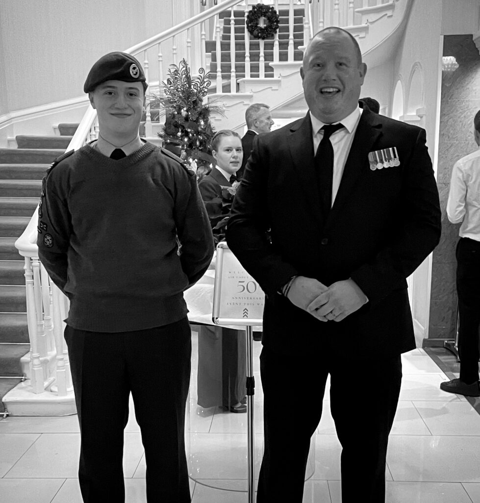
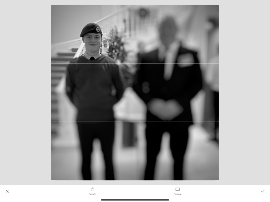
Firstly, I cropped this image to make the composition smaller and focused on what would be added to it later. With to much room I felt this would takeaway from what the outcome would look like.

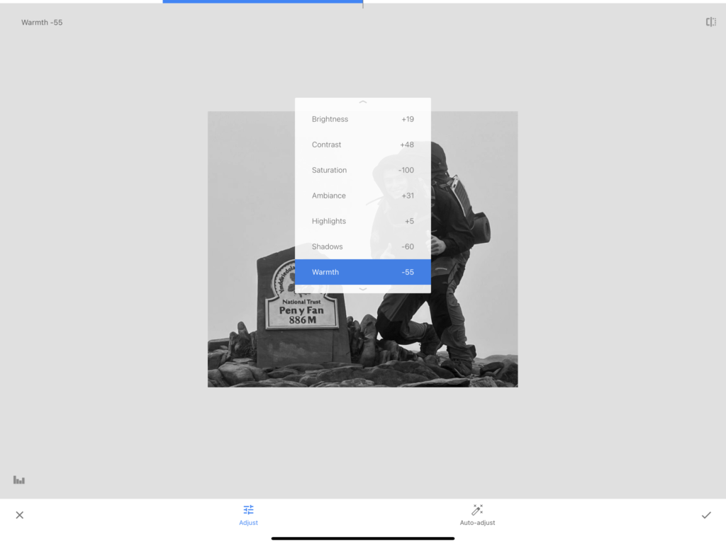
Using the following settings, I altered this image to make it greyscale, but also to make parts of the clothing I was wearing stand out more once converted. To do so I mainly lowered the shadows, and increased the brightness and contrast to what suited it best.

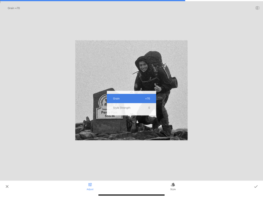
Adding grain to the image, this took inspiration from my artist reference, John Stezaker. The aim was to create the effect of a vintage photograph which is usually the subject of his work.

After –

Before –

Editing:

For the second edit of the image set, I applied the same edit settings as the previous image.

After –

Before

Editing:

Using a pre-set style from ski seed, This allowed the image to have that old-digital camera look which was what I hoped to create.

adding another vignette, this helped made the image look more realistic for when i added it to the final outcome.

After –

Before –

Editing:

Using the same settings as the previous image, I liked how this image came out, To me it really does replicate that early 2000’s camera style.

After –

Combining the works –

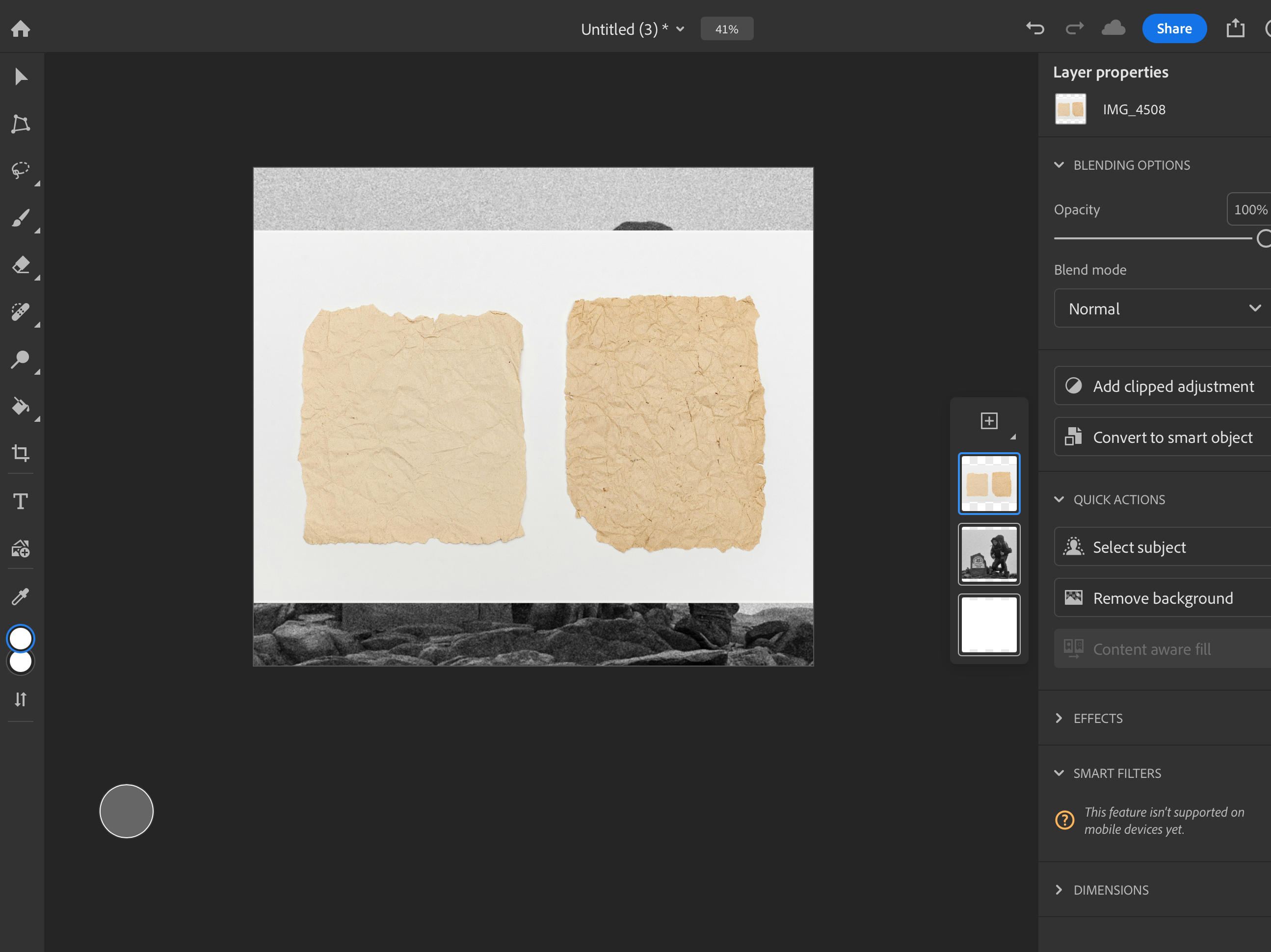
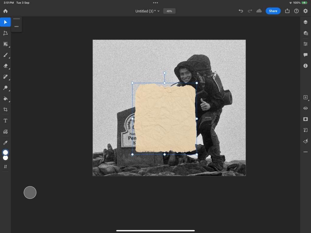
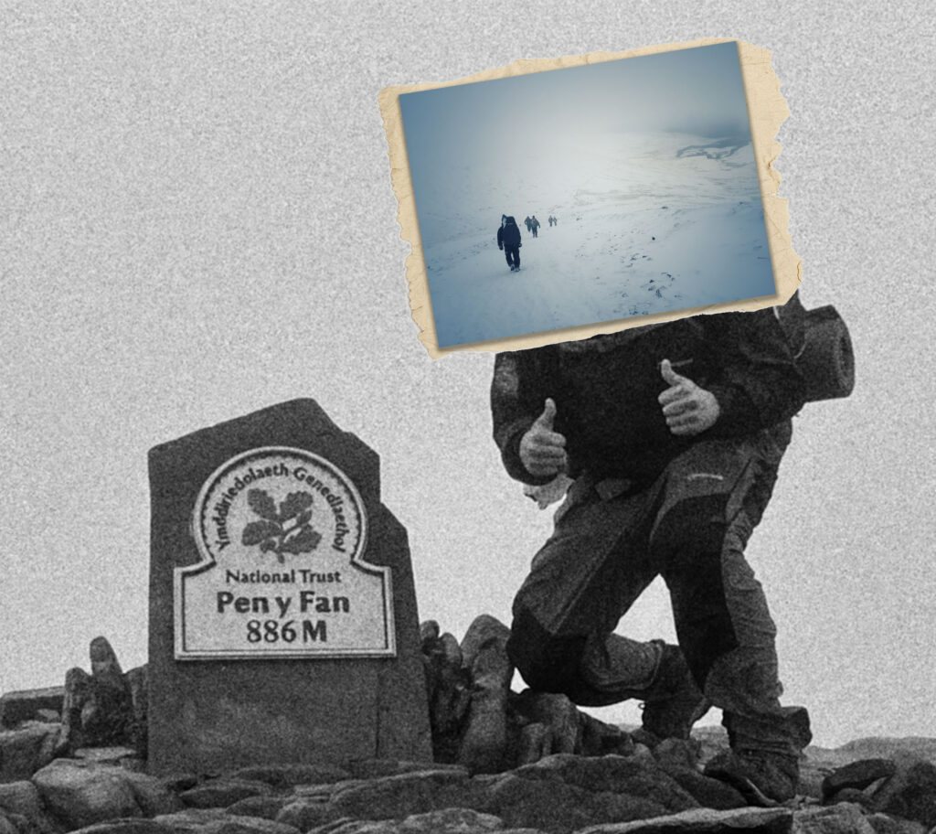
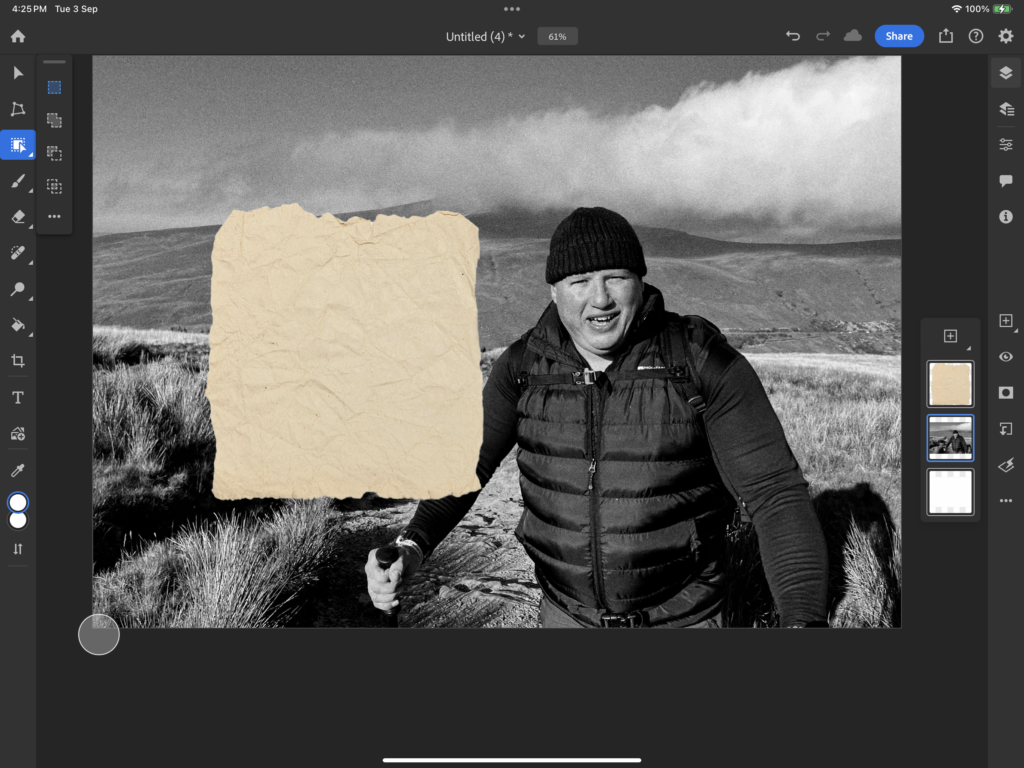
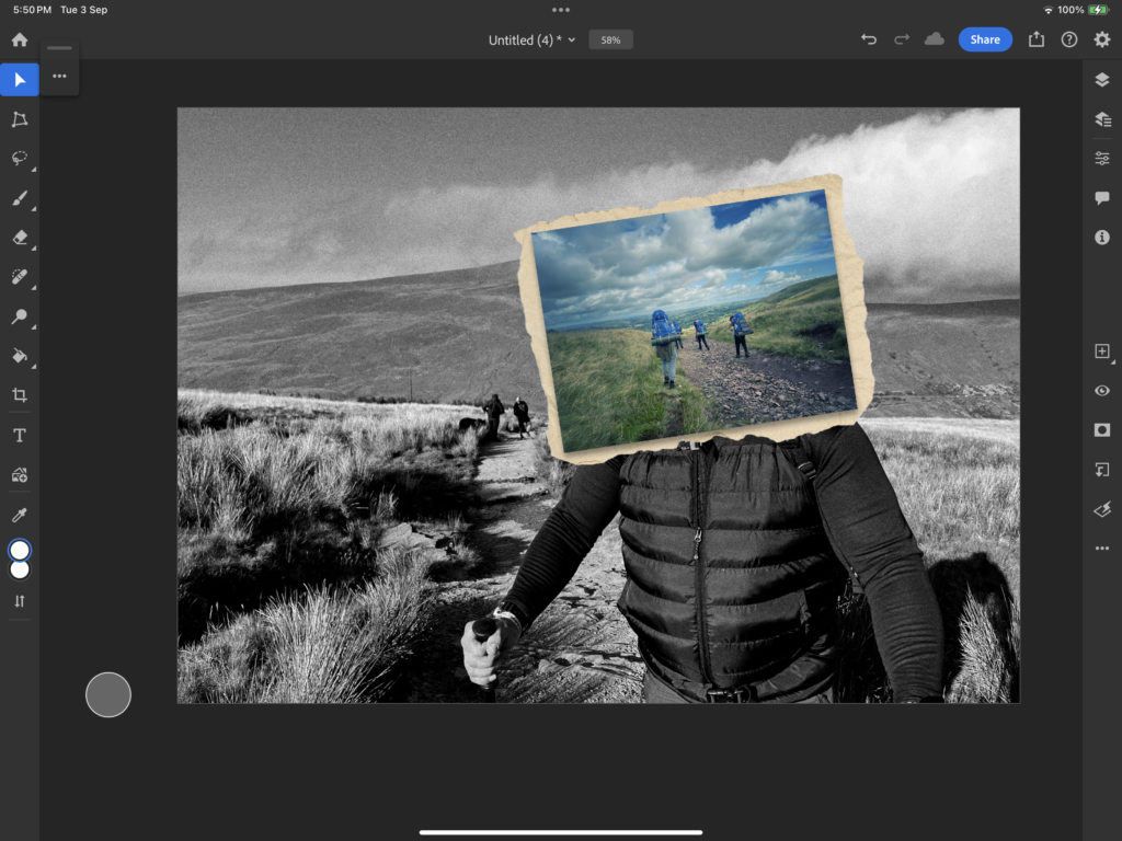
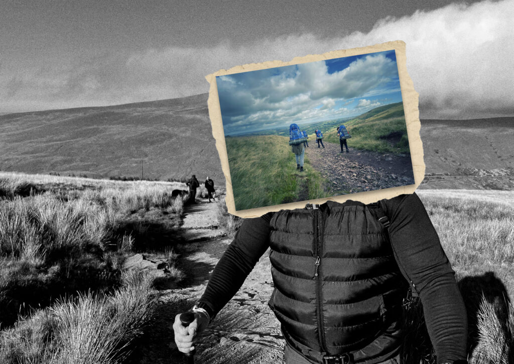
With Stezaker work, some of his images within images contain a ripped paper effect as if a post card has been glued on. To replicate this I found a stock image and copied the effect.

Using the Object select tool, I was able to cutout the stock image.

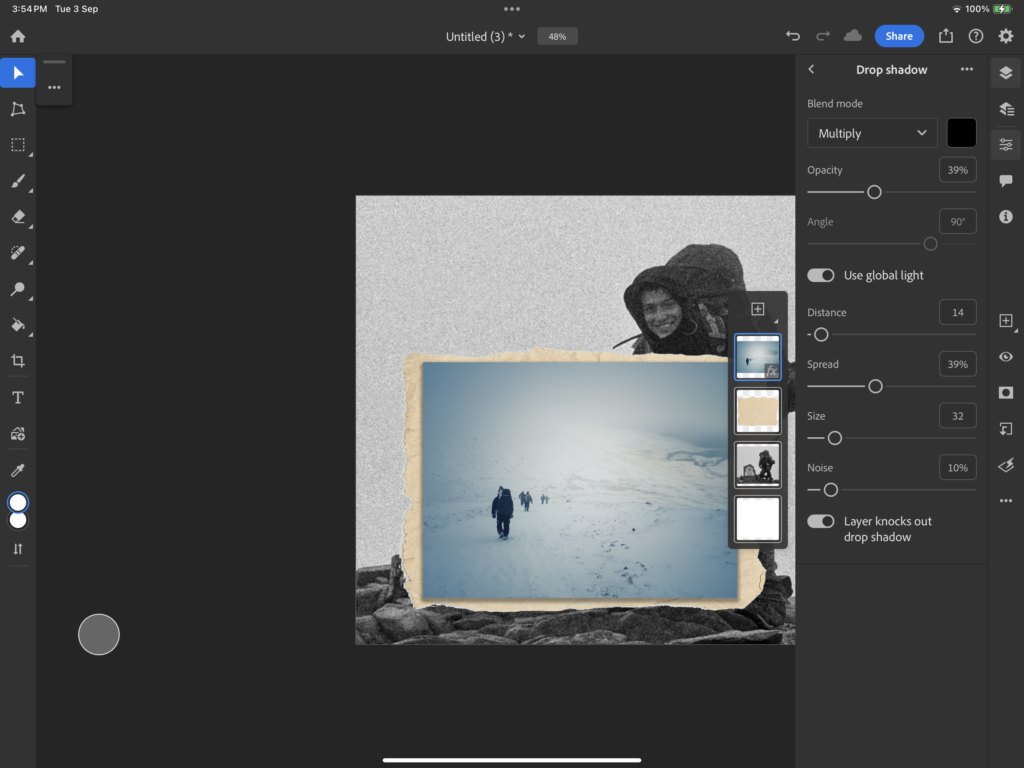
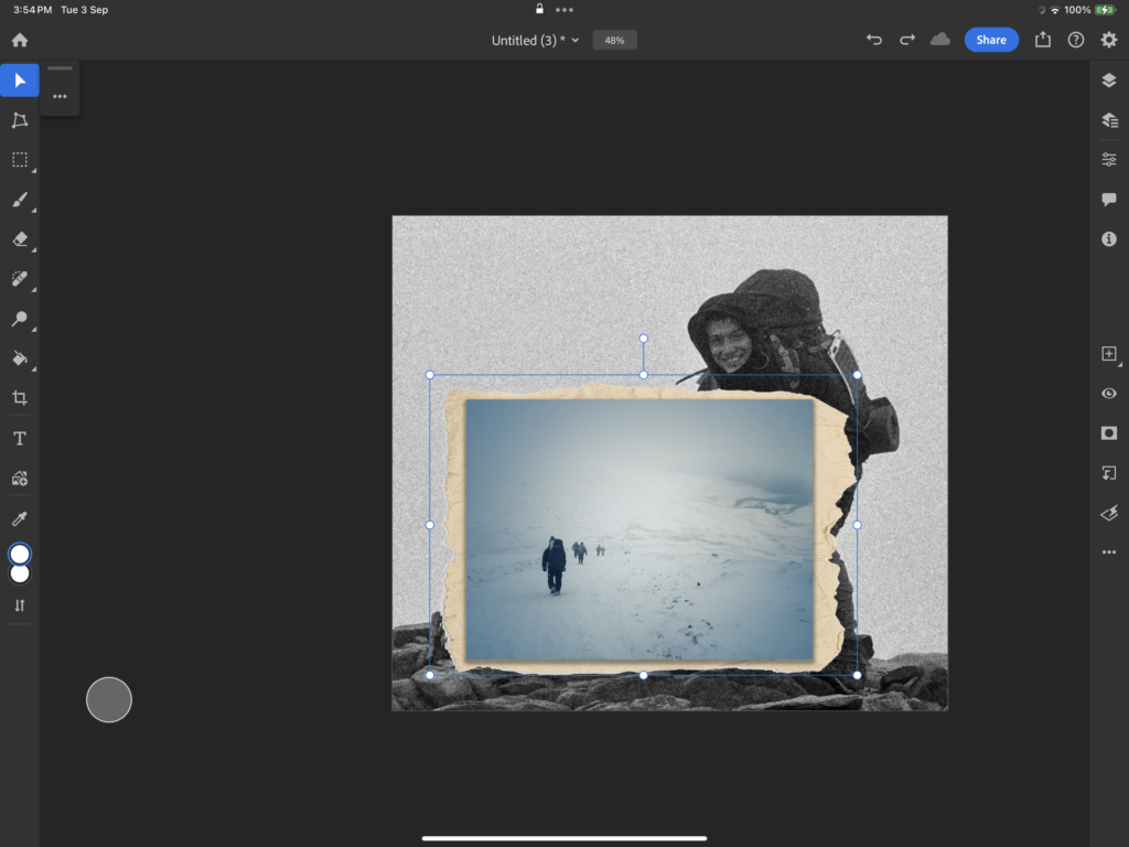
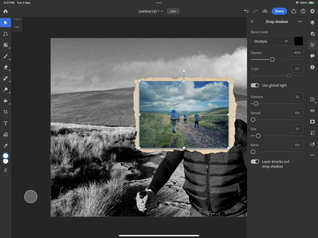
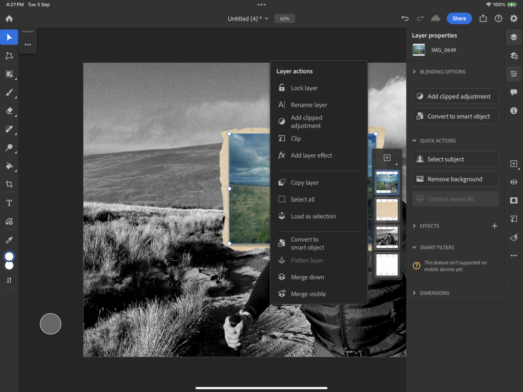
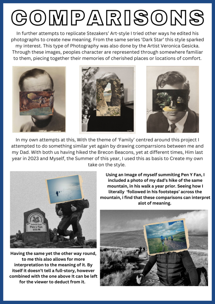
Combining this with the edited image, I added a drop shadow to make it seem as if the edited image looked like it wasn’t properly stuck down to the paper.

After merging the 2 I then adjusted the image to how make it seem more naturally placed like how Stezaker had done with his work.

As a result this is what turned out.

Combining the works –

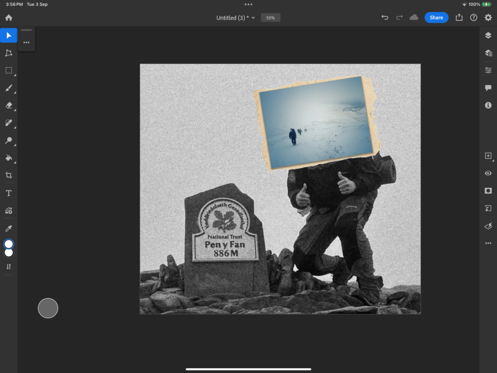
Like the image before I repeated the process of cutting out the paper to have that postcard effect.

Again, adding a drop shadow, and merging the imported image and paper this then allowed me to place it in the desired place for my final outcome.

As a final result it turned out like this.

Picture stories

This type of photography technique is used to tell a story within a range of photos printed on one page. These photos tend to link together displaying an overall meaning/story but each image also may be unique in its own way and tell a portion of the story of its own.

It’s important to carefully choose photos that make sense within the story you are telling, if you remove a photo and it no longer makes sense then it tells you that photo was an important aspect whereas if you remove one and it makes more sense that photo would be unneeded.

Establishing shot:- This is a shot that is usually a wide shot of buildings or landscapes which could include important landmarks. The photo would generally give the audience context and an understanding of where the shoot is based or a sum up of what the piece is about

Person at work:- This is a shot that captures an image of a person who is in their work environment. It would usually involve them participating in an activity that relates to their job while the image is being taken. The background of these images are important os that the viewer gets the best understanding of what job they do (for example rails of clothing behind them and a till would explain they work in a clothing shop) as well as this, props can also help (such as a name tag with the shops name on it or a uniform)

relationship shot:- this is a shot which shows a connection between people in the image. This could be relationships such as partners, family members, or friends.

detail shot:- This is usually a shot which would focus on one aspect of an image. Usually this small factor is able to tell the story of the image by itself. The background surrounding the main aspect would be usually blurred to make sure that the main focus remains the main focus and stays high-quality.

environmental portrait:- This is a shot where the person is in their natural environment such as their home or even their place of work. It usually shows key parts of that persons life and what they do

Final design

Observe, Seek, Challenge Experiment 3: Colour Splash (St Malo)

Experiment 1: Colour block

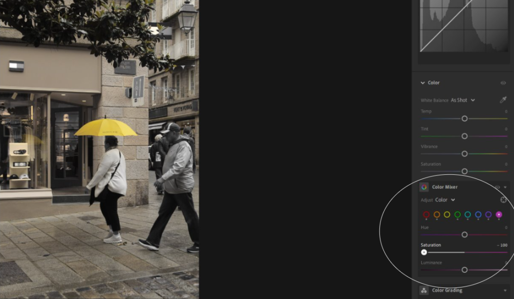
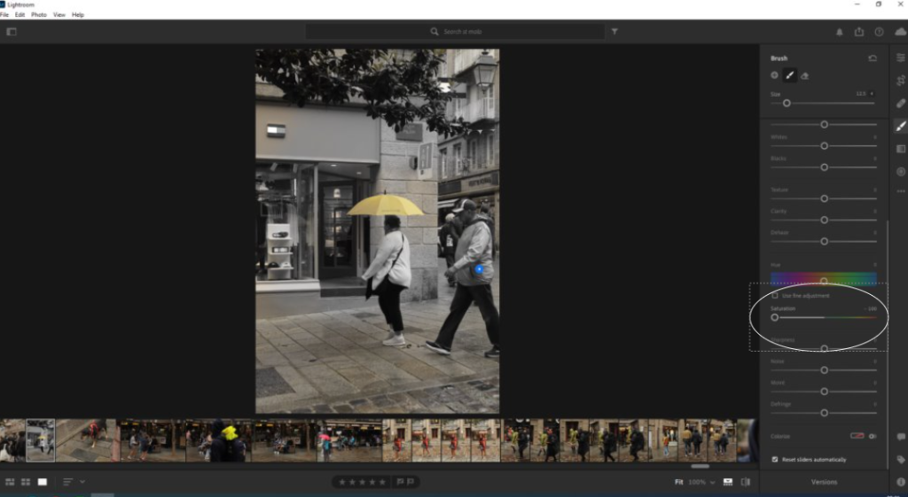
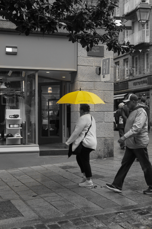
For this edit, I first had to start by picking an image that had an obvious colour in it so that I could make it stand out with the black and white. I chose this photo as yellow is a bright colour and would pop out well.

I got the photo up on Lightroom and then turned all the saturations to -100 on every colour but yellow as that was the colour of the umbrella. this washed out the colour elsewhere in the photo, however, it wasn’t completely black and white. using the brush tool I needed to scroll down and select saturation and turn it down to -100 as I did before with the individual colours. Then I could adjust the size of the brush and drag it over my image around the umbrella. The last step I did was going back to the first step to the saturation of the colours and select yellow and increase it so that the yellow became more vibrant amongst the black and white.

Final Piece:

Observe, Seek, Challenge Experiment 2: AI

Experiment 3: AI

For this edit, I used the AI experimentation work to get id of certain aspects of my image. As you can see in the screenshot photos, I dragged the rectangular marquee tool over the things or people I didn’t want in my image and then simply pressed the backspace on my keyboard and then ‘ok’. after a little bit of loading it then got rid of what I wanted. in some trials, the AI would distort the image which I didn’t like so I had to retry many times or just decide not to use the image.