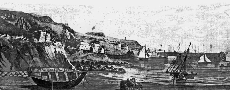
What was the involvement of Jersey mariners in the Canadian cod-fisheries and the Transatlantic carrying trade?
15th century –
- 1497 Newfoundland discovered 1504 Small Norman fishing boats visited the coasts of Newfoundland.
16th century –
- 1504 Small Norman fishing boats visited the coasts of Newfoundland
- 1562 Channel Islands boats noted on Grand Banks.
17th century –
- 1611 St Brelade and other parishes had fishermen who sailed to Newfoundland.
- 1699 There were Seigneurs in Gaspé. A Monsieur Rivers in Mont Louis in 1699 set the industry on a permanent basis, but lack of government support led to failure. Finally a Monsieur Maillet circa 1750 got the fishing industry profitable.
18th century –
- 1758 Gaspé became British property.
- 1789 Ship Elisha Tupper, 280 tons, built at Bel Royal for Janvrins, She was named after a Guernsey merchant.
19th century –
- 1806 4,000 tods of wool were imported into Jersey.

- 1835 William Fruing, son of William, bought 36, La Colomberie, St. Helier.
20th century –
- 1914 Robin and Collas sold out to Robin, Jones and Whitman with HQ in Halifax, being no longer a Jersey company.
- 1950s Clement and Company becomes the last Jersey company trading in Newfoundland cod.
Which ports did Jersey ships sail to and trade with?
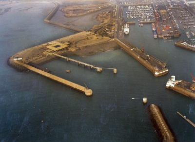
Jersey has been an island for approximately 8,000 years, therefore, apart from the last 60 years, the only way for people to come to or leave the island has been by sea. Ports of Jersey was incorporated by the States Assembly in 2015 to provide lifeline public services and to create wider community and economic benefits.
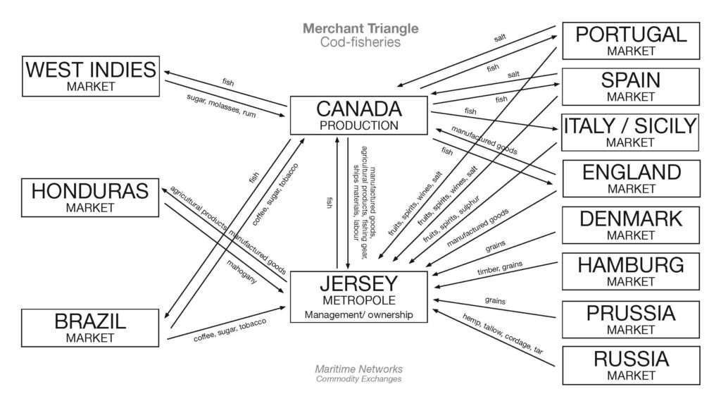
What type of goods did Jersey merchants exchange for cod-fish?
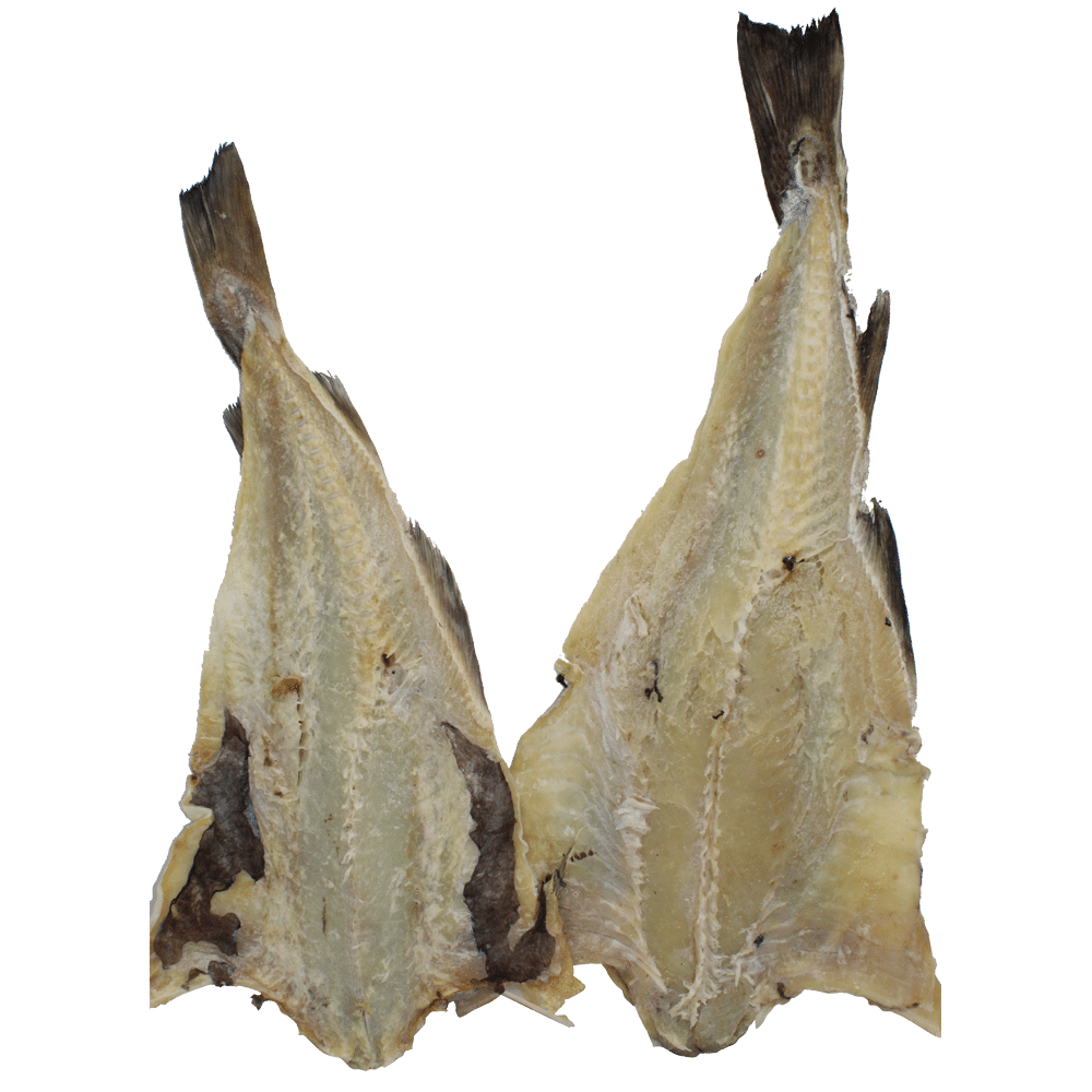
Jersey cod-merchants also exported cod-fish to British colonies in the West Indies and later Brazil too in exchange for plantation goods, such as sugar, molasses, rum, cotton, coffee and tobacco which it brought to markets in America, Europe and the UK. Within that context Jersey benefitted from the profits made in the British Empire build on a capitalist model of a slave-based economy Jersey seamen also braved the ocean to bring back cod fish and oil, skins and furs.
To what extend, has the island of Jersey benefitted from its constitutional relationship with Britain and the legacies of colonialism based on a slave plantation economy during the first Industrial Revolution (1760-1840)?
By the 1770s there may have been up to 70 Jersey ships and 2,000 Jerseymen engaged in the cod trade. By the 1840s it is estimated that the industry directly employed 4,000 people. Also, many others were engaged in manufacturing goods to be exported to the Canadian settlements.
However, Jersey was not without internal troubles notwithstanding increased prosperity. Both war and poor harvests led to increases in corn prices of such magnitudes that the poor were unable to feed themselves. Matters reached a head in 1769 when wealthy mill owners tried selling the little corn there was at very high prices to France, causing some local people to riot. The rioters went on to demand changes to the Island government which resulted in the Code of 1771, giving more power to the States Assembly.

Extra links & sources:
In 2021 Jersey Heritage produced report with details of current knowledge of Jersey’s links to the transatlantic slave trade.
Jersey Heritage report on legacies of Transatlantic slavery in Jersey
Jersey historian Doug Ford carried out much historical research in 2006 as part of the efforts to mark the bicentenary of the abolition of the slave trade.
A respectable trade or against humanity?
.

