Introduction
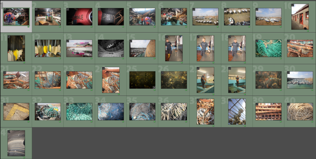
For the second shoot I started at the maritime museum, learning more about the history of the Jersey maritime history, from this I grabbed some quick shots to inspire me for the rest of the shoot. I then went onto walking around the harbours again. This time I had a different lens instead of the 70-200mm I had a 10-20mm this allowed me to get really wide angle shots.
Contact Sheets


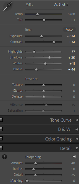
Edit One


This photo was great compositionally but I didn’t like the red so I changed the photo to black and white to emphasise the texture and tones in the photo, this helped also show the purposeful angle of the image, showing all the doors on the fishing storage sheds.
Edit Two


I like how the black and white evens out the photo from the over exposed area, it helps the repetitive pattern of the dredging tools. (a harsh, destructive fishing technique)
Edit Three


For this shot I think the colour actually adds to the image, not only is there many different textures but there is many different colours from the rusty chain to the green netting. The exposure being moved lower has helped enhance the colours and make them bolder making the photo feel more intense.
Edit Four


I orginally liked this photo for the lines but I didn’t like the yellow tone or noise from artifcial light, to fix this I changed the photo to black and white, this meant it empahsised the dimeson and removed the issues of colour.
Edit Five


Again I liked the lines and dimesion of the photo as it has the contuinal curve of the wall at the bottom of the shot but keeps the boat jus off center at the end of steps creating a great leading line. I again turned th ephoto to black and white as te true colours wern’t captured well so this helped add depth to the photo as the colours having been washed out took the dramatic tones out of the photo.
Edit Six


As I had fixed the last few photos I like but the lighting was off by turning photos black and white I thought I would try it with this one. I liked how the lobsters were an interesting subject choice with the one lobster in the middle, on top of the others it added a focus to the photo. The photo was indeed dramatically improved when I changed the photo to black and white revealing otherwise hidden areas of the busy photo.
Edit Seven


Following on the black and white theme I changed this photo to a similar, tonal black and white image again elevating the image from fairly flat and uninteresting to a dynamic, abstract photo.
Final Thoughts on the Editing
From this shoot I focused more on the details rather than the whole picture like the first photoshoot. Although not quite what I had planned it worked out well with getting quite a few good abstract shots of the harbour. I think having had quite a few of these edits in black and white I might use a double page spread in my zine to create pages of black and white photos especially the abstract ones so a fuller picture is given through small snippets.
